Your homepage is the most valuable real estate in your digital ecosystem. It is the definitive gatekeeper of your brand’s story, tasked with establishing immediate credibility, articulating your value proposition, and directing traffic with surgical precision. In 2026, a world-class homepage doesn’t just “look good” – it functions as a high-speed psychological trigger that moves a visitor from curiosity to commitment in seconds.
Our strategy and design team evaluated hundreds of entry points to identify the examples that master the “Above-the-Fold” experience. We evaluated these homepages based on hero-section impact, intuitive information architecture, and the strategic reduction of bounce rates. These selections demonstrate how to balance immersive visual storytelling with a frictionless path to deeper engagement.
Whether you are building a disruptive landing page or a complex corporate portal, these examples represent the current benchmark for homepage excellence in 2026.
Note on Our Selection Process: We recently audited this guide to remove outdated designs and sites that no longer meet our performance standards.
Top Homepage Layouts
1. Daysie
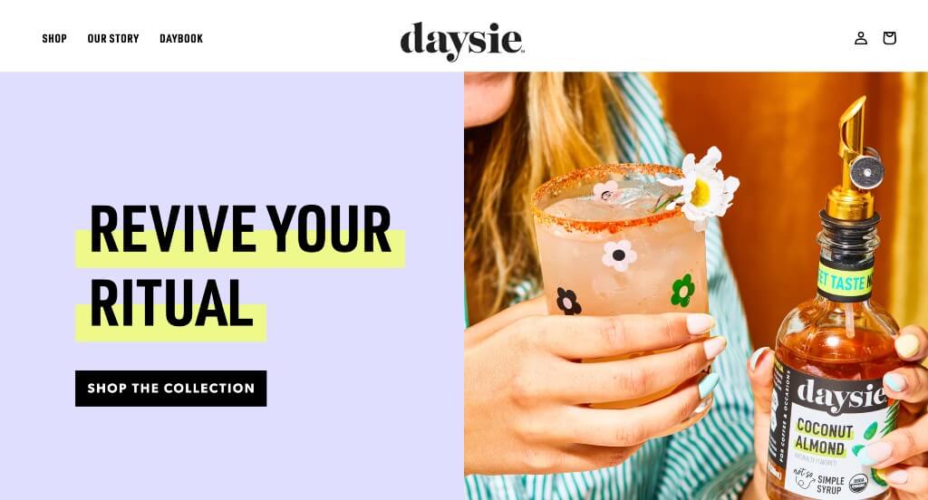
Daysie used a beautiful pastel color scheme, creating a sense of youth. Including high-quality and well staged imagery was a very impactful aspect. Within here, graphics are added in to allow for an amazing look that was playful. Their packaging was also something that we loved because it played along with their values.
2. Gradient Vodka Soda
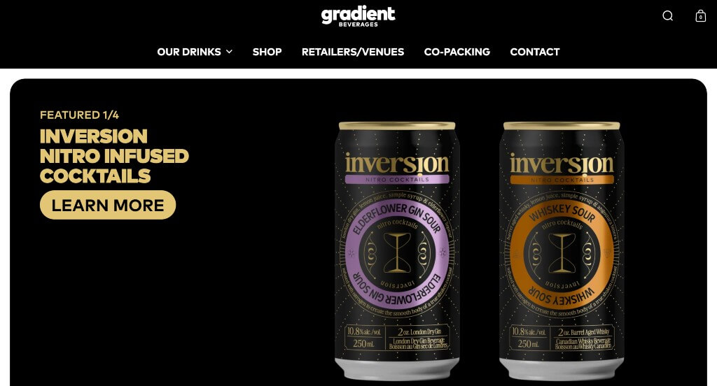
There was lots of product videos and sliding image carousel features. Bold fonts were used carefully to make everything look great together. Including an area that showcases their awards and best selling products was one of our favorite things. Subtle animations were a nice touch for any company looking for ideas. We also loved how they liked to display their packages.
3. Moon Cheese
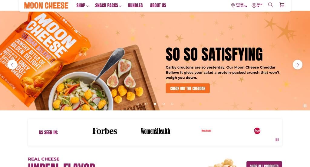
We appreciated how they used colors of orange, plum and white to create a stunning look. Something that Moon Cheese did well was their email sign up that has people spin a wheel to earn sale prices. Their use of banners mixed with images of their products was another feature we enjoyed. There was also lots of buttons that helped keep customers exploring more content.
4. Mammut
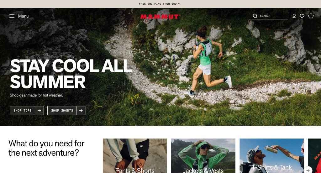
We loved how this one not only included their products, but also showed off their target audience enjoying life. They use a natural color palette, which was perfect because it’s logical for their company’s products. Mammut did a great job incorporating their social media posts, keeping customers engaged. They were smart when utilizing separate sections for each type of clothing within this homepage.
5. Hestra Gloves
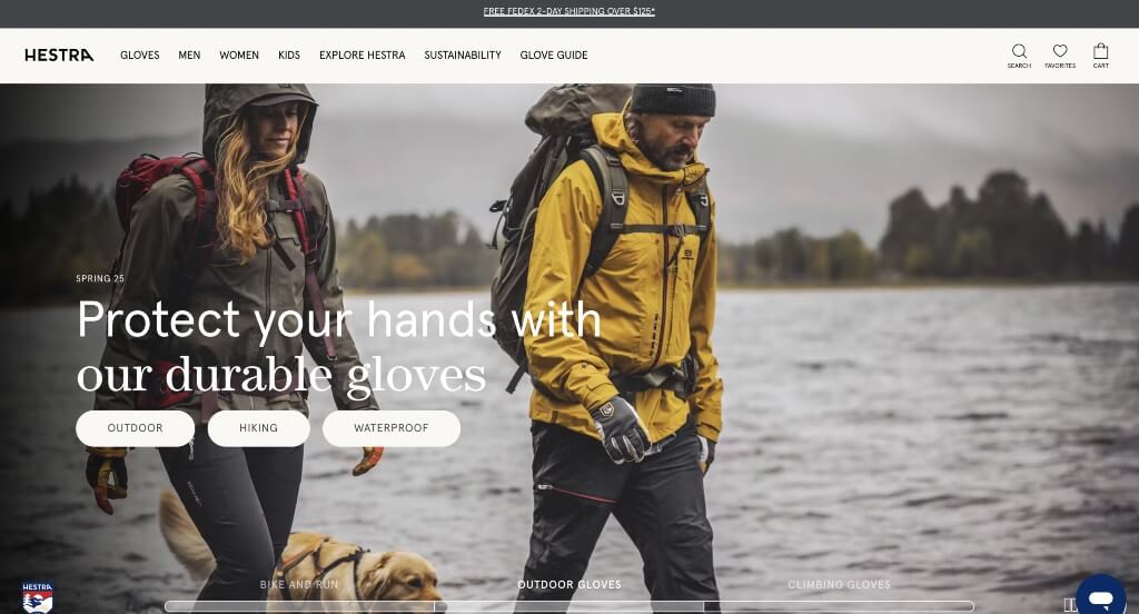
This was amazing! We loved how there was high quality images of people loving what they do, along with product images. We loved how there was large images to help break up content. It was a great feature to allow customers to compare up to four products. This will then compare things such as gender of user, waterproof, activity, details, along with ranking (out of 8) features like warmth, durability, and mobility.
6. Carbon Made
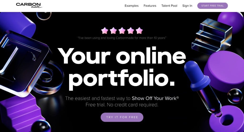
We loved this company’s bright colors of purple that are sure to grab attention against their dark background. Showing lots of examples of their products was another thing that we really appreciated. Including reasons why people should choose this company was something we liked because it highlights their values as a business.
7. Marc Jacobs
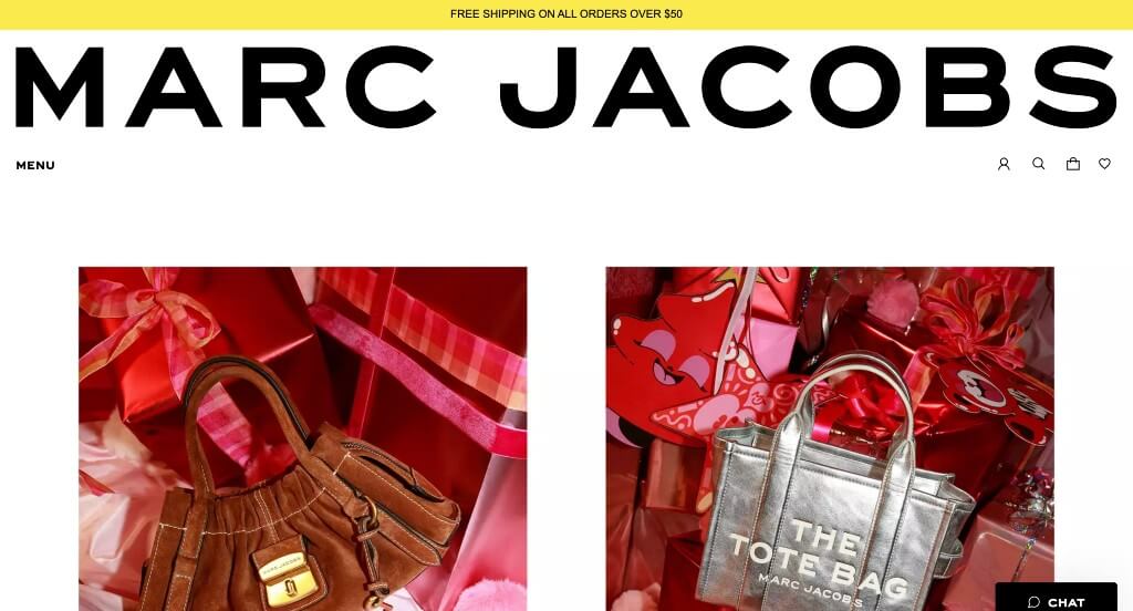
Large images was likely the best part about Marc Jacobs. They picked out fonts that were bold to create a more modern design. Showing a variety of different products was a perfect way to get people excited about new items. Having an opportunity to personalize their very own tote bag was a great way for customers to feel more involved with this business.
8. Air
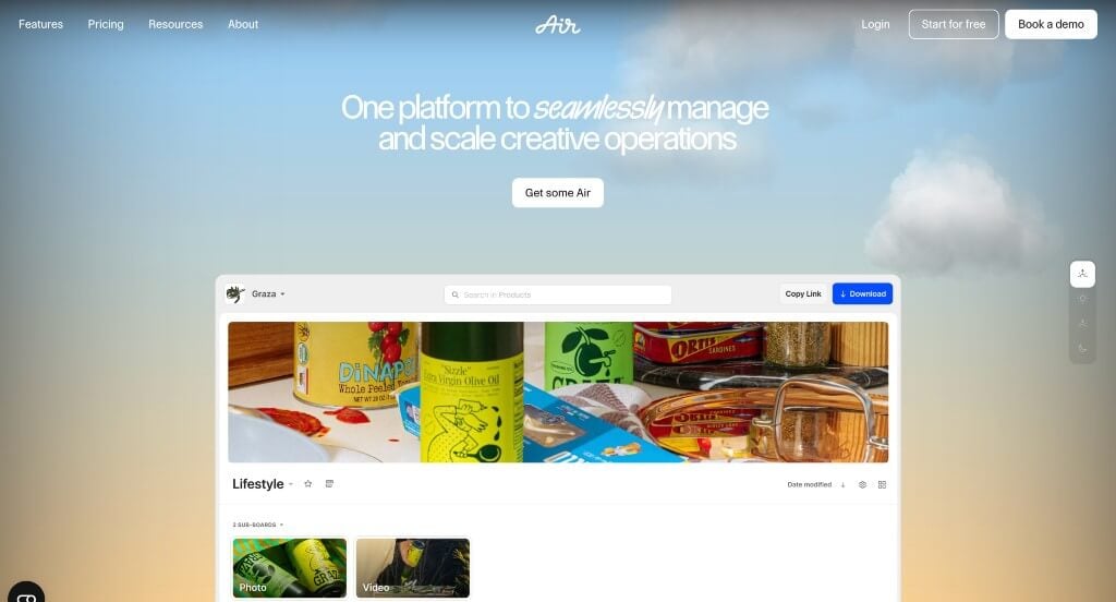
We really liked this template because of their perfect balance of images, text, graphics and white space. Their reviews continue to scroll, positivity emerging from every area. We thought it was cool how they added in memorable companies that use their software. Their navigation bar also was well organized with lots of drop downs, which we enjoyed.
9. Decibullz
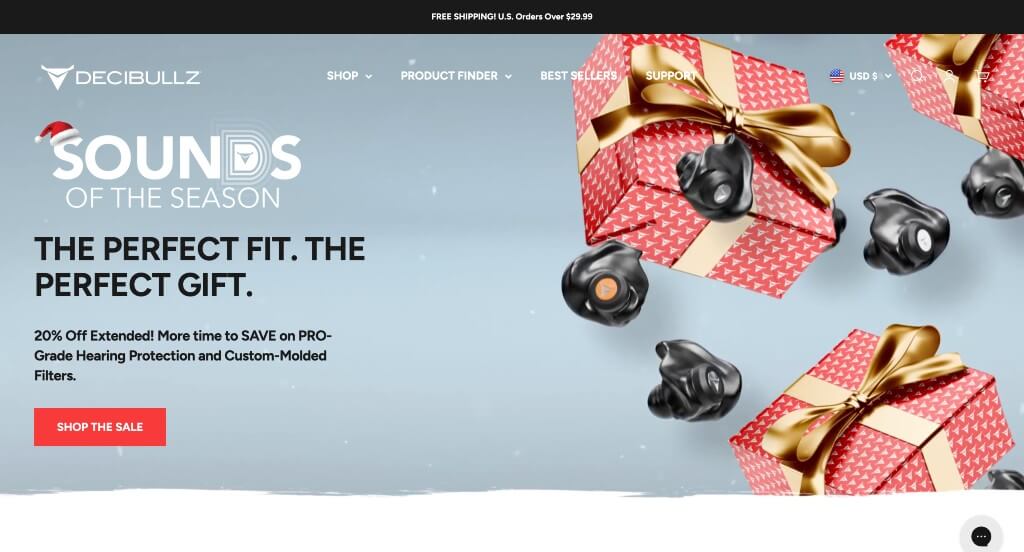
With just a few clicks, customers can complete a quiz that takes them to their recommended product. We liked their hexagons used for frames and patterns to create unity. This inventive logo was another quality we loved. Putting emphasis on their custom earplugs helped people understand what makes them special from their competitors.
10. Thinx
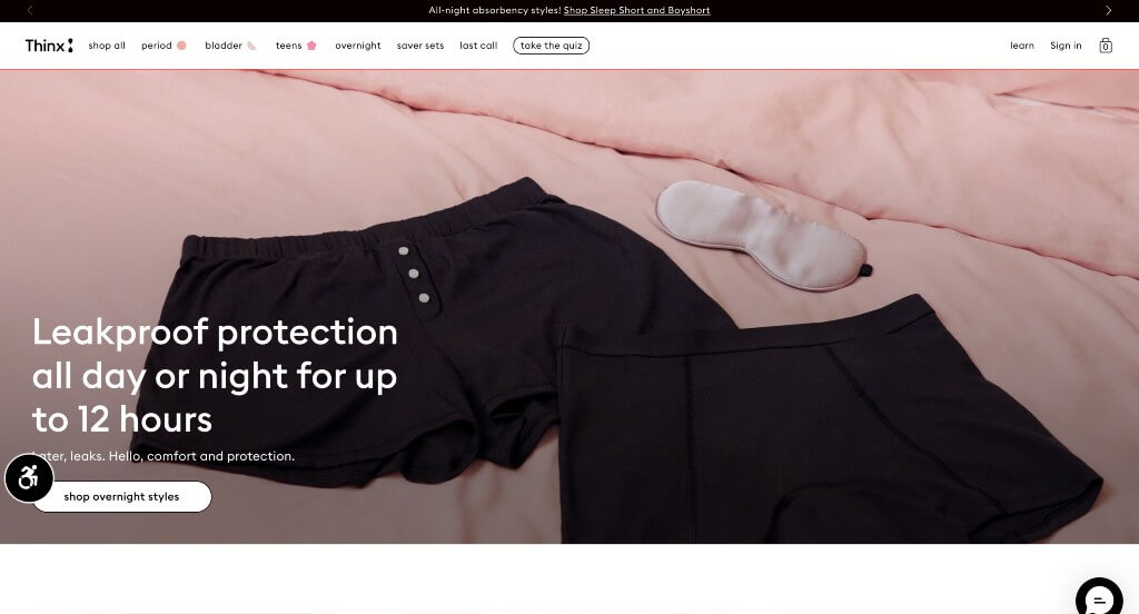
We really loved how this example does an amazing job showing off their product. They do a nice job with their inclusion of seemingly ink drawn graphics throughout the page. Adding in customer reviews was another thing that we really appreciated. Organizing their products by bestsellers, staff picks and night items was another smart choice.
11. CarMax
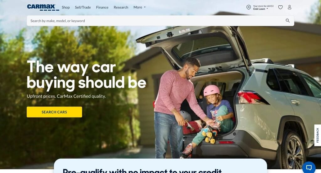
CarMax is a well known company, so their signature blue and yellow colors are absolutely vital. We thought it was nice how they included sketches of different vehicles along with your desired monthly payments, down payment, and your credit score. Another design quality that we noticed was their integration of social media. Allowing customers to save cars to their favorites was a cool feature too.
12. Streamtime
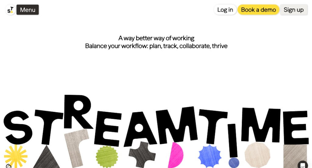
A blend of many colors within Streamtime stood out to us because it allows for a creative vibe. Another quality you might notice is their unique “patches” of color and graphics. Additionally, they showcase awards and business that love their service. Their domain is simple, making it easy to find and great for their brand recognition.
13. Stakt
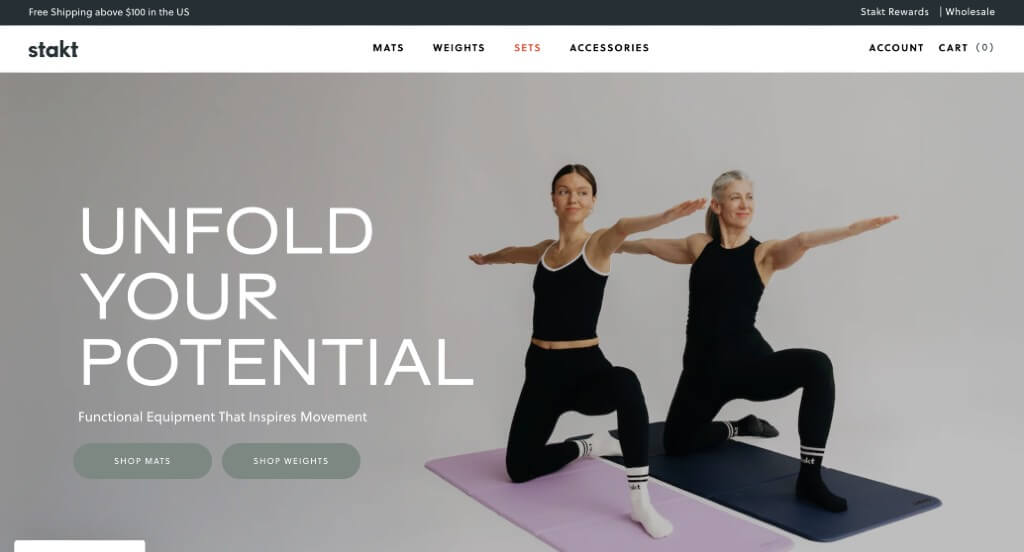
Images included within this example was likely its best feature. Along with that, we liked how there were buttons used throughout the page in order to guide viewers towards additional information. Including GIFs was another feature that we thought was unique, but we liked it. Their content was well organized and placed logically so information is never confusing.