In the woodworking and custom cabinetry industry, your website serves as your virtual showroom and a testament to your technical skill. Before a client commissions a custom piece or a builder selects a cabinetry partner, they use your online presence to evaluate your aesthetic range, joinery precision, and material knowledge. To succeed in 2026, a woodworking website must go beyond simple imagery to provide a high-definition narrative of the maker’s process.
Our design team evaluated hundreds of woodworking websites – from boutique furniture artisans and custom cabinetry shops to large-scale sawmills and industrial supply companies. We identified the top 8 examples that masterfully balance rustic authenticity with high-performance functionality, specifically analyzing their project gallery depth, wood species transparency, and mobile-friendly consultation flows.
Whether you are a solo artisan building a signature brand or a high-volume manufacturing shop, these examples represent the benchmark for digital excellence in the woodworking trade.
Note on Our Selection Process: We recently audited this guide to remove outdated designs and sites that no longer meet our performance standards.
Top Woodworker Website Designs
1. Brooklyn Millwork
Why We Chose Brooklyn Millwork
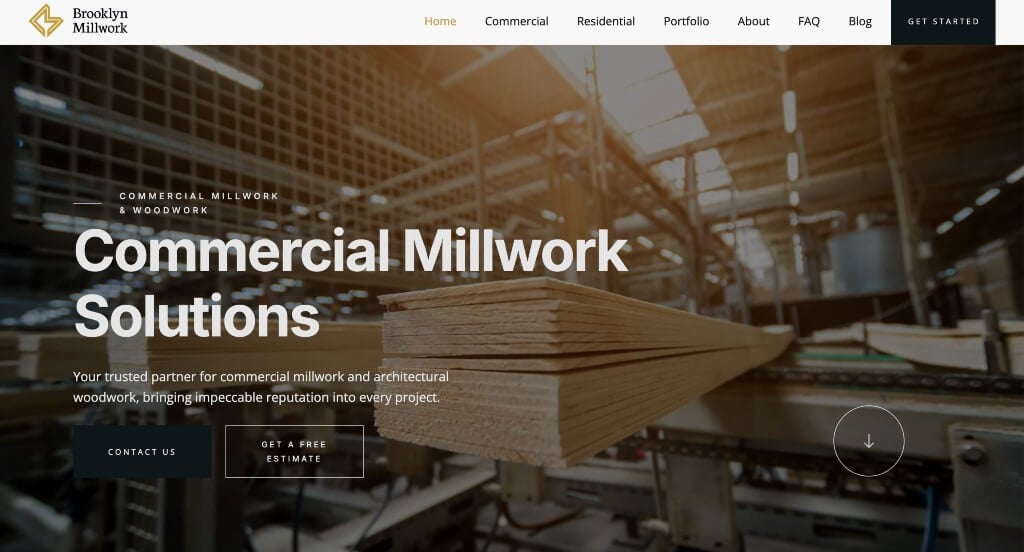
The digital presence for Brooklyn Millwork Click to open side panel for more information serves as a premier benchmark for “High-End Architectural Merchandising and Artisan Fabrication Trust Architecture.” In the luxury custom carpentry and commercial fabrication sectors, an online presence must immediately project physical precision, master engineering, and structural capability. The desktop interface delivers this positioning flawlessly, shifting away from generic contractor layouts to create a high-fidelity digital gallery that highlights their raw trade craftsmanship and architectural scale.
Key Design Highlights:
- Cinematic Workshop Craft Restoration Video Showrooms: Bringing the raw fabrication floor straight to the viewer, the homepage utilizes a high-definition background video module. By guiding visitors through their active production studio – showing precision CNC-machining, detailed manual hand-sanding, master assembly, and sweeping views of finished premium installations – the video immediately justifies their elite trade status through visual engineering mastery.
- Comprehensive Front-Page Architectural Service Blueprints: Demystifying their full design and engineering footprint is handled elegantly via a structured service index on the homepage. By mapping out their specialized fabrication disciplines – from custom residential cabinetry and luxury retail fixtures to large-scale commercial wood paneling and architectural engineering – the layout allows general contractors and developers to instantly assess the shop’s manufacturing range.
- Direct Front-Page Portfolio Project Showcases: The homepage operates as an upscale digital gallery by integrating a rich showcase of completed high-end projects directly into the primary scroll path. Displaying crisp, large-format photography of stunning real-world interior installations allows architects and interior designers to evaluate their alignment, material handling, and flawless finish execution on site.
- Fluid, Self-Contained Client Testimonial Sliders: Overcoming natural enterprise purchasing hesitation regarding delivery deadlines, architectural tolerances, and communication reliability is achieved smoothly via an integrated client testimonial slider. Showcasing authentic success stories, general contractor validation, and glowing reviews inside an interactive carousel provides powerful peer proof while maintaining a clean vertical layout.
2. California Woodworking
Why We Chose California Woodworking
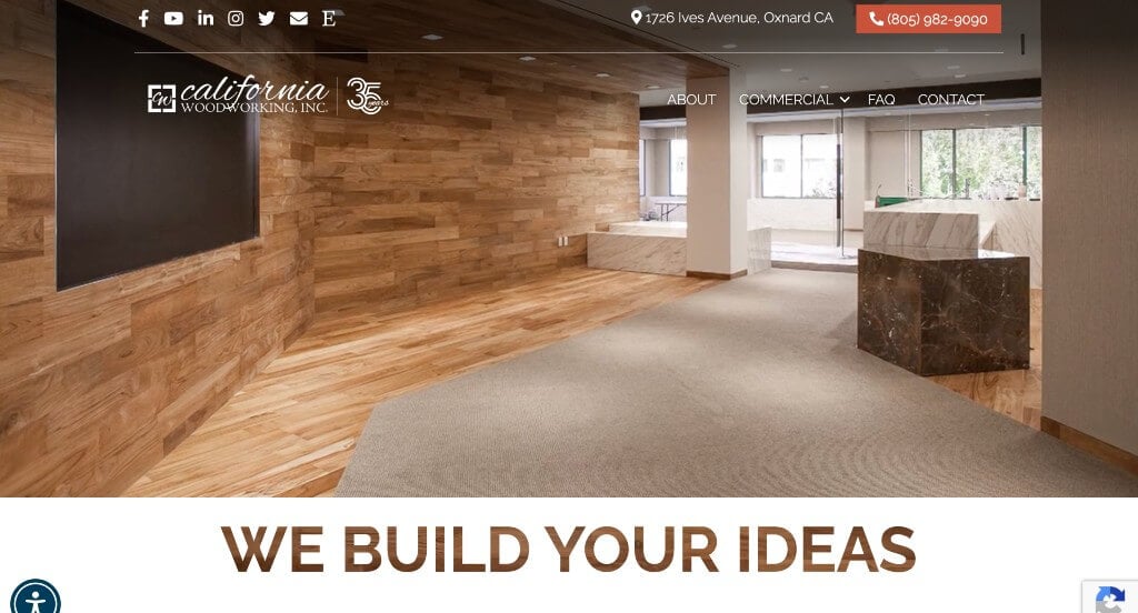
The digital presence for California Woodworking, Inc. Click to open side panel for more information serves as a premier benchmark for “Precision Millwork Merchandising and High-Trust Manufacturing Architecture.” In the commercial and architectural woodworking sector, a website needs to prove both aesthetic finesse and heavy-duty production capacity. The desktop interface masterfully locks down this positioning, trading generic contractor text for dynamic manufacturing visuals and clear operational pillars to immediately establish authority with general contractors, architects, and developers.
Key Design Highlights:
- Cinematic, Full-Bleed Project Hero Showrooms: Capturing their scale and finish quality is handled instantly upon landing via a high-fidelity hero video loop. By displaying sweeping visuals of completed, high-end commercial millwork projects, the website bypasses basic capability statements to focus directly on the beautiful, tangible results of their architectural fabrication and design installations.
- Interactive, Tile-Based Service Blueprints: Demystifying their full fabrication footprint is handled elegantly via a structured grid of service tiles on the homepage. This clean, visual index clearly outlines their specialized disciplines, allowing prospective clients to easily click through to dedicated, detailed pages to learn more about specific offerings like custom cabinetry, commercial fixtures, and architectural paneling.
- Behind-the-Scenes Manufacturing Video Engineering: Proving their heavy-duty production capacity, a secondary video module integrated lower on the homepage brings the raw shop floor straight to the viewer. By showcasing precision CNC machinery in action and real team members actively assembling custom pieces, the video expertly justifies their production scale, technological investment, and structural reliability through visual mechanical mastery.
- Value-Driven ‘Quality & Integrity’ Conversion Frameworks: Grounding the company’s operational excellence, the homepage features dedicated sections explicitly detailing their “Quality Custom Cabinet” promise and “Efficiency & Integrity” standards. Placing these transparent business pillars directly in the primary scroll path builds immediate trust, proving to high-stakes commercial buyers that the shop prioritizes pristine craftsmanship just as much as reliable, on-time project management.
3. HQ Carpenter Chicago
Why We Chose HQ Carpentry
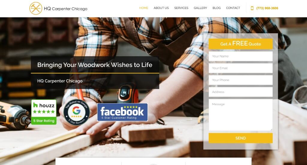
The digital presence for HQ Carpentry Click to open side panel for more information serves as a premier benchmark for “Localized Trade Merchandising and Direct-to-Consumer Contractor Trust Architecture.” In the hyper-competitive urban home improvement and custom woodworking market, an online landing page must instantly cut through digital noise by demonstrating three critical traits: transparent service mapping, visual proof of technical capability, and verified neighborhood reputation. The interface masterfully balances these pillars, providing residential and commercial clients with an organized, reassuring exploration path that simplifies the journey from initial inspiration to project kickoff.
Key Design Highlights:
- Structured Front-Page Remodeling Service Matrices: Rather than forcing visitors to dig through deep, multi-tiered drop-down menus, the homepage lays out their core technical capabilities in a clean, highly scannable visual grid. This straightforward mapping covers their specialized remodeling and finish carpentry disciplines – ranging from custom trim work and cabinetry installations to extensive structural build-outs – allowing homeowners to instantly verify that the team handles their specific project type.
- Value-Driven “Why Choose Us” Operational Blueprints: Directly addressing common consumer anxieties regarding contracting services – such as timeline delays, hidden costs, or subpar materials – the homepage incorporates a dedicated “Why Choose HQ Carpentry Chicago” section. Placing these transparent operational commitments directly in the primary scroll path acts as an immediate trust builder, framing the business as an ethical, detail-oriented trade partner.
- Direct Front-Page Portfolio Project Showcases: The homepage functions as a high-visibility physical showroom by embedding a rich gallery of completed carpentry projects straight into the main narrative. Showcasing crisp, high-resolution photos of real-world kitchen installations, custom built-ins, and flawless millwork finishes lets prospective clients critique their alignment, scribing, and spatial execution before initiating contact.
- Fluid, Space-Saving Client Testimonial Sliders: Reinforcing their pristine regional reputation without cluttering the layout, the website incorporates an active customer review slider on the homepage. Displaying verified local testimonials and flawless multi-star ratings inside a self-contained carousel provides strong social proof, reassuring cautious homeowners that the team consistently delivers high-hospitality service and clean, expert craftsmanship on site.

4. Carpenters Workshop Gallery
Why We Chose Carpenters Workshop Gallery
The desktop website for Carpenters Workshop Gallery serves as a premier benchmark for “Elite Collectible Design Merchandising and High-Art Editorial Architecture.” Producing and exhibiting functional sculptures by leading global artists requires an interface that treats the digital screen as a physical white-cube gallery space. The desktop layout achieves this by using a minimalist, luxury frame that lets avant-garde furniture and sculptural art take center stage while keeping international collectors deeply informed on global programming.
Key Design Highlights:
- Stunning, High-Fidelity Artistic Hero Showrooms: The homepage opens with large, incredibly crisp, high-resolution hero imagery that immediately establishes a sophisticated tone. By using massive visual framing instead of busy layouts, these opening visuals feel like stepping into a physical gallery exhibition, allowing collectors to appreciate the complex textures, raw materials, and forms of their functional art right away.
- Museum-Grade Global Exhibition Matrices: Keeping international art enthusiasts informed, the homepage features a beautifully organized exhibition showcase. The layout maps out current, featured, and upcoming shows across their physical locations (such as London, New York, and Paris), allowing collectors to stay connected with global programming and plan their visits or acquisitions ahead of time.
- Roster-First Artist and Sculptor Spotlights: Recognizing that high-end art collections are built around individual creative voices, the homepage features a dedicated section introducing their resident artists and designers. Spotlighting these creators directly in the primary scroll path emphasizes their elite talent pool and makes exploring historical portfolios highly accessible.
- Founder-Led Vision and Heritage Frameworks: Grounding the gallery’s global authority, the homepage incorporates a dedicated section detailing the visionaries who built the company. Showcasing the background and philosophy of the founders directly within the primary narrative adds a rich layer of human storytelling, reinforcing the gallery’s reputation as a pioneer in the collectible design movement.
5. A Carpenter’s Son
Why We Chose A Carpenter’s Son Design Co.
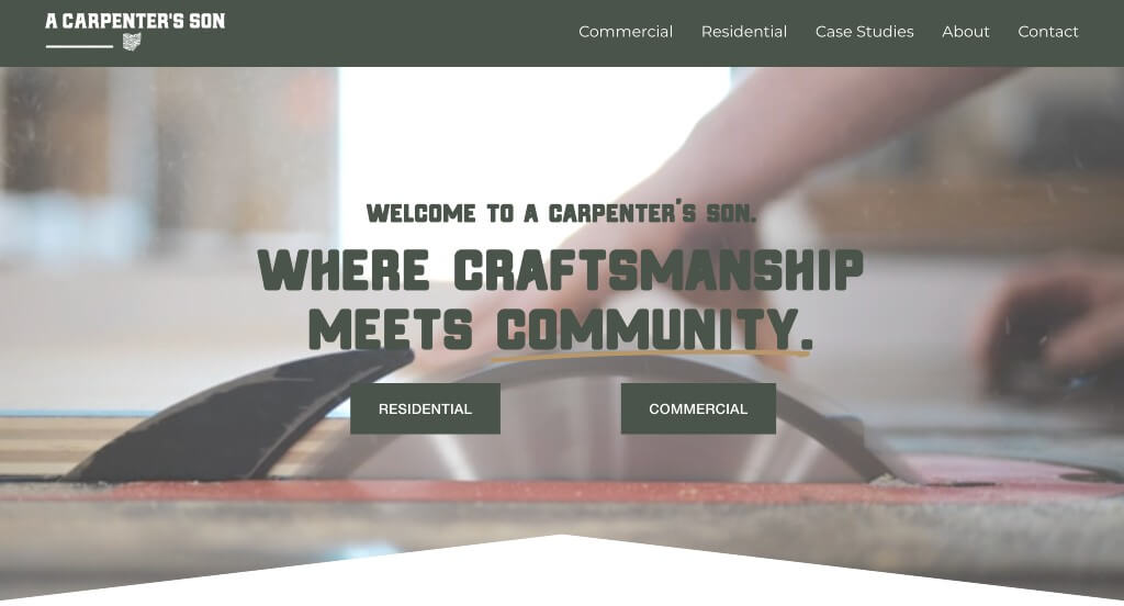
The digital storefront for A Carpenter’s Son serves as a premier benchmark for “Artisan Furniture Merchandising and Narrative-Driven Craft Trust Architecture.” Specializing in custom heirloom tables, architectural woodworking, and high-end residential furnishings, the brand faces the unique challenge of conveying handmade structural integrity and premium raw material quality through a digital screen. The interface masterfully secures this positioning, leveraging raw workshop footage and deeply detailed project breakdowns to transform a routine e-commerce visit into an authentic, behind-the-scenes craft journey.
Key Design Highlights:
- Cinematic, Full-Bleed Craftsmanship Hero Showrooms: Immediately upon landing, the hero section hooks visitors with a high-definition background video loop that acts as a visual highlight reel of their capabilities. By blending sweeping, architectural shots of finished custom installations with quick clips of the actual fabrication process, the layout immediately proves their execution quality and design range before a user ever begins to scroll.
- Human-First Workshop Action and Past Project Matrices: Breaking away from cold, sterile product grids, the homepage actively features rich imagery of real craftspeople hard at work in the woodshop alongside crisp close-ups of completed projects. Highlighting the flying sawdust, raw lumber slabs, and meticulous hand-finishing processes humanizes the upscale brand, validating their authentic artisan story and justifying premium pricing through pure physical labor.
- Deep-Dive Front-Page Case Studies: Moving beyond basic photo galleries, the homepage incorporates a dedicated feature section for comprehensive project case studies. By walking prospective clients through the entire life cycle of specific high-end builds – from the initial raw wood selection and spatial design hurdles to the final flawless delivery – the layout establishes immense professional authority and builds ironclad trust with architects, interior designers, and homeowners alike.
- Frictionless Mobile-First Scroll Architecture: Recognizing the rapid pace of modern consumer browsing, the smartphone viewport is heavily optimized for smooth, tactile exploration. The mobile layout expertly carries over the brand’s warm, story-driven aesthetic into an ultra-clean vertical stream, using fluid swipe mechanics and perfectly scaled media blocks that allow users to comfortably dive into deep project case studies from any screen size.
6. Kevin Carpenter Interiors
Why We Chose Kevin Carpenter Interiors
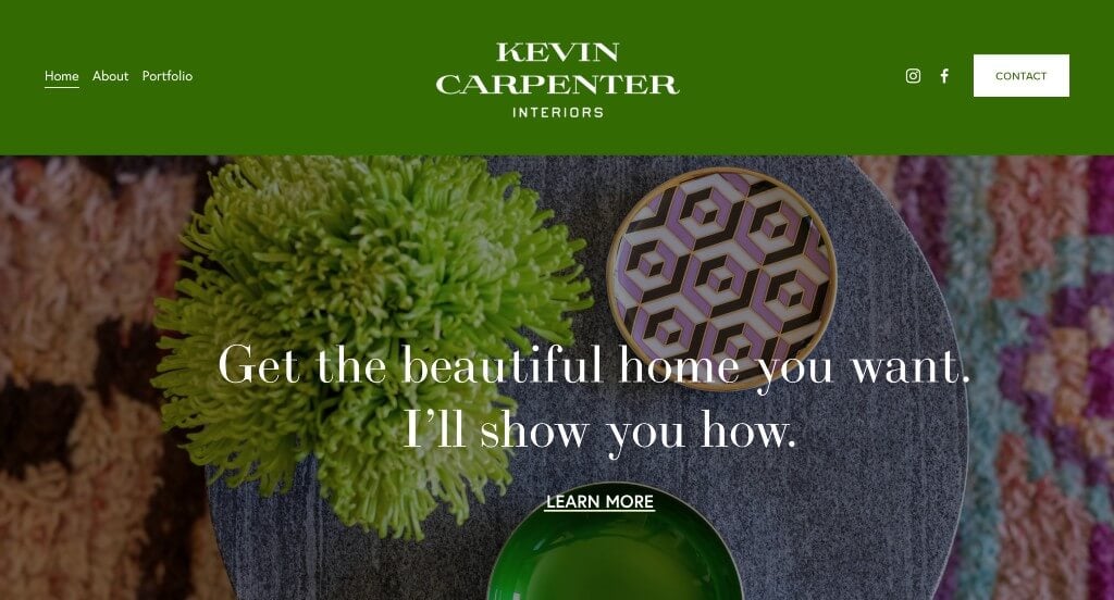
The digital presence for Kevin Carpenter Interiors serves as a premier benchmark for “High-End Spatial Merchandising and Boutique Interior Design Trust Architecture.” For residential interior designers and spatial consultants, a website must act as an immaculate virtual extension of their design philosophy. The layout achieves this elite standard by pairing an elegant editorial canvas with classic trust-building signals, ensuring that high-net-worth clients find an onboarding path that feels as bespoke and seamless as a personalized room transformation.
Key Design Highlights:
- Integrated Spatial Peer-Validation Hubs: Overcoming natural consumer hesitation regarding long-term construction timelines and luxury budgets is handled smoothly by embedding verified client reviews directly on the homepage. Displaying glowing client testimonials within the primary narrative scroll path provides immediate reassurance, proving their excellence in project management, trade communication, and creative vision.
- Front-Page Editorial Authority and Press Matrices: Instantly solidifying their premium standing within the competitive design industry, the homepage incorporates a dedicated “As Featured In” media showcase. Displaying the logos of recognized design publications and lifestyle authorities acts as an elite stamp of approval, reinforcing their professional status and eye for high-end aesthetics.
- Streamlined Front-Page Newsletter Captures: Recognizing that luxury design acquisitions often require a long, nurturing relationship path, the homepage integrates a clean, distraction-free newsletter sign-up module. Positioned strategically to capture inspiration-seeking visitors, this gateway allows design enthusiasts and potential clients to effortlessly subscribe for exclusive styling tips, project reveals, and studio updates.
- Impeccable Mobile-First Fluid Grid Execution: Because affluent clients frequently browse home inspiration and source design teams via mobile devices, the smartphone interface is heavily optimized for pristine, error-free rendering. The mobile platform translates the sophisticated desktop framework into a lightweight, vertical flow – eliminating any broken elements or formatting misalignments to maintain an uncompromised luxury brand experience on any screen.
7. Carpenter Oak
Why We Chose Carpenter Oak
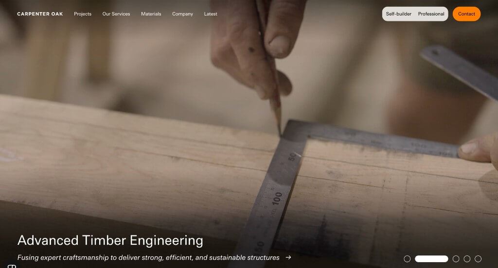
The digital storefront for Carpenter Oak serves as a premier benchmark for “Architectural Heavy-Timber Merchandising and Immersive Story-Driven Engineering Trust Architecture.” Specializing in bespoke oak framing, hand-crafted timber outbuildings, and premium sustainable architecture means their interface must communicate the monumental scale, structural engineering complexity, and historic artisan skill behind massive wooden structures. The layout masters this unique balance, using interactive, narrative-rich media modules that seamlessly pull self-builders, architects, and developers straight from initial conceptual designs into the physical reality of a timber raising.
Key Design Highlights:
- Cinematic Multi-Track Timber Framing Hero Showrooms: Capturing the epic scale of their heavy-timber framing occurs immediately upon landing via a series of rich, highly detailed hero video loops. By seamlessly rotating across three core operational narratives – displaying the heavy raw log processing inside their timber mill, meticulous hand-chiseling by master carpenters, and sweeping aerial views of dramatic completed homes – the video framework proves their deep trade authority from forest floor to final raising.
- Interactive, Multi-Sensory “Scrollytelling” Value Engines: Breaking away from flat paragraphs and standard bulleted features, the homepage utilizes advanced “scrollytelling” mechanics to unpack their unique market advantages. As a prospective client scrolls through the main narrative, background visual assets, structural callouts, and explanatory copy shift smoothly in reaction to their movement, transforming a passive read into an active, high-engagement education on their custom framing superiority.
- Front-Page Sustainable Architecture and Blog Hubs: Cultivating a passionate, inspiration-seeking community of green-builders and architectural purists, the homepage features a dedicated editorial showcase for their active company blog. Highlighting technical timber engineering breakdowns, structural design case studies, and sustainable forestry updates right within the main exploration path keeps self-builders deeply informed and continuously engaged throughout long construction planning lifecycles.
- Frictionless Mobile-First Fluid Grid Execution: Because luxury property developers and self-builders frequently explore spatial inspiration, review floor plans, and research contracting teams via smartphones, the mobile view is completely optimized for lightweight, error-free navigation. The mobile platform translates their complex desktop multimedia matrices into a clean, highly responsive vertical stream – ensuring that massive video assets load instantly and text layouts remain perfectly aligned for effortless reading on any viewport.
8. Handcraft
Why We Chose Handcraft Inc.
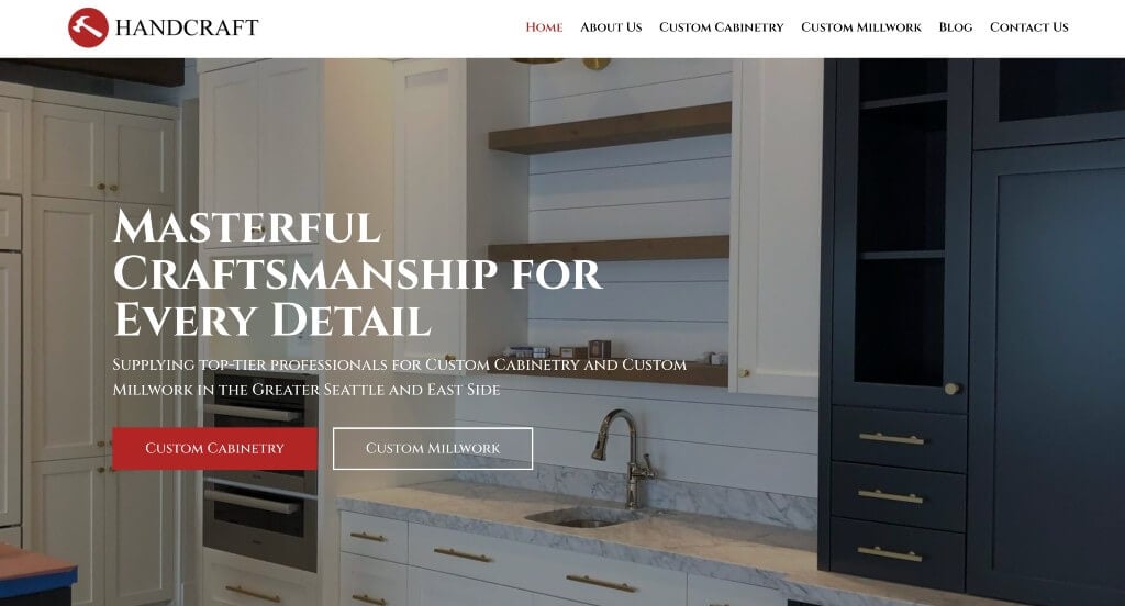
The digital storefront for Handcraft (Handcraft Inc.) serves as a premier benchmark for “Bespoke Trade Merchandising and Multi-Channel Visual Trust Architecture.” In the premium custom contracting, remodeling, and fabrication spaces, an online landing page must instantly bridge the gap between creative design concepts and clean physical execution. The interface masterfully balances these requirements, utilizing social proof loops and crisp visual frameworks to move high-intent homeowners and commercial developers comfortably from initial design inspiration to project booking.
Key Design Highlights:
- Structured “What We Do” Core Operational Blueprints: The homepage avoids ambiguous contracting jargon, immediately welcoming visitors with a clear, highly scannable “What We Do” service index. This straightforward section maps out their core technical capabilities and custom fabrication disciplines, allowing residential and commercial clients to instantly verify that the team handles their specific project requirements.
- Direct Front-Page Dynamic Project Galleries: The homepage functions as an upscale digital showroom by embedding a rich, high-resolution Project Gallery directly into the primary scroll path. Displaying completed high-end installations allows architects and interior designers to evaluate their craftsmanship, design versatility, and clean finish execution before initiating a project inquiry.
- Real-Time Social Proof and Live Instagram Feeds: Seamlessly connecting their static web portfolio with their active, day-to-day operations, the homepage features a live-updating Instagram social grid. This integration brings fresh, behind-the-scenes workshop updates, raw material sourcing clips, and real-time site installations directly to the frontend web experience – proving ongoing trade activity and community engagement.
- Fluid, Self-Contained Client Testimonial Sliders: Reinforcing their pristine regional reputation without cluttering the layout, the website incorporates an active customer review slider on the homepage. Displaying verified local testimonials and flawless multi-star ratings inside an interactive, space-saving carousel provides powerful social proof, reassuring cautious clients that the team consistently delivers high-hospitality service and expert craftsmanship on site.
WordPress Woodworking Themes
You can find free themes at wordpress.org or explore woodworking-inspired templates on ThemeForest.
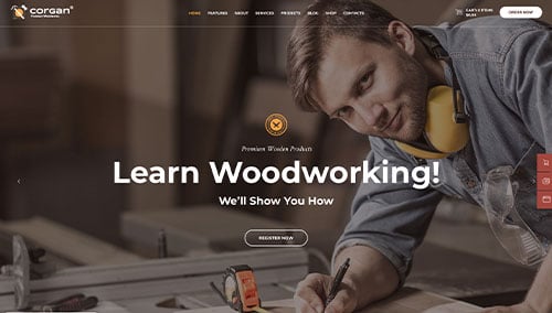
Corgan – Themeforest
$69
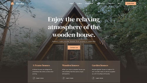
Wooha – Themeforest
$59
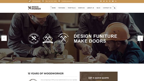
Woodworker – Themeforest
$59
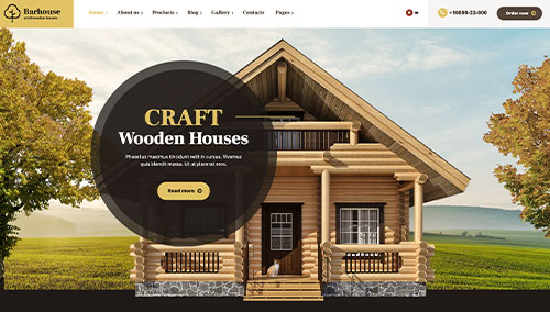
Barhouse – Themeforest
$59
WooCommerce Woodworking Themes
Discover a wide range of ecommerce woodworking themes for WooCommerce on ThemeForest.
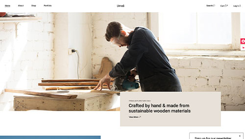
Umea – Themeforest
$79
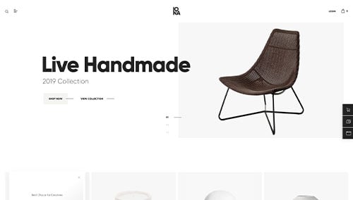
Iona – Themeforest
$69
Find free and paid themes at themes.shopify.com or explore options on marketplaces like ThemeForest.
Shopify Woodworking Themes
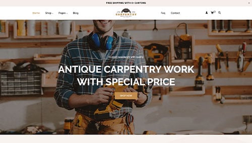
Carpentry – Themeforest
$58
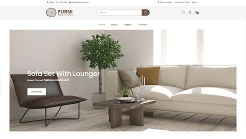
Furni – Themeforest
$59