In the high-velocity digital landscape of 2026, a landing page is the ultimate bridge between curiosity and conversion. For brands driving targeted traffic from search, social, or email, a landing page must achieve a singular, focused objective: eliminating distractions and guiding the visitor toward a specific action with surgical precision. To thrive in today’s “post-click” environment, your design must go beyond basic layouts to embrace “Immersive Conversion,” where persuasive copy, personalized value propositions, and high-performance speed converge to lower the user’s cognitive friction and maximize ROI.
Our team evaluated hundreds of high-converting landing pages – ranging from minimalist SaaS lead-gen forms and high-energy e-commerce sales pages to complex B2B webinar registrations and localized service-area “squeeze” pages. We narrowed the field to 8 examples that represent the gold standard for conversion-centric design. Our analysis focused specifically on benefit-led hero sections, mobile-first form optimization, and the strategic placement of “sticky” calls-to-action that maintain a constant path to conversion as the user scrolls through the narrative.
Whether you are a performance marketer looking to lower your Cost Per Acquisition (CPA) or a business owner building your first “Top-of-Funnel” asset, these ideas and examples provide the definitive benchmark for landing page excellence in 2026.
Note on Our Selection Process: We recently reviewed this list to ensure every featured page demonstrates a clear commitment to modern standards for Largest Contentful Paint (LCP), mobile message-match, and trust-signal integrity. This curated collection focuses on landing page designs that prioritize clarity over clutter, providing the most strategic value to both the advertiser and the prospect in 2026.
Building the Perfect Landing Page
Your landing page should guide visitors to complete your desired action. At a minimum, it should include these key elements:
- Content that is about a single page in length
- Easy-to-spot customer testimonials
- Sticky call-to-actions (CTA)
- Exclude navigation
- Interesting & high-quality images/gifs/videos
- Unique value proposition
- Captivating headlines
- Highlight top features & benefits
Including these core elements on your landing page is better than linking ads to your homepage. To maximize conversions, follow best practices and avoid worst practices discussed in the upcoming sections.
Best Practices for Landing Page Design
Creating brilliant landing pages involves many factors. Here’s a list of key features and concepts we find crucial for enhancing your visitors’ experience when used effectively.
- Fast loading speed
- No navigation bar
- No unnecessary links
- Include keywords from your ad
- Provide social proof
- Review/testimonial section
- A FAQ section
- Straightforward costs
- If your service is subscription-based, be clear about it
- Make your CTAs easy to spot with contrasting colors
- Use a sticky CTA when possible
- Include compelling features & benefits
- Include brand-orientated and easy-to-read typography
- Provide a unique value proposition
- Make your landing page is built with responsive design
- Include high-quality photos, videos, gifs, and animations
- Add badges and awards if you have them
- Use impressive performance figures, number of users/downloads, and interesting case studies
- Provide contact information
- Keep content clean, simple, and minimal.
- Only include exit-intent popups
- Use white space effectively
- Use story-telling techniques
- Use your company colors (4 colors or less is optimal)
What to Avoid When Designing Landing Pages
As you implement best practices in your landing pages, be mindful of common downfalls seen in custom websites. If creating a landing page feels difficult, stop and refer to this list to ensure you’re avoiding these bad practices.
- Not educating your users on your service
- Low-quality videos, images, animations, or gifs
- More than one CTAs, making it confusing
- Unnecessary complex or technical jargon
- Include information your ad didn’t mention
- Not including your brand’s story
- A color palette that is overwhelming
- Too much written content
- Navigation and links to other pages
- Bad typography (basic, boring, too small, too large, etc.)
- Include stats or facts about your company
- A boring CTA
Top 8 Landing Page Layouts
1. Wag!

What We Liked
- Captivating color palette
- A sort of review from dog walkers which is essentially this company’s clients
- High quality images and graphics
What We Didn’t Like
- Navigation and links on the landing page
- Lots of negative space and not much for call to action buttons
- Too many statistics
2. Airbnb
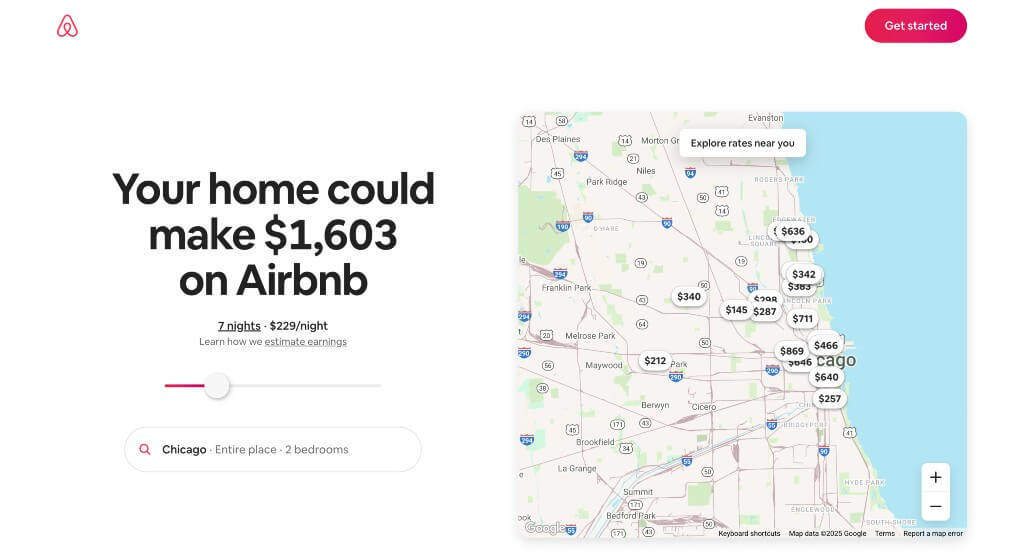
What We Liked
- Interactive sliding revenue calculator
- A color scheme that is used throughout the entire design
- We also liked the interesting phone and circle graphics with a variety of people
What We Didn’t Like
- Page lacks information
- Too much white space
- No comparison section for pricing, features, competitors, etc.
Related: Looking for a web design agency specializing in landing page creation? You’ve found one!
3. Deliveroo
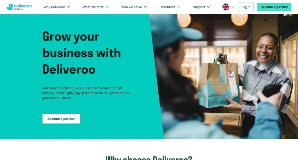
What We Liked
- A highly creative layout with awesome colors and icons
- A balance of images, content and white space
- Check marks used to organize written content and sprinkle it throughout the page
What We Didn’t Like
- Navigation allows visitors to leave the landing page
- Links throughout the page distract users from this company’s landing page
- No videos or gifs
4. Spotify For Creators
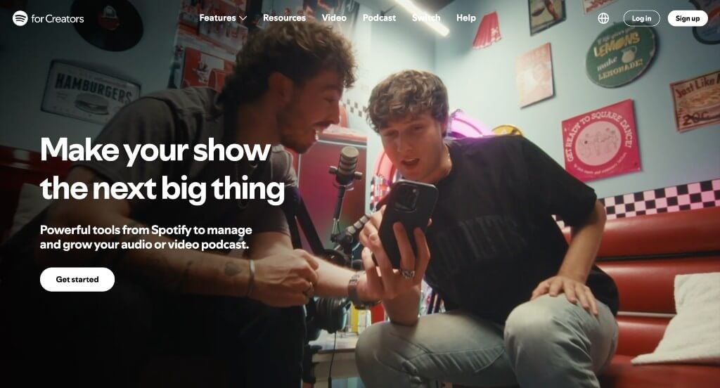
What We Liked
- Creative photo frames were helpful for this page
- Bold fonts are used for titles
- Social media serves as social proof
What We Didn’t Like
- Lots of links will distract customers from the landing page
- Too many colors are used as accents
- Though social media was nice to include, the link to their page sends people off that landing page
5. Weed Man
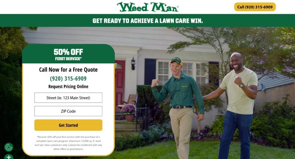
What We Liked
- Service is obvious so customers aren’t left wondering
- No navigation, making people leave the landing page
- Good amount of written content
What We Didn’t Like
- Images could have been larger
- Didn’t include this company’s backstory
- Some fonts aren’t super impressive
6. Curology
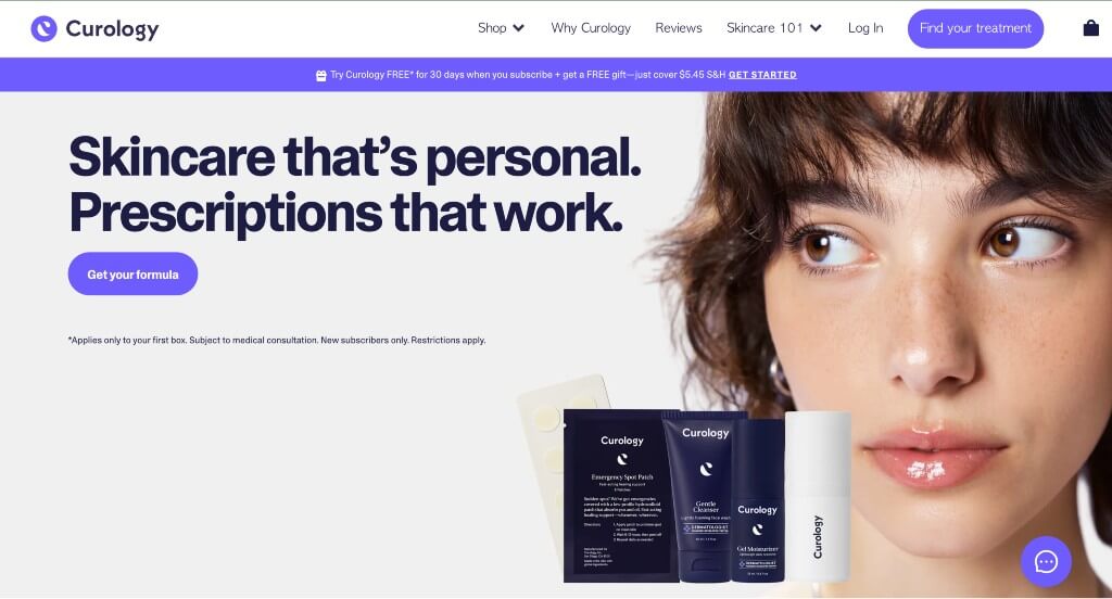
What We Liked
- Personalization and relatability are consistent
- Font was simple and not distracting
- Color scheme was interesting so it grabs attention
What We Didn’t Like
- Includes navigation
- Not much for content
- More info on the product, how it works, and any important data would be nice
7. Monday
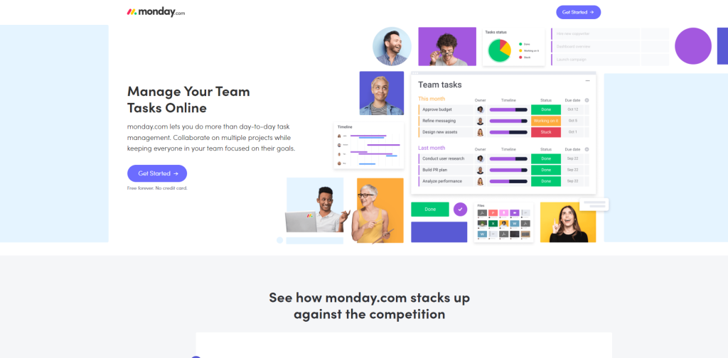
What We Liked
- Top-notch comparison section that visually represents the differences
- Great use of videos, animations, photography, while using their colors excellently
- Includes a sticky header
What We Didn’t Like
- The review section looks good, but there’s not much content there
- Typography is boring
- Doesn’t include integration with other apps
8. Future
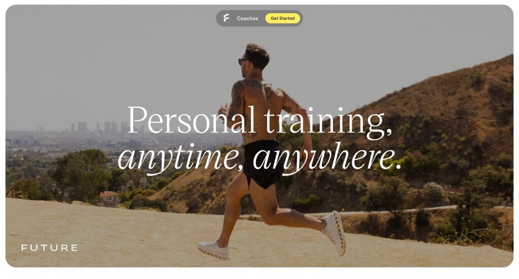
What We Liked
- Images and videos were included all throughout this design
- We liked how their page ran through examples of how they personalize sessions to you
- We also liked the short phrases used throughout
What We Didn’t Like
- Some areas tend to have too much white space
- Menu is included so customers can leave the page
- Could have used a more obvious FAQ and pricing sections