In the highly competitive fitness landscape, your website is your most influential lead-generation tool. For a personal trainer, your online presence is more than a resume – it is a visual promise of the results you can deliver. To attract high-value clients in 2026, your design must do more than showcase a gallery of workouts; it must communicate professional credibility, lifestyle authority, and a clear path to transformation.
Our design and strategy team evaluated hundreds of trainer websites – from boutique private studios and in-home specialists to global online coaching platforms. We identified the top 14 examples that masterfully balance dynamic branding with high-performance functionality, specifically analyzing their mobile-first lead capture, client social proof integration, and the seamless use of immersive video content.
Whether you are a solo coach building a personal brand or managing a growing fitness facility, these examples represent the current benchmark for personal training web design in 2026.
Note on Our Selection Process: We recently audited this guide to remove outdated designs and sites that no longer meet our performance standards.
Top Personal Trainer Website Designs
1. Speakeasy of Strength
Why We Chose Speakeasy of Strength
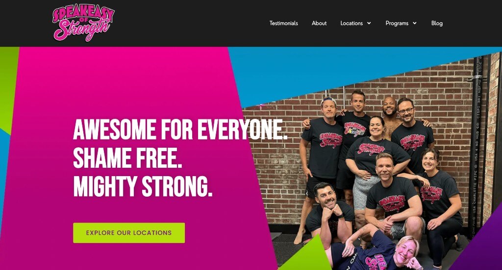
The digital storefront for Speakeasy of Strength serves as a premier benchmark for “High-Velocity Athletic Merchandising and High-Contrast Gamified Gym Branding.” Moving completely away from the generic, clinical, or overly sterile aesthetics of traditional fitness facilities, this website channels a high-energy, defiant community spirit. The interface navigates this beautifully by matching an electric, high-contrast visual design with a hyper-simplified onboarding journey, transforming the intimidating prospect of starting a new strength program into an exciting, clear, and highly rewarding athletic call to adventure.
Key Design Highlights:
- High-Octane, High-Contrast Neon Visual Showrooms: The platform establishes immediate brand authority by utilizing an electric, neon color palette set against a dark background. This bold color choice instantly injects a sense of energy, grit, and modern athletic culture into the user experience, perfectly reflecting the physical vitality of the training floor and signaling to visitors that this is a place to build serious strength.
- Streamlined “3 Steps to Fitness Greatness” Sequential Blueprints: Demystifying the onboarding process for newcomers, the homepage features a hyper-focused, three-step sequential guide. This deliberate layout design completely strips away administrative confusion, showing prospective members exactly how easy it is to start – from booking an initial consultation to executing their tailored plan – reducing entry-level anxiety.
- Symmetric, First-Touch Program and Training Matrices: The website cleanly maps out its diverse strength, conditioning, and personal coaching programs directly on the front page. Organizing their distinct training tracks into highly scannable visual blocks allows visitors to instantly evaluate which coaching tier aligns with their personal fitness goals.
- Cinematic “Stories of Glory” Community Validation Hubs: Championing the real-world triumphs of their members, the homepage features a dedicated, highly styled testimonial section titled “Stories of Glory.” Elevating standard client feedback into heroic personal transformations provides powerful social proof that reinforces their inclusive, results-driven community culture.
2. Karimu Samuels Movement
Why We Chose Karimu Samuels
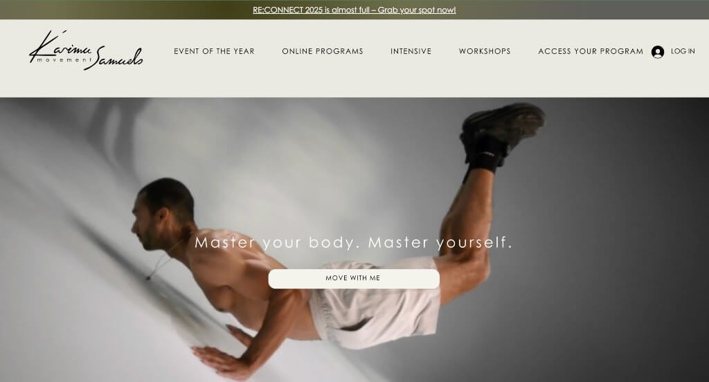
The digital presence for Karimu Samuels serves as a premier benchmark for “High-Touch Somatic Merchandising and Authentic Experiential Brand Architecture.” In the specialized fields of somatic healing, bodywork, and movement therapy, the primary hurdle is translating deep, tactile, and highly physical experiences into a digital format. The platform accomplishes this beautifully, replacing generic stock imagery and sterile clinical terms with rich, authentic media that invites visitors directly into the warmth of the actual studio.
Key Design Highlights:
- Atmosphere-Driven Cinematic Hero Showrooms: Instantly demystifying her unique healing modalities, the primary hero banner utilizes a high-definition background video loop that clearly shows Karimu in her element. Capturing real moments of somatic release, therapeutic touch, and physical transformation immediately communicates her exact specializations, allowing visitors to visually grasp the nature of her work within seconds of landing.
- First-Touch, Low-Barrier Newsletter Conversion Gates: Capitalizing on immediate engagement, the homepage places a clean newsletter sign-up module directly below the primary hero section. Positioning this lightweight, educational touchpoint right at the top of the scroll path allows curious visitors – who may not be ready to book a private session yet – to easily opt into her ecosystem for wellness insights, somatic tips, and event updates.
- Authentic, Studio-First Visual Documentation: Rejecting standard, clinical stock photography, the homepage relies almost entirely on real, high-quality images taken during actual group and individual sessions at the studio. This visual choice establishes immediate transparency, showing real bodies, organic movements, and the genuine, serene physical environment practitioners will experience when they walk through the door.
- Supportive “What Participants Say” Validation Hubs: Anchoring the emotional journey with deep relational trust, the homepage features a dedicated “What Participants Say” testimonial showcase. Highlighting these heartfelt, real-world stories of emotional release and physical restoration provides crucial peer validation, reassuring prospective clients of the safety, depth, and compassion behind her practice.

3. Happy Human
Why We Chose Happy Human
The digital storefront for Happy Human Click to open side panel for more information serves as a premier benchmark for “Inclusivity-Driven Wellness Merchandising and High-Warmth Fitness Architecture.” Moving far away from the intimidating, hyper-competitive aesthetics of standard athletic facilities, this website channels a welcoming and supportive community spirit. The platform navigates this masterfully, combining clear services and unique brand benefits with playful, engaging content blocks that make adopting a healthier lifestyle feel joyful and highly accessible.
Key Design Highlights:
- Accessible “Happy Human at a Glance” Snapshot Modules: Providing immediate clarity the moment a user lands, the homepage features a dedicated “Happy Human at a Glance” summary section. This highly scannable layout distills the studio’s core philosophy, target community, and welcoming environment into quick, digestible takeaways, ensuring first-time visitors immediately understand what the brand stands for.
- Symmetric, First-Touch Care and Service Matrices: The website structures its diverse personal training, group movement, and wellness offerings into a clean, highly organized outline directly on the front page. Clearly dividing these services into distinct functional tracks helps prospective members easily evaluate the studio’s training style and choose the perfect path for their body’s needs.
- Value-Driven Brand Differentiation and Benefit Blueprints: To de-risk the commitment of starting a new fitness journey, the homepage prominently highlights the unique physical and emotional benefits of choosing their program. Focusing on lifestyle improvements – such as functional strength, mood elevation, and sustainable habits – moves the narrative beyond simple weight loss and builds deeper relational trust with the reader.
- Engaging “All the Goodies” Resource and Community Hubs: Further humanizing the digital experience, the homepage includes a beautifully styled “all the goodies.” section. This dedicated area acts as a treasure trove of extra value, showcasing free community resources, upcoming social events, and helpful lifestyle guides that keep members connected and supported far beyond their daily workouts.
4. Alexia Clark
Why We Chose Alexia Clark
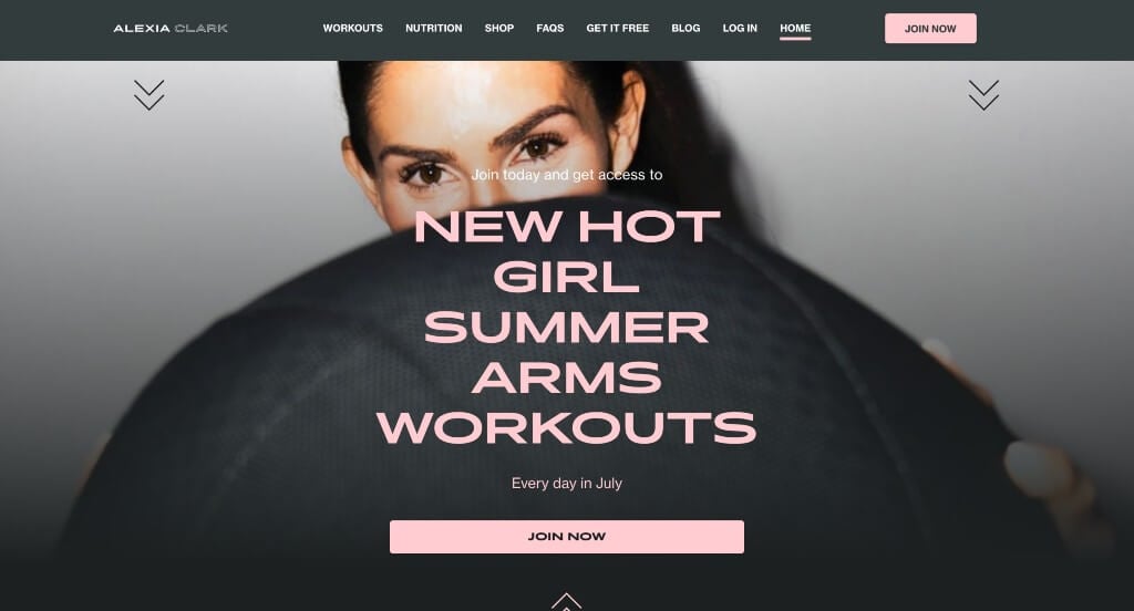
The digital storefront for Alexia Clark serves as a premier benchmark for “High-Energy Direct-to-Consumer Fitness Merchandising and High-Conversion Influencer Brand Architecture.” Designed around a globally recognized personal trainer, the platform must instantly translate an individual’s athletic authority into an accessible, scalable digital coaching product. The interface achieves this beautifully, combining a highly kinetic visual layout with powerful proof of transformation to immediately draw visitors into her training community.
Key Design Highlights:
- High-Impact, Full-Width Visual Showrooms: The platform makes an immediate, energetic impression from the moment the page loads by utilizing an expansive, full-width screen layout. This design choice removes restrictive borders and lets vibrant, dynamic training media fill the entire viewport, instantly capturing the user’s attention and reflecting the high-octane physical intensity of the workouts.
- Symmetric, First-Touch Fitness Program Matrices: The website cleanly maps out its diverse home- and gym-based workout formats directly on the front page. Organizing these distinct physical training tracks into highly scannable visual blocks allows prospective members to easily compare schedules, equipment needs, and workout styles, selecting the ideal routine for their daily lives.
- Authoritative, Relationship-Building Bio Showrooms: To build deep trust and a personal connection, the homepage features a dedicated biography of Alexia Clark. Highlighting her qualifications, training philosophy, and personal journey directly on the front page establishes her as a supportive, world-class mentor and humanizes the digital app-based experience.
- Cinematic Before-and-After Proof and Testimonial Validation Hubs: Providing ultimate proof of her methodology’s effectiveness, the homepage prominently features real student testimonials paired with striking before-and-after transformation galleries. Showcasing these authentic, peer-validated fitness journeys directly in the primary scroll path provides powerful social proof that reassures prospective members of the real-world results they can achieve.
5. Gymguyz
Why We Chose GYMGUYZ
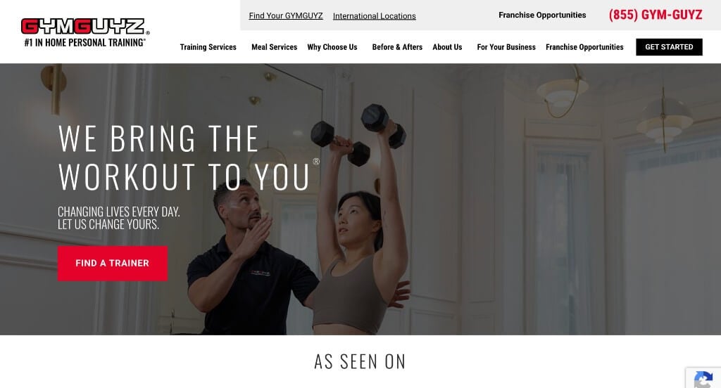
The digital storefront for GYMGUYZ serves as a premier benchmark for “Decentralized Mobile Fitness Merchandising and Frictionless At-Home Booking Architecture.” As a pioneer in the bring-the-gym-to-you personal training franchise model, the site’s design challenge is to clearly communicate that they provide all the gear and expertise directly to a client’s living room or backyard. The platform navigates this masterfully by blending highly interactive value education with undeniable client results, instantly turning a novel service concept into a highly practical, premium fitness solution.
Key Design Highlights:
- High-Utility Sticky Headers with Integrated Announcement Ribbons: Ensuring seamless navigation and immediate promotions during a deep scroll, the website pairs a sticky navigation header with an attention-grabbing announcement bar at the very top. This dual-purpose space keeps critical conversion prompts directly in view while ensuring that regional discounts, seasonal challenges, or franchise announcements are immediately visible without disrupting the primary browsing experience.
- Interactive “Expect More” Educational Showrooms: Moving beyond flat lists of bullet points, the homepage features an interactive “Expect More with GYMGUYZ” section. This highly engaging feature lets visitors actively click through and explore the brand’s unique selling points – such as customized workouts, professional-grade equipment delivery, and flexible scheduling – transforming a passive reading experience into an active discovery of why their mobile coaching model beats traditional gym memberships.
- Goal-Oriented Transformation Matrices with Deep-Dive Discovery: Establishing absolute credibility in their weight loss and strength-building results, the homepage features a dedicated transformations showcase. Rather than overwhelming the user with massive galleries, the section gives a clean, high-impact preview of real client physical changes, complete with a call-to-action button that lets interested visitors dive deeper into the specific stories and workout programs behind each success.
- Coordinated Editorial Insight and Lifestyle Blog Hubs: Solidifying their status as trusted authority figures in holistic physical health, the homepage features a curated showcase of their active blog. Integrating practical training advice, nutrition tips, and muscle-recovery strategies directly into the main scroll path provides ongoing value to visitors, showing that their coaches are invested in a client’s long-term lifestyle habits, not just their hourly workouts.

6. Forge Fitness
Why We Chose Forge Physical Therapy
The digital home for Forge Physical Therapy serves as a premier benchmark for “High-Trust Clinical Merchandising and Modern Orthopedic Branding Architecture.” Moving away from the clinical, sterile, and often intimidating look of traditional medicine, the website establishes a sleek, athletic presence that feels both deeply professional and highly welcoming. The interface achieves this beautifully by combining a specialized, cohesive color palette with clear, coach-led video explanations to build immediate clinical authority and ease patient anxiety.
Key Design Highlights:
- Cohesive, Premium Icy Blue and Slate Visual Palettes: The website establishes an immediate sense of focused recovery, strength, and modern clinical expertise through its strategic use of icy blues, grays, and crisp whites. This beautifully controlled color palette gives the entire digital presence a unified, high-end feel that feels more like an elite athletic performance center than a standard doctor’s office.
- Simplistic, Zero-Friction Mega Menu Navigation: To prevent the overwhelm that often comes with complex clinical services, the site utilizes a beautifully simplified mega menu. This design choice organizes key information – such as specialized treatment areas, pricing structures, and booking links – into a clean, spacious dropdown format, allowing users to find exactly what they need in a single click.
- Empathetic, Coach-Led Video Philosophy Showrooms: Instantly building human connection, the homepage features a high-fidelity video showcasing one of their expert coaches explaining the Forge philosophy and movement focus. Hearing directly from a practitioner about how the clinic treats the root cause of pain – rather than just managing symptoms – humanizes the brand and helps prospective patients feel confident about their recovery journey.
- Structured “What We Do” Collaborative Action Blueprints: The homepage features a highly practical, structured “What We Do” section that clearly explains exactly how their therapy sessions work. Detailing their hands-on, one-on-one treatment models and customized recovery plans removes the mystery from the initial visit, showing patients exactly how they will be supported from day one.

7. Training Loft
Why We Chose Training Loft Melrose
The digital storefront for Training Loft Melrose Click to open side panel for more information serves as a premier benchmark for “High-Intent Personal Training Merchandising and Contextual User Journey Architecture.” Designed around a boutique fitness environment, the website avoids generic stock media and rigid structures, opting instead for a highly transparent, conversion-driven scroll path. The interface achieves this beautifully by pairing authentic studio photography with persistent, strategic interactive points that guide prospective members smoothly toward their first workout session.
Key Design Highlights:
- Authentic, Studio-First Visual Documentation: Rejecting generic stock photography, the homepage relies entirely on high-quality, original images capturing actual trainers and clients working out together in their space. This realistic visual approach establishes immediate transparency, giving visitors an authentic preview of the studio’s upscale coaching environment, positive energy, and clean facility design before they visit in person.
- Symmetric, First-Touch Service and Offering Matrices: The website structures its diverse personal training packages, semi-private sessions, and nutritional programs into a clean, highly organized outline right on the front page. Clearly dividing these services into distinct visual blocks ensures prospective members can effortlessly evaluate the studio’s core competencies and match them to their personal fitness goals.
- Integrated Support Peer-Validation Hubs: Validating their instructional quality and client success rates, the homepage anchors its brand trust by embedding genuine client reviews directly within the main scroll path. Sharing real-world testimonials from active community members provides powerful social proof that reassures incoming practitioners of the trainers’ expertise, supportive culture, and results-driven methodologies.
- Contextual, High-Velocity Call-to-Action Anchors: Keeping user engagement fluid and focused, the homepage sprinkles strategic, high-visibility calls to action throughout the entire length of the page. This intentional layout design ensures that no matter how far down a user scrolls – whether they just finished reading a review or exploring a program – they always have a clear, friction-free path to take the next step on the site without backtracking.

8. Coastal Fitness
Why We Chose Coastal Fitness
The digital storefront for COASTAL FITNESS Click to open side panel for more information serves as a premier benchmark for “Community-First Strength Merchandising and High-Velocity Lead Capture Architecture.” For an elite strength and conditioning facility, the website must instantly shift the narrative from intimidating athletic metrics to inclusive, group-driven achievement. The platform navigates this masterfully by leading with powerful cultural visuals and immediate, low-friction inquiry paths to convert casual fitness seekers into active community members.
Key Design Highlights:
- Culture-Driven Collective Hero Showrooms: The website establishes an immediate sense of belonging and camaraderie by utilizing a prominent group hero image featuring their diverse community of coaches and clients together on the gym floor. Leading with a team photo rather than an isolated athlete breaks down entry intimidation, signaling to visitors that they are entering a supportive, welcoming fitness family.
- First-Touch, Low-Friction Intake Conversion Gates: Capitalizing on the immediate energy generated by the hero image, the homepage positions a streamlined contact form directly below the main header fold. This strategic layout placement allows high-intent visitors to raise their hand and request information instantly, bypassing standard multi-click menus at the moment of highest interest.
- Symmetric, First-Touch Training and Service Matrices: The platform organizes its specialized training methodologies, small-group classes, and individual programming tracks into a highly structured outline directly on the front page. Clearly communicating their exact fitness services upfront enables incoming athletes to easily self-educate and select the training model that matches their experience level and personal goals.
- Interactive Visual Transformation Proof and Results Sliders: Providing undeniable confirmation of their coaching methodology’s effectiveness, the homepage integrates an interactive before-and-after image slider. Allowing users to dynamically swipe through real physical changes provides powerful visual proof that validates the gym’s performance standards and motivates prospects to begin their own fitness journey.
9. Perfect Body
Why We Chose Shawn Phillips Training
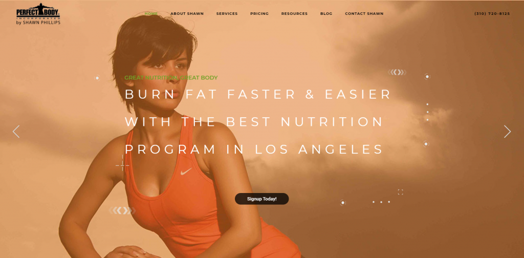
The digital home for Perfect Body by Shawn Phillips serves as a premier benchmark for “High-Impact Personal Brand Merchandising and Immersive Video-Driven Coaching Architecture.” For a high-performance personal trainer and fitness authority, a website must do more than just list credentials – it must capture their energy, teaching style, and physical presence. The platform achieves this masterfully, utilizing a multimedia-rich layout that relies on high-fidelity video to build deep individual credibility and transform passive viewers into committed fitness clients.
Key Design Highlights:
Coordinated Transformation Galleries and Peer Validation Hubs: Providing definitive proof of his training methodologies, the homepage pairs striking before-and-after physical transformation galleries with heartfelt client reviews. Placing these visual results right alongside genuine, real-world success stories provides powerful social proof that motivates incoming athletes and reassures them of the tangible results they can achieve.
Kinetic, Atmosphere-Driven Cinematic Hero Showrooms: The homepage makes an immediate, high-energy impact from the moment the page loads by leading with a powerful background hero video. Capturing dynamic workout footage and high-intensity coaching moments instantly sets an inspiring tone, capturing the user’s attention and communicating a strong sense of elite athletic performance right off the bat.
Symmetric, First-Touch Fitness and Service Matrices: The website cleanly organizes his specialized coaching paths, customized workout routines, and nutritional programming directly on the front page. Presenting these diverse services within a highly structured, scannable layout allows prospective clients to immediately see how he works and select the exact training model that aligns with their personal goals.
Strategic Multi-Faceted Video Education Hubs: To establish a profound personal connection and build authoritative trust, the homepage features a curated video library from Shawn himself. By segmenting these videos into specific functional tracks – including a personal background bio, a breakdown of what you will learn, and a showcase of training benefits – visitors can easily absorb his coaching philosophy and expertise through a dynamic, humanized learning experience.
10. Leo’s Fitness Lab
Why We Chose Leo’s Fitness Lab
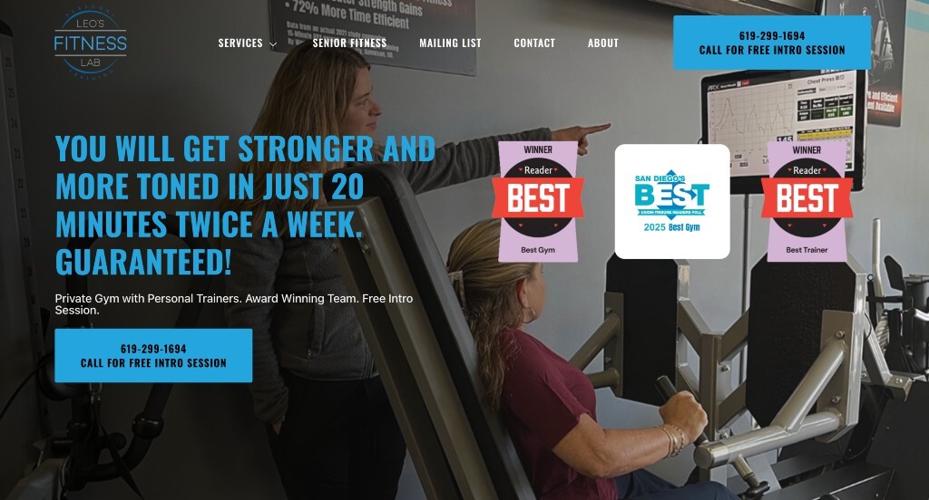
The digital storefront for Leo’s Fitness Lab serves as a premier benchmark for “Bio-Hacking Innovation Merchandising and Data-Driven Fitness Architecture.” For a high-technology strength and longevity facility, the main design challenge is to clearly communicate complex scientific methodologies in a way that feels accessible, highly efficient, and premium. The platform navigates this masterfully by leading with visual proof of its advanced equipment and framing its high-tech offerings around a powerful, time-saving value proposition that appeals directly to busy, performance-oriented consumers.
Key Design Highlights:
- Atmosphere-Driven Cinematic Tech Showrooms: The homepage makes an immediate impact by leading with a high-fidelity hero video that showcases the studio’s advanced machinery and computerized training stations in action. Visually introducing this boutique, data-centric environment right away sets a modern tone and helps first-time visitors immediately understand that this is a highly specialized facility rather than a traditional, manual-weight gym.
- Value-Driven Time-Efficiency Differentiators: Facing the common consumer barrier of a busy schedule, the homepage features a dedicated section explaining that members only need to spend 20 minutes twice a week in the gym to achieve results. Framing their entire physical methodology around ultra-efficient, science-backed workout intervals provides a compelling hook that lowers the psychological barrier to starting a new routine.
- Structured Multi-Tiered Technology Blueprints: The website does an exceptional job of breaking down the advanced science behind its workouts by clearly outlining the five core technologies they employ, such as ARX adaptive resistance and PNO? metabolic analysis. Presenting these sophisticated bio-hacking modalities in a structured, scannable format builds immense clinical credibility while educating visitors on exactly how personalized data shapes their physical recovery and strength gains.
- Multi-Layered Peer-Validation Hubs and Philosophy Video Spotlights: To bridge the gap between advanced data and human emotion, the homepage pairs an interactive client review slider with a dedicated video explaining why their studio model is different. Following this immediately with a secondary gallery of real video testimonials from actual clients provides multi-layered social proof that reassures prospective members of the warmth, results, and personal care behind the high-tech training floor.
11. Iron Orr Fitness
Why We Chose Iron Orr Fitness
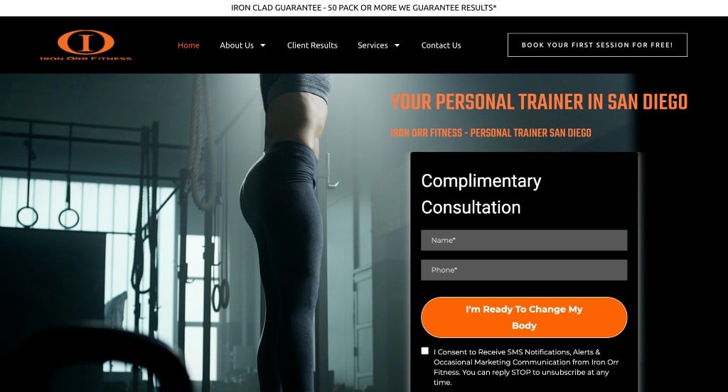
The digital presence for Iron Orr Fitness serves as a premier benchmark for “High-Velocity Direct-to-Consumer Merchandising and High-Conversion Fitness Architecture.” In a highly competitive personal training landscape, a website must rapidly cut through marketing fluff, address financial objections upfront, and establish a clear competitive advantage. The platform accomplishes this masterfully by blending immediate, zero-friction lead capture mechanisms with transparent pricing and undeniable proof of athletic transformation.
Key Design Highlights:
- Immediate Above-the-Fold Intake Conversion Gates: Rather than burying its contact options deep within secondary pages, the website places a streamlined inquiry form directly inside the primary hero area. This high-intent layout placement allows motivated visitors to raise their hand, submit their fitness goals, and request a consultation the exact second the page loads, significantly reducing onboarding friction.
- Radically Transparent Premium Pricing Showcases: Demystifying the financial investment of professional coaching, the homepage displays their training costs and tier structures directly within the main scroll path. Outlining pricing transparently upfront weeds out casual browsers while building immediate trust and financial clarity for serious prospects who want to evaluate affordability before booking.
- Value-Driven “Us vs. Them” Comparative Differentiators: To anchor their market superiority, the homepage features an explicit “Us vs. Them” comparative matrix, immediately followed by a targeted “Why Choose Us” narrative block. This powerful, back-to-back layout strategy clearly contrasts Iron Orr’s elite amenities and customized tracking with generic big-box gym limitations, giving users a logical, structured justification for choosing their facility.
- High-Impact Physical Transformation Galleries: Providing definitive proof of their training methodologies, the homepage features striking before-and-after physical transformation photographs. Showcasing these real-world results directly alongside their pricing and value propositions acts as an essential peer-validation hub, visually reassuring incoming athletes of the tangible physical changes they can achieve.

12. Mountainside Fitness
Why We Chose Mountainside Fitness
The digital home for Mountainside Fitness serves as a premier benchmark for “High-Scale Health Club Merchandising and Frictionless Local Lead Capture Architecture.” For a premier, multi-location fitness provider, the homepage must balance high-end lifestyle appeal with tactical regional conversion. The interface accomplishes this masterfully by blending highly accessible communication shortcuts with a structured showcase of their premium, resort-style facilities – giving prospective members an immediate sense of the elevated experience awaiting them.
Key Design Highlights:
- Comprehensive Full-Service Amenity and Facility Directories: The homepage features a highly structured layout detailing their expansive, luxury amenities. By explicitly listing premium club offerings – such as state-of-the-art childcare, executive locker rooms, group fitness schedules, and indoor pools – the site ensures that value-seeking families and fitness enthusiasts can instantly see how the club fits their lifestyle.
- Value-Driven “Mountainside Difference” Brand Anchors: Rather than relying on generic gym promises, the dedicated “Mountainside Difference” module highlights exactly what separates their brand from budget, self-service gyms. This section emphasizes local Arizona roots, clean facilities, and high-caliber staff, giving visitors a clear, compelling reason to choose their premium club model.
- Dual-Action, Low-Friction Communication Overlays: Meeting users exactly where they are, the homepage utilizes a prominent button overlay offering the immediate option to either text or call the club. This highly accessible mobile-first feature lowers the barrier to entry, allowing busy prospects to quickly ask questions about memberships or class schedules in a single tap.
- Integrated Support Peer-Validation Hubs: To back up their premium claims with real human experience, the homepage integrates authentic client reviews directly into the main scroll path. Sharing real-world testimonials from active community members provides the critical social proof needed to build trust, reassure families, and drive new member sign-ups.

13. Crossfit Winter Park
Why We Chose CrossFit Winter Park
The digital storefront for CrossFit Winter Park Click to open side panel for more information serves as a premier benchmark for “High-Intent Functional Fitness Merchandising and Frictionless Athlete Onboarding Architecture.” In the highly competitive functional fitness and CrossFit landscape, an effective website must rapidly break down the intimidating stigmas associated with intense barbell training. The platform navigates this masterfully by prioritizing structural transparency, clear division of physical tracks, and persistent navigation cues – transforming a high-intensity sport into a highly approachable, community-driven athletic call to action.
Key Design Highlights:
- Value-Driven “Why Us?” Culture Anchors: The website addresses the natural hesitation or intimidation that newcomers often feel toward functional fitness by featuring a dedicated “Why Us?” section right on the homepage. Rather than highlighting complex athletic benchmarks, this module focuses on the gym’s inclusive environment, expert coaching staff, and tight-knit member support network, giving prospective athletes a compelling reason to choose this facility over a standard, unguided gym.
- Symmetric, First-Touch Fitness Program Matrices: The homepage cleanly categorizes and outlines their diverse coaching tracks, group classes, and personal programming blocks directly on the front page. Organizing their services into distinct, scannable visual segments helps visitors of all experience levels – from seasoned competitive lifters to complete fitness beginners – easily find the correct path matching their physical capabilities and personal health goals.
- Integrated Support Peer-Validation Hubs: To reinforce their messaging with real-world proof of results and safety, the homepage integrates authentic client reviews directly into the main scroll path. Showcasing honest accounts of athletic breakthroughs, body composition changes, and personal recovery milestones from active community members builds deep relational trust and underscores the premium quality of the coaching.
- Persistent, Conversion-Optimized Sticky Headers: Ensuring fluid exploration and zero navigation friction as visitors scroll down the page, the website utilizes a seamless sticky header framework. No matter how deep a prospective member dives into the coaching philosophies or member success stories, the primary menu options and essential scheduling buttons remain anchored at the top of the viewport – providing an immediate path to take action the exact moment they feel motivated to join.

14. Transform Your Body
Why We Chose TYB Gym
The digital storefront for TYB Gym serves as a premier benchmark for “High-Conversion Direct-to-Consumer Fitness Merchandising and Risk-Mitigated Athlete Onboarding.” In a market saturated with generic workout advice and empty fitness promises, a website must actively de-risk the client’s investment while providing a relentless, clear path toward engagement. The platform achieves this masterfully, combining undeniable visual transformations with financial guarantees and strategic interaction points that guide prospects effortlessly from curiosity to commitment.
Key Design Highlights:
- High-Velocity, Multilayered Call-to-Action Networks: Rather than relying on a solitary booking link, the homepage strategically sprinkles high-visibility calls to action throughout the entire length of the page. By varying these hooks between deep-dive internal exploration and low-barrier, high-intent conversions – such as booking a free trial service – the site ensures that no matter where a user stops scrolling, they always have a friction-free next step to take.
- Coordinated Before-and-After Proof and Review Validation Hubs: Providing definitive proof of their training methodologies, the homepage pairs striking before-and-after physical transformation photographs directly with the corresponding client reviews. Coupling these visual results with written personal stories of lifestyle breakthroughs builds profound peer validation, reassuring incoming members of the tangible results they can achieve.
- Risk-Mitigating “Satisfaction Guaranteed” and Bio Blueprints: To completely dismantle final buyer hesitation, the homepage features a prominent “Satisfaction Guaranteed” assurance section, immediately followed by an authoritative trainer biography showroom. Presenting a structural safety net right alongside the coach’s credentials, education, and personal passion establishes a deep layer of relational trust and professional accountability before a single dollar is spent.
- Logistical Friction-Reduction and FAQ Directories: Directly addressing the common administrative concerns that delay gym sign-ups, the homepage integrates a structured Frequently Asked Questions directory into the main scroll path. Proactively answering upfront queries regarding scheduling, fitness levels, and membership structures removes psychological friction, clearing a smooth path toward immediate inquiry submissions.
WordPress Personal Training Themes
You can find free themes at wordpress.org or explore personal training-inspired templates at ThemeForest.
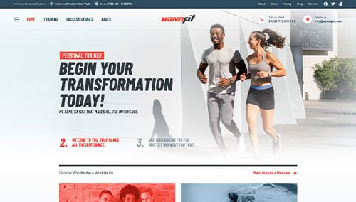
NanoFit – Themeforest
$39
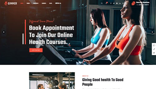
Gimmer – Themeforest
$59
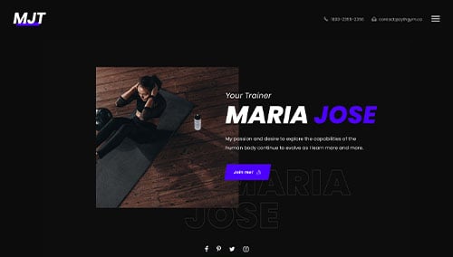
Zyth – Themeforest
$64
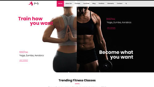
Gym Fitness – Themeforest
$69
WooCommerce Personal Training Themes
You’ll find a variety of ecommerce themes for WooCommerce on ThemeForest.
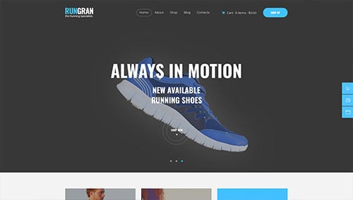
Run Gran – Themeforest
$69
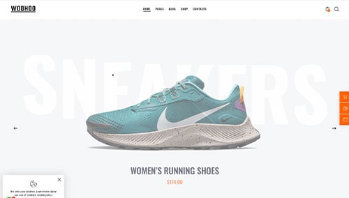
WooHoo – Themeforest
$69
Shopify Personal Training Themes
Explore free and paid themes at themes.shopify.com or consider options available through marketplaces like ThemeForest.
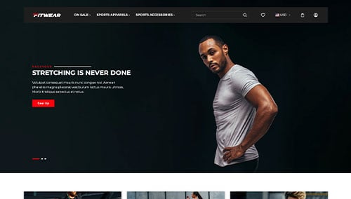
Fit Wear – Themeforest
$48
FitNet – Themeforest
$56