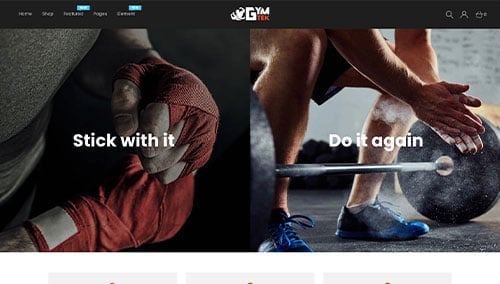
In the fitness and wellness industry, your website is where your community begins. For a potential member, your online presence is the first step toward a lifestyle change; it must immediately communicate high-performance energy, professional coaching authority, and a welcoming environment. To convert visitors into members in 2026, your design must do more than just list class times – it must provide an immersive preview of the fitness experience.
Our design team evaluated hundreds of wellness websites – from elite CrossFit boxes and personal training studios to yoga retreats, nutrition coaches, and fitness apparel brands. We identified the top 8 examples that excel in conversion-focused design, specifically analyzing their mobile-friendly class scheduling, instructor transparency, and the seamless integration of high-energy visual storytelling.
Whether you are a solo trainer building a personal brand or managing a national gym franchise, these examples represent the benchmark for digital excellence in the fitness world.
Note on Our Selection Process: We recently audited this guide to remove outdated designs and sites that no longer meet our performance standards. This curated list now focuses on the top 8 fitness websites providing the most strategic value in 2026.
The Top Fitness Website Designs
1. Fitlab
Why We Chose Fitlab
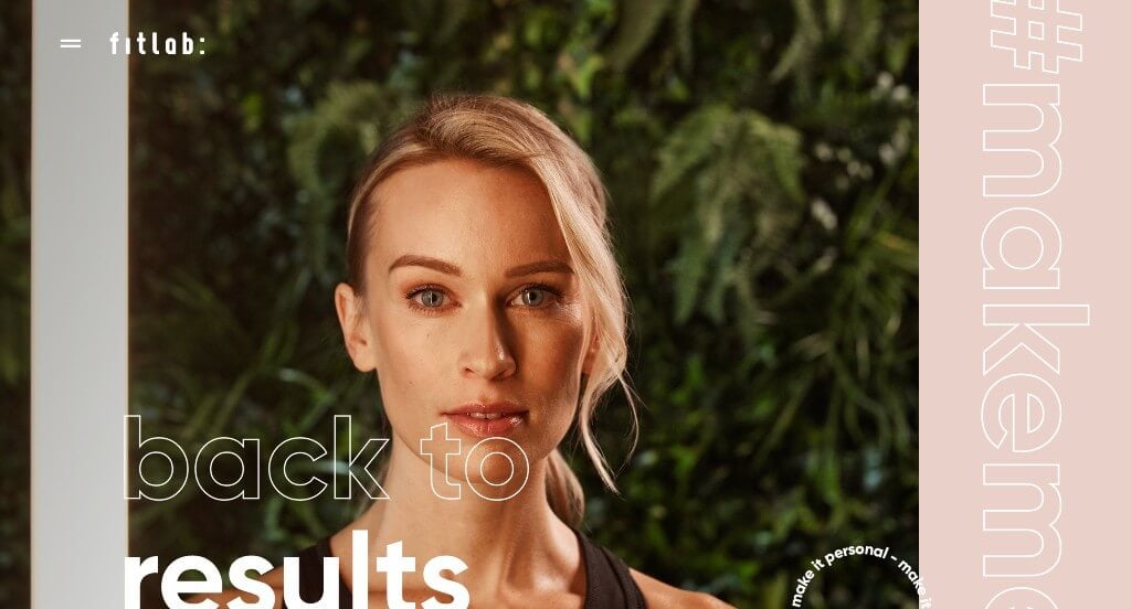
The website for Fitlab (fitlab.nl) serves as a premier benchmark for “High-Octane Fitness Merchandising and High-Conversion Boutique Studio Architecture.” As a premium personal training and fitness community, their digital storefront must translate physical energy, personal accountability, and athletic intensity into a sleek, high-end digital environment. This platform masterfully succeeds by treating its homepage as a kinetic visual portfolio, prioritizing high-fidelity human interaction and a highly disciplined minimalist structure that performs beautifully across both desktop and mobile viewports.
Key Design Highlights:
- Kinetic, High-Impact Hero Video Showroom: Capturing absolute visitor focus the exact split second the page initializes, the layout leverages an incredibly powerful, high-definition background video loop right near the primary hero real estate. By immediately showcasing dynamic, cinematic glimpses of intense training sessions, modern gym environments, and authentic athletic effort, the interface completely bypasses standard text-heavy explanations to deliver an instant, emotional, and aspirational rush.
- Sleek Desktop Hamburger Menu Framework: Breaking away from traditional, cluttered navigation rows that distract from visual branding, the site embraces a highly disciplined, minimalist hamburger menu for its primary desktop navigation. This design choice preserves maximum screen real estate for the brand’s premium photography, expanding smoothly upon click to reveal a perfectly structured, scannable directory that effortlessly guides prospective members toward training programs, pricing, and booking paths.
- Authentic Human Connection and Trainer-Client Showcases: Overcoming the visual coldness of generic fitness imagery, the homepage is strategically packed with high-quality, authentic photography showing real trainers working closely with clients. Highlighting these moments of hands-on coaching, technical form adjustment, and mutual encouragement provides powerful social proof, assuring prospective members that they are investing in an elite, personalized, and deeply supportive coaching relationship.
- Flawless Mobile Fluidity and Responsive Adaptability: Translating an aggressive, media-heavy desktop aesthetic onto smaller screens is flawlessly managed via an expertly optimized mobile framework. The smartphone interface handles the high-impact video elements and bold typography grids by condensing them into a fluid, single-column scroll path that loads instantly without visual lag. Maintaining clean spacing and touch-optimized interactive elements ensures that busy clients can comfortably review training schedules and connect with the studio while on the move.
2. Republic Fitness
Why We Chose Republic
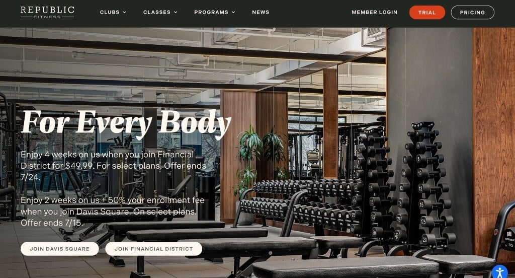
The website for Republic (republicbos.com) serves as a premier benchmark for “High-End Wellness Merchandising and High-Intent B2B/B2C Conversion Architecture.” As an elite, multi-disciplinary fitness and restoration club, their digital storefront must translate physical luxury, specialized athletic training, and state-of-the-art recovery spaces into a highly structured, frictionless digital experience. This platform masterfully succeeds by treating its homepage as a high-fidelity visual tour, pairing commanding spatial photography with ultra-accessible transactional gateways.
Key Design Highlights:
- Frictionless Header Pricing Integration: Eliminating the standard gatekeeping friction often found on premium fitness and wellness websites, the global header features a prominent, high-contrast “Pricing” call-to-action button. Positioning this core commercial gateway in premium, permanently visible screen real estate ensures that high-intent prospective members can immediately evaluate investment tiers at any phase of their site interaction, accelerating the conversion pipeline.
- Comprehensive Front-Page Capability Blueprint: The homepage entirely avoids vague lifestyle marketing by explicitly detailing their precise physical and therapeutic offerings right within the primary scroll path. By structuring their capabilities into distinct pillars – including dedicated training spaces for specific workout modalities alongside comprehensive services for personal training, biometric evaluation, and body restoration – the interface allows users to instantly map out their complete wellness journey.
- High-Efficiency, Elegant Mega Menu: Navigating a diverse ecosystem of specialized fitness schedules, recovery services, multiple facility spaces, and community portals is made completely effortless through a beautifully engineered mega menu. By organizing deep-site categories into a highly structured, scannable dropdown directory, the desktop navigation connects users to specific program details in a single click without cluttering the main page layout.
- Immersive, Large-Scale Spatial Imagery: The platform immediately commands luxury market positioning by dominating the homepage layout with stunning, ultra-high-quality, large-scale photography of the actual facility and workout spaces. Showcasing these meticulously designed, pristine environments creates an immediate emotional and aspirational connection with visitors, letting the physical caliber of the club act as the primary brand ambassador.
3. EOS Fitness
Why We Chose E?s Fitness
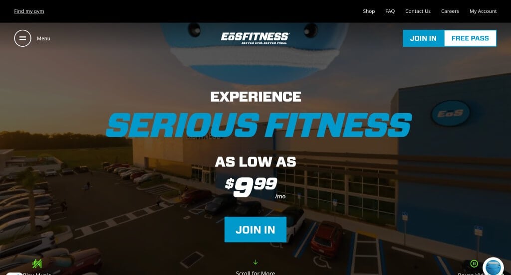
The website for E?s Fitness serves as a premier benchmark for “High-Velocity Fitness Merchandising and High-Intent Consumer Conversion Architecture.” As a rapidly expanding, high-value low-price (HVLP) gym chain, their digital storefront must manage immense consumer traffic while driving immediate membership sign-ups and highlighting premium club amenities. This platform masterfully succeeds by treating its homepage as a high-octane visual funnel, pairing energetic motion media with transparent pricing models and an expansive, immersive navigation ecosystem.
Key Design Highlights:
- High-Energy Hero Video Showroom: Capturing absolute user focus the exact split second the interface initializes, the website features a cinematic, high-definition background video loop dominating the primary hero real estate. By showcasing rapid, authentic glimpses of intense workouts, modern strength equipment, dynamic group classes, and a thriving community culture, the interface bypasses passive introductory text to deliver an instant emotional hook and aspirational rush.
- Immersive Desktop Hamburger to Full-Screen Mega Menu: Breaking away from standard, rigid navigation bars that often get cluttered on enterprise-scale sites, the platform utilizes a sophisticated desktop hamburger menu icon. When clicked, it expands into a beautifully structured, full-screen mega menu matrix. This layout masterfully organizes deep-site directories – such as specific gym locations, group fitness schedules, specialized amenities, and member portals – into a highly scannable, friction-free directory.
- Transparent Front-Page Membership and Pricing Triage: Overcoming a major consumer pain point in the fitness industry, the homepage completely eliminates pricing ambiguity by featuring membership packages and tier rates directly in the primary scroll path. This bold commitment to financial transparency lowers user skepticism, allowing prospective members to instantly compare plan benefits and initiate the signup process without having to dig through secondary sub-pages.
- Comprehensive Multi-Offering Capability Showcase: To prove that they offer a premium fitness experience at an affordable price point, the homepage is meticulously mapped with sections highlighting their diverse Classes, Spaces, and Club Offerings. Strategically spotlighting specific spaces like the E?s Yard, indoor pools, recovery beds, and boutique group fitness studios allows the interface to visually validate the massive value proposition of the facility, ensuring there is a clear hook for every type of athlete.

4. MADabolic
Why We Chose MADABOLIC
The website for MADABOLIC serves as a premier benchmark for “High-Energy Athletic Merchandising and High-Intent B2C Conversion Architecture.” As the industry’s first and only dedicated strength and conditioning franchise, their digital storefront must instantly separate their structural, science-backed intervals from standard, trend-heavy group fitness classes. This platform masterfully succeeds by treating its homepage as a bold, cinematic visual pipeline, pairing dark-mode aesthetics with relentless transaction accessibility across both desktop and mobile viewports.
Key Design Highlights:
- Cinematic, High-Impact Hero Video Showroom: Capturing absolute consumer focus the exact split second the interface initializes, the website features a powerful, high-definition background video loop dominating the primary hero real estate. By showcasing sharp, authentic glimpses of meticulous weightlifting form, intense floor intervals, and focused athletes moving with intent, the interface bypasses generic introductory copy to deliver an instant, aspirational rush that perfectly mirrors the energy of their training floor.
- Frictionless “Book Now” Header Integration: Maximizing client acquisition from the moment a user arrives, the global header features a prominent, permanently visible “Book Now” call-to-action button. Positioning this critical transactional gateway in the highest-value screen real estate ensures that both returning members looking to schedule a class and high-intent prospects can immediately jump into the booking and registration funnel at any point in their browsing experience.
- High-Contrast Dark-Mode and Signature Color Brand System: The platform establishes a striking, unforgettable visual identity by executing a disciplined dark-mode layout built on a deep black background, electrified by bright teal accents and highlights throughout the page. This intentional, high-contrast color scheme serves a dual purpose: it builds a gritty, premium, and focused athletic atmosphere while naturally drawing the user’s eye directly toward critical conversion paths, headers, and structural value propositions.
- Ultra-Clean Mobile Viewport and Seamless Flow: Translating an aggressive, video-heavy, and high-contrast brand ecosystem onto smaller screens is flawlessly handled via an expertly optimized mobile framework. The smartphone interface simplifies the bold layout elements into a beautifully responsive, single-column scroll path that keeps imagery and media loading instantly without visual lag. Maintaining generous spacing, highly legible typography, and touch-optimized action elements ensures that busy clients can effortlessly check schedules and manage accounts while on the go.

5. True 180
Why We Chose True180 Personal Training
The website for True180 Personal Training serves as a premier benchmark for “High-Trust Fitness Merchandising and Frictionless Client Onboarding Architecture.” Designed specifically to appeal to women looking for an encouraging, non-intimidating environment to achieve their fitness goals, the digital storefront completely bypasses standard aggressive gym tropes. This platform masterfully succeeds by structuring its homepage into a clear, step-by-step roadmap that systematically addresses consumer hesitation while lowering the barrier to entry with structured informational support.
Key Design Highlights:
- Highly Structured Front-Page Program Showcase: The website eliminates standard B2B/B2C ambiguity by explicitly showcasing their core specialized training tracks directly within the primary homepage scroll path. Rather than relying on vague fitness claims, the interface maps out the specific programs they offer, allowing prospective clients to instantly self-select the exact track that fits their comfort level and personal goals.
- Frictionless Step-by-Step Onboarding Outline: A major user experience triumph of the homepage layout is the inclusion of a clear, sequential roadmap detailing exactly how to get started. By breaking down the onboarding journey into simple, numbered steps – such as an initial consultation, a customized movement assessment, and the first coaching session – the interface completely demystifies the gym onboarding process and dramatically lowers the anxiety of trying something new.
- Integrated Front-Page FAQ Repository: Anticipating customer questions and overcoming common objections long before a consultation is booked, the homepage features a clean, organized Frequently Asked Questions (FAQ) section. Addressing common inquiries regarding schedule flexibility, fitness level requirements, and coaching styles right on the front page shortens the consumer decision-making cycle and builds immense institutional transparency.
- Authentic Social Proof and Client Testimonial Showrooms: Overcoming natural fitness skepticism is gracefully achieved by embedding direct, high-praise client testimonials directly within the central homepage flow. Highlighting the real-world stories and transformations of everyday members establishes immediate emotional and operational credibility, assuring prospective clients that they will be entering a deeply supportive, results-oriented training community.

6. Amped Fitness
Why We Chose Amped Fitness
The website for Amped Fitness serves as a premier benchmark for “High-Energy Fitness Merchandising and High-Intent B2C Lead Acquisition Architecture.” As an enterprise-grade commercial gym chain built around cutting-edge workout environments, their digital storefront must translate physical energy, massive facility scale, and specialized workout spaces into an intuitive online experience. This platform masterfully succeeds by treating its homepage as an interactive, media-rich onboarding funnel that systematically guides prospects from inspiration to direct contact.
Key Design Highlights:
- Kinetic, Facility-First Hero Video Showroom: Capturing absolute user attention the exact split second the interface initializes, the homepage features a high-definition background video loop dominating the primary hero area. By immediately showcasing crisp, sweeping glimpses of their state-of-the-art strength gear, dynamic group setups, and a diverse community of members working out, the design bypasses text-heavy introduction blocks to deliver an instant, aspirational look at the in-club experience.
- Interactive Amenity and “Zone” Carousel Matrix: Rather than cluttering the homepage with static rows of text descriptions, the platform features a beautifully engineered, fluid interactive media carousel that showcases their unique facility zones. Cycling seamlessly through specialized club environments – such as recovery spaces, childcare amenities, and elite training zones – allows users to visually tour the gym’s diverse offerings and map out how a membership fits their exact lifestyle needs.
- Integrated Front-Page Social Proof and Client Review Hub: Overcoming consumer skepticism and validating their premium-yet-accessible culture is gracefully achieved by embedding direct member testimonials and reviews directly within the primary homepage flow. Showcasing authentic success stories, high-praise endorsements, and fitness breakthroughs builds immediate operational credibility and fosters an welcoming sense of community trust for prospective members looking to join.
- Frictionless Base-of-Page Contact and Acquisition Gateway: Maximizing commercial acquisition at the absolute peak of user engagement, the homepage concludes with a streamlined, low-friction digital contact form. Positioned strategically at the end of the content journey, it ensures that visitors who have processed the facility video, explored the specialized zones, and verified the client reviews can immediately take action, initiating a direct inquiry or gym pass request without ever leaving the page.
7. Elite Sports
Why We Chose Elite Sports
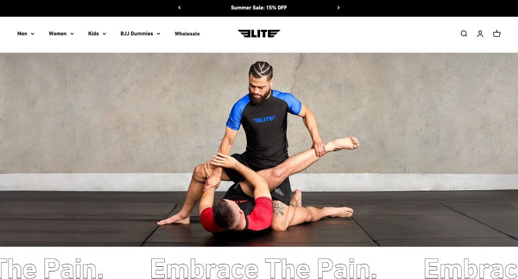
The website for Elite Sports (elitesports.com) serves as a premier benchmark for “High-Velocity Athletic E-Commerce and High-Intent Combat Sports Merchandising.” As a globally recognized manufacturer of premium martial arts gear – specializing in Brazilian Jiu-Jitsu (BJJ) Gis, rash guards, boxing gloves, and MMA equipment – their digital storefront must translate physical durability, technical compliance (such as IBJJF standards), and raw combat performance into a fast, highly commercial browsing experience. This platform masterfully succeeds by treating its homepage as an action-oriented visual funnel that seamlessly blends striking hero media with direct inventory access.
Key Design Highlights:
- Commanding, High-Impact Hero Showroom: Capturing absolute visitor focus the exact split second the layout initializes, the interface features an impressive, high-definition hero image that sets an immediate, authoritative tone. By instantly putting intense, authentic training imagery front and center, the website taps into the competitive mindset of fighters and martial artists, bypassing text-heavy introductory blocks to deliver an immediate aspirational hook.
- Front-Page Inventory and Product Curation: Capitalizing beautifully on direct buyer intent, the homepage layout eliminates traditional browsing friction by showcasing their core product lines directly in the primary scroll path. Instantly revealing best-selling Gis, compression apparel, and training equipment allows beginners and seasoned competitors alike to completely bypass secondary search menus and dive straight into high-conversion retail pipelines.
- Dynamic Multi-Media Integration Throughout the Page: The platform completely avoids layout staticity by distributing impactful photography and video content across the entire homepage scroll. Seamlessly integrating action clips and detailed product breakdowns alongside functional product listings keeps the scrolling experience highly engaging, allowing customers to visually analyze fabric textures, stitching reinforcement, and real-world athletic movement.
- Integrated Instagram Feed and Visual Social Proof: Overcoming consumer skepticism and validating product durability is gracefully achieved by embedding a live Instagram content feed directly into the lower homepage workflow. Showcasing real-world imagery of world-class athletes, academies, and everyday practitioners rolling and training in their gear builds a powerful community identity while providing continuous, user-generated social proof.

8. Yoga Maya New York
Why We Chose Yogamaya
The website for Yogamaya serves as a premier benchmark for “Avant-Garde Studio Merchandising and High-Concept Immersive Interface Architecture.” As an elite yoga studio rooted in tradition but elevated by a distinct creative edge, their digital storefront completely rejects the predictable, clinical design tropes of the wellness industry. This platform masterfully succeeds by treating its homepage as a living, highly interactive canvas where typography, layout art direction, and micro-interactions combine to create an enticing journey of discovery.
Key Design Highlights:
- Radical Text-Driven Hero Menu with Bespoke Micro-Animations: Breaking completely away from traditional web layouts, the website utilizes an incredibly unique framework where the primary hero text serves dual-purpose as the main navigation menu. When a visitor hovers over individual keywords – such as schedules, workshops, or training – the interface triggers custom, fluid animations specifically tailored to each word. This tactile responsiveness transforms structural site navigation into an engaging, artistic game that instantly hooks the user’s curiosity.
- Strategic, Content-First Announcement Bar Integration: Positioned purposefully below the primary studio logo, the interface integrates a sleek, high-visibility announcement banner. This dedicated bar acts as a core operational communication pipeline, allowing the studio to instantly broadcast upcoming teacher trainings, special workshops, or schedule alterations without interrupting the artistic layout or cluttering the core visual experience.
- Maximalist Typography and Mystical Visual Curation: The homepage relies on an entirely original blend of expressive, high-character fonts, massive text scales, and surreal, captivating imagery. By prioritizing bold artistic confidence over standard, sterile corporate grids, the design creates an immediate mood of curiosity and depth, naturally enticing the user to linger longer on the page and explore further into the site’s deeper spiritual and practical offerings.
- Seamless Social Integration and Community Cross-Pollination: Recognizing that a modern yoga practice thrives on community engagement outside the classroom, the homepage features a direct, stylized entry point connecting visitors directly to their active Instagram feed. This curated pathway ensures that prospective students can smoothly transition from the website’s conceptual framework to real-world, daily visual snapshots of the studio’s active community, instructors, and environment.
Fitness WordPress Themes
You can find free themes at wordpress.org, or explore fitness-inspired templates at ThemeForest.
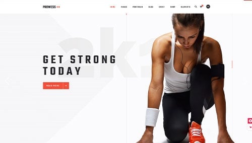
Prowess – Themeforest
$85
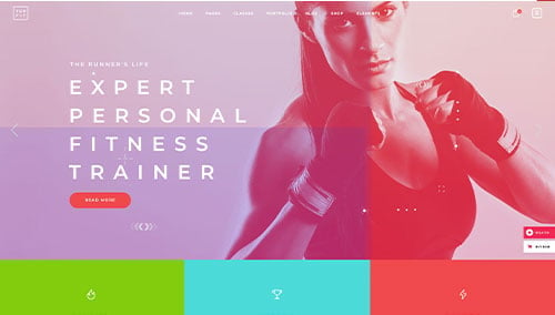
TopFit – Themeforest
$85
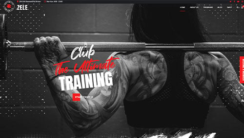
Zele – Themeforest
$69
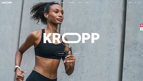
Kropp – Themeforest
$79
Fitness WooCommerce Themes
You’ll find a wide selection of ecommerce fitness themes for WooCommerce on ThemeForest.
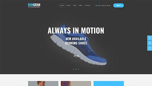
Run Gran – Themeforest
$69
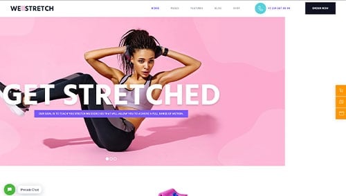
Welldone – Themeforest
$69
Fitness Shopify Themes
You can find free and paid themes at themes.shopify.com, or explore options through marketplaces like ThemeForest.
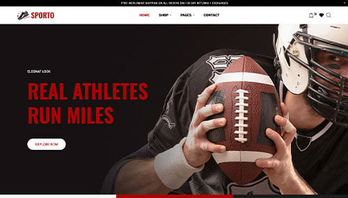
Sporto – Themeforest
$58
Gym Tek – Themeforest
$56