In the cultural sector, a museum’s website serves as a digital sanctuary for history, art, and scientific discovery. It is an essential extension of the physical gallery space, designed to provide an immersive, educational experience that transcends geographical boundaries. For modern cultural institutions, the challenge lies in creating a digital architecture that can house vast archives and complex visitor logistics while maintaining an aesthetic that honors the institution’s prestige.
Our team of design experts conducted a comprehensive audit of the global museum landscape, evaluating hundreds of platforms across the arts, sciences, and natural history sectors. We have narrowed our selection to 11 definitive examples that represent the pinnacle of museum web design in 2026. Our analysis focused on the integration of high-resolution virtual exhibits, intuitive wayfinding for ticket acquisition, and accessible information hierarchy that serves both the casual browser and the serious researcher.
Whether you are seeking to modernize a local historical society or scale a world-class national gallery, these examples provide the definitive benchmark for cultural web design. Use these industry leaders as inspiration to create a digital presence that reflects the depth, beauty, and educational mission of your institution.
Note on Our Selection Process: We recently updated this guide to ensure every featured site meets our 2026 standards for WCAG accessibility, mobile responsiveness, and interactive media performance. This curated list focuses on the art, science, and history museums currently providing the most strategic value to the global public.
Top Museum Website Designs
1. Heide
Why We Chose Heide Museum of Modern Art
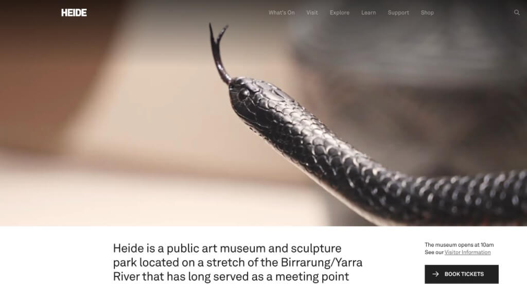
Heide manages to have a distinctive, design-forward home page without making visitors work for basic information. The page looks like it belongs to an art museum, but it still answers the practical questions – what’s on, how much it costs, and when you can go – before anyone has to click.
Key Design Highlights:
- Hero Video: The full-screen video shows the galleries, the outdoor sculpture park, and visitors walking through both, rather than a static shot of the building. It gives a clear sense of what a visit actually looks like.
- Ticket CTA Above the Fold: A “Book Tickets” button appears within the first screen, paired with a “Get Directions” link, so visitors who are ready to go don’t have to scroll or dig through the menu.
- Distinctive Layout: The home page uses an asymmetric layout with large images and plenty of white space instead of a standard template. It fits the institution without getting in the way of the content.
- Hours and Pricing on the Home Page: The full hours table and every admission price, including the free options for children, members, and the sculpture park, are listed directly on the home page rather than behind a “Plan Your Visit” link.
2. National Gallery of Art
Why We Chose the National Gallery of Art
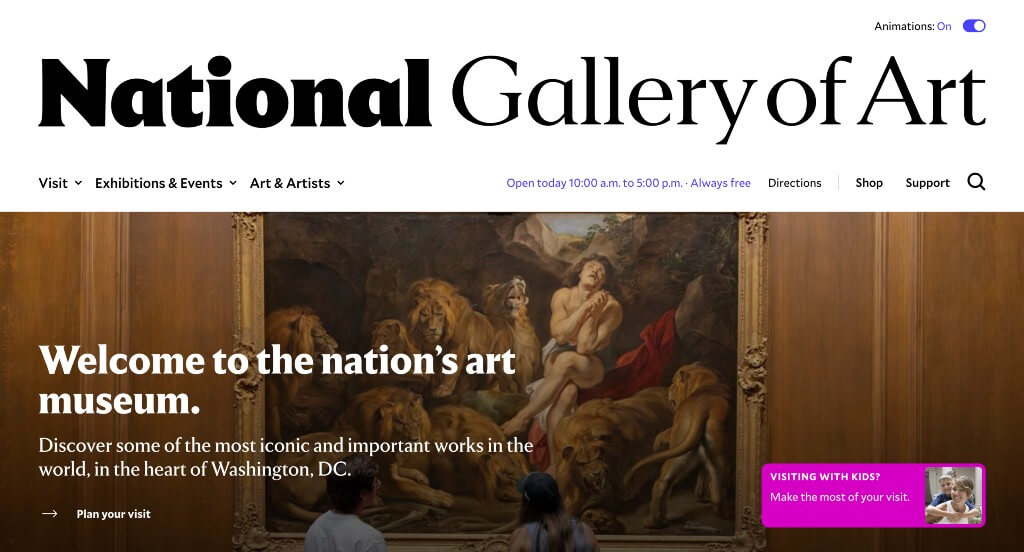
The National Gallery holds one of the largest art collections in the world, but the home page doesn’t lead with the archive. It leads with people – visitors out on the grounds, an artist talking about what the collection means to her, and a running list of what’s happening this week. The depth is available when you want it, but it isn’t the first thing a casual visitor has to sort through.
Key Design Highlights:
- Events as You Scroll: Just below the top of the page, a row of upcoming events appears with dates, times, and a category label such as “Concerts & Performances” or “Hands-On Activities.” It gives people a reason to visit this week rather than someday.
- Photography That Mixes People and Artwork: Shots of visitors relaxing on the grounds and walking through the galleries sit alongside large reproductions from the collection, each with the artist, title, and year credited underneath. The pairing keeps a very large institution from feeling intimidating while still treating the art seriously.
- Artist Video: A video on the home page follows an artist through the museum and covers how the collection has influenced her own work. That’s a more convincing case for a visit than a general promotional overview would be.
- Accessibility Controls: An “Animations: On / Off” toggle sits in the header so visitors sensitive to motion can shut off the page’s movement. The artwork images also carry unusually long written descriptions for screen reader users – a full paragraph describing each painting rather than a few words.
3. Rock & Roll Hall of Fame
Why We Chose the Rock & Roll Hall of Fame
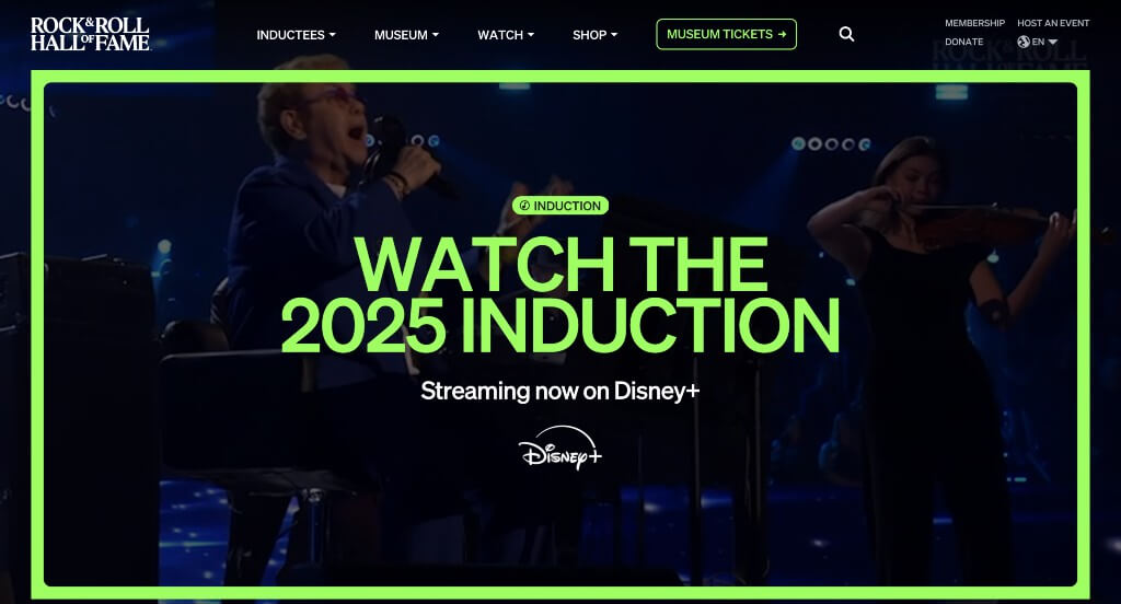
The Rock Hall’s home page reads more like a music publication than a museum site. Along with tickets and exhibit details, there’s a daily game, a video channel, a podcast, and a series tracing how old songs got sampled into new ones – content that works whether or not someone is actually planning a trip to Cleveland.
Key Design Highlights:
- Dark Background with Neon Accents: The site runs on a near-black background with bright accent colors, which lets the concert photography and album artwork do the work. It suits the subject without relying on decoration.
- Inductee Showcase: The Class of 2026 sits on the home page as a linked list of names – Phil Collins, Celia Cruz, Iron Maiden, Oasis, Queen Latifah, Wu-Tang Clan – each leading to that artist’s profile page. It highlights the museum’s main draw and doubles as a doorway into a very large archive.
- Video Throughout the Page: Clips of past concerts and performances play in the hero area and in several sections further down. They establish the tone immediately without asking anyone to press play first.
- Mega Menu: The navigation compresses a lot of material into four labels – Inductees, Museum, Play, and Shop – each opening into a full panel. “Play” is an unusual category for a museum, and it collects the games, video channels, and podcast in one predictable spot.
4. Grand Rapids Art Museum
Why We Chose the Grand Rapids Art Museum
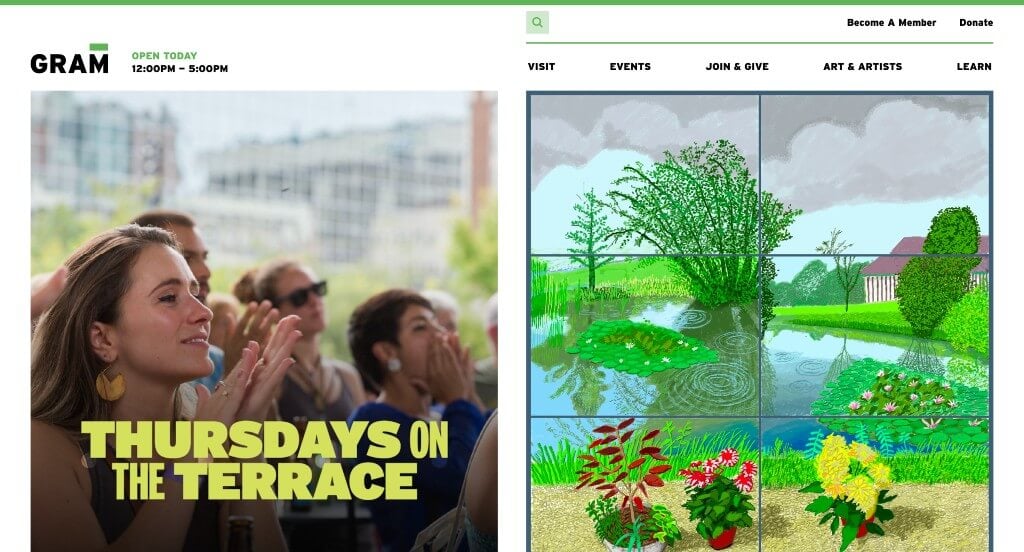
GRAM’s home page does something most museum sites skip: it addresses cost and access directly, in the same space where it promotes exhibitions. Alongside the current shows and collection highlights, there’s a section devoted to school tours, free admission programs, and a fund that covers field trip costs for local students. For a regional museum whose audience is mostly its own community, that’s the right thing to put on the front page.
Key Design Highlights:
- Announcement Bar Above the Header: A slim bar at the very top of the page carries timely news – currently extended Thursday hours running through August 27 – without disturbing the header or the hero image. It’s an easy place to update seasonal information that would otherwise require a redesign.
- Split-Scroll Layout: As you move down the home page, the left side stays fixed while the right side scrolls through current exhibitions and featured events. It lets one section cover a lot of ground without turning into an endless vertical list.
- Collection Highlights: A dedicated section pulls notable works from the collection – pieces by Picasso, Alexander Calder, Gordon Parks, and Jacob Lawrence among them – each labeled with the artist and title and linked to its own page. It signals the depth of the permanent collection to someone who only knows the current show.
- Access and Education Programs: A section near the bottom groups School Tours and Workshops, Free Admission Programs, and the Field Trip Fund. Putting the affordability options on the home page rather than three clicks deep tells families and teachers they’re welcome before they have to go looking.
5. Field Museum
Why We Chose the Field Museum
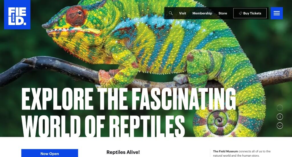
The Field is enormous, and the home page handles that by answering visitor questions in the order people actually ask them: what’s here right now, how do I get in, and what will I see once I’m inside. Each of those gets its own clearly labeled section, so nobody has to guess where to look.
Key Design Highlights:
- “What’s On” Exhibition Slider: Current exhibitions run in a slideshow near the top, each tagged with its status (“Featured,” “Open”), its closing date, and its floor location. Someone can tell at a glance what’s temporary and worth catching now versus what will still be there next year.
- “Plan Your Day at the Museum”: Four cards cover Tickets & Pricing, Directions & Parking, Accessibility, and current exhibition programming. Every logistical question a first-time visitor has is gathered in one row instead of scattered across the navigation.
- Visitor Quotes: A rotating set of short visitor comments, each attributed to a first name, sits in the middle of the page. Review-style social proof is common on retail sites and rare on museum sites, and it does something the museum’s own copy can’t – it lets past visitors make the case.
- “Explore the Museum”: A separate section from What’s On, this one covers the permanent halls and galleries with a link to view them all. Keeping the permanent collection distinct from the rotating exhibitions is a clear-headed way to organize a museum this size.
6. National Air & Space Museum
Why We Chose the National Air and Space Museum
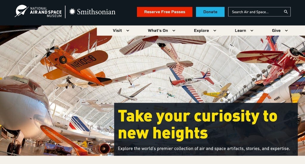
Air and Space has a problem most museums don’t: it’s two buildings, thirty miles apart, with different rules for getting in. The home page treats that as the first thing to solve rather than a footnote, and everything after it is built from labeled tiles that tell you what you’re looking at before you click.
Key Design Highlights:
- Two Locations, Side by Side: Directly under the hero, a section headed “One museum, two locations” gives the DC museum and the Udvar-Hazy Center in Chantilly equal cards with their own photos and Plan Your Visit links. The DC card carries a Reserve Passes button and the Virginia card states plainly that no passes are required – the exact distinction that would otherwise generate a phone call.
- “Featured” Section: A short section near the top spotlights a few current highlights and links out to the full list of open exhibitions. It gives the page an editorial voice without forcing every visitor through the entire catalog.
- “Explore” Stories: Further down, a row of stories and podcast episodes covers subjects like the crew of Artemis III and the history of the Wright family. It’s a reason to spend time on the site for the large share of visitors who will never make it to Washington.
- Labeled Tile Grid: The whole page is built from consistent image tiles, each tagged with what it is – Story, Deep Dive, Object, Event, Exhibition. Scanning is easy because every tile tells you what kind of content sits behind it before you commit to a click.
7. Barbican
Why We Chose the Barbican
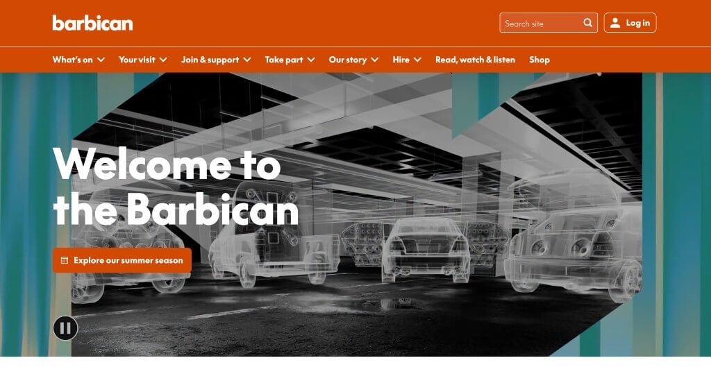
The Barbican isn’t a single kind of venue – it houses visual art, cinema, theatre, dance, classical and contemporary music, and a public library. The home page’s real job is sorting a very mixed audience, and it does that with tabs and clear genre labels rather than by making everyone scroll through everything.
Key Design Highlights:
- Tabbed “This Week” Section: One module carries three tabs – On This Week, Free Things to Do, and Plan Your Visit – so a ticket buyer, a budget visitor, and a first-timer all get served from the same block of space. Splitting by visitor intent rather than by content type is what makes it work.
- Direct Donation Ask: A section states that ticket sales and fundraising make up more than 60% of the Barbican’s income, then offers three preset buttons: £3, £5, and £10. Naming a real figure and a small suggested amount is far more effective than a general appeal to support the arts.
- Hero Slider: The top of the page rotates through what’s coming up this summer, giving several programs a turn in the most valuable space on the site. For a venue running dozens of concurrent events, one static hero would be a waste.
- Parallax Background Images: Background images shift at a different rate than the content moving over them, which adds depth to a page that’s mostly text and listings. It’s used sparingly enough that it doesn’t interfere with reading.
8. YBCA
Why We Chose YBCA
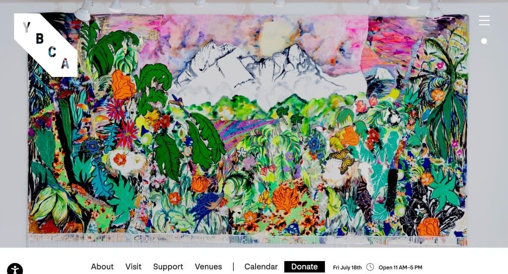
Almost everything YBCA shows is temporary, so the home page is arranged as a timeline: what’s on view now, what’s coming next, and what’s already happened. Giving the archive a real place on the front page – not just a link in the footer – is how a contemporary arts center builds a record of itself.
Key Design Highlights:
- Past Exhibitions Section: A section near the bottom links into the archive of past exhibitions and performances, alongside an index of the artists who have shown there. Most museums bury this; YBCA treats its history as part of what it has to offer.
- Hero Video: A full-width video shows the building, work on display, and visitors looking at it. Since the exhibitions rotate constantly, showing the experience rather than any one show keeps the top of the page from going stale.
- Overlapping Scroll: As you scroll, the rest of the page slides up over the hero and the main menu locks to the top, bringing today’s hours and a link to the events calendar into view immediately. The two things a visitor most needs stay reachable from that point on.
- News on the Home Page: Recent announcements – new exhibitions, a new senior curator, extended Wednesday hours – appear as a feed partway down. It keeps the page current between exhibition cycles and gives press and regulars a reason to check back.
9. Museum of Modern Art
Why We Chose MoMA
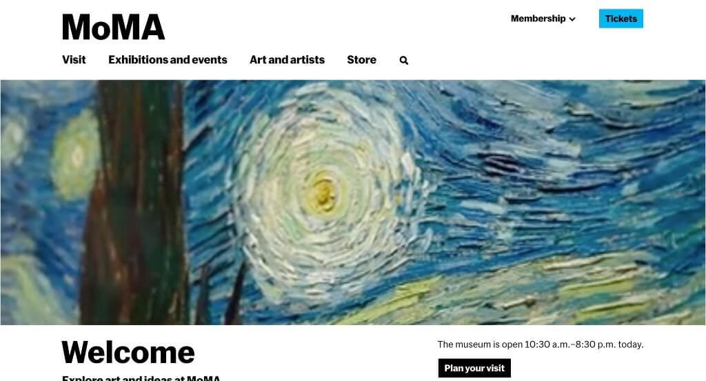
MoMA’s home page works more like a tool than a brochure. Today’s hours sit in the hero, exhibition cards tell you which shows are about to close, and a dedicated section points to the guide you’ll actually use once you’re inside the building – with the full collection available to browse whether or not a visit is in the plan.
Key Design Highlights:
- “Art and Artists in Our Collection”: A row of works from the permanent collection – Van Gogh’s The Starry Night, Matisse’s Dance (I), pieces by Warhol and Joan Mitchell – sits on the home page with a link to browse the full collection. It gives someone a reason to use the site even when a visit isn’t in the plan.
- Labeled AI Image Descriptions: The written descriptions attached to those collection images are generated by AI, and MoMA says so directly in the description text, along with an address for reporting inaccurate ones. Disclosing it rather than hiding it is a defensible way to describe tens of thousands of artworks without pretending a person wrote each one.
- Digital Visitor Guide: Under “Your Day at MoMA,” the page promotes a guide offering audio, self-guided tours, and an interactive museum map. Most museums stop at getting you through the door; MoMA uses the home page to help with the harder problem of navigating a very large building once you’re in it.
- “Last Chance” Labels: Exhibition cards that are close to their end date carry a “Last chance” tag right on the home page. It’s a small piece of copy that turns a browsing decision into a scheduling one, and it costs nothing to implement.
10. New Museum
Why We Chose the New Museum
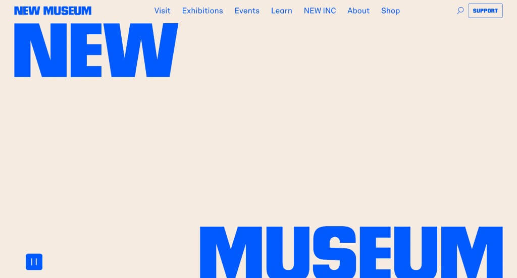
The New Museum reopened in 2026 with an expansion that doubled its gallery space, and the home page is built to convey that scale. Full-width video and imagery run edge to edge, with none of the boxed-in margins most sites use, so the page itself feels as expansive as the building it’s representing.
Key Design Highlights:
- Full-Width Hero Video: The page opens with an edge-to-edge video of visitors moving through the galleries and the work on display. Running it full-bleed rather than in a contained frame is what creates the sense of scale, and it puts the art and the crowds front and center before a single word of copy.
- Edge-to-Edge Layout: The whole page carries the full-width treatment through, letting images and video fill the screen. For a museum whose main news is a much larger building, a layout that feels big is doing quiet brand work on top of looking good.
- “Final Weeks” Section: A dedicated block flags the inaugural exhibition, New Humans: Memories of the Future, as being in its closing stretch – on partial view through August 30 – paired with a “Plan Your Visit” button. Naming the closing date turns “someday” into a deadline, and pairing it directly with the visit-planning link removes the step between deciding and acting.
- Video Gallery: A collection of videos further down the page showcases different aspects of the museum and its exhibitions, giving the site a moving-image depth that suits an institution focused on contemporary and new-media work.
11. Cleveland Museum of Art
Why We Chose the Cleveland Museum of Art
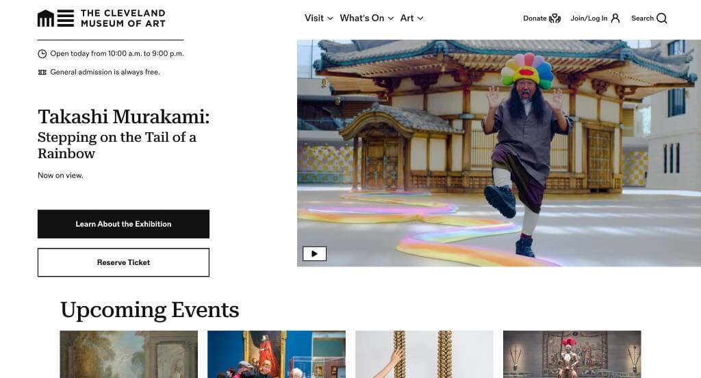
Cleveland’s home page front-loads the three things a prospective visitor needs before anything else – hours, cost, and what’s on right now – and packs them into the hero itself. From there, a consistent grid carries current exhibitions, events, and programs in a way that stays easy to scan no matter how far down you go.
Key Design Highlights:
- Hero with Hours, Cost, and Featured Show: The top of the page states today’s hours, notes that general admission is always free, and leads with the featured exhibition all in one view. Answering the practical questions in the same space as the marketing means a first-time visitor doesn’t have to hunt for the basics.
- Current Exhibitions with Full Labeling: Each show in the exhibitions section carries its run dates, a short description, and status tags – a member presale note here, an opening date there – so a compact card communicates as much as possible without forcing a click through. It respects the reader’s time while still covering the details that matter.
- Upcoming Events at a Glance: The events section gives a quick read on what’s coming up, with links straight to what’s on today versus what’s upcoming. Splitting those two views is a small touch that matches how people actually plan – some deciding tonight, others planning ahead.
- Cohesive Grid Layout: The whole page is built on a consistent grid, so exhibitions, events, and programs all share the same visual rhythm. That regularity is what makes a long home page easy to digest instead of exhausting to scroll.
WordPress Museum Themes
You can find free themes at wordpress.org, or consider museum-inspired templates on ThemeForest.
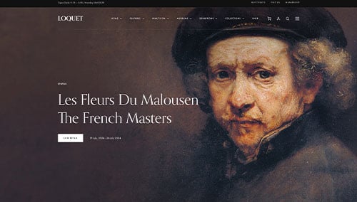
Loquet – Themeforest
$79
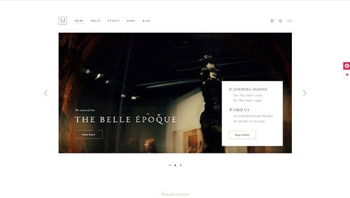
Musea – Themeforest
$85
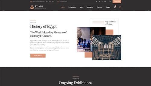
Egypt – Themeforest
$59
Muzex – Themeforest
$35