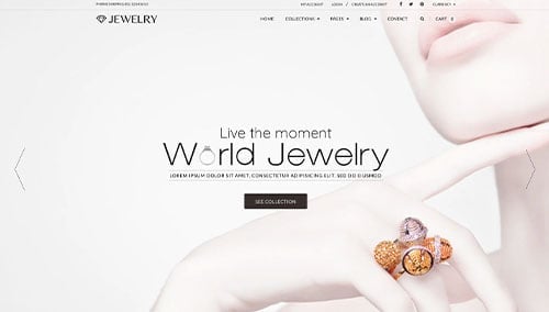
Are you seeking to make a statement with a design that attracts customers? If so, check out our list that we handpicked just for you.
While you might find inspiration for your own website, you’ll also pick up some tips on how to make your pages shine like a diamond.
So, get ready to add some sparkle to your business with the help of this guide! You’ll find many examples of retail stores, custom designers, repair shops, vintage & antique stores, and online companies all for jewelry in this list! For examples within other industries, head back to our web design examples article!
Top Jewelry Store Website Designs
- 1. Dinosaur Designs
- 2. Stone and Strand
- 3. Elizabeth Gage
- 4. James Allen
- 5. Mejuri
- 6. Blue Nile
- 7. VRAI
- 8. Leigh Miller
- 9. Swarovski
- 10. Bell & Bird
- 11. Amanda Deer
- 12. Tini Lux
- 13. Solange
- 14. Greenwich Jewelers
- 15. BaubleBar
- 16. Frasier Sterling
- 17. Jennifer Behr
- 18. Retrouvai
- 19. Luv Aj
- 20. John Hardy
- 21. Catbird
- 22. Bea Bongiasca
- 23. Daisy London
- 24. Jennifer Fisher Jewelry
- 25. Verlas Jewelry
- 26. Brinker & Eliza
- 27. Aureum Collection
- 28. Missoma
- 29. Gorjana
- 30. Viltier
- 31. Pamela Love
- 32. Kendra Scott
- 33. Net A Porter
- 34. Aurate
- 35. GLDN
- 36. Kinn Jewelry
- 37. Heera Diamonds
- 38. Auvere
- 39. Studs
- 40. Zales
- 41. Harry Winston
- 42. Holden
- 43. Kitsch
- 44. Dinny Hall
- 45. Air & Anchor
- 46. Brilliant Earth
- 47. Pandora
- 48. David Yurman
- 49. Kay Jewelers
- 50. Sholdt Jewelry Design
1. Dinosaur Designs
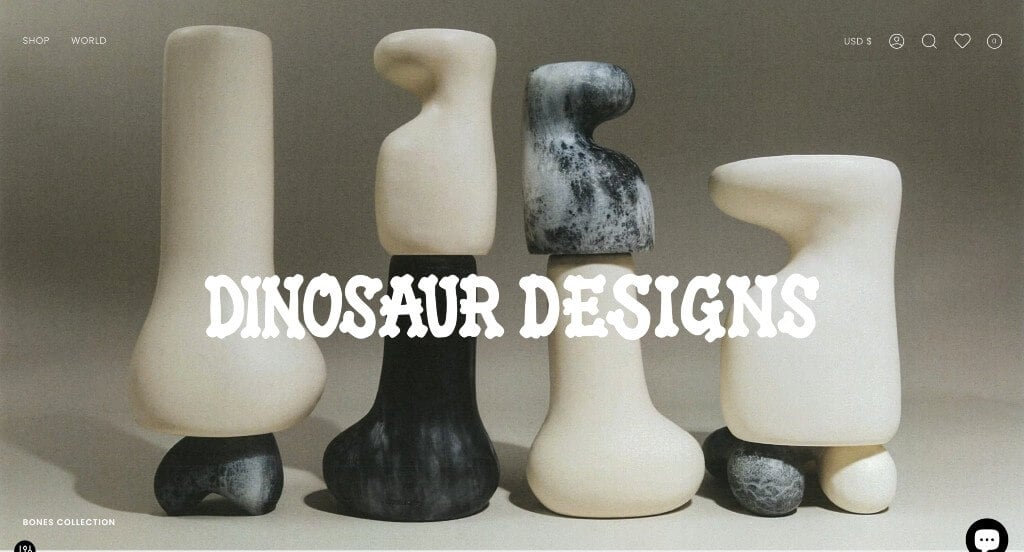
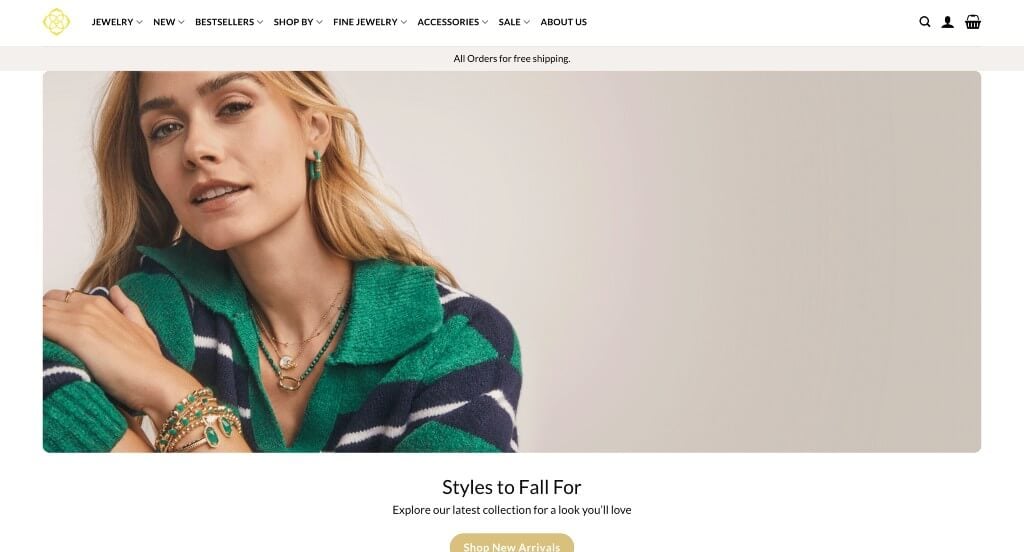
We loved the font that was used for this company’s name because it made sense for their business. Their products were extremely unique so having lots of great images was something else that helped this example for sure. Having minimal written content was nice because it helped to place emphasis on their jewelry and other products.
2. Stone and Strand
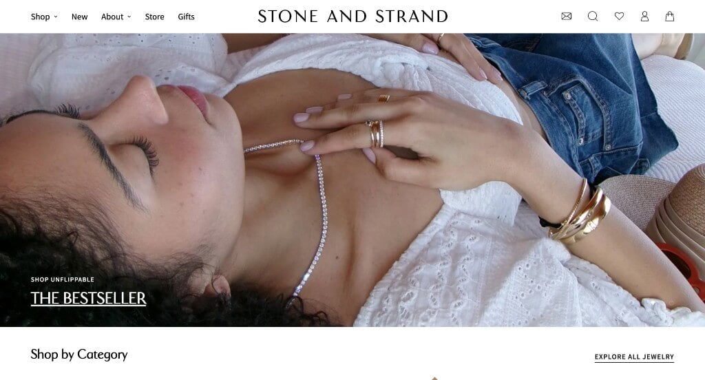
In this example, they did a great job with their unique image frames. Additionally, their fonts are professional and easy to read and we love it. it was a helpful feature to have a way to add products to your favorites list. Image sliders were another design quality in this professional site that we enjoyed. Small little graphics are also used to help improve their already solid design. What a great website to review when building out your next jewelry website!
3. Elizabeth Gage
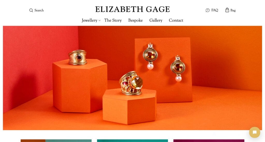
Likely this business’ most notable feature is their stunning backgrounds for their imagery. Showing all their products on a variety of different shaped podiums was a unique choice. Keeping all of their other website elements simple and clean really helped to create a luxurious feel for their company. We loved how a whole page was included to share out their story as a business. Finally, their menu was very well organized, making it easy to find information.
4. James Allen
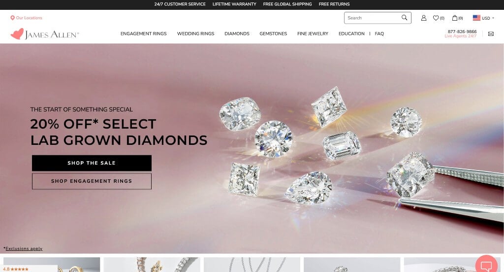
Here we have an example for anyone expecting to find something shiny and sleek. From a web design perspective, their variety of fonts and colors that work together in harmony was amazing. Their images did a great job showcasing the features of each and every product. Very short paragraphs can be used to keep things organized and simple. If you are looking for template options for your next jewelry web page, give some thought to this one.
5. Mejuri
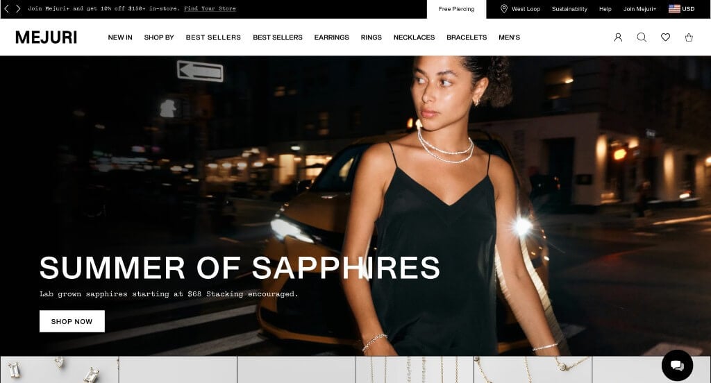
Mejuri caught our attention right away due to their stunning products. We loved how each product showed the colors available along with a hover image that shows their product on and off their models. Additionally, adding tags that let customers know what are selling fast and what are popular. We loved their addition of a page labeled “splurge-worthy” because any jewelry enthusiast would understand that. Aside from all of that, this business also did a great job with their checkout processes to help customers keep coming back.
6. Blue Nile
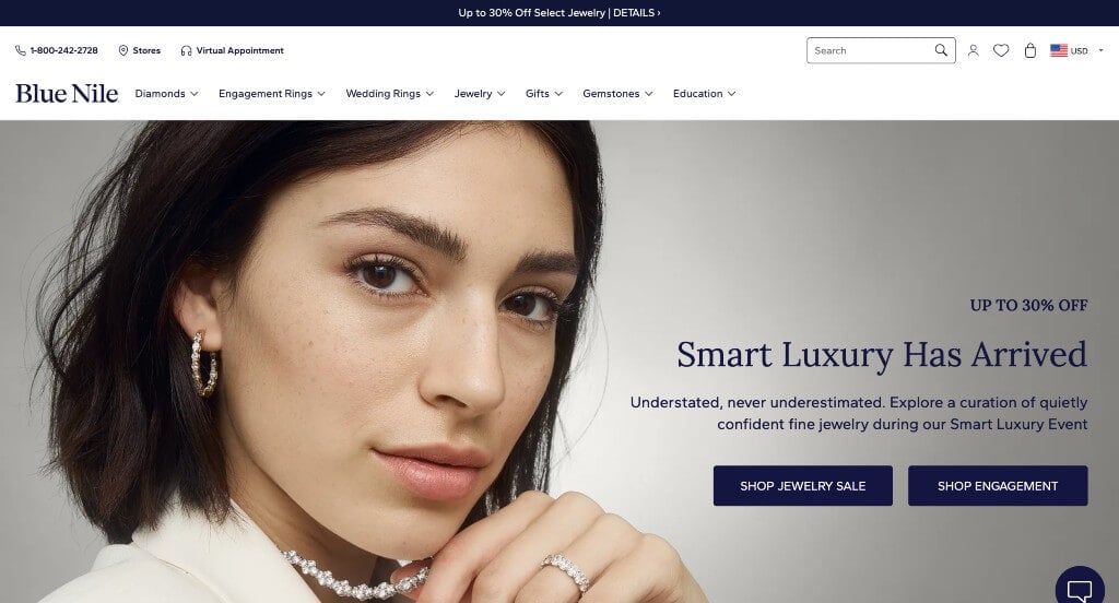
Using a neutral color scheme stood out to us because it’s pleasing to the eyes. We enjoyed the small graphics that help people find the stone they are searching for. Including a little icon to display which products will deliver in time for upcoming holidays was a perfect choice. It was also very helpful to include the ability to favorite an item to come back to it later. Our web designers liked the use of typography on this custom jewelry website. Blue Nile had website marketing in mind when building the domain that matches their business name.
7. VRAI
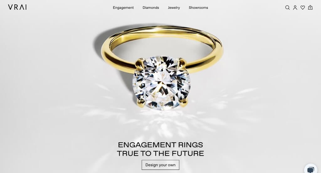
VRAI uses amazing imagery that plays around with light reflections. We loved how those same images were very high quality and catch the eyes of viewers. Using a little V to show all their locations on a world map was a feature we couldn’t miss. Lots of stunning white space might be notice to allow for a balanced design. From a marketing viewpoint, we really liked the way this jewelry website utilized promoting products with actors and actresses. Give some thought to the unique design of this jewelers website when developing your next custom website.
8. Leigh Miller
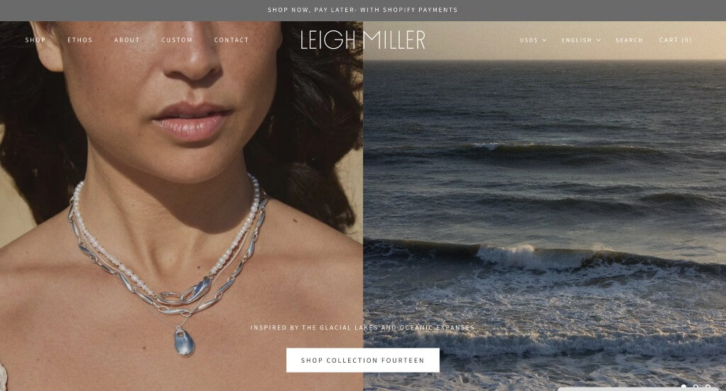
Leigh Miller does a great job displaying all of their products to embrace the elegance of their company. Additionally, their mixture of fonts to work together to create a beautiful design was a great choice. We liked how each and every product was displayed with a simple background, but upon hover, you can see it on a person. Having a stunning slider that is showcased right away on the homepage was another choice that we loved. For jewelers looking for examples for their next website layout, this design example will absolutely be one to keep in mind.
9. Swarovski
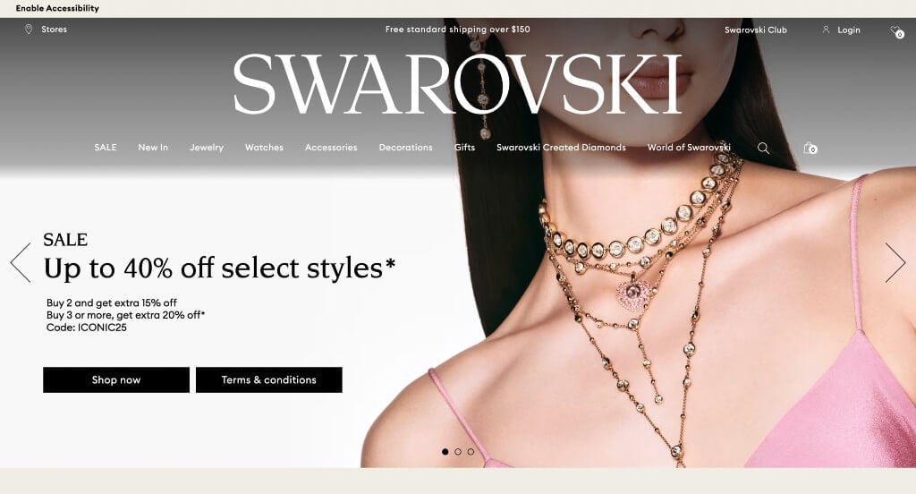
From a design viewpoint, we thought Swarovski did a great job using typography for this custom template. Including bold images were probably the most impactful feature in this homepage. Beige colors are used to allow for a very simple, fresh design. Offering free shipping was something that customers will be sure to notice while scrolling through this professional example. They had website marketing in mind when building the promotions throughout their website.
Related: Need help reaching a bigger audience to get leads? Consider digital marketing within your jewelry store’s advertising budget.
10. Bell & Bird
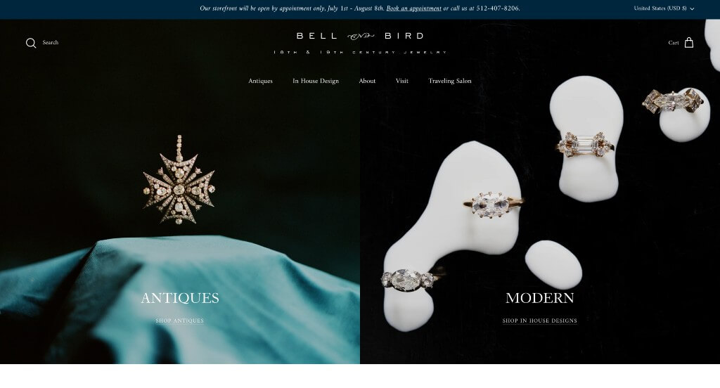
Luxuriousness is clearly evoked through this custom option. Their simple color scheme with lots of balanced white space definitely added to their luxury feeling. Including high quality images and videos was something else that we really enjoyed. After scrolling past the header, you’ll immediately notice their variety of stylish fonts. The videos help to explain the process this business goes through in order to create a one-of-a-kind product. Finally, we loved how their domain matches their company name to make everything easier.
11. Amanda Deer
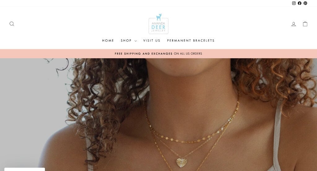
Here’s another amazing example for jewelry stores looking to improve their online presence. We really liked how pastel colors are used as small accents to build up an overall feel. Each product shows what metals are available which we really loved. Additionally, customers can look at reviews for each individual product to see if it is the piece for them. Including an online chat was another thoughtful feature that we really enjoyed. Finally, it was a smart idea to have a well labeled menu, making it easy for people to navigate their site.
12. Tini Lux
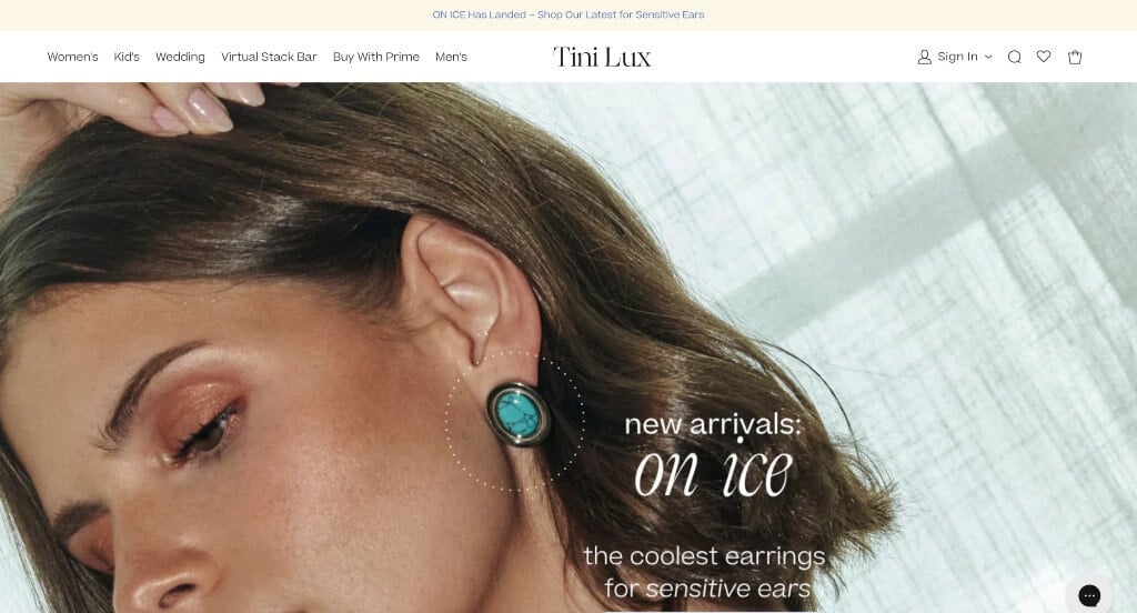
Here is a design that achieves greatness on each and every page. High quality images of their products on and off models was an addition that customers will be sure to notice. Thin lines are used to create graphics to describe the qualities of their business. Including lots of information about “clean” jewelry helps customers understand exactly what this company strives for. Making sure all of their paragraphs are short and straightforward was brilliant because people can skim through faster. Showing comparison images with clean jewelry versus hypoallergenic jewelry was a great way to pull in more people.
13. Solange
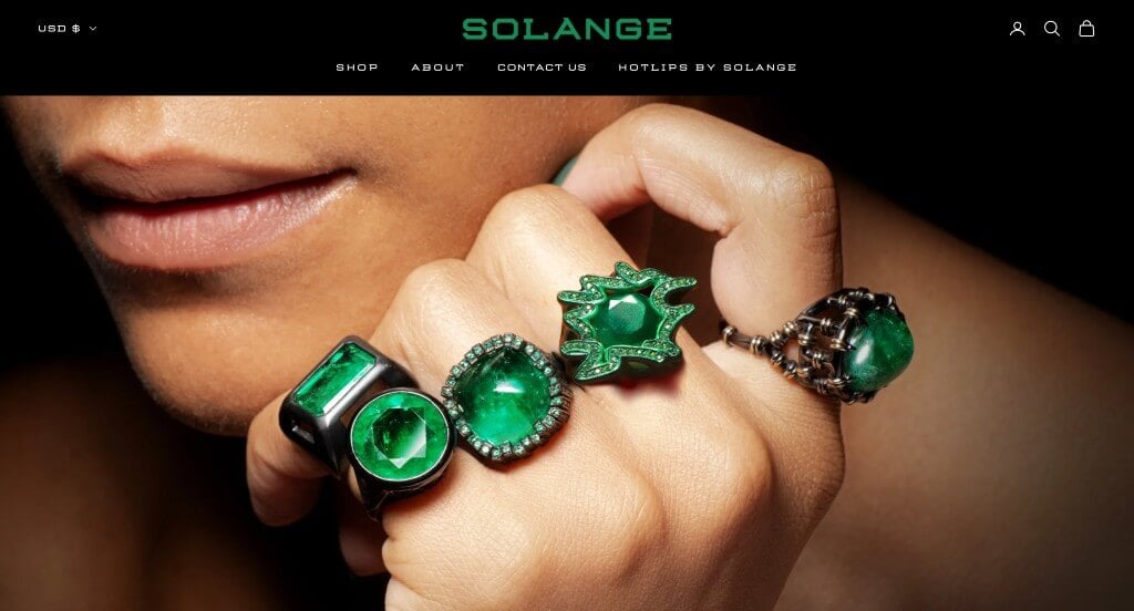
This brand screams luxury. Black backdrops can be noted for all of their imagery allowing for their products to really take the spotlight. Their thin fonts and outlined buttons also create a feeling of high quality. Adding in short automatically playing videos was something else that we liked about this design. Another feature that was creative was their variety of jewelry collections. Finally, they had a navigation bar that was very easy to use, making customers more happy because they’ll be able to find the information that they are looking for.
14. Greenwich Jewelers
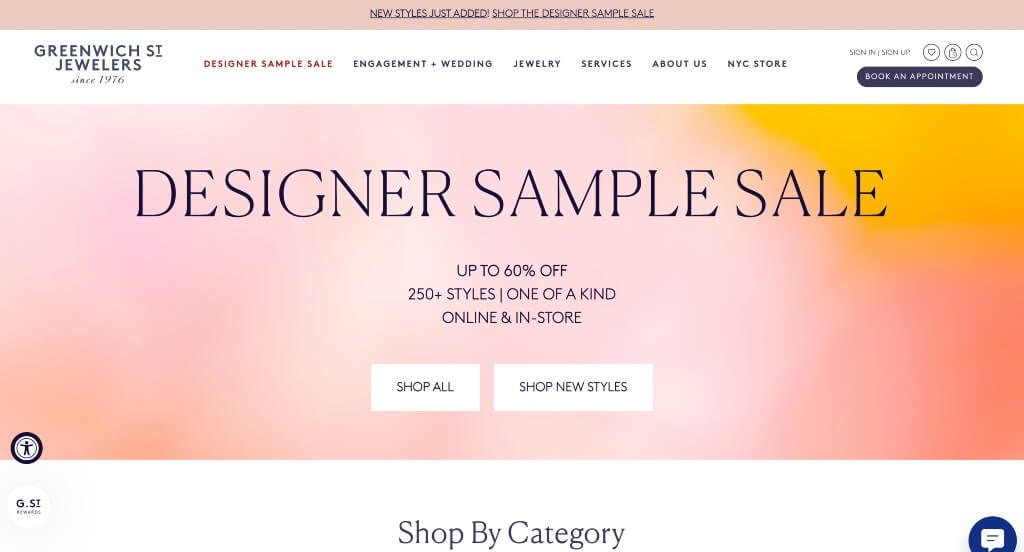
Here we have an example that uses professional and simple fonts so that customers can read information well. Along with that, we liked how they let customers heart items to save them for later. We liked how they had an option for a custom ring that is more special to the buyer. This navigation bar also included lots of tabs so that viewers can find content easier.
15. BaubleBar
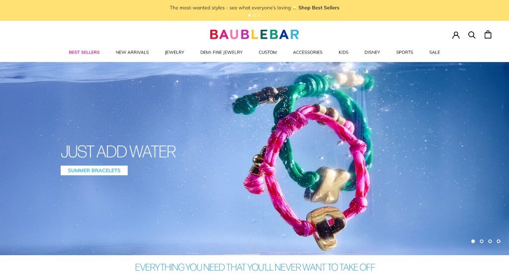
In this example, everything is gold and shimmery. Including lots of images help organize all of their unique products, making them easier to find by people searching through their site. Using capital letters that are bold and professional was something else that we really enjoyed. The dropdown navigation bar was a nice touch for a professional site like this one. Their variety of products aside from jewelry made it easy to recognize this design.
16. Frasier Sterling
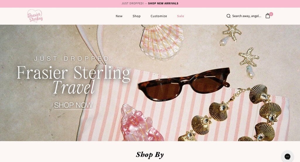
Frasier Sterling uses a pink and off-white color scheme, which we like because it enhances thoughts of love and caring. We loved their simple logo that is both cute and professional. Additionally we loved how pastel pink buttons are used to help people navigate throughout their design. After scrolling past their header, you’ll notice images in their menu bar to help people find what they are looking for. Another thoughtful quality was their areas to reveal customer reviews. Frasier Sterling had ease of use in mind when designing the layout of their website.
17. Jennifer Behr
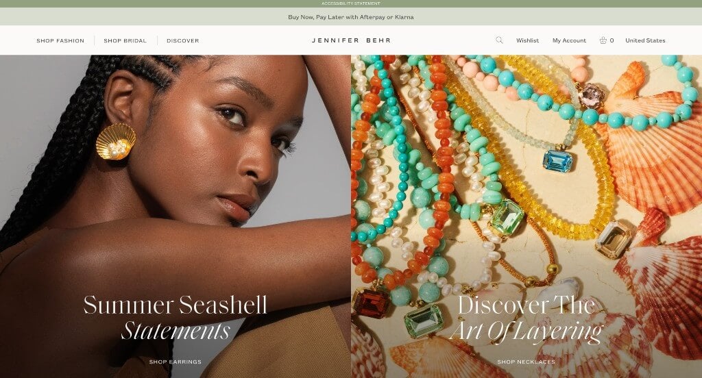
We love how these products seem almost mystical. All of their imagery is high quality, and model images are used to help improve the site without adding losing the elegance of their design. Allowing for a simple and stunning font to be used was another smart choice because it doesn’t take away from their design. It was creative to include little circles showcasing color options for each product. We also liked how pricing was labeled for products without clicking on them. Online appointment booking was a great choice for a site like this one. Including a search feature was another thing that stood out to us.
18. Retrouvai
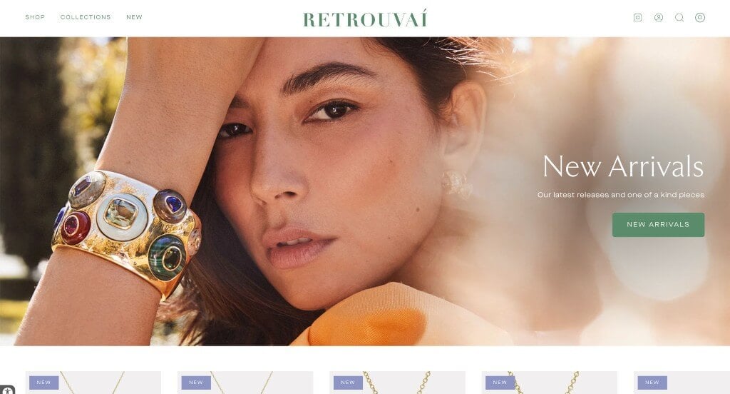
Retrouvai takes advantage of a stunning green and white color scheme, allowing for a more down-to-earth feel. We loved how some of their products have a little rectangle that shares if it’s a new product. Additionally, we thought their graphics with different animals and such was unique. Their imagery was created beautifully for both their product imagery and imagery sprinkled in as content. Everything is written in a way that is direct and straightforward which was a very smart choice.
19. Luv Aj
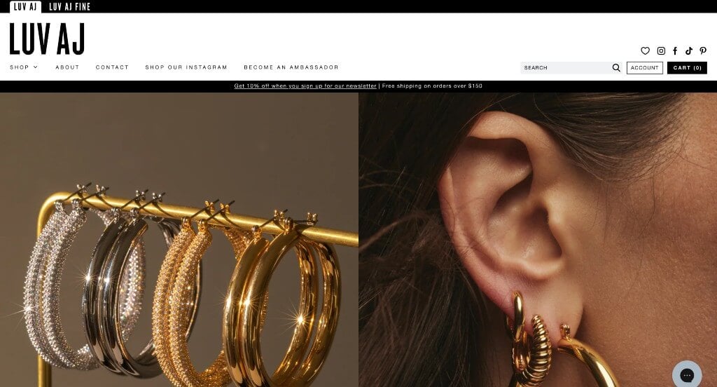
We loved how right away an image slider was used to display lots of their products in a different way. Luv Aj’s use of a neutral color palette stood out to us because it leaves opportunity for colors in their images. It was cool how their logo design had a unique spinning animation. Automatically playing videos are included which we really liked because it added interest to their template. Finally, we liked how their domain name matched their company name, making their site easy to find.
20. John Hardy
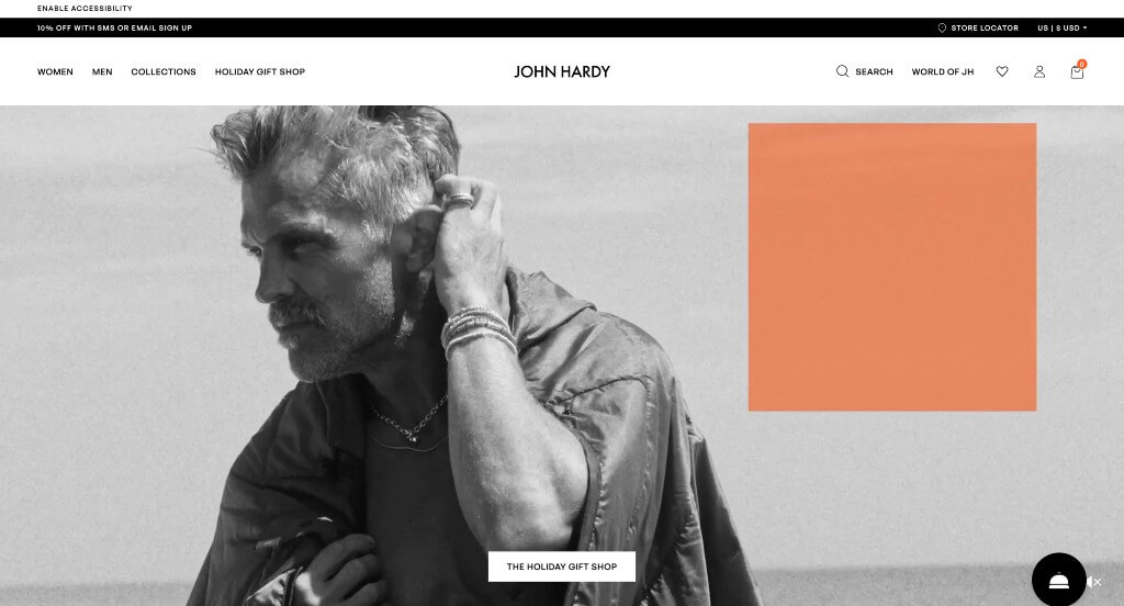
Here’s another extremely unique company. They use a variety of backgrounds to evoke a gender-neutral feel that encourages both men and women to buy their products. One of the features that caught our attention was definitely John Hardy’s use of images throughout this entire site. To add onto that, their images are creatively enhanced to make them more interesting that just a bracelet on a wrist. Adding in a specific shop based on the upcoming holiday was a brilliant choice.
21. Catbird
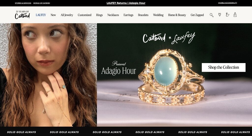
Creativity shines through every page of this website. Right away, we noticed their unique collage including short bits of information along with some high quality images. We also really love their amazing choice of fonts to enhance that creative feel. Another feature we enjoyed was customers’ ability to “shop the look” for images of models within their pages. Catbird clearly had a focus on usability when building the responsiveness for their website. Additionally, their navigation bar was very detailed making it perfect to manage their pages.
22. Bea Bongiasca
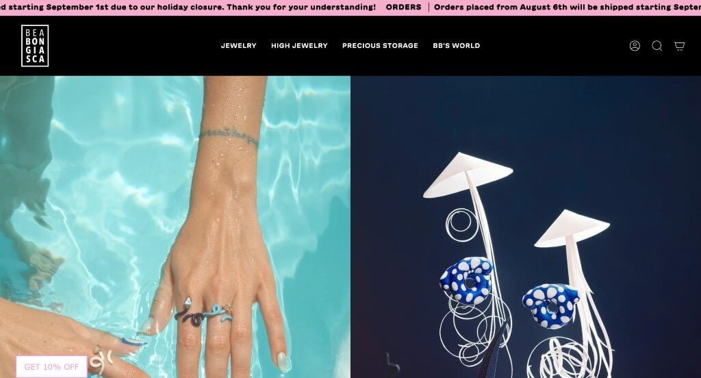
Here’s another web template that stands out to us. We loved their unique products that seem to have unity in their designs. Maintaining a clean and intuitive layout, Bea Bongiasca keeps things simple for a jewelry business. We loved how there was short paragraphs to help describe things within their site. Their large buttons were another aspect that is extremely helpful for anyone trying to navigate through this example. We loved how their images were well planned, making their imagery stand out.
23. Daisy London
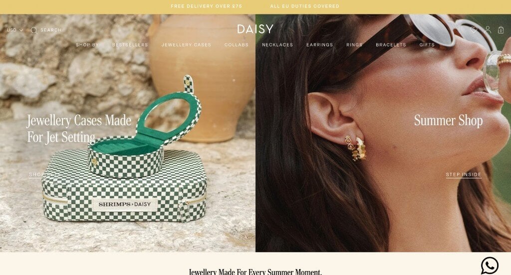
Stunning imagery was clearly important to this company when building their design. It was cool how images were used as backdrops for their buttons. Including a front-page carousel for ads was likely the most impactful feature within Daisy London. Additionally, we loved their menu that had lots of categories to provide a well-organized design. It was a smart choice to include an automatically scrolling bar on the top of their page showcasing important information. Showing off their color options and prices right on their homepage was a great option.
24. Jennifer Fisher Jewelry
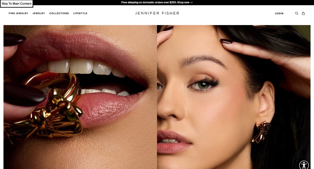
Jennifer Fisher Jewelry was an example that we won’t forget. Their images clearly speak for themselves because of their high quality. Allowing customers to shop by category was another feature that was beyond brilliant. Additionally, their luxury and professional fonts was another thing that we really enjoyed. We loved how their links were very simple and clean, not taking away from their aesthetically pleasing design. Additionally, it was smart to clearly label their prices for each product.
Related: If you’ve got room in the marketing budget, consider adding SEO to get ranked higher in search results.
25. Verlas Jewelry
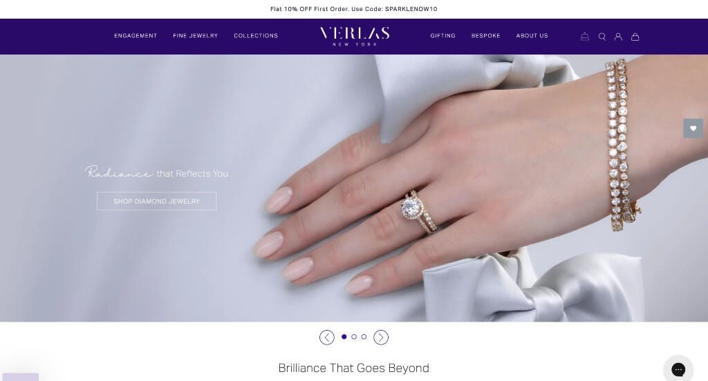
This example takes advantage of a white and purple color scheme that gives off a luxurious feel. We thought it was cool that customers are able to search for jewelry based on gem shape. Due to its clean and distinctive looks, this site grabs the attention of their customers. Verlas utilized stunning imagery with creative backgrounds and elements. Allowing customers to try products at home was a unique choice for a custom example like this one. They clearly had a focus on internet marketing when building the arrangement for their website.
26. Brinker & Eliza
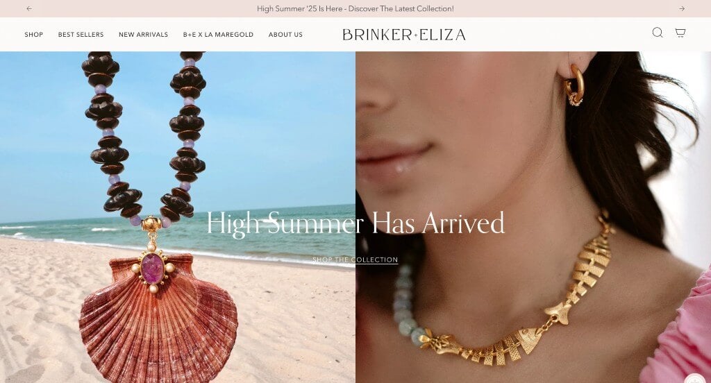
Showing off their products on and off models was a choice that we absolutely loved. From a design perspective, we liked their great use of typography. Including all of their social media links near the bottom of their homepage was another brilliant idea. Additionally, including information about their homemade roots was a smart idea. Overall, this business’ bulky nature helps them stand out from their competitors and customers will recognize them.
27. Aureum Collection
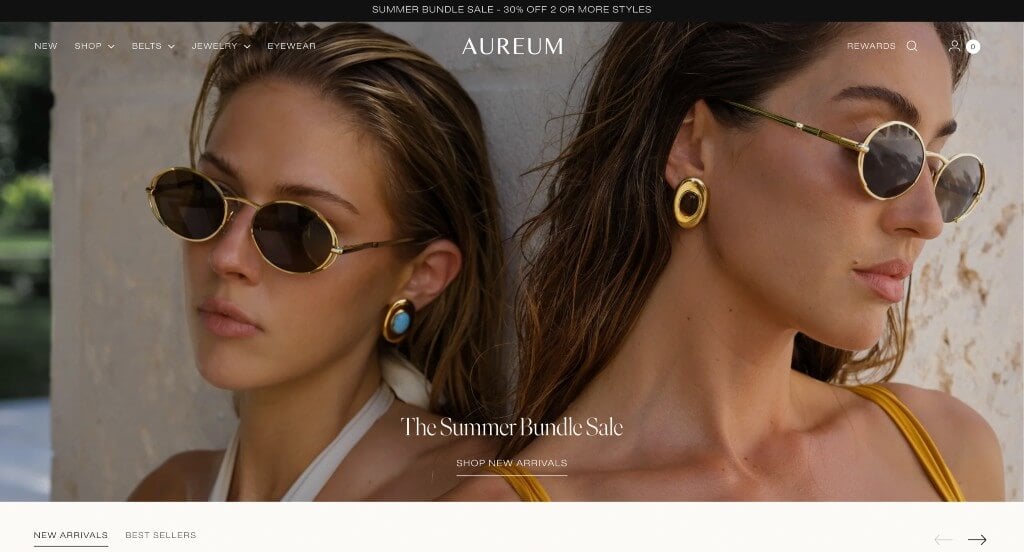
Make sure to check out this design if you are looking for a custom ideas. This company’s large, high-quality imagery is likely the best part about this example. Using lots of neutral colors was another good choice because it allowed for their shiny jewelry to really stand out in their images. Additionally, we liked how their navigation bar separates out belts and jewelry. Another feature you might notice is how their domain name matches their company name. Any website designer mocking up sites for jewelers will want to consider checking this one out.
28. Missoma
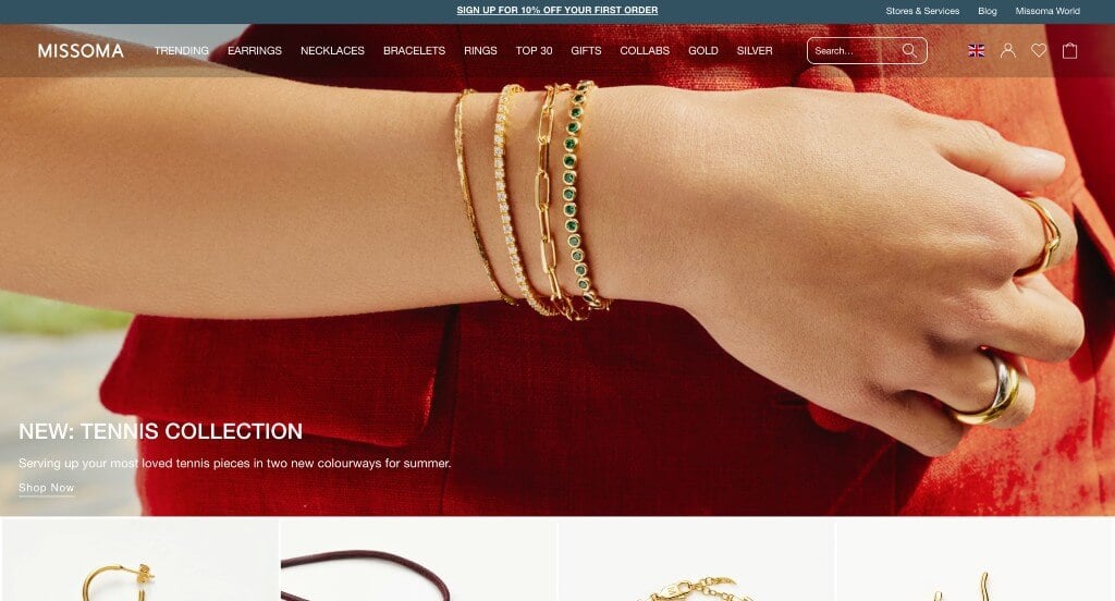
We liked how a grid style was used to display a variety of images for viewers. It was a great addition to have customer reviews included right in their homepage. We really enjoyed their small little graphics that add a some character. Adding in posts from their Instagram page was another feature that we couldn’t miss. As you scroll through, you might also notice their easy to read drop down menu. Their advertisements for sustainability, free shipping, and discounts helped make them stand out from their competitors. Finally, we loved that they included a search bar to help customers find something specific.
29. Gorjana
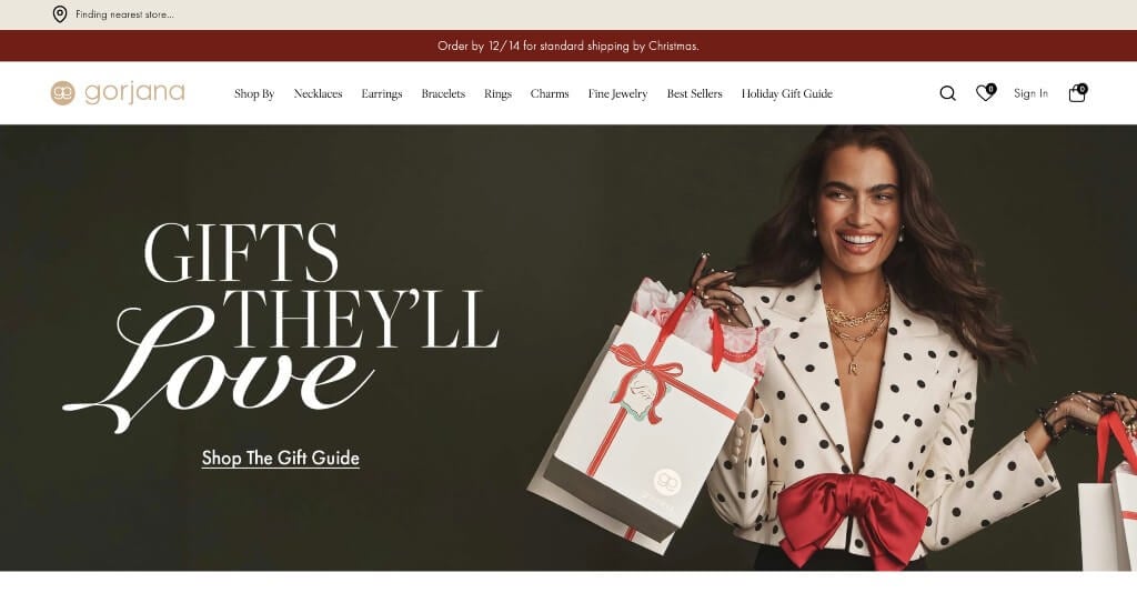
Gorjana really likes to focus on the upcoming seasons, and that is showcased in their imagery and products. Their simplistic fonts and logo design really spoke to us. Little circles are used to display all color options to help personalize their products was another great addition. As you scroll through, you’ll notice their variety of items offered. We also really liked how they want customers to come to their store versus only online shopping. Finally, they used a navigation bar that was well organized, making everything easier to find.
30. Viltier
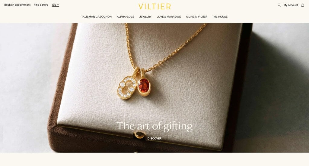
Here’s another one of a kind business, with very special products. Including an automatically playing video right away was a great choice that really grabbed viewers’ attention. Their simplistic color scheme stood out to us because it’s very distinctive and eye-catching. Of all these jewelry businesses that we reviewed, we really liked Viltier’s whimsical images. Viltier’s logo design was remarkable, and what made it even better was that they reused it throughout their site. We enjoyed how all of their written content was shortened, making it easier for people to digest.
31. Pamela Love
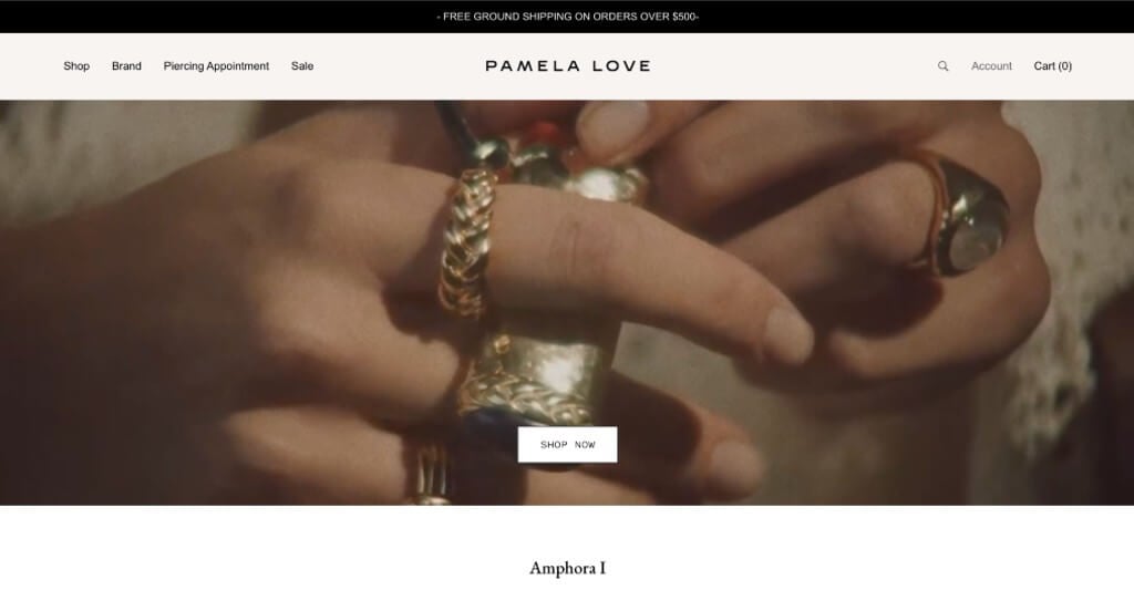
Pamela Love has a very professional feel to it, thanks to its blended use of cream, white, black and green. Their choice of fonts was smart because it continues to build on their naturalistic feel. Each of their products reflects their business strongly with their designs and color choice. Having a feature that allows customers to order or repurpose custom antique pieces was another innovative option. We also thought a nice inclusion was the little box in the top showing what is a hot item and what is sold out.
32. Kendra Scott
We liked this example because of their well staged images that feature models styling a variety of their products, always color coordinated to their clothing. Drop down menus for within their navigation bar was another thing that we liked because it made it much easier to find information. Showing off new arrivals and items on sale was another smart choice.
33. Net A Porter
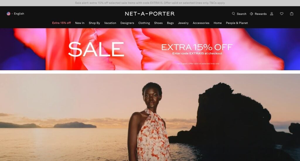
Likely the best thing about this example was their imagery that uses highly fashioned models in order to evoke a sense of higher quality fashion for their business. Additionally, a very modern color scheme and font was used to build up that high quality image. We loved how their domain name clearly matched their business name. It was for sure a great thing to have categories for their navigation bar to keep all their content organized. Having a page dedicated to their new items also stood out to us. They had accessibility in mind when building a live chat section for their website.
34. Aurate
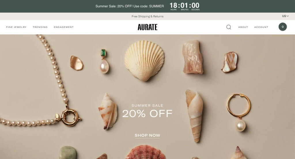
This example is another one for the books. Their images are of course high quality, but we really liked their interesting photos that combine multiple products. We thought it was helpful to include a few videos too because it really shows how much the glitter sparkles when the light catches. Having a sharp logo was absolutely a consideration when ranking Aurate in our list. We thought it was nice to have a little banner with a countdown for the end of their current sale. We also loved their little section featuring reviews from other businesses.
35. GLDN
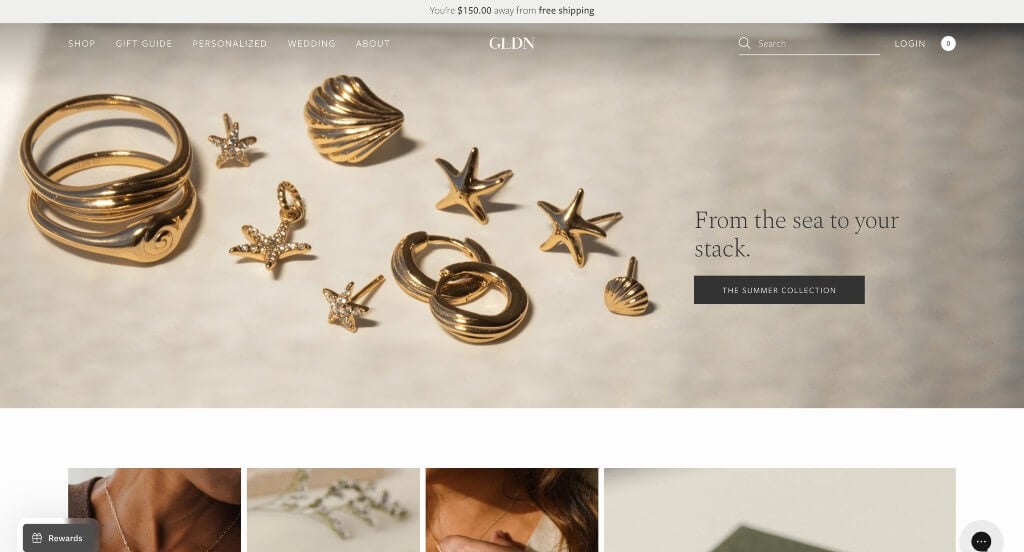
Right away, we noticed this business’s name that was clever to go along with their gold jewelry. We really loved their images that show the process involved to create one of their one of a kind, handmade pieces. Their sleek buttons were another feature we couldn’t ignore. Additionally, descriptions for these products were written in a straightforward way which we really liked. Adding in their Instagram posts with a feature to shop the item in the post was brilliant. With so many good reasons to consider GLDN, it’s obvious why we included it in this list!
36. Kinn Jewelry
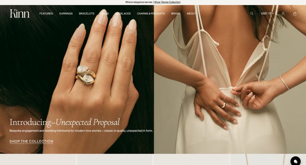
Kinn Jewelry uses different models to prove that their product is usable by lots of different people of different age groups. As you scroll through, you might notice text sliders that reveal additional information about some of their products. We liked how live chats are included to allow customers to ask any questions and get them answered quickly. Adding a little tab to show their best sellers was a feature we really enjoyed. Additionally, their domain name matched their company name which was perfect because it makes their site easy to find.
37. Heera Diamonds
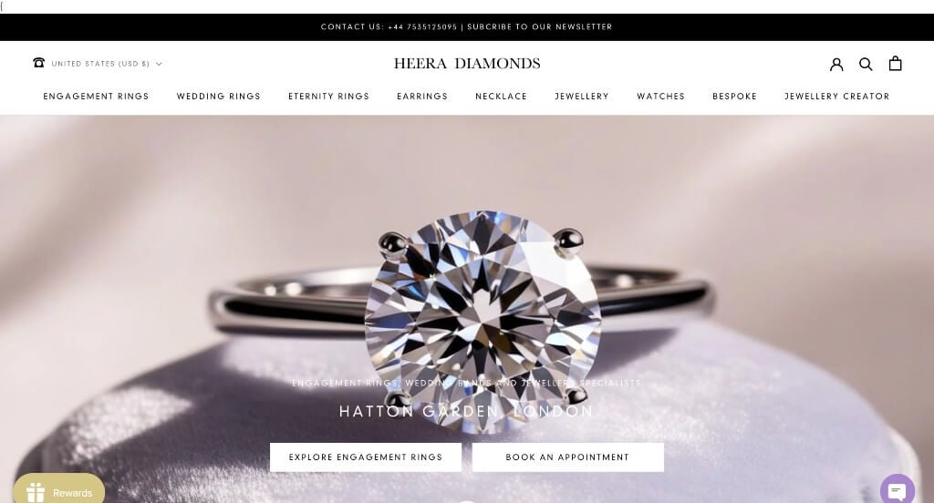
This business knows how to make their products shine with their high quality images. They did a great job organizing jewelry into different sections to make it easier to find whatever customers are looking for. Adding in buttons was a great way to provide more information without the pages being overwhelming.
38. Auvere
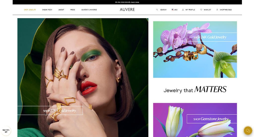
The most impactful part about this design was their high-quality and stunning imagery. Having short paragraphs to help keep their content looking uncluttered. Their buttons were a simple option, but including an awesome font with it will get people to click on the links for sure. Another thoughtful aspect of this professional site was their modern design. We thought it was a good choice to add a bright red circle with writing to show which pieces have won awards. We also thought it was a great choice to include their packaging designs that of course evoke a luxurious style with their dark purple and gold color scheme.
39. Studs
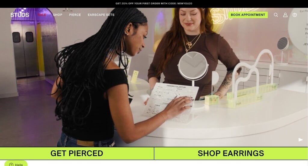
We love, love, loved this example. Their layout was what really stood out to us with their creative grid format. Studs used lots of bright colors as accents to create some life in their pages. Scrolling through this template, we noticed some automatically playing videos, which we liked. Attention to detail was another thoughtful feature in this professional web page that we enjoyed. We thought it was smart to allow customers search for earrings based on their piercing placements. Additionally, circling the product on their model’s ear was another smart choice.
40. Zales
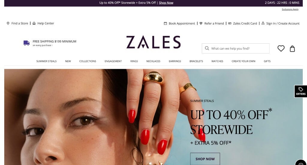
Zales used lots of different shades of purple to create a relaxed but still high quality feeling. Our web designers felt the use of typography on this template was good. We liked how in their images, they made sure to play with light to show little light shadows on their backdrops. Having a section dedicated to the upcoming holiday was a great choice. Another design quality we enjoyed in this clean site was the ability to sort products.
41. Harry Winston
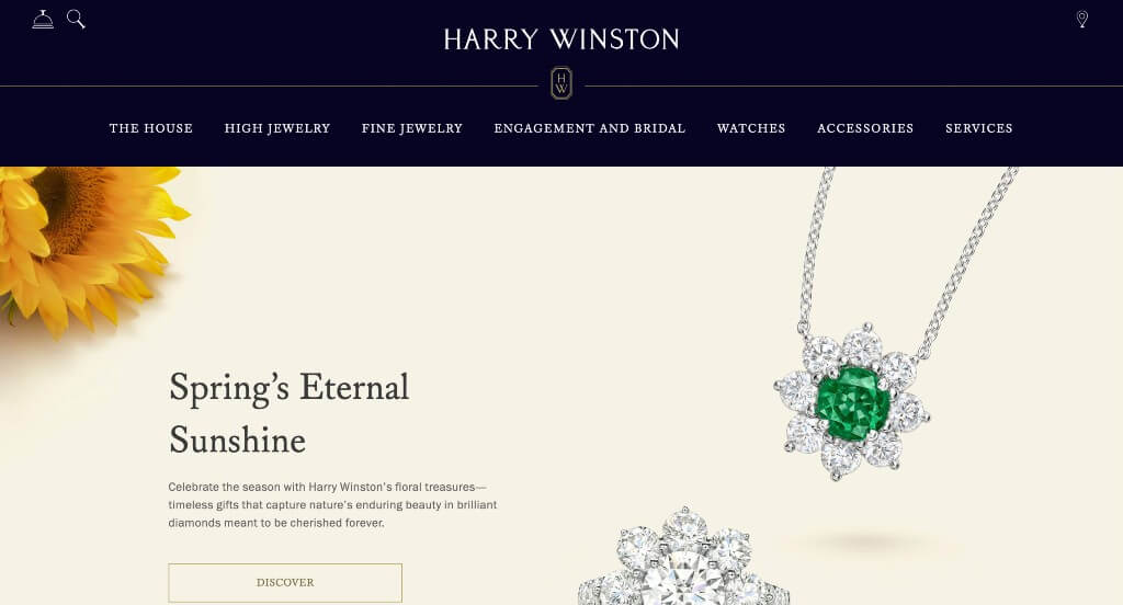
Here we have an example that uses a simple color scheme that really lets their jewelry take center stage. We appreciated their creative separator lines to keep their content more organized. Having a designated bridal section for their company was another thing that we really liked because that is one of the main reasons people buy expensive jewelry.
42. Holden
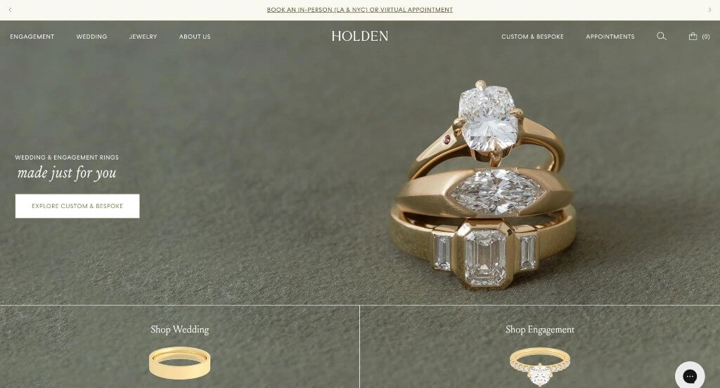
This design was definitely one of our favorites. Their images appear to have a warm filter over them, giving them a natural feel. The olive green and white color scheme used here stood out to us because it looks clean and classic. We enjoyed how they were providing support to the LGBTQ community by donating some of their profits to the Trevor Project. Including lots of different blog series for their articles was another great choice. Holden clearly had a focus on ease of use when building the format for this website.
43. Kitsch
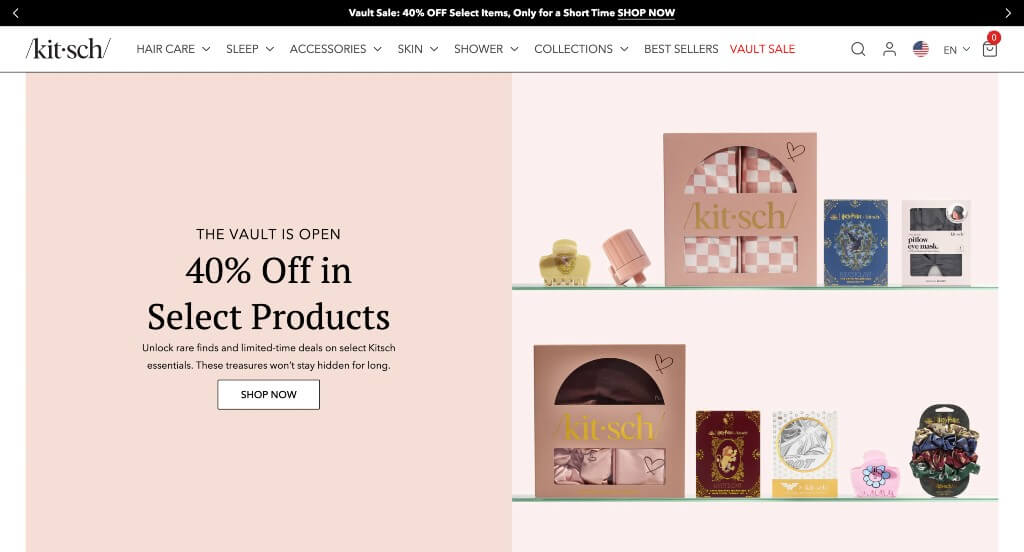
Kitsch has a slightly more feminine feel because of their blush pink color scheme. However, beyond that, we liked how their images were well staged to create a more professional and creative feel for their company. Adding in lots of customer reviews was also smart because it helps to build trust with customers. Including their story was another nice touch.
44. Dinny Hall
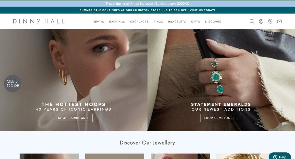
In this example, we really appreciated their bold fonts that are easy to read for sure. Having a feature for their monthly bestsellers was something that we really liked. Their whitespace was very well balanced which made for a cleaner template. Including their social media posts right into their homepage was a great way to stay connected with their viewers.
45. Air & Anchor
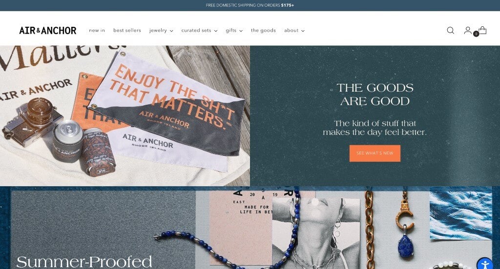
Everything about this design was beautiful. We thought it was perfect to add a few collage images to create a warmer feel. Additionally, their fonts were carefully hand-picked to help build their overall feel. We thought that it was a great choice to include some images that were in black in white to add an additional visual appeal to their design. Showing many different necklaces on models and labeling their chain sizes was another great idea. Finally, we loved the way that their navigation bar was organized, making all of their information easy to find.
46. Brilliant Earth
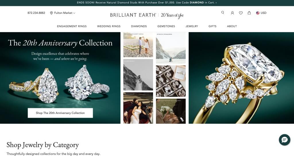
Right away, we noticed that this company utilizes lots of images to help guid customers to the perfect product for them. Showing a variety of diamond shapes was another great choice that this company decided on. Having a section just for their holiday collection was extremely smart because they’ll get extra products sold. Another thoughtful quality in this custom layout was how usable it is. It was also a unique option to have buttons that let customers search by price ranges.
47. Pandora
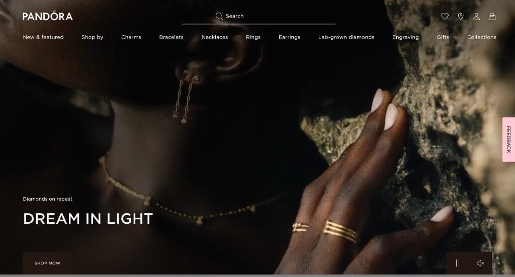
To close out our list of jeweler sites, we picked Pandora. This is a widely popular business that focuses on timeless designs for their products. Starting off in this example, we notice their large images used as a slider to allow for great visual appeal. Right away, you’ll notice that it carries a feeling of love and caring throughout all of the pages. Showcasing the different collections and partnerships that they have was another thing that grabbed our attention. We really loved how their logo design was very bold and elegant, even including a crown over the “O”. They also did a great job with their extremely organized menu bar that makes it really easy to find whatever you are searching for. Additionally, they knew what to do when creating a domain by picking something that matches to their business.
48. David Yurman
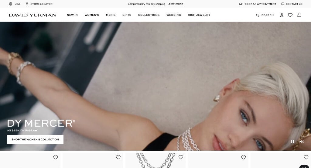
David Yurman did a nice job with their heart feature that can save items for later so customers can decide later if they’ll purchase it. Something that was simple but smart was their domain that matched with their company name. Additionally, those images are extremely high quality, making them shine in this template.
49. Kay Jewelers

This example starts with a very modern feel with their black and white color scheme. Keeping their images in color was a great way to let their products really pop within the pages. Including a variety of quick links within their footer for discounts and other information was nice. Sorting their products by jewelry type was another thing that we enjoyed because it made it much easier to find what you are looking for.
50. Sholdt Jewelry Design
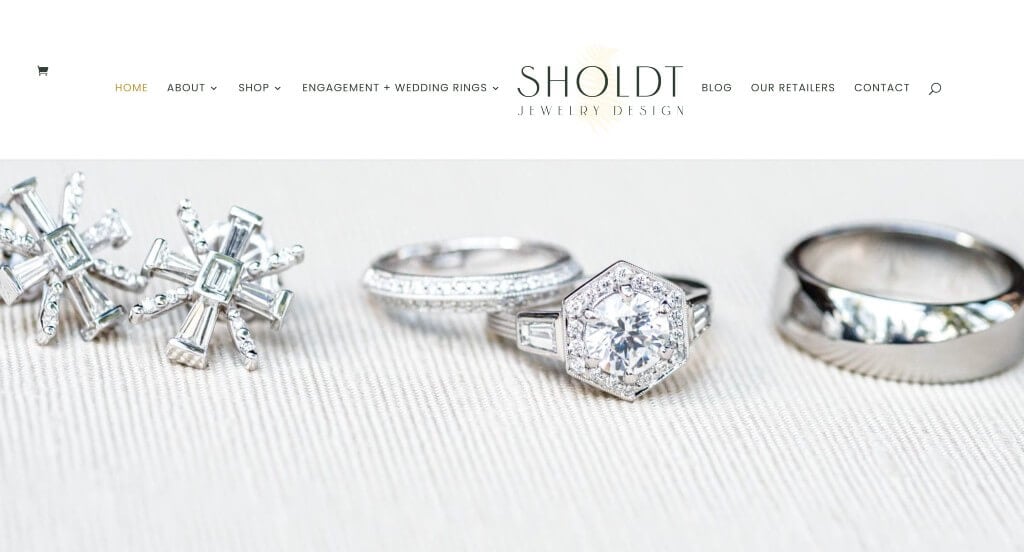
This is a clean layout that makes use of whitespace very carefully. We thought it was nice how they made use of interesting image frames and a unique template. These fonts are professional and look stunning in this example. Buttons are also used to guide viewers towards additional information about their products. Including a blog was another thing that we noticed.
WooCommerce Jewelry Themes
Explore a variety of ecommerce jewelry themes for WooCommerce on ThemeForest.
GoldSmith – Themeforest
$39
Bijoux – Themeforest
$89
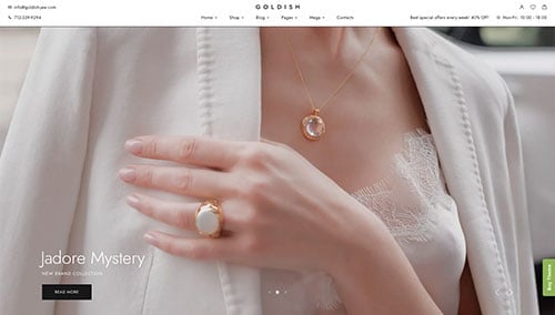
Goldish – Themeforest
$49
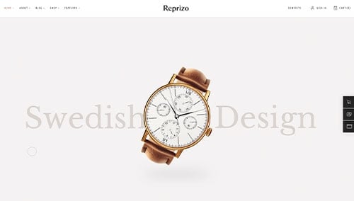
Reprizo – Themeforest
$69
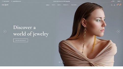
Mojuri – Themeforest
$69
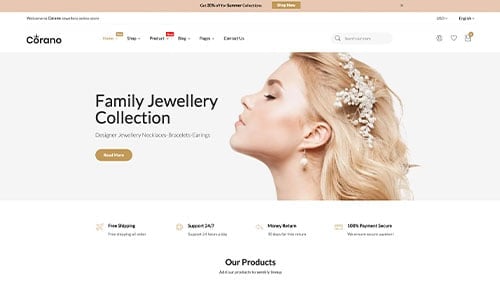
Corano – Themeforest
$59
Jewelry – Themeforest
$49
Anamika – Themeforest
$59