In the enterprise landscape, your website is the definitive statement of your brand’s maturity and global stature. For a multinational organization or a high-growth private firm, the digital presence must do more than just provide information – it must communicate corporate governance, strategic vision, and market dominance. To lead in 2026, a corporate website must balance high-level brand storytelling with the rigorous demands of transparency and stakeholder engagement.
Our strategy and design team evaluated hundreds of enterprise-level websites – from publicly traded multinationals and private equity firms to global professional corporations and non-profit foundations. We identified the top 15 examples that masterfully bridge the gap between brand prestige and functional excellence, specifically analyzing their investor relations accessibility, corporate social responsibility (CSR) storytelling, and global multi-language architecture.
Whether you are navigating an IPO or managing an established global brand, these examples represent the current gold standard for corporate web design in 2026.
Note on Our Selection Process: We recently audited this guide to remove outdated designs and sites that no longer meet our performance standards.
Top Corporate Website Designs
1. Asset Class
Why We Chose Asset Class
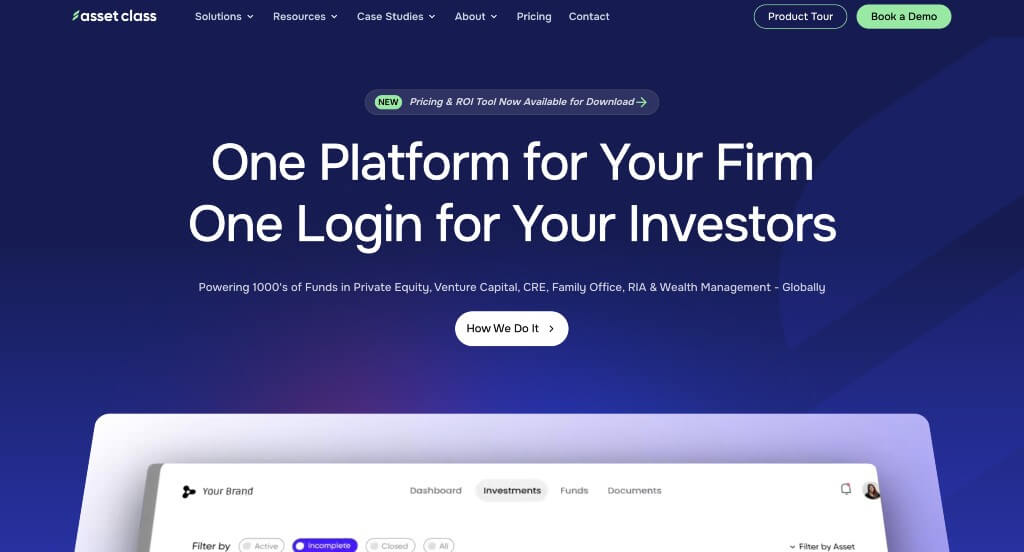
The desktop website for Asset Class serves as a premier benchmark for “Next-Generation FinTech Merchandising and High-Trust Intelligent Venture Architecture.” As an AI-powered operating system built to streamline asset management, venture capital, and private equity workflows, the digital presence must instantly project deep mathematical intelligence and institutional-grade reliability. The desktop interface flawlessly secures this positioning by ditching vague financial hype, electing instead to present clear software screenshots, transparent technological capabilities, and elite industry proof.
Key Design Highlights:
- High-Fidelity Platform Interface Showrooms: Demystifying the inner mechanics of the software is handled beautifully through high-resolution screenshots embedded straight into the homepage layout. By displaying actual dashboard interfaces, investment pipeline visualizations, and real-time portfolio data tracking, the platform allows investment officers and fund managers to preview the clean, professional design of the tool before initiating onboarding.
- Persistent, High-Conversion “Book a Demo” Header Gateway: Positioned prominently at the far right of the global navigation header, a high-visibility “Book a Demo” button remains anchored across the desktop browsing path. This strategic call-to-action acts as a friction-free pipeline for institutional procurement teams, keeping the primary entry point for deeper client consultation constantly within arm’s reach.
- Transparent Artificial Intelligence Capability Blueprint: Rather than leaning on hollow tech buzzwords, the homepage devotes significant space to making the platform’s distinct AI features crystal clear. The site systematically maps out how its machine learning models automate capital calls, summarize complex investor documents, and extract smart financial insights, proving its operational value to prospective asset managers right away.
- Elite Peer-Validation and Institutional Testimonial Hubs: To completely neutralize the skepticism that surrounds adopting new software in high-stakes financial markets, the homepage showcases high-level client testimonials from verified industry professionals. Displaying these premier peer success stories along the primary scroll path gives alternative asset managers the ironclad social proof needed to trust Asset Class AI with their investment operations.
2. Nametag
Why We Chose Nametag
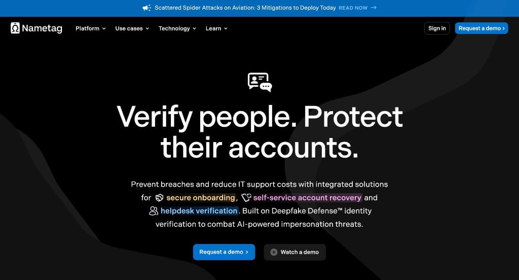
The desktop website for Nametag serves as a premier benchmark for “Identity Verification Merchandising and High-Trust Cyber-Security Architecture.” In a digital ecosystem plagued by deepfakes, social engineering, and rampant helpdesk account takeover attacks, a security platform’s website must project absolute technical integrity and effortless ease of use. The desktop interface achieves this flawlessly by combining clear structural walk-throughs with high-visibility conversion pathways, proving to enterprise security teams that account recovery can be both unbreachable and frictionless.
Key Design Highlights:
- Top-Level Dynamic Announcement Banner: Running edge-to-edge across the absolute highest point of the page, the layout incorporates an optimized announcement bar. This highly visible text channel acts as a primary vector for timely corporate messaging – alerting visiting security professionals to recent industry compliance updates, major product launches, or critical data safety briefs without cluttering the main navigation.
- Persistent “Request a Demo” Header Gateway: Positioned firmly at the focal right point of the global desktop header, a prominent “Request a Demo” call-to-action button remains locked in place as users browse. This high-conversion anchor ensures that enterprise security buyers, IT directors, and chief information security officers (CISOs) can instantly initiate direct consultation the moment they decide to upgrade their security perimeter.
- Step-by-Step Identity Verification Blueprint: Demystifying complex cryptographic and biometric authentication processes is handled elegantly through a dedicated, self-contained operational map. The homepage explicitly details how the software works in real time – walking the user through the scan of a physical ID document, AI-driven liveness checking, and secure cryptographic verification to show how easily it stops unauthorized account access.
- High-Trust Enterprise Peer Review Showrooms: Overcoming natural enterprise skepticism regarding multi-factor authentication (MFA) safety and user adoption is addressed smoothly through a curated client review matrix on the homepage. Showcasing verified testimonials from active security administrators and IT teams builds immediate structural credibility, validating the platform’s real-world ability to block fraudulent account overrides.

3. Paddle
Why We Chose Paddle
The desktop website for Paddle serves as a premier benchmark for “Global Merchant of Record (MoR) Merchandising and High-Scale SaaS Optimization Architecture.” For digital businesses scaling across international borders, navigating localized tax compliance, fraud prevention, and regional payment methods can be a massive operational headache. Paddle’s digital presence addresses these complexities head-on, trading traditional payment gateway noise for a deeply structured, value-driven layout that turns complex global financial regulations into a streamlined engine for business growth.
Key Design Highlights:
- Comprehensive Multi-Column Desktop Mega Menu: Managing an intricate product ecosystem – spanning subscription billing logic, global tax management, checkout optimizations, and localized compliance protection – is handled gracefully with an advanced desktop mega menu. Hovering over primary navigation links reveals an expansive panel that systematically organizes platform capabilities by business model, role, and technical resource tier into scannable blocks.
- Dedicated Merchant of Record Advantage Blueprint: Rather than presenting itself as a standard processing gateway, the homepage features a prominent, dedicated section mapping out the explicit value of a Merchant of Record model. This breakdown details exactly how their software assumes full legal liability for sales tax collection, financial filing, and local compliance, showing SaaS founders how the platform instantly offloads heavy operational liabilities.
- High-Impact Featured Case Study Showrooms: To concrete the financial ROI of a unified billing engine, the homepage embeds a curated gallery of enterprise success stories. These real-world case studies showcase elite software brands alongside verifiable growth data – such as percentage increases in international checkout conversions and thousands of engineering hours saved – giving prospective buyers deep proof of the platform’s execution capability.
- The “Not Just Another Payments Platform” Competitive Hub: Directly confronting a crowded market of payment providers, the website integrates a sharp, value-proposition section that highlights exactly what makes Paddle different. This matrix shifts the focus away from commodity processing fees to spotlight their true business differentiators: a completely unified billing stack that completely eliminates the need to stitch together separate subscription tools, tax calculators, and fraud engines.
4. Paypal
Why We Chose PayPal
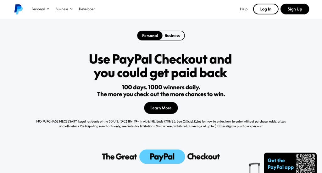
The desktop website for PayPal serves as a premier benchmark for “Ubiquitous Consumer Finance Merchandising and High-Conversion Ecosystem Onboarding Architecture.” As a global leader in digital payments and peer-to-peer money transfers, their digital presence must cater to two very different audiences simultaneously: individual everyday consumers and high-velocity commercial merchants. The homepage layout masterfully handles this by prioritizing immediate personal financial utility, transforming a highly secure payment network into an approachable, motion-driven lifestyle tool.
Key Design Highlights:
- Immersive Scroll-Driven “Scrollytelling” Journey: Moving away from flat, static text boxes, the homepage relies on fluid scrollytelling mechanics to walk users through its ecosystem. As desktop users move down the page, rich visual modules and text callouts transform dynamically in step with the scroll bar, pacing out features in an engaging, narrative-driven sequence that keeps visitors highly engaged without feeling overwhelmed.
- Multichannel “Ways to Pay” Versatility Showrooms: To remind shoppers of its massive omnipresence at checkout, the landing page features a dedicated, highly visual section mapping out the diverse ways users can execute transactions. By cleanly categorizing their core digital checkout paths – such as online single-click purchasing, in-store tap solutions, contactless transactions, and customizable credit tiers – the layout reminds users how seamlessly PayPal fits into their daily routines.
- Comprehensive Everyday Services and Utility Blueprints: The homepage acts as a complete directory for modern financial lifestyle tools, clearly detailing the platform’s everyday capabilities beyond simple retail purchasing. Dedicated, easy-to-read sections break down popular features like sending and receiving money across borders, instantly splitting dinner bills with friends, and setting up communal money pools for group gifts, making its peer-to-peer utility crystal clear.
- Persistent, Friction-Free QR Code App Gateway: Positioned strategically in the lower right corner of the desktop viewport, a persistent QR code module remains anchored in place as a floating element. This clever cross-device conversion bridge allows browsing desktop users to instantly scan the screen with their mobile devices, providing a lightning-fast path to download the native PayPal mobile application without forcing them to manually search an app store.
5. Make Us Care
Why We Chose Make Us Care
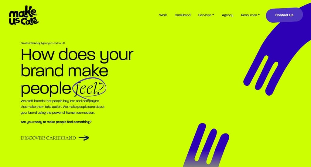
The desktop website for Make Us Care serves as a premier benchmark for “Immersive Creative Agency Merchandising and Kinetic Brand Storytelling Architecture.” As a brand studio centered on building emotional connection and cultural belonging, their digital storefront cannot rely on a cookie-cutter corporate grid. The desktop interface flawlessly embodies their creative mission, blending interactive cursor play with fluid motion mechanics and high-energy portfolio showreels to prove their storytelling power the moment the page loads.
Key Design Highlights:
- Playful, Interactive Hero Hover Physics: Setting an immediate tone of creative curiosity, the hero section features a unique cursor-tracking animation. As visitors move their mouse across the desktop screen, a playful trail of custom heart characters with eyes appears, dynamically tracking and following the user’s cursor path to create an instant, memorable moment of digital joy.
- Seamless Scroll-Driven “Scrollytelling” Progression: The homepage completely moves away from rigid vertical stacks, opting for a fluid scrollytelling engine that transforms the traditional scroll into a narrative journey. Graphic layouts, typography, and background layers animate in perfect sync with the user’s descent, allowing the agency to control the narrative pace and reveal information in a highly engaging, theatrical sequence.
- High-Energy Video Portfolio Showrooms: To deliver instant, unarguable proof of their creative execution, the homepage integrates an array of vivid, high-energy videos showcasing real brand campaigns they have directed. By putting these punchy, moving-image assets front and center on the landing page, the studio lets their cinematic capabilities speak for themselves, immediately engaging visiting marketing directors.
- The “How We Create Belonging” Step-by-Step Blueprint: Demystifying their collaborative process, a dedicated structural section titled “How we create belonging” maps out their client journey step by step. This clear, sequential breakdown outlines exactly how they research, design, and launch brand narratives, transforming a highly creative, abstract service into a predictable, high-trust project roadmap for prospective clients.
6. Decor Systems
Why We Chose Decor Systems
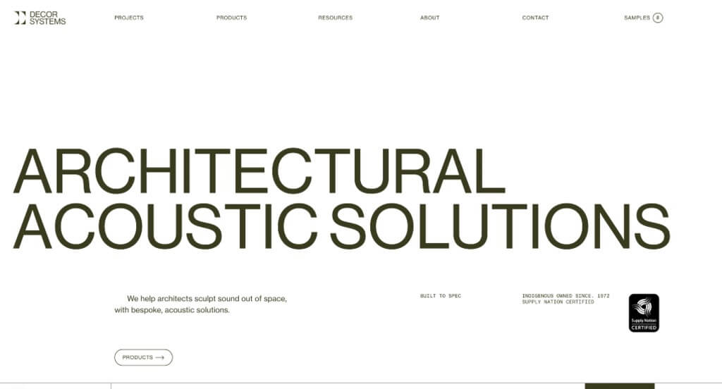
The desktop website for Decor Systems serves as a premier benchmark for “Architectural Acoustic Merchandising and High-Conversion Spatial Specification Architecture.” For an industry-leading provider of architectural acoustic panels and ceiling systems, the digital storefront must serve two distinct purposes: inspire top-tier architects with striking spatial aesthetics and provide a frictionless path for contractors to lock in technical pricing. The desktop interface masterfully bridges these worlds, combining a stark, clean structural layout with highly accessible conversion utilities.
Key Design Highlights:
- Persistent, Action-Oriented Sticky Footer Hub: Staying locked to the bottom edge of the viewport throughout the entire browsing journey, the website incorporates an optimized sticky footer. This conversion tool houses immediate call-to-action buttons for live chat and expedited quote requests, ensuring that whether a designer is gathering inspiration or a contractor is ready to price a project blueprint, the next step is always within arm’s reach.
- Cinematic Hardware Capability and Process Showrooms: Positioned directly on the homepage, a high-fidelity video loop anchors the brand’s technical identity. By effortlessly transitioning from raw factory processing and precision perforations to final, beautifully installed architectural systems, the video gives trade professionals an immediate, comprehensive understanding of their manufacturing scale and design capabilities.
- Maximalist, High-Fidelity Project Case Showrooms: Proving their real-world capabilities is handled elegantly through a curated showcase of completed landmark installations. Utilizing massive, high-resolution photography of acoustic wall and ceiling configurations in premium commercial spaces, the homepage serves as a beautiful gallery that validates the absolute acoustic performance and premium texture of their product lines.
- Minimalist White Canvas Framing Heavy Visual Assets: The overall user interface relies on a clean, solid white backdrop paired with crisp, understated typography. This layout choice acts as a quiet frame – allowing the complex textures, natural timber grains, and striking patterns of their large project images to completely dominate the page and capture the attention of high-end commercial designers.
7. Groove Life
Why We Chose Groove Life
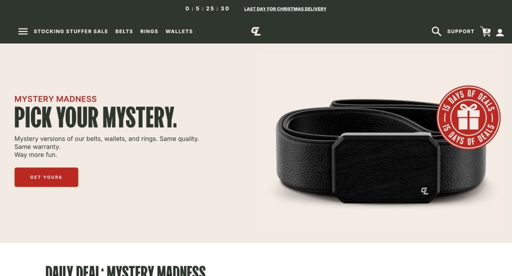
The desktop website for Groove Life serves as a premier benchmark for “Active Lifestyle Gear Merchandising and High-Trust Direct-to-Consumer (DTC) Conversion Architecture.” Selling rugged, everyday gear like breathable silicone rings and ultra-durable belts requires an online storefront that instantly captures the spirit of adventure while breaking down heavy buying hesitation. The desktop layout achieves this flawlessly by framing a vast, highly segmented product catalog inside an active, customer-first ecosystem built on ironclad product confidence.
Key Design Highlights:
- Comprehensive Multi-Category Desktop Mega Menu: Managing an extensive, fast-growing inventory – spanning silicone wedding bands, heavy-duty belts, wallets, and licensed collegiate collections – is handled gracefully with an expansive desktop mega menu. Hovering over primary navigation headers opens a clean, multi-column workspace that lets users browse effortlessly by collection, style, or specific gear category without unnecessary page reloads.
- Activity-Driven Lifestyle Filter Matrix: To help shoppers find the exact gear built for their specific lifestyle, the homepage features an intuitive “Explore by Activity” section. By neatly grouping products into distinct real-world domains – such as everyday wear, rugged field work, high-intensity fitness, and outdoor hunting – the layout helps users immediately self-select gear tailored to the precise environments they face.
- Integrated Front-Page Social Proof Showrooms: Overcoming the natural online shopping hesitation regarding fit, material comfort, and long-term durability is handled smoothly by embedding verified customer reviews directly into the homepage scroll path. Showcasing authentic user feedback and explicit star ratings alongside the actual products gives visiting adventurers immediate peace of mind before heading to checkout.
- High-Visibility “Groove Guarantee” Trust Anchors: A central pillar of the brand’s customer-retention strategy is the prominent, front-and-center explanation of the Groove Guarantee on the homepage. Explicitly laying out their lifetime, “no-questions-asked” replacement policy directly in the main scroll path completely neutralizes purchasing risk, reassuring buyers that their gear is fully backed against loss, damage, or wear for life.
8. OneWheel
Why We Chose Onewheel
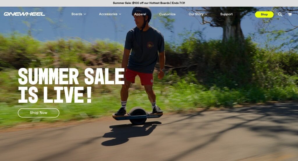
The desktop website for Onewheel serves as a premier benchmark for “Action-Sports Innovation Merchandising and High-Velocity Lifestyle E-Commerce Architecture.” As an industry pioneer in self-balancing electric boards, the digital storefront must instantly capture the thrill of riding while simultaneously educating first-time visitors on the technology, safety, and model variations. The desktop interface flawlessly secures this positioning, pairing high-energy lifestyle media with structured product pathways to turn curious spectators into confident buyers.
Key Design Highlights:
- Immersive High-Energy Hero Video Showrooms: Capturing the raw thrill of riding is handled immediately upon landing through a cinematic, full-bleed hero video loop. By displaying real people riding effortlessly across diverse terrain – from smooth city pavement and beach sand to rugged dirt trails – the website bypasses basic technical descriptions to focus entirely on the emotional freedom, lifestyle, and dynamic motion of the product.
- Streamlined Multi-Tiered Desktop Mega Menu: Organizing a growing product and accessory footprint – spanning different board models, custom fenders, bumpers, chargers, and branded apparel – is executed gracefully via an expansive desktop mega menu. Hovering over the navigation headers displays a clean, visual drop-down layout that routes riders to specific boards, bundles, or component upgrades without forcing a page reload.
- Direct Front-Page Fleet and Accessory Showcases: The homepage functions as a high-visibility digital showroom, laying out their core product lineup in a beautifully structured matrix. By placing flagship board models side-by-side with clear specifications, price points, and target use-cases directly in the primary scroll path, the site allows users to instantly compare models and select the board that fits their riding style.
- Integrated Peer-Validation and Community Review Hubs: Overcoming natural purchasing hesitation regarding safety, learning curves, and premium hardware investment is handled smoothly by embedding authentic customer reviews on the homepage. Showcasing verified rider testimonials, star ratings, and real-world feedback directly within the exploration path provides the ironclad social proof needed to build immediate consumer trust before checkout.
9. Square
Why We Chose Square
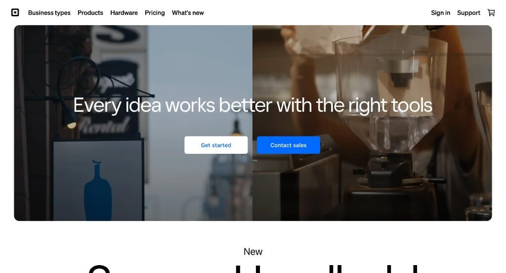
The desktop website for Square serves as a premier benchmark for “Omnichannel Commerce Merchandising and High-Scale Business Ecosystem Architecture.” Catering to everything from independent coffee shops to enterprise-level retail chains requires an interface that can distill complex financial tools into straightforward utility. The desktop layout achieves this by blending playful interactivity with highly structured business blueprints, positioning their hardware and software not just as card readers, but as an all-in-one operating system for modern business growth.
Key Design Highlights:
- Fluid, Motion-Driven “Scrollytelling” Progression: The homepage rejects static text rows in favor of an active scrollytelling engine. As users move down the page, sleek physical payment terminals rotate, software dashboards shift, and feature callouts transform smoothly in step with the desktop scroll bar, pacing out complex technical capabilities in an engaging visual sequence.
- Comprehensive Point of Sale (POS) Capability Matrix: A central pillar of the homepage is a dedicated section breaking down their foundational Point of Sale system. Instead of focusing solely on swiping cards, this module explicitly maps out how the software acts as a centralized business hub – showing merchants exactly how the ecosystem optimizes employee scheduling, tracks inventory patterns, automates customer loyalty programs, and unlocks real-time sales data.
- Transparent, Friction-Free Front-Page Pricing Showrooms: Neutralizing the common fear of hidden credit card processing fees, the homepage incorporates an upfront, transparent pricing display. By cleanly laying out flat-rate processing percentages and software subscription costs right on the main landing page, Square builds immediate merchant trust and speeds up the decision-making path for small business owners.
- Interactive “Make Your Next Move” Cursor Showcase: Injecting a moment of high-energy creative engagement, the “Make Your Next Move” section features a dynamic, hover-responsive media layout. As visitors slide their mouse across this desktop workspace, vibrant, contextual imagery of diverse real-world businesses dynamically changes and tracks the cursor, creating an interactive proof point of the varied industries the platform empowers.
10. Secret Lab
Why We Chose Secretlab
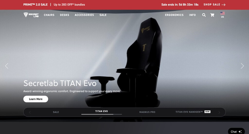
The desktop website for Secretlab serves as a premier benchmark for “Premium Ergonomic Merchandising and Immersive Direct-to-Consumer (DTC) Product Architecture.” As a global leader in high-performance gaming and office chairs, Secretlab faces the challenge of justifying a premium price tag for a product that users cannot physically sit in before buying. The desktop interface masterfully solves this by leaning heavily into rich, fluid motion mechanics, real-world scenario mapping, and instant client support to build unshakeable confidence in their materials and engineering.
Key Design Highlights:
- Interactive, Multi-Track Hero Video Showrooms: Immediately upon landing, the hero section provides a highly interactive workspace where users can click through different product categories – such as core gaming chairs, heavy-duty xl lines, and ergonomic desks. Clicking each tab instantly changes the main background visual to a high-fidelity video showcasing that specific product, providing an immediate, motion-rich preview of their design variations.
- Continuous Multi-Scenario Video Engineering: Moving beyond static product shots, the homepage is highly dynamic, embedding multiple high-definition videos throughout the entire scroll path. By visually demonstrating real people using the chairs across diverse, real-world environments – from high-intensity esports arenas and creative studios to sleek corporate offices – the layout expertly proves the versatility, comfort, and premium styling of their product ecosystem.
- Integrated Front-Page Social Proof Hubs: Overcoming natural shopping hesitation regarding long-term ergonomics, fabric breathability, and build quality is handled smoothly through a curated client review matrix on the homepage. Displaying verified user feedback, explicit star ratings, and detailed testimonials directly within the primary exploration path gives visiting buyers the ironclad peer validation needed before checkout.
- Real-Time Interactive Live Chat Portal: To immediately capture high-intent traffic and address complex pre-sale questions – such as sizing recommendations, shipping logistics, or warranty details – the homepage integrates an accessible Live Chat gateway. This instant support channel operates as a direct digital concierge, lowering buying friction and assisting consumers right at the point of consideration.
WordPress Corporate Themes
You can find free themes at wordpress.org, or consider corporate-inspired templates on ThemeForest.
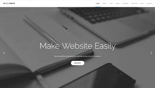
Infinite – Themeforest
$67
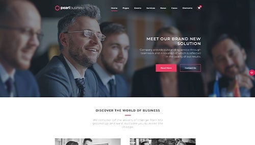
Pearl – Themeforest
$59
BLO – Themeforest
$59

Creote – Themeforest
$39