In the B2B sector, your website is your most tireless high-level sales executive. Because the business-to-business sales cycle is rooted in research and multi-stakeholder approval, your online presence must do more than just list services – it must communicate strategic value, operational scalability, and deep industry expertise. In 2026, a winning B2B design must master the art of converting technical complexity into a clear competitive advantage.
Our design and strategy team evaluated hundreds of B2B websites – from SaaS and fintech platforms to industrial logistics, HR solutions, and professional marketing agencies. We identified the top 12 examples that excel in conversion-focused UX, specifically analyzing their lead-capture architecture, gated content strategies, and the seamless integration of social proof through case studies and client testimonials.
Whether you are a startup looking to disrupt a legacy industry or an established enterprise firm, these examples represent the current benchmark for B2B digital excellence.
Note on Our Selection Process: We recently audited this guide to remove outdated designs and sites that no longer meet our performance standards. This curated list now focuses on the top 12 B2B websites providing the most strategic value in 2026.
Top B2B Website Designs
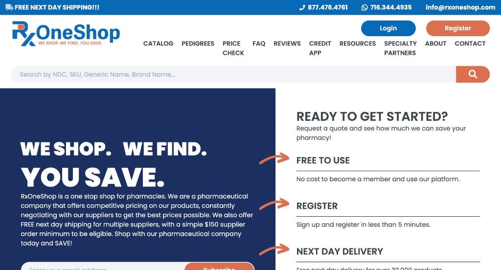
1. RxOneShop
Why We Chose RxOneShop
The website for RxOneShop serves as a premier benchmark for “High-Trust B2B Pharmaceutical Merchandising and Frictionless Order Acquisition Architecture.” As a wholesale pharmaceutical distributor serving pharmacies, hospitals, and long-term care facilities, the digital storefront must immediately project absolute regulatory compliance, supply chain reliability, and transactional efficiency. This platform masterfully succeeds by organizing its homepage into a clear, institutional roadmap that streamlines the high-volume procurement process for busy healthcare purchasing managers.
Key Design Highlights:
- Immediate Above-the-Fold Onboarding Pipeline: The platform eliminates operational ambiguity by embedding a clear, step-by-step “Get Started” guide directly inside the primary hero real estate. Placing this onboarding framework within the first visual frame ensures that new pharmacy owners and procurement officers can instantly understand how to open an account and initiate compliance vetting the exact second the page loads.
- Transparent “How It Works” Procedural Blueprint: Positioned prominently within the central homepage scroll path is a dedicated, highly visual breakdown mapping out the exact purchasing workflow. By explicitly illustrating the operational journey – from uploading a product registry or shopping the catalog to receiving real-time price comparisons and bulk logistics delivery – the layout removes systemic friction and builds professional confidence.
- Persuasive “Why Choose Our Pharmaceutical Company?” Value Matrix: Embedded directly in the primary layout flow is a structured segment detailing the core pillars of their distribution network. Systematically calling out their foundational institutional advantages – such as access to a massive network of FDA-approved suppliers, next-day shipping capabilities, and personalized account management – allows healthcare buyers to rapidly validate the company’s supply chain safety.
- High-Visibility Global Announcement Bar: Capitalizing on top-tier screen real estate, the interface utilizes a permanent announcement bar running across the absolute top of the site layout. This dedicated banner serves as a vital communication channel, keeping pharmacy buyers instantly informed of fluctuating market updates, immediate shipping cut-off windows, or urgent supply chain notices without obstructing primary navigation.
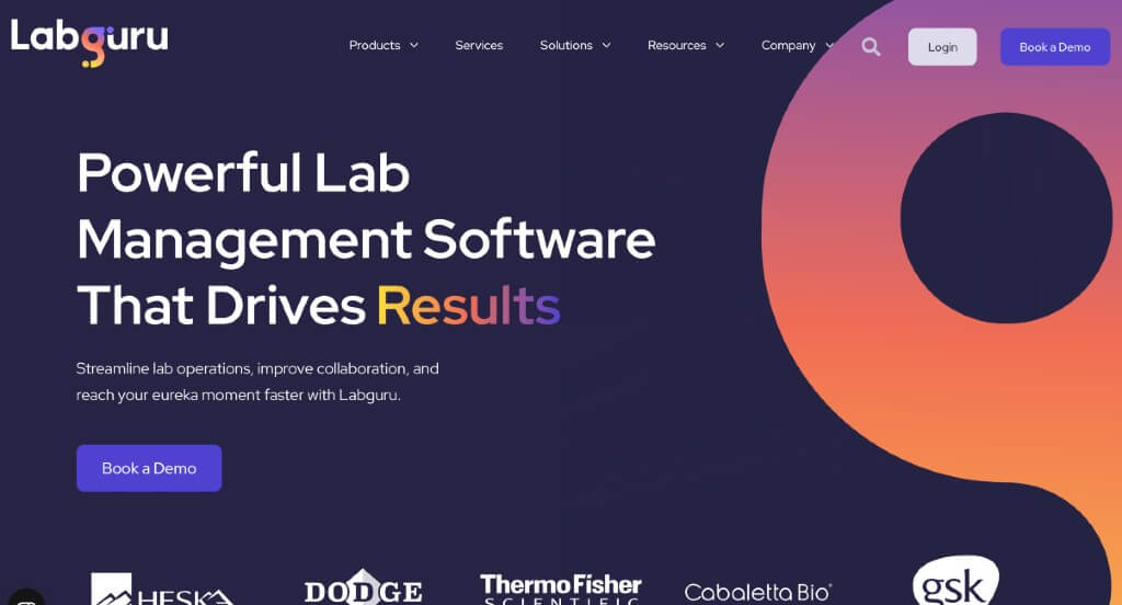
2. Labguru
Why We Chose Labguru
The website for Labguru serves as a premier benchmark for “High-Trust Enterprise SaaS Merchandising and Life Sciences Onboarding Architecture.” As an all-in-one research data management platform integrating an Electronic Lab Notebook (ELN), Laboratory Information Management System (LIMS), and informatics tools, the digital storefront must immediately project rigorous scientific compliance, data safety, and operational efficiency. This platform masterfully succeeds by organizing its homepage into a highly technical yet accessible roadmap that clearly maps out how biotech, pharma, and academic institutions can optimize their research workflows.
Key Design Highlights:
- High-Efficiency Technical Global Mega Menu: Navigating a sprawling ecosystem of data management tools, compliance standards, and industry-specific solutions is made entirely effortless through a beautifully engineered mega menu. By organizing deep-site branches – such as specialized products, feature breakdowns, compliance resources, and target industries – into structured, scannable dropdown matrices, the desktop framework eliminates navigation friction and connects researchers to their desired solutions in a single click.
- Immersive Product Explainer Video Integration: Positioned strategically right below the primary hero area, the platform secures instant operational clarity with an authentic product video. By dynamically walking viewers through the software’s interface and showing exactly how Labguru works in real time, the media completely demystifies the platform, demonstrating its tangible value to lab managers and principal investigators the moment they scroll down.
- Comprehensive Products and Services Blueprint: The homepage entirely avoids vague software generalizations, choosing instead to clearly organize its advanced digital offerings into highly structured, scannable content blocks. By explicitly mapping out core pillars – such as their Electronic Lab Notebook (ELN), LIMS capabilities, inventory tracking, and data automation tools – the layout allows research teams to rapidly match their unique laboratory challenges with the platform’s exact technical capabilities.
- Value-Driven Workflow Optimization Directory: Woven smoothly into the central scroll path is the dedicated section titled “Streamline Research with Labguru.” This area directly addresses the core pain points of modern laboratory environments, explaining how the software connects siloed data, automates repetitive manual documentation, and ensures strict regulatory compliance. By framing the platform as a cohesive solution to research bottlenecks, the interface transforms abstract features into a compelling business case for scientific acceleration.
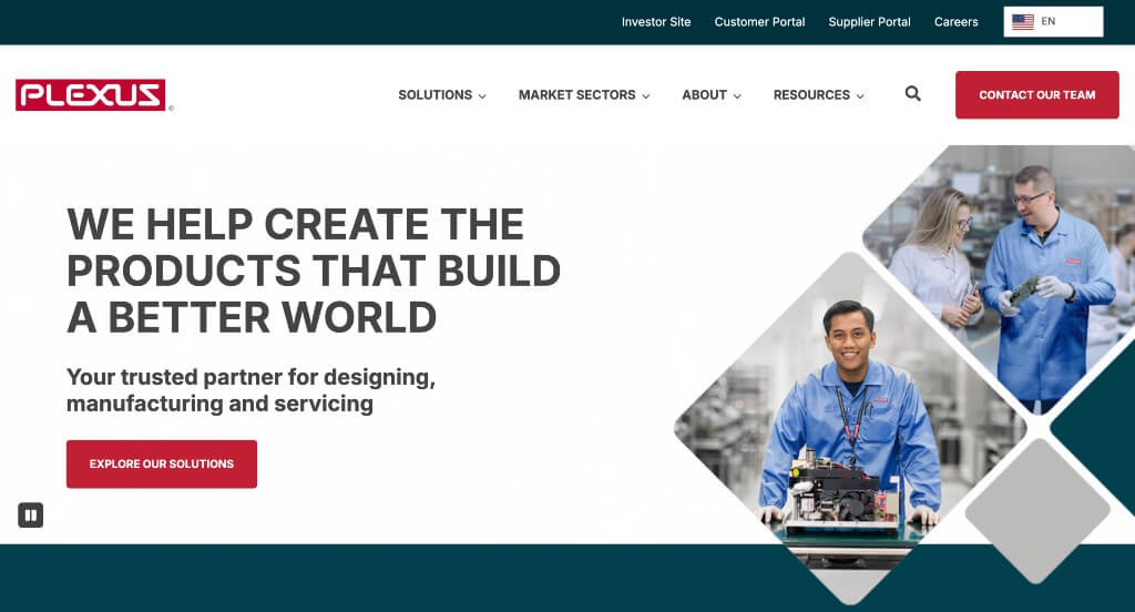
3. Plexus
Why We Chose Plexus
The website for Plexus Corp. serves as a premier benchmark for “High-Trust B2B Engineering Merchandising and Global Supply Chain Architecture.” As an international leader in complex electronics design, manufacturing, and aftermarket services, their digital storefront must immediately project absolute regulatory compliance, advanced technical capability, and corporate stability. The platform masterfully succeeds by treating its homepage as a clear, high-level corporate roadmap that seamlessly introduces its product realization lifecycle, balances deep content categories, and aligns its engineering expertise with highly regulated global markets.
Key Design Highlights:
- High-Efficiency Technical Global Mega Menu: Navigating a sprawling ecosystem of manufacturing solutions, case studies, and engineering services is made entirely effortless through a beautifully engineered mega menu. By organizing deep-site branches – such as specific product realization services, market sectors, sustainability initiatives, and careers – into structured, scannable dropdown matrices, the desktop framework eliminates navigation friction and connects enterprise buyers to their desired solutions in a single click.
- Comprehensive Front-Page Operational Blueprint: The website completely eliminates B2B ambiguity by delivering a clear, high-level overview of exactly what they do right in the primary homepage scroll path. By explicitly framing their capabilities around the entire “ideation-to-commercialization” lifecycle – including advanced engineering, sustainable manufacturing, supply chain optimization, and aftermarket services – the interface allows enterprise procurement officers to instantly grasp the full scale of their product realization services.
- Highly Segmented Industrial Specialization Framework: A major strategic triumph of the homepage layout is how it structures its core market sectors into a clean, easily navigable matrix. Rather than offering vague manufacturing generalizations, the interface explicitly outlines the specific, highly regulated industries they specialize in – such as Healthcare and Life Sciences, Aerospace and Defense, and Industrial solutions. This targeted presentation allows specialized corporate partners to immediately validate that Plexus possesses the precise compliance certifications and technical expertise required for their unique sector.
- Front-Page Thought Leadership and Innovation Triage: Positioned smoothly within the lower homepage layout workflow is an active repository of global updates and insights straight from their corporate blog. Spotlighting deep-dive articles on supply chain resilience, engineering breakthroughs, and sustainable manufacturing practices elevates the platform from a static industrial directory into an authoritative, forward-thinking voice in global technology solutions.
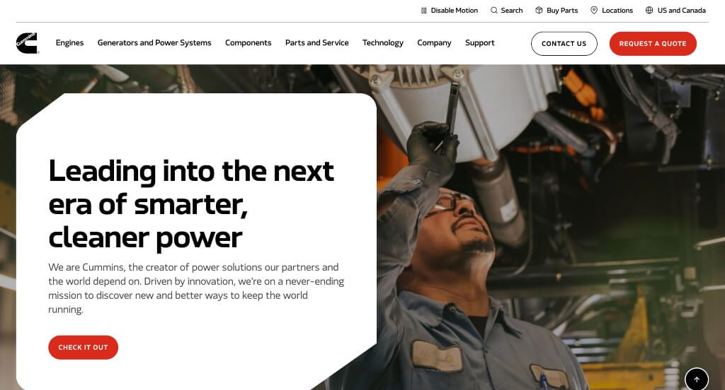
4. Cummins
Why We Chose Cummins
The website for Cummins (cummins.com) serves as a premier benchmark for “High-Scale Industrial Manufacturing Merchandising and Global Engineering Architecture.” As a global power leader that designs, manufactures, distributes, and services a vast portfolio of power solutions – ranging from diesel and natural gas engines to hybrid, electric, and hydrogen powertrains – their digital storefront must project immense technical authority, operational dependability, and commercial readiness. This platform masterfully succeeds by organizing its homepage into a high-intent, structured navigation ecosystem that balances deep engineering resources with immediate B2B commercial gateways.
Key Design Highlights:
- High-Efficiency Industrial Global Mega Menu: Navigating an incredibly vast ecosystem of engines, power generation systems, components, and digital solutions is made entirely effortless through a beautifully engineered mega menu. By organizing deep-site branches – such as specific product categories, diverse industries served, parts and service networks, and corporate sustainability goals – into highly structured, scannable dropdown matrices, the desktop framework eliminates navigation friction and connects enterprise buyers to complex specifications in a single click.
- Frictionless “Request a Quote” Header Integration: Maximizing commercial acquisition from the absolute moment an enterprise procurement officer or fleet manager arrives, the global header features a prominent, high-contrast “Request a Quote” call-to-action button. Positioned in this premium, permanently visible screen real estate, it ensures that high-intent commercial buyers can immediately initiate a transactional inquiry or connect with sales teams at any phase of their site interaction.
- Comprehensive Front-Page Technical Excellence Blueprint: The website completely eliminates B2B ambiguity by explicitly outlining exactly what Cummins excels at right within the primary homepage scroll path. By directly showcasing their foundational pillars of innovation – including fuel efficiency, decarbonization technologies, robust power reliability, and advanced lifecycle support – the interface allows global logistics, construction, and agricultural partners to instantly validate the company’s engineering dominance.
- Front-Page Thought Leadership and Innovation Triage: Positioned smoothly within the lower homepage layout workflow is an active repository of technological updates and industrial insights straight from their corporate news and blog. Spotlighting deep-dive articles on the future of alternative fuels, hydrogen fuel cell development, and global supply chain optimization elevates the platform from a static product catalog into an authoritative, forward-thinking curator of global energy transformation.
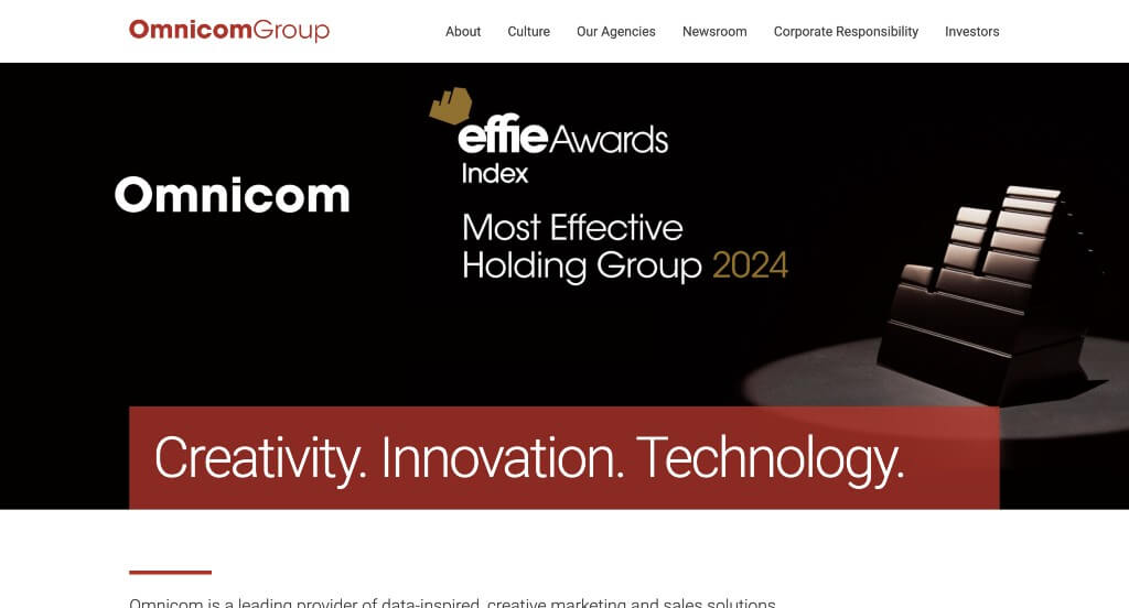
5. Omnicom Group
Why We Chose Omnicom Group
The website for Omni serves as a premier benchmark for “High-Velocity Enterprise SaaS Merchandising and Fluid Brand Identity Architecture.” As an advanced data and operational orchestration platform, its digital storefront must translate abstract software capabilities – like data integration, automation, and predictive analytics – into a highly cohesive, tangible corporate value proposition. This platform masterfully succeeds by coupling an interactive capabilities showcase with a persistent, geometrically unified design system that ensures a flawless experience across all devices.
Key Design Highlights:
- Interactive “Core Capabilities” Carousel Matrix: Rather than forcing enterprise buyers to read through static text blocks, the homepage features a beautifully engineered interactive slider that showcases exactly what Omni can do. By allowing visitors to seamlessly cycle through core technical pillars – such as central orchestration, predictive intelligence, and unified data pipelines – the interface makes complex backend software mechanics instantly understandable and visually engaging.
- Cohesive Geometric Design and Circle Branding Motifs: A standout triumph of the platform’s visual identity is the deliberate, consistent use of circular shapes and rounded design elements throughout the layout. This geometric continuity acts as a powerful subtle anchor for brand recognition, weaving the circular theme through iconography, button frameworks, and graphic backgrounds to project a modern, harmonized, and forward-thinking corporate aesthetic.
- Front-Page Thought Leadership and Insights Triage: Positioned smoothly within the lower homepage scroll path is a dedicated feature section highlighting their curated corporate blog and industry analysis. Spotlighting deep-dive articles on machine learning trends, operational efficiency, and data strategy elevates the platform from a standard product catalog into an authoritative, forward-thinking curator of enterprise technology solutions.
- Ultra-Clean Mobile Viewport and Gestural Continuity: Translating an enterprise-grade software ecosystem onto smaller screens is flawlessly managed via an expertly optimized mobile framework. The smartphone interface handles complex layout structures by condensing horizontal arrays into a perfectly balanced, single-column scroll path. Retaining generous whitespace, crisp typography, and touch-optimized interactive elements ensures that busy executives can comfortably review capabilities and engage with content on the go.
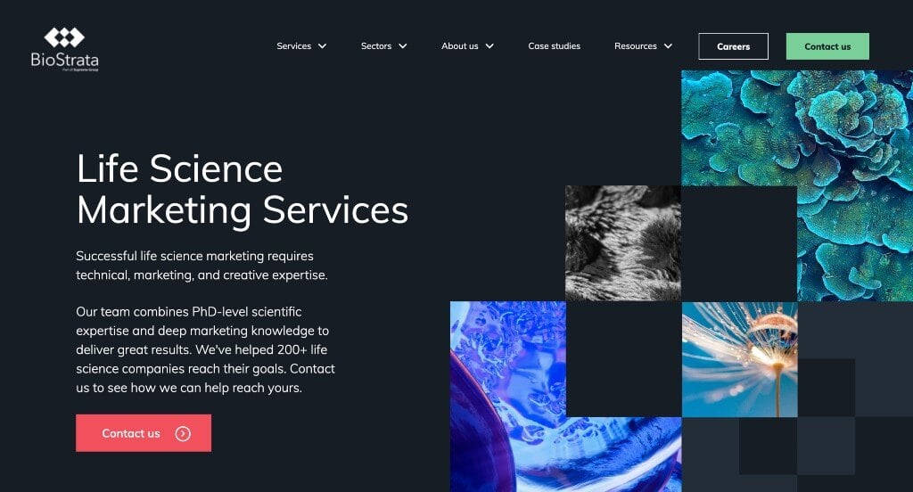
6. BioStrata
Why We Chose BioStrata
The website for BioStrata serves as a premier benchmark for “High-Trust B2B Life Science Merchandising and Technical Agency Architecture.” As a specialized marketing agency dedicated to connecting life science companies with scientists, dentists, and healthcare professionals, their digital storefront must project deep scientific comprehension alongside creative marketing expertise. This platform masterfully succeeds by organizing its homepage into a clear, value-driven blueprint that balances authoritative client validation with highly segmented industry pathways.
Key Design Highlights:
- High-Efficiency Global Mega Menu: Navigating a sprawling matrix of marketing services, industry insights, and scientific sectors is made entirely effortless through a beautifully engineered mega menu. By organizing deep-site branches – such as specific inbound marketing services, public relations, web development, and educational resources – into a highly structured dropdown directory, the desktop framework connects busy marketing directors to exact solutions in a single click.
- Segmented Front-Page Scientific Sectors Matrix: The website avoids generic B2B marketing phrases by explicitly showcasing the specific scientific industries they serve right on the homepage. By organizing their expertise into clear categories – such as biotechnology, diagnostics, lab automation, and medical devices – the interface allows potential clients to instantly validate that the agency speaks the complex language of their technical sector.
- Persuasive “Reasons to Choose Us” Value Section: Woven dynamically into the central scroll path is the section titled “We’re the natural selection to help drive your marketing evolution.” Playing cleverly on biological themes, this area explicitly outlines their core competitive advantages, explaining how their unique combination of hands-on scientific backgrounds and proven commercial marketing strategies helps drive measurable lead generation and business growth.
- Front-Page Social Proof and Client Review Carousels: Overcoming institutional skepticism is gracefully achieved by embedding direct client testimonials and reviews directly within the homepage flow. Displaying high-praise endorsements from real life science executives and marketing managers establishes immediate operational credibility, assuring prospective partners that the agency consistently delivers high-impact results for complex technical campaigns.
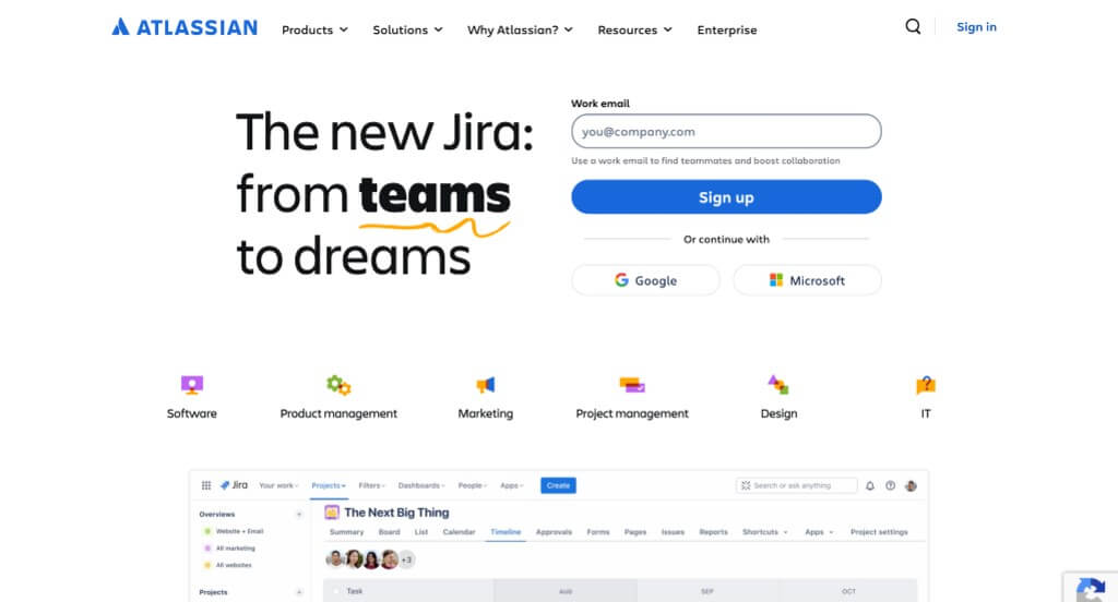
7. Atlassian
Why We Chose Atlassian
The website for Atlassian serves as a premier benchmark for “High-Velocity Enterprise B2B Product Merchandising and Scalable Navigation Architecture.” As a global leader in team collaboration and productivity software – powering platforms like Jira, Confluence, and Trello – their digital storefront must manage an immense, highly technical product portfolio while maintaining clarity for diverse user personas, from small startups to Fortune 500 engineering teams. This platform masterfully succeeds by organizing its homepage into a dynamic, friction-free discovery pipeline that balances interactive product showcases with robust social proof.
Key Design Highlights:
- High-Efficiency Global Mega Menu: Navigating Atlassian’s vast ecosystem of software tools, agile frameworks, and team management solutions is made completely effortless through a beautifully engineered mega menu. By neatly structuring deep-site categories – such as individual products, specialized team solutions, enterprise pricing tiers, and educational resources – into highly organized, scannable matrices, the desktop navigation connects users to precise software landing pages in a single click.
- Dynamic Vertical Product-Service Scroller: Rather than overwhelming visitors with standard, static grid layouts, the homepage features an innovative vertical scrolling animation matrix to showcase its core software suites. As the user moves down the page, the layout smoothly transitions through contextual product groupings – such as software development, IT service management, and work management – keeping complex product feature sets highly engaging and visually cohesive.
- High-Visibility Global Announcement Bar: Capitalizing on the absolute peak of visual real estate, the interface utilizes a prominent announcement bar positioned directly above the primary global header. This dedicated banner acts as an essential corporate communication channel, instantly alerting enterprise teams to major product updates, upcoming global events (like Atlassian Team), or critical industry trend reports without cluttering the main navigation.
- Front-Page Social Proof and Customer Review Matrix: Overcoming enterprise procurement skepticism is gracefully achieved by embedding a dedicated customer review and success story segment directly within the primary homepage flow. Displaying high-praise endorsements, metrics-driven outcomes, and recognizable brand logos from global organizations establishes immediate technical credibility, assuring prospective buyers that the software scales reliably across complex workflows.
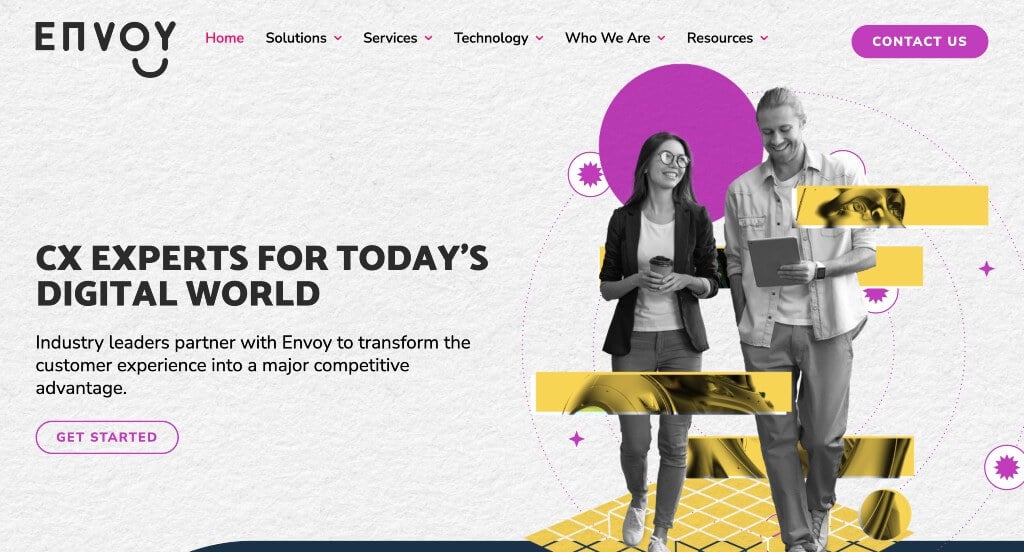
8. Envoy
Why We Chose Envoy
The website for Envoy (goenvoy.co) serves as a premier benchmark for “High-Trust Customer Experience (CX) Merchandising and Immersive Digital Agency Architecture.” As a specialized consulting and technology integration partner, their digital storefront must translate complex enterprise workflows – like customer service automation, CRM optimization, and omni-channel support – into a highly accessible, results-oriented value proposition. This platform masterfully succeeds by treating its homepage as a dynamic, interactive journey that balances structural technical expertise with clear social proof.
Key Design Highlights:
- Fluid Scroll-Driven Motion Graphics and Animation: The platform completely avoids layout staticity by utilizing sophisticated, scroll-triggered animations throughout the homepage. As users move down the page, structural design elements, text blocks, and technical graphics seamlessly build and transition, maintaining high visual engagement and mimicking the forward-thinking, agile nature of modern tech solutions.
- Comprehensive Front-Page Operational Blueprint: The website eliminates standard B2B ambiguity by explicitly mapping out their core service tiers directly on the homepage. By organizing their capabilities into clear, digestible categories, the interface allows operations managers and enterprise buyers to instantly evaluate how the agency can optimize, scale, and manage their customer support infrastructure.
- Highly Target “CX Technologies We Know” Platform Matrix: A major technical and trust-building triumph of the homepage layout is the dedicated section titled “CX technologies we know, inside & out.” Rather than relying on vague software claims, this area explicitly showcases the specific industry-leading platforms they specialize in. This immediate clarity reassures prospective clients that Envoy possesses the precise engineering expertise required to deploy and support their exact corporate tech stack.
- Authentic Front-Page Social Proof and Case Study Triage: Overcoming client hesitation is gracefully achieved by embedding direct, high-impact client verification directly within the homepage flow. Highlighting deep-dive results and endorsements from recognizable brands – such as TriSports – establishes immediate operational credibility, giving prospective partners tangible mathematical proof that the agency successfully accelerates customer satisfaction and operational efficiency.
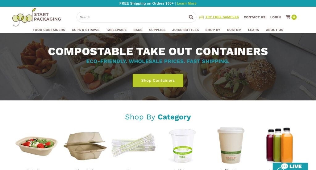
9. Good Start Packaging
Why We Chose Good Start Packaging
The website for Good Start Packaging serves as a premier benchmark for “High-Velocity Sustainable E-Commerce and Frictionless B2B Merchandising.” As a leading distributor of compostable packaging and multi-category restaurant supplies, their digital storefront must translate bulk commercial purchasing into an incredibly fast, highly intuitive retail experience. This platform masterfully succeeds by treating its homepage as a dynamic, front-loaded product catalog that eliminates navigational barriers for busy restaurant owners, chefs, and purchasing managers.
Key Design Highlights:
- High-Efficiency E-Commerce Mega Menu: Navigating a massive inventory of compostable takeout containers, cups, bags, and cutlery is made completely effortless through a beautifully engineered mega menu. By neatly structuring deep-site product segments, industry solutions, and sustainability guides into highly organized, scannable matrices, the desktop navigation connects business buyers to specific inventory lines in a single click.
- Front-Page Inventory and Merchandising Triage: Capitalizing beautifully on varying buyer intents, the homepage layout prominently features direct, curated entry points for Product Categories, New Products, and Best Sellers right in the main scroll path. This immediate exposure allows returning clients looking for top items or new arrivals to completely bypass traditional deep-site searches and dive straight into high-conversion shopping pipelines.
- Streamlined “Shop by Brand” Portal: Understanding that commercial buyers often have strict manufacturing preferences, the interface integrates a dedicated section on the homepage allowing users to shop directly by brand. Mapping out these trusted manufacturing partnerships right from the front page simplifies the vendor procurement process, dramatically lowering choice friction for brand-loyal B2B clients.
- Authentic Social Proof and Integrated Instagram Feed: Overcoming institutional skepticism and building lifestyle alignment is gracefully achieved by embedding a live Instagram content feed directly into the lower homepage workflow. Showcasing real-world imagery of clients using their eco-friendly products in active food establishments provides immediate visual social proof, reinforcing the brand’s sustainable community footprint while dynamically updating the page with fresh user-generated content.
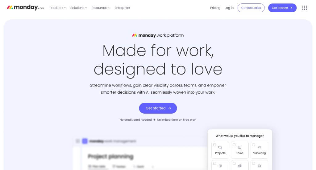
10. Monday
Why We Chose monday.com
The website for monday.com serves as a premier benchmark for “High-Conversion Enterprise SaaS Merchandising and Immersive Workflow Simulation Architecture.” As a leading Work Operating System (Work OS) where teams create workflow apps to run their processes, projects, and everyday work, the digital storefront must seamlessly bridge the gap between abstract software functionality and tangible day-to-day utility. This platform masterfully succeeds by organizing its homepage into a highly interactive, visually dynamic discovery funnel that gives users a realistic preview of the product’s interface before they ever sign up.
Key Design Highlights:
- High-Efficiency Multi-Product Global Mega Menu: Navigating a sprawling ecosystem of specialized product tracks – such as monday work management, monday CRM, and monday dev – is made completely effortless through a beautifully engineered mega menu. By cleanly structuring distinct operational suites, industry use cases, enterprise security features, and extensive learning resources into highly organized, scannable matrices, the desktop framework connects diverse corporate personas to precise landing pages in a single click.
- Highly Segmented Front-Page Solutions Matrix: The homepage entirely avoids vague product messaging by explicitly showcasing their diverse range of specialized business solutions right in the primary scroll path. By mapping out specific core operational verticals – including project management, marketing campaigns, sales pipelines, HR workflows, and software development – the interface allows teams from completely different corporate departments to instantly recognize how the platform scales to fit their unique requirements.
- Dynamic, Animated Interface Simulation Overlays: A major interactive triumph of the homepage layout is the integration of animated, high-fidelity screenshare loops and micro-videos. Rather than relying on static mockups, these fluid animations demonstrate the real-time user experience – showing how boards update, how automation recipes trigger, and how cross-team dashboards look in motion – giving prospective buyers an immediate, accurate sense of what utilizing the platform actually feels like.
- Front-Page Social Proof and Data-Backed Case Studies: Overcoming enterprise procurement hesitation is gracefully achieved by embedding direct, metrics-driven client success stories and case studies right into the homepage flow. Spotlighting recognized global brands alongside concrete mathematical proof – such as percentage increases in team efficiency or hours saved weekly – validates their institutional reliability and assures new organizations that the platform reliably solves complex workflow bottlenecks at scale.
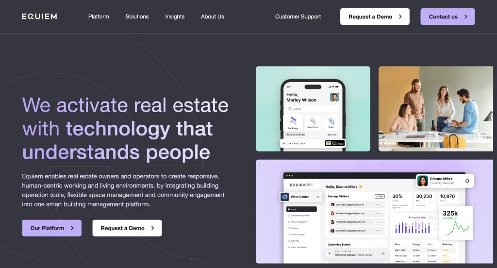
11. Equiem
Why We Chose Equiem
The website for Equiem serves as a premier benchmark for “High-Trust PropTech Merchandising and B2B Workplace Experience Architecture.” As a pioneer in tenant engagement and property management software for commercial real estate, their digital storefront must translate abstract workplace solutions into clear, metrics-driven advantages for landlords, property managers, and enterprise tenants. This platform masterfully succeeds by treating its homepage as a high-fidelity visual showroom that balances immediate software validation with robust social proof.
Key Design Highlights:
- Highly Segmented Front-Page Solutions Matrix: The website entirely avoids vague software generalizations by explicitly outlining its core software and data offerings right in the primary homepage scroll path. By structuring its capabilities into distinct pillars – such as tenant engagement apps, building operations workflows, and real estate data analytics – the interface allows commercial property teams to rapidly identify the exact technology needed to solve their specific asset management challenges.
- High-Fidelity Interface and App Simulation Overlays: A major visual and educational triumph of the layout is the strategic inclusion of crisp, detailed screenshots and mockups of the platform’s mobile and desktop app interfaces. Rather than relying solely on descriptive text, these visual previews show exactly what property owners and workplace tenants can expect, effectively demonstrating the product’s clean user interface and intuitive feature layouts long before a demo is booked.
- Persistent Enterprise Validation Trust Scroller: Overcoming institutional B2B procurement skepticism is smoothly achieved through a high-frequency logo carousel running dynamically on the homepage. By continuously cycling through the branding of major, globally recognized real estate organizations, asset managers, and commercial landlords that trust the software, the interface establishes immense enterprise credibility the moment a visitor evaluates the platform.
- Front-Page Social Proof and Client Testimonial Showrooms: Deepening its authoritative brand positioning, the platform integrates direct client testimonials and success stories directly into the lower homepage workflow. Showcasing high-praise endorsements from real-world property operators provides definitive social proof, validating that their tenant experience tools deliver tangible value, lower vacancy rates, and optimized building operations.
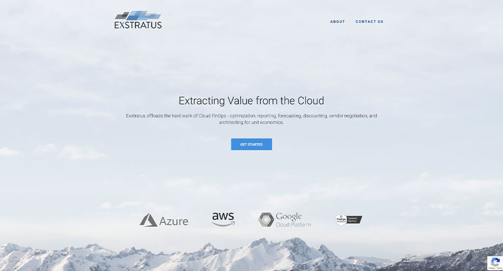
12. Exstratus
Why We Chose Exstratus
The website for Exstratus serves as a premier benchmark for “High-Trust Enterprise Cloud Governance Merchandising and Precision B2B Positioning.” As a specialized Cloud FinOps and infrastructure optimization consultancy, their digital storefront must translate highly complex, abstract cloud architectures into immediate, quantifiable business value – specifically cost reduction and engineering efficiency. This platform masterfully succeeds by treating its homepage as a clear, institutional roadmap that combines structural service visibility with authoritative social proof.
Key Design Highlights:
- Persistent Frictionless Sticky Navigation: To maintain an effortless user journey as visitors process highly technical cloud optimization data, the interface features a beautifully engineered sticky header menu. As corporate stakeholders scroll deep into the homepage content, the main navigation bar pins cleanly to the top of the viewport, keeping essential contact portals, service menus, and strategic conversion gateways continuously accessible within the immediate viewing frame.
- Comprehensive “Cloud FinOps Solution” Framework: The homepage completely avoids vague IT jargon, choosing instead to explicitly detail its core operational methodology under the section titled “The Exstratus Cloud FinOps Solution.” By cleanly mapping out how they analyze, optimize, and govern cloud infrastructure, the interface allows chief technology officers and financial directors to instantly grasp exactly how the firm bridges the gap between cloud engineering and corporate financial accountability.
- Multi-Platform Cloud Ecosystem Triage: Demonstrating deep technical capability and platform versatility, the homepage clearly lists the various major cloud environments the company has streamlined. Showcasing their concrete experience across diverse cloud service providers reassures enterprise clients that Exstratus possesses the exact multi-platform engineering expertise required to audit and refine their specific, complex cloud infrastructure.
- Front-Page Executive Validation and Testimonials: Overcoming institutional skepticism in the high-stakes enterprise tech sector is gracefully achieved by embedding direct client testimonials directly into the homepage layout. Displaying high-praise endorsements from real-world technology leaders and enterprise executives establishes immediate operational credibility, giving prospective partners confidence that the company’s consulting frameworks yield tangible, bottom-line financial savings.
WordPress B2B Themes
You can find free themes and templates at wordpress.org or at ThemeForest.
Wega – Themeforest
$75
Industrial – Themeforest
$69
WooCommerce B2B Themes
You’ll find a variety of ecommerce B2B themes for WooCommerce on ThemeForest.
Angro – Themeforest
$75
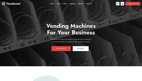
Vendomat – Themeforest
$75
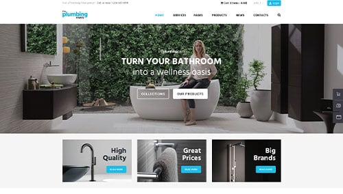
Plumbing – Themeforest
$69
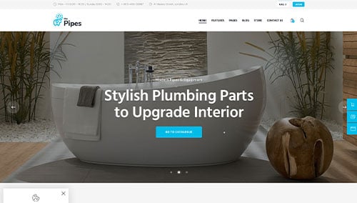
The Pipes – Themeforest
$69
Shopify B2B Themes
Explore free and paid themes at themes.shopify.com or consider options available on marketplaces like ThemeForest.
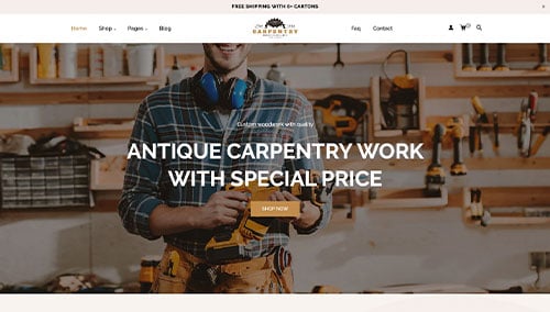
Carpentry – Themeforest
$59
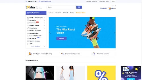
Torba – Themeforest
$39