Greetings, nonprofit champions! Are you looking for web design inspiration for your organization? Check out our guide of top 50 non-profit websites.
Our experts have identified what we consider the best nonprofit websites by assessing design, functionality, uniqueness, and user experience. These sites showcase charming, impactful designs along with easy navigation, to represent themselves in online excellence.
While you’ll find inspiration for your own site, you might also learn new tips about how to make your company stand out from your competitors.
Boost your template with this guide featuring examples from charitable, educational, healthcare, religious, environmental, and advocacy organizations! If you are searching for inspiration in another industry, visit our website design examples article!
Top Non-Profit Organization Website Designs
- 1. Eden Reforestation Project
- 2. Acumen
- 3. WCS
- 4. Clean The World
- 5. Time To Choose
- 6. Surfrider Foundation
- 7. Water.org
- 8. Greenpeace
- 9. Earth Justice
- 10. Plant Chicago
- 11. Oceana
- 12. Change The Course
- 13. The California Wellness Foundation
- 14. Upstream
- 15. Invisible Children
- 16. Charity: Water
- 17. Heifer International
- 18. Warrior Rising
- 19. Free Street
- 20. Thorn
- 21. Lions Club International
- 22. International Rhino Foundation
- 23. Mobilize Recovery
- 24. Mend
- 25. buildOn
- 26. Alzheimer’s Association
- 27. Best Friends Animal Society
- 28. Conservation International Foundation
- 29. Nashville Zoo
- 30. National Audubon Society
- 31. World Wildlife Fund
- 32. Coworker.org
- 33. Kiva
- 34. Wikimedia Foundation
- 35. Convoy Of Hope
- 36. Open Society Foundations
- 37. Scouting America
- 38. Do Something
- 39. Room To Read
- 40. Teach For America
- 41. The Trevor Project
- 42. Girls Who Code
- 43. Doctors Without Borders
- 44. David Suzuki Foundation
- 45. The Humane League
- 46. The Conservation Fund
- 47. American Heart Association
- 48. The Nature Conservancy
- 49. Memphis Zoo
- 50. Children’s Organ Transplant Association
1. Eden Reforestation Project
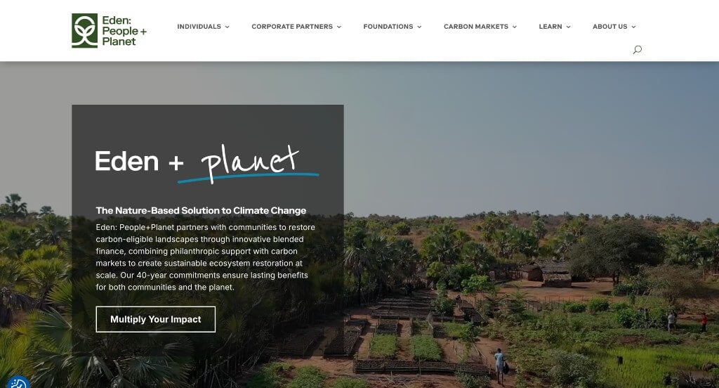
Having a simplistic design and color scheme really gives a welcoming touch to Eden Reforestation Project’s webpage. Additionally, many high-quality images showcase different people working to restore their planet. It was important that all of their information was written in short paragraphs in a very straightforward manner. Another aspect of this design we enjoyed was how they included their partner businesses.
2. Acumen
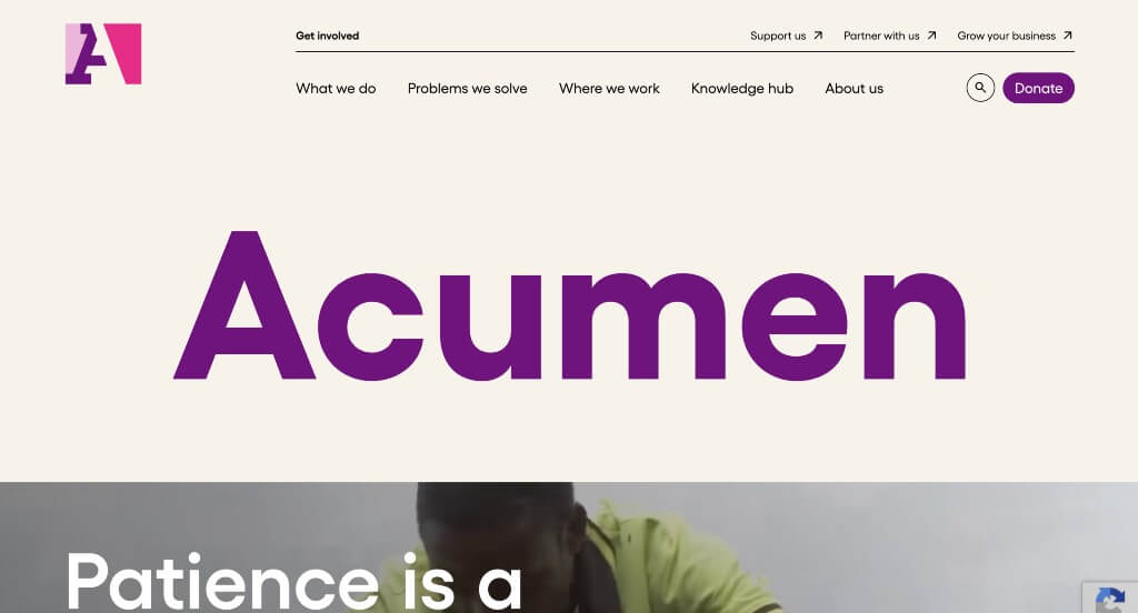
Although this layout does not have much text in their homepage, their unique brand speaks to its customers through images, graphics, animations and a few statistics. As you scroll through this site you’ll notice different opportunities to click on their donate button. Also, this design is user-friendly, thanks to having a clearly labeled menu. Investments, academy, funds, and reports are all available on its homepage, which is also nice. We also thought it was a good choice to have such a bold font that helps important information stand out.
3. WCS

WCS or Wildlife Conservation Society boasts four-star ratings and has earned a charity score of 94.50 on Charity Navigator, due to their visually appealing website. One portion of their site that makes them so successful is how they showcase images of wildlife and nature doing well so customers can feel that their donations help the planet look like their images. Their logo design really was intriguing to us because it is made of two hearts, while also creating a W that matches with their company. Having a sidebar menu that is easy-to-follow helps to invite visitors to learn more about them as an organization, ensuring a seamless transition to its vast resources.
Related: Need help managing paid ads for your charity? We’ve got experience with Google Ad Grants.
4. Clean The World
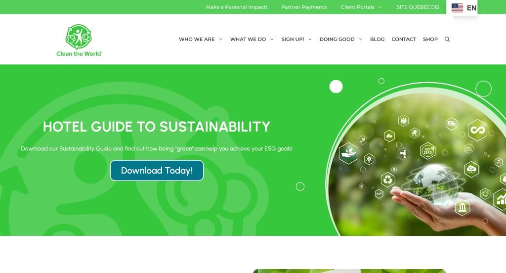
Here we have a website that grabs attention because of how their information guides viewers to understand their purpose as a company. A clean and professional look is created for Clean The World which was nice. Along with that, this site gives viewers plenty of ways to include themselves into their community. Including a search box and a “Stay In Touch” form, further enhances the user experience. We also noticed how they had links to different social media accounts plus contact information making it easy for donors and visitors to connect with their organization.
5. Time To Choose
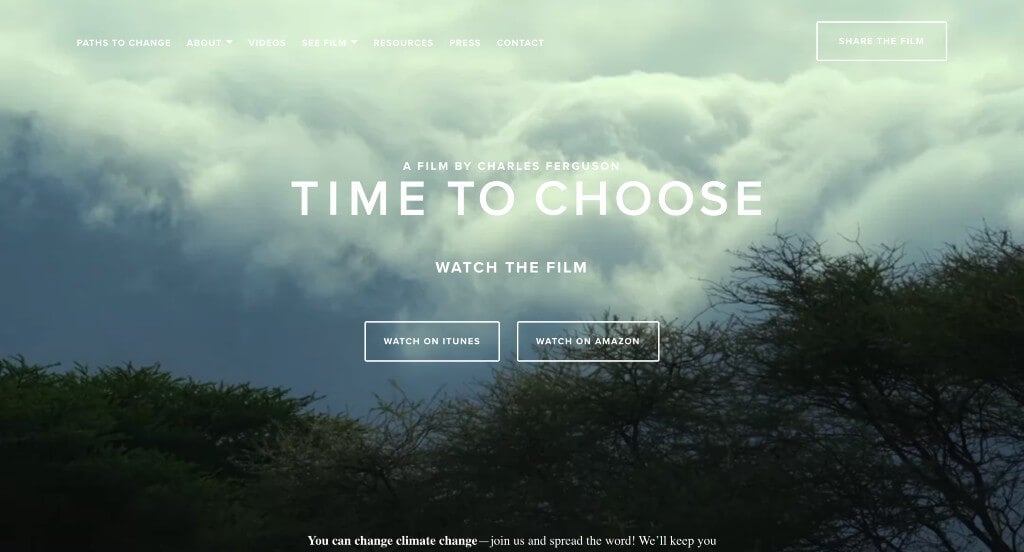
This charity website design wanted to hook customers by including a live background along with lots of information for their homepage. It was a good choice to have checkmarks used as bullet points to help organize this design. Time To Choose also included many buttons to help navigate throughout their simple template. Choosing a white and green color combination is fitting, as it matches the message of this organization.
6. Surfrider Foundation
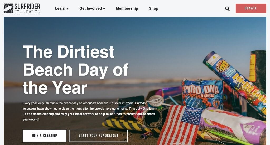
Looking for volunteers and donors to help you in your initiatives? Check out the website of the Surfrider Foundation to get ideas to attract them to your organization. A call-to-action button can be noticed, in order to make customers feel included. Another interesting aspect of this design that helped it place in the top nonprofit websites was their stunning imagery. Blue accents for photo frames and highlighting different texts takes this to the next level.
7. Water.org
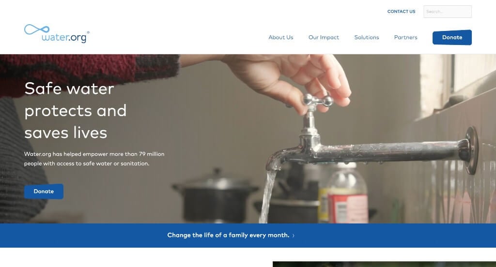
Water.org is all about providing access to safe water, and its interactive background showcases that. They went with a simple but attractive look. Using a white background enhances content legibility. Also, font sizing and colors are consistent throughout their pages. We liked how they used a creative pattern in their backgrounds. To add a nice touch they included videos throughout.
8. Greenpeace
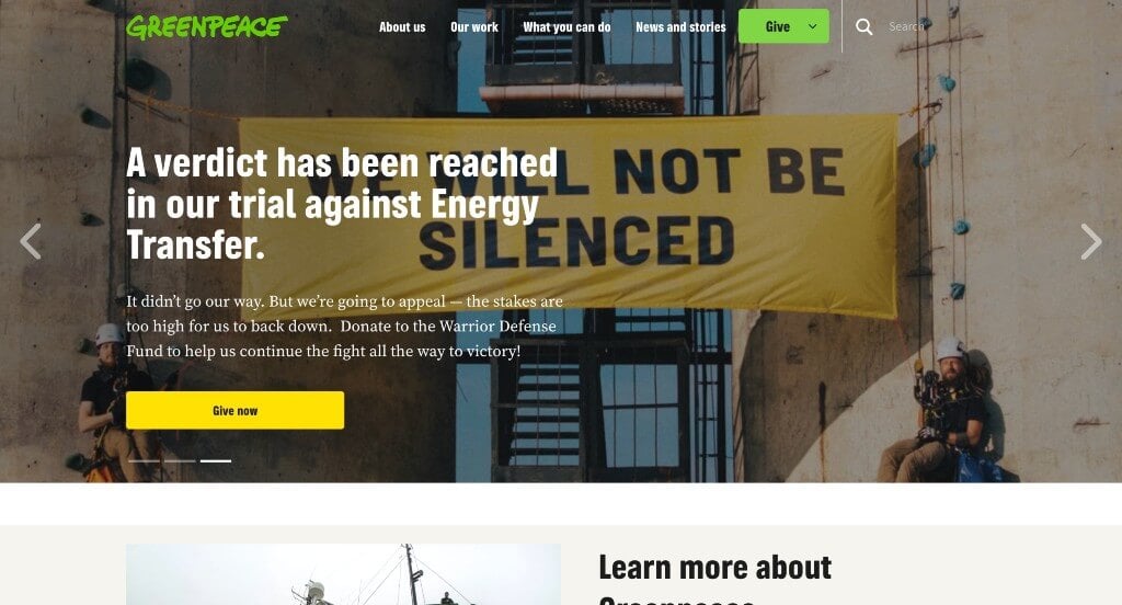
One of our favorite things about this site is that they use a bold green to accent everything. This company chose a simple font which was nice because it was easy to read and wasn’t overwhelming. We also liked their backgrounds that have small patterns to help it look more interesting. Many opportunities are given to serve as call to actions. It was also a great choice to have high quality visuals also.
9. Earth Justice
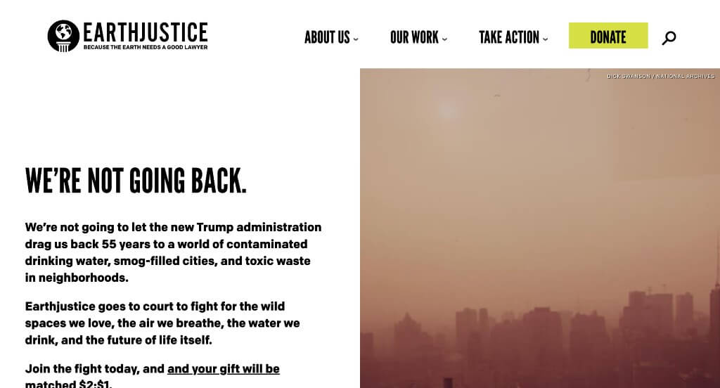
Earth Justice fights for climate change, and their website depicts that. Additionally, dropdown menus are displayed on every page, making it easy for visitors to find what they are looking for. There are only a few images but they are displayed in a large format. Because they only included essential information, everything is much more organized and customers are more likely to keep browsing through. Their logo design was simple but creative and we enjoyed that.
10. Plant Chicago
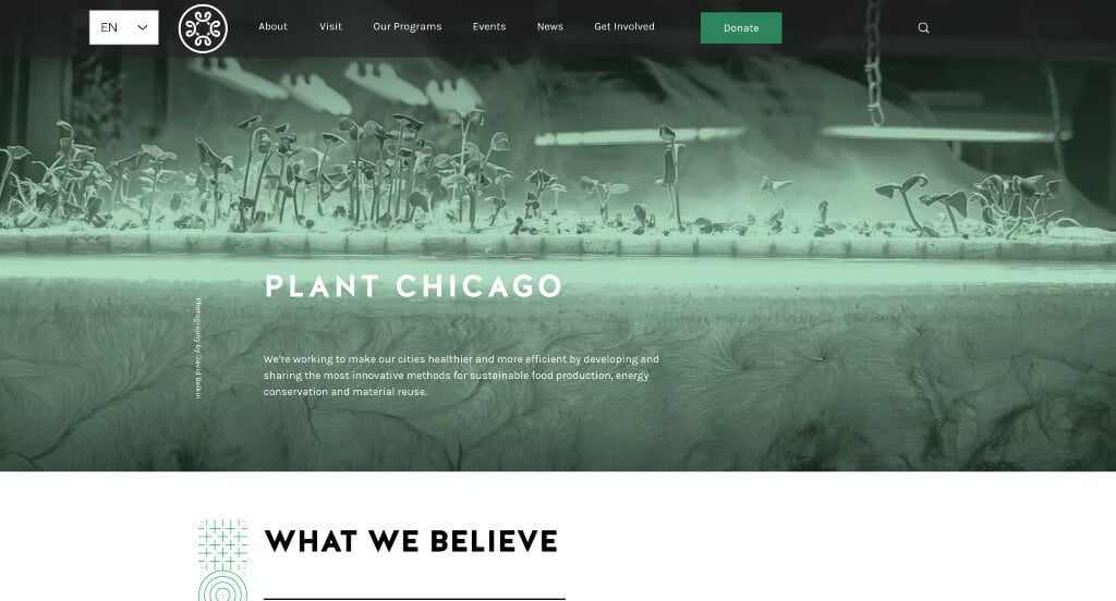
Plant Chicago works to make cities healthier and more efficient which makes people want to donate. We liked how many graphics are used to decorate this site along with high quality images. Having dropdown menus, featured events, news, and a search box makes this very user-friendly. A white, green and black color combination attracts customers. Furthermore, a homepage such as this one gives off a feel of sophistication. It was also helpful to have a domain for their site that matches their company name, a marketing feature we noticed right away.
11. Oceana
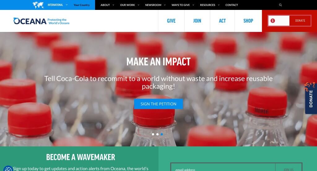
Dedicated to protecting oceans, Oceana inspires people to become involved in their cause. It takes visitors on a journey using high-quality images, creative color palettes, well-written blogs, and featured campaigns. This meticulously designed site contains call-to-action buttons on every page along with links to their social media accounts. A simple design is grouped with bright colors to leave a lasting impression on visitors.
12. Change The Course
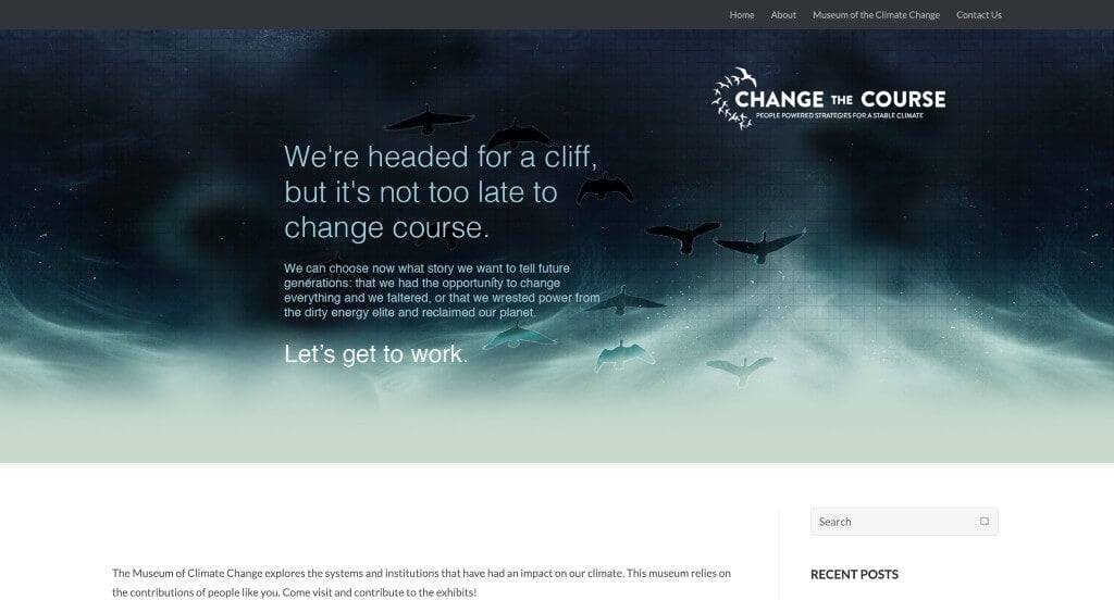
We thought this company did a great job adding in color without becoming overwhelming. It was nice to include a slider for images on their homepage. As you scroll further, you can explore projects they’ve completed over the years. Image thumbnails can also give you additional information about any project you wish to learn about. Their contact information was very easy to find and was written simply allowing for customers to reach out with any questions. This web design also had great balance of content and white space.
13. The California Wellness Foundation

These pastel colors seen throughout their pages and their images grabbed our attention right away. Along with that, we thought that their logo design was unique and simple. Their navigation bar was well labeled, making it extremely easy to find whatever information viewers are looking for. Showing what they use your donations for was another thing that we appreciated.
14. Upstream
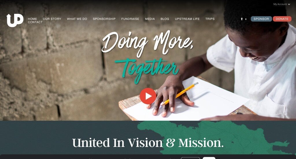
Quite honestly, what stood out to us most was how this company used unique fonts to help certain sentences stand out to people browsing this site. After a warm welcome, visitors are introduced to their company’s mission and emphasizes how important their support is. Not only that, but it also uses plenty of images with headings that are simple yet powerful. We liked how a seemingly recycled paper texture is used for a background.
15. Invisible Children
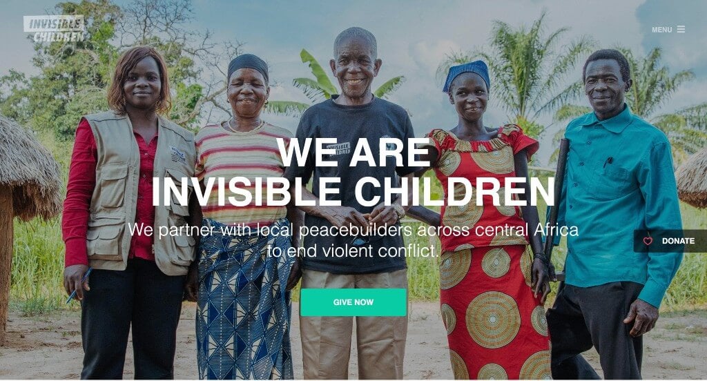
Here we have a minimalist feel, thanks to their simple backgrounds, bold fonts and bright accents. We liked how color blocks were used throughout to help break up lengthy content. It was nice that they picked images to be used as backgrounds for smaller boxes because it created a unique look. We also noticed many small graphics that help to depict what information will be included so viewers have a visual aid.
16. Charity: Water
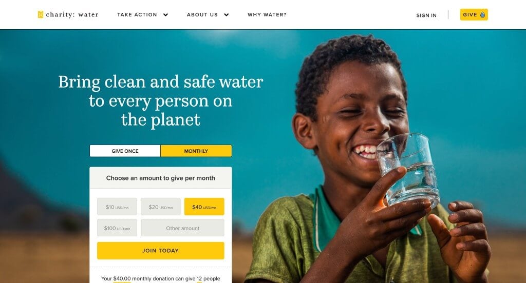
Right away this company displays a page with a form allowing customers to donate to their charity. It was a great touch to add in many statistics and such. By using compelling images, this organization explains its work and offers ways to get involved through multiple call to action links. Besides, it features a trailer for a Netflix film to spread awareness about a variety of complexities faced by millions of people who lack access to clean water. They also offer many ways to be part of their community, making it easy for people to support them as an organization.
Related: Rank your charitable organization higher in search results with SEO services.
17. Heifer International
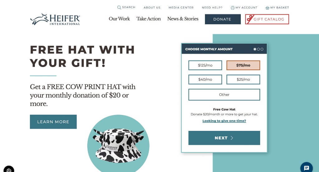
Heifer International uses a variety of photos that is paired with blue with white, giving this homepage an eye-catching layout. What’s particularly impressive was their real-life stories that discuss the change people can bring about with their donations. As thumbnails increase interactivity, you’ll find plenty of them on this site to keep audiences engaged. Overall, their entire layout prioritizes making a difference by explaining the benefits with real examples of donating money or giving a gift.
18. Warrior Rising
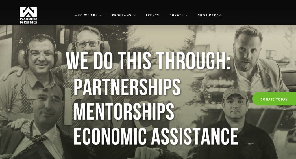
If you are looking for creative inspiration, check out this design. Started by Veterans, Warrior Rising dedicates itself to helping military veterans achieve success in their respective businesses. This homepage keeps visitors there by utilizing a slideshow to share the mission of their organization. A sticky header enhances overall experiences, so users can navigate to different pages without scrolling up. From “get started” to “register now,” this layout is full of call-to-action buttons, allowing viewers to be engaged in their content.
19. Free Street

Exhibiting a dark-theme to grab attention, Free Street tells complicated stories in human ways to hit the heartstrings. Right away, we could tell that this business was unique and they shared their mission almost immediately. Many images are featured instead of words to prove what they as a company are doing. But what caught our attention was their unique call-to-action buttons, featuring a hashtag, inviting more clicks and increased donations. Another feature we enjoyed was their interesting font. Lastly, it was very important to have a domain that matches their company’s name.
Related: Digital marketing services can help non profit organizations reach a broader audience and stay engaged with them over the long term.
20. Thorn
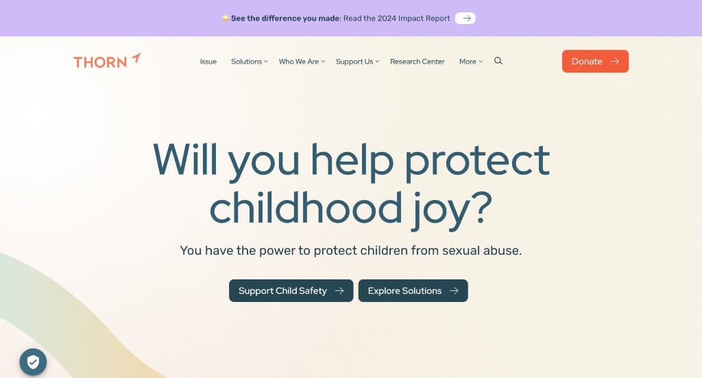
Thorn takes its bold goal of raising awareness of sexual abuse of children to the next level with its dynamic site. It draws in support by using pictures of children, creative backgrounds, and an interesting color palette. We liked how they added in statistics to prove their success so far as a company. Customer reviews are also added into their homepage, making it even more outstanding.
21. Lions Club International
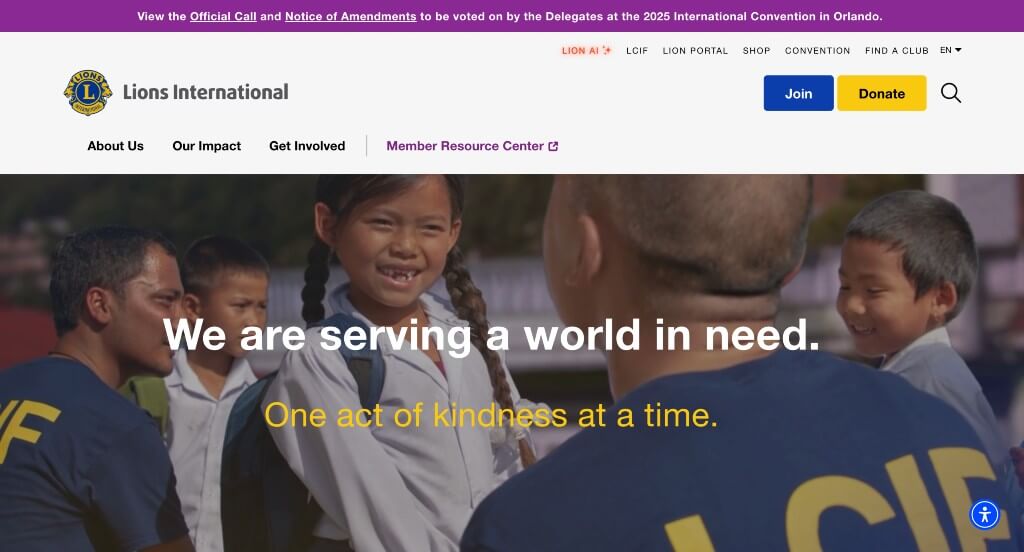
Incorporating high-definition images, videos, and stories on their homepage, Lions Club International makes its mission clear right away. They also placed a button for joining and a button for donating which was very helpful. Throughout, medium-sized fonts are used to allow people to read the text without any issues. We liked how their color scheme mainly reflected their logo, just to create a better sense of unity. It was also a great choice to include social media into their site.
22. International Rhino Foundation
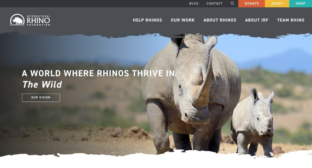
Surely, International Rhino Foundation has a unique approach to captivate its visitors, and it is a great thing to have on a charity site. While visitors get a glimpse of this company’s vision in their header, the remaining areas of this homepage discusses their initiatives as a company. Everything is expertly balanced with gray and white color schemes. We also liked their creative edging on their images along with simple patterns and graphics subtly placed in their backgrounds. To top it off, a sticky header features call-to-action buttons in varied colors that pop against their gray background.
23. Mobilize Recovery

The Voices Project uses the ‘Permanent Marker’ font on the homepage instead of the regular Sans Serif fonts to deliver its message to the people. Although the header and above the fold are dark-themed, the site features light colors on the rest of the homepage, creating a contrast between the two sections. The pale white and light cream colors are a perfect backdrop to the high-resolution images, posts, and news. While a call-to-action button is displayed on the sticky header, you’ll find one towards the end of the homepage and other web pages.
24. Mend
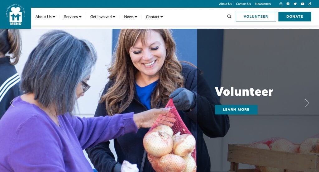
We loved how this color palette was almost all black, white and grey, but then orange and blue are scattered into the design. Despite being packed with a lot of information, this homepage doesn’t appear disjointed or overwhelming, which is always something to strive for when building a webpage. Almost as if suggesting that visitors should read their newsletters, they placed them in an area that is easy to access. They also have an adorable logo design that warms hearts of people on the edge of donating to their charity.
25. buildOn
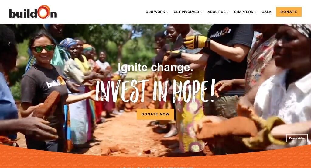
Something that sets buildOn apart from similar organizations was their short video clip on this homepage that reflects what the organization does. Adding to that was their unique font, helping certain phrases stand out more. Orange, yellow, red, black and white make for a clean design, making remaining elements noticeable. Another feature that deserves attention was their footer designed similarly to their logo of the organization, creating strong branding and a great feeling of unity.
26. Alzheimer’s Association
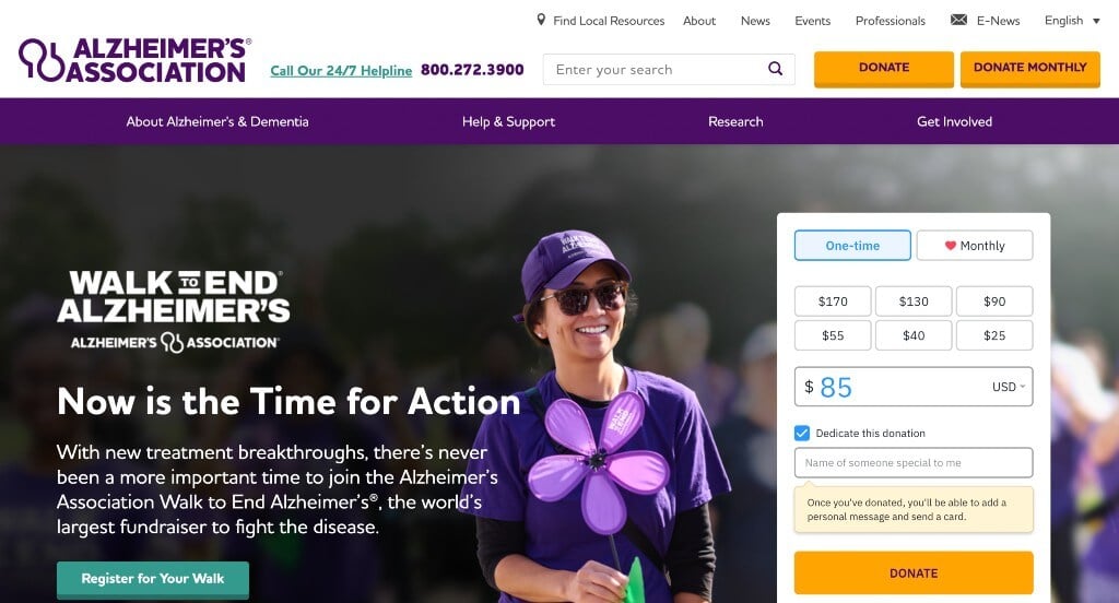
As soon as you arrive at the Alzheimer’s Association, you’ll be greeted with a pop-up message that encourages citizens to help those in need. Minimalistic yet intuitive, this header features sections making it very easy for users to navigate. As purple is the official color of the Alzheimer’s movement, it is skillfully used to grab visitors’ attention. We also love that Alzhimer’s Association smartly placed their social media channel links in their footer.
Related: Boost your digital marketing by hiring an agency to help bring awareness to your charity!
27. Best Friends Animal Society
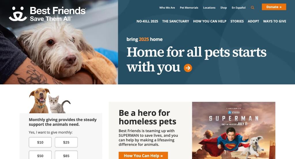
All throughout this web template, Best Friends Animal Society uses heartwarming images of animals to urge people to step forward to donate. We liked how they included a news portion almost right away. Many links were used with text and buttons, which was nice because it helps viewers navigate their site easily. You’ll soon understand this company’s mission, vision, and principles upon scrolling their site. We also liked that they had simple fonts that didn’t detract from their design.
28. Conservation International Foundation
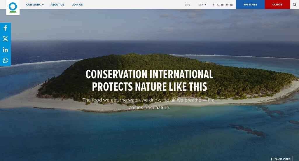
Conservation International Foundation’s charity website design greets visitors with images of nature. What sets it apart from similar nonprofits was how simple their design was. Visitors can also notice a well-labeled navigation bar along with lots of call-to-action buttons. It was also a great option to have all donate buttons in a red color while all other accents are blue. It was nice to have less images and lots of white space. We also thought it was a great idea to link in their social media pages.
29. Nashville Zoo

Immediately, any animal loving person would be attracted to this charity due to their high-quality videos of tigers playing shown as a hero header. It was such a creative idea to have animal prints seen as accents for their backgrounds. It was also cool to have phrases animated to look as if they are being typed out, erased and a new phrase is written. Having a clear and uncluttered navigation menu lets you explore all their pages with ease, plus the footer contains their location and links to social media accounts and partners.
30. National Audubon Society

Nothing looks better than an extremely high-quality image for a hero header followed by plenty on information. We loved the balance of images, text and white space that was seen in National Audubon Society’s web design. It was helpful to have many blog articles that customers can read so they can learn about additional accomplishments from the company. Interestingly enough, a bird catalog was added into their site which allows anyone to search for additional information on over 800 species of birds. Every area that is used as a call-to-action to donate money was highlighted in a bright yellowish-orange color.
31. World Wildlife Fund
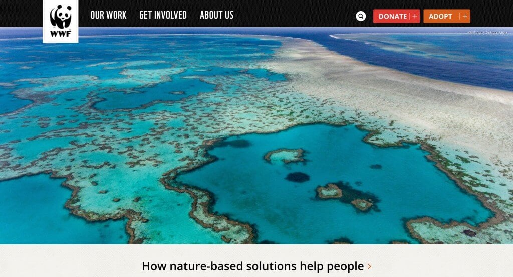
Upon entering this site, we can notice high quality images of various sizes that are used to break up content. We also liked the small graphics used as icons because they help add personality to World Wildlife Fund’s layout. While their navigation menu features everything, first-time visitors can appreciate a search box, making specific information easy to find. We liked how text and images were laid out in an alternating style to create a more balanced look.
Related: Use paid advertising to help improve awareness of your non profit organization.
32. Coworker.org
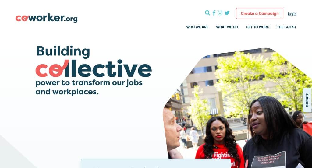
Coworker.org is another great example of a minimalist website that knows how to keep possible volunteers, donors or customers engaged in their webpage. Although bright colors aren’t used, the simplistic design with dulled accent colors sends out a message. After scrolling down, you’ll come across plenty of resources to walk you through important information. If you’ve got any doubts, you can take a look at the campaigns featured on their website.
33. Kiva

The moment we landed on Kiva, we were shocked by how well this company included how donations helped certain people. This is a great tactic because it makes incoming donors realize just what an extra $25 could help another person. We really like the green accent color and the small graphics used to decorate this design placing in our top nonprofit websites. This charity organization also gains trust and establishes credibility by featuring their success rates.
34. Wikimedia Foundation

From various languages to the graphic illustration, Wikimedia Foundation has a very unique visual language urging visitors to explore more of the site. This company has a header that features links to every page, but you can still learn more about the organization if you scroll throughout their homepage. Wikimedia Foundation’s color scheme causes better readability, but it also adds to the minimalist feel of their design. Towards the bottom, you might notice how their contact details are clearly labeled.
35. Convoy Of Hope
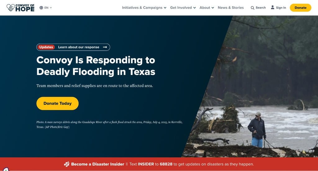
Right away, we spotted this company’s logo design and the emotions that are tied to the gesture. While scrolling deeper into Convoy Of Hope, we stumbled upon some stories of citizens of all ages being helped by this organization. Adding in CTA buttons beneath these heartwarming stories was a stellar choice, as people are more likely to extend support after hearing what this company has done in the past. Besides, their color choices for text and backgrounds were great since it was always quite easy to read. We also liked how statistics were added in to prove that they are a reliable charity solving real problems.
36. Open Society Foundations
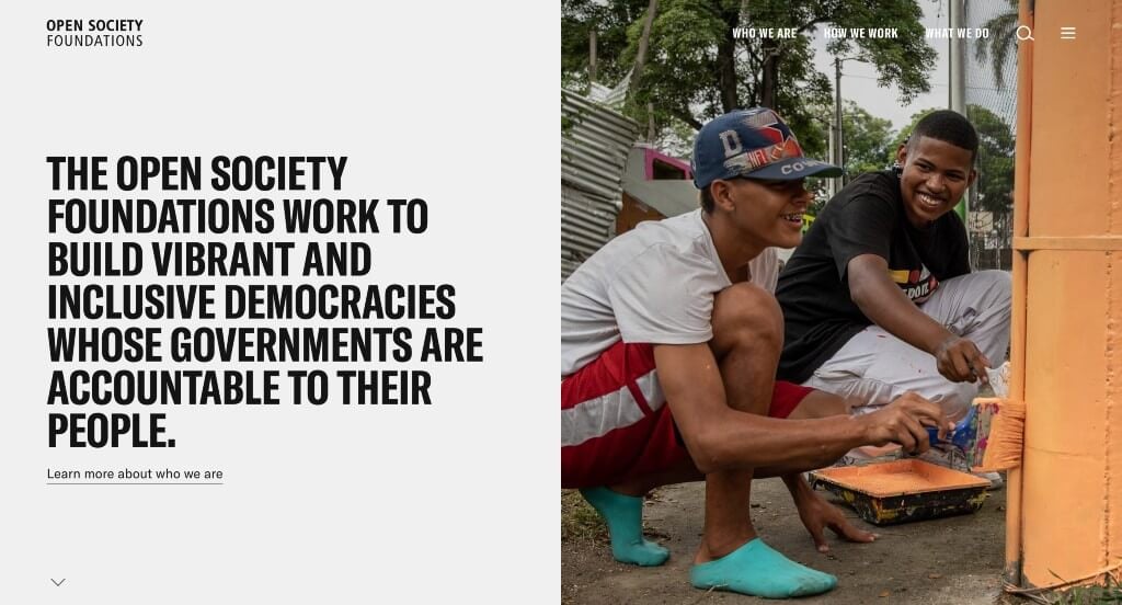
If you are searching for another example, look no further than this clean, balanced homepage. A basic color palette is paired with a simple layout to give off a vibrant and fresh feel, making us want to explore more about this organization. Fonts are also extremely bold so important titles can be noticed. We enjoyed how almost full-length images were used to break up written content.
37. Scouting America
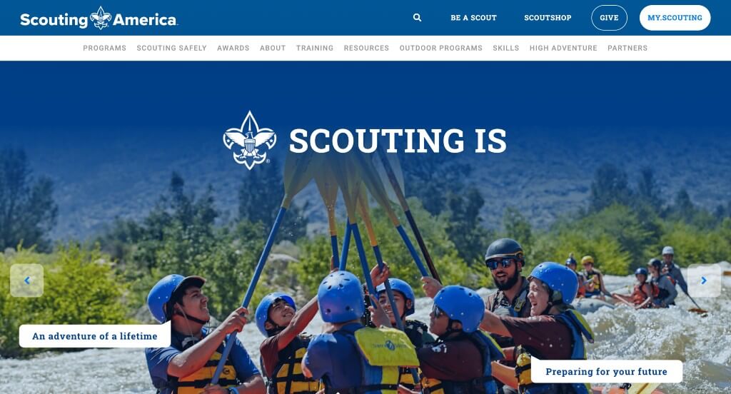
Boy Scouts Of America creates a brand identity with their graphics that appear similar along with their color scheme. It was great to add in their mission, scout law, and scout oath into this homepage. We liked how the background and font colors alternated between white and blue. It was a nice touch to include reviews from parents and troop leaders. It was also interesting to have creative patterns on their extra pages. We liked how they displayed all of their adventure bases also.
38. Do Something
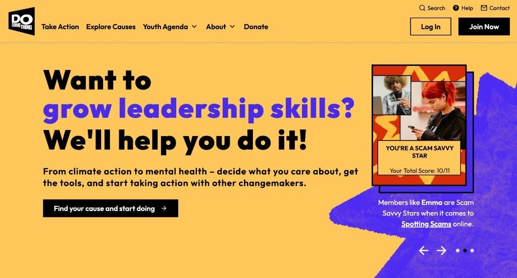
When first entering this site, we can see many examples of real people trying to make a difference in their community. Many bright colors are displayed to attract attention to their pages. We liked how they included a quick survey to recommend programs for you to take action in a way you’re comfortable with. We also thought it was great how really bold fonts are used as titles, attracting viewers to their headers. Additionally, it was a great choice to include a bit of statistics to prove that their charity is truly making a difference.
39. Room To Read

Room To Read creates an emotional connection by showing what the knowledge of books and power of reading can do for small children. We really enjoyed how they used bright colors but yet they were still toned down enough that it wasn’t overwhelming. A basic font was also used to flow with their simple and organized design. They also had an extremely organized menu which was very nice for anyone trying to navigate their site. Lastly, it was a very smart and important marketing choice to pick a domain for their website that matches their charity’s name.
40. Teach For America

Overall, this web design had a very formal feel to it. We liked how balanced their white space was with text and images. It was a smart choice to occasionally use bullet points to organize information. Bright orange, green and purple are used to contrast with their simple color scheme adding a bit of energy to their layout. It was a nice idea to include a live chat feature because it helps possible donors ask any immediate questions in a quick matter. Additionally, we loved how a large social media section was included so people can see what this nonprofit has been up to recently.
41. The Trevor Project

We enjoyed how this nonprofit business displayed their goals and what they hope their company gives to members of the LGBTQ+ community. It was nice to have many images scattered around the pages along with short phrases to hook viewers into reading certain sections. Call-to-action buttons are displayed in large fonts, so people won’t have trouble finding them. There are also many graphics used throughout this site to add a creative feel. To add onto that, colors that this company picked when designing the website keep visitors engaged. Overall, high-resolution images, multiple CTAs, and graphic illustrations compel people to respond to urgent needs of the people.
Related: Struggling to be found online? Try SEO services geared toward helping non profits excel online.
42. Girls Who Code

Right away, we were surprised by the variations of blues used which attracted us to dive into the depths. Girls Who Code provides an excellent example of how organizations can take their website to the next level by pairing bold texts with a compelling hero image. We also liked the sharp squiggly lines with slight animations. Having a section for recent news also helps people feel connected to their company. There were also many buttons to help customers find additional information.
43. Doctors Without Borders

Here we have a spacious and clean layout showcasing their dedication to providing assistance to those in need. A fiery red color is contrasted with a pearly white, to reflects the mission and vision of this organization perfectly. Another noteworthy feature is their “donate” button which changes color from red to black when you place your cursor on it. We also enjoyed how they had darkened images for a more suspenseful feel. It was also helpful for images to bounce from right to left to create a better flow.
44. David Suzuki Foundation

David Suzuki Foundation wanted to take a different approach to make their website appealing. Their design is very collected and sophisticated. Lots of white space can be noticed, and that helps their webpage to not be too overwhelming. We liked how some of their backgrounds were images or textures just to change it up a bit. It was also nice that their link for donating was in red while all other colors were in green or blue. Their color palette was nice and relaxing due to their almost natural hues.
45. The Humane League

Working to end animal abuse, The Humane League uses a picture of a cow living its best life as a hero image to empower others to take action. We thought there was a lot of valid information about their cause that could persuade incoming possible donors. A black, white and red color scheme is used to help highlight the cruelty (red) in what could be a peaceful world (black and white). It was also a nice addition to have awards that their charity has one to once more prove that they are a reliable charity.
46. The Conservation Fund
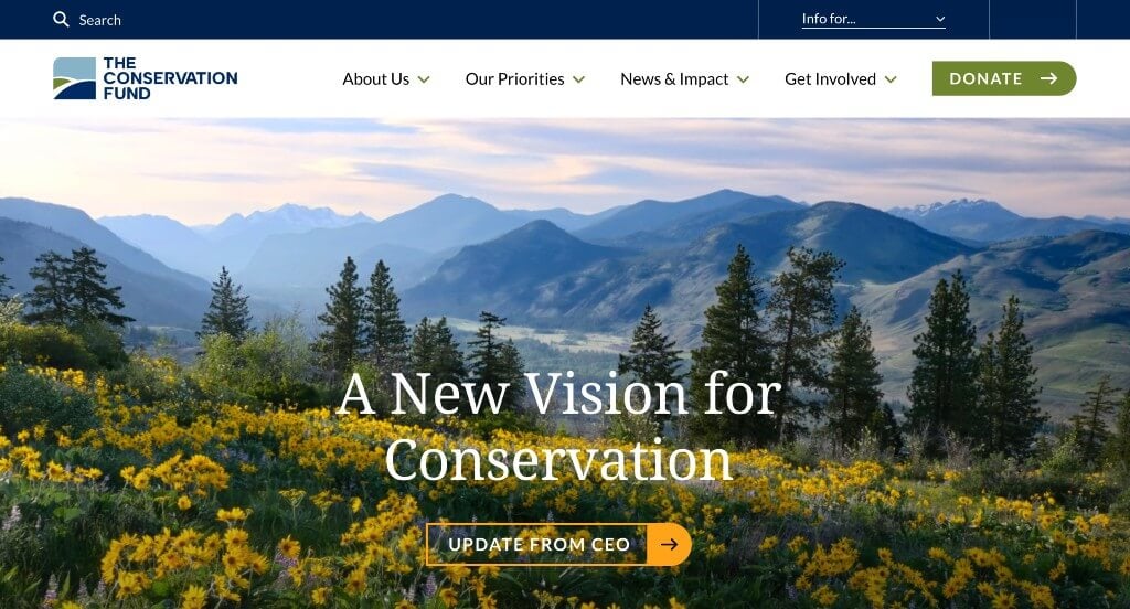
Of course, having an images slider peaks interest of visitors, and including buttons on these sliders made it even better. A simple navigation bar was chosen so it is super easy to find whatever information you need. Pairing an electric blue color with white makes it appear more professional and adds a touch of sophistication. A basic font was also used in order for this design to stay simple. This nonprofit business also did a great job with their footer that contains important links and contact details, so donors can connect with them without difficulty.
47. American Heart Association

Minimal and elegant, American Heart Association can be applauded for their ease of navigation. Although they didn’t use sharp, contrasting images, their image choices make sense for the written content that it was paired with. A stellar red shade (a color associated with heart disease awareness) is paired with a white background, to make this website more attractive. We also liked how their buttons were bright red so it was easy to find links pointing visitors to new areas of their site. They also had lots of white space which was nice because it maintained a layout that wasn’t overwhelming.
48. The Nature Conservancy
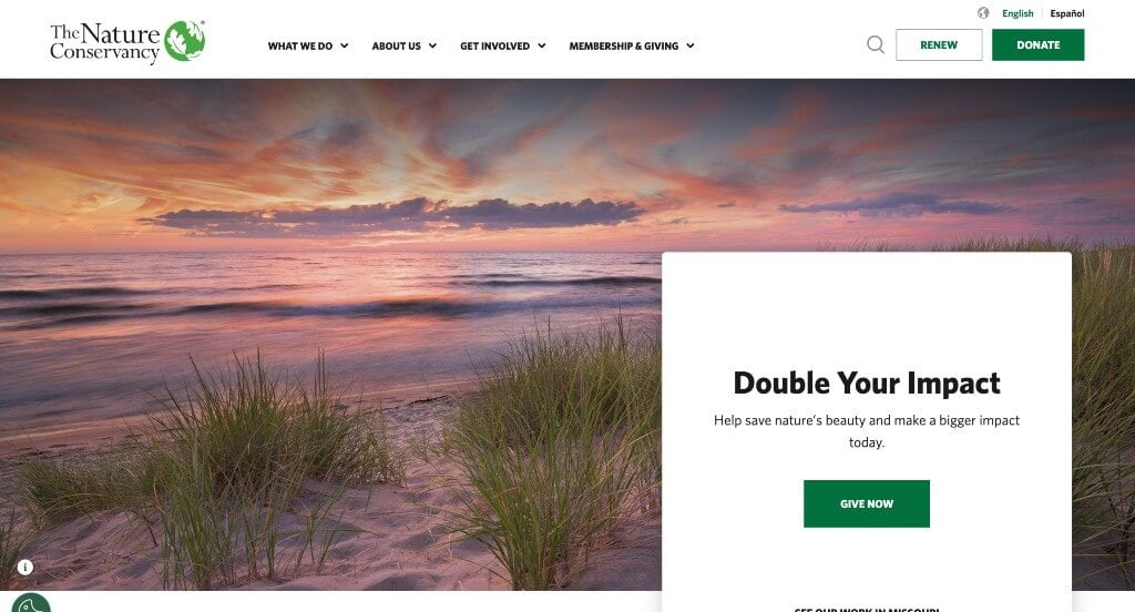
What had the biggest impact for us was most likely how high quality and inspiring visuals were included. From a crisp hero image to multiple CTA buttons spread across the page, the Nature Conservancy thoughtfully varies its content to make its homepage appealing. It was also creative to add many different graphics that can accent their content. Plus, whoever designed their site took user experience into consideration, so they placed their mission, stories, and how to help their organization right away on this homepage.
49. Memphis Zoo

Animations and their creative landing page were definitely our favorite things about this site. It was nice to structure this design around their new dino park. We liked how different colors and prints were used to help break up content. Many crisp and clear images attract visitors, along with well-crafted elements and graphics draw people to explore more. Memphis Zoo also has a well organized navigation bar which is nice for visitors when they are trying to find information within this site. We also liked how they included links for additional information such as zoo map, parking, rules, FAQ, today at the zoo, dining and zoo hacks.
50. Children’s Organ Transplant Association

Bright colors are used here to symbolize happiness and hope for children who are in need. Using subtle graphics to highlight visuals and content was a brilliant addition. We liked how there was lots of buttons that can be found throughout the pages in order to bring customers towards additional information. Short paragraphs is another thing that we really enjoyed because viewers can stay engaged longer.
WordPress Nonprofit Themes
You can find free themes at wordpress.org, or explore nonprofit-inspired templates on ThemeForest.
Goodwish – Themeforest
$69
DoGood – Themeforest
$79
LoveIcon – Themeforest
$29
Act – Themeforest
$44