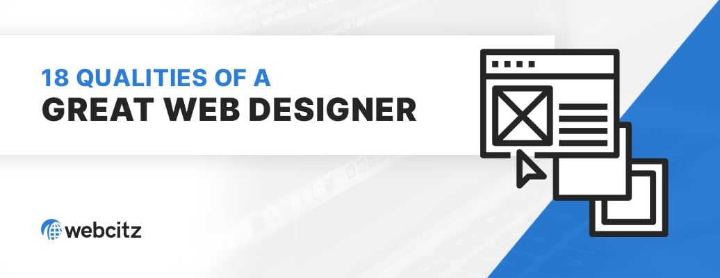


Strategic Paths for Designing a Website
Every company has unique requirements for deployment velocity, visual resonance, and technical interaction. We offer two distinct web design methodologies, ensuring that regardless of your choice, your digital asset is built on a resilient foundation managed entirely by our onsite Wisconsin team.
Choose the Right Path for Your Project
Whether you need a fast, cost-effective launch or a ground-up custom build, we ensure the final product is stable, secure, and easy to manage.
Template-Based Web DesignAn efficient path to a professional website. | Custom Web Design & ArchitectureA completely custom path to your perfect website. | |
|---|---|---|
| Ideal For: | Small to mid-size sites (typically 5-15 pages) that need a professional, fast launch without a custom-design budget. | Larger or complex sites – think 50+ pages, custom functionality, location / staff directories, unique design requirements, etc. |
| Starting Point: | Instead of starting with expensive custom mockups, we provide a selection of vetted, hand-picked templates – like those in the Qode ecosystem – that we’ve used and trusted for years. You choose a base design that fits your vision, and we handle the technicals. | We start with a blank canvas. Our UI/UX architects draft custom mockups in Figma of your homepage and key landing pages. This allows for custom layouts for anything from location pages, doctor profiles, or complex service funnels before any code is written. |
| Build Process: | We set up the template in a development environment, remove demo content, and harden the installation with our preferred configuration. From there, we customize the colors, typography, and layout to match your brand. After that, we integrate your content into the theme, tune for page speed, and optimize for search performance. | Once you approve the mockups, we build a completely custom theme from scratch in a development environment. This results in a lean codebase – meaning there is no unnecessary bloat from features you don’t need. The end result is a fully custom website with unmatched speed, security, and capability. |
| The Result: | You get a polished, high-functioning website at a lower price point, built on a foundation we know how to support and maintain. | You get a “perfect” website, free of constraints found in templates, and benefit from a minimal codebase and improved crawlability. |
| Project Investment: | Starts at $3,750 | Timeline: 2-3 Weeks | Typically $15,000 – $25,000 | Timeline: 2-3 Months |
Technical Scope & Budget Estimator
Define your project’s architectural requirements to receive an immediate investment range. Whether you choose a curated template or a bespoke custom build, these figures represent a fully managed deployment by our senior engineering team.
Case Studies in Professional Web Design
These case studies highlight our commitment to UI/UX engineering and visual resilience. Every featured project represents a unique project where aesthetic precision meets rendering velocity, ensuring a frictionless customer journey.
Dewar Nurseries
Logistics-Integrated Visual Architecture: Engineering a High-Capacity B2B Horticulture Portal
Dewar Nurseries operates at a tier of operational complexity where standard retail templates fail to resolve the spatial logistics of national agricultural distribution. WebCitz engineered a bespoke visual architecture that serves as a high-fidelity interface for a proprietary truck-optimization engine. By hand-coding a custom environment from the ground up, we eliminated the visual and technical debt of third-party frameworks – allowing the brand’s botanical DNA to synchronize perfectly with complex B2B logic and real-time spatial data visualization. This project highlights our ability to translate physical logistical constraints into a seamless, high-performance UI/UX environment for professional wholesale buyers.

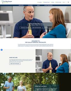
Fox Valley Surgical Associates
High-Trust Clinical Architecture: Engineering a Scalable Patient-Centric Interface
Fox Valley Surgical Associates (FVSA) manages a high-volume surgical network requiring a digital interface that balances clinical authority with patient accessibility. WebCitz engineered a high-fidelity visual architecture that serves as a regional hub for multi-specialty surgical care. By implementing a custom-coded physician directory and location-management nodes, we established a scalable structural framework that organizes complex medical data into intuitive patient pathways. The 2025 deployment integrates HIPAA-compliant infrastructure and high-resolution environmental imagery to foster immediate patient trust, ensuring a frictionless transition from digital inquiry to clinical consultation.
Edge Advisors
Precision Design Preservation: Engineering Architectural Continuity for Professional Services
For high-stakes advisory firms like Edge Advisors, visual continuity is a primary trust signal that cannot be compromised during infrastructure transitions. WebCitz executed a precision-engineered design migration, performing a pixel-perfect reconstruction of their sophisticated brand identity within a custom-hardened WordPress environment. By eliminating the technical debt of an inflexible legacy backend, we established a high-performance architectural framework that prioritizes both visual integrity and administrative agility. This project highlights our ability to maintain brand sovereignty while engineering a resilient system capable of managing complex interaction nodes – from professional education hubs to recruitment portals – without deviating from a single pixel of the original design intent.

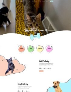
Little Orphans Animal Rescue
Narrative-Driven Visual Architecture: Engineering an Automated Digital Sanctuary
For mission-driven organizations like Little Orphans Animal Rescue, the digital interface is a high-stakes bridge between operational logistics and emotional conversion. WebCitz engineered a bespoke digital sanctuary that prioritizes cinematic storytelling through high-fidelity video overlays and fluid interaction nodes. A core technical pillar of the build is the seamless API-driven synchronization with RescueGroups.org, ensuring real-time data integrity for animal listings with zero administrative friction. By architecting a frictionless, mobile-first adoption funnel, we created a high-resonance environment that optimizes volunteer hours while maximizing the reach of their lifesaving mission.
Defining Your Website’s Strategic Objectives
Before we start designing or coding, we align your project with the specific business outcomes that drive growth. Our engineering team doesn’t just build sites; we solve technical challenges. The most successful projects we lead usually focus on one or more of the following objectives:
- Establishing a High-Velocity Foundation: Launching a new brand with a digital presence that is scalable and technically sound from day one.
- Modernizing Legacy Infrastructure: Redesigning outdated or broken sites to eliminate technical debt, ensure mobile-first responsiveness, and refresh aging content.
- Conversion Engineering: Improving user experience (UX) to reduce bounce rates, increase session duration, and turn passive visitors into active leads.
- Performance Hardening: Optimizing site architecture to achieve exceptional page speeds and pass Google’s Core Web Vitals.
- Inclusive Design & Compliance: Resolving accessibility barriers to ensure your site is usable by everyone and meets modern legal standards (ADA/WCAG).
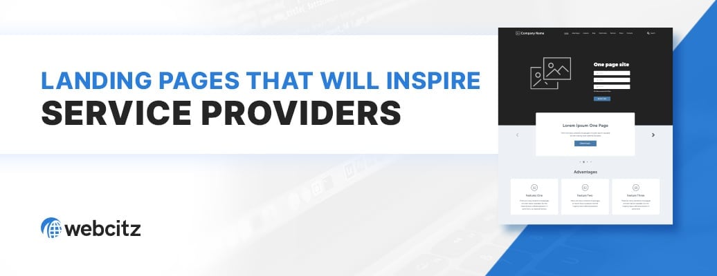
- Revenue Funnel Architecture: Developing high-conversion landing pages and funnels designed specifically to maximize lead generation and ROI.
- Model Accessibility & Synthesis Readiness: Architecting your site’s code to ensure AI discovery engines and autonomous agents can ingest your proprietary data without hallucinations. This includes prioritizing token efficiency so your brand is the first choice for AI-generated summaries and task completions.
We have spent 22 years engineering solutions for these exact challenges. Once we understand your primary objectives, we can conduct a strategic platform audit to determine the best CMS for your project – ensuring your technology stack supports your vision without getting in the way.
Meet the Architects Behind Your Build
A great design is only as good as the developers who build it. The UI/UX architects pictured below are our actual in-house team members who take personal ownership of your project’s technical integrity.
Whether they are drafting custom layouts in Figma or hardening a vetted template for high performance, these are the specialists responsible for your site’s speed, security, and conversions. When you have a question about your build, you are getting an answer from a professional who is actually inside your code.


The Right Infrastructure for Your Goals
To ensure your website remains a long-term asset, it must be built on a content management system (CMS) that offers both ease of use and technical flexibility. While our development team has deep-level experience in various frameworks, including Laravel for complex web applications, we almost always recommend WordPress for template and custom web design projects.
With a global market share exceeding 40%, WordPress has become the universal standard for digital growth. We specialize in WordPress not just because of its popularity, but because it provides the most reliable architecture for success.
Benefits of WordPress
- Unrivaled Extensibility: With a massive library of vetted plugins and API integrations, we can deploy complex functionality, from advanced SEO tools to custom CRM hooks, without reinventing the wheel.
- Global Security & Stability: Supported by a massive community of world-class developers, the WordPress core is constantly hardened against modern security threats and optimized for the latest server-side environments.
- Total Data Sovereignty: Unlike closed platforms (like Wix or Squarespace), WordPress is open-source. This means you own your code, your data, and your hosting selection. Your site is independent, ready to be connected to the global agentic web without vendor lock-in.
- Platform Longevity: Choosing the world’s most popular CMS ensures that your website’s architecture will be supported for decades to come, providing a clear path for future scaling and modernization.
Our Performance Standards
To ensure the long-term success of your digital infrastructure, we adhere to a strict set of technical standards on every project. When you partner with WebCitz, these aren’t options – they are the foundation of our engineering process.
- 100% USA-Based Engineering: We never outsource your project. Every line of code, every design mockup, and every database optimization is handled by our in-house team in the United States. This ensures total accountability and direct communication.
- Search Equity Protection: A redesign shouldn’t cost you your rankings. We implement comprehensive 301 redirect mapping as a standard procedure to ensure your existing search engine authority is preserved during the transition to your new site.
- Aggressive, Transparent Timelines: We respect your time-to-market. Our engineering-led process allows us to launch template-based sites in 2–3 weeks and full custom builds within 2-3 months, depending on technical complexity.
- 720+ Case Studies: With 22 years of documented success, we don’t rely on promises. We provide a massive library of verified Clutch reviews and in-depth case studies that prove our ability to deliver high-yield results across a multitude of business sectors.
Our Engineering Lifecycle
We don’t just build sites – we manage a high-precision deployment process designed to eliminate technical friction and ensure a seamless transition from your legacy infrastructure to your new digital asset.
Strategic Discovery & Technical Review
Every project begins with a deep dive into your business objectives. We audit your existing data, analyze your competitors’ infrastructure, and identify the specific functionality required for your growth. This allows us to recommend the ideal development path – whether it’s a custom design or a customized template.
UI/UX Prototyping & Architecture
Once the development path is selected, we move into the structural phase.
For Template Builds: We curate a selection of vetted frameworks, helping you select a visual foundation that matches your brand’s intent while maintaining code integrity.
For Custom Builds: Our designers draft high-fidelity mockups in Figma, allowing you to visualize the user flow and content layouts before development begins.
Managed Development & Environment Hardening
Our in-house, USA-based developers begin the build on a password-protected development URL. Whether we are engineering a custom theme or configuring a specialized framework, we prioritize efficiency and security.
Zero downtime guarantee: Your current website remains fully operational throughout the entire build. We work entirely behind the scenes until the new infrastructure is ready for deployment.
Quality Assurance & Yield Testing
Before launch, your site undergoes a rigorous technical audit. We test for cross-browser compatibility, mobile responsiveness, and page speed performance. We ensure that all 301 redirects are mapped and that your tracking and pixels are verified and active.
Precision Deployment & Technical Handover
On your chosen launch date, we execute a managed deployment. Following the launch, we provide a technical handover session, ensuring your team is fully trained on the CMS. You aren’t just left with a new site; you are equipped with a high-performance engine and the knowledge to operate it.
Beyond the Launch
A high-performance website is the foundation of your digital presence, but its long-term yield depends on continuous technical stewardship and strategic growth. We provide a robust ecosystem of services to ensure your investment remains secure, fast, and profitable.
- Managed Infrastructure & Hosting: Experience the performance of our LiteSpeed-powered hosting. We provide the high-velocity environment your new site needs to maintain excellent page speeds.
- Proactive Management: Protect your asset with proactive security hardening, performance audits, and regular core updates led by our in-house engineering team.
- Performance Marketing (incl. GEO & AEO): Your site is built to convert; now let’s drive the right traffic. From expert SEO to synthesis dominance and high-intent PPC management, we engineer the visibility your brand deserves.
- Transactional Architecture (Ecommerce): Scale your revenue with specialized builds within WooCommerce and Shopify. We develop frictionless shopping experiences designed for high-volume conversion.
- Full-Stack Custom Programming: Need more than a content-focused website? Our developers specialize in PHP, Vue.js, and custom API integrations to build feature-rich web applications tailored to your operations.
- Technical Stewardship: From content updates to new feature rollouts, our USA-based team is available for ongoing support, ensuring your site evolves alongside your business.
Your journey doesn’t end at launch. Partner with an engineering firm that supports every stage of your digital evolution.
Web Design Service FAQs
How much does a new website project cost?
The investment required for a new website depends on the build path you select and the technical complexity of your requirements. We prioritize price transparency to ensure you can make an informed decision for your business.
Marketing & Information Websites
- Template-Based (Vetted Frameworks): Starting at $3,750. This covers the professional configuration and hardening of a curated, high-performance framework by our in-house team.
- Bespoke Custom Build (Figma-led Design): Starting at $9,500. This includes a ground-up design process with custom mockups and a zero-bloat, custom-coded theme for maximum UX and search performance.
Beyond the base architecture, your investment is determined by the technical scope of the project. The primary factors that influence final pricing include:
- Advanced Functionality: Specialized calculators, API integrations, or custom user portals.
- Data Migration: The secure transfer of legacy content, customer data, or SEO redirects from an existing platform.
- Premium Design Requirements: Advanced animations, custom graphics, or the implementation of action layers and Universal Commerce Protocols (UCP) for AI discovery engines.
Every project we lead is handled 100% in-house by our USA-based engineers – ensuring that your investment goes directly into the quality and integrity of your code, not into managing offshore contractors.
How long does it take to launch a new website?
Our development cycles are engineered for efficiency and transparency. While the exact timeline depends on the technical complexity of your build, we generally follow two primary deployment tracks:
- Curated Template Deployment: Typically 2–3 weeks. Since we utilize battle-tested frameworks, we can bypass the heavy mockup phase and move straight into environment hardening, customization, and content integration.
- Bespoke Custom Builds: Typically 2-3 months. This allows for a full-stack design cycle – including initial discovery, Figma wireframing, custom mockup revisions, and the hand-coding of a unique WordPress theme.
Factors Influencing the Speed of Your Build: While we maintain a disciplined internal schedule, the final launch date is often determined by three key variables:
- Strategic Alignment & Feedback: Projects move fastest when feedback loops are tight. Rapid approval of design milestones or technical specifications allows our engineering team to move into the next sprint without delay.
- Content Readiness: The code of the site is often ready before the final text and visual content. Having your copy, images, and data prepared early ensures we aren’t building a structure for content that hasn’t arrived yet.
- Integration Complexity: Custom API hooks, complex data migrations, or the architectural hardening required for AI model grounding and specialized ecommerce logic require extensive quality testing to ensure a frictionless launch.
Because we are 100% in-house, we eliminate the communication lags found in agencies that outsource their development projects. You are working directly with the engineers responsible for the build, leading to a faster, more predictable deployment.
Which platforms and frameworks do you support?
While WordPress and Shopify are our primary solutions for performance-first marketing and ecommerce builds, we are a full-stack engineering firm with the capability to develop across a variety of high-level frameworks.
Our technology stack is chosen based on what will provide the most reliable, scalable, and secure foundation for your specific goals:
- WordPress: Our primary architecture for website builds and complex content management.
- Shopify & WooCommerce: Our preferred engines for high-velocity, scalable ecommerce.
- Laravel: We utilize this for bespoke, ground-up web applications that require custom logic and data structures beyond the capabilities of a standard CMS.
- Enterprise & Legacy Systems: We also maintain deep-level expertise in platforms like BigCommerce, Magento, and Joomla.
We don’t believe in a one-size-fits-all approach. During our technical strategy session, we will conduct a platform audit to ensure your site is built on the ecosystem that offers the best performance and long-term data sovereignty for your brand.
Will I have full control and the ability to edit my website?
Absolutely. A core tenet of our 22-year philosophy is total data sovereignty. Unlike proprietary walled garden platforms that lock you into their ecosystem, we build on open-source standards like WordPress, WooCommerce and Joomla. This ensures you own 100% of your code, content, and data. We do not restrict your access to any administrative functionality.
- The Handover: Following your launch, we provide a technical handover session to empower your team. We’ll walk you through the custom-engineered backend, showing you how to update text, swap imagery, and manage your content with total confidence.
- Engineered for Ease: We build our sites with a user-first philosophy. This means the administrative interface is streamlined and intuitive, allowing you to make routine updates without touching a single line of code.
- Professional Stewardship: While we empower you to handle daily updates, our in-house dev team is always available for high-level maintenance, structural changes, or performance hardening.
Whether you want to be hands-on with your website or prefer to have our specialists manage the technical integrity of everything, the choice is entirely yours.
What are the payment terms?
We believe in a transparent, milestone-based investment structure that aligns with our development lifecycle. This ensures total accountability throughout every phase of your project.
- Standard Build Terms: For most web design projects, we utilize a two-payment structure: 50% project initialization to secure your spot in our queue and 50% final deployment upon the successful launch of your site.
- Complex Architecture Terms: For larger-scale custom builds or enterprise ecommerce projects, we offer the flexibility of three installments: 33% at project kickoff, 33% about halfway into the project, and 34% at final deployment.
To make the process as frictionless as possible, we accept:
- Major Credit Cards
- Corporate Checks
- PayPal
Who is responsible for the website content?
We view content as a critical layer of your digital presence. In most projects, our clients as the subject matter experts of their industries and provide the core messaging for their pages. This ensures your brand’s unique voice and authority are accurately represented.
To ensure your content performs at a high level, we offer two paths for development:
- Client-Led with Technical Optimization: You provide the raw copy, and our team handles the technical SEO layer. We ensure your expertise is structured with proper heading hierarchies, meta-data, and keyword density to satisfy both human readers and search algorithms.
- Strategic Content Engineering: For brands that require a hands-off experience, we offer professional copywriting & content strategy for an additional investment. Our in-house writers specialize in conversion copywriting – crafting messages that balance user psychology with the technical requirements of modern search engines.
Regardless of the path you choose, our goal is to ensure your content is a high-yield asset that drives authority and lead generation. During our strategic discovery phase, we will help you determine which approach best fits your team’s capacity and your project’s goals.
Where should I host my website?
Hosting is the engine of your digital asset. The distance between a “good” host and a “cheap” host isn’t just about uptime – it’s about Core Web Vitals and Time to First Byte (TTFB).
While we do not require you to host with us, we view your choice of infrastructure as a critical factor in the long-term ROI of the site we’ve engineered for you.
- The WebCitz Advantage: We offer high-performance, managed hosting on our own dedicated servers. These environments are specifically optimized for our builds, utilizing LiteSpeed Cache and high-velocity server-side configurations to minimize agentic latency. If an AI agent can’t parse your data in under 200ms, your brand is effectively invisible. We build the high-velocity infrastructure that keeps you in the answer.
- Total Managed Oversight: When you host with us, our engineering team handles the “heavy lifting” of server-side security, automated backups, and performance hardening. If there is a technical issue, you don’t call a call center; you call the people who built your site.
- Alternative Environments: If you choose to host elsewhere, we strongly recommend opting for enterprise-grade solutions (such as WP Engine or Pressable). We advise avoiding entry-level shared hosting plans, as these environments often struggle to provide the resource allocation necessary for modern, high-performance themes and ecommerce engines.
Ultimately, your hosting choice should be an extension of your business goals. During our technical handover, we can help you evaluate your current provider to ensure they meet the architectural requirements of your new build.
Who has legal ownership of the website?
Upon final payment of your project, you have 100% ownership of your website. We believe in total transparency and asset portability – you are never locked in to our agency or an unknown platform.
What You Own Outright:
- Custom Intellectual Property: You own all the custom code, CSS, graphics, and unique theme work engineered specifically for your brand.
- Content & Data: You own 100% of your copy, imagery, and customer database.
- The “Keys” to the Castle: You have full administrative access. If you ever choose to move your site to a different host or partner, you have the legal and technical right to take your entire asset with you.
The Distinction of Open-Source Architecture: While you own your specific build, the underlying engines (like WordPress or Shopify) and third-party plugins operate under their respective licenses.
Our goal is to be your long-term partner because we deliver results, not because we hold your code hostage.
Is WordPress manageable for non-technical users?
Yes. In fact, WordPress is the global standard specifically because of its intuitive administrative experience. While the underlying code of a WebCitz project is sophisticated, the interface you use to manage your content is designed for clarity and ease of use.
- A Streamlined Administrative Experience: We don’t just hand over a default WordPress install. Our engineering team tailors the backend of your site to remove unnecessary clutter, leaving you with a clean, logical dashboard where you can manage text, imagery, and blog posts without touching a single line of code.
- The “Visual” Advantage: Most modern WordPress builds utilize block-based editing, which allows you to see your changes in real-time. If you can use a basic word processor or a social media platform, you can manage a WordPress site.
- Empowered Handover: As part of our technical handover, we provide your team with the specific knowledge needed to manage your unique build. We ensure you feel confident navigating your site’s architecture before we go live.
- Built-In Guardrails: We build our themes with safety nets in place. This means you can update your content with the peace of mind that you won’t break the site’s structural integrity or design layout.
Our goal is to build a high-performance asset that empowers your team, not one that requires a developer for every minor update.
Hear what our customers are saying

Rummeles Fine Jewelry
Great company to deal with! They have a great team of people and are always there to answer any questions we have!