50 Best Interactive Websites

Looking to boost your online presence with engaging features? If so, this guide is packed with inspiration for you. We’ve handpicked impressive sites based on design, functionality, uniqueness, and user experience. From sleek visuals to intuitive tools, you’ll understand how interactivity can captivate and convert.

Engaging content keeps visitors there longer, which can boost your search rankings. Whether it’s a product configurator, PPC calculators, web design tools, digital marketing tools, or cost estimator, interactive features can offer real value and keep users exploring. You can see these features come to life in our web design, ecommerce development, and SEO services pages.

If you’re not sure where to start, check out our favorite web design ideas across different industries. These can serve as inspiration no matter your industry. See something you like? Reach out – we’d love to help bring your interactive vision to life!


Top Interactive Website Designs

1. Redwood Empire

We liked how cream, and dark accents help create an attractive look. It was cool to have a seed that has to be “planted” to enter. This shows their dedication to planting trees to help the environment. Their graphics were very unique and help to create a brand’s feel. Subtle animations as viewers scroll was another thing that we really enjoyed.


2. My Grandmother’s Lingo

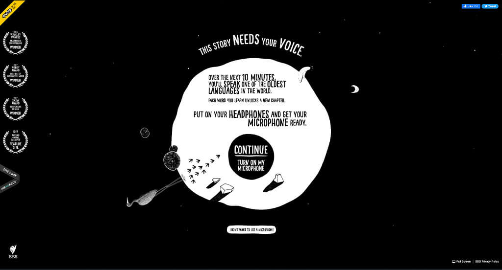
This dominantly black and white example did a great job getting people engaged. There was also lots of interesting graphics that grab our attention. Their loading animation was another addition that we really liked because it was simple, but logical for them. Accents of stunning bright colors for rivers, butterflies and more really made us fall in love with My Grandmother’s Lingo.
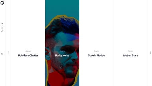

3. JaM Cellars

Interesting animated text was outstanding for this one. Their bright yellow that can be found within their fonts but also their images was perfect. Having creative buttons that look like hand-circled information in order to help them feel important was cool. Including their social media was another helpful choice that we couldn’t ignore.


4. Cycles Gladiator

Not only was this example interactive, but it also looked beautiful. Their font choices was one of our favorite parts, helping them stand out. We loved how smaller images to keep their site from feeling overwhelming. Another addition that we noticed was their use of shadows and simple decorative lines. Their domain was carefully chosen in order to make it easier to find.


5. Rose Island

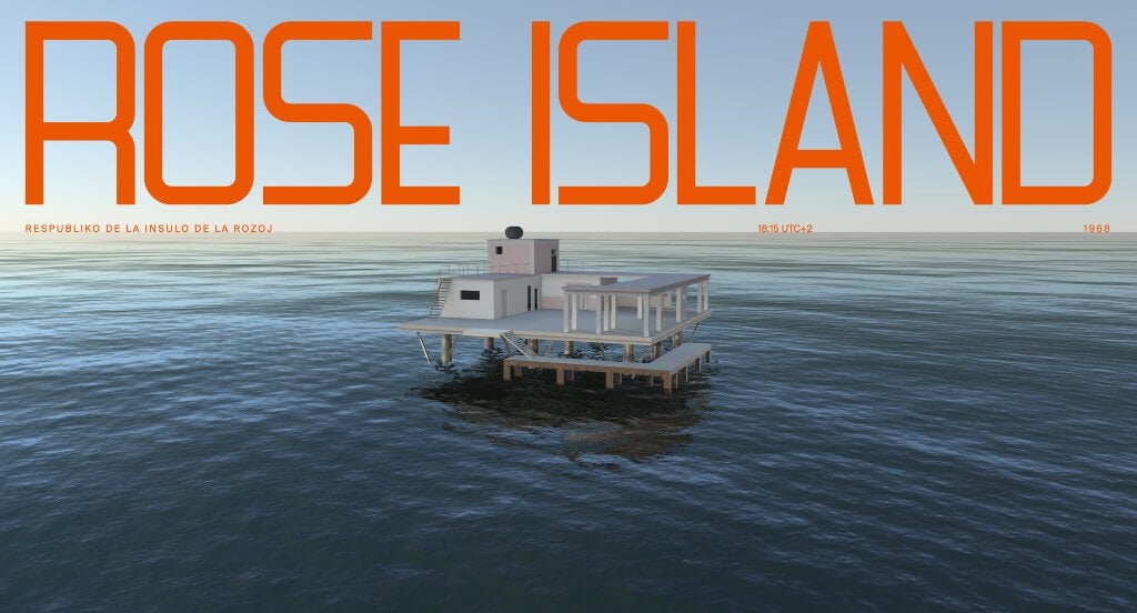
Right away, we loved how this example used large orange fonts to show their titles. We thought it was cool how their other text lined up perfectly with the horizon line. As viewers move their mouse around the perspective will change, which we enjoyed. Their layout for content was stunning. Along with that, we felt that this company did a nice job with their introduction of information that used some animations.


6. 30 Species, 30 Pieces

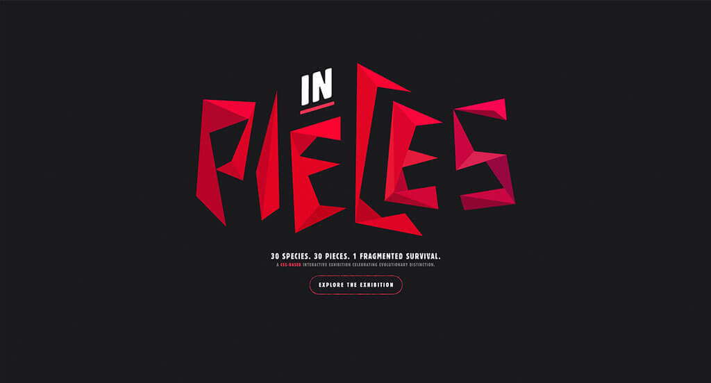
This was a unique company that stands for raising awareness towards endangered species. Their artsy feel and transitions from animal to animal was amazing. We loved how their font had a subtle texture to it, helping their site feel more interesting. A simplistic template was used to keep people engaged. Including information on why each species is threatened was also great.


7. A Tiny Adventure

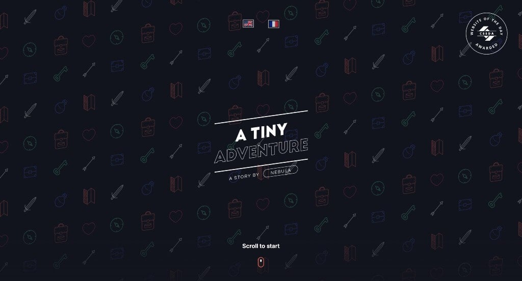
This example caught our attention because of their bright colors used on a dark background. Their graphics were cute and fun which made sense for a storytelling type of website. Another thing that we liked was how this company made use of animations because it helps their elements stand out more. We also liked how allowed readers to set the pace of the story.


8. Ronin

Ronin uses stunning transitional techniques along with their automatically playing videos. Making use of a bright blue accent throughout this entire design was another part that we loved. Occasionally using bullet points to keep content organized and easy to read was a smart choice. Another thing that we noticed was how their background colors alternated from black to white to help break up information.


9. Super Valdis

This template was the first thing that grabbed our attention because it was different and we loved that. Their color scheme was another thing that we really appreciated because it made sense and wasn’t overwhelming. Along with that, they continued to add links even in the areas that already provide information.


10. Volkswagen

This white themed webpage made for a clean feel. We loved their text used to name their models showing up as only a faint gray outline, allowing the focal point to be their vehicle model. Their loading symbol with their logo and two highly designed vehicles was something we couldn’t ignore. Volkswagen had marketing in mind when allowing for simple navigation within their website.


11. BBC

With an emphasis on the ocean, it was important to note that BBC did a great job with their relaxing and logical color choices. We loved how many sketched graphics were included that were relevant to what they were informing customers about. Their water background slowly gets darker and darker as viewers progress through this timeline – ending in an anchor to symbolize the end. This timeline was for sure this company’s best feature.


12. Kayenta

This example was interesting because of their animation that catches the eyes of customers right away. Their logo seems to match with this animated background which was nice. Their icons were woven out of a seemingly wire graphic to match with their overall feel for their pages. Including lots of client testimonials was another thing that we noticed.


13. Prometheus Fuels

If you are looking to display lots of information, but still keep viewers engaged, here’s a great way to do it. We loved how they animated in a way that if viewers hold space, more things to happen. Bold fonts are used to attract attention to certain parts. Reusing Prometheus Fuels’ logo was something else that we noticed.


14. Be The Buzz

We loved the bright colors that were used in the background of this example. Their bold fonts was another thing that we really appreciated because it helps certain information stand out more. Something that stood out to us was their graphics that move as viewers scroll through these pages. Including case studies was also a great way to show that they are a reliable business.


15. Popcornopolis

Lots of bright colors are used here to create an overall energetic feel, which we really enjoyed. Their image frames were a great addition, because they keep everything looking interesting, but still professional. Having subtle animations and graphics was another feature that we really loved. A simple checkout process was maintained and that often helps customers feel welcome to shop there again.


16. Late Checkout

This was an interesting template that uses a map as a navigation tool. Their graphics are built up carefully to create something that is sure to impress viewers. Many of the buildings include links to more information within their webpage. We liked how viewers can hover over buildings to read where the link will take them so they don’t waste as much time.


17. Incredifulls

This was an amazing example for any business looking for inspiration. We loved how bright red was used because it is both exciting and a logical color for pizza. Adding in a little pizza cupcake graphic that was occasionally animated was also cool. Showing off their feature on shark tank along with many other groups was a great aspect.


18. All Press Espresso

This color scheme is not only stunning but makes sense for a coffee business. Their professional fonts that are often displayed largely was something else that we really enjoyed. Another thoughtful quality we liked was their innovative loading icon – fuel from coffee. Everything within this example was well organized, which made it easy for anyone looking for information.


19. Because Recollection

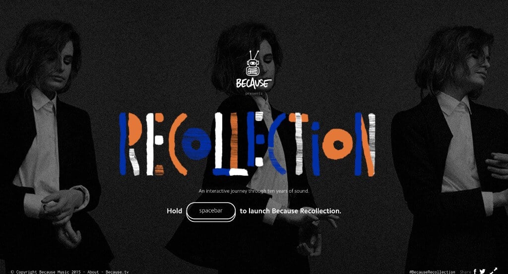
This was one of our favorite examples. What better way to celebrate the artists that they’ve represented in an interactive template. Recreating album covers of these artists while featuring some of their music was a great way to do that. It was interesting how the space bar creates a sort of “home button” that guides viewers to a new artist.


20. The Goonies

This webpage starts of strong with an interesting landing page that eases into all their information. We loved how this example included lots of information about this movie in an organized way. We thought it was cool how viewers can see the progression through the website’s information right in their navigation bar. Including a photo gallery was something that we really appreciated.


21. Digital Silk

We really appreciated how this example had content that moved automatically to feature more information. Their use of bullet points was a great way to keep everything more organized. We loved their chosen color scheme that was sure to grab attention. Something else that we really appreciated was their large fonts that keep information easy to read and comprehend.


22. Nike React

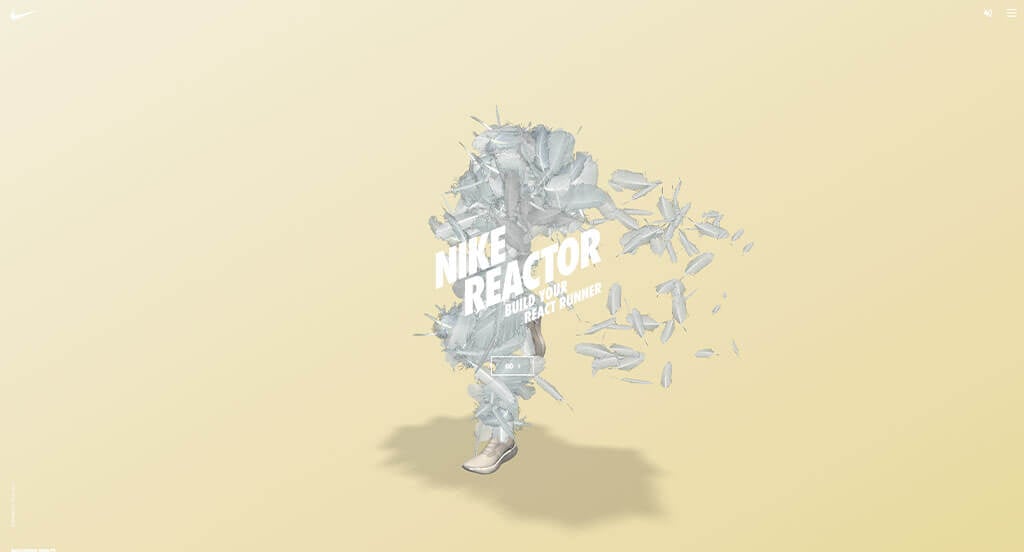
This one was interesting and felt personal for each person that attempted to use it. Having lots of animations, even their text really excited people and draws them towards buying something from Nike. Additionally building a character to represent your choice in shoes was a nice thought. We also thought it was nice that your character changed color depending on which you picked for your shoes.


23. Cyclemon

We loved how Cyclemon used lots of pastel themed colors in order to grab attention of viewers. Their most interesting part was definitely their little slideshow of animated products. This idea represents that you are what you ride, which seems to be their slogan. Interesting backgrounds can also be noticed for each graphic of bikes. They also made sure to pick an easy domain that matches well with their business.


24. Dusted

Adding in automatically playing videos was something that we really liked about this example. They used an image cube that flips as customers scroll which was something that we appreciated. Their interesting font was another thing that stood out which was another thing that we appreciated. We liked their interesting transitions that are sure to grab attention.


25. Wake It Up

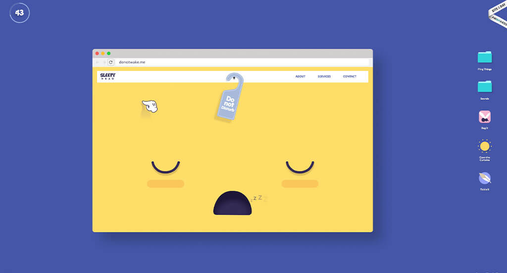
If you are looking for a way to grab attention, this is perfect. Those who are competitive will rise to the challenge of “waking up this site”, even feeling interested in the point of this little game. Shortly after your time is over, a pop-up will appear explaining the importance of grabbing attention right away. This relates directly to their services offered, as they are a web design agency.


26. Ocean School

This is a good example of an interactive website design that can give inspiration to another company’s professional website. As you scroll through the homepage of this website, one of the design qualities you’ll see is their subtle animations when hovering over areas. Their inventive logo design was another reason why we included this website in our list of the best designs for interactive sites. Ocean School had website marketing in mind when creating the organized menu for their website. With so many great reasons to consider this interactive website, its obvious why we included it in this list of the best websites!


27. iSpy

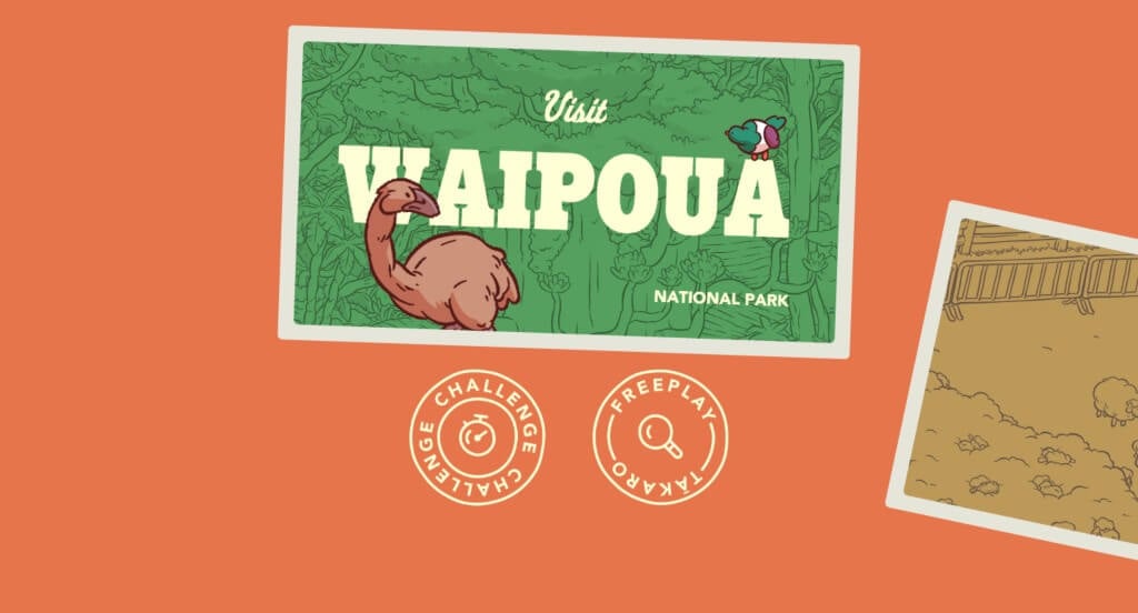
This example was a great way to introduce a variety of features within New Zealand. Adding in fun little games to have kids and adults have fun with these sights before visiting them in real life. We really enjoyed their color scheme that looked great within this company. Another thing that we really appreciated was their use of graphics.


28. Fishing The Feed

Fishing The Feed does a great job with using blues and purples that slowly get darker as viewers are guided towards depths of what we call the seafood farming industry. We loved their use of a watercolor look, because it is unique and feels more personal. Including real images and real videos was something else that they did well with. Additionally, we loved their creative font choices.


29. IKEA Kreativ

Within IKEA, they had this outstanding feature that lets customers play around with different products within their room without purchasing anything. Having the ability to scan a room instead of typing in all of the dimensions was another thoughtful feature. Having starting rooms that are already predesigned was a great way for non-skilled designers to pick a look for their room.


30. The Eames by Enso

There was a lot of great features here because of their interesting transitions. We loved how their scrolling goes both vertical and horizontal to add more variety. Lots of negative space was nice because it helped to balance content more. Large fonts were also used occasionally to grab attention faster. Using small icons was another thing that we noticed.


31. Krave Jerky

There was lots of amazing graphics that can be noticed right away – both shapes and realistic elements. We love their bright colors from their packages that can be seen all throughout their site. Their captivating font was something else that we liked. Krave Jerky clearly had customer use in mind when designing a simple checkout process.


32. Black Negative

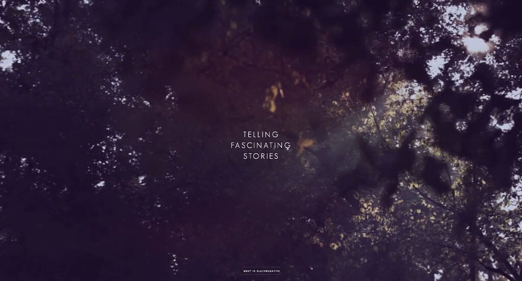
Our team noticed how this color scheme changes based on image colors, but it still used a filter to create unity. We loved how they used lots of inspirational phrases to keep people smiling as they scroll through this information. There are also lots of animations that lead to more content. It was awesome how lots of their images changed upon hover to make for a more interesting look.


33. Cocainenomics

We quickly noticed how a black, white and red color scheme was used for Cocainenomics, which we liked because it conveys a dangerous feeling. We enjoyed this overall layout because there was lots of written content, but it is all broken up by videos, images and graphics. We thought it was also unique how their hero header used a creative animation to show what this site is all about.


34. Google Arts & Culture

We liked how this company started with large icons that signify places, museums, art, and games in order to find relevant information. Having aspects like create your own newspaper was another thing that helped this company stand out. A variety of games are included right in their homepage which was something we loved. Being able to explore artwork by color was one of our favorite things.


35. Feed Music

We loved how Feed Music’s text appeared in an interesting way – with transitions that get people interested. Something else that caught our attention was their little tag that shows their award granted for “Site of the Day”. Another part about this one we really liked was their logo that is both creative and memorable. We also thought it was cool that little atom-like features that build and rebuild themselves as customers scroll.


36. Pierre Herme Nicolas Buffe

This was a great example that used lots of high quality graphics and animations to build something outstanding. We loved that there was a slider on the right corner that lets viewers control when to move on to the next part of the story. Having interesting scrolls that show whether you are in the moon kingdom or the sun kingdom was another spectacular idea.


37. From Fauna

A variety of cool sliding transitions was something that grabbed our attention right away. We really enjoyed that while hovering over almost anything, it warps and changes beneath each user’s cursor. It was also cool how small images were used within text to create an interesting look. Their paragraphs were also fairly short, which we enjoyed because it kept readers engaged.


38. ARK: Star Citizen Map

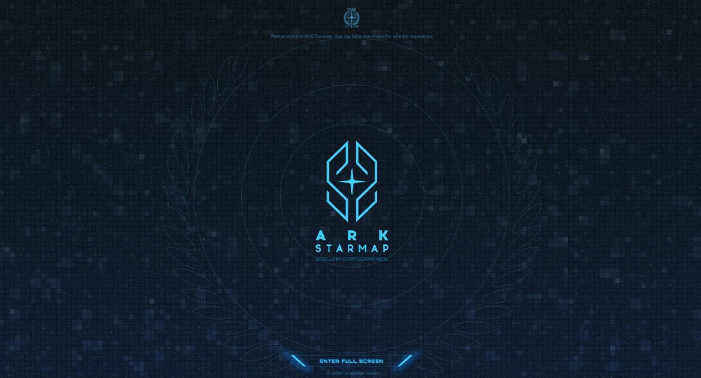
Of all these things we reviewed, a feature we liked was their use of a perfected color scheme throughout this entire page. We also loved their logo that feels technological, which makes sense for what this is. We liked how everything within this example has a cohesive feel, tying everything together. We also thought it was an interesting way to get people excited about space, which was a perfect choice for this company.


39. Nomadic Tribe

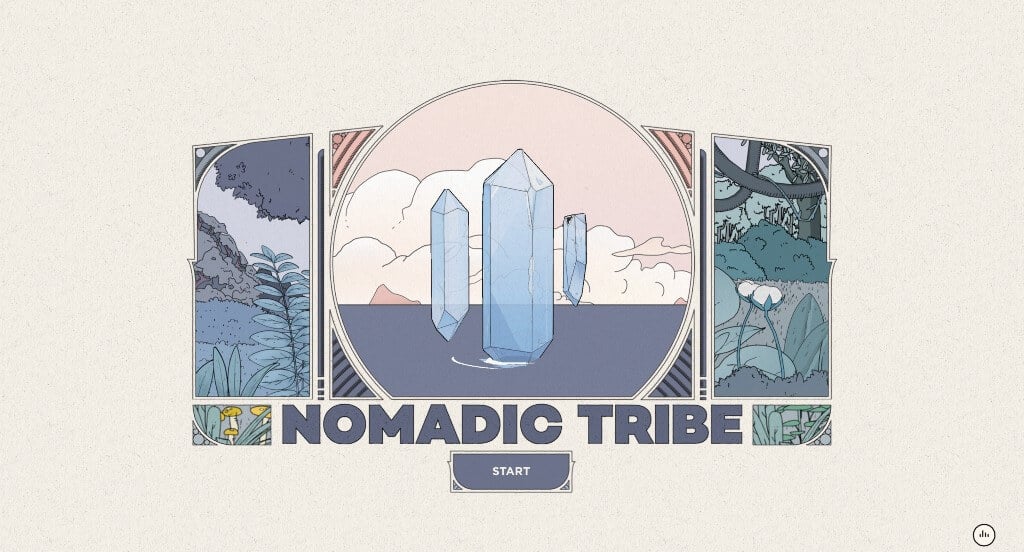
This company has stunning graphics that are similar that makes for a strong brand identity. We loved their color scheme that was simple and relaxing. Each page had a new object to interact with, which we really liked. We loved their buttons that look great and help customers navigate through the story better. We liked their audio that reads the story and makes it more interesting.


40. Delve Architects

We immediately noticed a variation of pastel colors, which we liked because it created a fun environment. This design has lots of white space but never looks unfinished, a perfect choice. Mainly, it was free of distractions which was another reason why we included it. Having a well developed portfolio is something that can be helpful for any professional company or group.


41. Lianz Surfaces

We loved their darkened images that create a more luxurious look. They have a stunning, balanced layout that makes it beyond easy to find whatever you are searching for. Including a blend of images and videos was another thing that we liked about Lianz Surfaces. Having a clearly labeled menu helped make this a great choice for inspiration.


42. First Cut Corn

We really liked how there was a mainly green color scheme that showcases a feeling of growth. It was smart how as customers scroll, an animation of the life of corn is depicted. Having bold fonts for their written content was something else that we noticed. Including information about specific recipes was something helps them stand out.


43. Slavery Footprint

First off, we liked how this site made use of graphics to make a harsh topic easier to grasp. We thought their feature allowing visitors to choose products and locations to see how slavery still exists was impactful. It was also interesting how there was a slider bar showing numbers fluctuating as the years changed.


44. Nurture Digital

We loved how this example seemed to change each time that viewers scrolled further down the page. Their way of writing out the entire company name in image frames was another thing that we liked. Linking customers to a variety of different case studies was another thing that we really appreciated. Their creative fonts were also quite helpful.


45. The Useless Web

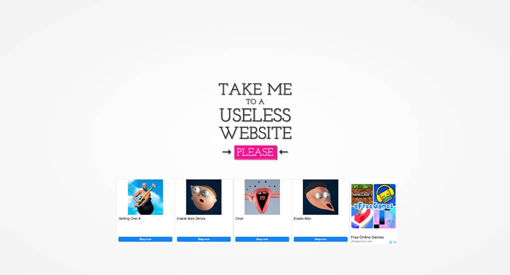
We noticed how a white and black color scheme was used along with a bright pink accent. Curious, many people will explore their brightly colored button to be taken to so many different games. This will keep people engaged, wondering which games will appear next. We thought it was interesting that their homepage and each of their game pages use domains that are logical for each page.


46. The World of Unknown Critters

We love all aspects of this design because of their interesting graphics. Additionally, we thought it was nice how calming music was added. We felt this overall layout was interesting because of their setup that allows for instructions to prepare players for their game, helping customers get excited to download and play it. Their logo was also extremely interesting and logical for their business.


47. Tarot-O-Bot

Tarot-O-Bot does a nice job with this company’s variety of colors that can be seen. We loved their animations that help improve the entire webpage. We loved their creative design used on each and every one of their tarot cards. Having the ability to share the cards onto a social media platform was another thing we enjoyed.


48. Hi Fly

This example did a nice job with their color scheme that is logical for their company type. Being able to see 3D models and read information about each plane of the fleet was another great choice. We loved how their background remained a clouded background. Along with all of that, we really appreciated how they kept their paragraphs short and to the point.


49. Fern

Our favorite part about this example was their interesting fonts that are professional and look great. Their animated images was another aspect that helps them stand out from their competitors. This logo stayed stuck to the left hand corner which was something that we really liked. Including links to each of their social media pages was another thing that we appreciated.


50. Defeat B.O.C.O.

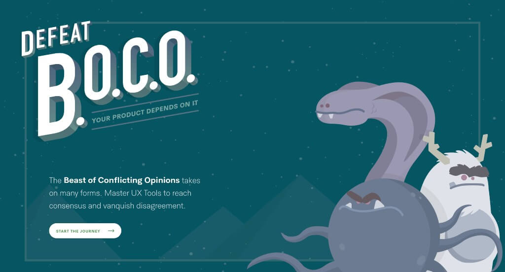
This company did nice balancing their written content with graphics to create something outstanding. We thought it was cool how they created a visual to match with the story of building a UX design. Their color palette was stunning and made sense for each of their stories which we really liked. Their domain was another aspect that we appreciated because it matched their name.


Recommended Interactive WordPress Themes

Vavo – Themeforest

$59

Cygni – Themeforest

$59

Qreatix – Themeforest

$49

Artha – Themeforest

$59

Disclaimer: WebCitz, LLC does not warrant or make any representations concerning the accuracy, likely results, or reliability of the information found on this page or on any web sites linked to from this page. This blog article was written by David W in his or her personal capacity. The opinion(s) expressed in this article are the author's own and may not reflect the opinion(s) of WebCitz, LLC.