In the sensory-driven culinary market of 2026, a bakery’s website has evolved from a simple menu page into a digital storefront designed to trigger an immediate dopamine response. For artisan boulangeries and high-volume patisseries, an online presence must achieve a mouthwatering balance: projecting the “warmth” of the oven through the screen while offering a frictionless, high-speed ordering experience. To thrive in today’s “on-demand” economy, your design must move beyond static imagery to embrace “Texture-Led Discovery,” using high-definition macro-photography and slow-motion video to communicate the crunch, crumb, and quality of your bakes before the first bite.
Our analysis of the current landscape focused specifically on mobile-first “One-Tap” checkouts, localized pickup/delivery scheduling, and the strategic use of dietary transparency icons. These elements eliminate the guesswork for modern consumers – especially those with specific health or allergen needs – ensuring a seamless path from cravings to completed purchase.
Whether you are a neighborhood micro-bakery building a loyal local following or a national brand scaling a seasonal subscription service, the following benchmarks represent the gold standard for bakery web design in 2026.
Note on Modern Standards: Current industry leaders demonstrate a clear commitment to “Visual Hunger” principles, where the product remains the hero without the distraction of cluttered promotional banners. This selection focuses on design patterns that prioritize sensory storytelling and operational efficiency, providing the most strategic value to both the baker and the modern dessert-lover in 2026.
Top Bakery Website Designs
1. Susie Cakes
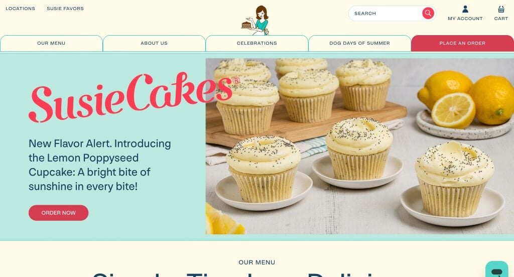
This color palette really stood out to us because it is different for this type of business. We loved their images that show off a variety of their products. Additionally, buttons were used in order to direct viewers to more content. Including customer reviews was also a great choice. This domain was simple and matched their company name which was nice.
2. Bread Alone
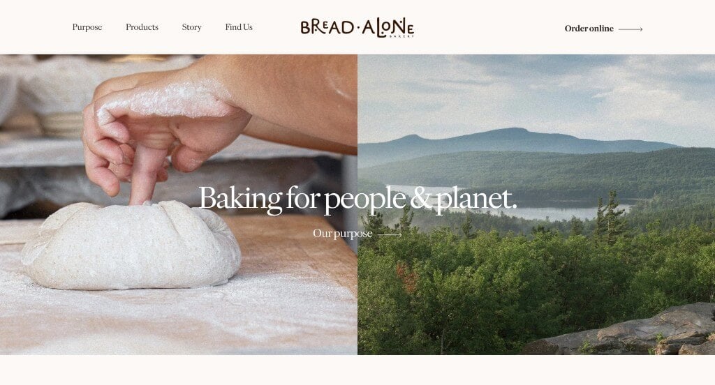
Bread Alone was a company that knew how to balance all of their content to create something professional. These images were fairly large but they never took over their pages. This company picked their fonts carefully to blend well with their overall feel of their website. We thought the way that they designed their logo was unique and a great way to represent their brand.
3. Billy’s Bakery
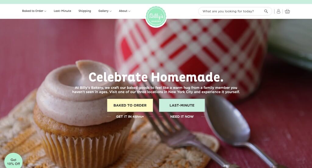
This was a very cute design that is sure to grab attention. Using creative little image frames that feel homemade was an addition to this site that we couldn’t ignore. Having an introduction and link to each of their cakes was a choice that we really liked. Adding in customer reviews was a nice way to build trust with incoming customers.
4. Flour Bakery + Cafe
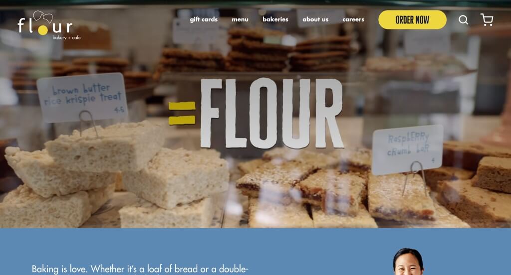
Our favorite part about this example was for sure this company’s logo design that is very logical for their brand. Their automatically playing video that uses text and imagery to show their values as a business was another great choice. This blend of yellow and blue along with their white and black color scheme created something that was outstanding.
5. Jenna Rae Cakes
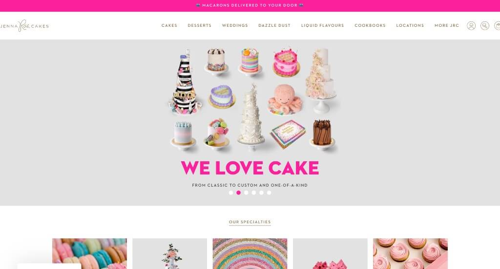
Having cakes that are seasonal was the first thing that Jenna Rae Cakes did right, but it wasn’t the only thing. They used an arrangement that seems almost authentic to their company. Adding in a blog was a nice touch for a unique website. They also made sure to include social media which was something that we couldn’t ignore.
6. Magnolia Bakery
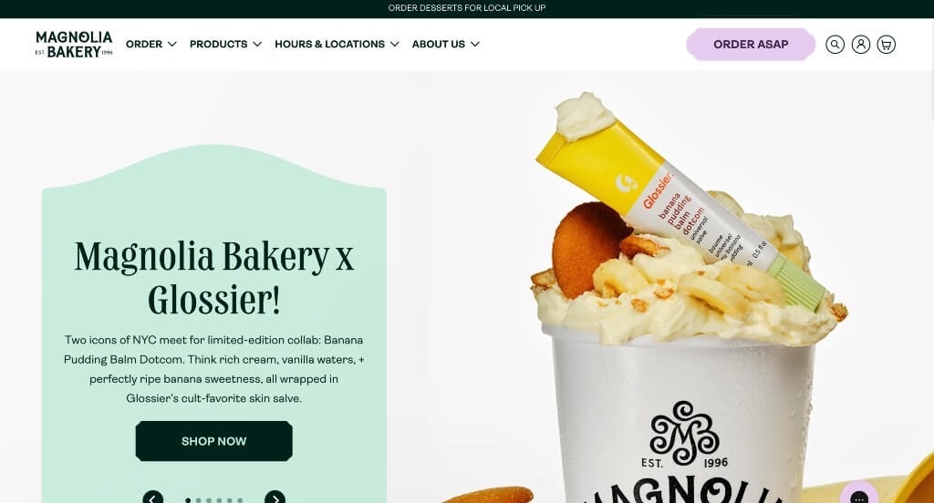
One of our favorite parts about this example was for sure the inventive fonts that were used throughout the entire example. These images are high quality and use similar colors as the rest of their page which looks amazing. Having some watercolor patterns as backgrounds for some of these pictures was another thing that stood out to us.
7. Levain Bakery
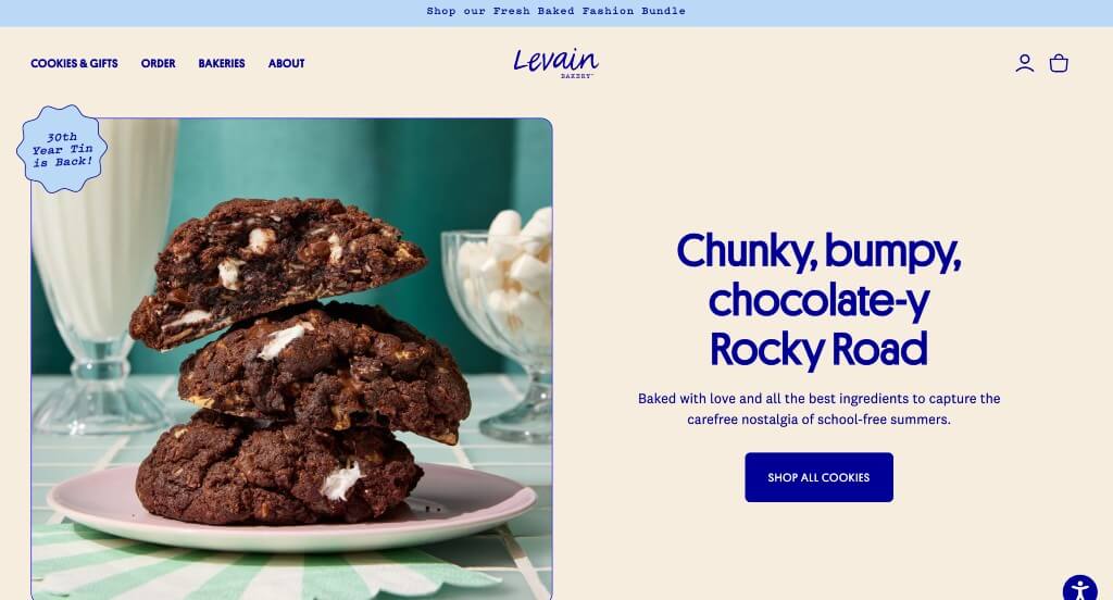
Levain Bakery did a great job mixing different shades of blue for accents throughout the page which caught our attention. We liked how graphics are used in order to help balance images with their white space. Simple navigation was used here which is something that we always find to be helpful. Along with all of that, we liked their simple thin lines that were used as frames for images and text boxes.
8. Milk Bar
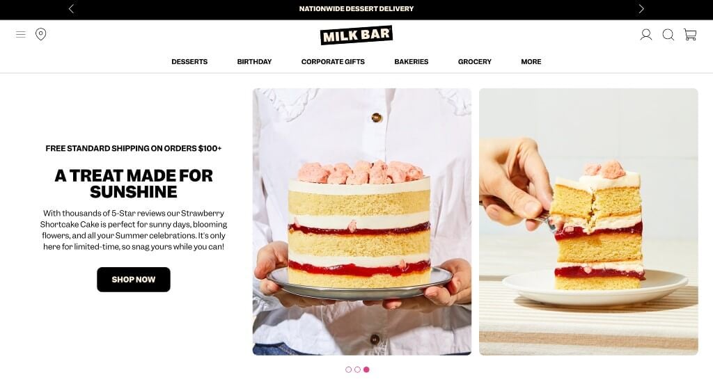
Milk Bar’s best feature is for sure these high quality images that are mouthwatering. This company used a color scheme that was very modern with small pops of neon pink to highlight various parts of the website. Allowing viewers to see parts of their packaging was another smart choice because it’s part of their branding. Paragraphs were kept short to keep people engaged with their information longer which is always a plus.
9. Partake Foods
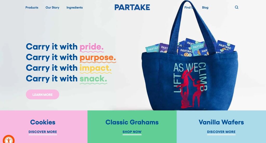
This was a stunning design that anyone could appreciate because of their bright colors that help accent certain parts of their site. Lots of links were included in order to guide viewers towards important information without cluttering the pages. We really liked how they used images that have been cut out along with graphics to have a more stunning visual appeal.
10. Justice of the Pies
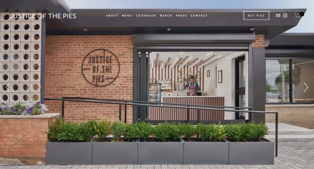
Bold fonts was something that we enjoyed because it grabbed attention and it was easy to read. Using lots of images to help guide viewers towards additional information was something that really stood out to us. Along with all of that, we really enjoyed how they featured a Netflix show to get their customers more involved. We also thought that this logo was creative which is always nice.
WordPress Bakery Themes
You can find free themes at wordpress.org or consider bakery-inspired templates on ThemeForest.
Cake Bakery – Themeforest
$54
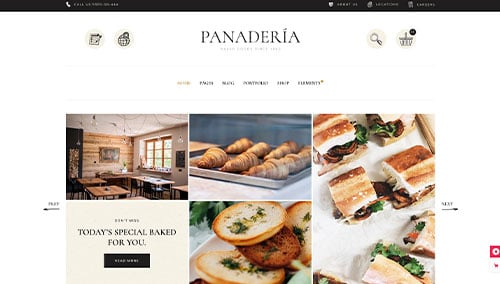
Panaderia – Themeforest
$79
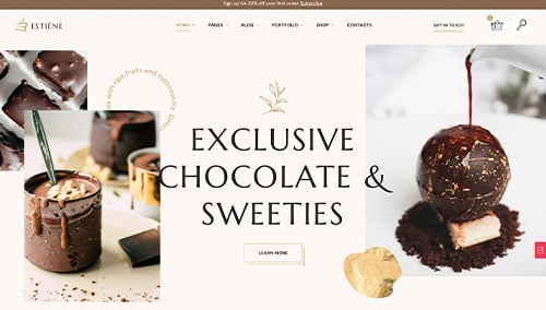
Estiene – Themeforest
$69
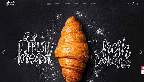
Baker – Themeforest
$79
WooCommerce Bakery Themes
You’ll find a wide selection of ecommerce bakery themes for WooCommerce on ThemeForest.
Noucake – Themeforest
$59
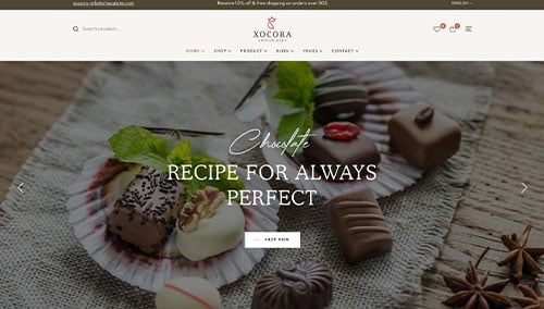
Xocora – Themeforest
$59
Shopify Bakery Themes
Explore free and paid themes at themes.shopify.com or consider options available on marketplaces like ThemeForest.
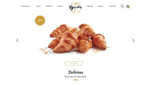
Bready – Themeforest
$79
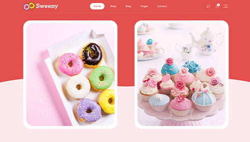
Sweeny – Themeforest
$58