Explore the world’s best tourism webpages with our curated guide! We’ve evaluated these examples for design, functionality, and user experience – featuring stunning visuals and rich destination info. Whether you’re a travel agency, accommodation service, or provide tours, find inspiration and practical tips to create an engaging online presence. For more industries, check out our best web designs article!
Top Tourist Destination Website Designs
- 1. Travel Oregon
- 2. Visit Montana
- 3. Pure Michigan
- 4. Travel South Dakota
- 5. Visit New Mexico
- 6. Travel Alabama
- 7. Go Hawaii
- 8. Travel Louisiana
- 9. Visit Indiana
- 10. Experience Abu Dhabi
- 11. Travel Wisconsin
- 12. Explore Minnesota
- 13. Visit Arizona
- 14. North Dakota Tourism
- 15. Travel Nevada
- 16. Travel Oklahoma
- 17. Visit Idaho
- 18. Visit Missouri
- 19. Vermont Vacation
- 20. Visit Finland
- 21. I Love New York
- 22. Visit Washington
- 23. Texas Vacation
- 24. Travel Iowa
- 25. Visit Rhode Island
- 26. Visit North Carolina
- 27. Visit Utah
- 28. Enjoy Illinois
- 29. Visit Pennsylvania
- 30. Visit Brasil
- 31. Visit California
- 32. Visit Arkansas
- 33. Visit Florida
- 34. Tennessee Vacation
- 35. Colorado Tourism
- 36. Discover South Carolina
- 37. Visit Nebraska
- 38. Kentucky Tourism
- 39. The Islands Of Tahiti
- 40. On The Grid
- 41. Visit Massachusetts
- 42. Visit Mississippi
- 43. Visit Wyoming
- 44. Visit Maine
- 45. Travel Alaska
- 46. Explore Georgia
- 47. Travel Kansas
- 48. Visit Virginia
- 49. Visit Maryland
- 50. Visit West Virginia
1. Travel Oregon

A green accent was a very impactful part of this one. It was amazing how they made use of Oregon’s state silhouette throughout. Simple fonts were also used, which is smart because it makes content easier to read. Additionally, Travel Oregon had a domain that was short and simple.
2. Visit Montana

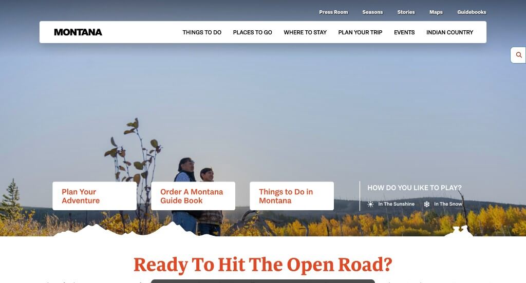
Right away, anyone would notice how stunning images were used to guide viewers through this design. Integrating social media is another thing that many visitors will like. Bold fonts for phrases used as titles looked nice and helped those titles stand out more.
3. Pure Michigan

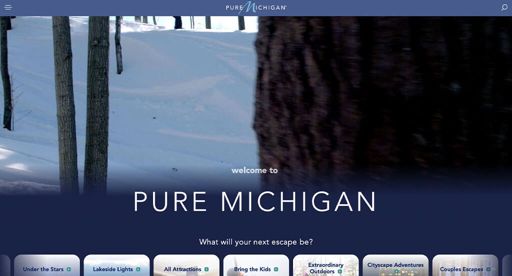
A variety of blue colors are used in Pure Michigans page. This was not only logical but also really pretty. Automatically playing videos were another thing that stood out to us. Short paragraphs are utilized in order to keep content easy to skim and more enjoyable to read.
4. Travel South Dakota

There was a few graphics and captivating fonts, which makes for visual stunning pages. Accents of blue were pretty and helped to break up content. Social media was included which was a unique choice. Full screen images are also occasionally used to allow for a more organized template.
5. Visit New Mexico

Right away we noticed this simple logo that uses mainly text with a small graphic. Images are occasionally used for a background for linked content which looks great. Having short paragraphs is always helpful, but we really liked it here because small bits of information can help people plan their trip.
6. Travel Alabama

If you’ve ever been to here, you’d know that this example harnesses the beauty of Alabama. We liked their use of circular graphics to show off a variety of possible entertainment options. Relaxing imagery is another smart choice for this webpage.
7. Go Hawaii

Go Hawaii is very professional, thanks to its blended use of blue, white and a few other accents. Patterned graphics appear in strips to create a stunning aesthetic for their pages. Images are featured in different sizes and arranged carefully to make something appealing.
8. Travel Louisiana

Right away, our team noticed how an automatically playing video was included for a hero image in order to attract attention. A balance of images and videos was smart because people could see what they could be experiencing. A navigation bar that matched their company name was another helpful choice.
9. Visit Indiana

A great choice for Visit Indiana was how their D included the state’s silhouette. Being able to look at attractions by regions of this state was an interesting feature. Having a tab within their navigation bar that’s dedicated to those that wish to explore this state through the joy of a road trip.
Related: Tourist destinations often utilize digital marketing as a way of connecting with an engaged audience and nurturing those relationships.
10. Experience Abu Dhabi

One of our favorite parts about this example was for sure their professional and interesting fonts. These paragraphs were short and straight to the point which is always appreciated by those reading through their content. They also did well making sure to include high quality images throughout the entire template. We also liked their interactive map that we don’t see in every example.
11. Travel Wisconsin

Using a variety of different colors was something that many people will notice right away. As you scroll through, a quality you’ll notice is the ability to look at categories based on the season. A short series is included to help visitors find their favorite attractions within Wisconsin.
12. Explore Minnesota

Many images were included in a variety of areas in order to allow for a website that people will get excited about. A bold font is used that is professional and easy to read. Short paragraphs and linking text were a few of the other aspects that we liked about Explore Minnesota.
13. Visit Arizona

This one made sure to use some visual representation along with text for their logo, which looked great. A red accent used throughout was extremely impactful to highlight certain content. We also loved occasional hover animations that breathe life into their pages.
14. North Dakota Tourism

There were many qualities of North Dakota Tourism that we really liked. One of those qualities was definitely their wavy framing for large images that creates a unique feel. Our team also noticed how there was small graphics such as flowers and plants to accent their pages.
15. Travel Nevada

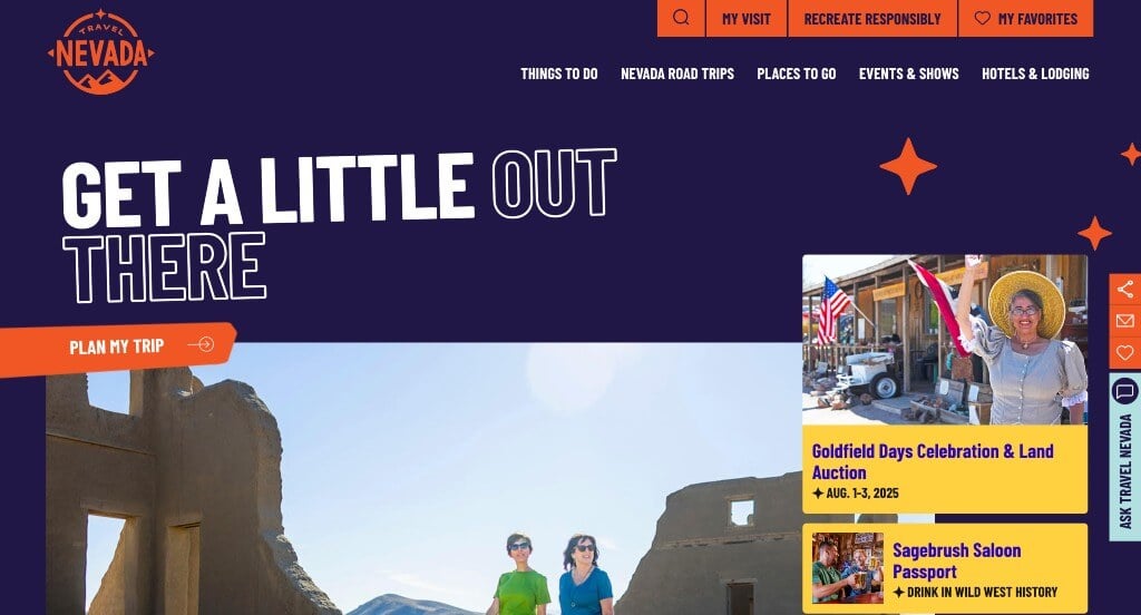
This is a creative one to take inspiration from if you want to stand out. Unlike many of their competitors, this company used subtle animations and graphics to keep people scrolling. An interesting color choice was another thing that makes them different.
16. Travel Oklahoma

Interesting patterns were used as backgrounds – something that isn’t necessary, but allows for a more unique feel. A variety of activities that appeal to different people are included so more customers will be satisfied with their site. Another feature here that was nice was their alluring imagery.
17. Visit Idaho

Graphics and textures are used all over this example, making it look amazing. They do a great job organizing their content. Additionally, there is a good balance in this layout so nothing feels too cluttered. Small icons are used to pair with quick statistics about this destination.
18. Visit Missouri

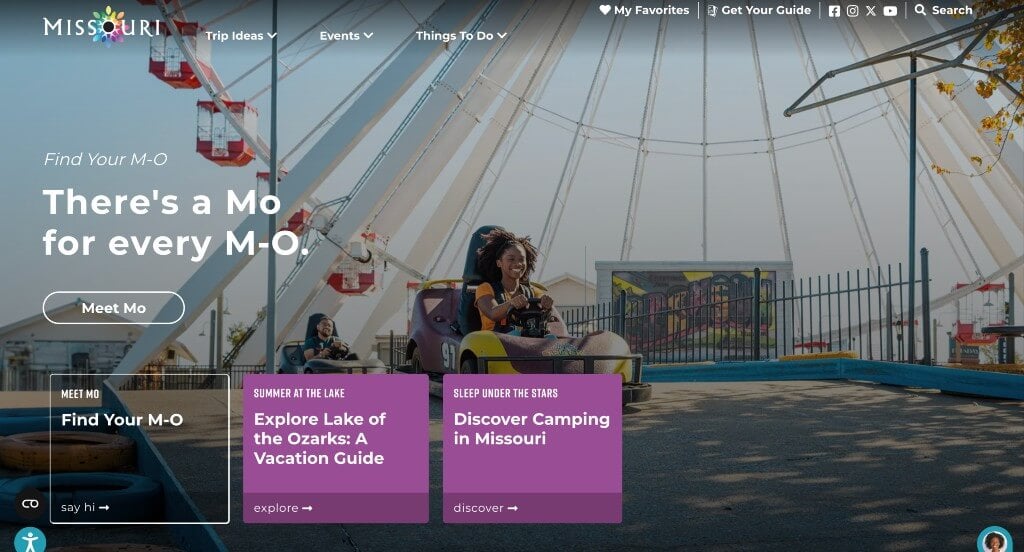
Upon entering this example, you’ll find their most unique attribute. Find your Mo was a quick survey that allows couples, families, and individuals to find their calling in Missouri. Having preplanned itineraries was another helpful choice.
19. Vermont Vacation

Images are for sure the best part about Vermont Vacation. They also did a great job utilizing gray, orange, white and black throughout for a sense of unity. Everything was well organized, making it easy to find content and read what viewers want to read. A simple domain matching their brand name was another smart idea.
20. Visit Finland

A good balance is maintained in this example. Whitespace is used carefully and images and videos are included in an aesthetically pleasing way. Allowing for an ability to heart different articles was another great idea. A survey was also included to help people find the best location for them.
21. I Love New York

Using this classic logo along with a blended use of white, red, black and gray was really nice. Including a blog was refreshing and was a great way for viewers to learn more information. Maps are included which is an amazing addition that will be appreciated.
22. Visit Washington

Large images that are full page helped their pages feel more balanced. An interactive map with separate counties to display what can be done in each area of Washington was helpful. Incorporating social media was another quality that showcased professionalism for their business.
23. Texas Vacation

Large images used as backdrops was a choice that we appreciated. Using a blue accent to help highlight certain content was amazing. Showing their state within the website reminds customers where they will find themselves vacationing.
24. Travel Iowa

A feature we liked within Travel Iowa was how they added in buttons to enhance usability. Their color scheme was stunning and we loved how they were perfectly paired. Their navigation bar used drop downs in order to keep everything organized and easy to find.
Related: Rank your vacation hotspot in search results with the help of a local SEO agency with experience in the industry.
25. Visit Rhode Island

Automatically playing videos capture attention right away, which is always helpful. Our team liked how there was a good balance of text and images – plus their white space is balanced well too. Adding a search bar for lodging that can feature content based on your vacation date and lodging type.
26. Visit North Carolina

These perfected color choices was something that caught our eyes, plus it created a relaxing feel. Their interesting fonts were another feature that made their visuals even better. Adding in an Instagram section was helpful to keep people engaged.
27. Visit Utah

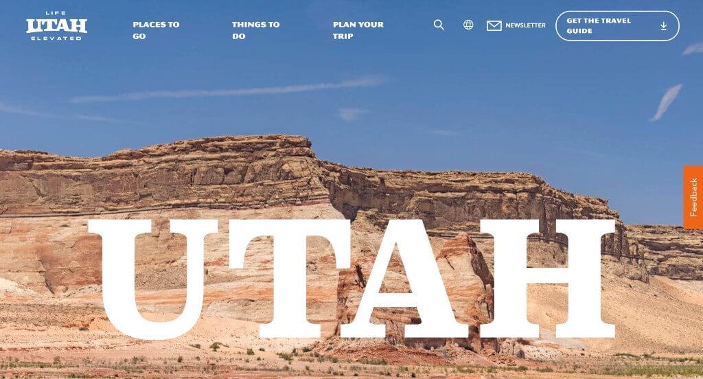
Monochromatic colors are used for text accents to help certain information pop more. Buttons were helpful to help people navigate through their content and keep everything organized. Short paragraphs are nice because people can stay engaged with their information for a longer amount of time.
28. Enjoy Illinois

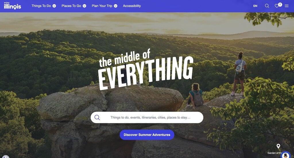
Allowing their navigation bar to change color or patterns based on holidays or events. A search bar is included right away so that people can find what they are interested in learning about. Icons create a backdrop that is simplistic.
29. Visit Pennsylvania

This example did a nice job utilizing bold fonts that are professional and look nice. Lots of buttons were another helpful choice to guide people through content. Images are of high-quality and balanced nicely throughout their pages.
30. Visit Brasil

Something that felt special to us was their use of bright ombre patterns to highlight certain events. Everything is well balanced making it easy to find information. After looking for a bit, you’ll notice their colorful and unique logo.
31. Visit California

We liked how this example used boxes or frames to organize content within images. The organized categories on their page was likely the most impactful quality in the homepage of this website. Another thoughtful quality in this professional travel website we enjoyed was the stories included into the site. They clearly had website marketing in mind when designing the high-quality imagery in the social media area of their website. Give some thought to the one-of-a-kind design of this tourism website when developing your next custom website.
32. Visit Arkansas

The white, cream, blue and yellow colors used in this tourism website stood out to us because it was simple but still professional looking. The captivating font was likely the most impactful quality in the homepage of this website. The use of maps of the state was absolutely a consideration when ranking Visit Arkansas in this list of top tourism websites. They clearly had website marketing in mind when building the well-labeled navigation bar for their website. For the tourist destinations out there searching for website examples, make sure to check this one out!
33. Visit Florida

This is a great website design example for tourist destinations looking for custom website layout ideas. As you scroll through the homepage of the website, one of the design qualities we liked was their captivating visuals. The pink accent was a unique choice for a custom travel website. They clearly had conversions in mind when creating the integration of social media. Be sure to consider the unique design of this tourism website when building out your next website.
34. Tennessee Vacation

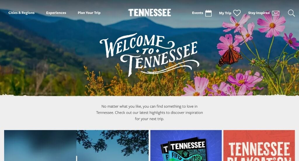
This is a good example of a website design for tourism areas looking for a professional look and feel for their next custom site. The professional font was definitely the most impactful quality in the homepage of this website. Another thoughtful quality in this creative tourism website was the creative graphics. Tennessee Vacation had website accessibility in mind when building the well-labeled navigation bar for their website. These were just a few of the numerous qualities in this website we had to consider while we were putting together this list of top websites for travel.
35. Colorado Tourism

There were numerous travel destination sites to choose from, but the website for Colorado Tourism was the perfect example of a well-designed website that used white with multiple different accent colors for their color scheme. Of all the custom travel websites we reviewed, one of the features in this custom website we liked was the logo that relates to the state. Another feature in this custom travel destination site we liked was their framing for some of the images and text. Colorado Tourism clearly had a focus on ease of use when creating the categories so viewers can look at events they would be interested in. Give some thought to the great design of this tourism website when building out your next website.
36. Discover South Carolina

The white, blue, brown and black color palette used in this tourism website stood out to us because it looks relaxing. The videos and information based on Darius Rucker’s favorite places to visit was likely the most impactful quality in the homepage of Discover South Carolina. Another thoughtful feature in this clean tourism site we noticed was their thought provoking logo design. From a marketing point of view, we really liked the way this travel destination website utilized icons to help users navigate their website. Any website designer making websites for tourist companies will want to consider checking this website out.
37. Visit Nebraska

This is a great web design example for travel destinations looking for a professional layout idea. The most refreshing part of this travel website was their images that truly represent the heart of Nebraska. The different sized fonts to emphasize titles was refreshing for a custom tourist website. Visit Nebraska clearly had a focus on digital marketing when creating the domain for their website that matches their company’s name. Talk about a great website to have included in this list of top websites!
Related: When SEO isn’t getting the results you need fast enough, look toward paid advertising for instant awareness for your vacation or tourist destination.
38. Kentucky Tourism

This is a good example of a website design for tourism destinations looking for a custom look and feel for their next site. The addition of a map laying out all the towns was likely the most impactful quality in the homepage of Kentucky Tourism. Another design quality in this custom travel site was how they showed popular categories within each region of the state. From a marketing perspective, for a tourism website we really liked the way they utilized a search bar that allows for filters. You won’t be disappointed after reviewing this website for design ideas for your next website!
39. The Islands Of Tahiti

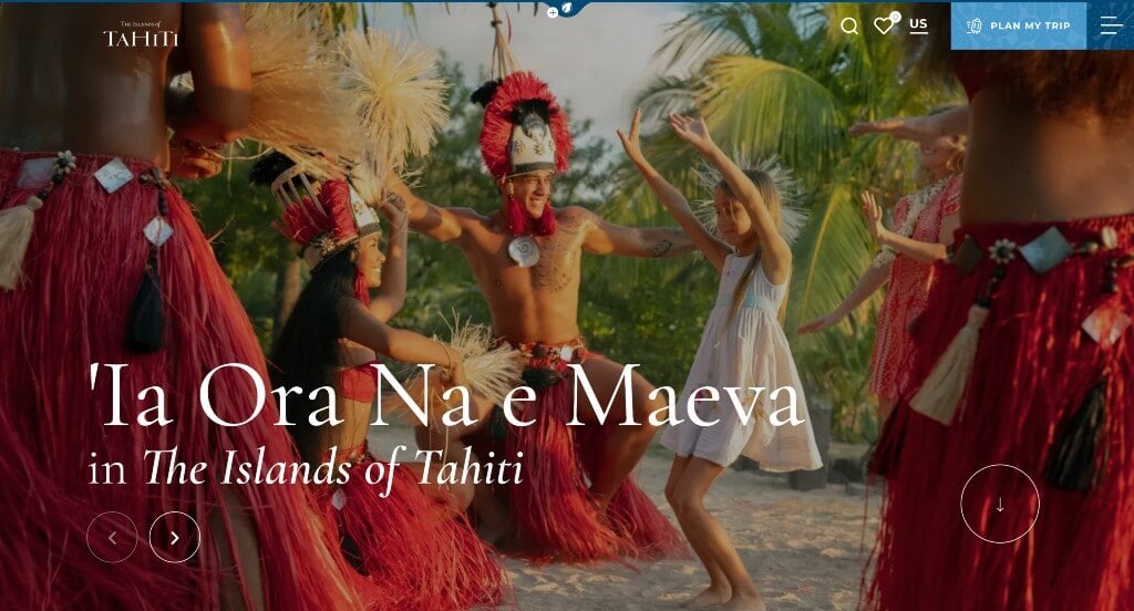
This example’s best feature was for sure their high quality images that get people ready for their coastal vacation. Splitting up each of these islands into their own groups was a great way to provide information in a more organized manner. Making sure to keep their paragraphs short and straight forward was another thing that we liked about this example.
40. On The Grid

The bright color palette used in this custom tourism website stood out to us because it creates an energetic environment. One of the design features we liked most in the homepage of On The Grid was their focus on different areas in different states because it was rather refreshing for a tourism website. Another feature in this creative travel destination website we noticed was their graphics showing landmarks from different areas. They clearly had website marketing in mind when building the captivating logo design for their website. Be sure to consider the great design of this tourist website when developing your next custom website.
41. Visit Massachusetts

We loved how this company started off with a slider that features images from their beautiful state. Featuring the silhouette of their state on each of those images was another thing that we noticed. Simple fonts were used in this example to create a design that looks stunning and professional. Allowing local businesses to collaborate with their website was a feature that we really appreciated.
42. Visit Mississippi

The Visit Mississippi website has a very classy feel to it, thanks to its unique use of white, cream, blue, green. As you scroll through the homepage of the website, one of the design qualities we liked was the variety of ways to break up content. Another thoughtful quality in this professional travel site was the display of things to do with a picture of the state to show where it’s located. They clearly had conversions in mind when creating the tourism destination in their website. Don’t scroll past this website when hunting for design ideas for your next travel website!
43. Visit Wyoming

This is a great website example for travel destinations who are looking for a custom web design. After scrolling past the header of this tourist website, you’ll immediately notice the relaxed outdoor feel portrayed through their color scheme. Another thoughtful feature in this custom travel site we noticed was the creative fonts. From a marketing viewpoint, we really liked the way they utilized a well-labeled navigation bar. What a great website to review when designing your next website!
44. Visit Maine

This is a good example of a web design for tourist destinations who are looking for a custom layout. As you scroll through the homepage, one of the qualities you’ll notice right away is the template that had a good balance of white space. The simple navigation throughout their site was definitely refreshing for a professional travel website. They clearly had conversations in mind when building the refreshing imagery for their website. Give some thought to the unique design of this tourism website when developing your next custom website.
45. Travel Alaska

The mainly blue and white colors used in this custom travel website stood out to us because it matches their images. As you scroll through the homepage of this website, one of the design qualities you’ll notice is the layout and color scheme that feels authentic to their company. The unique fonts were another design quality in this custom travel destination website we enjoyed. They clearly had internet marketing in mind when building the stunning graphic bands for their website. If you are looking for template examples for your next tourism website, be sure to check this one out.
46. Explore Georgia

We immediately noticed the simple color scheme in the Explore Georgia website, which we liked because it allows the images and information to be the focus not the design. We thought this was a good homepage design example for tourist sites because of the subtle animations. The large imagery seen in this website helped it make it into our list of the best template ideas for travel destinations. Their clearly labeled menu helped make this one of the top tourism websites we considered. For the travel websites out there searching for website examples, make sure to check this one out!
47. Travel Kansas

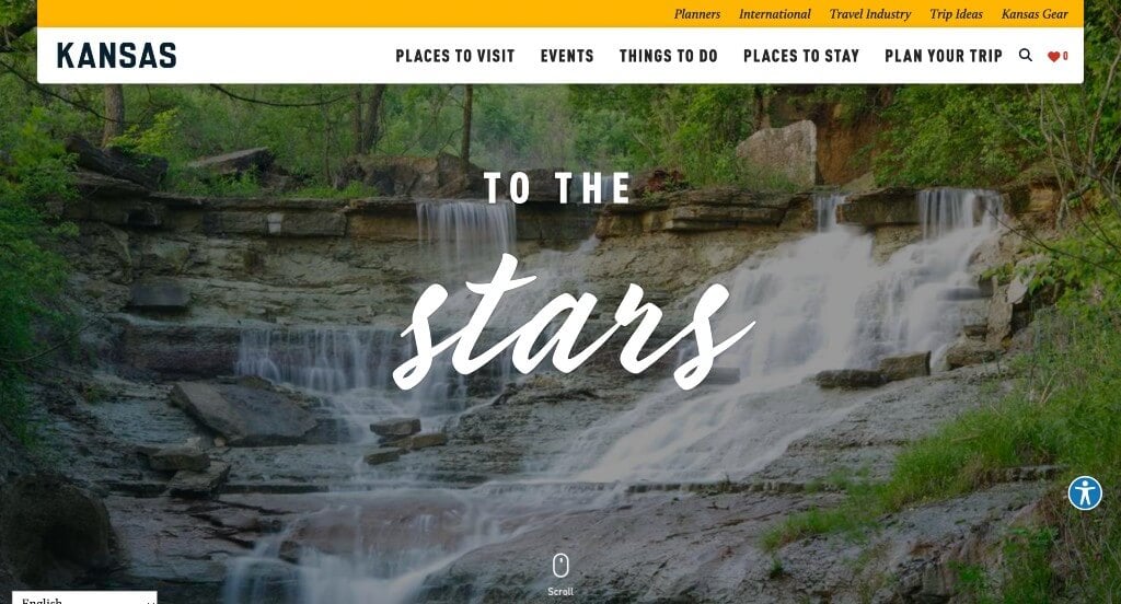
The yellow, white and black color palette used in this tourism website stood out to us because it creates a simple layout. After scrolling past the header of this tourist website, you’ll notice the smooth transitions. The use of short phrases was refreshing for a custom travel destination site. Travel Kansas had website marketing in mind when creating the ability to look at activities based on regions of the state. Any website designer making websites for tourist destinations will want to consider checking this website out.
48. Visit Virginia

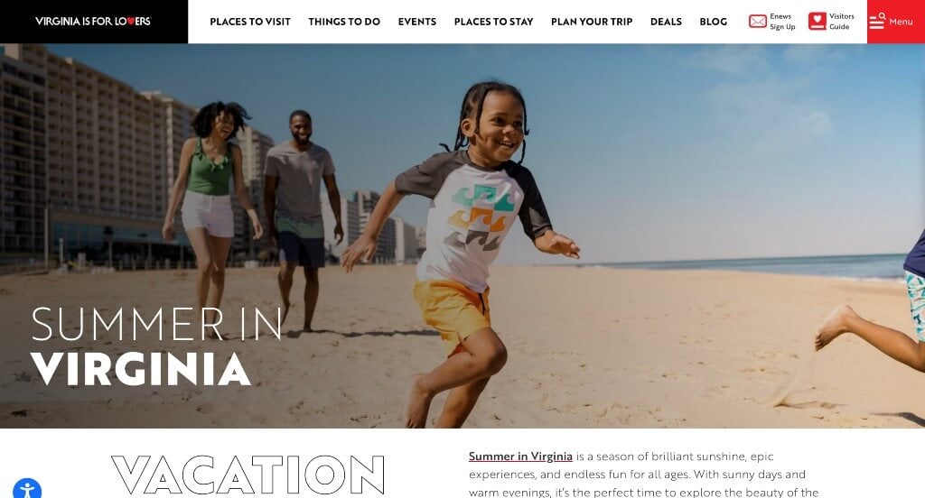
We liked how this tourism website combined the colors of black, white and red to create a custom web design. As you scroll through the homepage of this website, one of the qualities you’ll notice right away is their different thicknesses of fonts to show off titles. Another thoughtful feature in this custom tourist site was their addition of buttons for simple use. The videos displayed throughout their site was a marketing feature we noticed right away. Be sure to consider the unique design of this travel destination website when developing your next custom website.
49. Visit Maryland

This is a creative website design example for tourism groups looking to build their next website. The animated waving flag was probably the most impactful quality in the homepage of Visit Maryland. Their trending section was definitely refreshing for a professional website. Visit Maryland had ease of use in mind when designing the domain for their website that matches their company’s name. What a great website to review when building out your next website!
50. Visit West Virginia

This is a good example of a website layout for travel destinations who are looking for inspiration for their next custom web design. We thought this was a good homepage design example for travel sites because of their stunning imagery. Their inclusion of social media was another reason why we included this website in our list of the best websites for tourist companies. Visit West Virginia clearly had a focus on ease of use when designing the well labeled navigation bar for their website. With so many good reasons to consider this tourism website, it’s no wonder we included it in this list of the best websites!
WordPress Tourism Themes
You can find free themes at wordpress.org, or explore tourism-inspired templates on ThemeForest.
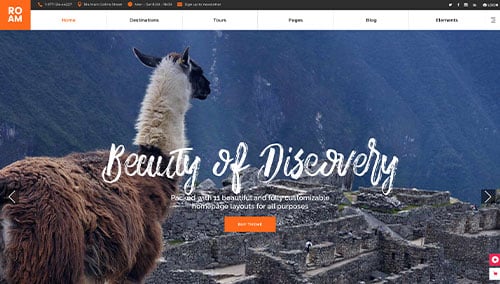
Roam – Themeforest
$89

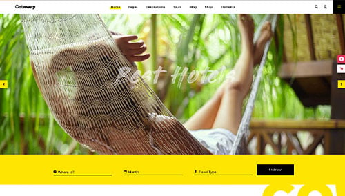
Getaway – Themeforest
$85

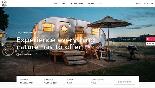
Kamperen – Themeforest
$85

UniTravel – Themeforest
$69
