Greetings, foodie entrepreneurs! Need web design inspiration for your eatery? Check out our guide to the top 39 restaurant websites.
Our team has evaluated the best restaurant sites for design, functionality, uniqueness, and user experience. From stunning visuals to seamless navigation, these sites are the crème de la crème.
You’ll find ideas for your site and valuable tips to make your online presence stand out.
Boost your restaurant business with this guide! Find website examples for various eateries. For more inspiration, check out our most unique websites of the year blog article!
Top Restaurant Website Designs
- 1. Forage Kitchen
- 2. Daniel
- 3. Flight
- 4. IL Mio
- 5. La Barraca
- 6. Bevri
- 7. Dede Licieux
- 8. Hasia
- 9. Bonaparte
- 10. Ottavio’s Italian Restaurant
- 11. Rare Bird Rooftop Bar
- 12. Desert Chill
- 13. Streetbird
- 14. Bandits
- 15. Katsuya
- 16. Risotteria Melotti NYC
- 17. Fat Choy
- 18. Farmacy
- 19. Block 16
- 20. Rookies Sports Bar
- 21. Saffy’s
- 22. Kuma’s Corner
- 23. Michael Jordan’s Steakhouse
- 24. Phil Stefani
- 25. Wolfgang Puck
- 26. Jean-Georges
- 27. The Bazaar
- 28. Santa Barbara Shellfish Company
- 29. Veggiegrill
- 30. Forgione
- 31. Anton’s
- 32. Pastaria
- 33. China Poblano
- 34. Ruth’s Chris Steak House
- 35. Lawry’s Restaurants
- 36. Francie
- 37. Snooze
- 38. Dasher & Crank
- 39. Bull & Last
1. Forage Kitchen
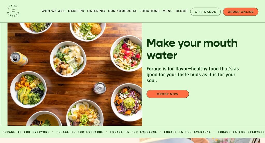
This was a website that we really appreciated because of their color scheme that is energetic and powerful. Using lots of buttons to help viewers navigate their content was another smart idea. We really liked their use of interesting fonts that helps them as a company stand out from their competitor brands.
2. Daniel
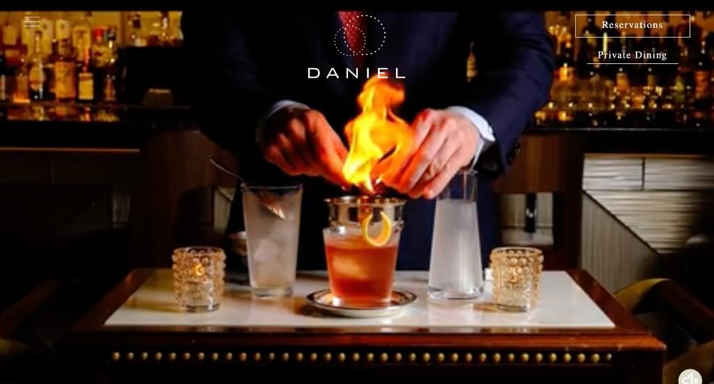
Daniel has a very modern feel because of white space, large images, and headers included. A simple grayscale color scheme creates a sophisticated template. We thought it was helpful to add a photo gallery to showcase unique dishes that they offer. Incorporating helpful links makes it easy to get contact them, reserve a table, or order online. Don’t forget to check out Daniel when looking for restaurant website inspiration!
Learn more about our award-winning website design services.
3. Flight
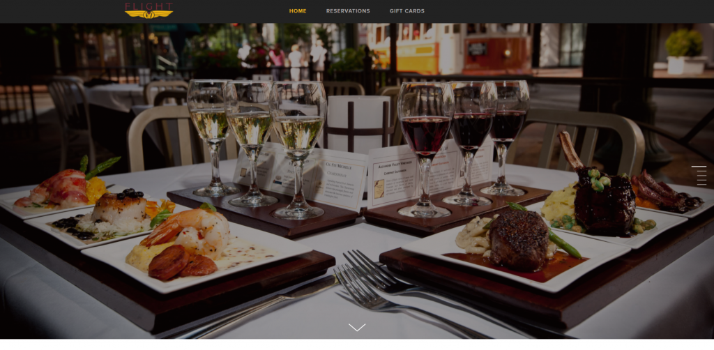
Flight’s website is simple along with being extremely attractive. Large, full-length images plus plenty of white backgrounds helps to break up content. Paragraphs are written in smaller font, resulting in a more professional feel. Exhibiting their menu and wine list makes it easy to see what they have to offer. Another aspect we really enjoyed was their professional, creative logo design.
4. IL Mio

Here’s another great web design example for restaurants that are looking for a professional template. After scrolling through, you’ll immediately notice stunning graphics. This custom Italian restaurant site also does a good job using creative fonts. High-quality visuals made this one of our top restaurant websites ideas. If you’re looking for template options, give some thought to IL Mio.
5. La Barraca
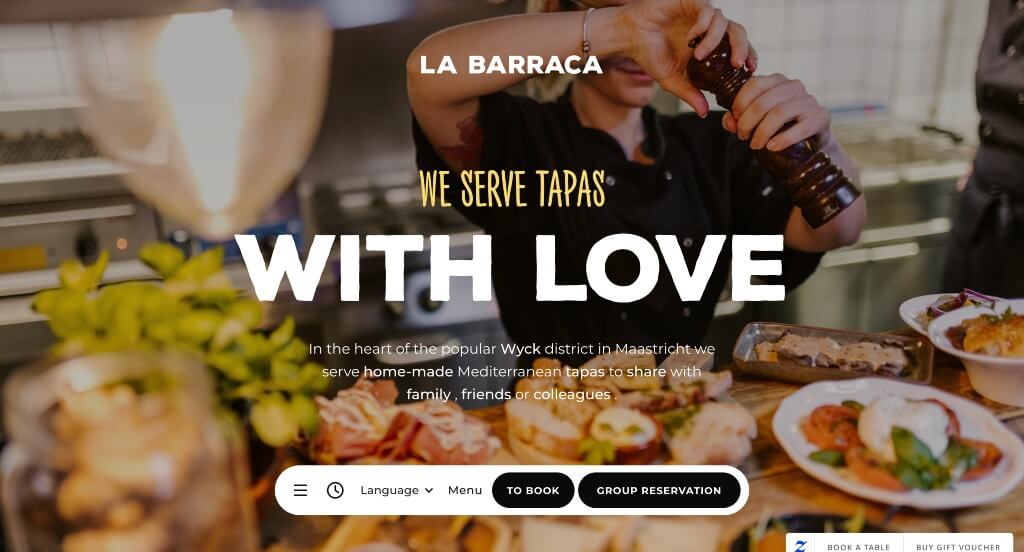
Upon entering La Barraca’s site, one might notice that text is written in a different language. However, google translate is compatible with their site making it easier for english speakers. On the homepage, high-quality photos of food, along with their locations gives customers more understanding of this company as a whole. Including an Instagram section is a great way to get people involved with your company. Google reviews from happy customers help prove reliability. Contact information is visible in multiple points, making it easy to quickly connect with them.
6. Bevri
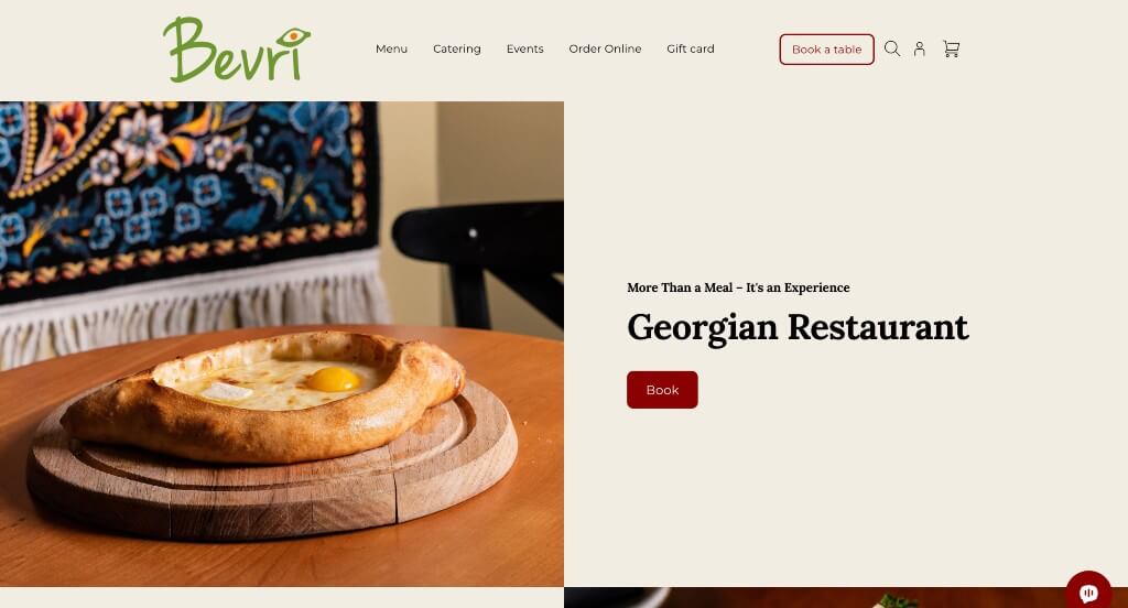
Incoming users of this site are instantly drawn to photos of appealing dishes. Having a clean, organized menu helps customers decide on food quickly. Along with that, favorite dishes from guests are listed within the menu. A relaxing color scheme helps to bring professionalism to this site. Lastly, it was nice to include buttons to help navigate through this stunning restaurant web design.
7. Dede Licieux
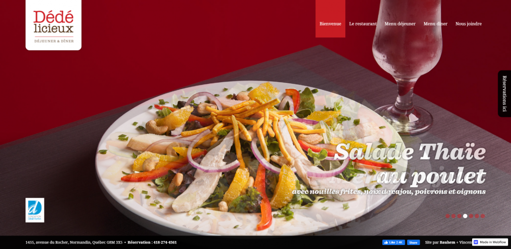
A simple, organized layout is seen immediately to allow people to click through information easily. Red is used to attract attention to important information. Having professional fonts really adds a professional touch to the site. We also thought including both a lunch and a dinner menu assists customers with choosing their meal.
8. Hasia
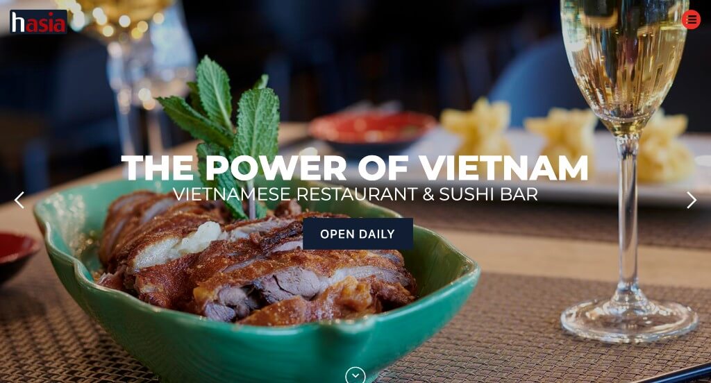
Hasia has a great layout with a good ratio of images to written content. For the color scheme, they use red alongside navy color to really pull the whole website together. We liked how they offer discounts upon entry of this site, which helps them stand out because not every restaurant offers discounts. We also enjoyed their creative graphics. Lastly, it was important to have a contrast in a variety of fonts (large, small, simple, decorative, bold, along with skinny).
9. Bonaparte
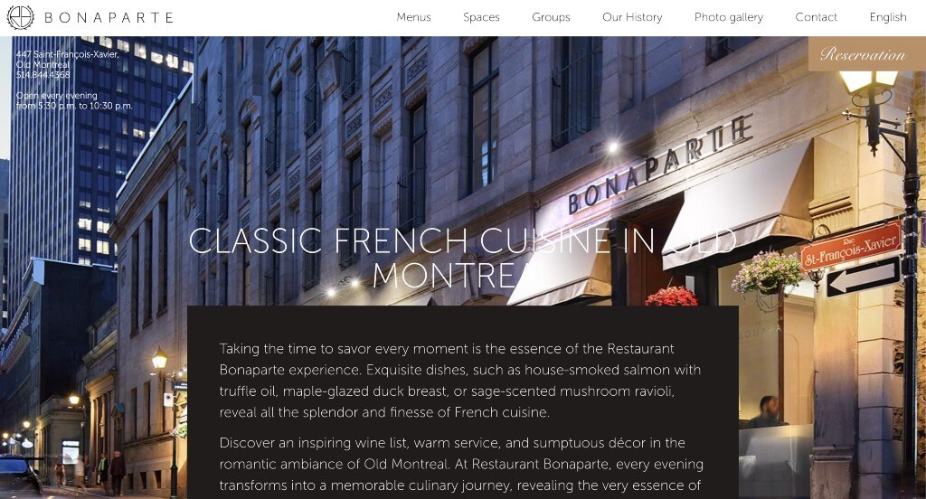
Here we have a bright red banner in order to grab attention of possible customers, plus helps them stand out from their competitor companies. Having a phone number, address, and social media links visible right away is a smart idea for any type of site. Bonaparte’s picked a minimalist feel portrayed by small writing and a good amount of space around information. Also, this allows for a clean, attractive design, making it easier to read.
10. Ottavio’s Italian Restaurant
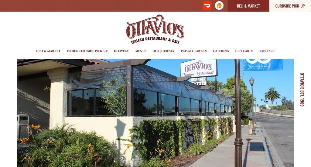
This was an example that we really liked because of their dark red accents. A few high quality images are included but not too many that it becomes a distraction. Ottavio’s Italian Restaurant also does a nice job with their navigation bar that is well organized in order to get people to the information that they need.
11. Rare Bird Rooftop Bar
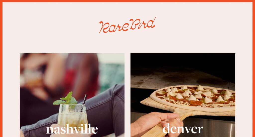
Separating this website by their location was something that we really enjoyed about this website. Accents of bright orange throughout the entire page was another thing that we really appreciated. Simple fonts and graphics are added in to create a more interesting template. Showing their location, hours, and menus in each part of the website was helpful.
12. Desert Chill

Without hesitation, we see a bright and exciting color scheme. Many different designs, colors, and patterns are included to spice it up. It was unique to have different frame shapes for this company’s images. Having a fun and simple logo design also helps this company out. Including buttons help users navigate the site.
13. Streetbird
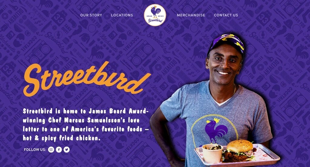
This example did a great job with their patterned background that is sure to be loved by viewers. We loved how this color scheme was used carefully to create the best possible template. They used lots of interesting fonts which was another thing that we noticed and enjoyed. Adding in videos to provide information in a different way was something else we appreciated.
14. Bandits
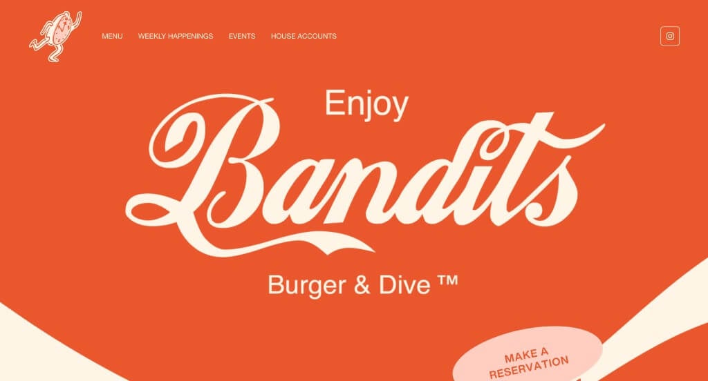
Here we have an example that makes good use of interesting fonts and a unique logo design. We also really liked the colors that were used in this example that are sure to be loved by anyone who views it. Including their menu right in their homepage was another thing that we really enjoyed because customers can see what is available here.
Related: Rank your bar or sports club higher in Google search with SEO services.
15. Katsuya
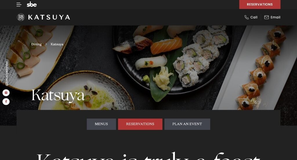
We enjoyed how this site makes sure to mention all of their locations, along with each location’s uniqueness. Different background colors are used to help separate information. Incorporating a social media section shows off customer experiences while also allowing possible clients to read past experiences. Don’t forget many high-quality photos and videos lining this site.
16. Risotteria Melotti NYC

Risotteria Melotti has a simple web design where all content is centered. Some simple icons are used to help describe information. We thought they do a great job explaining information. It was also a smart idea to include links to reviews so people can reach out and find them. Along with that, links for delivery companies (Uber Eats and GrubHub) making it easy to order food. When looking for restaurant website examples, don’t forget to take a look at this one.
17. Fat Choy
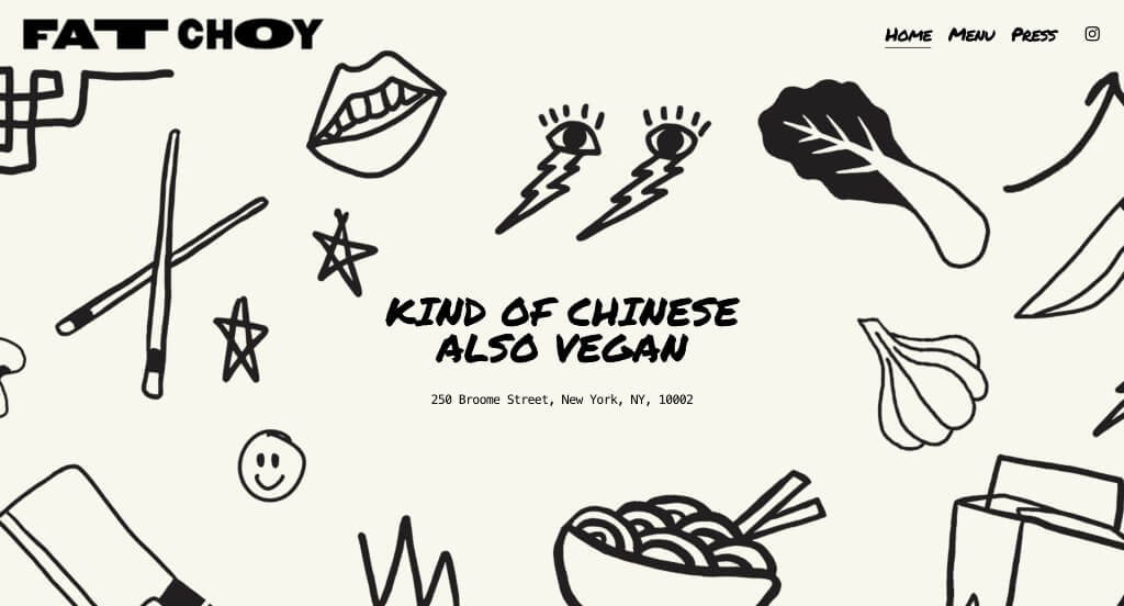
Creative graphics was the best part about this example because it helped them feel more creative. This company made use of a permanent marker font that goes along well with their graphics. Showing images with tape graphics to feel more like a scrapbook was another thing that we liked. Including a page for press related to their company was a thoughtful feature.
18. Farmacy
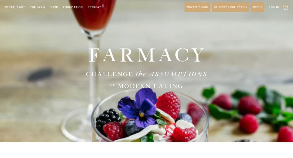
Starting this website out with an automatically playing video was a great way to introduce this company and their values. Using unique graphics that match with their color scheme was another thing that we appreciated. A feature that stood out to us was their font that ties their whole brand identity together. Adding in buttons was also a great way to guide viewers towards additional information.
19. Block 16
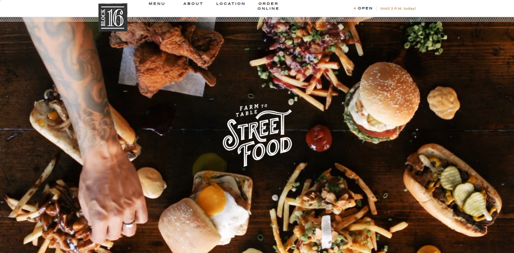
Block 16 certainly knows how to create a stunning design. Headlines are big, with capital letters. High-quality visuals can be noticed. Immediately, they share their hours for each specific day. A Facebook section allows visitors to see what their daily special is. Contact information can be found making it easy to connect with them. Also, social media links are offering more than one way to connect.
20. Rookies Sports Bar
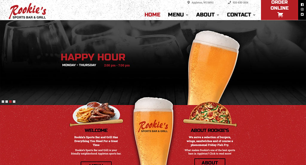
A red, black, and white color scheme is used for this custom sports bar website, which stood out to us because it creates a stunning template. After scrolling through this sports bar website, you’ll notice their addition of creative fonts. Something we noticed that was interesting was their textured background. They clearly had a focus on digital marketing when designing short and to the point paragraphs. These were just a few of the numerous qualities we had to consider when putting together this list of top restaurant web designs.
Related: Jump start your restaurant’s digital marketing with professional services geared toward food establishments.
21. Saffy’s

Here’s another example with a logical and professional color scheme that people will enjoy. Something else that we noticed here was their interesting graphics that are animated to create a more visually appealing design. Adding in buttons to help with any navigation issues was another smart idea that we liked.
22. Kuma’s Corner
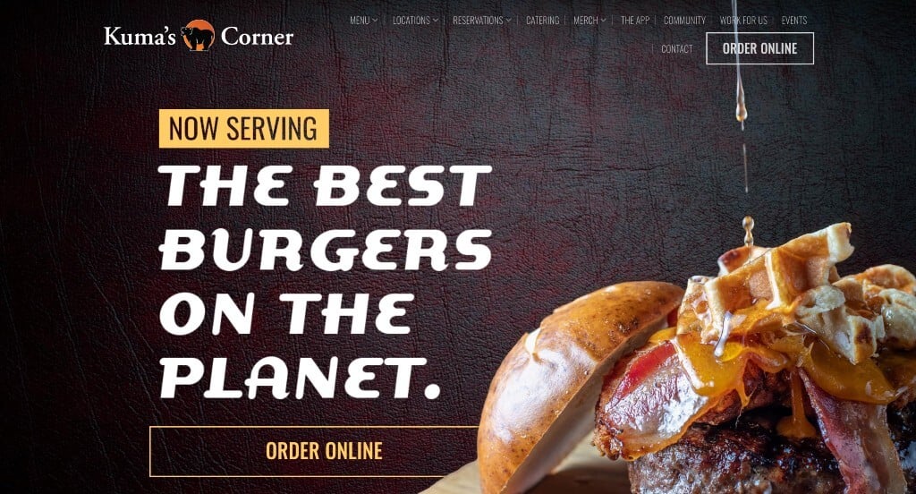
This was an amazing example because of the way their information and visuals are laid out. We also really liked how this example had textured backgrounds because it really helps them stand out from other restaurant sites. It was nice how when information was included in the form of written text, it was short and easy to read.
23. Michael Jordan’s Steakhouse
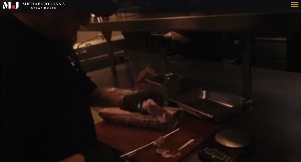
Michael Jordan’s Steakhouse website has a unique layout that stands out from others like it. We liked how they utilized a dark color for a background with pops of red and white to highlight information. A phone number and address are both visible which makes contacting them easy. Along with that, it was nice to have an automatically playing video and unique photo frames.
24. Phil Stefani
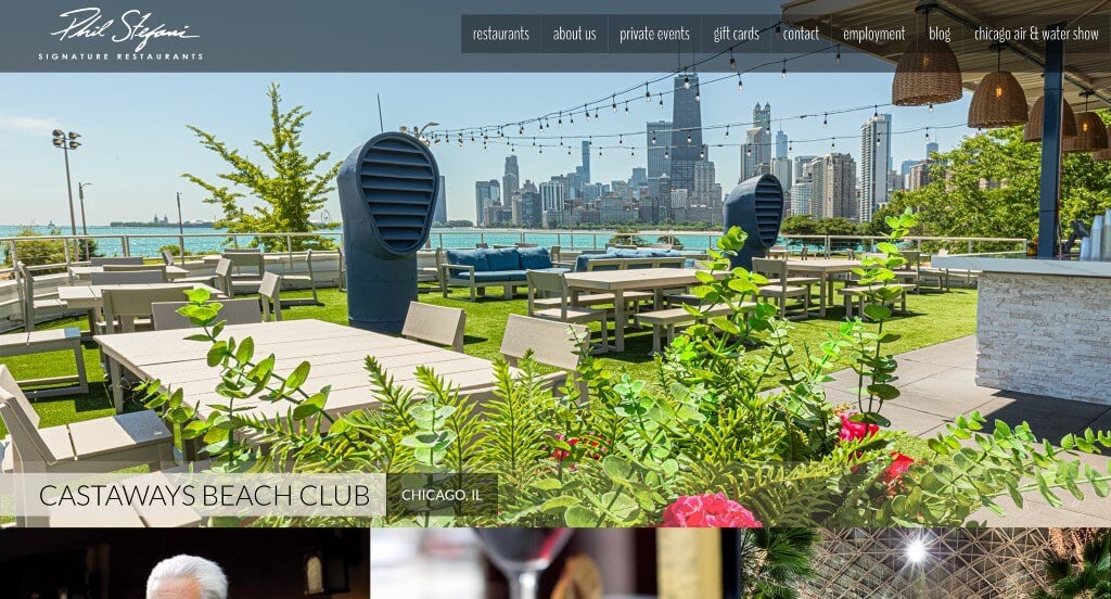
This restaurant starts by displaying some very delicious-looking meals. Homepage is kept simple with pictures, white space and links to more information. It’s easy to navigate because of the user-friendly menu. Incoming customers can easily join their mailing list with a form. We also enjoyed this company’s high-quality and professionally staged images.
25. Wolfgang Puck
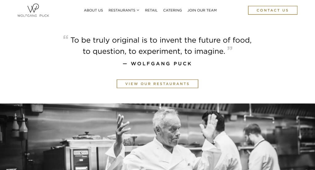
When looking for ideas for a luxurious restaurant web design, here is what you are looking for. This company exhibits luxury at its finest. All dishes and images are staged beautifully from placement to focus to background. Simple and delicate fonts are chosen to represent that feel. Additionally, a marble pattern is included as a background in a few areas.
26. Jean-Georges
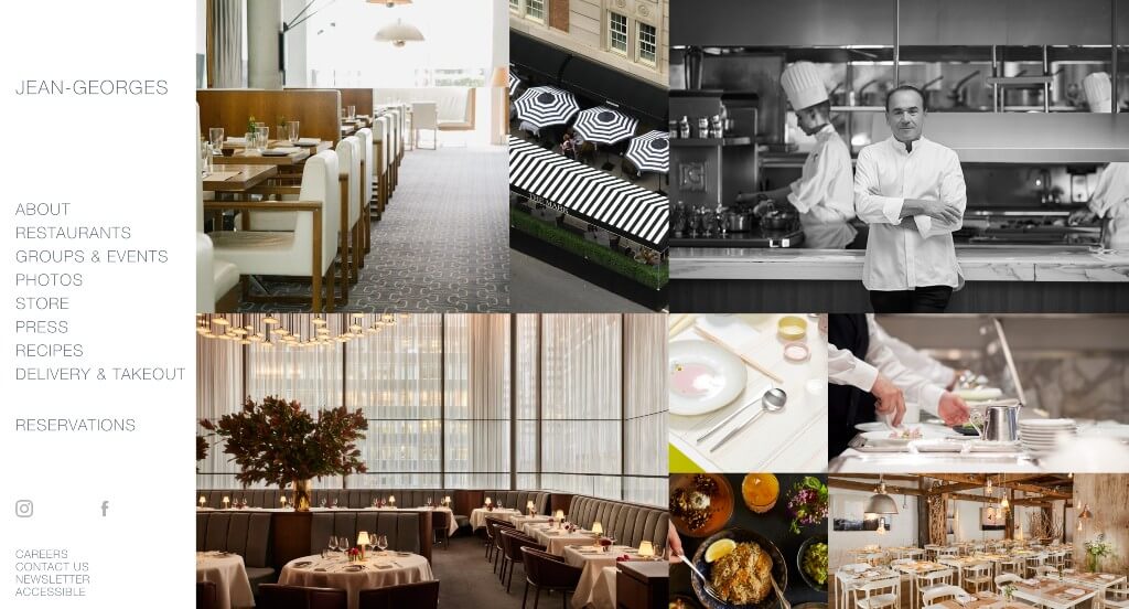
If simple is what you are looking for, check out Jean Georges. This company went with a basic but refreshing greyscale color scheme to help their images stand out. It was very accommodating to include a well organized navigation bar – with categories within. A section just for photos was also a great inclusion.
27. The Bazaar
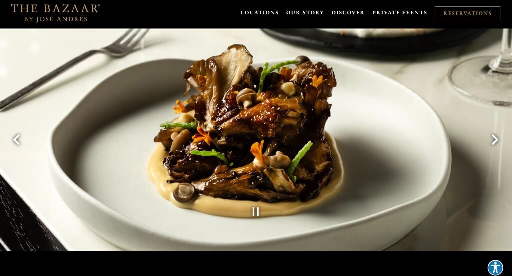
The Bazaar’s website design reflects on food they serve, modern and elegant. A black background makes pictures pop, while bringing attention to them. Layout set-up makes it very easy to schedule a reservation and sign up for emails. We really enjoyed the professional visuals of tasty food. Also, a large font allows for titles to stand out.
28. Santa Barbara Shellfish Company
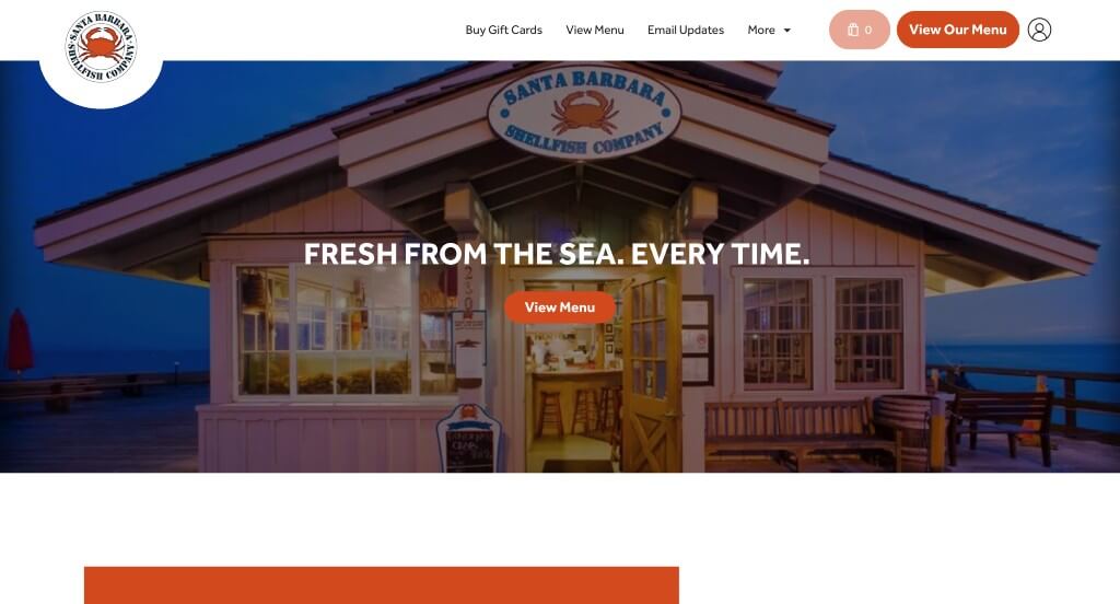
Bright orange color really adds to this template to highlight important information. A section to feature customer testimonials, showing good experiences was a nice touch. Many images of meals can be found to show potential customers what their meals could look like. Santa Barbara Shellfish Company’s contact information is noticeable along with a Google map.
Related: Bring targeted local traffic to your restaurant with the help of a managed PPC campaign.
29. Veggiegrill
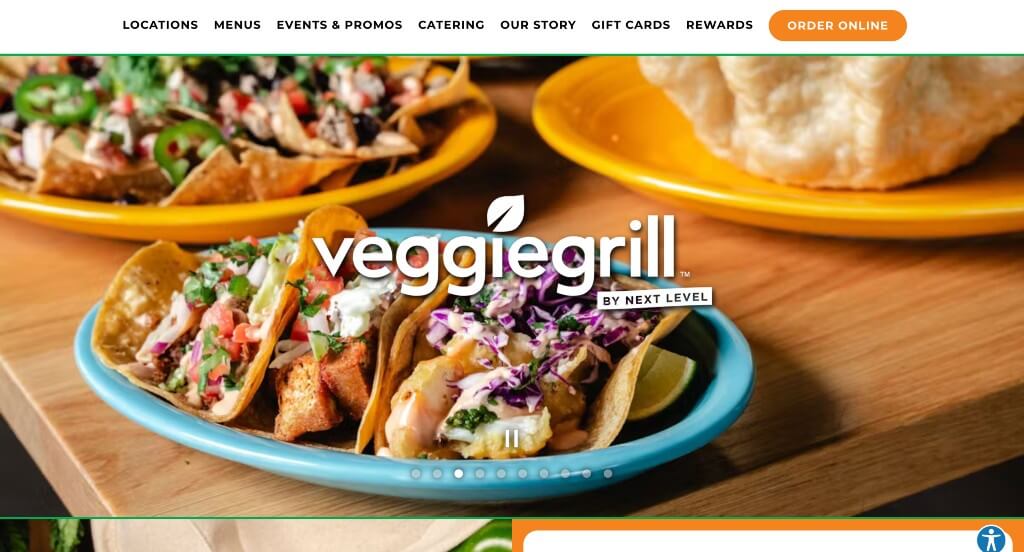
Veggiegrill has many strong headlines with big, capital letters. Bright colors are used to draw attention to headlines to give customers more information. This website is easy to read and understand information provided within the pages. Having a simple and refined logo design also brings reliability for your business. We also thought having a slideshow of well-prepared dishes was a great choice for this homepage.
30. Forgione
Forgione’s site design has a very modern and elegant feel. A color palette of black with white writing, keeps the homepage simple. Other pages are organized well with images and short to-the-point paragraphs. We thought it was extremely useful to place their hours and location in many areas of their template. They also include links to Facebook, Twitter, and Instagram to stay connected.
31. Anton’s
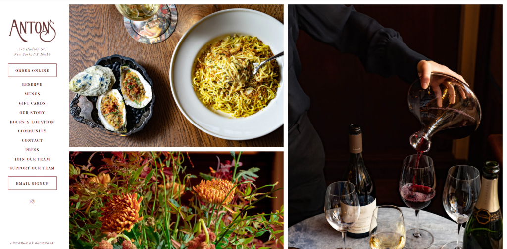
Right away, customers eyes are drawn to the stunning imagery along with the elegant swooping letters of their logo design. Anton’s is simple with plenty of white background. We noticed a pop-up giving information, which is a great way to get information to your readers. Having many images carefully placed was another sense of art within this layout. It was considerate to include a well-labeled menu.
32. Pastaria
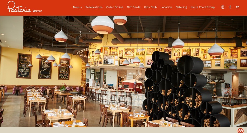
Bright orange is very eye-catching so it is used to highlight what this company wants you to see. Links to order, contact them or reserve a table are shown near the top, making it easy to connect right away. Their full food menu is placed in the homepage, allowing people to see what kind of food they offer. We also thought using little circles around this site made it more unique.
33. China Poblano
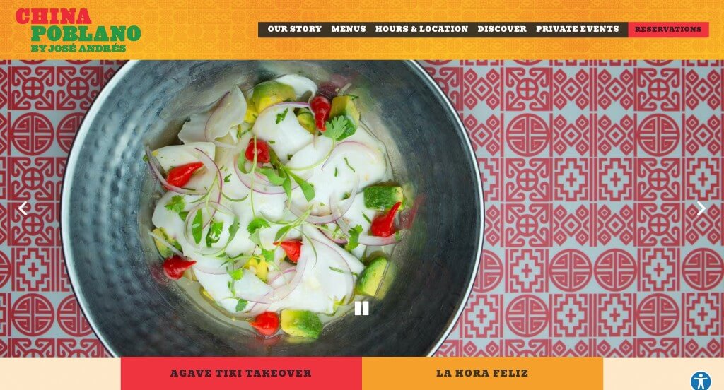
This website is very bright, but all these different colors harmonize with each other. A simple homepage with some links for visitors reach out for more information or questions was a great addition. Aspects that stood out to us were social media links, a sticky header, plus how everything was easily accessible. Also, from a marketing point-of-view, it was nice that the domain matches their company’s name.
34. Ruth’s Chris Steak House
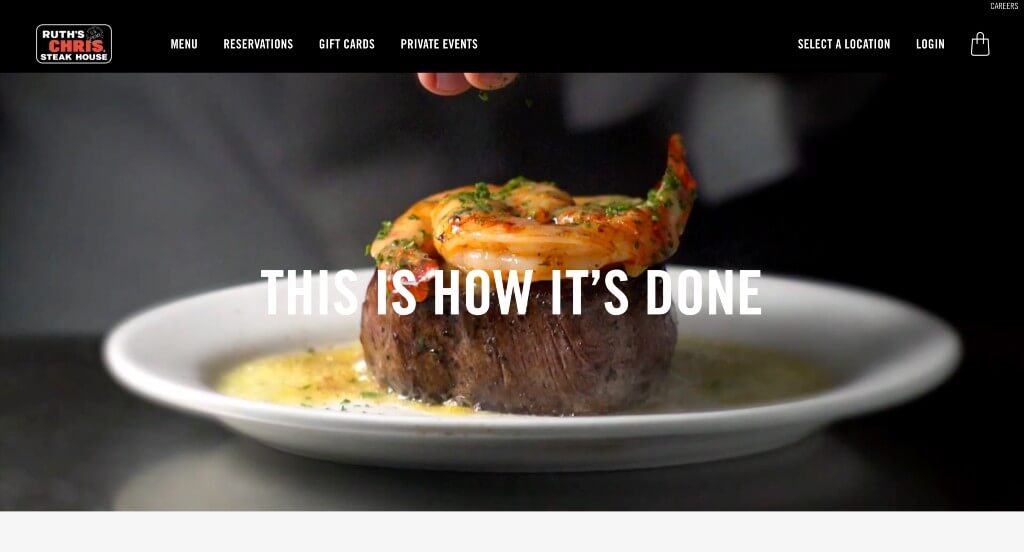
Ruth’s Chris Steak House does a great job showing simplicity. Images aren’t overwhelming, and neither are their pages. Adding in colorful buttons to help people navigate their site was helpful. Short paragraphs help get information out in a straight-forward way. We also liked how they used images almost as backdrops for written content.
Related: Rank higher for searches like “local restaurants” with the help of SEO services.
35. Lawry’s Restaurants
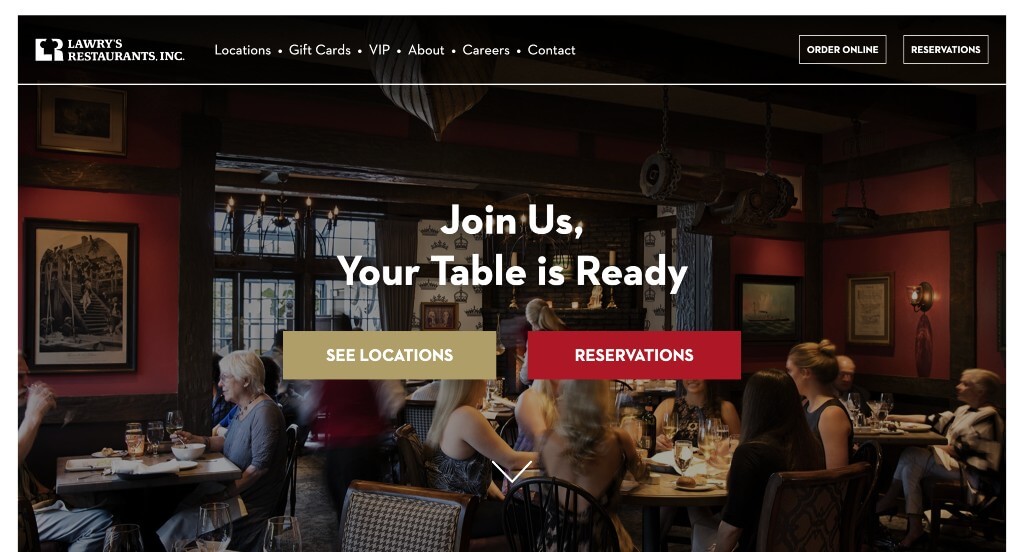
It’s very convenient for potential customers to plan their events with each location due to pictures of what it looks like inside, along with a short form for date and size of party. We noticed this company’s clever logo design that includes their business’s monogram along with a chef’s hat. Large buttons are used to help customers get to the information they need.
36. Francie
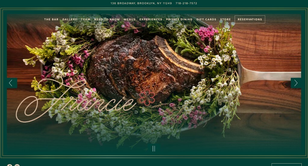
Francie has a very simple design with a good mix of images and text. We thought having green contrast with a gold for this template was an amazing choice. It’s very easy to navigate through this site because all the links nicely organized. Additionally, having simple gold blocks creates a distinguished touch.
37. Snooze
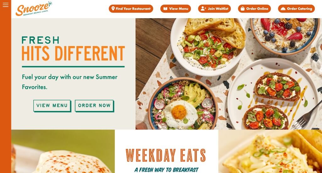
This restaurant website had many images or few short clips throughout the site, which helps them stand out from competitors. Along with that, stunning fonts and graphics are included. Having an incredible layout weaving many elements together was an interesting feature. We also thought using bright colors was also nice. Make sure to think about this example when trying to find inspiration for your new site.
38. Dasher & Crank
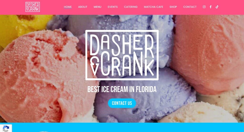
Here we have a layout that is both fun and relaxing. This site is unique, but additionally, they pride themselves on having unique ice cream flavors. Many images of delicious-looking ice cream can be seen through this web design. We really liked their simple logo design. Another aspect we thought was great was their choice of bright colors to contrast with the black and white colors.
39. Bull & Last

Bull & Last did a nice job with their fonts that are bold and easy to read. Along with that, we liked their little spinning circles that display their company name and year of establishment. Including lots of high quality images was another choice that we appreciated. Something else that they sis well with was their domain that matched their company name.
WordPress Restaurant Themes
Find free themes at wordpress.org or explore restaurant templates on ThemeForest.
Savory – Themeforest
$69

Laurent – Themeforest
$75

Picante – Themeforest
$59

Patio Time – Themeforest
$64
