Greetings, insurance professionals! Looking to boost your online presence and attract more clients? Check out our guide to the top 43 insurance websites.
Our experts have evaluated the best insurance sites for design, functionality, uniqueness, and user experience. These top sites feature sleek designs and effortless navigation, representing the best in the insurance world.
You’ll find inspiration for your own site and valuable tips to make your online presence stand out.
Secure your future and boost your insurance business with this guide! It includes examples from independent agents, captive agents, online marketplaces, benefits consultants, adjusters, and risk management consultants. For more industries, check our most creative websites of 2025 blog article!
Top Insurance Agent Website Designs
- 1. Sean The Insurance Guy
- 2. Uia Health Insurance
- 3. New York Life
- 4. Concordia Plans
- 5. Progressive
- 6. Insurify
- 7. Lemonade
- 8. Ladder
- 9. StateFarm
- 10. Geico
- 11. Farmers Insurance
- 12. Prudential
- 13. Nationwide
- 14. Allstate
- 15. Worth Insurance
- 16. King Risk Partners
- 17. Liberty Mutual
- 18. The Zebra
- 19. Quotelab
- 20. Wefox
- 21. CoverHound
- 22. Esurance
- 23. ManyPets
- 24. Warren Insurance Group Inc
- 25. Oscar
- 26. PassportCard
- 27. Steadily
- 28. MyLifeProtected
- 29. Humana
- 30. Coverfox
- 31. Aetna
- 32. Figo Pet Insurance
- 33. Erie Insurance
- 34. Lumico
- 35. HealthCare.gov
- 36. Gabi
- 37. GradGuard
- 38. Policygenius
- 39. League
- 40. Simply Business
- 41. Corvus Insurance
- 42. CarInsurance.com
- 43. Honeycomb Insurance
1. Sean The Insurance Guy
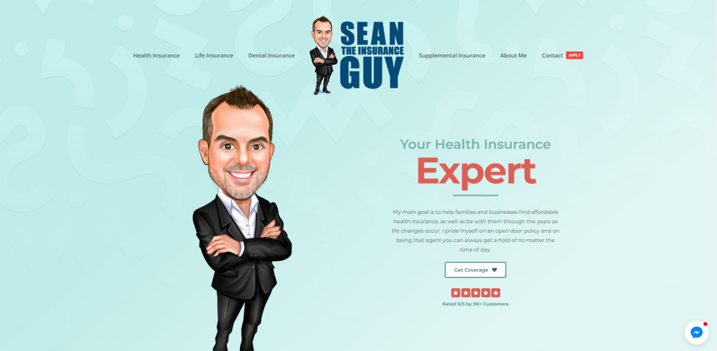
A simple color scheme and a creative design help to bring this site to life. We thought it was unique to add in a cartoon character to personify this design. Another aspect added into Sean The Insurance Guy was how it offers many different types of insurance, all neatly separated. Additional things that stood out to us were client testimonials, a live chat, and also an informative blog.
2. Uia Health Insurance
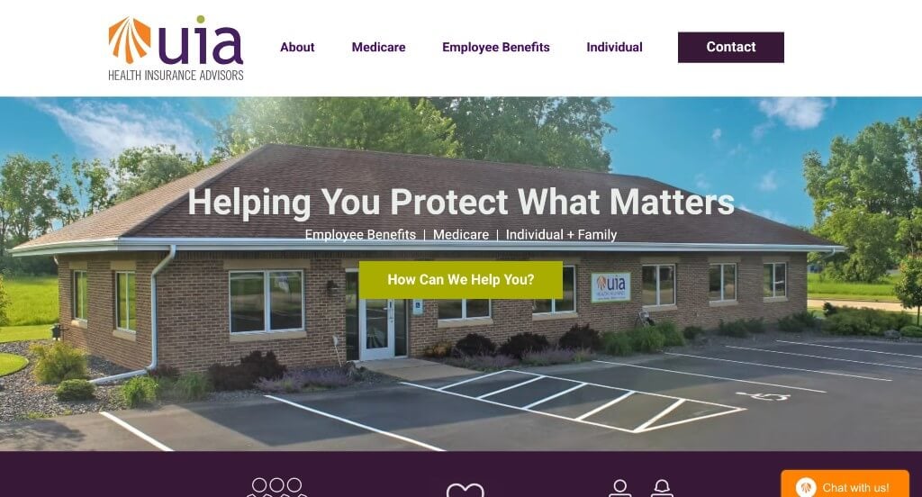
Uia Health Insurance is very welcoming, displaying an intro slider with images of their team. A few bright colors are used to ensure content can be found and read. Client testimonials can be noticed, along with a live chat to make it easier for potential customers to contact this company and get answers as soon as possible. We also noticed that near the bottom, there is a contact form, reviews from other places, and a Google map.
3. New York Life
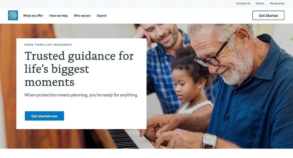
New York Life maintains a very informative layout, making sure to answer any questions or doubts clients might have. Also, additional blogs and resources available through links within their site. Content is organized well ensuring that it’s easy to browse through. We also liked how New York Life used small icons and buttons to help liven it up.
4. Concordia Plans
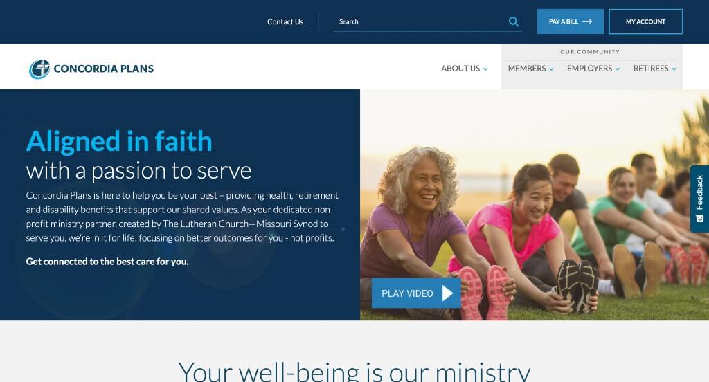
Here we have mainly a blue and white color palette that brings uniformity to this company. We enjoyed how short video clips were attached into the site. Even though there are many pages, everything is kept clean and simple. A clearly labeled menu was added in which was an extremely good choice. Bold fonts are used for titles to make sure customers know what each section is about.
5. Progressive
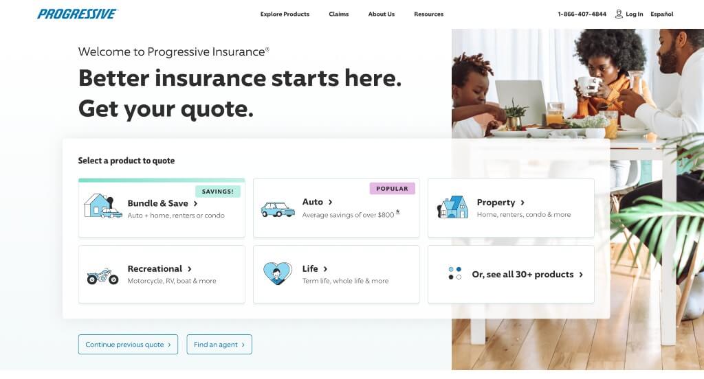
Progressive’s template is very simple with plenty of white space and a smaller font. Right away, some statistics are shown to prove reliability. Adding in high quality images, graphics and photo frames was something we definitely noticed. A quick form allows customers to get a quote for insurance in a timely manner. It was also helpful to choose a domain that matches their company so clients can find it easier.
6. Insurify
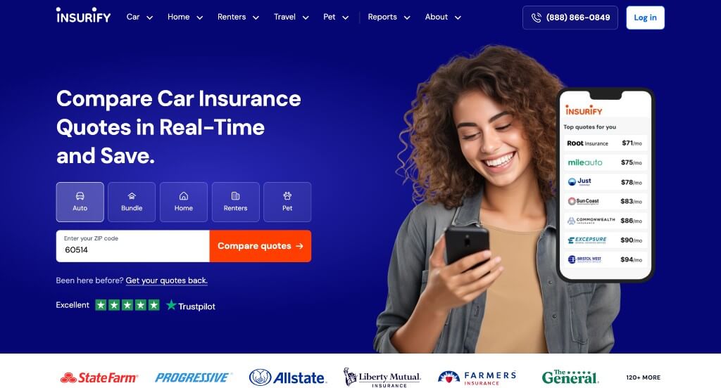
Right off the bat, a form is featured to receive a quote for insurance, whether you are looking for home, auto or a bundle. Brightly colored buttons are sprinkled throughout so clients can navigate easier. A frequently asked questions can be noticed closer to the bottom. Insurify also had a great balance of images, written content and white space ensuring that it wasn’t overwhelming.
7. Lemonade
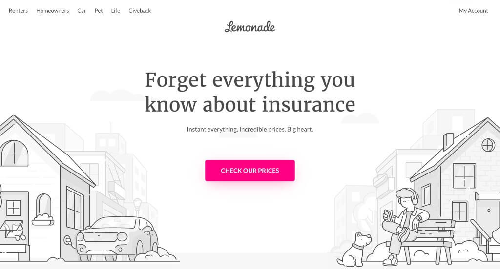
We instantly noticed how attractive and creative this company’s webpage is. Everything is black and white for writing and visuals, with a pop of bright pink to attract attention to information they want you to see. Client testimonials automatically scroll, allowing newcomers to read as many as they wish. We liked how their company name invokes a playful feel, relaxing its customers. Social media links, such as Instagram, Facebook, and Youtube, can also be seen to stay in touch with their company.
8. Ladder
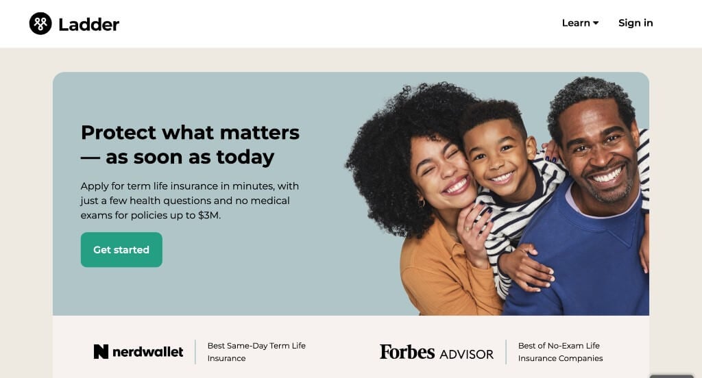
Upon entering Ladder, there are a few less images, but that just lets customers get to their content faster. An “About Us” tab features many images and written content about their history as a company along with how this business is run. It’s fast and simple to receive a quote due to many opportunities to click “Get My Price”. Client testimonials, FAQs, and social media links decorate this homepage.
9. StateFarm
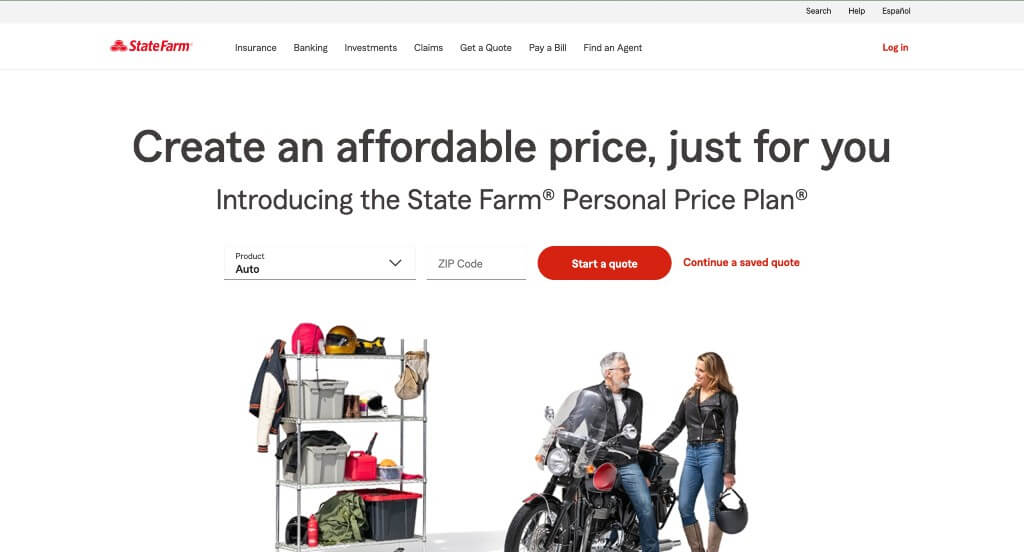
StateFarm uses lots of neutral colors with red as a minimal accent color. CTAs are all displayed in that red color. Many components of this site are rounded to give pages a nice clean look. A few different discounts can be noticed throughout the homepage to convince possible clients to be insured by them. Don’t forget StateFarm’s simple but memorable logo design.
10. Geico
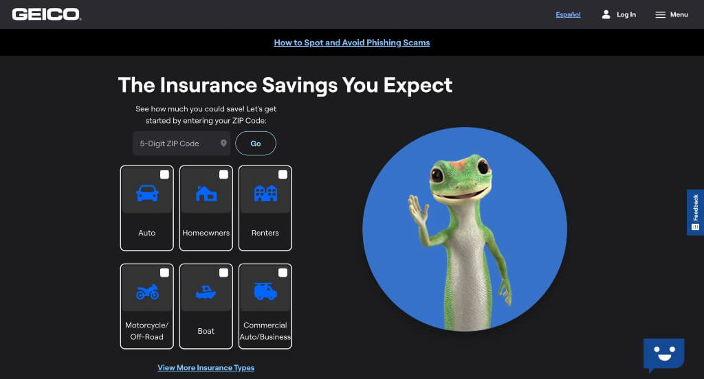
We enjoyed how right away a playful gecko is used to make their company more interesting. Many helpful links are visible, ensuring that customers and potential customers can get information and support they need. A menu helps to keep this site easy to browse through. Graphics can also be noticed, these are a great choice because it helps customers understand what they’re looking at.
11. Farmers Insurance
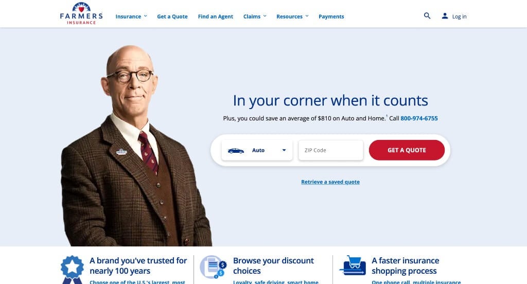
Graphics definitely prove their place in this unique example. We can see a variety of graphics depicting homes, cars, but also seen through a variety of small icons. A few blogs are also included, which helps people to plan and prepare for what’s important to them. Because of features such as color blocks, visuals, and icons, lots of information can be included without it being overwhelming. Lastly, we really liked the color scheme that was chosen for this insurance agency.
12. Prudential
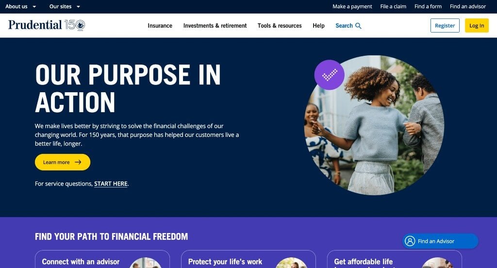
Prudential focuses on getting customers involved and keeping their attention throughout the entire site. A stunning color palette is introduced, and tends to stay similar. Buttons are used for many reasons, such as finding a professional to help. We also liked that a survey about their site was included so customers can feel that they have some input. Social media links are included as well to keep people connected to their business, and as a form of social proof.
13. Nationwide
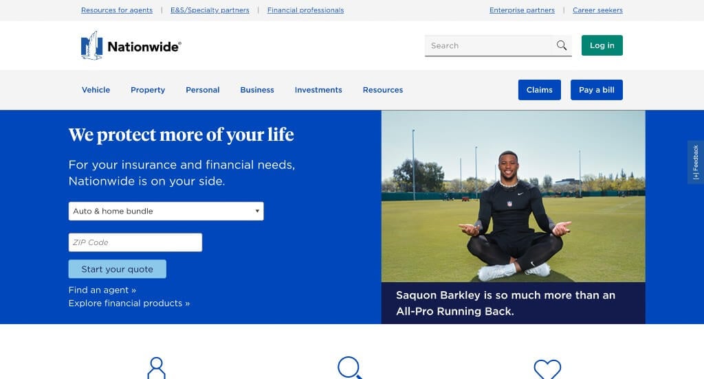
Here we have an example that offers personal and business services, which are clearly separated so you can find what you are looking for. Nationwide is all about making it as easy as possible for its potential customers. Having a login and a search bar to find a local agent all help to to learn more about the agency. Bold blue banners help to highlight information, break up information and add just a splash of color to their layout.
14. Allstate
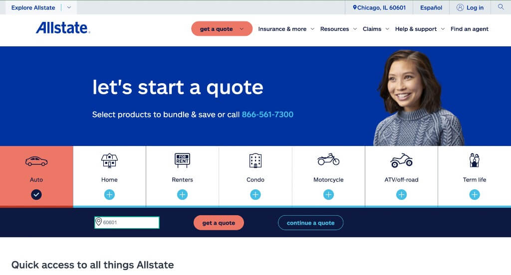
Allstate clearly displays all insurances offered through their agency right away. Which makes it easy because people are able to click on what insurance they’re looking for to get information related to their insurance. Many images are included with a variety of people symbolizing that this company is suitable for anyone looking for insurance. Finally, we did really like how Allstate included a search bar to find the information you are looking for.
15. Worth Insurance
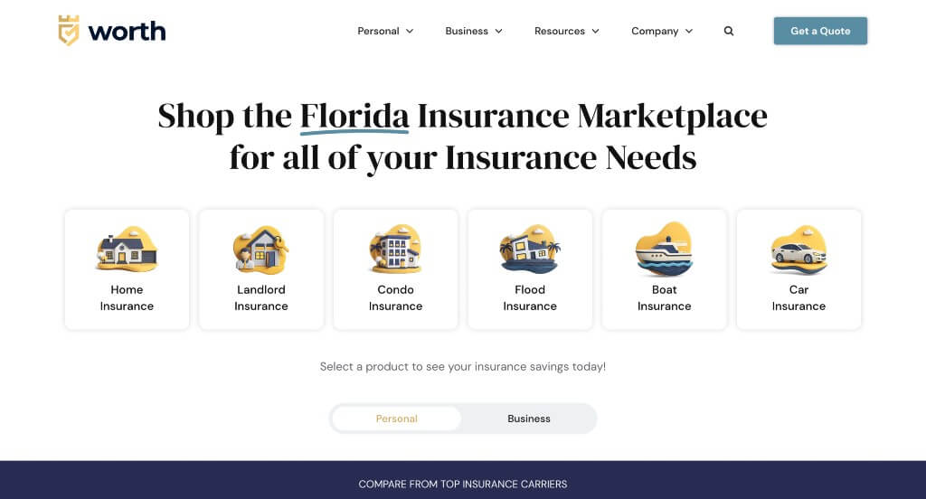
We loved how this example made good use of graphics that made sense for their business. Along with that, we loved their color scheme that was used throughout the pages. Including buttons and links was a great way to get information customers without overwhelming them. This web domain matched carefully with their company name which we appreciated.
16. King Risk Partners
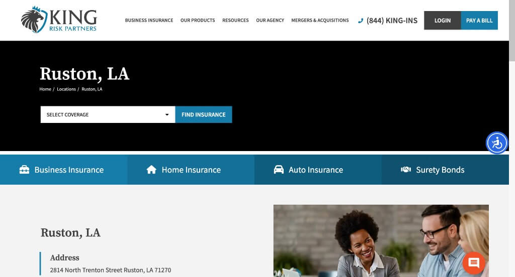
This example caught our attention because of this interesting logo design. We loved how they used italics in some ares to emphasize certain information. Their navigation bar was well organized which was nice in order to keep people looking for information that they are curious about. We loved their addition of videos that provides information in a different way.
17. Liberty Mutual
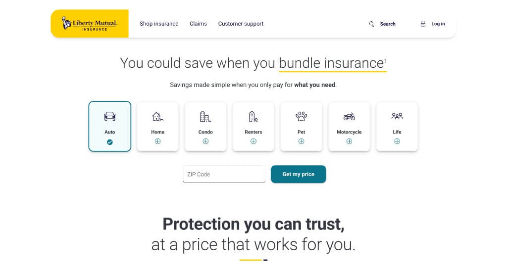
Liberty Mutual has their own sense of branding that is memorable and effective: their logo, color scheme and of course LiMu Emu & Doug. We liked how Liberty Mutual has a clearly labeled menu of three different categories, which makes navigation better. High-quality visuals also elevated this agency to help it place on our list of top insurance websites.
18. The Zebra
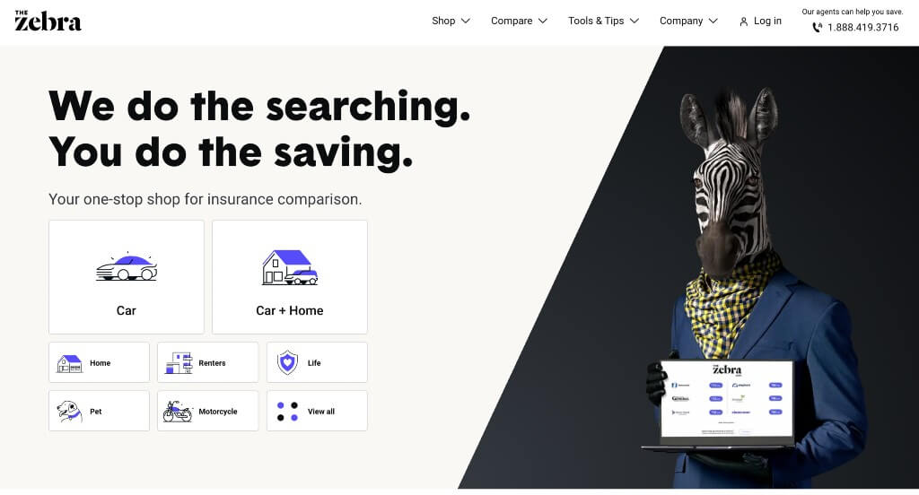
This is a very straightforward template, and we thought it was smart to chose a color scheme that was simple but also matched their company name. Right away options for different types of insurance are included. It was smart to have simple forms to fill out after clicking on the type of insurance you are looking for.
19. Quotelab
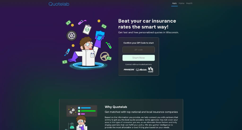
Cartoon characters dominate this site which is both eye-catching and unique. There are many helpful articles for each insurance offered, which allows potential customers to decide what is best for their situation. Multiple different color blocks break up content. We liked how they picked a domain that matches their company name.
20. Wefox
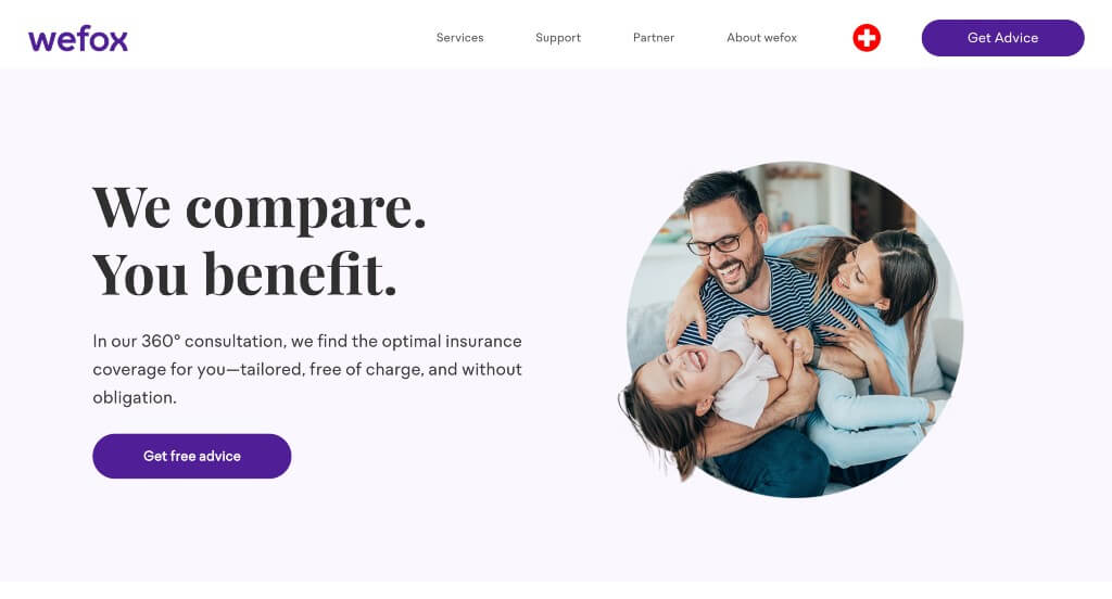
This website utilizes a purple color scheme to help them stand out from competitors. A contact form is visible, making it convenient to contact them quickly. A simple font helps to make this site feel very professional. We enjoyed how the same purple color is used throughout Wefox as accents, buttons, or text.
21. CoverHound
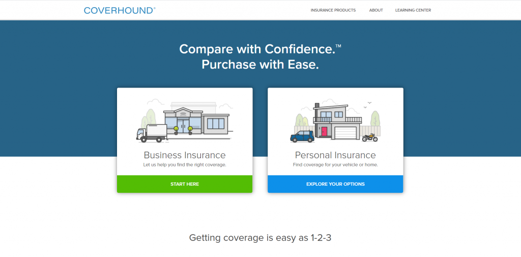
An organized design is shown here with each service labeled and separated into different groups, making it easier to browse through to find a service helpful to you. Also seen on the homepage were customer testimonials, helpful articles, and social media links. We really liked how buttons and bright accent colors were added in. Don’t forget about this company’s stunning balance of images, white space and written content.
Related: Your insurance company might be interested in digital marketing services to help with lead generation, social media management, and online reputation.
22. Esurance
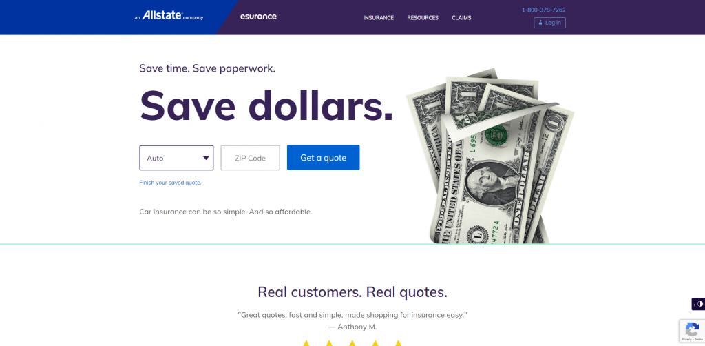
Esurance made it onto our list of best insurance agency web designs, for obvious reasons. Fonts were bold to help break up written content, simple imagery was used, and a well organized navigation bar was added in. Another helpful aspect in this company was the ability to use their app, which allows customers to make a payment, update info, and file a claim. It was extremely helpful to chose a domain that matches their company’s name.
23. ManyPets
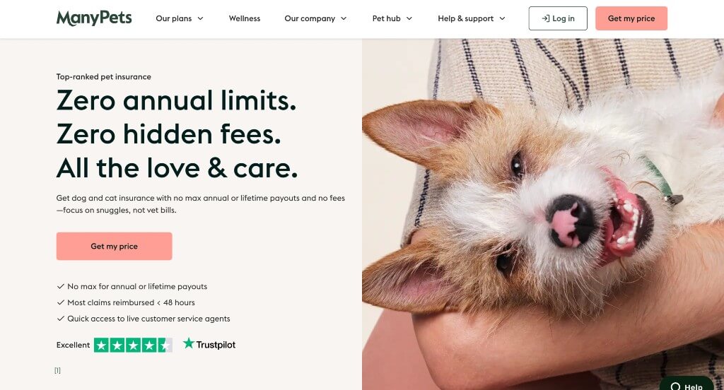
This website is very eye-catching with many images of pets. The images do a great job of grabbing the attention of the audience and explains the content well. Right off the bat, they showcase why their coverage is different from other insurance companies. The CTAs are very strong and stand out with a bright pink color. One customer’s review is visible on the homepage with a link allowing people to see more reviews through Feefo, which gives the visitor more to see.
24. Warren Insurance Group Inc
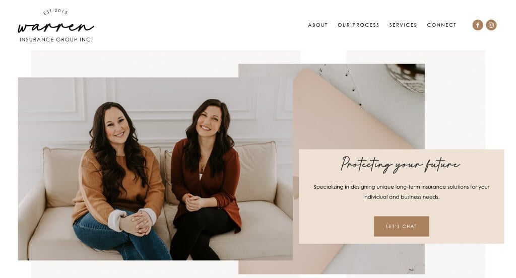
We absolutely loved this example because of their interesting fonts that definitely grabbed our attention. We loved their overlapping images that created a stunning template. Another thing that we appreciated was their color scheme that matches with their images for a sense of total unity. Showing their process with numbered images was a smart choice.
25. Oscar
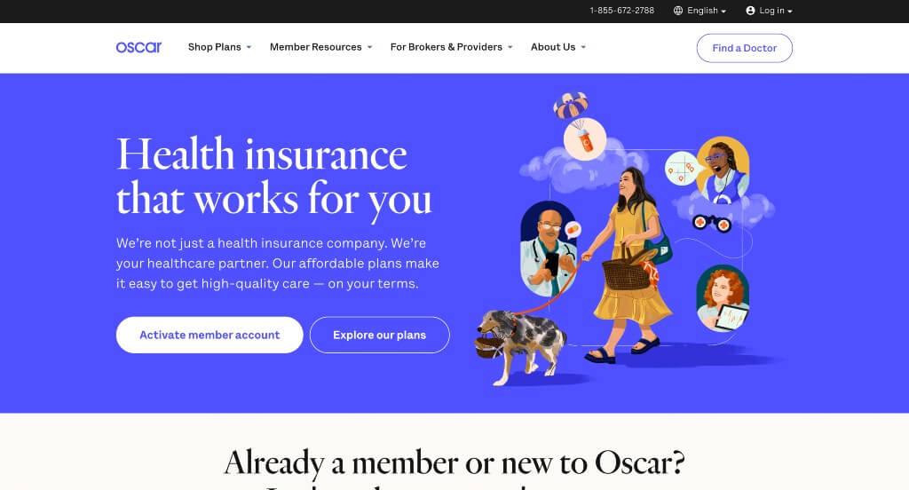
Bright colors flood this site right away to evoke an energetic feel. We thought it was smart to have a phone number visible right away, a button to find a doctor, and a button to activate an account. Oscar wants to get information customers might need to them as soon as possible. A frequently asked question section is visible, along with informative blogs to sprinkle in more information.
26. PassportCard
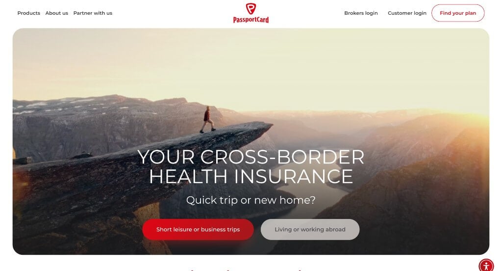
Almost instantaneously, we can notice that an introduction video is shown as a background to maintain an exciting and adventurous feeling. It was a great choice to have full-length images to makes the website flow seamlessly. A simple logo design also elevated this site. On the bottom, an “About Us” section is featured to allow possible clients to meet their team and understand the business. A contact form is found easily encouraging customers to fill it out and get in touch.
27. Steadily
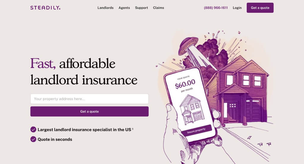
We felt it was thoughtful that this example used purple accents to grab attention and stand out from competitors. We loved their graphics that appeared hand-sketched because that isn’t typical for insurance agencies. Additionally, we really liked how their pages were well balanced and used buttons to make for smoother navigation.
Related: Most insurance agents look to SEO services as a way to improve organic traffic to their website for lead gen purposes.
28. MyLifeProtected
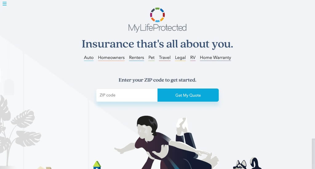
MyLifeProtected utilized graphics to have a stunning relaxing look. Along with that, their logo design is very colorful, which contrasts with their basic color scheme for the rest of the site. Using color blocks to separate and organize content was another choice we really enjoyed. Additional features that stood out to us were the live chat option, a social media link, and a helpful blog.
29. Humana
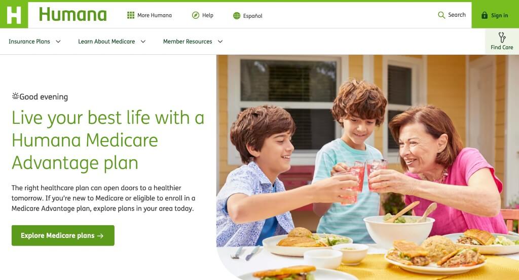
Humana is a great example of a straightforward web page. Their client focus is geared more towards older people, so simplicity is needed so they aren’t overwhelmed. A search bar can be found and a questions are asked to involve customers in their site. Personal stories, FAQ, and information about Medicare can all be noticed to improve their layout.
30. Coverfox
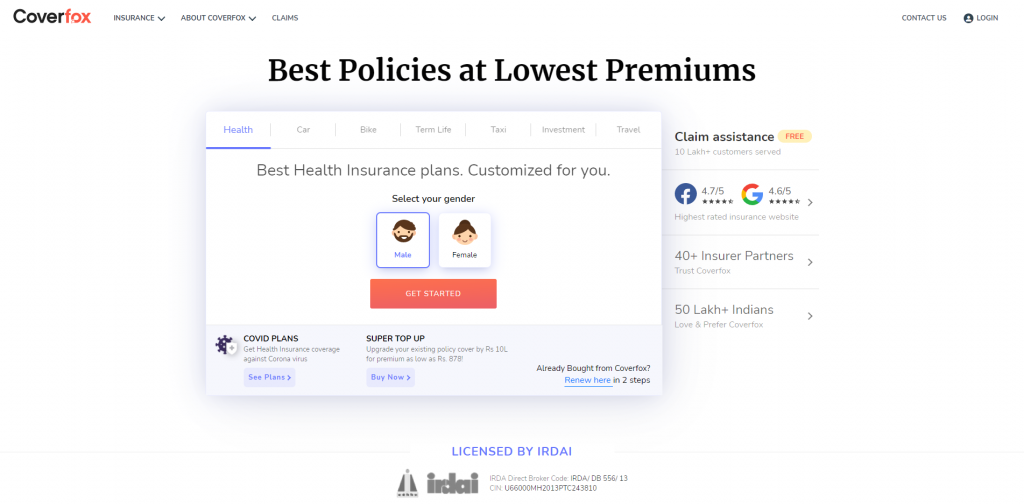
Coverfox displays a form right away to help potential clients find the best insurance for them. We thought it was great to have bullet points to create more organized template. It was a smart move to have an option to buy insurance online and don’t leave out visuals so people will understand exactly how to do it. It was also a great idea to include happy, client testimonials that scroll display themselves on the pages.
31. Aetna
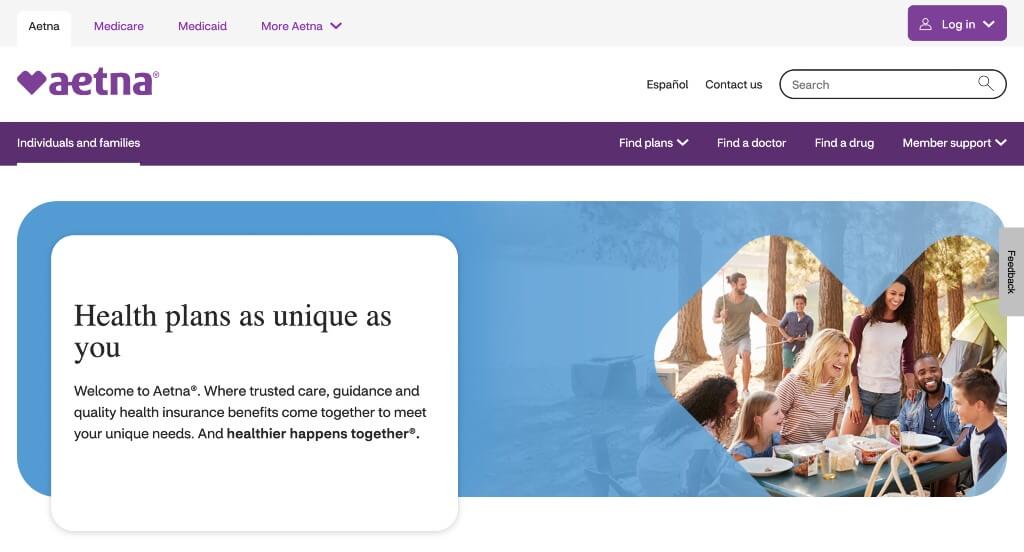
Here’s an insurance website with a clean and simple look, focusing on their areas of service. Boxes are used to separate information, maintaining that clean and simple style. Small graphics and images are added in to plop some color into their site. Having a menu that was well-thought out was another aspect of Aetna’s site we enjoyed.
Related: Your insurance agencies can consider PPC management services to get help improving the return on investment from your paid ads campaigns.
32. Figo Pet Insurance
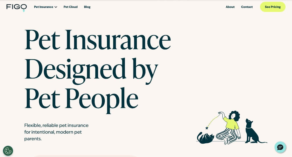
We really liked this example because of their more relaxed color palette. Their use of simplistic graphics was another thing that we noticed because it creates a unique feel for their pages. It was also nice how a variety of phrases are used throughout the layout in order to highlight certain information. Including customer reviews was another choice that we really liked.
33. Erie Insurance
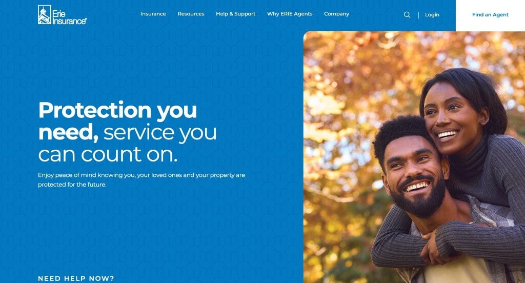
Erie Insurance’s site design can serve as an example for new insurance companies. Upon entering this website, a white, black and blue color scheme is adopted. An interesting logo design can be noticed for Erie Insurance that clients are sure to recognize. We thought this site was great at using concise sentences so readers aren’t overwhelmed with information.
34. Lumico
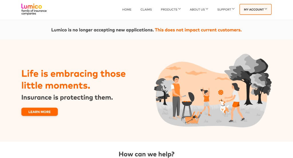
We really enjoyed the color scheme used in this example because it was unique and felt trustworthy. They had lots of interesting graphics which was something that we really liked. Including their customer testimonials was another great idea that was helpful for new viewers. This navigation bar was well organized and easy to find information within.
35. HealthCare.gov
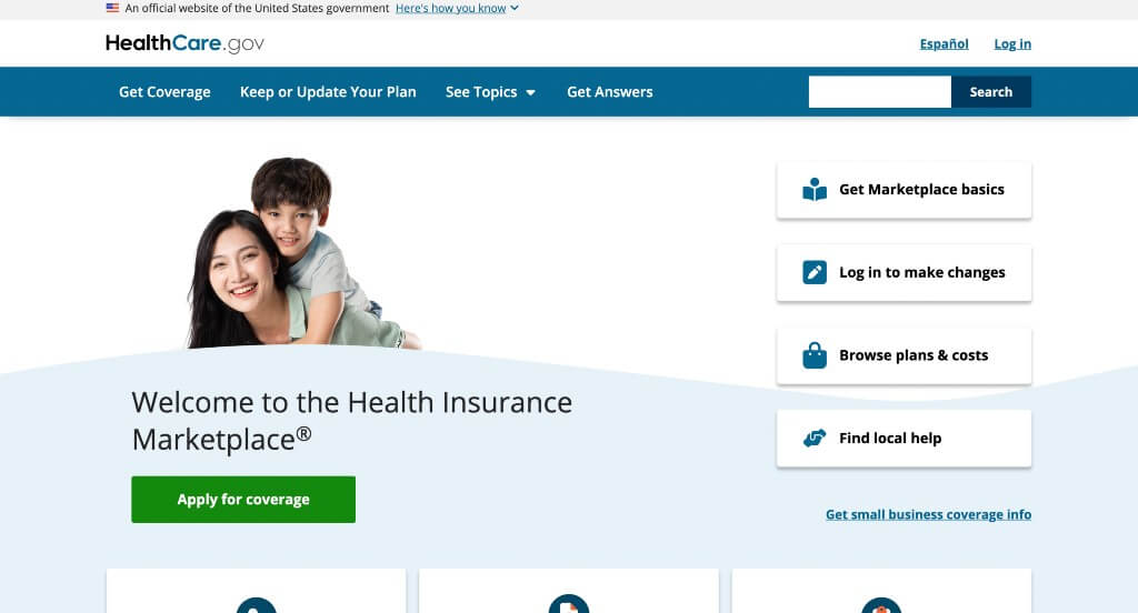
HealthCare.gov is very straightforward, which makes information super easy to find. Right away, important resources are shown to help clients with tips, info, finding help or learning how to cover the cost. Choosing a domain that can be easily identified when searching for their company was another great idea. We also loved the idea of having a search bar to help find content.
36. Gabi
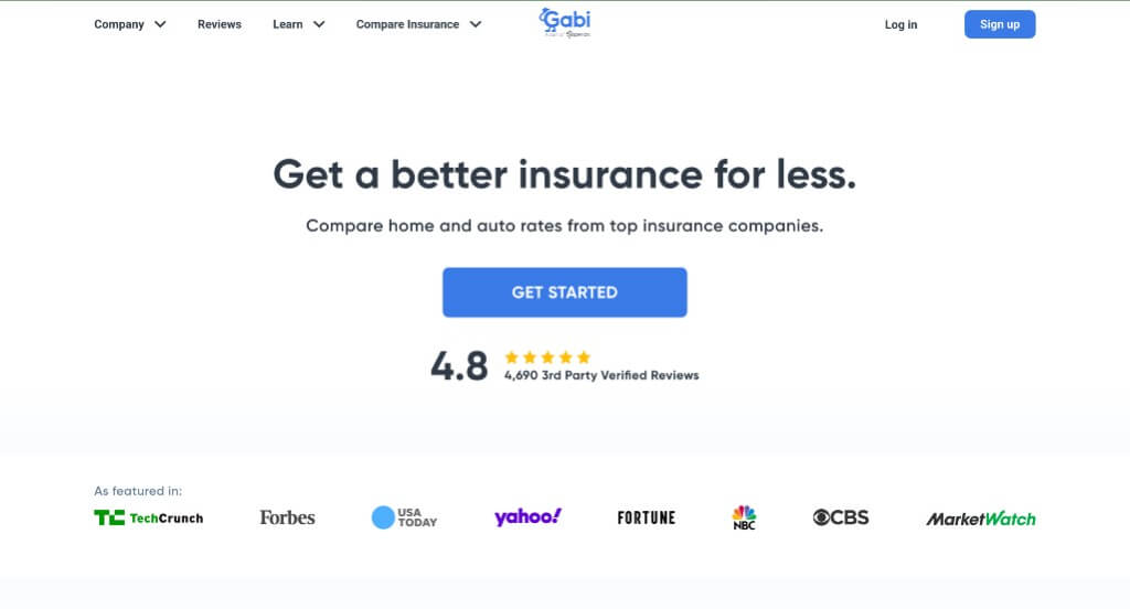
Understanding clients is the key to a successful business, and this company displays their attention to customers with their ratings along with reviews. Additionally, we liked their playful and courteous logo design. Another thing we noticed was how Gabi showcased what sets them apart from their competitor companies.
37. GradGuard
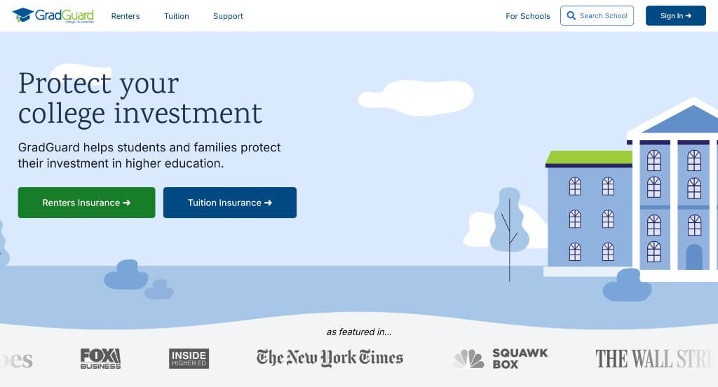
Many visuals help to aid written content throughout GradGuard. We really liked how client testimonials were added in to allow visitors to read about past experiences to decide if this insurance company for them. We also noticed the feeling of unity throughout this design with similar colors, graphics and fonts.
38. Policygenius
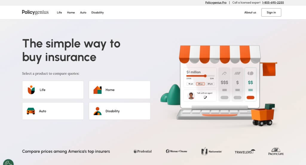
Policygenius attracts attention of incoming customers with their color scheme and their bold and strong headlines. Understanding that other insurance companies could look similar to them, they attempt to stand out by offering services and a template competitors don’t. Including a 24/7 chat service to help customers whenever it’s needed was nice. Adding in many graphics also makes this sight more organized.
39. League
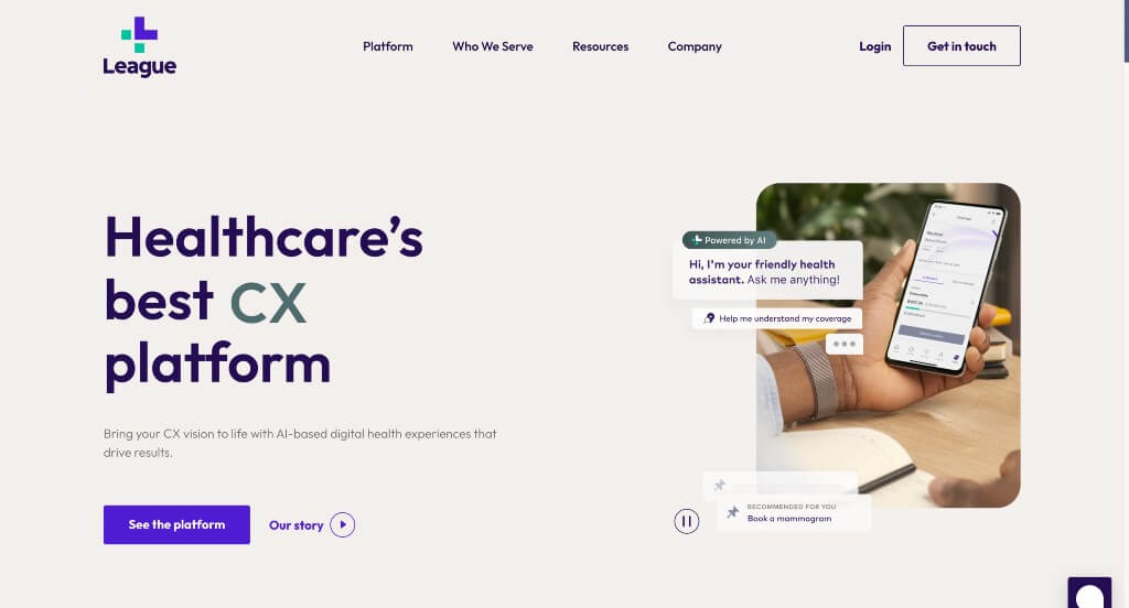
League is displayed with a minimalist feel, less is more. Plenty of space is used between visuals and written content. We really enjoyed this company’s creative animations to move along their information in a more exciting way. Additionally, client testimonials, news articles and services offered are all included. Some features that stood out were a contact form and social media links allowing customers to connect and discover information in a variety of ways.
40. Simply Business
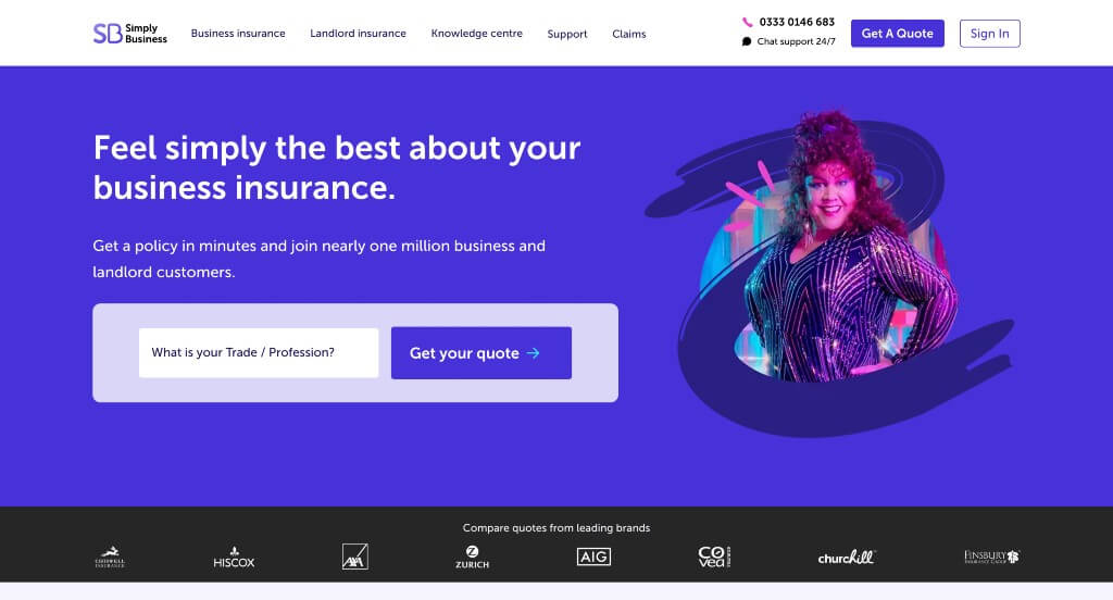
We liked how Simply Business placed all of their links in areas that can be accessed easily. A search bar helps potential customers find their profession and estimated cost quickly and easily. We thought Simply Business had an interesting logo design and a stunning color palette, which added to the looks of their web design. It was also nice to have a good amount of information related to how they stand out from similar companies.
41. Corvus Insurance
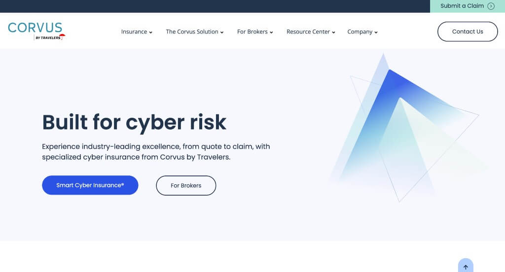
This was a fairly simple template that caught our eye because of its balanced white space. Accents of blue throughout the page was normal for insurance agencies, but it still looked great. Using videos was another thing that we liked because it provided information in a new way. Using buttons to help with navigation and maintain a clean layout was something we liked.
42. CarInsurance.com
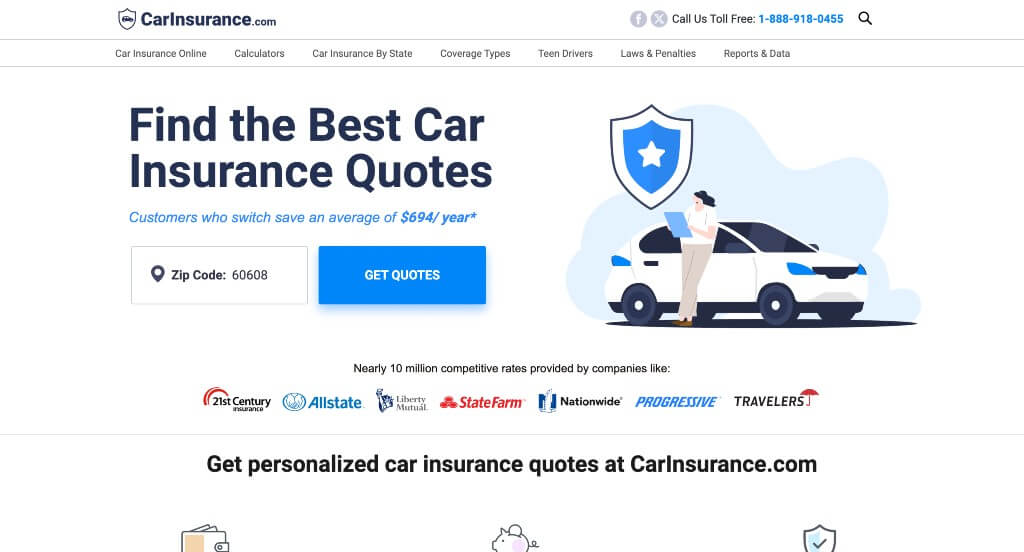
Graphics was likely the first thing that we noticed about this example. Their domain was an exact match to their business name which made it very easy to find their website. Building in information about a variety of different car insurance brands was something that many people could find helpful. Lots of buttons were also used to create an outstanding template.
43. Honeycomb Insurance
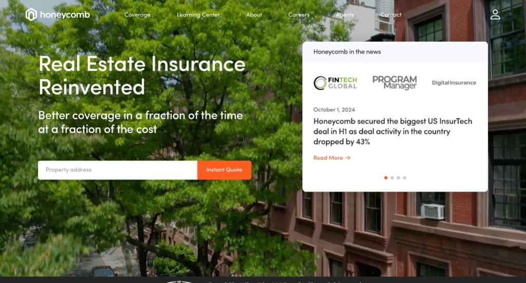
We loved the orange accents that highlight a variety of information within their pages. Adding in a search bar to create an instant quote based off of customers address was a nice choice. Adding in icons was another thing that we really liked because it added visuals without cluttering the pages with lots of images.
WordPress Insurance Themes
You can find free themes at wordpress.org or explore insurance-inspired templates at ThemeForest.
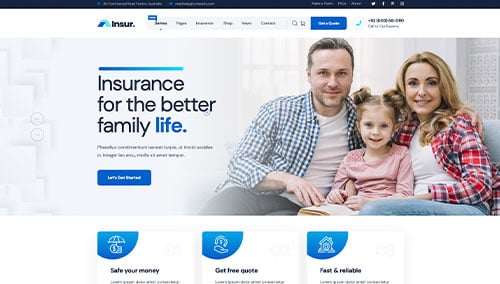
Insur – Themeforest
$49
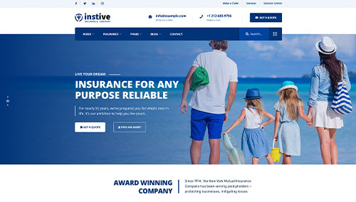
Instive – Themeforest
$55
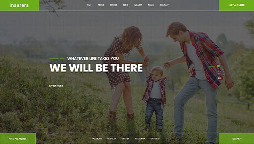
Insurers – Themeforest
$49
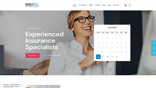
InsuRel – Themeforest
$69