Hello! As a business owner, do you wish to improve your online presence and boost your amount of customers? If yes, make sure to check out our top 50 web page designs for assisted living.
We’ve scoured the web to find and evaluate some outstanding examples based on design, functionality, uniqueness, and user experience. From warm and inviting designs to effortless navigation, these sites set a clear bar for an industry such as elder care.
You will surely gain some inspiration, but you’ll also learn valuable tips on how to make your online presence shine.
If you find this extremely helpful and you wish to research additional industries, head over to our cool web design examples article!
Top Assisted Living Home Website Designs
- 1. Atria Senior Living
- 2. Merrill Gardens
- 3. Elegance Living
- 4. Leisure Care
- 5. Solana At The Park Independent & Assisted Living Community
- 6. Life Enriching Communities
- 7. New Perspective Senior Living
- 8. Fox Run
- 9. Carlton Senior Living
- 10. Robson Resort Communities
- 11. GenCare Lifestyle
- 12. Bella Vista Senior Living
- 13. Five-Star Senior Living
- 14. Kisco Senior Living
- 15. ‘LLima at Leihana Senior Living
- 16. Frontida Assisted Living
- 17. Robson Senior Living
- 18. Mountain Park Senior Living
- 19. Eddy Senior Living
- 20. Eagle Point Luxury Senior Living
- 21. TouchMark
- 22. Sunrise Senior Living
- 23. Oak Park Place
- 24. Parkside
- 25. Senior Lifestyle
- 26. Belmont Village
- 27. Frontier Senior Living
- 28. Scottsdale Village Square
- 29. McDowell Village
- 30. Manor On Paradise Senior Living
- 31. The Palace Group
- 32. Oakridge Gardens
- 33. Dimensions Living
- 34. Heritage Senior Living
- 35. Coterie Senior Living
- 36. Burlingame Senior Living
- 37. Park Vista Living
- 38. Prestige Assisted Living
- 39. Century Park
- 40. Bright View Senior Living
- 41. Bickford Senior Living
- 42. Virginia Health Services
- 43. Cobbdale Assisted Living
- 44. Heritage Village Assisted Living
- 45. Peach Creek Assisted Living
- 46. Carnegie East House
- 47. Village Care
- 48. Inspir Assisted Living
- 49. Elm York Assisted Living
- 50. Spring Lake Assisted Living & Memory Care
1. Atria Senior Living
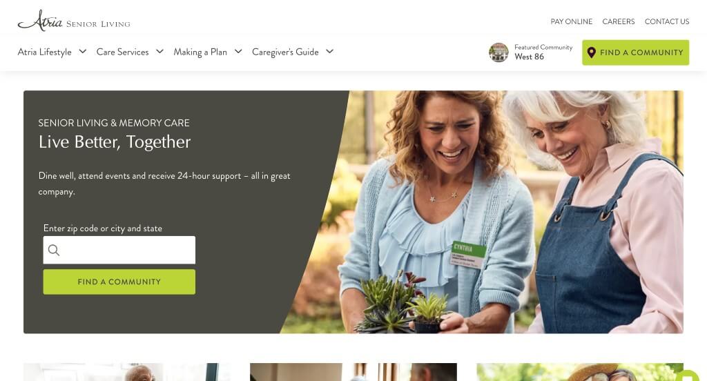
Theme is directly displayed in Atria Senior Living, creating a clean and simple look. Including a white background helps their green button accents stand out for visitors to easily find what they’re looking for. We loved how they included a zip code search bar to allow possible clients to see how close this center is to customers current home or caretakers. A live chat option can also be noticed, offering people to reach out quickly and easily.
Related: Looking for more website leads to your senior living home? Think about hiring an assisted living SEO expert to boost your search rankings!
2. Merrill Gardens
A beautiful picture of Merrill Gardens happy clients instantly attracts viewers’ attention. Its color choices creates a modern and sophisticated look without ever feeling overwhelming. Their logo was simple and logical, which is always nice. This company did a nice job picking a simple and easily readable font.
3. Elegance Living
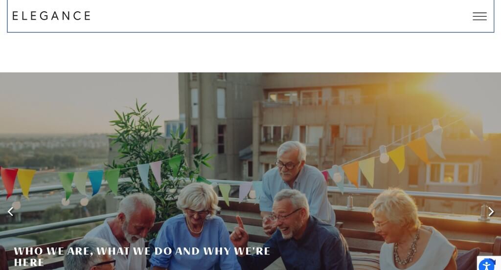
Here we have a rather simplistic design, featuring various photos of senior citizens celebrating togetherness. Creative bold title fonts are used to help each section stand out to scrolling viewers eyes. Users can locate a “Find A Community” option to search for a community that suits their needs. Everything in this site is broken down into digestible paragraphs, making it easy to read their content. Also featured in Elegance Living was several blogs to highlight colorful stories about their citizens. You’ll also find a link and an incorporated section to connect customers to their social media pages.
4. Leisure Care
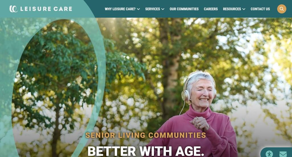
This is an extremely happy, energetic template with a color theme of turquoise, bright green, and grey-beige shades. Small accents of animations are added, for a slight addition of interest. Visitors can explore the different finely tailored services offered through this business that fit their requirements. Many creative fonts are balanced with simple fonts to create a unique but still professional look. Moreover, they can easily search and view all Leisure Care communities using a search panel.
5. Solana At The Park Independent & Assisted Living Community
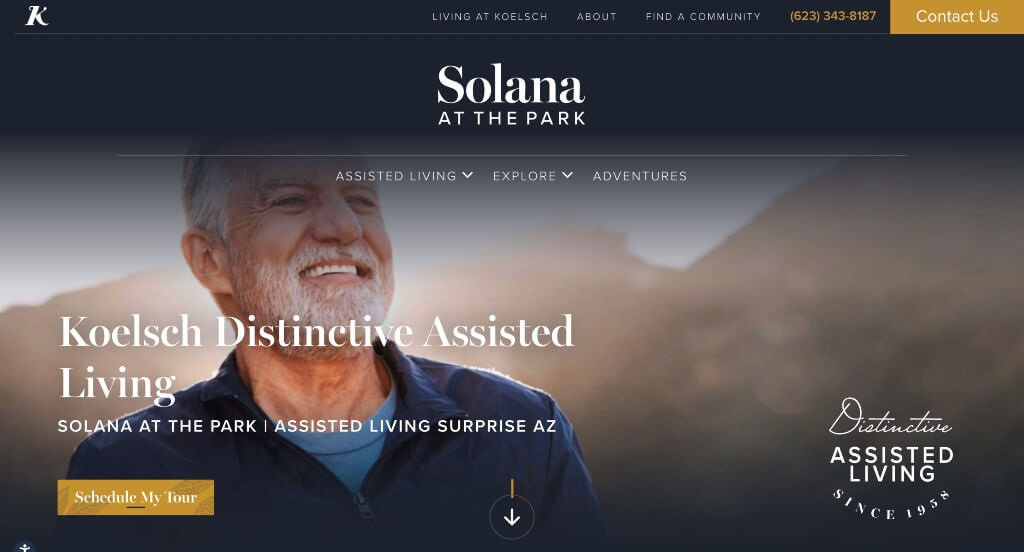
This assisted living web design has a glamorous appeal reflecting their luxurious community, thanks to its white and golden color theme featuring bold black fonts. We thought adding in etched looking images as backgrounds was an extra touch that helped this site shine. An interesting feature that stood out to us was their addition of floor plans, comforting loved ones on what their senior’s new home will be like. We also lover how small golden lines were used as accents over and over to create a design that seems timeless.
6. Life Enriching Communities
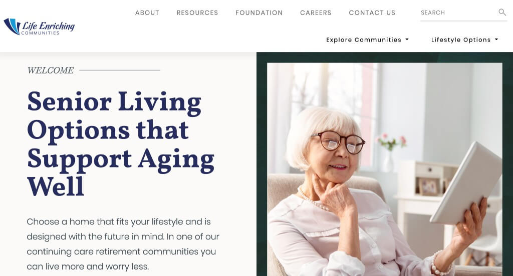
Life Enriching Communities offers an excellent user interface and readily informs clients about all every service available. Once you scroll down, you’ll find complete lists of services, including options for independent living, assisted living, nursing services, therapy services, and fitness and wellness. Moreover, they also feature a detailed blog about several communities to be involved in such as Twin Lakes, Twin Towers, and Concord Reserve. Lastly, we enjoyed their approach with lots of white space to help viewers not feel overwhelmed.
7. New Perspective Senior Living
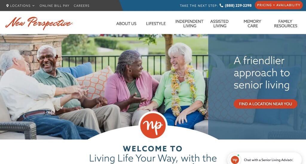
We really liked how this assisted living facility used a creative font for their logo. Additionally, their color scheme was professional and relaxing for any type of business. A live chat was something else that stood out to us because customers could ask questions if they want them answered quickly. Lots of buttons are added in to guide customers towards additional information and keep things uncluttered.
8. Fox Run
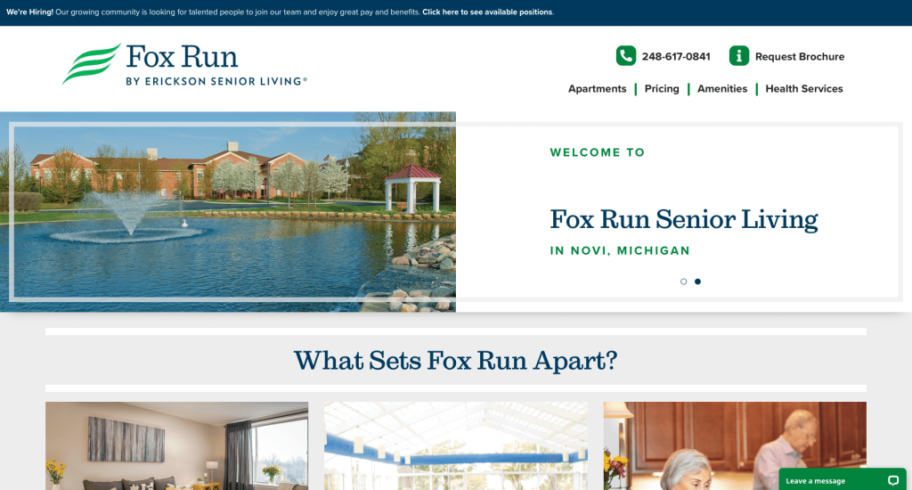
Fox Run utilizes a pleasingly attractive color palette tone that’s simple yet modern. We liked that simple underlining features were used to help titles stand out. Additionally, green buttons are used to help include additional information while maintaining that organized feel. We loved their simple logo design that seems to show off a modern take on a leaf, providing a “natural” feeling.
9. Carlton Senior Living
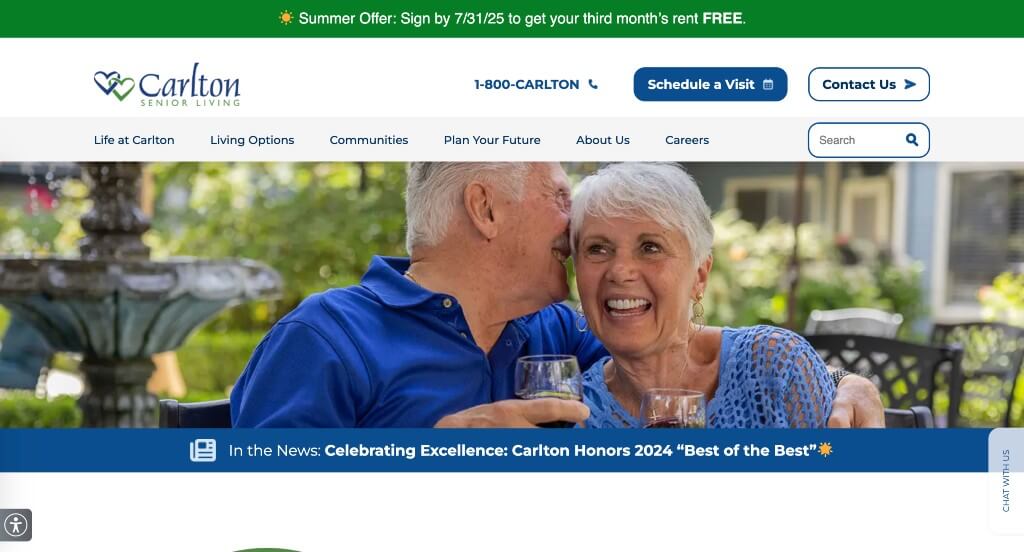
Whether clients want to schedule a tour of this center or simply get directions, this template is designed to offer all necessary information. It was nice that their logo design allows a feeling of comfort. It was helpful to have bullet pointed list of benefits of their business. It was helpful to include their floor plans, helping clients get a feel for Carlton Senior Living. Along with all of that, we liked how their client testimonials include images.
Related: Kickstart your assisted living company’s digital marketing with services that focus on getting quality leads.
10. Robson Resort Communities
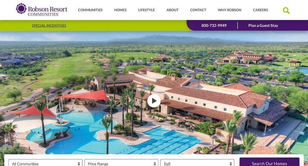
Once you visit Robson Resort Communities’ website, you’ll be able to see how they utilized a complementary palette. We thought it was smart to include a video that encapsulates their company and its goals. We thought it was helpful to raise awareness for to their multiple locations. It was creative to include triangular patterns as an interesting background. Additionally, a search bar was used to help customers to find information that they’re searching for.
11. GenCare Lifestyle
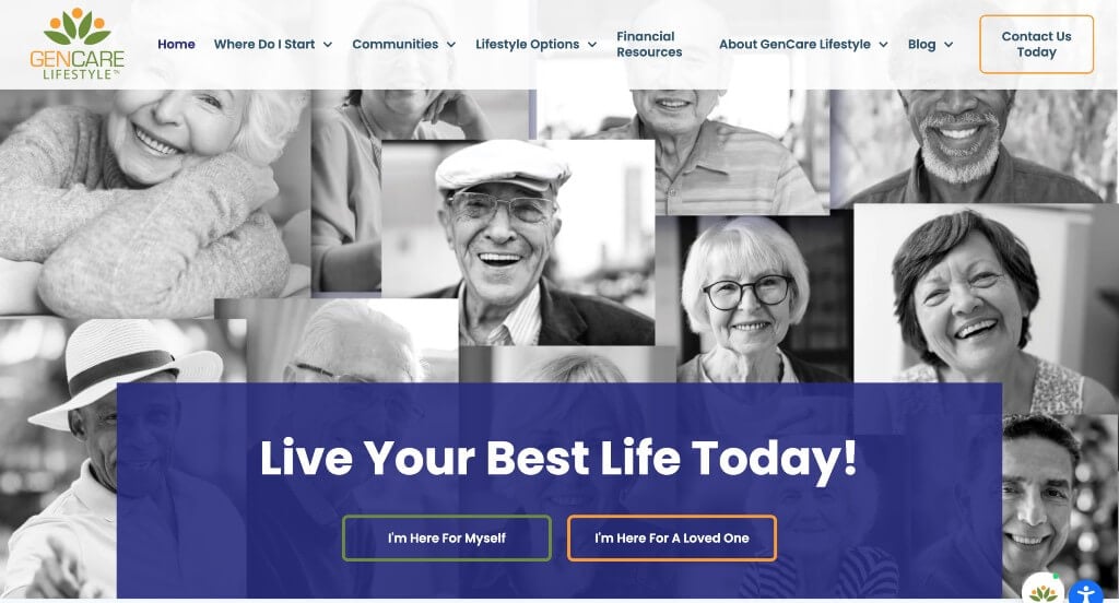
Right away, a heartwarming compilation of images can be found, connecting to any newcomers. We really liked how GenCare Lifestyle had a stunning logo, using relaxing colors and shapes in a way that could resemble people reaching out, and connecting to each other. A pop-up menu with options such as live chat, price details, cost comparisons, tour schedules, and various community events is also included. It was also great that awards were included along with a blog including upcoming events and news.
12. Bella Vista Senior Living
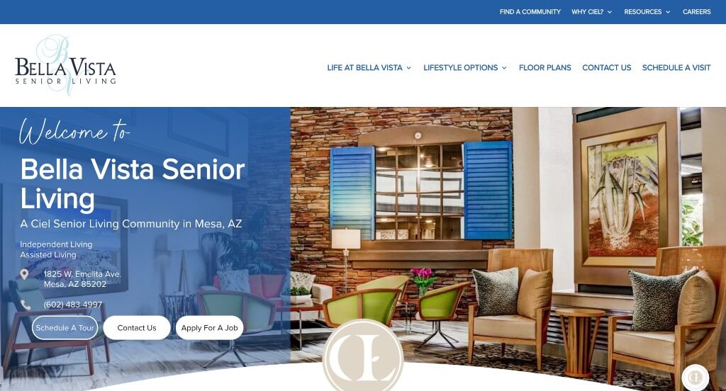
We really loved how this company utilized multiple different fonts that allow for a unique feel to their design. Darkened images are used to create a refreshing appeal feeling almost luxurious. Blocks of colors were used to help break up written content. You might also notice see bite-sized information and beautiful photos in order to highlight this company’s gorgeous living spaces and various activities.
Related: You can get more assisted living leads for your senior living community by running targeted ads on search engines and social networks.
13. Five-Star Senior Living
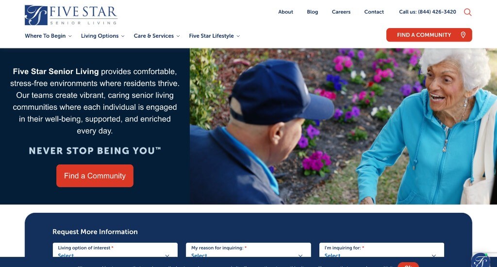
Here we have a sophisticated and professional feel that’s crisp and straightforward so people don’t waste their time. We loved their option for requesting more information that allows for filters to only give information that would be helpful to clients. An option to find a community by entering city, state or zip code was another feature we liked. Generating a luxurious, curly logo design shows that they set a bar for high end care centers. It was also useful that their domain matches their company’s name.
14. Kisco Senior Living
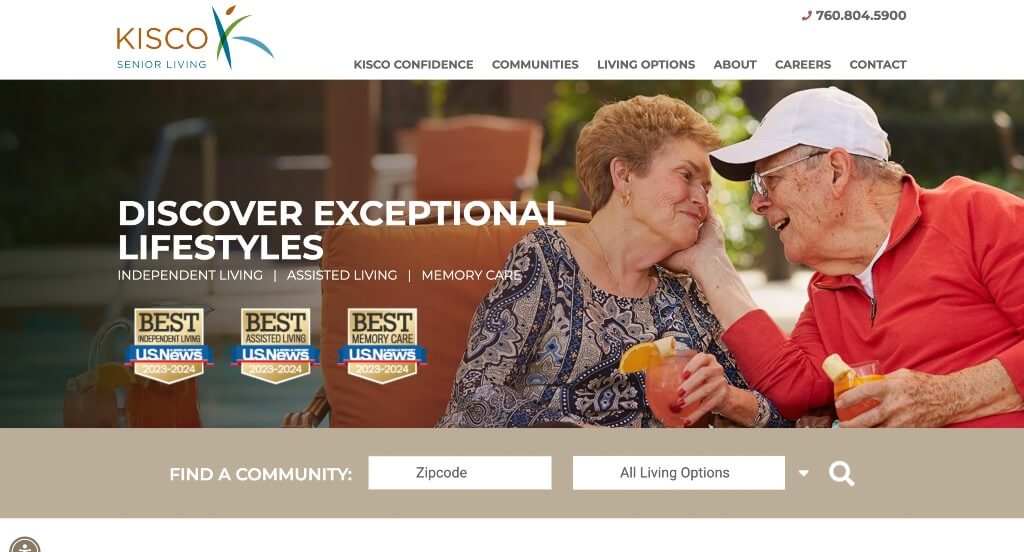
This logo grabbed our attention right away because it signifies connection and joy, something that these citizens are likely looking for. Featuring their awards received was nice to prove that they are a reliable company. Having three different living communities to fit the needs of their customers was a very smart business decision. We loved how they showed off images of all their locations and communities so people can get a feel for their atmosphere.
15. ‘LLima at Leihana Senior Living
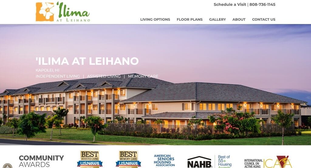
Right away we can notice well-organized and clean design offering a modern and simplistic look. We enjoyed their use of awards and a long image of their housing. It was helpful to include a photo gallery along with floor plans. Another great feature was their bright and happy feeling logo. You also might notice that large lettering showcases their phone number and schedule a visit button.
16. Frontida Assisted Living
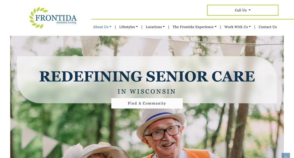
Here’s an example that is full of life. Lime green accents their pages bringing joy and energy to their website. Reusing their logo and other patterns in order to create a more interesting template was another thing that we enjoyed about Frontida Assisted Living. Showing off awards and partnerships was a great way to build trust with customers. Including some frequently asked questions with additional resources was also very helpful.
17. Robson Senior Living
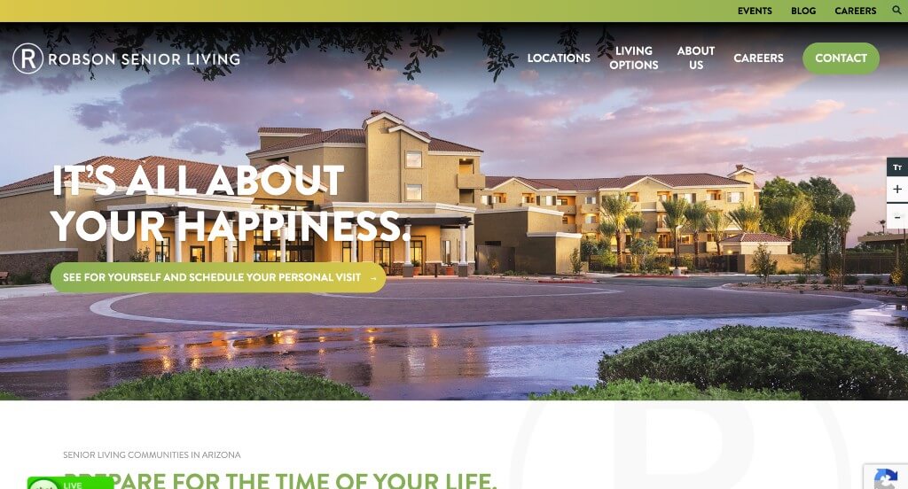
First, we thought their stunning color scheme was one that will blow customers away. Having bold texts for titles was another stunning choice that we really liked. A basic logo design is used to create that simplistic look. It was easy enough to find opportunities leading to additional information and contact information. Many images of high-quality, smiling patients was another great idea.
18. Mountain Park Senior Living
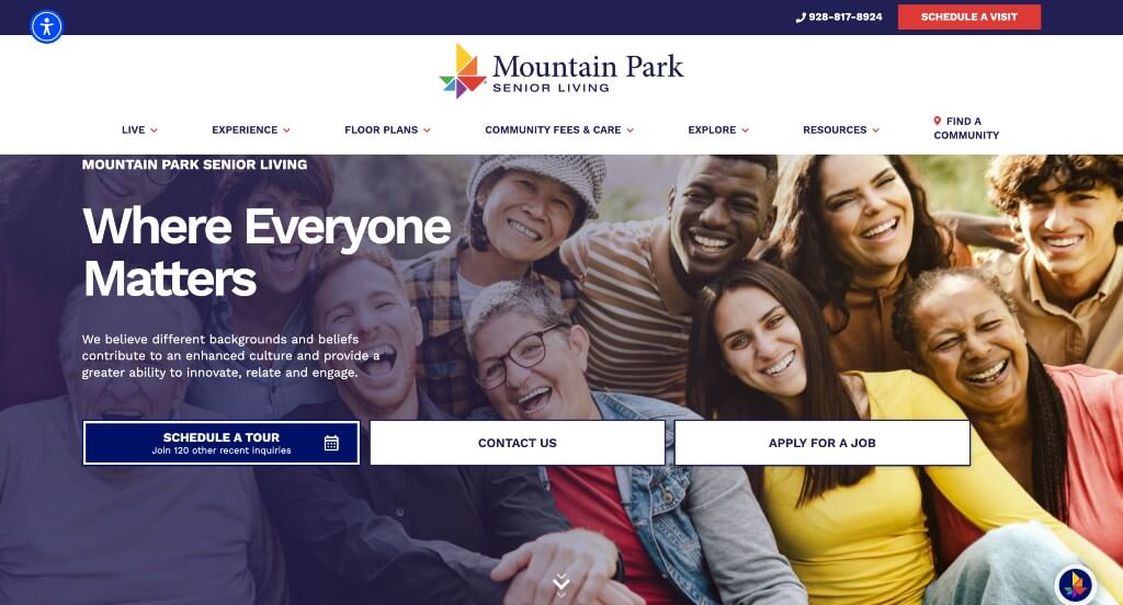
Right away, based off of this logo design we can tell that this company strives for diversity and caring for everyone. An Instagram feature can be seen with fun and creative posts. Information about floor plans and client testimonials can also be found. We believed it was thoughtful to include awards and recognition to prove that they are a reputable business. This company also had a well organized menu that could easily be navigated.
19. Eddy Senior Living
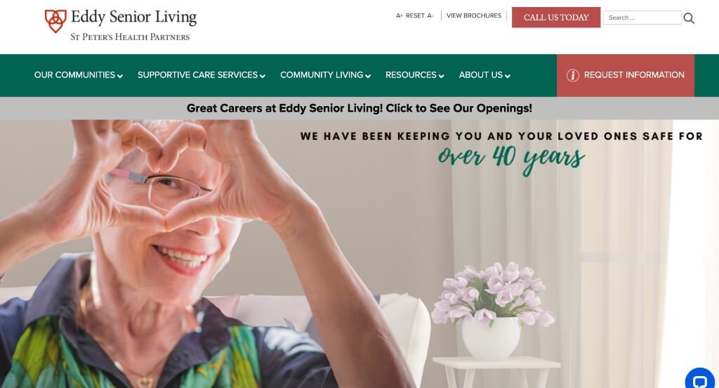
When you visit Eddy Senior Living’s website, you’ll come across an option to schedule a visit right away. Lots of buttons and linking text is used to organize content, making it easier to find information that you are looking for. We thought it was creative to have a logo design that almost appears to look like a heart. We liked that they had a search bar. Additionally, it was a great choice to chose a domain name that matches their company name.
20. Eagle Point Luxury Senior Living
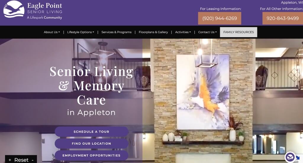
Here we have lots of visual aspects highlighted by several photos highlighting living spaces and lifestyles of residents. A nice purple accent color covers a good portion of their site. A sticky header allows viewers to explore this website and know all about services and programs, upcoming events, floor plans, and much more. It was helpful to pick a domain that matches this company’s business name.
21. TouchMark
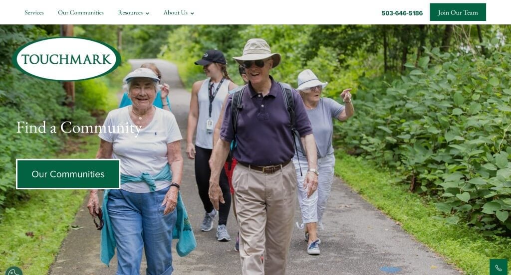
TouchMark has a website design that looks and feels highly professional with no unnecessary extra images or content. Using a clean color palette helps create that clean feel. An excellent intro clip to feature their grounds, resorts, and residents. A detailed map can also be found towards the bottom showing streets, healthcare facilities, and shopping centers nearby for your reference. If you scroll further down, you can see an option to request more information, along with links to TouchMark’s social media pages.
22. Sunrise Senior Living
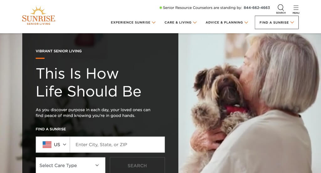
Representing its name, this web design has a bright, cheery and refreshing vibe that will easily attract visitors. Lots of images with smiling clients, to show off that they care about their customers. We loved their use of small orange and blue accents because they really add in that pop of color that this site needs. Adding in a search bar was a great option to help people find information they wish for. We also thought it was helpful to include a variety of graphics that can be seen to add some sense of visual appeal.
23. Oak Park Place
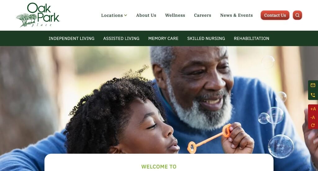
Oak Park Place has a neat and extremely sophisticated design with a soothing color theme of white and dark green. A few patterned and textured backgrounds are added for a great look. This company did a great job with their navigation bar that was well organized and easy to use. Bright colors were also used as little buttons to separate some of their options. Finally, we really liked how they used a domain that matches their company name.
24. Parkside
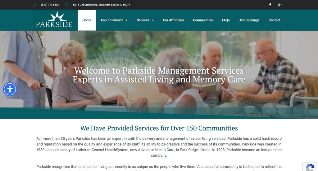
Parkside has a stunning aqua color that is used for an accent in order to highlight some of their information. Along with that, content was formatted into short paragraphs in order to make information faster to read. A page dedicated to their frequently asked questions was very helpful for those wanting to learn more about their company. Adding in a blog was also a great inclusion in order to provide information in a different way.
25. Senior Lifestyle
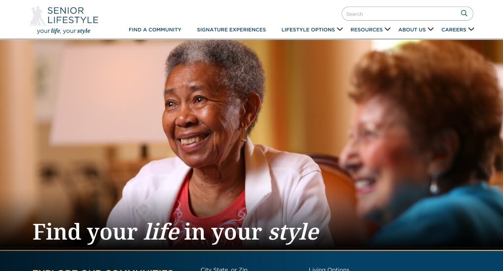
Senior Lifestyle has professional design that allows visitors to explore offered communities right away while visiting this website. It was helpful to have an ability to search for a city, state or zip code, and filter by living options. Whether clients are exploring for themselves or a loved one, they feature many options to explore. Small graphics along with skinny lines to create accents help to add a unique feeling to their business.
Related: Need help managing a senior living digital marketing campaign for your community? Enlist the help of an agency with experience!
26. Belmont Village
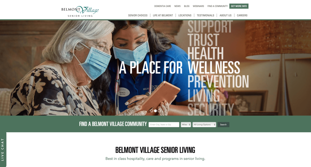
Belmont Village has a rather minimalist tone with great font choices and color palettes. You might notice that videos are also included in many areas. Content within this homepage is brief and straightforward, allowing everything to feel seamless. Belmont Village also had an elegant logo design that helped their company feel more luxurious. There is also a section just for latest news and events to help keep people into the loop.
27. Frontier Senior Living
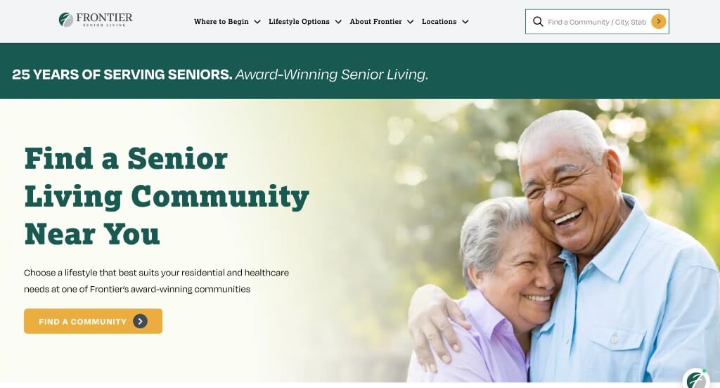
One of the first things that we noticed was Frontier Senior Living’s stunning font choices. Along with that, it was helpful to include information about each of their locations so people can understand what their time at this facility would be like. Including bursts of color and graphics throughout the pages was something that we enjoyed. Additionally, a search bar can be found in order to find communities near your current location.
28. Scottsdale Village Square
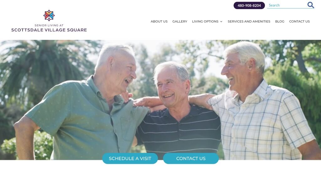
Something we really enjoyed was their creative patterns used on these pages. It was helpful to include a gallery but also a customer review section. You might also notice how they featured a short promotional clip to engage visitors. We also liked their pop-up that allows customers to be linked to schedule a tour, pricing, along with more options. Additionally, it was helpful to include a gallery and a blog post.
29. McDowell Village
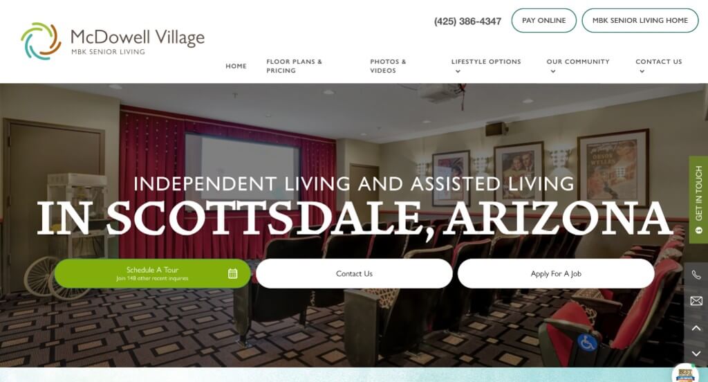
Here we have a variety of great qualities. One of them was their bullet points to organize a variety of content. They used a few fonts to help create a feeling of wholeness in their template. It was smart to display their awards, showing they are a reputable source. It features brief introductions to services that are offered at this facility and offers a quick glimpse at lifestyles residents could expect. High quality visuals are also used to create a stunning visual look.
30. Manor On Paradise Senior Living
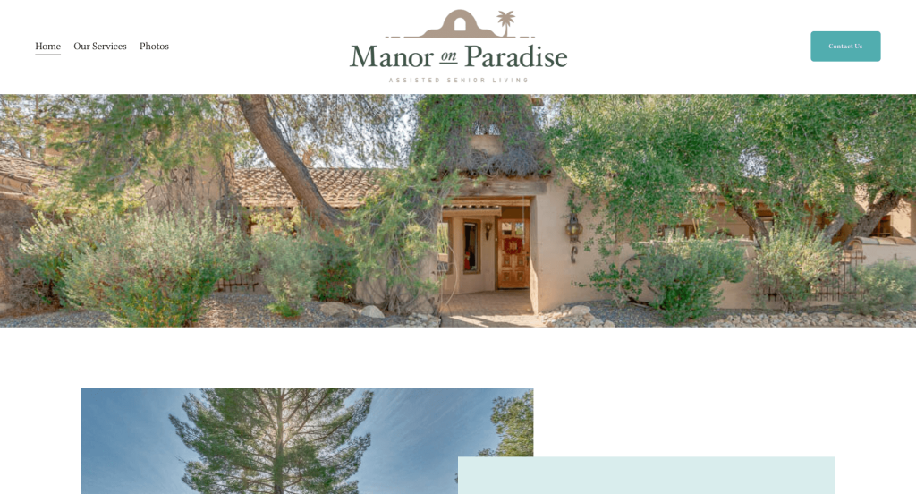
This may have been one of our favorite designs, due to their relaxing color palette. Their logo design followed along with that simple, relaxing feel. This business’s layout for Manor On Paradise is pretty straightforward, featuring minimalistic information. We liked how so many images of their center were displayed so potential customers can get a feel for what they’ll be stepping into.
31. The Palace Group
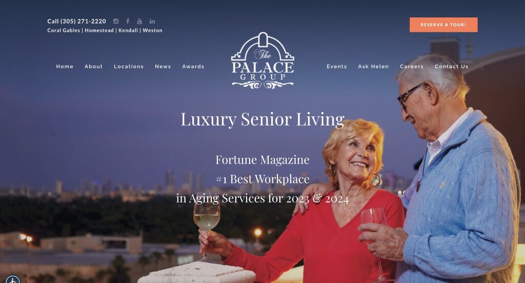
Right away, we notice how this company does a great job with displaying their logo design so it stands out. This company leans more towards an informative feel due to their homepage with images, locations, awards and YouTube videos. We also thought it was a great choice to add in those videos because it allows customers to sneak in a virtual tour. The Palace Group also did well with their choice in fonts, it was calming but professional.
32. Oakridge Gardens
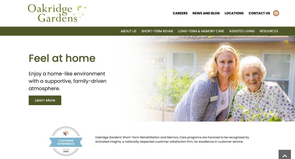
This example has a great balance of white space, keeping their template looking clean and professional. We enjoyed how they showed their communities within their brand, but connected it all as Oakridge Gardens. Their color scheme is logical based on their company name, and it seems to signify growth and joy in these citizens lives. Customer reviews were also included which is always a good idea, no matter what type of company you have.
33. Dimensions Living
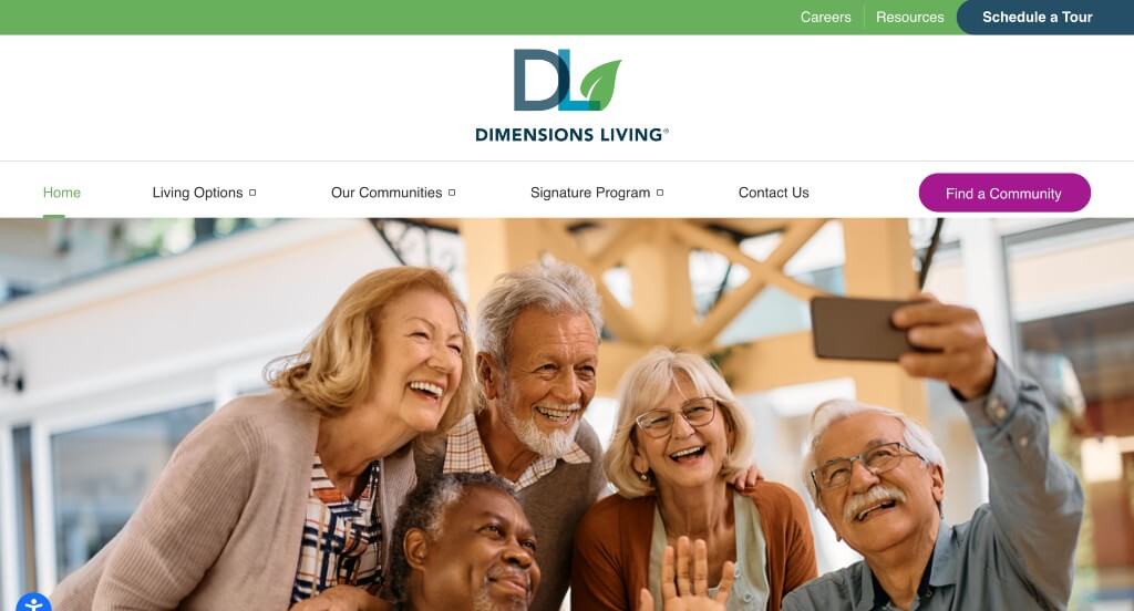
This company starts of strong with their graphics that appear to be similar to their logo design. Their logo also appears in multiple areas which is helpful to build up their brand identity. Dimensions Living also did an amazing job with their navigation bar with drop downs in order to keep everything organized and easy to find. Their domain also was very simple and matched their company name which is beyond helpful.
34. Heritage Senior Living
Here we have a site with a very relaxed color scheme that we loved. Their font choice was simple and professional, which is always a great choice. Using a template that switches images and content back and forth to create a good balance was another feature that we enjoyed. Buttons were added in to keep everything less cluttered, and make it easier to find information that’s needed. Videos were also nice to include because it presents information in a different way.
35. Coterie Senior Living
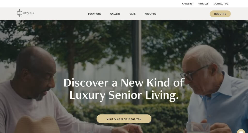
A feature you will be sure to notice right away is this company’s stunning color palette. Coterie Senior Living also does a great job with a logo design that showcases their brand name and their elite feeling. We really thought their menu was stunning. It was also really helpful to use gray color blocks to separate written content and photos. Adding in an automatically playing video was a good idea, because it adds to their elite appearance. To end off this site design, their domain matches their company name.
36. Burlingame Senior Living
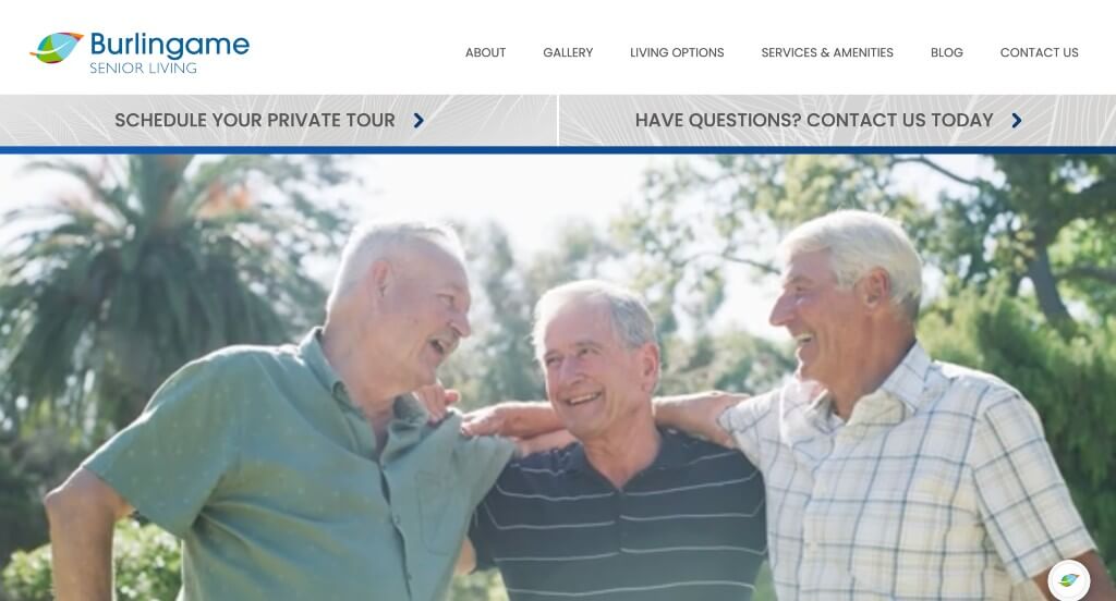
Burlingame Senior Living is carefully planned to create a template that balances everything well. Images, text, videos, patterns and more help to elevate this site to another level. Adding in a live chat was also a thoughtful idea because simple questions can be asked through there. Strips of images and graphics are useful to break up lengthier paragraphs.
37. Park Vista Living
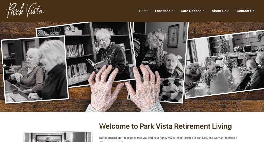
This is one of our favorite examples because of their interesting aesthetic. Using black and white photo frames to highlight their images in a “scrapbook” was very different from many of their competitors, which was good. A blend of professional and decorative fonts was another choice that we really enjoyed. Buttons were also included to guide people towards more information.
38. Prestige Assisted Living
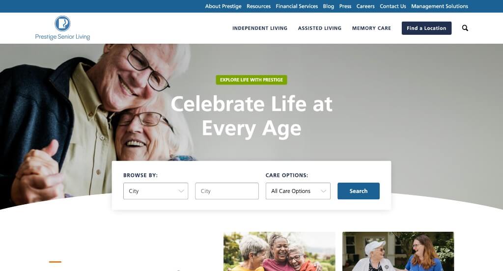
This business’s web design has an all-business feel, featuring in-depth information and attractive visuals. Right away, people will surely notice how this company used a browse bar sorting by city, state, zip code or location code along with care options. As a web development company, we noticed their captivating logo design almost instantaneously that features a P for Prestige, but also features two faces within it. Moreover, there are individual content segments on various wellness programs and community highlights. Finally, it was a great idea to include a blog post for their customers to visit.
39. Century Park
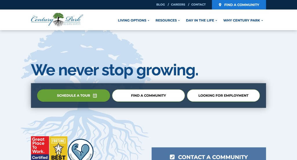
We loved how Century Park played on the idea of roots and growth. At first, it might seem a bit overcrowded because of its visuals and bold fonts, but it offers lots of information about current events and services. Whether users want a career at Century Park or want to book a stay, they can explore all options using their helpful search panel. You can also find a search option that lets you take a look at Century Park communities across different states of within the United States.
40. Bright View Senior Living
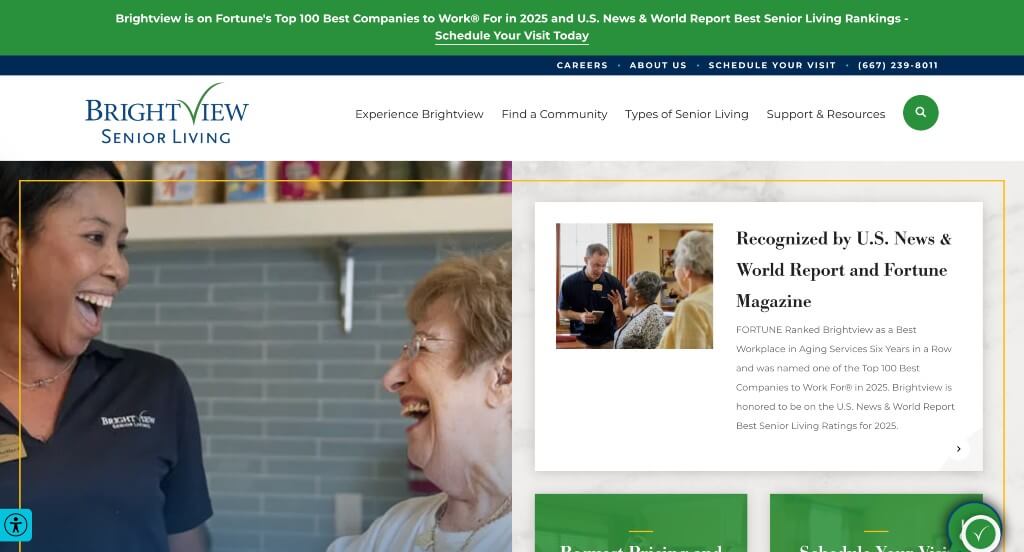
This brand went with a vibrant blue, green and yellow color scheme which looked amazing. We liked how they arranged their content because it was different than their typical sites, helping them to stand out more. Awards and recognition were also included in this webpage which was nice because it builds trust with those customers. Allowing people to schedule visits before choosing this company was a nice opportunity.
41. Bickford Senior Living
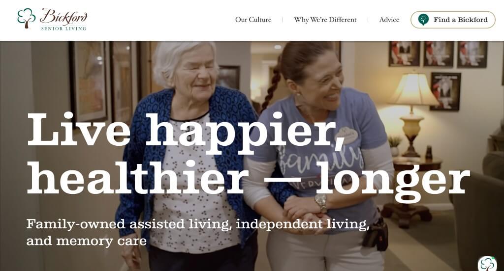
Likely one of the most outstanding features was this their location finder sharing states and their number of facilities in that state. It helped to draw more attention to their visuals with a use of videos – especially automatically playing ones. It was unique to include other tree graphics besides their logo. Their video explaining HigherPath in a personal cartoon way was also a great choice. They also had beautiful accent colors that really created a welcoming feel.
42. Virginia Health Services
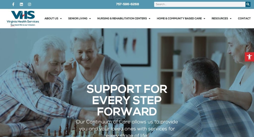
This website has a polished design with many colorful visuals and symbols highlighting their resources, amenities, and life in general at Virginia Health Services. Their bold color palette brings across a feeling of patriotism for an American company, but also contrasts nicely. Many icons and buttons are used to make navigation much easier. Additionally, they have a series of blog posts that can be found for additional information.
43. Cobbdale Assisted Living
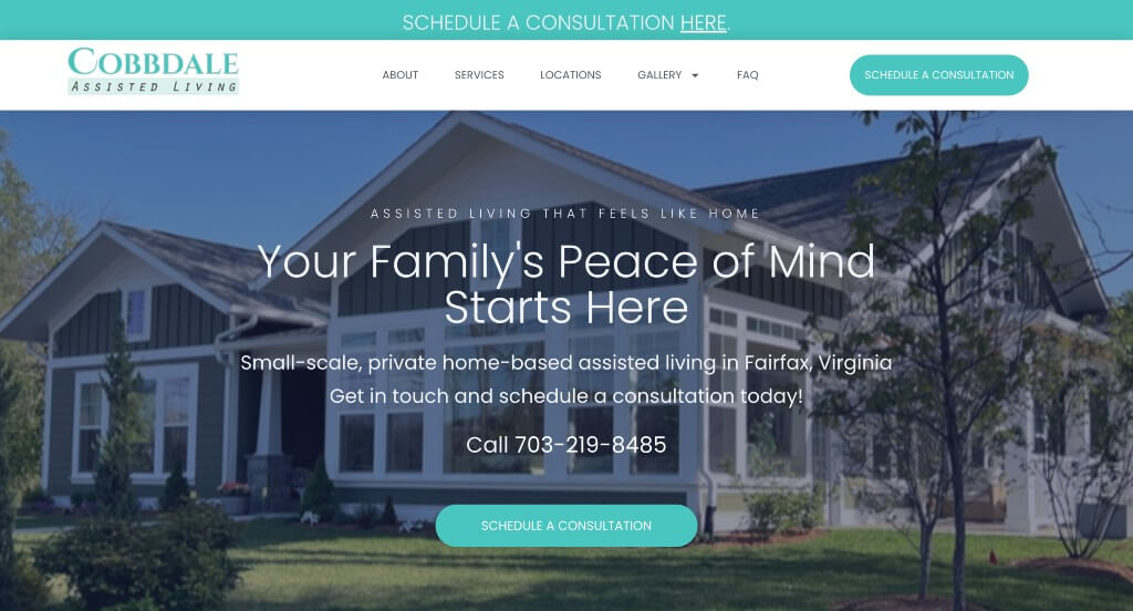
If you are looking for a simple and clean design featuring a short intro paired with some stunning visuals, check out this example. A few short animations really brings this simple design just a step higher. Their relaxing blue tones was another aspect that we really liked. Adding in testimonials also helped to provide additional information to potential customers.
44. Heritage Village Assisted Living
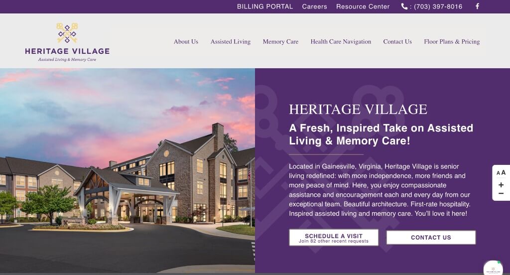
Having a color theme of purple, yellow, beige, and white makes Heritage Village stand out. We really liked how their logo design has two keys built right into it. It was also great that their logo was reused in multiple different ways. Adding in a map was perfect because customers will be able to see where they are located. They had lots of information spread all throughout this beautiful template.
45. Peach Creek Assisted Living
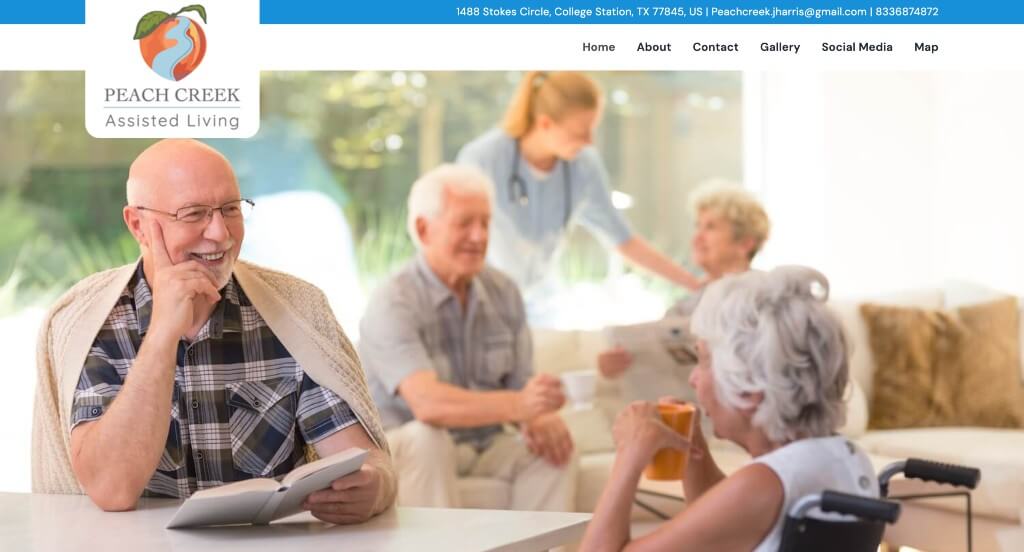
Right away, we noticed this interesting logo. It made sense for their brand name, but it was also unique and memorable. We thought it was nice how they included bullet points listing what they as a facility offer for their clients. Showing how many years of experience they offer was nice because it builds trust and shows that they are qualified. Having a simple fillable form was nice because people can email their questions right from the website.
46. Carnegie East House
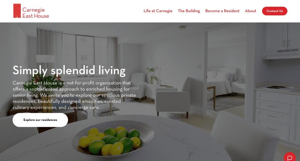
Here we think red, white and black was definitely the right choice. Every one of their tabs on their navigation bar has a drop down to provide additional information. Many high quality visuals are included, which makes it even better. Furthermore, several thumbnails highlight activities that are offered at Carnegie East House. Users can also find an inquiry form if they have any questions and want to contact this business.
47. Village Care
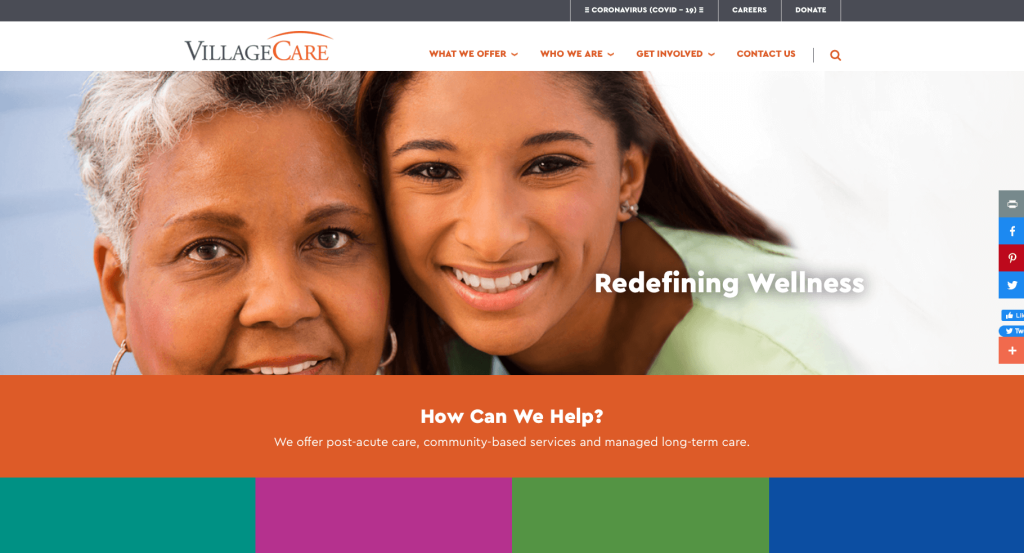
Village Care’s website has a colorful design creating an engaging template, with lots of content. This homepage highlights different healthcare services and options that are available through Village Care. Adding in all these bright colors allows for a more exciting and youthful feeling. It was helpful that their domain matches their company name. It was also a good idea to have a donate tab for their business.
48. Inspir Assisted Living
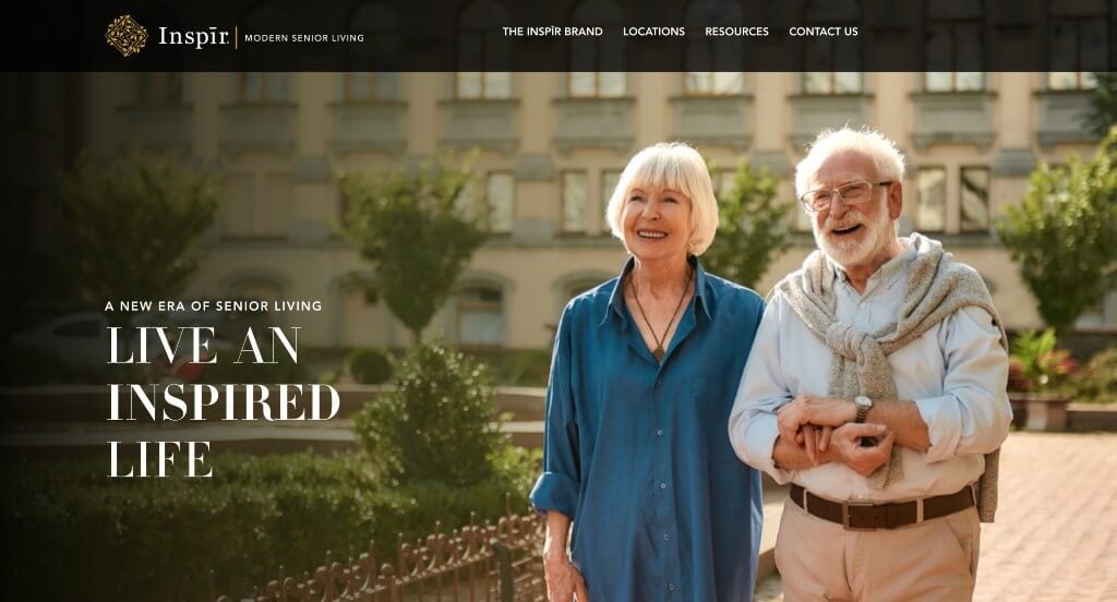
Inspir has a luxurious and modern appeal featuring a rich and bold theme of black, white, and golden colors. We really enjoyed how they had a delicate logo design to match their company’s appearance. Detailed blog posts are also added in which was great. Aside from that, community locations and social media links are also available. Finally, bold fonts were used to have a more uniform look.
49. Elm York Assisted Living
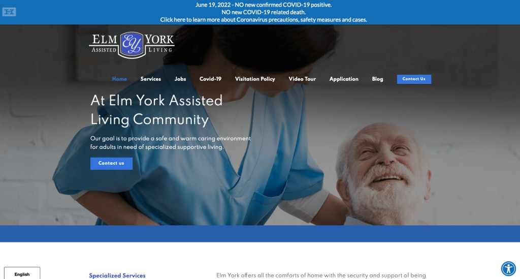
Here we have a simple layout to highlight only the most essential pieces and brief intros about Elm York’s services. As you scroll down, there are separate thumbnails for different services available at Elm York, including recreational activities, dietary services, healthcare services, and housekeeping. Their relaxing color palette was another amazing feature, because it allows for a clean look.
50. Spring Lake Assisted Living & Memory Care
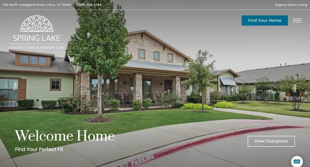
This example created a stunning look because of their high quality images and professional fonts. Including a photo gallery that allows people to look at their facility to see if it’s the right fit for them was thoughtful. Having a page dedicated to their floor plans was another helpful choice. We liked that their was information about the neighborhood for those who might be visiting. There was lots of great additions to this page, all to help the viewers.
WordPress Assisted Living Home Themes
Find free themes at wordpress.org or explore assisted living templates on ThemeForest.
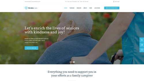
KindlyCare – Themeforest
$69
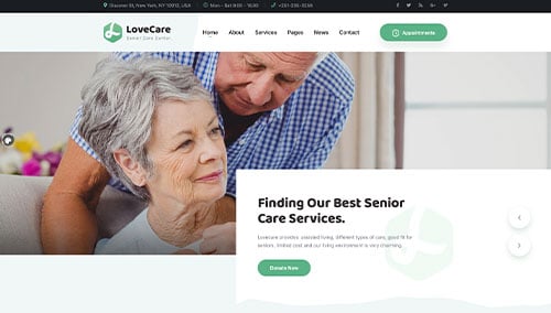
Lovecare – Themeforest
$39
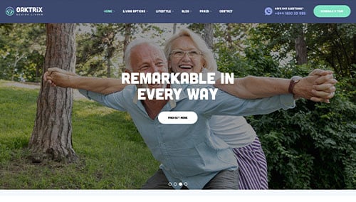
OakTrix – Themeforest
$49
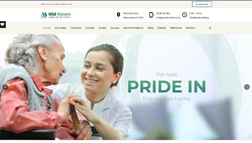
Old Haven – Themeforest
$69