Attention auto repair pros! Need web design inspiration for your garage? Check out our guide to the top 50 automobile repair websites!
Our expert web developers have curated the finest vehicle repair sites online, focusing on design, functionality, uniqueness, and user experience. These sites boast visually stunning layouts and seamless navigation, setting the standard in the auto repair industry.
Here, you will discover ideas for your website and learn tips to enhance your online presence.
Rev up to elevate your car repair business with this guide! Explore website examples from various types of auto repair shops, including independents, franchises, dealerships, specialty shops, mobile services, and tire shops. For examples from other industries, check out our Greatest Websites of 2025 article!
Top Auto Repair Shop Website Designs
- 1. Avondale Auto Repair
- 2. Zepeda Auto Service
- 3. Chicago Auto Repair
- 4. Fred’s Auto Repair
- 5. BA Auto Care
- 6. We Fix It Auto Repair
- 7. Milito’s Auto Repair
- 8. Nelson’s Automotive
- 9. Meineke Car Care Center
- 10. Luke’s Garage LLC
- 11. Dave’s Body Shop
- 12. Wink’s Body Shop
- 13. McLean Auto Repair
- 14. West Seattle Autoworks
- 15. Bernie’s Automotive Service
- 16. Stoiched Automotive
- 17. Repair Revolution
- 18. Hawthorne Auto Clinic
- 19. Elite Auto Repair & Sales
- 20. Dana Bros
- 21. Bradshaw’s Auto
- 22. Marino’s Auto Repair
- 23. Expert Auto Repair
- 24. Everett Street Autoworks
- 25. Precision Automotive Service
- 26. Ray’s Transmissions & Auto Center
- 27. Curt’s Auto Repair
- 28. Midtown
- 29. The Auto Experts
- 30. Galson Auto
- 31. Sacramento Auto Repair
- 32. San Francisco Automotive Solutions
- 33. Scott’s Auto Repair
- 34. Leale’s
- 35. Tony’s Auto Service Center
- 36. Rob’s Import Repair
- 37. Avo’s Automotive
- 38. Hollywood Mechanic
- 39. Pete Kelley’s Auto Service
- 40. Don’s Auto Repair
- 41. West Coast Tire & Service
- 42. Allied Service Center
- 43. Christian Brothers Automotive
- 44. Bumper Buddies
- 45. Auto Scope
- 46. The Electrified Garage
- 47. Astra Automotive
- 48. Auto Select
- 49. Simply Auto
- 50. Roda
1. Avondale Auto Repair
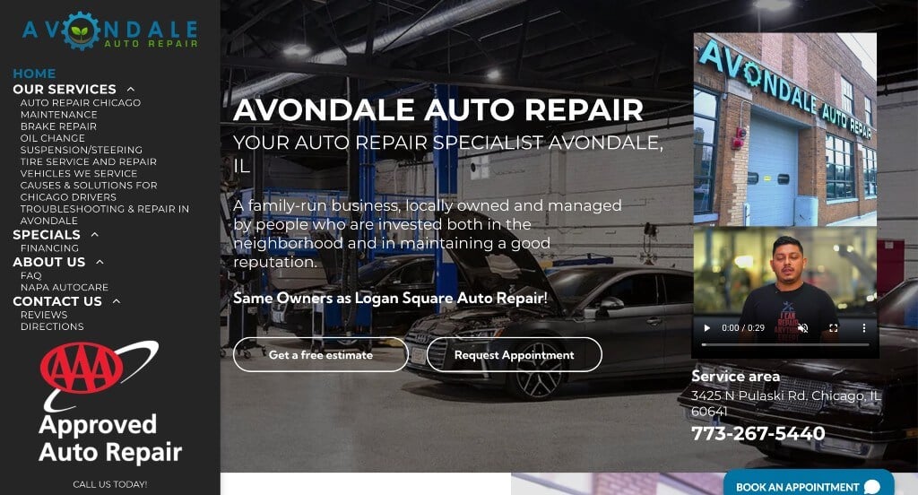
Avondale Auto Repair has a great website to focus on bringing in business to their auto shop. Offering a first-time customer special to make it very easy to get a quote and request an appointment was something we noticed right away. A button to book your appointment and a phone number are visible on every page. Furthermore, this is a great example of a custom auto repair template because of how well their site flows, and how an interesting design keeps the attention of their clients.
2. Zepeda Auto Service
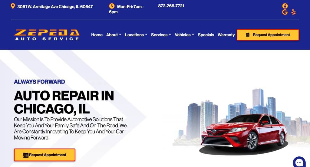
At Zepeda Auto Services, visitors are greeted with a pop-up window showing a form to sign up for their text messages to receive important updates and exclusive offers. This automobile website makes it clear what kind of vehicles they service based off of a list located in the homepage including their services offered. When combining all of these factors, it shows that Zepeda Auto Services makes it easy for customers to know if this company is best for them.
3. Chicago Auto Repair
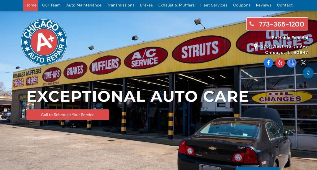
When looking for ideas for your mechanic website, check out this one featuring their business hours right at the top along with showing off services they offer. Adding in a video to allow people to get a better understanding of Chicago Auto Repair was something that helped it make it onto our list of best automobile repair websites. Some features that stand out in this homepage are the live chat, variety of visuals, happy customer testimonials, and a Google Map.
4. Fred’s Auto Repair
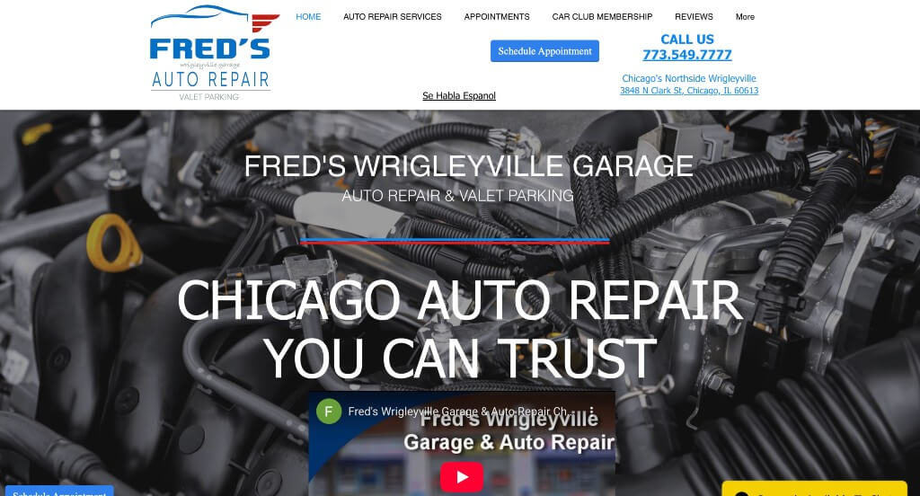
This company utilizes plenty of written content, but doesn’t overwhelm clients. Choosing a template with a good amount of white space and easy-to-read font was a feature we noticed right away. This repair shop website offers many services and clearly lists them on a slider with pictures, making it easy to see. Aspects that stood out were things such as live chat, customer testimonials, and hours of operation. The contact page makes it easy to connect with them and a Google Map makes it simple to know where they are located.
5. BA Auto Care
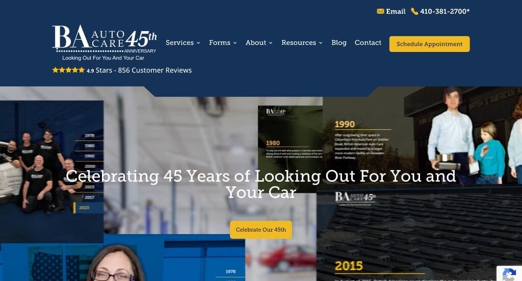
We thought this example started out with an interesting way of highlighting important moments within their 45 years of service. Their use of both images and videos was another thing that we really appreciated. Something else that we liked was their bright accents of yellow because people were curious about this information.
6. We Fix It Auto Repair
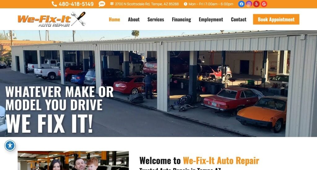
This example covered their pages with accents of a light orange, which isn’t typical for this type of company. This navigation bar did a nice job keeping everything organized, making it fairly easy to find information when viewers are searching for it. Icons were used throughout the page because it looked interesting. We also appreciated how this company used interesting image frames.
7. Milito’s Auto Repair
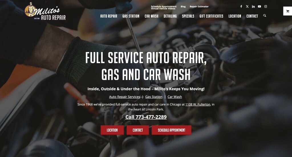
A clear and attention-grabbing design is what stands out for this custom template. Showing off services offered in areas clients eyes are automatically drawn to really made an impact in this example. Also, a section sharing background information about the business helps potential customers gain trust with them. Milito’s Auto Repair lists different repairs offered, along with what vehicles they work on. Because of that, potential customers will know if they can bring their car to this company. Seen near the bottom, a contact form can be accessed after reading their included information.
8. Nelson’s Automotive

Nelson’s Automotive is very clean and straightforward site with a pop of red to make everything come together. Red is used to highlight and bring attention to important information throughout this repair shop website. Utilizing a navigation bar that is well-organized allows for customers to find the information needed as soon as possible. Making it clear where their locations are was definitely a helpful feature. Overall, this was a great website example to check out when looking for custom template ideas.
9. Meineke Car Care Center
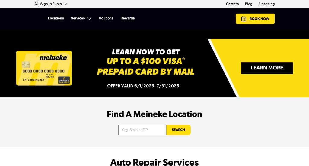
This unique vehicle repair shop grabbed our attention with their bright color scheme. A designated area for their offers was a feature we won’t forget. A domain that was simple and similar to their company name makes it easy for customers to find. Graphics are seen throughout the page which helped with the organization of Meineke Car Care Center. White space seen throughout their site balanced out the site and made it more aesthetically pleasing. For anyone looking for design examples, make sure to take a look at this one.
10. Luke’s Garage LLC
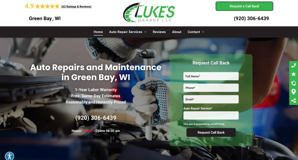
We really enjoyed how this company had lots of information included within it while still being organized and easy to read which was nice. Adding in buttons to help improve navigation and make their pages feel less overwhelming was another thing that we liked. Using small icons to pair nicely with their content was also a helpful choice.
11. Dave’s Body Shop
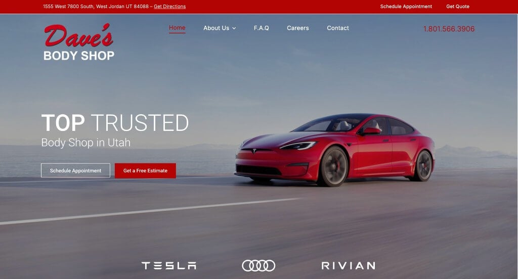
This example grabs attention with their large image that is captivating. A FAQ page was another choice that doesn’t always happen, but we liked seeing it in here. This domain was simple and matched the company name which was a smart idea. Including customer reviews from google was something that we really enjoyed getting to see in use.
12. Wink’s Body Shop
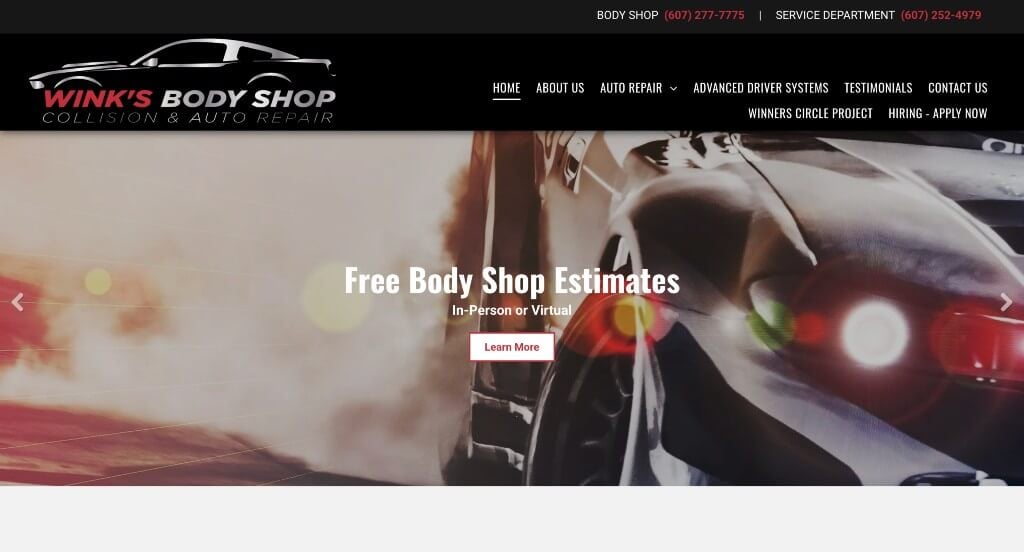
We enjoyed this company’s color scheme that is professional and logical for their business. This navigation bar was well organized, making it much easier to find information which is nice, especially if you’re looking for something specifically. Small icons was another thing that we really liked because it adds another sense of visuals.
13. McLean Auto Repair
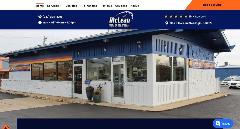
This was a great example that used fonts that we absolutely loved. Along with those fonts, this company did a nice job with their short paragraphs that make it easy to read whatever content sounds interesting. We loved these brightly colored buttons that grab attention and guide people towards additional content.
14. West Seattle Autoworks
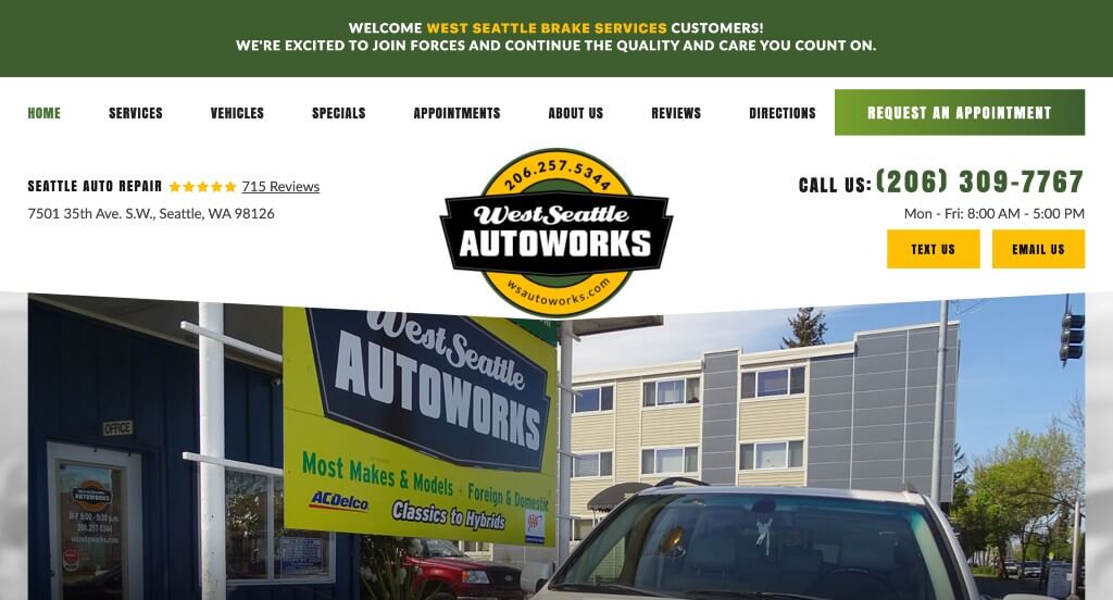
West Seattle Autoworks has a very welcoming website. Including a 20 percent off special that was featured right away, draws attention to people that are looking to save some money. A basic logo design pulled together their company. Using a color palette that stayed equal throughout the entire site. Some other features that stand out in this example are client testimonials, social media links, and a contact form to help customers make an appointment. When searching for template ideas, don’t forget to check this one out.
15. Bernie’s Automotive Service
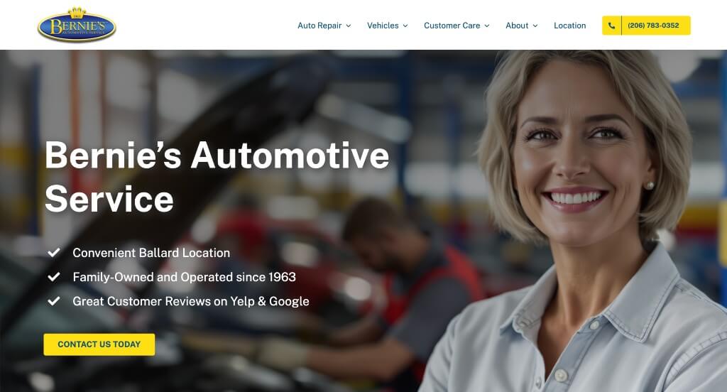
This automotive shop’s site makes it easy to get into contact by their phone number and contact form that is easily accessible. Also, it’s made very easy to browse through their information because of their many buttons and a sticky header including a variety of links. Using bullet points to organize their information really helped this website make it onto our list of best repair shop templates.
Related: View our auto repair shop digital marketing services.
16. Stoiched Automotive
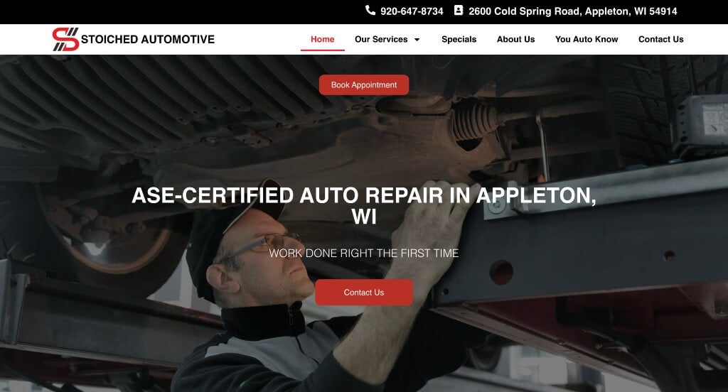
One of the first things that grabbed our attention was this unique logo design that was professional. Keeping paragraphs short and easy to comprehend was another thing that we really appreciated. Including lots of buttons which is helpful to keep customers engaged with their information and directed towards what they are looking for.
17. Repair Revolution

Repair Revolution uses a red, white, and blue color scheme to presents a professional appearance for their custom mechanic shop. Featuring a video on their homepage, gives a better explanation of what they as a business offer. In addition, they list their services in detail along with including images. We liked how testimonials and social media links can be found throughout their homepage.
18. Hawthorne Auto Clinic
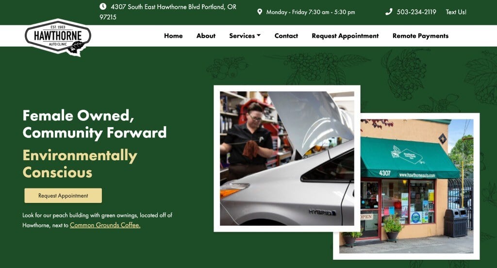
If you’re searching for clean and easy to follow web designs to serve as examples, this site is a great option. A variety of visuals grab the attention of potential clients. Hawthorne does a great job explaining services they offer, along with more details related to their business and team. Including an Instagram section showing what customers are saying about Hawthorne as a company, along with keeping customers updated with what’s going, which is driving business to them.
19. Elite Auto Repair & Sales
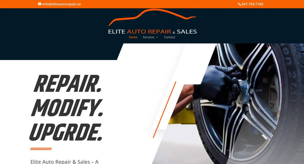
This was an example that we absolutely loved because of their slanted color blocks and imagery. Adding in bright orange to accent the white and dark blue color scheme was something that we appreciated. They did a nice job with adding in a calendar within their website’s footer so people can access it faster.
20. Dana Bros
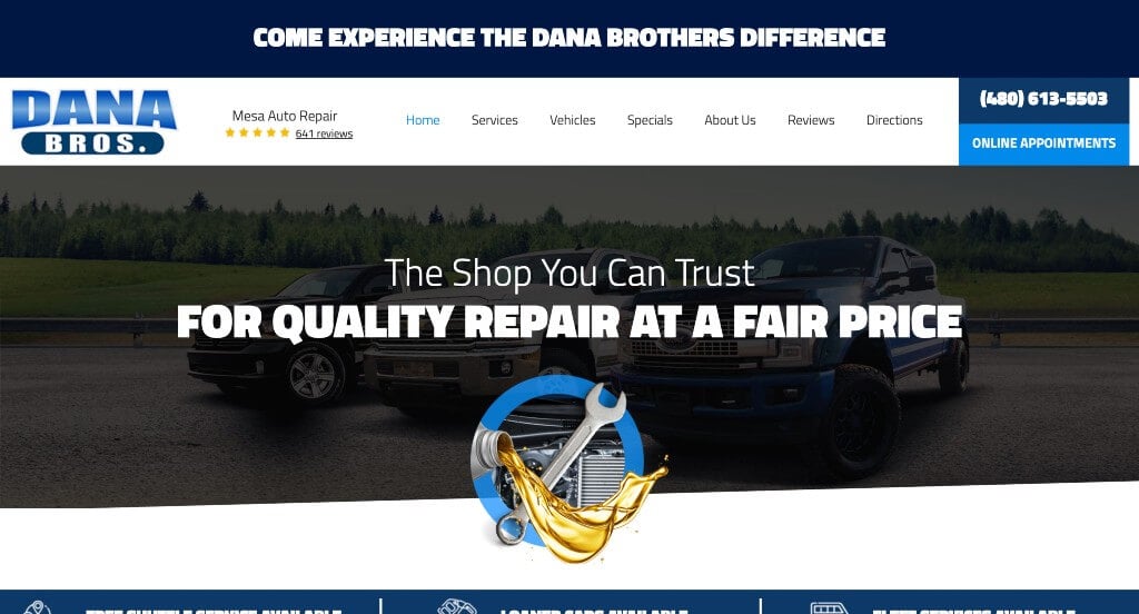
This company’s biggest plus was their overall design that is sure to grab attention. Their fonts were bold and grabbed attention which helped to grab attention and guide people towards specific information. We thought this logo was logical and innovative which we really appreciated. Adding in customer reviews was another thing that we noticed.
Related: Take a look at our auto repair SEO services.
21. Bradshaw’s Auto
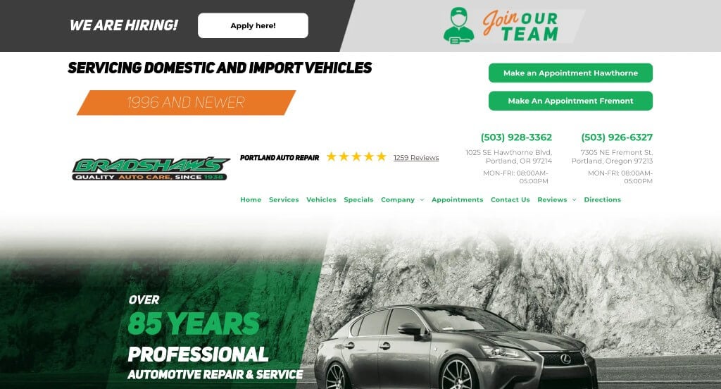
An interesting intro header is displayed to show off the company’s history of over 80 years. A few links explain what they offer, including but not limited to: warranties, fast estimates, and an online appointment booking. Another feature that can be seen in Bradshaw’s Auto was a variety of well-organized links, making it easy for people to browse through information. The last feature we enjoyed in this site was their high quality visuals.
22. Marino’s Auto Repair
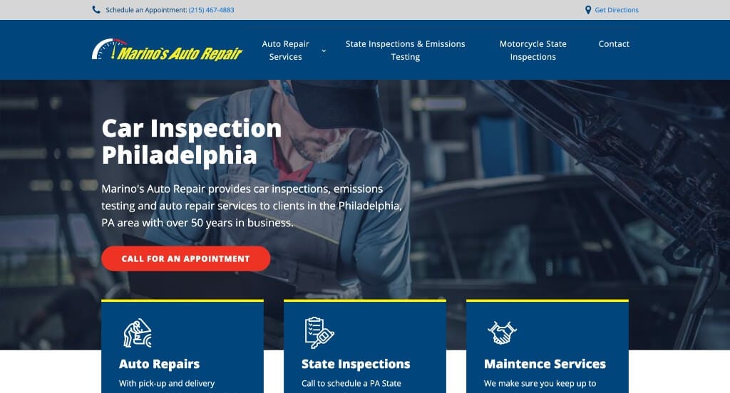
This example maintains a simple design that uses blocks of color to organize their text which we really liked. We loved their color scheme that consisted of yellow, blue, red, along with white and black. Some of their images used white backgrounds to create a more interesting look. Short paragraphs are used to help keep content straightforward for those reading it.
23. Expert Auto Repair
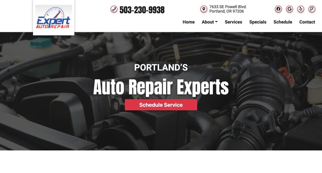
This site utilizes a great introduction paragraph and immediately lists services offered by them. It’s helpful to be able to easily access their button to schedule an appointment, phone number, contact form, and Google Map. Adding in thoughtful fonts that build contrast in their site was something else we noticed right away. Small pops of color was a nice touch that wasn’t overdone for Expert Auto Care. When building your next vehicle repair shop site, make sure to check out this example.
24. Everett Street Autoworks
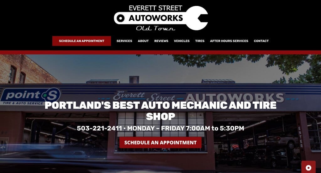
This car repair website was extremely organized and easy to browse through. Right away, we see an intro header with a phone number and a way to request an appointment. These features are added to make it as easy as possible for clients to contact them. At their shop, a lot of tire sales happen, so their website emphasizes it. Information in their site is clear and easy to read, which makes customers feel better about the company they are choosing. Another notable feature we saw was their logo design that was relatable, unique, but also simple.
Related: View our auto repair PPC management services.
25. Precision Automotive Service
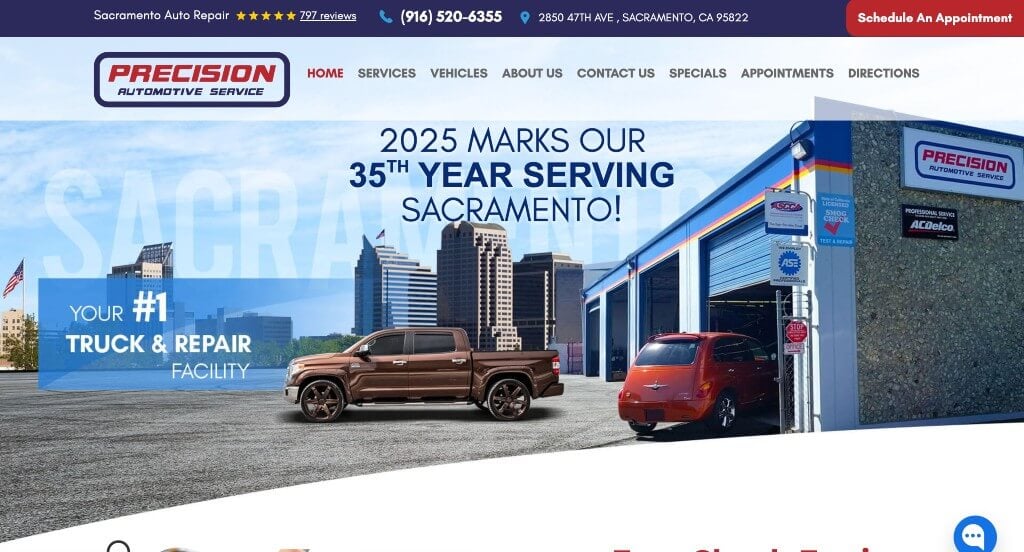
Precision Automotive Service was put onto our list because of their clean template and website. There is plenty of white space around information giving the website a more relaxed feel. Edges of images have a unique fade out feature that allows for the pages to flow together better. We liked that they included customer testimonials and a live chat option. A navigation bar that was well-organized really helped with customer usability.
26. Ray’s Transmissions & Auto Center
One of the first things that we noticed about this example was their bright red accents that are sure to highlight important information. Along with that, we really liked how their fonts were professional and look great within their pages. Including a simple form to request an appointment for your vehicle was another thing that we really liked.
27. Curt’s Auto Repair
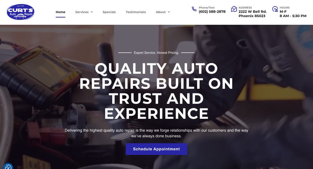
Bold fonts were used to draw attention towards titles and get people interested in their services. Short paragraphs were helpful because people will be able to skim content easier without missing information. Using icons and images throughout the entire page was a great way to create a template that people can enjoy.
28. Midtown
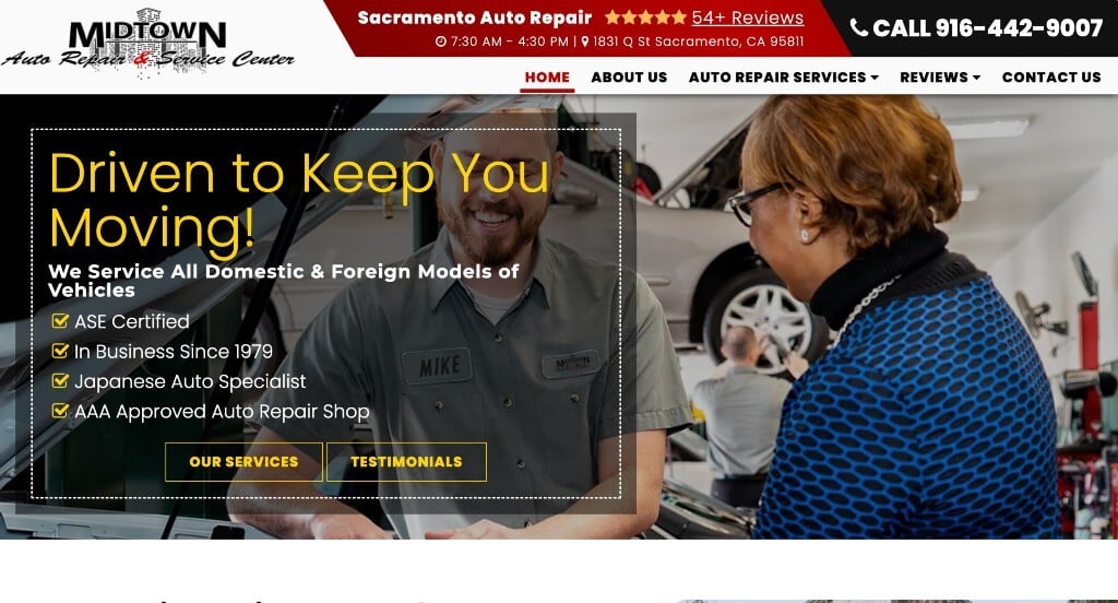
The use of a bright red color scheme draws your attention to their phone number, among other important information such as: services offered, information about them, and reviews. Midtown shares reviews from both Yelp and Google, which adds variety to their site. Using bold lettering in this site also helped us rank it in our list of best auto repair sites.
29. The Auto Experts
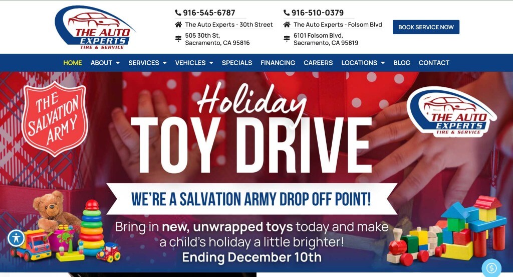
This website shows their priorities when offering a 10 dollar discount for your next service if you sign up for text message alerts. Other features highlighted right away are warranty, shuttle service, coupons, phone number, and a button to schedule an appointment. We also enjoyed the variety of blue colors used in their palette. Adding in images and vehicle models was something we won’t forget.
30. Galson Auto
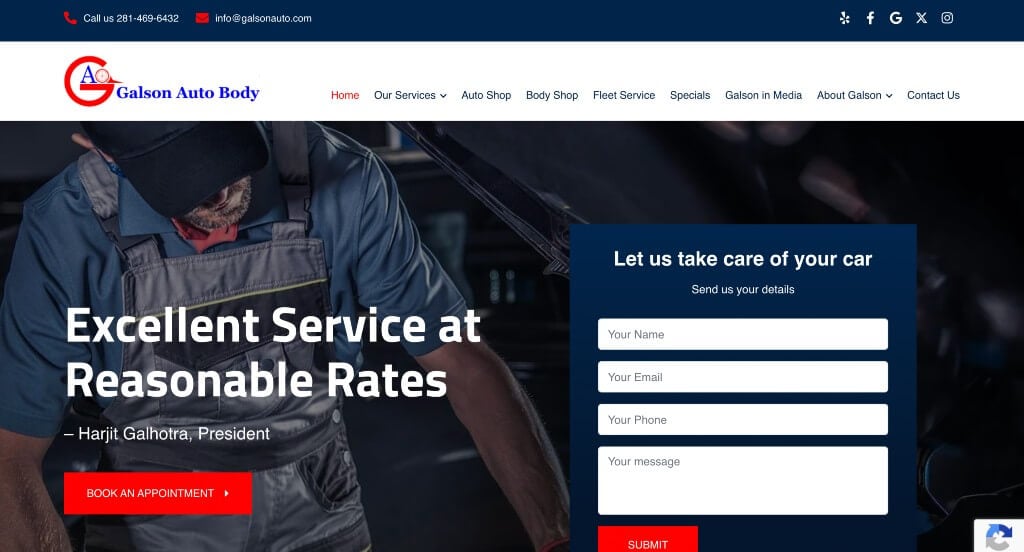
This example does a great job using professional fonts that make their website look great. Along with that, we liked how they balanced all of their information well and created a stunning template. Having a navigation bar with lots of tabs made it very easy to find whatever information viewers are searching for.
31. Sacramento Auto Repair
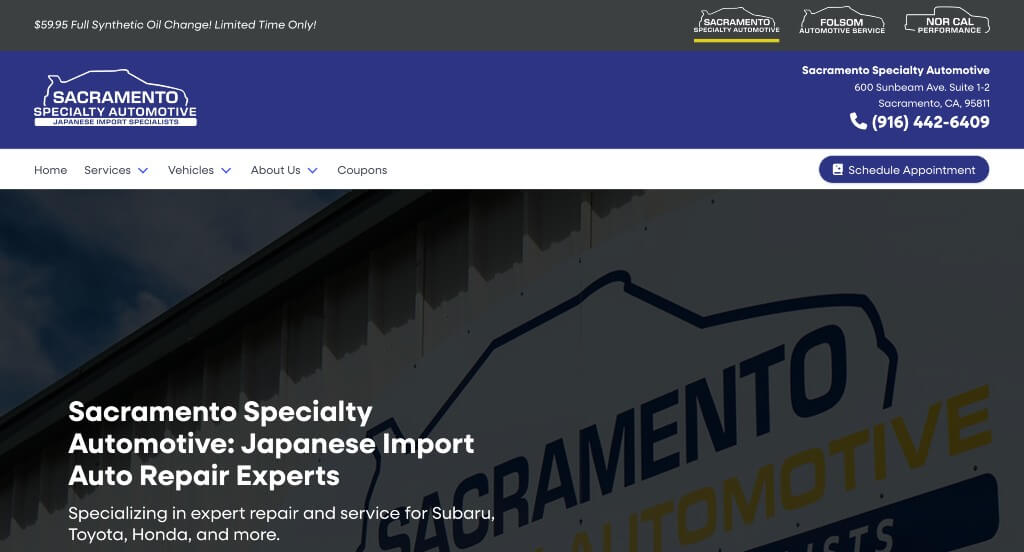
Sacramento Auto Repair had a very clean and attractive site with a yellow, blue and white color scheme. Utilizing a perfect design for pictures to draw viewers’ attention to them is essential for a unique site. This company makes it simple and easy to make an appointment with a few different links placing into the site. Another thing this automobile repair shop does well with is their inclusion of social media through links. A font that is easy to read but still unique was also an interesting feature in this website design.
32. San Francisco Automotive Solutions
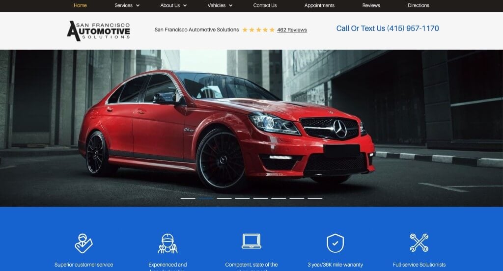
If you are looking for a simple and straight to the point website, this would be a good site to consider. An intro slider shows off which cars they work on. We also liked how their services were very straight forward with pictures and links. Graphics can be seen throughout the site and it really adds to their organization. Some notable features are inclusion of a Google Map, Social media icons, and customer testimonials. Be sure to check this site out when searching for layout ideas.
33. Scott’s Auto Repair
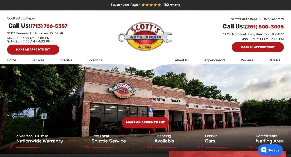
Having bright red accents throughout the whole site was one of the first things that we really appreciated. We felt that their pages had a good sense of balance to them which created an easy to use template. Including all of their contact information right in the header was another helpful choice because people could reach them faster.
34. Leale’s
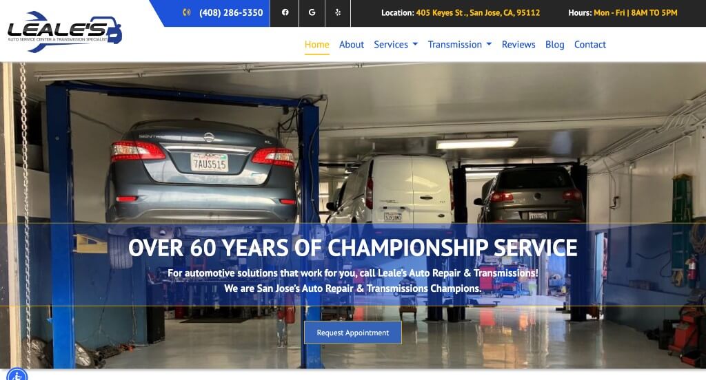
Leale’s bright color scheme presents a professional appearance for this repair shop. Notable information is all in an area that is easy to find. Adding in informative features such as blogs and car care tips. A organized layout really makes it easy to discover information or find exactly what you are looking for. Including buttons throughout their site really helped viewers be able to navigate their site effectively.
35. Tony’s Auto Service Center
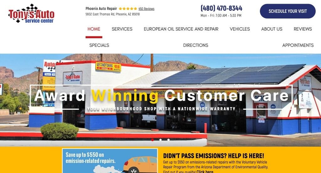
This example is fairly organized and uses different colors to keep everything looking more uniform. We enjoyed their graphics and images that were used as backgrounds. Something else that stood out to us was how they showed all of their certifications to show that they are a reliable business. Having a simple form to request an appointment was also quite useful.
36. Rob’s Import Repair
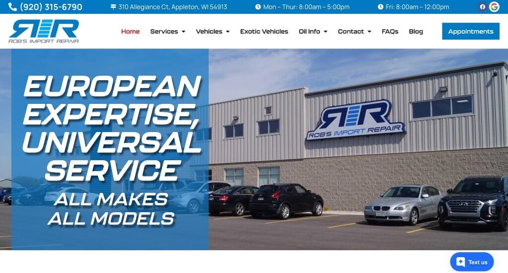
Here we have an example that looks great because of their stunning color palette. This font choice was outstanding so we absolutely loved because it is one that isn’t seen on many websites. Keeping paragraphs short and straightforward was a great way to get viewers engaged with their information. This company also does a great job with their domain that matches their business name.
37. Avo’s Automotive
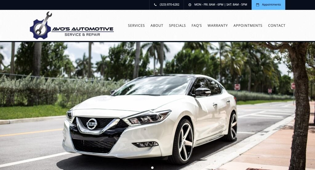
This vehicle repair website has a good balance of pictures and written content. There is plenty of white space and a simple blue used to highlight important information, such as phone numbers and services offered. The company also goes into detail about many of their services and how it could be beneficial to clients. Some features that stood out on this homepage were testimonials from happy customers, Google Maps, and social media links.
38. Hollywood Mechanic
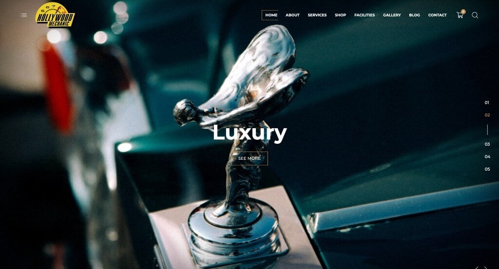
This site does a great job of showing and explaining what cars they service, along with including many high quality videos of attractive cars. The use of bright colors when developing their color scheme was a design feature we noticed right away. Another feature we liked was their logo design that relates to their company’s services. Adding in client testimonials was another aspect that really elevated this site. Also a very quick and easy contact form, along with other contact information was helpful.
39. Pete Kelley’s Auto Service
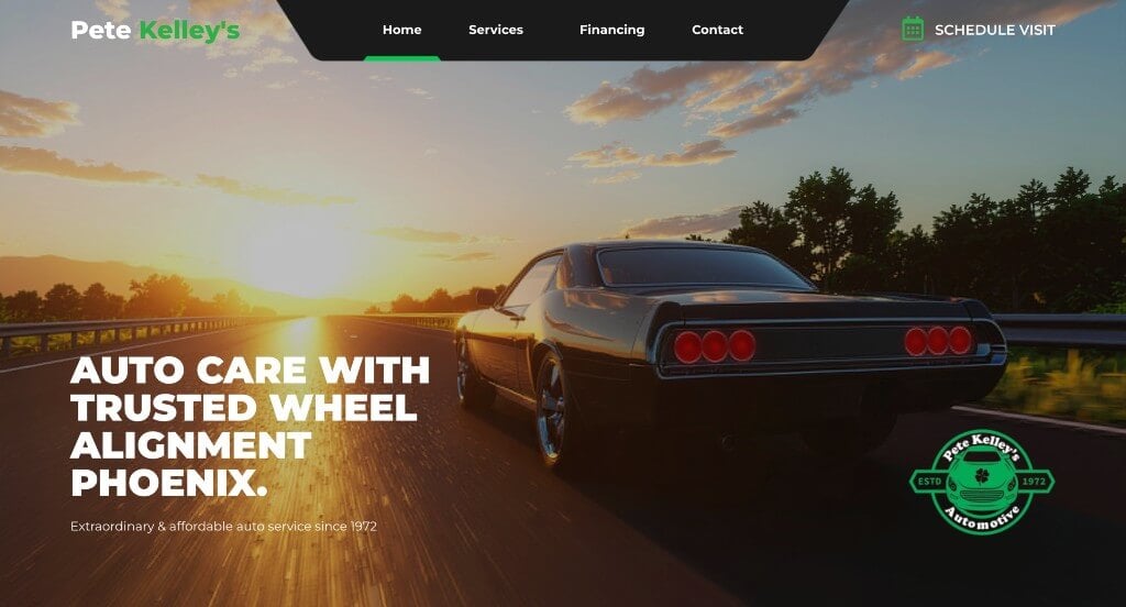
Here we have an example with lime green accents that help to highlight links and other important content. Their content is well balanced and their pages never feel unorganized which is something that many people can appreciate. Showing that they have lots of 5 star reviews on different review platforms was another smart idea.
40. Don’s Auto Repair

Don’s Auto Repair has a simple design with a small, thin font which offers a lot of white space within their template. Also, simple icons are used to help explain services they offer. A “Why Choose Us?” text block emphasizes qualities such as “best quality work”, “best materials”, and “affordable cost”. Links are given at accessible areas making it easy for users to discover information quickly. The interesting logo really brought forward that this company really cares for their clients’ vehicles.
41. West Coast Tire & Service
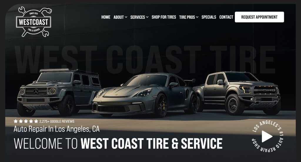
We really enjoyed this company’s website because of their dark color scheme that is sure to grab attention. Their fonts are simple and professional, which is always nice. Along with all of that, we thought that this company did well with their image frames that are unique to their company. We also loved how their text circles graphics or overlaps each other to look more interesting.
42. Allied Service Center

This company shows off information right away with a contact form so customers know what price they will roughly be spending if they pick this vehicle shop. Adding in videos that are very informative helps customers who are learn better from visuals understand more about their company. This wesite also includes their coupons that are available, along with testimonials and Google reviews.
43. Christian Brothers Automotive
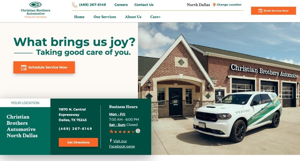
A green color scheme used in this custom site really gives an upbeat feel. They also include an image of their team smiling and illustrating music playing, adding to this upbeat feeling. Including their slogan, “We’ll Help You Keep On Rollin’.” was clever and shows that they will fix your car promptly, with honest work, and no pressure on unnecessary services. Scheduling your visit will be quick and easy because of their many opportunities to fill out a contact form or call their phone number throughout the website. This example is for sure one to take a look at when searching for ideas.
44. Bumper Buddies
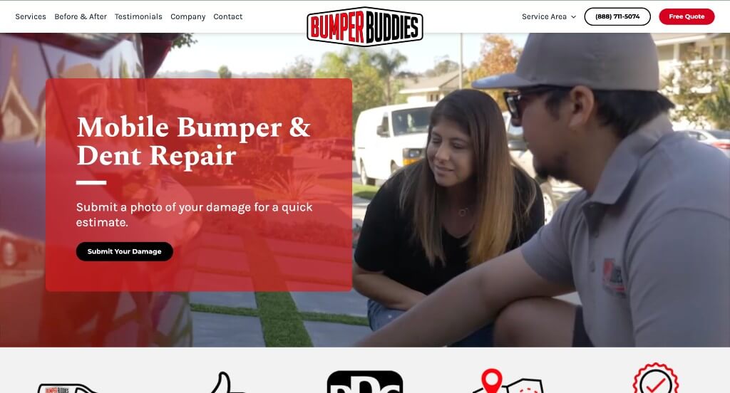
This design was very unique with their wavy patterns used further down on the homepage. Graphics and icons were used to improve their visuals without cluttering the page with lots of images. Comparing their company to their competitors with a t-chart was something that we noticed because not all businesses do that.
45. Auto Scope
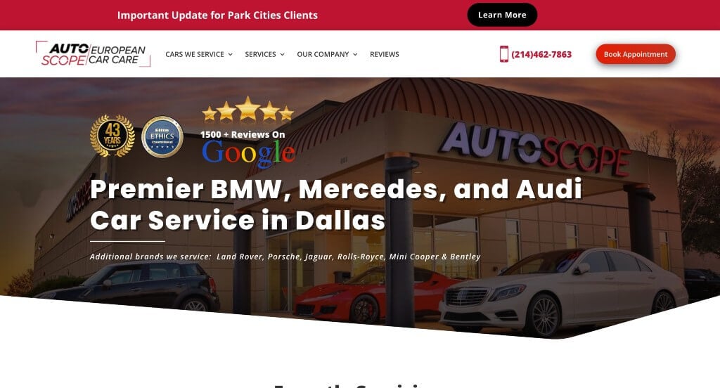
Auto Scope gets to the point by stating what services they offer and what cars they service. Using a bright yellow color as an accent is very eye-catching, and a helpful tactic as a designer. Links to video testimonials and client reviews can be found which is a great form of social proof. They also display awards that their company has won allowing customers to be more confident in this company. All in all, this is a great website to check out when looking for custom web design ideas.
46. The Electrified Garage
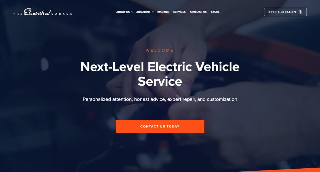
Here we have an example that makes use of an automatically playing video that introduces their business and their practices. We thought this slanted color blocks were something that helped them as a company stand out more. Buttons were used to guide viewers to additional information that they could need. Short paragraphs were used to keep people involved in their information.
47. Astra Automotive
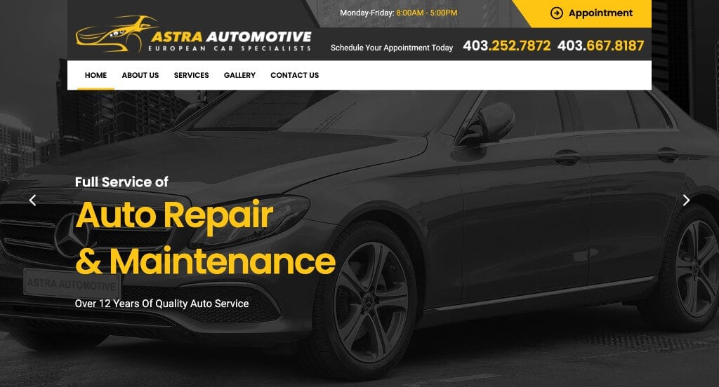
We loved this color scheme because it was sure to grab attention and look stunning. We thought this imagery was creative because it was mostly black and white with one aspect of the image highlighted in bright yellow. This web domain mostly matched their company name which is always a smart idea. These fonts were also fairly simple but still professional which was nice.
48. Auto Select
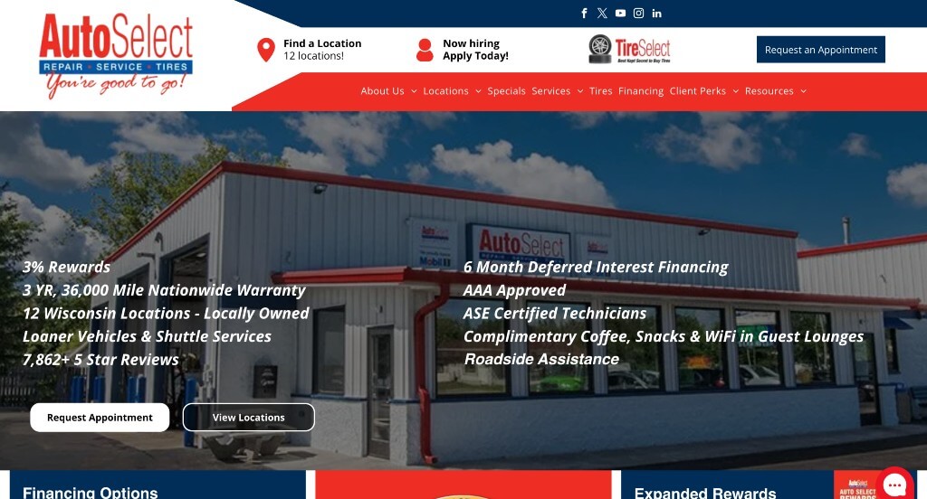
We really enjoyed how this company used their logo colors to decorate their entire site and create a brand. Their fonts were simple and professional which was nice. Occasionally using bullet points was a nice way to make content easier to read and make for a more organized design. Including all of their locations right away was another thing that we liked.
49. Simply Auto
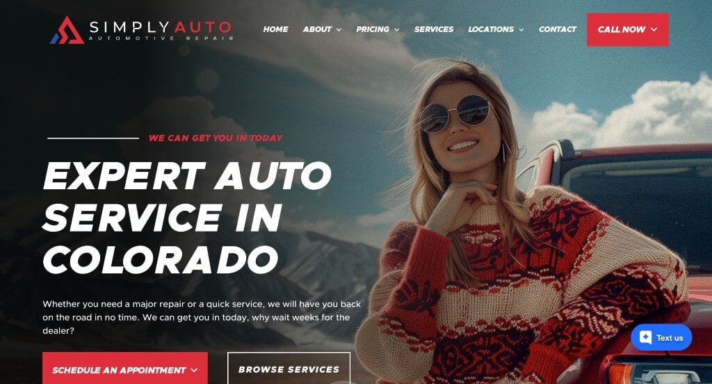
We loved this company’s web page because their template is stunning and easy to use. These fonts are bold and professional so it helped attract attention towards their content. We liked their random bursts of color that help to breathe life into their example without it looking overwhelming. Showing each of their locations on the homepage was another smart choice.
50. Roda

This example stood out to us because of their large images that are used throughout the template. We liked how they had lots of small graphics and icons used to improve their visuals. Bullet points were helpful in order to organize information and make it much easier to read. This logo design was also quite interesting which is always a good choice.
WordPress Auto Repair Themes
You can find free themes at wordpress.org, or explore auto repair templates on ThemeForest.
Macchina – Themeforest
$89
Automotz – Themeforest
$69
EnginX – Themeforest
$49
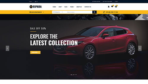
Ripara – Themeforest
$100