Bakery lovers, rejoice! Explore the top 50 bakery websites, handpicked for their design, functionality, and mouth-watering visuals. Whether you’re building a retail, wholesale, specialty, or online bakery site, this guide offers inspiration and tips to craft a deliciously unique online presence. For more industries, check out our top websites of 2025!
Top Bakery Website Designs
- 1. Franz Bakery
- 2. Little Tart Bakeshop
- 3. Back Door Donuts
- 4. Hell Yeah Gluten Free
- 5. Gold Coast Baking Company
- 6. Greyston Bakery
- 7. Grand Central Bakery
- 8. Flowers Foods
- 9. Susie Cakes
- 10. Bakery Nouveau
- 11. Lost Larson
- 12. Bread Alone
- 13. Billy’s Bakery
- 14. Salt N Sprinkles
- 15. Flour Bakery + Cafe
- 16. Bourke Street Bakery
- 17. Jenna Rae Cakes
- 18. Angelina Bakery
- 19. Gayle’s Bakery & Rosticceria
- 20. Magnolia Bakery
- 21. Heritage Bakery & Cafe
- 22. Mochi Joy
- 23. King Arthur Baking Company
- 24. Sweet Mae’s Cookie Company
- 25. Bread Man Baking Co
- 26. Levain Bakery
- 27. Milk Bar
- 28. Alessi Bakery
- 29. She Wolf Bakery
- 30. Owl Bakery
- 31. Partake Foods
- 32. Emporium Pies
- 33. Crumbs & Doilies
- 34. Voyageurs Bakehouse
- 35. Breads Bakery
- 36. Porto’s Bakery
- 37. Zaro’s Family Bakery
- 38. Friends & Family
- 39. Jane
- 40. Little Bread Co
- 41. Justice of the Pies
- 42. Tartine Bakery
- 43. The Bread & Butter Project
- 44. Happy Bellies Bake Shop
- 45. Neil’s Donuts
- 46. CH Patisserie
- 47. Seylou
- 48. Blue Star Donuts
- 49. Noble Bread
- 50. Cobs Bread Bakery
1. Franz Bakery
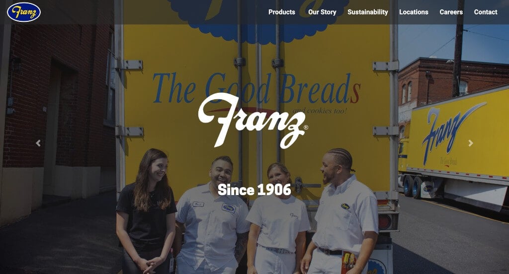
Large images was one thing that this company did very well with. Along with that, we really liked how they kept their paragraphs and overall content short and concise, making it much easier to read. Franz Bakery also used a stunning color scheme that really created a brand identity for their company. Adding in buttons to improve navigation was another choice that we really appreciated.
2. Little Tart Bakeshop
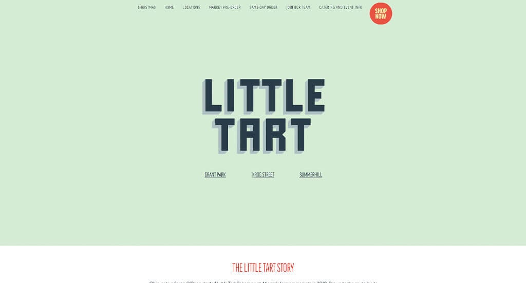
Short paragraphs were used in this example to keep everything their content more engaging. Simple animations and graphics are included in a variety of pages which we loved. They had fonts that were bold and tell a story, which was a huge plus for this company. Making sure to add in images from their social media pages was another thing that caught our eyes.
3. Back Door Donuts
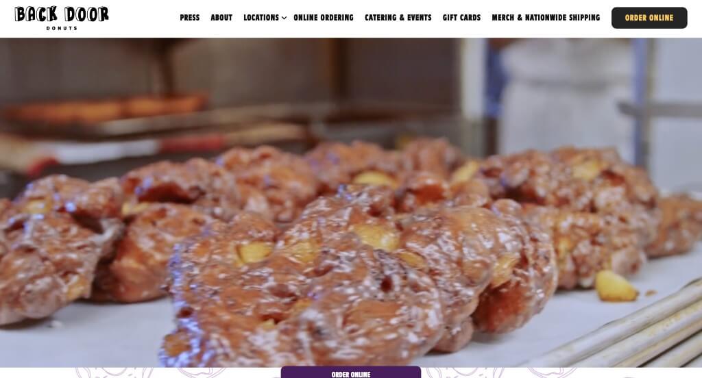
We liked how this example started out with an automatically playing video in order to introduce their company. We liked their color scheme that was playful but still very professional. Adding in graphics for their background patterns was another choice that we really appreciated. It was also helpful how they had lots of buttons in order for customers to find information without having cluttered pages.
4. Hell Yeah Gluten Free
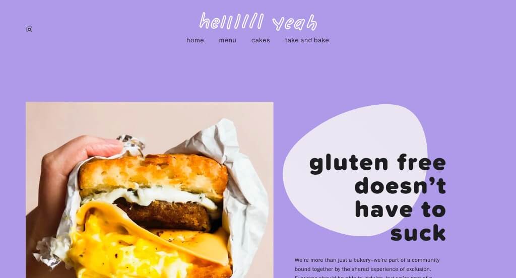
We chose Hell Yeah Gluten Free because of its stunning purple, blue, white and black color scheme. It was nice to underline certain text in order to highlight that information. Their sliding text that provided short bits of information was something else that we enjoyed. High-quality visuals were definitely refreshing, especially for a company like this one.
Related: Drive traffic and awareness to your bakery through paid advertising.
5. Gold Coast Baking Company
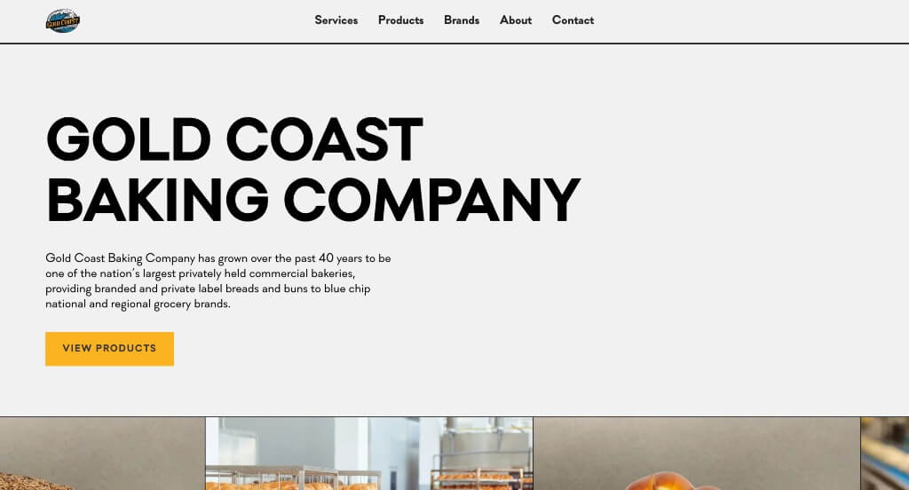
Here we have a simpler example that plays around with a relaxing color palette. Their backgrounds are basic which makes it easy to see all of the content. We liked how accents of bright yellow highlight their pages because it makes it easier to find button and links. Another thing that we noticed about this example was their cute circles that appear animated throughout the pages.
6. Greyston Bakery
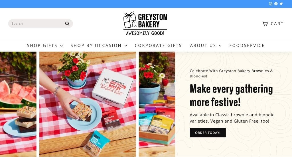
Right away, we saw how interesting patterns were used as their background sometimes. Their unique photo frames helped them to stand out a little more. Showing off each of their flavors was something else that we absolutely loved. They used a few little icons which we found helpful and it enhanced the visual aspect of their webpage.
7. Grand Central Bakery
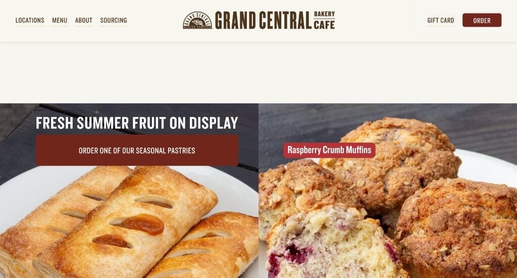
Here we have an example that does a great job with their color scheme that is homey and professional. Using lots of buttons to help make everything feel more organized was another thing that we appreciated in this webpage. We felt that these bold fonts were very nice to include because they grab attention and match their overall aesthetic.
8. Flowers Foods
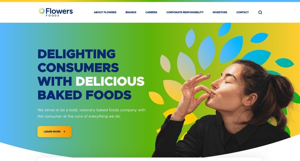
This example stood out to us right away because of their logo that appears in multiple places throughout their template. Bright colors are used to create an overall energetic feel. Bold fonts are used for many of the titles in order to grab the attention of viewers. Along with that, they have a very well organized navigation bar that makes it easy to find information.
9. Susie Cakes
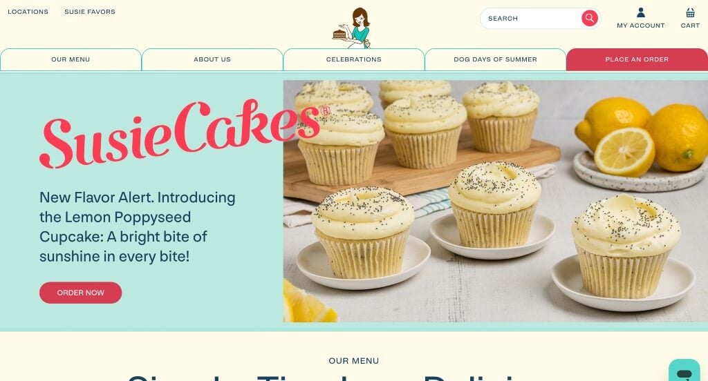
This color palette really stood out to us because it is different for this type of business. We loved their images that show off a variety of their products. Additionally, buttons were used in order to direct viewers to more content. Including customer reviews was also a great choice. This domain was simple and matched their company name which was nice.
10. Bakery Nouveau
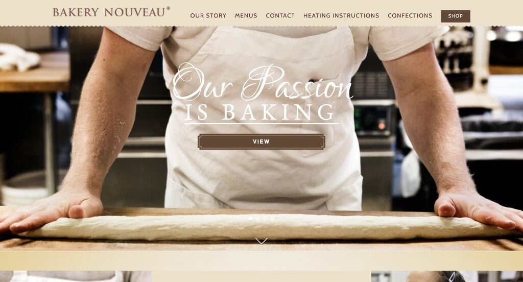
Smooth brown colors are used in Bakery Nouveau to create a pleasing template. Including their Instagram is something that should be normalized and used in every type of site. Their buttons are a great inclusion to provide more information. Along with that, we love how their buttons looked because they seemed much different than typical buttons.
11. Lost Larson
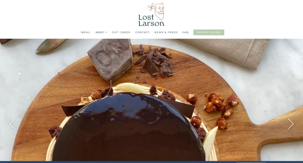
This example blends high quality images, graphics, and whitespace to create a template that can’t be ignored. This logo was unique and really helps them as a company stand out. Keeping paragraphs short was another thing that we noticed because it made their information much easier to engage in. Having a FAQ page was another choice that we really liked.
12. Bread Alone
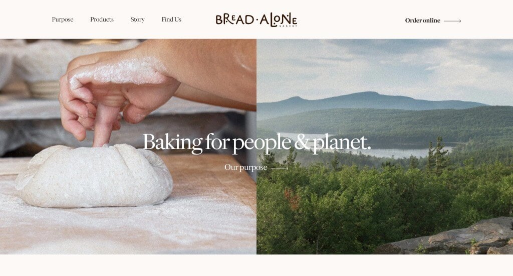
Bread Alone was a company that knew how to balance all of their content to create something professional. These images were fairly large but they never took over their pages. This company picked their fonts carefully to blend well with their overall feel of their website. We thought the way that they designed their logo was unique and a great way to represent their brand.
13. Billy’s Bakery
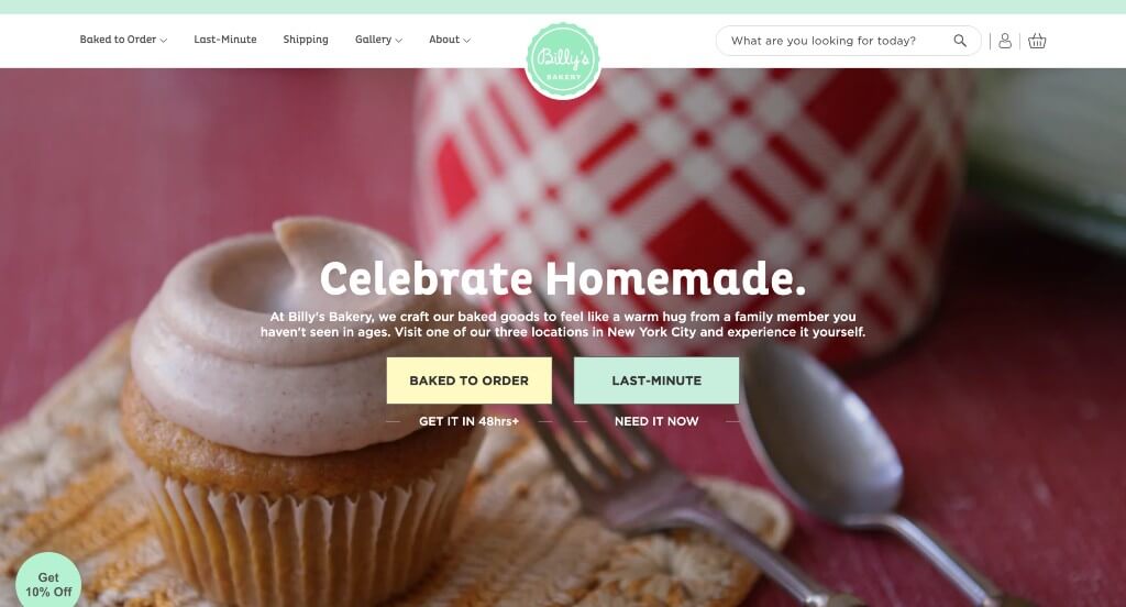
This was a very cute design that is sure to grab attention. Using creative little image frames that feel homemade was an addition to this site that we couldn’t ignore. Having an introduction and link to each of their cakes was a choice that we really liked. Adding in customer reviews was a nice way to build trust with incoming customers.
14. Salt N Sprinkles
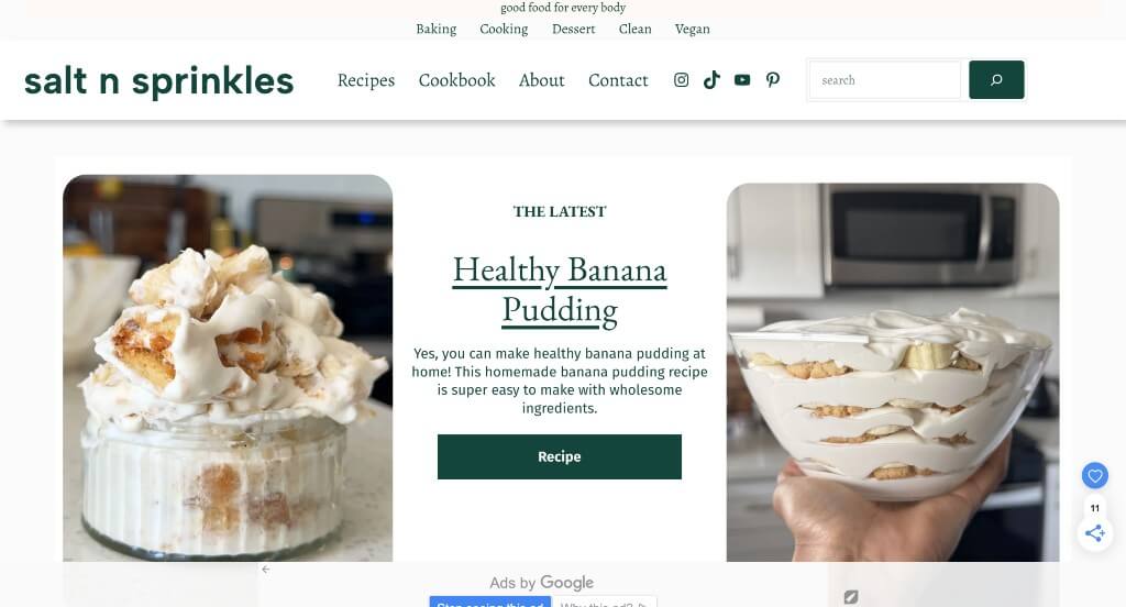
There was lots of high quality images that are used within this example but they are spaced out well which makes for a more creative template. Using a simple background allows their accents of color in text and buttons to really pop. Including a search bar to help find specific recipes and other information was a choice that we really appreciated.
15. Flour Bakery + Cafe
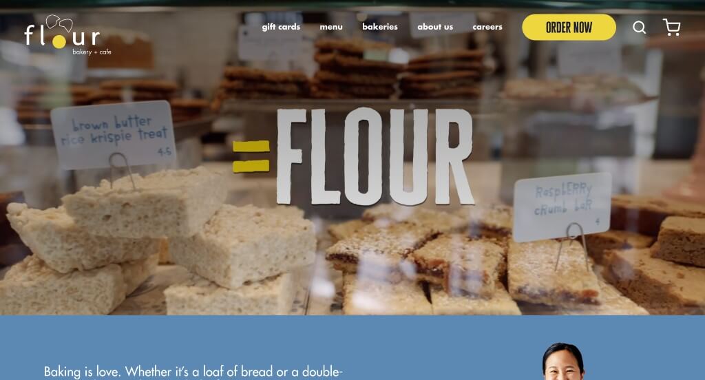
Our favorite part about this example was for sure this company’s logo design that is very logical for their brand. Their automatically playing video that uses text and imagery to show their values as a business was another great choice. This blend of yellow and blue along with their white and black color scheme created something that was outstanding.
16. Bourke Street Bakery
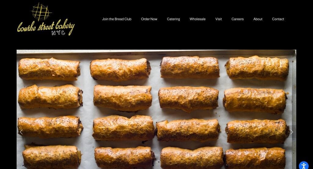
Something that stood out to us with this example was their black backgrounds that feel more luxurious. Large images featuring mouthwatering foods was a great choice for people to be excited about this business. This logo design was seemingly hand drawn while still looking great which is another idea that we absolutely loved.
17. Jenna Rae Cakes
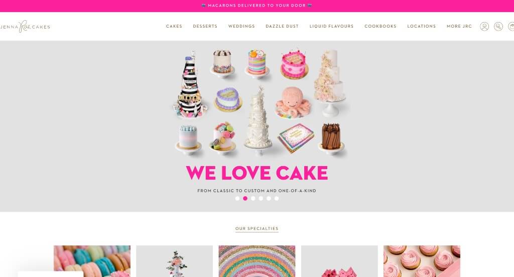
Having cakes that are seasonal was the first thing that Jenna Rae Cakes did right, but it wasn’t the only thing. They used an arrangement that seems almost authentic to their company. Adding in a blog was a nice touch for a unique website. They also made sure to include social media which was something that we couldn’t ignore.
18. Angelina Bakery
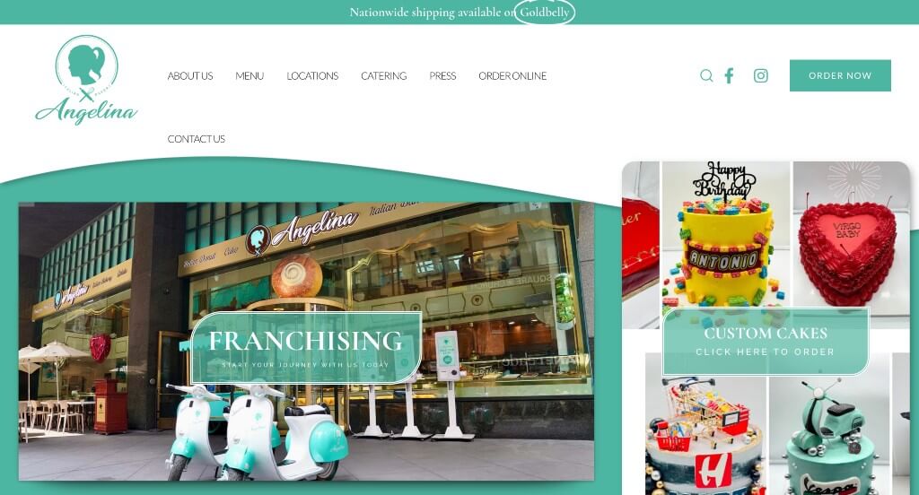
The color choices in this example was definitely the best part about this example because it was bright and peppy. This navigation bar has their pages clearly labeled which makes it very easy to find whatever viewers are searching for. We thought this logo was brilliant for including both a whisk and a rolling pin along with their name.
Related: Digital marketing campaigns can help bakeries reach a wider audience in their area while nurturing those connections.
19. Gayle’s Bakery & Rosticceria
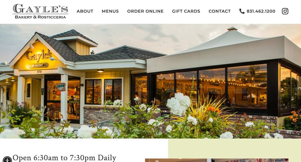
Right away, we knew that these images were the leading quality of Gayle’s Bakery & Rosticceria. Including their current menu along with other important documents like how to buy gift cards. Adding in their Instagram was another feature that we really liked. It was smart how they utilized a balance of negative space for their overall look.
20. Magnolia Bakery
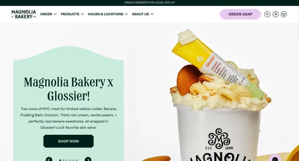
One of our favorite parts about this example was for sure the inventive fonts that were used throughout the entire example. These images are high quality and use similar colors as the rest of their page which looks amazing. Having some watercolor patterns as backgrounds for some of these pictures was another thing that stood out to us.
21. Heritage Bakery & Cafe
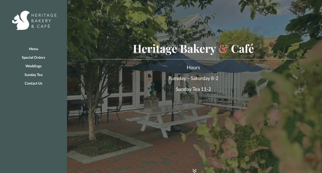
Heritage Bakery & Cafe was a cute example because of their simplistic nature to their pages. Along with that, we really liked how their font choice was beautiful but still fairly easy to read. Adding in images from their social media pages was another thing that we enjoyed. Their little squirrel used as a logo was another cool choice that helps them stand out from their competitors.
22. Mochi Joy
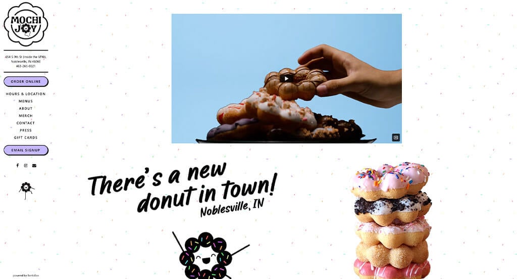
This cute little character was one of the first things that we noticed for Mochi Joy. We thought it was nice how they used confetti sprinkles for their background. Using occasional tie dye prints was another cool thing that we loved about this example. Their cutout images was something else that we couldn’t ignore.
23. King Arthur Baking Company
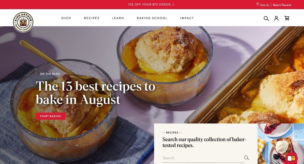
King Arthur Baking Company is an example that knows how to organize content. Using buttons, search bars, live chats and more were some of the aspects that we enjoyed about this webpage. High quality images were helpful to make their pages feel more lively and professional. This logo was another feature that we really liked because it was logical for their brand name.
24. Sweet Mae’s Cookie Company
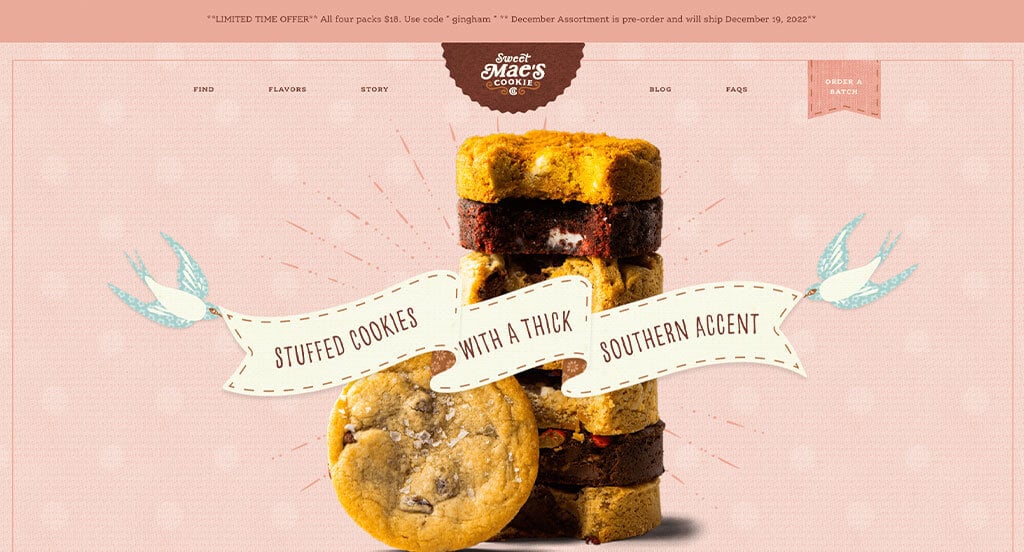
Here we have a very creative website that grabs attention by having a scrapbook feel to their pages. Blending textured images, graphics and images all together to create something so unique was something that we loved. These fonts were professional and easy to read which really improved the look of their pages. Including a blog into their webpage was another feature that we really liked.
25. Bread Man Baking Co
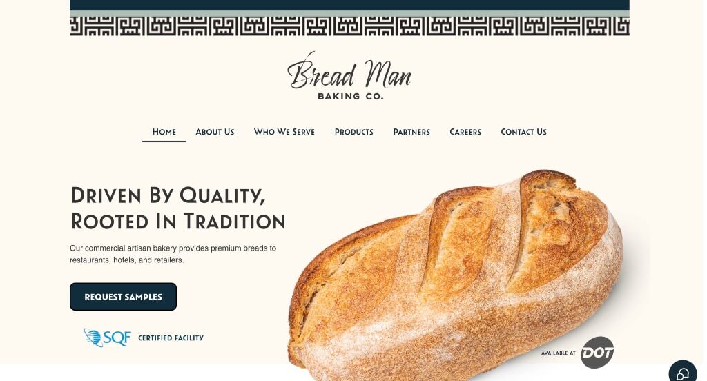
We thought this was an interesting site because of their creative patterns that appear above their navigation bar. Along with that, we really liked how they used inventive fonts that seem authentic to their brand. Adding in images with transparent backgrounds was another choice that we enjoyed for this company. Including a section to meet the founder was also a smart idea.
26. Levain Bakery
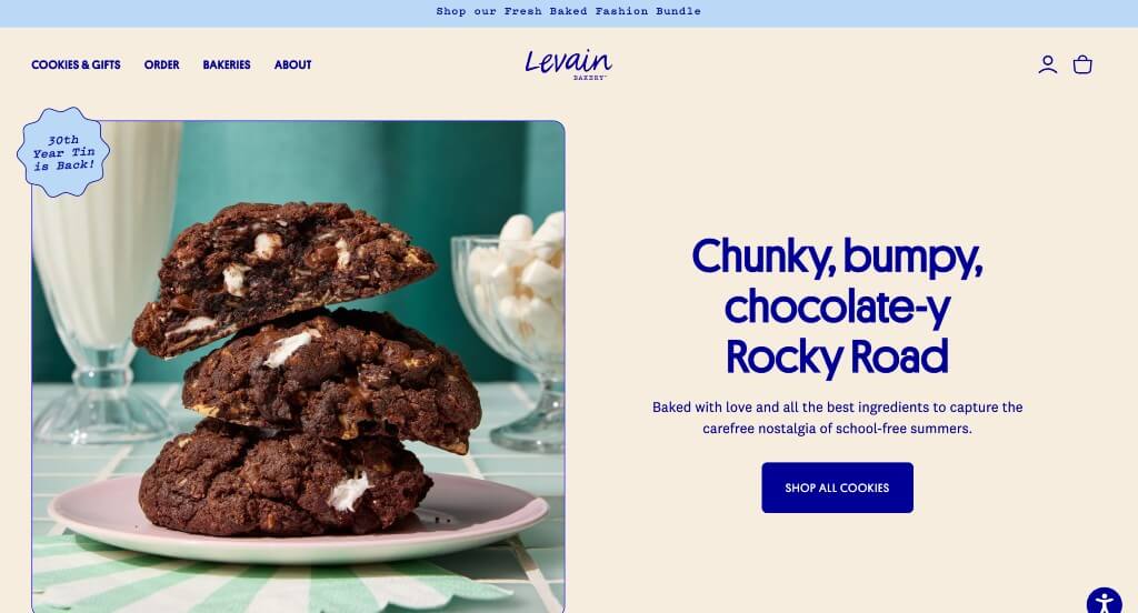
Levain Bakery did a great job mixing different shades of blue for accents throughout the page which caught our attention. We liked how graphics are used in order to help balance images with their white space. Simple navigation was used here which is something that we always find to be helpful. Along with all of that, we liked their simple thin lines that were used as frames for images and text boxes.
27. Milk Bar
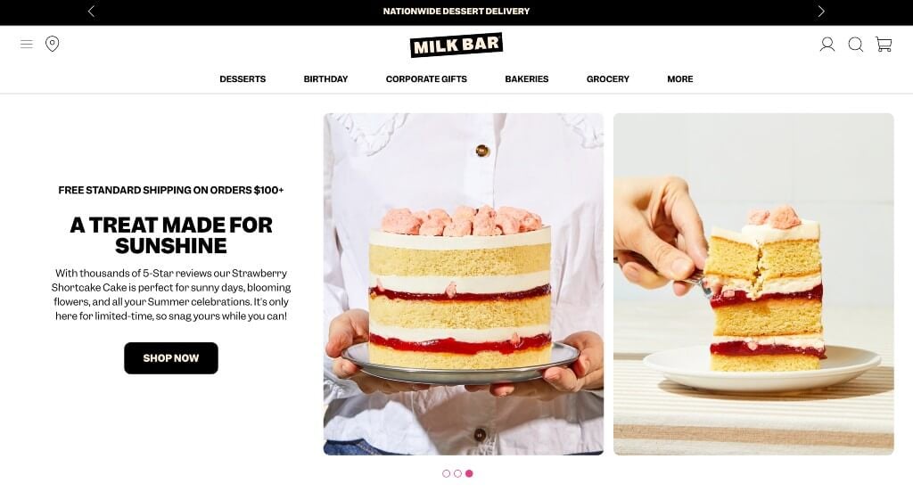
Milk Bar’s best feature is for sure these high quality images that are mouthwatering. This company used a color scheme that was very modern with small pops of neon pink to highlight various parts of the website. Allowing viewers to see parts of their packaging was another smart choice because it’s part of their branding. Paragraphs were kept short to keep people engaged with their information longer which is always a plus.
28. Alessi Bakery
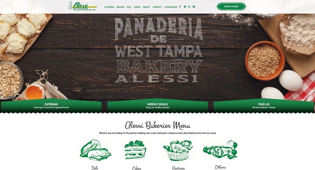
We thought that this was a great example to take inspiration from because of their green accents that aren’t typical for bakeries. Along with their stunning colors, we really liked how they used inventive fonts that help them stand out more. Using graphics that looked almost hand stamped was a small business feel which is something that many customers find to be important to support.
29. She Wolf Bakery
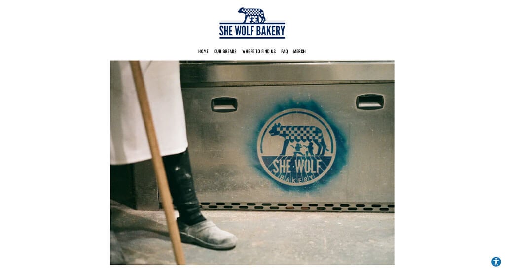
This was a website that grabbed our attention because of their simple logo that is logical for their brand. Adding in accents of dark blue was another choice that we appreciated because it breaks up their information. Including a page for FAQs was another thing that we appreciated because it helped customers know answers to the basic questions without having to waste the company’s time.
Related: Look at local bakery SEO as a way of improving organic traffic to your website when people look for shops in your area!
30. Owl Bakery
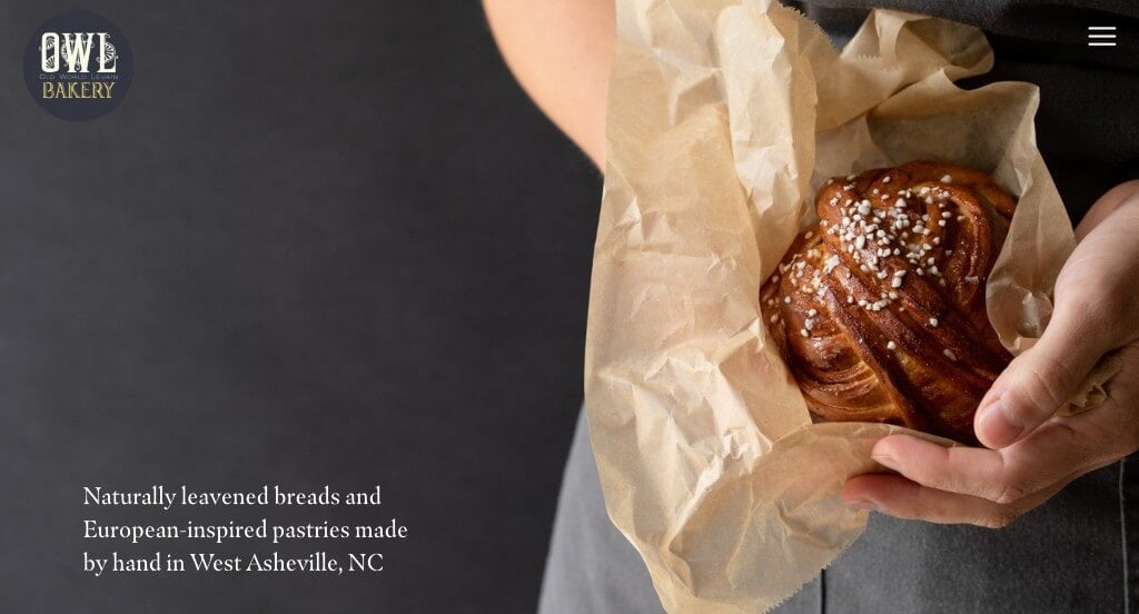
Here we have an example with an overall aesthetic that we really enjoy because it creates a brand identity for their company. We liked how many of their images used similar backgrounds in order to allow for a sense of unity. We felt like it was a nice inclusion to show both of their locations along with their hours of operation and links to menus all within the footers.
31. Partake Foods
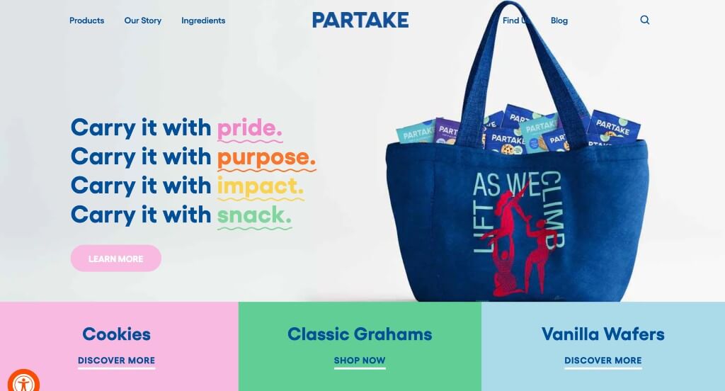
This was a stunning design that anyone could appreciate because of their bright colors that help accent certain parts of their site. Lots of links were included in order to guide viewers towards important information without cluttering the pages. We really liked how they used images that have been cut out along with graphics to have a more stunning visual appeal.
32. Emporium Pies
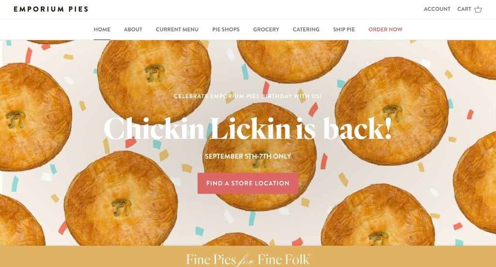
This was a very cute design that made great use of high quality images. Along with that, they use a few different fonts to help certain parts of their information stand out more. We liked how they showed a variety of their pies as spinning images to grab more attention. Another thing that we really liked was their use of patterns and graphics as backgrounds.
33. Crumbs & Doilies
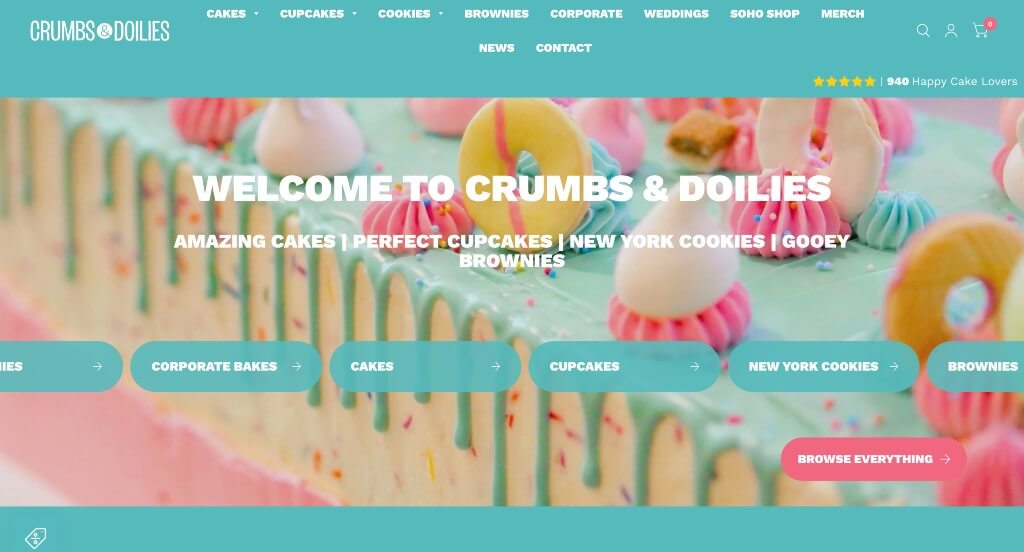
Crumbs & Doilies was a cute and outstanding website that used pops of pink and blue colors to create that vibe. We really loved how they used lots of buttons to help people get information without sacrificing organizations. We felt that including a customer review section was another aspect that can’t be ignored. Another really smart idea for this business was their web domain that matched their company’s name.
34. Voyageurs Bakehouse
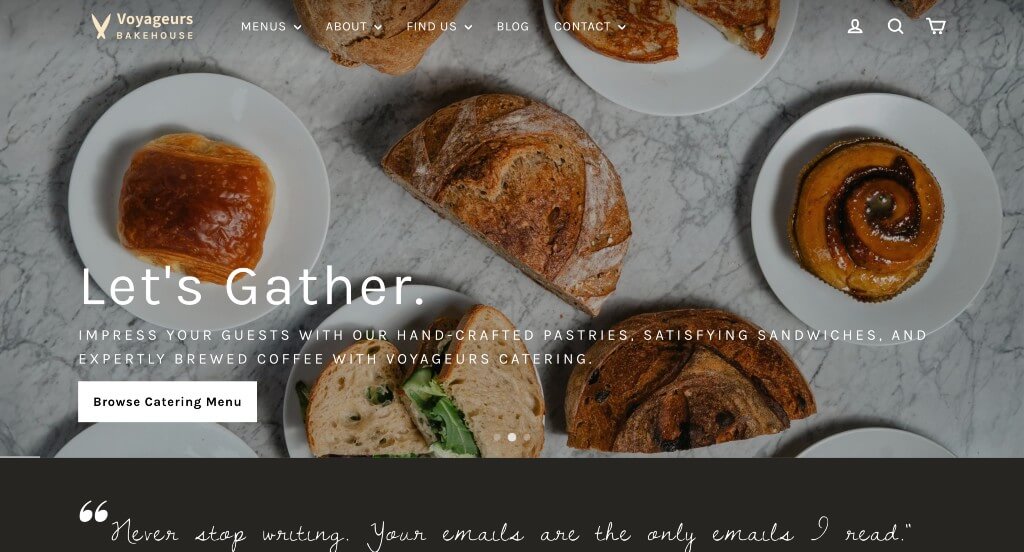
This is an example that you won’t want to miss because of their relaxing color palette. Neutral colors are used to make the images stand out more. These fonts that look handwritten are a nice touch to draw attention towards certain information. Having a navigation bar that used drop downs in order to keep their content more organized was another thing that we liked.
35. Breads Bakery
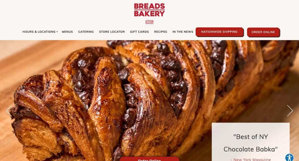
Many of the images within this example are high quality, but also well laid out making the whole page look more appealing. We thought it was nice how there was small graphics that were spread throughout the page. Including a short version of how their company came to be was a good addition. Another thing we noticed was that they included their Instagram tag so that viewers could check out their social media.
36. Porto’s Bakery
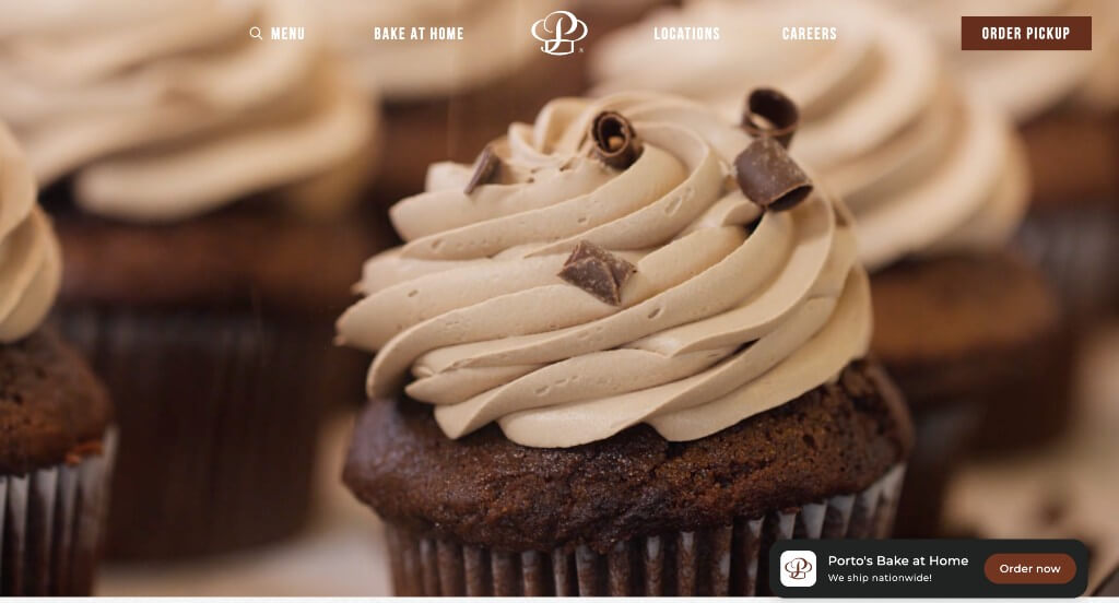
Upon entering this website, the first thing that we noticed was their inventive logo that is thoughtful and logical for their brand. Showing people and organizations that they support is cool to show who is behind this business. We thought it was helpful how a button is included to order their products and it stays on the screen no matter where in the website viewers are.
37. Zaro’s Family Bakery
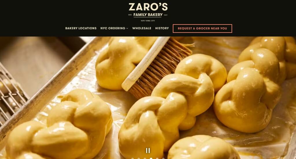
We noticed how this brand went with a dark background, which is against the norm for their type of business. Short paragraphs was a helpful feature to make people more interested in learning more. Another feature we enjoyed was their simple navigation. Buttons were all around this example to guide people towards more content.
38. Friends & Family
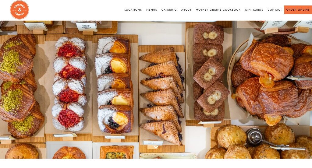
This example did well balancing their images and graphics within their pages. Bright orange accents are used to help highlight information that could be important to viewers. Lots of reviews were added in to help build trust between the company and their customers. They clearly had conversions in mind when including buttons to enhance usability.
39. Jane
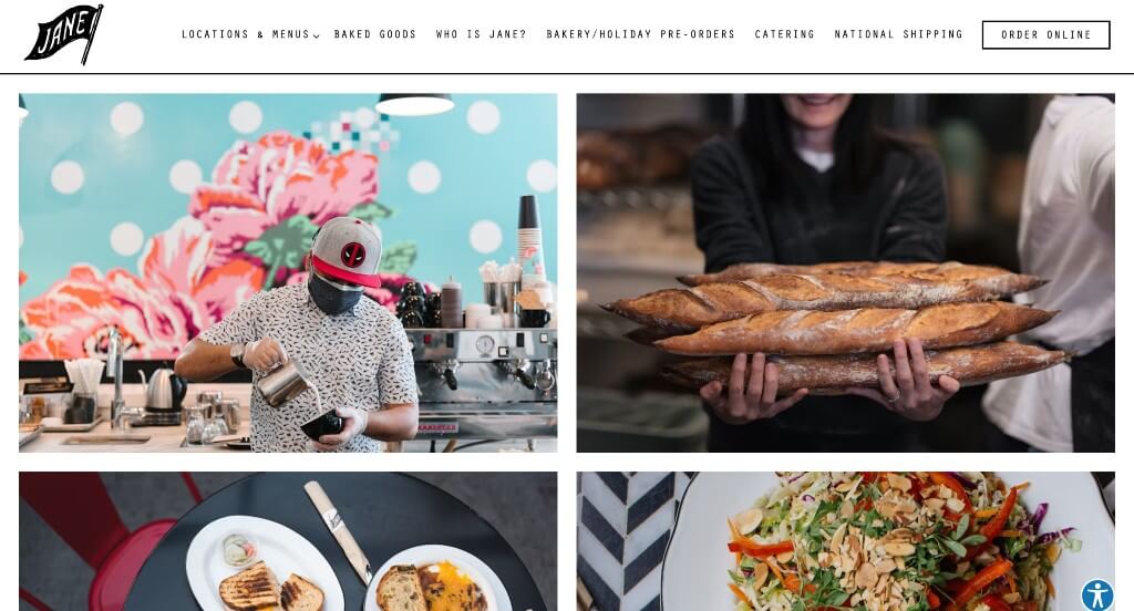
It was cool how Jane reused their logo on products throughout their pages. As you scroll through, a quality you’ll notice right away is their simplistic template. Having a page dedicated to their holiday items was nice too. A separate button made for online orders was another thing that we liked.
40. Little Bread Co
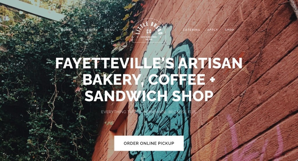
Little Bread Co did very well with their layering of images that created a unique feel for their pages. Along with that, we liked how they used large images that are sure to grab the attention of viewers. Adding in buttons was a nice choice because it allows people to navigate through information quicker and easier. Including their menus right on the homepage was another smart idea.
41. Justice of the Pies
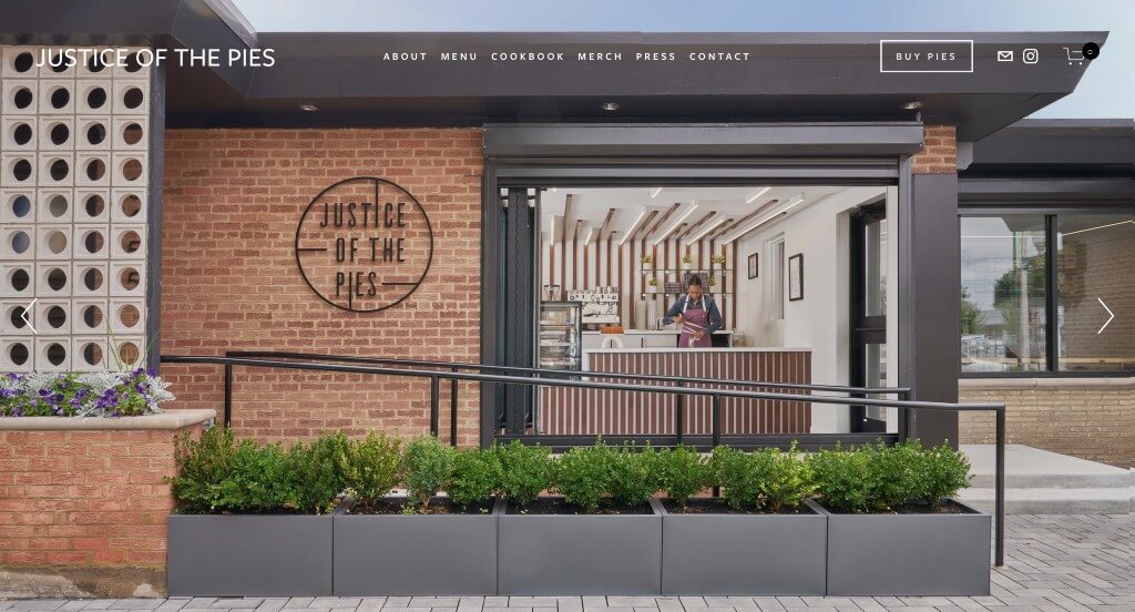
Bold fonts was something that we enjoyed because it grabbed attention and it was easy to read. Using lots of images to help guide viewers towards additional information was something that really stood out to us. Along with all of that, we really enjoyed how they featured a Netflix show to get their customers more involved. We also thought that this logo was creative which is always nice.
42. Tartine Bakery
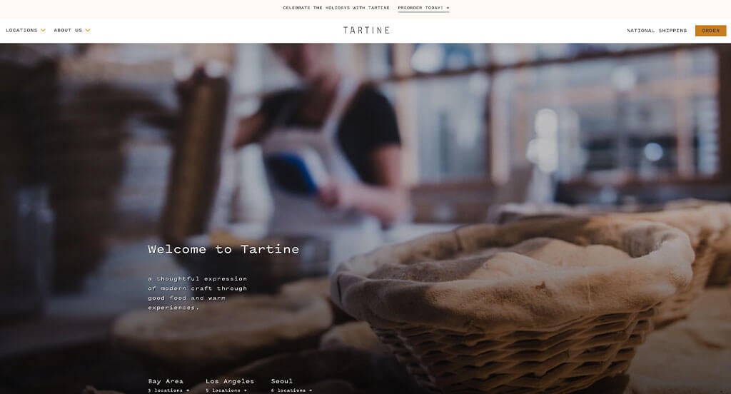
High quality images dominate much of this example, making it a very interesting template to look at. We really liked their use of short paragraphs that make it easy to stay engaged with their content. Including customer reviews from popular newspapers and companies was a great way to get customers to trust their brand more.
43. The Bread & Butter Project
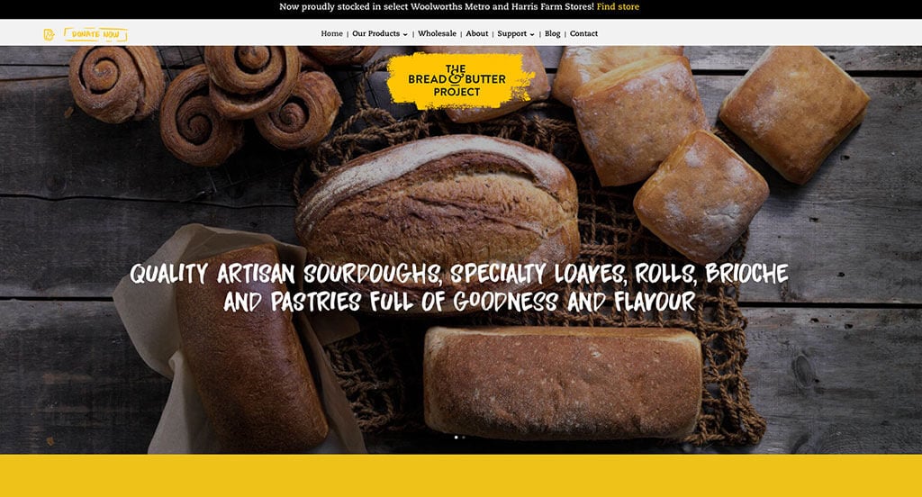
Right away, you’ll notice how a bright yellow accent highlights important content and breaks up lengthy information. Having an area dedicated to thanking their supporters was a nice touch that we don’t always see. We also thought that these fonts were creative and help them stand out more. Including a blog was another choice that we appreciated.
44. Happy Bellies Bake Shop
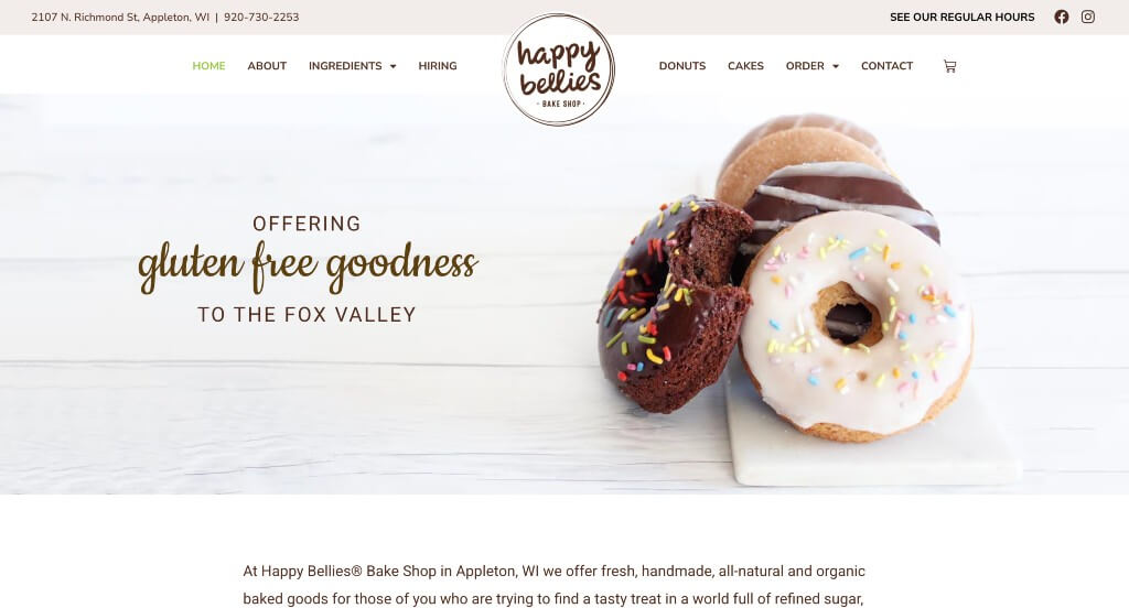
Images that help their mouthwatering food appeal to customers was a choice that we loved. It was smart how they used a decorative font along with a simple font to help their information look more presentable. Happy Bellies made great use of creative graphics for their background which we felt was refreshing. Another thing that we enjoyed was how they included a calendar to show upcoming events.
45. Neil’s Donuts
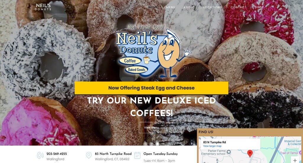
This overall color scheme was smart and logical because of what this business sells. A creative and fun logo was another impactful feature that we really appreciated about Neil’s Donuts. Adding in a video to show off who they are as a company is a feature that we really enjoyed. Including statistics related to donuts made daily, customers a week, 5 star reviews, and years of service was an amazing way to build trust.
46. CH Patisserie
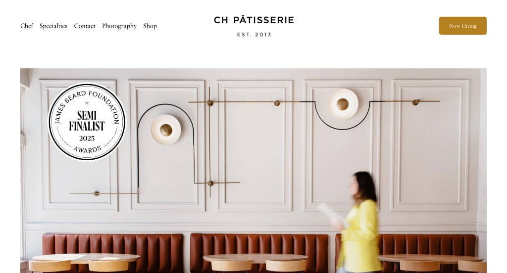
If you are looking for inspiration, here’s an amazing example for you. This company did a great job with their overall modern aesthetic that appears throughout the entire template. Including an award that they won was a great way to build trust with this business. We also liked that their navigation bar was simple and easy to use because it will keep people coming back.
47. Seylou
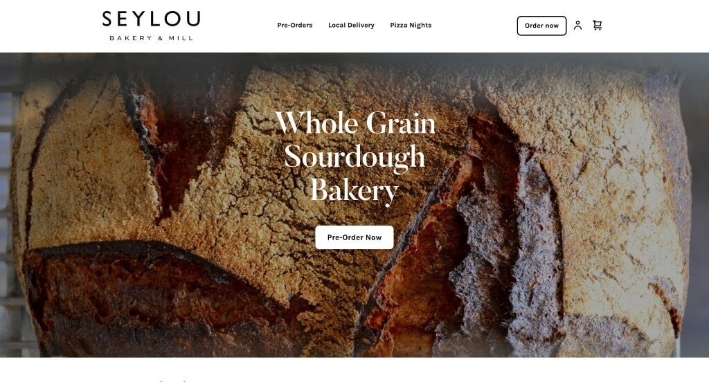
This was another example that was focused on high quality images which was a nice idea. These paragraphs were easy to comprehend, making it more realistic for people to keep reading and stay engaged. We liked that their font was simple and modern because it made sense for their brand identity. Adding in a map to show exactly where they are located was another thing that we liked.
48. Blue Star Donuts
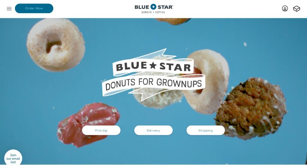
We really liked how this example used a looping video that shows their donuts falling in front of the screen to draw attention to their page. Showing popular brands that have featured their company was a great way to help new customers trust their brand. Having an area that features their most popular donuts was another choice that we really liked.
49. Noble Bread
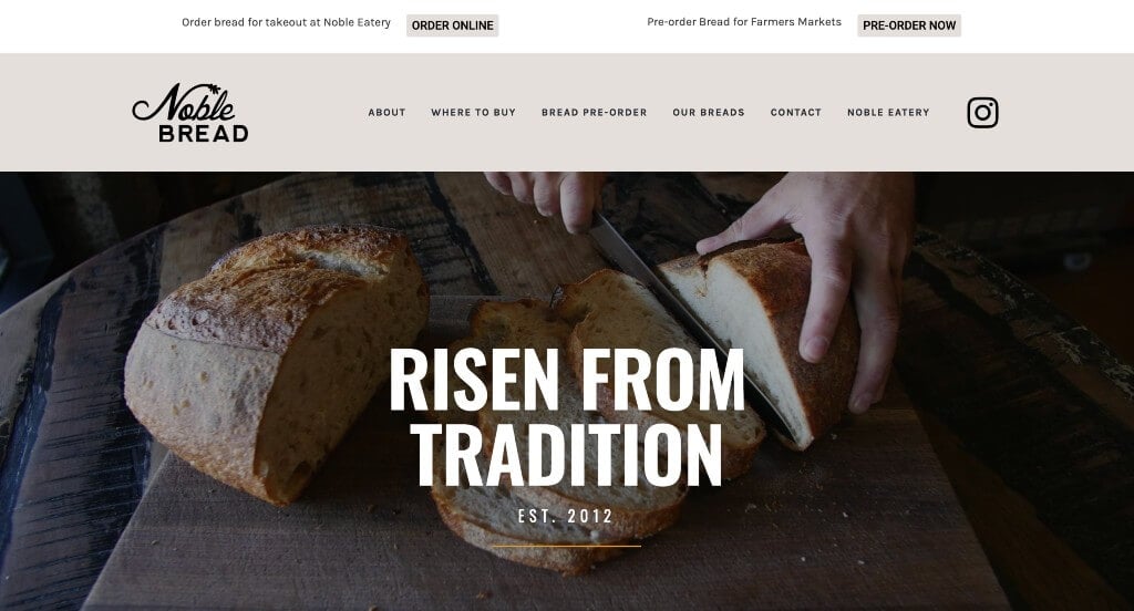
This was another example that had fonts that were both creative and impressive. We really appreciated how their logo used a wheat symbol within their N to create something more logical for them as a brand. Including links to their social media was another thing that stood out to us. This color scheme was relaxing and sensible for a company like this one.
50. Cobs Bread Bakery
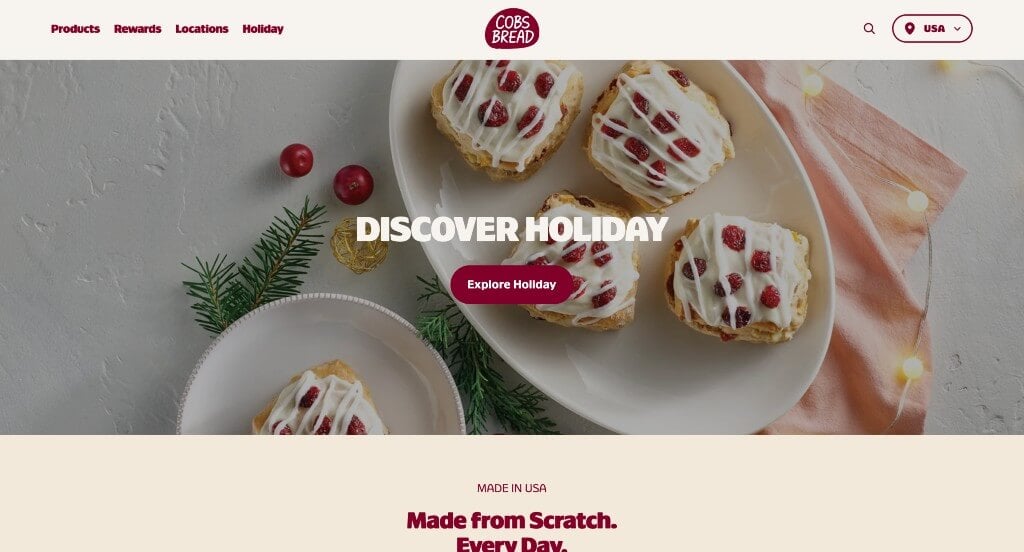
One of our favorite parts about this example was their use of bold fonts that are sure to grab attention. These buttons not only looked unique but also guided people towards a variety of different information that could prove to be useful. Keeping paragraphs short was another thing that we appreciated because it makes their information easier to comprehend.
WordPress Bakery Themes
You can find free themes at wordpress.org or consider bakery-inspired templates on ThemeForest.
Cake Bakery – Themeforest
$54
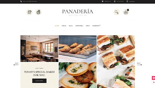
Panaderia – Themeforest
$79
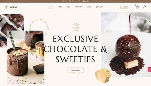
Estiene – Themeforest
$69
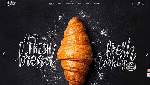
Baker – Themeforest
$79
WooCommerce Bakery Themes
You’ll find a wide selection of ecommerce bakery themes for WooCommerce on ThemeForest.
Noucake – Themeforest
$59
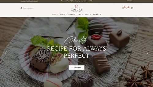
Xocora – Themeforest
$59
Shopify Bakery Themes
Explore free and paid themes at themes.shopify.com or consider options available on marketplaces like ThemeForest.
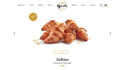
Bready – Themeforest
$79
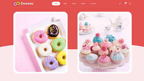
Sweeny – Themeforest
$58