Hello, one and all! Looking for inspiration to boost your online presence and attract more readers? We’ve found our favorite 47 blog sites, carefully selected by our team for stunning visuals, seamless navigation, and outstanding user experiences.
Discover valuable tips and inspiring examples of WordPress, personal, news, niche, company, and affiliate marketing blogs. For additional professions, check out our best web design examples article!
47 Best Blogger Website Designs
- 1. Cup of Jo
- 2. Sincerely Jules
- 3. The Londoner
- 4. 500px
- 5. Pando
- 6. Design Milk
- 7. Dan Flying Solo
- 8. Fubiz
- 9. Web Design Depot
- 10. Bark Box
- 11. Mashable
- 12. The Blog Abroad
- 13. Adventure.com
- 14. HyperQuake
- 15. TreeHugger
- 16. Dribbble
- 17. Brit + Co
- 18. Little Fat Boy
- 19. Flourist
- 20. Lili’s Travel Plans
- 21. Urban Beardsman
- 22. Traveling Mitch
- 23. Urban Influence
- 24. Copy Blogger
- 25. Fairly Curated
- 26. No Film School
- 27. Jeremy D. Larson
- 28. Create & Cultivate
- 29. Color Me Courtney
- 30. TechCrunch
- 31. Selective Potential
- 32. The Recipe Critic
- 33. Help Scout
- 34. GoSquared
- 35. SPI
- 36. Smashing Magazine
- 37. Awwwards
- 38. Maria Killiam
- 39. Cookie + Kate
- 40. Writing Revolt
- 41. He Spoke Style
- 42. Afford Anything
- 43. GirlBoss
- 44. Pixelgrade
- 45. The QMan (The Quintessential Man)
- 46. The Crafty Needle
- 47. Sevenports
1. Cup of Jo
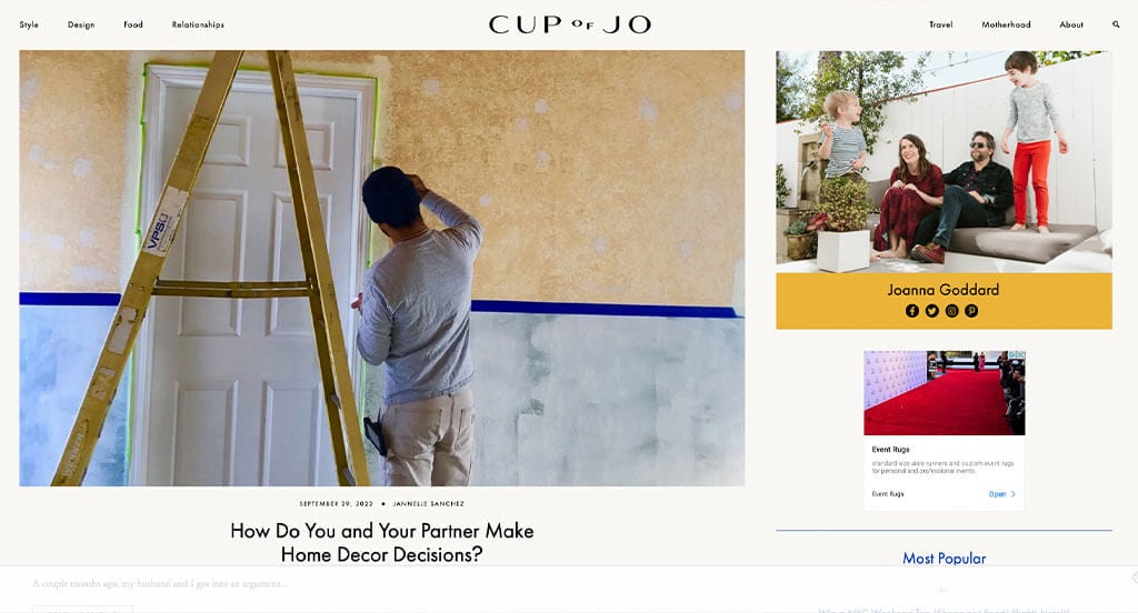
Right away, we noticed how Cup of Jo was significantly bigger within their navigation bar, making it stand out. We loved how a variety of topics are included, so anyone can find something interesting. Additionally, we felt that it was a great idea to include lots of images for each post. We thought it was cool that this author likes to focus on her experiences, then turning it to the readers.
2. Sincerely Jules
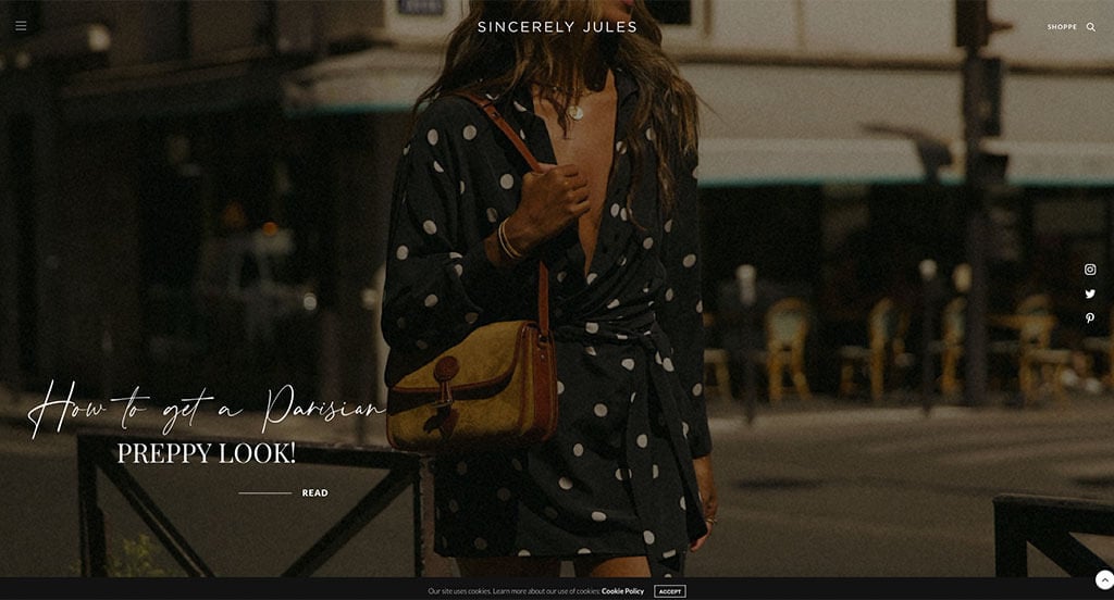
Here we have an example that uses a great mix of bold and script-like fonts. Additionally, we liked how it was cool to show off certain styles. Showing smaller images with links taking customers to similar products as her images. Lots of buttons was also a great addition. If you are a fashion enthusiast, this is an amazing example. Including their Instagram right into this page was smart and helpful.
3. The Londoner
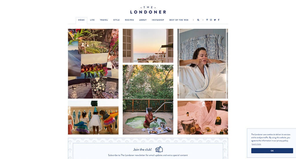
Our favorite feature was this layout for all their images linking to different posts. We liked how small accents are used to help organize their posts into categories. Their navigation was also very well organization which is helpful to anyone browsing. Additionally, including all of their social media links was also a good addition. Using a patterned background for additional information about their mailing email.
4. 500px
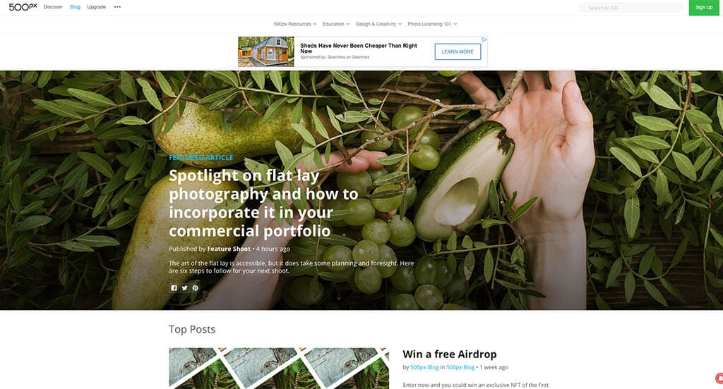
Lots of large images are used in various places to grab attention. We loved how titles, the author and how recent a post is can all be noticed along with a short paragraph about each post all within this landing page. It was also a great choice to include lots of buttons to take people to new areas. From a marketing perspective, we liked how they utilized bold lettering for titles.
5. Pando
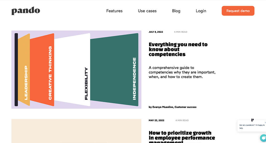
A variety of bright colors create a custom, exciting feel for this one. Including recent posts all within a grid of 3 wide was beyond helpful. Showing an author name along with sometimes their job title was an option that was perfect for this type of company. Including images and bullet points to help keep everything organized was amazing. Their domain name was also nice because it was simple and logical.
6. Design Milk
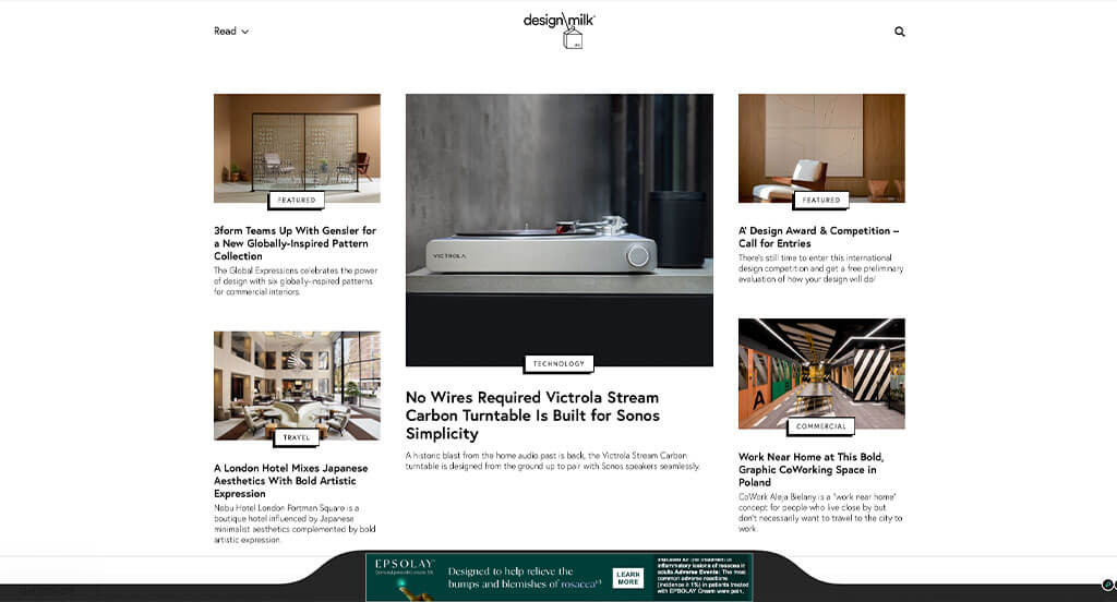
Our favorite part about Design Milk was their interesting logo design. We liked how their overall arrangement was using an asymmetrical balance. We also liked how their titles (sometimes) and buttons used a unique 3D feel. A perfect balance of white space can also be noticed in this site. Including a search bar was also unique and helpful for readers. Additionally, their lack of bright text attracts viewers towards their vibrant images.
7. Dan Flying Solo
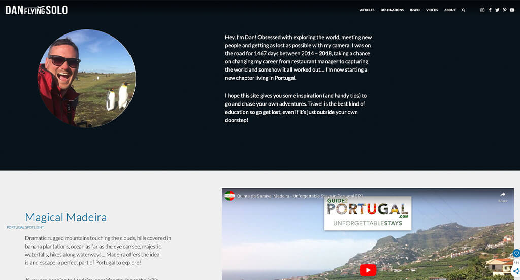
Dan Flying Solo was a perfect template because of their variety of blue colors found throughout. He likes to use interesting imageries and patterns within them that makes everything better. We liked how there is wavy, artsy looking edges to their color blocks. Another feature that we enjoyed was Dan’s use of graphics looking like hand sketched designs to separate his travels by country. We also loved how this logo design combines typography with a small airplane graphic.
8. Fubiz
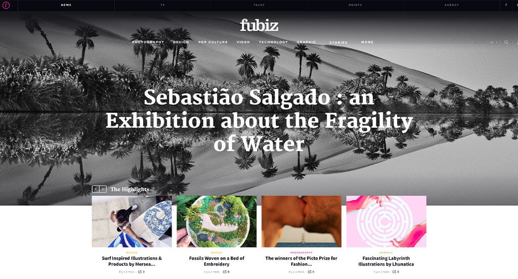
We loved how a black and white image is used for this hero header. This was well loved because it grabs attention, and it draws more attention towards their brightly colored images. Having colored subtitles for each blog was perfect because it allows viewers to explore topics they are interested in. We liked an interesting animation for their logo upon entering this site. Fubiz Media had marketing in mind when using alternating background colors.
9. Web Design Depot
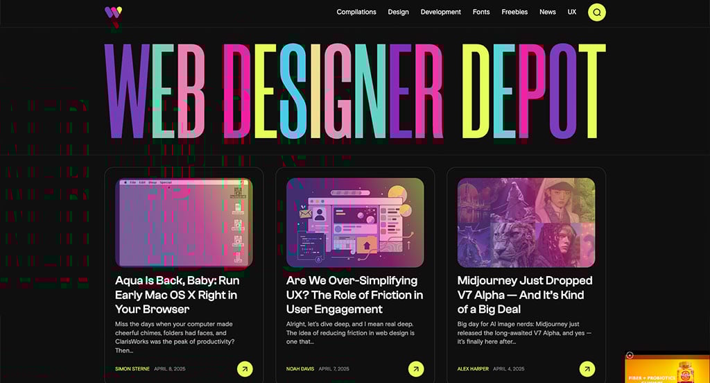
This is a stellar choice to look at if you are hoping for additional inspiration. We loved the stunning bright colors used for their company name. Additionally, all of their bright content contrasts well with their black backgrounds. Subtle animations that appear upon hover was amazing for them. Another thing that we enjoyed was how a filter of sorts was placed over many of their images before hover.
10. Bark Box
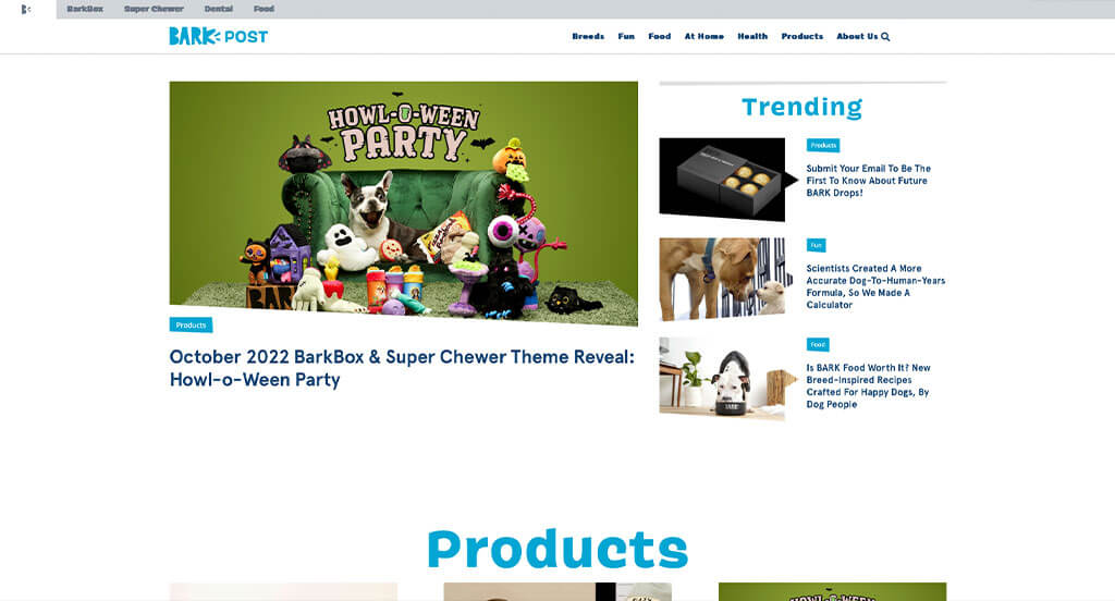
We loved how humor was added into this example, getting animal lovers to explore more. Their light and dark blue accents made sense because of it being practically trademark for Bark’s brand. We loved how many images of pets exploring new and loved toys was included. Simple navigation was obviously something that was important to them. Additionally, we loved little tabs that tells viewers what category each post belongs to.
11. Mashable
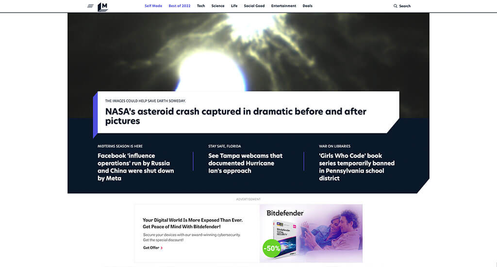
Mashable does a great job grabbing attention by placing their most relevant news right away in their hero header. We also felt like their simple but interesting logo was a perfect addition. A section included just for their games was special in a good way. Another thoughtful feature we noticed was how a unique 3D look was applied to many areas. A simple font is also used which we felt was perfect.
12. The Blog Abroad
We loved how each post includes a title, an image and estimated reading time. Allowing an ability to place comments within her content was perfect, because it gets people talking. Having their domain match this organization name is a nice addition, making it feel more reliable. A FAQ page was also a great choice that gets viewers more involved. Everything is well organized, which is beyond helpful.
13. Adventure.com
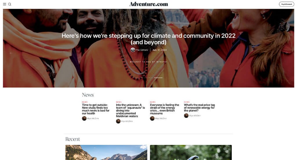
Lots of images, phrases and chunks of content were carefully added to distract viewers and keep them reading. Adventure.com did an amazing job with their professional fonts, that can also be read very easily. Subtle accents of red can be noticed to highlight links and important information. We loved how they make it easy to tell that they add to and update their site often.
14. HyperQuake
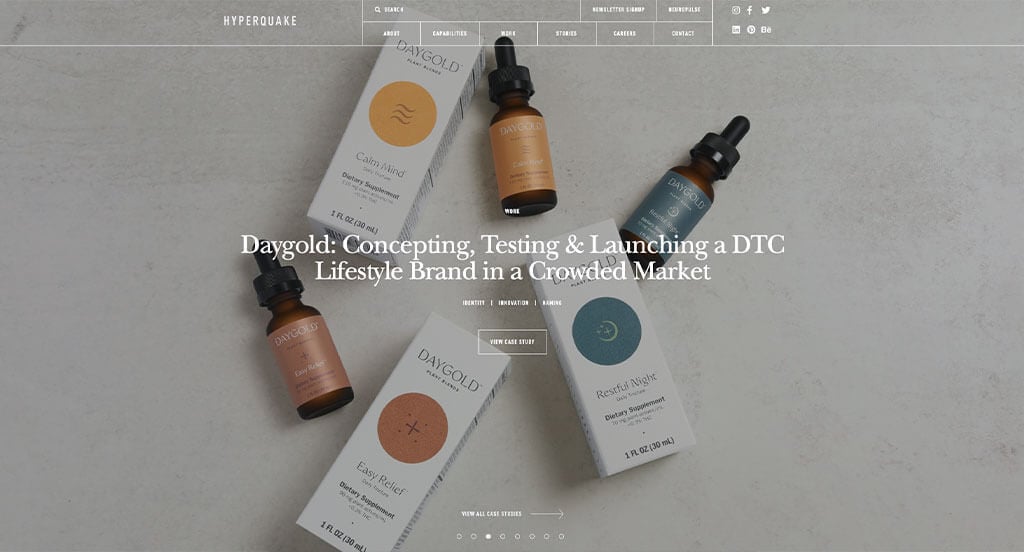
Although this company puts less emphasis on their blog as some of our other favorites, HyperQuake still has many good features. Our team really loved how they include their clients and attach case studies. We also liked how within their blog, they used bright red subtitles to show what type of information would be included in that post. Finally, we felt that it was nice to include a button to direct customers to their newsletter.
15. TreeHugger
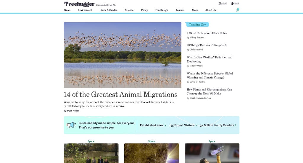
Here we can see that their catch phrase, “Sustainability for All,” is repeated in multiple areas, which is nice because it helps viewers understand their mission. We loved how some of their recent content is broken into groups such as: Environment, Home & Garden, Business & Policy, Science, Animals, Clean Beauty, Design, and Culture. We fell in love with the blue and white used throughout TreeHugger’s webpage, because it created an elegant and simple design. They also do well with incorporating social media.
16. Dribbble
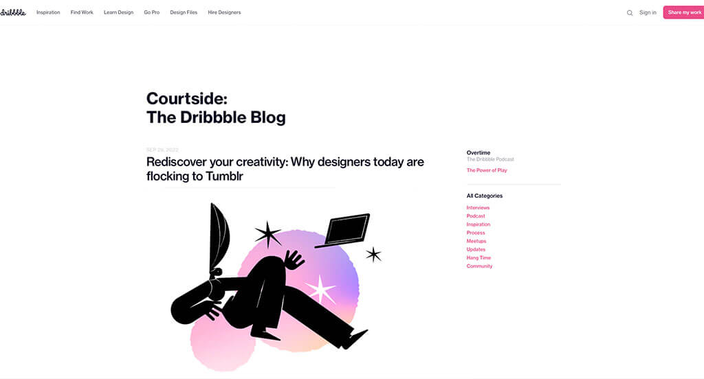
Dribbble used mainly black and white, but occasionally added in accents of pastels to add interest. We loved how seemingly customized images are used for thumbnails. Having a search bar for this type of group is perfect. Another thing that we enjoyed was their carousel feature near the footer including a variety of topics leading customers towards more information. Their domain is simple and logical for this brand.
17. Brit + Co
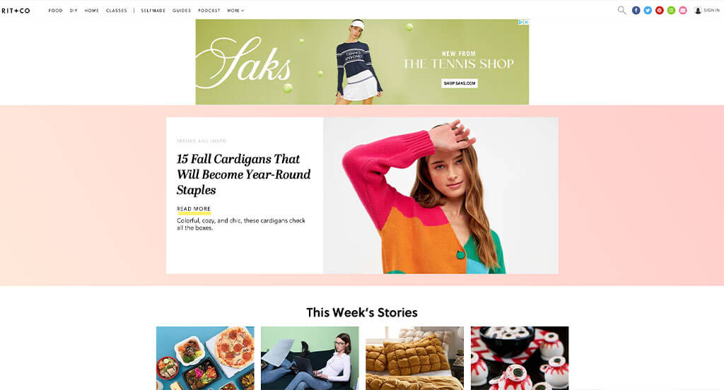
Judging by Brit + Co’s pink accented template, we can guess that their common viewers are females. After scrolling through, you’ll immediately notice a mixture of fun and simple fonts. Arranging more popular news to appear first, was very smart, because it draws people in faster. We also felt that adding in a section for “what to watch next” was refreshing, because these days everyone’s looking for another show to binge.
18. Little Fat Boy
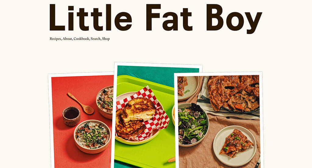
Little Fat Boy does an outstanding job with their images and how they display them. A scrapbook look was definitely very impactful for a food blog rooted in family history. Including information on not only food, but also recipes and upcoming cookbooks was amazing. Allowing viewers to browse by a variety of food categories was an addition we couldn’t ignore. They had conversions in mind when using a careful balance of white space.
19. Flourist
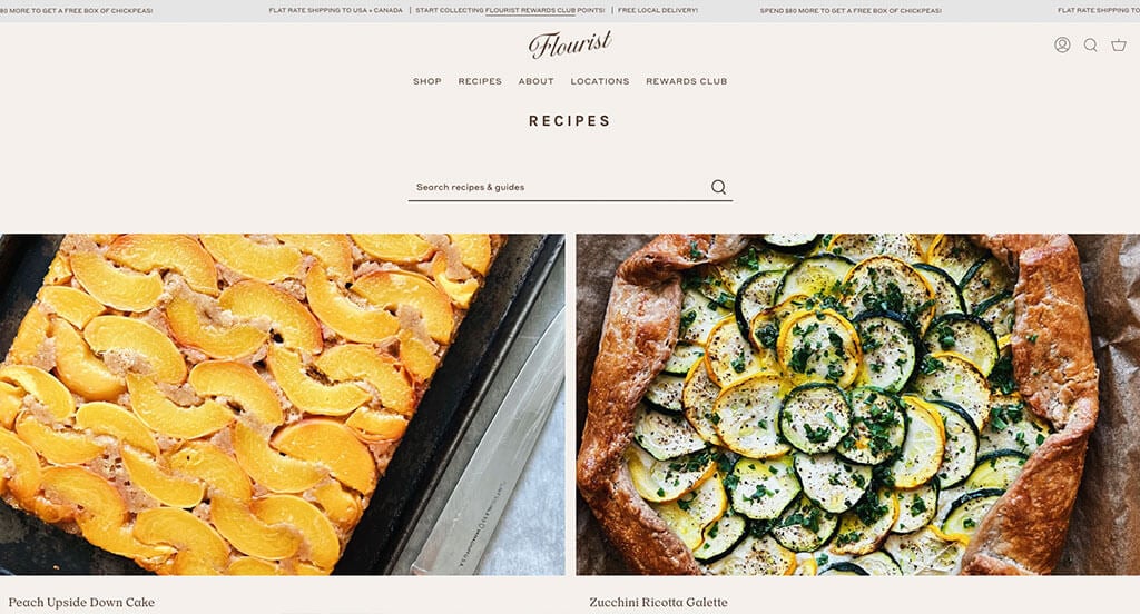
This is another beautiful food blog that we needed to add onto this list. Their images that are high quality and well composed would make anyone hungry. There are lots of options, which is perfect because it means that even picky eaters could find something interesting. We appreciated how brown and tan are used to create an attractive look. Being able to look through a variety of additional information about their company specifically was perfect.
20. Lili’s Travel Plans
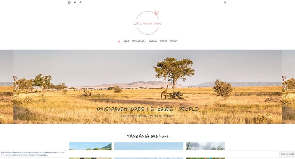
If you are looking to build up a travel blog – this is the only example you need. Her voice is funny, relatable and easy to understand. White, gray and powder pink makes for an attractive look that also feels adventurous. A strikethrough feature is used in many different areas to add comedic effect. We LOVED this logo design because it was refreshing, simple and cute. Using a custom font was a nice touch for a personal feel. Images are almost always placed in an interesting arrangement, along with some short quotes and phrases. Another thing we enjoyed was Lili’s Travel Plans’ unique photo frames that mimic a Polaroid picture.
21. Urban Beardsman
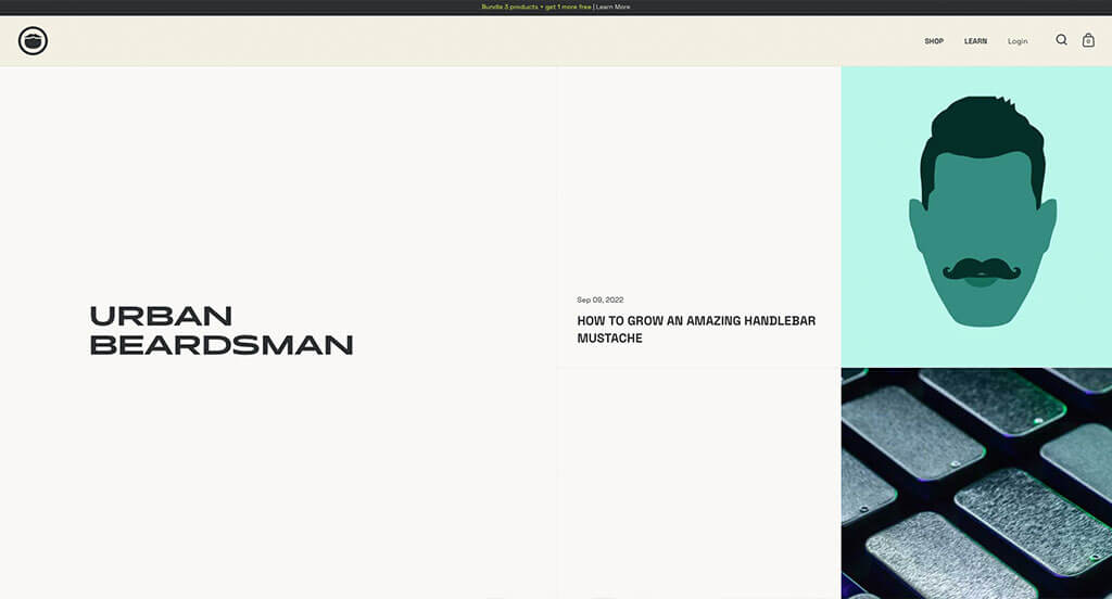
Right away Urban Beardsman takes a different approach and uses image banners with buttons to guide viewers towards additional information. Their seemingly stretched font was bold and grabbed attention for sure. We also loved how all of their content is in black and white while images use bright colors to make them pop more. They did well when creating a simple but memorable logo to represent their brand.
22. Traveling Mitch
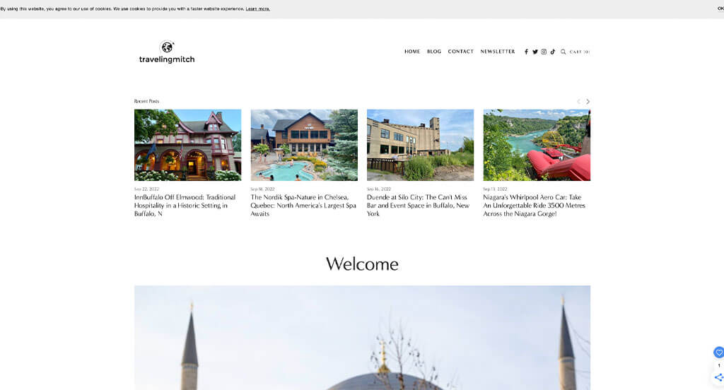
We loved how this company has a logo design that makes sense for them. Showing awards for their blog along with popular companies they’ve been featured in was a nice touch. We liked how posts are organized by continent, making it easier to see information from travel ares that interest you. Their social media accounts are linked within to allow their viewers to connect with them faster.
23. Urban Influence
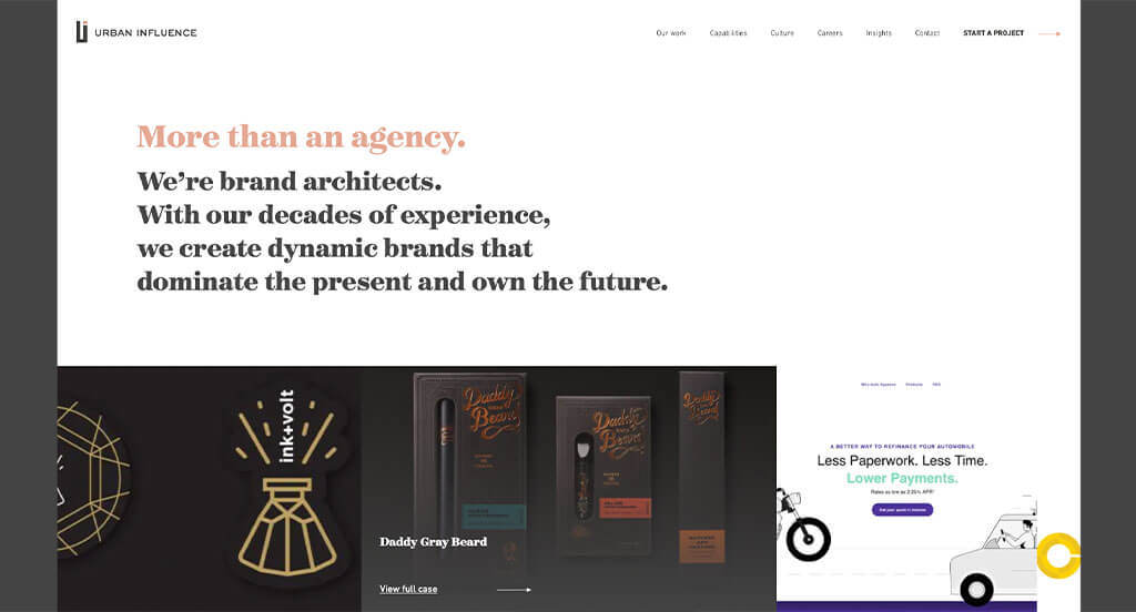
Our favorite part about this example was their inventive logo. Additionally, we liked how other companies were included into their template. Using simple fonts was another design quality we enjoyed. A clearly labeled navigation bar was also used to help organize everything. It was also helpful to have a simple domain name that matches with their company name.
24. Copy Blogger
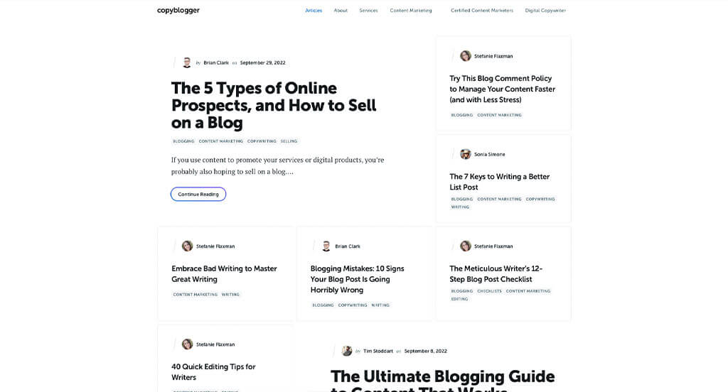
This webpage tried their best to maintain a simplistic look, which was a great idea. Their titles use sans serif fonts whereas their content uses serif fonts to create some contrast. Small tags are used to help viewers know what type of content they can expect when reading. Including in an area to get people to subscribe to their services was another great addition.
25. Fairly Curated
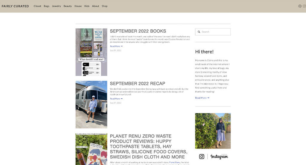
This was a great choice to inspire you if you are a lover of clothes, fashion and more. Tan, gray and white are combined carefully to create a natural look. Including an author section to provide readers with a little context was a perfect choice. A simplistic font made sense for this brand, sticking to their values. Including a search bar was another feature that we never try to ignore.
26. No Film School
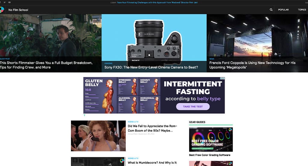
For any film nerd that is wanting to stay updated on all the hot takes, this is a pure example. We loved how so many different topics are used within the film industry. Having a bright blue accent that can be noticed in many areas was amazing. It was nice to include content that is relevant to current events, but also including some good classic throwbacks within their posts.
27. Jeremy D. Larson
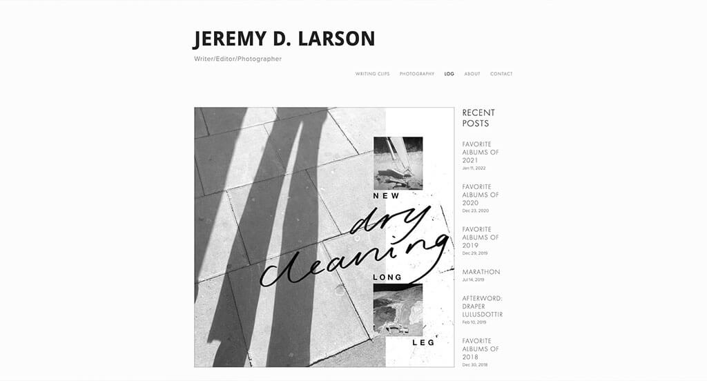
Although this site could add more interesting graphics or visuals to break up long text, we enjoyed how all their images use similar aesthetics to create a customized feel. Additionally, adding in lists among their paragraphs was nice. It was definitely nice to have no distracting ads or content so if you are interested in this, you can just read. Aside from that, we loved how their domain matched with their name.
28. Create & Cultivate
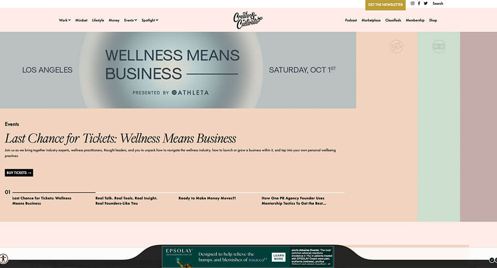
We loved how this one had a feature that displayed “For the ____________”, dropping their stereotyped readers. Additionally, using a few different accent colors was nice to brighten up this overall feel. All of Create & Cultivate’s information was formatted into short paragraphs, which was nice because it wasn’t overwhelming. We also loved their interesting logo that mainly used text.
29. Color Me Courtney
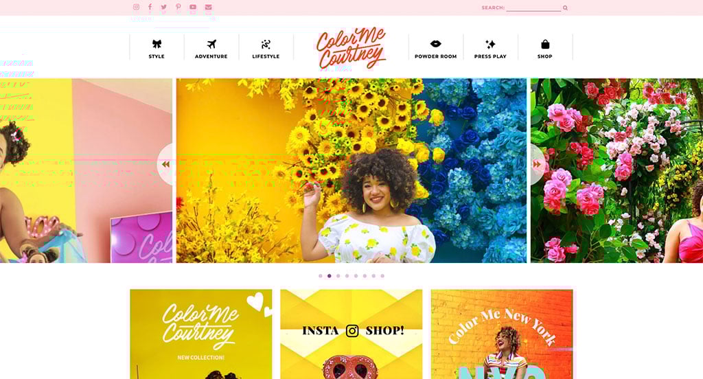
We could feel the vibrancy shining through every area of these pages. Decorative fonts are used to create a more appealing look. Additionally, a beautiful combination of colors are used for text, backgrounds, buttons, images and more. Showing a highlighted banner showing publication dates was a good addition that every blog should use somehow. Using a bubbly, positive tone while writing is something that Color Me Courtney does a great job with. Finding ways to include social media was also very well done in this one.
30. TechCrunch
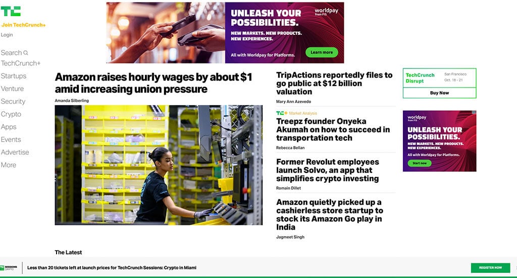
This is a template built to inspire due to their organized look. We loved how bullet points are used to state top headlines. It was also helpful to include an image linked to more information for more recent news in the tech world. Additionally, we noticed how a bright purple accents their list of most popular articles. Using bright green to create positive energy helped make this a great idea to consider.
31. Selective Potential
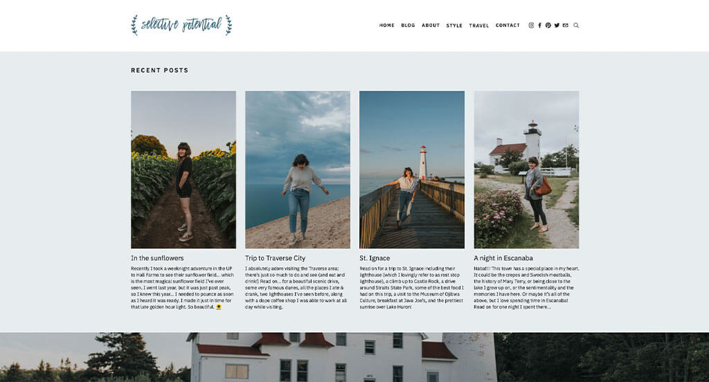
This blog displays feelings of curiosity, wonder and simplistic beauty. We loved how their logo was their company name written in decorative writing. Overall, our team felt that images were this webpage’s best quality. Not only were they high quality, but they were aesthetically pleasing, making viewers want to embrace their potential. Another feature we thought was unique was a page dedicated to outfits that allows viewers to check out her outfits from any season.
32. The Recipe Critic
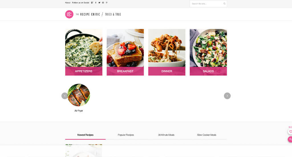
This was a very exciting layout that uses bright pinks to accent some areas. Images were of extreme quality and looked sooooo yummy! We thought it was interesting to have a free meal plans for weeks that includes a shopping list to save time on your weekly meal prep. Another thing that we really liked was how recipes could be separated by meat or method of cooking. Having a section for upcoming holidays (and the traditional foods) was a great choice.
33. Help Scout
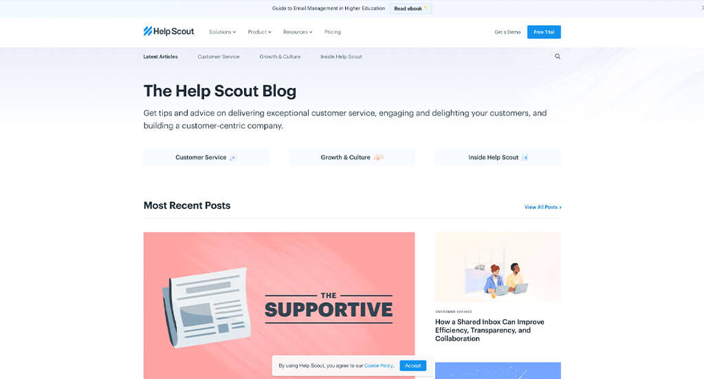
Honestly, the first thing that we realized about this one was their interesting logo. We loved how everything was organized into lots of categories making navigation easy. We felt that their blue accents were perfect for a site that is packed with information. Another thing that we noticed was how they had lots of interesting graphics and seemingly custom images. A well labeled navigation bar was also a great addition.
34. GoSquared

Right away, we thought this site was very basic with its mainly black and white look. However, as we continued to scroll through, vibrant images blew us away. We also loved how they had a great balance of white space in their overall layout. It was nice to include estimated reading times for each post, so people know what to expect. Including a search bar was another thing that we loved for a blog site.
35. SPI
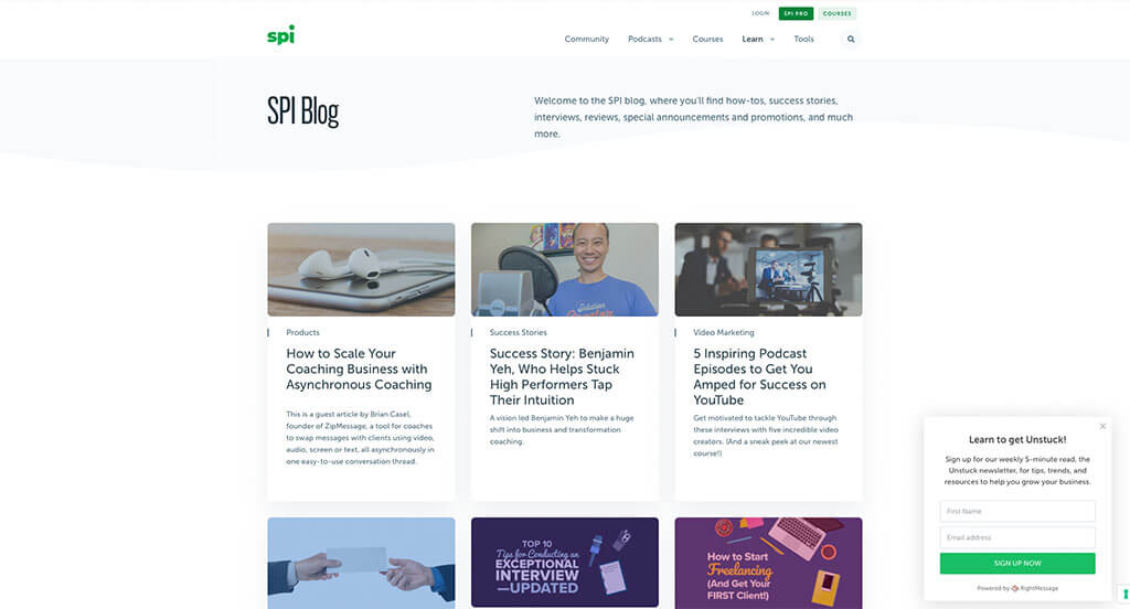
We loved how SPI made great use of colorful shapes to breathe life into their site. Including lots of icons was another feature that we really enjoyed. While they share this quality with most of their competitors, they did a nice job using different colors to emphasize different categories for their content. Providing options to receive content – extending out to podcasts was a nice touch. Another aspect we noticed was how lots of call-to-action buttons were used.
36. Smashing Magazine
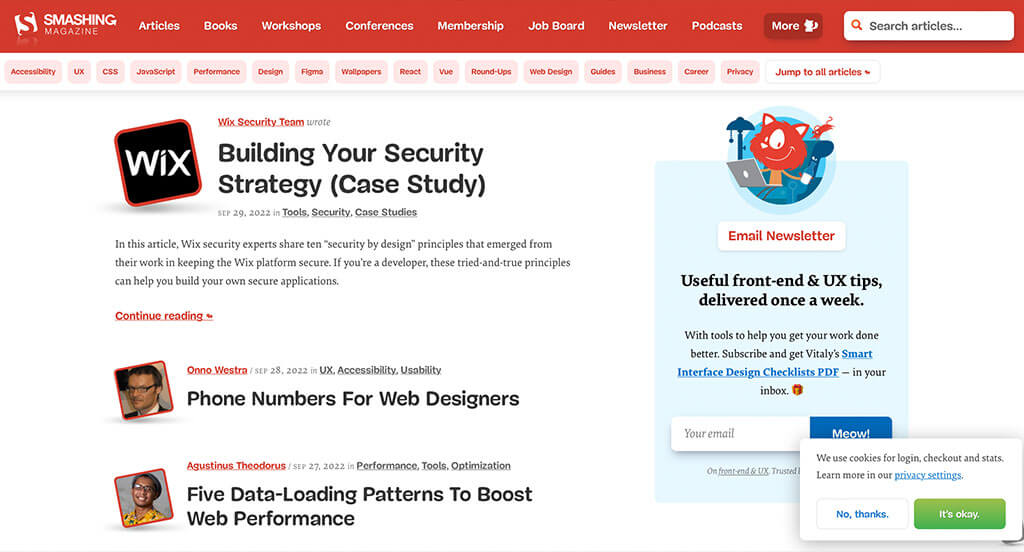
Smashing Magazine’s most unique quality was hands-down their use of their logo over and over as a photo frame. We felt that their bubbly text for titles was different, and it helped them stand out. Red and white was a great choice to help all their content pop and feel exciting. Another thing you might notice is their use of their cat mascot to get people involved more. Including all of their topics in the footer was an aspect we couldn’t ignore.
37. Awwwards
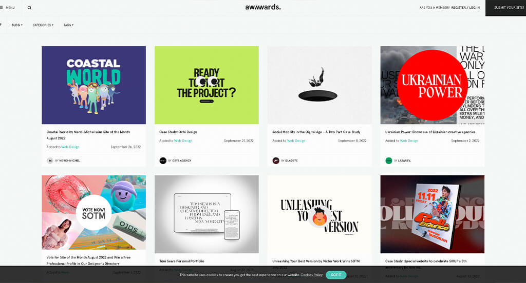
Almost instantly, we noticed how very large text was used throughout to make a statement. Along with that, it was nice to have large imagery to add a bit of variety. On this landing page, we felt it was perfect to have only very short paragraphs to hook customers into certain posts. It was also cool how they added in their business’ case studies within this blog.
38. Maria Killiam
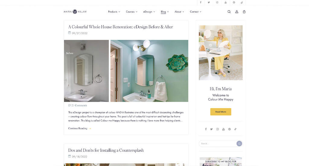
Between images and this company’s logo, visuals are definitely successful here. It’s obvious that Maria Killiam focuses on continuously update their content. We loved how each post allows for comments so readers can connect and create a community here. We noticed within this header how all social media links are included. Each of these titles are carefully crafted for a unique feel. They also did a great job building pieces to look like ads but actually link to another page within this blog.
39. Cookie + Kate
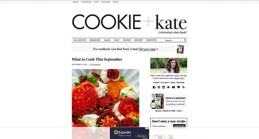
Lots of tasty looking images are included right away to get viewers excited about this content. We loved Cookie + Kate’s feature to find a perfect recipe by typing filters: course, cuisine, ingredient, diet, and season. Including information about this author was perfect because it gets people feeling more connected to this content. Usability was another thing that we felt this example did very well with.
40. Writing Revolt
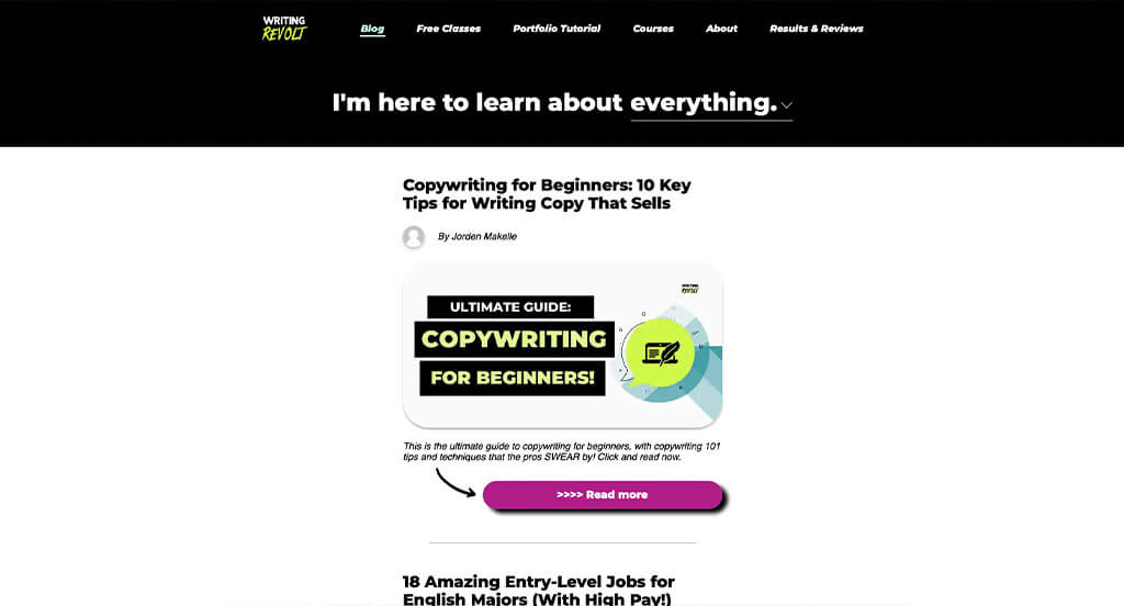
Bright green and purples are used to attract attention to specific information within this one. Adding in buttons was another thing that we really enjoyed. We thought that including “I’m here to learn about _______” with a dropdown box was a creative touch. Another aspect that we liked was how “revolt” in their logo appeared in an innovative font. Including images for each button leading to more information was also helpful.
41. He Spoke Style
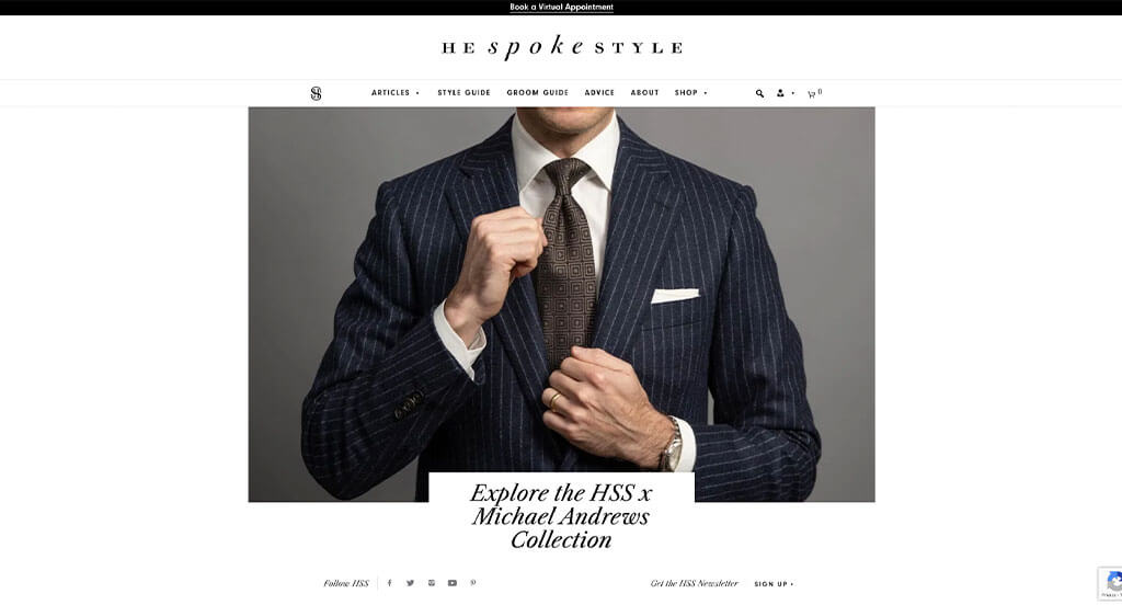
We loved how this special one uses mainly black and white that allows for a modern feel. Using an interesting font that is simplistic and goes with their brand identity was perfect. High-quality images were also a great addition to take He Spoke Style to another level. A lack of graphics makes this example almost more professional and “manly”. We also liked how they brought some information in about their business and products.
42. Afford Anything
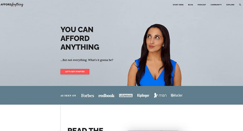
Lots of choices that Afford Anything made was very perfect. We loved how there was a blend of bold fonts with decorative ones. Short paragraphs was another thing that was helpful for customers reading through their information. Using colorful buttons to make it east to navigation was something else we enjoyed. Having a bright red accent color was also nice.
43. GirlBoss
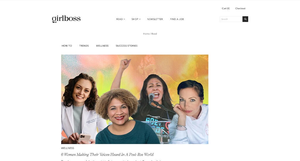
Our favorite part about this one was certainly their interesting fonts. Beyond that, it was nice to use different versions of this font for titles, subtitles and content. We also liked how they customized their images to make a more personal feel. Another feature of GirlBoss that was great was their colorful backgrounds in areas. Their navigation bar was also pretty simple, so it was easy to read and use.
44. Pixelgrade
A purple color scheme creates a slightly luxurious feel that customers will love. Each post did a great job adding in images for each, making them stand out to viewers more. Showing estimated reading times was another thing that we loved. Adding in their brand’s mission within their footer was very smart. Finally, allowing for this domain to match with their business name was. a choice that couldn’t be ignored.
45. The QMan (The Quintessential Man)
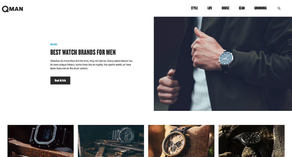
First off, we enjoyed how there is lots of high-quality images of products so that people know what their main focus is. Additionally, using blue for all automatically linked text. Bold font is used – especially within their well organized navigation bar, which is always a great choice. Including a search bar was another feature that is good for any type of blog.
46. The Crafty Needle
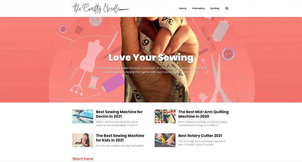
This blog blew us away with their interesting logo design that used both a decorative font and played around with a graphic related to their focus. Using accents of pastels, especially pink was an addition we couldn’t ignore. The “Love Your _______” that moves through many of their talking points was a cool idea. A starter section was included for those just getting into this complex hobby, which is something we don’t see often.
47. Sevenports
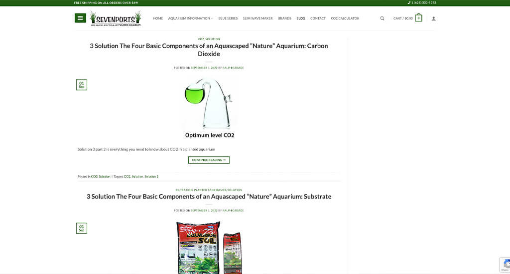
Sticking to dark green accents was a choice that we loved, especially because this company is into plants and nature for aquariums. All their content seems to be logically organized in a way that makes customers want to explore more. Another thoughtful feature was little tabs that appear on the left-hand side showing when it was published. Having interesting navigation tags and methods within this site was another good choice.
Blogging can boost your overall exposure and revenue, but it can be time-consuming and hard to manage. This article offers tips for running a successful blog to help you grow your brand.
Best Strategies for Managing a Blog
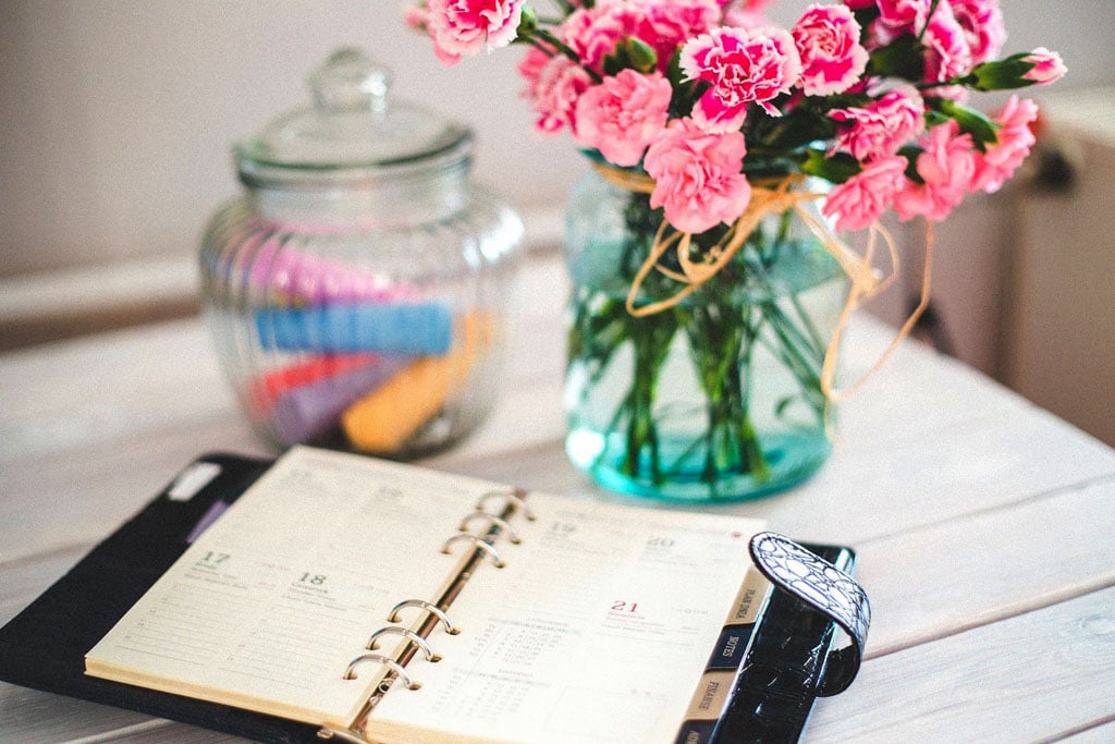
1.) Editorial Calendar
Using an editorial calendar helps you stay organized by planning posts in advance and setting a clear publishing schedule. This is essential if you work with a team of editors. Tools like Google Calendar or CoSpot make it easy to manage content, plan social media marketing campaigns, track keywords, and set reminders so you never miss a deadline.
2.) What Do They Want?
Your readers value time they spend within your blog, so consider what they’re looking for – entertainment or information – as you write. Knowing this will help you craft more effective posts.

3.) Target Audience
Identify your target audience right away so you can create content that’s relevant to them. For example, a blog for kids won’t benefit from topics like “How to Manage a Blog.”
4.) Blog Categories
Organize posts by topic to make it easier to find past content and help readers quickly access what interests them.
5.) Guest Posts
Guest posting on other sites helps drive traffic and expand your blog’s reach by getting your content in front of new audiences.
6.) Social Media
Social media attached to your blog builds a community and lets you connect with your audience more personally. Additionally, you can promote new posts on platforms like Facebook, Twitter, and LinkedIn to boost traffic through word-of-mouth sharing. Another thing that can be helpful is making your content easy to repost on customers’ social media to use their connections.

7.) Posting Schedule
Posting consistently on your blog encourages repeat visits and builds trust with readers. This could mean publishing several times a week, depending on your overall activity.
8.) Limit “Sale” Posts
Limit promotional posts in order to build trust and show readers you care about their interests – not just making a sale.
9.) Choose a Platform
Selecting a perfect platform is key to meeting your needs as a company. Look for a platform with essential features like user-friendly templates, analytics, and plugin support.
10.) Database Backups
Regularly back up your content to protect against accidental loss, hacks, or viruses. If you need help, WordPress BackupBuddy can be a good way to go for this process.
11.) Professionalism
Your website’s design sets the tone for your blog, so avoid flashy graphics and excessive ads. A clean, user-friendly layout ensures a positive experience that encourages return visits. Additionally, write your posts and comment replies in a professional manner, it is how your viewers perceive you.
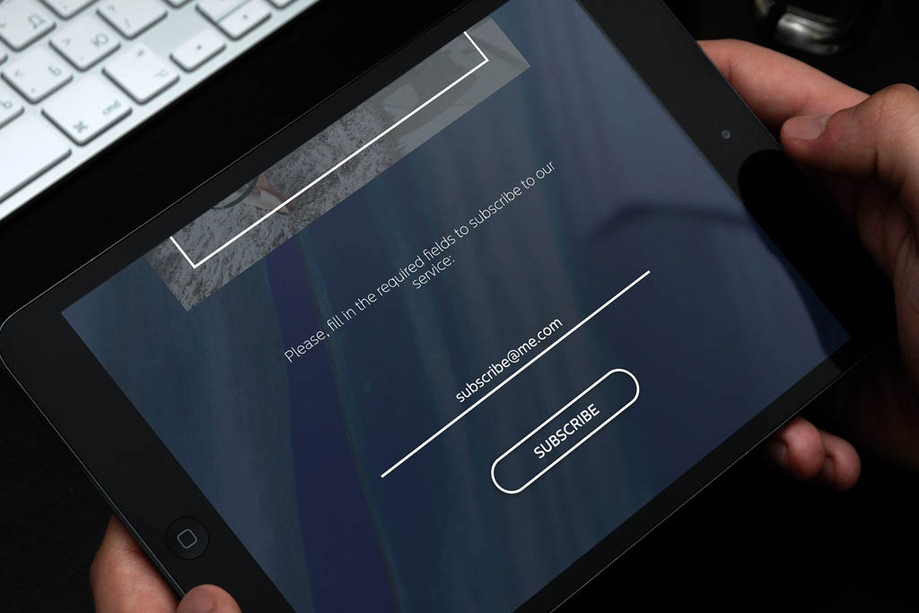
12.) Email Addresses
Create an email address tied to your business. Additionally, you should allow a feature where people can subscribe to your blog. This way, you can notify them about new content, plus, you’ll establish a friendly relationship with your audience, which is never a bad thing!
13.) Copyright
Avoid legal issues by using copyright-free images or ones with Creative Commons licenses from sites like Unsplash or Pixabay.
14.) Search Engine Optimization (SEO)
SEO helps your blog rank higher in search results, bringing in more traffic to your site. Use keywords, fast loading speeds, internal and external links, quality writing, and a good user experience. Checking out benefits of a SEO Audit can be a great first step.
15.) What’s Your Why?
It’s important for people to understand why you use a blog – whether it’s for business, personal reasons, or a mix of both. Once that’s clear, everything else falls into place. For instance, if you’re promoting a product, focus on content that speaks to those target users.

16.) Unique Content
Avoid copying others’ posts to prevent plagiarism and search engine penalties, leaving you back to square one. Instead, use competitors’ content as inspiration to create your content. Expressing interesting perspectives on common topics or your own personal experience to something will help you stand out.
17.) Research
Check out other blogs within your niche. Study them to understand what’s driving their success – not to copy them, but to find ways to improve your own blog. Strong competition simply means your blog needs to be even better to stand out.
Additionally, research and learn from top bloggers like Gary Vaynerchuk and Jon Morrow. It doesn’t matter if you are in the same niche, their unique styles show that success is possible anywhere.

18.) Traffic Sources
Use Google Analytics to track the traffic sources, which is where your blog traffic comes from. Aim for a mix of sources like Google, social media, and other websites to grow your audience.
19.) Check Comments
No one wants spammy comments showing up on their blog! When it comes to moderating comments you receive, you’ll have to either turn off the comment feature altogether, or only allow “approved” comments.

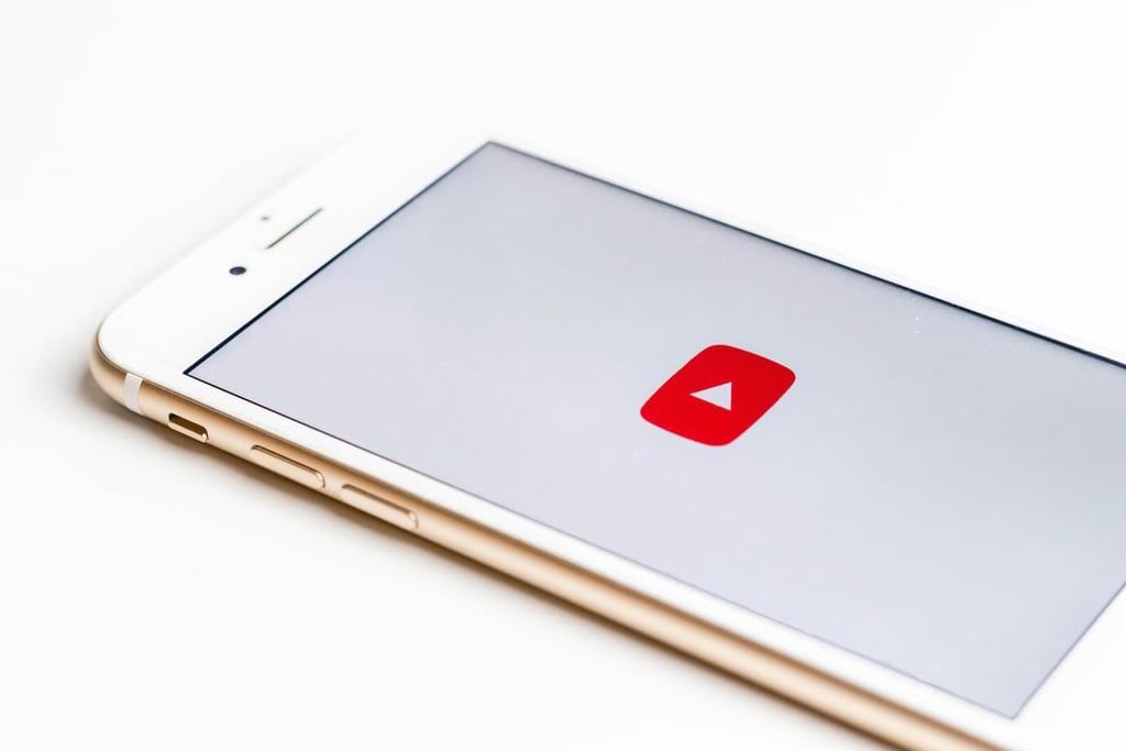
20.) Videos
If possible, video content is a great way to keep people engaged by providing information in a more interactive and interesting format. While this might help your blog stand out from competitors, you’ll also improve the amount of time people stay on your site, which is great for SEO!
21.) Managing Passwords
Use a strong, hard-to-guess, secure password to keep your blog unhackable. Store credentials in an offline manager like KeePass or LastPass for added safety.
22.) Engaging with Other Bloggers
Making connections with other bloggers so you can share information and tips, is always a great choice. You may even be able to cross-promote your blogs, which will help both parties out.

23.) About Page
When you’re just starting, it’s basically required to include an about page to help readers understand who you are, what you do and possibly why you do it. By doing this, you’ll establish credibility and trust, which is crucial in the long run when building up a brand.
24.) Loading Times
No one likes a slow site – optimize images, clean up content, and streamline code to improve load times. Check out our post on the Top 15 Tips for Improving Page Speed to learn more.
25.) Mobile Friendly
With more users browsing on mobile devices, it’s crucial your blog is mobile-friendly. Use a responsive design and keep image sizes small for faster loading on all screens.
26.) Post-Marketing
Great, high-quality content isn’t enough – you need to market it. Promote posts via social media, email newsletters, guest posts, influencers, and directories. Tools like Hootsuite or Buffer make sharing easy, and email updates keep your audience engaged.
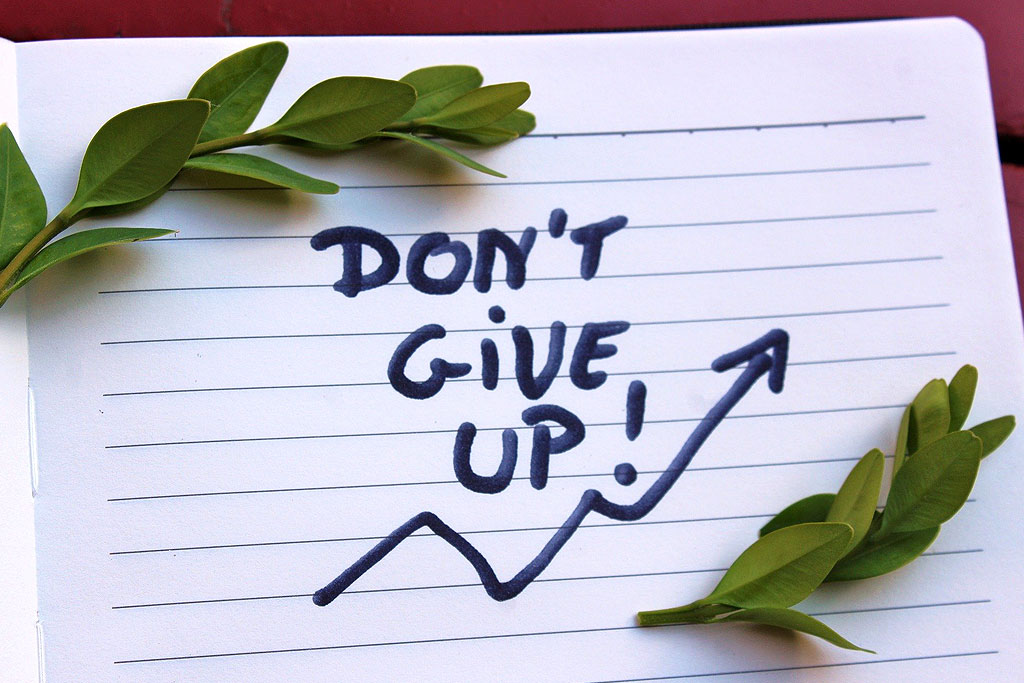
27.) Don’t Give Up!
Blogging can be difficult at first, and it will most likely take a while for an audience that’s really invested in your blog to develop. However, it’s important not to lose hope or become discouraged because success will happen eventually – just keep trying new strategies until something sticks!
Recommended WordPress Blog Themes
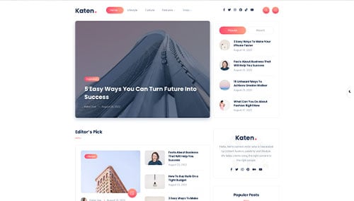
Katen – Themeforest
$39
Schematic – Themeforest
$69

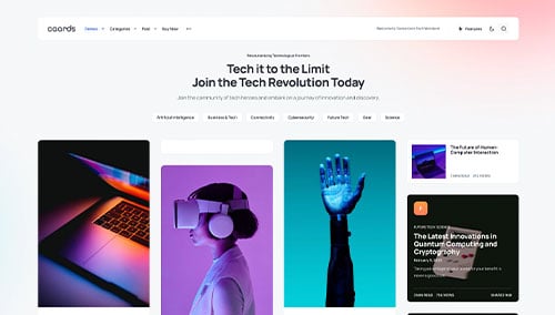
Caards – Themeforest
$69
Sunflower – Themeforest
$59
