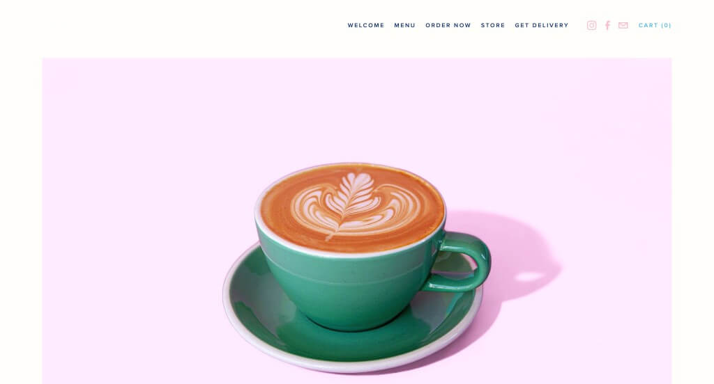
Calling all coffee and tea lovers! Ready to explore webpages that will inspire you? This guide highlights standout brands known for great design, functionality, and user experience.
From roasters and cafes to tea retailers and equipment makers, these sites offer inspiration and tips to help you build a flavorful online presence that reflects your passion for coffee or tea.
Looking for more website inspiration? Check out our top web designs across other industries!
Top Coffee & Tea Company Website Designs
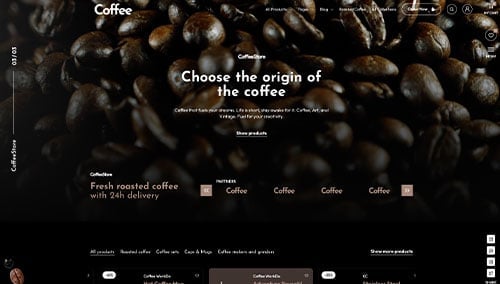
- 1. Quills Coffee
- 2. Republic of Pie
- 3. Dark Matter Coffee
- 4. Byte & Bark Brew
- 5. Regent Coffee
- 6. Colectivo Coffee
- 7. Sightglass Coffee
- 8. Fava Tea Company
- 9. Stumptown Coffee Roasters
- 10. Cafe Patachou
- 11. Roast Works Coffee Co.
- 12. Grit Coffee Roasting Co.
- 13. Tiago Coffee
- 14. Tofino Coffee Roasting Company
- 15. Greater Goods Roasting
- 16. Parakeet Cafe
- 17. Ceremony Coffee Roasters
- 18. Black Fox Coffee Co.
- 19. Interstellar
- 20. Cafe Britt
- 21. Culture Espresso
- 22. Counter Culture Coffee
- 23. Bones Coffee Company
- 24. Blue Bottle Coffee
- 25. The Missing Bean
- 26. Madcap Coffee
- 27. Single O
- 28. Felix Roasting Co.
- 29. Goodboybob Coffee Roasters
- 30. Conscious Cup Coffee Roasters
- 31. Metropolis Coffee
- 32. Foxy Loxy Cafe
- 33. The Pinery Coffee Co
- 34. The WestBean Coffee Roasters
- 35. Joffery’s Coffee & Tea Company
- 36. Souvenir Coffee
- 37. Onyx Coffee Lab
- 38. The Boy & The Bear Coffee Roasters
- 39. Theory Coffee Roasters
- 40. Summer Moon Coffee
- 41. Equator Coffees
- 42. The Local Restaurant & Cafe
- 43. Knowledge Perk Coffee Company
- 44. Campos Coffee
- 45. Cafe Umbria
- 46. ReAnimator Coffee Roasters
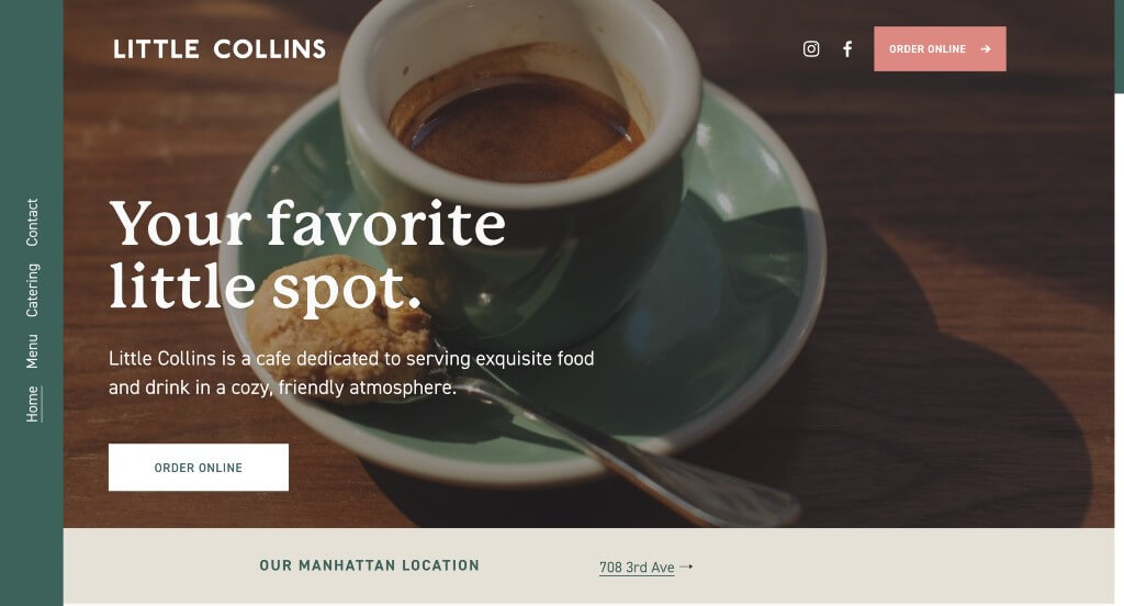
- 47. Little Collins
- 48. Hilltop Coffee & Kitchen
- 49. Lucky Goat Coffee
- 50. Alpha Coffee
1. Quills Coffee
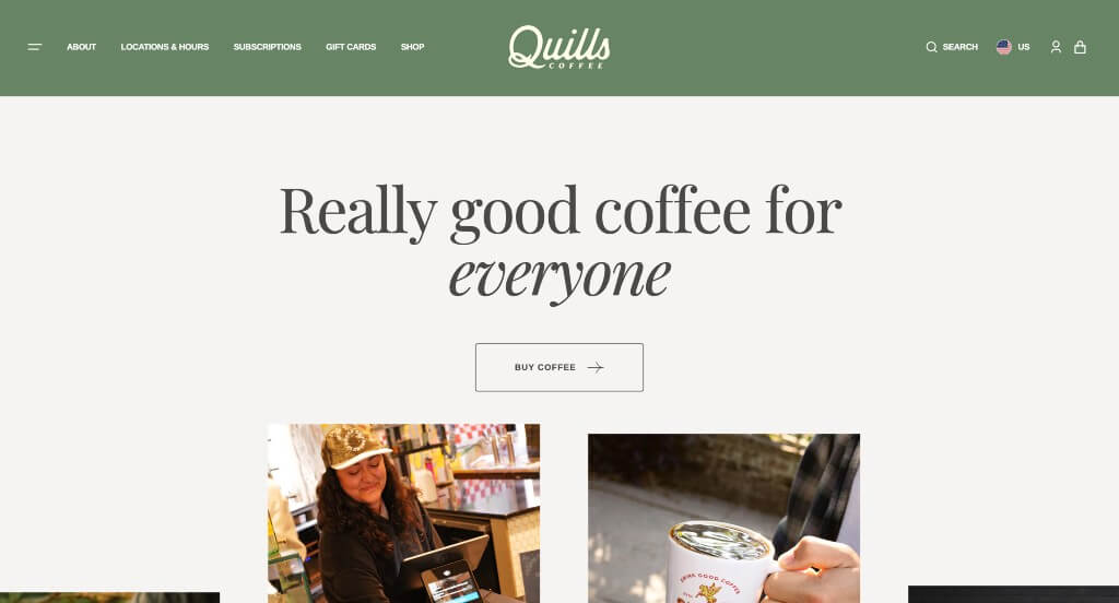
This company did a good job with their accents that create a more interesting look. Showing that they offer eGift cards that could be of use to customers who want to shop online. Lots of images of different sizes were used in order to create a good balance of white space.
2. Republic of Pie
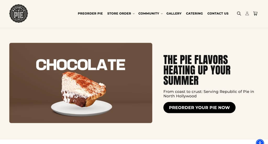
A small emblem was used for this logo, which we felt like was a nice touch. A design feature that you might see was their variety of products because that isn’t something you find on most coffee seller websites. Adding in videos was another aspect that was appreciated.
3. Dark Matter Coffee
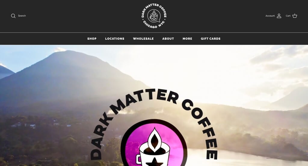
We loved how this example used an automatically playing video to introduce their business. Along with that, we thought it was cool how this company played around with different variations of their logos. Another thing they did well with was their images that appear to be designed with bright colors and patterns just for their company.
4. Byte & Bark Brew
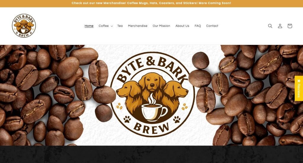
Along with this company’s unique name, we really liked how their logo was well designed. Including sales with codes to make it easy for viewers to save some money when purchasing their coffee. Including tea and merchandise helps their products appeal to more than just the coffee lovers. Adding in a FAQ page was another helpful way to build trust with new buyers.
Related: Drive traffic to your local coffee shop with digital marketing campaigns!
5. Regent Coffee
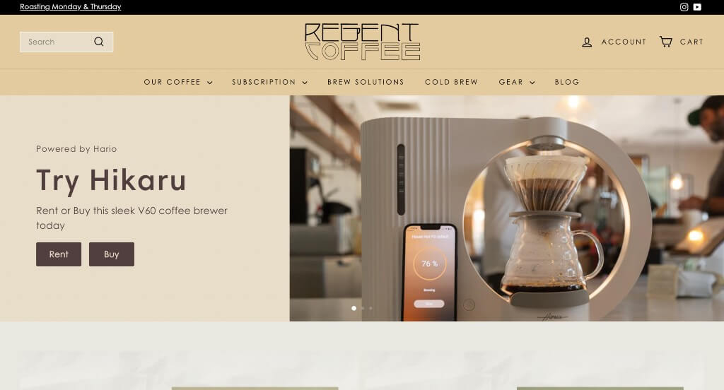
There were so many things that stood out about Regent Coffee. Something that our team saw was their logo that turned the G into a coffee pot. Using textured backgrounds was something else that was appreciated. Buttons are included to keep everything easy to access and looking organized.
6. Colectivo Coffee
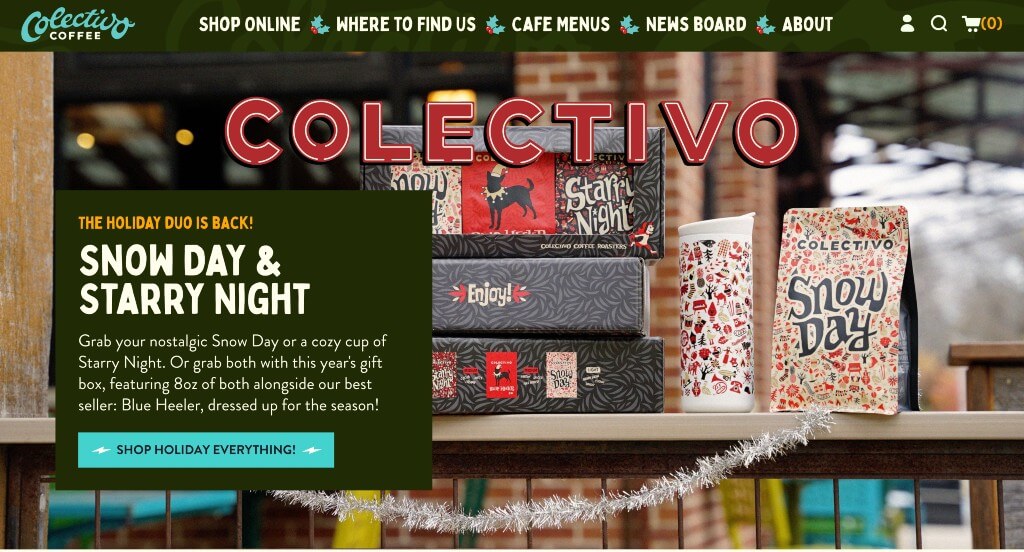
Colectivo Coffee did well with their graphics that look almost hand drawn that allows for a more personal feel. Their creative fonts were also an amazing addition. Something else that our team noticed was their small animations that appear upon hover.
7. Sightglass Coffee
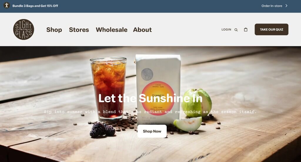
Showing where many of these products come from was a cool idea. Having customer reviews included was another thing that was really nice. This business added in some graphics to allow for a more visually appealing layout. Incorporating social media into pages is another thing that all companies should consider.
8. Fava Tea Company
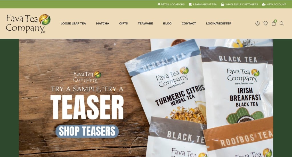
This color palette includes browns and greens in order to allow for a more natural look. Inventive fonts are used to help Fava Tea Company stand out from their competitors. Having an section dedicated to their favorite blends was a nice idea.
9. Stumptown Coffee Roasters
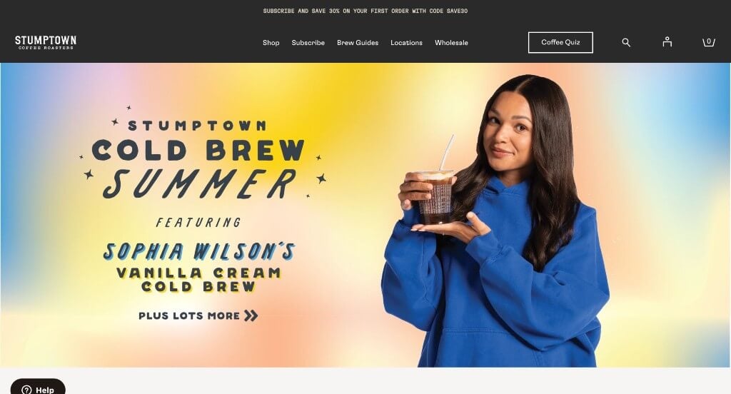
Right away, Stumptown Coffee Roasters did a great job with their one of a kind images that also include text. It was nice how they included their packaging so people can see what they are to expect when ordering from them. A simple checkout process was something else that is always helpful.
10. Cafe Patachou
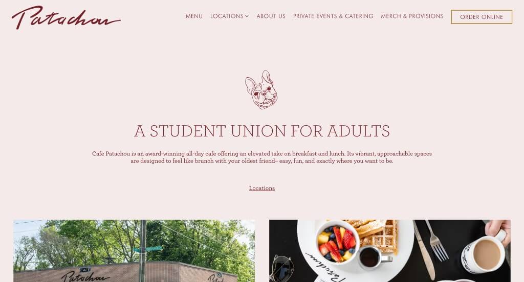
This was an amazing template that balanced white space well. Images were organized well and slightly staggered to look special. Short paragraphs were nice to keep people engaged with their content. Buttons were also included which was nice because it helps customers find more content.
11. Roast Works Coffee Co.
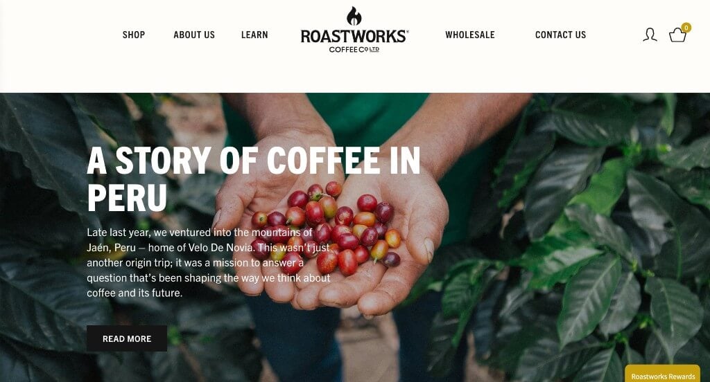
Lots of high quality images are used here, sometimes even as backgrounds. A simplistic logo was very impactful especially for a coffee roaster. They did a nice job with their different sized fonts that make for better readability. Including an area to sign up for an email list was a smart choice.
12. Grit Coffee Roasting Co.

Although it was a small change, having rounded corners on images brought a more interesting look to their pages. Font choice was another thing done well by Grit Coffee Roasting Co. Creative patterns on their packages was something that many customers are sure to enjoy.
13. Tiago Coffee
Large images are paired carefully with readable fonts. Including maps to show customers where they are located which was helpful. This navigation bar is well labeled and looks clean, making it easy to find certain information. They clearly had a focus on conversions when building a simplistic template.
14. Tofino Coffee Roasting Company
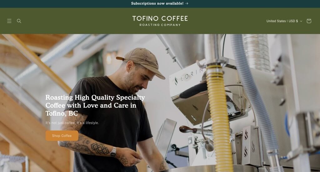
We liked how there was a variety of colors used throughout these pages. Interesting image frames are used in many areas that look great. It was smart to show off their packaging so that people can excited when they see that same package.
15. Greater Goods Roasting
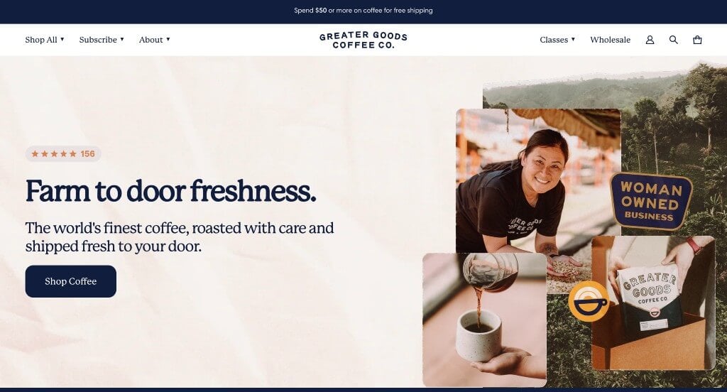
This was a great example to take a look at if you are wishing to take a more creative approach. Pastel colors were used in many areas to help everything look more interesting. Including starting prices for each product featured on their homepage was smart.
Related: Run paid advertising to help drive awareness and traffic to your coffee website!
16. Parakeet Cafe
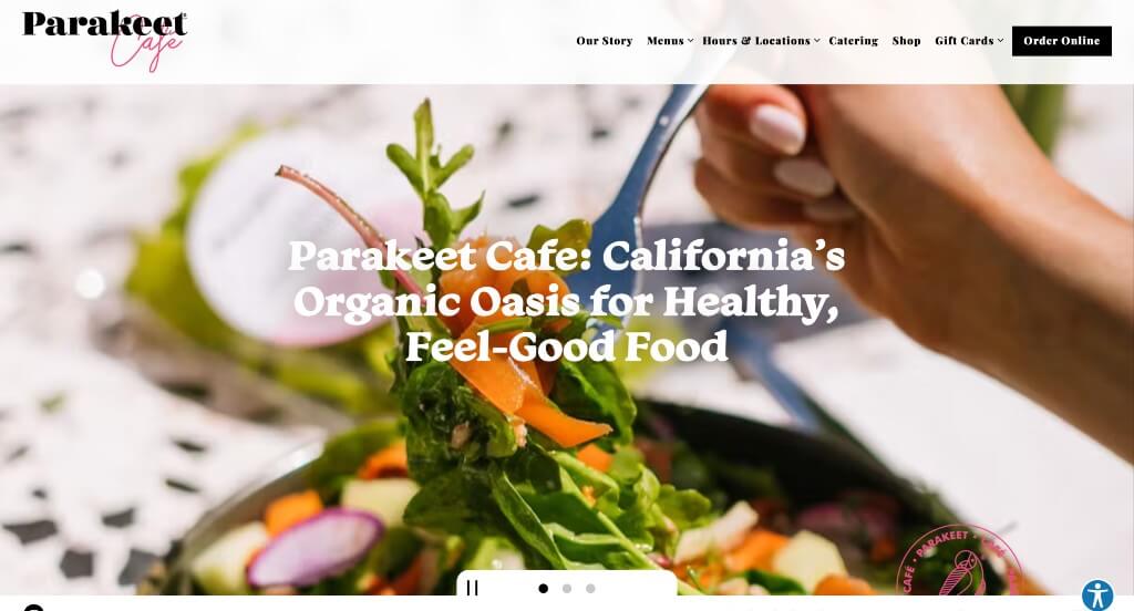
This Cafe does a nice job with their subtle pink accents throughout. Making sure that people understand that this company sells more than just coffee was another thing that was noted. A page made for their shop was a nice touch. This domain is smart for them because it matches their name.
17. Ceremony Coffee Roasters
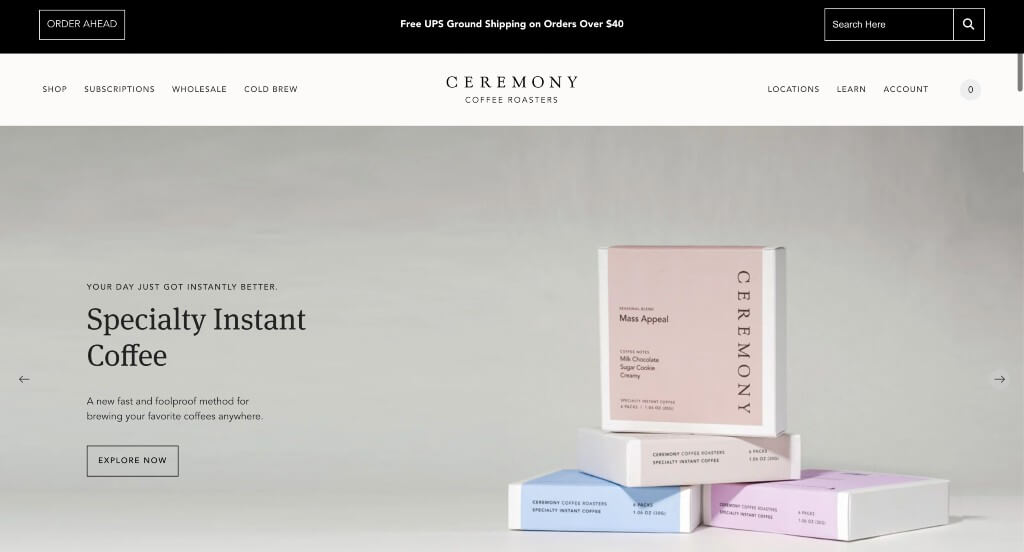
Many of these images stood out to use because they were high quality and arranged nicely. Short customer reviews were also helpful for those wishing to learn about past customers. Integrating Instagram into their page was also helpful to keep people connected.
18. Black Fox Coffee Co.
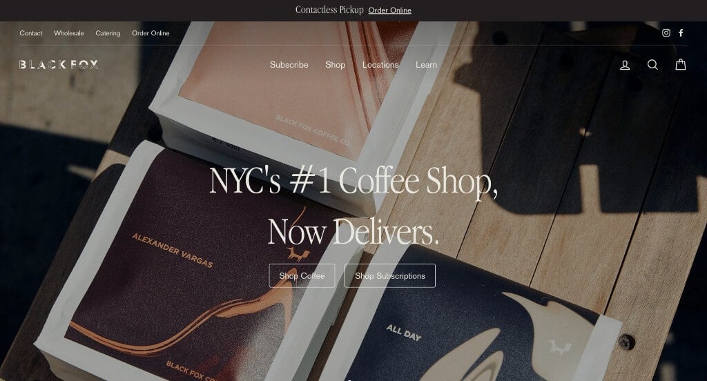
Here we have images that create a sense of unity with their stunning backgrounds. Including prices for their products was a nice touch. Different sized fonts made it easier to read information in the way it was meant to be read. Adding in a search bar was something else that stood out to us.
19. Interstellar
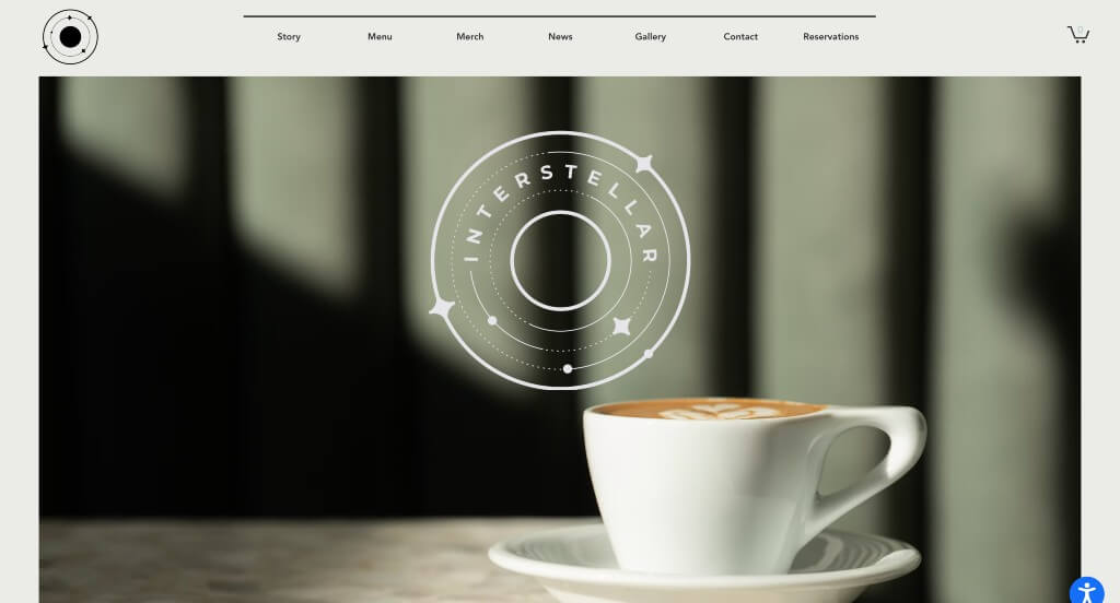
Our favorite part about Interstellar was their inventive fonts. Making sure to mention different meal times (for different menus) was smart. It was cool how they used thin lines to separate written content. Their logo was another thing that was more unique, but still made sense with their company name.
20. Cafe Britt
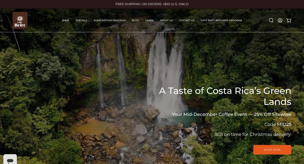
An automatically playing video is featured right away to grab attention of viewers. A variety of sales happen through this company, and it was smart to display them so customers can feel like they are saving money. Buttons were also included in order to keep content organized and easy to find more information.
21. Culture Espresso
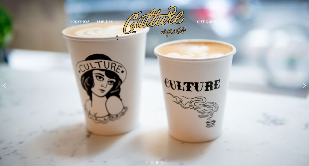
Including images of their location was something that anyone could notice. This cafe also did well using small graphics that are unique to their business. They clearly had a focus on ease of use when making a template that was easy to navigate.
22. Counter Culture Coffee
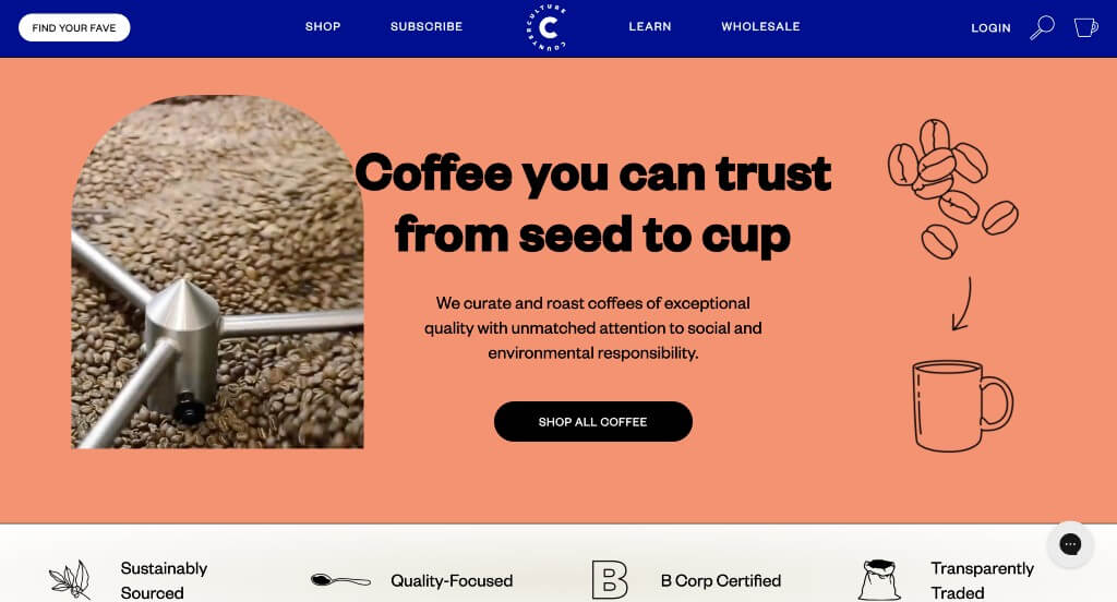
Bright colors was the first thing that grabbed our attention in this example. We also liked how they had stunning graphics that are logical to their company because it adds a sense of visuals. Showing a shaded bar to identify the level of roast for each product was a brilliant choice. We liked their thin lines that helped to separate information.
23. Bones Coffee Company
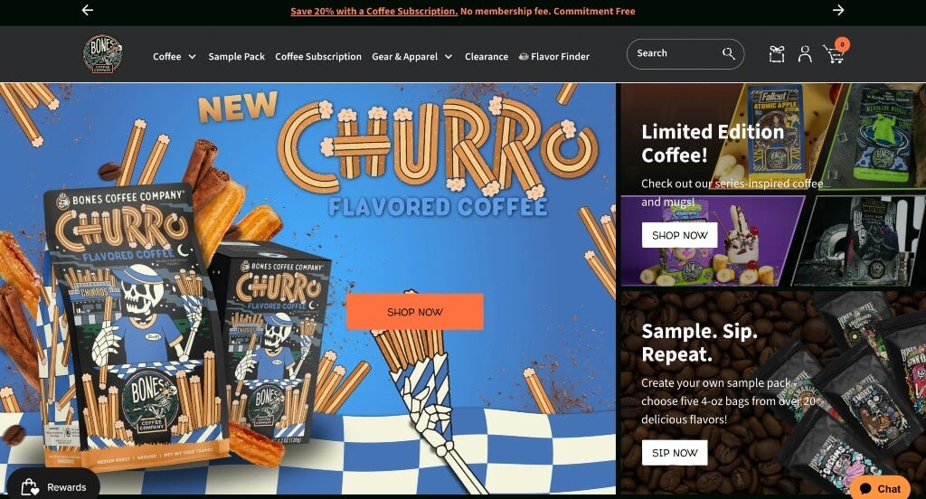
This dark color scheme was something that we noticed right away because it feels slightly more luxurious. Along with that, we appreciated how their product packaging is clearly displayed to create a brand identity. Showing a variety of publications that these products are featured in was a great way to promote their coffee.
24. Blue Bottle Coffee
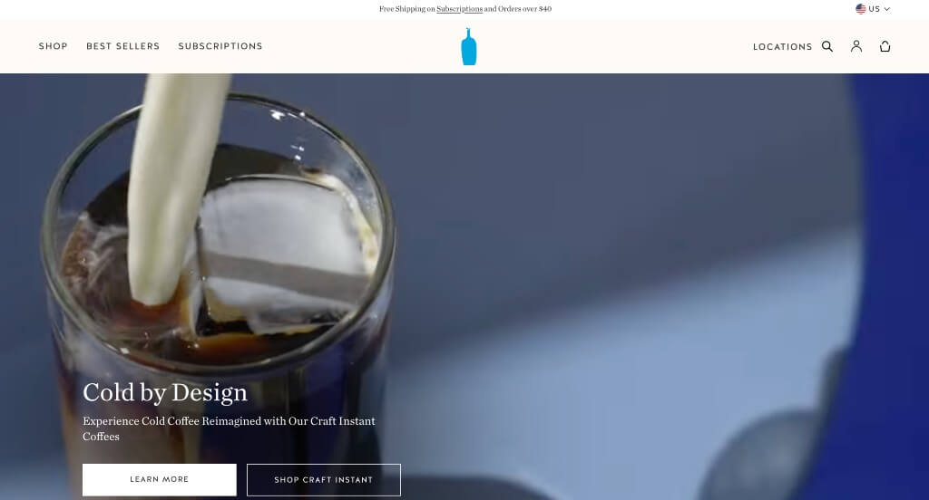
Here we loved how there was a video that introduces this company and their products. Their logo was simple and extremely logical which was a great way to identify their business. Featuring their best sellers in one area was sure to grab attention and get shoppers started was a nice touch. Small icons were also a great idea for this example.
25. The Missing Bean
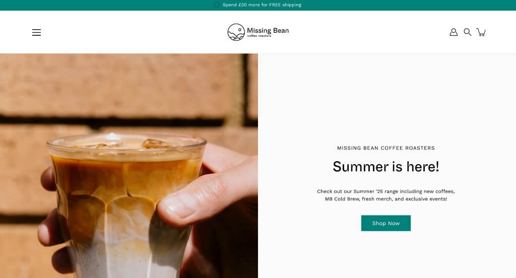
Missing Bean has a gorgeous color palette for their webpage that matches their logo and packaging. Reusing their logo in images throughout this example was something else we found helpful. Making sure to use creative fonts was a nice choice too.
26. Madcap Coffee
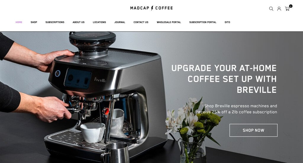
This example did a nice job with their simple color scheme that allows their bright colors to stand out more. This navigation bar is well organized in order to make information easy to find. Using images to provide links towards additional content was another great idea. Their font choice was simple yet unique, helping them to stand out more.
27. Single O
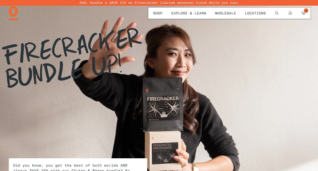
Likely the most impactful part about Single O was their packaging that really helped them stand out. Additionally, they did an amazing job with their inventive fonts seen throughout their pages. Using bursts of orange throughout (and in images) was helpful because it highlighted specific content.
28. Felix Roasting Co.
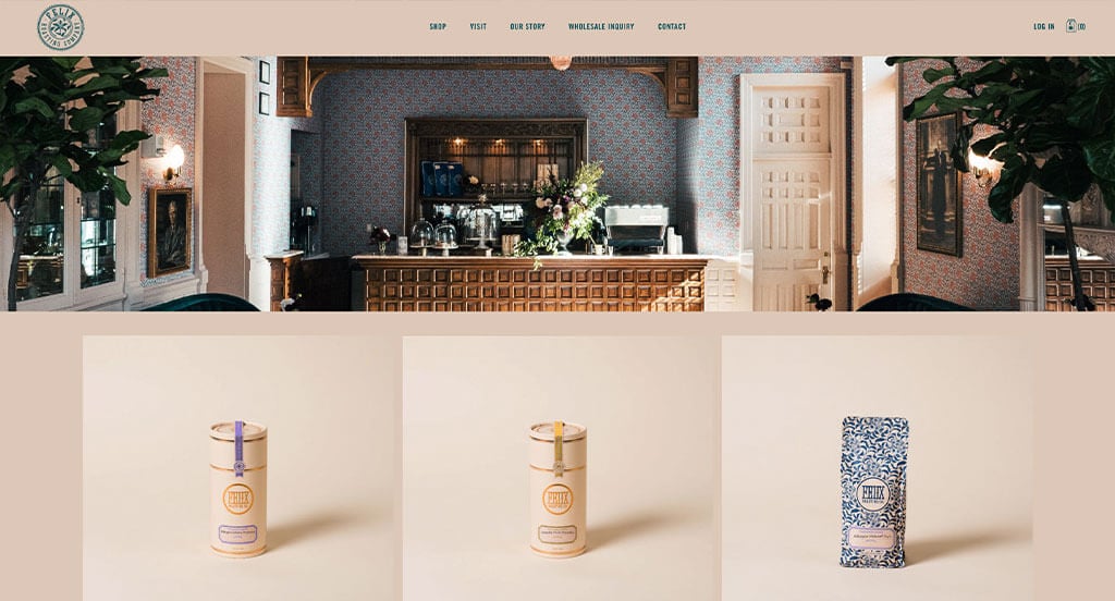
After scrolling past this header, you’ll immediately notice their clearly labeled pricing. Their products and images make this company feel luxurious, attracted customers looking for something special. This logo was thoughtful and was a stunning color.
29. Goodboybob Coffee Roasters
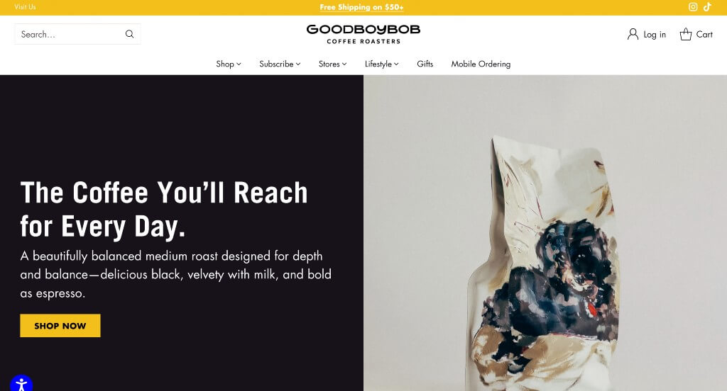
Simplicity shines in each area of this example. Goodboybob Coffee Roasters does well with their professional fonts. Small graphics in the form of icons was another smart addition. A navigation bar that uses images was nice because it felt more unique than just text.
Related: Rank your coffee roasting business in Google with the help of an SEO agency.
30. Conscious Cup Coffee Roasters
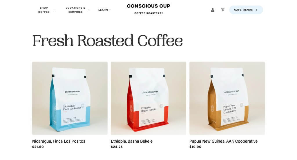
Here’s an example that balanced white space well to create a more appealing design. Their fonts are bold and professional which looks great in this modern looking website. Overlapping images and using rounded image frames was another thing that we really liked. Paragraphs were organized into short forms which made people more likely to read all their content and stay engaged.
31. Metropolis Coffee
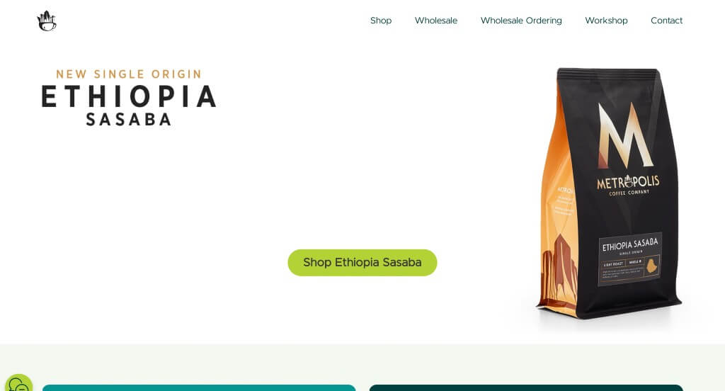
In this one, we liked how they wanted to show off their product packaging because it is a big part of their brand. Having a section of their company that is targeted towards businesses as they sell products wholesale. Adding in blog posts was a great way to keep people connected to their business and additional information.
32. Foxy Loxy Cafe
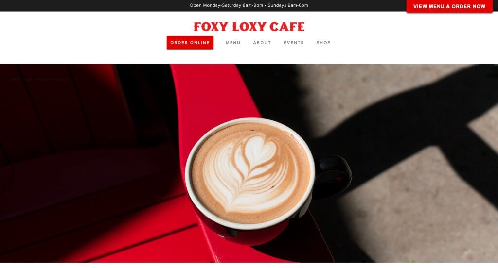
Bright accents of red can be noticed in images, text, and buttons to help certain parts stand out. Including images of their cafe, products, and more was a great choice. Another quality in this professional webpage we enjoyed was their creative menu.
33. The Pinery Coffee Co
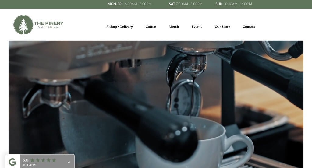
Here we have another example that uses automatically playing videos to introduce their brand, and their location. Having a cause of the month that helps build up the community in their area was another thing we appreciated. We liked how their images and text were well placed within the page to balance the white space carefully.
34. The WestBean Coffee Roasters
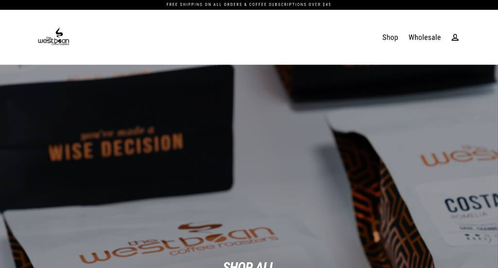
There was a few different colors used for their background, which we liked because it created an engaging look. We appreciated how this cafe stacked some of their images in order to make a template that is well balanced. Short paragraphs was another nice choice making it easy to read and keep reading content.
35. Joffery’s Coffee & Tea Company
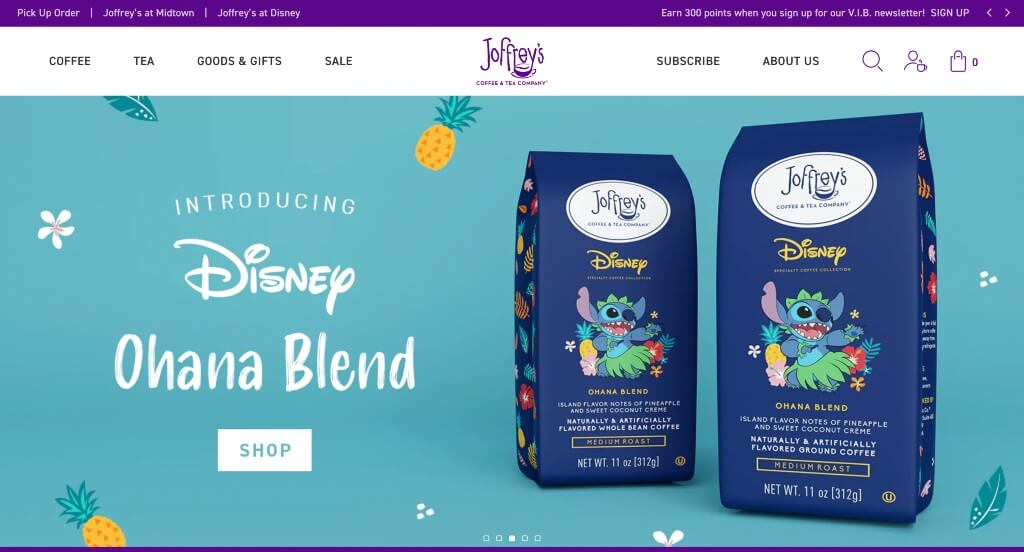
This company did a great job with their slider that shows new and unique products that they are currently selling. Cute dashed graphics and coffee beans highlight information and images within their content for a stunning template. Showing different company’s that they’ve been featured in was another good idea to build trust.
36. Souvenir Coffee
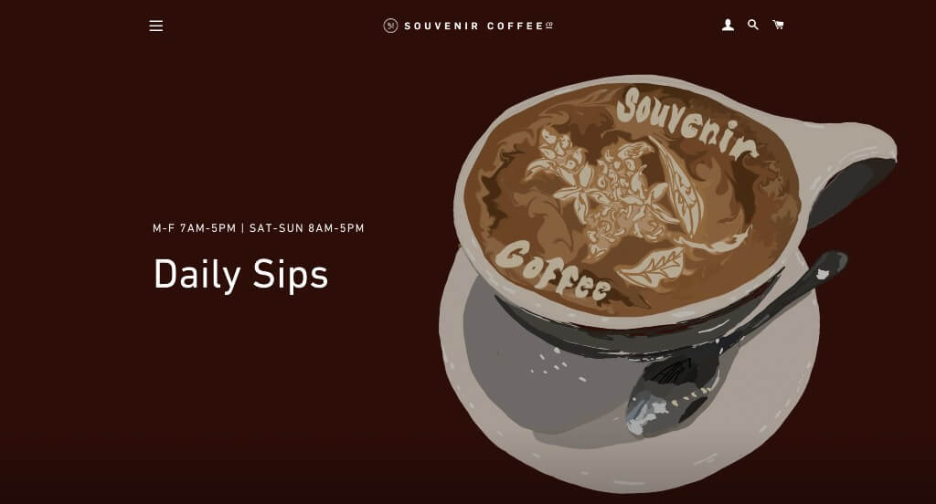
A hero header is the first thing that viewers will notice, and they’ll love it. Having bold font for titles and delicate ones for paragraphs. This company does a great job with putting their inventive packages on display. Souvenir Coffee had ease of use in mind when adding in an informational blog.
37. Onyx Coffee Lab
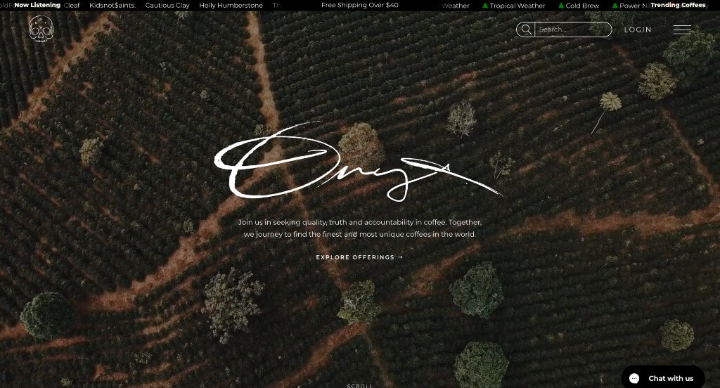
This was an outstanding example to get inspiration from because of their interesting visuals. Onyx Coffee Lab also does a very good job with their customized fonts that feels more personal to their viewers. Paragraphs found within this website are short and straightforward which is nice so customers aren’t overwhelmed by content.
38. The Boy & The Bear Coffee Roasters
Using an automatically playing video that was noticed right away was smart. A mixture of graphics and packaging images was not only helpful but stunning. Their simplistic look for everything helped them seem more unique and appeal to their audience more.
39. Theory Coffee Roasters
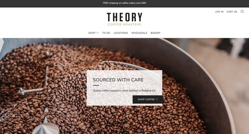
Here we have a slider with large images that shows off what is important to this company. We loved how their template is organized because it is logical and easy to read through. Their accents of gold was another thing that we really appreciated because it highlighted some information. Showing star reviews for each product was something else that we really liked.
40. Summer Moon Coffee
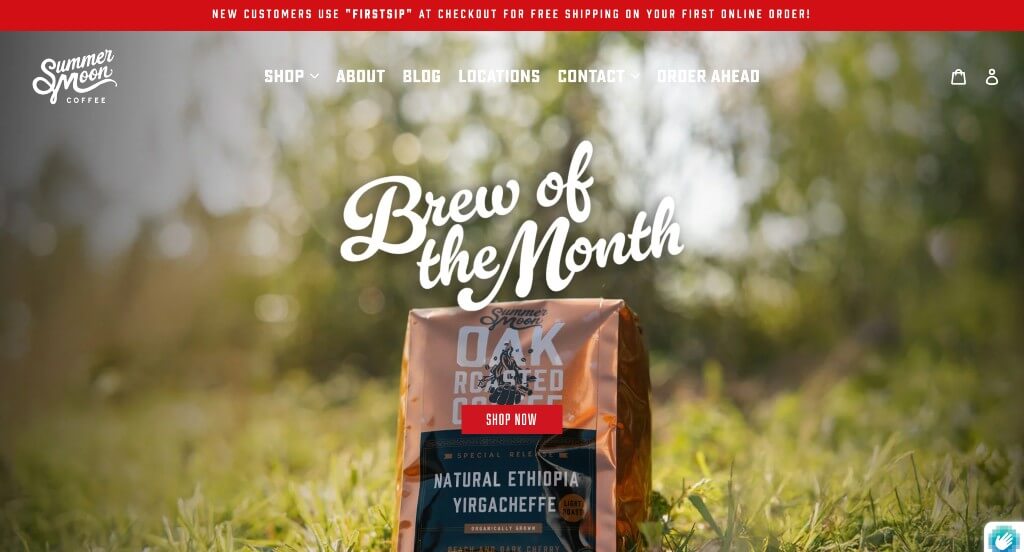
Managing to include their logo in a variety of different areas was extremely helpful. Bold fonts are used in lots of areas to stick to a stunning look. Showing off their locations is smart, and is always appreciated. They also had a well labeled navigation bar which is extremely nice for those looking for more information.
41. Equator Coffees
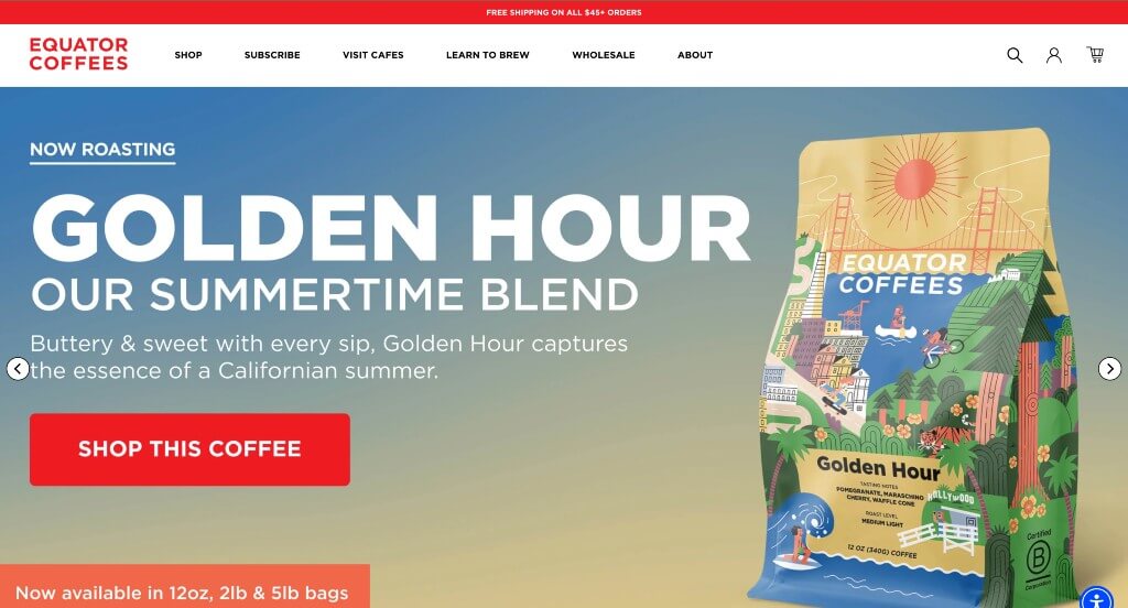
We appreciated how this example made a good use of bright reds to give off an energetic feeling. Adding in customer reviews right to their homepage was another thing that we liked about this example. Including their logo design in many different areas throughout their webpage was another thing that we really enjoyed.
42. The Local Restaurant & Cafe
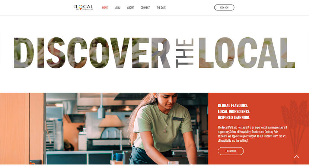
One of our favorite things about The Local Restaurant & Cafe was their use of a location pin within their name. Content was logically organized, which is a feature that is always helpful to include. Using graphics within backgrounds of their pages created a more interesting look.
43. Knowledge Perk Coffee Company
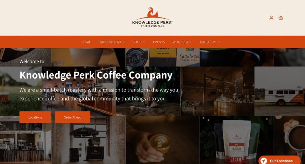
We loved how this example blended bright orange with a deep green in order to create something outstanding. Creating a collage of images for their hero header was something else we noticed. Including a map right into their website that helps people find locations near them was a nice choice. Adding in customer reviews was another way to see that they are a well loved company.
44. Campos Coffee
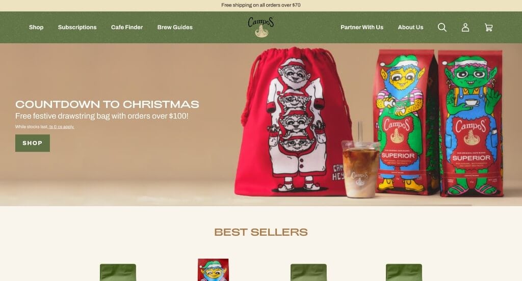
A filter seems to be placed over many of this images to create a more homey feel throughout their entire webpage. Campos Coffee had a relaxing logo that also symbolized their product, which is brilliant. Displaying their product packaging so when it arrives at their door, people know what it is.
45. Cafe Umbria
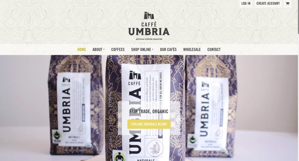
Within this example, striking graphics are for sure their best aspect. Using intricate patterns as an accent for their backgrounds was beautiful. Short paragraphs about each blend was another thing that proved to be helpful. Including shipping rates based on your location (in their footer) was another thing that we noticed.
46. ReAnimator Coffee Roasters
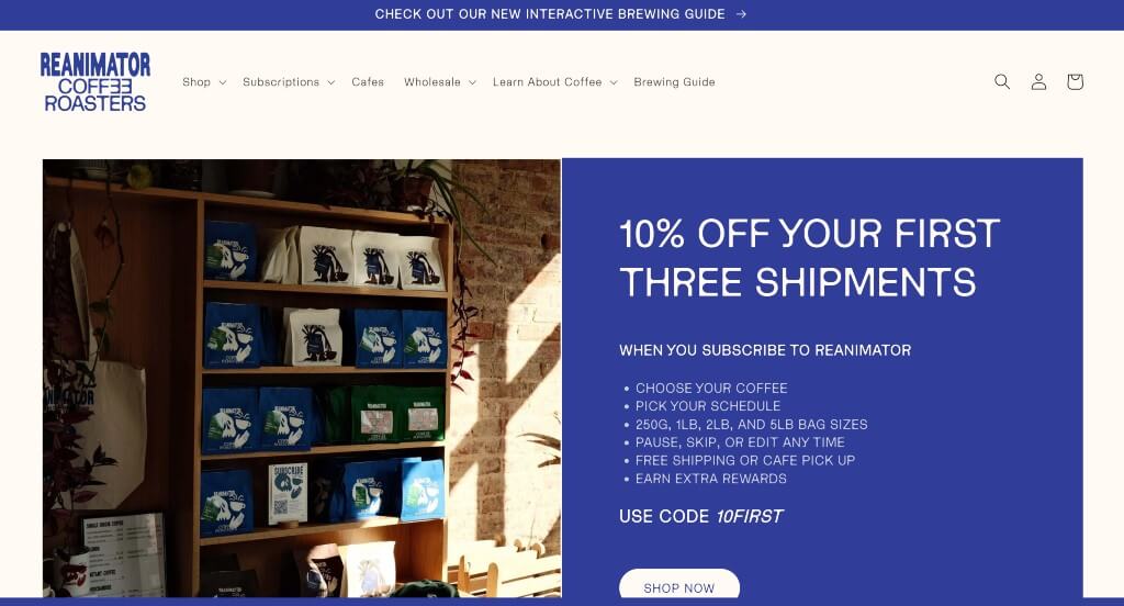
Bright blue colors were used in this example to create an outstanding template that anyone could love. Using a creative font was another thing that stood out to us. Adding in bullet points to keep content simple and easy to read was something else that we noticed. We loved their large buttons that help people add products to their cart quickly and efficiently.
47. Little Collins
Adding in a stunning accent color within this entire website was attribute our team liked. After scrolling for a bit, you’ll notice their adorable mascot. Subtle animations used throughout breathe live into their pages, and make them stand our as a company.
48. Hilltop Coffee & Kitchen
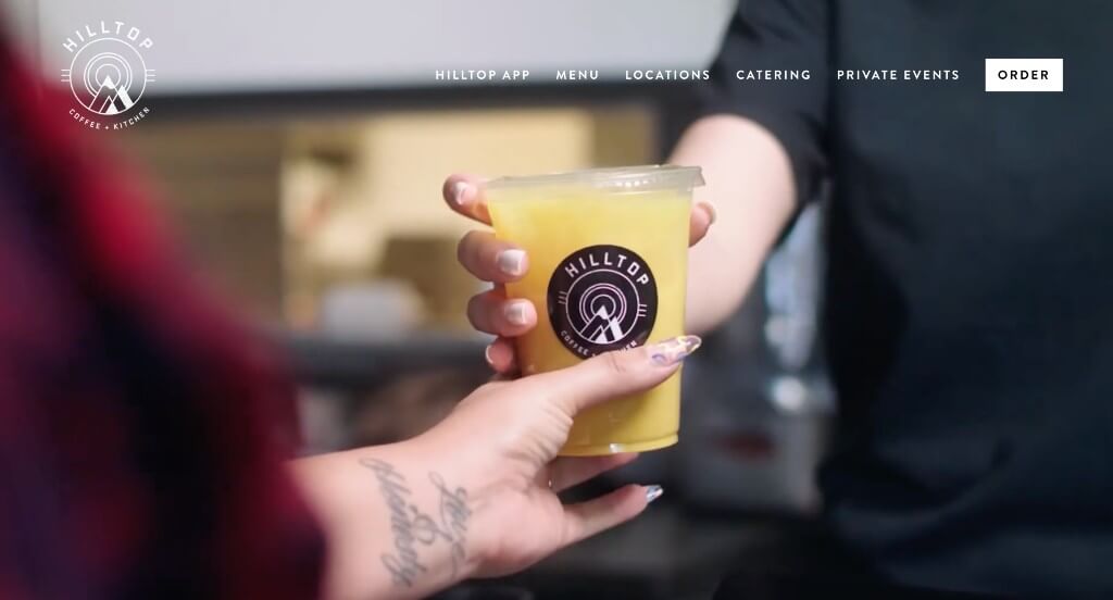
A careful mix of a stunning logo and a fun font were choices that were well loved. Showing off their logo in multiple areas helped to build up their brand identity too. Reusing similar graphics, like the swirls or confetti in their images allowed for a sense of unity.
49. Lucky Goat Coffee
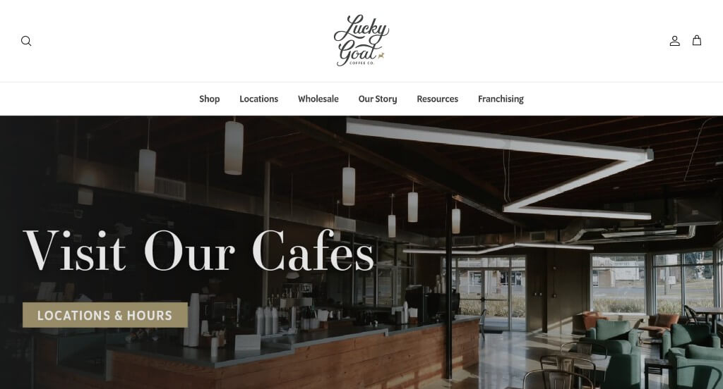
The chosen colors for this company makes it obvious what their company sells. Something refreshing and reminding us of nature. Labeled pricing was nice so that viewers didn’t have to search around to see how much they’ll be spending. Adding in buttons for simple navigation was also nice.
50. Alpha Coffee
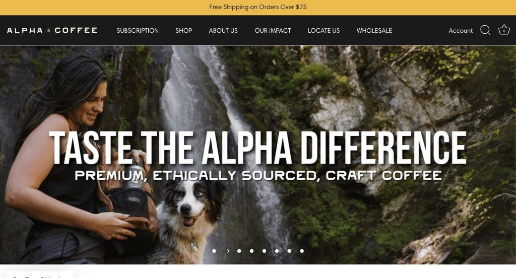
We really appreciated how this example highlighted a variety of stories through their Grounds for Good Series. Having little banners on each product image to show their level of roast was a nice touch. We also liked how customer reviews were included right in the homepage. Large fonts was another great choice for this professional example.
WordPress Coffee Themes
You can find free themes at wordpress.org, or explore coffee-inspired templates on ThemeForest.
Amaya – Themeforest
$79
Corretto – Themeforest
$69
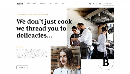
Bouffe – Themeforest
$59
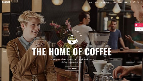
Barista – Themeforest
$79
WooCommerce Coffee Themes
You’ll find numerous ecommerce coffee themes for WooCommerce on ThemeForest.
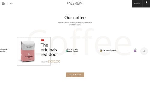
Larcorso – Themeforest
$110
Bakerfresh – Themeforest
$59
Shopify Coffee Themes
You can find free and paid themes at themes.shopify.com, or explore options through marketplaces like ThemeForest.
Coffee – Themeforest
$29
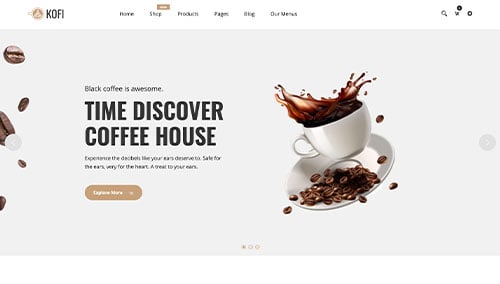
Kofi – Themeforest
$39