Are you ready to boost online presence and attract more clients just from your webpage? Our guide with some of the best examples is right here to serve as inspiration.
We’ve handpicked sites based on design, functionality, and user experience. From sleek visuals to easy navigation, these will set a high standard in consulting.
Find inspiration and tips to help your business stand out. This list features examples from management, IT, financial, HR, and marketing consulting firms. For more, check out another article filled with our favorites!
Top Consulting Company Website Designs
- 1. Science of People
- 2. Bridge Investment Group
- 3. Nigel Green
- 4. Navigate
- 5. Dana James Mwangi
- 6. Harpar Grace International
- 7. AHEAD
- 8. Fresh Consulting
- 9. Grand Studio
- 10. Tastefully Tash
- 11. Kesslers
- 12. Echelon Front
- 13. Cognizant
- 14. Kea Consultants
- 15. Frankie Noller
- 16. HeronCode
- 17. Launchpad
- 18. Frog Design
- 19. Dierks + Company
- 20. Apexon
- 21. BCC Consulting
- 22. EVP Consulting
- 23. FourFold Consulting
- 24. Path For Growth
- 25. Laurie Ruettimann
- 26. Accenture
- 27. Epic Teams
- 28. AIM Consulting
- 29. Deloitte Digital
- 30. SBTI
- 31. Fabian Roschig
- 32. Implement Consulting Group
- 33. Bell Lap Advisors
- 34. CitrusAd
- 35. Kearney
- 36. Bain & Company
- 37. TinySeed
- 38. Susan David
- 39. Cities Reimagined
- 40. Sharif Walker
- 41. Media Club
- 42. Adkisson Search Consultants
- 43. Jeff Gothelf
- 44. Field Work
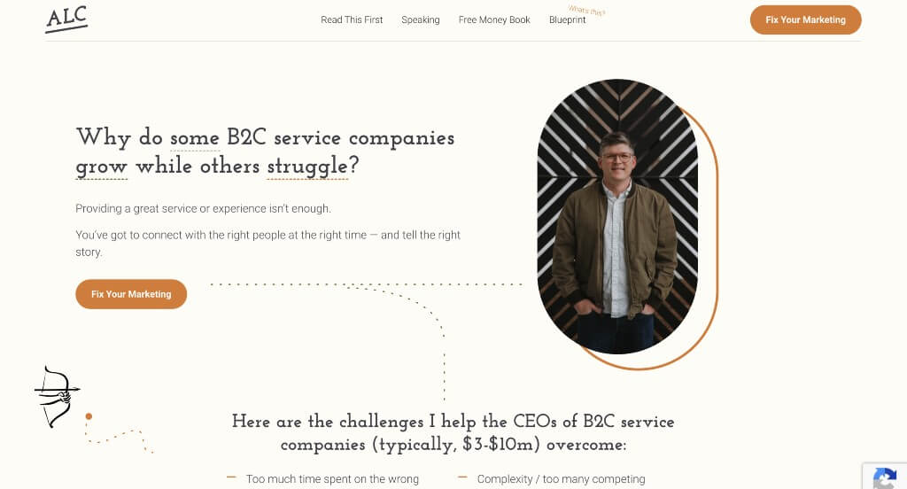
- 45. Austin L. Church
- 46. Hypefin
- 47. VanRein Compliance
- 48. Nylon Consulting
- 49. Jamie R. Cox
- 50. Analytics8
1. Science of People
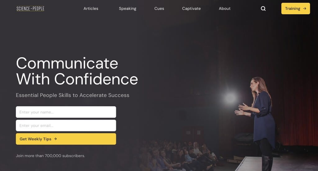
Science of People has a very classy feel to it, thanks to its use of white, gray, black and yellow. We thought it was nice to include lots of linking text, images and buttons to allow for visitors to navigate better. It was smart how they included small little gray tabs showing categories for each blog article. Another feature that we noticed was how their image backgrounds were customized to allow for a cohesive look.
2. Bridge Investment Group
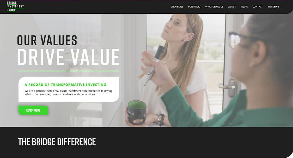
Right away, we can notice how there is an automatically playing video that helps to introduce the phrase “Our Values Drive Value.” After scrolling, you’ll immediately notice their use of rounded corners for images to help them stand out more. We liked how there was an area that shows their success by numbers. Another design quality they picked well was we their professional text choice.
3. Nigel Green
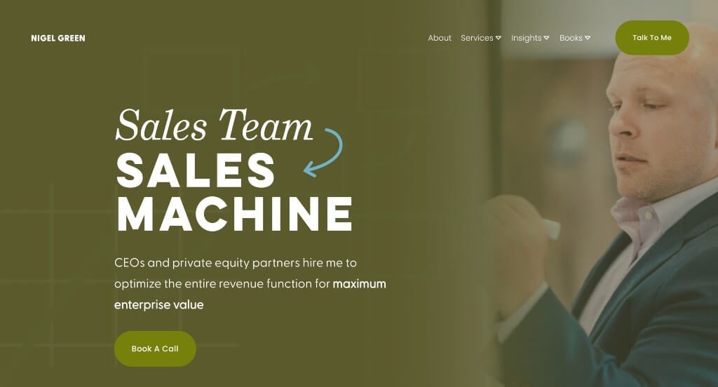
Likely our favorite part about Nigel Green would be their use of graphics in many areas. Their muted color palette not only looked sharp, but it was very different from their competitors. We also thought it was thoughtful to include little arrows to show where certain information is. They also used lots of buttons which helped with their navigation.
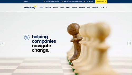
4. Navigate
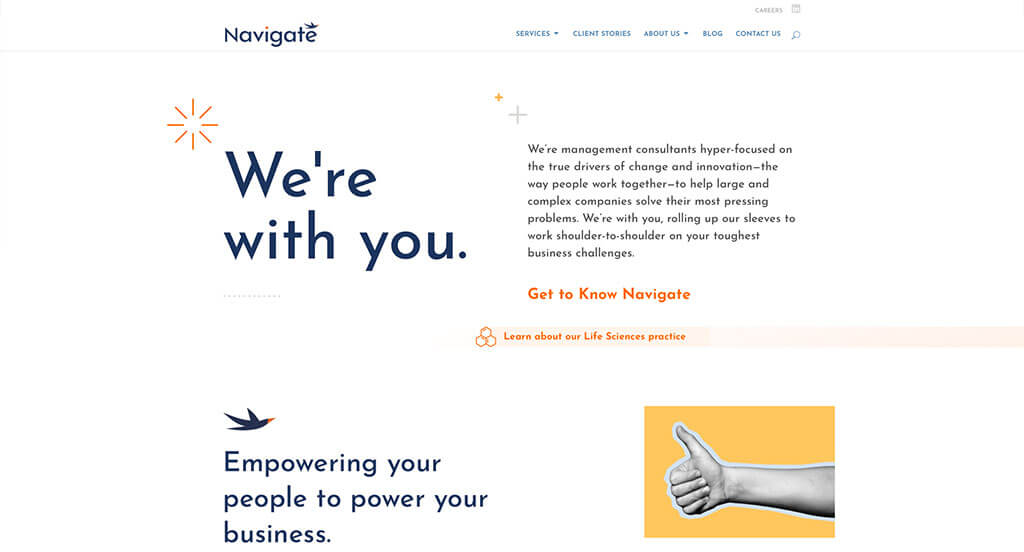
Navigate was a very unique layout with creative graphics. Additionally, their images are customized to look artsy and bright. They have a well established balance of white space, making it very easy to navigate and read through their content. Many different sizes of text is used in order to create importance in certain phrases. Including subtle animations was another thoughtful feature we enjoyed.
5. Dana James Mwangi
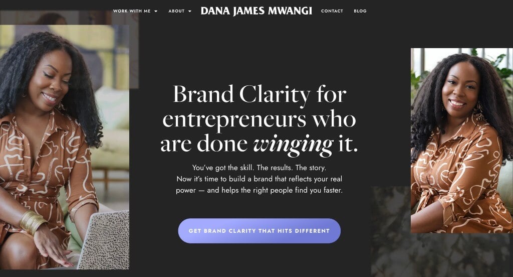
This was a great example that used stunning accents of green and purple among their black and white backgrounds. Having lots of images was definitely very impactful and creating a more visually pleasing look. We liked how many of those images have been edited to match the overall aesthetic. Using bullet points to help organize some of their information was also very nice.
6. Harpar Grace International
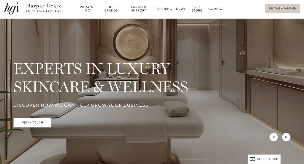
Although this example was fairly simple, we loved how professional all these fonts were. Everything was formatted into short paragraphs in order to make content easier to comprehend. We loved how their products are displayed in stunning images in order to excite customers. Their navigation bar is extremely well organized, making it very easy to find content that viewers are looking for.
7. AHEAD

We loved how there was accents of dark blue in order to highlight certain information. Short paragraphs, organized carefully was something that was extremely helpful. There was also lots of buttons to help move people through all of their information. We liked how there are rounded lines in many areas, to keep everything looking great. A search bar was another great inclusion that we absolutely loved.
8. Fresh Consulting
We loved how there was bright green accents on black and white backgrounds to create something outstanding. A simple logo was used to help create an innovative feel. Using a variety of text, photos and videos was another reason why we included Fresh Consulting in our list. We thought it was interesting to have unique hover animations on these buttons, to grab attention.
9. Grand Studio
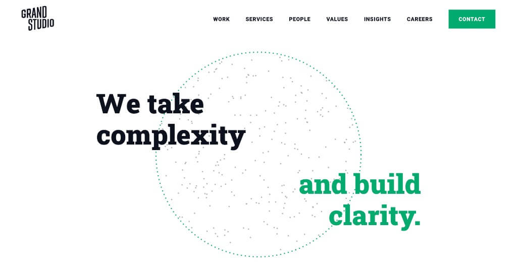
One of the things that we really loved about this example was their accents of green that are sure to highlight important phrases, information and links. We liked their use of simple background patterns that look amazing. Along with all of that, we really enjoyed how these paragraphs were kept short making it easier to read through the information.
10. Tastefully Tash
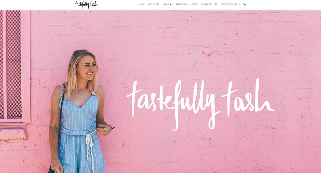
Tastefully Tash used a captivating font to feel more personal and creative. Making sure to edit their images with dried flowers, tape and filters in order to add to their aesthetic was perfect. They also included images as backgrounds to allow for a more interesting look. Their pink buttons was another perfect addition that we noticed.
11. Kesslers
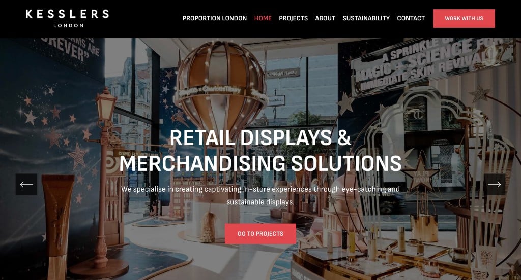
We really liked how there was lots of examples of past projects to get possible customers more excited. Showing companies that they proudly work with was also a good choice. Incorporating social media was another impactful feature that helps them stay connected. Their font choice was amazing, standing out from others. Their use of patterned backgrounds was something else that we liked.
12. Echelon Front
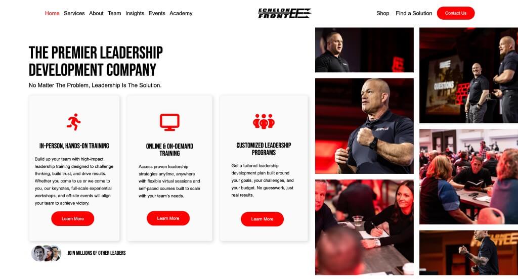
Instantly, we noticed this logo that explores not only the initials of their brand, but also an interesting graphic. Many of their images use filters to make everything more cohesive. Their red accents help to organize and break up information in a good way. We liked how their images alternated from right to left to make a more appealing arrangement.
Related: A full blown digital marketing strategy can help your consulting business grow.
13. Cognizant
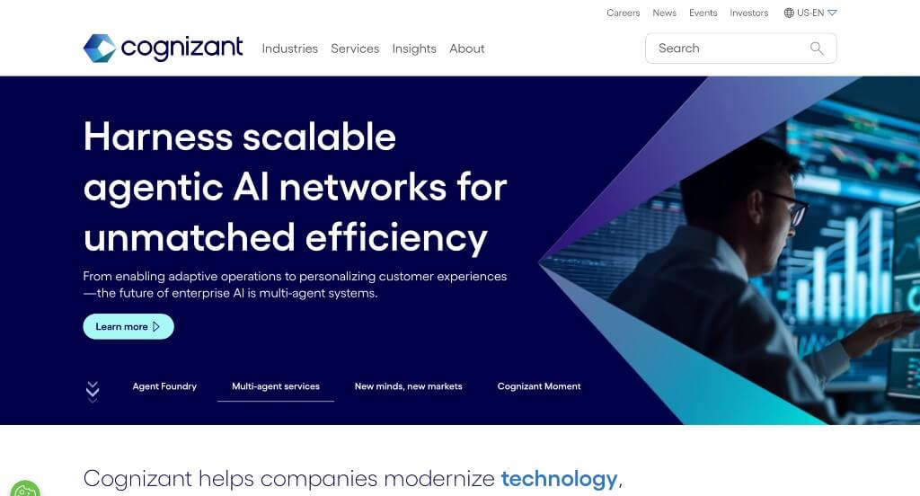
A relaxing combinations of blue colors are used in this webpage (even in their images). There was lots of short paragraphs with brightly colored titles, which we loved. Making sure to include case studies was definitely a very impactful quality for Cognizant. Having a search bar to make it easy to find specific information was very helpful.
14. Kea Consultants
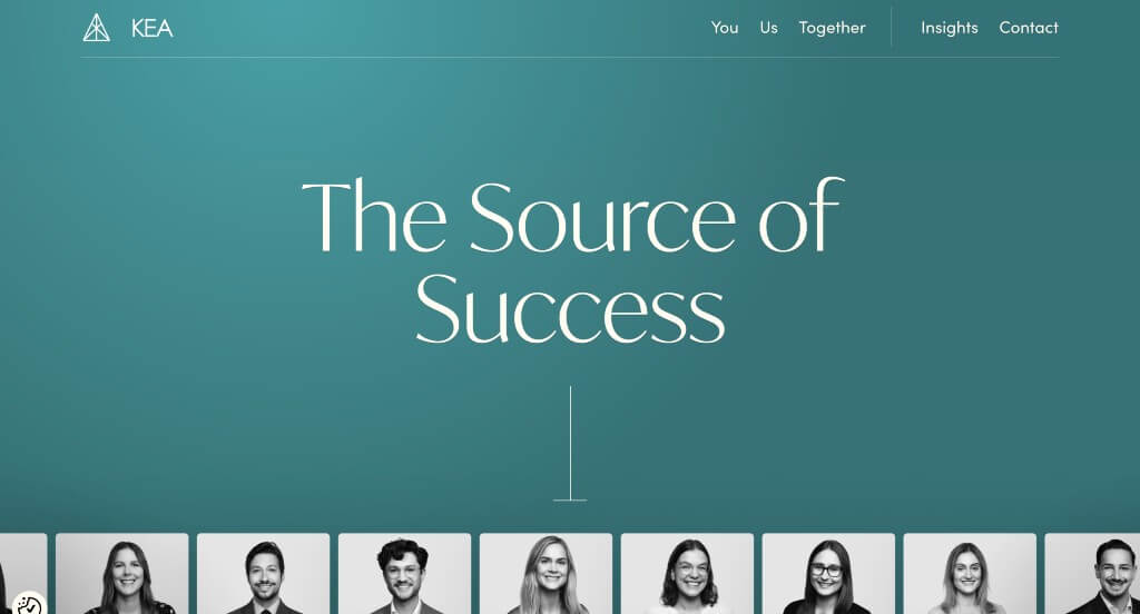
Right away, we loved how this company uses a scrolling animation to show a variety of people involved in their company. There is a very classy feel to this one, thanks to its blended use of teal, black and white. We thought their logo was very simple but also unique. Another thoughtful aspect is how this template was free of distractions.
15. Frankie Noller
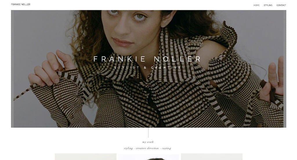
These images were not only high quality, but they also displayed their products uniquely, helping them stand out. Including a feature to “heart” products, saving them for later was a great choice. We also thought it was nice that they used lots of different styles in order to attract a variety of customers. Their domain was also very simple, making it pretty easy to find them.
16. HeronCode
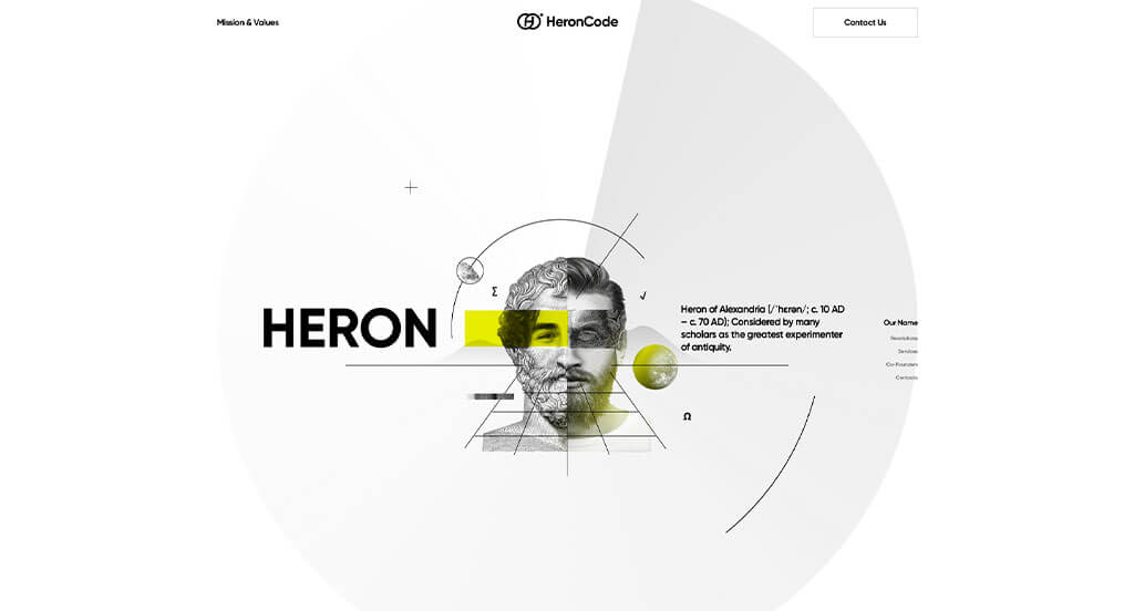
Right away, we loved how this example had an interesting animation that introduced their logo. Upon entering their site, we loved how their transitions help create unity using similar graphics and animations. Having a simplified timeline was another aspect we really liked. We loved their flow of content, making it easy to comprehend everything.
17. Launchpad
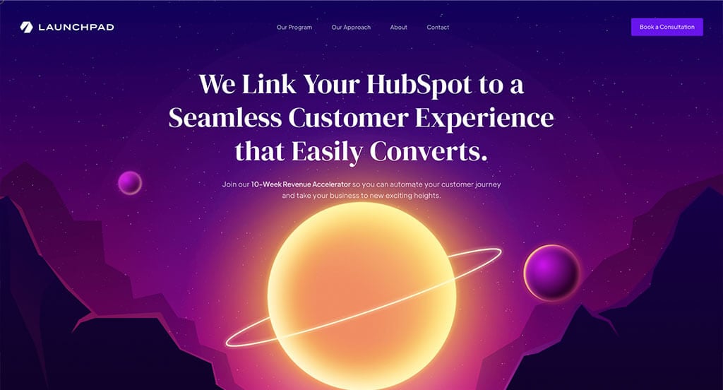
Launchpad has an artistic feel, thanks to its use of black, white, pink, purple and blue. We loved how their graphics matched well with the aesthetic of their pages. Using buttons to enhance usability was an impactful feature, as always. It was cool how a lot of their title texts are outlined and almost hidden into the background to create a more interesting feel.
18. Frog Design
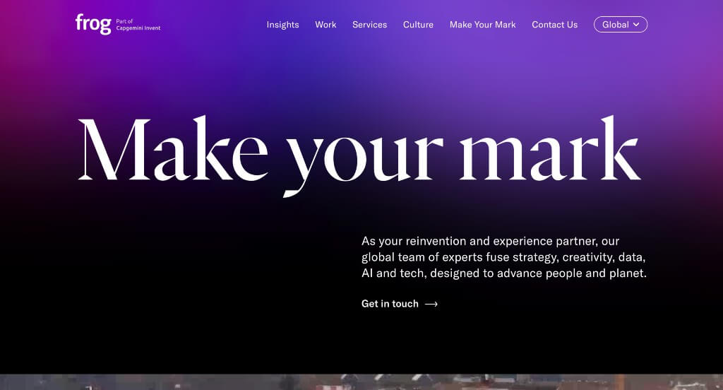
Here we have an example that occasionally uses large images to help break up their information. Including images and a short bio on their team members was a great way to make people feel more comfortable with this business. We liked their dark colored backgrounds that are used throughout the entire website that creates a more luxurious feeling.
19. Dierks + Company
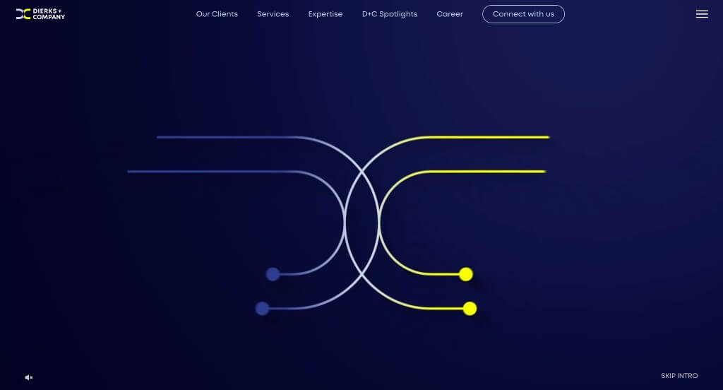
We really loved how there was graphics that became animated upon the center line coming in contact with them. Including bright accent colors was something else that grabbed out attention for sure. Some other graphics served as icons to connect visuals to written content. Simple navigation was another thing that was well done in Dierks + Company’s site.
20. Apexon
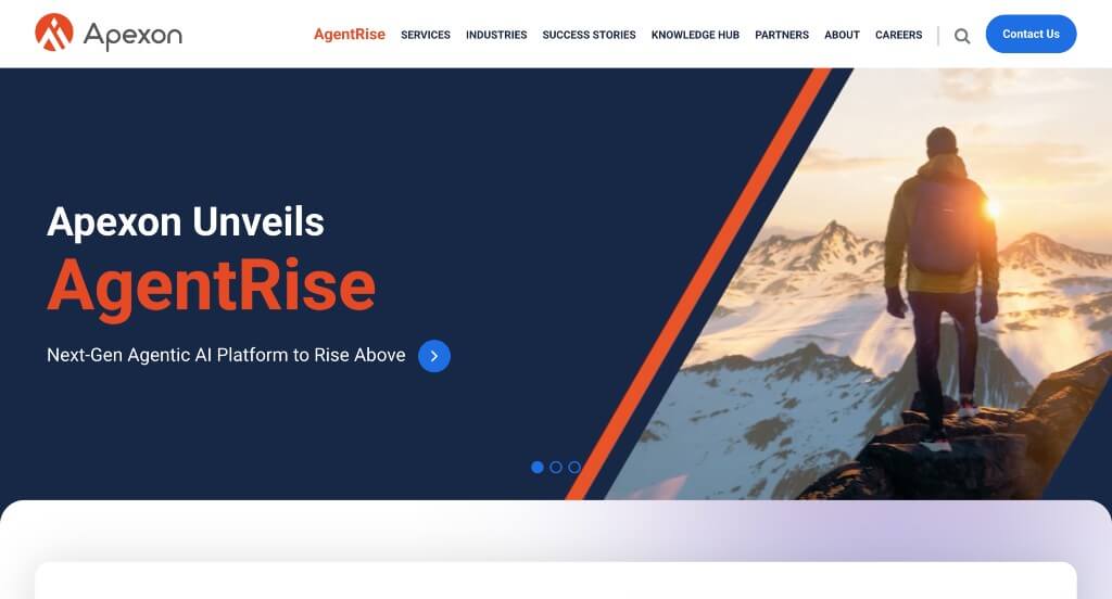
This example was beautiful especially because of their accents of bright orange against their typical dark blue colors. We thought this logo was very unique and was repeated throughout the website which helped improve brand identity. Keeping paragraphs short was another thing that we appreciated because it made it easier for customers to stay engaged.
21. BCC Consulting
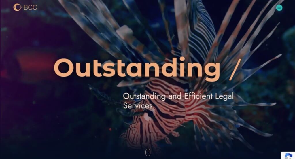
This was certainly one of our most favorites, because of their contrast in background and title colors. We loved that they reused their logo as a photo frame. Additionally, they used lots of amazing images for backgrounds and accents for their template. Showing that they’ve been in good standing for 18 years builds a sense of trust. Videos are also used to attract viewers.
22. EVP Consulting
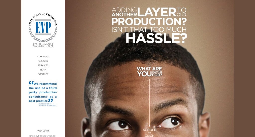
We loved how text was displayed in a way that grabs our attention. We thought their logo was smart because it creates a prestigious feeling. Bright colors with graphics were also used interestingly in order to create a stunning look. Their domain was simple, and easy for customers to revisit if they wish. Using icons to show customers progression through their content was another perfect idea.
23. FourFold Consulting
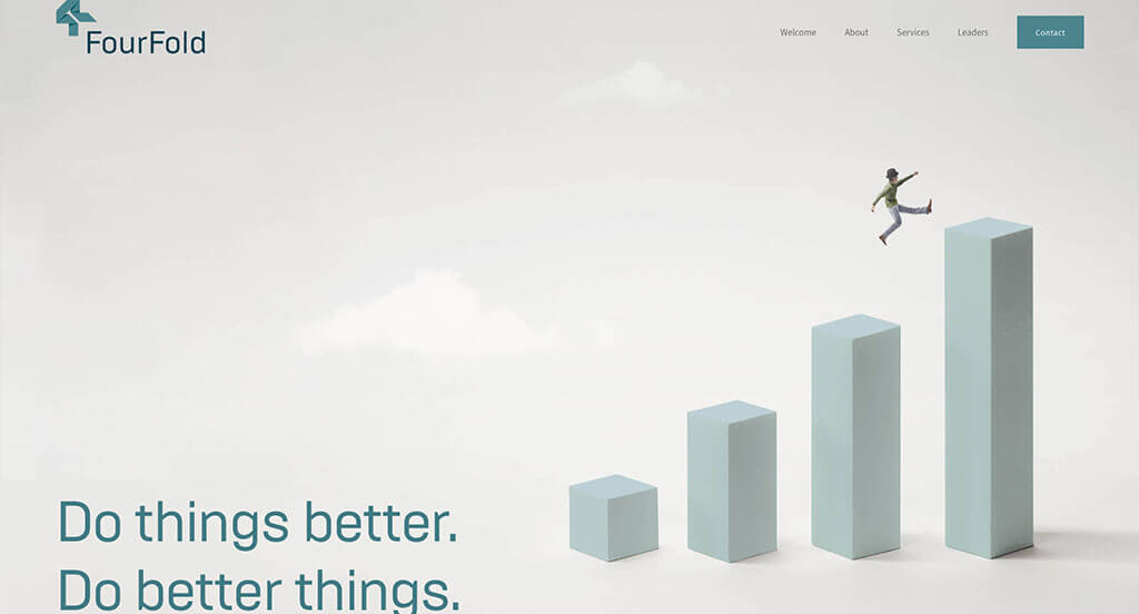
We noticed these images right away because they are very unique and still are related, maintaining a feeling of unity throughout these pages. Their accent of blues in both images and content was stunning. Additionally, we loved how their logo appeared to be folded ribbon to create a 4. There was also a great balance of white space, making everything feel less overwhelming.
24. Path For Growth
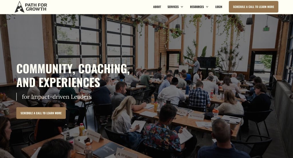
This example used bold fonts for their titles that made their information easy to access. We loved their logo because it signified that there is beauty in growth, which seems to be what they are going for. Using buttons to guide people towards additional content was another thing that we appreciated. Adding in lots of customer reviews from a variety of different companies was another smart idea.
25. Laurie Ruettimann
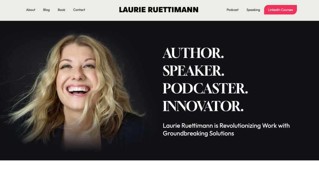
Laurie Ruettimann was extremely professional looking because of how they organized content. We love how they used buttons for simple navigation. Adding in alternating color blocks was another reason we included them in our list of favorites. Another thing that we really liked was their use of short paragraphs that helps to break up the content so that it’s easier to digest.
26. Accenture
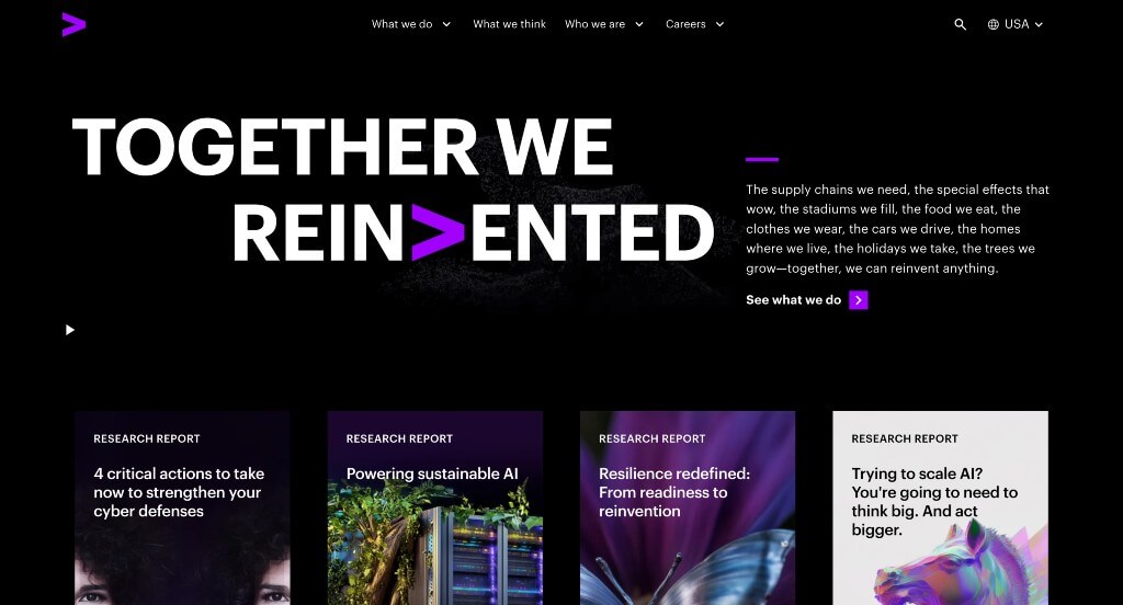
Accenture carefully embraced using a bright purple color to accent everything, which we absolutely loved. Having a black background helped to create an almost luxurious and mysterious feel. Their interesting hover animation to turn images into written content was another thing that we loved. Including different sized fonts to create a statement was nice to create a great visual hierarchy.
27. Epic Teams
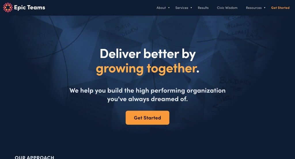
There was many alluring elements about this example. Almost right away, this company’s use of small graphics grabbed our attention. Everything was logically placed in order to keep readers engaged. Having bright accent colors placed on a dark background was refreshing. Epic Teams also had a unique logo that they chose to reuse in a few different places.
28. AIM Consulting
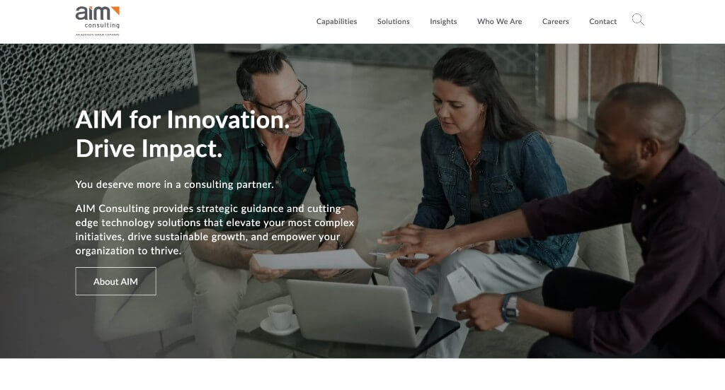
One of our favorite parts about AIM Consulting was their interesting photo frames that continue to grab our attention. There was also a sliding display showing off companies that use their services. We felt it was helpful for readers how they used bullet points for better organization. Lots of buttons were also used, and easily accessible, which we found helpful.
29. Deloitte Digital
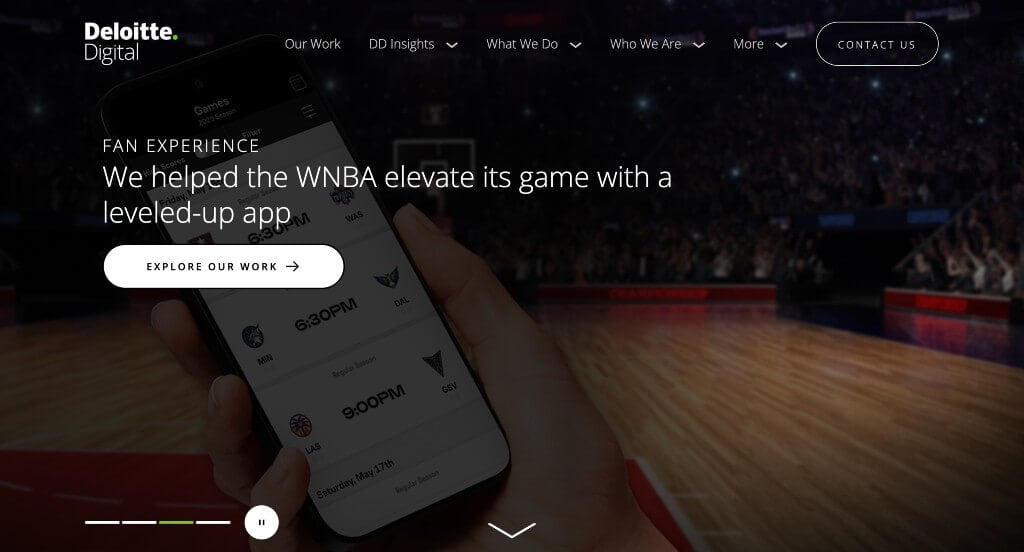
This was a modern template that anyone could appreciate because it was clean and simple. We liked how there was lots of links to guide viewers towards additional information within their site. Using stunning fonts throughout the entire template was another professional choice within this example. Another thing that we liked was their domain that matched with their brand name.
30. SBTI
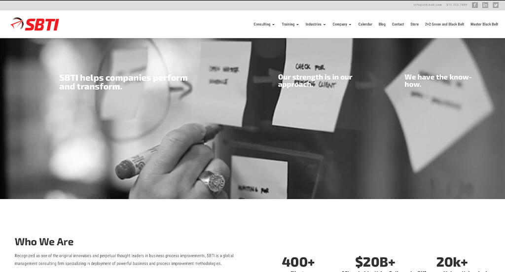
A bright red accent grabbed our attention right away, especially because this company uses a black and white color scheme for everything else. They also had a very simplistic layout, making it feel more calming. Interesting fonts were a great choice that helps them stand out a little more. Including a blog with a variety of information was something that we really enjoyed because it’s another way to get information out to viewers.
31. Fabian Roschig
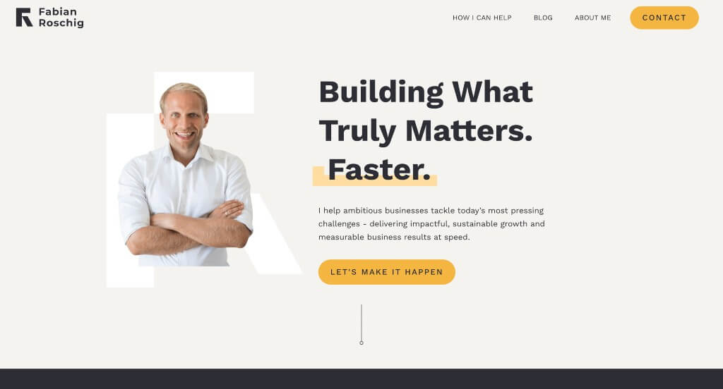
The organization and visuals in this example paired perfectly together. We liked how small arrows help to guide people through this information. Additionally, we felt it was a great idea to include customer reviews. Using professional and insightful font was refreshing too. It was nice to include a bio for the owner including his credentials.
32. Implement Consulting Group
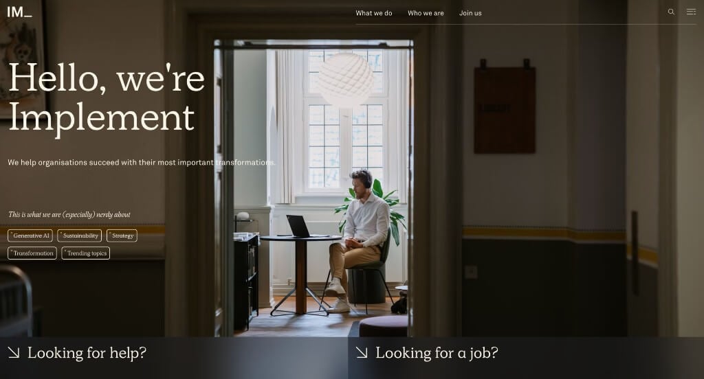
Implement Consulting Group reminds us about the importance of high-quality, large images. They also make use of a well organized menu for better navigation. Another quality we loved was their classic and professional font choices. Their color palette was also very simplistic, which seems to match with their business practice and overall design for this site.
33. Bell Lap Advisors
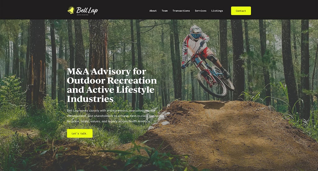
Here’s a creative example for a consultant looking to build their next website. We loved how small patterns are used within these backgrounds to help create stunning visuals. We also liked how they used a variety of ways to include images. Another thoughtful feature was their neon green accent color. Bell Lap Advisors also were smart to make their domain match their business name.
34. CitrusAd
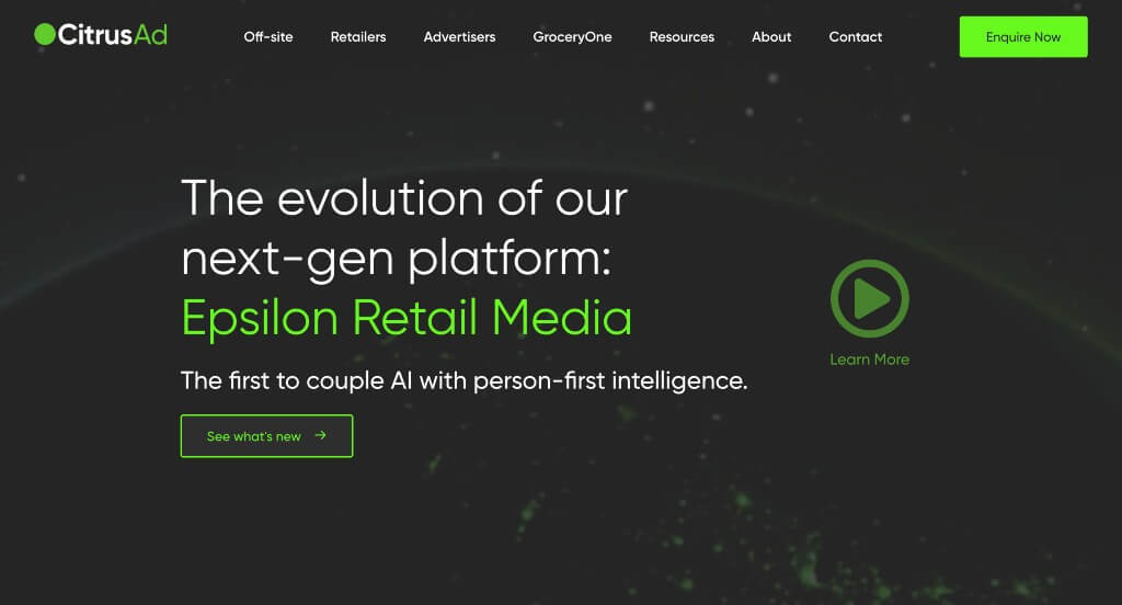
We enjoyed how gray, white and neon green colors created an energetic feel right away. CitrusAd did a good job using small icons to create something a little more visually appealing. We thought it was cool how they included statistics to prove their to prove their worth. All their content was written well and in short paragraphs, something that is always helpful.
Related: Skyrocket your position in search results with SEO services focused on helping consulting firms grow online.
35. Kearney
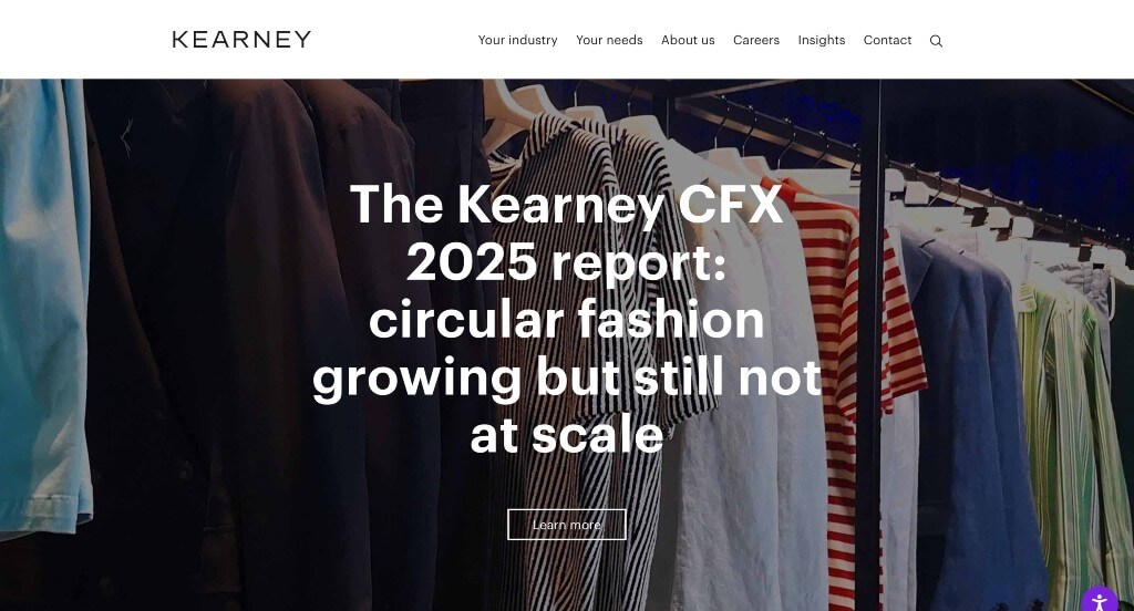
Small accents of purple looked great here, and we encourage others to take advantage of small accents. Utilizing a staggered layout was an impactful quality that we loved. Having individual categories within their menu was a nice touch. Kearney had simple contact information too, which made sure that customers could easily get in contact with them if they wished.
36. Bain & Company
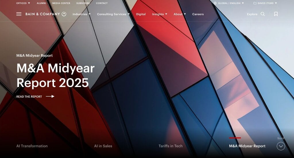
We thought it was awesome that they mixed images and videos to create a stunning look. Another interesting idea was their two question survey that helps customers find steps that could be useful for them. Drop downs are used within their navigation bar in order to keep everything nice and clean. A search bar was another thing we felt was useful.
37. TinySeed
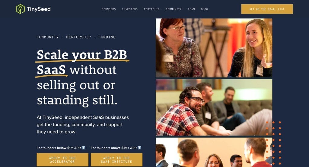
Our most favorite part about TinySeed was their interesting logo design that ties nature into their site. Reusing that logo along with other small graphics and icons was another great choice. We also felt that it was smart to add in customer reviews. Their domain was not only simple, but it matched with their chosen name. We also liked how they used dark blue and then sprinkled in accents of green and yellow.
38. Susan David
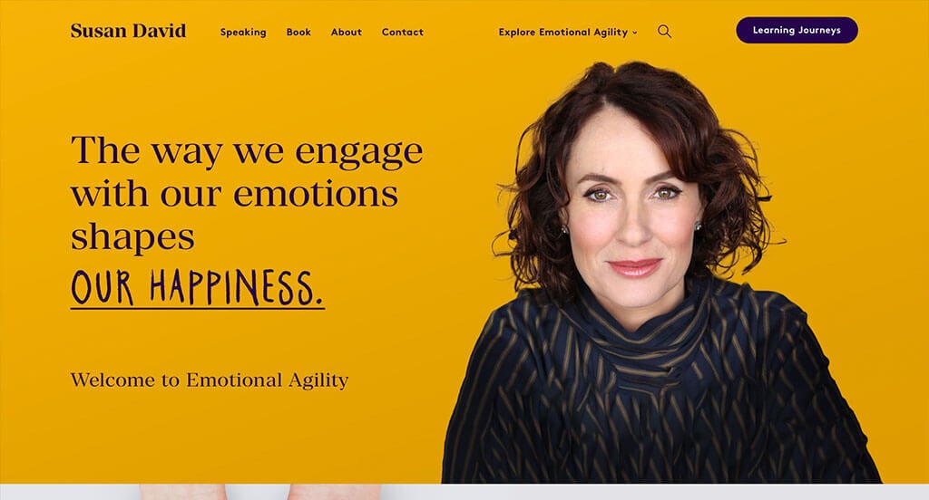
We liked how there was a small phrase that changed to show their values. Including her books, speeches and other opportunities to learn from her was a great choice. They did a great job with graphics and interesting image frames in order to create a stunning look. It was also smart to include a search bar and a simple domain to make everything look amazing.
39. Cities Reimagined
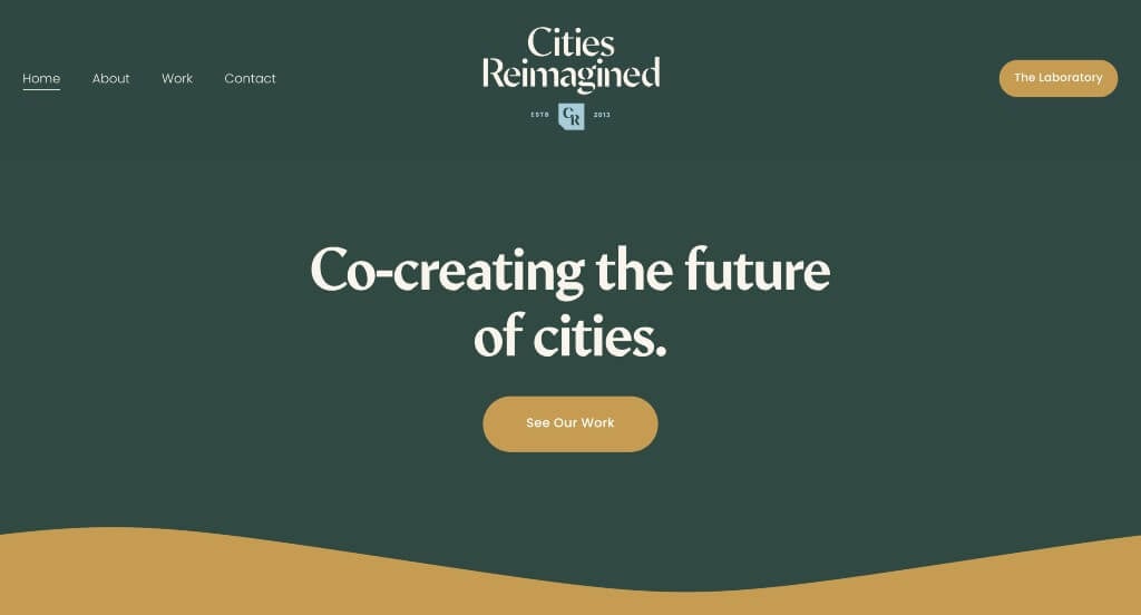
We loved how this example used interesting photo frames that matched with their overall feel. We loved the subtle graphic accents that pair nicely with their entire site. We liked their swoosh that appears in color blocks in order to break up content effectively. Cities Reimagined also did amazing with their title font that is creative and professional.
40. Sharif Walker
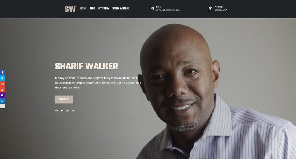
Right away, we noticed how Sharif Walker’s template made great use of bold and basic fonts, to help create a more straightforward, professional look. There was also a few bullet points that are used in order to maintain an organized feel. They also made use of alternating color blocks in attempts to break up lengthy content. A variety of different sized images was another thing that stood out to us.
41. Media Club
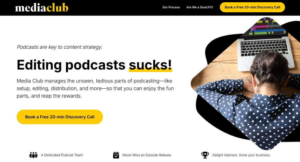
This was an example that we really liked because of their accents of bright yellow. Along with that, there was interesting image frames that was sure to grab attention, which was a great idea. We enjoyed how they used a graphic to show the realistic podcast lifecycle that anyone who has attempted this business can relate to.
42. Adkisson Search Consultants
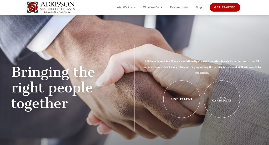
This was a well planned template that played around with abstract placement of images. Even though it was different from typical sites, we felt it made their example even stronger. We loved how the A from their logo appeared in many different places. A simplistic template helped make this an amazing example to be reviewed. Including links to their social media pages was also an idea that we appreciated.
43. Jeff Gothelf
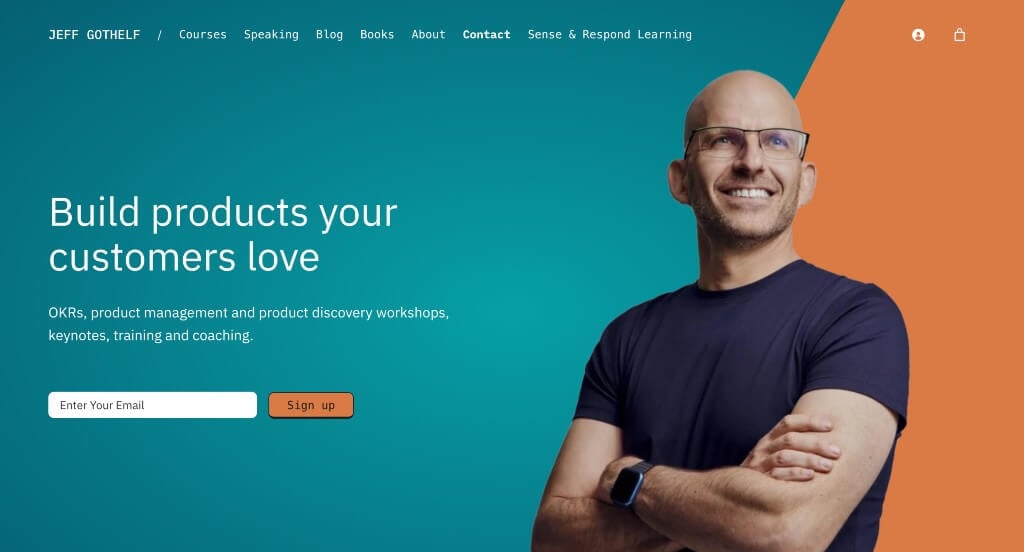
Jeff Gothelf did a great job using large images in order to grab the attention of customers. We also really enjoyed how buttons were used, but they also looked different than the typical buttons. They also had lots of short paragraphs with professional fonts. Their menu is also very well organized and easy to navigate towards.
44. Field Work
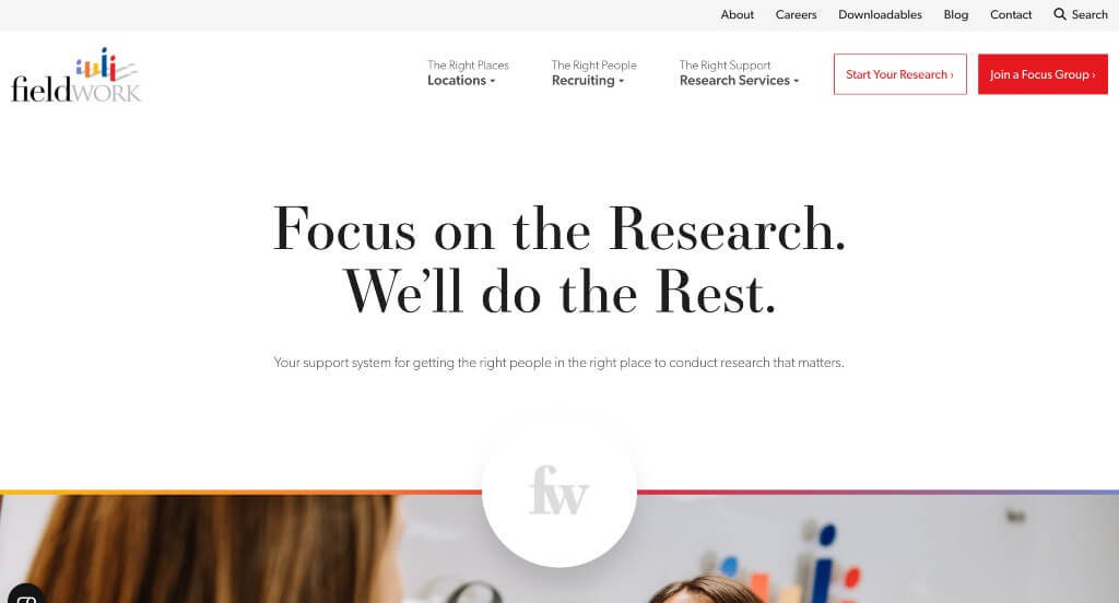
There was lots of white space that was extremely well balanced, making it look less packed with information. The variation of media such at text, graphics, statistics and images was amazing. Field Work also included lots of customer reviews which is always a great choice for any type of business. We also loved their logo that was bright, full of life and of course creative.
45. Austin L. Church
We loved the variety of leading lines that are used to direct viewer’s eyes throughout their pages. We also loved how their graphics are almost hand-drawn, appearing more personal. They also did a great job describing what was included in each package and how much it is. Additionally, they did a great job with their interesting photo frames, which we enjoyed.
46. Hypefin
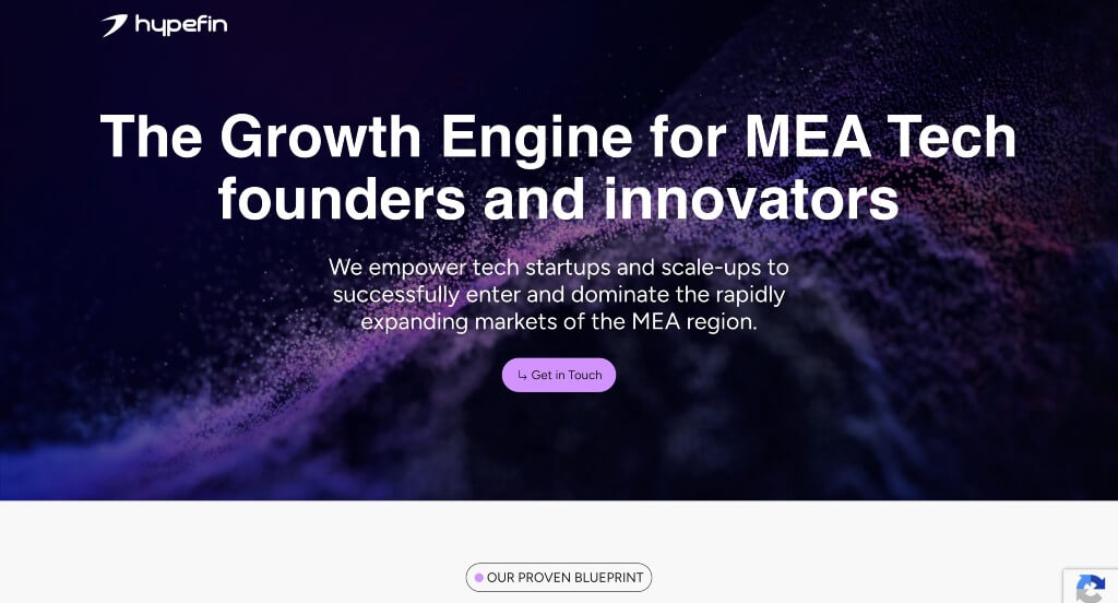
Something we noticed right away was their element of unity with these honeycomb patterns. Black, white and orange colors are carefully used to catch customers’ eyes. Their subtle animations for their backgrounds that mimic Hype Finance Technology’s honeycombs. They clearly had digital marketing in mind when designing an interesting logo for them.
47. VanRein Compliance
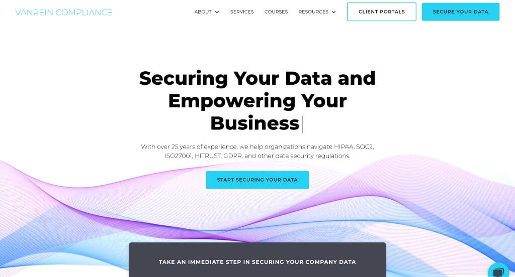
The beginning of this example looked great because of their text that types itself with a flashing cursor. Their information was organized well and blocked into sections which was a smart choice. Showing lots of companies that trust them was a great way to look more reliable as a brand. Including a live chat was another feature that could come in handy.
48. Nylon Consulting
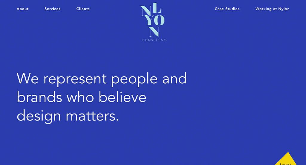
Right away, we noticed how their company name was displayed in a stacked manner, and upon scrolling it flattens into this top navigation bar. Mainly blue and white covers this example, which stood out to us because it creates a relaxing and professional feel. We also loved how there is lots of balanced white space, making it easier to navigate through. Having smooth transitions was another feature we enjoyed.
49. Jamie R. Cox
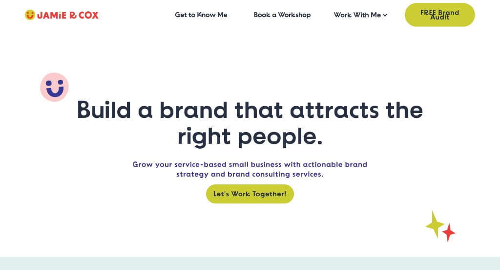
Here we have an example that does a great job with their use of animated graphics. Information is balanced well so customers never feel overwhelmed with these pages. They made sure that their paragraphs were written in a straightforward manner which keeps people engaged for a longer amount of time which we liked.
50. Analytics8
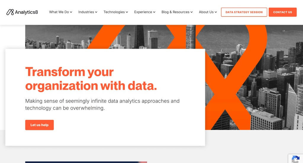
We absolutely loved how this example used bright orange colors to liven up their website. This was a stunning logo design that really stood out to us, especially because it was placed in different parts of their website. Keeping paragraphs short and to the point was helpful because viewers were able to read and comprehend their information easier.
WordPress Consulting Themes
You can find free themes at wordpress.org or consider consulting-inspired templates at ThemeForest.
Avantage – Themeforest
$69
Nifty – Themeforest
$69
Consulting – Themeforest
$59
Consultancy – Themeforest
$69