In the dental and orthodontic industry, your website is the digital front door to your practice. Before a patient ever sits in your chair, they use your online presence to evaluate your level of care, your technology, and your professionalism. In a competitive local market, your design must communicate clinical excellence, patient comfort, and modern innovation.
Our design team analyzed hundreds of dental websites – from boutique general practices and pediatric specialists to high-end periodontic and orthodontic clinics. We evaluated these sites based on mobile-first appointment scheduling, the use of high-quality “real” office photography, and clear communication of insurance and financing options.
Whether you are a solo practitioner or managing a multi-location dental group, these 11 examples represent the gold standard for dental web design in 2026.
Note on Our Selection Process: We recently audited this guide to remove outdated designs and sites that no longer meet our performance standards. This curated list now focuses on the top 11 dental websites providing the most strategic value in 2026.
Top Dentist Website Designs
1. Embassy Dental
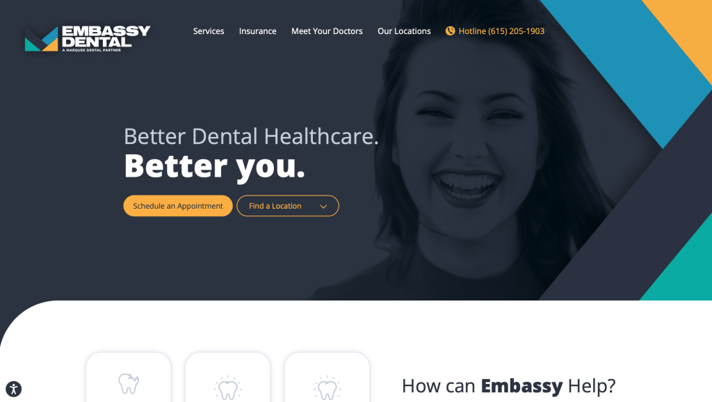
Making use of vivid and bold colors, Embassy Dental’s professional dental website manages to set itself apart from competitors. It uses an impressive background image with a dark filter to capture visitors’ attention. Colors like orange, blue, and white, were added to help create a contrasting effect. It was nice to include a live chat so that customers can reach out to this company faster. This company also had a creative and striking logo design that stands out when compared to other dental care companies.
2. ArchPoint Dental
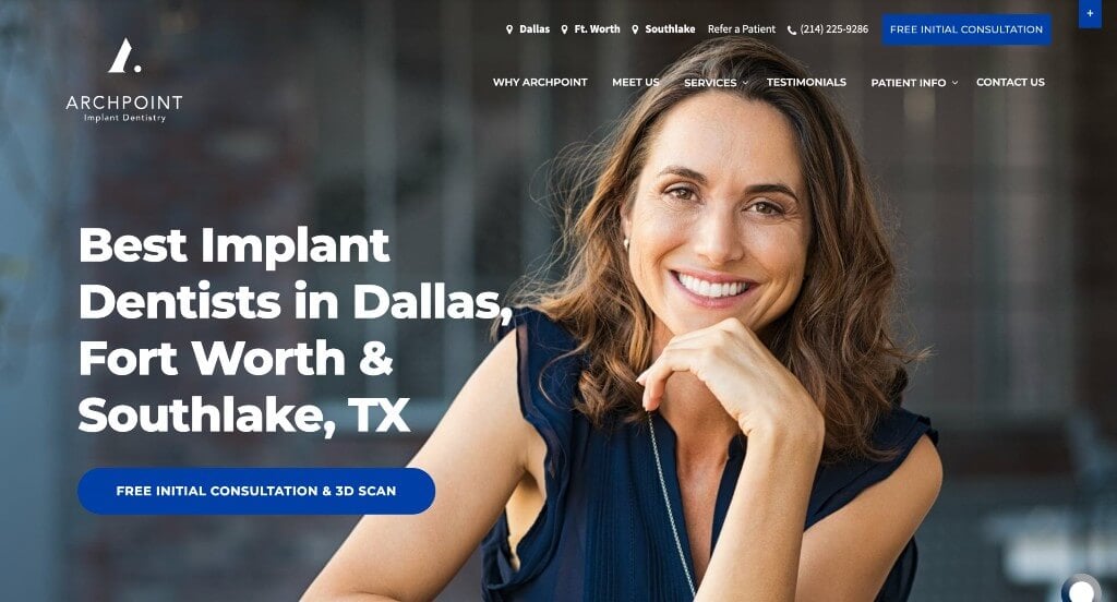
ArchPoint Dental has a straightforward design that provides visitors with necessary information as soon as they enter this site. An obvious feature that takes this dental website to the next level was their high-quality visuals. Additionally, it was nice to have a live chat feature allowing possible customers to ask a quick question and hopefully have a quick response. Also a series of video testimonials was included to ease potential customers’ worries.
3. Little Royals Dentistry
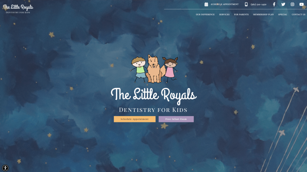
Connect to kids and parents of young kids are clearly the main focus of this web design. Many “kid” graphics and images are included to show this focus. Creative fonts are used to create a more fun look for this appealing website design. Buttons are used throughout Little Royals Dentistry linking to other areas to help customers navigate better. Contact information and links to social media platforms are provided right away. We also thought it was a great idea to have short and straightforward paragraphs because parents with little kids won’t have a lot of time to read through lengthy descriptions.
Related: Boost your online marketing with the help of a digital marketing campaign targeted toward dental offices.
4. Kingstowne Dentist
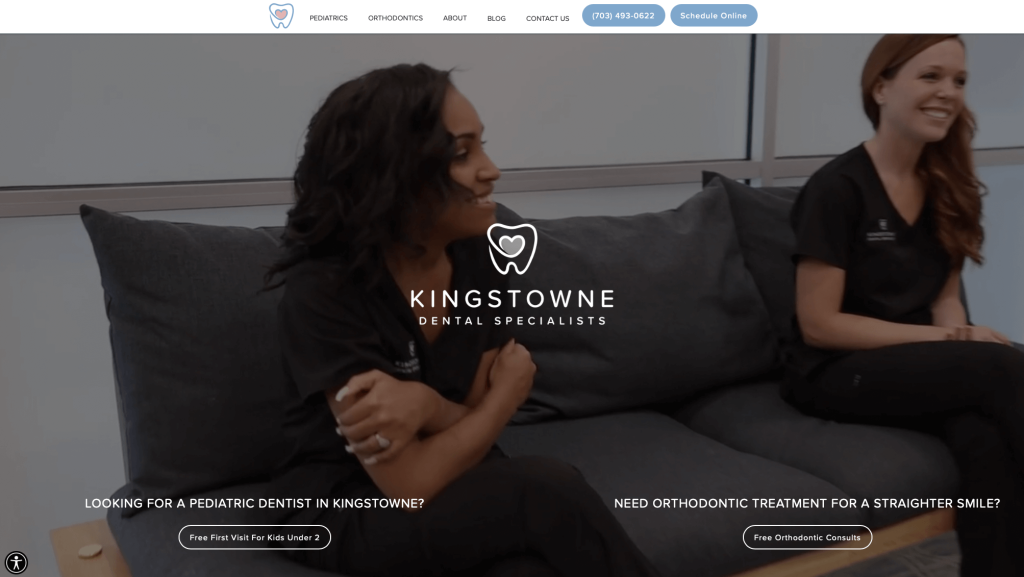
Images are always more effective than words, and that’s why Kingstowne Dentist incorporates lots of them. Along with images, many graphics (including their awesome logo design) are also placed into these webpages, helping them land themselves into our list of best dental websites. We enjoyed their white background which helped to make their accents look even more stunning. This design also incorporates Google Maps, helping visitors locate them by themselves.
5. Cox Bond Dental
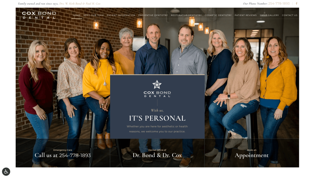
Using well-placed images and featuring unique design elements, Cox Bond Dental is a great example of how to draw in customers. Right away, an image of this company’s qualified team is showcased, along with important links such as appointment booking and emergency care. Similarly, services that are provided are mentioned on a blue background for easy readability. Further down, many past patient reviews can be found to help new customers feel more comfortable about this company.
6. Smile & Company

Keeping things simple, Smile & Company uses a video clip to explain why they are different than other dental care companies. We liked how this company made to include many images of their office and matched their web design to their office aesthetic. Smile & Company also had a nice sliding transition utilized throughout this entire template. Clicking on their sleek hamburger menu will launch a full-page drop-down list with important links. This business also has a stunning font choice.
7. Del Mar Dental Studio
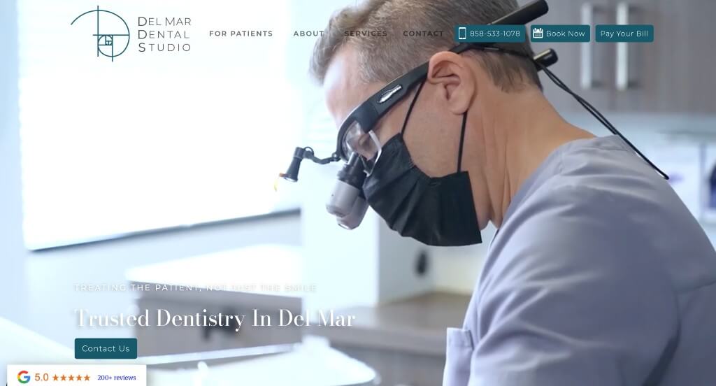
To start off this template, Del Mar Dental Studio uses an impressive video clip serving as a hero header for their homepage. We feel that this layout excels at providing information without making it overpowering. Images can be noticed as backgrounds to add a bit of texture to Del Mar Dental Studio’s web page. It was helpful to have different fonts that help to organize which should be read first. Another great feature of this stunning professional dental website was their short and straightforward paragraphs.
8. Tend
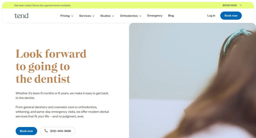
Tend utilizes a clean, modern, design with a video clip and a few visuals. A section is dedicated to testimonials, which are present in neat, gray boxes. Additionally, all locations are mentioned in a list with complete details. This company’s color scheme was very simple but it made for a fun and relaxing look. Tend also showcases its services by accompanying them with pictures and uses capsule-shaped blue buttons to allow visitors to book appointments. Fonts that were chosen were simple just like their color scheme, but it was still striking.
Related: Get help launching effective paid ads campaigns for your dentists!
9. Heart of Texas Smiles
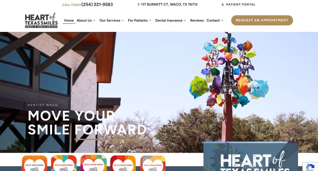
Right away, visitors will notice how Heart of Texas Smiles shows awards that they’ve received in order to prove that they are a reliable company. We loved how they showed off images of their dental team, making people feel comfortable and familiar when they come in for their appointment. Adding in customer reviews is another amazing choice that we always appreciate. Adding in their social media right into their homepage was another smart idea.
10. Jackson Family Dental
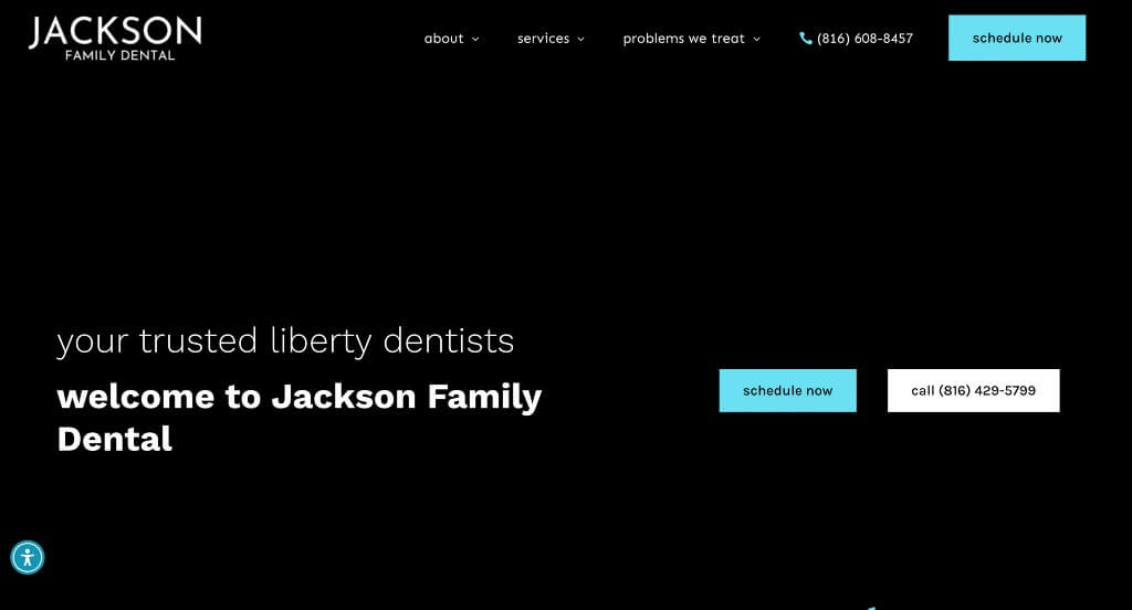
With an eye-catching video clip, Jackson Family Dental knows how to grab attention of people instantly. Other images and videos throughout depict various procedures and services offered. This company’s layout and features such as color scheme, fonts, and simple animations makes for a very modern feel. We liked how they used many textures that seem to match their in person facility. Testimonials are included, and displayed right under their services section. Buttons are also used in a variety of areas to help customers navigate better.
11. Winter Garden Smiles
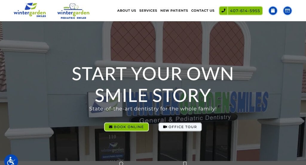
Three main colors are used in Winter Garden Smiles’ website, which are white, blue, and green, making it feel clean and organized. Important information, including images, is presented with a white background, with green or blue buttons, making them hard to miss. Located in their sticky footer, visitors can find two icons (that are links), one for directions and another for contact information. Social media buttons are also included and neatly arranged on a green banner, enhancing its appeal and making it easier for visitors to find.
WordPress Dental Themes
You can find free themes at wordpress.org, or explore dental-inspired templates at ThemeForest.
DentiCare – Themeforest
$69
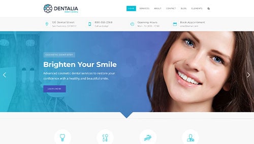
Dentalia – Themeforest
$69
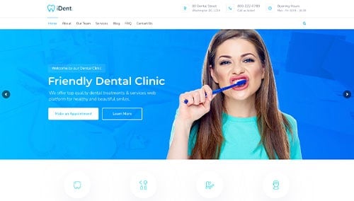
iDent – Themeforest
$59
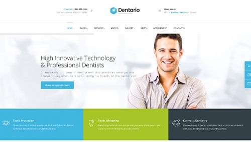
Dentario – Themeforest
$69