Hello educators and lifelong learners! Want to boost your online presence and attract more overall customers? If so, you’ve come to the right place – here you’ll find inspiration, usability tips, and many examples across schools, online learning, tutoring, publishing, software, and more. For other industries, head over to our full web design examples article!
Top Educational Companies
- 1. PBS Kids
- 2. Teachers Pay Teachers
- 3. Mystery Science
- 4. PowerSchool
- 5. Nick Jr.
- 6. Seussville
- 7. BrainPOP
- 8. Curious World
- 9. Instructure
- 10. National Geographic
- 11. W3Schools
- 12. Pearson
- 13. Course Hero
- 14. Quizlet
- 15. Renaissance Freckle
- 16. Clever
- 17. Chegg
- 18. Gilman School
- 19. Alverno College
- 20. Louisiana State University
- 21. Ohio University
- 22. Summit Country Day School
- 23. University Of North Dakota
- 24. The New School
- 25. Harvard University
- 26. Rhode Island School of Design
- 27. Marquette University
- 28. UW Stout
- 29. Archer School for Girls
- 30. Carnegie Mellon University
- 31. St. George’s School
- 32. George Washington University
- 33. Tufts University
- 34. Syracuse University
- 35. University of Texas
- 36. International Grammar School
- 37. University of Georgia
- 38. Clemson University
- 39. Hamilton College
- 40. University of Tennessee
- 41. Virginia Tech
- 42. University of Rochester
- 43. Muhlenberg College
- 44. UW Oshkosh
- 45. UW Green Bay
- 46. UW Madison
- 47. Loyola University Maryland
- 48. University of Notre Dame
- 49. Georgetown University
- 50. Park University
1. PBS Kids
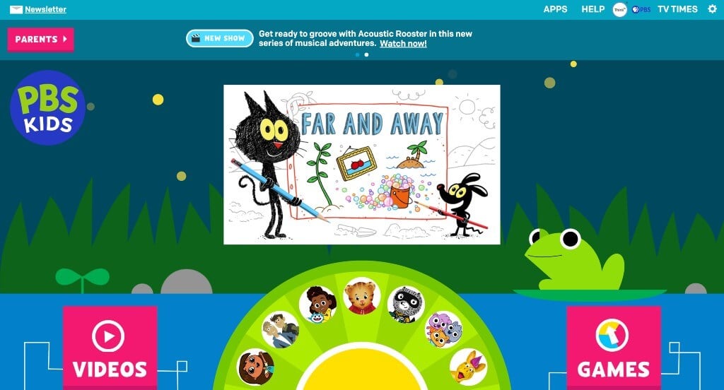
Anyone wishing to create a kid focused site, here is an example for you. Right away, we can see that they love to show off their characters – both the classics and recents. Bright colors and interesting animations are used together to hold attention of small kids. Being able to choose games based off of favorite shows or characters was another thing that we really liked.
2. Teachers Pay Teachers
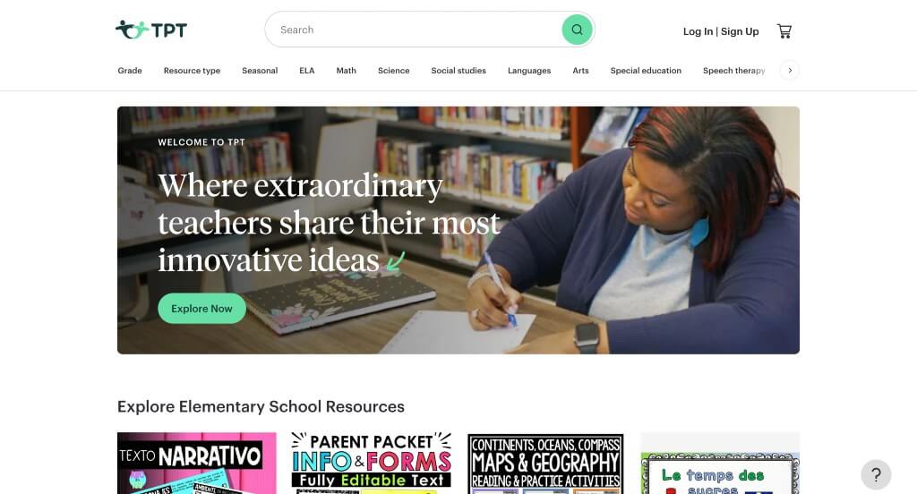
Teachers Pay Teachers makes use of stunning green and blue accents, which we like because it’s very refreshing. Additionally, showing a preview of each product, the seller, price and star rating was perfect for something like this. Another thoughtful quality we noticed was this logo! It embraced the idea of community in a simplistic way. An easy checkout process is also used that is very nice for busy teachers.
3. Mystery Science
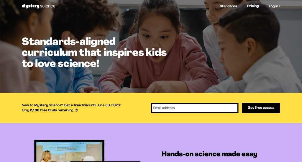
Our web designers noticed how a variety of bright colors can be found in Mystery Science’s webpage, which creates an energetic and engaging look. We loved how everything was organized by age or grade, making it easy for teachers, kids or parents. Adding in bullet points to help guide readers, and keep things organized was great.
4. PowerSchool
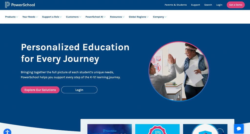
Right away, this company’s logo design caught our attention due how it sparks creativity and curiosity. A mixture of blues and pinks were used as accents. We loved the use of gradients all throughout this example. A live-chat was an aspect that stood out to us, because visitors can get answers quickly. Lots of shapes are used to make a more exciting template for PowerSchool.
5. Nick Jr.
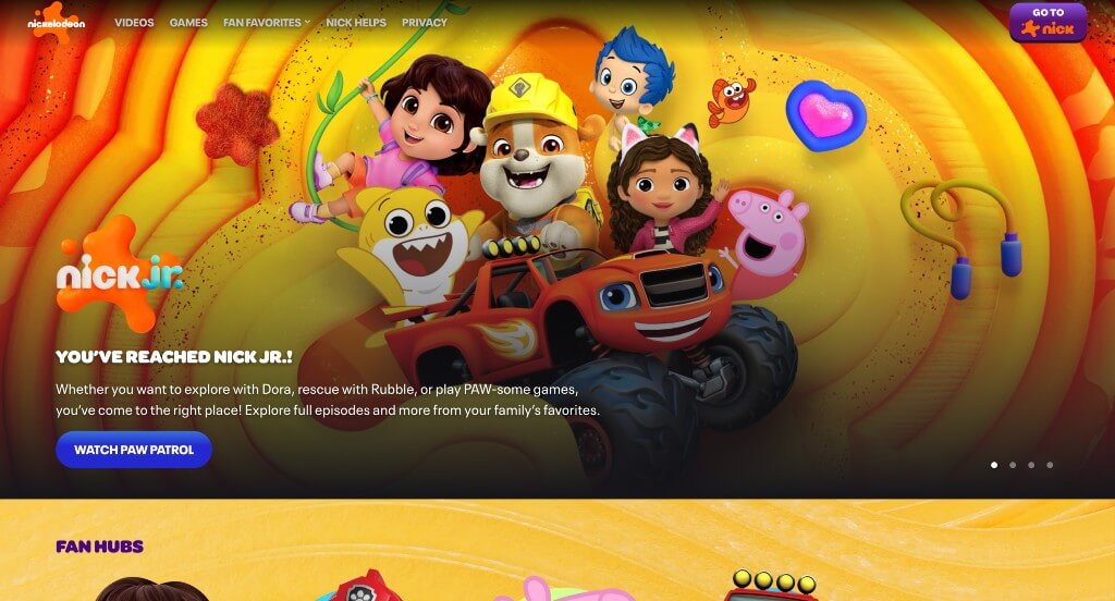
Similar to PBS Kids, Nick Jr. did a great job showcasing their well-known characters. We liked how there was episodes included into their site along with games, quizzes and more. Their background was both colorful and exciting for kids. We also loved how they alternated between the background and black color blocks.
6. Seussville
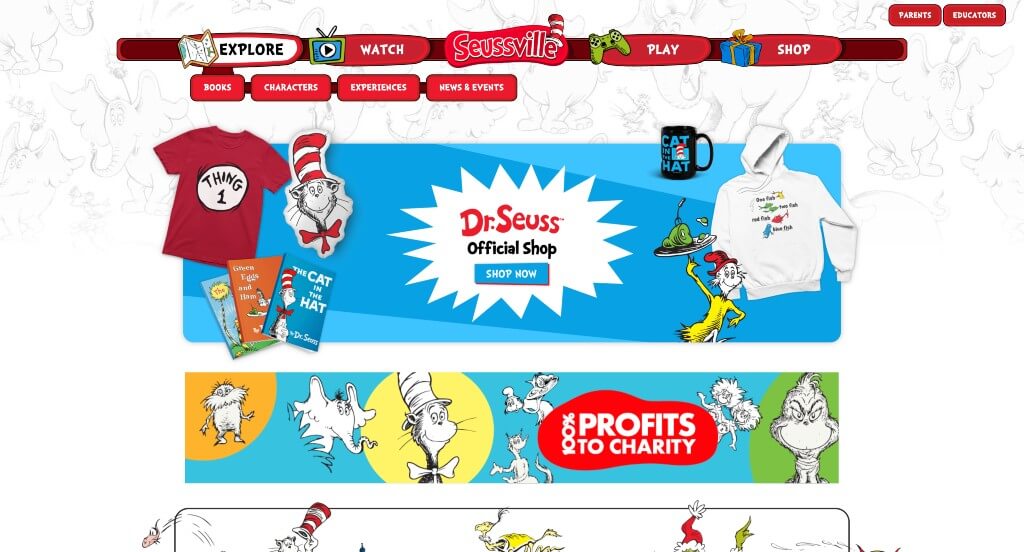
This color scheme was amazing because it matched perfectly with Cat in the Hat, one of Seuss’ most popular characters. Their cartoony font was both smart and fun, keeping even kids engaged. Obviously, adding in characters all over makes this site feel personal to children. Though their navigation bar looked very different than others, it works effectively and matches their overall feel.
7. BrainPOP
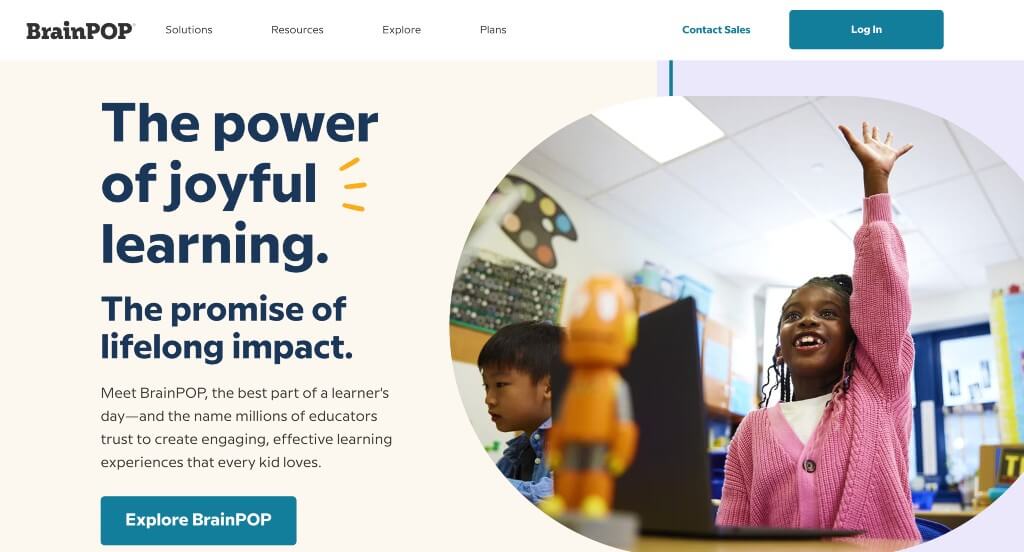
Simple animations was something that took this one to another level. We loved all their small graphics that make it more exciting to look at. Additionally, there’s a variety of types of content, making it easy to find something that works for readers to comprehend. Showing characters involved in their teaching methods was smart, but they never distracted from content in this example.
8. Curious World
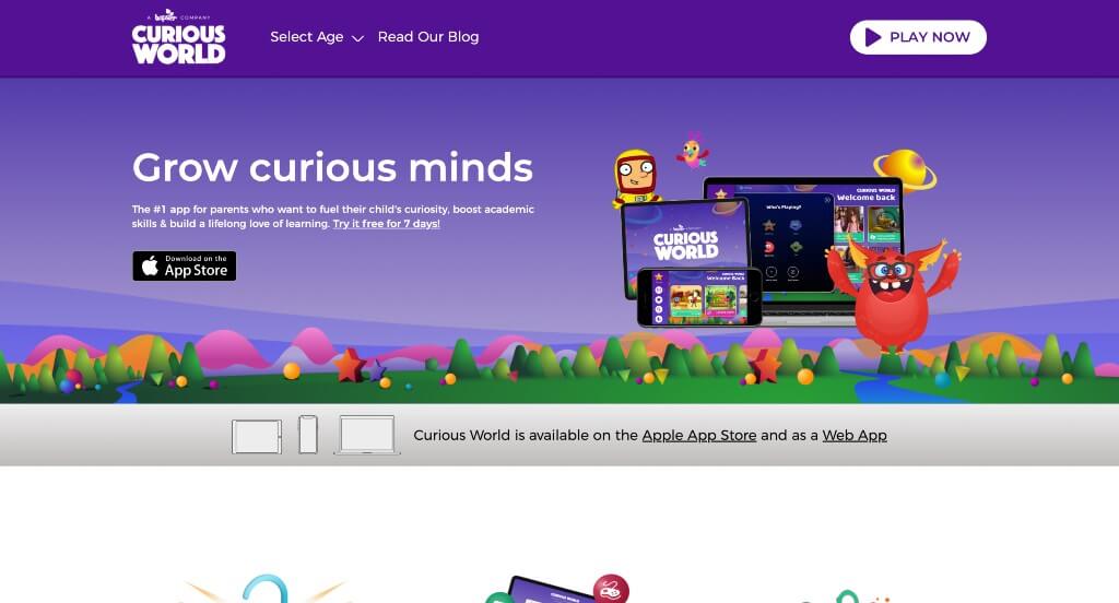
An aspect that we liked was their purple accents, because we often don’t see that in education, and it looks great. Showing off some of this company’s awards, without flaunting them was refreshing, and helps to build trust with wary customers. Having a customer review section was something that we greatly appreciated. This company also used their name as their domain, which is always a good idea if possible.
Related: Set up an awesome paid advertising campaign with the help of a PPC agency with experience helping educational organizations.
9. Instructure
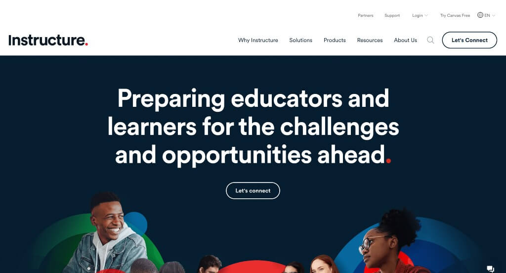
Our favorite part about Instructure, creator of Canvas, was their abstract arrangement that grabs attention quickly. We loved how they continually used hexagons throughout (as image frames and award frames) because it creates a sense of unity. Their large fonts used for titles was another feature that we felt needed to be recognized.
10. National Geographic
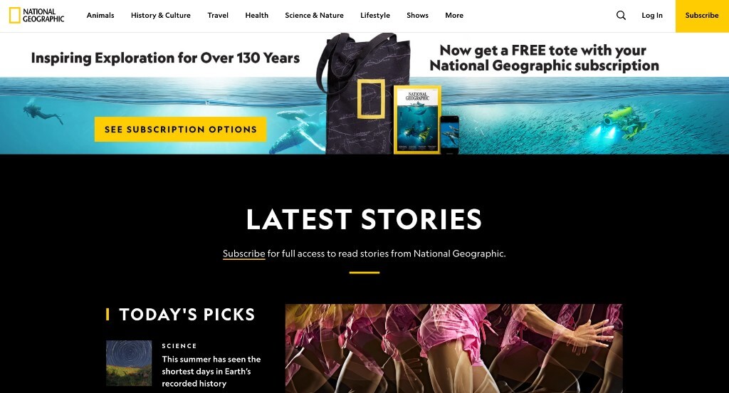
National Geographic is known for their bright yellow rectangle, so using the same yellow within this site was a smart idea. Including a variety of topics that interest many different age groups was perfect. We loved their use of dark (black) backgrounds to contrast their text in a more pleasing way. They clearly had marketing in mind when building a simple email list sign-up to keep customers updated.
11. W3Schools
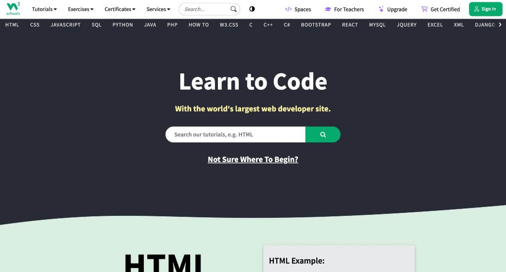
We loved this site, especially because it’s a simple way to start learning coding! It was awesome to showcase examples on the right so viewers can understand what they might be seeing if they try this coding method. A mixture of pastel colors was exciting but never overwhelming. From a marketing perspective, we liked how a clearly labeled menu was utilized.
12. Pearson
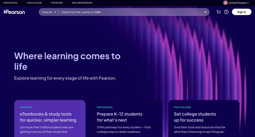
This is a great educational web design example for anyone looking for a professional look and feel. As you scroll through the homepage of this website, one of the qualities you’ll notice right away is the inventive logo. Their clearly labeled pricing was a nice touch for a custom website. Pearson clearly had internet marketing in mind when designing the simple navigation for their website. These were just a few of the numerous qualities in this website to consider while we were putting together this list of top websites for educational purposes.
13. Course Hero
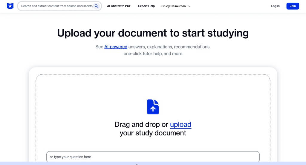
Although this uses a very simple color scheme, we loved how they effectively balance white space. It’s seamless organization allows for customers to read information with ease. Allowing viewers to type in their school and class to find pre-made study guides was very nice. Being able to drop your PDF right into this site was a unique feature that students will enjoy.
14. Quizlet
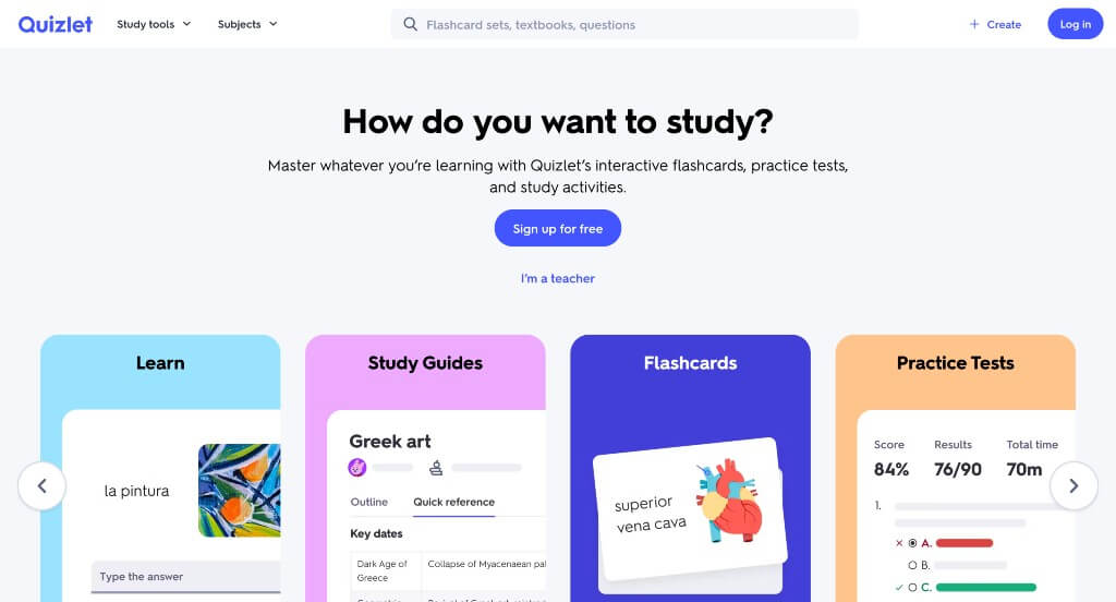
Showing images of what this product will look like when it’s in use was a brilliant idea. Having subtle animations was definitely a very impactful feature within their homepage. Their font is also simple and legible, which is what students typically want from a studying service. Having lots of call-to-action buttons was also really helpful. Showcasing popular flashcard sets was a unique touch we noticed.
15. Renaissance Freckle
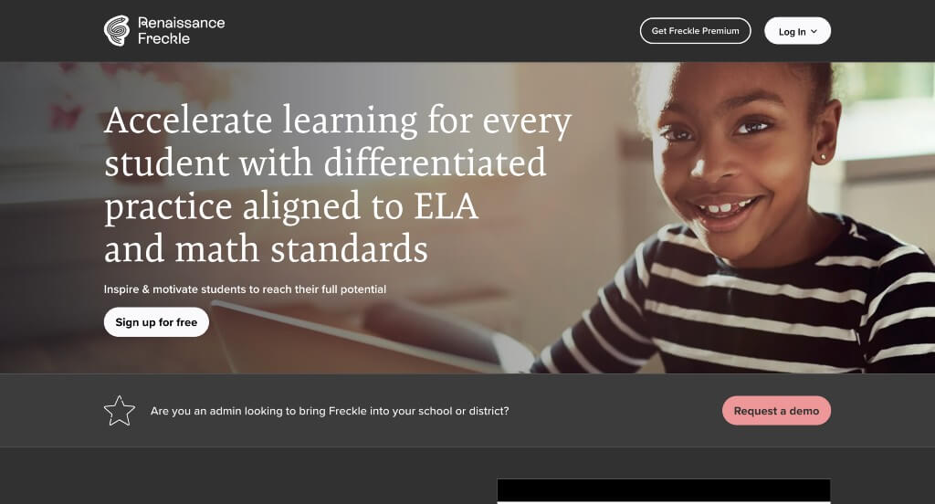
Right away, we were interested in this example because of their bold choice of a gray background. This allows their white text and pink accents to stand out more. After scrolling through, you’ll notice how bullet points are used to logically organize information. Another thing we liked about Freckle was their interesting logo that made use of a pencil graphic. This domain matches with their company name, which is always a good idea.
16. Clever
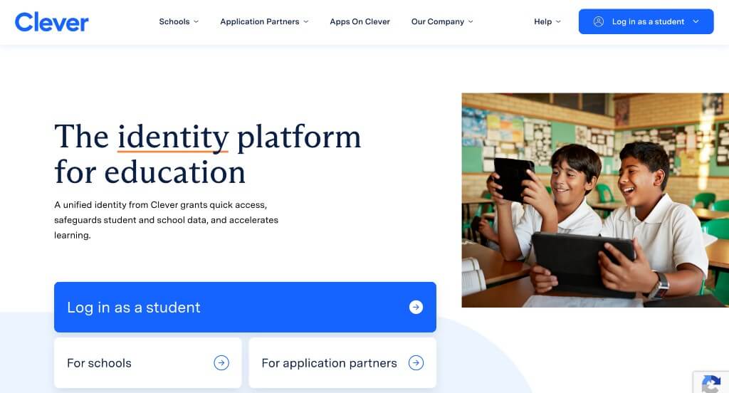
Small animations as visitors scroll was an interesting choice that we loved. Including small paragraphs of different was beyond helpful for those unfamiliar with Clever. Other small line graphics was another feature that grabbed our attention. Bright blue buttons are perfect to help get people exploring more areas within their informational webpage.
17. Chegg
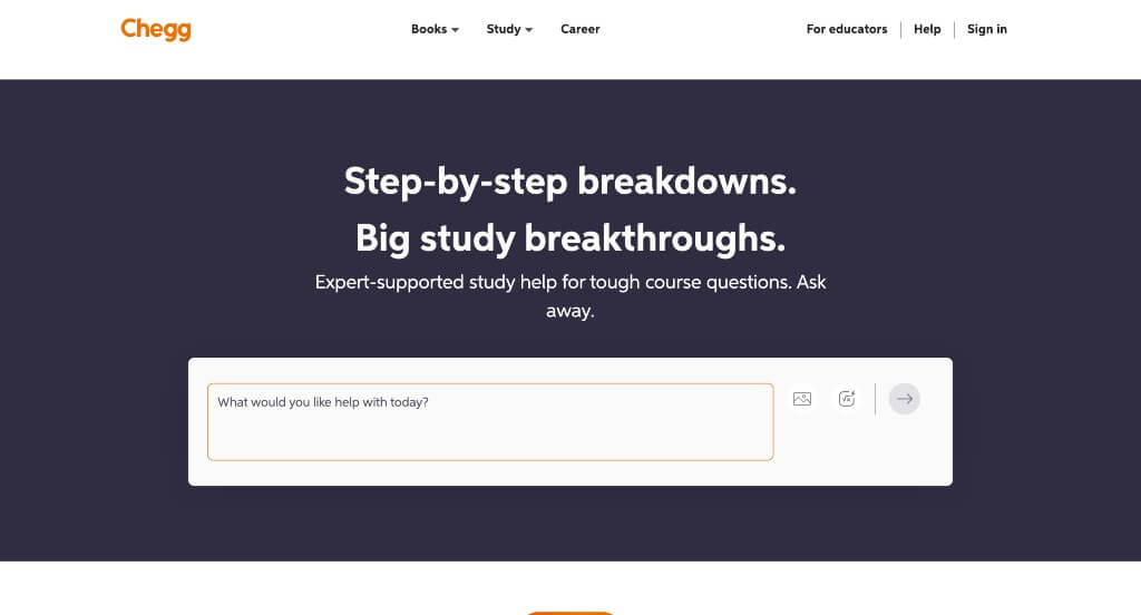
Customized images can be noticed within Chegg, allowing for a more personal feel. Interesting graphics come from so many places within this example, making it stellar. Showcasing perks that come with their services such as Max, DoorDash, Tinder and Busuu. We felt that Chegg did a nice job with their simplistic arrangement, making it easy for all viewers.
18. Gilman School
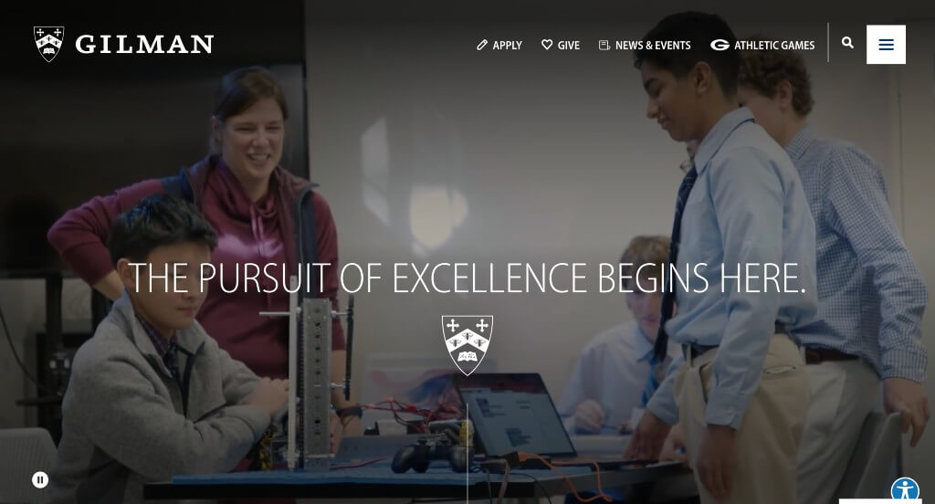
We loved how this one made use of animations that follow along with whatever point in this site the viewer is at. Their interactive timeline-like feature was our favorite. Lots of content was included, but it never felt overwhelming. Displaying their logo in a variety of places was nice because it continued to remind people who they are. Their use of inspirational phrases really helped to set them apart from other schools.
Related: Lift your educational website in search results by implementing SEO techniques that get you found online!
19. Alverno College
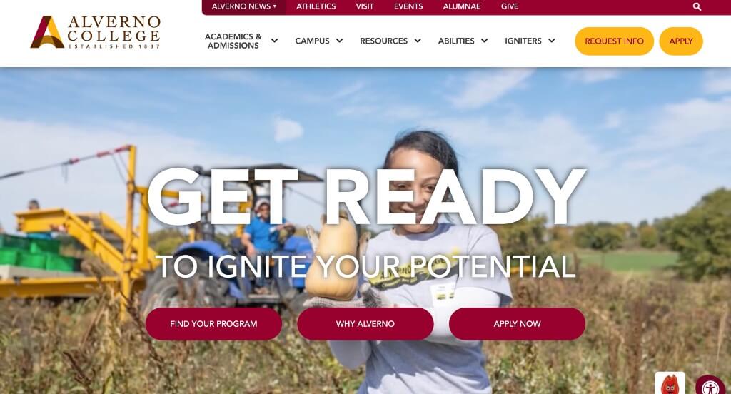
Alverno College picked a stunning color scheme and stuck to it – it can be noticed throughout this entire design along with their logo. We thought it was cool to include percent statistics about them. Although their logo was simple, it was interesting and caught our attention. Having two buttons attached to their sticky header that includes their application and instructions to request information was something we liked.
20. Louisiana State University
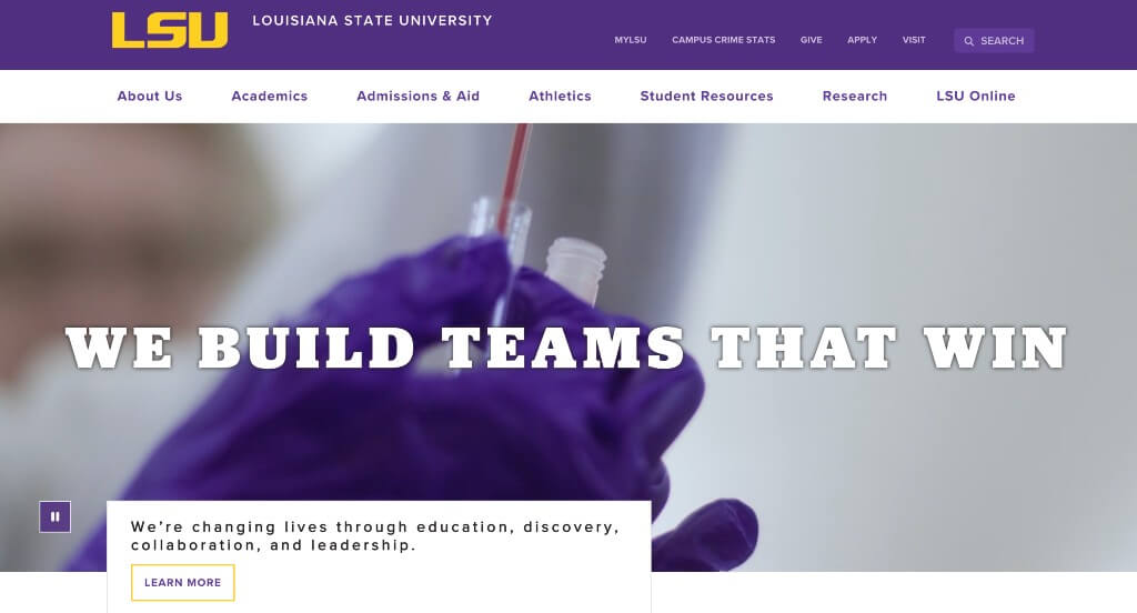
We liked how most areas of this school’s background use filters over images, for a more interesting look. Choosing the complementary colors of yellow and purple was perfect. Using tiger print in some areas was something else we enjoyed, especially because if you belong at this school, you will become a “Tiger”. Being able to explore their options related to online school was something else that we loved.
21. Ohio University
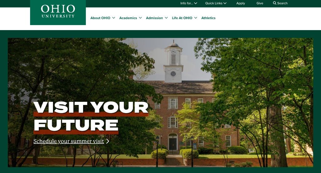
This example uses an interesting layout that plays around with small rectangles for written content arranged in an interesting way. We loved how all of their accenting graphics use different shades of green. Showcasing a small map of Ohio with all of their locations was a great idea. Having featured news and a social media section was also helpful.
22. Summit Country Day School
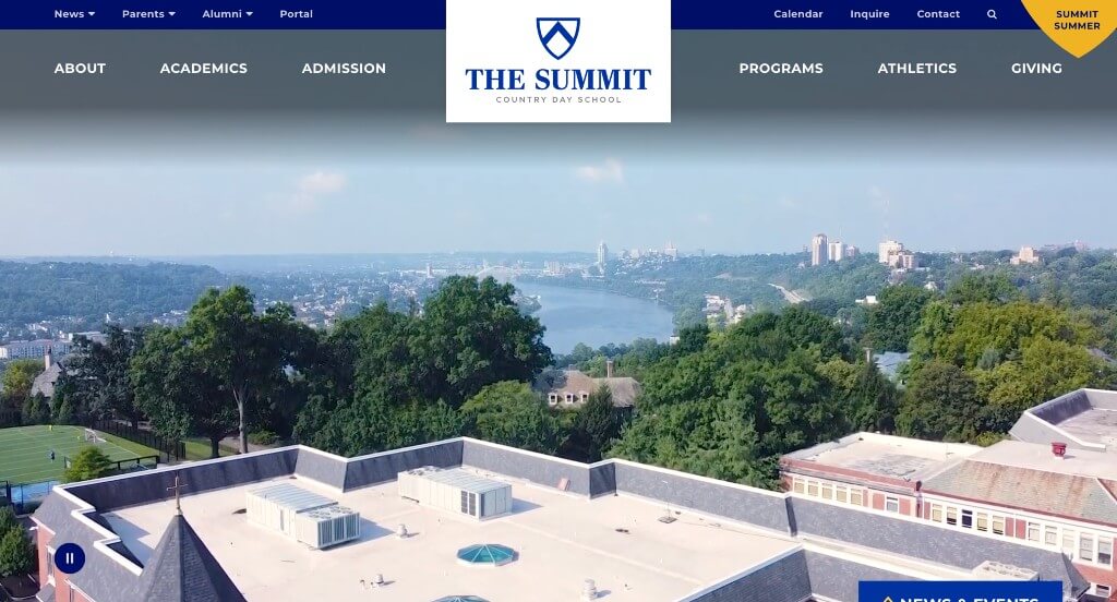
It was unique how this example reused their logo in a variety of places. A blue and white color scheme, with small bits of yellow is attention grabbing to say the least. Their creative way of displaying their visuals and information was something that really helped them stand out. Showcasing awards that they received was also helpful to build trust with new customers.
23. University Of North Dakota
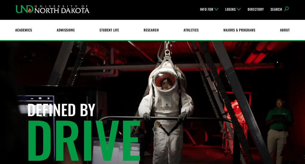
There were lots of great features within this school’s webpage, but we really enjoyed their green accents. We thought that it was cool how they used interesting lines and patterns to help their pages look more exciting. They also took time to include their social media which is something many students now want to check out.
24. The New School
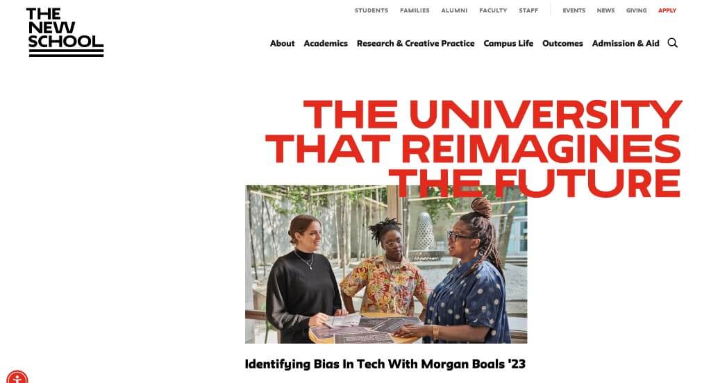
Reds that accent titles, buttons and more was a very impactful part of this example. Showing off announcements to keep people engaged with current news is smart. We liked how linked images had unique hover animations that lets viewers know that there is more information to be explored. Their interesting placement for images helped them stand out because it was more asymmetrically balanced.
25. Harvard University
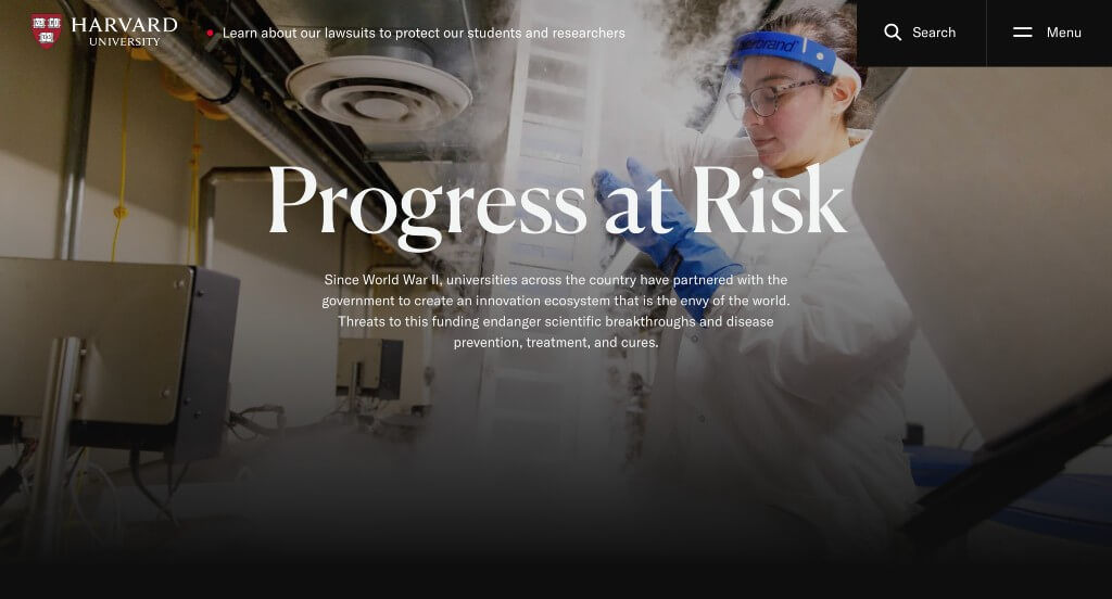
Harvard University uses a sleek black and white color scheme that makes them feel modern and of high-quality. Their images don’t tone down their excellence. Showing information in numbers related to money and people was a helpful thing for those considering. Having a feature dedicated to the Harvard-Yale football game was interesting.
26. Rhode Island School of Design
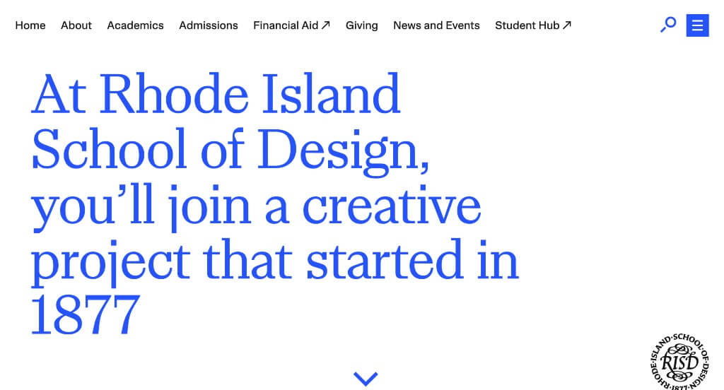
This example does a great job including information for those considering, and those attending. We liked how many of their unique designs from their school are showcased so people know that design truly is their specialty. We liked their good balance of white space, making navigation super easy. Showcasing some upcoming events was also a nice touch.
27. Marquette University
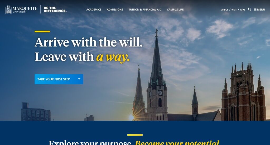
This is an outstanding example, so if you are a university looking for inspiration, you cannot miss this one. Their unique graphics and photo frames was what stood out to us the most. But, they also did great at using high-quality images, and overlapping them looked amazing. Including short, inspirational phrases was something that we really liked.
28. UW Stout
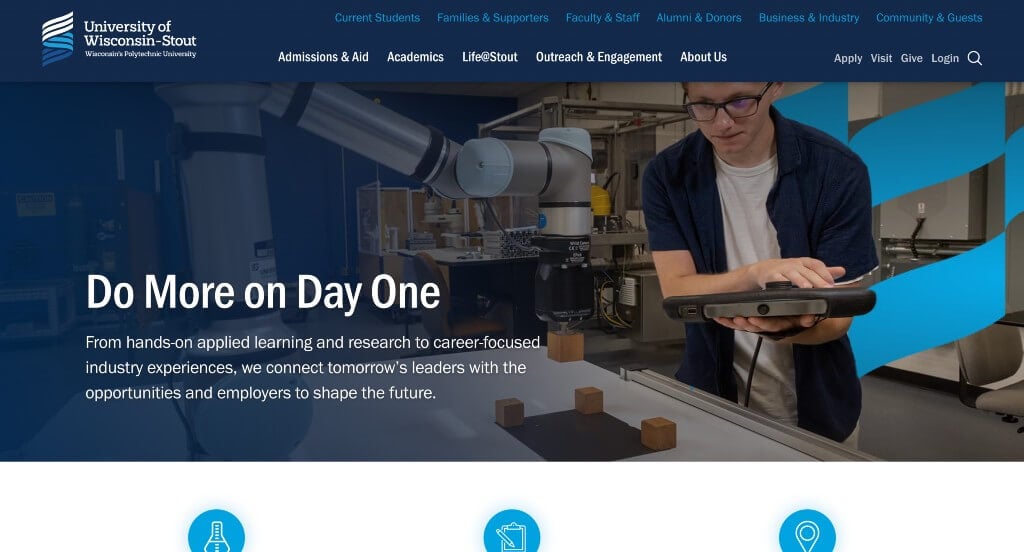
We loved how this example reused a form of their logo throughout the entire design. Something else that grabbed our attention was the different shades of blue that could be seen all over the page. Small icons were used to improve the overall visual appeal. There was lots of tabs within the navigation bar, making it easy to find information.
29. Archer School for Girls
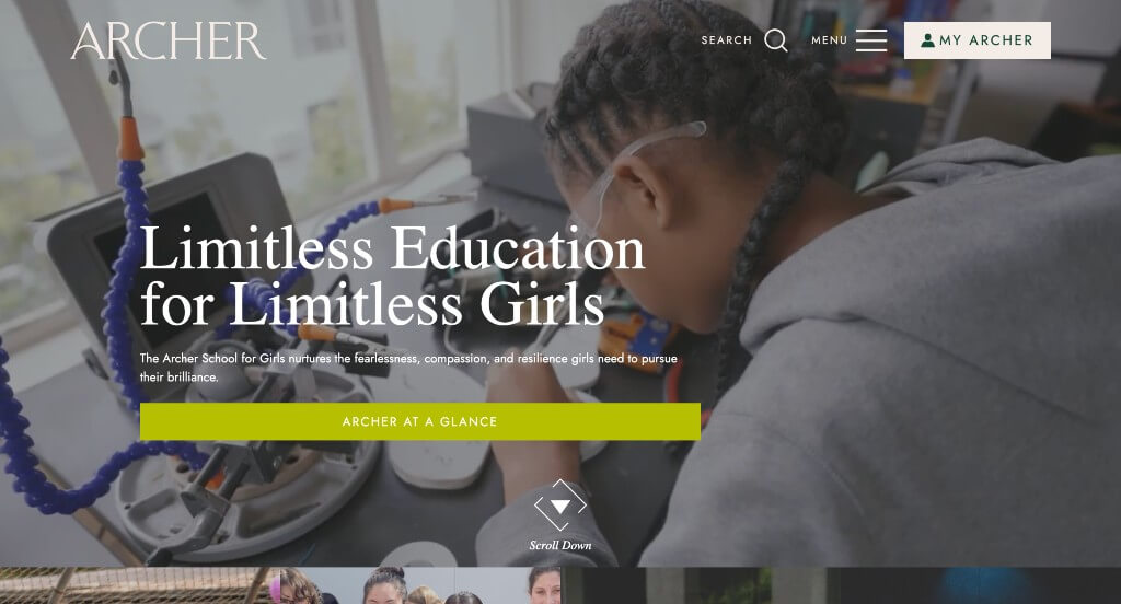
We really liked how this school used an interesting arrangement to get people involved with them. Having splashes of bright colors was also really nice to breathe life in to their pages. Another feature within this Archer School for Girls that we enjoyed was their accessible school schedule. Simple navigation was another very nice part about this example.
Related: An educational company can rely on digital marketing services to design and build conversion funnels, manage online reputation, and improve lead generation.
30. Carnegie Mellon University
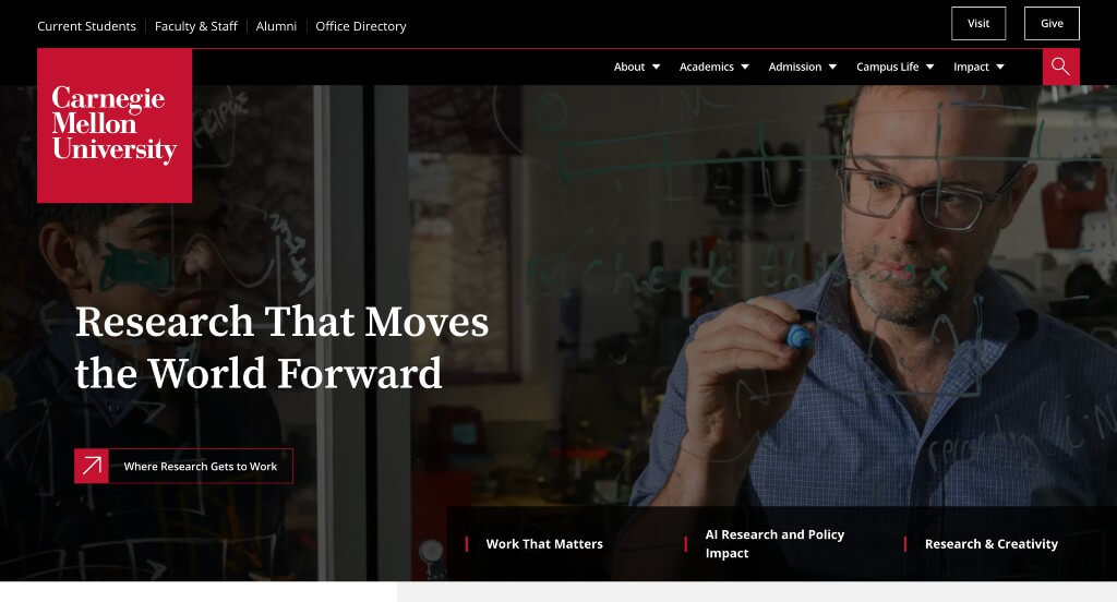
Using a video right away to emphasize the joys of this school was something that we enjoyed. We loved their color choices and use of animated graphics. Their interesting way of displaying images and layering rectangles for titles was unique, helping them stand out. Showing their top initiatives was another aspect that they did very well with.
31. St. George’s School

High quality videos and images is just the start for St. George’s School. We felt their color choice was not only logical, but also felt very formal. Their menu is short, but is very well organized making everything easy to find. Additionally, their domain is put simply, and matches with this school name. A search bar was also added in, which we loved.
32. George Washington University
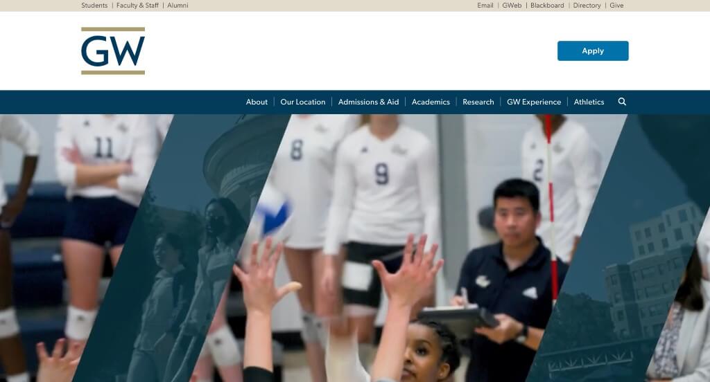
One of our favorite things about George Washington University was their use of creative icons. We really enjoyed how they covered recent local news. Another feature of this clean site was their use of bold fonts to help emphasize statements. Using linking text was something else that we noticed to help customers explore new things.
33. Tufts University
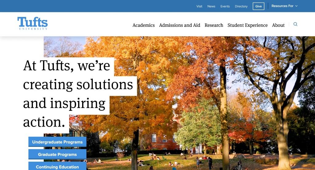
Each area of this example shone with excellence. There was lots of buttons and short paragraphs which was absolutely perfect. Showing a variety of statistics related to their school was very helpful for those wishing to apply or learn more. We liked how a variety of different image sizes are used for a better look. Titles use a bold fonts to grab attention was perfect.
34. Syracuse University
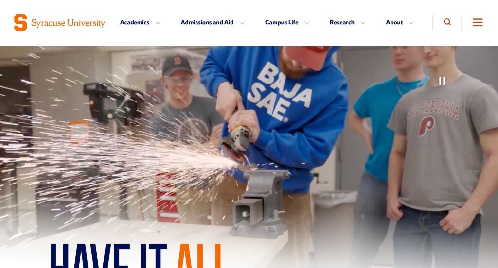
This was an amazing example to look at if you need inspiration. First off, their color palette was amazing – and logical because that’s their school colors. We loved how short paragraphs are used to make it easy to read through. Showcasing unique stories from their school was another feature that we enjoyed. It was nice that a lot of their fonts matched with their logo’s font.
35. University of Texas
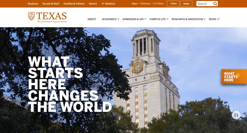
Large and bold text for titles was something that grabbed our attention right away. Including lots of number statistics about their school was appreciated. We absolutely loved their interesting textures used as backgrounds throughout this example. Smooth transitions was also among our favorite parts of University of Texas. Their giant graphic of their school near the bottom of this homepage was very impactful.
36. International Grammar School
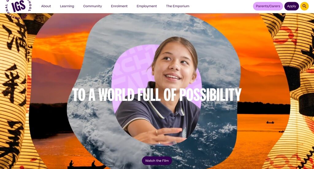
We loved the energetic feel portrayed for this company just from seeing their video. It was really cool to have titles that flipped through different languages, reaching more audiences. Their template was free of distractions which was very helpful. An interesting background pattern was created in different languages which we thought was cool.
37. University of Georgia
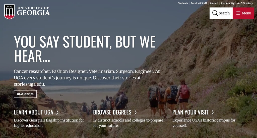
Interesting slanted lines cover a good portion of this example, which we thought looked really cool. Many interesting patterns are used here which we enjoyed. A search bar was included, making it much easier for people who are looking for something specific to find it. Having a small part of their site for students, faculty/staff and alumni was something we liked.
38. Clemson University
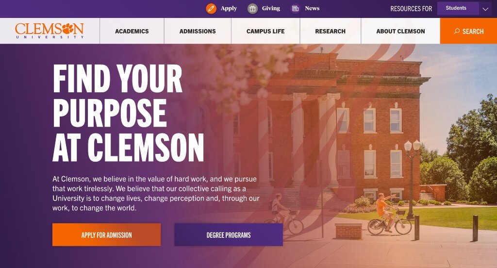
The loading icon was unique for them, and we loved it. Using their paw print in lots of different areas was another thing that we enjoyed. We also liked how a search bar for majors and programs was included. Their color scheme was beautiful and matched well because it is their school colors. Their interesting graphic near the bottom was also really cool.
39. Hamilton College
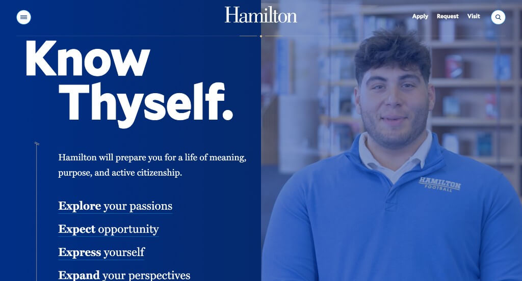
Including images and videos was a smart idea to balance out their visuals. Our web designers thought this was a good design idea for educational sites because of their optimized content. Another thoughtful feature within Hamilton College was their captivating font. We also loved their vertical lines that signify movement through this layout.
40. University of Tennessee
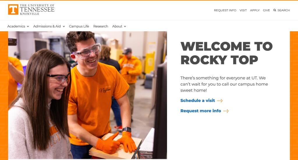
Graphics are definitely what helps separate this example from its competitors. They can be noticed everywhere within this site and make for a more creative feel. We enjoyed their subtle transitions that helped to highlight certain information. High-quality visuals was another feature in University of Tennessee that we enjoyed.
41. Virginia Tech
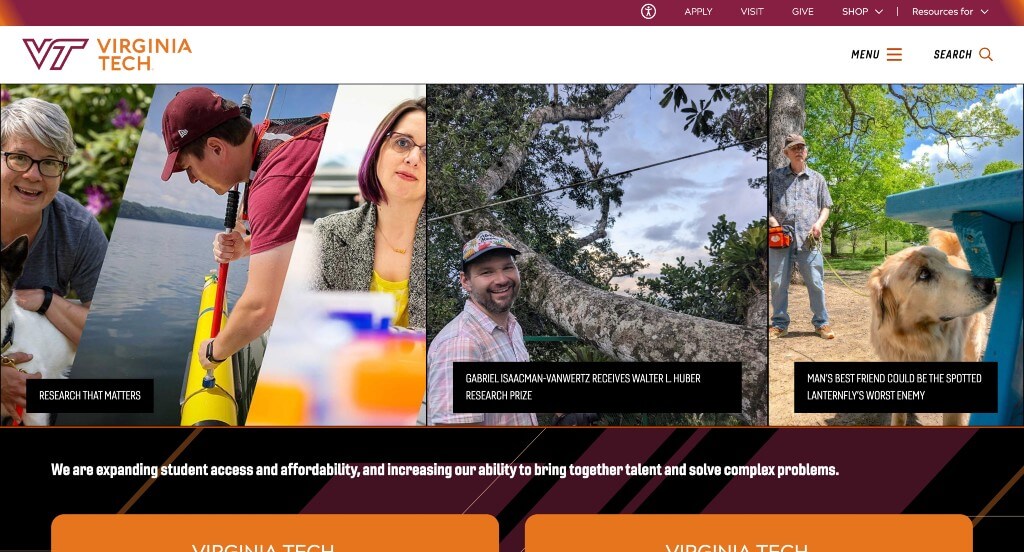
Although this was a fairly simple example, we loved their interesting backgrounds for banners along with their brightly colored buttons. Including videos was also a good choice, because it’s helpful for those who retain information better through audio. Having a menu that expands to provide more helpful information was nice. We also liked how they occasionally used an ombre feature to make everything look great.
42. University of Rochester
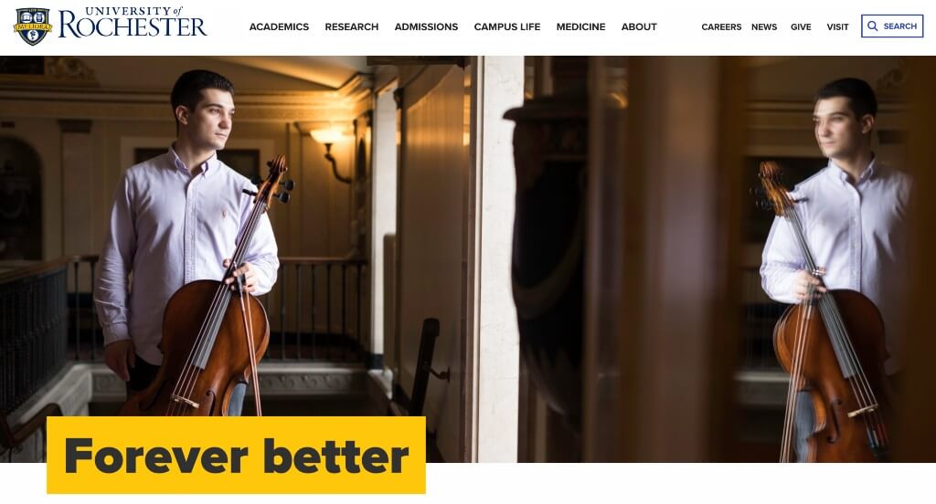
Graphics easily display where quotations are including, helping them stand out more. We liked their bright yellow highlight that shows off titles. Having links almost right away relating to how to apply, financial aid, and their programs/majors. We also loved how they organized their images in an interesting way. Incorporating social media was something else that we couldn’t ignore.
43. Muhlenberg College
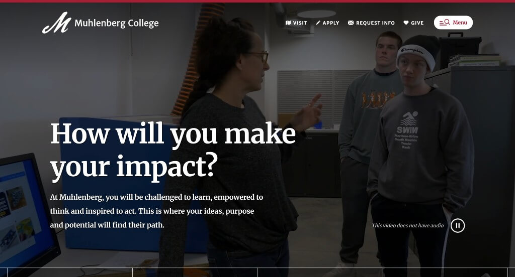
Simple, professional fonts was one of our favorite parts about this example. They occasionally used simplistic graphics for a background because it looked great. Showcasing information about their student life by using videos of actual students speaking helped them stand out. Using a grid of sorts to show useful statistics.
44. UW Oshkosh
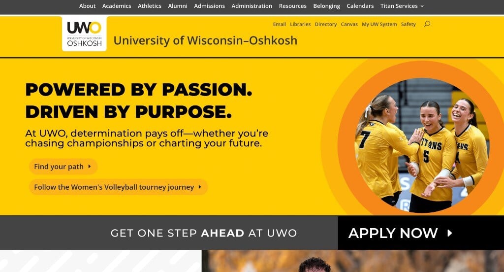
We liked how their site was designed knowing that students, parents, those considering UW Oshkosh, and alumni could be visiting. Using graphics as patterns within their webpage was smart. We also really liked how lots of bright yellow buttons are used to provide additional information. Their navigation bar makes information very easy to find, which is amazing for anyone looking for something.
45. UW Green Bay

We loved this example because they used vibrant colors that don’t necessarily match their school colors exactly. Interesting accent graphics and frames was also very nice. We liked how they included the phrase “Try on your wings” because when you attend UW Green Bay, you become a phoenix. Their domain is also very logical and simple, a feature we like to point out.
46. UW Madison
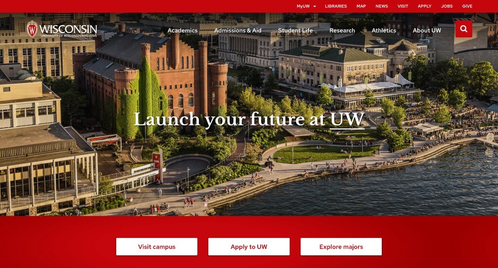
UW Madison is a great example if you are looking for a classy template. They use lots of high quality images to engage people. Showing that they are a campus who values diversity was also a nice addition. Using a simple but professional font was also a nice touch for a custom education website. Short paragraphs blended with bold titles helped keep everything organized.
47. Loyola University Maryland
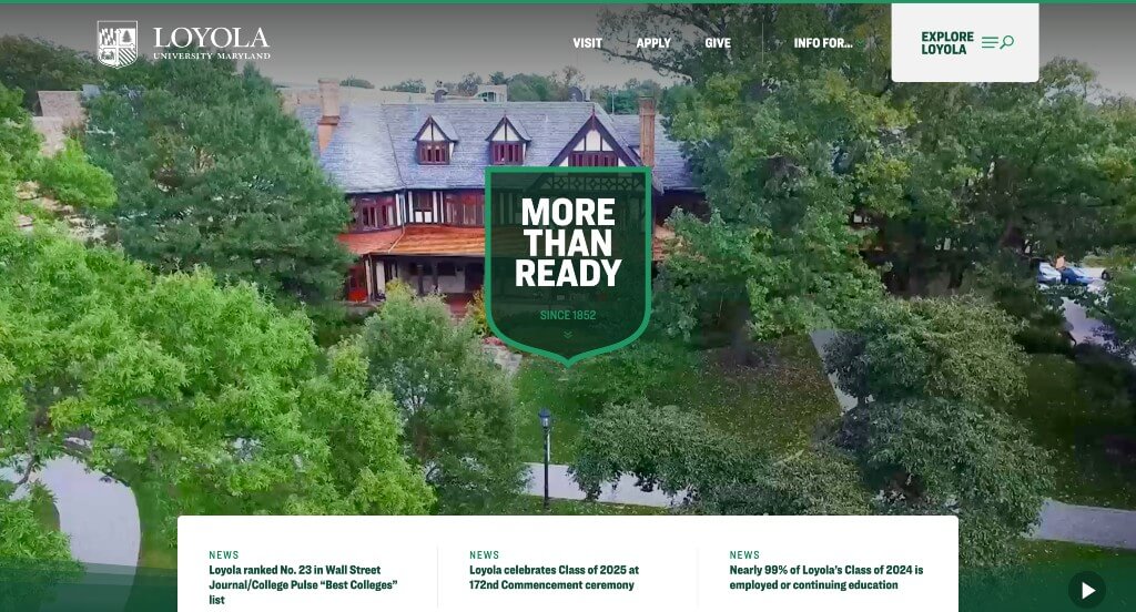
Showcasing their crest in a few places was nice. We liked how little lines with stripes within them are used to add a bit of visual interest. Utilizing short phrases to grab attention was a feature we couldn’t ignore. Simple fonts was another one of their marketing features that really stood out to us. Having a page dedicated to applying was super smart, because there’s a lot of information that is needed.
48. University of Notre Dame
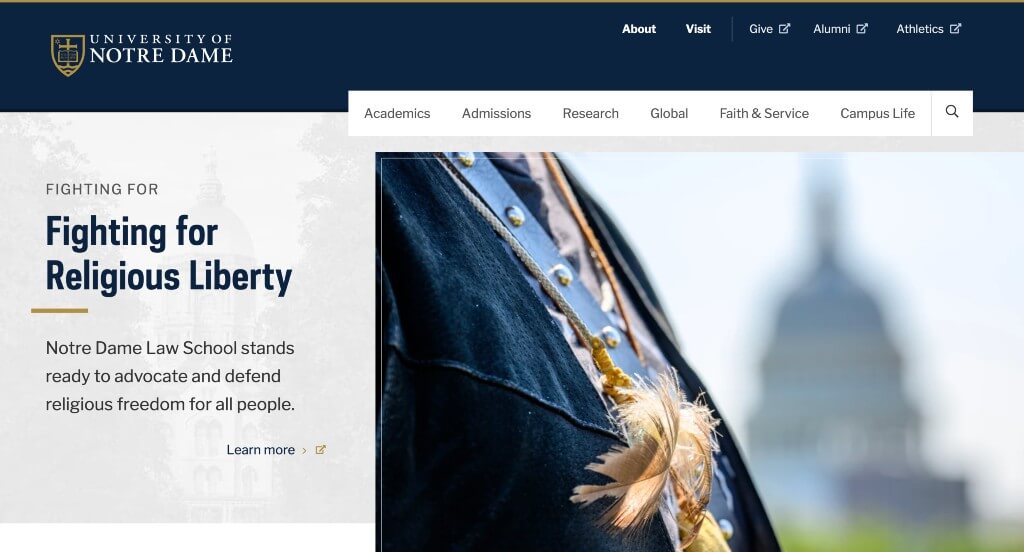
We enjoyed how each of their images have a thin line to create a stunning frame. Having their beautiful school colors within University of Notre Dame was perfect. Using a staggered alignment for images and text was very impactful quality for them. Using news stories focused on students or their programs was another design quality we noticed.
49. Georgetown University
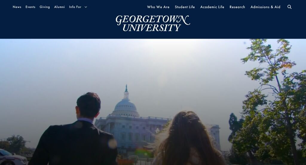
Short paragraphs make for information that is easy to understand and retain. Occasionally using images with a white overlay as backgrounds was an amazing choice. Using videos, images and image collections was a great choice. This navigation bar was also well organized, making it very easy to find useful information. Including their X posts right in this homepage was something else that we enjoyed.
50. Park University
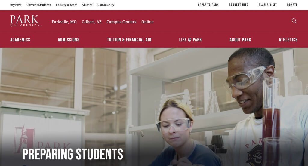
We loved how capital, bold fonts are used all around this example in order to grab attention. Their large buttons was another very helpful aspect. Showing off their different locations with large images was not only helpful, but attention grabbing. We also liked their interesting logo found in their footer.
WordPress Educational Themes
You can find free themes at wordpress.org or explore educational templates on ThemeForest.
Educator – Themeforest
$79
Eikra – Themeforest
$49
Kalvi – Themeforest
$49
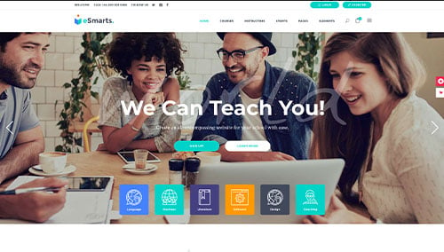
eSmarts – Themeforest
$85