Hey, trend setters! Ready to make a statement and attract more customers online? We’ve managed to find 50 great fashion sites to inspire you.
Our team searched far and wide to find sites that shine in design, functionality, and user experience. From sleek looks to smooth navigation, these examples show how to bring serious style online.
Get ideas for your own business and tips to make your online presence pop! You’ll find examples from clothing brands, accessory designers, retailers, stylists, and more. Looking for other industries? Check out our full website inspiration guide!
Top Fashion Website Designs
- 1. Gym Shark
- 2. Albion Fit
- 3. Urban Outfitters
- 4. Dior
- 5. Young & Reckless
- 6. Forever 21
- 7. Everlane
- 8. Athleta
- 9. Allen Edmonds
- 10. SSENSE
- 11. Zara
- 12. GUCCI
- 13. Versace
- 14. Louis Vuitton
- 15. Ralph Lauren
- 16. Coach
- 17. Rollie Nation
- 18. DKNY
- 19. John Varvatos
- 20. Melula
- 21. N. Peal
- 22. Nordstrom
- 23. Marysia
- 24. Rolex
- 25. Banana Republic
- 26. Tommy Hilfiger
- 27. Balenciaga
- 28. Burberry
- 29. True Links Wear
- 30. Tom Ford
- 31. Kenneth Cole
- 32. Calvin Klein
- 33. INDEE
- 34. Micheal Kors
- 35. Marrisa Wilson NY
- 36. Paul Smith
- 37. Puma
- 38. Prada
- 39. Timberland
- 40. Lucky Brand
- 41. Thursday Boot Company
- 42. Express
- 43. Hugo Boss
- 44. Armani
- 45. Omega
- 46. TAG Heuer
- 47. Mango
- 48. Christian Louboutin
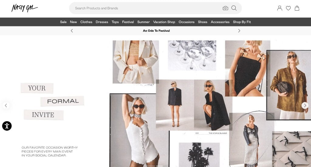
- 49. NastyGal
- 50. Steve Madden
1. Gym Shark
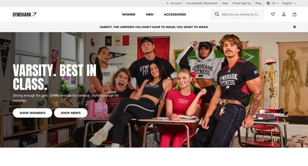
Gym Shark uses mainly black and white that lets their products be the pop of color for their site. Large imagery and videos to break up content was something that was really helpful. It was cool to have an innovative logo that makes sense for their company name. Adding in a search bar and a well labeled menu was a great thing to have. Finally, we like Gym Shark’s variety of brightly colored products.
2. Albion Fit

Right away, we noticed how Albion Fit used full page images to liven up their site. Having areas dedicated to best sellers and new arrivals was another feature we loved. Using a neutral color scheme helped to create a more relaxed template. It was smart to include a star rating review system for products within their site. Albion Fit also used a’s to create a logo looking similar to a butterfly.
3. Urban Outfitters
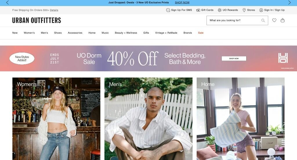
Right away you’ll notice how this company makes good use of bright colors in a banner to highlight important information or sales. We also thought their interesting arrangement for images was nice to help stand out. Large buttons were a great option to help people to find what they are looking for. Using bold fonts that were very professional was another choice we loved. Finally, their product images were very appealing making shoppers want to buy something from them.
4. Dior
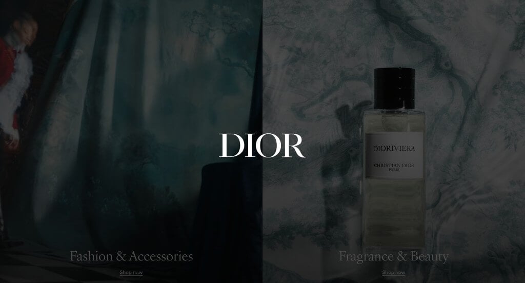
One of our favorite parts about Dior was their option to choose between Fashion & Accessories or Fragrance & Beauty. A mix of stunning images, celebrities and inspiring phrases all work together to motivate viewers to make a purchase. Dior also has some stunning transitional animations that make their whole template seem luxurious. We loved their menu that was extremely organized, making their content easy to find.
5. Young & Reckless
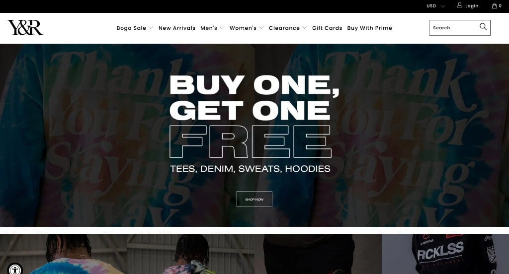
Young and Reckless showcases a layout that seems almost urban, which matches their clothing also. We liked how their images were planned out to have relatable backgrounds and such. Having bold fonts helped important titles and sales stand out. We thought it was helpful to use images to sort out products into other areas of the site. Any web designer creating mock-ups for clothing stores will want to consider checking this one out.
6. Forever 21
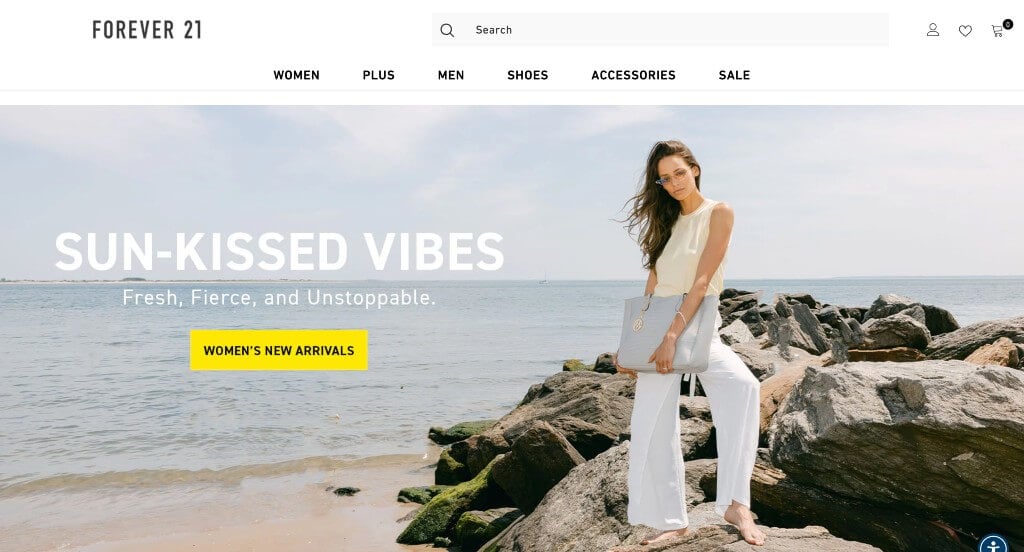
We loved the pastel accent colors that can be noticed in Forever 21’s web design. Their innovative way of incorporating images into each page was very impactful. A feature for Forever Favorites was something that we truly loved. Additionally, we noticed a search bar and favorite section, which is always a plus. You won’t be disappointed after reviewing this website for design ideas for your next website!
7. Everlane
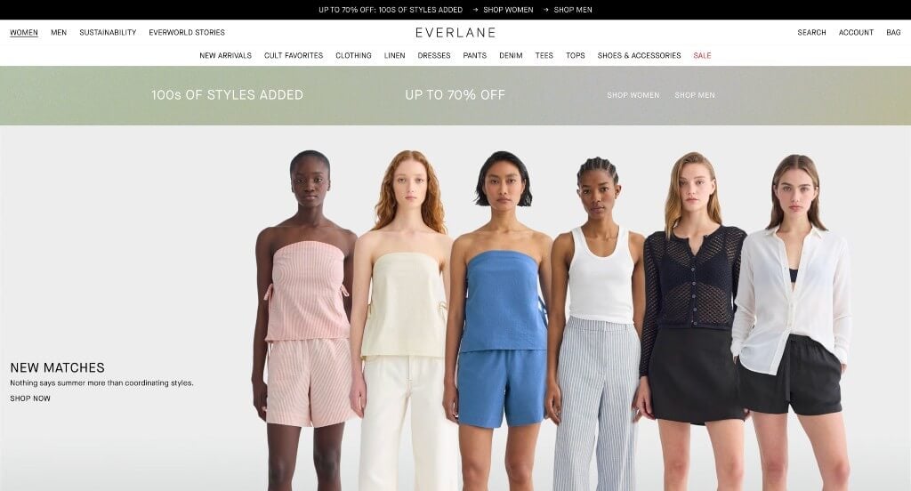
Here’s another great example that knows how to take a simple color scheme and make something stunning. It was a great choice to allow customers to filter products by color, fabric, and other factors. We also thought it was helpful to have little tags showing products on sale and new arrivals. Everlane clearly put some thought into their domain when matching it to their business name. We also liked how their prices were seen before clicking on them.
8. Athleta
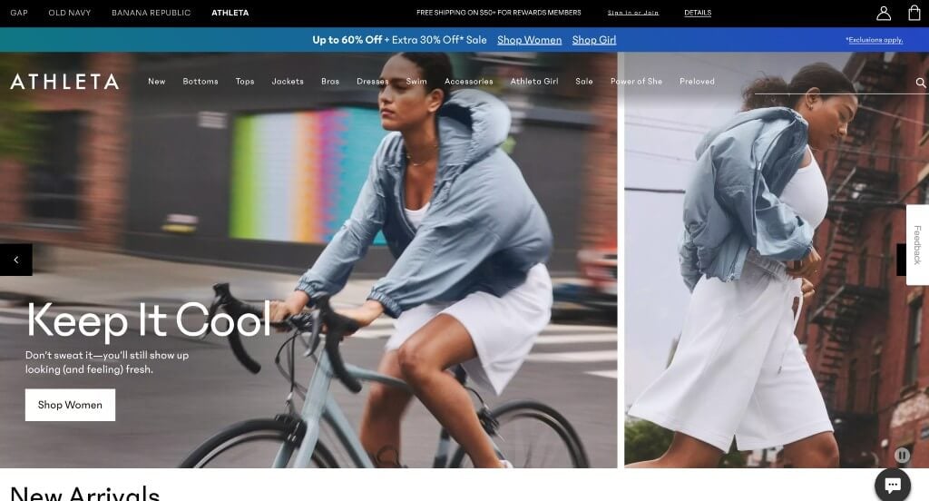
We really liked how Athleta went with multiple pictures one after another to create a stop-action sort of feeling. Their color scheme was neutral and helped their products stand out more. After scrolling through this website, you’ll notice how the information flows in a logical and organized manner. Showing off both the front and back of their clothing was something that is always helpful.
9. Allen Edmonds
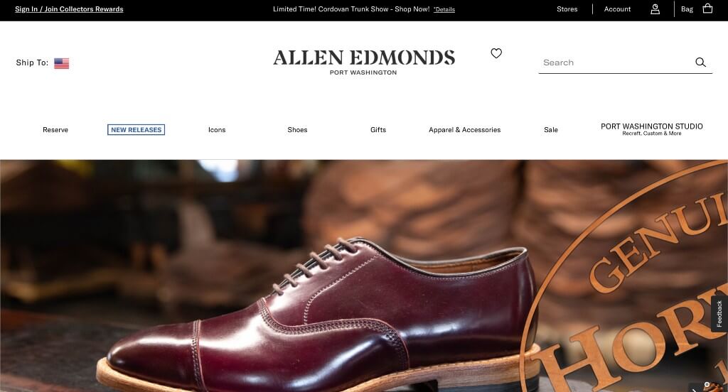
Visuals are the best part of this example. They used both high quality images and videos – large and small – to create conversations within their design. It was cool to have images that show their shoes seemingly floating in midair, showing off some of their best qualities. We loved how Allen Edmonds used interesting fonts to attract customers. A little information banner near their footer was nice to include small bits of information and their mission statement. Adding social media right into their webpages was another feature we couldn’t ignore.
Related: Stop searching for your fashion website in search results. Hire a fashion SEO company with experience helping such brands rank in search results.
10. SSENSE

Right away, we loved how SSENSE created a newspaper feel for their overall template. Images were formatted into different sizes to create variety within their unity. Simplistic fonts are also used so users attention is captured right after seeing an interesting image. SSENSE had conversions in mind when building a wishlist feature. We also thought that they did a great job including recent information related to their products while also displaying their clothing.
11. Zara
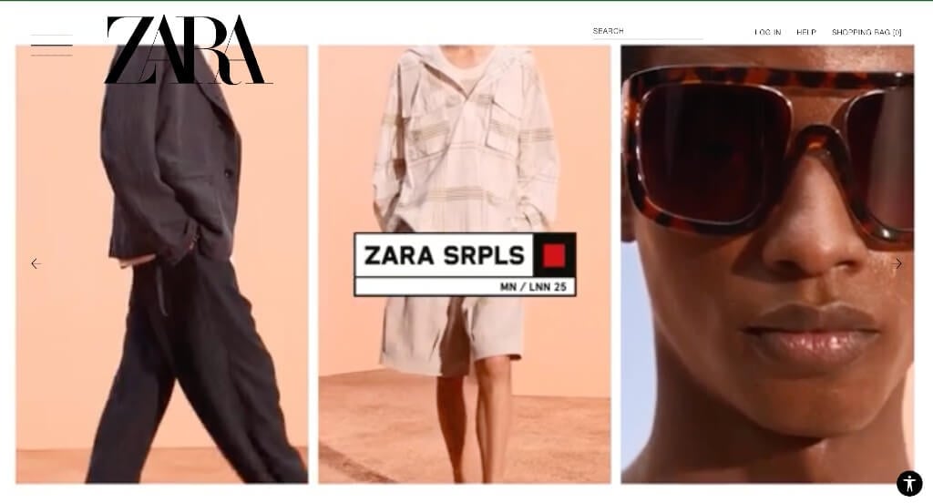
ZARA gets us right away with their seemingly overlapping letters in their logo design. They also make use of a black and white palette, making for a sleek and luxurious look. Unique animations and transitions was another helpful idea. Their balance of white space, and a staple to have a refreshing look for any professional business. ZARA had conversions in mind when including a clearly labeled menu for better navigation.
12. GUCCI

Full page images is for sure an advantage for GUCCI. Their interesting spin on shoes, handbags and more helps them stand out in a competitive market such as fashion. Many of their images also seemed to have similar backgrounds and color schemes, allowing for a cohesive look. Subtle transitions can be noticed in this example, giving them a well-executed website. Additionally, stunning buttons were used to make information easier to find.
13. Versace
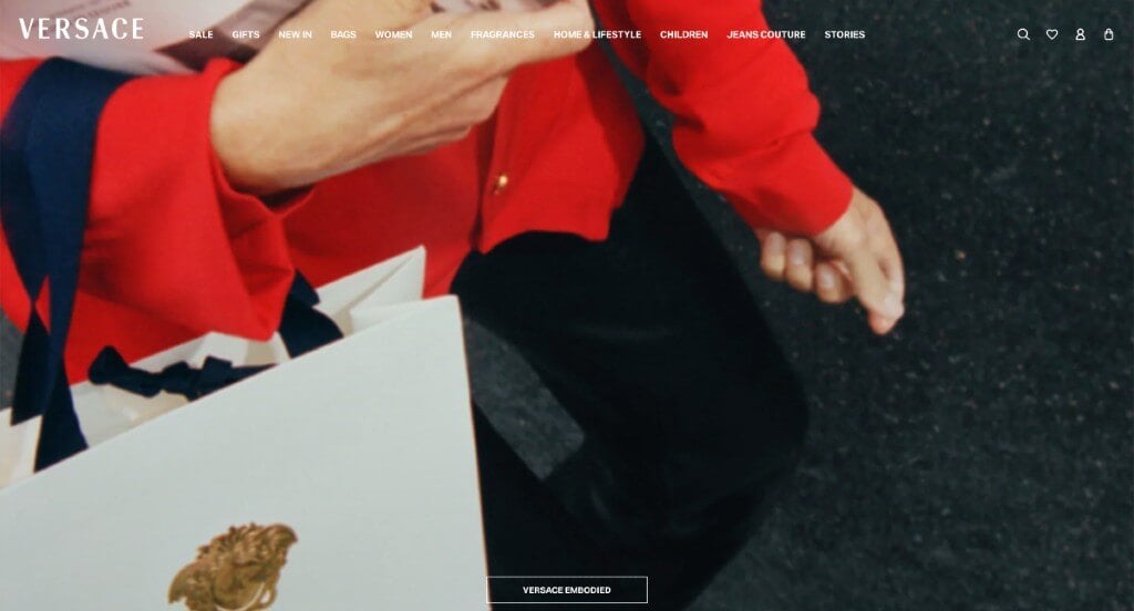
Right away, we liked how this brand had Medusa as their icon related to their logo. This makes sense for Versace because of their luxurious products and alluring nature. We loved how all everything was organized into different age groups (and gender), making it easier to shop. A feature of Versace we noticed was their thoughtful seasonal highlights. Some of their images used pinpoints to display certain products within the image.
14. Louis Vuitton

Louis Vuitton knows their worth, and they show it off. All their images are simplistic and well planned, making everything seem more elegant. Large images of models and celebrities wearing their clothes and accessories was another choice we loved. Noticeable buttons are also helpful because it directs customers through their content. It was also smart to keep their domain the same as Louis Vuitton’s business name.
15. Ralph Lauren

This modern site makes use of a video with interesting transitions. We loved how Ralph Lauren made good use of interesting photo frames and bright backgrounds for their images. Allowing people to see clothes on and off a model was a helpful to make purchasing decisions. A simple checkout process was used, which we always found to be very helpful.
16. Coach
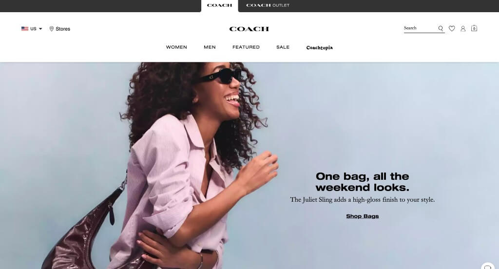
Right away, we saw that Coach collaborates with celebrities in order to get their customers to buy certain products. We thought an attention grabbing aspect in this apparel site was their subtle animations to add a bit of interest. We also thought it was cool to include little charm add ons for any bag. Coach had internet marketing in mind when building their Coach (Re)Loved feature.
17. Rollie Nation
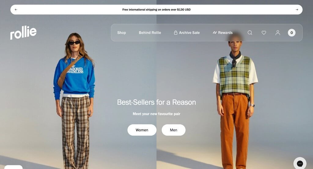
We chose Rollie Nation because of its innovative layout that asymmetrically balanced their content. Different sized images and frames was something that we really loved in this example. A showcase of their current collaborations was eye-catching and was definitely refreshing. We also liked how many short inspirational phrases are included. For apparel sellers looking for examples for their next layout, this one will absolutely be one to take a look at.
18. DKNY

We loved how DKNY displayed their aesthetic carefully within their images with unique filters and such. Bold fonts were used carefully throughout this entire site to create a modern design. Using creative imagery for their navigation bar was definitely smart. Having noticeable offered sales banners helped customers understand what is a good deal for them. Finally, we liked how they used occasional pop-ups to get more information out there.
19. John Varvatos
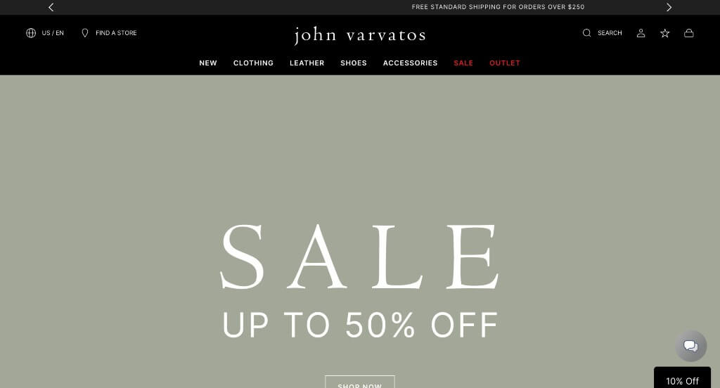
Right away, we noticed that this brand is focused on the high quality feel for their apparel. A good use of title fonts along with buttons helped with their overall feel and their navigation. Red writing used occasionally to emphasize their important content was a great choice. We also loved how their homepage focuses on their current collection right away.
20. Melula

Unlike any shoe brand we’ve seen before, Melula was focused on simplistic, colorful images that harness the true feeling of their shoes. A custom organization was used to feature lots of images in an interesting way, making their company seem more innovative. We also liked how a small section of their Instagram page was included.
21. N. Peal

The most important part of N.Peal was their images of great quality, that are carefully planned to create a simplistic feel. A small section is included for their newest collection. We liked how they included a drawing of London in their footer so customers understand where they are located. Including news stories was something else that we couldn’t ignore when looking at this example.
22. Nordstrom
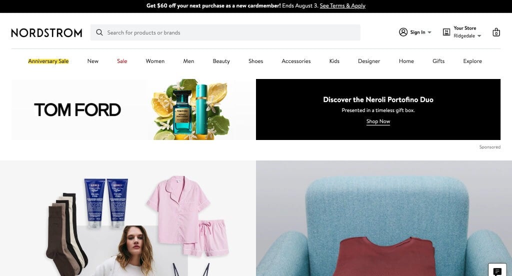
An emphasis was created on stunning photos that attract new and returning customers. After scrolling for a bit, you’ll immediately notice subtle animations to add a fun touch to Nordstrom. Being able to view garments in multiple colors was yet another reason why we included them on this list. A simple checkout process was another feature that we absolutely loved.
23. Marysia
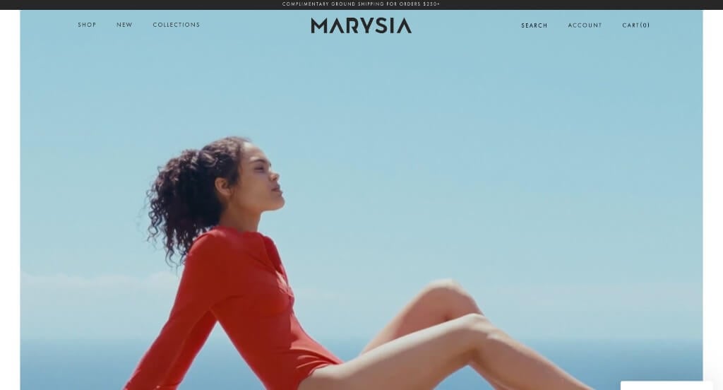
Starting off with an automatically playing video was something that we really likes about Marysia. We thought it was nice how this company shows their products both on models and off so customers can get a good feel for what they are buying. Addiitonally offering different colors and patterns for similar products was another thing we liked.
24. Rolex

This is a great example for anyone looking for professional site inspiration. As we moved through their webpages, something we enjoyed was their alluring high-quality videos that play on their own. Another design quality in Rolex that we found interesting was how images were carefully planned imagery to represent each watch perfectly. Additionally, they chose blog posts to help inform their target market on their watches and other fashion news.
25. Banana Republic

We thought it was cool to include crossover collections related to popular TV. We liked how they had a good balance of exotic, patterned designs with basic colors for their clothing. Another thoughtful quality that can be found in these clean pages was Banana Republic’s personal styling feature. There was also a page dedicated to their sale items that are still well organized.
26. Tommy Hilfiger

Images are used fashionably to help organize their content. We thought it was unique that they created different “shops” such as the spring break shop, new arrivals, logo shop, and their stories. After scrolling past this header, you’ll notice beautifully executed staggered imagery. Another thoughtful feature in Tommy Hilfiger was the ability to view fronts and backs of garments of your choice. Adding in a search bar was another smart choice for any online seller.
27. Balenciaga
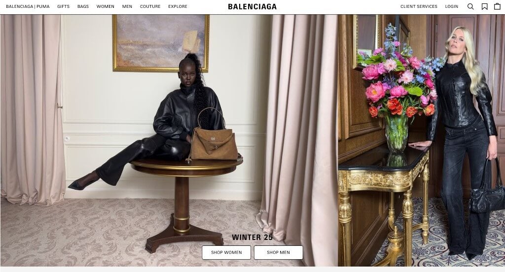
In a competitive market like this one, you need to learn how to stand out. Balenciaga certainly does that. Even through they have a simple black and white color scheme, they had images that were unique for clothing business. They made sure to only include information that was absolutely necessary, making it easier for customers to read. It was also unique to include famous signatures to help people see who is involved with this company.
28. Burberry

We appreciated how this brand used patterns within their products to decorate their layout. Additionally, we thought it was nice to plan out their images to make their products look like gifts to their customers. A navigation bar with more precise categories was another reason why we included Burberry in our rankings. Clearly labeled pricing was another addition that we felt was perfect for any shops going online. Finally, having a simple domain that matches their brand was a helpful feature.
29. True Links Wear

We liked how a welcoming video can be noticed that showcases a variety of their clothing items. Having a simple template was likely the most impactful quality for True Links Wear. We also liked that some of their images had the technology to allow customers to “shop the look”. Little tag-like features can also be seen that allow people to see unique features about certain items along with items on sale.
30. Tom Ford
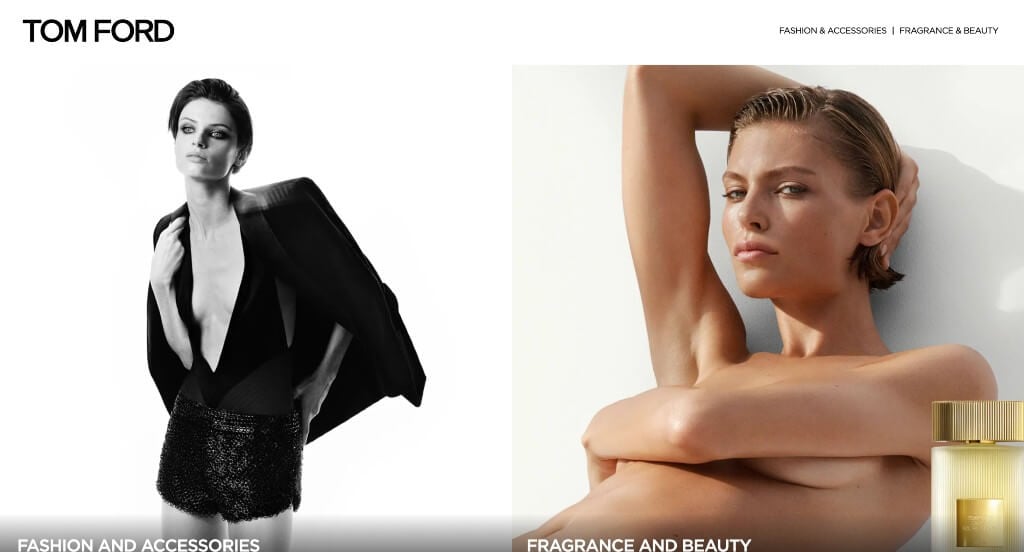
Visuals definitely guide customers through this amazing website. We loved their bright colors for products paired with dull backgrounds to help everything pop. Their even balance of white space was a great reason to include this business to inspire other professionals. We also thought their simplistic nature made everything all the much better. It was a unique choice to include links in their navigation bar that open in a new tab.
31. Kenneth Cole

This is a good example for fashion retailers to check out when looking for ideas for their webpage. Using black and white carefully in a way where black seems to dominate the site makes them feel more luxurious. We liked how circles of different items were included to link customers to each product page. It was unique to have a banner that includes any current sales.
32. Calvin Klein

Our web designers thought this was a good example of a homepage layout for fashion wear because of their high quality visuals. We loved how even though their images featured different models and products, it had a feeling of unity throughout them all. Being able to easily navigate their site due to their navigation bar and use of filters was a great choice. Don’t skip past this one when hunting for ideas for your next clothing website!
33. INDEE

Anyone looking for a custom look and feel and needing ideas should make sure to take a look at this one. As you scroll through, you’ll notice how they use a bold and fun text. Bright colors that make the most sense for their current collections can be noticed, making their layout stand out from their competitors. Incorporating social media was refreshing to say the least. We also liked how small icons and scrolling fonts are included to help add to their design.
34. Micheal Kors
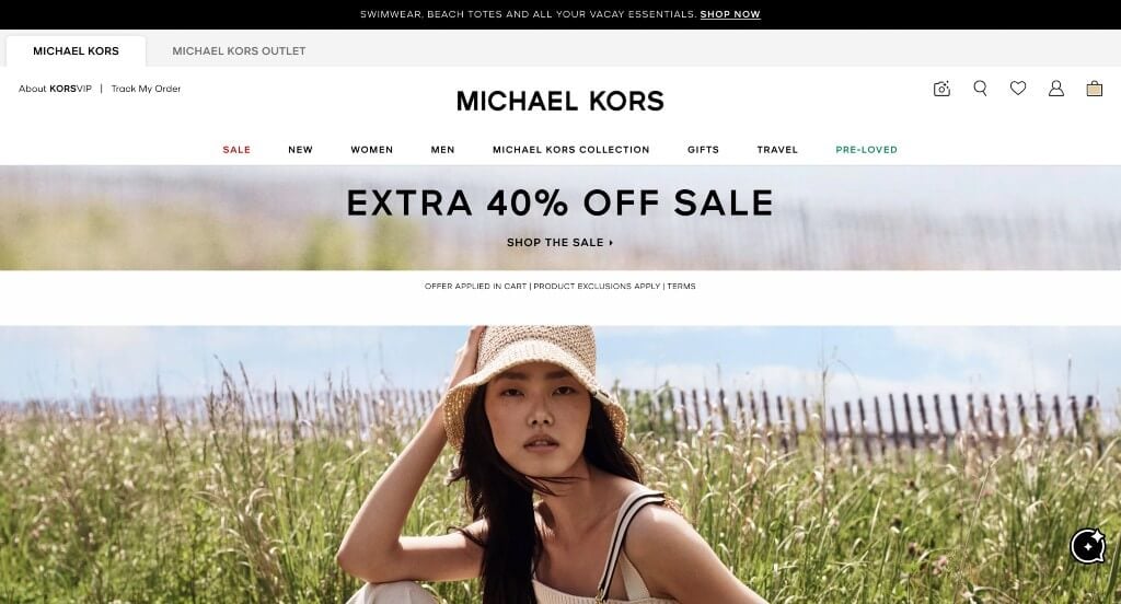
Michael Kors makes great use of natural colors, which we like because feels different than the typical modern black and white. We loved how their backgrounds for images seemed from a place of peace (oceans, stunning villages, tropical trees, etc.). Sorting garments by their categories was a choice we didn’t ignore. Including a pre-loved page was helpful and unique for a brand like this one. We also thought it was nice for the homepage to include a section for new releases.
Related: Looking for help managing online reputation, social media profiles, or lead generation? You might be interested in digital marketing for your fashion business!
35. Marrisa Wilson NY
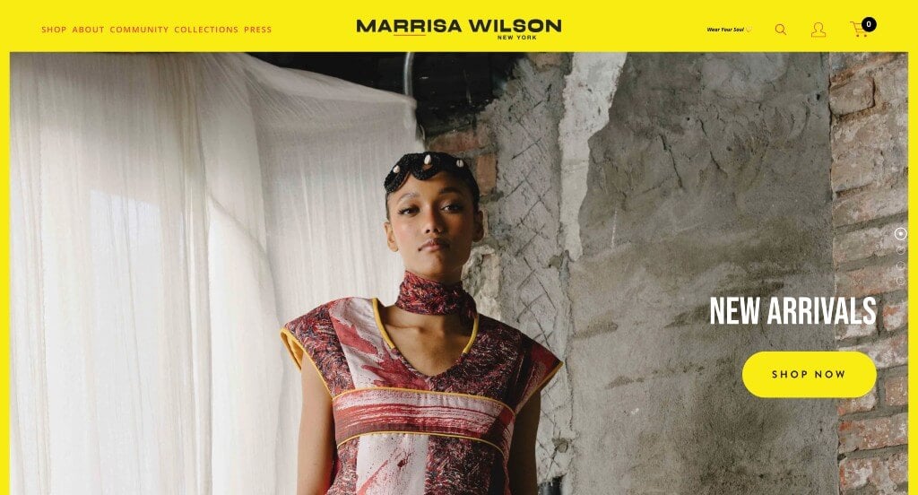
This example did an amazing job with their accents of bright yellow accents without it being distracting. We also really liked how they made use of high quality, full page images to create a more visually appealing design. It was also nice how these images sometimes featured models and other times featured just the products.
36. Paul Smith

First off, we thought their logo design was fun with their handwritten font. An automatically playing video with a variety of items included was a great inclusion. We liked how Paul Smith weaved in blog posts in between their images and other content. Another thoughtful quality of this creative template was their clean balance of white space. A simple domain that matched with their company name was another perfect choice.
37. Puma

Right away we noticed the large, bold fonts that attract attention. We loved how they made use of images that showcase action, movement – which is what Puma wants to display. We liked how they included a “how to wear it feature” that pairs the product you want to purchase with other items from them. Another design quality in this custom template that was smart was their logo used as a loading icon. It was also nice to include a product story, features & benefits, details, material information, and care instructions for each product once clicking on an item.
38. Prada
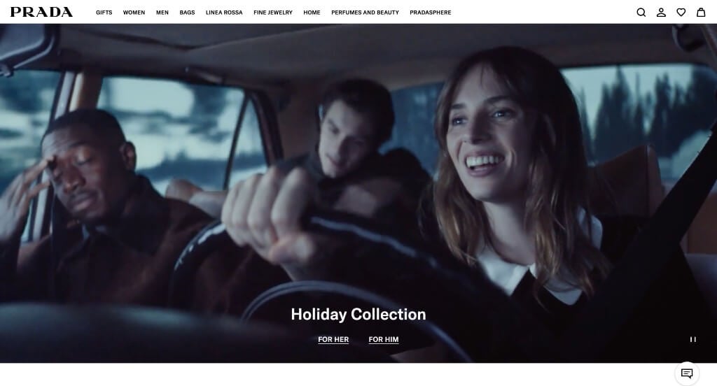
Here, you will notice large images that display their products while also taking advantage of famous people. We liked how a simple color scheme is used to help those images be the main point of their website. It was nice how nearly every product image showcases their logo. Prada also puts full page videos to the test when creating their alluring template.
39. Timberland
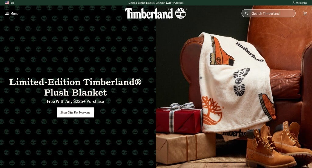
Timberland has a very classy feel to it, thanks to its blended use of black, white and burnt orange. Additionally, they used interesting fonts throughout this whole site that made sense for their unique products. We loved how their logo design can be seen all throughout this site. Making sure prices were clearly stated was another design quality that we enjoyed. Timberland had website accessibility in mind when creating a menu with specific categories.
40. Lucky Brand

Right away, Lucky Brand offers deals by allowing customers to spin their wheel. We also noticed that they made use of a live chat feature too, which was nice. They did a great job showcasing an aesthetic within their images that becomes a face to their brand. We also liked how they placed images randomly but still created a balanced look. It was cool to have their large hero image stay frozen, while a smaller one beside it changes frequently.
41. Thursday Boot Company
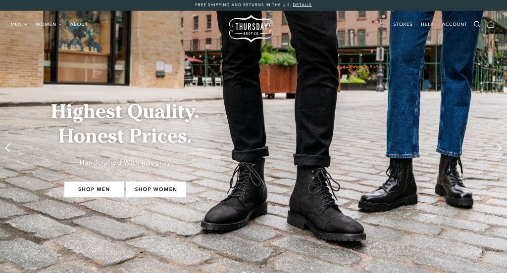
What grabbed our attention was their sleek and fitting logo. Including customer reviews and showing popular brands that have featured them were two things that are essential to build trust with customers. This company also used quirky names for their items, which makes people more interested. Their simple navigation was refreshing for a professional website. Thursday Boot Company also had a well-labeled footer, which was beyond smart.
42. Express
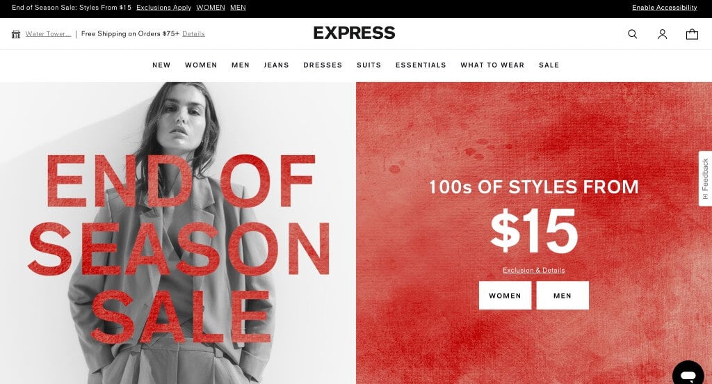
We thought this was a good example for apparel sellers because of this creative arrangement and spacing of imagery. Allowing people to see garments at different angles was another quality we enjoyed. Express did a great job utilizing their images as backgrounds often. This allows for content to be included without feeling too wordy. Adding in celebrity picks was a unique feature that we absolutely loved.
43. Hugo Boss
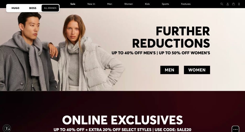
This was a nice turn on a merged fashion company. Letting customers shop by Hugo or Boss or all brands was another great choice. It was also nice that it’s also an option to search by polos, activewear, office wear, transitional layers and more. Including collaborations such as TV shows, celebrities and more was another cool idea. Allowing people to join their Hugo Boss newsletter was another aspect we loved.
44. Armani
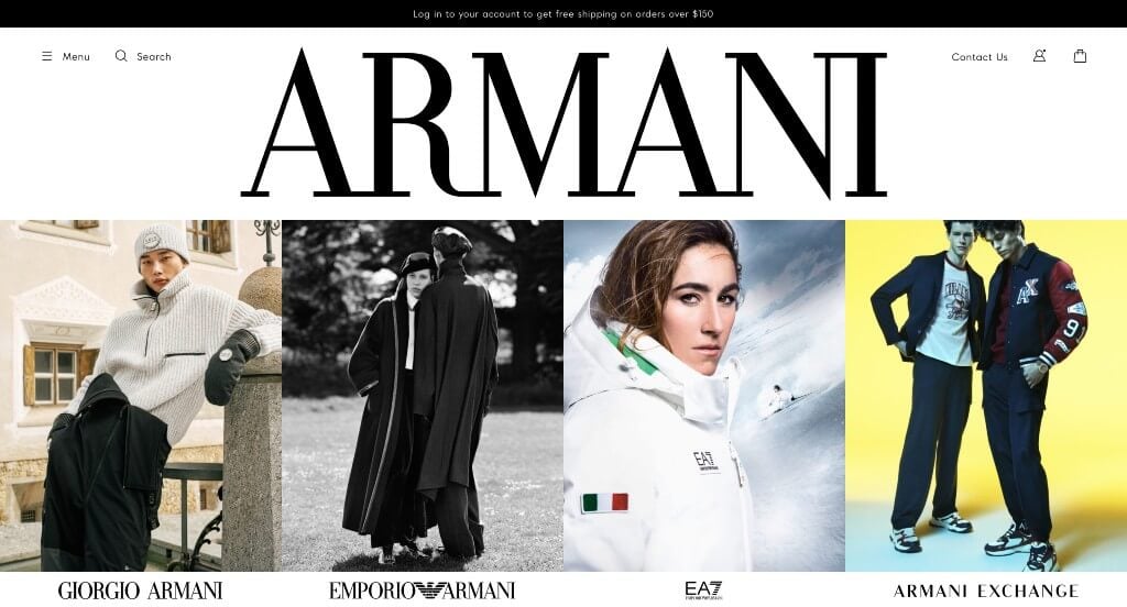
Showcasing each sub company within Armani was something we found helpful. Images that are included are both high-quality and well planned, making it an amazing addition. A black and white color scheme is used that lets images speak up was perfect. We enjoyed how bold and professional fonts are used to allow for a modern and professional approach. Using large buttons for simple navigation was absolutely a consideration when ranking Armani in our list.
45. Omega
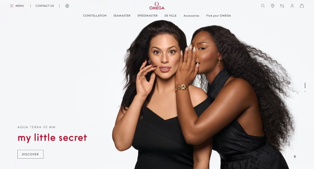
Creating custom watches that match with the upcoming holidays was an aspect we loved. Their simplistic and luxurious logo was something that’s small, but a great addition to any site. As we scrolled through, we liked how red was incorporated throughout for an alluring look. Different sized images staggered throughout the page created an interesting look. Allowing customers to add certain watches to their wishlist was another feature that was helpful.
46. TAG Heuer

Here’s another watch business that knows how to attract customers through their legendary videos. Within these videos, they use bright colors, interesting graphics and of course, their product. We thought it was cool to have watches endorsed by certain celebrities. Showcasing that Tag Heuer is responsible as the timekeeper for Formula 1 was an addition that people will notice.
47. Mango
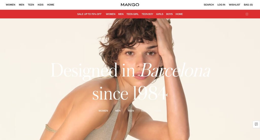
Upon entering this websites, we noted their innovative and professional fonts used throughout the entire web page. Large images are also used to attract the attention of people, getting them to explore more of this design. Including a wishlist was something else we feel every clothing company should include. They also do a good job with their simple subscription option for a newsletter.
48. Christian Louboutin
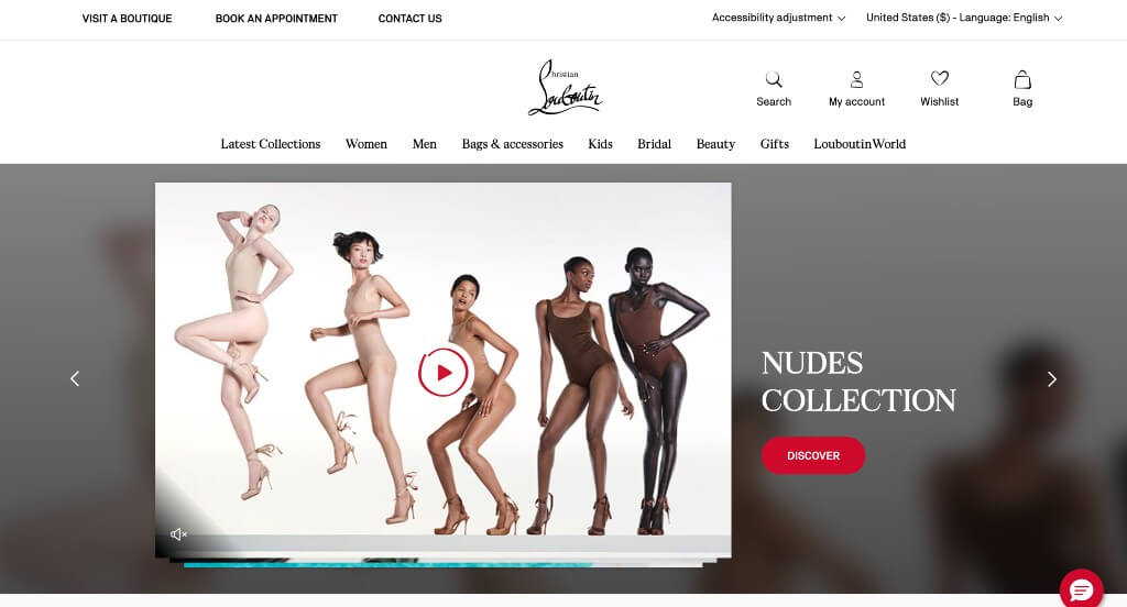
We loved everything about this design – first captivating videos and unique products. Their logo design might have been Christian Louboutin’s best feature. It was not only unique to them, but it was also beautiful. Using images that played on blurred motion was interesting for any online site and it helped set them apart from their competitors. Finally, we loved how they accented this template with the same bold red that covers each sole of their shoes.
49. NastyGal
We quickly noticed how this brand focuses on their identity as a “grunge” business. We loved how they made use of almost handwritten fonts to add to their unique touch. Their high quality images that mix their image with written content was great. Showing off which payment options are available was something customers will appreciate. Having an updated blog was also helpful to get additional information out to their target market.
50. Steve Madden
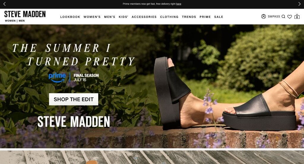
Almost instantaneously, viewers’ attention is captured by their images with bright colors that tell a story. Bold fonts are used all throughout their template, which helps guide customers to information that they need to see. Their menu also sorts everything into nice categories. We especially liked how they included a list of their different shops if you are looking for something more seasonal. Another good choice was their ability to add items to your wishlist, making them easier to access later.
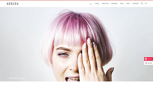
WordPress Fashion Themes
Free themes can be found at wordpress.org, or explore fashion-inspired templates on ThemeForest.
Azalea – Themeforest
$85
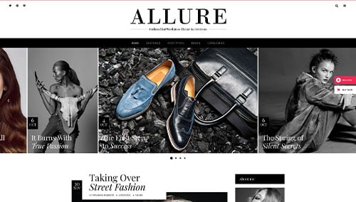
Allure – Themeforest
$69
WooCommerce Fashion Themes
A wide range of e-commerce fashion themes for WooCommerce are also on ThemeForest.
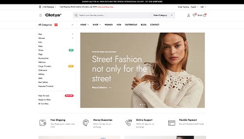
Clotya – Themeforest
$29
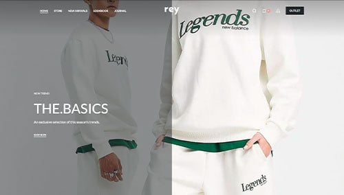
Rey – Themeforest
$69
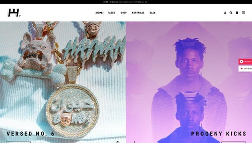
Haaken – Themeforest
$75
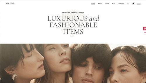
Valeska – Themeforest
$79
Shopify Fashion Themes
Explore more free and paid themes at themes.shopify.com, or browse options through marketplaces like ThemeForest.
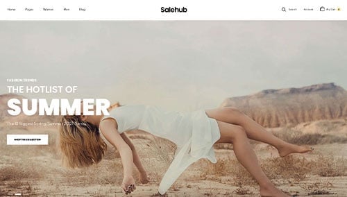
SaleHub – Themeforest
$59
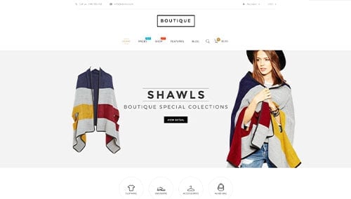
Boutique – Themeforest
$59
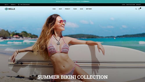
Belle – Themeforest
$79
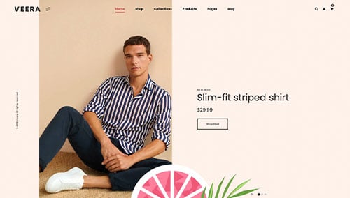
Veera – Themeforest
$69