Welcome all! Want to boost your online presence and attract more clients? Check out our guide to the top 50 home builder sites. We’ve handpicked our favorite examples based on design, functionality, and user experience – from sleek layouts to intuitive navigation.
Find inspiration and pick up expert tips to stand out online. Whether you’re a custom home builder, remodeler, or modular home expert, this list has you covered. For more web design ideas across industries, visit our top ranked website designs article!
Top Home Builder Website Designs
- 1. Highland Custom Homes
- 2. Liberty Homes
- 3. UnionMain Homes
- 4. Sustainable 9
- 5. Scott Salisbury Homes
- 6. CBH Homes
- 7. C&M Home Builders
- 8. Latala Homes
- 9. Xhema
- 10. KB Home
- 11. QualMax
- 12. Toll Brothers
- 13. Tri Pointe Homes
- 14. Martell Builders
- 15. BH Design & Build
- 16. Housebrand
- 17. Shea Homes
- 18. Ellis Don
- 19. Artistree Home
- 20. Ivory Homes
- 21. Stokkers & Company
- 22. JDG Constructions
- 23. The Farrell Companies
- 24. Riverside Homebuilders
- 25. Sweenor Builders
- 26. CCS Homes
- 27. Virtue Homes
- 28. AR Homes
- 29. M&M Custom Homes
- 30. Highland Homes
- 31. Risewell Homes
- 32. Bill Huey + Associates
- 33. Wausau Homes
- 34. Cover
- 35. Ryan Homes
- 36. Stylecraft
- 37. K Hovnanian Homes
- 38. California Home Builders
- 39. Canyon Design Build
- 40. Stanley Martin
- 41. Olson Homes
- 42. Sierra Classic Custom Homes
- 43. Pulte Homes
- 44. Maronda Homes
- 45. Century Communities
- 46. Lexington Homes
- 47. Beazer Homes
- 48. Mattamy Homes
- 49. Schumacher Homes
- 50. Sina Homes
1. Highland Custom Homes
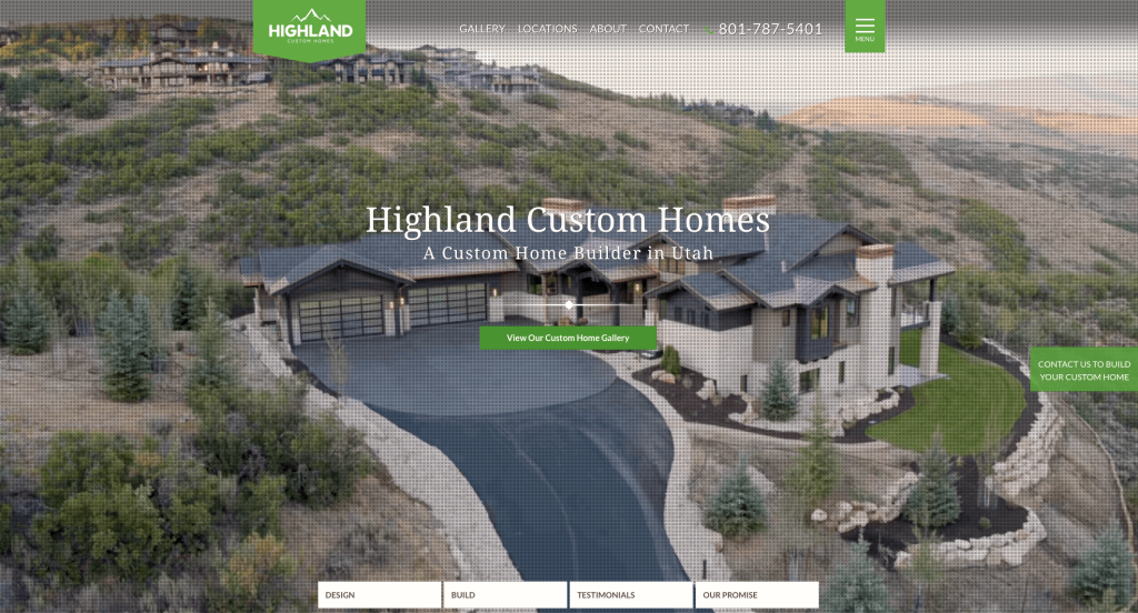
There was a great accent of bright greens that grabbed our attention. We loved how there were creative background graphics that matched their business, but also helped them stand out. Another thing that we enjoyed was their FAQ section to help customers explore more. Their logo was also very simplistic, proving to be very effective.
2. Liberty Homes
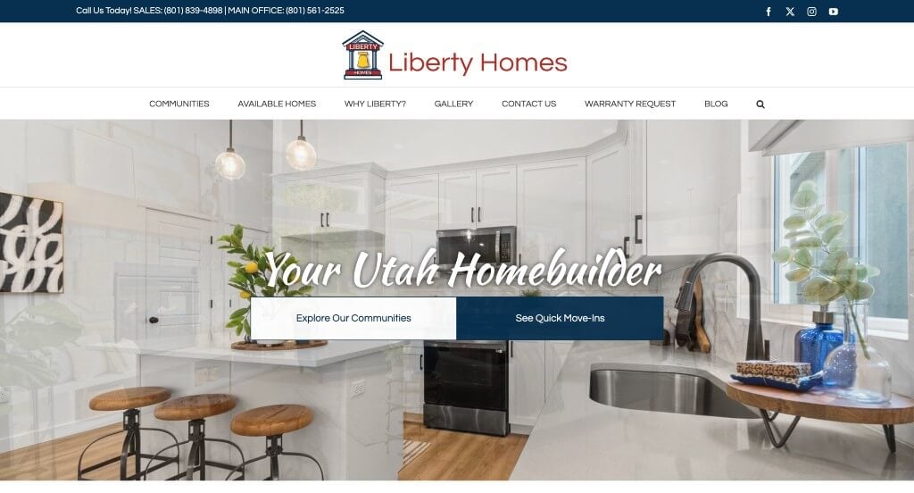
This company grabbed our attention with their large image used for their hero header. Additionally, their logo made sense for their business without being too complex. We liked their seemingly handwritten fonts that appear as their titles. Including different communities they are selling homes in or typically build homes in was a great choice.
3. UnionMain Homes

Starting with an automatically playing video is a great thing for those entering their site. Being able to search for filters to find the perfect home for you was a great choice. We liked how each home plan had starting prices on them without even having to click on them. Their menu was also very organized making it much easier to find information within their pages.
4. Sustainable 9

We loved this company’s dark background color that helps their text and accent colors pop. Additionally, we thought it was nice how they use small graphic patterns that improve their overall template. We thought that their logo was simple but still creative. Another thing that we really liked was their loading icon that appeared as another version of their logo.
5. Scott Salisbury Homes

This example did an amazing job with their blend of simple and professional text in order to help certain content stand out more. We liked their occasional use of black and white images. We also liked this logo that appeared to be a building but wasn’t super complex. Showing their building awards was also a great choice because it helps show that they are a reliable company.
6. CBH Homes

Our favorite part about this webpage was their creative fonts that made them feel more personal. A live chat also was interesting and it makes communication better. We loved their accents of bright red that helped highlight important information. We also thought that this personalized search bar was another great idea for a page like this one.
7. C&M Home Builders

C&M Home Builders is a great example that uses bold and professional fonts. You might notice how content is carefully optimized in order to get better results from their readers. We also thought it was cool how they occasionally used different photo frames and overlapped text boxes to create an interesting look. Our team loved their logo that made use of a simplistic house and some line sketches.
8. Latala Homes
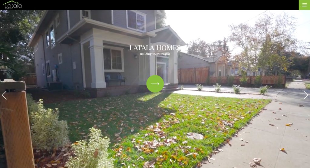
We loved this green accent that can be found in all pages of this example. There was also very professional fonts, which is always a good choice. It was smart to include their some of their portfolio right away in this homepage. Another feature we noticed was how their testimonials were displayed. Along with all of that, we enjoyed their simple contact information and a clearly labeled menu.
9. Xhema
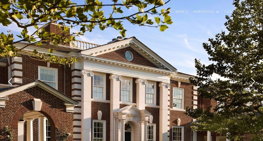
Right away, we noticed how a city portfolio and a country portfolio was included. We felt this was a great choice because their final images have different aesthetics going for them, so it’s nice to see what this company can do. Everything was displayed very simply, which we also enjoyed. They clearly were thinking about their viewers when choosing quality information to include in this website.
10. KB Home

Yellow accents highlight specific areas of KB Home to grab attention of anyone visiting this webpage. This company clearly knows how to balance between text, graphics and images. Another feature they did well with was including buttons to enhance usability. We also really enjoyed their interesting shapes that were accents behind and near images.
11. QualMax
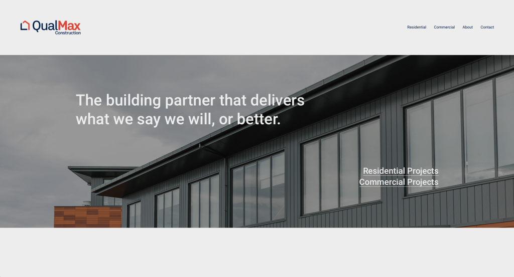
Balance is QualMax’s best feature. They take the time to create an arrangement for their content that makes good use of each area, while still including whitespace. Along with that, they do a great job using large images to break up content carefully. They had usability in mind when picking out this domain because it matches their company name.
12. Toll Brothers

One of the first things that we noticed was Toll Brothers’ use of a search bar to find homes in your desired area. There was lots of icons that were carefully placed to create a better balance between visuals and words. Another thoughtful feature within this example was a map showing where they build homes. We also felt it was an interesting choice to be able to add to favorites, and view those favorites whenever you choose.
13. Tri Pointe Homes

White, gray and lime green colors strike customers eyes and creates a clean feel. We loved how each house was displayed with an image, status, location, price, size and additional features to give possible clients a good idea on what they’d be getting if they purchased. Using bullet points is something that we always find helpful, so we noticed it here too.
14. Martell Builders
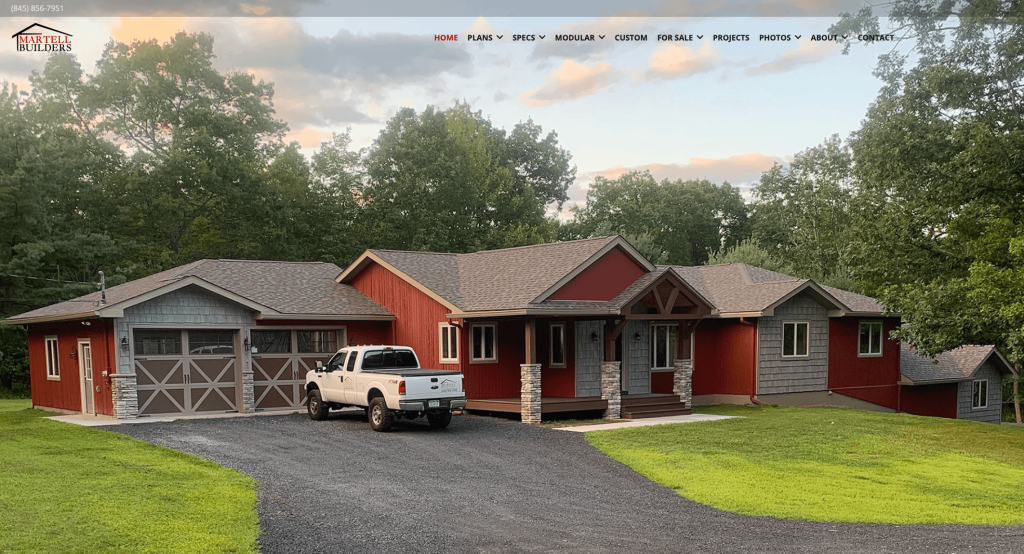
We were instantly happy with this overall layout. Everything is logically organized, easy to find, and images are included. We thought it was nice how they included a small emblem to show that they have been around for 35 years. Another aspect we liked was that they included their name and location along with their slogan right away in this homepage.
Related: Paid advertising can be an effective way to reach prospective clients looking to build a future home.
15. BH Design & Build

Color blocks to separate content was something that we noticed right away. Additionally, we thought it was nice to have images occasionally used as a background. This logo was very unique and was included in multiple areas of their site. Their color choices was another great choice because they looked great together, while still maintaining a professional look.
16. Housebrand
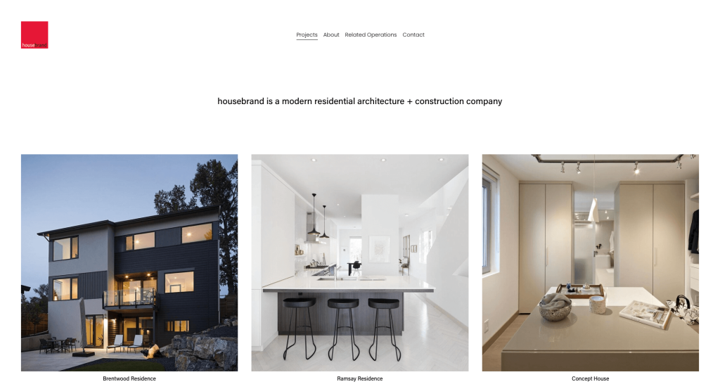
Displaying previous projects in square frames – just like their logo – was something that we really enjoyed. Showcasing a variety of different color palettes within their past work was also helpful because viewers can envision their potential as a company. We also felt that their navigation bar was well organized and very easy to use.
17. Shea Homes

Images are used to separate categories and guide viewers to other information, which was a very impactful decision. Including news and events to keep customers updated was another great choice. We enjoyed how they made it very easy to contact them by placing their information in many areas. A well labeled navigation bar was something else that we really enjoyed.
18. Ellis Don

Likely our favorite part about Ellis Don was their logo. It created an e and a D, playing around with negative space to create the e. Utilizing smooth transitions was not only stunning, but also helpful. We really enjoyed their use of graphics, images and videos as for visuals because it allows for a bigger impact. Another feature we noticed and liked was their dark background paired with light text.
19. Artistree Home

This was an example that fully harnessed their business just by their color choices. Brown, gray, and white are used in harmony in order to create a more natural feel. We also liked being able to see some of their more unique projects. Artistree also does a great job embracing their natural feel by hiding “tree” within their business name. Plus, we feel that their logo fits that focus on nature too.
20. Ivory Homes

Here you will notice bright red accents that highlight important information. Reusing their elephant throughout this example is another thing that we enjoyed. We thought it was cool how they included both images and floor plans to show what it was and what it ends up as. There was a series of drop-downs within their navigation bar which is extremely helpful.
21. Stokkers & Company
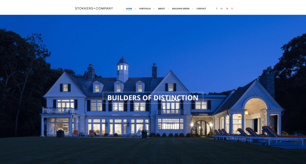
Stokkers & Company has a lot of great imagery that really speaks on their site. Showing different projects built in different styles was very impactful and smart to include. We thought it was innovative how many of their titles have a thin rectangle that circles around it to highlight it. Their domain was also very simple and logical, which is always nice.
22. JDG Constructions

We really enjoyed how there was interesting animations in order to introduce their information. Using black and white for text and backgrounds was beautiful because it helped images be the main focus. Another thing that we liked was their balance between images along with small icons. It was also very easy to contact them with questions or to start up a project.
23. The Farrell Companies

The Farrell Companies did an amazing job with their large imagery and automatically playing videos. Having tabs for houses for sale and for rent was an interesting choice that we really enjoyed. Their buttons that change appearance upon hover were modern and stunning. They also balance their white space very carefully which makes for a more enjoyable webpage. This domain was also good for brand recognition because it matches their company name.
24. Riverside Homebuilders

There was a very simplistic but interesting logo that makes sense for their company name. Adding in buttons to help with navigation and get more information was nice. We loved this monochromatic template that looked great. It was great to add in statistics about their rankings as a business because it helps them look more professional.
25. Sweenor Builders

We loved how there was lots of high-quality images and videos in order to look amazing. Their bold and simplistic font was a great idea that helped them feel more professional. This was a very organized webpage that made it extremely easy to find information. Sweenor Builders also picked out a domain that matched with their company name making them easy to find.
26. CCS Homes

Large images were extremely helpful for this example to create a stunning layout. Using a few different fonts and styles to create a sense of visual hierarchy was something that we liked. Including a gallery organized by room type was a great choice for people to see what they’ve done so far. Customer reviews are also added in, which is always a helpful choice.
27. Virtue Homes
Related: Consider implementing a digital marketing strategy to improve lead generation, email marketing, and reputation management of your home building company.

High quality and well displayed images was our favorite part about this one. It was nice to show which associations that they are involved in. Buttons are also a helpful choice for any site looking for ideas. Short and straightforward paragraphs are utilized which is extremely nice because it makes it easier for people to read. An organized navigation bar is also a great choice to help viewers find what they are looking for.
28. AR Homes

We really liked how this company reused their logo within their background as a pattern. They made use of a scattered layout that keeps it looking unique but still organized. Short paragraphs make it easer to comprehend information that is included in their pages. These images are also top notch, making it seem like their services would be too.
29. M&M Custom Homes
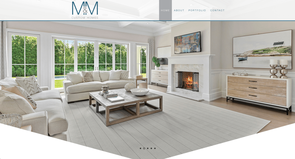
There was so many high quality images that really helps M&M Custom Homes stand out. We loved their inclusion of customer reviews. Including their mission statement within their homepage was also quite effective. This menu was very simplistic, which made it very easy to find information. Adding in buttons was also very helpful to get customers more involved in their information.
30. Highland Homes

There was so many interesting graphics that made this example look amazing. We loved the one that showed communities they serve in Texas. Having a section dedicated to quick move-ins was a nice touch. We thought their blue color scheme was a great choice of an accent. Simple contact information was also used which is always helpful.
31. Risewell Homes
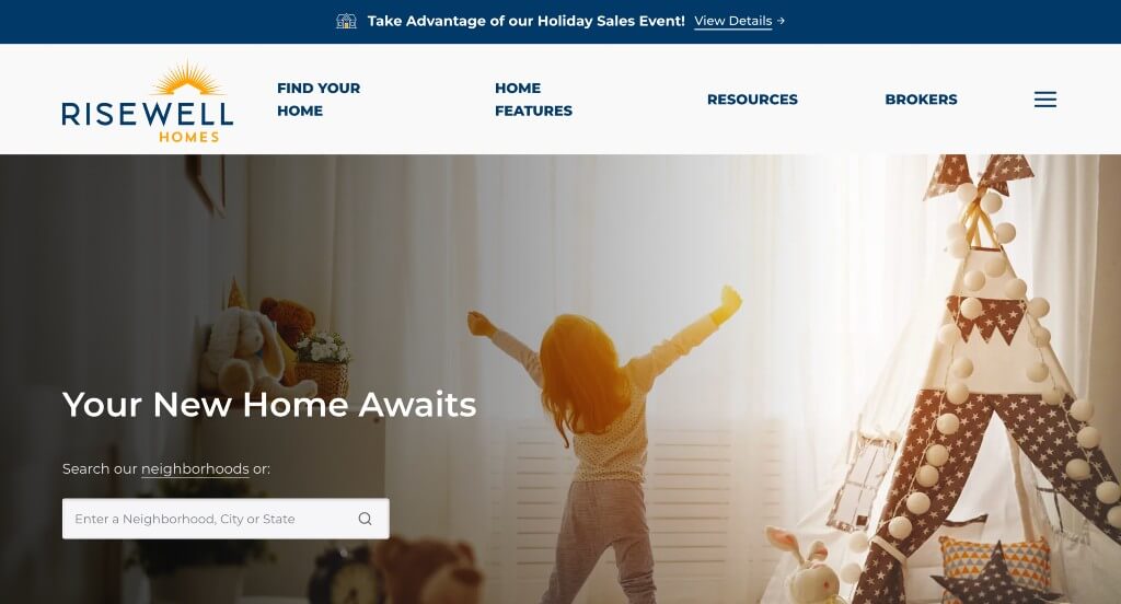
We loved how they made use of a drop box to search for certain neighborhoods. They made use of short paragraphs along with bullet points to keep everything simple and organized. Adding in videos was another thing that we felt was nice. A FAQ section was very helpful to answer the common questions and waste less of worker’s time answering the same questions.
32. Bill Huey + Associates

Large images were very helpful to capture attention successfully. Additionally, big and bold fonts are used for a more interesting look. Allowing for their portfolio to be included was a very nice touch for any company. Our team enjoyed how their portfolio was well organized, making it easy to find examples to take a look at. Their navigation bar also only has a few tabs making it super easy to find what customers want to find.
33. Wausau Homes

There was so many things that we enjoyed about Wausau Homes. One of them being their large collection of floor plans. These include estimated images, floor plans and written information so people can find exactly what they are looking for. Wausau Homes also does a great job using their main colors for everything including their graphics.
34. Cover

Simplicity is the best feature about Cover for sure. We loved how their photo frames were rounded to make everything seem more “finished”. There was lots of buttons to help customers navigate through their information effectively. Adding in reviews by other companies was very impactful to help gain trust with them. Their basic font was also helpful and went well with their simplistic feel.
35. Ryan Homes

Right away, we noticed how accents of dark blue and occasional orange looked amazing. There was lots of short paragraphs that made it easy to comprehend their information. A design feature we enjoyed was their survey to help you find a home matching your price range and square footage preferences. It was also very effective to include their company name right in their header.
36. Stylecraft

Having automatically playing videos as backgrounds was a great idea for Stylecraft. Including a map with their building locations was a perfect addition. We also enjoyed how there was a layout for images that was a little more unique, helping them stand out more. Integrating their Instagram account into their homepage was another aspect that we thought was awesome.
37. K Hovnanian Homes

This example started out strong with their search bar to find a specific location in which you’d want to live. We thought it was cool how they used a United States map with shaded states where people can find homes. Blending decorative with formal fonts was something that we really enjoyed about K Hovnanian Homes. Incorporating their star ratings along with star breakdowns was a feature we rarely see, but we enjoyed it.
38. California Home Builders

There was also lots of paragraphs carefully written in short form so people aren’t overwhelmed. We also enjoyed how they elaborated on each part of their process. They balanced their white space very well, which is extremely helpful for anyone exploring their content. California Home Builders also included links to their social media pages in order to keep customers connected.
39. Canyon Design Build

Accents of orange can be seen throughout this example in order to highlight important information. We thought it was helpful how they made use of an area to showcase companies that have featured them. Another thoughtful quality was this staggered layout for text and imagery. This one also made great use of reviews and their common services.
40. Stanley Martin

This example makes use of lots of short phrases that serve as titles which we enjoyed. Along with that, there’s a blend of blue and white throughout their entire site which is amazing. Client reviews are another addition that are always helpful no matter what type of company you own. This menu is also very well organized making it easy to find whatever information is needed.
41. Olson Homes

We liked how commonly two images are used side by side in order to maintain a balanced look. There was a good ratio of written content to visuals, which always makes for a better looking design. This organized template was an impactful quality within their webpage. They also made use of simple patterns for their backgrounds in order to create something that looked stunning.
42. Sierra Classic Custom Homes

This simplistic example was something that we loved because it helped keep viewers focused on their information, not distracted by visuals. We also loved how they displayed all of their partnerships to to build reliability. Something else that was amazing was how they used small color blocks and overlapped them on images for a creative look.
43. Pulte Homes

This logo was very simple, but we loved it because it clearly shows what their services are. We also thought it was a great addition to have a search bar of sorts to help customers find what they want. Offering a 3 question survey to ask about your home shopping status was interesting. Their domain was also extremely easy to remember because it matches their business name.
44. Maronda Homes

This logo – although only text – made an impact on viewers because of their contrast of fonts. Showing 10 states they service with a drop down showing the specific communities was another great choice. It was amazing to highlight certain phrases in green to help them stand out. There was also a great addition of buttons to help with navigation.
Related: Rank higher in search results when people are looking for home builders in your area.
45. Century Communities

This example has an interesting feature to start out that lets viewers pick their desired state and quantity of bedrooms and bathrooms for their new home. We thought their accents of plum purple was another great choice to help highlight links and important content. Including lots of other resources to help find the perfect home was a great addition. Adding in awards was another feature that we enjoyed.
46. Lexington Homes

These titles were easy to distinguish as they used a stunning font. Their small fonts were used to create short but informative paragraphs, which we always love. It was special to include images with filters over them to create subtly patterned backgrounds. Using bullet points to organize their information helped make this a great example to get inspiration from.
47. Beazer Homes

Beazer Homes did a great job with their images that represent their company well. Including sliders that show different emotions that they could evoke with just a few changes within a room. Small icons were found within their pages to help create a more visually appealing design. This navigation bar was also well organized making it very easy to find information.
48. Mattamy Homes

Right away anyone could notice this search bar that helps people find a home or land in their desired location. Their rounded image frames although simple was an addition that helped them stand out. Short paragraphs are used carefully in order for people to skim through content easier. They had an appealing layout that balanced their white space well. Additionally, an ability for people to love homes and save them to view later was beyond helpful.
49. Schumacher Homes

Here we have an extremely professional design, and we really enjoyed how their logo felt luxurious. Trending homes are listed right away which is smart because they are faster and easier to find. Small icons are used to help pair visuals with written information. These font choices are easy to read and look professional, which is always good. Adding in some videos was another touch that we enjoyed.
50. Sina Homes

Sina Homes makes use of an interesting logo design that is simple. Along with that, we enjoyed how they used an image underneath some of their text with a filter over it to make the text more readable. Displaying past projects and their dates helps people see how far they’ve come and what they could do for you as a new customer. Social media links can also be found near the bottom which is very helpful for those wishing to stay connected.
WordPress Home Builder Themes
You can find free themes at wordpress.org or explore home builder templates on ThemeForest.
BAUEN – Themeforest
$59
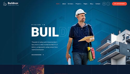
Buildnox – Themeforest
$49
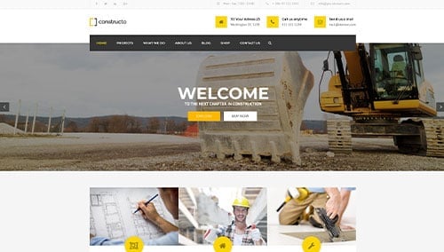
Constructo – Themeforest
$59
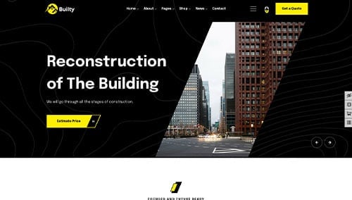
Builty – Themeforest
$49