Hello, industrial businesses! Want to boost your online presence and reach more customers? Then check out our guide to the top 50 industrial websites.
Our experts have evaluated some of the best industrial sites for design, functionality, uniqueness, and user experience. These top sites set will set a standard with sleek designs and intuitive navigation.
Find inspiration for your website and learn valuable tips to make your online presence shine.
Boost your industrial business with this web design ideas guide! Discover examples from chemical, construction, engineering, logistics, transportation, metals & mining, electrical, aerospace, and defense companies. For more industries, visit our expertly designed website examples blog article!
Top Industrial Website Designs
- 1. DOW
- 2. Greenbrier
- 3. Martin Marietta
- 4. Mercury Marine
- 5. Penske
- 6. Barrett
- 7. American Alloy
- 8. Dedicated Computing
- 9. Lockheed Martin
- 10. M3 Glass Technologies
- 11. 3M
- 12. Mattei
- 13. Caterpillar
- 14. Dehumidifier Corporation of America
- 15. We Energies
- 16. AGCO
- 17. Skanska
- 18. Fendt
- 19. CASE
- 20. Kronos
- 21. Massey Ferguson
- 22. Johnson Controls
- 23. The Boeing Company
- 24. Fortive
- 25. Illinois Tool Works
- 26. Kensworth
- 27. PACCAR
- 28. Foxconn
- 29. Bosch
- 30. Procter & Gamble
- 31. IBM
- 32. Siemens
- 33. Unilever
- 34. RTX
- 35. Hewlett Packard Enterprise
- 36. GE
- 37. FedEx
- 38. Nestle
- 39. Johnson & Johnson
- 40. General Motors
- 41. Exxon Mobil Corporation
- 42. Union Pacific
- 43. Honeywell
- 44. Emerson Electric
- 45. Republic Services
- 46. Waste Connections
- 47. Carrier
- 48. Otis
- 49. Cintas
- 50. Northrop Grumman
1. DOW
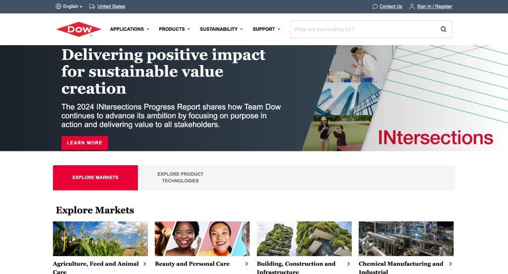
To start us off, we have a relatively simplistic design. One of the first things you’ll notice is a bright red color which is used to highlight important information. Links also turn from their original color to red when you hover over them. Many high-quality images were included, however at points it seemed overwhelming. We liked how the navigation bar was labeled very well. A search bar was also a nice addition for an industrial web design.
2. Greenbrier
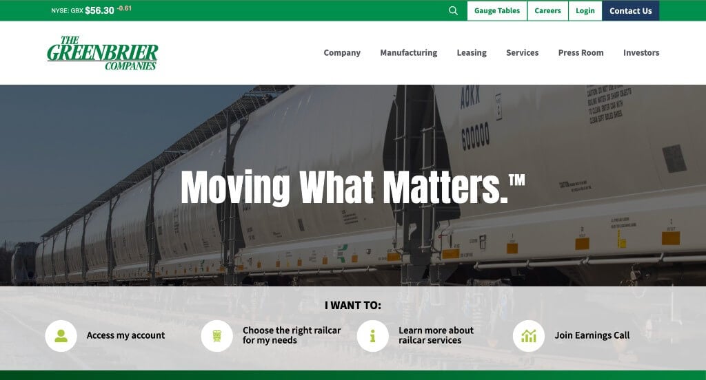
This layout has lots of green hues, along with some blue, white and gray, which makes for a stunning design. It was nice that bold fonts were used as titles so they really stood out. It was helpful that so many icons were used to help viewers understand information. Another great addition was how they added in a news section related to their company.
3. Martin Marietta
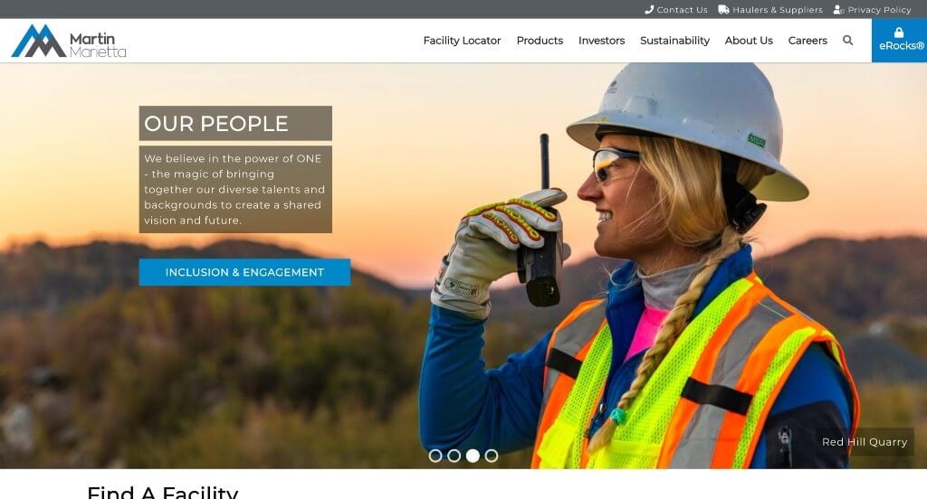
Most likely, you will first notice this company’s stunning logo design. Thankfully, their logo design uses the same color scheme as their entire website. Buttons are blue, but they change to a lighter shade when you hover over them, making them a bit more unique. Having a large banner with high-quality images that change periodically was a great touch. Along with all of that, it was helpful to have a map to show where they are located.
4. Mercury Marine
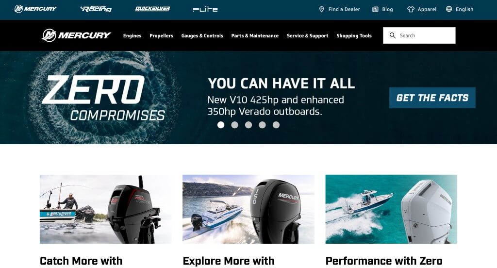
Upon visiting this website, you’ll see they follow a red, blue and black color scheme that is striking to viewers’ eyes. Another feature we enjoyed was how they utilized different fonts, creating a unique feel for their company. If you ask us, their layout was stunning. Everything seemed well-balanced, there was some relevant images (but not too many). Likewise, each CTA link has a large accompanying image, in order to attract a visitor’s attention. Their logo design was also nice because it incorporated an “M” from their company and a wave.
5. Penske
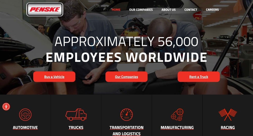
As you can see, this is another catchy and minimalistic design dominated by a black and red color scheme. Similarly, using a bold white font looks great against their dark background. Having bright red highlights also helps important information stand out. Another unique feature was their banner that cycles between different images with phrases and statistics. Penske also did a great job with their clearly labeled navigation bar. Lastly, we enjoyed their use of many simple graphics just to add a bit of visuals to their minimalistic feel.
6. Barrett
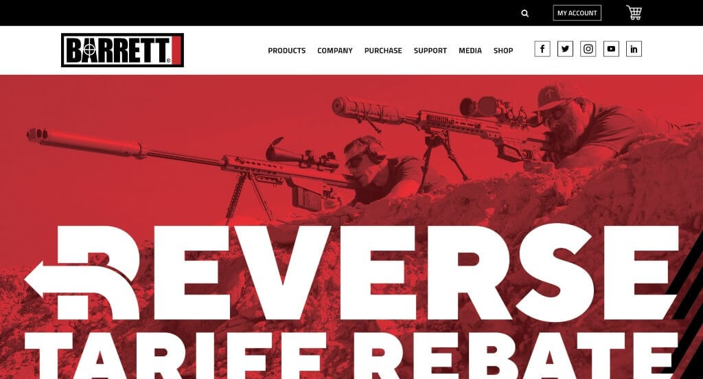
Possibly the best thing about Barrett’s webpage is their stunning imagery with graphics added into it. There is a black and gray color scheme on this website, with some red accents in certain parts. Apart from that, many other interesting effects can be noticed when you hover links covering their page, which always makes sites just a tad better. You will find all the links to social media handles right in their header, allowing customers to connect easily and quickly. Including a large client testimonial section was another feature that stood out to us.
7. American Alloy
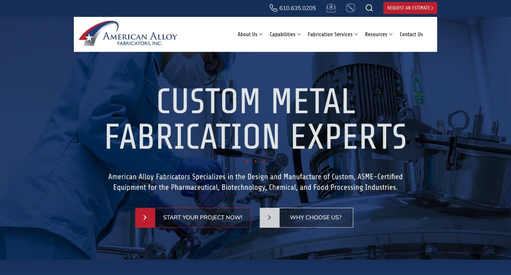
American Alloy’s most recognizable feature is their color scheme that symbolizes that they are an American company. As you continue to scroll through, you’ll find that everything is well-organized and quite frankly pretty balanced. It was helpful to have short but straightforward paragraphs so clients aren’t overwhelmed. Their logo design was another aspect that they mastered, including their color scheme, almost a metal look, and a star. Aside from all of that, this company’s hover animations were simple but creative, helping them stand out.
8. Dedicated Computing
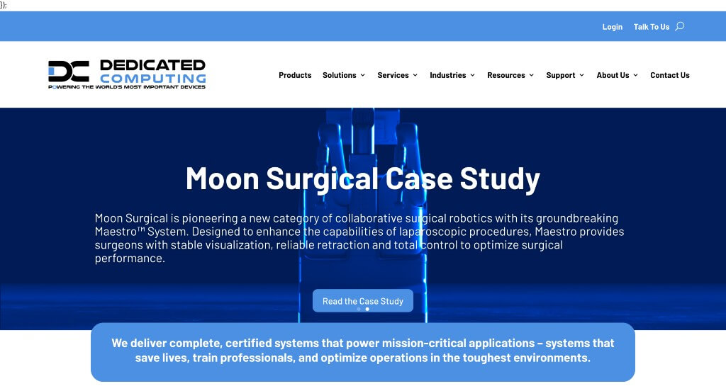
Arguably this company’s best feature was their bright blue color and many graphics. We also liked how there was simple animations to help liven up their site. Additionally, you’ll find social media links and contact information very easily, so whenever you wish to connect or reach out to them as a company, you can. The sticky header also helps makes their website easier to navigate. Other features that we did enjoy were their high quality images, simple fonts and their search bar.
9. Lockheed Martin
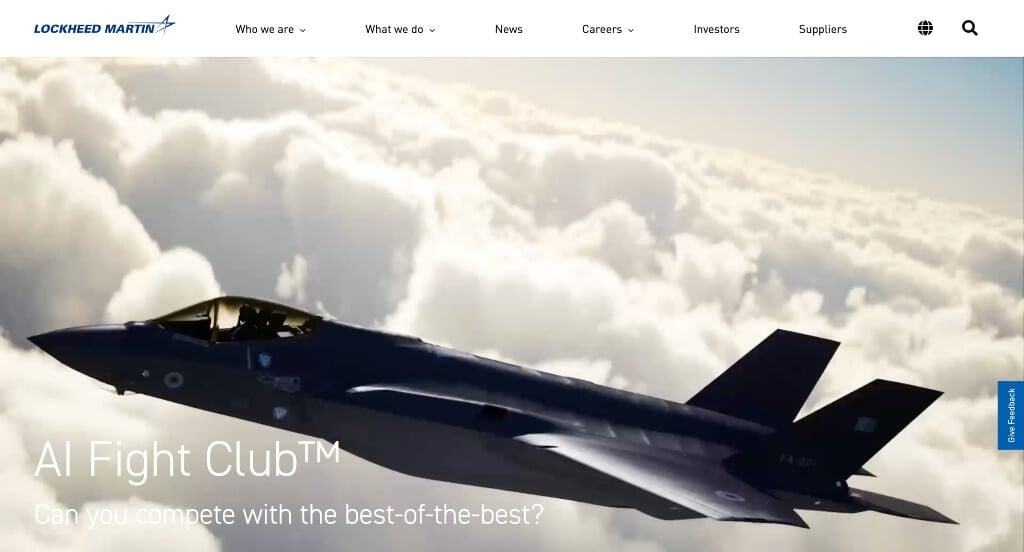
When you visit Lockheed Martin Corporation’s website, you’ll be greeted with a professional-looking website. Many relevant links are included, along with a search function. It was a nice thought to include a large banner right away that includes many short video clips. Adding in a news section is also interesting, as it contains links to several stories and articles about them as a company. Another feature we enjoyed was how their template was very balanced, and broken up with full screen images and banners.
10. M3 Glass Technologies
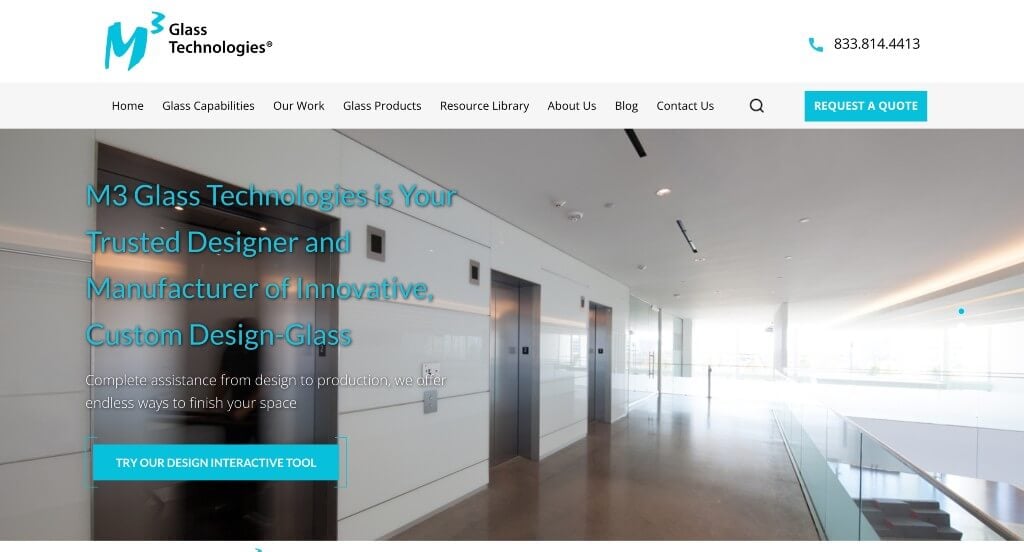
M3 Glass Technologies has a very professional design with a light blue accent color to match their logo. We liked the use of different fonts to help organize their content, however their sizing wasn’t the greatest. It was creative to have animations for their buttons appearing almost glossy, similar to a glass reflection. Including an informational blog was another great choice to provide customers with additional information. It was also nice to have a menu that was very simple and easy to use.
11. 3M
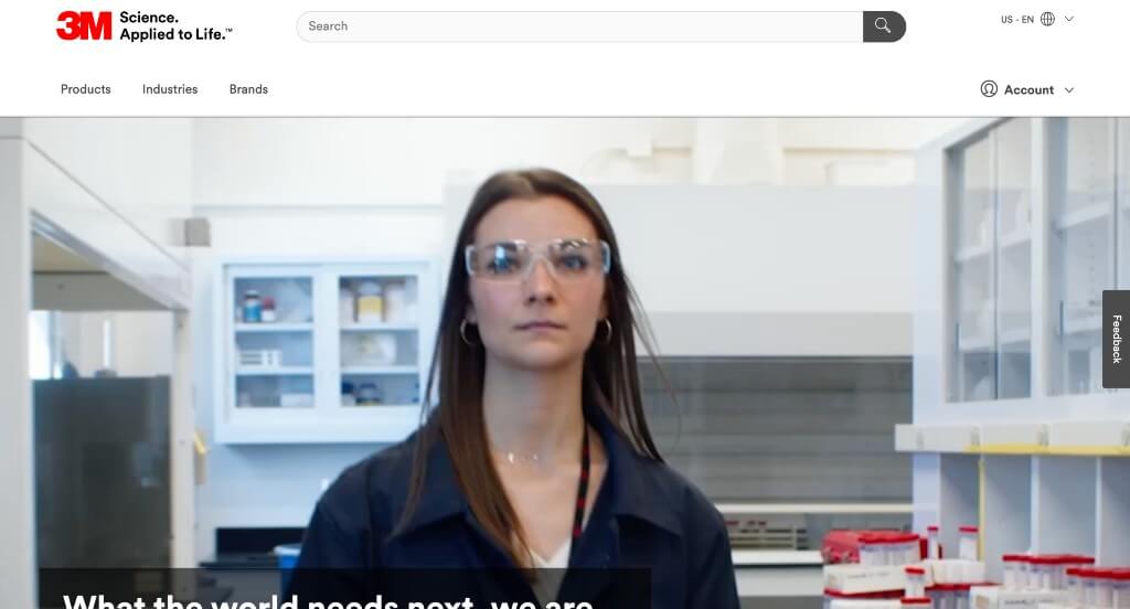
3M Science has included a large search bar right away, which makes it easy for possible customers to find what they are looking for. Then we have their banner, where you’ll see some quick links to pages such as About Us, Careers, Sustainability/ESG, and Investors. Not only are the links included, but graphics are paired with them to help them stand out more. This company does a great job with their balance of white space, making sure their site isn’t overwhelming.
12. Mattei
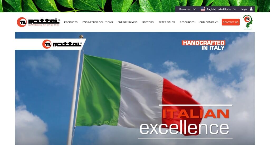
This website is painted with a red color scheme, highlighting links, buttons, and important information. We liked how Mattei used mostly 3 column layouts, but they also included full length visuals or 2 column sections to it breaks up sections. Another helpful feature was their banner that contains a navigation button that helps leads you to additional sections. Apart from that, there is a blog and news section can be found near the bottom, which is always a great addition.
13. Caterpillar
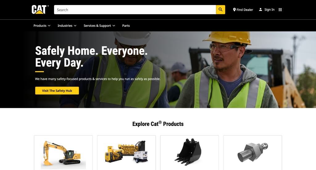
Upon entering Caterpillar’s website, you’ll immediately recognize this brand’s signature yellow and black color scheme, with occasional white text. If you hover over any linked text, it turns yellow, which is an amazing choice because it helps people realize that there is more information to be found. It was also an amazing idea to include many images of their products so everyone searching the site understands exactly what they are selling.
14. Dehumidifier Corporation of America
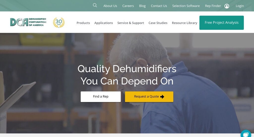
This example makes use of a live chat which is nice because customers can ask simple questions without wasting time with emails. Having a light bluish-green accent throughout the pages was something that we really enjoyed. There was also lots of short paragraphs that made content easy and fast to read through. A blog was also included which was something that we really appreciated.
15. We Energies
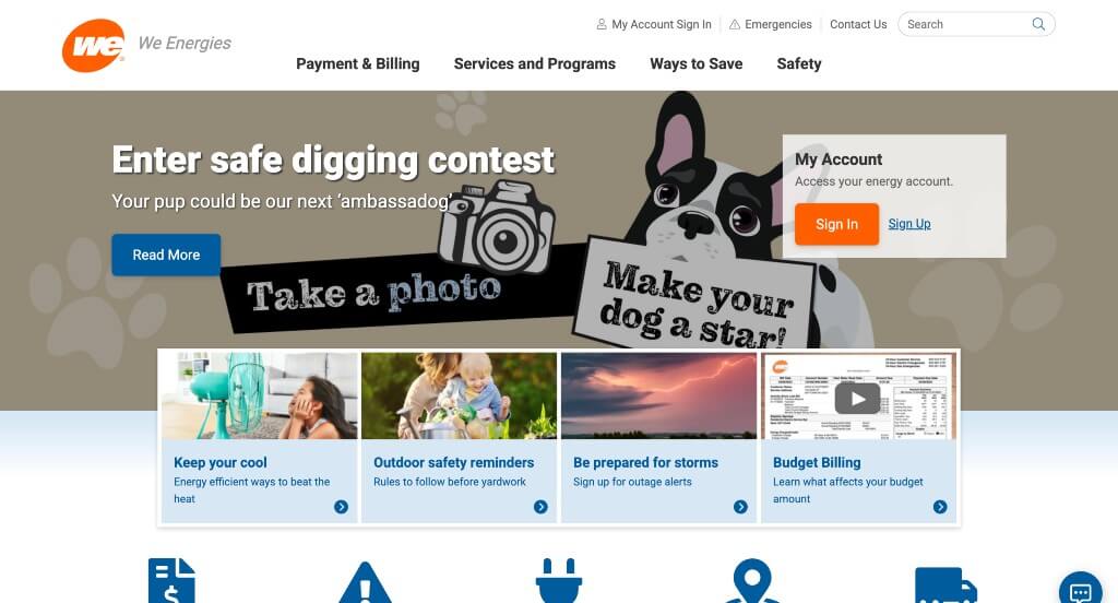
Throughout this website, a blue and slight orange color scheme is used to highlighting links, buttons, and graphical icons. This addition of these simple colors everywhere was nice because it helps add color to the site without it becoming overwhelming. Another interesting feature in this website was how they had a virtual assistant tab that stays put throughout the entire site. Lastly, they picked a domain for their website that matched their company name so possible and returning customers could find it easily.
16. AGCO
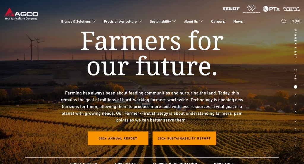
AGCO’s website has a relatively large banner that showcases a high quality images with links to different pages denoted with a red button. This red color is used in quite a few places throughout to bring attention to certain areas. You might also see a section dedicated to news and media explaining them as a company, building trust with customers. We also noticed that their menu is well labeled with organized drop down bars for each section.
17. Skanska
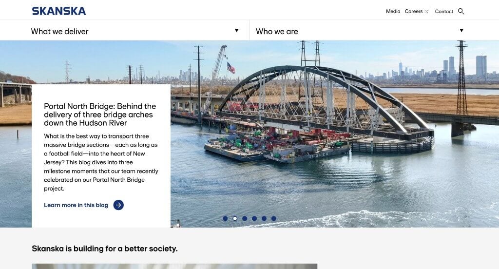
There was lots of high quality images and videos that made their visuals stand out. They balanced white space to carefully to create a template that is stunning and organized. Skanska did an amazing job with their domain that matches their company name for better brand identity. There was also many links that bring viewers to additional information.
Related: Boost your organic traffic with SEO services targeted toward industrial companies.
18. Fendt
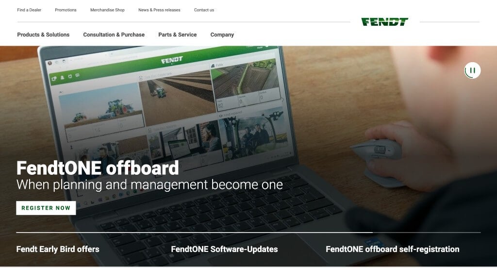
Fendt makes use of a green color scheme, matching their logo and machines. Almost all of this company’s texts, buttons, and menus are highlighted in green when you hover over them. Every few seconds, you’ll see that their homepage’s banner cycles between different videos to display a their product in action. We really liked how small images of their machines can be noticed almost everywhere in their design. Besides, there are also dedicated sections for news, events, and company information, which can be very helpful for potential customers.
19. CASE
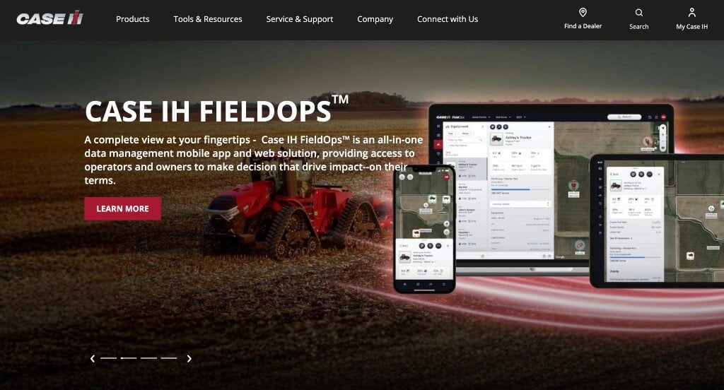
Here we have a visually catchy red, white and black color scheme, which helps visitors stay engaged in this site. Including a banner that consists of different images, cycling periodically was a great choice. There were many buttons near their written content, showing that there is more information to be seen. It was also nice to include a search bar so customers could search for parts or information within this site. Lastly, their extremely organized menu with little individual categories was smart.
20. Kronos
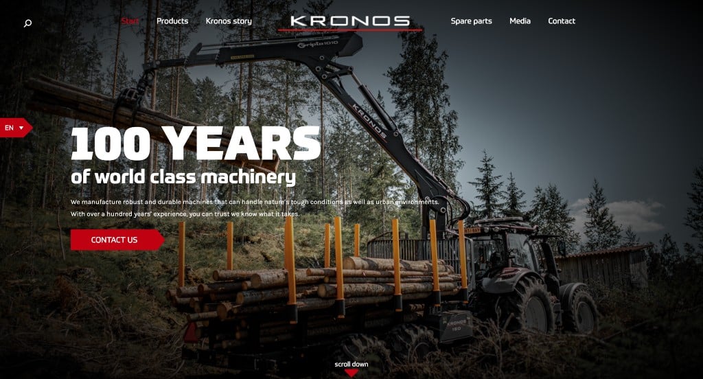
Possibly the most attention grabbing feature of Kronos was their stunning imagery noticed right away. This banner slowly fades into black to match their typical background, which was a pretty unique design choice. We also liked how they included their machines as images but also as almost stickers with transparent backgrounds. This company really thought from a marketing perspective when choosing their domain name that matches their company name. Finally, it was a nice choice to include a variety of different sized fonts to help certain texts stand out.
21. Massey Ferguson
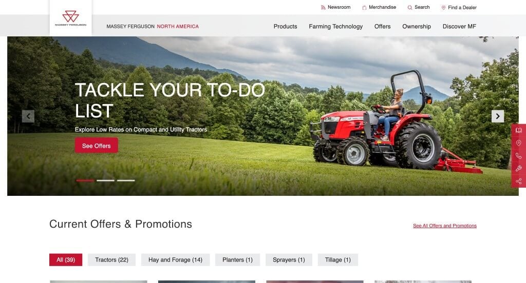
Likely the most prominent aspect of this website was their large product section that is conveniently organized. Each product tile has a view product button to show in depth information and also a quick view button, which displays simple facts such as dimensions, bale size, horsepower, etc. This company also designed a simple but unique logo design which is always helpful for your company.
22. Johnson Controls
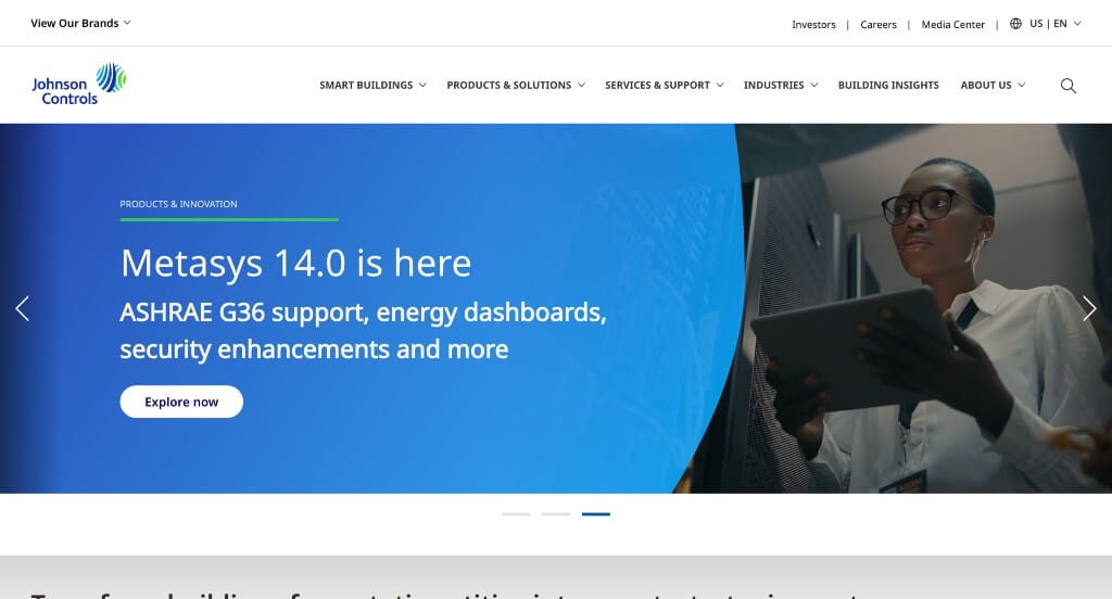
We really liked this company’s logo design that was unique and engaging. Along with that, they used stunning accents of color to create a more interesting layout. Showing off past projects in their portfolio was helpful to include because it shows that they are a trustworthy business. Their navigation bar used drop downs to keep everything organized and easy to find.
23. The Boeing Company
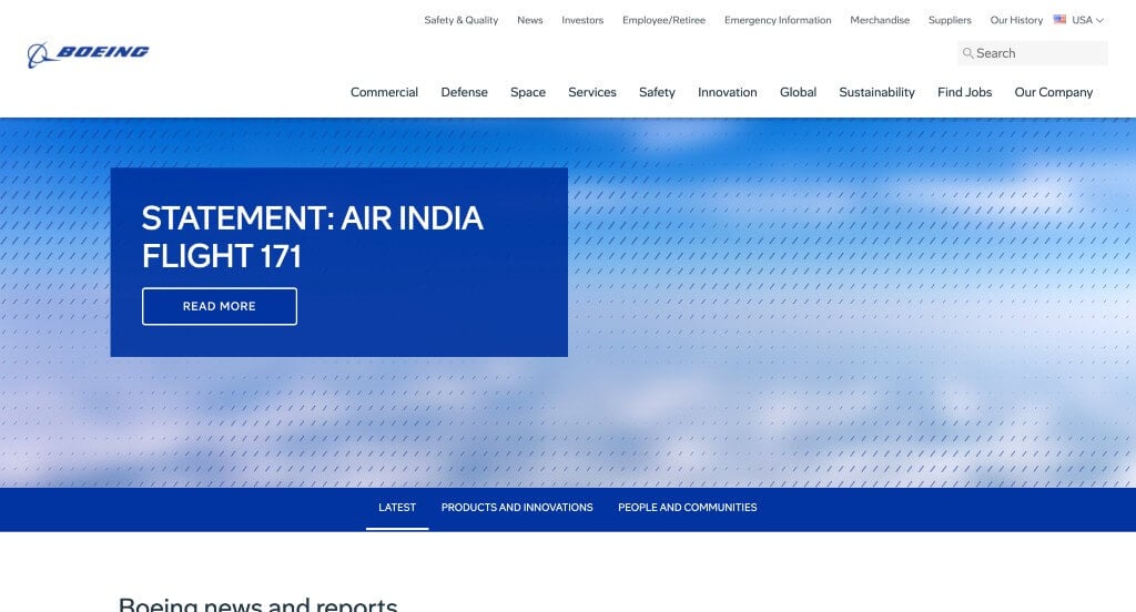
This example had an amazing logo design that really displays what they as a company do. We liked their blue accents that help build up a more impressive template. Adding in buttons was something that we appreciated because it helped provide information without making pages feel cluttered. A search bar was another choice that we really appreciated.
24. Fortive
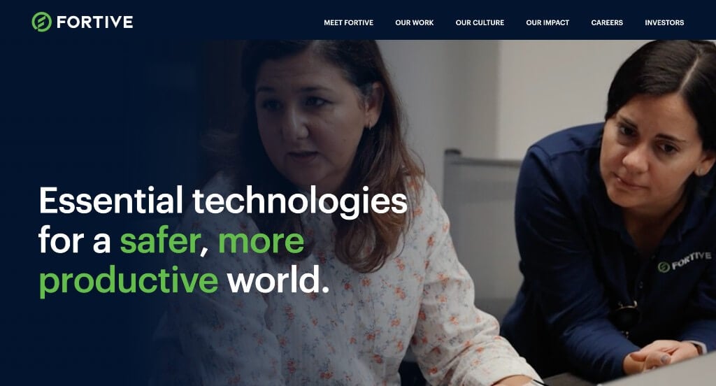
This company’s most prominent feature is probably their large, video banner with a fade-out design and bold, multicolored text. Their balance of white, green and blue was stunning. Having brightly colored buttons was a great choice because it will stand out to potential customers and make their site easier to browse through. This company also made good use of a simple but professional font.
25. Illinois Tool Works
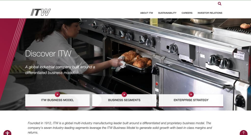
A maroon accent is placed throughout this site, and we really liked that because it helped add some character. It was creative how boxes of content were stacked together to form the design they wanted. It was also nice to have plenty of white space to balance out their striking color scheme. Their buttons were also quite interesting with their shape and how they chance colors when hovering over them.
26. Kensworth
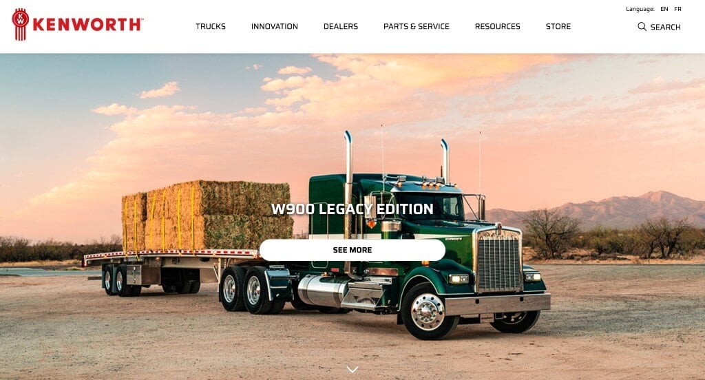
Visually, this website stands out quite a bit since each section is designed like a large banner. These sections have large, high-resolution images, bold text, and buttons that change color upon hovering. Towards the bottom, there is a segment that consists of different tiles with image thumbnails that lead to different pages. When you hover over these tiles, the background will change to a semi-transparent white color while displaying some additional text. On top of that, the sticky header makes it convenient to navigate through the site.
27. PACCAR
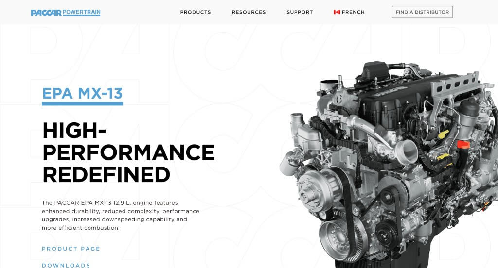
As you might notice, PACCAR uses high quality visuals displaying engines, proving what they as a company sell. This website has a striking blue and black color scheme that many visitors find attractive. This company’s large banner has a static background that contains their logo, which we thought was a stellar addition. We liked how their background colors alternate to break up the design just a bit. Besides that, their navigation bar is simple and well organized.
Related: Looking to improve the effectiveness of your paid ads? Check out these PPC services from a company helping industrial companies.
28. Foxconn
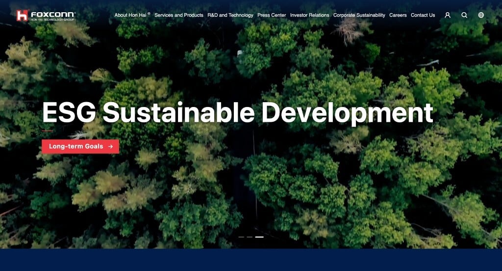
Here we have Foxconn, a Chinese manufacturing company, and they display that with a few Chinese symbols found throughout their pages. This website has a blue color scheme, while some buttons and text have red or white accents. We also thought it was a great idea that they included a graphic in the top left corner to show how many years they have been a company. Their header that shared an automatically playing video was another great choice. Another feature we really liked was their buttons and links that could be found all around on Foxconn’s industrial web design.
29. Bosch
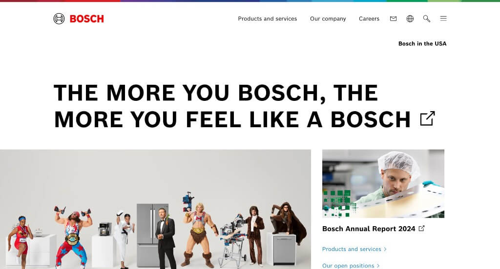
Bosch has a very basic-looking website, which is nice because it isn’t overwhelming for visitors. You’ll notice a very thin multi-colored strip near the top, followed by a minimalistic header that contains only three tabs besides their memorable logo. An aspect found in this design that we felt could use some work was their color scheme and white space as it felt almost too simple. Many high quality images were included, which we liked, but there could have been a few more graphics placed throughout this example.
30. Procter & Gamble
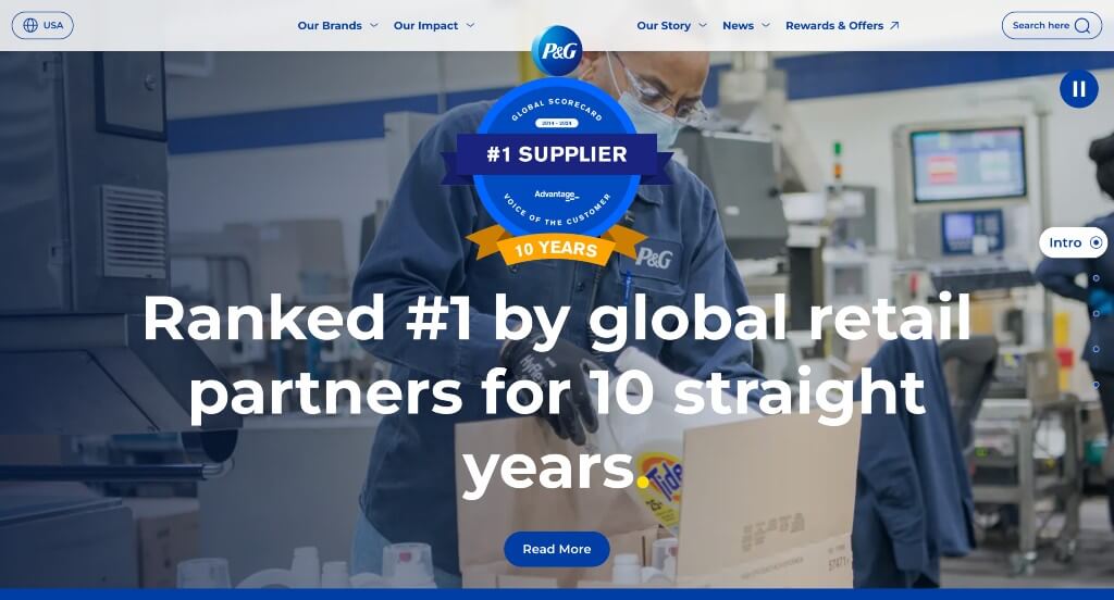
Likely what viewers will be captivated by is Procter & Gamble’s starting slider that has a unique transition. This company’s use of circles and ovals created a clean look that is different from many of their competitors. It was a great choice to include some of their popular brands to gain recognition with their possible customers. On the right, there’s also a tracker to show you which section of the site you are currently browsing. To top it all off, their balance of images, text and graphics was practically perfect.
31. IBM
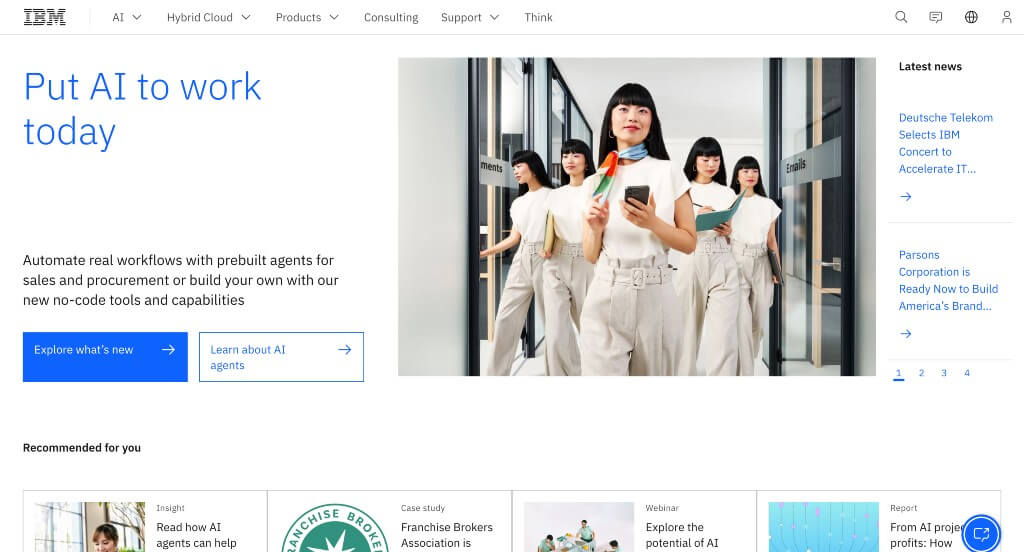
This website has a simple yet efficient design that users may find attractive. Having a simple but eye-catching animation right away was a great choice. We liked the blue, white and black color scheme that gave off a technological feel. There is an adequate number of images that keeps this site interesting without becoming too cluttered. Including an informational blog was another smart addition to IBM’s web design.
32. Siemens
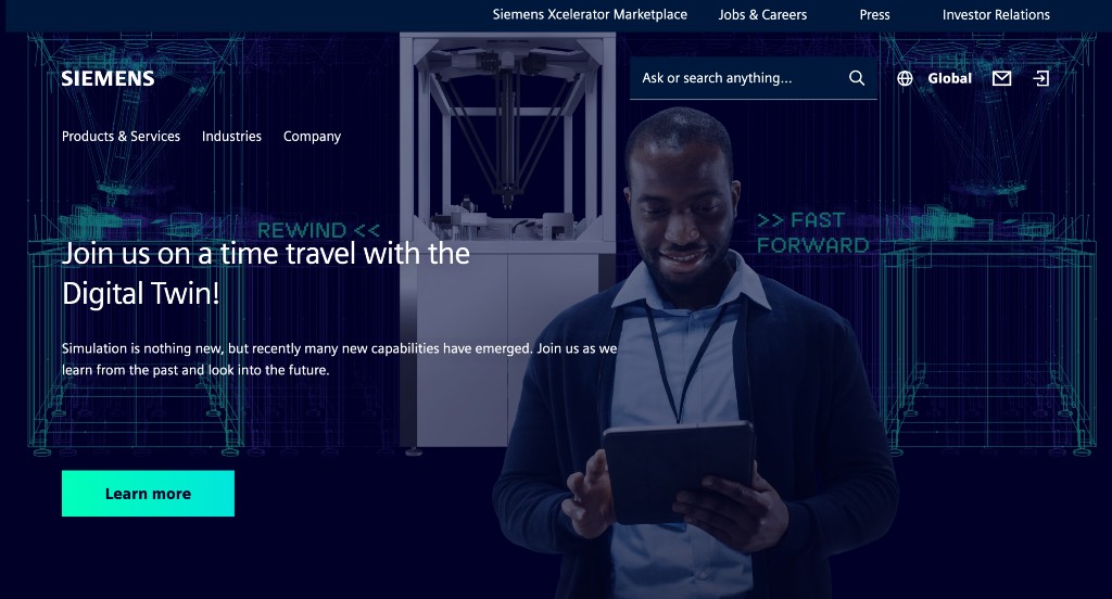
Likely the most noticeable part in this layout was their contrasting color scheme – a navy blue background, with bright cyan or lime colored links and accents. It was helpful to have all their important pages clearly linked to their homepage, making it easier to navigate. Siemens also did a great job choosing their domain name because it matches their company name. Their navigation bar was also clearly labeled, which is always a plus.
33. Unilever
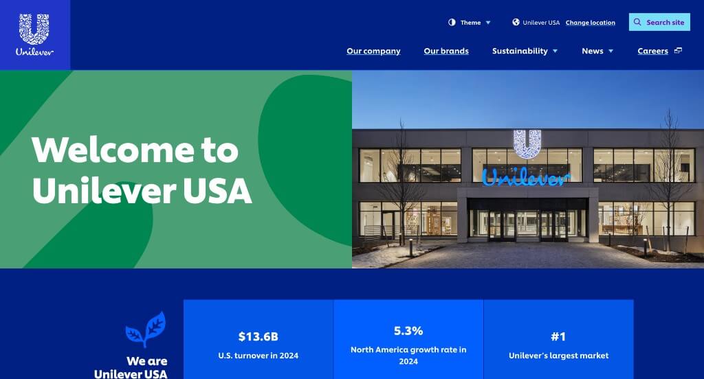
Unilever uses lots of digital art paired with vibrant colors, which is engaging for visitors. We liked how their logo design included many small graphics that represent their company. Additionally, it was nice to include a news section that can be helpful for all customers. Functionality-wise, including a large search bar was a convenient choice. Likewise, their bold and simple font used throughout this example enhances visibility and professionalism in their design.
34. RTX
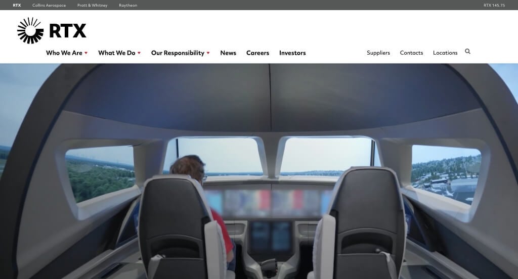
When you visit the RTX website, you will be greeted with a large video banner. The linked text on the banner is in white, which changes to red when you move the cursor over it. Similarly, there are more tiles with image thumbnails below, and each leads to a specific article about the company. There are other tiles below which have eye-catching effects on hovering. Overall, there is an adequate number of images to keep the visitor hooked. Another notable feature is the sticky header, which only appears if you are scrolling up.
Related: Rank your aviation company in search results with the help of quality SEO services.
35. Hewlett Packard Enterprise
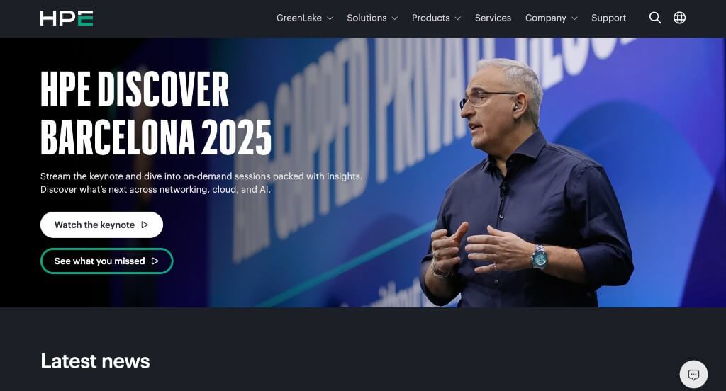
Right away, anyone looking at this site will notice how Hewlett Packard Enterprise embedded videos for their banner images. You may notice a small icon for their live chat feature, another great choice. If you scroll down, you’ll come across colorful boxes, which are striking to customers’ eyes and hold lots of information. Another good feature in Hewlett Packard Enterprise’s industrial web design was their use of many buttons to link customers to other areas of their site.
36. GE
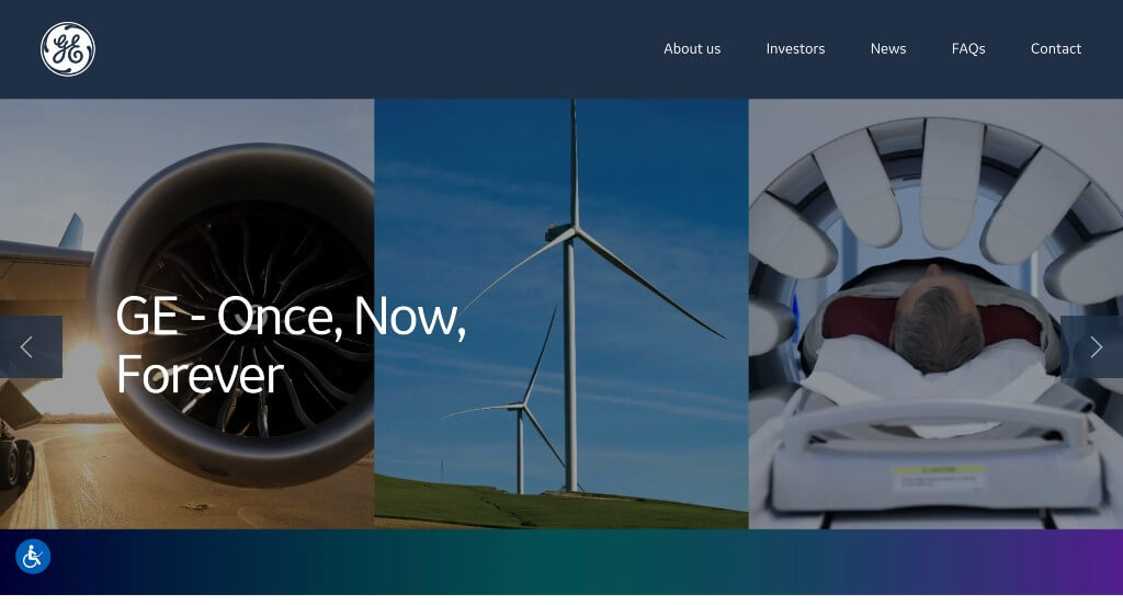
Although this company doesn’t have much for their homepage, professional imagery is used which elevated this company’s visual appearance by a lot. We also noticed how they designed a clearly labeled navigation bar with pages for news, FAQs and contact information among other information. It was helpful to have blocks of white and blocks of dark blue to help break up their written content. We also thought it was nice that there was links to their additional stand-alone sites instead of trying to squish all the information into one site.
37. FedEx
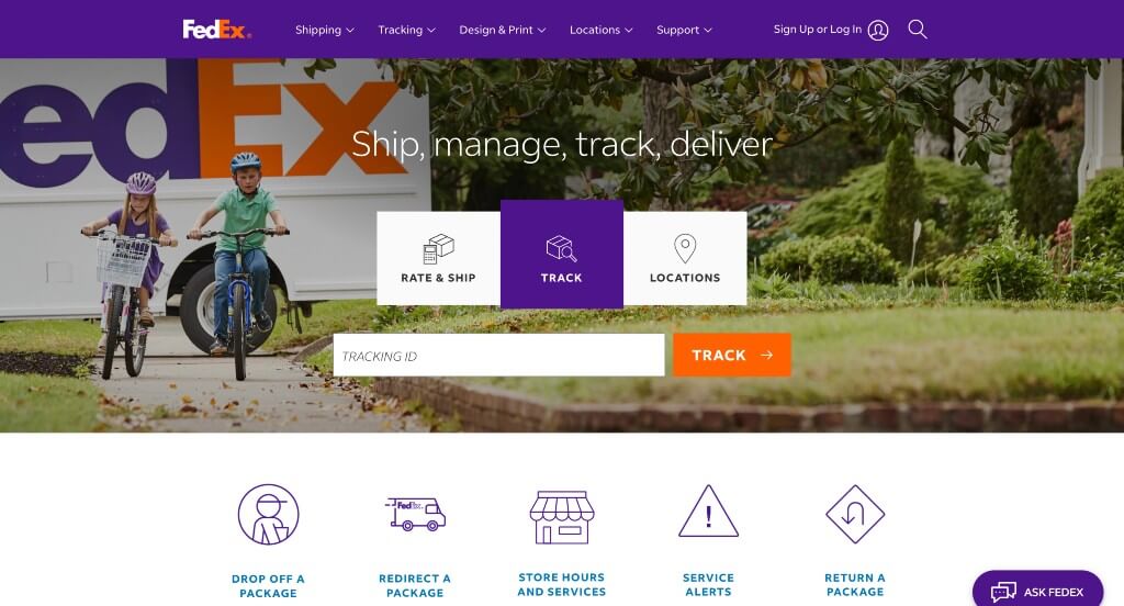
We really loved how FedEx uses their brand colors to highlight information and create an amazing example. There were many small icons used within these pages which was something that we appreciated. Along with that, we liked how they used a search bar in order find a specific order. We also noticed how this web domain matched their business name.
38. Nestle
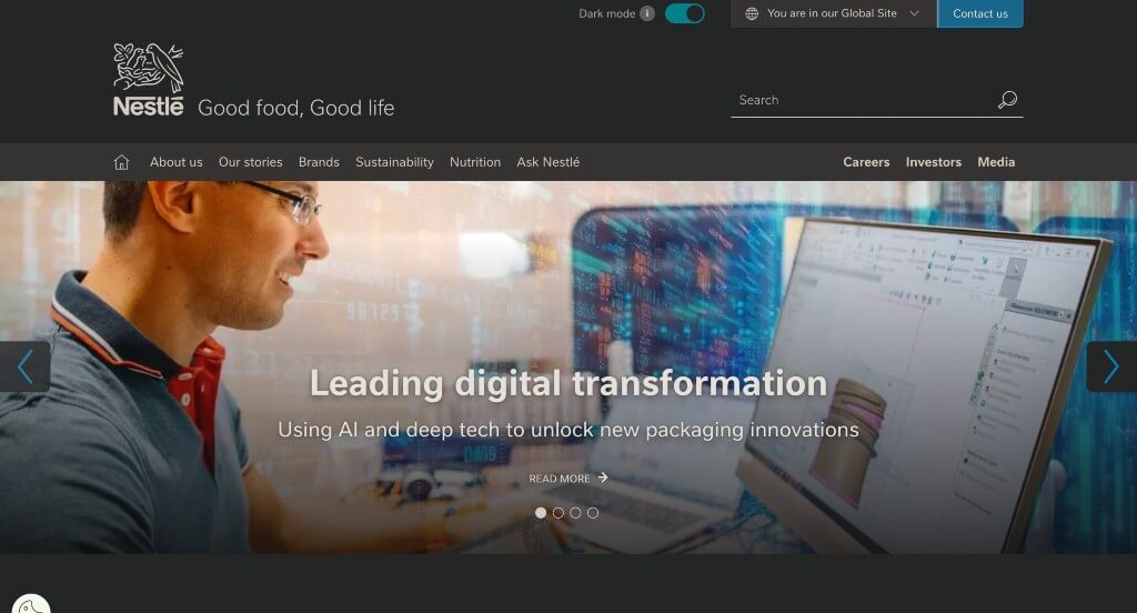
Here we have a very relaxed design. Lots of dark colors are used to give off that relaxed feel, and just small bursts of additional colors are included. This company chose to include a slider to show all of their popular brands, which was smart because it helps customers gain trust in them. There’s a section with a magenta background that displays all of Nestle’s latest news. This company also did a great job with their navigation bar, making it easy to use while still including lots of information.
Related: Energize your advertising budget with the inclusion of digital marketing services from an agency specializing in industrial companies.
39. Johnson & Johnson
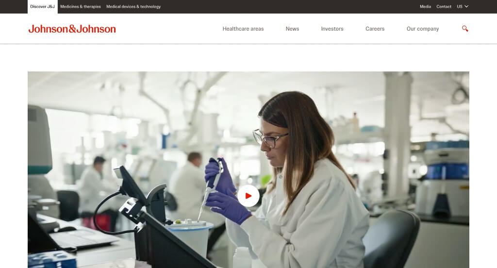
An aspect we really liked about Johnson & Johnson was that they seemed to display exactly what their company’s goals are. Another unique feature that you might see is their thoughtful layout that uses white spaces well. Choosing a bright red accent color was perfect because it could highlight important information while still looking stunning. Aside from all of that, many high quality visuals were included along with links to additional information. Make sure to take a look at this site when you are searching for inspiration for your industrial web page design.
40. General Motors
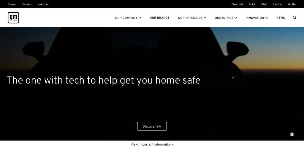
Here their overall design is a blue color scheme that is highly attractive and instantly grabs the attention of audiences. There’s also a large video slider that helps to display their company as a whole. Many high-quality images help to make this layout more stunning. It was also nice to include a section to display all of their brands within General Motors. Clearly, they also had customer navigation in mind when creating their professional and simple navigation bar that was easy to use.
41. Exxon Mobil Corporation
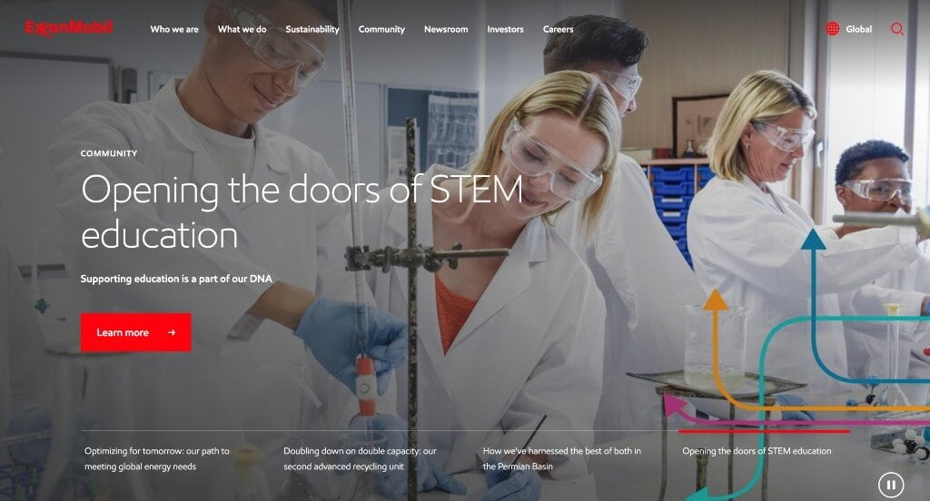
In this example, we liked how there was a stunning hero header that is sure to grab attention. Lots of linking buttons and text help viewers find the information that they are looking for. Red accents are used throughout this example in order to get people to notice specific information. This was a very well organized example that makes it very easy to find information.
42. Union Pacific
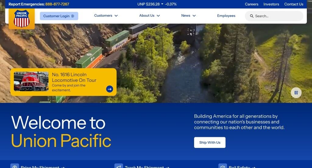
While we were reviewing this site, we noticed many amazing features about it. What we noticed right away was their simple design that was effective in displaying much information without it looking cluttered. It was also nice that so many graphics were used to help customers understand what is going on. We also liked that a search bar was also included. Lastly, it was nice that their logo design displayed their American background.
43. Honeywell
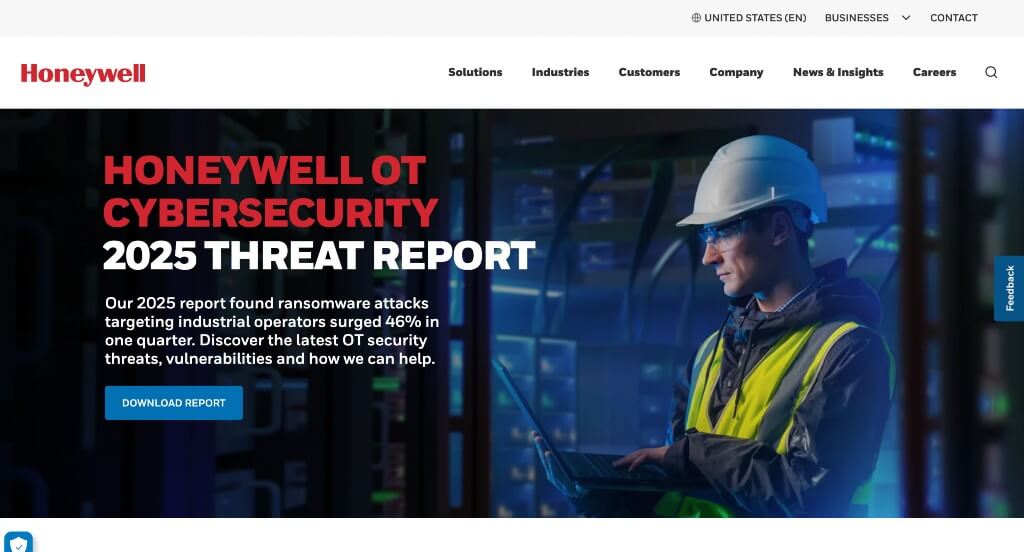
Right away, Honeywell uses a captivating image slider to hold the attention of their possible clients. It was smart to balance their white space with a variety of images and written content. Along with all of that, another feature we liked was their simple and professional font choices. Another thing you’ll notice is that they include many image tiles that link to different pages. Plus, this site was very well organized making it easy to use their site.
44. Emerson Electric
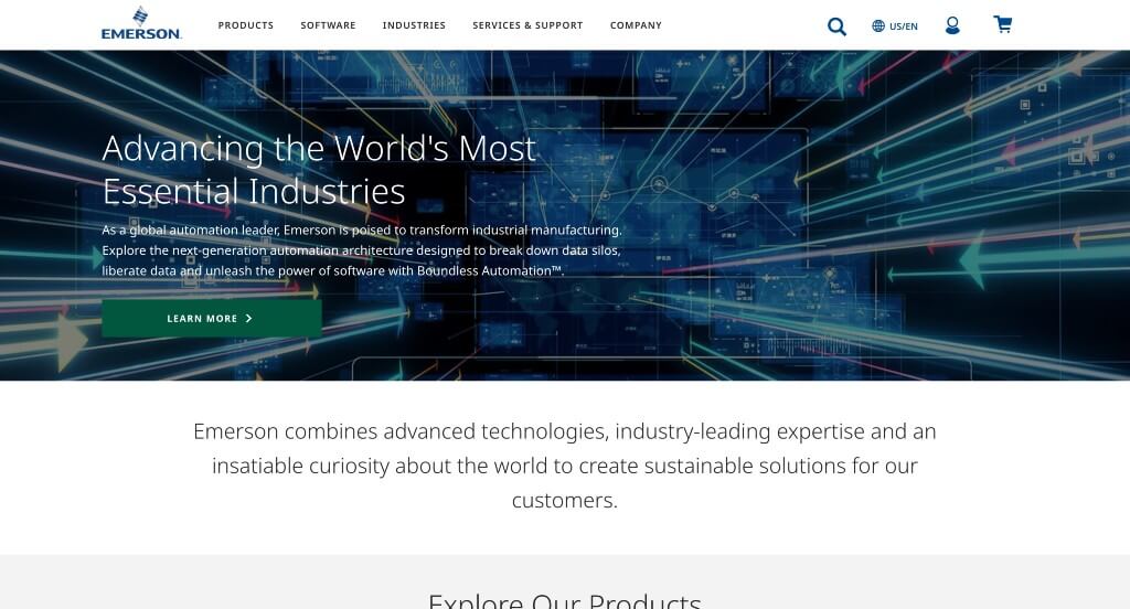
Emerson Electric’s web design was quite simple, with a sense of elegancy to it. Right away, this company included a search bar to find content faster. If you start to scroll down, you’ll also find a section with links to several interesting articles about their company, categorized by topic. On top of that, almost all of their paragraphs were short and straight forward.
45. Republic Services
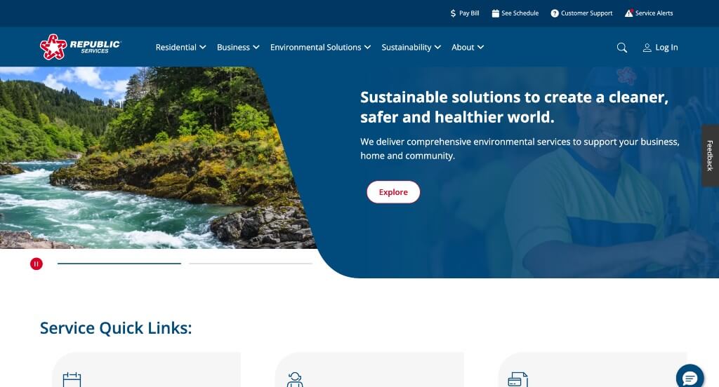
Likely two of the most outstanding features were their stunning color palette and their interesting rounded corners as an accent. You might notice that some accents and backgrounds are in red as well to help them stand out. A simple font was chosen to make their written content easy to read. Additionally, people may find the large banner captivating. Lastly, we felt that everything seemed really balanced and organized.
46. Waste Connections
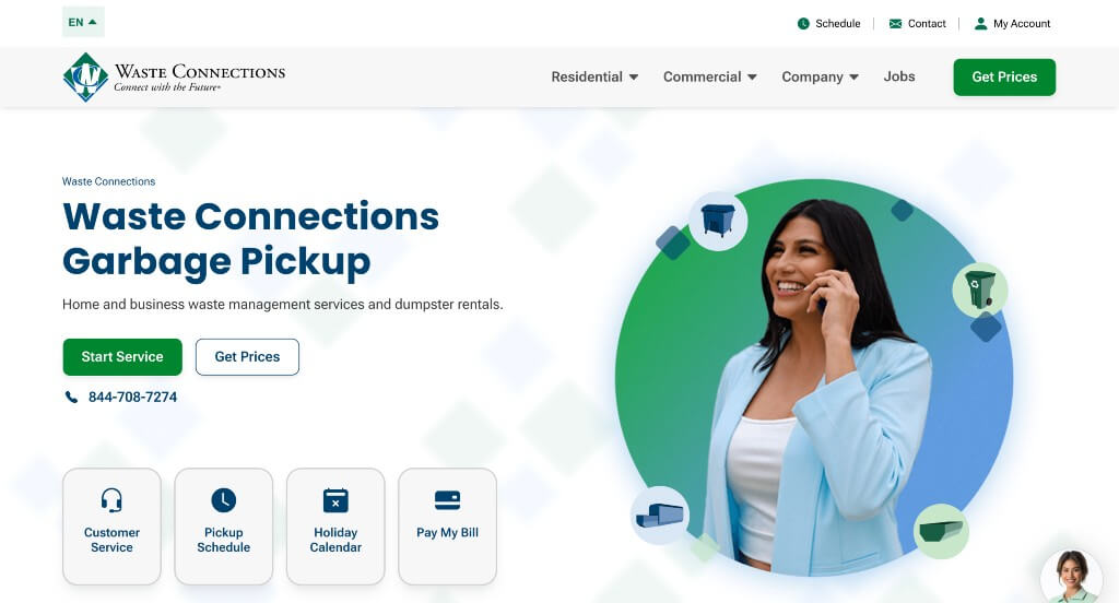
Most likely, Waste Connections’ best feature was their variety of graphics and patterned backgrounds. Bright and bold buttons are helpful to have because it allows possible customers to come into contact with additional information. Having a sticky header makes it convenient to navigate throughout this site. We also liked how they made sure that their domain matched their company name.
47. Carrier
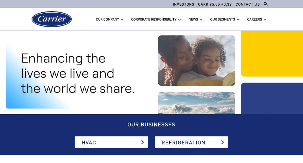
Here we have a navy blue color scheme for this website, which matches their company’s logo. Apart from that, you’ll notice accents of gray, making for an interesting color combination. It was a nice inclusion to have an automatically playing video as a hero header. We also liked how social media links were added in at the bottom.
48. Otis
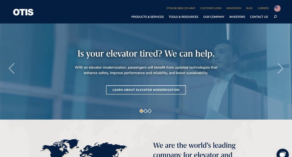
This company did a nice job with their variety of blue shades to form their color palette. Showing off statistics was another thing that we appreciated because it shows that they are a reliable brand. High quality images were also used throughout this entire example which was nice to create a more professional look. A live chat was another thoughtful addition.
49. Cintas
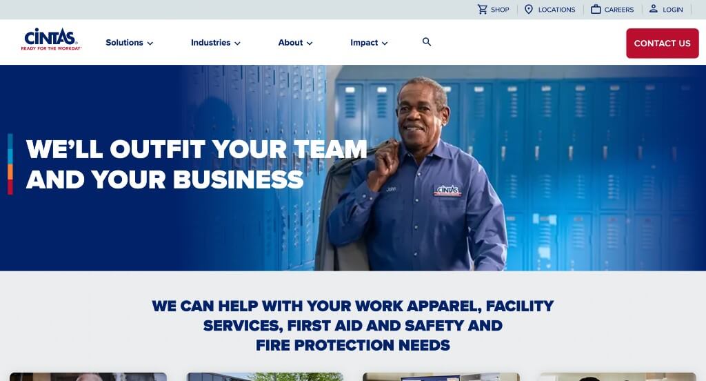
This example uses bold and professional fonts, making it easier to read their content. Everything was written in short paragraphs in order to get viewers reading and engaging in their content for a longer amount of time. This navigation bar also used drop downs to keep everything more organized. White space is very well balanced which allows for a cleaner look for their template.
50. Northrop Grumman
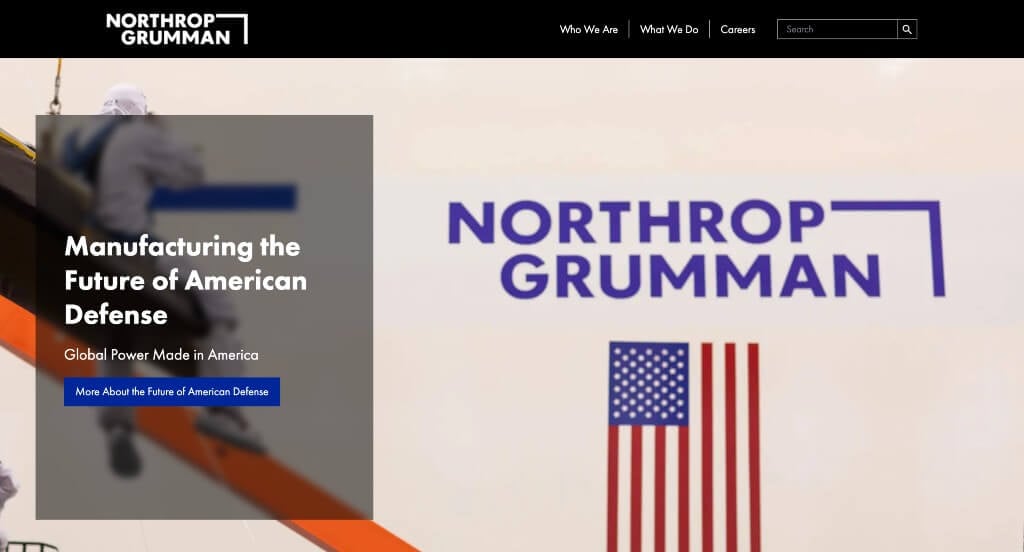
This example does a nice job with their large images throughout their homepage. Along with that, we liked their logo that was clean and simple so customers aren’t confused. There are also lots of buttons to guide people towards additional information, which is always a helpful choice. Another thing that we appreciated was how their domain also matches with their company name.
WordPress Industrial Themes
You can find free themes at wordpress.org, or consider industrial-inspired templates on ThemeForest.
Industrial – Themeforest
$69
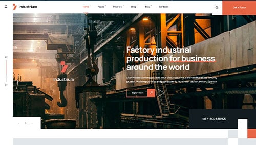
Industrium – Themeforest
$39
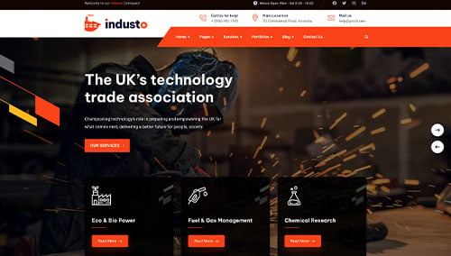
Industo – Themeforest
$59
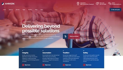
Amwerk – Themeforest
$69