Stay informed and inspired with our guide to the top 50 news and information websites! We’ve handpicked standout examples from news agencies, digital publishers, and broadcast networks – evaluated for design, usability, and user experience. Whether you’re building your own site or exploring the best in online news, this guide offers valuable insights and real-world inspiration. For more industry-specific examples, check out our best website designs article!
Top News & Information Website Designs
- 1. CBS News
- 2. Forbes
- 3. Beautiful News
- 4. Los Angeles Times
- 5. Newsweek
- 6. The Boston Globe
- 7. The Atlantic
- 8. Wired
- 9. Vox
- 10. The Next Web
- 11. NBC News
- 12. Time
- 13. Venture Beat
- 14. BBC
- 15. Vulture
- 16. Creative Review
- 17. Computer World
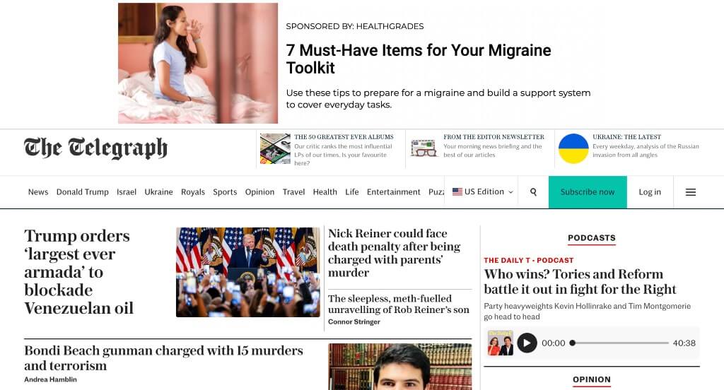
- 18. The Telegraph
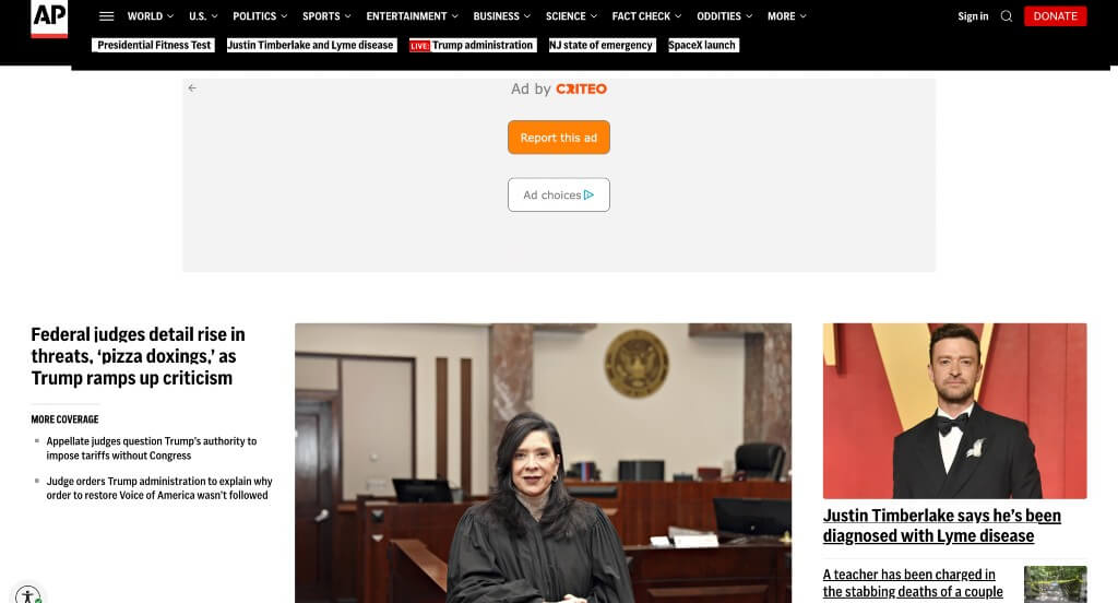
- 19. Associated Press
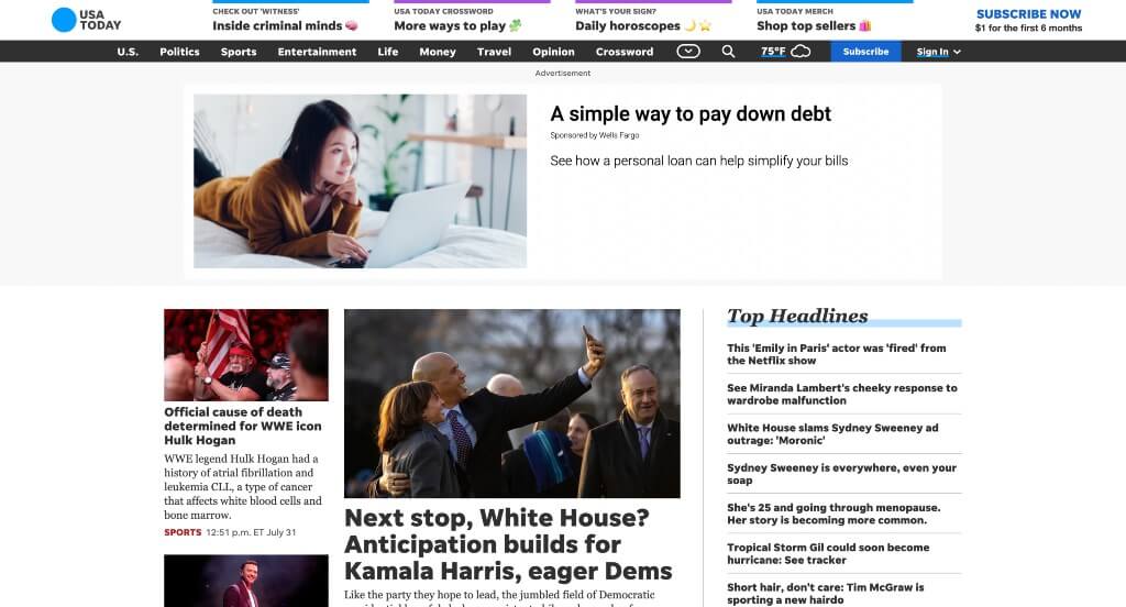
- 20. USA Today
- 21. The Art Newspaper
- 22. AdAge
- 23. The Verge
- 24. The Intercept
- 25. ESPN
- 26. W Magazine
- 27. Entrepreneur
- 28. New York Post
- 29. The Economist
- 30. Vanity Fair
- 31. The New York Times
- 32. The New Yorker
- 33. Glamour
- 34. Bloomberg
- 35. Fox Sports
- 36. CNN
- 37. Engadget
- 38. Search Engine Land
- 39. TechCrunch
- 40. The Hill
- 41. Fast Company
- 42. New York Magazine
- 43. Brides
- 44. Washington Post
- 45. Think Global Health
- 46. Billboard
- 47. Macworld
- 48. Entertainment Weekly
- 49. Good Good Good
- 50. Blavity News
1. CBS News
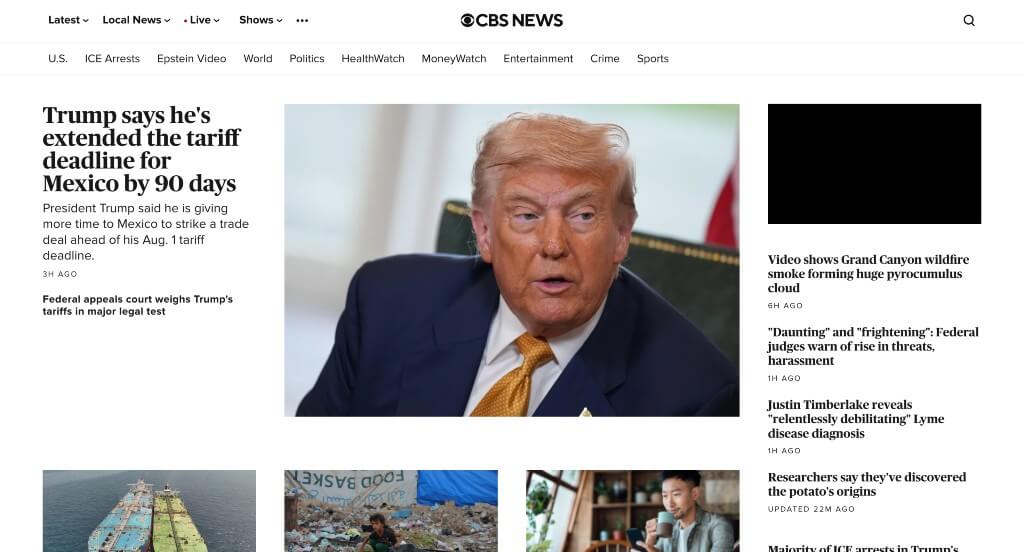
This news company used black and white to create a custom web design. A professional font choice was probably an impactful quality within this homepage. Their way of organizing was also very nice because people could easily find what they are wishing to read about. CBS News also had a simple domain that made them easier for customers to find in the long wrong.
2. Forbes
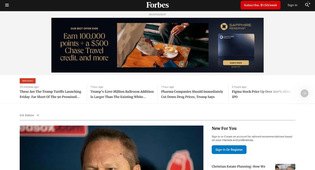
Here we have an example that uses a variety of different sized images in order to help with the overall balance of everything. We thought it was interesting to have a list of trending news and editors’ choice news. Their subtle accents of red were nice to highlight more important information. Another interesting addition was a quote of the day.
3. Beautiful News

After scrolling through, you’ll notice a pinkish-red accent that adds some personality. Another quality in Beautiful News was their creative logo that appeared as a graphic in other areas for unity. Having an ability to heart or bookmark articles was another great choice. Placing most recent stories near right below their hero header was very smart.
4. Los Angeles Times
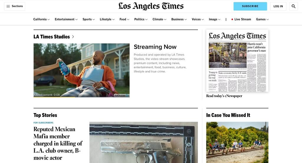
This is a well-known brand, so making sure that their web arrangement is similar to their print newspapers is something that’s essential. Dividing their content into clear sections was another great choice. High-quality images correlate with their articles which is refreshing. They clearly had ease of use in mind when building in a search bar.
5. Newsweek
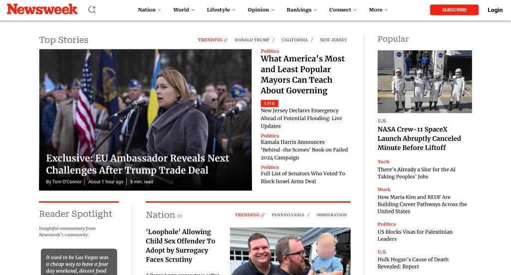
We loved how there was lots of images that include graphics sometimes. This menu was very well organized with separate categories within. Featuring the popular news on the right side was something that many people enjoy. Another feature that was interesting was their use of different size and styled fonts that still look nice together.
6. The Boston Globe
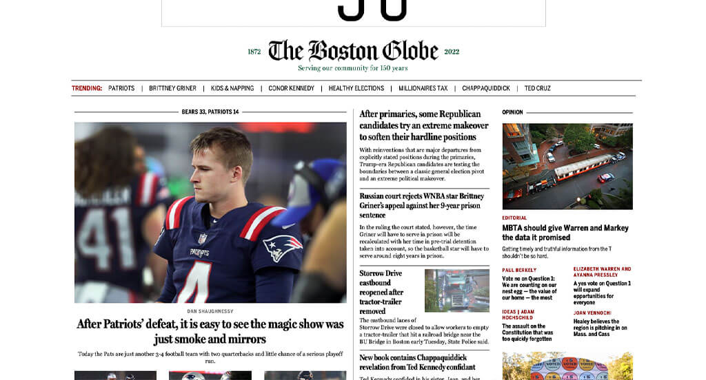
Something that anyone could appreciate is how there are lines separating content within this example. Having some images that are larger to grab attention is another great idea. An area for articles written by their partners was a nice touch. The Boston Globe domain was also simple and easy to find again if needed. Lots of small bursts of color were used to highlight important content.
7. The Atlantic
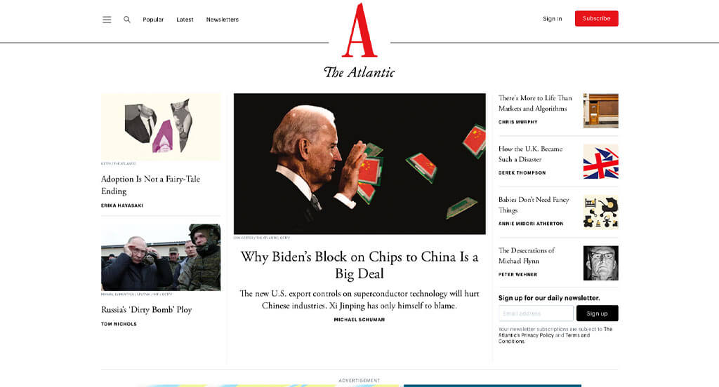
Upon scrolling for a bit, viewers might notice how there is an area that curates articles just for you. Additionally, they have a column for latest and popular news. Interesting imagery is always impactful no matter what type of business. They did a great job making it easy to find information throughout this site. Using bright red to accent a variety of areas was an aspect to be appreciated for sure.
8. Wired
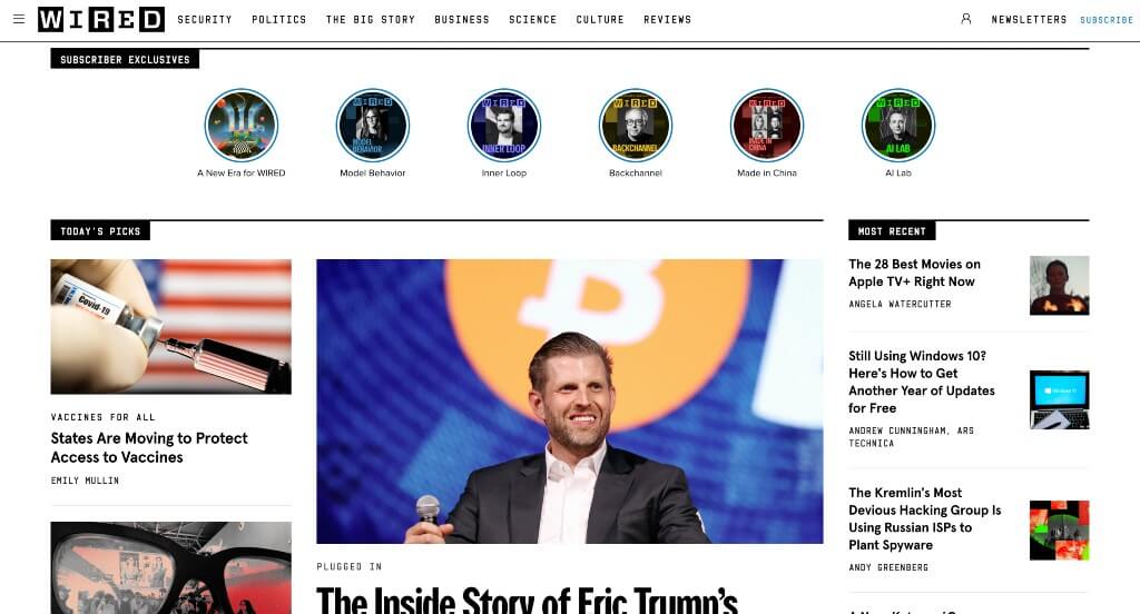
White space is carefully balanced in every area of Wired, which is something that all companies should effectively do. This logo grabs attention and gets people interested about learning about a topic. Adding in small tabs to show topics and subtopics was another feature that anyone could enjoy. A search bar was also included in order for viewers to find what they are looking to read about.
9. Vox
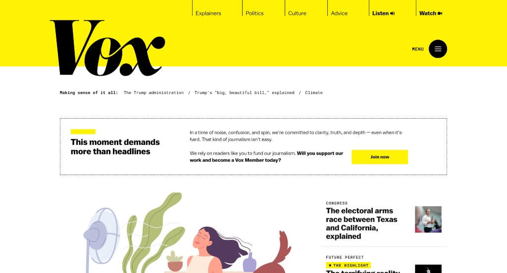
Almost instantly, we can notice how this company likes to show off their logo in a large manner – but somehow it doesn’t feel overpowering. A bright yellow highlights many areas of this example making certain information easier to find. Adding in an ability to listen to their content helped them stand out from their competitors. Their specific sections for things like politics, culture, advice, and more.
10. The Next Web
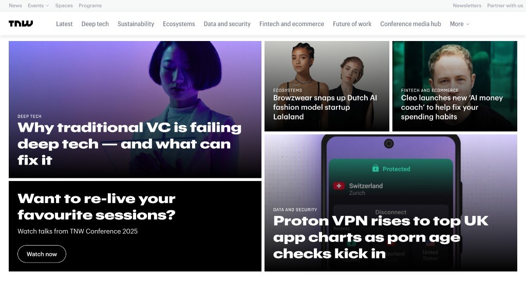
The Next Web feels almost futuristic based on their logo. Captivating visuals that capture attention to their articles was very impactful, and helpful. Our team liked how they used an interesting arrangement for their images that wasn’t just columns. They had a focus on marketing when creating a theme that looks similar on every page. Using banners to show deals that are currently happening was also great.
11. NBC News
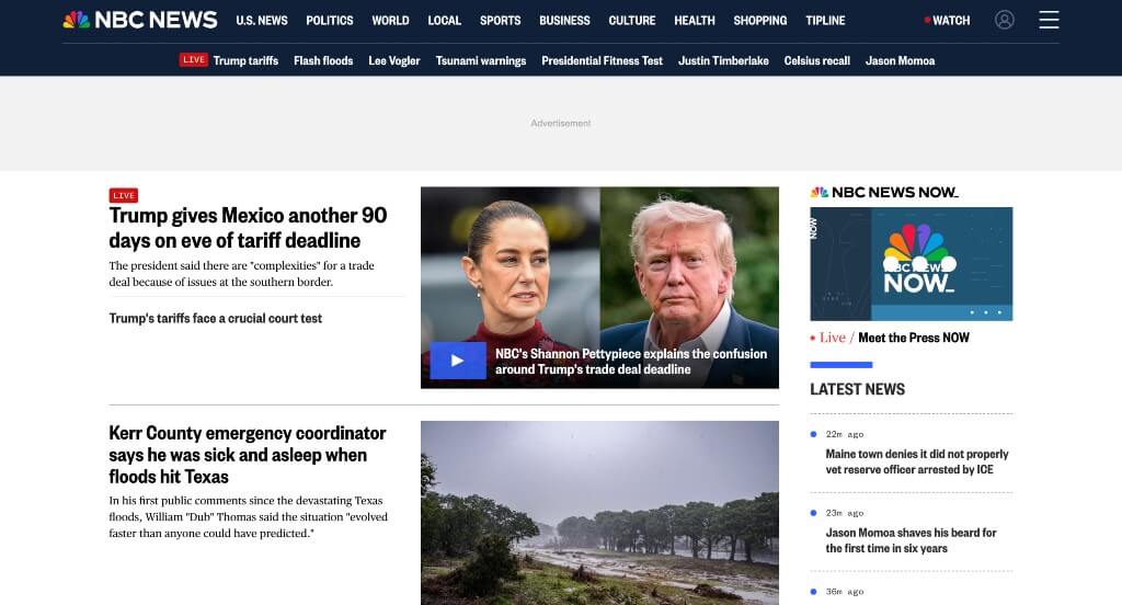
NBC News created a stunning logo that creates a “hidden” peacock for their streaming service. Using bold, simple fonts helped to create a very professional feel. This business does a great job keeping everything organized and easy to find. Their accent of bright blue was also very nice because it highlighted more important information. Their domain also matched this brand name, which is always helpful.
12. Time
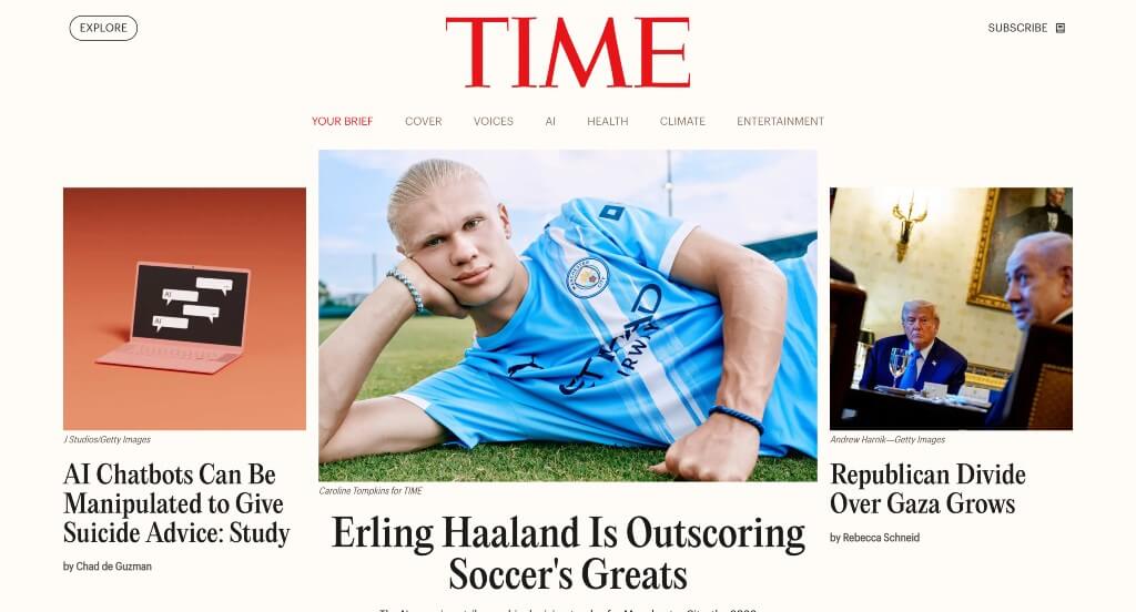
There was lots of great ways to grab attention within Time. We also thought it was a cool feature to have “Milestones” interviews with well-known individuals. They carefully mix articles and videos to create something that many people can enjoy. Time also utilized a layout that has a good balance of white space, which is always nice.
13. Venture Beat
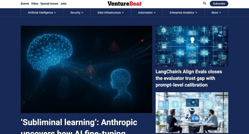
Venture Beat did a great job utilizing blue, white and black throughout their pages. Many of their images have similar aesthetics, which is always good because it creates a sense of unity. This company had a focus on their viewers when guaranteeing simple navigation. Another thing that our team enjoyed was their mix of real life images and cartoonish images.
14. BBC
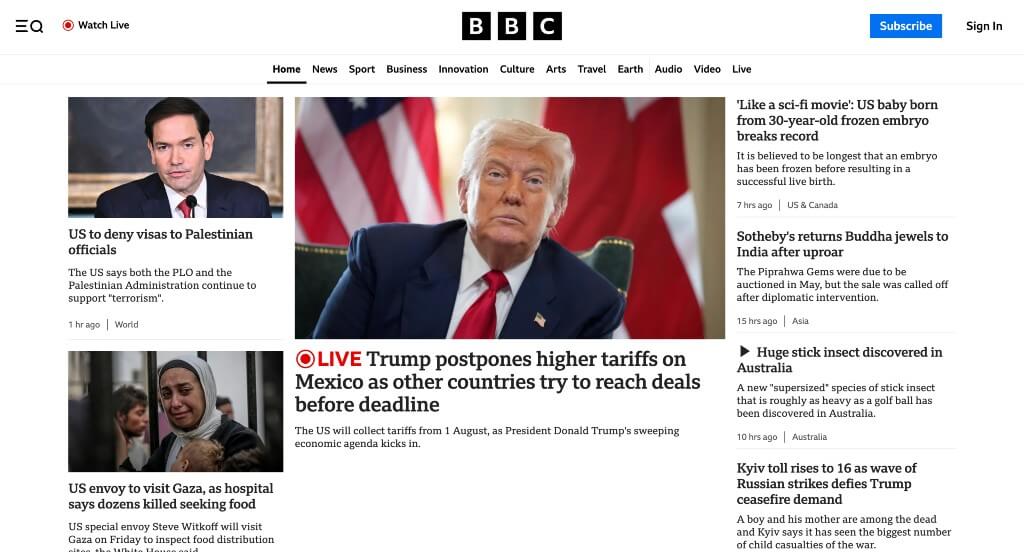
Right away, customers can notice how this navigation bar has lots of buttons, making it easy to find information that they’re interested in. An audio section was also very nice to include because not all news companies include this. High-quality images is something that’s essential for this type of business. Many people also might notice how they can gain quality information either as articles, videos, audio, or live.
15. Vulture
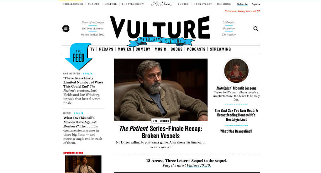
Here we have a webpage that seems to be focused on pop culture – movies, shows, books, and more. Another aspect that many people will enjoy is their use of blue accents in things like graphics and underlines. Those creative graphics were certainly refreshing. We loved how just because of their overall layout for this example, it felt different to us.
16. Creative Review
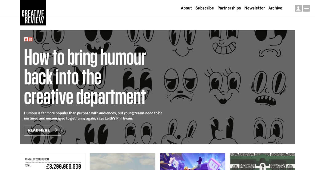
Having annual awards given out to a variety of different companies was something that was enjoyable. This font was simple and professional making it easy to read. Lots of interesting images were included in order to grasp viewers right away and get them reading. White-space was used carefully and effectively, which always makes for a better experience for viewers.
17. Computer World
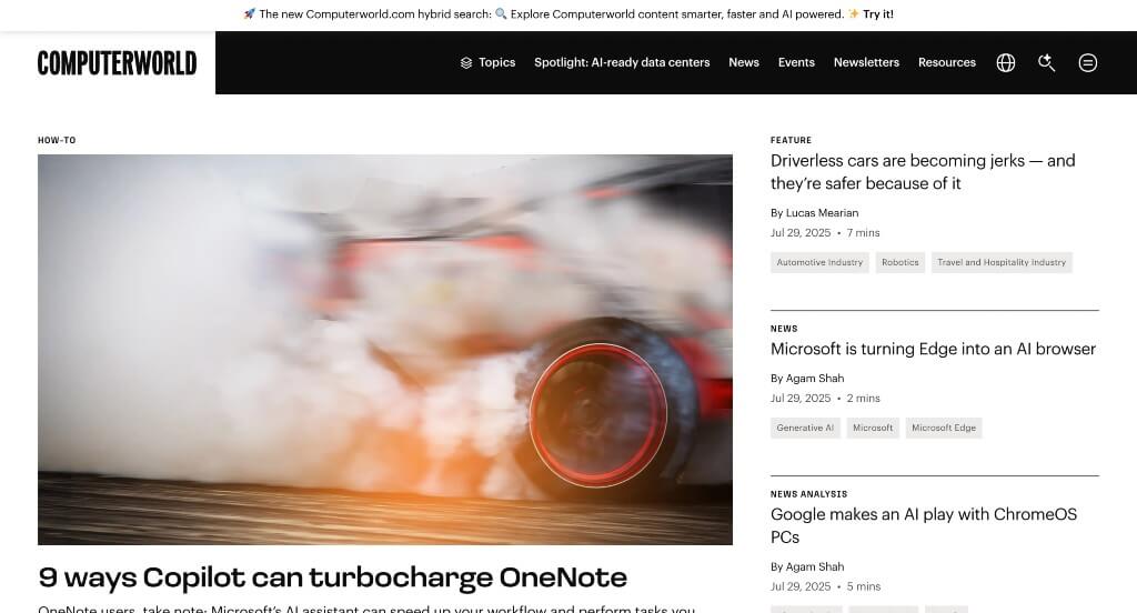
As a visitor, something that will be noticed is their accent of light purples. This helps to break up content but is also great for building part of their brand identity. Further down, people might see a variety of buttons guiding them to lot of different topics. Many of their topics are broken down more in order to make everything more accessible for those searching for something specific.
18. The Telegraph
White, black and teal color can be seen here, and it stood out to us because it creates a design that isn’t distracting. This example writes about so many different topics, that it’d be impossible to find nothing to read about. Their content is well organized into sections, which is very helpful. We also loved how there was lots of images to guide viewers.
19. Associated Press
This example also does a great job getting information to viewers. Something that we noticed was their short quiz that can be taken to see if you’ve been up to date about recent news. Showing US News next to a section for World News was nice because it helps people decide what they want to learn about. Putting together a list of articles suggested for each viewer was something else that we noticed.
20. USA Today
A layout is used here to make all their information easier to comprehend. Featuring top stories in a certain area was something else that can be noticed. Using a variety of colors for each bigger topic was helpful for those looking through their site. Large titles are also used making it easy to understand what you’ll be reading about.
21. The Art Newspaper
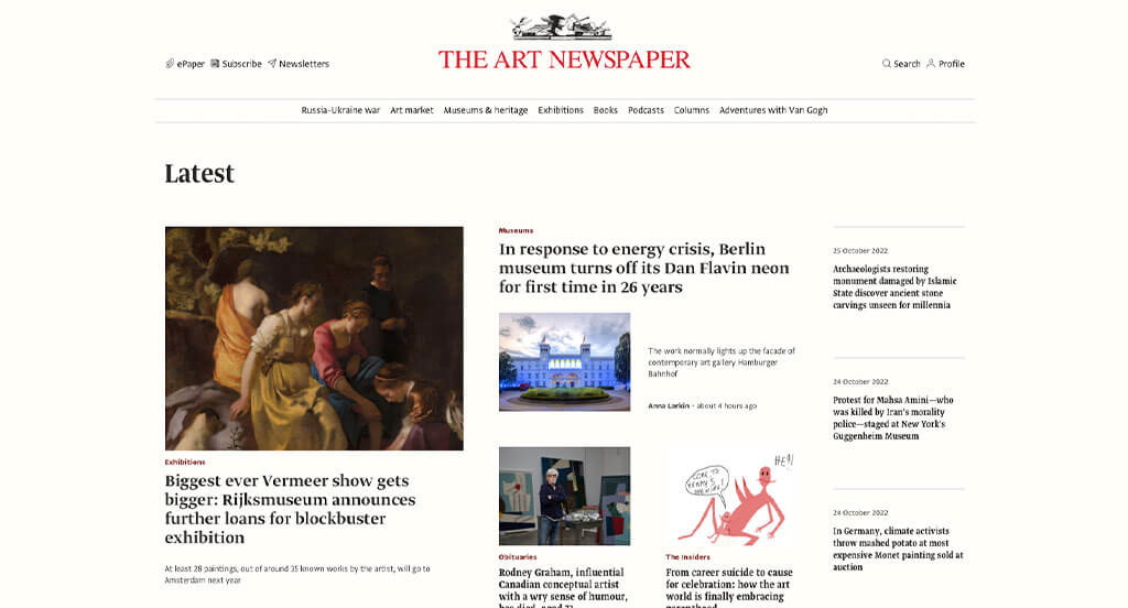
Obviously images of are included here, but we enjoyed how there was also many real life photos also. Their basic color scheme allowed for images to stand out more, making people more engaged. This font choice is easy to read and absolutely stunning. The Art Newspaper’s accents of pink was a nice touch. Their domain is also matching with their company, a feature that is always great.
22. AdAge
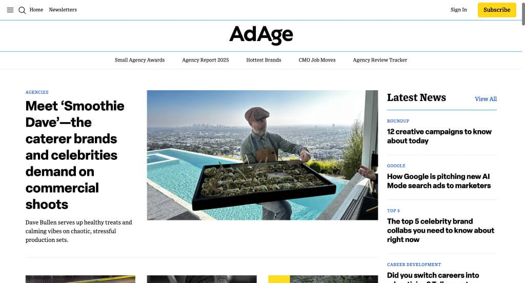
Right away, AdAge makes use of a search bar so viewers can find specific articles even faster. Showing categories of their most popular article types within a navigation bar was smart. We loved how there was different sized images to add a sense of variety. As free users, many articles appear to not include any information – because viewers have to subscribe first.
23. The Verge
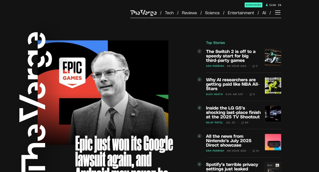
Interestingly, The Verge makes use of a black background and bright text colors to stand out from their competitors. Their logo text was inventive and is sure to grab attention. Another feature within this example that is noteworthy is this layout that had a social media vibe to it. We loved how many of their images made use of those bright colors to create unity.
24. The Intercept
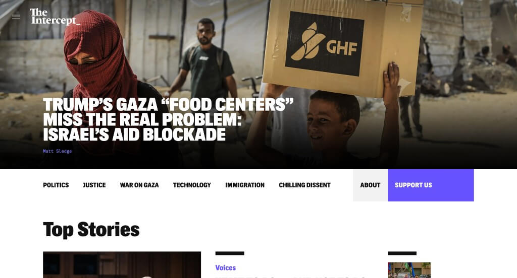
Bold fonts grabbed our attention right away, which was amazing because people are wanting to read information almost instantly. Letting text change color upon hover if it leads to an article or another page was a smart choice. We felt that their use of a few different fonts paired carefully together was a cool thing to see. This example also used dark backgrounds, which seems to look more mysterious and different.
25. ESPN
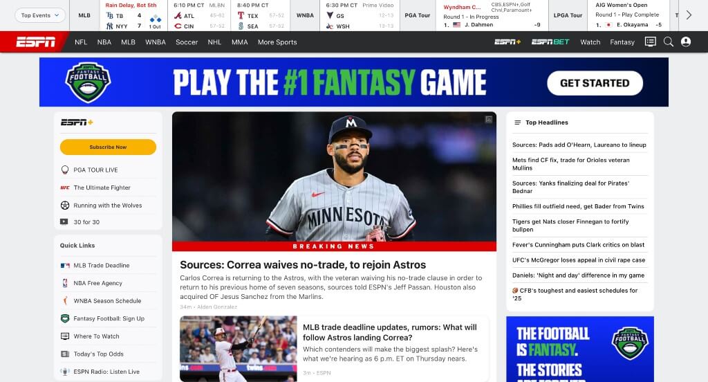
ESPN makes good use of not only images, but also videos – which makes sense, especially when featuring sports. Of all these news webpages we reviewed, it was cool how this example showed upcoming games or events on right on top of their page. This memorable and well-known logo is essential to include in their pages.
26. W Magazine
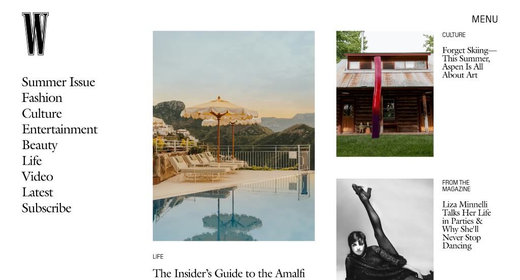
Using a mix of color and black and white images was something that stands out to us. We loved how their images are high-quality and thought out. Using information that is both big news and small news is helpful because they have some information that isn’t on every other news site. They put thought behind their staggered layout for information within this example.
27. Entrepreneur
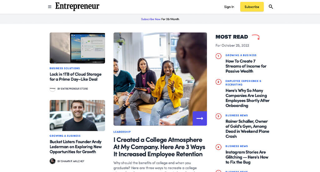
We loved these organized pages that use black, white, blue, yellow and red for a color scheme. As you scroll through, you might see their simple graphics. Having short and straightforward paragraphs before clicking on articles was refreshing, helping readers understand what they might see. Entrepreneur clearly had a focus on accessibility when utilizing buttons.
28. New York Post
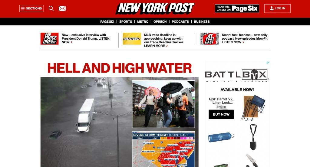
Our favorite part about New York Post is their bright red accents for sure. Along with that, it was helpful to have very bold fonts that help people see specific information first. It was unique how many of their images actually appeared as almost a collage. We also thought it was cool how red highlighted certain parts of their words to show the important parts.
29. The Economist
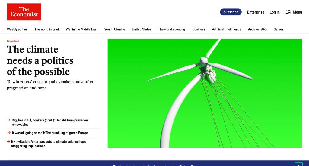
This company’s mix of images and cartoon or graphic images was something that stood out to us. It was helpful to have different sized images for articles because it helped display which are seen as “more important”. Their balance of white space was something that we really enjoyed. A section for most popular reads was very refreshing.
30. Vanity Fair
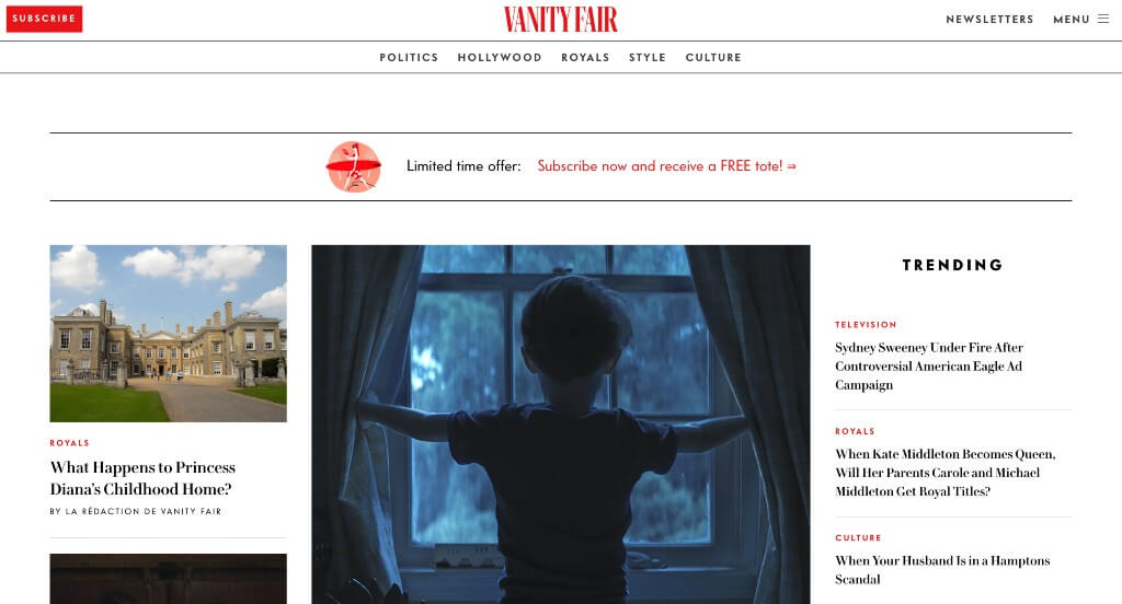
We really loved the use of large images in multiple areas to grab attention. Their red accents can be used to highlight certain areas and of course point out where more content is located (through buttons and links). Lots of information is always included about current award ceremonies or galas and the aftermath of them. Vanity Fair was thinking about brand recognition when finding a domain that matches their company name.
31. The New York Times
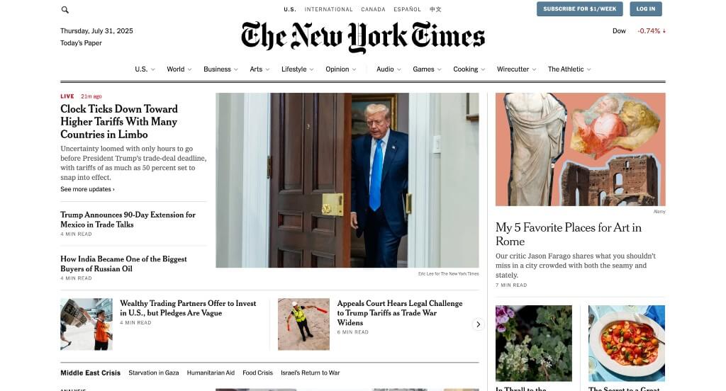
Here’s another example that is designed to look like their newspaper. This black and white color palette is once again used in order to highlight images that appear in color. We also loved their lettering for their logo – this is seen as classy for any newspaper type of business (online or on print). The New York Times clearly had ease of use in mind when building smaller titles to show what categories articles belongs to.
32. The New Yorker
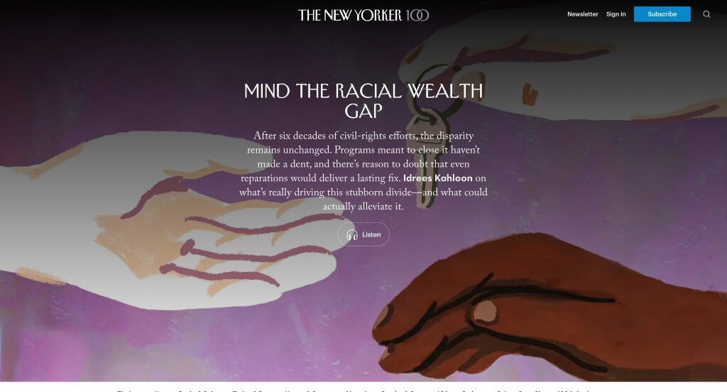
One of our favorite parts about this one was their feature “The Ledge”, that informs viewers with what they need to know on a day-to-day basis. Adding in a few creative graphics was a nice touch too. Including games, quizzes and contests was another aspect that we very much enjoyed. Offering podcasts and a shop was unique, but we still loved it.
33. Glamour
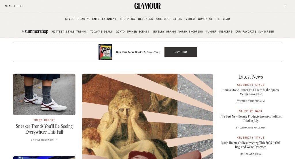
A black and white color scheme focuses on simplicity and modernism. We thought it was cool for their editors to choose products that they recommend. Glamour also does a good job with their logically organized content. This clearly labeled menu was a marketing feature that really stood out to us. They also used lots of interesting fonts, which we thought was unique.
34. Bloomberg
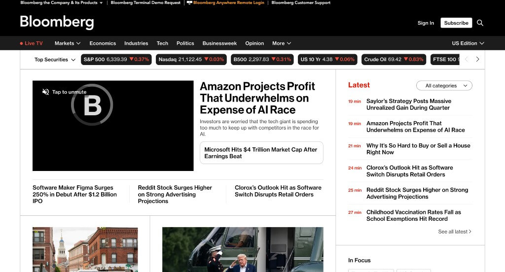
After scrolling for a little bit, you’ll notice their variety of content. Another thoughtful feature was their distinctive categories for each article. Bloomberg clearly had visual hierarchy in mind when choosing large fonts for titles. We also thought it was nice how this company used a balance of images and videos.
35. Fox Sports
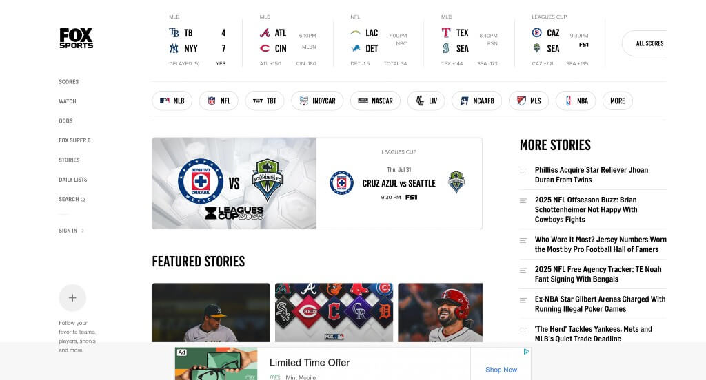
Right away, we noticed how they had live feed running with a variety of sports, which engages people. Fox Sports clearly had a focus on accessibility when designing a simple layout. They also had lots of professional, high quality images. Fox Sports also had a very well organized menu that made it easy to find what viewers are looking for.
36. CNN
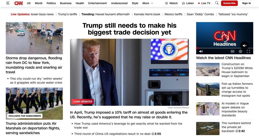
A very attention grabbing aspect here was their categories to show popular articles from each section. Another thoughtful quality in CNN was their memorable logo design. We also liked how they organized the information and used images to break up wordy areas. Their domain was also very simple and matched their company name which was nice.
37. Engadget
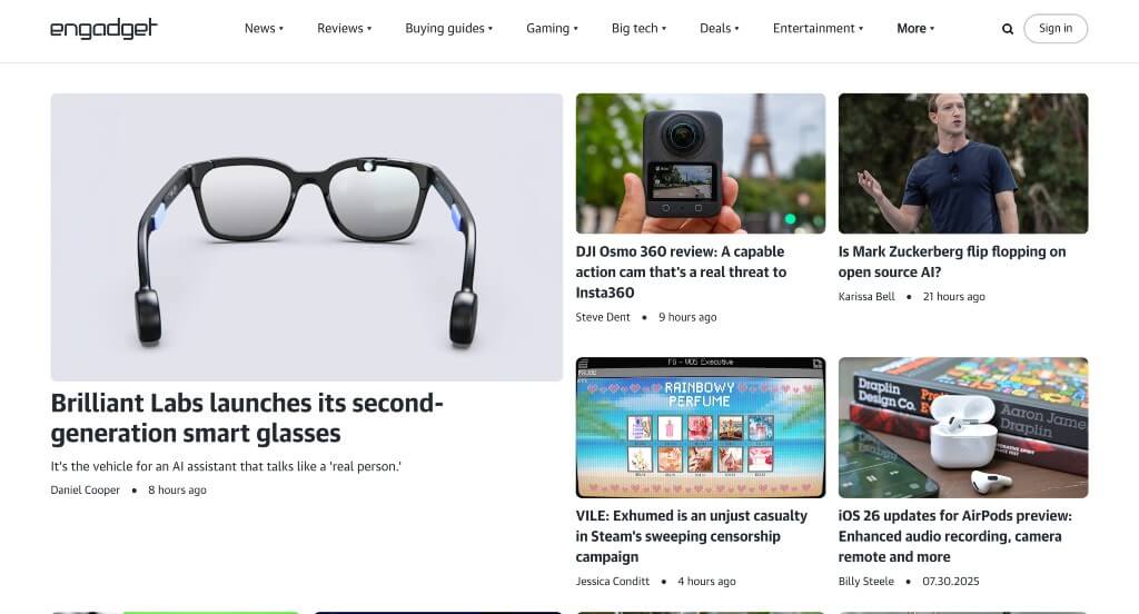
Of all these informational webpages we reviewed, a feature we liked was their use of white space. Professional text was refreshing for any company. They had usability in mind when building this navigation bar with organized categories. It was also a great addition to include holiday discounts on popular items.
38. Search Engine Land
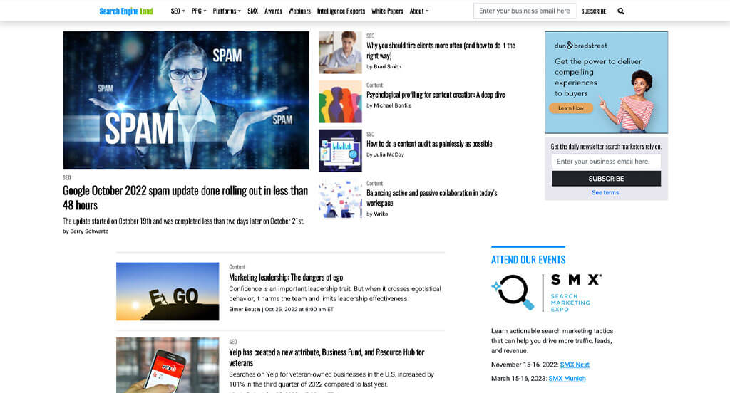
Upon first glances, we noticed how links change color upon hover, which is helpful for anyone reading through. A blue and green accent color was an impactful quality for Search Engine Land. Another feature we enjoyed was their creative imagery. Optimized content helped make this a stellar example.
39. TechCrunch
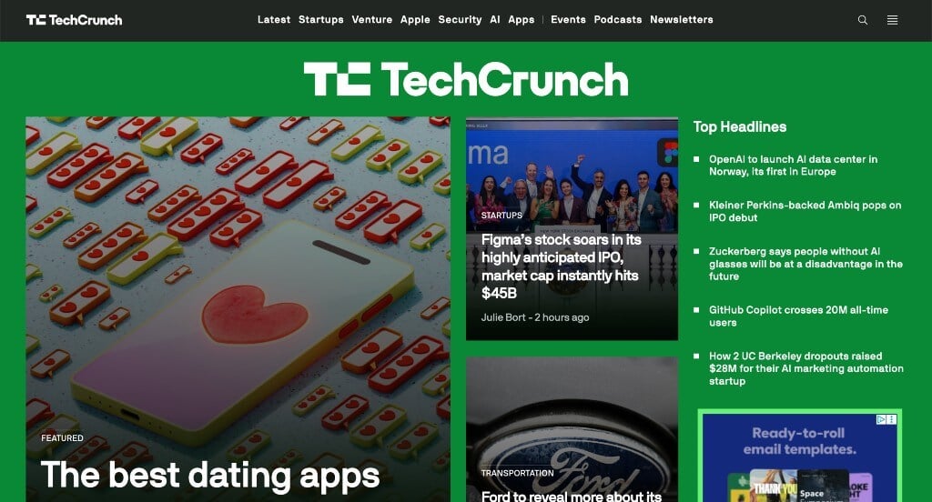
One of the first things we noticed was their creative logo that appears in a variety of areas throughout their site. Using bullet points in a bunch of places to help keep things organized was smart. We liked their small bursts of green and yellow accents. TechCrunch also picked a domain that matched their company name.
40. The Hill
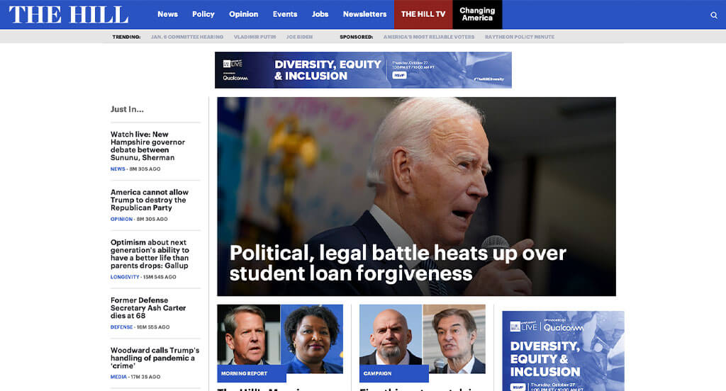
We loved how there was a bright blue accent to make everything look great. Small little tabs are used to keep all their content organized. From a marketing point of view, for a news website we liked the way they utilized banners showing which category articles come from. Give some thought to the one-of-a-kind design of this informational website when developing your next custom website.
41. Fast Company
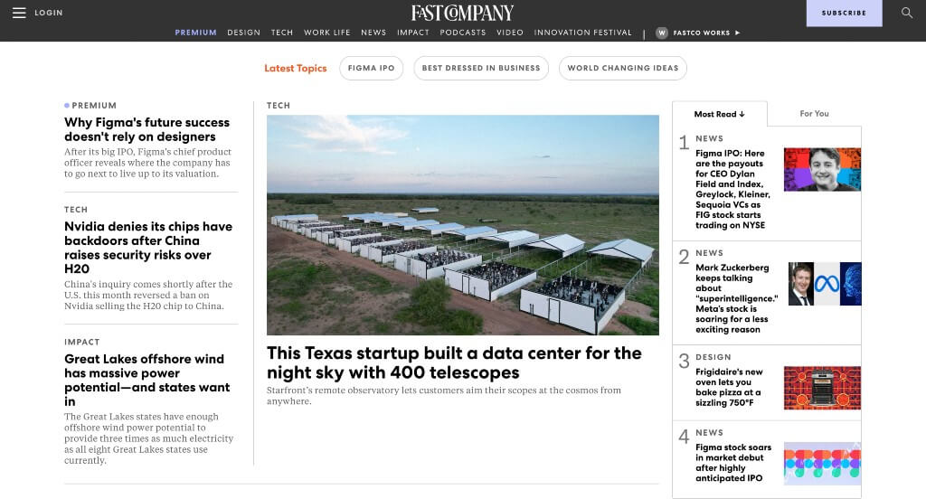
Something that we thought was cool was how Fast Company experimented with different sized letters to create a logo. A variety of topics are explored in this example, meaning lots of people will find something interesting. A section is included for subscribers only, which is a unique addition.
42. New York Magazine
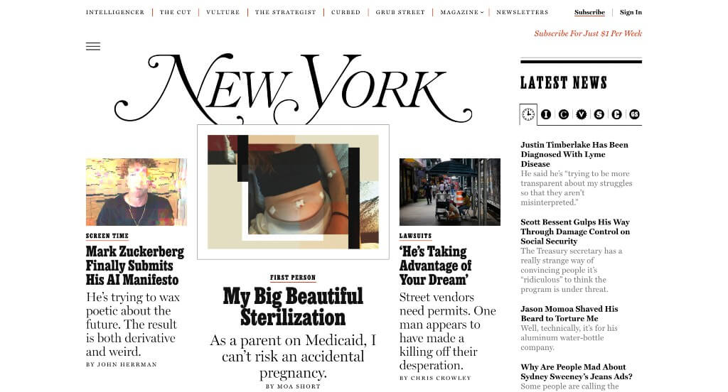
This company has lots of interesting title names, making people excited to read recent news. Because they are trying to make money, you will run into lots of paywalls, however, they clearly label their pricing. We really enjoyed their use of different fonts that creates a look that we all can enjoy.
43. Brides
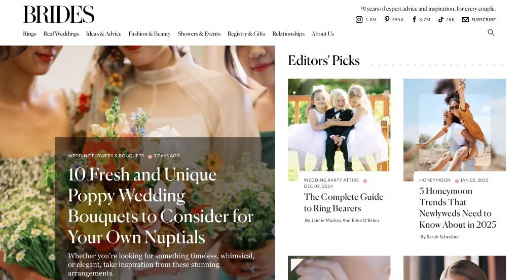
There was lots of pretty pictures included here that tie in the excitement of weddings. We loved how some of their content was more informational while others were opinions. Lots of accenting fonts were used that were very creative. We liked their graphics and their layout for everything within their pages. Adding in their social media was another feature that we couldn’t ignore.
44. Washington Post
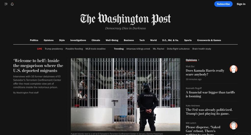
Right away, we noticed how there was a dark background with white text which was bold, and matched with a phrase included “Democracy Dies in Darkness”. We also felt that their inclusion of images was a great choice. Having thin white lines that are used to separate different topics was another great idea.
45. Think Global Health
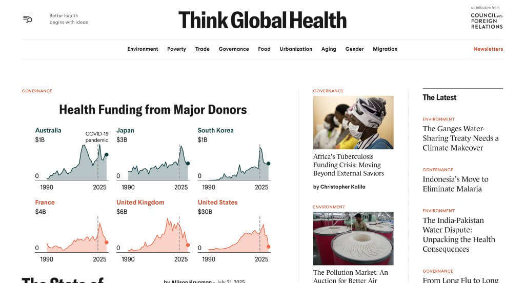
The accents of bright red was something that we loved about Think Global Health. Including statistics in this example was refreshing. Lots of high quality images are used to elevate this example to another level. A search bar was also added in, which we thought was a nice touch.
46. Billboard

This example made sure to place a variety of image sizes within it which was nice especially because it attracts readers to certain areas. Including the Billboard Hot 100 is something that we loved, because it’s what they are known for. The variation of media was an amazing choice for them. Their content also branched off into important subtopic of their desired focus.
47. Macworld
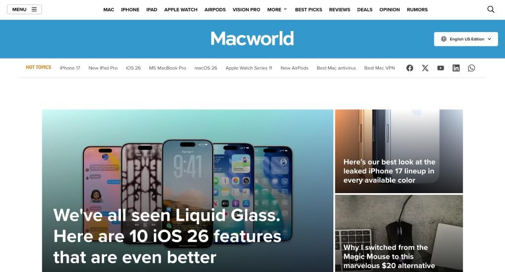
We loved how all information tied to technology – especially because their name is Macworld. High-quality and large sized visuals were probably a very impactful quality here. Their domain was also very simple and made sense with their business, which was perfect.
48. Entertainment Weekly
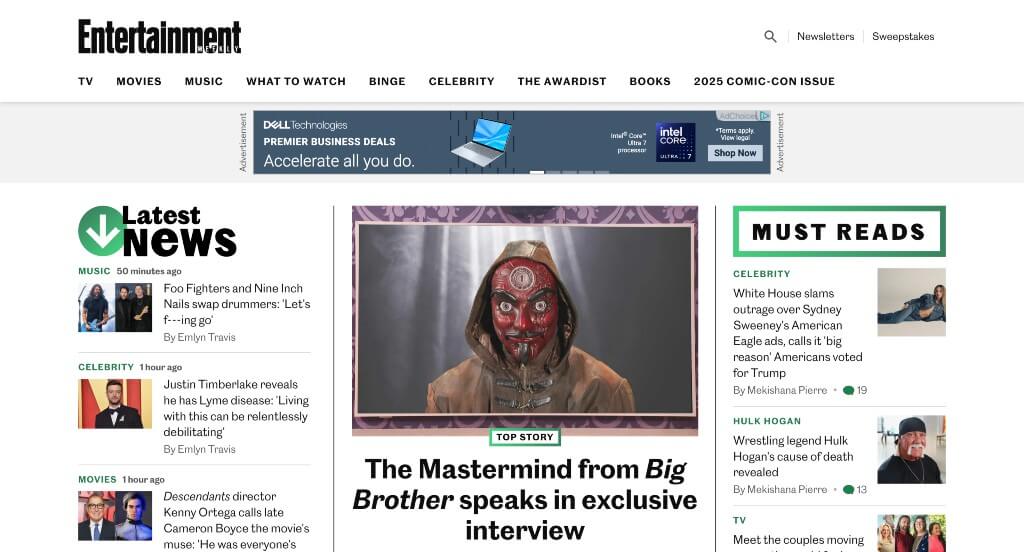
We liked how this example used different sized images to place more emphasis on certain articles. Highlighting some parts of their webpage with green in order to draw attention to it was another thing that we noticed. We also loved how this navigation bar was well labeled making it easy to find information that is important to you.
49. Good Good Good
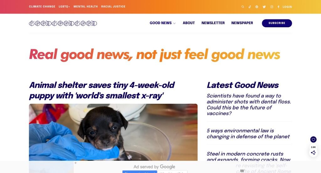
This example used lots of bright colors which helped it stand out more against their competitors. Making use of italics for some of their fonts was another smart choice that helps their information with links easier to find. Using little tabs to show what type of information is featured in certain articles was a great way to help organize everything.
50. Blavity News
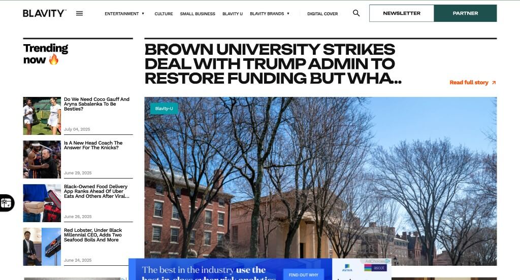
This example did a nice job organizing articles by relevance because it makes it easier for those looking for up to date information. Keeping ads near the bottom of the page was something that we liked because it wasn’t drawing as much attention towards it. They also do a nice job with their navigation bar that keeps everything easy to find.
WordPress News Themes
Browse free themes at wordpress.org or explore news-inspired templates at ThemeForest.
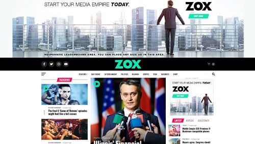
Zox News – Themeforest
$55
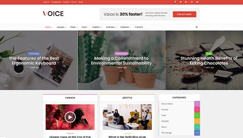
Voice – Themeforest
$69
SmartMag – Themeforest
$59
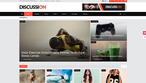
Discussion – Themeforest
$79