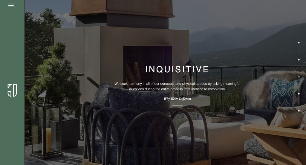
Hello, interior designers! Are you wanting to boost your online presence and attract more clients? If so, check out this guide with our top 50 websites to inspire you.
We’ve handpicked some because of their design, functionality, and user experience. Find inspiration, plus tips to make your website shine.
Explore examples related to kitchen & bath, residential, commercial, and sustainable design firms. For more industries, head back to our ideas for website layouts article.
Top Interior Decorator Website Designs
- 1. Duet Design Group
- 2. Grant Design Group
- 3. Design Theory 19
- 4. Laura U Design Collective
- 5. Jean-Louis Deniot
- 6. Taylor Howes
- 7. Laurel & Wolf
- 8. Giorgi Girl Design
- 9. WRJ Design
- 10. Lillian Wu Studio
- 11. Karim Rashid
- 12. Donna Mondi
- 13. Anoushka Allum Design
- 14. Mackenzie Collier Interiors
- 15. Love Décor
- 16. Zuzana Fontaine Design
- 17. Henge
- 18. Havenly
- 19. Design House Interiors
- 20. Blythe Interiors
- 21. Martin Kemp Design
- 22. Powerhouse Company
- 23. Old Brand New
- 24. Studio Hollond
- 25. Margaret Winters Interiors
- 26. HKS Inc
- 27. Avery Cox Design
- 28. Sonya Cotter Design
- 29. Viterbo Interior Design
- 30. Form And Field
- 31. James Thomas Chicago
- 32. LLI Design
- 33. Abel Design Group
- 34. Iconic Modern Home
- 35. Elizabeth Hay
- 36. Matilda Goad & Co
- 37. Jacob Interiors
- 38. Jayne Design Studio
- 39. Bunsa Studio
- 40. Nate Berkus
- 41. BoldRM
- 42. Tara Benet Interior Design
- 43. Studio Ilse
- 44. Ciatti Design
- 45. Celene Interiors
- 46. Pfuner Design
- 47. Victoria Hagan
- 48. Katharine Pooley
- 49. Decorilla
- 50. Elite Design Studio
1. Duet Design Group
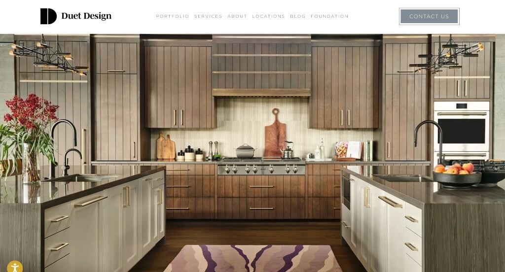
Duet Design Group ranked because of their golden color accent creating a warm but modern feeling. Adding in textures for backgrounds to allows for more interesting visuals. We also liked how they had featured portfolios to introduce some of their work. A slight accent of yellow was a great choice to liven up their mainly white style. Showcasing their awards and press inclusion was helpful too.
2. Grant Design Group
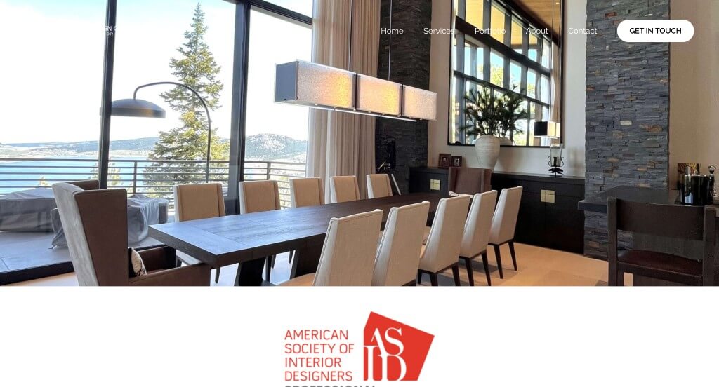
Here we have a great one to review that has great visuals and colors. We thought it was very very helpful to have shortened paragraphs that makes reading through much easier. Having buttons within their site was another feature that we couldn’t ignore. A simple contact information area also helped them make it into our list. It was also nice to bold words that were important for customers to see.
3. Design Theory 19
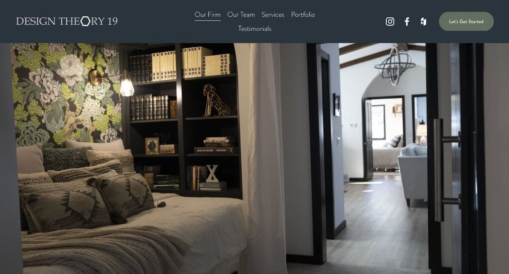
This company makes a stunning layout with their grayish blue colors paired with white and gray. Along with that, we liked how they blending bold fonts with decorative ones in order to allow for a professional design. Sharing a small burst of information about the firm was a nice way to build trust with the business. We liked their hexagonal image frames that’s also used in their logo design because it’s unique to the brand.
4. Laura U Design Collective
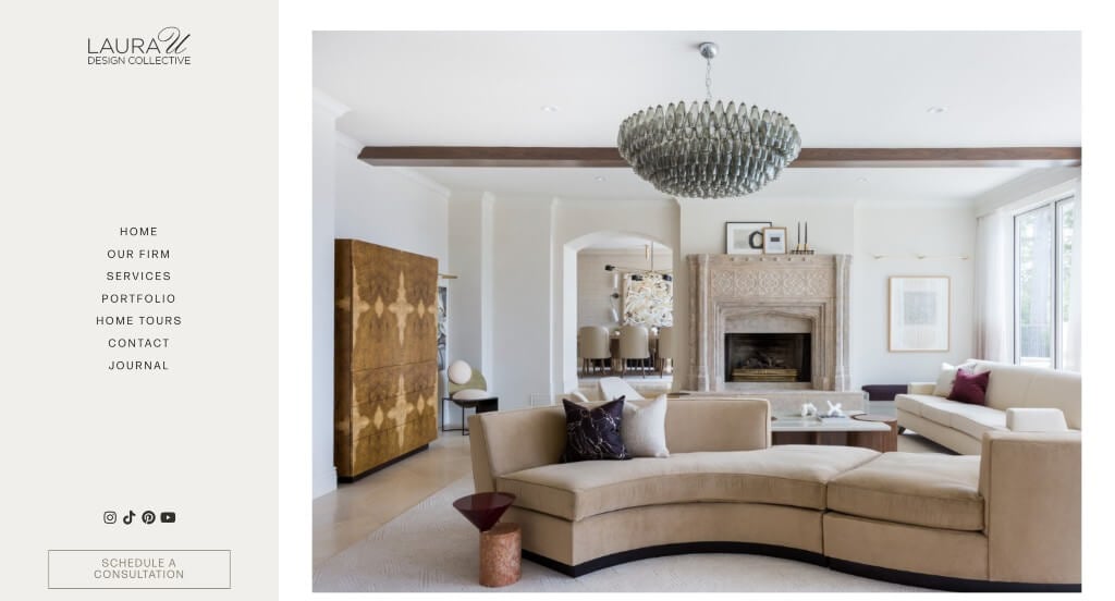
A simple font is paired with a simple color scheme which we loved for them. Another great quality was their buttons that were added in keeping every area of the site easy to navigate to. We loved how their menu was always displayed, but it was on the left hand side of their pages. Including popular publications that have featured was nice for publicity.
5. Jean-Louis Deniot
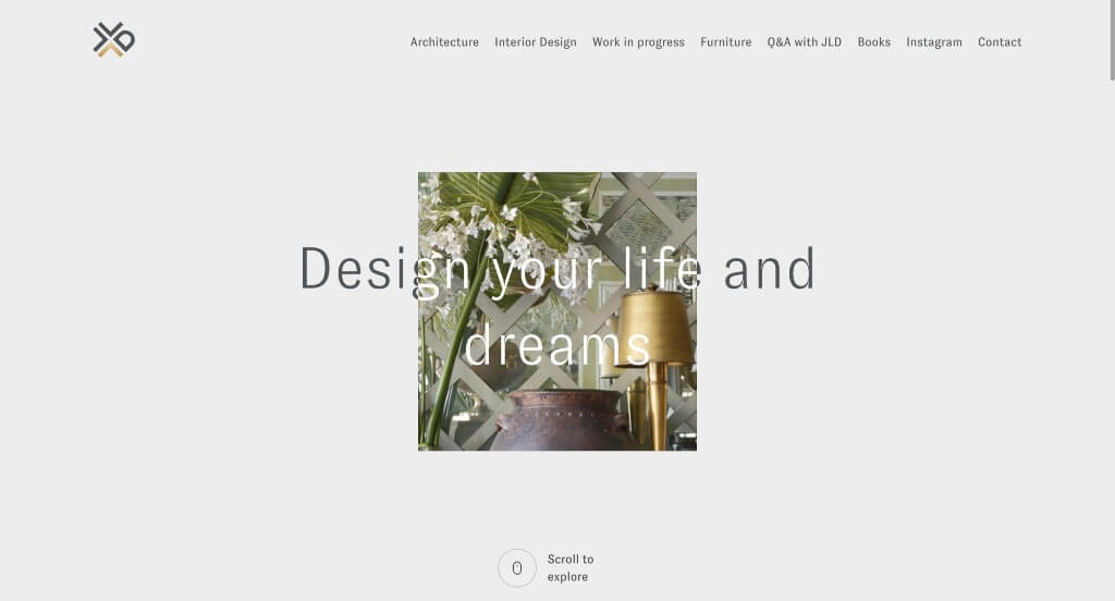
Our first observation about Jean-Louis Deniot was their logo design that uses little arrows to great a creative pattern while still using a D from their name. It was unique to have an introduction webpage before the actual site, but we liked it because it created a backstory for them as a brand. Smooth transitions were used effectively to do a great job keeping people engaged. Having high quality images to reflect their high quality service was another thing that we really loved.
6. Taylor Howes
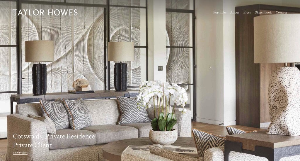
Large images was something that this business clearly knows how to utilize. We loved their page labeled Sketchbook that showed progresses from some of their past projects. There was also a page dedicated to any press release with them included in it which was unique. Their contact information was also very easy to understand, plus, they included a map. Finally, it was amazing to use their name as their domain, which helps with brand recognition.
7. Laurel & Wolf
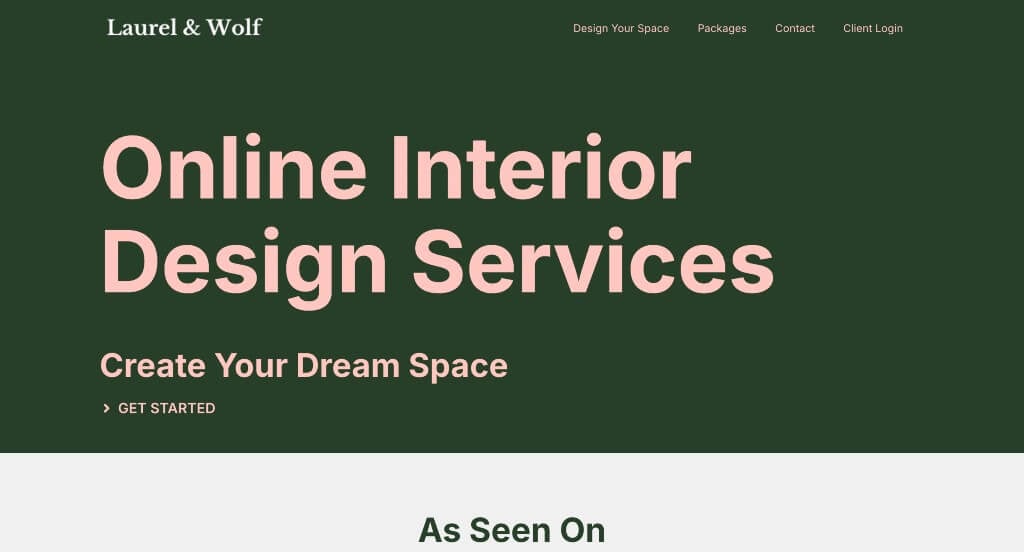
Right away, we noticed how a green and pink color scheme was adapted, which was unique for their industry, but we loved it. Having featured and latest articles from their blog was a nice touch. From a marketing perspective, we liked how they utilized clearly stated prices for each package. Also having a client login so that their customers can be given additional information was helpful.
8. Giorgi Girl Design
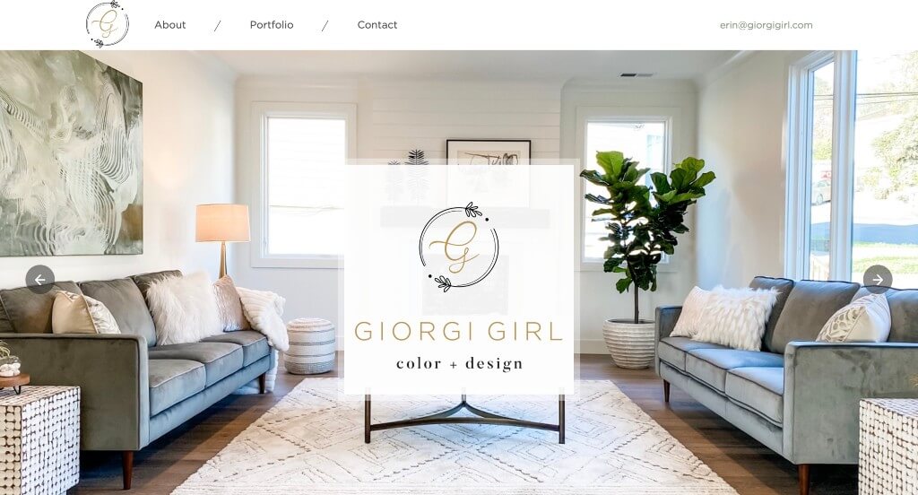
Our favorite part was definitely their logo that screams simplistic beauty. This makes total sense especially when you look at their past work. Picking a striking text was very impactful for a home decorator. Testimonials were also included which helped customers gain trust with them. We also loved how occasionally before and after sliders were added in. Having a slight accent of gold throughout their pages was also a nice touch.
Related: Your interior decorating business might benefit from website marketing services that include conversion funnels, email marketing, reputation management, and social media assistance.
9. WRJ Design
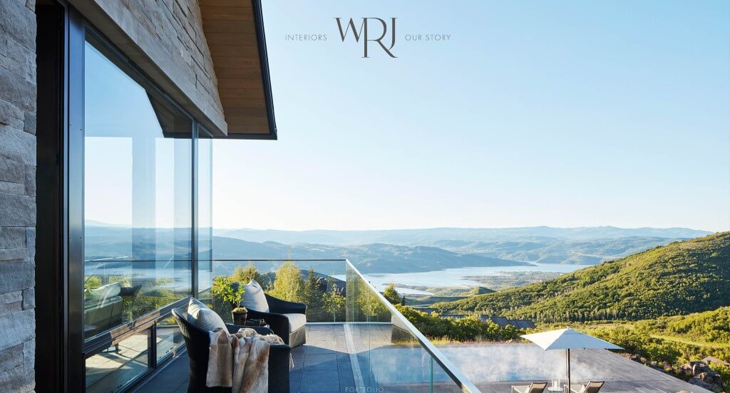
A large hero slider with images was nice to create a professional look upon entering their design. We loved how they had a smooth transition to go from one image to another within their slider. This template was extremely relaxing due to their small, delicate fonts. We liked how their logo used their name and connected each letter in a pleasing way. It was nice to show locations of past work upon hover of an image of their portfolio.
10. Lillian Wu Studio
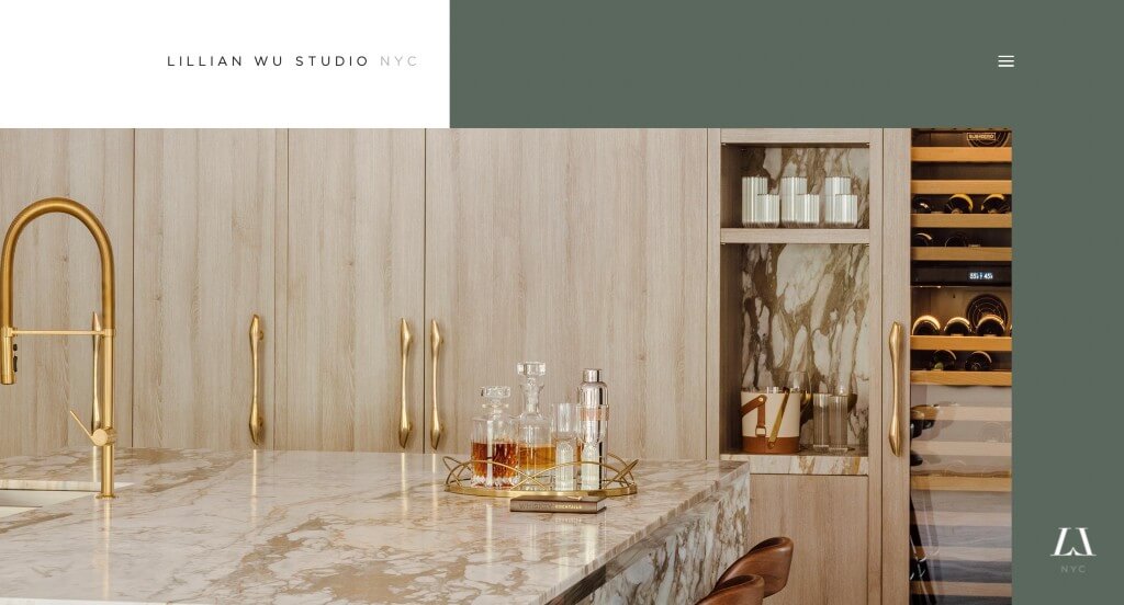
A green and white color scheme caught our eyes right away because of its natural feel. We loved their creative layout because it stands out from competitor sites. It was helpful to show their team members on their homepage so customers can “meet” them. Lillian Wu Studio also did a great job with their logo design that makes of two L’s to create a W.
11. Karim Rashid
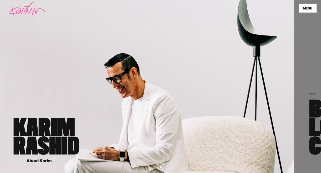
We loved the innovative look that can be seen for Karim Rashid’s site. We thought it was cool that upon hover each type of product explodes with vibrant colors, making everything feel more exciting. We also loved how they displayed lots of their products from a variety of different years right on their homepage. Large pictures that serve as buttons leading to each category was a nice touch. Finally, we loved how Karim Rashid used their name for their domain, making it match their branding.
12. Donna Mondi
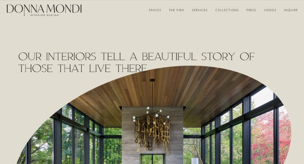
Almost instantly, we noticed their smooth transitions and interesting animations that make everything more exciting. Including videos was something else that we enjoyed. We also really loved their sleek fonts that match well with the overall look of this site. Having a well labeled navigation bar was another helpful feature – especially because they included little drop downs to organize everything a little more.
13. Anoushka Allum Design
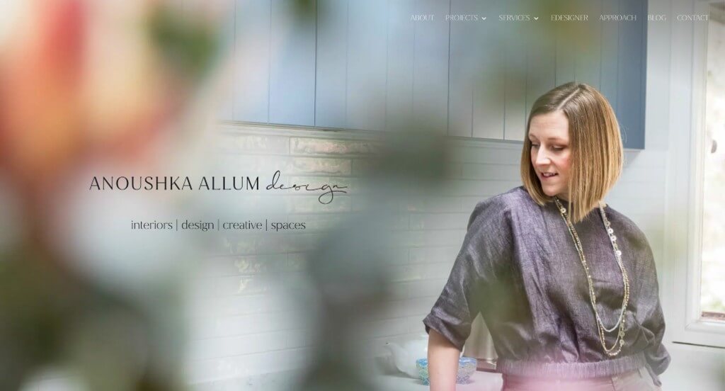
Anoushka Allum Design makes great use of a relaxing color palette. Additionally, we felt that including small accents of color helped to make for a more interesting look. They knew how to utilize fun fonts which made everything better. Their logo can also be noticed within their header, and we loved it. Small graphics of tropical leaves and such was a unique quality that we enjoyed.
14. Mackenzie Collier Interiors
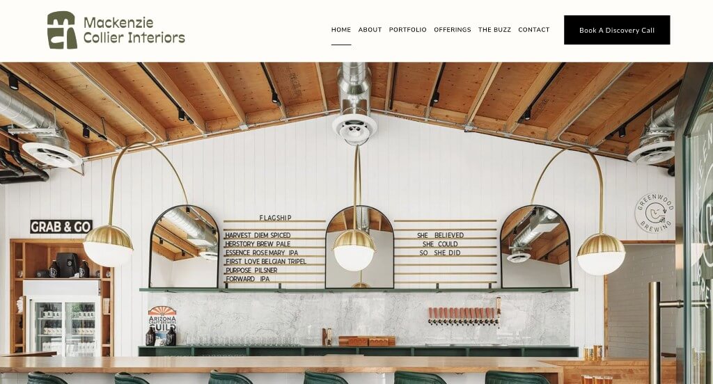
We felt that this was a great example due to their opening image slider that includes a lot of their past work. Showcasing all the popular publications they’ve been featured in was also a nice addition. We also thought it was another great choice to include some of their awards from popular businesses. The careful balance of white space was very professional. It was cool to use their logo repetitively in different areas to occasionally create a pattern for a background.
15. Love Décor
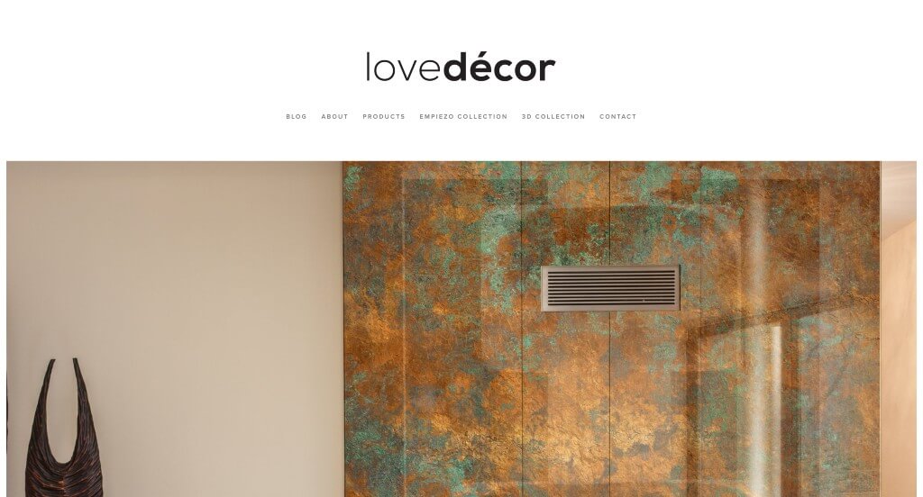
High quality images that clearly show off this business’ service was a very strong feature of this example. It was helpful to have very short paragraphs, making their content easier to skim. From a marketing perspective, we felt it was important to have a testimonials section. Another smart choice when building out this site was their navigation bar that was very easy to use.
16. Zuzana Fontaine Design
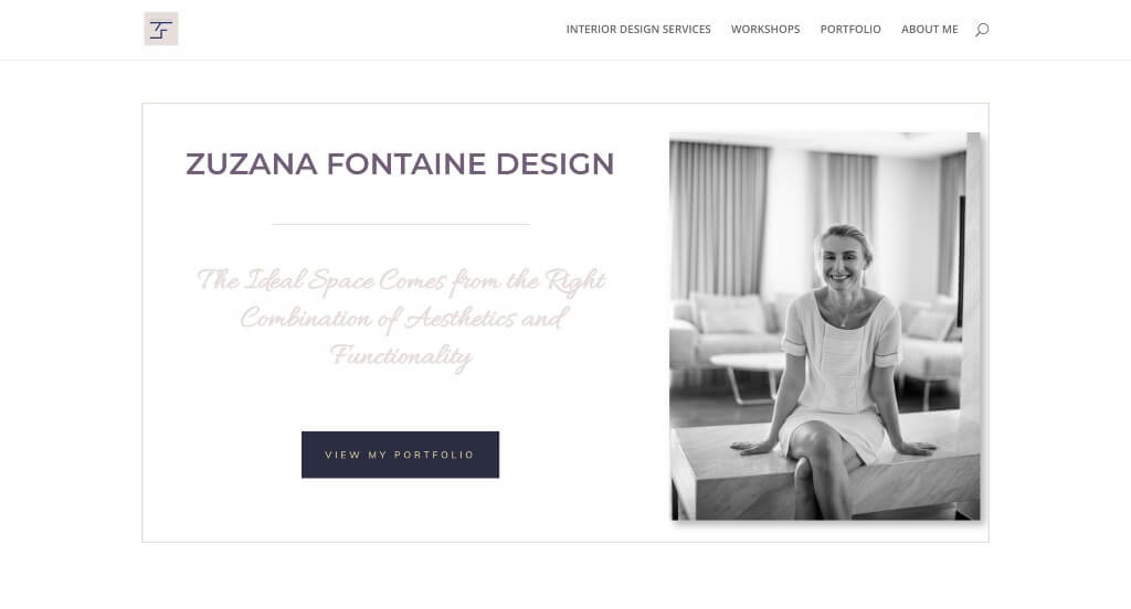
There was lots of great aspects about this example, especially their look of ink splatters. Another amazing addition was their unique layout. Adding in buttons to navigate through everything better was nice. Having pages dedicated to their workshop and a developed portfolio was a nice touch. Swirly lettering was nice to have a little bit of fanciness added in. Using bullet points for their information was a nice touch.
17. Henge
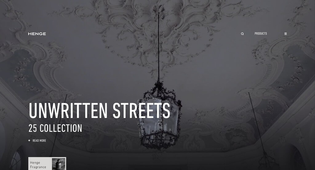
We loved how an automatically playing video was used to grab attention. It was nice to have a dedicated feel for all their images which created a sense of unity. Another good aspect within this professional interior design web page was their smooth transitions. We also really loved how most of their template was covered in black in white to create a modern feel.
18. Havenly
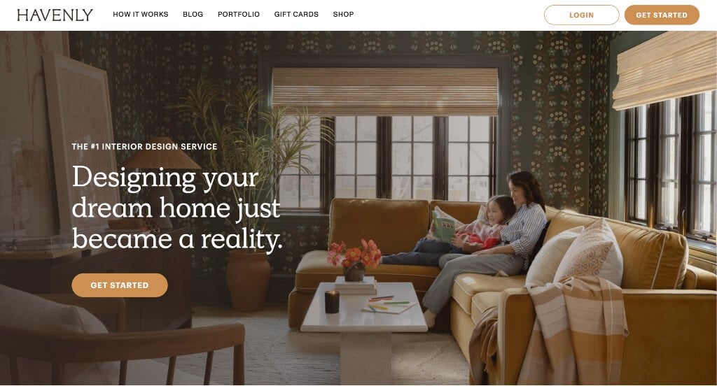
One of our favorite things that could be seen in Havenly was their multitude of sales, and that they advertise them well. Short paragraphs and large fonts for titles was another choice that made sense for them. We liked how they included customer reviews right next to their press releases. Using images in a staggered pattern was likely the most impactful quality. It was also nice to include before and after sliders that showcase past work.
19. Design House Interiors
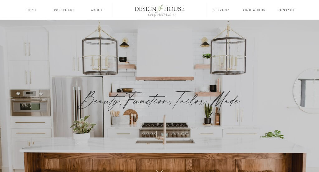
We love the mixture of stunning images and powerful fonts. We liked how they made use of small vine graphics and images to have a natural looking feel. Their small slider meant for a section about their latest work was neat. Integrating social media right into their main page was a good choice. As you scroll through, a quality we noticed right away was their clean, simple and elegant template.
Related: Interior decorators are often interested in local SEO campaigns to bring nearby potential customers into their website.
20. Blythe Interiors
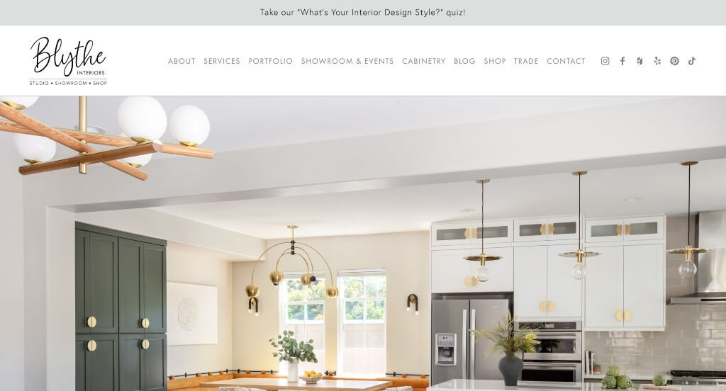
Simplicity shines through every crack in this example. We loved how their color scheme allowed the images to speak for themselves. Including large buttons for simple navigation was a very impactful feature. You might also notice how they include blog posts. Having a nicely designed footer was extremely nice to keep everything organized.
21. Martin Kemp Design
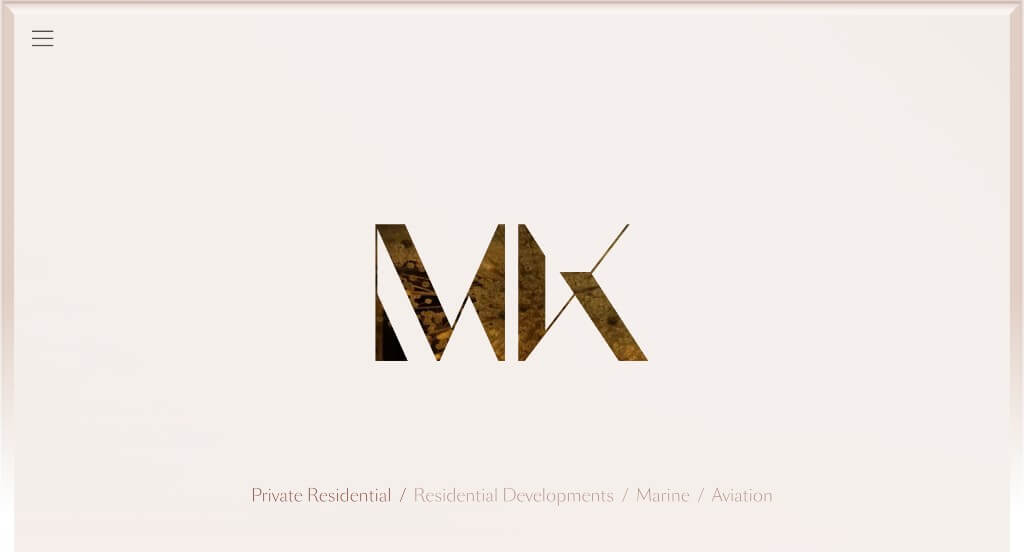
This example starts off with a bold initial signature with a video playing behind it. Another thing they do well with is their high quality, large images to grab attention. Including press related information was a great addition. Their menu is simple and well labeled which makes it easy to find information. Showing off their latest projects was typical, but we really loved how they separated projects by location.
22. Powerhouse Company
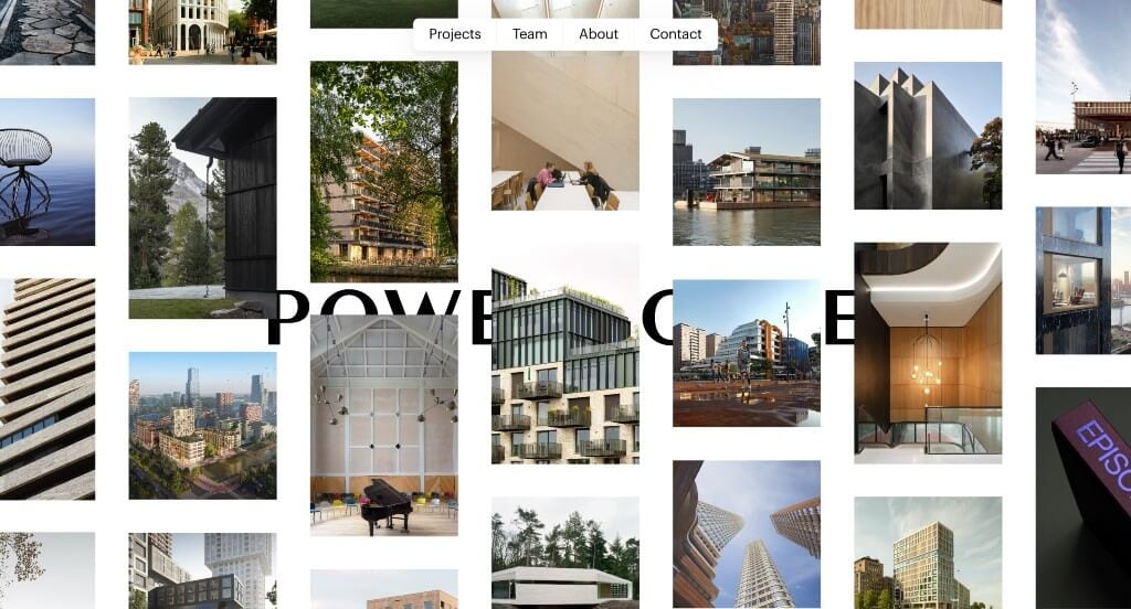
Right away, we loved how they used an interesting opening animation to show off their work. An interesting organizing feature is used that starts with “We give meaning to..” and customers chose which type of room they wish to see. We also loved their thought-provoking layout that grabs attention. It was nice to have a domain that matches with this brand’s name.
23. Old Brand New
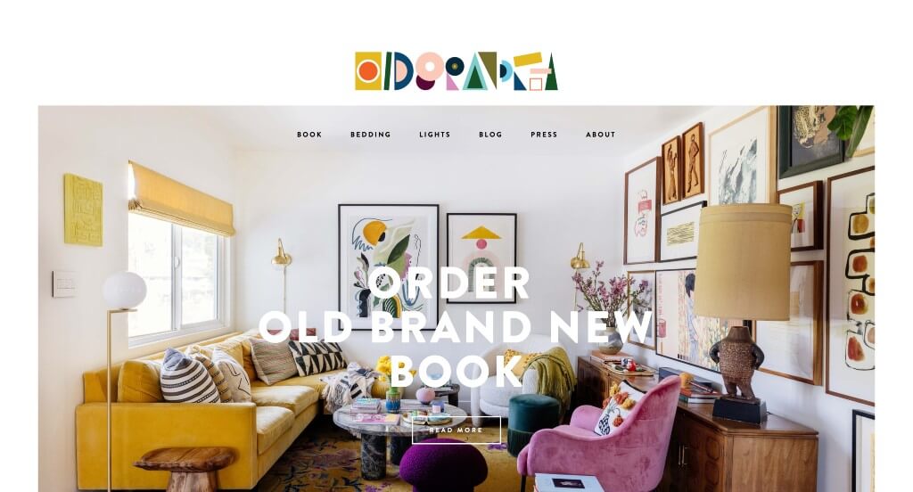
Old Brand New’s creative logo practically pops off their page due to its funky look and bright colors. This ties directly to the overall feel of their work. We thought it was nice to have blogs and newsletters to get additional information out there. Simple animations help take them to another level. Having an organized navigation bar was another great choice that allowed for customers to find what they need faster.
24. Studio Hollond
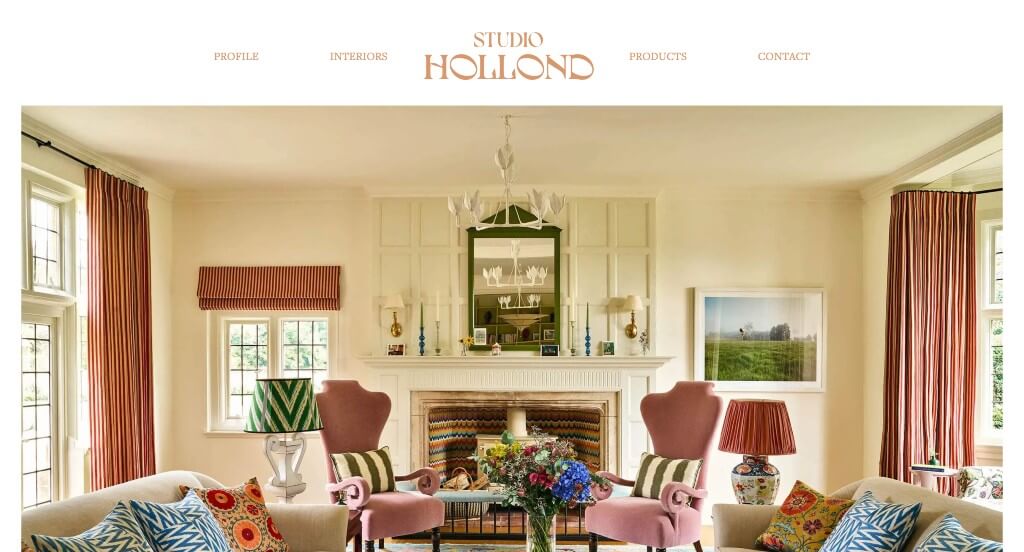
We liked this funky font that was used for their logo design that screams individuality. A large image right away shows off that they don’t design to fit in with their competitors. Their domain is simple and matches with the business name which is a brilliant idea. Short paragraphs are another helpful tool because it keeps viewers engaged much longer.
25. Margaret Winters Interiors
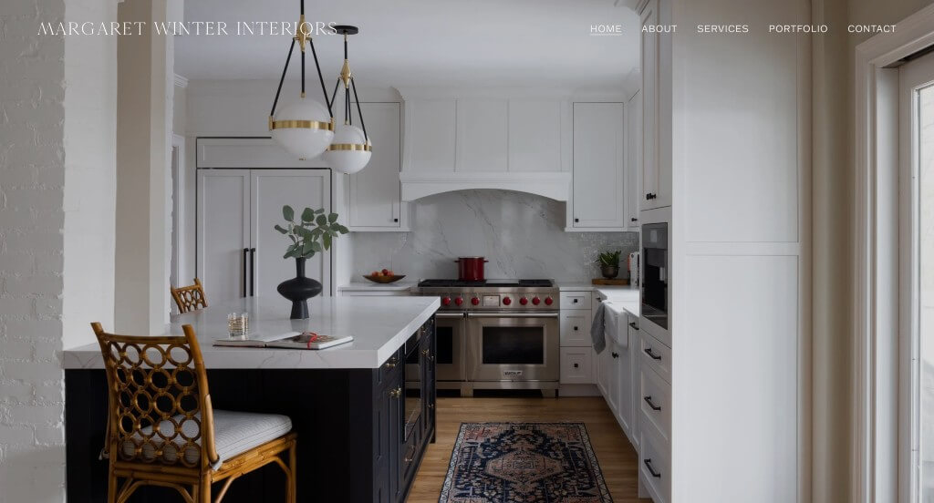
We chose Margaret Winters Interiors because of their high quality images. Their balanced white space and short paragraphs was enjoyed by all who enter this site. A simple color palette was used which was overall a nice touch because it made for a more relaxing feel. Their logo was interesting enough to gain recognition for their brand. Another feature we enjoyed was their simple navigation.
26. HKS Inc
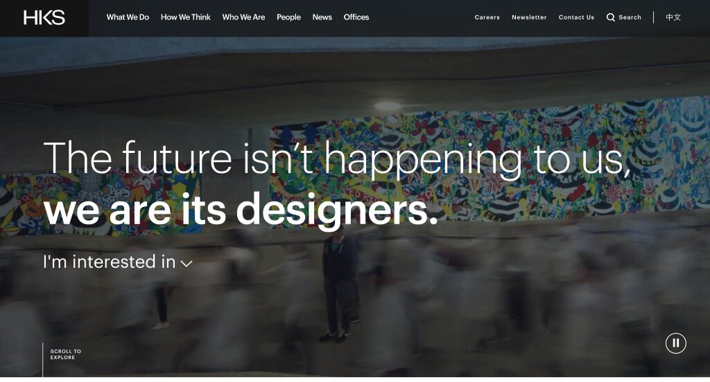
We loved how lots of edited images and videos are used to allow for an amazing visual appeal. We liked how their news stories are spread throughout their homepage. Adding in buttons was a great idea because they were able to direct customers to more pages that peak their interests. We also thought it was cool to have the ability to see projects from certain areas of the world.
27. Avery Cox Design
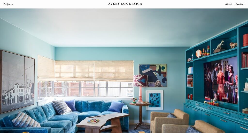
Using stunning imagery was a reason we placed Avery Cox Design into this list. Their mixture of dark and light colored rooms was a nice touch. We definitely thought it was cool how they occasionally used some animations (such as smoke on the candles). They clearly had a focus on their customers when using simple contact information and placing it within their site.
28. Sonya Cotter Design
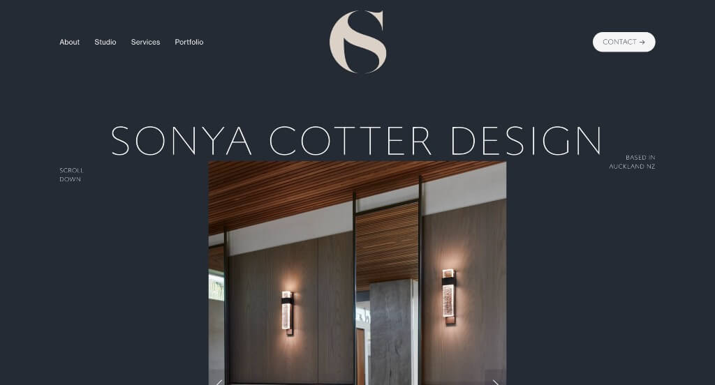
Right away, we fell in love with this logo design. It is both sleek and professional, while also making use of a C and an S. We thought it was awesome to include images of a variety of textiles. Their color choice was another thing that they did well with for a custom site. Lots of thought was put into the inclusion of different font sizes. These were just some qualities we considered when putting together this list.
29. Viterbo Interior Design
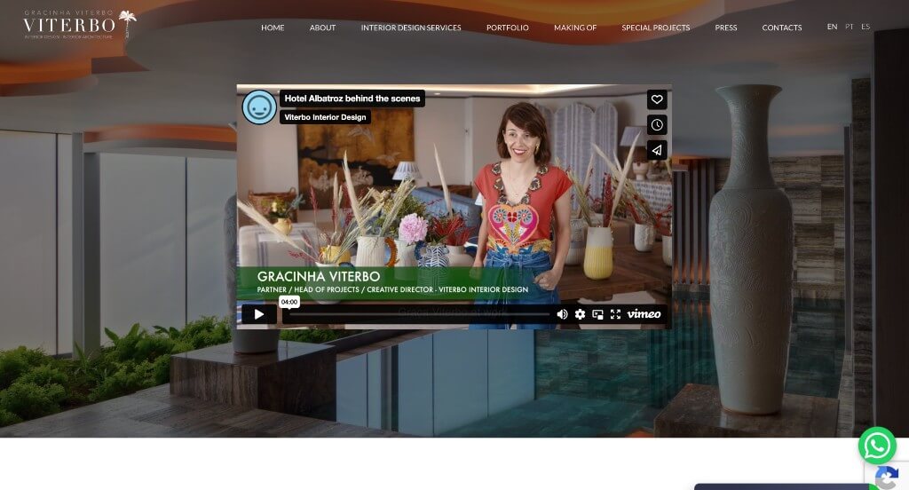
This company did a great job creating a stunning look. Between their mixture of innovative fonts and their polaroid frames, there was lots to look at here. Fun graphics used here helped Viterbo Interior Design make it into our list. If you’re looking for ideas while building out your site, be sure to check this one out.
30. Form And Field
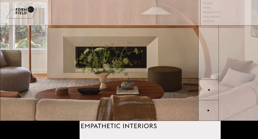
Form and Field did a good job with their layout that takes advantage of repetitive lines to create a unique feel. We also thought this look was nice because it off centers their images. Their mainly black and white color scheme was helpful because it let their images tell their story. A clearly labeled menu was another thing that we really enjoyed, and it was helpful too.
31. James Thomas Chicago
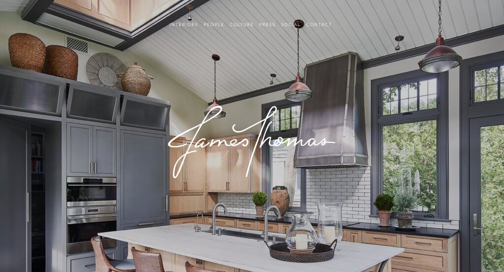
We felt that a cursive font fit this business well, which is always a plus. We liked their beige accents that look clean and modern. Having a page dedicated to their founders and team was a special choice. Additionally, press and social media had their very own pages, which was nice. James Thomas Chicago had internet marketing in mind when choosing a domain that matches their company.
32. LLI Design
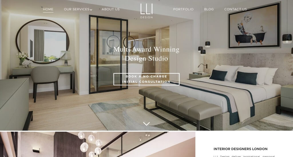
LLI Design has a well-designed site that uses a black and white color palette, which is helpful because it creates a clean and sleek design. As you scroll through, you might notice their staggered imagery. Short paragraphs with eye-catching spacing was nice. We liked how they balanced their whitespace carefully to create an alluring look. Including a blog is always something that we will appreciate.
33. Abel Design Group
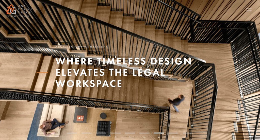
Right away, we were drawn to this company’s logo design that uses a continuous loop to incorporate ADG (their abbreviated name). Our team also noticed a white, gray, black and orange color scheme used, which we liked because it gives a professional but creative feel. Their images are very high quality and reflect how they as a company strive to be. Another helpful feature was their buttons placed all around this site to direct viewers to different areas.
34. Iconic Modern Home
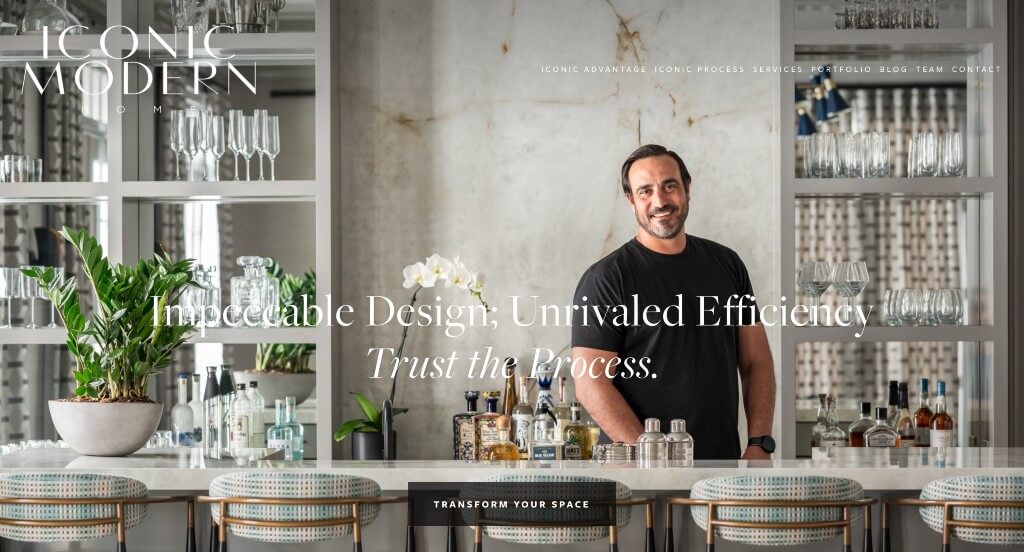
We loved how this example placed their images in various different places to make the most of their whitespace. Additionally, we thought it was nice to visually display their different services with a brief description. It was also helpful to pick a modern, readable font. We liked how they had a beach feel to their template, which makes sense based on their past job images. The integration of social media was also refreshing for any professional company.
35. Elizabeth Hay
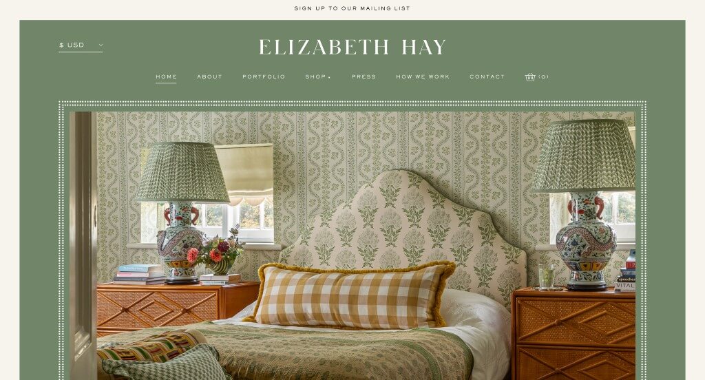
When we first entered this site, we loved their sage green background. It was also a nice touch to have a white dotted frame around their images. Using small little graphics that seem to match their overall aesthetics was a choice we couldn’t ignore. Having their own shop was another feature that was really appreciated. We also really enjoyed their bold and professional fonts.
36. Matilda Goad & Co

We liked this company’s images that appear as videos in a few small areas to grab attention. Along with that, a section can be noticed with new incoming products. Many of these images were tied to an aesthetic that really builds up their brand identity. We also really enjoyed their accents of dark red that highlight content. We also loved their font choices that felt unique.
37. Jacob Interiors
We loved how this site was so involved with their calming sliding animations. An alluring green color scheme was definitely the most impactful quality in Jacobs Interiors. A creative logo design was refreshing for a professional example like this one. They clearly had a focus on internet marketing when finding a unique way to display visuals.
38. Jayne Design Studio
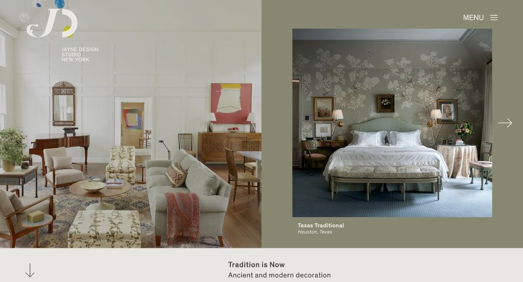
This company did a great job with their simple font to create a relaxing look. We also thought it was cool to include newspaper clippings within their pages. Their logo design grabbed our attention and made sense for them as a brand. Additionally, their menu was well organized, which customers will always enjoy.
39. Bunsa Studio
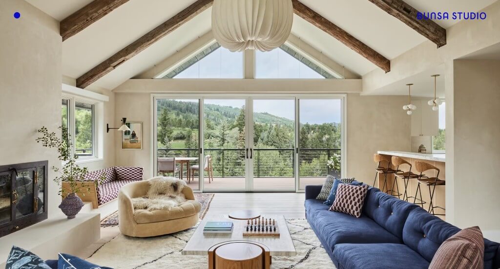
What our team noticed about this example was how they loved to use images – full screen or small image, they always make a big impact. We liked how white text was used over images to look like cutouts almost. Bright blue accents was a refreshing addition to their webpages. We felt that it was also a good choice to have such an easy way to navigate through this content.
40. Nate Berkus
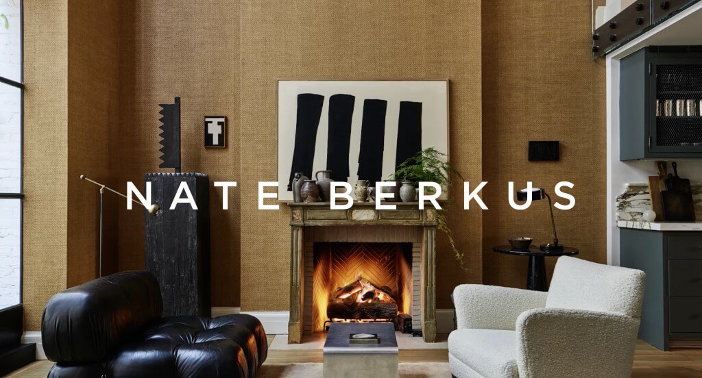
Simple animations are a nice touch to a site like this one (we especially liked the burning fireplace. Including short phrases was also a cool little thing to look forward to. We thought it was helpful to include different companies that sponsor their home collections. This company also used their name for their domain, which is always a good choice.
41. BoldRM
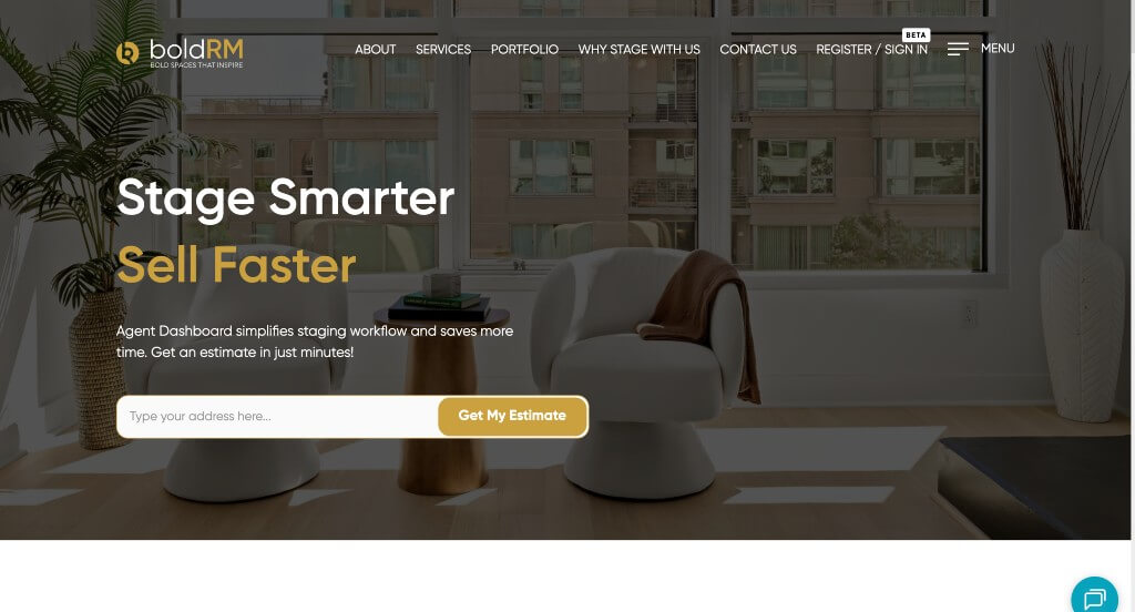
A white, black and gold color palette covers this template, which we liked because of the contrast it creates. Using smooth transitions was a very impactful part that we enjoyed. We liked how they made use of little graphics to add a sense of visual appeal. Adding in buttons to help guide people through their design was something else that we liked.
42. Tara Benet Interior Design
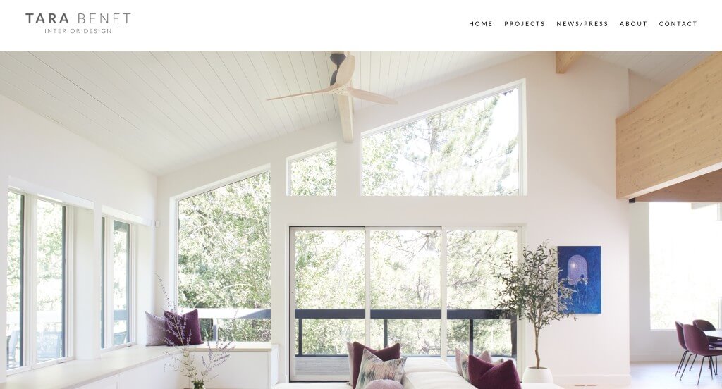
Large images flood into this template, which is something that we felt really helped to create a stunning look. Including buttons that help guide to new areas of the design was a choice we really enjoyed. Additionally, we thought it was smart to have their awards included in this footer. Having well balanced white space kept everything organized and moving along well. Finally, we really liked how they had a well labeled navigation bar that helps with making everything easier to find.
43. Studio Ilse
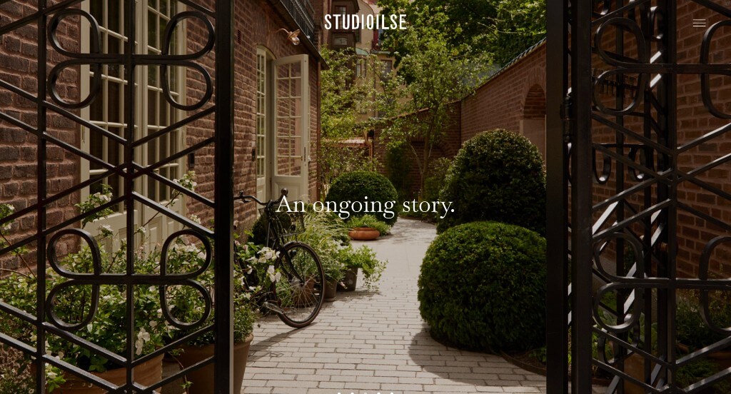
Here bold fonts can be noticed along with simple backgrounds that make for a clean look. Adding in videos within the template is smart because it provides information to viewers in a new way. Simple phrases can be noticed all throughout pages, which we thought was a good addition. Staggering images in a pleasing way was nice in order to create a balanced design.
44. Ciatti Design
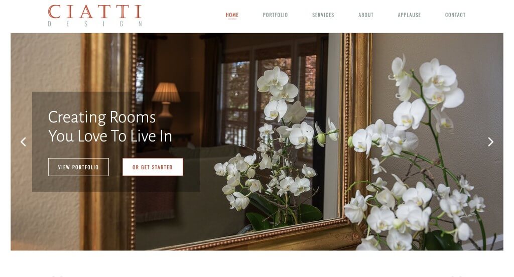
Right away, we noticed how Ciatti Design used subtle animations throughout their pages. We liked the accent of reddish-orange to highlight certain important areas. Having an image slider for an introduction was something else that we enjoyed. Additionally, short paragraphs were used which was very smart because it made the information easier to skim through.
45. Celene Interiors
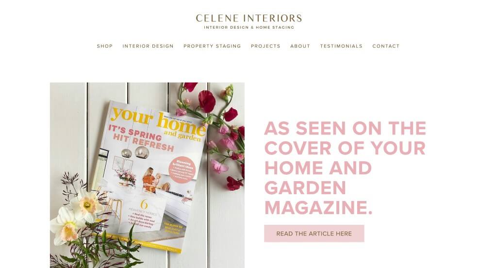
While most interior design sites pick stunning color palettes, we liked their pink and brown accents. Large, colorful buttons can also be noticed that help customers navigate through. Their domain was simple and included part of their company name which was also helpful. Their imagery is both high quality and well planned, which always improves the overall looks.
46. Pfuner Design
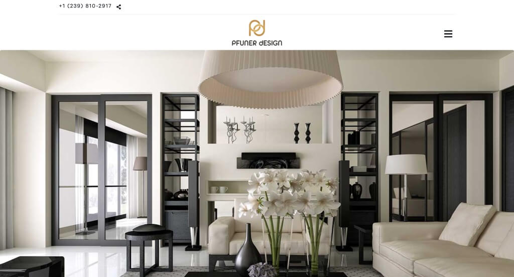
We appreciated how a unique logo design was used here – we especially thought it was cool how they used a mix of upper and lower case letters. Colors of black, gray, yellow, white and tan create an attractive site. Quotes of sorts are added in to inspire people considering choosing their business. Including a virtual design feature was unique, and allows customers to play around with what fits them best.
47. Victoria Hagan
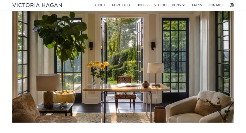
Victoria Hagan definitely knows how to create a modern design. Having a section in their homepage that leads to their portfolio was smart because it’s something visitors will want to check out. A page for their press releases was another feature that we enjoyed. Having a clearly labeled menu was another unique quality within this company’s site that we enjoyed. Simple navigation was also used here, which is always a big help.
48. Katharine Pooley
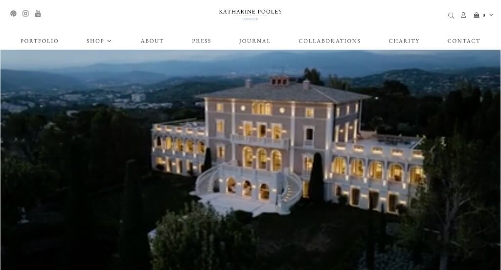
We liked how this example starts out with an automatically playing video to introduce their company as a whole. They also do a great job with simple and modern fonts throughout these pages. It was nice how they separated their portfolio by international, city, country, and coastal & marine to find examples for inspiration. Their navigation bar was extremely well organized which made it easy to find whatever viewers are looking for.
49. Decorilla
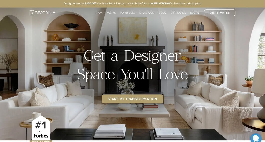
We liked the simple fonts used throughout this entire example in order to not distract viewers. Adding in videos were also very helpful to provide information in a new way. There was also small icons that were used in order to pair visuals to their written content. This domain matched with their company name which was brilliant because it makes them more identifiable.
50. Elite Design Studio
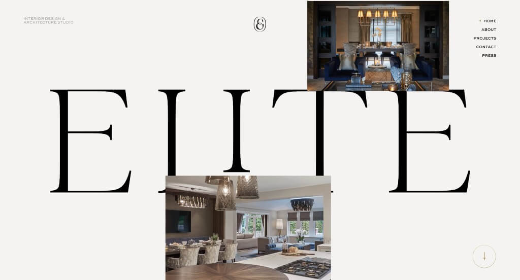
We liked the black and white color scheme used here because it is sophisticated and stunning. We thought it was cool how they used images to float over their logo to show off past designs. Their menu is simple and small so it isn’t super flashy, but still gets the job done. A tab dedicated to their press was another thing that we found to be interesting.
WordPress Interior Design Themes
You can find free themes at wordpress.org, or consider interior design-inspired templates at ThemeForest.
Hiroshi – Themeforest
$89
Emaurri – Themeforest
$79
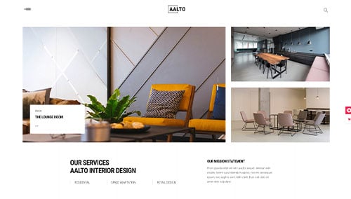
Aalto – Themeforest
$85
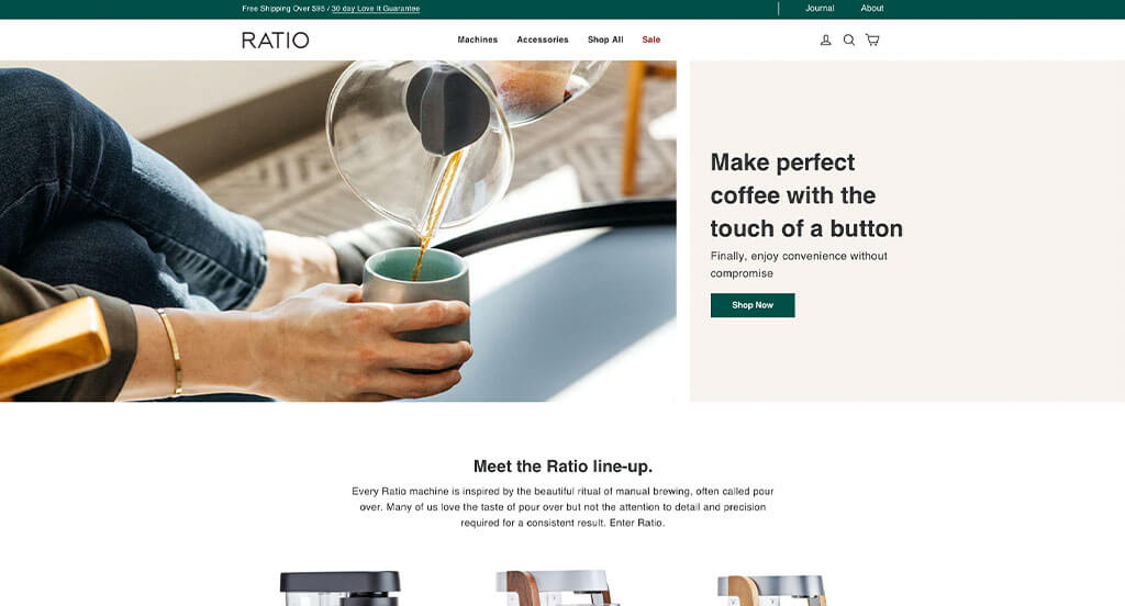
Ratio – Themeforest
$79