Greetings, manufacturing companies! Want to boost your online presence and reach more customers? Check out our guide to the top 50 manufacturing websites.
Our experts have searched for the best manufacturing sites based on design, functionality, uniqueness, and user experience. From sleek designs to effortless navigation, these sites are the top templates of the manufacturing world.
Boost your manufacturing business with this guide! Find website examples for industrial machinery, food & beverage, pharmaceutical, automotive, textile & clothing, and chemical manufacturers. For other industries, check out our professional web design examples article!
Top Manufacturer Website Designs
- 1. Pierce Manufacturing
- 2. Lincoln Electric
- 3. Rice Lake Glass
- 4. Eagle Performance Plastics
- 5. Graco
- 6. Sonoco
- 7. A to Z Machine
- 8. Forever Joint Tops
- 9. Chalmers & Kubeck
- 10. Encapsys
- 11. Unitek Technical Services
- 12. Sharretts Plating
- 13. Plex Smart Manufacturing
- 14. Marion Body Works
- 15. AngloAmerican
- 16. CST Tires
- 17. EOS
- 18. Anduril
- 19. 460 Rowland
- 20. Weima
- 21. JCB
- 22. FabCo
- 23. DuPont
- 24. Molecular Products
- 25. Tungco
- 26. Caldera Manufacturing Group
- 27. Aalberts
- 28. Stark Tech
- 29. TexTech Industries
- 30. Titan Systems
- 31. Zeon Chemicals
- 32. Pelican
- 33. Seagate
- 34. Gerard Machine LLC
- 35. TrinityRail
- 36. T-L
- 37. Textron Aviation
- 38. Protolabs
- 39. Xometry
- 40. Stora Enso
- 41. UVify
- 42. Lear
- 43. Ihne & Tesch
- 44. WIC
- 45. Global Manufacturing, Inc
- 46. Ameripharma
- 47. PR Hoffman, Inc
- 48. Mattei
- 49. Packwire
- 50. VJTechnologies
1. Pierce Manufacturing
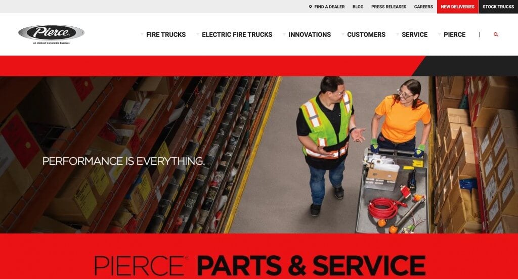
You might notice bold colors upon entering this site. Using a balance of red and black captures attention of viewers almost instantly. We also thought it was a great idea to include their social media content. Also, having an informational blog related to services provided by them was a nice addition. We liked how this company’s logo design gives an effect of shining metal.
2. Lincoln Electric
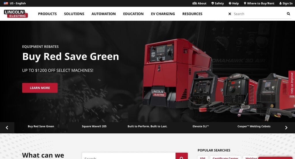
We chose Lincoln Electric because of how they had user’s convenience in mind. Adding in a search bar helps with that user convenience. Many of their paragraphs were written concisely, making their site feel less cluttered. A basic but professional font helps keep things looking great. We also liked how Lincoln Electric included buttons to help customers navigate their web design.
3. Rice Lake Glass
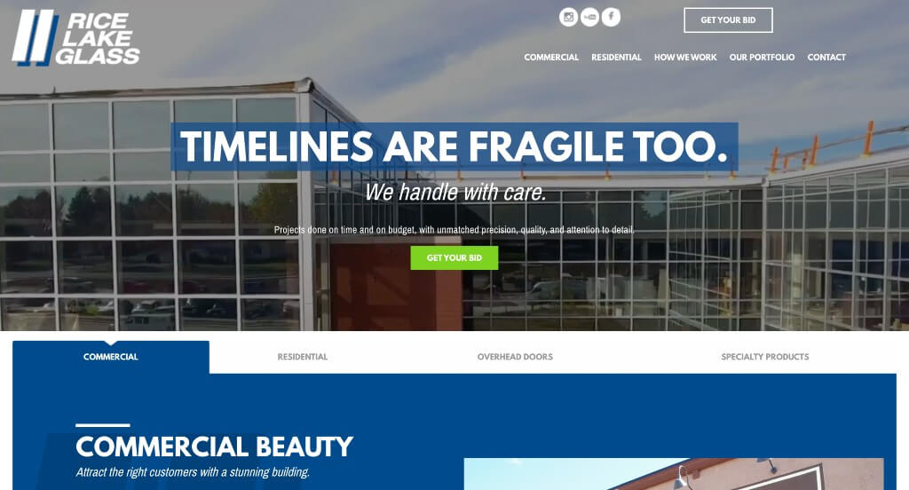
Rice Lake Glass looks professional and sophisticated. A white and blue background allows for a clean manufacturing website design. They also use orange and green in small bursts to attract attention to important information. A variety of different fonts are used to help titles stand out, along with information flowing nicely. Aside from all of that, Rice Lake Glass made a good marketing choice when picking a domain that matches their company name.
4. Eagle Performance Plastics
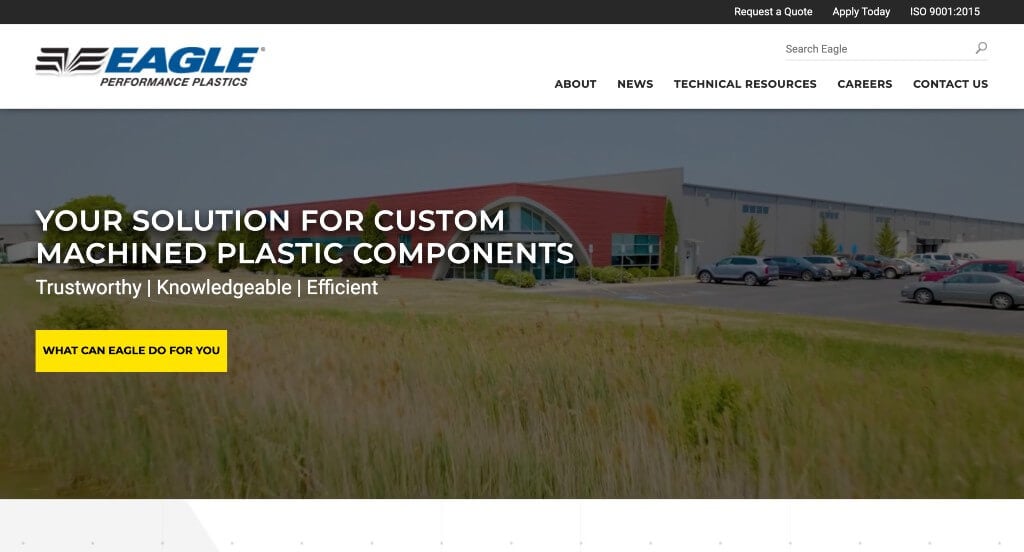
What we noticed about this design is that elements are minimal, and a yellow and blue color scheme highlights important aspects. Additionally, specific case studies are published allowing you to browse through. Many brightly colored buttons can be seen throughout to help customers navigate easier. You might also find that their menu is extremely organized.
5. Graco
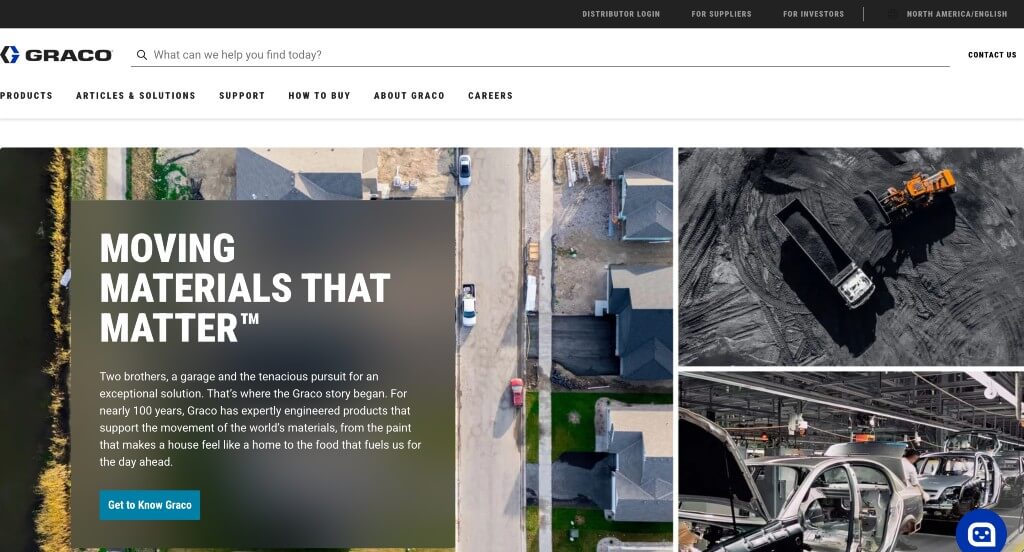
Arguably, Graco’s best quality is their balance of white space, text and images. We liked how this company’s logo design was simple but interesting. Having a basic color palette allows for customers focus to be brought to written content not the layout. It was also smart to include a chat bot to help answer questions more immediately. Allowing two different sizes of images to be included was another great choice. A simple domain is used that matches their company name which is better for marketing reasons.
6. Sonoco
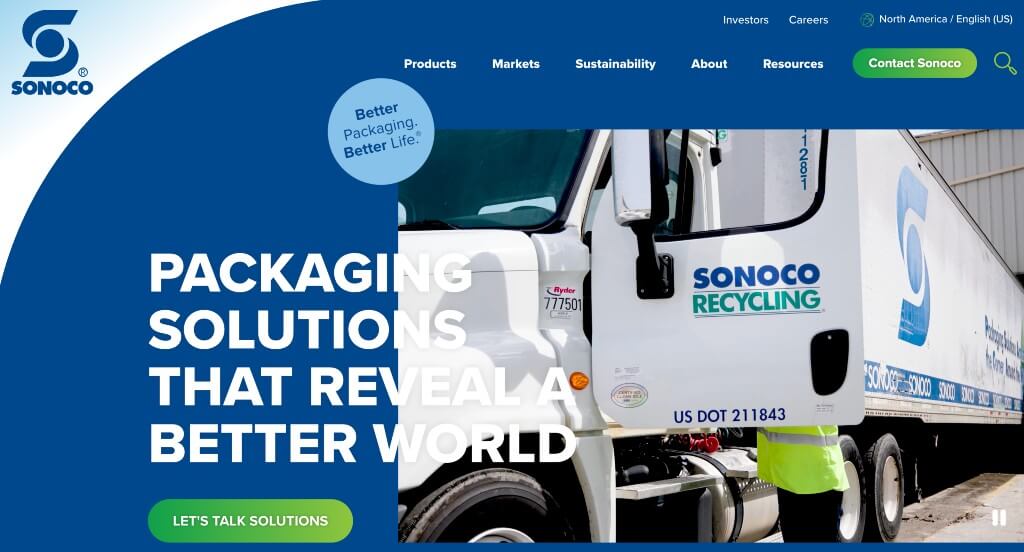
What we liked about Sonoco right away was their use of lots of images to add some visual appeal. Using simple fonts helps this site to look very professional. A menu bar can be noticed in the top right corner which saves space on their homepage but also keeps their navigation information nice and organized. A search bar was also added into their menu which can be useful for people to find specific information. Including an informational blog allows customers to read plenty of helpful information if they need it.
7. A to Z Machine
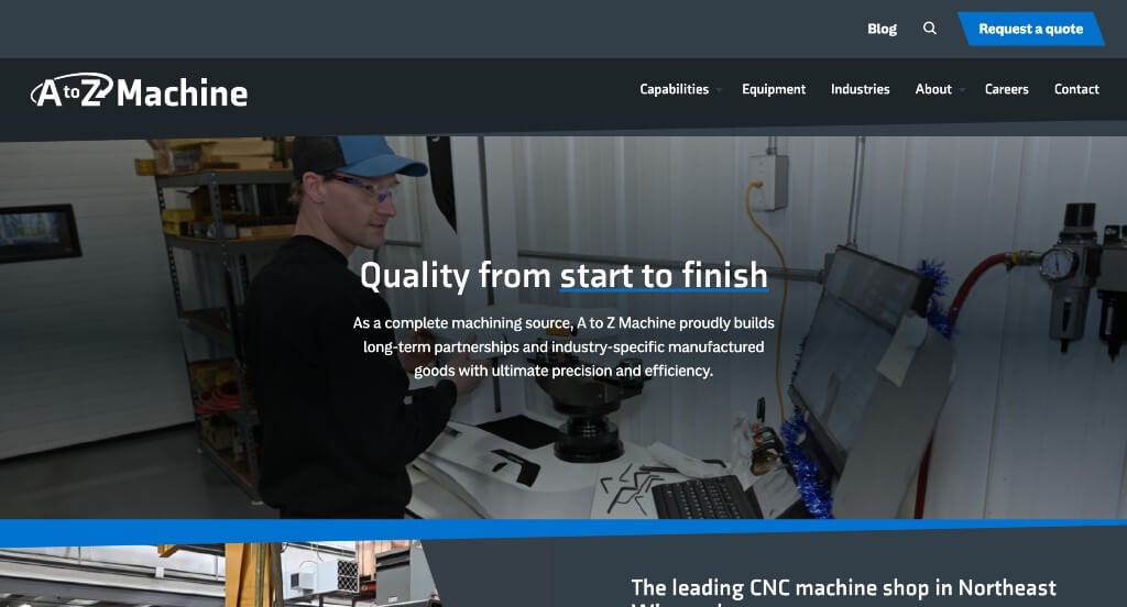
Here’s another great example for you to check out when creating your custom manufacturing web design. A blue and bluish-gray layout is adopted by A to Z Machine, allowing for a relaxed feel, and making it easy to find information. A nice font style and size also makes it easy to read. A menu section is added to organize more information. We also enjoyed how this company included all of their awards to prove their reliability.
Related: Take control of your digital marketing through lead generation, social media marketing, and online reputation management for your manufacturing company.
8. Forever Joint Tops
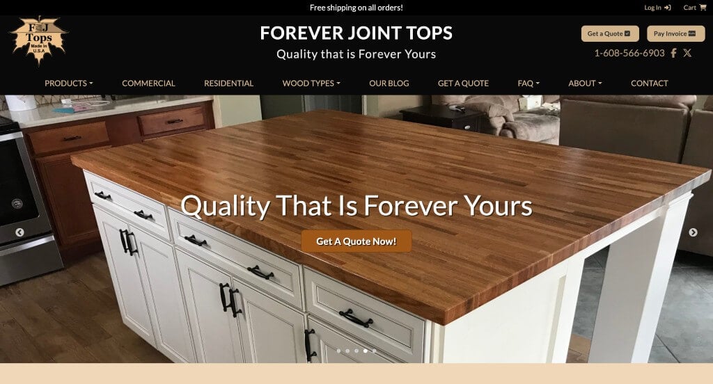
First off, this site displays their products very well with a beautiful slider instead of a hero image. We liked how images of their wood patterns and colors are set side by side for customers to see. Additionally, Forever Joint Tops smartly used bullet-points in areas to help organize their information. Using a brown color scheme is not only relaxing, but it also makes sense because of their product. Make sure to check out this site as you are searching for examples!
9. Chalmers & Kubeck
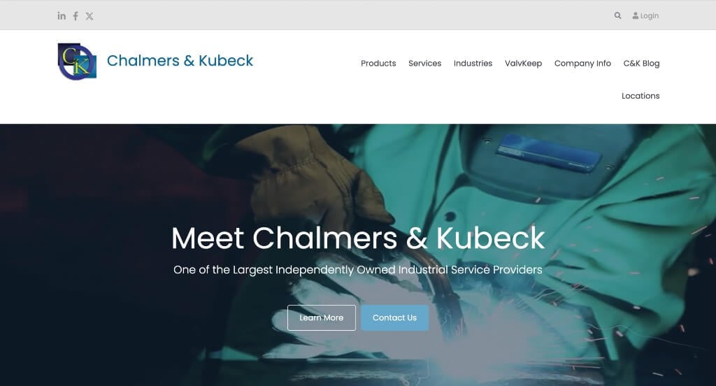
Here’s an example that does a great job with their balance of white space and content. This allows for an uncluttered, thoughtful template that viewers will enjoy. We liked how this company used images and small icons to make their design more appealing. They also did a great job with their short paragraphs that keep readers engaged for a longer amount of time.
10. Encapsys
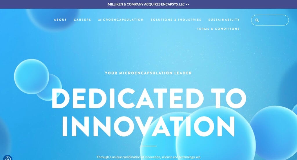
Relaxing blue and white colors flood this site, and we liked it. Another aspect we really liked was their choice in fonts and sizing for fonts because it attracts customers eyes to important information first. Large buttons can also be noticed which helps customers get around on their webpage. Including a video into this homepage was another great choice. Icons were added to connect a visual to each service.
11. Unitek Technical Services
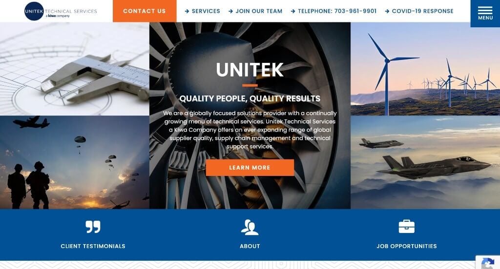
The first thing that grabbed our attention in this example was the collage of images used right away. This helps to introduce their company and makes a more interesting template. Another thing that we really enjoyed was their occasional use of patterns for their backgrounds because it helps them stand out from competitors. Making sure to add in certifications and recognition was something else that helps this business seem more reliable.
12. Sharretts Plating
Instantly, we were surprised by Sharretts Plating’s stunning design. Everything was top notch, high-quality images, a great color scheme, creative fonts and more. A minimalistic appeal is maintained due to white space surrounding content. Also adding in a video helps to bring a new perspective into their design. It was nice to pick a domain name that matches their company name, at least for marketing reasons.
13. Plex Smart Manufacturing
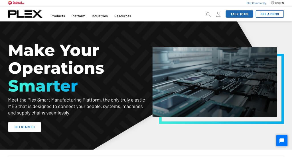
This company clearly wanted to stand out from their competitors. In a smart way, they managed to use a black background with bright colors to help those colors really pop. Buttons can be seen all throughout this site to help customers find what they are looking for. A chat bot can also be noticed for clients to reach out. We liked how Plex Smart Manufacturing sorted their navigation bar into categories making it more user friendly. There are also many opportunities to read additional information about their company and related to their services.
14. Marion Body Works
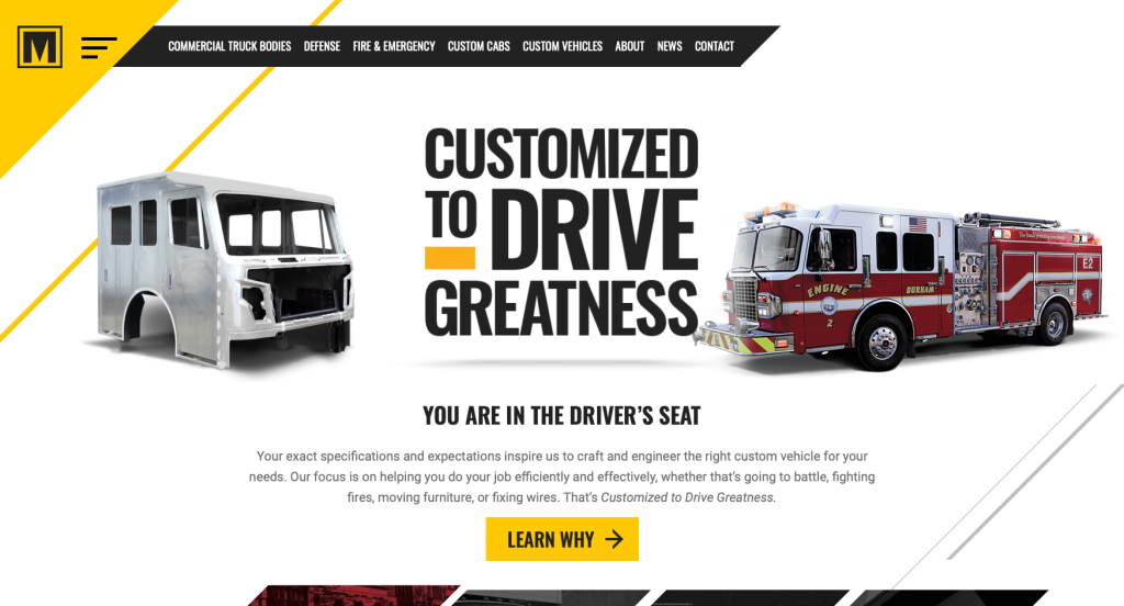
Text choice and repetitive parallelograms were probably the best aspects of this company’s custom design. A bold black and yellow color scheme creates a simple but bright layout. We liked how Marion Body Works used a creative 4 piece image frame to show 4 keys to making “your truck”. It was also a nice touch to include simple animations as customers scroll through this stunning design. Every element is well thought out and organized, making it easy for visitors to navigate. They also included all of their links to social media pages which is helpful for many customers.
15. AngloAmerican
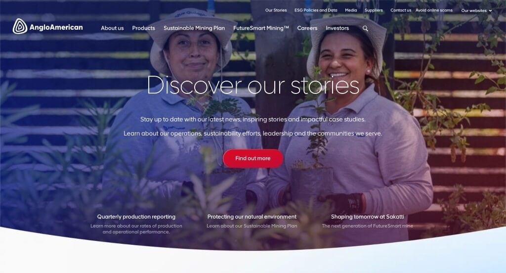
AngloAmerican’s best aspect is most likely their color palette, though it is basic, it utilized versions of gradients which look stunning. Fonts that were used are simple, bold and clearly spaced, making it easy to read. Balance of white space allows for written and visual content pop out. High-quality images also enhance the visual appeal of this webpage. Information is all clearly labeled within their header and navigation bar. Domain was picked to match their company name which is always a great choice.
16. CST Tires
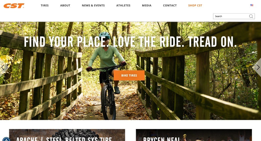
On this homepage, you will see more visual content than written, which is very attractive as images manage to draw more attention than any other element. Each images is linked to their products or relevant achievements, causing customers to be more engaged than just clicking on a colored button. Adding in a few videos helps to break up content. We also liked how they used a small cartoon in their footer just to add a bit of fun to their site. Another aspect we enjoyed was how they made sure to add in a search bar.
Related: Take a look at paid advertising options through a PPC agency with experience helping manufacturers get leads.
17. EOS
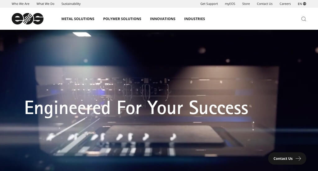
Using an automatically playing video to capture attention right away was a feature that we loved for this example. Their professional and relaxing font choices was another thing that we really appreciated. Blending images and graphics together to create stunning visuals was another thing that EOS did really well at. We also liked this company’s accents of bright colors to liven up their pages.
18. Anduril
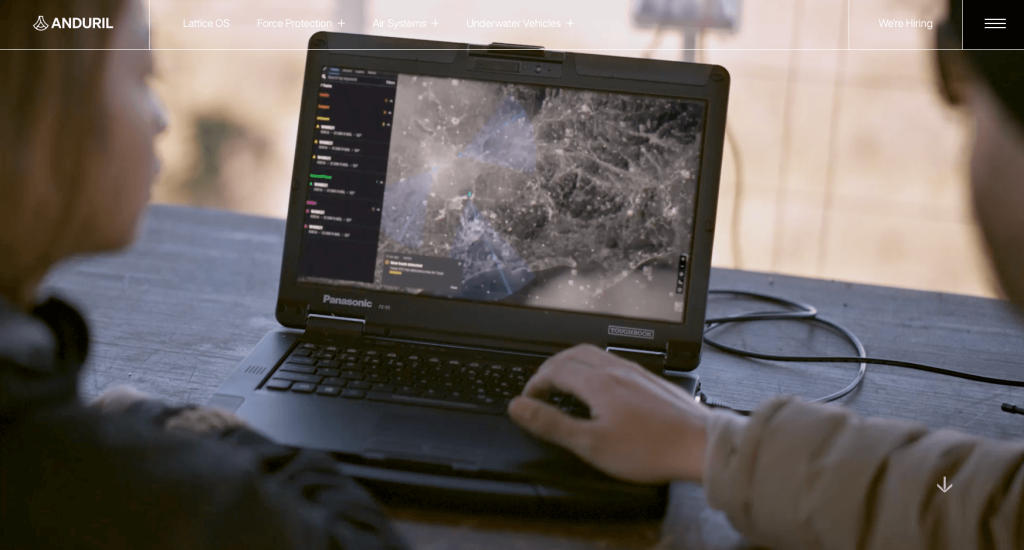
Personally, we enjoyed this companies video for their hero image that seems to show what their company is about. As you scroll through, you will notice that they have a clean and crisp layout. A basic font is used so that they don’t have an overwhelming template. This business also created an interesting logo design that helps them stand out when compared to competitors. We thought it was nice to include both a navigation bar and a menu that were both well labeled, allowing for navigation to be amazing.
19. 460 Rowland
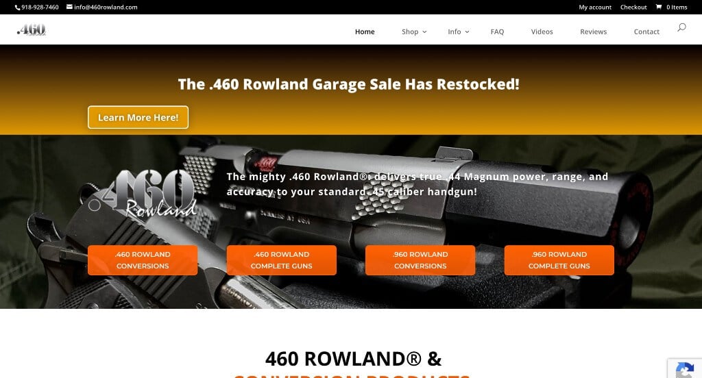
We loved everything about this site from their accent colors to their product images. Including simple animations to introduce their content was a cool idea. Contact information is located near the bottom with the option for a contact form. 460 Rowland made sure to create a menu that was easy to read, and in turn allowed for easy navigation. Every part of their written content is broken into paragraphs which helps everything feel less cluttered. Overall, this was a great example to look at while searching for ideas for your site.
20. Weima
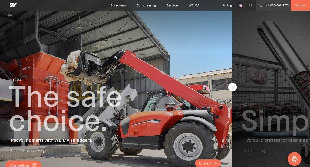
Images, graphics and animations that were high-quality and captivating was probably Weima’s best quality. We also liked how they used creative photo frames that are offset. Using a bright orange color to accent this layout was a great idea, especially because then it highlights important information. We thought it was smart to have a contact button right on their homepage with a contact form. They have so much information in their site but thankfully it is extremely organized so it doesn’t even seem cluttered.
21. JCB
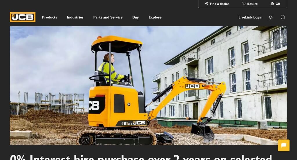
JCB is a company that needs no introduction, and that is proven in their site. Stunning visuals dominate this template, which is good because there aren’t many graphics to add in visual aspects. We liked that a large yellow banner is used like a header to display a link for pricing and a brochure download. It was nice that so many links were added through text, images and buttons. Large fonts are helpful because they are easy to read.
22. FabCo
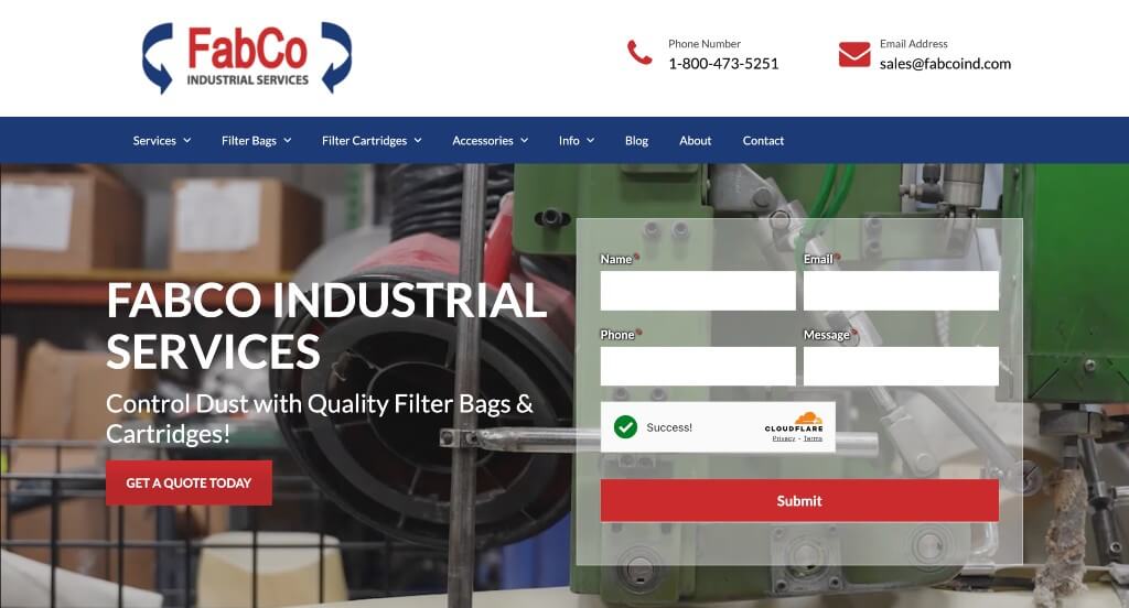
Our favorite part about this website was the professional and relaxing color scheme. We liked the subtle, yet noticeable transitions that bring images into view. The bright red buttons can’t be missed, which is a good addition to draw eyes to call to actions. They service baghouse filter systems and manufacture custom baghouse filters for a variety of industries, which was a unique product we hadn’t come across while building out this article.
23. DuPont
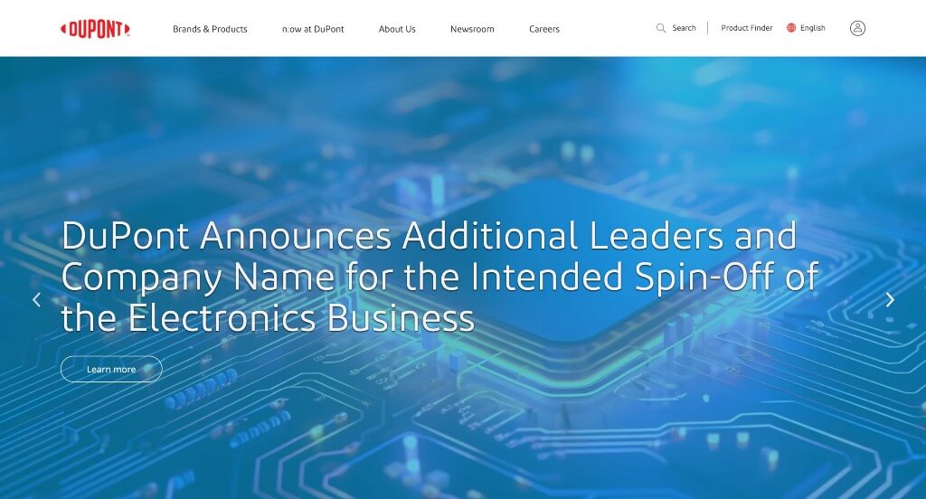
When it comes to creating a top-notch web design, Dupont has nailed it. A mainly white background color makes sure that all other elements are highlighted with their accent colors. A great mix of relevant images and text are put into this site to tell you more about them as a company and what they have to offer. Their font really spoke to us, it felt very professional but a bit creative. Adding in large images and videos was a good move to break up written content.
24. Molecular Products
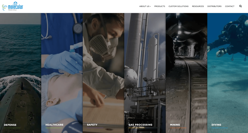
Right away in this homepage, you’ll see that every area they specialize in were labeled in an interesting way. We thought their logo design was creative and reminds people of a clean ecosystem. We liked how their product pictures clearly display what they are selling. Images, graphics and animations are used to help break up content and enhance the visual appeal. Overall, this site is extremely easy to navigate along with finding any information you may be looking for.
25. Tungco
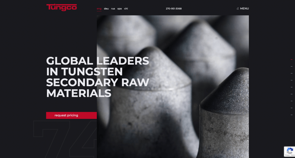
Tungco uses one a black, white, and white color scheme, which when used correctly can look stunning. Allowing images for this site to be mostly in black and white adds to their already stunning color palette. Red highlights important information, buttons and links. It was a good choice to include a blog into this web design. Along with all that, you will find details about what makes this company stand apart from its competitors.
26. Caldera Manufacturing Group
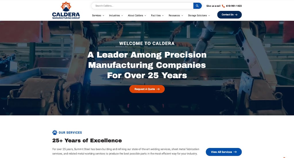
The blue and gray color combination present on the Fairlawn Tool Inc goes well with the service and product it provides. To be honest, the blue is very soothing and striking at the same time. On the homepage, you will find details about the company and a “contact us” option that will help you get directly in touch with the company. And towards the end of the page, you will find interesting blogs that you can go through to learn more about metal and its working. They are a good resource, and you will enjoy spending time reading them.
27. Aalberts
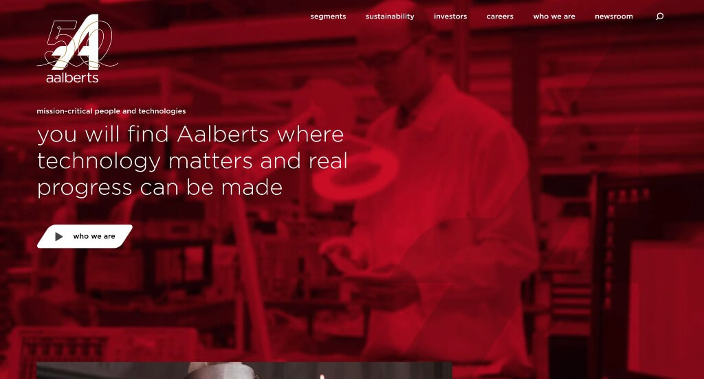
What’s most impressive is how they included a video to automatically play with a red filter over it. Along with that, a button saying “who we are” links viewers to another video explaining themselves as a business. We liked how their buttons were shaped differently. If you scroll down, you might also notice how they implemented case studies, news reports, and job openings. It was also helpful to have a clearly labeled navigation bar that allows for customers to navigate their site better.
28. Stark Tech
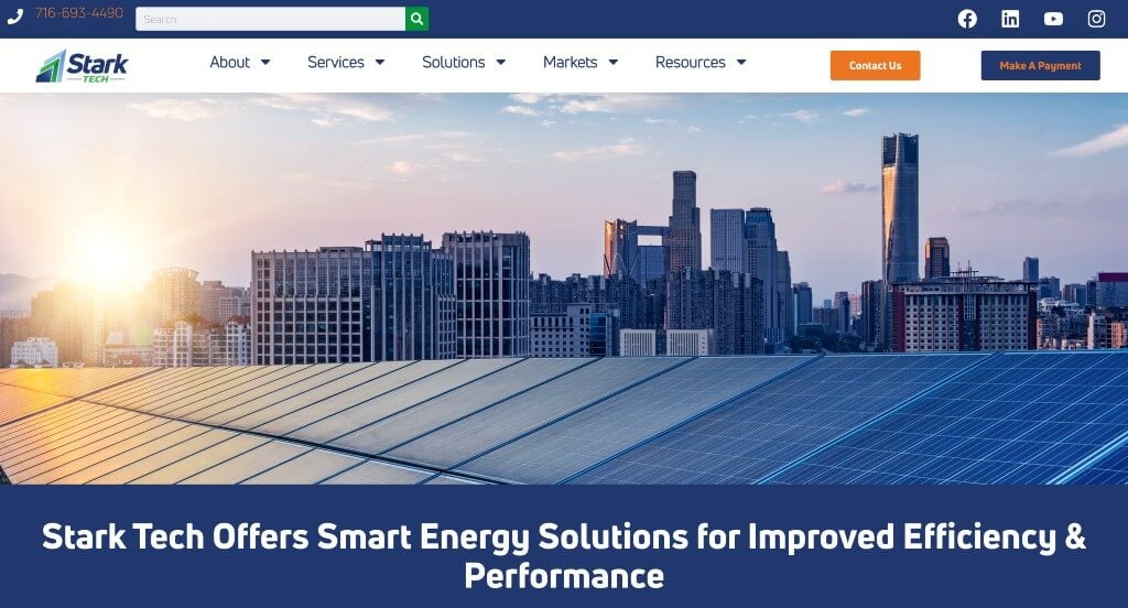
Here we have another red, black and white combination used to give their design a bright and attractive touch. This layout is designed so well that you’ll have no problem browsing to find what you’re looking for. This company went with a navigation bar with organized categories which makes it even easier for customers. We liked how many icons were used so that customers can see a visual for titles.
Related: Turbo charge your manufacturing company’s organic traffic through mfg search engine optimization services like content writing, link building, and page speed optimization.
29. TexTech Industries
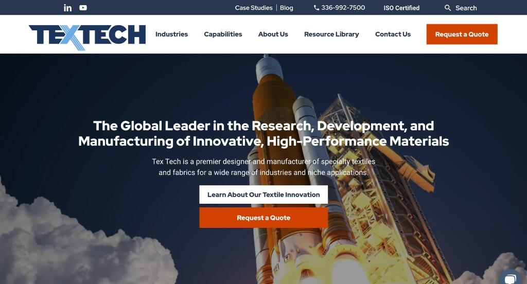
With colorful and interesting visuals and bold textual content, TexTech Industries’ layout will manage to grab your attention instantaneously. We liked how both blue and orange were used to contrast each other and look stunning doing it. It was a great choice to include a button to request a quote. We also liked how they had very short and straightforward paragraphs which helps keep the site concise. Another thing we liked was that upon hovering over icons, buttons and such there is a slight color change and animation. Lastly, we liked how there was a chat bot to answer possible questions but it wasn’t obnoxious.
30. Titan Systems
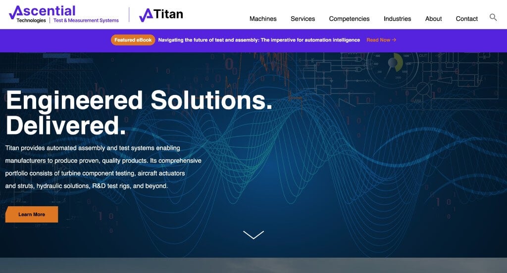
If you are inspired by companies who have a professional feel to their site designs, you will surely like this one. Titan Systems uses blue and dark colors for their background and bright colors for text to add a pop of color. Every element within this template is well-spaced so that you won’t be overwhelmed. We liked how the titles were written in bold fonts to help them stand out. It was a nice touch to include a few videos because it was different than past layouts.
31. Zeon Chemicals
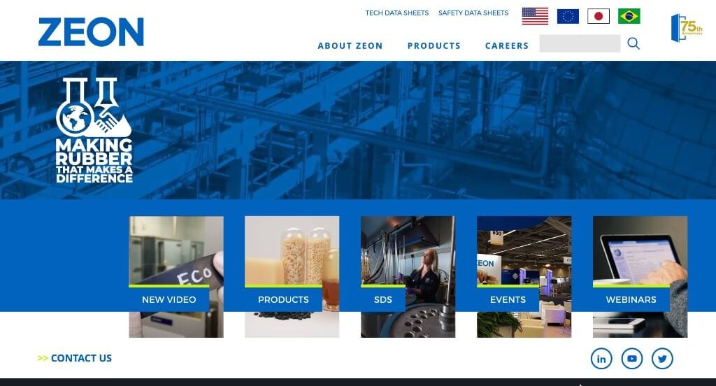
Zeon Chemicals definitely knows how to keep visitors on their page for a long time. Many visuals will give you a glimpse into what this company does and offers to its users. Contact details such as phone number and email address can be found right away without any struggles. Having a domain that matches their company was a smart choice in the marketing world. We also really liked their logo design because it was creative and makes sense for their company.
32. Pelican
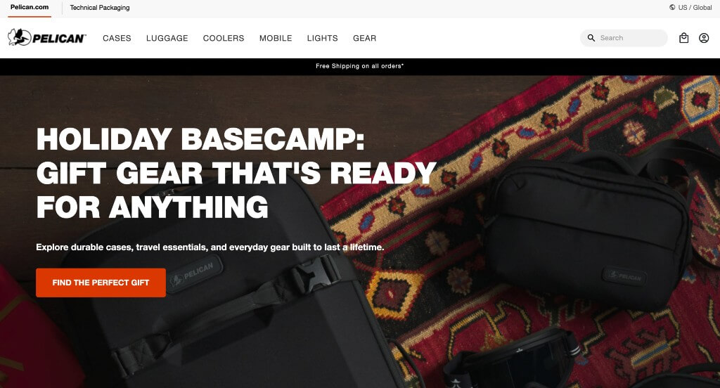
After entering Pelican’s website, you’ll be greeted by an invitation to sign up for their newsletter to receive a 10% discount code. Many captivating visuals flood this design which makes it more intriguing. It was nice to have all of their products organized into categories of which you might use their products. To complement its products, the company website has used gray, black, and white as the main colors. Everything else on this site has clearly labeled pricing.
33. Seagate
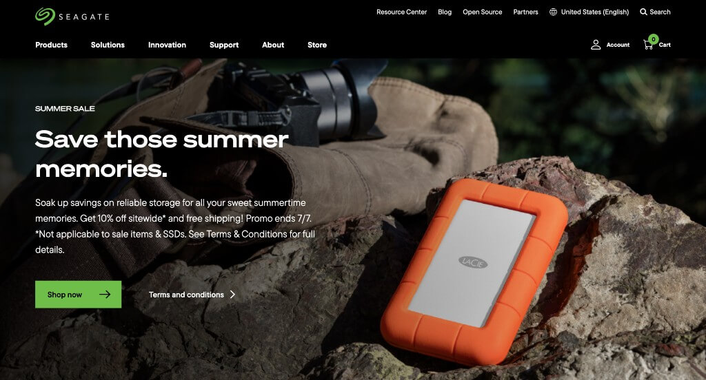
There’s no doubt that once you click on Seagate’s link, you will spend a considerable amount of time on it to learn about them. Choosing a vibrant green and a black background immediately grabs attention of possible customers. Services and products this company makes are clearly listed and are easy to find. We liked how backgrounds alternate in their site to help break up content. It was a great choice to add in many links throughout the design.
34. Gerard Machine LLC
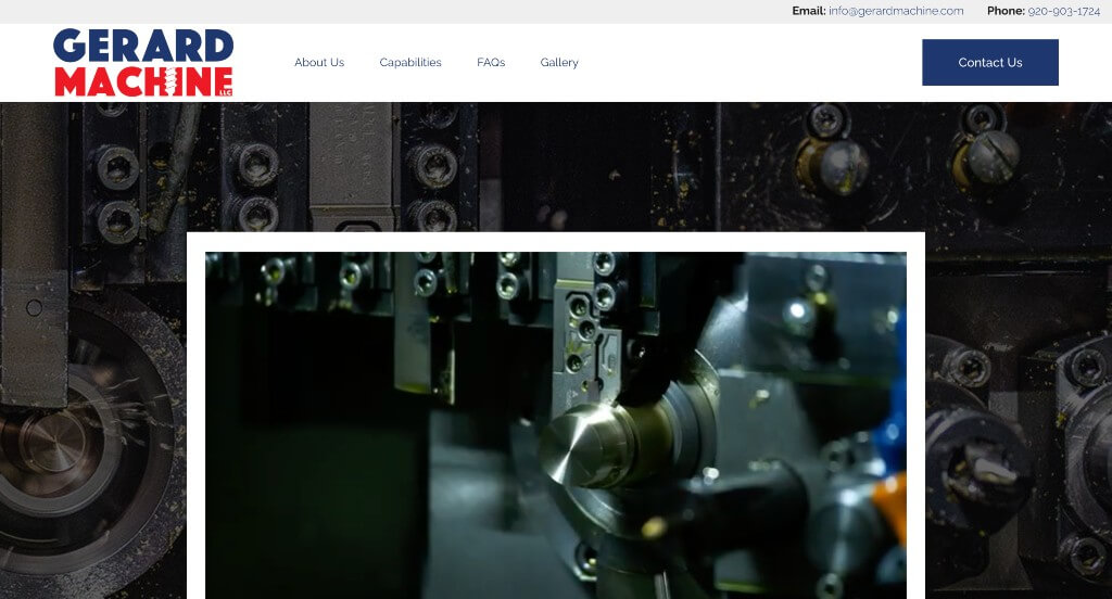
The very first thing we noticed about this design was their interesting fonts. Their use of white space was great because it helped everything seem organized. Showcasing their social media accounts right away on the gray sidebar was another feature we couldn’t miss. Allowing for a page related to frequently asked questions was smart and helpful for everyone.
35. TrinityRail
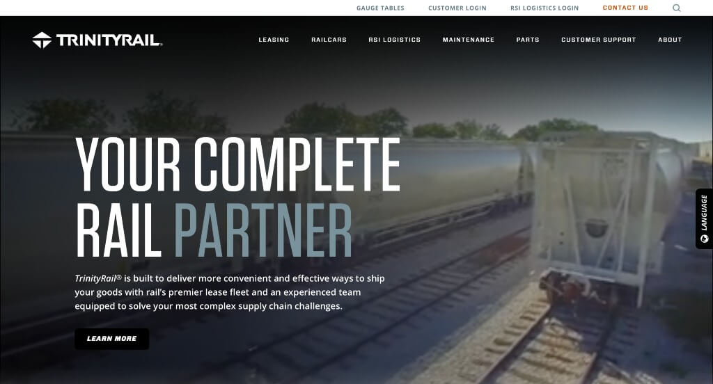
TrinityRail aims to connect with visitors right away by including an appealing video to highlight what they as a company have to offer. As you scroll down, you’ll see a small section with textual content which delves into what this business does. We enjoyed how they used a gray and black color scheme, with occasional touches of blues, surely adds to this custom manufacturing website design.
36. T-L
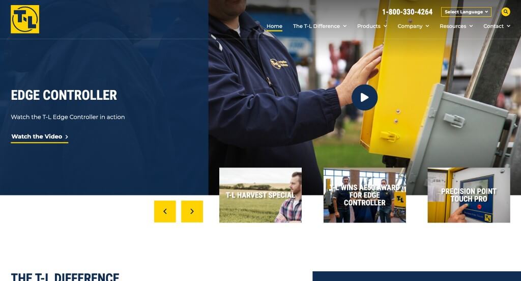
Using blue and white as primary colors and yellow as accents was an idea that stood out to us. We liked how titles were bold and white so they stand out when compared to other text. Including in videos was another thing we did really enjoy. This layout was absolutely stunning, included lots of information, and was organized well. Not many graphics were used but because of that, it adopted a more basic appeal.
37. Textron Aviation
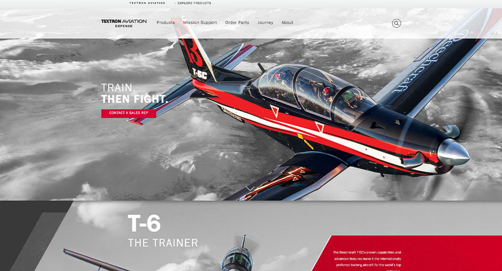
Aviation enthusiasts will love this website the moment they click on it. Right on the homepage, you will find attractive visuals of aircraft and the mechanisms involved in building them. To make things more interesting for the visitors, the website showcases a range of intriguing videos that highlight the journey of the company. Largely the website is done in white, with occasional touches of red. And that is what ensures that the visitors’ attention rests solely on the content. At the end of the homepage, you will find the Twitter handle and some interesting tweets from the company.
38. Protolabs
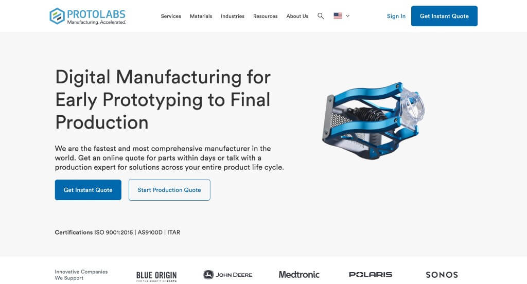
We liked how this company displays how they allow customers to upload parts to be made. Services are clearly labeled and neatly charted out, allowing you to just click on “learn more” to know about a particular service in depth. We thought their logo design was stunning even though it was quite simple. We liked how much of their page had a good balance of white space when compared to content. It was another great idea to have a layout that bounces side to side to balance the look.
39. Xometry
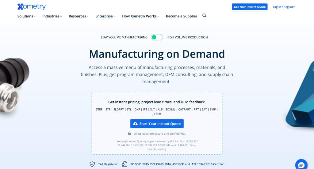
Xometry’s website grabbed our attention due to their beautiful blue color used mainly as highlights. A variety in text size helps to give importance to certain texts. Many graphics were added which helps a lot because unfamiliar customers can visualize their services and such. Including a live chat option was nice to get your questions answered immediately. Lastly, it was an excellent choice to have a domain that matches their company name.
40. Stora Enso
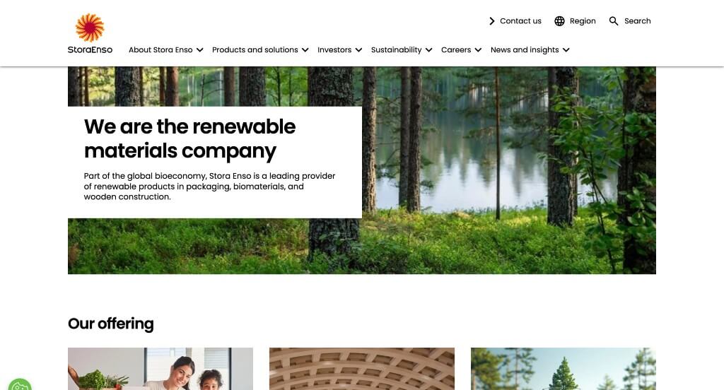
Stora Enso stands out from their competitors because of their simplistic feel. Bright yellow accents will help important information and links stand out to you. It was thoughtful to have a well-labeled navigation bar. As you scroll through, a range of sustainable solutions the company offers are provided. Including a search bar was another thing we noticed right away that was interesting.
41. UVify
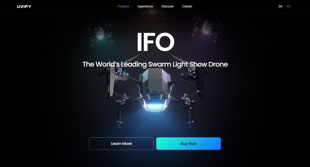
Uvify is a swarm light show drone company, and on its website, you will learn that. This entire design is created in black and white, with blue used as a highlight color to signify night and technology being a part of that sky. We liked how their buttons were large, colorful and easy to notice. High-quality images help to provide a whole new level of interest as for the looks of their pages. It was also nice to have interesting sliding animations as you scroll through each page.
42. Lear
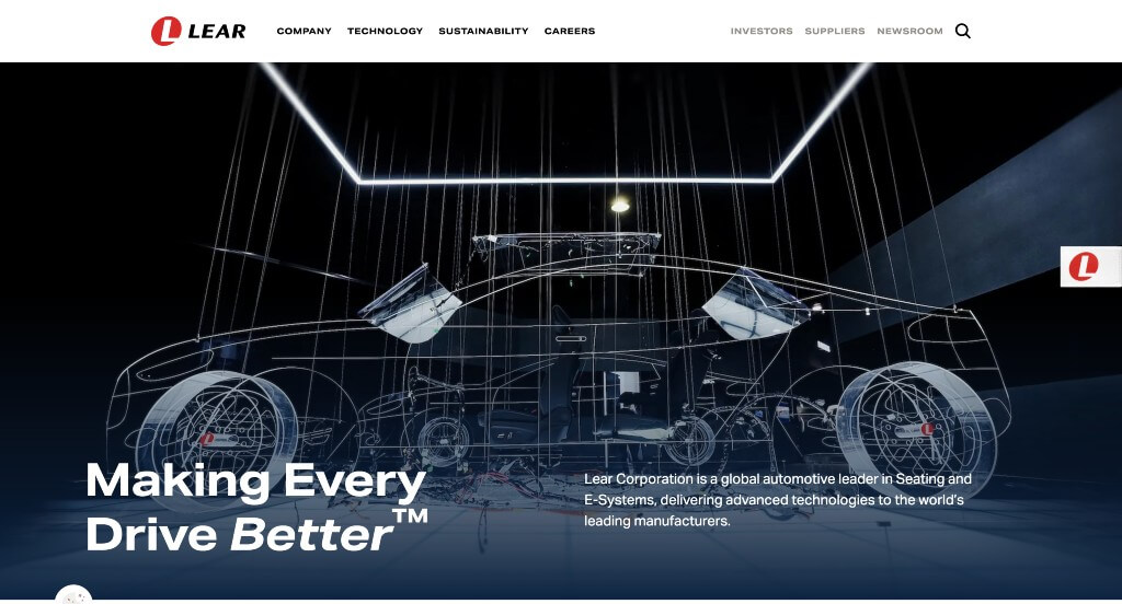
Here we have another simple design that isn’t distracting. Bold fonts are used for titles but they aren’t overwhelming which is nice. A good inclusion was their blog or newsroom section to have just a bit of additional information. A settings icon allows viewers to adjust this layout to have a better experience. Other options are included to help visually impaired people, viewers with ADHD, or people with cognitive disabilities navigate this site better. Their menu is also clearly labeled which is super nice for anyone trying to get around in this site.
43. Ihne & Tesch
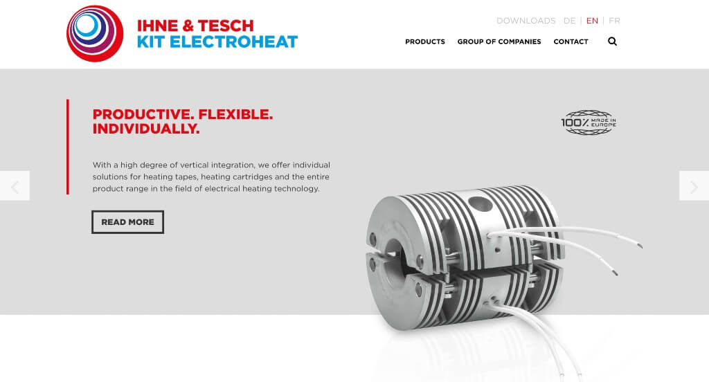
To wrap up this set of top manufacturing designs, we have Ihne & Tesch. Primarily white, blue, and red are used to help parts of their site pop. Many stunning visuals were included to help viewers understand what they are seeing. Right away, they chose to include a section to list services they as a company provide. Near the page end, you might notice that many areas are listed in a clean and organized fashion. Also a world map with colored pins shows off where this company operates.
44. WIC
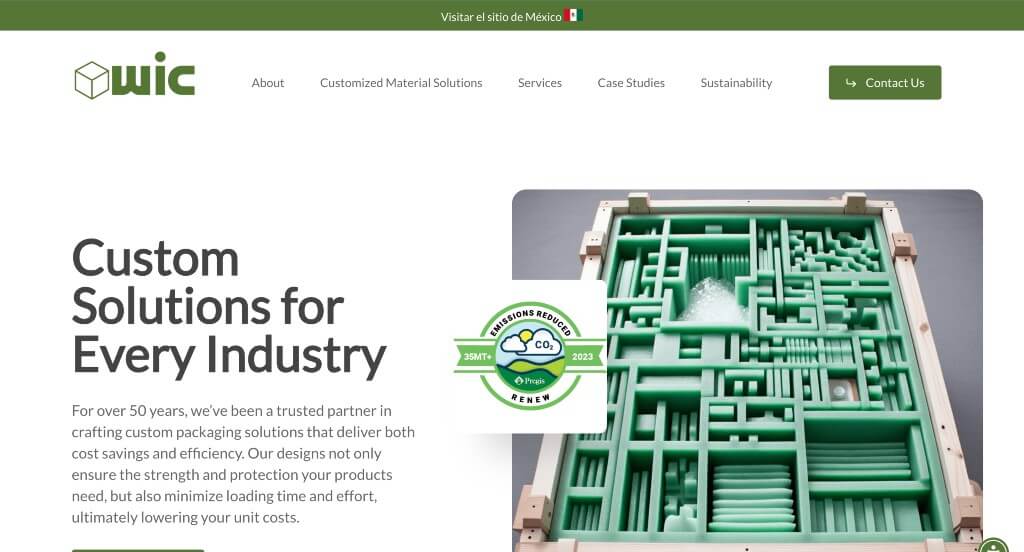
Starting this example out, they use green carefully as an accent which we felt like was a nice touch. Along with that, small animated graphics are used to make for a more interesting look. We also liked how they separated their information by industries they serve, because it makes it easier for those searching for information. Case studies are another feature that helps this example excel.
45. Global Manufacturing, Inc
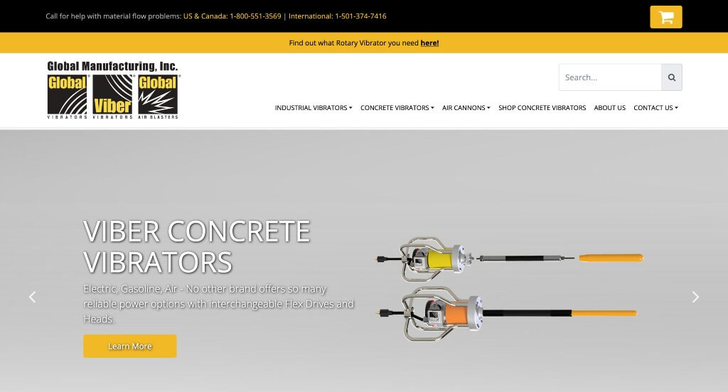
We liked how this example included 3D models in order to really show off what this business does. We liked how much of their site was accented with yellow in order to grab attention. Their web domain matched with their business name which always seems to be helpful. This navigation bar was well labeled with drop downs in order to keep everything organized and easy to find.
46. Ameripharma
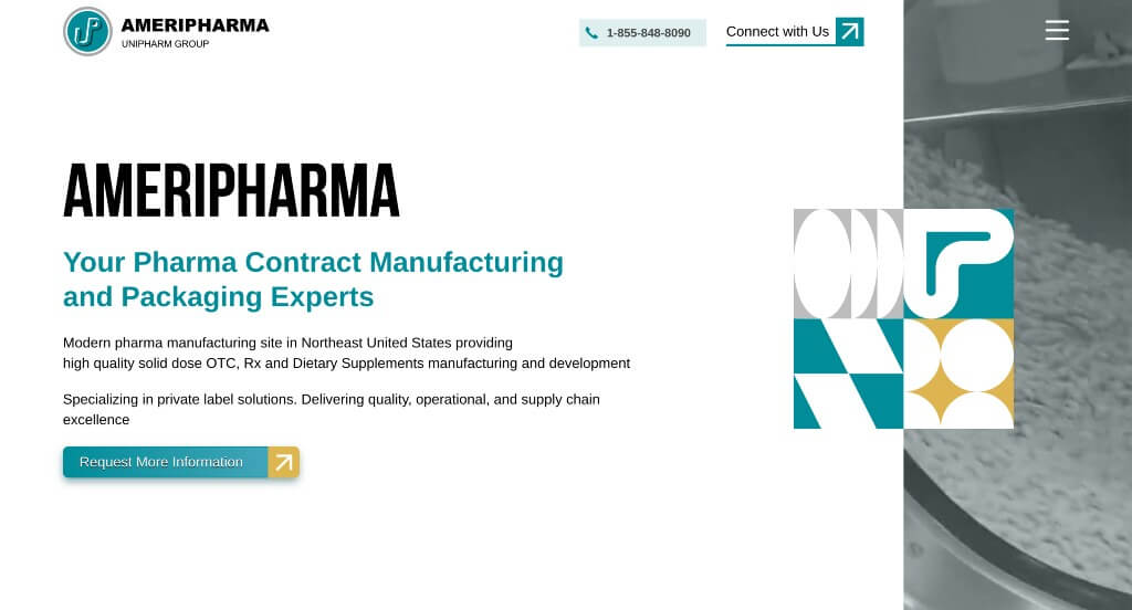
We really enjoyed the color scheme used within this example. Along with that, we felt that Ameripharma did a nice job with their graphic patterns that appear with in their images too. Animated graphics were also included which was a nice touch for them. All paragraphs were short and to the point which keeps people engaged with their content longer.
47. PR Hoffman, Inc
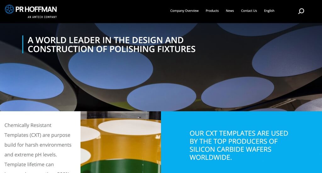
PR Hoffman, Inc did a nice job adding in lots of images without feeling cluttered. Along with that, they use a variety of blue colors to accent the page and breathe live into it. A search bar was also added in for those who are wishing to find specific information. The fonts used for this company were simple and professional which is always a good choice.
48. Mattei
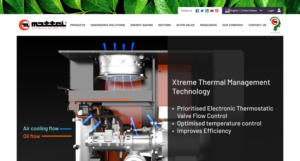
We liked how this example did well with their logo design that appeared throughout the pages. Along with that, we felt that it was smart how they had many tabs within their navigation bar to keep things more organized. It was nice how many of their products used the same signature red to create a brand identity. Circular frames are also used which we really enjoyed.
49. Packwire
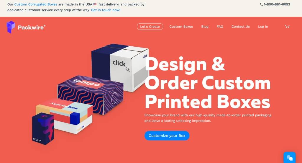
Packwire does an amazing job with their scrolling transitions to keep introducing the information. We thought it was interesting how each time that this page is refreshed, the color scheme changes. This is smart to show their values towards customization. Showing the simple steps to order a custom box through this business was another smart idea. Finally, a FAQ page on their homepage was very useful addition.
50. VJTechnologies
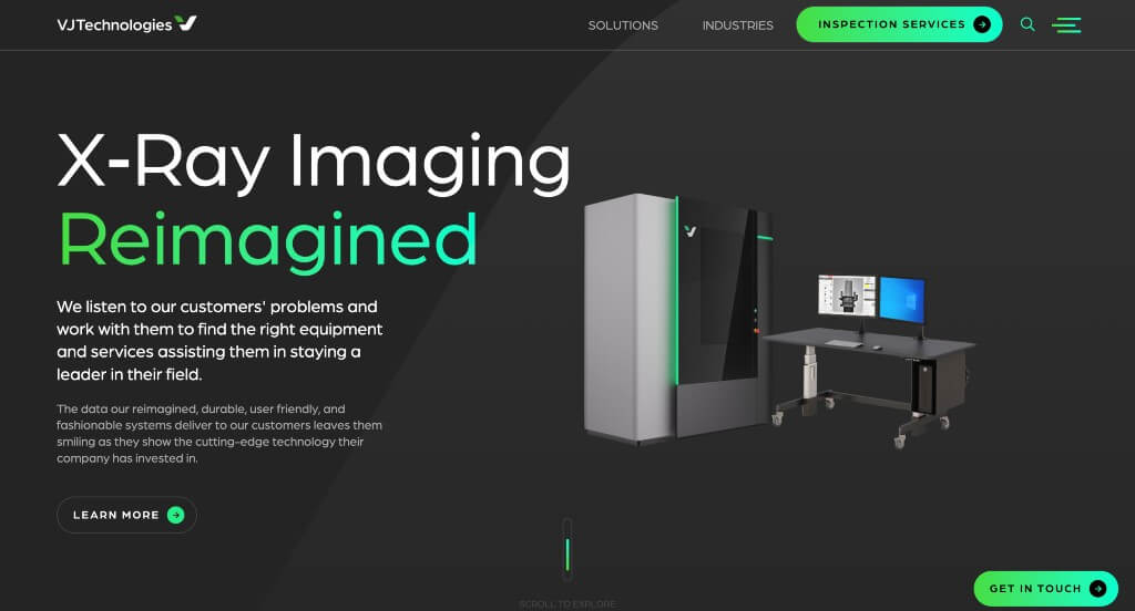
This is a sophisticated looking webpage because of its black backgrounds and brightly colored accents highlighting information. Having a section to display the industries that VJTechnologies work with was something that we noticed. Short paragraphs are used in order to keep viewers reading through information. We loved how brightly colored buttons change upon hover to bring attention towards their links and additional content.
WordPress Manufacturing Themes
Find free themes at wordpress.org or explore manufacturing-inspired templates at ThemeForest.
Industrialist – Themeforest
$79
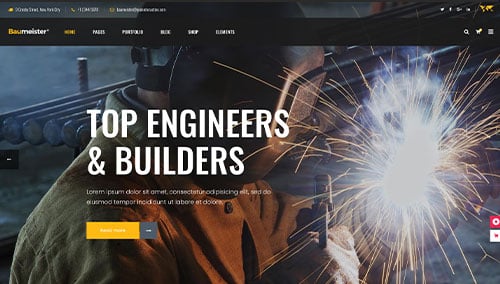
Baumeister – Themeforest
$79
Manufacturing – Themeforest
$59
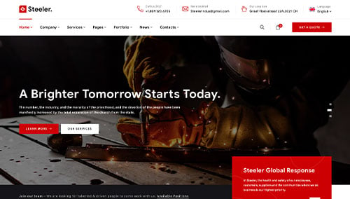
Steeler – Themeforest
$59