Looking to elevate your med spa’s online presence? This guide features some of our favorites, handpicked for their design, functionality, and user experience.
Discover stunning examples from skin care spas, laser clinics, wellness centers, and cosmetic surgery practices. Use this list for inspiration and tips to create a website that reflects the quality and uniqueness of your services.
Want more ideas? Check out our article on designs from other industries!
Top Med Spa Website Designs
- 1. Shevet Hammam & Spa
- 2. Beauty Boost Spa
- 3. Miami Skin Spa
- 4. Belle Meade Medical Spa
- 5. Rescue Spa
- 6. Forever Young Spa
- 7. Scarlet Spa
- 8. Heal Thyself
- 9. Massage Envy
- 10. Biomed Spa
- 11. Skincare Paris
- 12. Hi, Finch
- 13. The Refuge Spa
- 14. Ama the Salon
- 15. BODHI Spa
- 16. Marina Medspa
- 17. Vive Med Spa
- 18. Agea Spa
- 19. Face Foundrie
- 20. Unity Medspa
- 21. Juniper
- 22. Glasskin
- 23. Opulence Chicago
- 24. Bamford Wellness
- 25. Blushed Beauty Bar
- 26. Beverly Hills Med Spa
- 27. Oasis Spa
- 28. Glen Ivy Hot Springs
- 29. Spa Luxe
- 30. Destination Aesthetics Medical Spa
- 31. Skin Clinics
- 32. Radiance Medspa
- 33. Napa Valley Massage & Wellness Spa
- 34. Spavia Day Spa
- 35. Blue Lagoon Iceland
- 36. GLANZ
- 37. SUBBIO
- 38. The Spring Resort & Spa
- 39. Trellis Spa
- 40. Calabasas MedSpa
- 41. Shop Good
- 42. Cheeks & Co
- 43. La Belle Studio
- 44. Willow Med Spa & Salon
- 45. Gaia Retreat & Spa
- 46. Cure Daily
- 47. Infinique Skin & Spa
- 48. Woodhouse Spa
- 49. Skinney Medspa + Wellness
- 50. Urban Nirvana
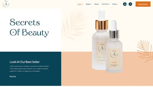
1. Shevet Hammam & Spa
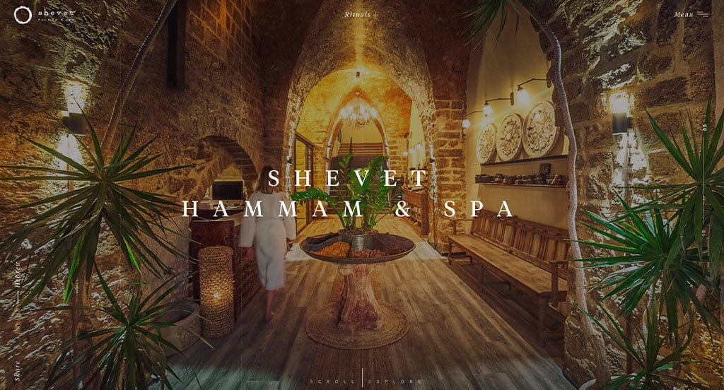
Starting off with a full screen video was amazing because it grabs attention of those entering their webpage. We really enjoyed their woodsy color scheme. Relaxing transitions for their information was another thing we noticed. High-quality imagery was something that grabbed our attention.
2. Beauty Boost Spa
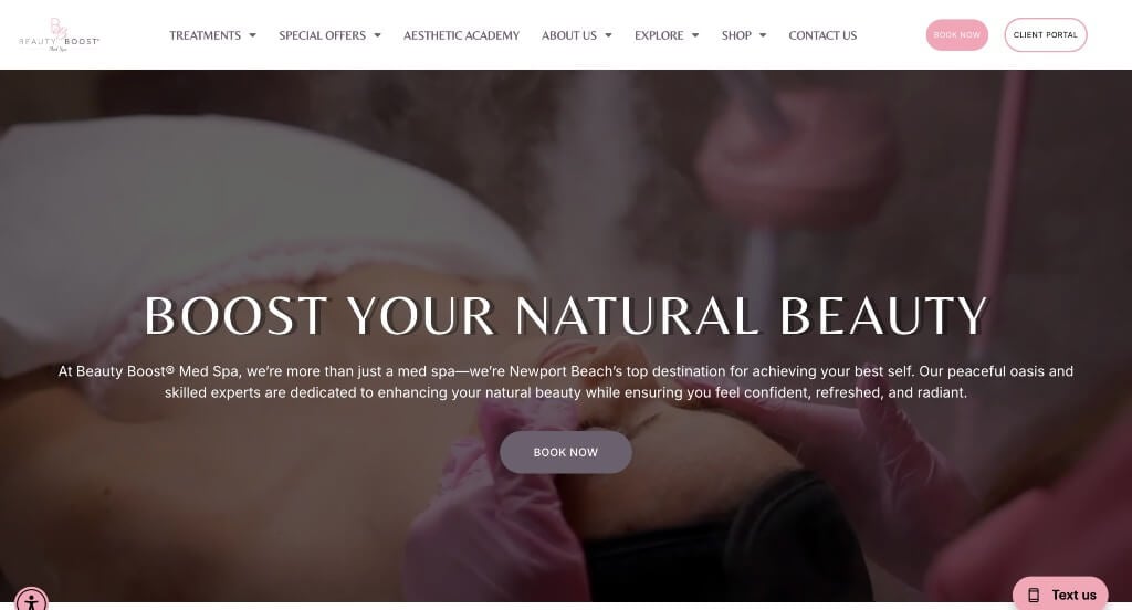
Here we have a subtle pink accent that feels delicate and feminine, perfect for their target market. Their logo reflected that same overall feel and made use of their business’ “initials”. Adding in customer reviews was refreshing too. It was nice that their images matched with their color scheme.
3. Miami Skin Spa
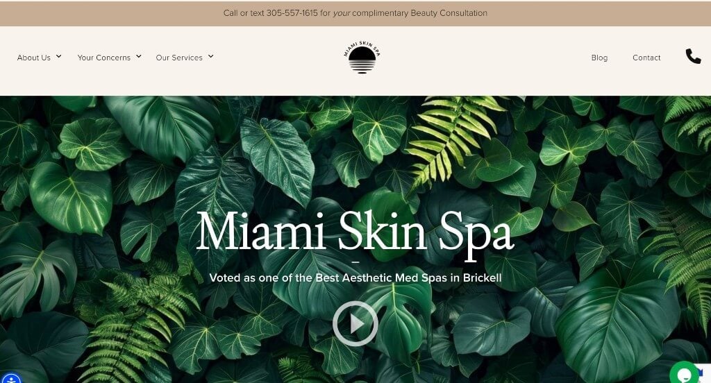
We really enjoyed this company’s neutral color palette that helps the visuals come together well. A video is included right away to provide viewers with additional information. We liked their logo design that really showcases their focus on relaxation. Listing their treatments with a small description was extremely helpful for those considering their services.
4. Belle Meade Medical Spa
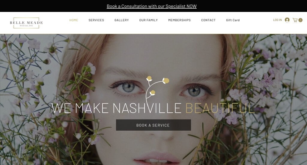
This company grabbed our attention right away because of their automatically playing video as a background. This was paired with thin, professional text with a flower graphic growing from the V. They use small icon graphics to highlight specific content which was a nice choice. We also really liked how they made use of interesting image frames.
5. Rescue Spa
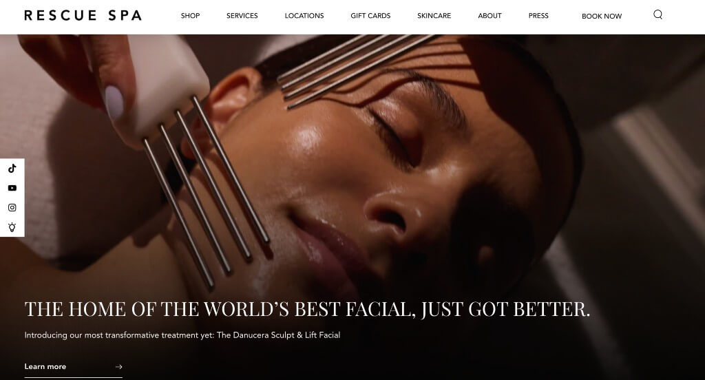
A pop up for a live chat was the first thing that we saw, and it was beyond helpful. Having reviews from popular publications like New York Post or Vogue helps possible clients gain trust. Showing all their services with images and links for each one was a great choice.
6. Forever Young Spa
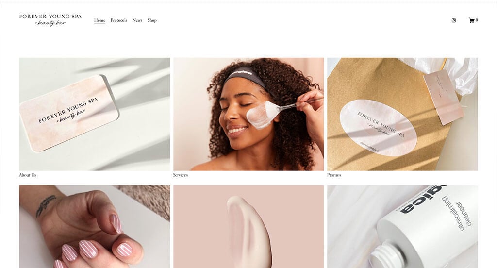
These were all stunning images that creates an overall feel for this company. Their template was simplistic, making information feel more organized. Picking out a font that is simple and professional is essential for any company. Showing that they are a local company is also really nice because some people love to support local businesses.
7. Scarlet Spa
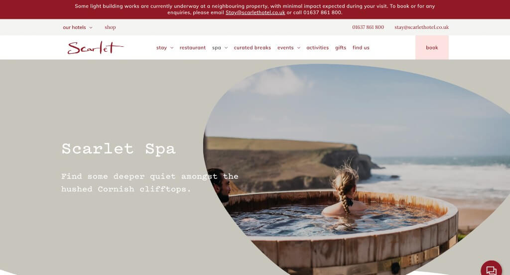
Our first feature that we liked was their accents of red that makes sense because of their name. Shaped image frames was also nice because it was different, and helps them stand out from competitors. Having a font that can be identified or reminded of your company was also smart.
Related: Drive more quality leads to your medical spa through digital marketing services delivered by an agency with relevant experience.
8. Heal Thyself
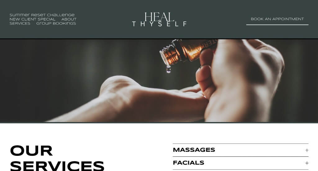
We loved this relaxing color scheme used throughout all these pages. Small, simple accents were used in order to bring more visuals in. Another thing that we enjoyed was their interesting font. We appreciated drop downs to explain what is included for each area of service.
9. Massage Envy
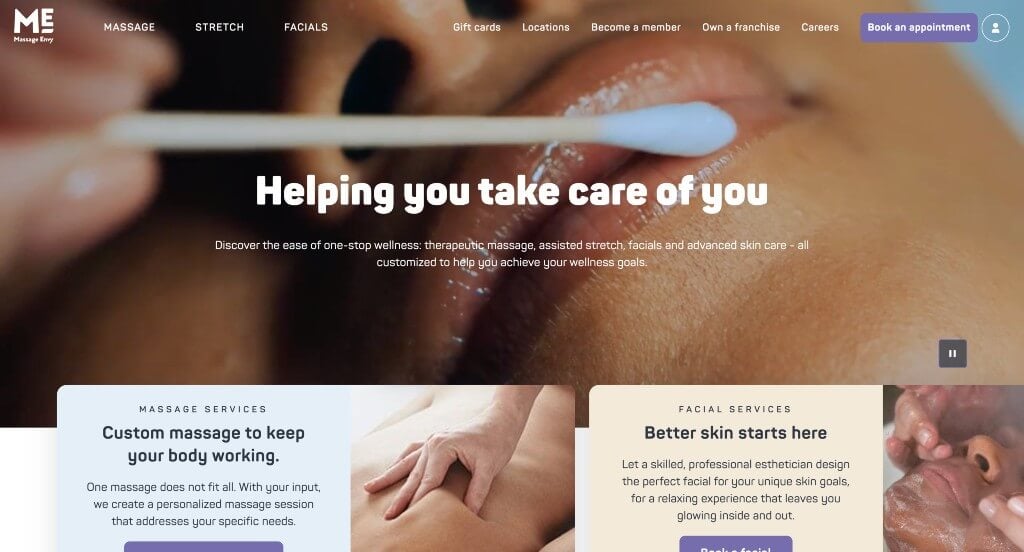
This company does a great job with their icons and graphics throughout their pages. We really enjoyed their thoughtful, but simple logo. They clearly showcase why they are different, and why you should choose them. Small accents of purple are used in here which is also nice.
10. Biomed Spa
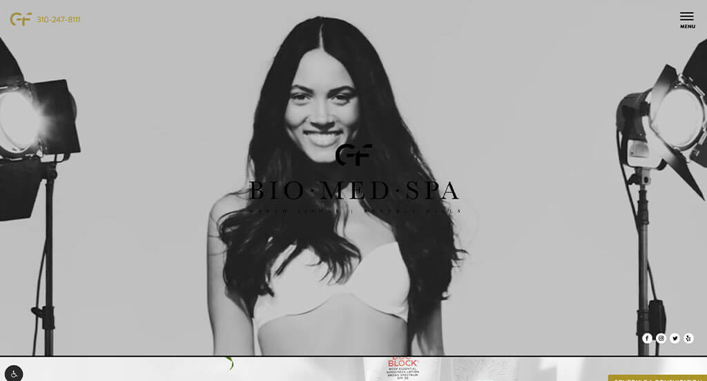
A black and white video starts this company off strong. Accents of gold really makes their company feel luxurious. Their use of videos in many places along with images was something that we really liked. They had internet marketing in mind when creating a simplistic template.
11. Skincare Paris
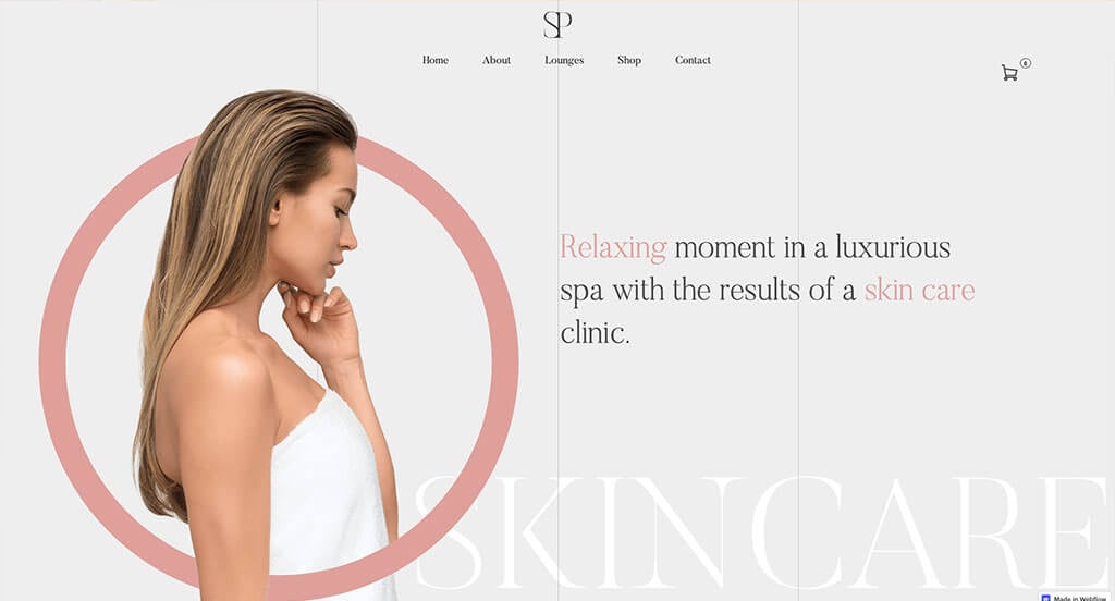
We liked how Skincare Paris used both graphics, images, and text to create something amazing. We liked their subtle transition animations to draw eyes to new information. Having buttons that help bring customers to each product was a great idea. Including images from their Instagram page was something that we noticed.
12. Hi, Finch
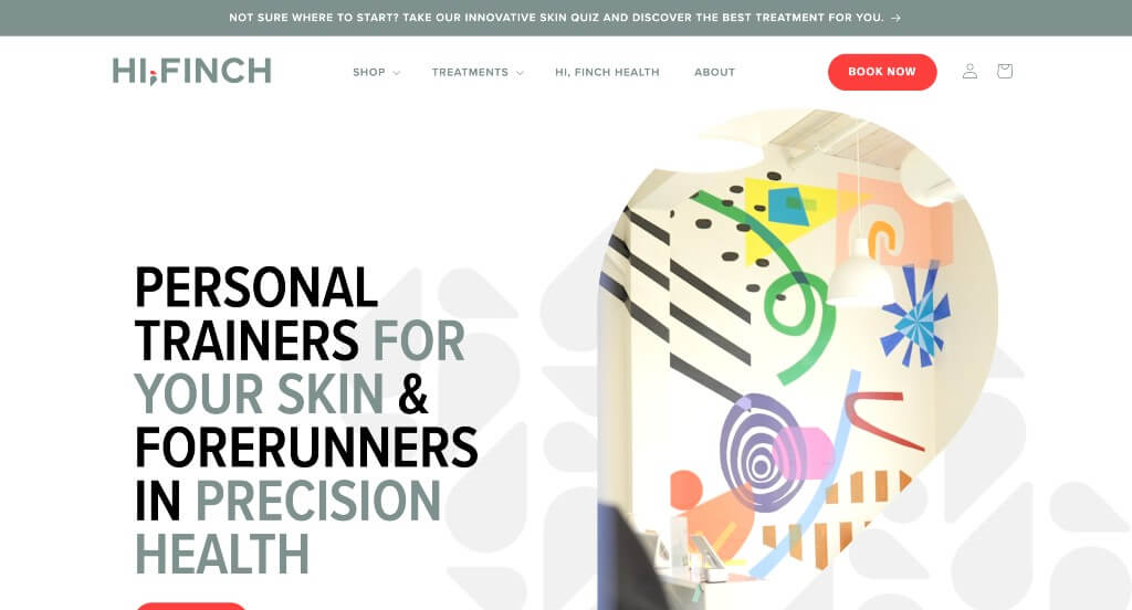
Right away we noticed this little teardrop shaped graphic that can be noticed throughout the page, and can even be noticed within their logo. There was an automatically playing video within one of these teardrop frames which looked nice. Occasionally having black backgrounds was a creative touch that was noticed for sure. This domain also matched with their company name which improved brand identity.
13. The Refuge Spa
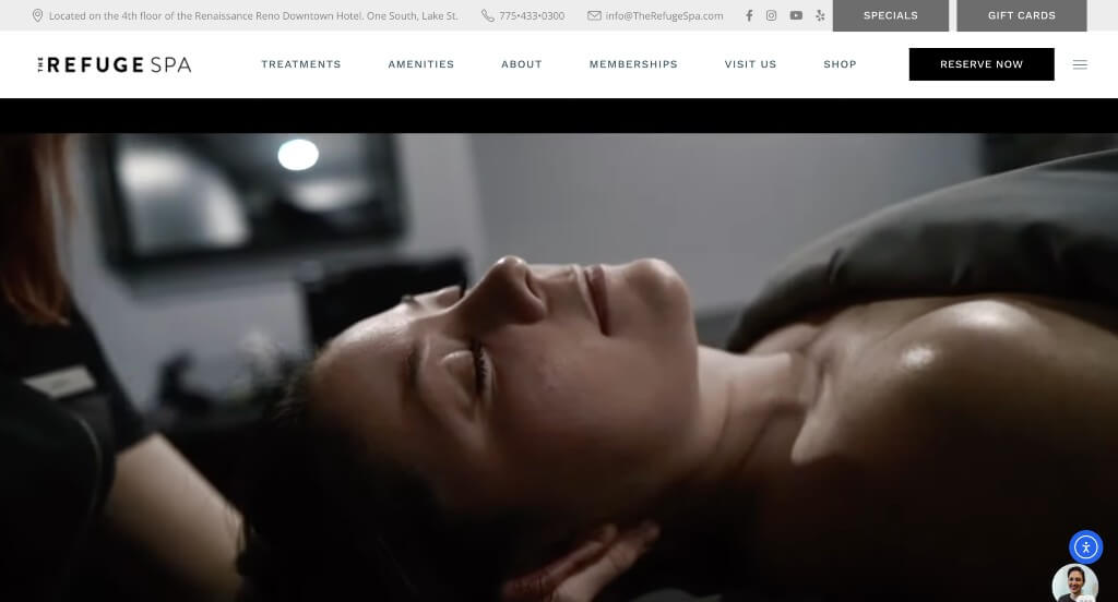
We liked how delicate graphics were used not only throughout, but also in backgrounds. We loved their small accents of blue in many of their pages. Buttons are used all over to help guide people towards additional information. Their domain also matched with their company name, making their site easier to find again.
14. Ama the Salon
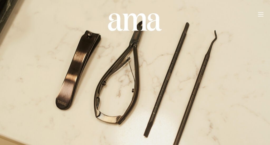
We liked how there was small accents of different colors in order to help breathe life into it. Large images dominated most of this site, which we really enjoyed. Short and straightforward paragraphs were used to hold the attention of customers.
15. BODHI Spa
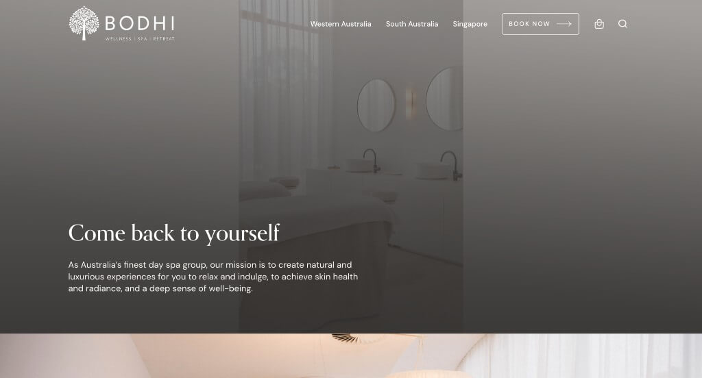
The first thing that we noticed was their interesting logo. High quality images were displayed in so many areas, which is very smart. Small icons were a cute addition. We really loved how their color palette was minimalistic and mainly white and cream colored.
16. Marina Medspa
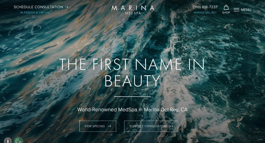
Marina Medspa did well with their slider with high quality images right away in order to capture attention. Along with that, they use thin, professional fonts that are used throughout the entire webpage. Including statistics helps to customers trust their company more was a brilliant choice. Additionally, we liked how they included awards that they’ve received because it was a way to prove their reliability.
17. Vive Med Spa
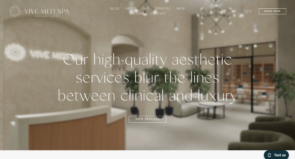
The first thing that we noticed about this example was their logo design that was almost luxurious. Along with that, their fonts matched with how they wish to be perceived. Including their mission within their homepage was a great way to show off their business’ values. Their social media page was integrated near the bottom of this page which was something that we enjoyed.
18. Agea Spa
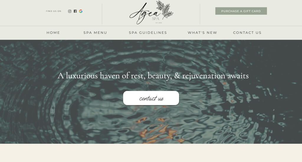
We loved how Agea Spa made use of stacked images to create a more interesting layout. Adding in creative graphics helps bring their template to a whole new level. Their balance of professional and decorative fonts was very nice.
19. Face Foundrie
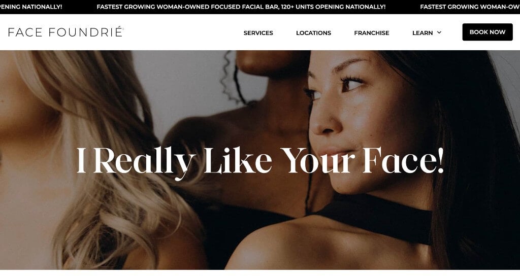
This color palette was simplistic and looked professional for their company. Allowing for a simple checkout process is a choice we always appreciate. Including a blog is another helpful feature in order to get information out to viewers. A big black button was included in order to book appointments, which was a good choice.
20. Unity Medspa
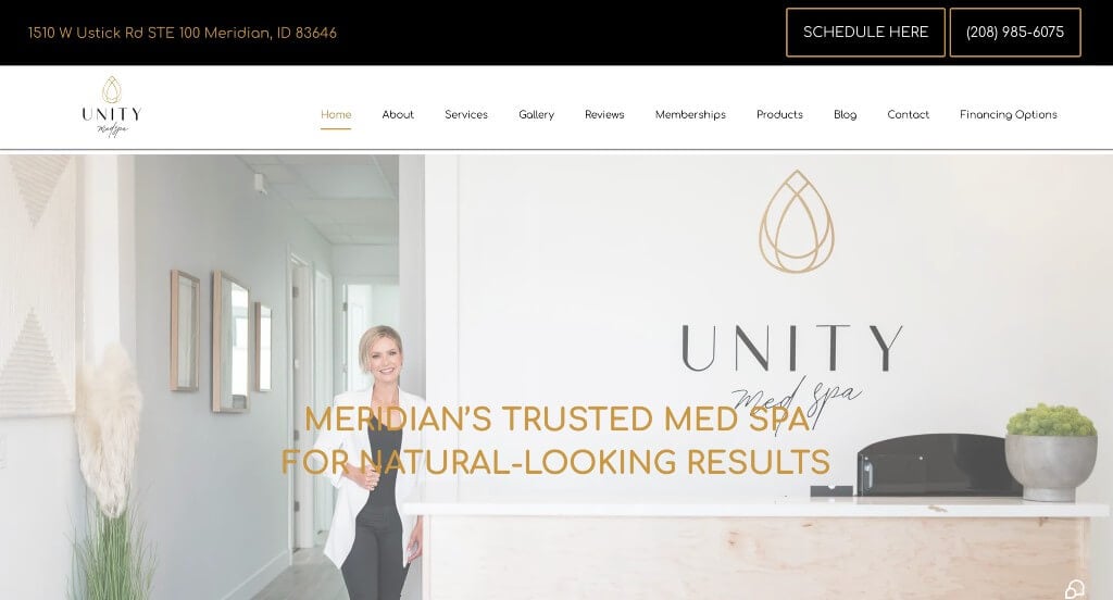
This example grabbed our attention because of its bold color scheme. Adding in gold accents, especially for a company like this one was a great idea. Along with that, we really liked how they used bullet points to keep information more organized. Their logo design was delicate and simple which made sense for a Medspa. Content was all written into short paragraphs, making it easier for those trying to read through information.
21. Juniper
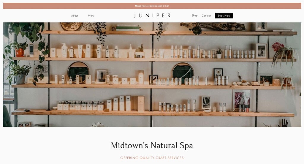
Accents of muted tones helped to make something that was attractive, catching the eyes of customers. Keeping all their content logically organized was another outstanding choice. Large images was another choice that we were beyond happy about. Separating content into body, face, and nails was also a great choice.
Related: Run paid advertising to help target an engaged or interested audience to promote your medical spa.
22. Glasskin
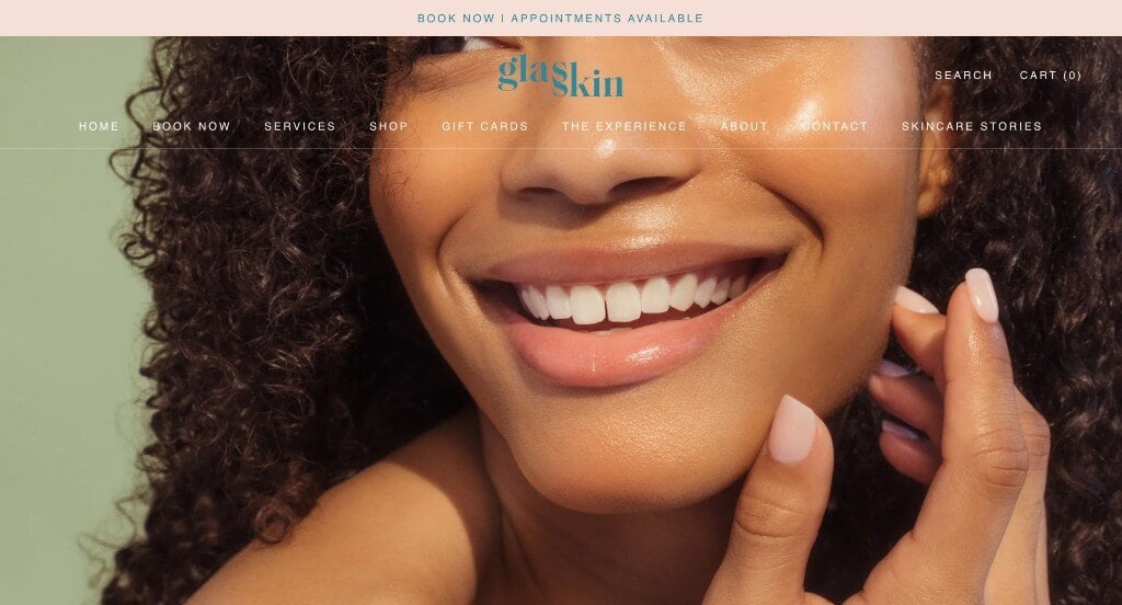
Including some pinks, greens, and blues within these pages allows for a delicate feel for their website. A search bar was included in order to make it easier to find certain information or products. Buttons are also helpful to keep things organized. A simple checkout process was used, which we really enjoyed.
23. Opulence Chicago
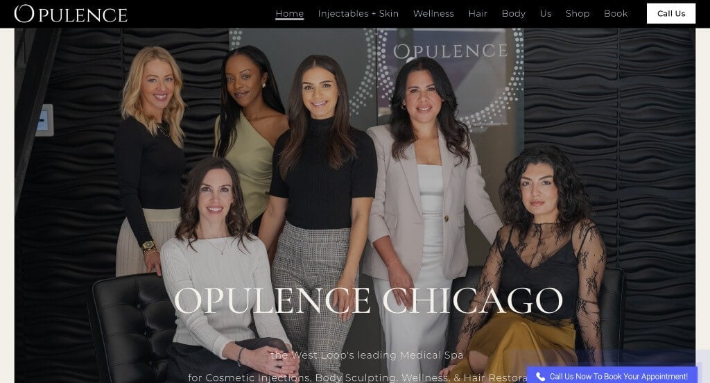
Opulence Chicago did a nice job with their black and white color scheme that appears throughout their entire template. There are quite a few buttons that help guide viewers to more information. Including their customer testimonials was another helpful choice that we noticed. This domain matched with their company name which was a great way to improve their brand identity.
24. Bamford Wellness
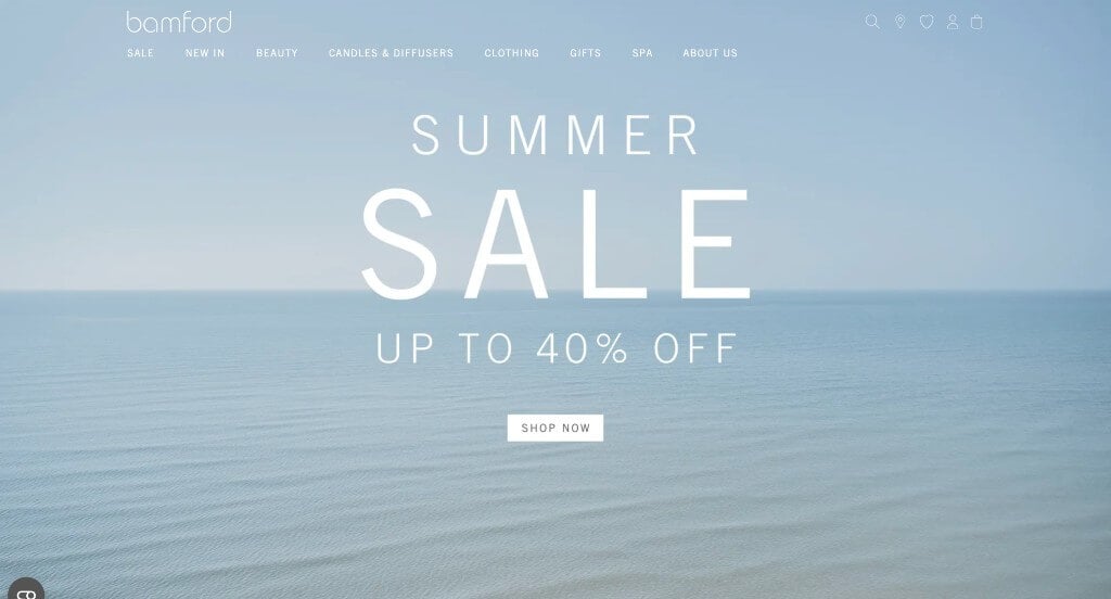
Dark greens are used in their packaging and images, creating a feeling of unity. Their logo was simple and modern, which seems to reflect their business practices. Lots of images were carefully balanced to create a stunning look. Their navigation bar was labeled well, making it better for finding information.
25. Blushed Beauty Bar
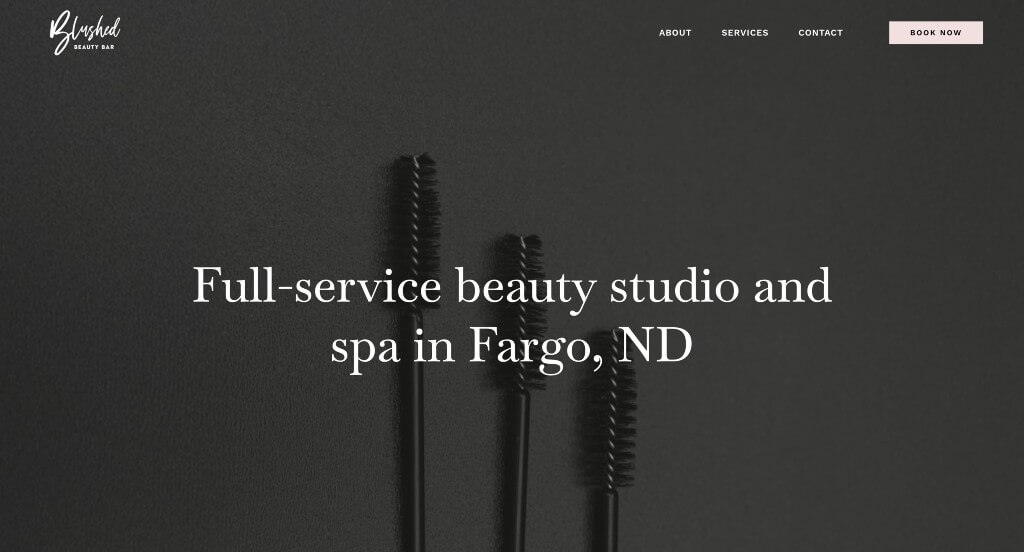
In this example, we noticed their use of pastel pink for accents. This was nice because it created a delicate, feminine touch to their webpage. Including a decorative font that is still professional but more creative was something we couldn’t ignore.
26. Beverly Hills Med Spa
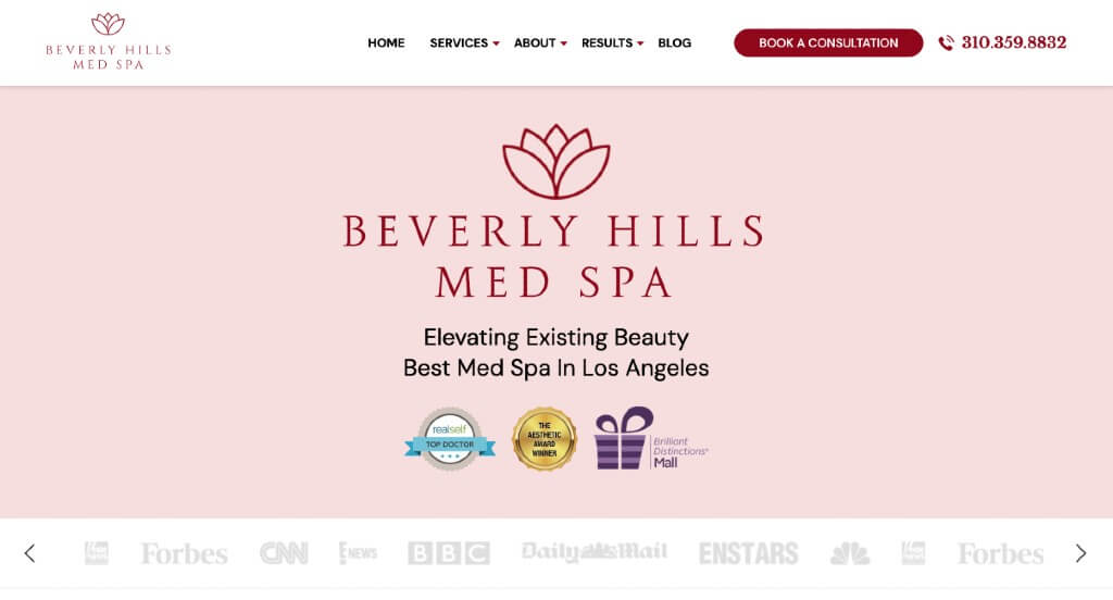
Beverly Hills Med Spa used a feminine color palette that felt relaxing and delicate. Another thing that we liked was their lotus graphic that appears all throughout their web design. We thought it was nice how the aesthetic of their social media posts matched their overall feel for their website. Using accents of a deep red looked great with their pastel pink.
27. Oasis Spa
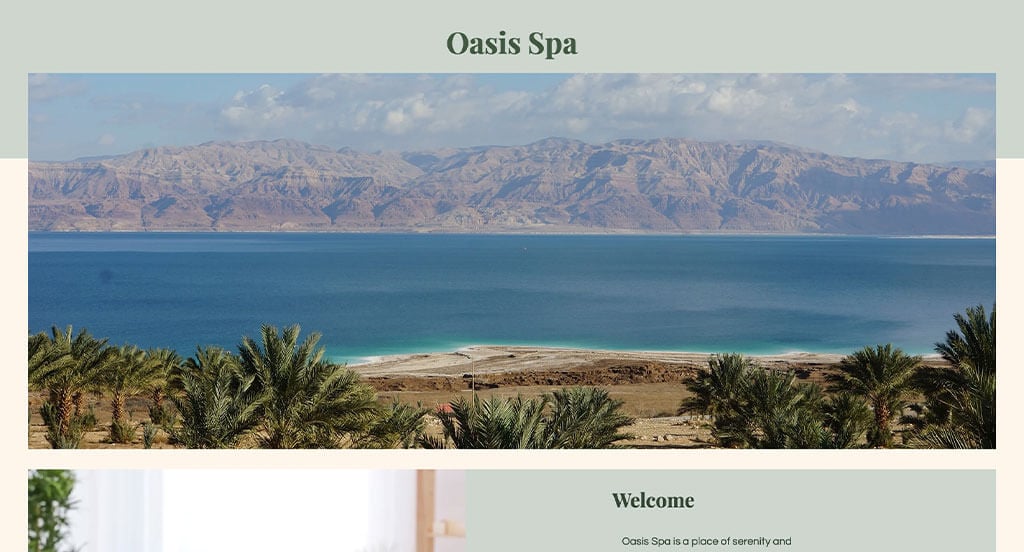
We enjoyed the interesting framing used throughout these pages for images and text. Showing the timing for each service and it’s price was something that we liked. We felt that it was really helpful to have bullet points keeping everything looking sharp, and easy to read. Another interesting thing here was their short and straightforward paragraphs.
28. Glen Ivy Hot Springs
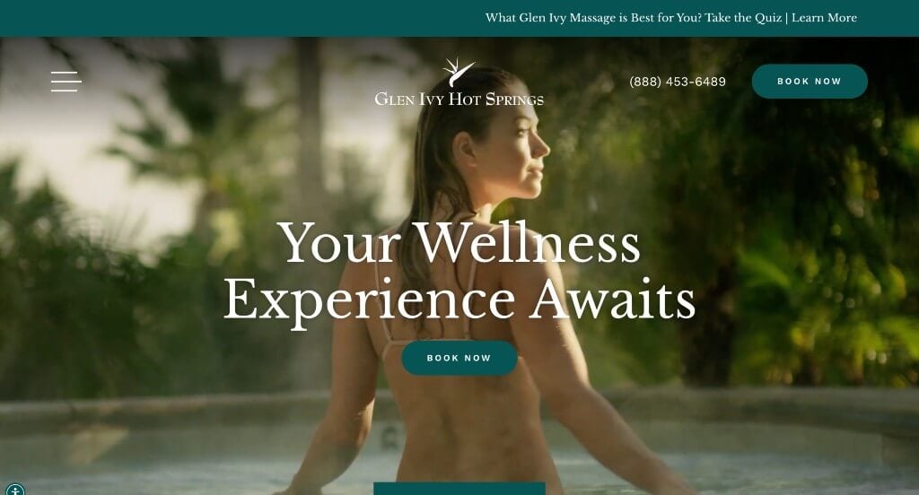
Upon entering Glen Ivy Hot Springs, we noticed their automatically playing video that shows them off as a company. We really enjoyed their little drawing (in the background) that resembles their logo. Customer reviews are also included, which is always a plus. Their domain was also very simple, making it easy to find.
29. Spa Luxe
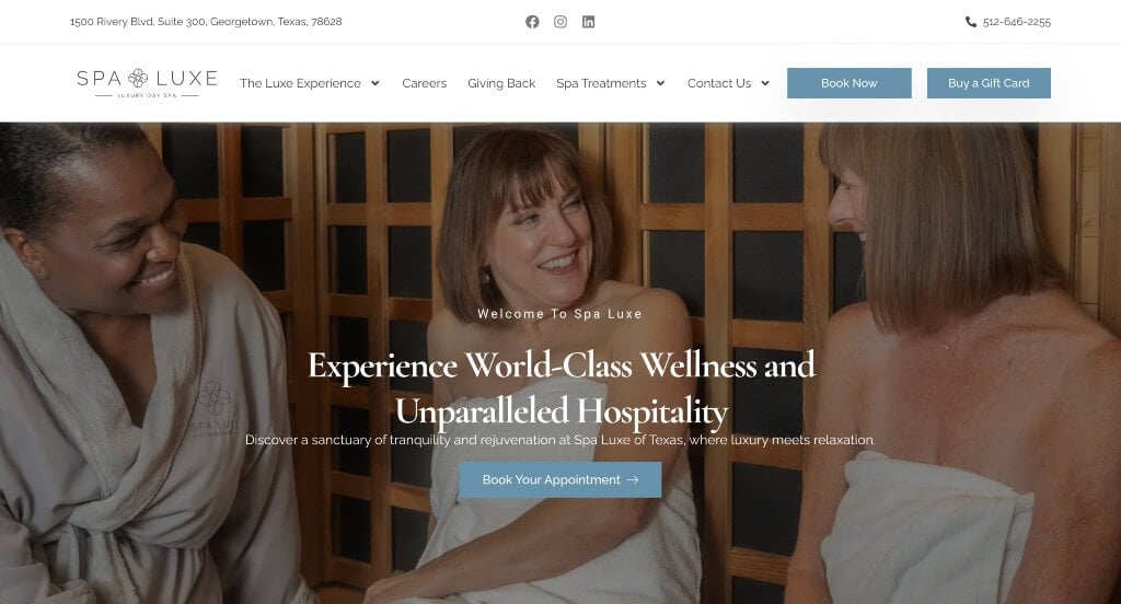
One of our favorite parts about Spa Luxe was their inclusion of awards to show off why they are loved as a business. We liked their little icons that are used for bullet points to keep everything organized. Something that we saw here was their addition of image frames to make everything look better.
30. Destination Aesthetics Medical Spa
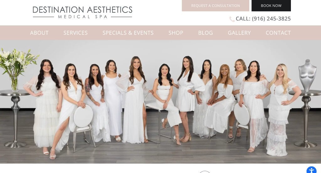
White, pastel pink, and black creates a simplistic feel that is still professional. We like this interesting template that used ripped paper and watercolor effects to stand out more. Putting their logo in a variety of places was something that we found enjoyable. Including a gallery to show what this business can do for you was nice.
31. Skin Clinics
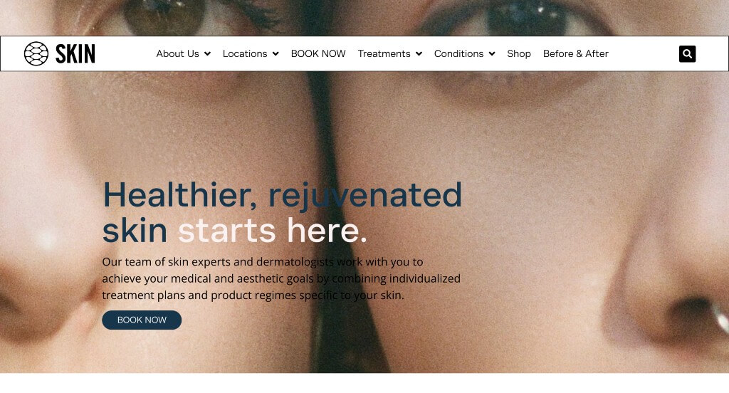
There was lots of images here that helped everything tie together beautifully. We liked how they used a map showing each of their locations, so customers could understand if there is a location near them. There was also lots of linking buttons that are helpful in order to find additional information about a variety of things. Short paragraphs are used to keep people engaged.
32. Radiance Medspa
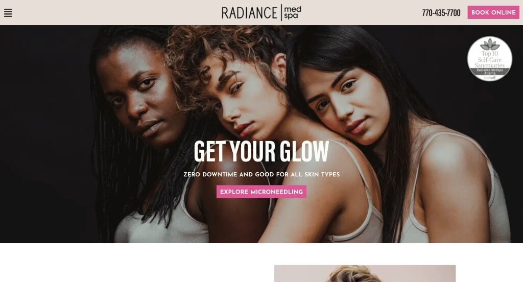
Here we have an example that uses lots of high quality images within their pages. Videos are also included which we thought was nice for those who learn better from videos. Integrating their social media posts right into their page was another feature that we appreciated. Bursts of bright pinks was something that stood out to us.
33. Napa Valley Massage & Wellness Spa
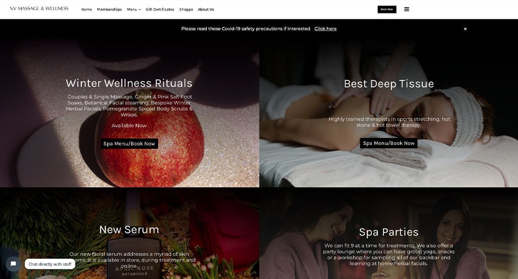
Right away, we could notice large images that help to attract customers. We loved how they offered gift cards for their company. Additionally, customer reviews are included along with their star rating. Their careful balance of different forms of content was a nice touch.
Related: Help rank your medical spa in local organic search results by implementing an expert SEO service.
34. Spavia Day Spa
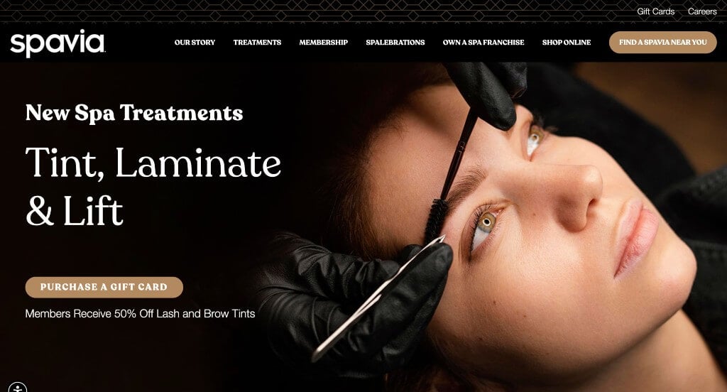
This example shows that these services can be for females or males. High quality images were used in a bunch of areas which is a choice people won’t be mad at. Including videos alongside their images was a great addition. They clearly had internet marketing in mind when choosing a domain that matched with their company name.
35. Blue Lagoon Iceland
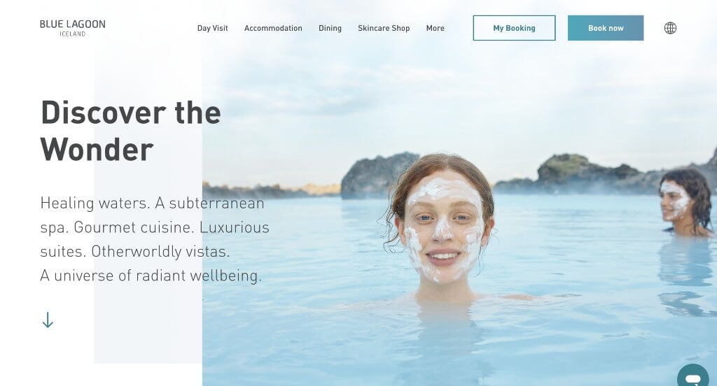
Blue Lagoon Iceland did a great job with their use of layered content to help everything look more interesting. Their high quality images that fill up good portions of their pages was another great choice. These simple fonts helped to make pages that were easy to read.
36. GLANZ
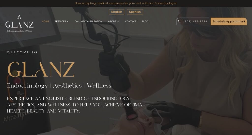
We liked this interesting font that was chosen for GLANZ because it was unique. We loved their overall layout that layers images and uses videos upon hover. Paragraphs were shortened in order to make them easier for viewers to read and comprehend. Testimonials are included which is a feature that we always appreciate no matter the industry.
37. SUBBIO
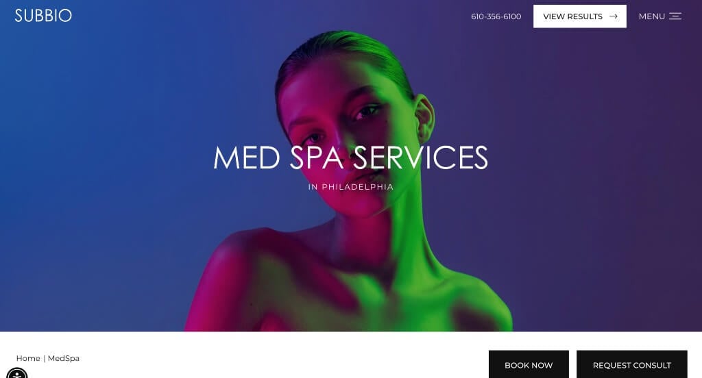
SUBBIO starts off with an image that has lots of vibrant colors within it. They balanced their white space very carefully which was helpful to create an uncluttered template. We liked how they broke down each service into the variety of ways they can achieve your goal. Their color scheme was also fairly simple which made for a more interesting design.
38. The Spring Resort & Spa
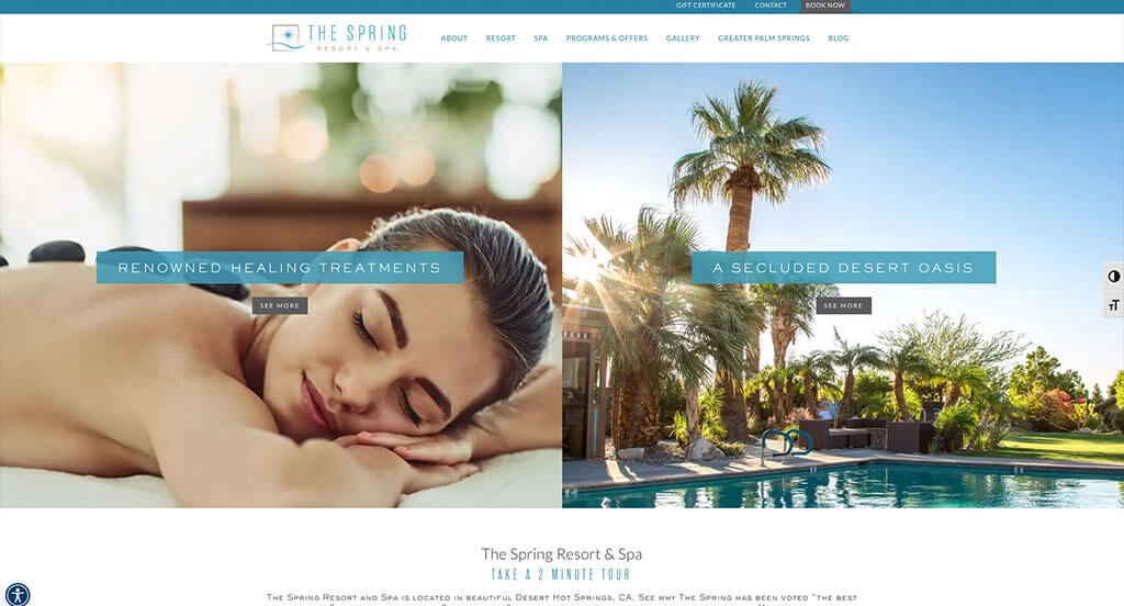
We liked how blue highlights their text, making it much easier to read. We liked their extremely simple logo that was relaxing and matched their color scheme. Including a gallery and a blog was another helpful addition for this company. Adding in buttons was helpful to keep people engaged and reading more information.
39. Trellis Spa
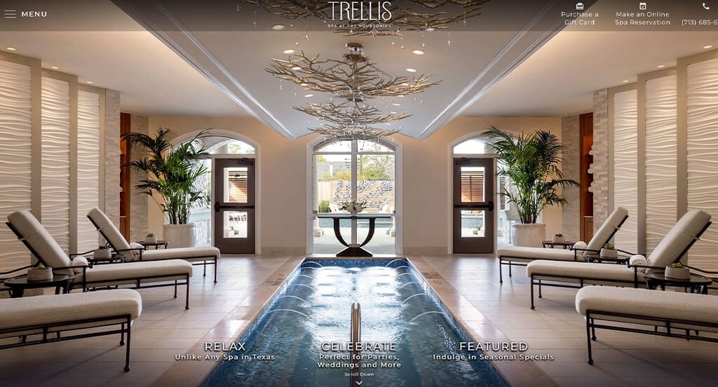
We loved the interesting framing that was used for some of their text boxes to make for easier readability (and a more appealing design). Their font was another feature that was carefully chosen, for its professional and creative nature. Trellis Spa also picked a color scheme that was stunning and relaxing, making their pages shine.
40. Calabasas MedSpa
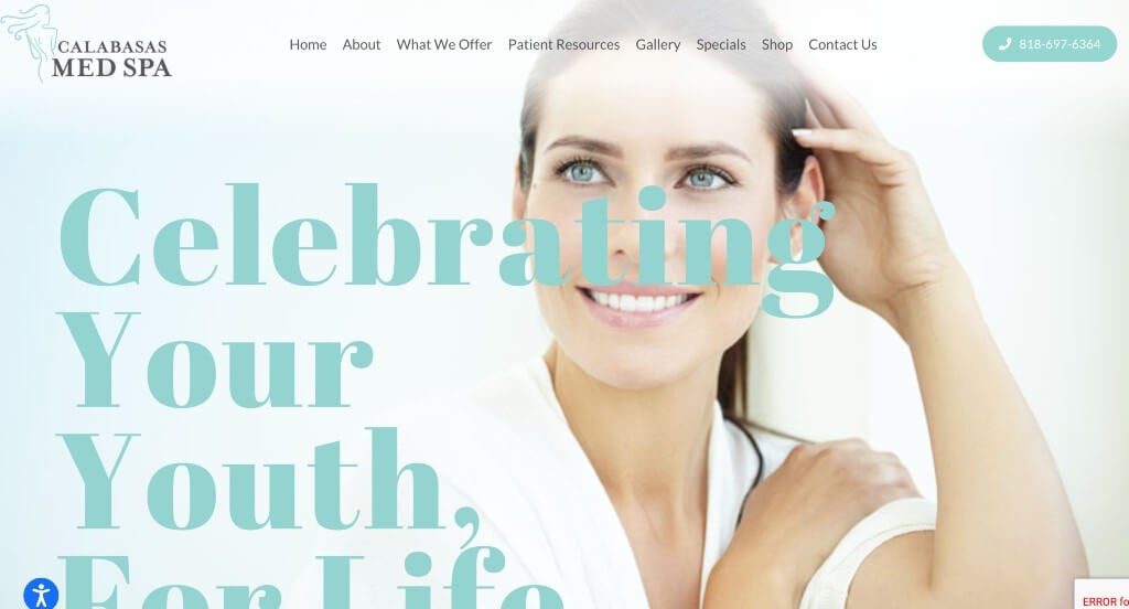
Between large images, stunning fonts, and beautiful colors, we couldn’t skip this example. Many of their images use their color scheme keeping everything more unified. They clearly had conversions in mind when allowing for a well-labeled navigation bar. Another brilliant choice was their domain that matched their company name.
41. Shop Good
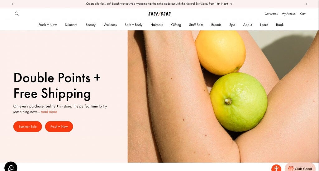
One of the first things that we noticed was how their products had clearly labeled prices. A pink palette was a very impactful feature here. Including the opportunity to like product in order to find them later. Having a button to lead people towards new arrivals was a smart choice.
42. Cheeks & Co
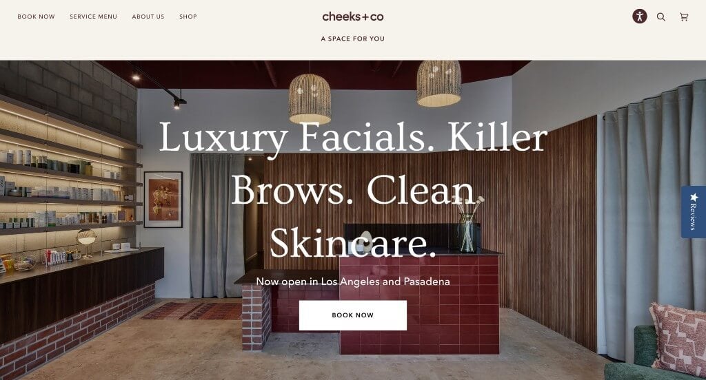
We loved how this example really showed off their product packaging, which is an important part of their product. A careful balance of images and videos was included, making a template that stands out to viewers. It was cool that their navigation bar used emojis and images to make for a more interesting look.
43. La Belle Studio
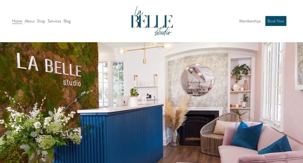
Showing off awards that they’ve won was a choice we couldn’t ignore. Their staggered template that creates a more interesting layout was a great idea. Allowing a variety of services was another feature that we really enjoyed. Lots of customer reviews were added in, which we liked. Incorporating social media was another aspect that they did well with.
44. Willow Med Spa & Salon
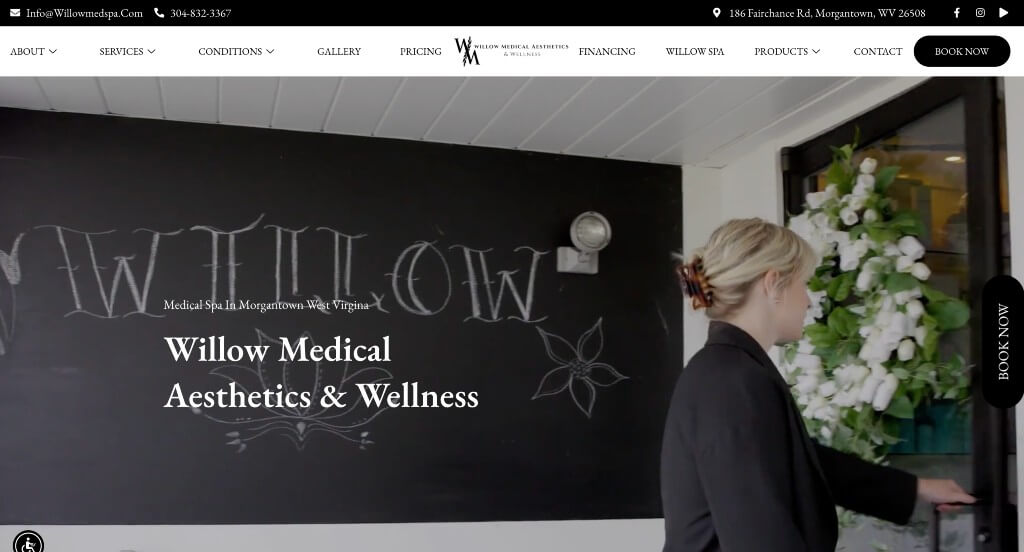
This example started out with an automatically playing video to introduce their company as a whole. We thought their logo design was unique and appealing even though it was simple. Showing off their featured treatments was another brilliant choice for customers to know what to expect. Using a section to introduce their team was smart because clients will feel more comfortable when coming in for an appointment.
45. Gaia Retreat & Spa
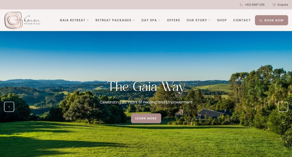
We loved how Gaia Retreat & Spa had a stunning color scheme with gold accents. High-quality images was another thing that we really loved. Adding in buttons made it also easier to find more information on what customers want to know. Showing off their awards helped possible clients to gain trust with them.
46. Cure Daily
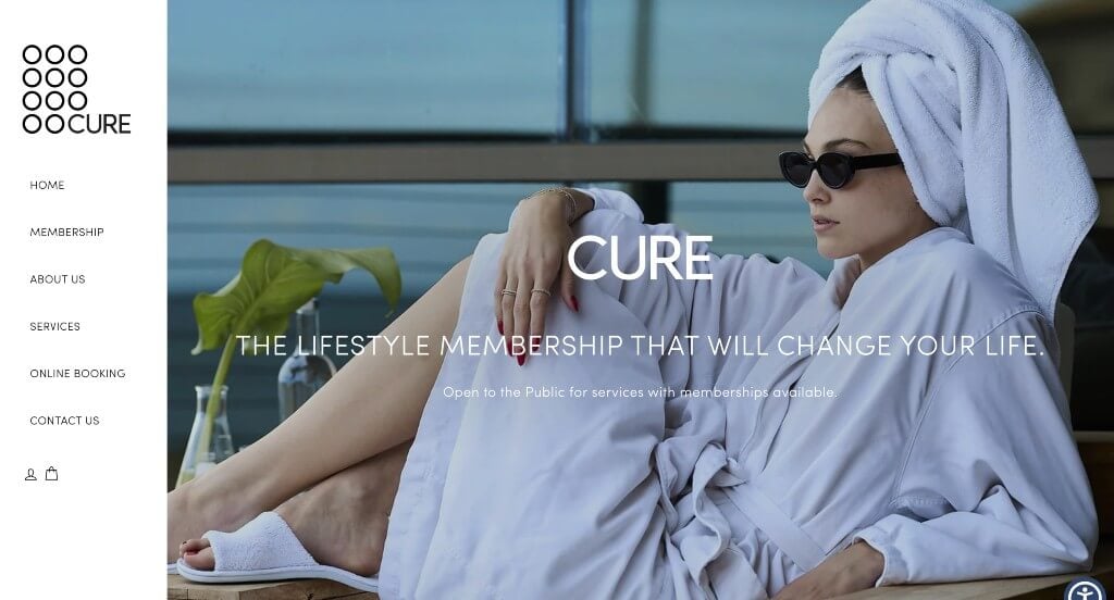
Upon entering this site, you can appreciate their large and high quality images. Along with that, their logo was interesting and unique. Blending bold fonts with cursive fonts creates a more interesting template. Their domain matches with their business name which creates a strong brand identity. They also include lots of information without having a disorganized template.
47. Infinique Skin & Spa
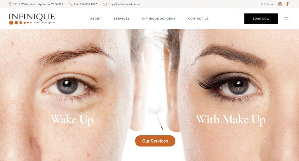
As you scroll through Infinique Skin & Spa, a quality you’ll notice right away was their subtle animations. Beautiful graphics were added in to have a interesting visuals. Adding in awards that they as a company have received was an idea we couldn’t ignore.
48. Woodhouse Spa
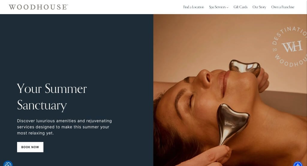
One of the things that we noticed was how these images were edited in order to create a sense of unity. Many buttons were added in here to help people find more information. They had conversions in mind when choosing a domain that matches their company’s name.
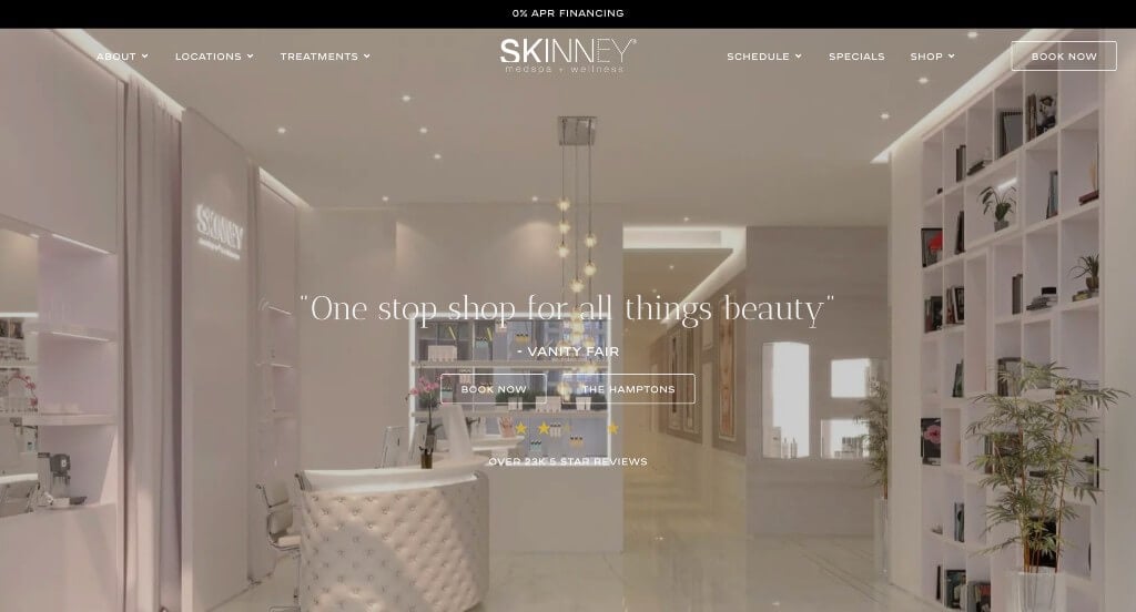
49. Skinney Medspa + Wellness
Skinney Medspa + Wellness had an interesting logo that mixes fonts within their brand name. Along with that, buttons can be noticed to guide viewers towards additional information. Including their story as a business helps them become more trustworthy and reliable. Adding in videos was appreciated because it creates a sense of variety in their webpage.
50. Urban Nirvana
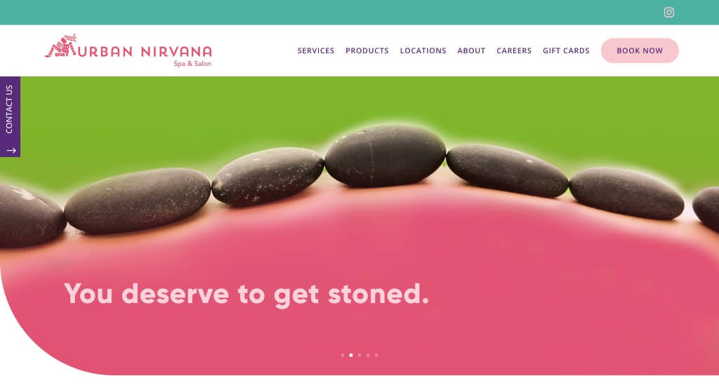
Many bright colors are used throughout these pages, even in their images. An interesting logo was a great choice to help make their business more memorable. We also felt that it was nice to include icons that reflect what they are talking about. Additionally, their domain matched with their business name.
WordPress Medical Spa Themes
You can explore free themes at wordpress.org or browse through medical spa-inspired templates on ThemeForest.
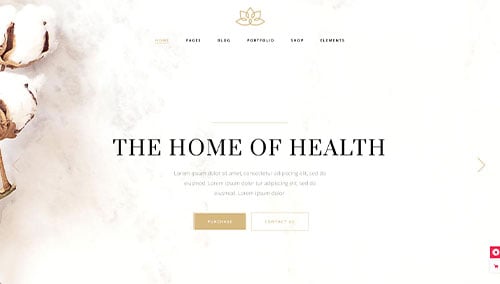
Reina – Themeforest
$79
Aviana – Themeforest
$79
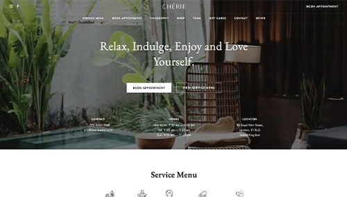
Chérie – Themeforest
$79
Oaza – Themeforest
$79
WooCommerce Medical Spa Themes
You’ll find a wide range of ecommerce medical spa themes for WooCommerce on ThemeForest.
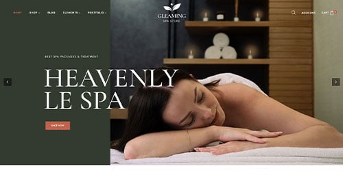
Gleaming – Themeforest
$38
Allora – Themeforest
$39
Shopify Medical Spa Themes
Explore free and paid themes at themes.shopify.com or consider options available on marketplaces like ThemeForest.
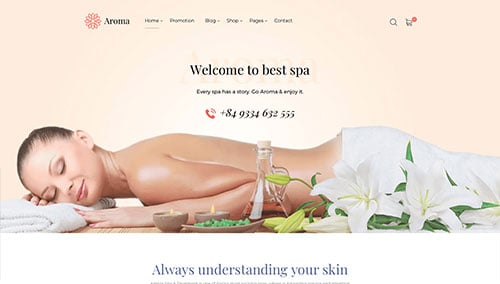
Aroma – Themeforest
$79
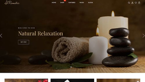
Romatic – Themeforest
$56