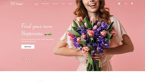
Greetings, small business owners! Want to boost your online presence to reach more customers? Then you’re in the right place!
Our experts evaluated based on design, functionality, uniqueness, and user experience. We focused mainly on WordPress websites – the most common choice for small businesses – but also included some great examples from WooCommerce, Shopify, Wix, and other platforms.
Gain inspiration and valuable tips to help your website stand out. Explore website examples from retail stores, service businesses, restaurants & cafes, home-based businesses, and local manufacturers. For more ideas, visit our greatest web design examples article!
Top Small Business Website Designs
- 1. Skin By Gabby
- 2. Loro Eats
- 3. Anée Atelier
- 4. Chez Felix Gourmet
- 5. World Financial Group
- 6. Christianos Pizza
- 7. Moving Waldo
- 8. Milk Jar Candle Co.
- 9. Our Place
- 10. Stone Arch Brewpub
- 11. Solo Salon
- 12. Moment Skis
- 13. Vortic Watches
- 14. Sawmill Brewery
- 15. Shwood Eyewear
- 16. LivSo
- 17. Rye Restaurant
- 18. Casa Mami
- 19. Rhone
- 20. Sophie Ratner
- 21. Studio Neat
- 22. The People Vs Coffee
- 23. Coastal Yacht Management
- 24. Tailwaggers Doggy Daycare
- 25. Izzy Wheels
- 26. Fresh Air Technologies
- 27. Tattly
- 28. Pop Chart
- 29. Discovery Land Global
- 30. Rise Athlete
- 31. Barrel & Baskit
- 32. Zee Dog
- 33. Kustom Thrills
- 34. Hair By Taylor Ross
- 35. Terlingua Real Estate
- 36. Ginger & Baker
- 37. Silk & Willow
- 38. The Wild Pine
- 39. Storehouse Tea
- 40. 2510 Restaurant
- 41. Complete Canine Companion
- 42. South Coast Canteen
- 43. Log Jam Bar and Eatery
- 44. Piboco
- 45. KeyNest
- 46. Fat Cat Creamery
- 47. The Milk Merchant
- 48. Surftwins Essaouira
- 49. Alyssa & Anna Fine Jewelry
- 50. Ted’s Pizza
1. Skin By Gabby
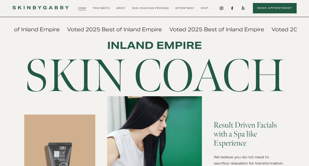
We liked the relaxing colors that were used within this example. Including images that use the same accent color that they use for their text was a great choice. We thought their font choice was brilliant for this company which helped it stand out more. Showcasing a few before and after images to show that this treatment really works was was also smart.
2. Loro Eats
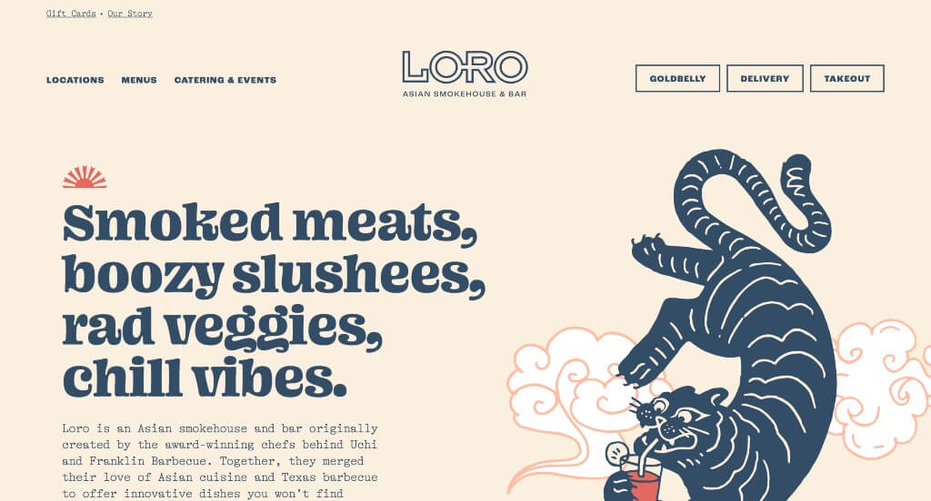
This company’s best feature is their graphics for sure. We liked how all of their paragraphs were written in short form so customers weren’t overwhelmed with content. Their blend of pastels and muted tones was something that we absolutely loved. Including some animations was another thing that really helps Loro Eats stand out from their competitors.
3. Anée Atelier
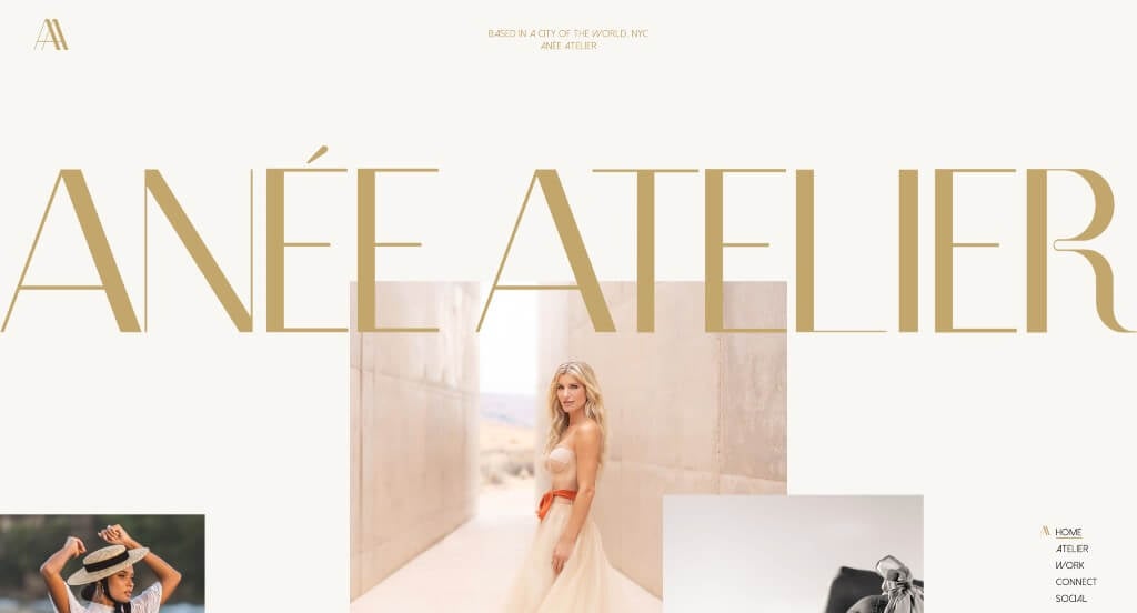
Anée Atelier does an amazing job displaying their products right away. These colors were outstanding because of the gold accents that makes them feel more luxurious. Their blend of bold, sophisticated, and decorative fonts also improved their visual appeal. We also really liked how their images are scattered to create a unique layout while still balancing their white space carefully.
4. Chez Felix Gourmet
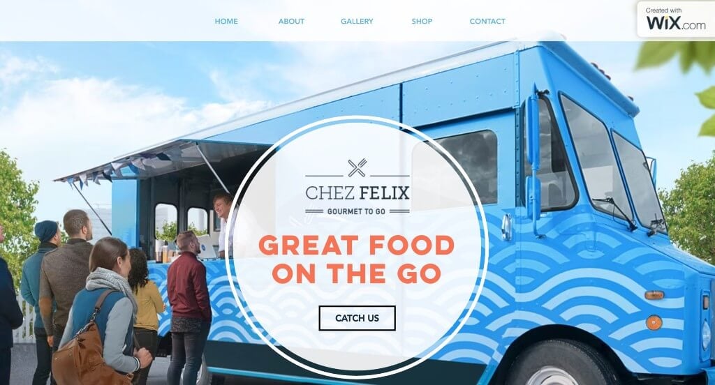
This example does an amazing job with their accent colors and graphics that create a feeling of happiness. Their titles used large, bold fonts that are sure to grab attention. High quality images of the truck, cheerful customers, and food were all great additions to this webpage. This domain also matched with their brand name which is always a smart idea.
5. World Financial Group
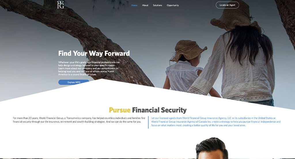
Lots of buttons are used to enhance usability which was very impactful. Another design quality we liked was their showcase of companies they represent. This logo also caught our eyes because of its uniqueness. A button to locate an agent was also very helpful. A navigation bar that was very organized with drop downs was extremely helpful.
6. Christianos Pizza
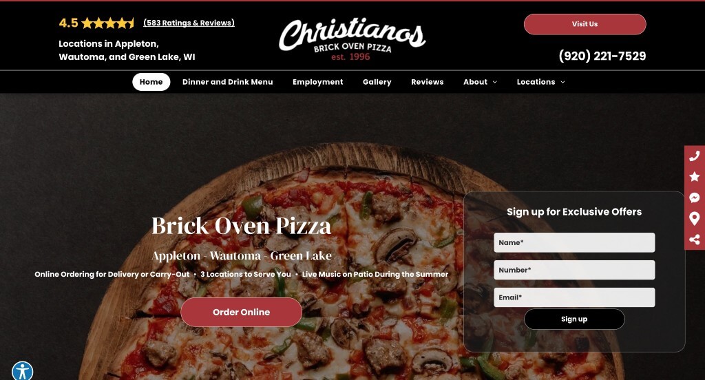
So many high quality images are included here to get customers excited about tasty food. We also loved how there was a variety of icons relating to their business. Adding in a photo gallery was also helpful for people to stay connected with this business. Their domain is simple and matches with their business name which is totally smart. A drop down showcasing all their locations was very helpful.
7. Moving Waldo
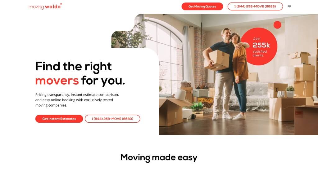
Orange accents help to liven up this example and highlight what’s important. Using bullet points to help logically organize some of their information was also a good choice. Interesting photo frames and layered images can be noticed on multiple pages of Moving Waldo. A frequently asked questions section was another feature that we absolutely loved.
8. Milk Jar Candle Co.
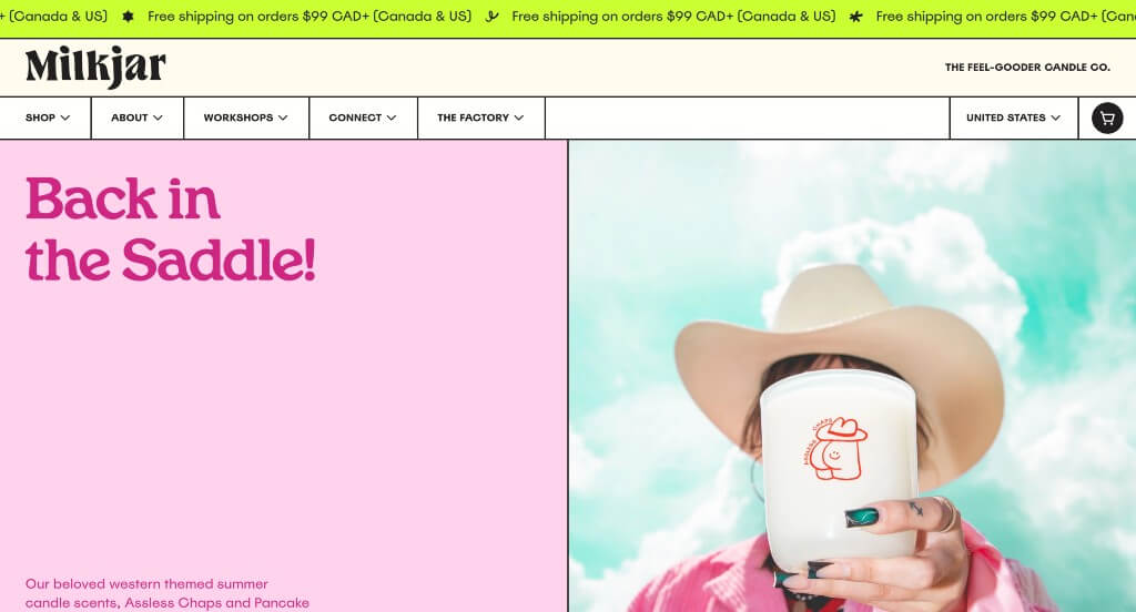
Having original images that really harness how they wish their brand to be perceived was an amazing feature within this company. Their fun icons noticed on their packaging was something else that is playful, making them stand out. Bright colors were also used very effectively to create an engaging look. They had marketing in mind when designing a scent seer feature, allowing viewers to pick different general scents they enjoy to give them recommendations.
9. Our Place
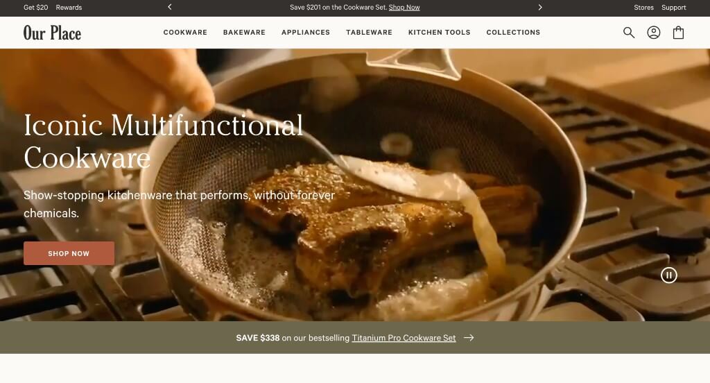
Having little new tags showing products recently released. Additionally, showing ways that customers can save money was also a very helpful aspect. Allowing for a variety of color options was something else that we felt was refreshing. Their large customer review section was also very useful. A search bar was another feature that we really liked.
10. Stone Arch Brewpub
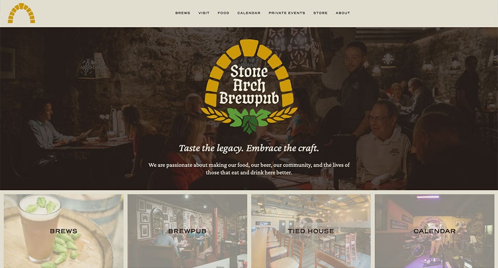
Graphics and images were likely the best features within Stone Arch Brewpub. We really liked how they included lots of event opportunities for all kinds of people. This unique logo really helped them stand out from other small pubs. A relaxing color palette was used that made sense for their brand. Their footer was very well organized and included lots of information.
11. Solo Salon
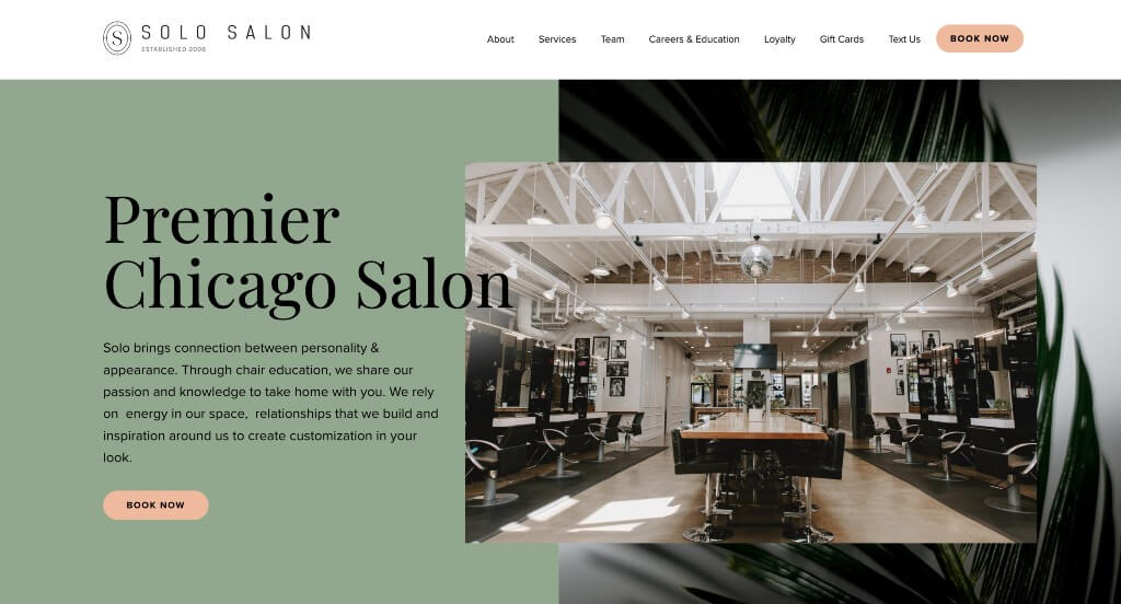
Upon entering this example, our team noticed how they layered images within their template. We loved the aesthetic that they chose for their brand that is delicate yet professional. Including images of their buildings that appear in watercolor was a nice touch. Their simple line drawings that add to the overall look of their pages was something else that we liked.
12. Moment Skis
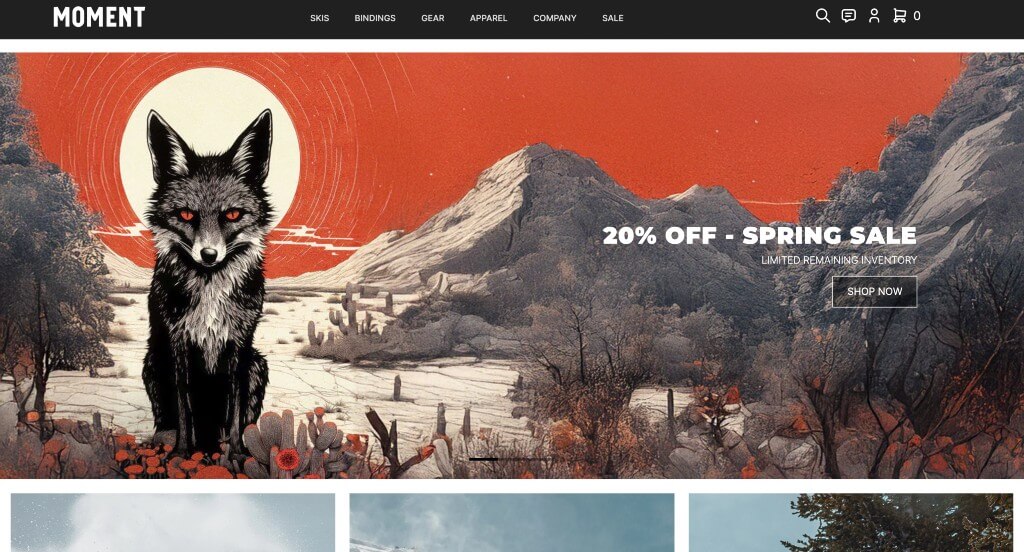
Images are beautiful in this example – some vibrant, some black and white. We loved how many images changed upon hover to show their love for skiing. A page dedicated to sale items was another thing that we enjoyed. Allowing for lots of different colors and products helps them, but also helps their customers.
13. Vortic Watches
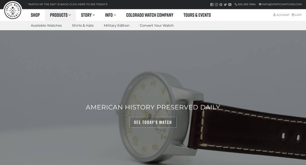
High quality visuals appeared everywhere within this example. We loved how as you scroll, a large watch image seamlessly transforms into different watch styles. Lots of customer reviews can be found to get new people excited about these products. Their ability to transform a pocket watch into a wrist watch was something that will help this company stand out.
14. Sawmill Brewery
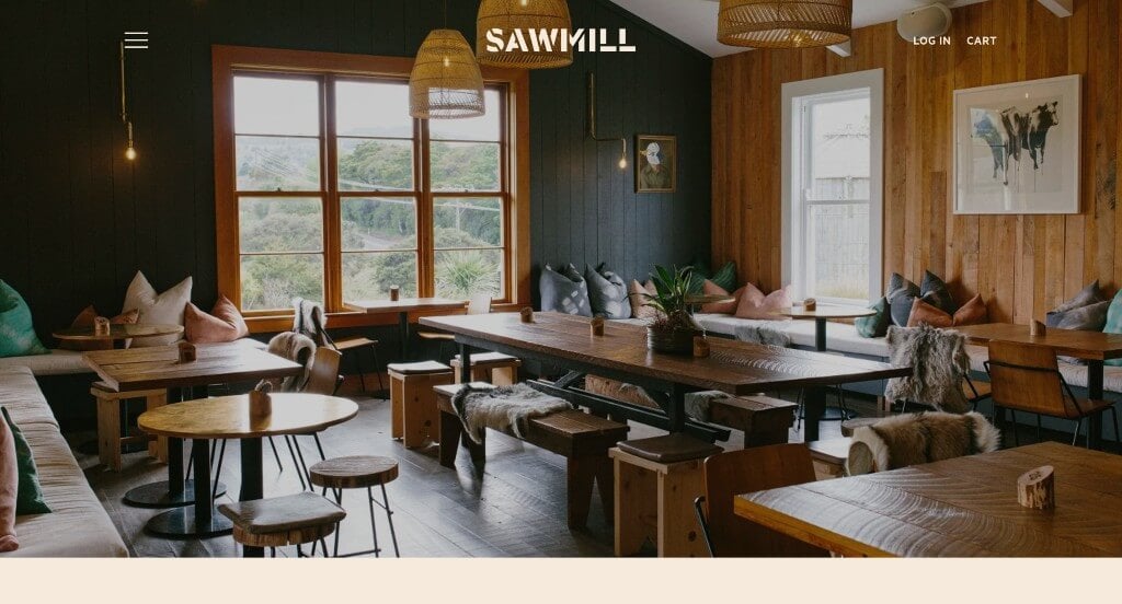
We loved how this example used a fun font for their logo that appears throughout the whole webpage. Showing images of their products and their location helps people understand if this is a place they would like. Information was provided in short paragraphs, making it easy for viewers to read and stay engaged with.
15. Shwood Eyewear
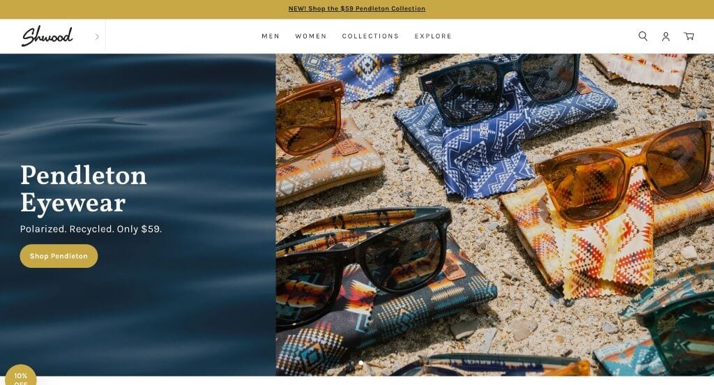
Shwood Eyewear does a great job showing off their current collaboration products. An easily noticed feature of Shwood Eyewear we liked was how imagery tends to break up content. Upon clicking on a product, information about that product can be found. We loved how within that information they included bullet points to keep things simple and organized.
16. LivSo
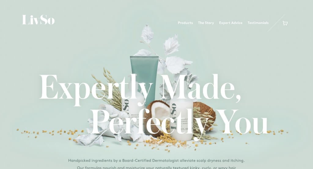
This example did a great job including their product packaging within their pages to create a brand identity. Using a color palette that was stunning in their pages but also in their packaging and images. We liked the subtle wavy graphics that appear in their backgrounds to create a more unique look. LivSo also picked a simple domain that matches with their business name.
17. Rye Restaurant
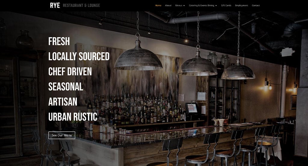
High quality visuals is definitely Rye Restaurant’s best feature. Additionally, they showcase what certain areas of their restaurant looks like, which gets people excited to visit. Their bold font was another part of their site that we really liked. Another design quality in this one that we enjoyed was their simple steps for reservations. They clearly had digital marketing in mind when allowing customers to view their entire menu online.
18. Casa Mami
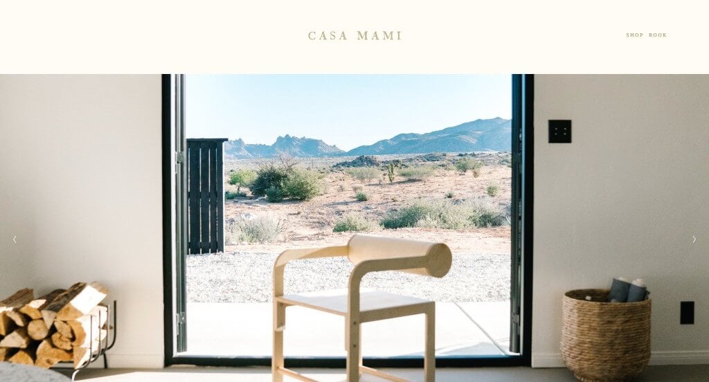
Elegance shines through every area of their website which is something that we appreciated. We loved their large images that grab attention right away. All of their images, no matter the size, are high quality and visually appealing. Small graphics and buttons were great additions for this example. Including links to their social media pages within their footer was helpful.
19. Rhone
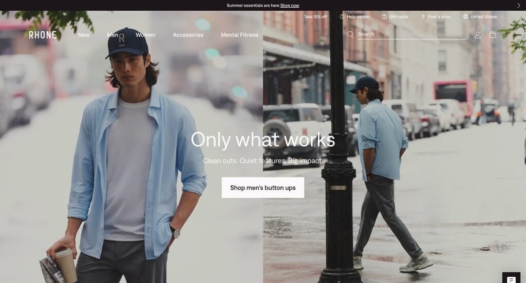
This example with minimal colors was very professional and allowed for images of their products to guide viewers’ eyes. A template that was simple and easy to follow was a very impactful quality. Including posts from Instagram was something that we also felt was very helpful. Navigation bars within this site are very organized and include lots of information. We loved their slight accents of green to bring attention towards small bits of information.
20. Sophie Ratner
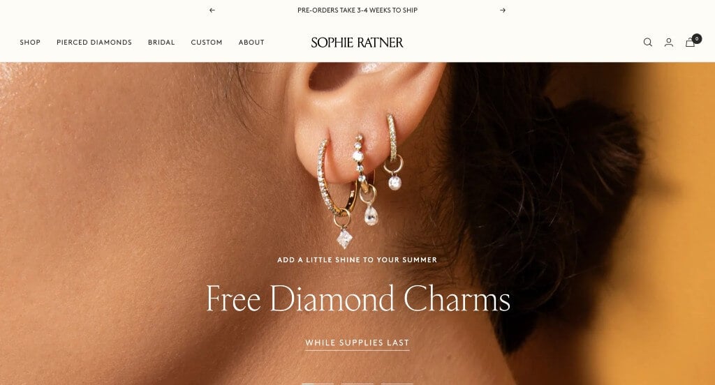
This example had an interesting template that shows off their products carefully. We liked how they show products on a white background, but then upon hover those products are modeled on real people. Allowing customers to shop by collections was a great addition to make products easier to find. An option for custom designs was a feature that helps them stand out.
21. Studio Neat
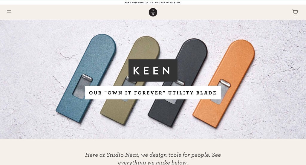
This is an overall minimalistic company selling writing tools and other office gadgets. Their color that explodes upon hover was a great addition. Their logo is also very simplistic, which makes sense for their site and products. Being able to sign up for their newsletter was another feature we liked. Subtle accents of blue looked great in this example.
22. The People Vs Coffee
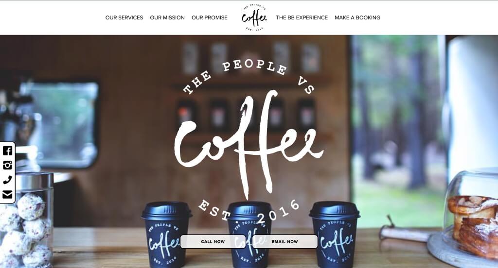
This logo design was something that grabbed our attention right away because it feels homemade. Short paragraphs were used within their design making content more engaging and their layout less overwhelming. This navigation bar was well labeled which made information much easier to find which is always helpful.
23. Coastal Yacht Management
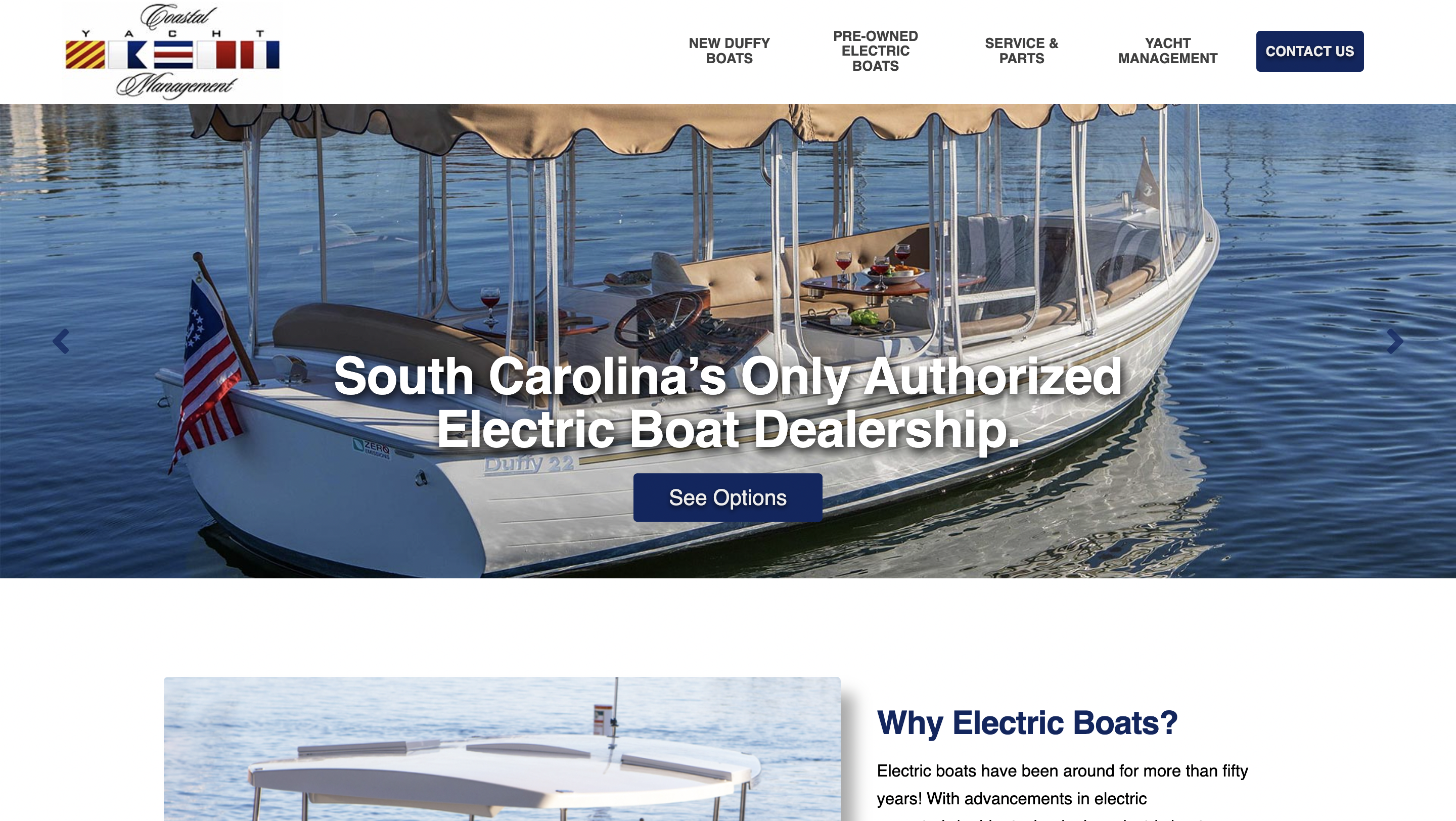
This one effectively conveys a sense of cleanliness and luxury. Generous white space is provided while still being well-balanced, ensuring the layout doesn’t feel cluttered. This logo gives an impression of exclusivity, resembling that of a prestigious club. Using blue complements imagery within, reinforcing their water theme and yacht management.
24. Tailwaggers Doggy Daycare
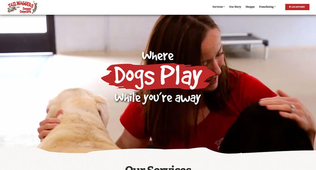
We loved how many interesting fonts were used here, making it look more personal. Lots of images of puppers are included, which makes sense for them. We loved their red accents that appear to highlight information and buttons. Their logo evoked a sense of energy, which is something that people resemble with puppies.
25. Izzy Wheels
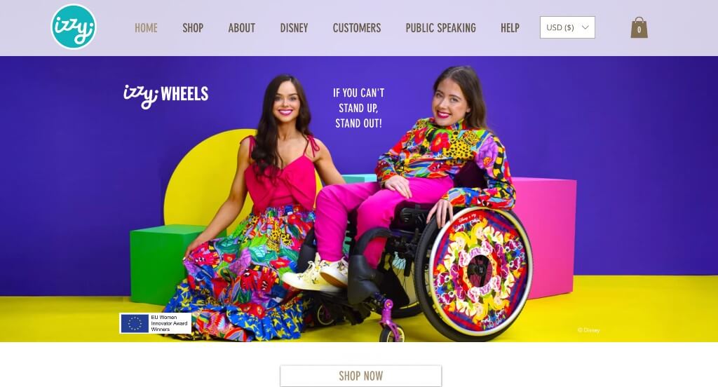
We really love this example, mainly because of their bright colors. Allowing for product collections with big brands like Disney is something that is great for a small business like this one. We also really loved how touching their business story is – and they include it. A page dedicated to their public speaking (along with a request form) was also a very nice choice.
26. Fresh Air Technologies
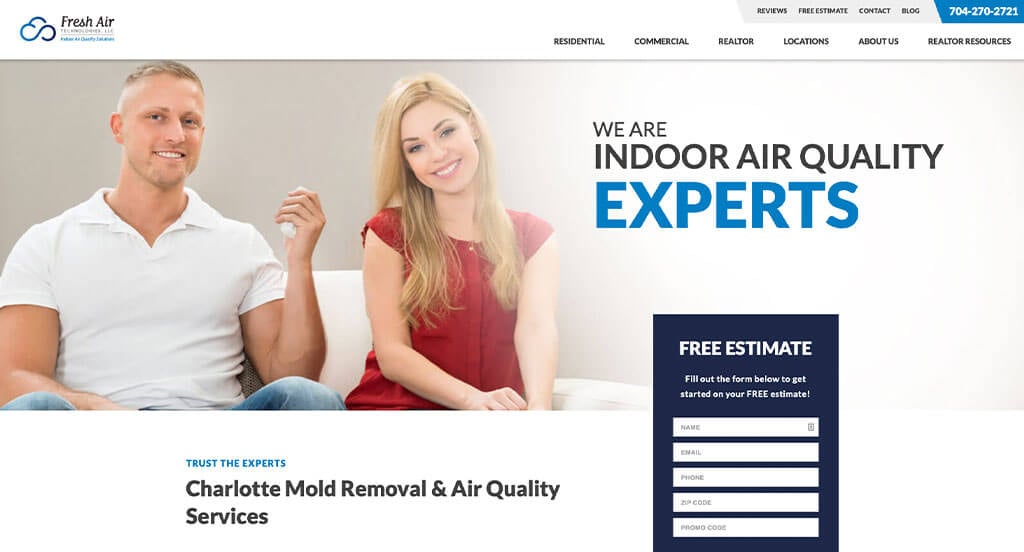
We liked how different sized fonts are used to help certain parts of their design stand out more. Their use of different shades of blue was another thing that we really liked. Our web designers thought this was a good example because of their effective use of white space. Another thoughtful quality that we typically enjoy is a customer review section.
27. Tattly
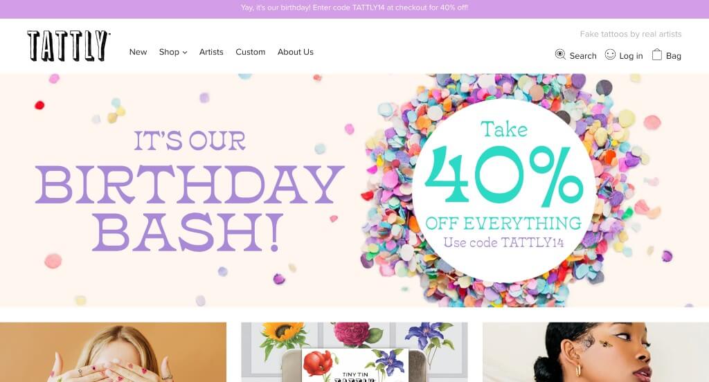
For tattoo lovers of any age, you will instantly be engaged in this example. They use an artsy font for their logo, and include lots of colors. Showcasing many of their products on smiling people of all ages was a great choice. Being able to shop by categories like florals, real tattoo artists, kids, bestsellers and more was something we really liked. Being able to shop by tattoo color was another feature that stood out to us.
28. Pop Chart
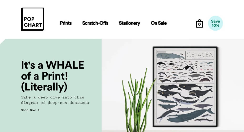
We loved fonts that are used within this custom site. A unique selection of posters that are neatly organized into sections makes it exciting for people to search for a product. Incorporating social media is always a great choice for companies like this one. Their domain was also simple, making it seem more relevant with their business.
29. Discovery Land Global
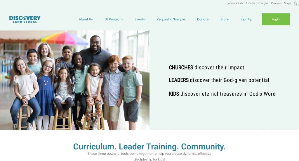
This overall design is amazing – there is lots of color and everything is well balanced. As you scroll through, you might notice their use of large buttons to draw attention towards additional information. Having a well organized navigation bar is always extremely helpful to include. Paragraphs were short and straightforward, which was overall great.
30. Rise Athlete
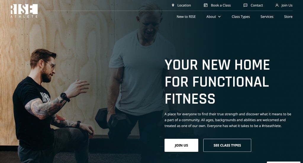
We loved this company’s use of an interesting font that is professional and readable. Lots of images were included which was stunning and improved their template. It was interesting how their images used a fading technique to occasionally get rid of hard edges. We loved that their logo used negative space in order to create the words.
31. Barrel & Baskit
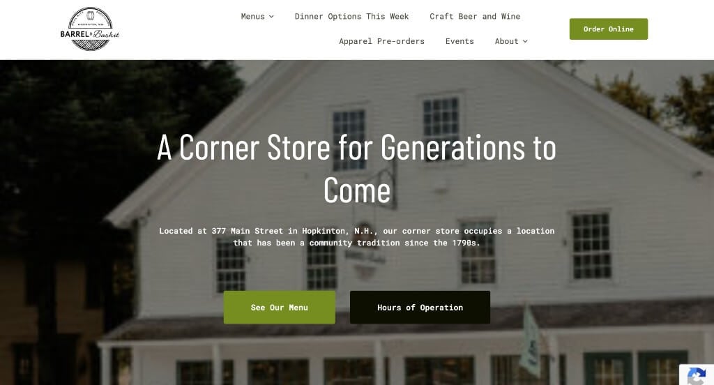
Here we have an example that truly showcases how local this business is. Using checkboxes to show what to expect from their services was something we really enjoyed. We felt that their yellow accents allowed for a vibrant and happy design. Occasionally, small graphics were used to add another sense of visuals to their page. They also did a great job balancing their white space throughout this template.
32. Zee Dog
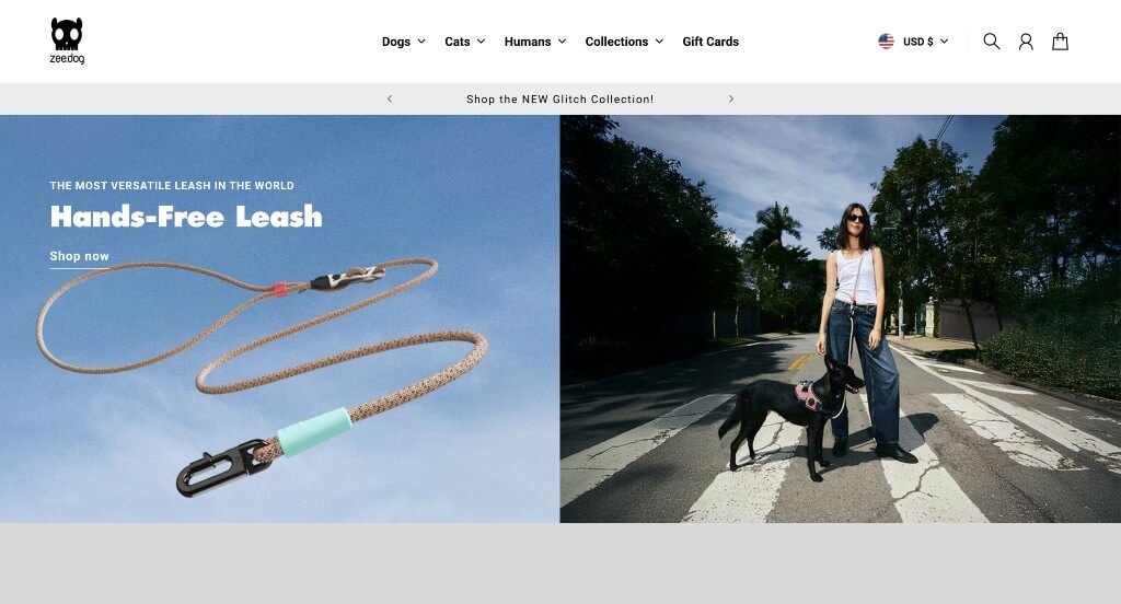
We liked how this business finds a way to allow a variety of products in many colors and patterns. Having collections that come out regularly was another thing that we enjoyed. Zee Dog did such a good job expanding on their products but also coming into other pet markets like cats. Having a small banner to show their current sales on their products of shipping was something else they did well with.
33. Kustom Thrills
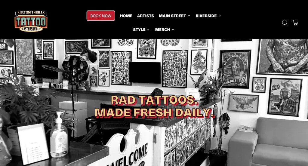
Kustom Thrills has an unforgettable design. Their font and layout is very cohesive but extremely artistic, which is what makes sense for such an expressive business. Additionally, individual images and portfolios for each team member was refreshing and helpful for those wishing to book an appointment. Selling merch alongside their main service was also a good choice.
34. Hair By Taylor Ross
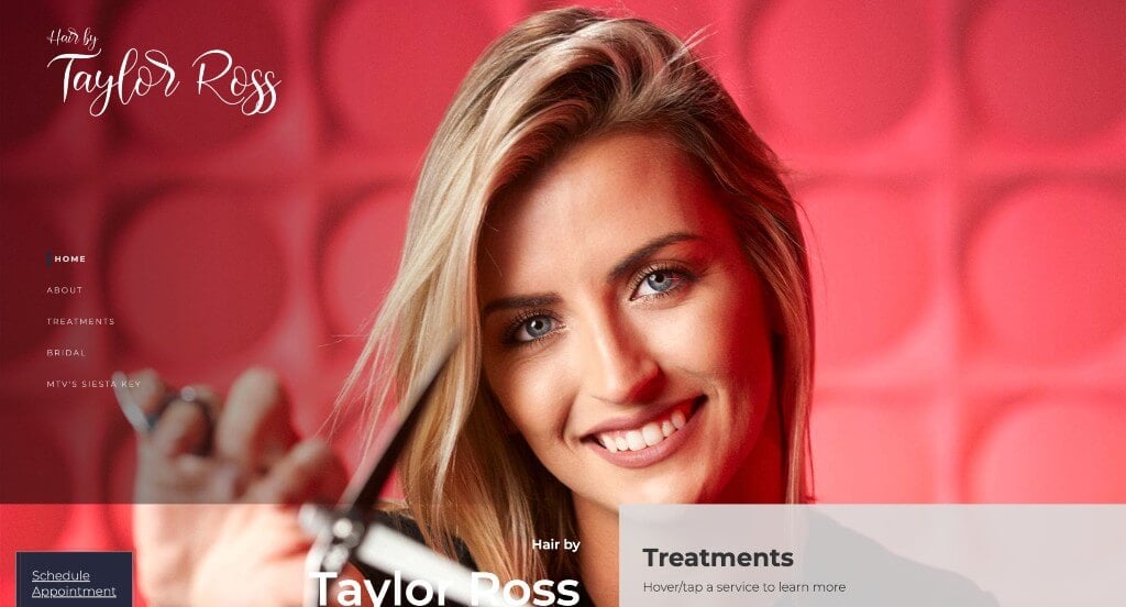
This company has an outstanding animation that introduces their website. We loved their bright color scheme that was joyful and optimistic. Showing lots of images of finished hairstyles and the hairstylist at work was another smart choice. Their navigation was easy to use and prices were clearly labeled so customers were never tricked with high prices.
35. Terlingua Real Estate
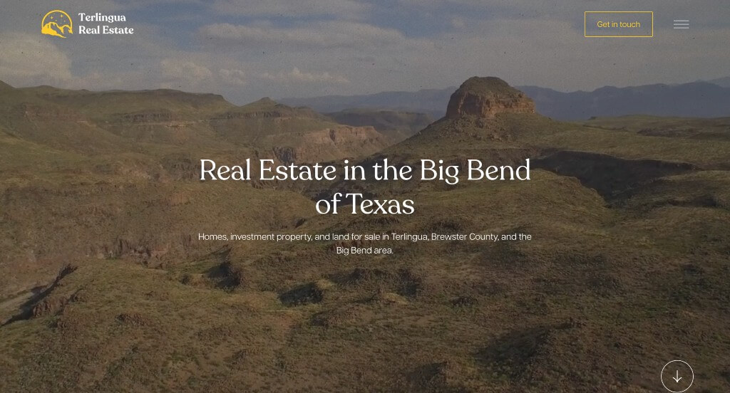
An automatically playing video is used right away in order to grab attention. This company also does a great job with their font choice and simple graphics. Thin black lines can also be noticed to help separate content which looks amazing. Having an area for their recent listings was a great way to get people looking.
36. Ginger & Baker
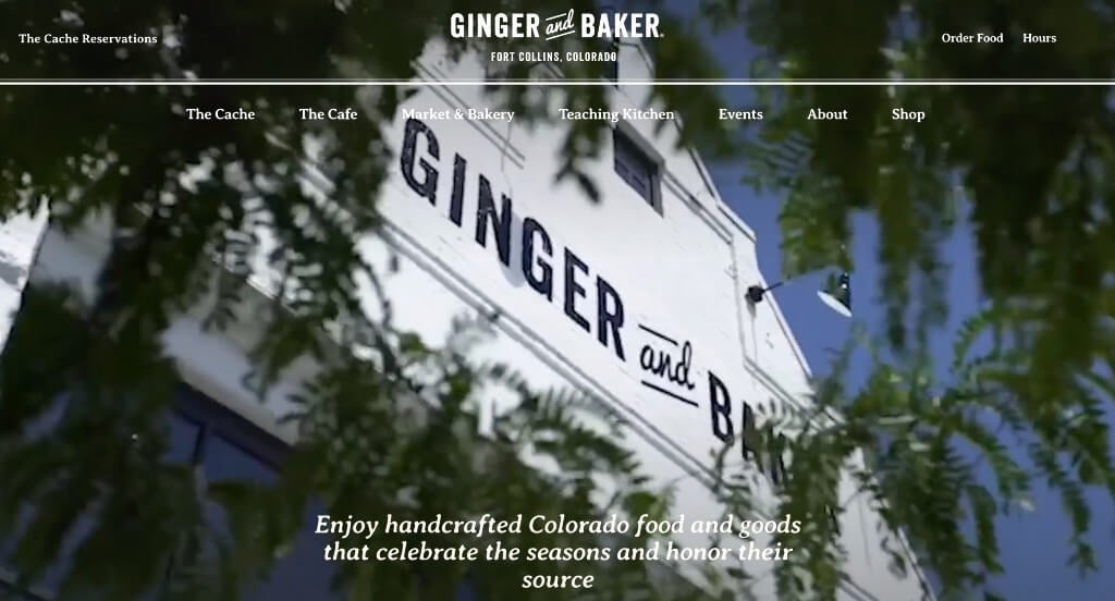
If you are looking to use lots of images and videos, here’s an example for you. These images are high quality, and speak a thousand words. Their font was creative, but still classy. Including a variety of classes and events within their website on a calendar was another great idea. We also enjoyed how they creating a company blog.
37. Silk & Willow
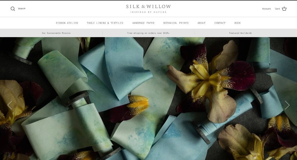
Silk & Willow takes an interesting approach on wedding services. Instead of the typical white and bright accent colors, it uses lots of muted colors and grays – helping them stand out. Their images were stunning with their rich dark backgrounds. Their font was a cool addition looking like a typewriter almost. Including lots of buttons to help keep a good flow without being annoyed by buttons was something else they did well with.
38. The Wild Pine
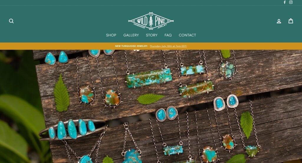
This example knew how to create a design that looks unique and really shows off their products. Their interesting color palette was another thing that we noticed because it truly displayed a feel that matched their products. Having customer service reviews but labeling it “kind words” was an interesting touch. The Wild Pine’s logo truly showed their focus on handcrafting their products.
39. Storehouse Tea
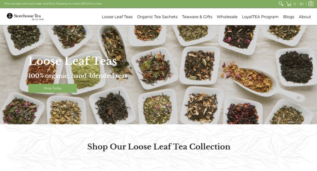
There was lots of images that really show off what this business is all about. We felt that their addition of graphics looking like plants was another great choice. Their accent of green was another feature that we e enjoyed quite a bit. A captivating font was also used to allow for a more professional design overall. Including reviews and an AI generated summary of all their reviews was a neat touch.
40. 2510 Restaurant
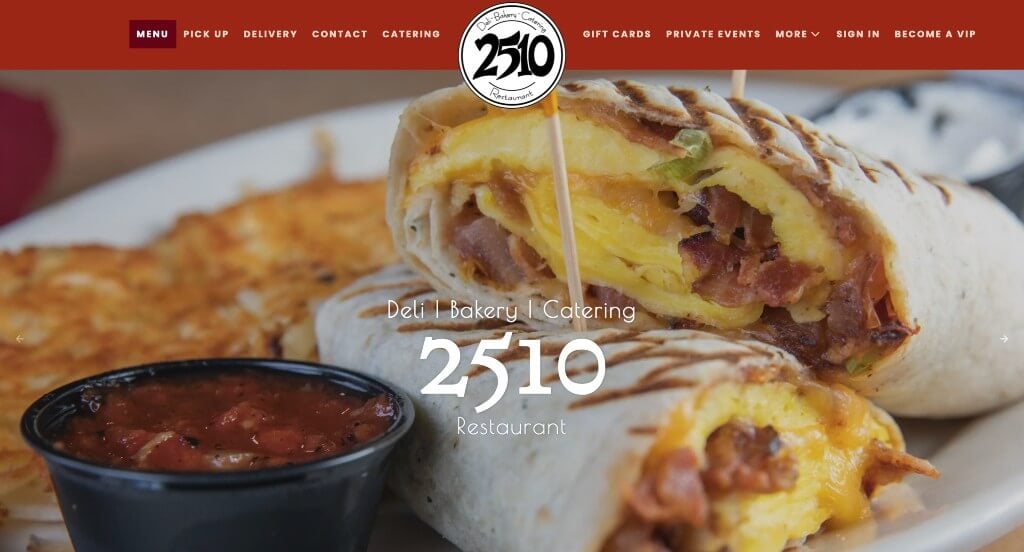
We really enjoyed how this example does a nice job displaying their fan favorite foods with an image slider. Throughout the entire site, their best feature is their mouthwatering imagery. Their red accents can be noticed throughout this design which we really appreciated. Showing that they also cater food was another great addition. Reviews are also included, which was smart.
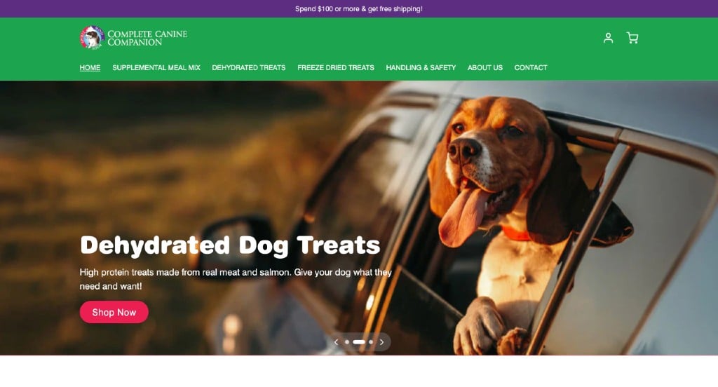
41. Complete Canine Companion
This company’s color palette really helps elevate this example to a whole other level. Many pictures of happy dogs and their products are included to gain trust with customers. A variety of different text sizes are included to separate titles, subtitles and body text so readers can skim through. Brightly colored buttons can also be noticed.
42. South Coast Canteen
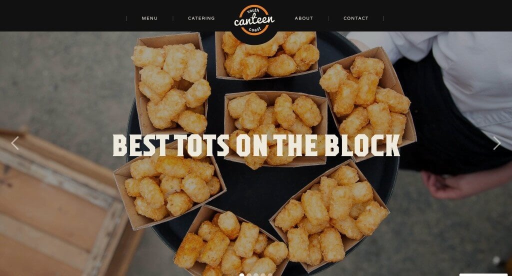
This company’s color scheme was something that anyone could appreciate. Along with that, we liked that they designed their menu to appear as a letter board to allow for a more small town feel. They made sure to show that they have many upcoming events that customers can enjoy along with their products.
43. Log Jam Bar and Eatery
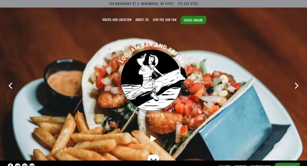
Log Jam Bar and Eatery does an amazing job with their delicious imagery. Along with that, they have lots of stunning fonts that are sure to create stunning visuals. We thought it was nice how their backgrounds were either images, black, or textures. Their navigation bar was well labeled so anything customers are wishing to know can be found quickly.
44. Piboco
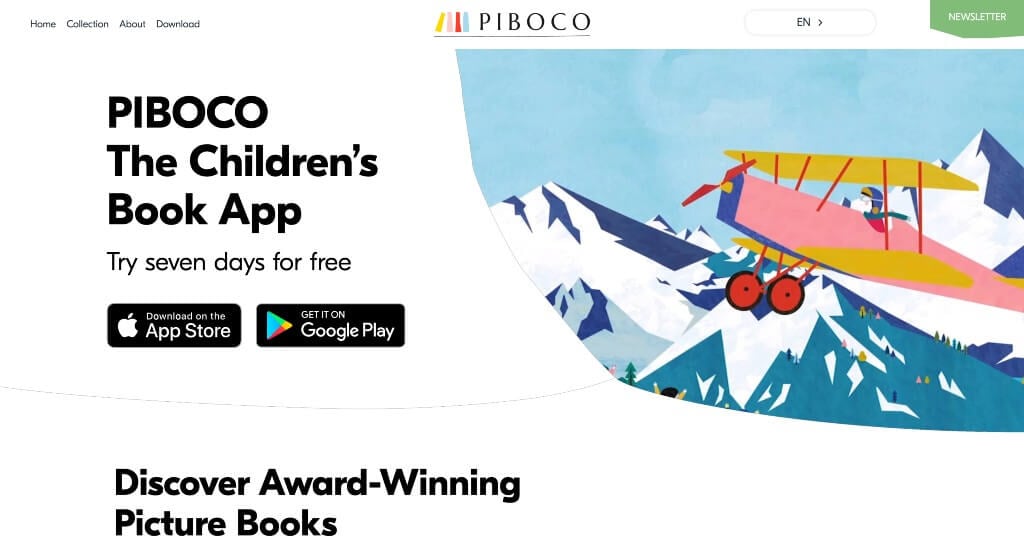
This example is sure to grab your attention because of their interesting image frames. Along with that, many of their graphics and images were childish and brightly colored, which makes for more exciting pages. Their logo design is simple but still aligns with their brand identity. Showing their three plans that includes their prices was a great choice.
45. KeyNest
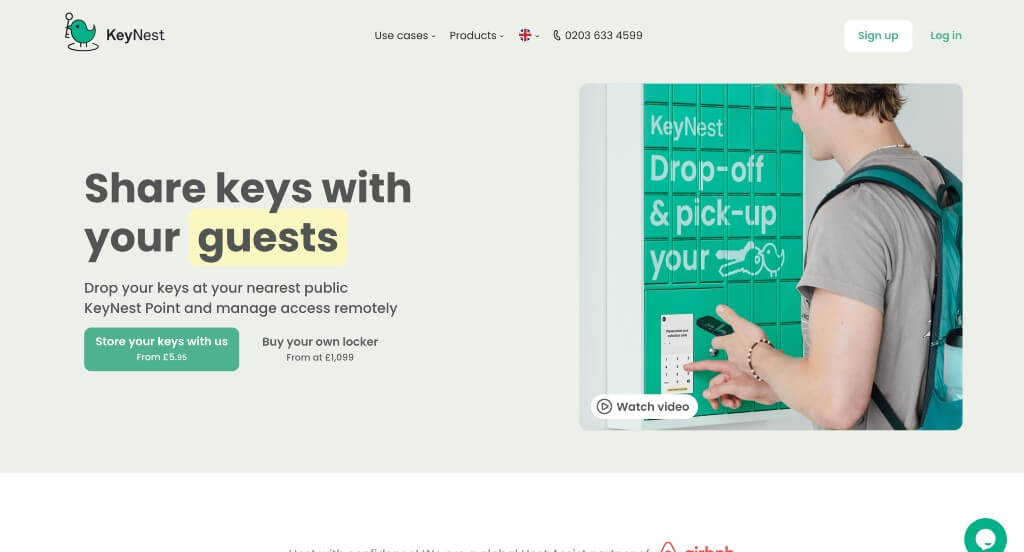
Our favorite part about this example was their color palette that was beautiful and relaxing. We liked their use of buttons that guide viewers towards additional information. Their logo was simple and cute which was smart. Their domain matched with their business name which made for a stronger brand. Showing other businesses that use their service was a great way to build trust.
46. Fat Cat Creamery
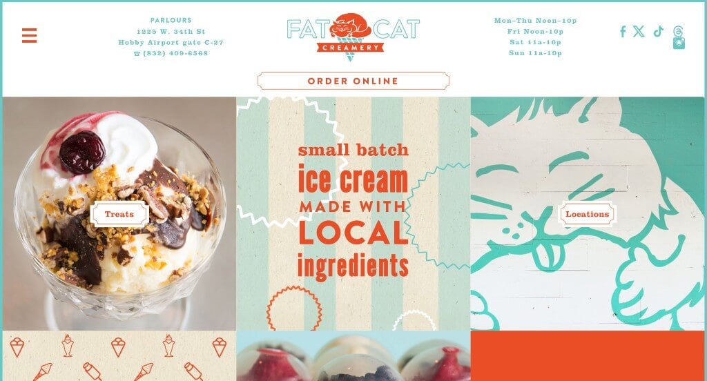
This was an adorable site because of their blend of graphics, unique text, and images. We loved their color scheme that was bold and unique. Their use of textures was another amazing addition for this ice cream company. Their buttons looked specific to their brand and it also provides viewers with more information, which is always a nice idea.
47. The Milk Merchant
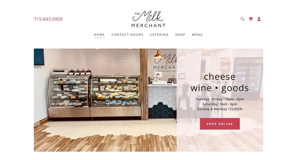
The Milk Merchant does well with showing off their store so customers will feel comfortable when entering their in person store. Accents of pink created a simple way to highlight information, links, and titles. It was nice how they showed off their products and included prices before clicking on the product. Allowing customers to sign up for an email list was another way to keep customers connected to their business.
48. Surftwins Essaouira
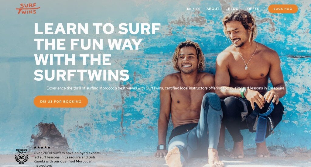
Surftwins Essaouira used high quality images which is a feature that is always appreciated. Along with that, they use fun patterned backgrounds for banners to break up information. Small icons are used to add visuals to their site without cramming it with images. Including information on why you should choose their company to surf or kitesurf was something that we really enjoyed.
49. Alyssa & Anna Fine Jewelry
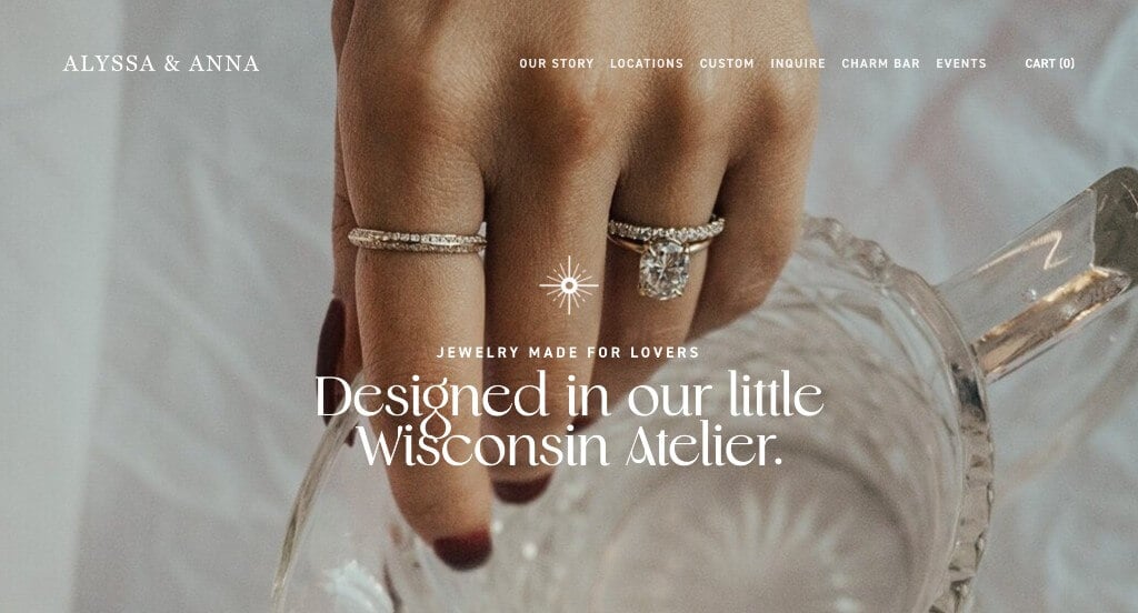
Fonts and graphics are this company’s specialty feature to grab attention. Along with that, we love that their imagery has an overall aesthetic that creates a sense of unity within their whole site. Including bullet points to organize written content was helpful for viewers to find information quicker. We also liked their brownish orange accent that is sure to highlight their titles.
50. Ted’s Pizza
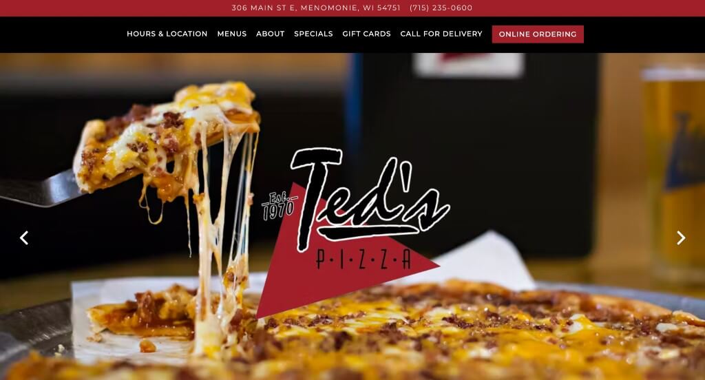
This slider used right away to provide lots of images that are sure to grab attention. They do a great job with their unique fonts that helped them appear as a homegrown business. We liked their wood panel backgrounds that appear throughout their pages. Red accents are used to highlight information which makes sense because of their brand colors.
WordPress Business Themes
You can find free themes at wordpress.org or explore business templates at ThemeForest.
Ohlala – Themeforest
$59
Don Peppe – Themeforest
$79

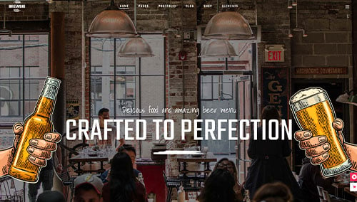
Brewski – Themeforest
$79
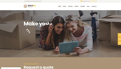
MoveMe – Themeforest
$69
WooCommerce Business Themes
You’ll find numerous ecommerce themes for WooCommerce on ThemeForest.
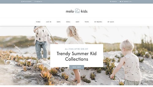
MeloKids – Themeforest
$59
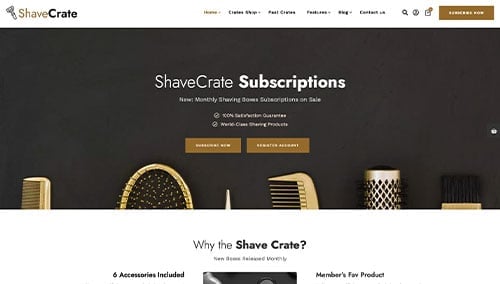
TheCrate – Themeforest
$59
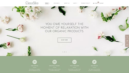
CleanSkin – Themeforest
$69
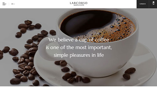
Larcorso – Themeforest
$110
Shopify Business Themes
Discover free and paid themes at themes.shopify.com or explore options through marketplaces like ThemeForest.
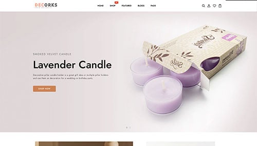
Decorks – Themeforest
$56
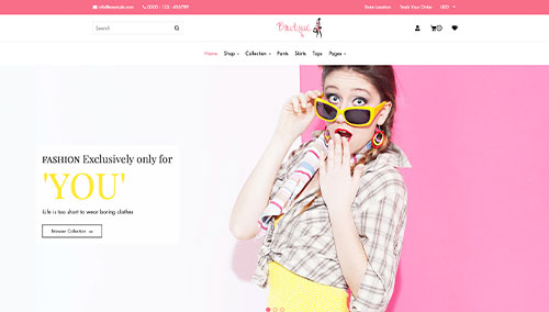
Boutique – Themeforest
$99
Pookal – Themeforest
$69
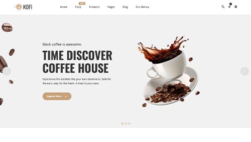
Kofi – Themeforest
$39