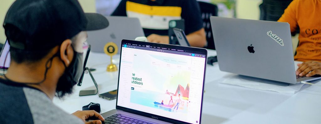
Hey UX enthusiasts! Ready to elevate your overall user experience? Check out our examples, handpicked for their design, functionality, and seamless navigation.
Get inspired and discover tips to craft an unforgettable online experience that keeps visitors coming back. For more design ideas, head over to our incredible web design examples!
Top UX Website Designs
- 1. Happy Sleep
- 2. Parallel
- 3. Oak & Eden
- 4. QuickBooks
- 5. Reserve America
- 6. Ikon Pass
- 7. Mural
- 8. Ikea
- 9. Scheels
- 10. Target
- 11. Marco
- 12. Meijer
- 13. Ralph Lauren
- 14. Apple
- 15. Pocus
- 16. Busch
- 17. Marcus Medical
- 18. BruMate
- 19. Credit Karma
- 20. Altoids
- 21. Idle
- 22. Starbucks
- 23. Pick ‘n Save
- 24. Shopify
- 25. Rover
- 26. Simplehuman
- 27. Yelp
- 28. Symbol Audio
- 29. The Wood Veneer Hub
- 30. Cuckoo
- 31. Mint Mobile
- 32. Duolingo
- 33. Sdx
- 34. Trippin
- 35. The Adventure Group
- 36. Nash
- 37. Fallen Grape
- 38. Tim Hortons
- 39. The Year of Greta
- 40. Spotify
- 41. Creative Navy
- 42. Vergo
- 43. Cinch PR
- 44. Storylane
- 45. Heva Health
- 46. Teachable
- 47. Jasper AI
- 48. Lattice
- 49. Airbnb
- 50. Immersity AI
- What is User Experience?
- UX Incorporates Elements Of:
- 1.) Conduct Usability Tests & Provide Feedback
- 2.) Create Design and Layout Wireframes
- 3.) Improve Navigation & Page Flow
1. Happy Sleep
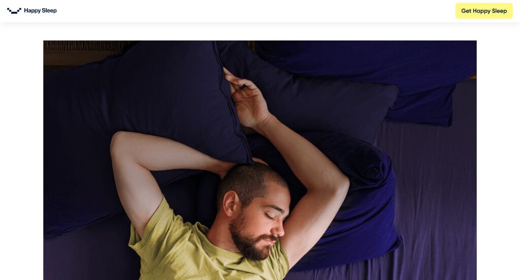
This was a very calming example, which makes sense because they focus on providing customers with true sleep. Something that we enjoyed was their smooth transitions to keep information flowing correctly. Another cool feature was their one minute sleep quiz that helps people predict if they have a sleeping conditioned. They also did a great job balancing their white space to create a stunning look.
2. Parallel
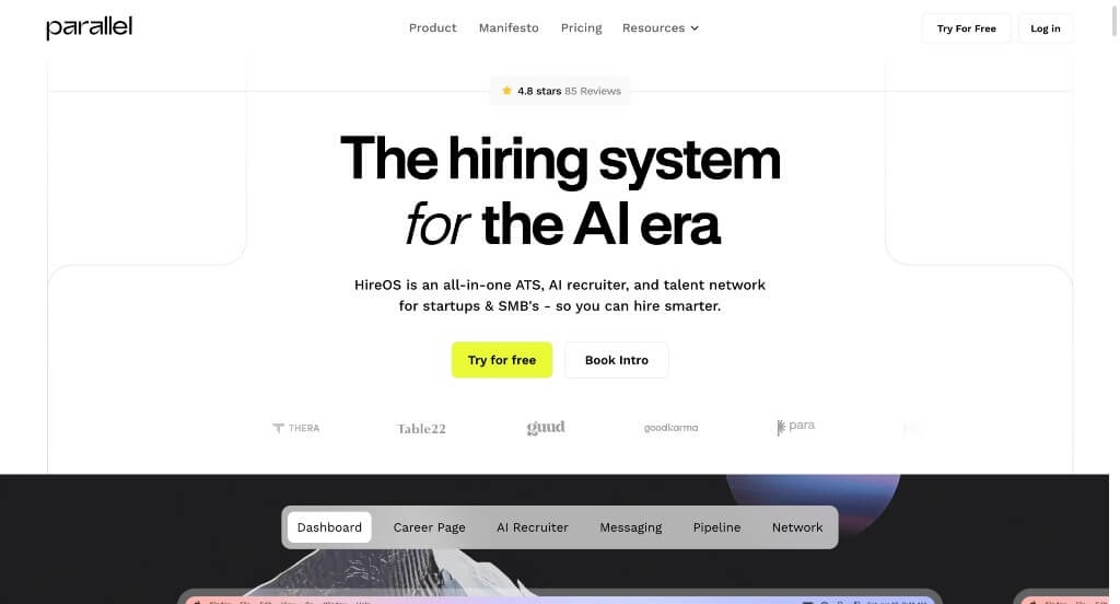
There was a great aesthetic that shines through due to their interesting layout that captures attention. Parallel did a great job with a simplistic font. Our team liked how they had small bursts of color to make everything feel more inviting. Using different sized text was a good choice to create beautiful visual hierarchy. They also added in lots of statistics, which was a great way to prove that they are trustworthy.
3. Oak & Eden
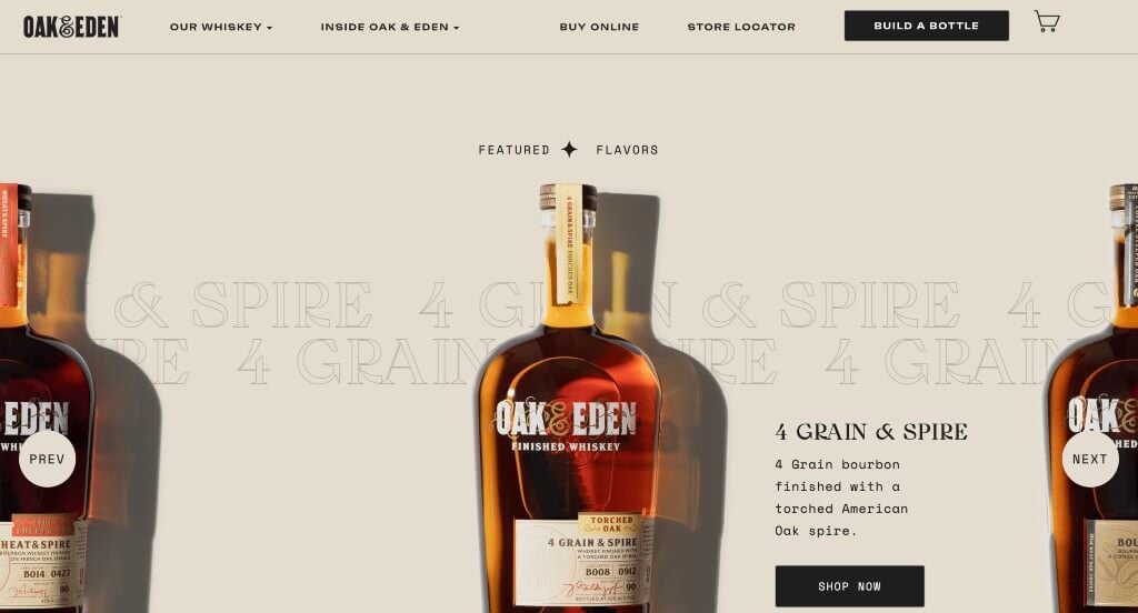
This was a stunning option due to their high quality images and graphics. Creative fonts are used and animated to keep people engaged with this information. Oak & Eden’s simple color palette was another thing that was enjoyable, but also made sense for their products. Short paragraphs was another thing that made all of this information very easy to comprehend.
4. QuickBooks
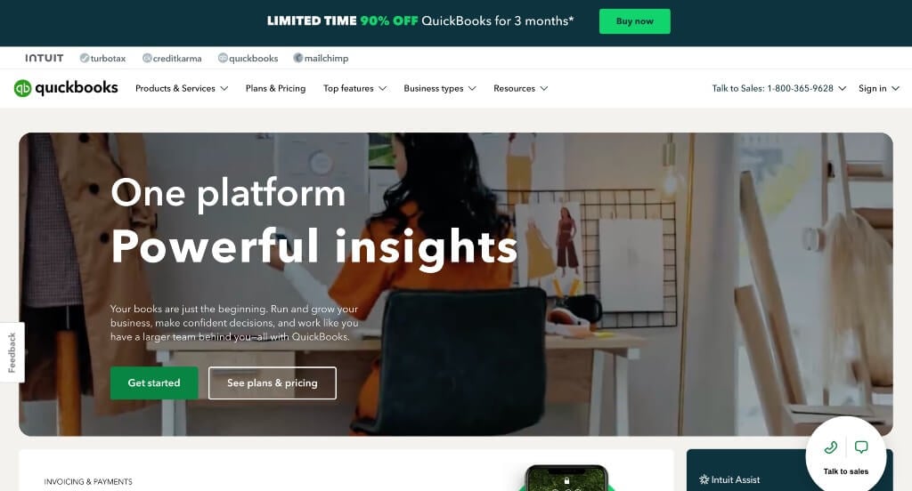
These green accents was a great choice for a reliable software service. It was helpful to have clearly labeled pricing for each plans that show you what’s included. Large buttons to enhance usability was another reason why we included QuickBooks here. They also did a great job with small icons to add a visual appeal to this example. Finally, we felt like there was lots of drop downs within their navigation bars which was really thoughtful.
5. Reserve America

This was a great example that used lots of creative graphics for their backgrounds. Reserve America also had a great logo that is memorable and rational for what they do. High quality images are also used in order to get clients excited about outdoor adventures. Adding in a search bar to find information about specific locations for your upcoming trip.
6. Ikon Pass
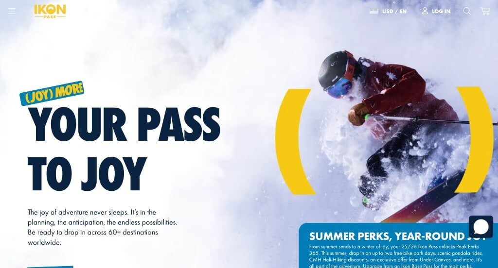
There was lots of large images to create a stunning look. This balance of blue, white and yellow looked great together. We thought it was cool how they used parenthesis to emphasize a variety of statements. Another feature within Ikon Pass we noticed was their subtle animations. There are also great graphics included in order to make a template that stands out.
7. Mural
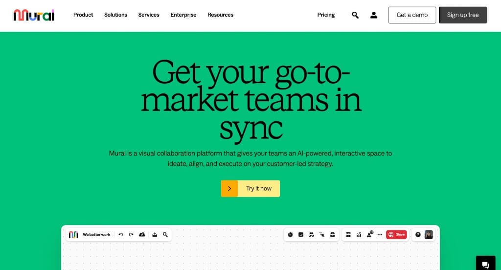
Here we have Mural, a fun and creative site that is bound to grab attention. We loved their logo along with their bright but small icons. Their font was also simplistic and powerful in order to keep that clean look. Having an organized flow of information was something else that most people will enjoy. There are also subtle accents of bright colors, which looks amazing.
8. Ikea
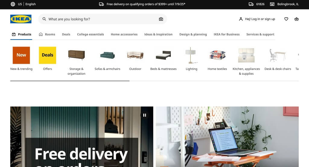
Short paragraphs are used in order to keep people reading through all this content. We thought it was nice to use bolded fonts for their titles because it helps them stand out. This logo is memorable which helps with brand identity in the future. Having little tabs for new content was another choice we loved. A search bar was included which was another aspect that worked well.
9. Scheels
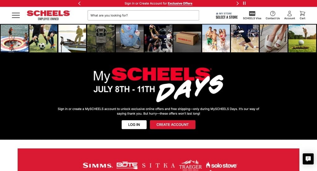
Right away, we noticed how Scheels features seasonal collections that always get people excited. They carefully accented their bright red colors, which we thought looked amazing. Using a logical structure for content was another feature they did well with. A simple checkout process was also used, which is thoughtful for their online shoppers. We also thought it was nice that they offered lots of discounts on select brands or items.
10. Target
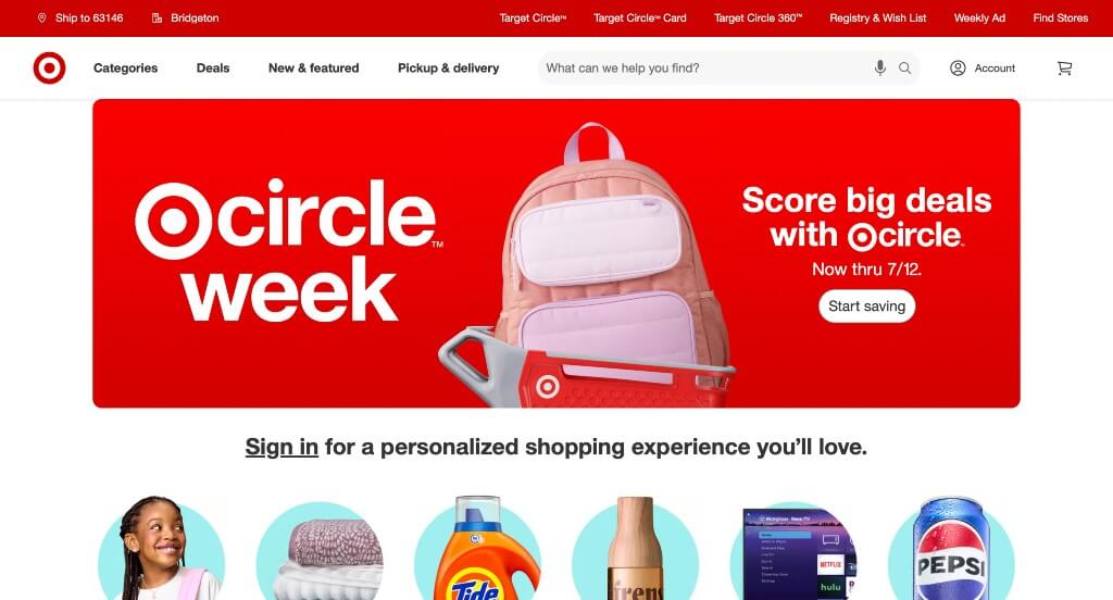
Target is a widely known brand, and they did a great job sticking to their identity and values while designing their site. Using stunning imagery along with displaying their collaboration products was something that stood out to us. Making sure to include their memorable logo design was something we loved. Target also picked their domain to match their company name, which is always a great choice.
11. Marco
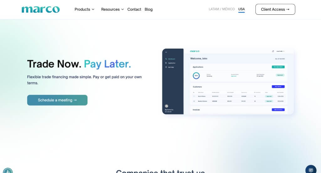
This was an overall simplistic feel, making Marco fun to scroll through. You might notice how screenshots are included to show off what people can expect. We also liked how there was small areas including statistics to gain trust with their business. Their use of different photo frames was another thing that we liked, because it made them look different from competitors.
12. Meijer
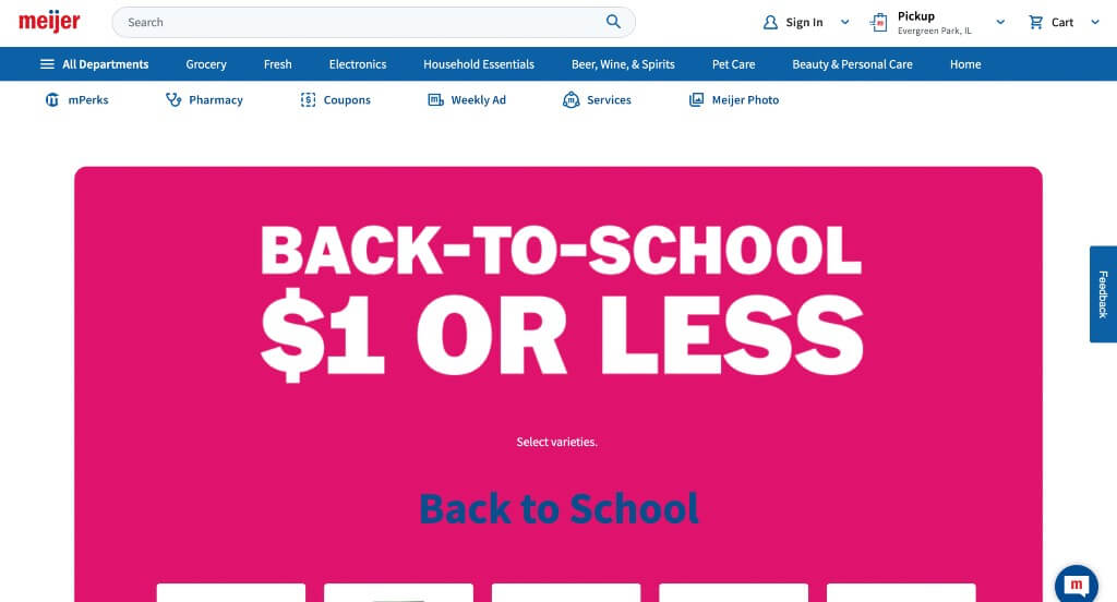
This one did a great job with their use of various colored blocks to keep everything organized. Including a search bar was something else that we really enjoyed. They did a great job balancing their white space, keeping everything well organized for those who enter. Being able to shop online by department was something that we really liked.
13. Ralph Lauren
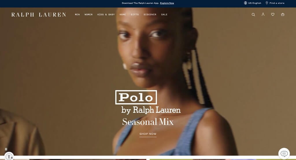
Ralph Lauren did a great job with their simple colors that lets their visuals be the main focus. We also felt that it was nice to have automatic videos included as backgrounds. Using a domain that matches this company’s name helped make them outstanding. This navigation bar was also very simplistic and easy to use.
14. Apple
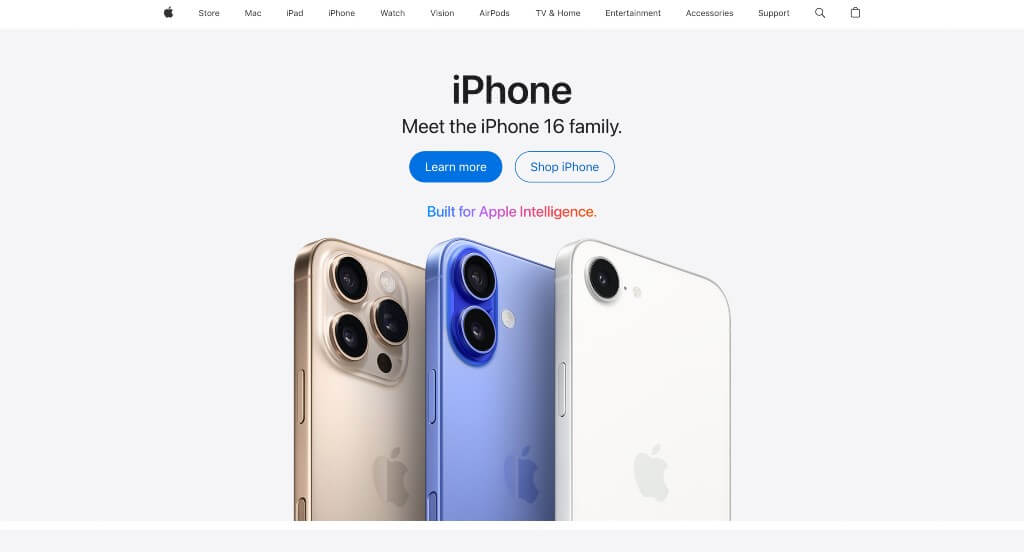
Simplicity leaks through every area of this example, which was perfect because of their products. Information and ads were also included from Apple TV, another great addition. Their images were high quality, but they also use alluring backgrounds. They clearly had conversions in mind when using a simple and professional font.
15. Pocus
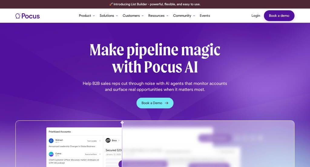
This company starts out with a bright purple background that is sure to grab attention. We really enjoyed their blurry slider that previews what clients will see when using this service. Showing well known companies that are compatible with Pocus was another great addition. Their fonts were professional and bold without being obnoxious.
16. Busch
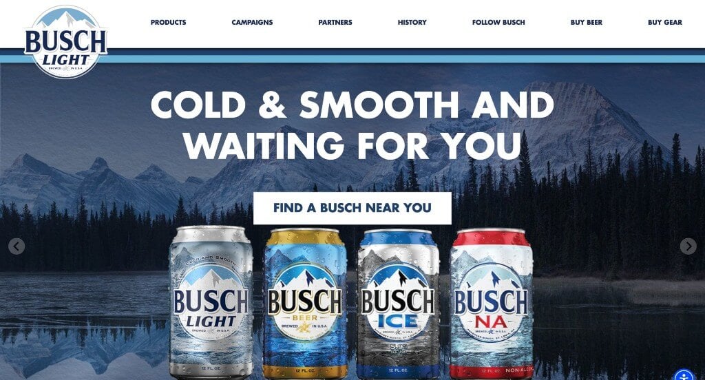
We really like how Busch does a great job with reusing their logo in a variety of different places. There was lots of buttons that make it fairly easy to navigate. Showing many of their packages was another thing that we liked. Short paragraphs are also utilized to make everything easy to read. We thought it was interesting to have a campaign page that shows some of their close ties.
17. Marcus Medical
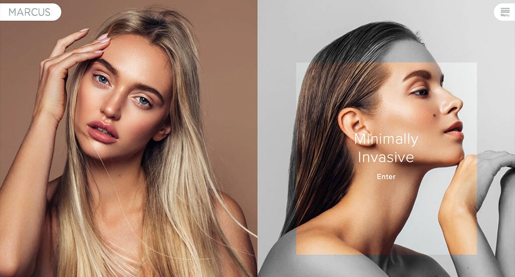
This was an amazing example for those who love attention grabbing images. Creating an interesting feature that turns parts of images black and white was a great choice. We liked these subtle accents of grayish-green. Having different shaped frames for images was another thing that we liked. Including lots of customer testimonials was also very helpful.
18. BruMate
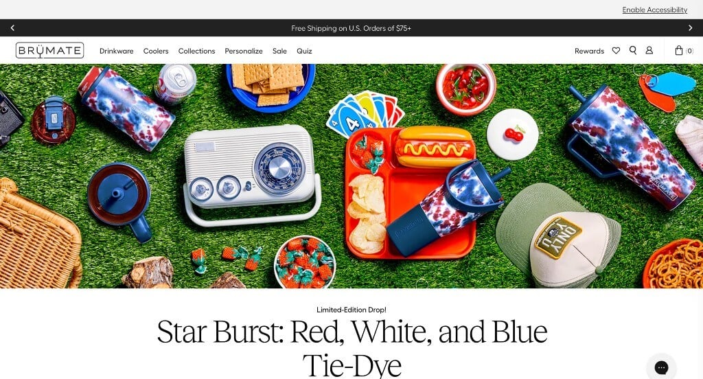
BruMate does a great job making use of lots of fun patterns on their products. Well planned images including happy customers was a quality we enjoyed. Allowing for customizable products was something else that we noticed. They had internet marketing in mind when incorporating social media within their pages.
19. Credit Karma
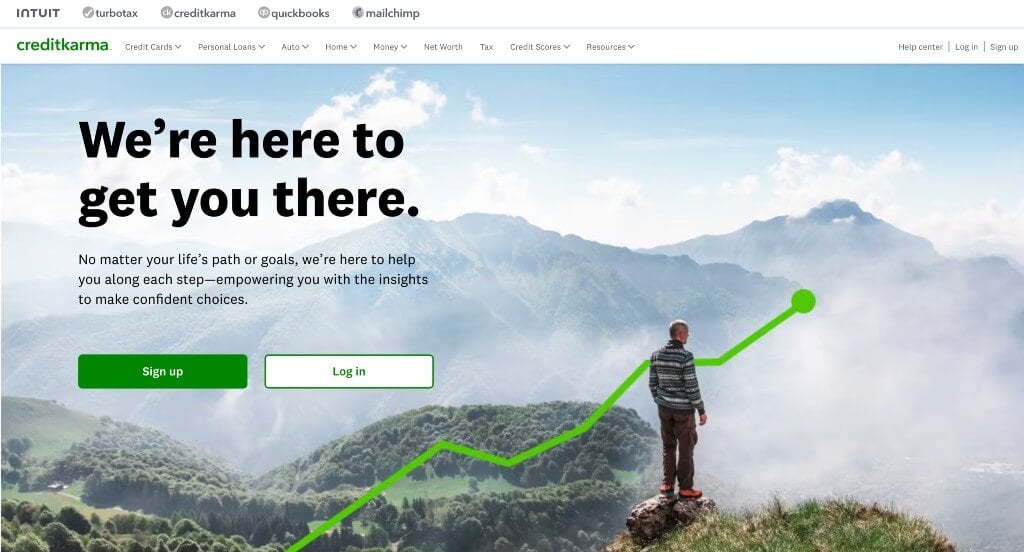
This perfected color scheme always grabs our attention. We also think that you’ll notice their simple graphics, something that we absolutely loved. Bold fonts are also used for titles to help certain things stand out more. Brightly colored buttons was another choice that we noticed. Their domain was also very logical for them, which is always a helpful choice.
20. Altoids
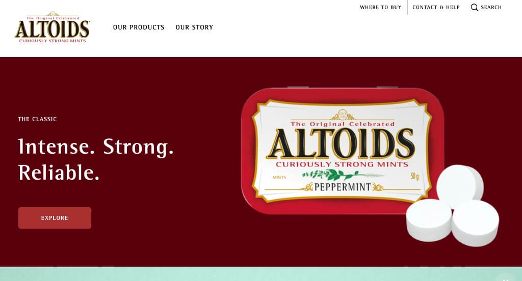
We really liked how they different flavors were displayed in this example. Showing off their packaging design is something that we enjoy, because it’s part of their branding. Utilizing a simplistic template was refreshing because it makes everything easier to access. A memorable logo is also used so that customers know what product is inside just by seeing their logo.
21. Idle
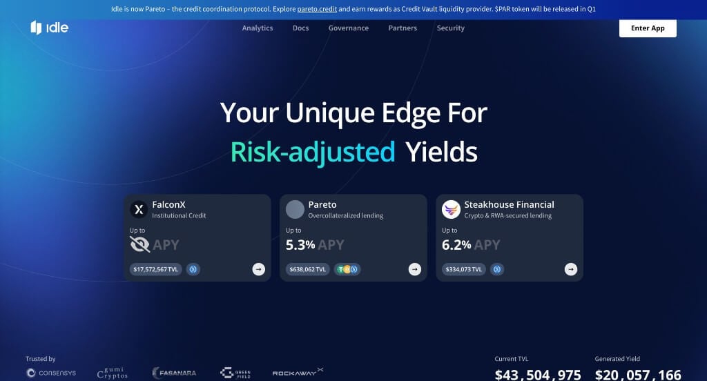
Lots of blue colors were used in order to create a calming template. We thought their use of animated graphics was a great choice to involve their viewers more. Small graphics are used as icons in order to get people interested in certain topics. Another great choice here was this font that was very professional and kept Idle looking great.
22. Starbucks
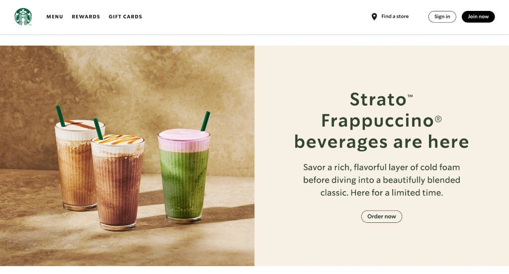
If you’re looking for something with a good sense of unity, check out this one. Rich green colors are used that match their logo design which looks great. We really love that they display new policies and changes that Starbucks is making to stay true to their values. These images were also high quality, and made for an overall cohesive look.
23. Pick ‘n Save
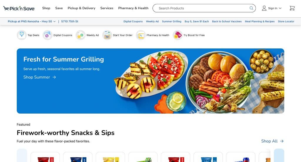
This one did a great job mixing and matching images, graphics and stunning backgrounds. We also liked their logo that helps them feel like an environmentally friendly company. Having bright yellow tabs to show where there is discounted items was a great choice. The ability to use a search bar to search for specific products was another thing that we enjoyed.
24. Shopify

There was lots of simplistic animations and transitions used within this example. Displaying that people using Shopify can sell and ship anywhere. Backgrounds are dark and simplistic in order to create a stunning design. A variety of short and simple phrases, creating a better look. Another thing they did well with was creating a balance of white space.
25. Rover

Rover had a great example of a well organized site with a black, green, blue and white color scheme. We enjoyed their small form that helps customers get the best care for their cat or dog. Little icons were used in order to inform readers what their text will be about. They also used an easy to remember domain, making it accessible to their established customers.
26. Simplehuman

A sleek and interesting video caught our attention right away. This. video not only showed off their products, but it set a mood for their brand. Having a calming animation that creates their logo design was something that we loved of course. Using large visuals was something else that we noticed. Including an informative blog is a feature that is always helpful, no matter what your products are.
27. Yelp

Subtle red accents help highlight the important information such as ratings, icons and more. We really enjoyed how viewers could look at reviews by business type (nightlife, automotive, restaurants, etc.). Yelp has a logo that is recognizable, and well-known making them a trusty brand. Having a search bar also made it easy for customers to find reviews on exactly what they are looking for.
28. Symbol Audio

This pairing of yellowish cream along with red-orange was stunning and helped Symbol Audio stand out. Their captivating font choice was very smart because it intrigued viewers. They included lots of images of their products, so people weren’t confused about their business. Labeling each product with prices before clicking on them was another thing that we really did enjoy.
29. The Wood Veneer Hub

Utilizing brightly colored buttons and sale tabs was something that helped The Wood Veneer Hub stand apart from competitors. We though this white, brown and yellow color scheme was thought provoking and created a beautiful harmony with their images. High-quality visuals was another perfect choice for them. They clearly had a focus on digital marketing when designing a simple checkout process.
30. Cuckoo

After scrolling into this example, you’ll notice their bright yellow, pink and white color palette that feels energetic. Including FAQ to prepare people with the service they will be getting was something that we loved. Drop-downs are used within their navigation bar to keep everything organized and easy to access. We also loved their use of interesting animations, just to help stand out a little more.
31. Mint Mobile

We loved how Mint Mobile used their trade character in a variety of spots. Obviously, using mint green as one of their colors was a perfect fit for their company. Including reviews from Google, Amazon, and Facebook users was nice. Occasionally, you might notice some bullet points to help organized and clean.
32. Duolingo

The green and white color scheme of this UX website stood out to us because it gives off a feeling of growth or in this case learning. Our web designers thought this website was a good design idea for UX sites because of the creative font. The animal and people graphics that are seen throughout their site was definitely refreshing for a custom learning site. They clearly had a focus on website usability when creating the domain for their website that matches the company’s name. If you are looking for template examples for your next UX site, be sure to check this one out.
33. Sdx

One of our team’s favorite parts about Sdx was their stunning logo that is reused as image frames. Neon blues and greens was definitely very impactful, because it’s different. Accents of geometric patterns seen throughout these pages also made us happy. They also made good use of buttons, which is always really helpful in order to find more information.
34. Trippin

Trippin includes lots of blog posts and information to get people excited about travel. Many of their images included dots that lead to a variety of additional information. We felt it was nice to have popular destinations listed in alphabetical order. A thought provoking logo design was a great inclusion. A variety of different sized fonts allows for a great sense of visual hierarchy.
35. The Adventure Group

These colors are carefully picked to create a feeling of exploration and adventure. This logo was definitely on the simplistic side, but we loved it because it made sense for them. Additionally, we liked how they included their Instagram page right into this design. Something else that we thought was really cool was how their buttons tipped upon hover.
36. Nash

Showing off popular companies that use this service was a great way to build trust. There was lots of whitespace here that is carefully balanced to create a stunning look. We also felt it was nice to include graphics to look like screens was another good idea. A design features we liked was these bright colors that catches customers eyes.
37. Fallen Grape

Right away, we can notice an almost paper cutout look to introduce their product. As you continue through, there are lots of high-quality, well-staged images, helping the visuals stand out. This custom site also does a good job offering an ability to order a larger quantity to save money. Each of their paragraphs was written in short form so that readers don’t get overwhelmed was nice.
38. Tim Hortons

Using bright red to highlight areas of their template is something that we noticed right away. Lots of images of different food and drink products was a great idea. We also liked how they included images related to current holidays or seasons. Another feature in Tim Hortons was these large buttons that help enhance usability. Tim Hortons clearly had a focus on digital marketing when designing a simple checkout process.
39. The Year of Greta
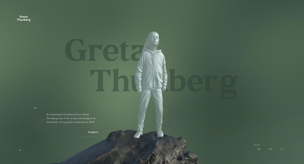
Here we have an example that uses a 3D model of a revolutionary figure in history. Information about this girl’s impact on the world scrolls in a tornado animation around her as viewers proceed through the timeline. We felt that it was nice that they included links to their social media pages to keep people connected.
40. Spotify
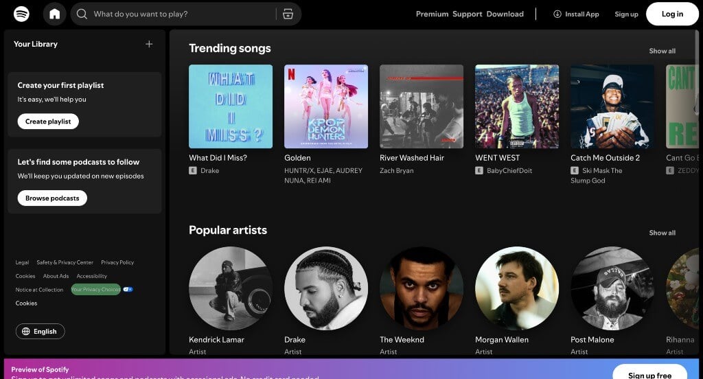
In Spotify’s example, they make use of bright colors that pop against dark backgrounds to grab attention. Using square frames for album or single covers and circles for artist images was a great way to organize it all. Using their signature green to add in a graphic to play music was a great choice for this type of company. Along with that, we liked how there was lots of buttons used in order to help with navigation of content.
41. Creative Navy
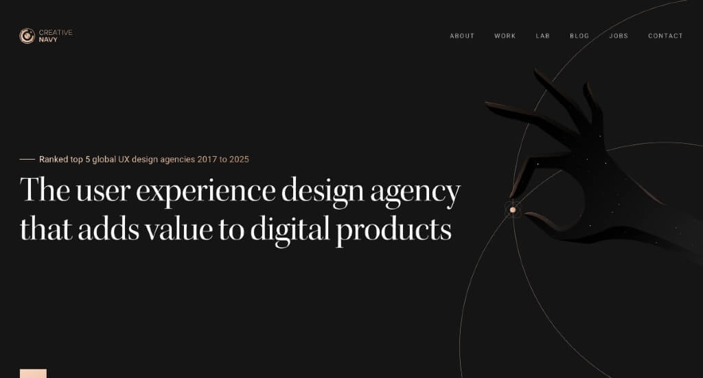
This was an outstanding template because of their graphics carefully placed throughout the entire webpage. Another thing that we enjoyed was their dark background that creates a more sophisticated design. Adding in banners for videos and images was a great way to blend that with their graphics. Placing case studies within their pages was also a great feature to include.
42. Vergo

We really enjoyed how this example did a nice job with their subtle modern colors. Along with that, their font choice was stellar, making it easy to read. Showing famous, well known brands that trust this company helped them become a more reliable company. Using images that show previews of how their product looks when it’s in service was another thing that we really liked.
43. Cinch PR

This example grabbed our attention right away from their large font sharing their business name. We also enjoyed their image that changes to show some of the things that their company values. Their template was well organized and balanced white space carefully which made for a more professional template. Cinch PR had the same domain name as their company do make it easy to find their website.
44. Storylane

Bright colors to highlight information was the first thing that we noticed in this example. Along with that, we liked their use of graphics and patterned backgrounds to create a more visually appealing layout. We liked their use of buttons to help guide viewers to additional information. Making sure to provide the companies that they work with was yet another feature that we found helpful.
45. Heva Health
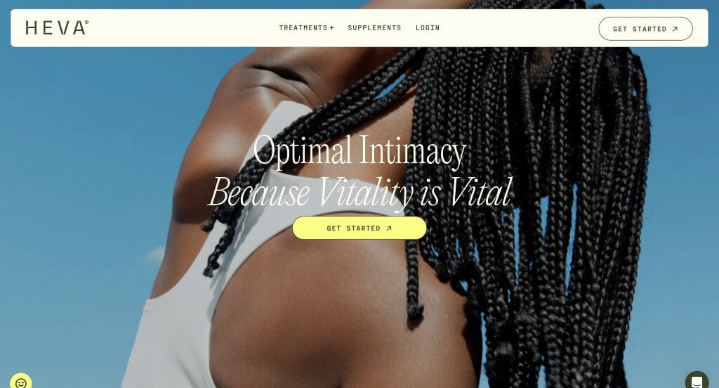
This example was sure to attract viewers with their high quality, automatically looping video within their hero header. Another thing we liked was their professional fonts that bring attention towards certain content. We felt that they added in images carefully in order to have an effective use of space. Buttons were a nice inclusion to keep pages clean and uncluttered.
46. Teachable
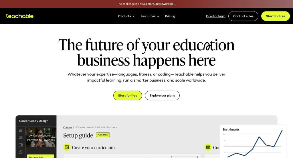
Here’s another example that uses bright accents of color in order to highlight phrases and information. Including graphics that match with their color scheme was a brilliant choice. Including customer reviews was a great way to build trust with new customers who are unsure about this business. Their navigation bar also used drop downs in order to keep information organized and easy to read through.
47. Jasper AI

We liked this company’s blend of images and graphics with text to create fun accents for their pages. This company did a nice job with their use of short paragraphs that are easy to stay engaged with. Pastel colors can be noticed throughout their entire website in order to highlight information and create a more interesting design overall.
48. Lattice

We liked how this example started off with a video to provide viewers with additional information about their business. Their logo design was simple but overall pleasing which was something that we appreciated. This footer included lots of links to additional content so readers were never feeling lost. Their domain was simple and made for stronger brand identity.
49. Airbnb

We liked how this example separated homes by location in order to find rentals in your desired area. Another thing that we appreciated was an option to heart homes and save them for later. A search bar was included with filters in order help customers find the rental properties that they are looking for. Adding in a button to provide information about becoming a host was a nice choice that anyone could appreciate.
50. Immersity AI
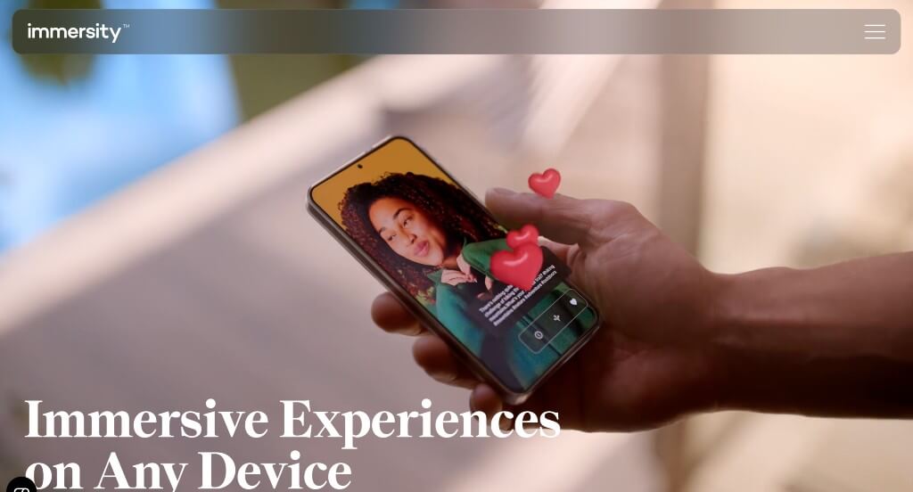
It was interesting how this template showed off in exactly how this service is improving. Large images and looping videos were included to show how AI is improving and what this business is doing about it. Their font was professional and bold which was always appreciated. Short paragraphs are nice to keep people informed but still engaged.
What is User Experience?
User Experience (UX), coined by Don Norman in the early 1990s at Apple, combines design, engineering, psychology, and customer service. It focuses on how users interact with a website, device, or product, how they feel during use, and whether the design helps them achieve their goals.
UX Incorporates Elements Of:
- Conducting user research
- Analyzing user testing
- Understanding user needs
- Improving content
- Utilizing interactive designs
Peter Morville’s User Experience Honeycomb outlines seven key UX aspects (usability.gov). Choose a web development company that understands these factors:
- Usefulness – content should meet user needs
- Usability – easy to use, helping users achieve goals
- Desirability – visually appealing through branding and design
- Findability – content and navigation are easy to locate
- Accessibility – usable to users with disabilities
- Credibility – builds trust in a reliable and honest way
- Valuable – benefits both the business and its users
3 Things a UX Design Company Can Do for Your Website
If you want to redesign and improve your user experience, consider hiring a UX design company. They can enhance navigation and flow, helping visitors easily find what they need.
1.) Conduct Usability Tests & Provide Feedback
UX web designers improve your site through user testing, aiming to benefit both your business and customers. They observe real users interacting with your site, identify issues, and suggest improvements. Testing may involve in-person sessions or surveys to see how easily users navigate your site and complete tasks.
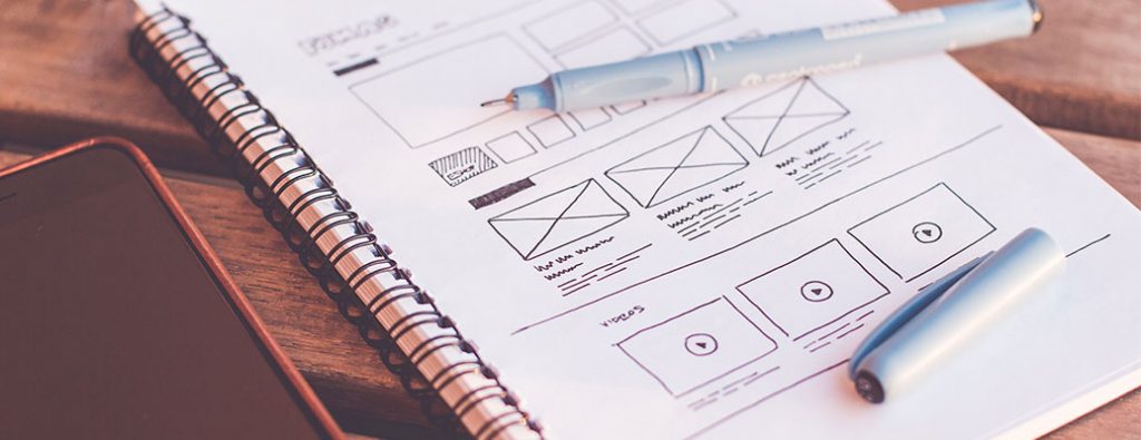
2.) Create Design and Layout Wireframes
UX designers also create wireframes to map out website layouts, especially for complex sites. These simple, grayscale visuals help plan structure early, saving time later by clarifying where and why each element is placed.
3.) Improve Navigation & Page Flow
A UX design company can simplify your site’s navigation by reducing clutter and options, making it easier for users to find what they need. This leads to faster actions, like completing purchases or contacting you, and helps reduce cart abandonment and lost customers. Ready to build your site? Check out our 15 tips for commercial web design!
How to Find a UX Design Company that Fits Your Business?
When choosing a UX design company, ensure they have experience in your industry and can provide references. Ask about hourly vs. project-based pricing, depending on your needs. It may be worth paying more upfront for expert help that saves time and money later. Don’t hesitate to negotiate – some providers may offer discounts if they believe in your project.

Questions to Ask the UX Design Company
Asking questions is key to any business deal. Consider these:
- What is your availability like?
- Can you work with our budget?
- How much experience do you have in this field?
- What is your web design process?
- What projects are you proud of (or really enjoyed)?
- Do you offer monthly retainer pricing plans?
- What do you need from us before you start?
- What kind of results can we expect from your service?
- How long do web projects usually take?
- How often do we need to update our website?
- Do you have any testimonials?
- Who are some of your satisfied clients?
You’ll get the most out of a provider if you know what they specialize in and are able to communicate your needs. Once you’ve found a company, make sure that communication is open throughout your entire project. Following up with providers when there have been delays is also best practice for establishing trust with them.