Looking to enhance your homepage in order to make a strong first impression? Our list features sites that standout based on design, functionality, uniqueness, and user experience.
Get inspired by visually striking layouts and smart navigation, along with tips to keep visitors engaged – perfect for a new site or a redesign. For more inspiration across industries, check out our favorite websites!
Top Homepage Layouts
- 1. Trading.com
- 2. Daysie
- 3. Sprout Social
- 4. Sweetgreen
- 5. Modern Sheet Metal Heating & Cooling
- 6. Hidden Valley
- 7. Gradient Vodka Soda
- 8. DropBox Business
- 9. Moon Cheese
- 10. Mammut
- 11. Nespresso
- 12. Hestra Gloves
- 13. 4 Rivers Smokehouse
- 14. Carbon Made
- 15. Mrs. Meyer’s Clean Day
- 16. KIND
- 17. Bugaboo
- 18. Gogoro Global
- 19. Open Wear
- 20. Visit Australia
- 21. Welly
- 22. Pybus Point Lodge
- 23. Rhino
- 24. Expensify
- 25. Everytown
- 26. The Counter
- 27. REI
- 28. Marc Jacobs
- 29. Apidura
- 30. Oscar
- 31. Zip
- 32. Green Mountain Energy
- 33. Webex
- 34. Urby
- 35. Air
- 36. Decibullz
- 37. Thinx
- 38. A24 Films
- 39. Easyship
- 40. CarMax
- 41. Streamtime
- 42. Missing Code
- 43. Mad Tasty
- 44. Cocokind
- 45. Zoox
- 46. Champo
- 47. Volvo
- 48. RAW Juicery
- 49. Stakt
- 50. Lyka
1. Trading.com
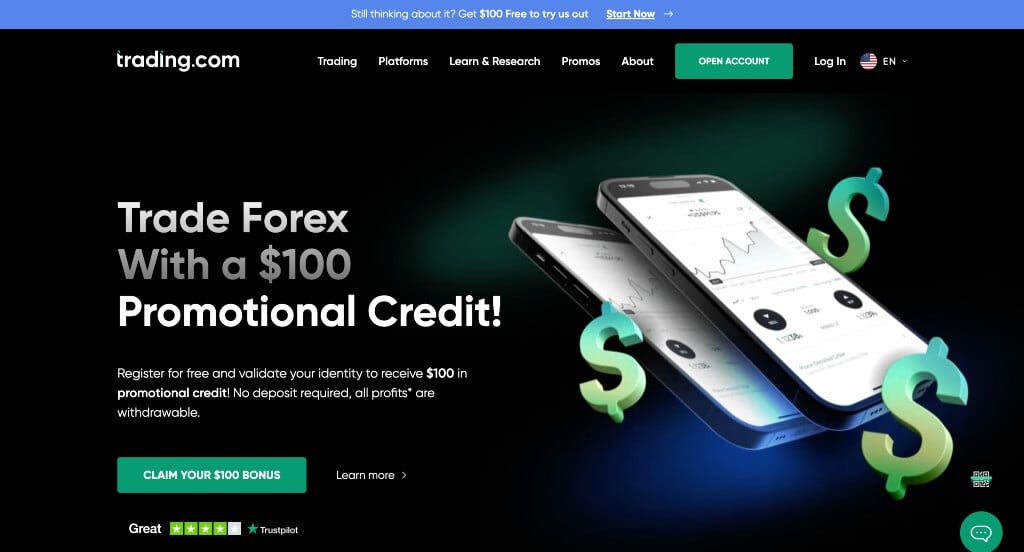
Trading.com did a great job with their simplistic color palette that looks nice with their fonts. We also really liked how they included some of their awards, because it helps gain trust with their clients. Usability was another thing that was done well – especially because of their organized menu.
2. Daysie
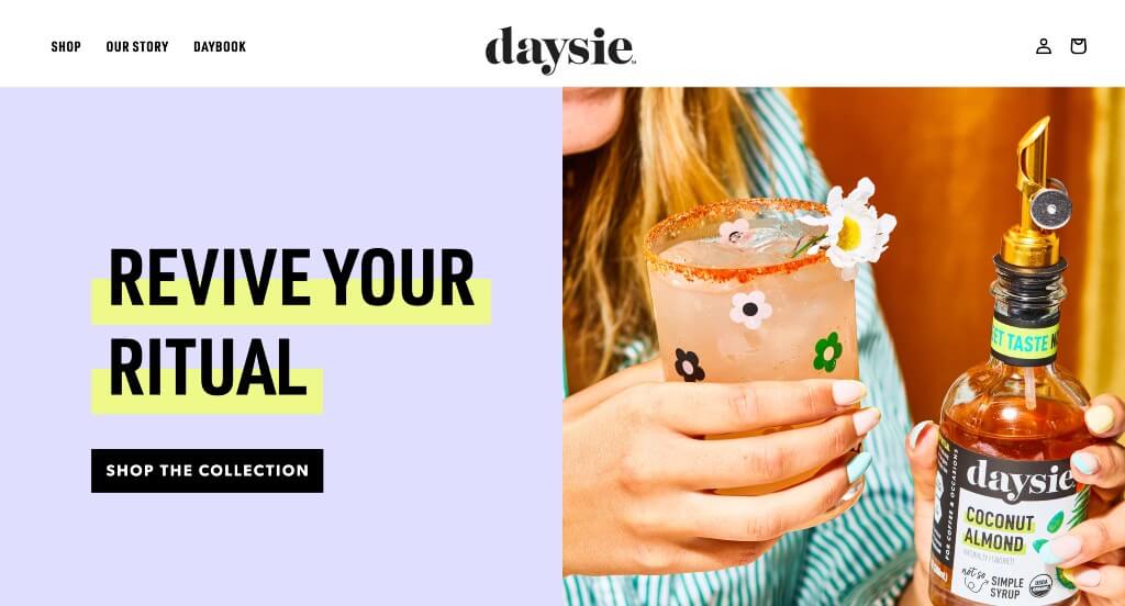
Daysie used a beautiful pastel color scheme, creating a sense of youth. Including high-quality and well staged imagery was a very impactful aspect. Within here, graphics are added in to allow for an amazing look that was playful. Their packaging was also something that we loved because it played along with their values.
3. Sprout Social
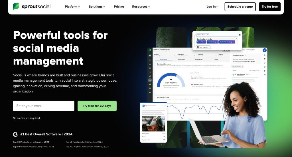
We loved how green accents covers many areas of this example, to show a sense of growth and trust. Simplistic fonts are also used to keep a professional look going for them. Showing off their trusted partnerships with icons was another thing that we noticed. Their awards are also displayed near the bottom which is helpful for incoming clients to help build trust.
4. Sweetgreen
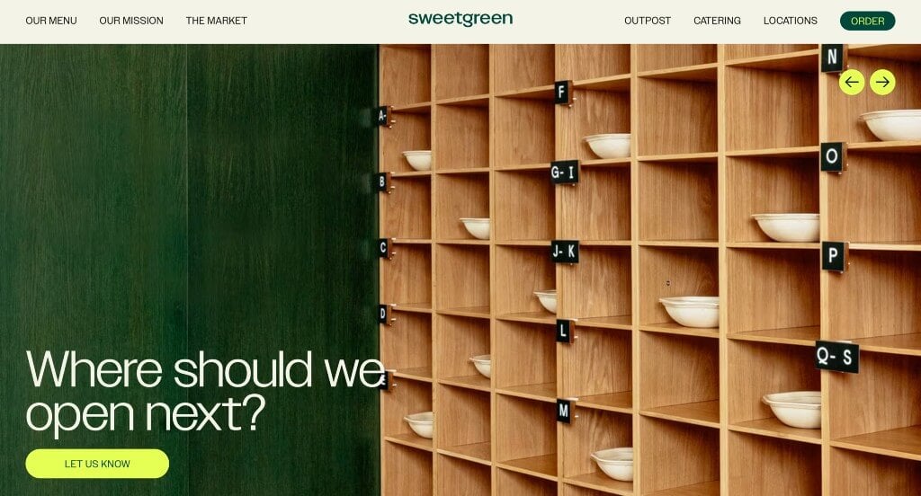
This is a good example of a website design for anyone to see when looking for ideas for their next site. As you scroll through the homepage of the website, one of the qualities you’ll notice right away is the colorful labels that show their popular meals. The beige and sage color palette was definitely refreshing for a professional website. Sweetgreen had conversions in mind when designing the blog for their website. Give some thought to the creative design of this website’s homepage when developing your next custom website.
5. Modern Sheet Metal Heating & Cooling
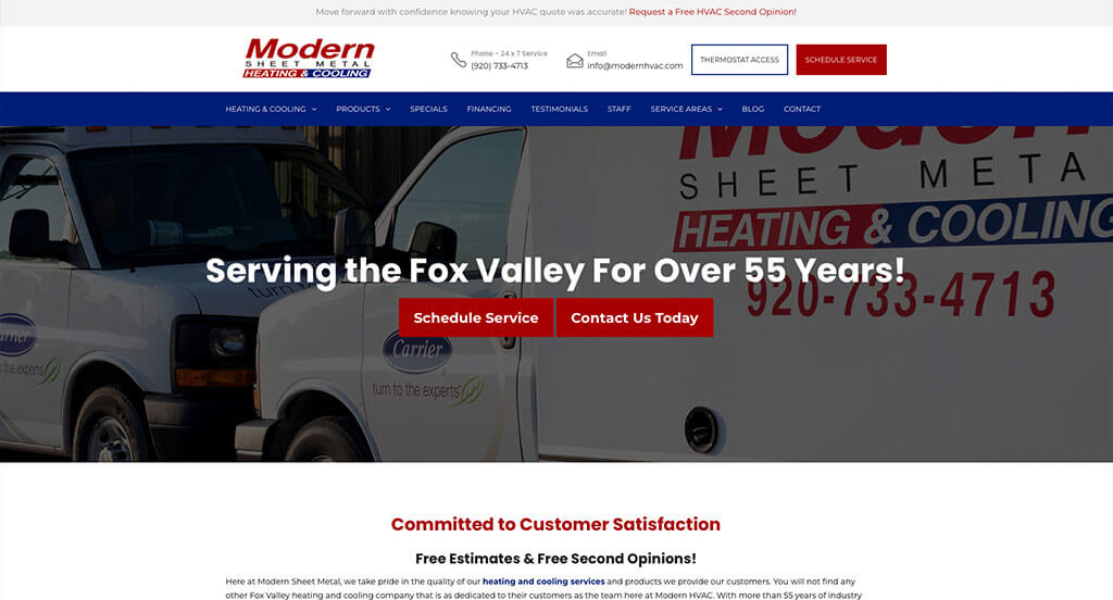
Overall, we loved how there was lots of white space that maintains balanced. Additionally, there was lots of bullet points to help information stay organized, and easy to read. Modern Sheet Metal Heating & Cooling also did a great job creating a simple contact information for this company. Including buttons to help people navigate through their content was perfect.
6. Hidden Valley
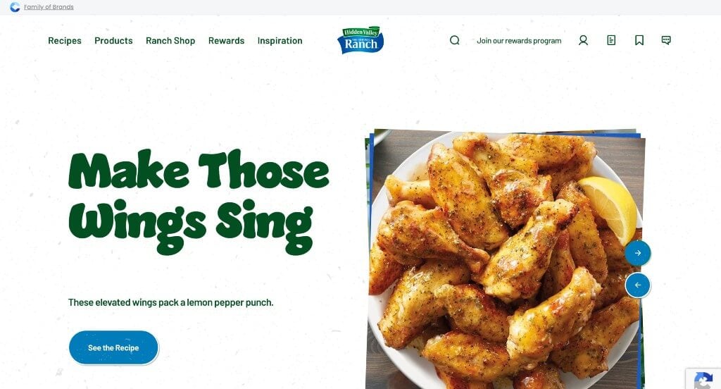
We enjoyed how Hidden Valley used dark greens and blue accents in many areas. They did a great job with their images scattered carefully. We thought it was nice how they featured lots of recipes to keep ranch lovers hooked. These titles were large and used amazing fonts to help keep everything flowing logically. Additionally, we loved how there was buttons and links to keep people browsing through more information.
7. Gradient Vodka Soda
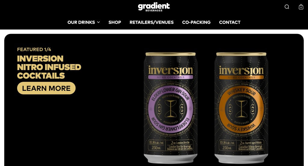
There was lots of product videos and sliding image carousel features. Bold fonts were used carefully to make everything look great together. Including an area that showcases their awards and best selling products was one of our favorite things. Subtle animations were a nice touch for any company looking for ideas. We also loved how they liked to display their packages.
8. DropBox Business
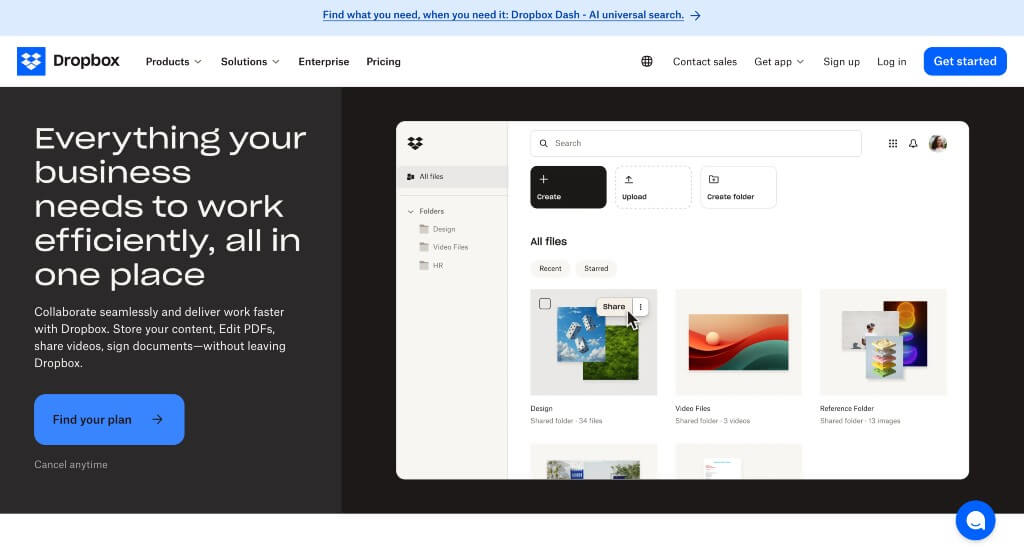
A pop-up appeared right away to let viewers know that a live chat feature is available. As you scroll through, a quality you’ll notice is their recurring bright blue accents. Clearly labeling prices with a breakdown of each plan and which group of people it works better for. Including case studies is nice because new people considering them can understand how they treat those who hire them.
9. Moon Cheese
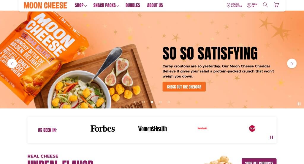
We appreciated how they used colors of orange, plum and white to create a stunning look. Something that Moon Cheese did well was their email sign up that has people spin a wheel to earn sale prices. Their use of banners mixed with images of their products was another feature we enjoyed. There was also lots of buttons that helped keep customers exploring more content.
10. Mammut
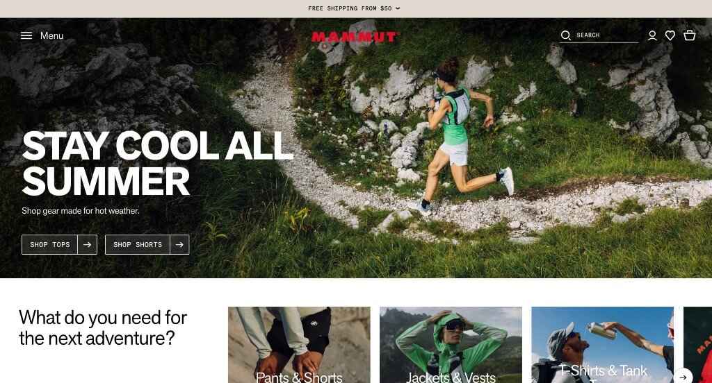
We loved how this one not only included their products, but also showed off their target audience enjoying life. They use a natural color palette, which was perfect because it’s logical for their company’s products. Mammut did a great job incorporating their social media posts, keeping customers engaged. They were smart when utilizing separate sections for each type of clothing within this homepage.
11. Nespresso
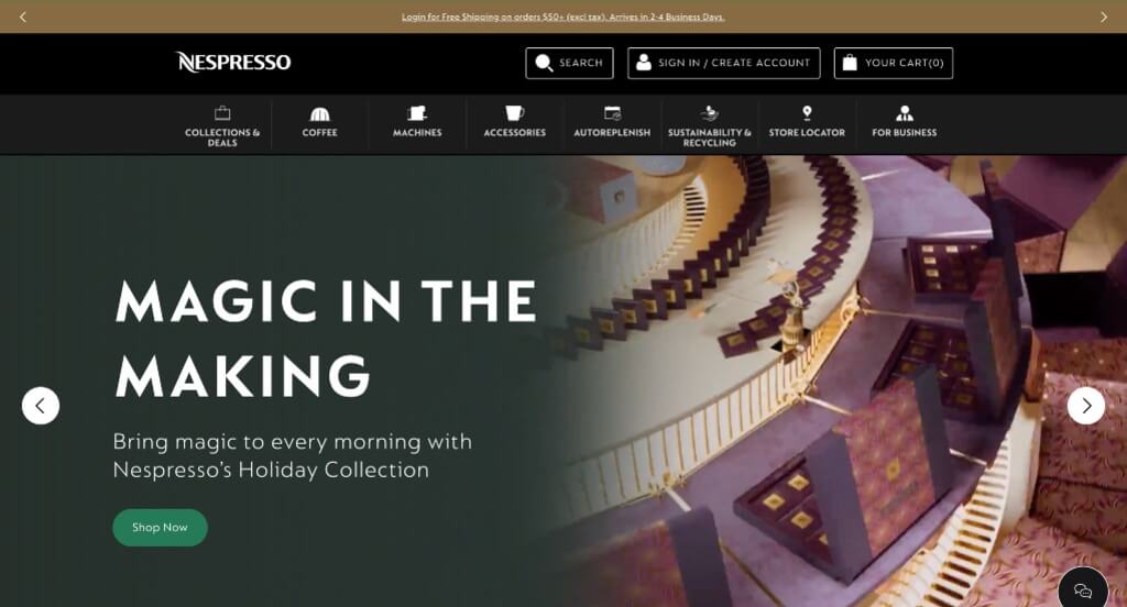
This was another source of inspiration because of their neutral color scheme. Their browns are used carefully to create a relaxing feel that is logical for a coffee company. Graphics to insure simpler use throughout was a unique idea that we loved. Additionally, there was a simple domain that matches their name, helping with their brand recognition.
12. Hestra Gloves
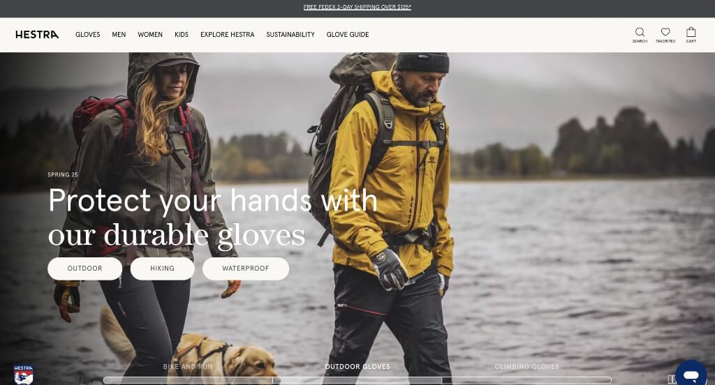
This was amazing! We loved how there was high quality images of people loving what they do, along with product images. We loved how there was large images to help break up content. It was a great feature to allow customers to compare up to four products. This will then compare things such as gender of user, waterproof, activity, details, along with ranking (out of 8) features like warmth, durability, and mobility.
13. 4 Rivers Smokehouse
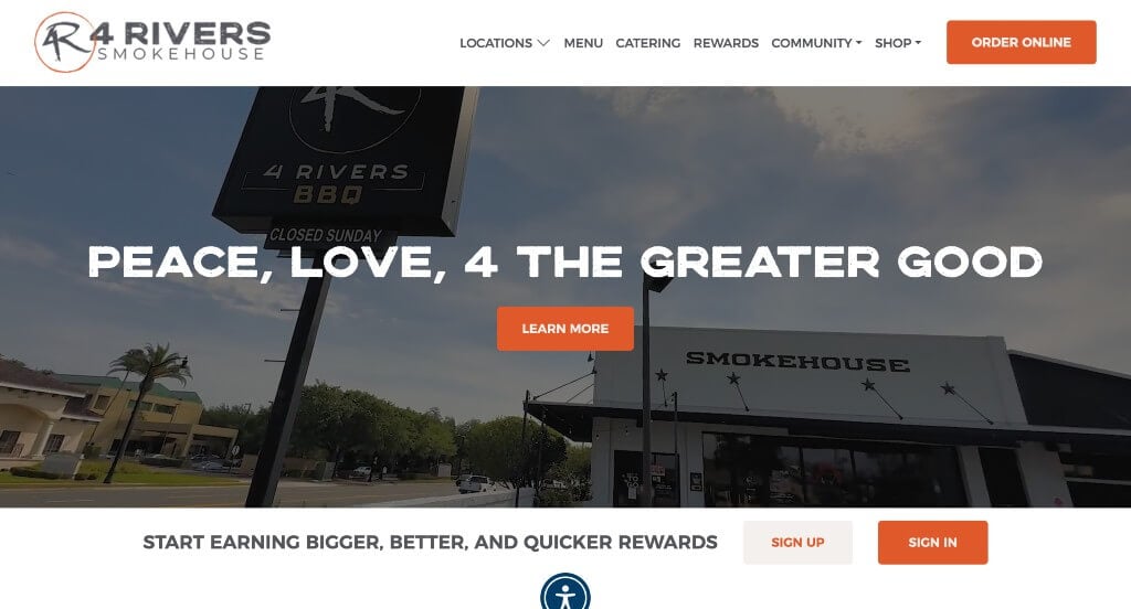
This inventive logo was an extremely impactful quality that we loved. Something we really enjoyed was their mouthwatering visuals, which was of course necessary for any type of restaurant. We loved how they included a short description of their smoked briskets, chicken, and pork. Their bold, bright orange texts help attract attention to certain content.
14. Carbon Made
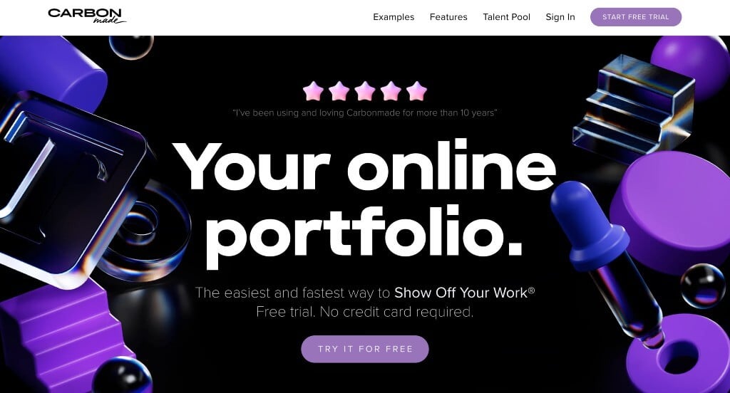
We loved this company’s bright colors of purple that are sure to grab attention against their dark background. Showing lots of examples of their products was another thing that we really appreciated. Including reasons why people should choose this company was something we liked because it highlights their values as a business.
15. Mrs. Meyer’s Clean Day
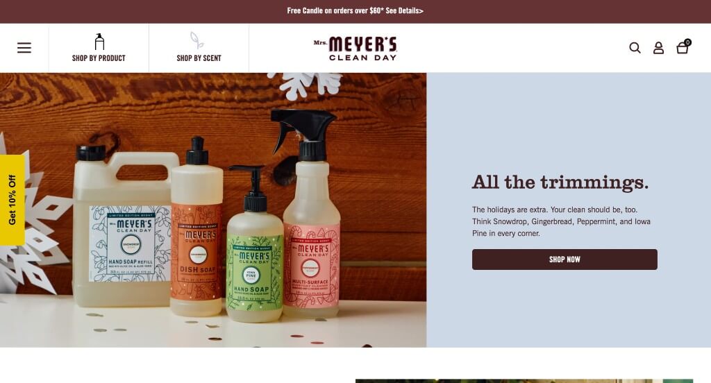
Mrs. Meyer’s Clean Day did well with including lots of their packages to create a great look. Additionally, we enjoyed how upon hover, graphics related to scents of their products appeared behind their products. Being able to sort products by scent was something else we found very useful. Using buttons within this example was really helpful to direct people towards more information.
16. KIND
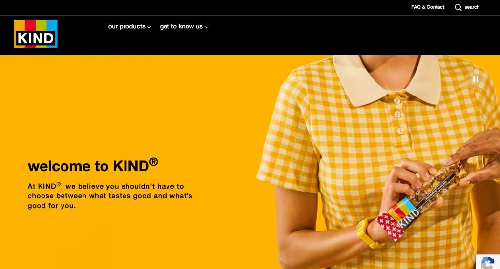
This unique imagery is something that really stood out to us. Lots of bright colors are used to attract attention to their products. We enjoyed their catch phrase of “What makes us KIND” that leads people towards what this company does to give back. KIND clearly had a focus on accessibility when building a simple navigation bar in order to keep everything easy to find.
17. Bugaboo
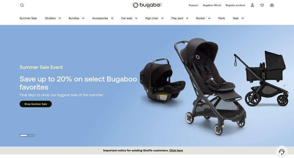
Something that we noticed about Bugaboo was their logo that used both imagery and text to create something special. Stunning product images were also very helpful in order to get customers excited. Their color options for products was nice because many of them could be gender neutral. Additionally, their navigation bar had a ton of drop downs that made it super easy to find what you are looking for.
18. Gogoro Global
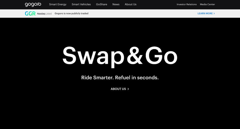
Gogoro Global keeps people engaged right away by their automatically playing videos used as backgrounds. Bright accents are used for their images and occasional backgrounds, breathing positivity into every page. Including news articles was another aspect that we enjoyed. Showcasing a variety of brands powered by them was something that helped them feel more trustworthy.
19. Open Wear
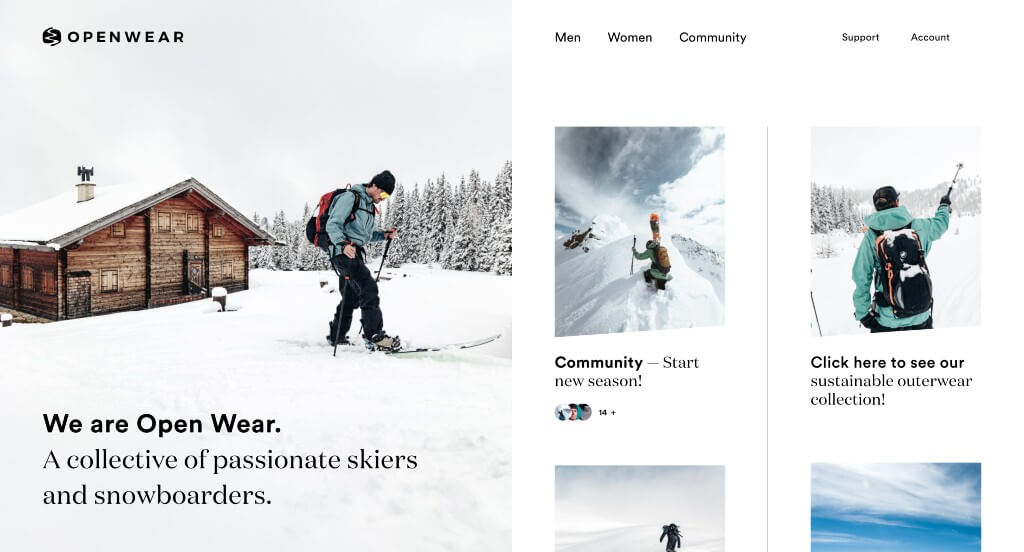
This company did a great job with their mainly white color scheme that reflects their love of skiing. We liked their inclusion of Instagram posts sharing stories of success with their products. Their bold black fonts was another thing that we enjoyed because it grabs attention. Their organized menu was another thing that we really liked because it makes it easy for those visiting.
20. Visit Australia
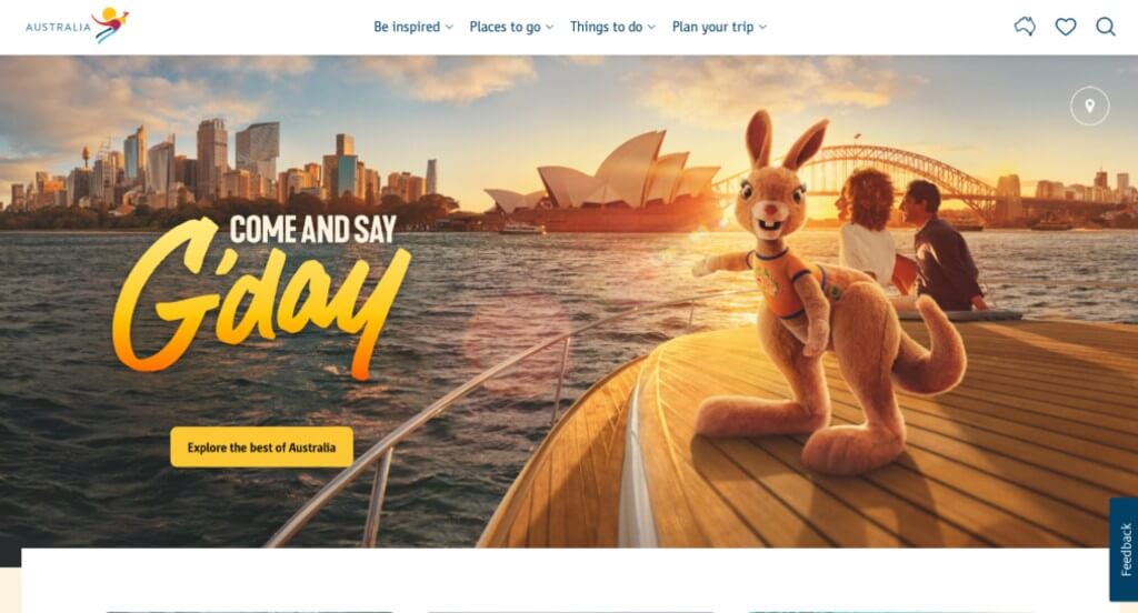
This was a great webpage to explore because of their fun kangaroo trade character. A live chat feature being used within Visit Australia was nice for customers who wish to ask some quick questions. Their logo was also bright and happy, which is what people typically look for in vacations. Showing stunning coastal views was a perfect choice because that’s a popular type of destination trips.
21. Welly
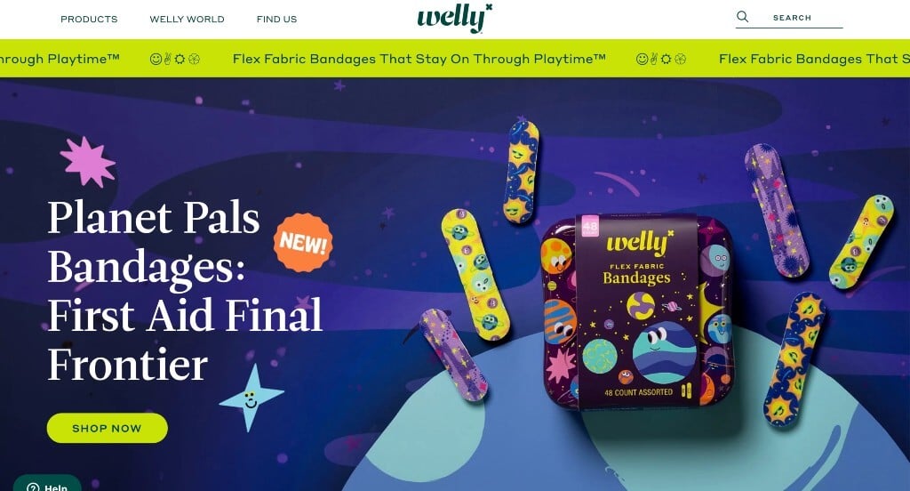
Here we have lots of bright colors that make for a kid-friendly look. We loved how creative graphics are used in order to make their brand feel more fun. A customer review area was something else that we liked within this one. Including fun patterns on their products was another thing that helped them stand out. Their unique photo frames were also very nice.
22. Pybus Point Lodge
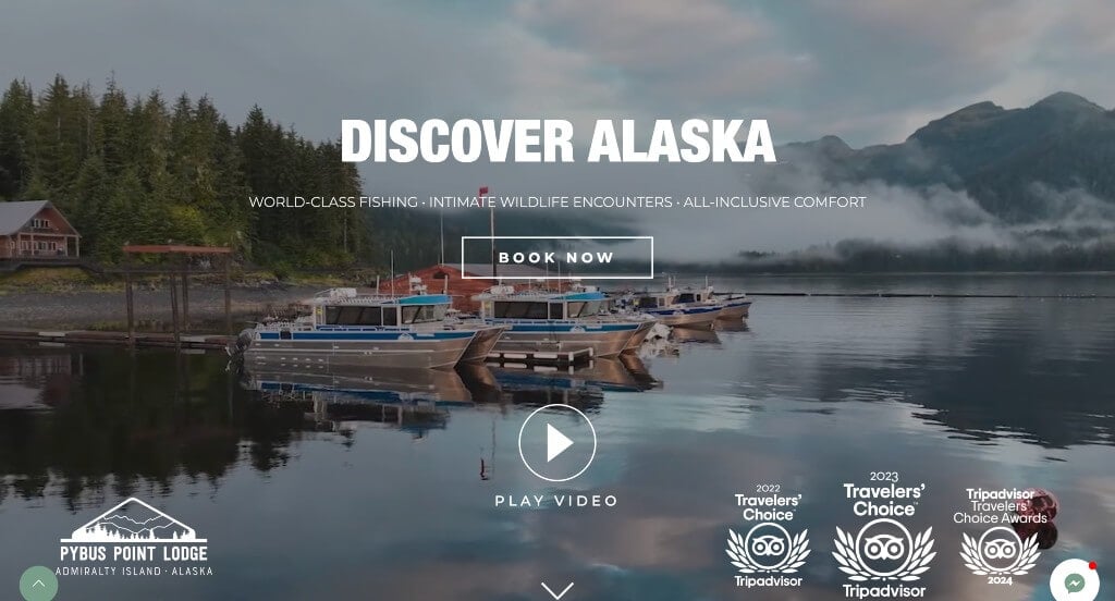
Right away Pybus Point Lodge captures viewers by playing an interesting video within their backgrounds. We liked how they subtly displayed their Tripadvisor awards that they’ve received. We also really enjoyed their stunning logo that embraced the views of Alaska. This example did a great job using different fonts together to create a template that successfully used visual hierarchy.
23. Rhino
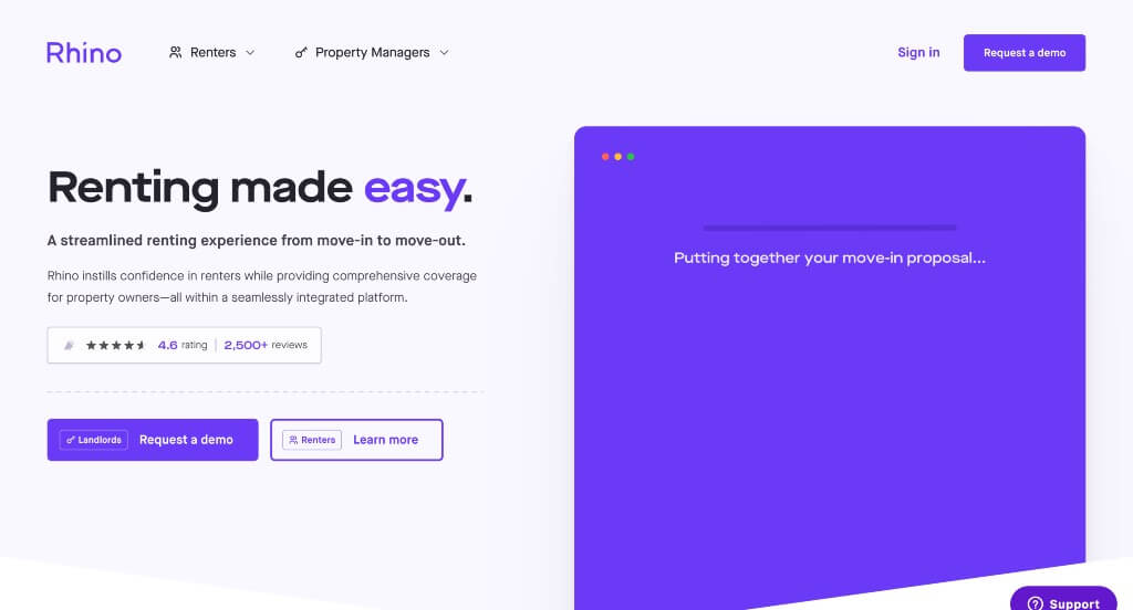
This was one to remember because of their simplistic colors. Just a few areas with bright purple looked great without losing its professional look. Using lots of small icons was another thing that made Rhino stand out. We also felt that including customer reviews was a great choice. Having a FAQ drop down was something that we wished we saw in more sites.
24. Expensify
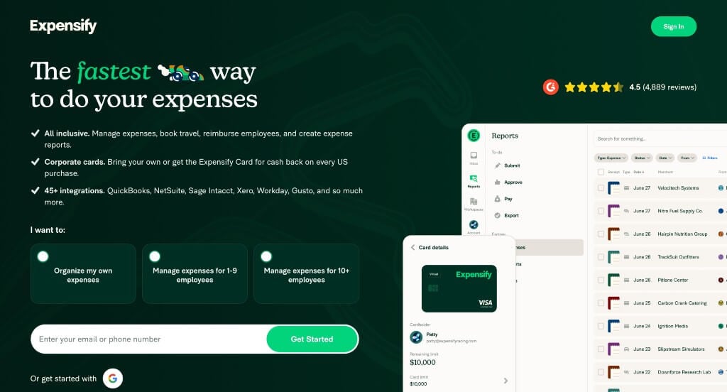
We loved this monochromatic color scheme that helps people trust this company. We loved their use of bullet points, a series of features and their display of integrations. Using fun graphics throughout was an impactful quality. Their domain was simple and matched with their business name. We also liked their simple font choice that made it very easy to read.
25. Everytown
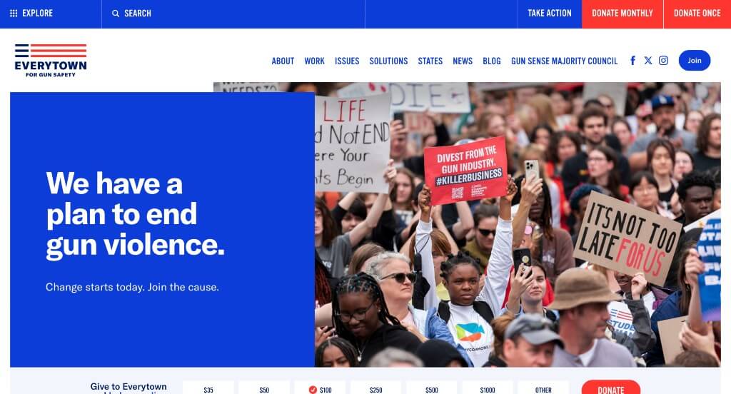
You will notice this patriotic color scheme that was very impactful for Everytown. We thought it was nice how they have buttons near the top that offer donation plans (whether you donate once or every month). Each paragraph is short and sweet, making it easy for those skimming through. Bright colored buttons was also helpful to keep customers on this page, exploring more information.
26. The Counter
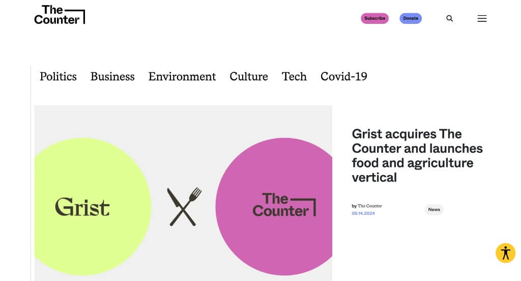
One of our favorite things about The Counter was how their collaboration projects are represented with a knife and a fork crossed. Using large imagery was another quality we enjoyed a lot. We loved how there was articles from a variety of different topics. We thought it was cool how some of their images were edited to make for a more creative look.
27. REI
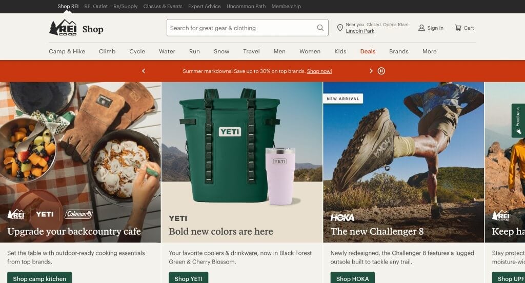
There were lots of amazing parts about REI, especially their high quality images. We really liked how there was large fonts used to showcase upcoming or current deals. Being able to shop by top categories with an image to get people excited. A simplistic template is always helpful to make sure everything is organized well and easy to find.
28. Marc Jacobs
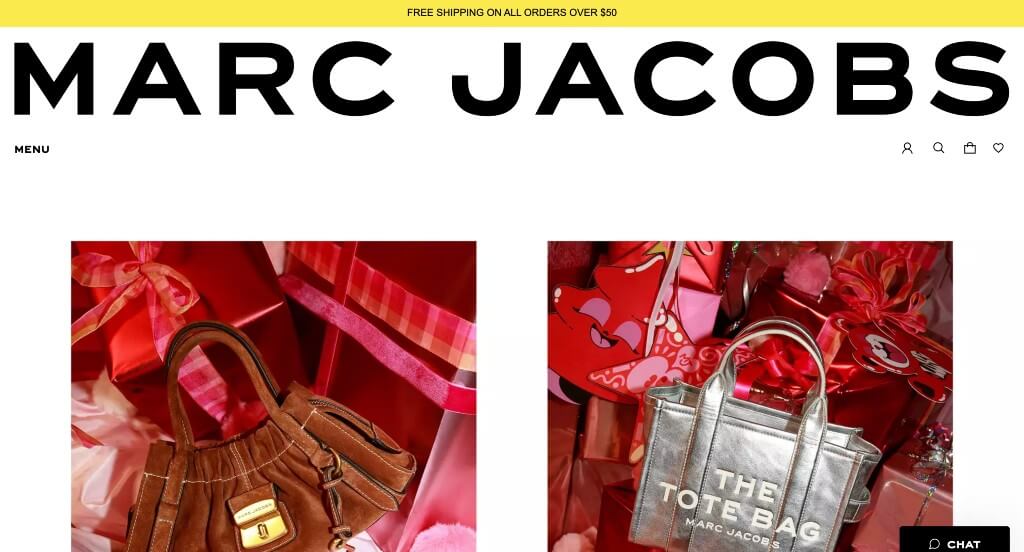
Large images was likely the best part about Marc Jacobs. They picked out fonts that were bold to create a more modern design. Showing a variety of different products was a perfect way to get people excited about new items. Having an opportunity to personalize their very own tote bag was a great way for customers to feel more involved with this business.
29. Apidura
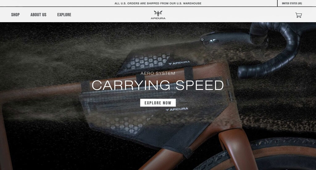
Here we have an edgy design that is carried by stunning images. Their white space was carefully balanced to create something that was easy to use, plus it looks professional. Using buttons that help people navigate towards additional content was another thing that we really liked. This company also had an interesting logo that makes sense for their business.
30. Oscar
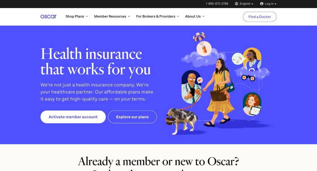
Oscar used lots of bright colors that are used in between basic colors to create a pop of excitement. Well designed graphics were a great choice for them. All their written content was short, making it easy for people to take quick glances at. Using large buttons for simple navigation was refreshing to include more information without it feeling overwhelming.
31. Zip
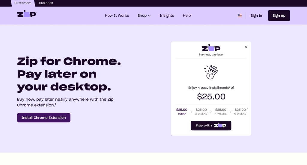
We loved how there was small graphics and screenshots of how their service will help you. A good feature within Zip that our team noticed was their purple accent color. Utilizing a simplistic font was another thoughtful feature, keeping it professional. Numbering their information was a great choice in order to make their content easy to follow.
32. Green Mountain Energy
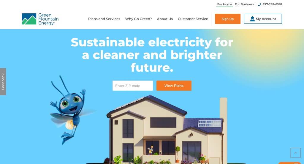
Even though this one was full of graphics, it was still a useful site. We loved their cute little bug that appeared on different pages. Allowing customers to enter their zip code to see if they service your area was a great idea. It was cool how banners were used to separate content, but they still used silhouettes of mountains and such. Their color scheme was also very simple and matched with their overall color palette.
33. Webex
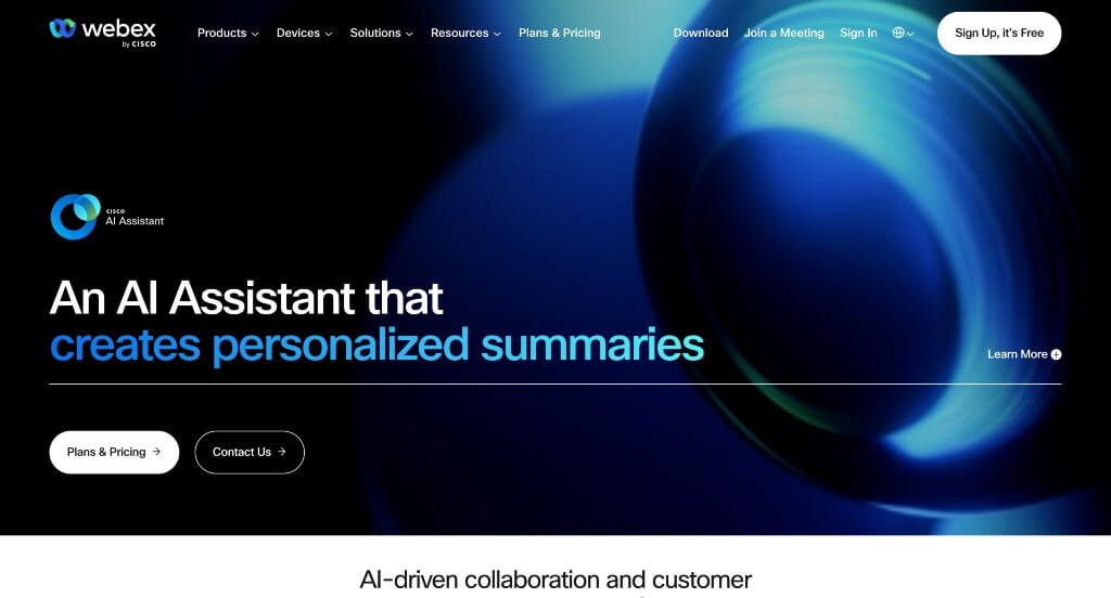
This memorable logo was perfect for Webex because it helps with brand recognition. This clean arrangement also does a good job with their logical flow of content. We loved how there was lots of buttons to direct people to more areas, and more content. This domain is also simple and logical, something that we love if possible. Drop downs within their navigation bar was another thing we really liked.
34. Urby
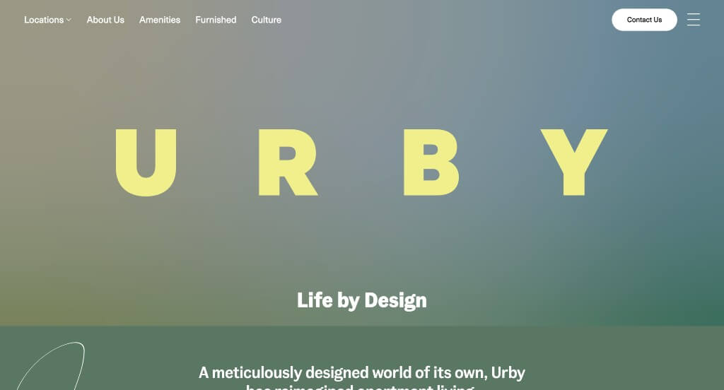
Playfully animated thin lines was something that Urby did very well with. We enjoyed how they had an automatically playing video for their hero header. Their accents of green, blue and yellow looked great. After scrolling for a while, you’ll notice their bold lettering that creates titles. Urby had their customers in mind when linking in their social media pages to help people stay connected.
35. Air
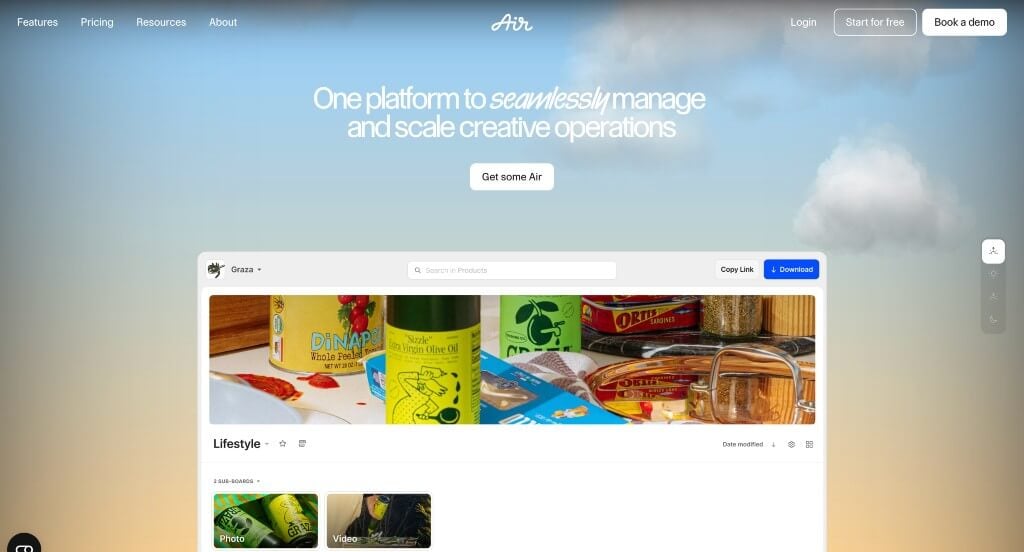
We really liked this template because of their perfect balance of images, text, graphics and white space. Their reviews continue to scroll, positivity emerging from every area. We thought it was cool how they added in memorable companies that use their software. Their navigation bar also was well organized with lots of drop downs, which we enjoyed.
36. Decibullz
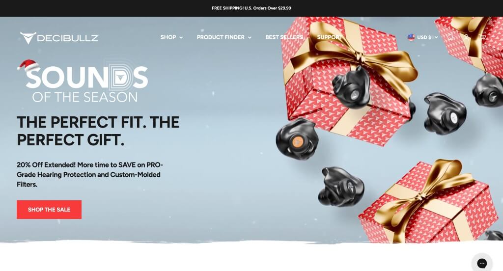
With just a few clicks, customers can complete a quiz that takes them to their recommended product. We liked their hexagons used for frames and patterns to create unity. This inventive logo was another quality we loved. Putting emphasis on their custom earplugs helped people understand what makes them special from their competitors.
37. Thinx
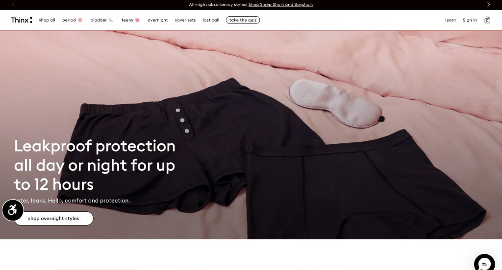
We really loved how this example does an amazing job showing off their product. They do a nice job with their inclusion of seemingly ink drawn graphics throughout the page. Adding in customer reviews was another thing that we really appreciated. Organizing their products by bestsellers, staff picks and night items was another smart choice.
38. A24 Films

Lots of things were featured within A24 Films such as merch, podcasts, news stories and episodes. Our team liked this one because of this staggered content approach. Balancing whitespace carefully was another part of this example that we loved. Everything within A24 Film was very professional and simple, which is always a good way to go when creating your webpage.
39. Easyship
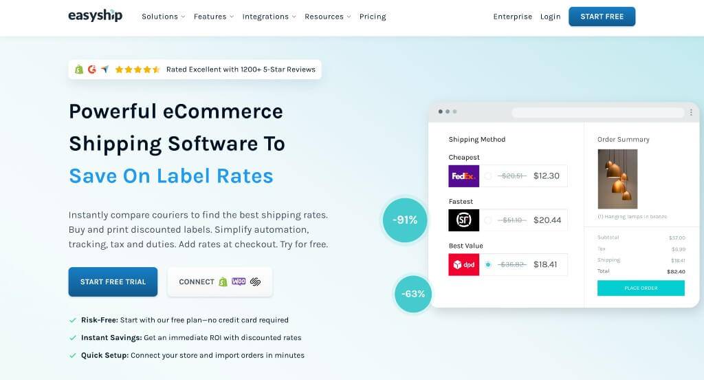
Showing off awards that were received by them was another thing we really enjoyed. This overall blue color theme was both relaxing and realistic for their brand. Including animated graphics was absolutely a consideration for including them within our list. We also liked how lots of linking text was used to help them with SEO related things.
40. CarMax
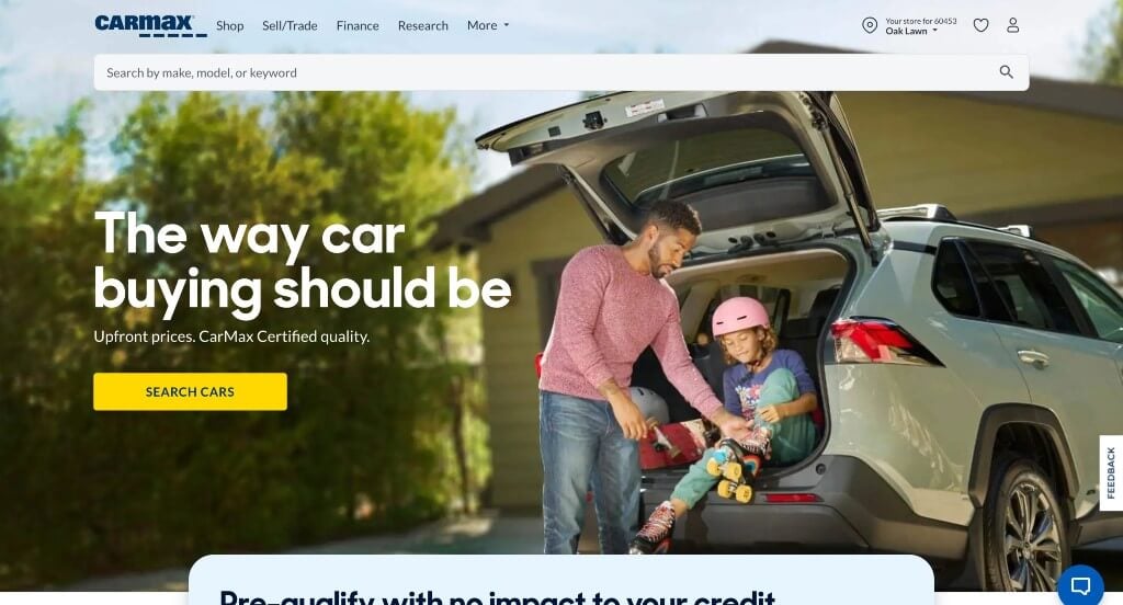
CarMax is a well known company, so their signature blue and yellow colors are absolutely vital. We thought it was nice how they included sketches of different vehicles along with your desired monthly payments, down payment, and your credit score. Another design quality that we noticed was their integration of social media. Allowing customers to save cars to their favorites was a cool feature too.
41. Streamtime
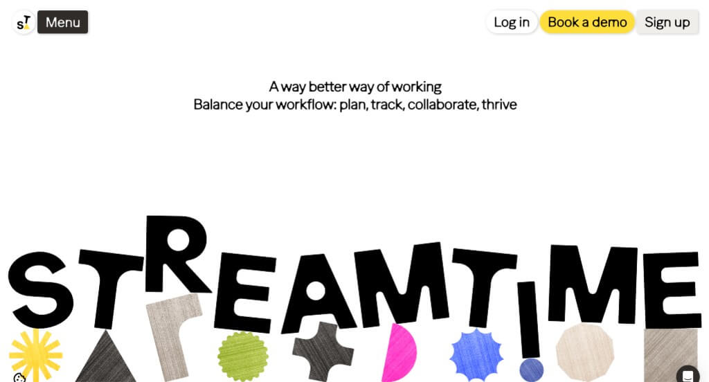
A blend of many colors within Streamtime stood out to us because it allows for a creative vibe. Another quality you might notice is their unique “patches” of color and graphics. Additionally, they showcase awards and business that love their service. Their domain is simple, making it easy to find and great for their brand recognition.
42. Missing Code
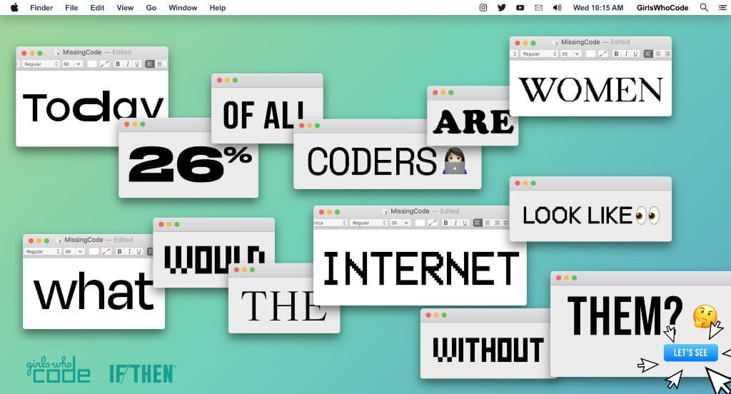
This was an amazing example that anyone wishing to stand out should totally take a look at! It was interesting, but totally logical to make this site look like a MacBook desktop. We also loved how upon clicking on the disk saved to desktop, viewers can experience a mind-boggling video that shows what would happen if every code written by a woman was deleted. Their final call to action button is very captivating, and has the power to get people involved with their company.
43. Mad Tasty
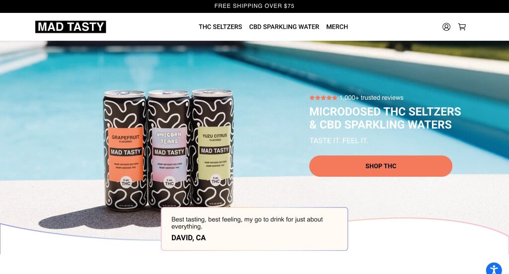
We absolutely loved this company’s burst of colors that is fun but not overwhelming. Their tie dyed background for product images was another thing that we enjoyed. Making sure to showcase their packaging was also smart because it is part of their brand identity. Including customer reviews and FAQ was another thing that we really appreciated.
44. Cocokind
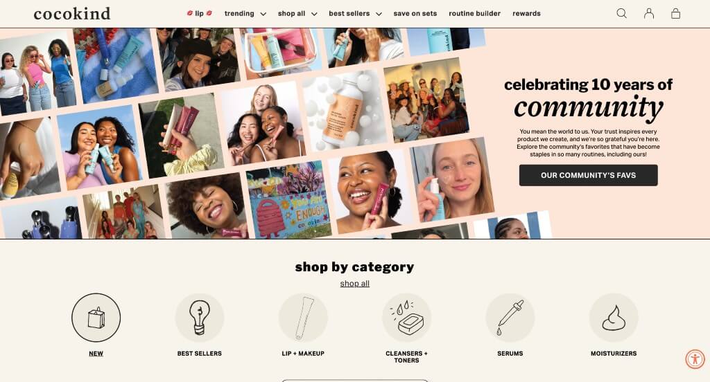
Cocokind uses green, tan and cream colors for a color scheme, which we like because it creates a calm and classy environment for them. We loved their small but impactful graphics that look almost hand sketched. They also had an interesting way of displaying their products. We thought it was cool how many of their images were labeled with information.
45. Zoox
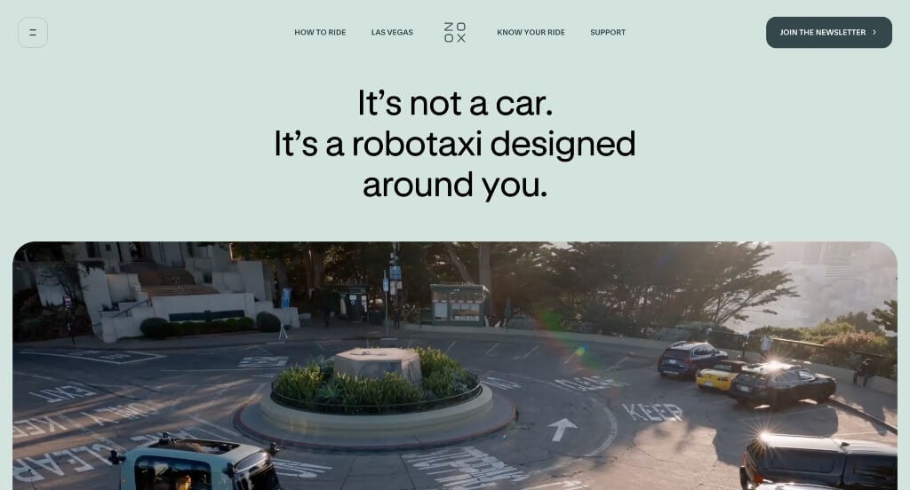
This is a product that is very unique, and its website reflects that. We really liked how they made sure to include lots of smooth transitions. Another thing we thought was cool was how they showed how the Zoox experience can look different for everyone. Short phrases were also used carefully to get people excited about this unique experience.
46. Champo
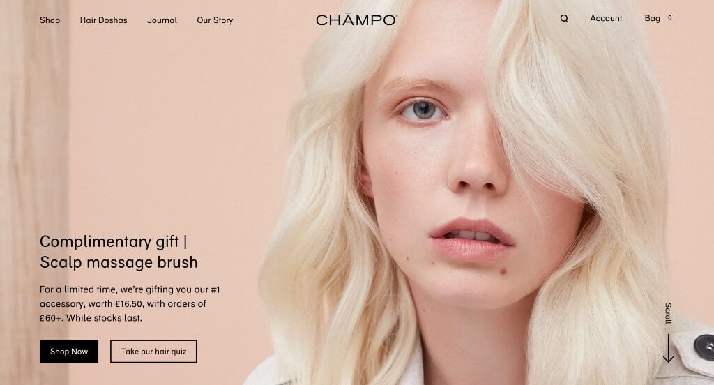
This example started out strong with their large image that grabs the attention of viewers. This business does a great job using high quality images throughout the entire page. We liked how they showed awards that each product received in order to prove reliability in their company. Their color scheme was natural and looked great.
47. Volvo
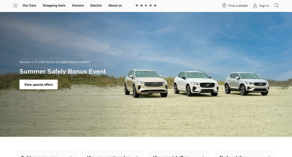
Lots of images are used to display their products. Short paragraphs are use which is very nice for those wishing to learn more content. A location icon appears that lets people know that they can find a retailer near them. Their navigation bar is also fairly simple, which is great because it makes everything more organized.
48. RAW Juicery
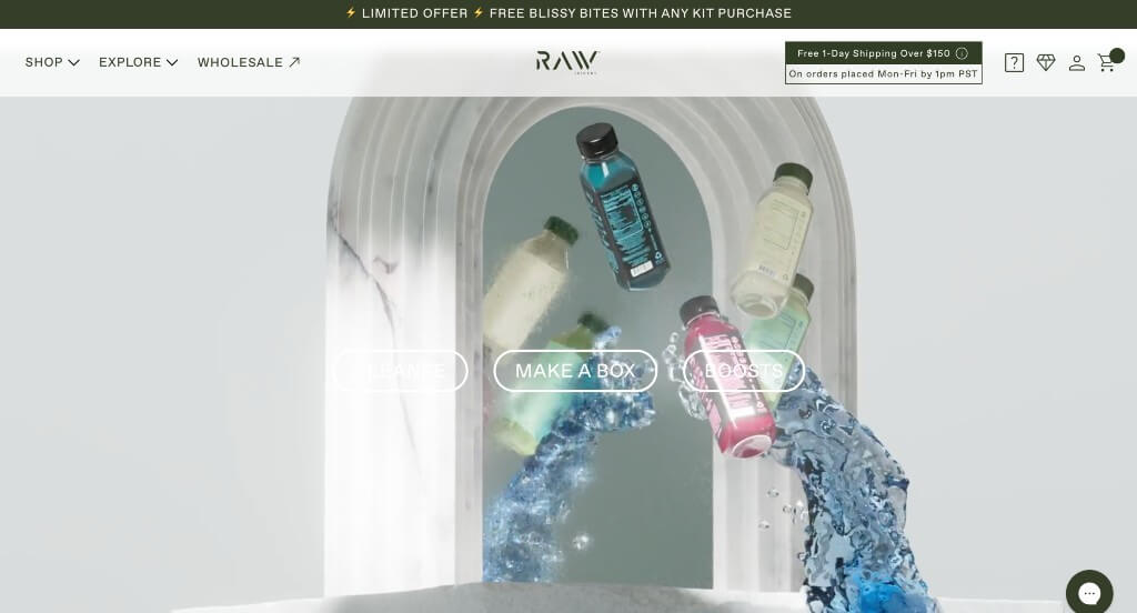
This company started off with an automatically playing video that we loved because it introduces their brand. We liked their use of interesting image frames that helps them stand out more. Including posts from their social media page was another smart way to keep customers connected to their business. Their balance of white space was another thing we noticed.
49. Stakt
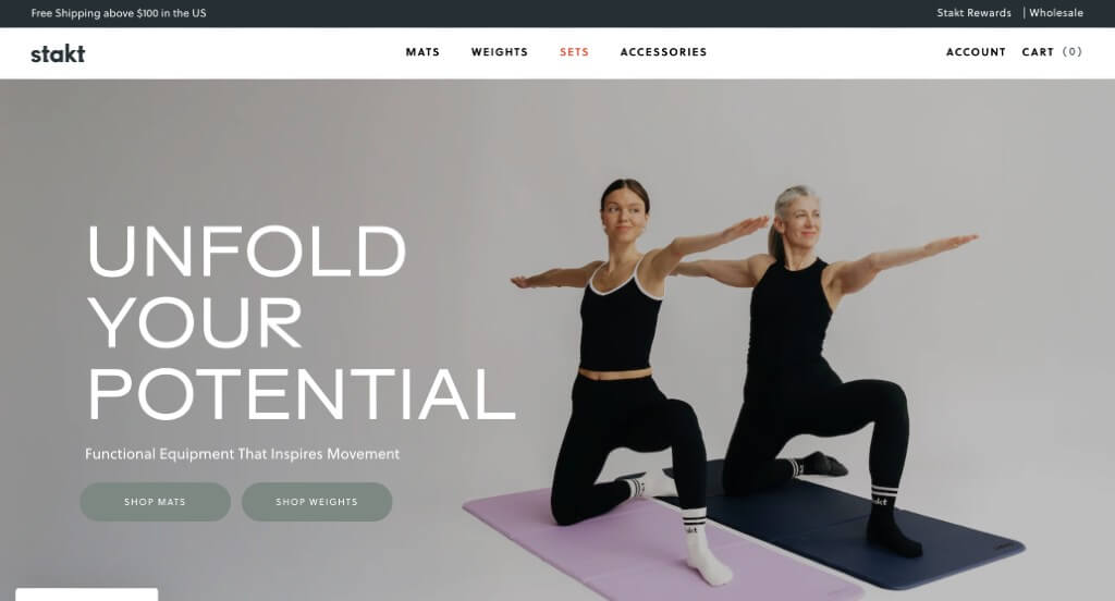
Images included within this example was likely its best feature. Along with that, we liked how there were buttons used throughout the page in order to guide viewers towards additional information. Including GIFs was another feature that we thought was unique, but we liked it. Their content was well organized and placed logically so information is never confusing.
50. Lyka
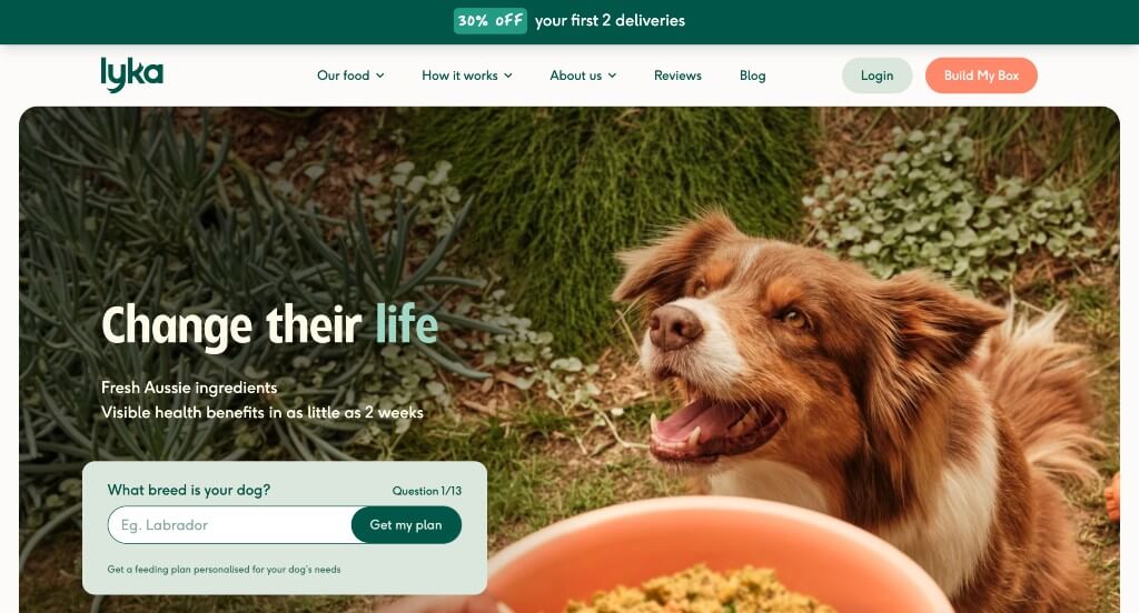
This was a great example because of their search bar that can be used to guide customers towards a feeding plan for their dog. We loved the fonts used within this website. Another thing that we liked was how they included lots of high quality images that are sure to grab attention. Adding in videos and showing their packaging was also a great choice.