Hello, wedding planners and dreamers!
Looking to wow your guests? Our guide to the top 50 wedding webpages showcases the best in design, functionality, and user experience.
Discover inspiration from beautifully crafted sites for planners, caterers, photographers, florists, and entertainers. Plus, get tips to build a memorable online experience for your big day.
Explore this guide and make your wedding website as unforgettable as your celebration! For more inspiration, check out our best web designs across all industries.
Top Wedding Website Designs
- 1. SuitSupply
- 2. Clement & Co Events
- 3. Piper & Muse
- 4. Lindsay Landman Events
- 5. Estera Events
- 6. Laurie Arons Special Events
- 7. Pink Peony Weddings & Events
- 8. Simply Eloped
- 9. Wilder West Elopements
- 10. The Black Tux
- 11. Lola Event Productions
- 12. Danielle Frankel
- 13. Heavenly Day Events
- 14. Marcy Blum
- 15. Kate + Company
- 16. Sprinkles of Love Events
- 17. Allure Bridals
- 18. Everly Studios
- 19. Fox Events
- 20. The Knot
- 21. David’s Bridal
- 22. Joy
- 23. Calder Clark
- 24. Gold Leaf Events
- 25. Valley & Company Events
- 26. Elaine’s Wedding & Event Center
- 27. Dare to Dream
- 28. Adventure & Vow
- 29. Love, Laura
- 30. Tie The Knot
- 31. Amsale
- 32. Barefoot Bride Tenerife
- 33. Toast Events
- 34. Modern Gents
- 35. Chippewa Valley Wedding Crashers
- 36. Lovely Bridal
- 37. One Wedding House
- 38. Cedar & Sage Weddings
- 39. Bridal Bliss
- 40. Men’s Wearhouse
- 41. Galia Lahav
- 42. Fallon Carter Events
- 43. La Luz Weddings & Events
- 44. DFW Event Design
- 45. Mumu Weddings
- 46. Eloping is Fun
- 47. Kindred Weddings & Events
- 48. The Vale
- 49. Mandy Marie Events
- 50. Simply Elegant Group
1. SuitSupply
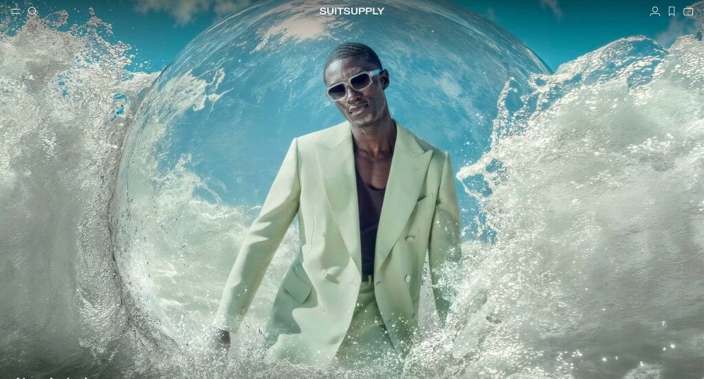
We loved these high quality and unique images used throughout their pages. It was cool to include a variety of short catch phrases that link to other pages. Their personalized options were also a nice touch for any people planning their big day. Additionally, their domain was simple and matched to their company name.
2. Clement & Co Events
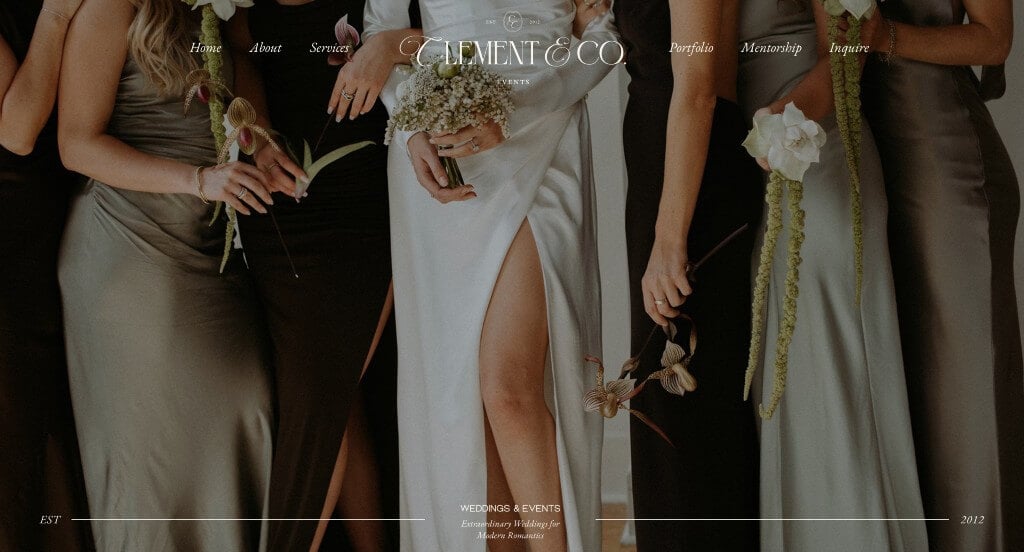
We really liked how this example displayed large images within their hero header to grab attention. We thought it was nice how some of their images were in color and others were black and white because it looked unique. They did a great job with their stunning fonts that were professional and easy to read. Along with all of that, we thought it was nice how they used videos within the template.
3. Piper & Muse
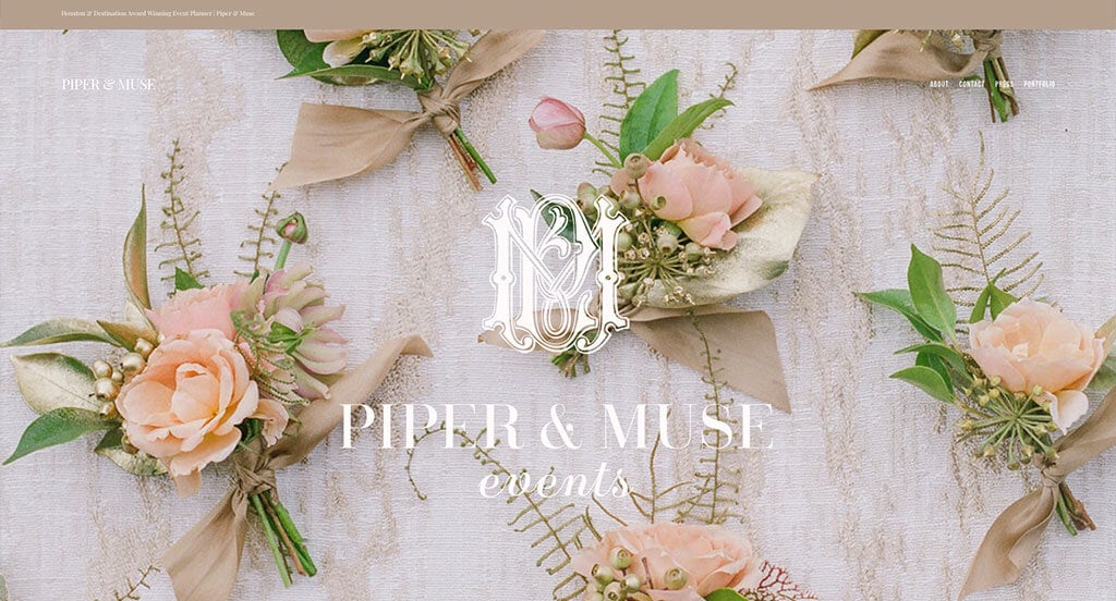
Displaying a variety of brands that have featured this business helps customers to gain trust in them. We liked their use of small icons that help to add some visuals aside from images. We felt that this logo design was luxurious and was a great way to represent their brand. Additionally, these paragraphs were short and straightforward which made it easy to read through their content.
4. Lindsay Landman Events
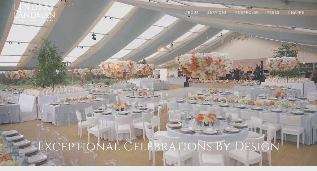
We felt that the calming accents of lilac purple in this design was a great choice. They did a good job picking out fonts that were professional and modern. Using large images to help break up content was another feature that we noticed. Something else that we thought was cool was their use of videos to help welcome visitors to their site.
5. Estera Events
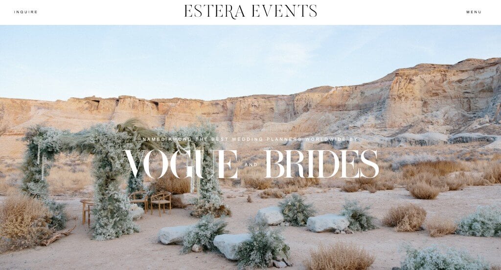
Right away, viewers won’t be confused by what is important because Estera Events does a great job with their visual hierarchy. A feature we liked was their stunning visuals. Their creative and thoughtful balance of white space was definitely refreshing. We also noticed how they included images from their Instagram pages to help keep customers involved with their work.
6. Laurie Arons Special Events
High quality images serve as a guide for this company. These images not only grab attention, but they really showcase what you could expect when hiring them. An interesting logo helps them to stand out, making them feel more unique. It was also very helpful to add in lots of past projects so incoming customers can see what could be possible.
7. Pink Peony Weddings & Events
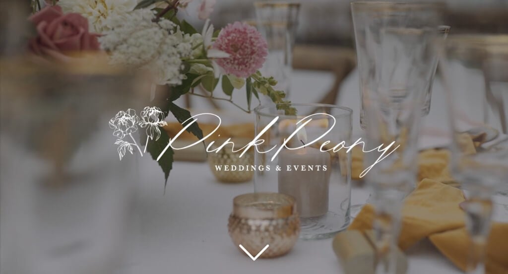
This is a great example that makes use of stunning images and also an automatically playing video that grabs attention right away. Including images and posts from their Instagram was another thing that we really enjoyed because it helps to build connection. Their fonts that were of high quality and were fairly modern was also a nice choice for their company.
Related: Start getting more leads from your website by focusing on your SEO. This will help rank your wedding website higher in search engines.
8. Simply Eloped
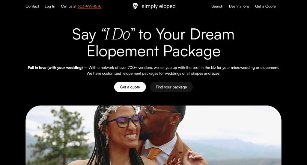
One of our favorite parts about Simply Eloped is their use of a variety of plans to help customers get the best use of their money. Including testimonials was another smart choice that eases those who are unsure about this service. A frequently asked questions section was another feature that we found helpful.
9. Wilder West Elopements
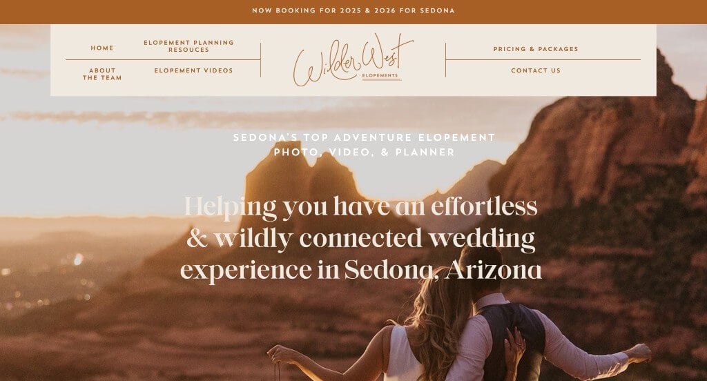
We loved the color scheme picked for this webpage. Professional and creative fonts was very impactful because it feels more unique. Their carefully crafted paragraphs help customers to understand the personal devotion this business will make to their dreams. Images that are included here are magical and represent real life experiences that other couples have had. We enjoyed their use of graphics and interesting layouts that make for an amazing template.
10. The Black Tux
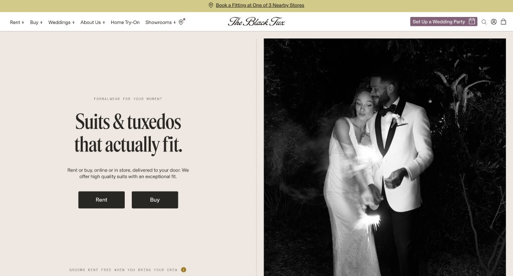
An overall sleek feeling is projected here, which makes sense for their business. We liked their cream colored backgrounds that are less abrupt than the typical white. Bold fonts were used to lean into that modern, sleek, look. Lots of high quality images were used – both color and black and white – which looked great. We also thought it was nice how they offered an option to outfit your entire wedding party.
11. Lola Event Productions
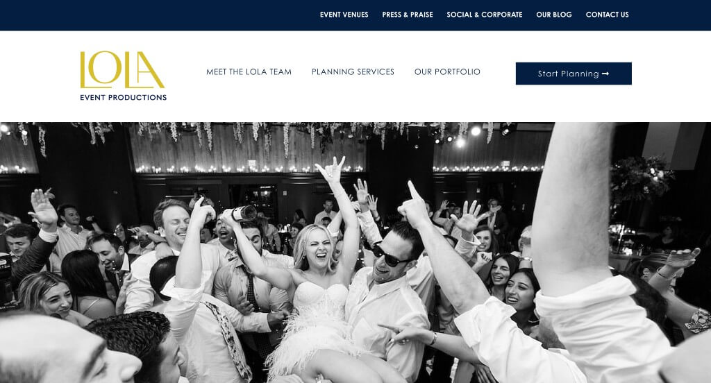
One of the first things we noticed was their automatically playing video that introduces their company and its values. Combining blue, white, pink, black and gold to create an alluring look was brilliant. Their cursive, almost hand written fonts create a whole new level of style for their company. Their balance of white space, text, videos, and images was another thing that set them apart from competitors. Adding in lots of blog posts to see past weddings was also very helpful.
12. Danielle Frankel
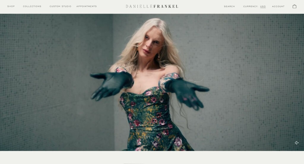
We thought this was a good example because of their display of products with no distractions from their dresses. Showing off their products was something that is essential for this company because of their uniqueness. All images and videos are of high quality, which is always helpful. Danielle Frankel also provides information on the fact that each piece is custom made, which sets them apart from many other companies.
13. Heavenly Day Events
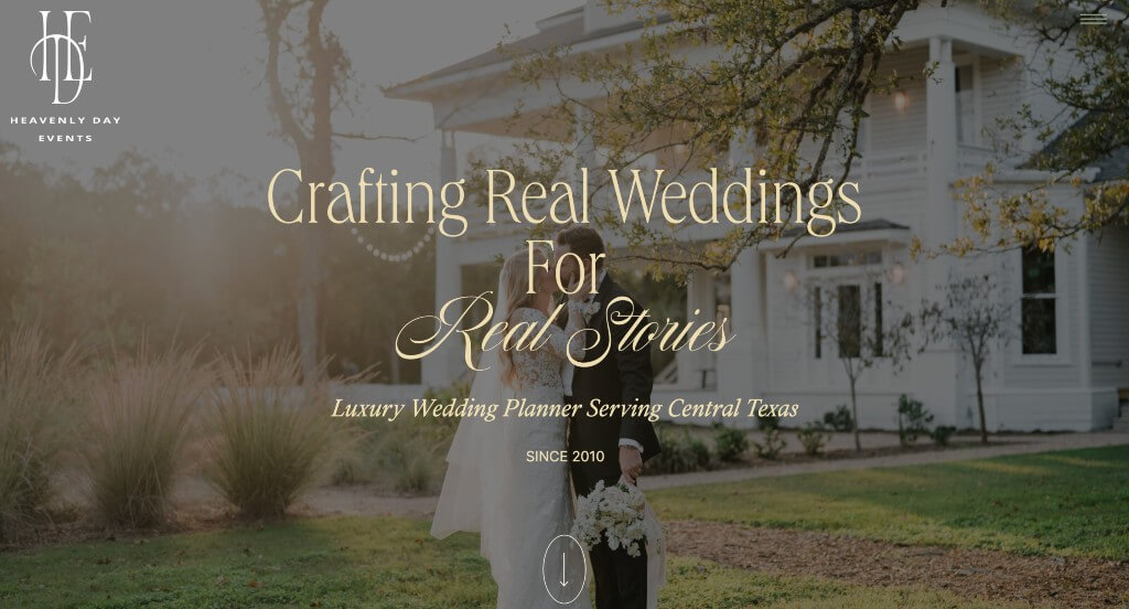
We loved how this example took an approach using simplistic beauty. Lots of high quality and beautiful images were used to sell customers on their services. Another thing that we thought was nice was their stunning logo that uses essentially their company’s initials. Their balance of plain and decorative fonts was also a visual element that we enjoyed.
14. Marcy Blum
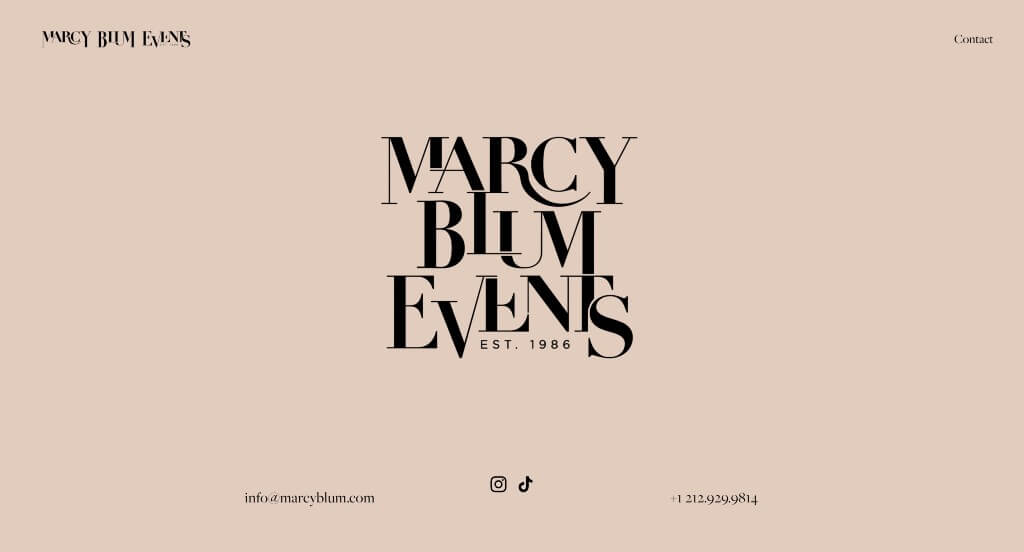
There was lots of images that appeal to a variety of customers, which is always a nice idea. A staggered layout was definitely a smart choice for Marcy Blum. They also made sure to include their Instagram within the homepage, which is a great way to keep people connected. We thought it was creative to allow their lettering to overlap in their logo. Showing off companies like Vogue or New York Times that have featured them was also a helpful choice.
15. Kate + Company
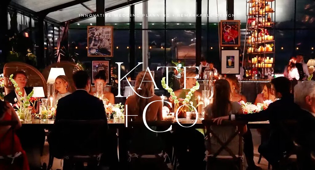
Colors are everything with wedding sites. These colors pair nicely and create a beautiful look, which is perfect for their intended audience. Short paragraphs are used to make sure everything is easy to read and comprehend. Overlapping images was another thing that worked well in this template. Their balance of text that is professional and decorative was amazing.
16. Sprinkles of Love Events
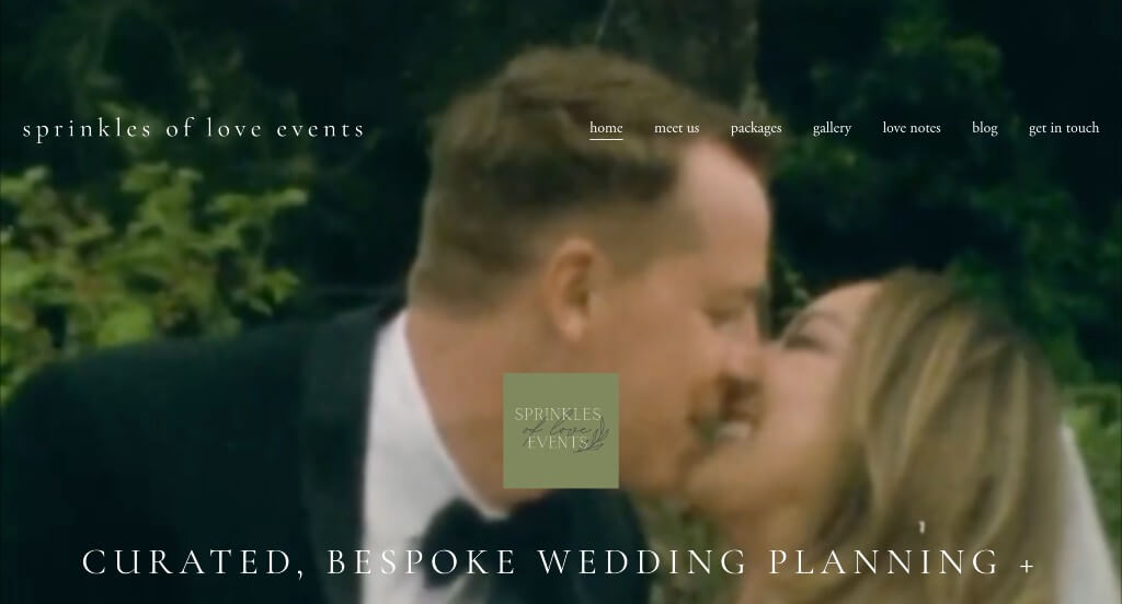
We really enjoyed how there was this creative video that was displayed right away in order to stand out from their competitors. We liked the accents of green that were used in this example in order to feel more majestical. High quality images are used throughout the template to create a more interesting look that viewers will appreciate more.
17. Allure Bridals
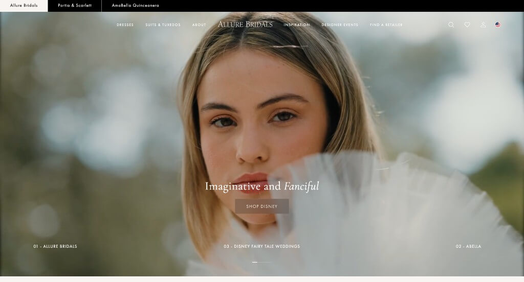
Here we have an amazing website that makes use of high quality images that are sure to grab attention and get customers excited about their products. Keeping their paragraphs short and straightforward was another thing that we enjoyed because people can stay engaged longer. This domain makes sense with their brand name which was also smart.
18. Everly Studios
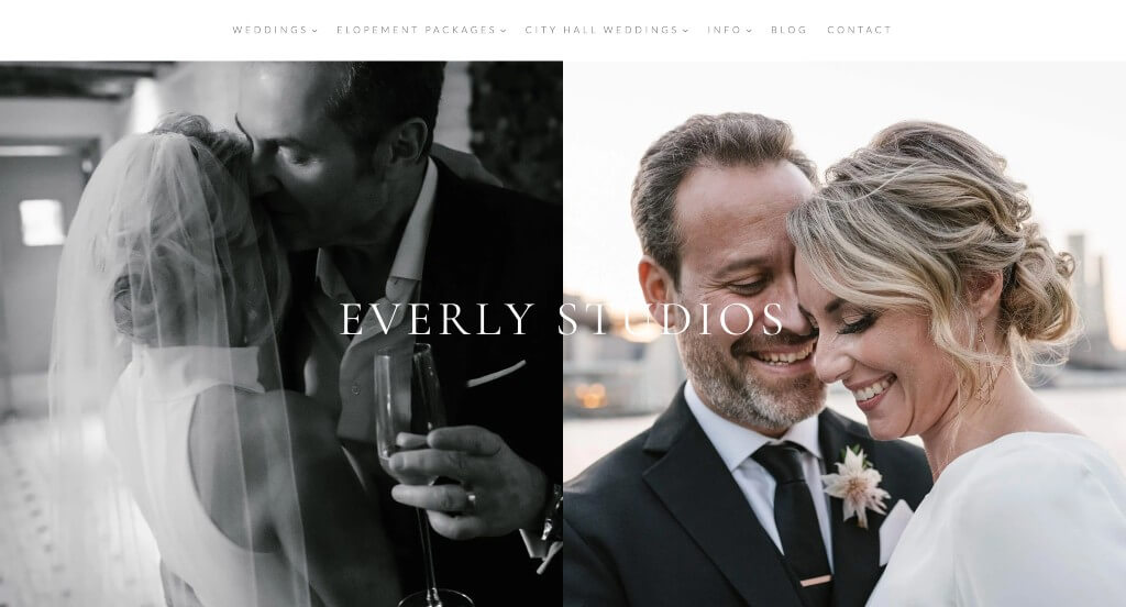
Displaying images that help customers get excited about this service is essential. Along with that, it was nice to explain that they photograph weddings, city hall weddings, and elopements. Including testimonials is another choice that is always good. We liked how this business also had a blog in order to inform viewers in another way. They clearly had a focus on accessibility when creating a domain that matches their company’s name.
19. Fox Events
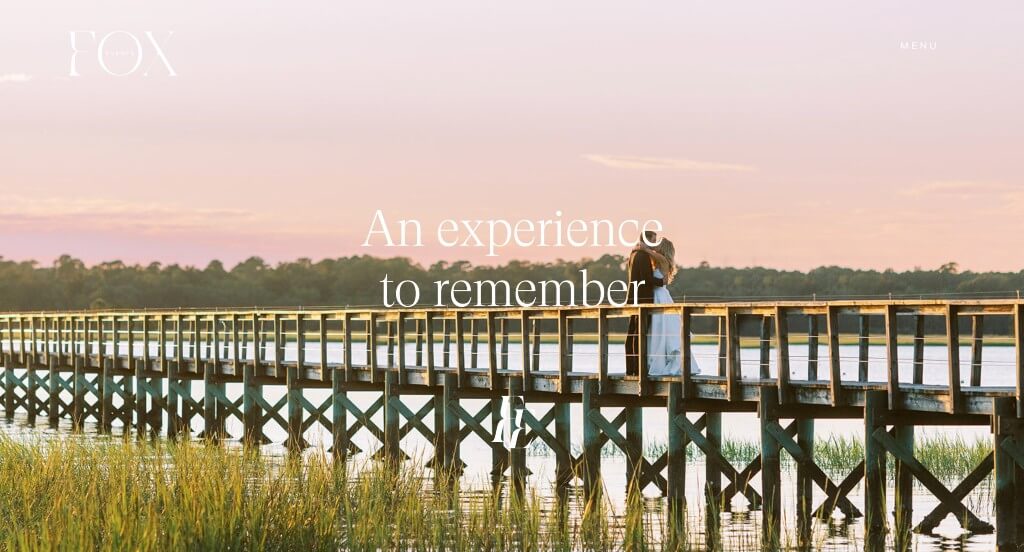
Fox Events had a stunning color scheme that anyone could appreciate. Even though their color choices were amazing, they did even better organizing all of their content in a way that was professional and appealing. Inlcuding their social media posts right into their website was an aspect that we don’t always see, so we like when we do see it.
20. The Knot
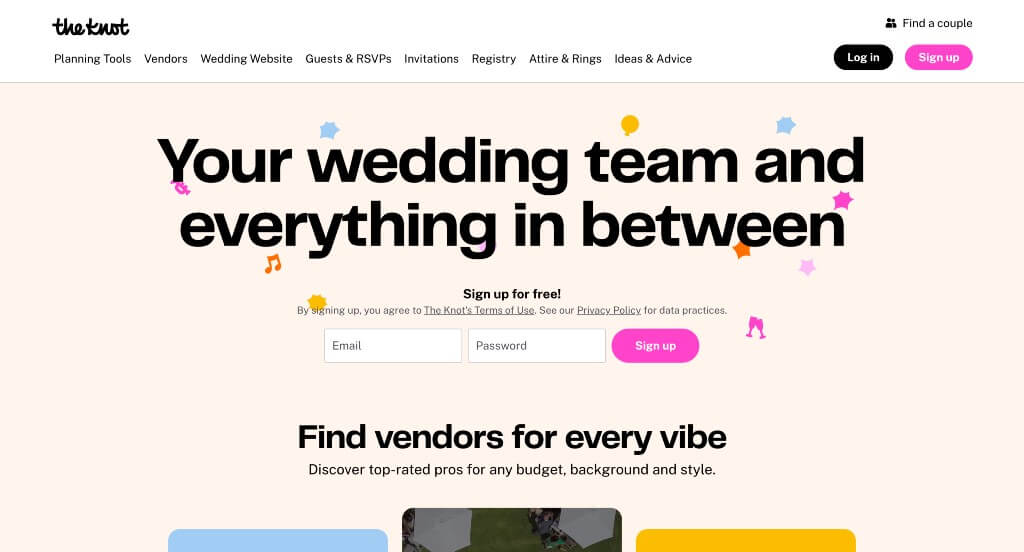
Lots of colorful accents and graphics were used carefully in this example to create something that people would remember. We loved how they showed off their venues and the variety of people that they as a company attract. Additionally, we liked that customers could save venues and such if they were still deciding. Lots of images are included which is always helpful for those planning out their perfect day.
21. David’s Bridal
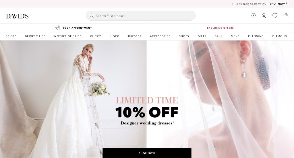
While this is company mainly sells wedding dresses, we loved that there was other event dresses available through them. Being able to sort product by size, color, price, fabric, and more was another great idea. Showing current deals is always helpful for those searching for dresses. A search bar was another aspect that helped them rank into our list of favorites.
22. Joy
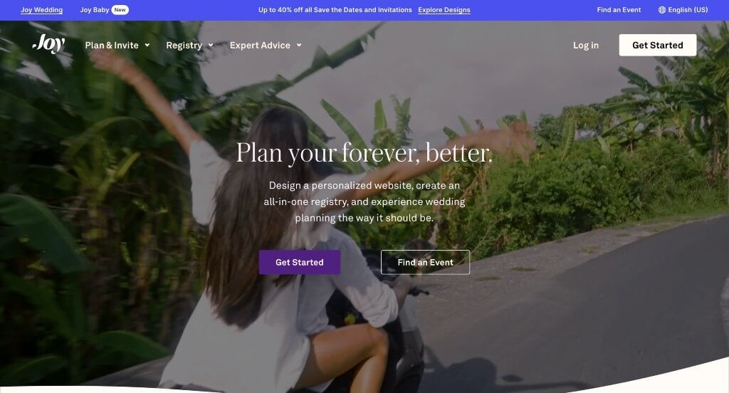
We really liked how interesting transitions were used within this webpage. Their balance between text and graphics was amazing so people could retain information in different ways. A catch phrase “With Joy” appears in a variety of areas which we enjoyed because it creates a sense of unity. Joy also does a great job with their well labeled navigation bar making it easy to find information.
23. Calder Clark
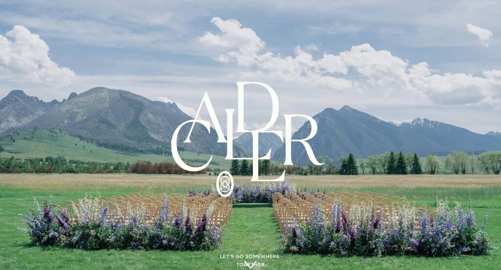
Lucious greens cover this design, keeping it looking fresh and luxurious. Some line graphics were used as backgrounds for their pages which was an impactful quality for them. Another feature that we found enjoyable was how they continually reused their logo. Adding in buttons to help people find more information was something else we couldn’t ignore.
24. Gold Leaf Events
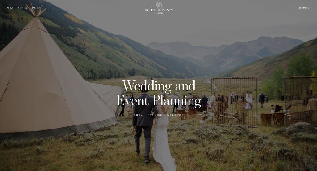
Sticking to gold accents is a great choice for this company especially because of their company name. We loved how many high quality images are used to enhance their visual aspects. A good balance of white space was maintained, making their site easy to manage. Another thing that we really enjoyed was their fonts that were easily readable making customers able to understand information.
25. Valley & Company Events
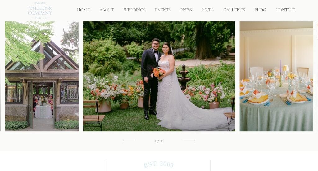
There was lots of inventive fonts that were used within this example which really grabbed our attention. Their optimized content was another design quality that we really enjoyed. We liked how paragraphs were short and straight forward in order to keep everything easier to read through. Including a blog was another thing that we appreciated as a wedding planner.
26. Elaine’s Wedding & Event Center
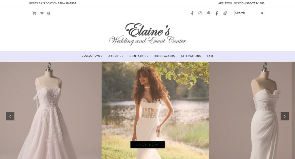
This example does a great job including their social media links. Using lots of different models to show how dresses look on different people and body shapes. Their sliding introduction showing off their products was another thing that we loved. A frequently asked question page was helpful for anyone wishing to purchase one of their products.
27. Dare to Dream
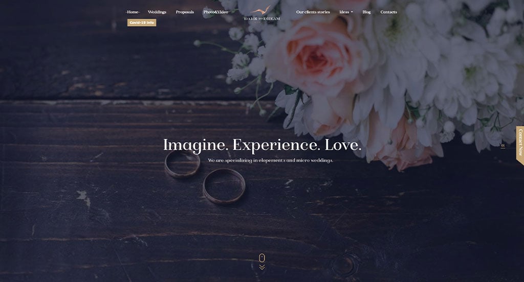
Dare to Dream uses beautiful graphics that harness all the beauty that weddings hold. We enjoyed their staggered layout that is used in order to balance their images and text. Using a type of frame for their text boxes was a nice touch. Their domain was simple and matched with their company making it nice and easy.
28. Adventure & Vow
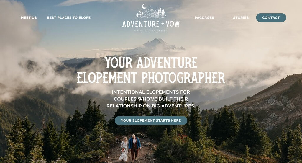
We loved the fonts that were used for this example. It was smart to use little star icons to create bullet points, keeping information organized. Their creative graphics were also nice because it made sense for their business. From a marketing perspective, we liked how they utilized a staggered layout that balances their white space.
29. Love, Laura
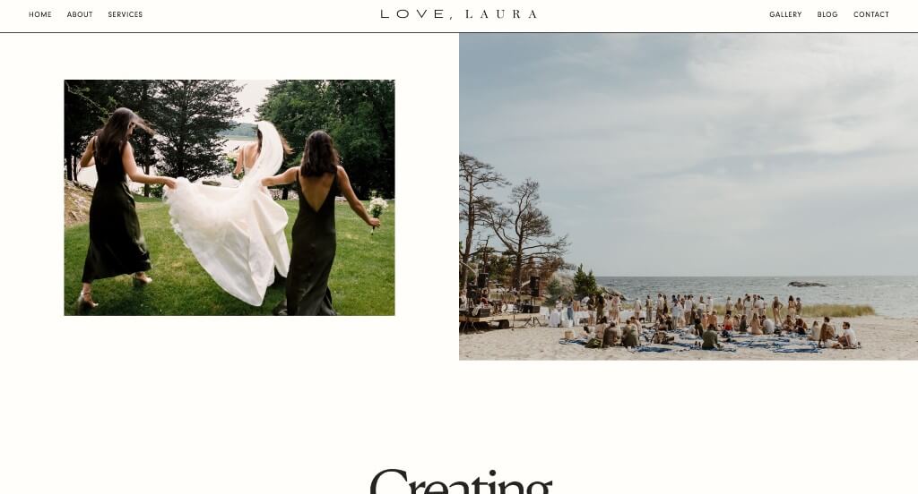
Our favorite thing about this example was the way that information was provided. We liked the interesting transitions that are used to provide viewers with enough written information along with images. The font that this company used was creative and logical for this brand. Another idea that we really liked about this example was their addition of customer reviews because it helps to build trust.
30. Tie The Knot
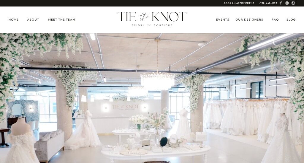
Right away, Tie The Knot used a video that showcased their store, which is always a good choice. Displaying their new arrivals was another thing that we liked. Their creative text made information easy to understand and a joy to read. Adding in lots of buttons to help guide people through the pages was a great idea.
31. Amsale
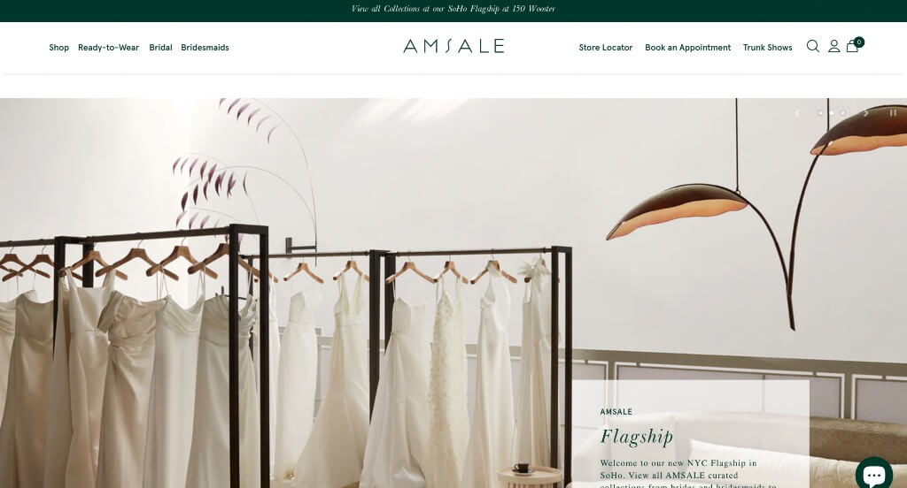
Our favorite part about Amsale is how they allow customers to customize their own dress based on their preferences. Showing off their different colors and patterns for each style of dress was another thing that we enjoyed. We also thought that it was nice to have images as backgrounds for buttons that separate their products. Their menu also had lots of organization to it, making information easy to find.
32. Barefoot Bride Tenerife
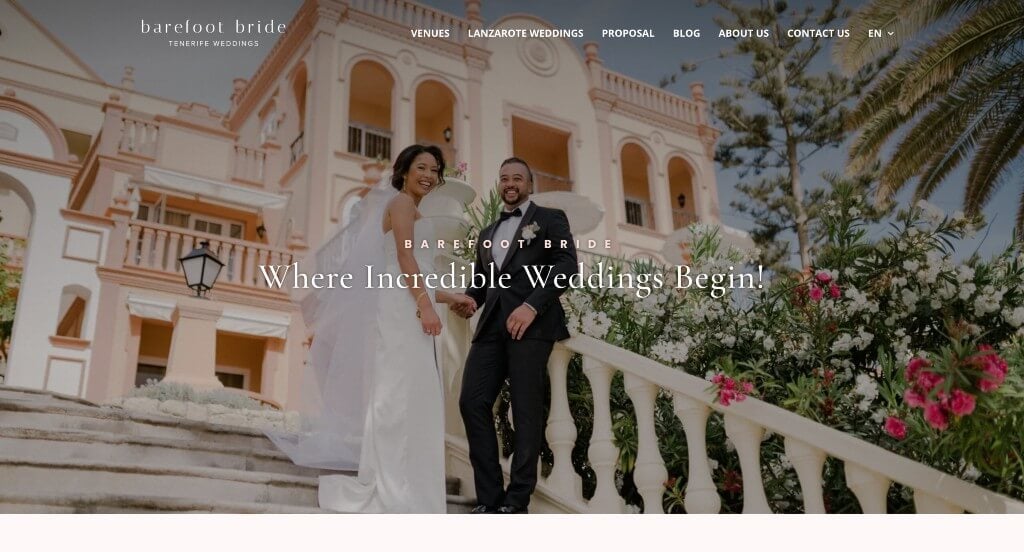
We loved their use of different sized images that create a stunning look for their webpage. Subtle pink accents made for a design that was delicate and full of beauty. These image frames were also a great choice for any company because it helps them stand out more. Barefoot Bride Tenerife did a great job with their simplistic font choices.
33. Toast Events
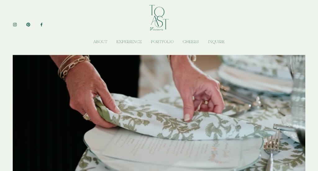
Starting with a video was a choice that we noticed, and enjoyed. Our web designers thought this was a good example for wedding planners because of their simplistic template. Their incorporation of social media was another reason why we included it in our rankings. This subtle greenish-blue color scheme helped breathe life into their webpage.
34. Modern Gents
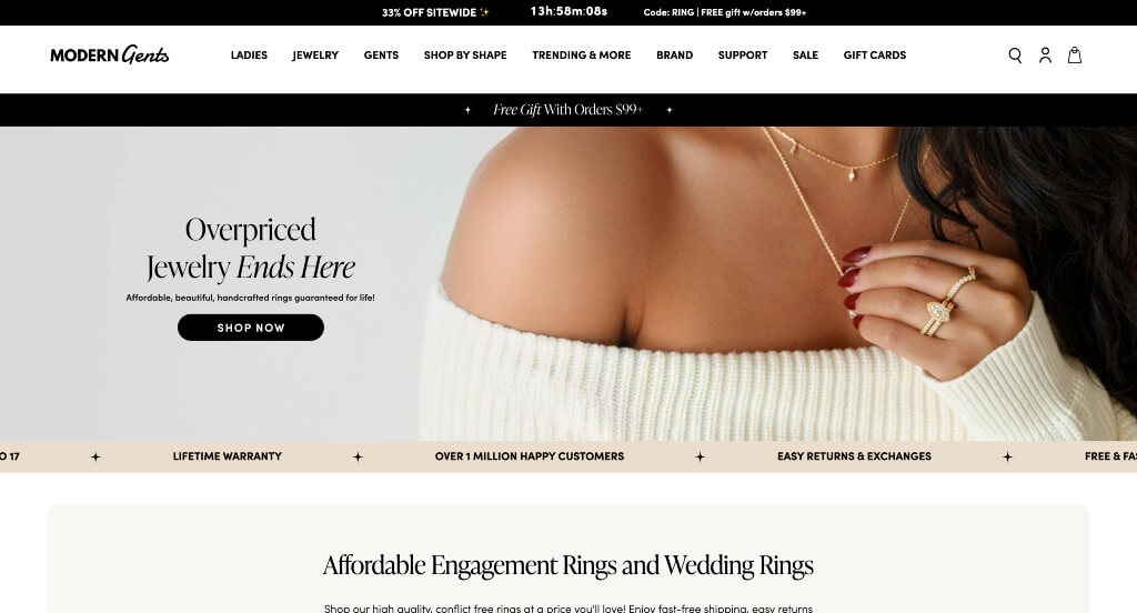
One of our favorite parts about this wedding and engagement ring company was their navigation bar that is extremely easy to use and find information. Showing well known companies who trust this brand was another great addition for their company. Some small graphics was nice because it creates a more inviting template.
35. Chippewa Valley Wedding Crashers
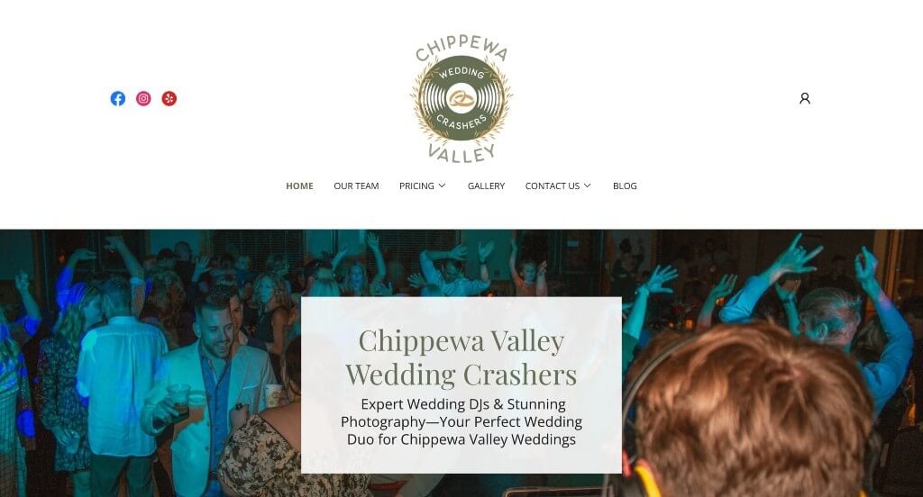
Something that captured our attention right away was their logo that was creative and made sense for their business. Adding in a blog was another thing that we enjoyed because not all companies do that, plus it provides customers with additional information. Drop downs were also pretty nice because it helps keep everything more informational.
36. Lovely Bridal
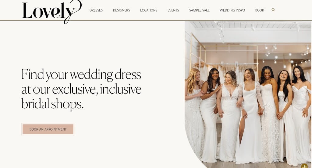
This example made sure to show lots of smiling brides, which makes sense. Showing their locations pinned on a world map was another nice touch. After scrolling for a while, you’ll notice how images are placed into frames with curved edges. Lovely clearly had a focus on conversions when building a webpage that feels personal to viewers.
37. One Wedding House
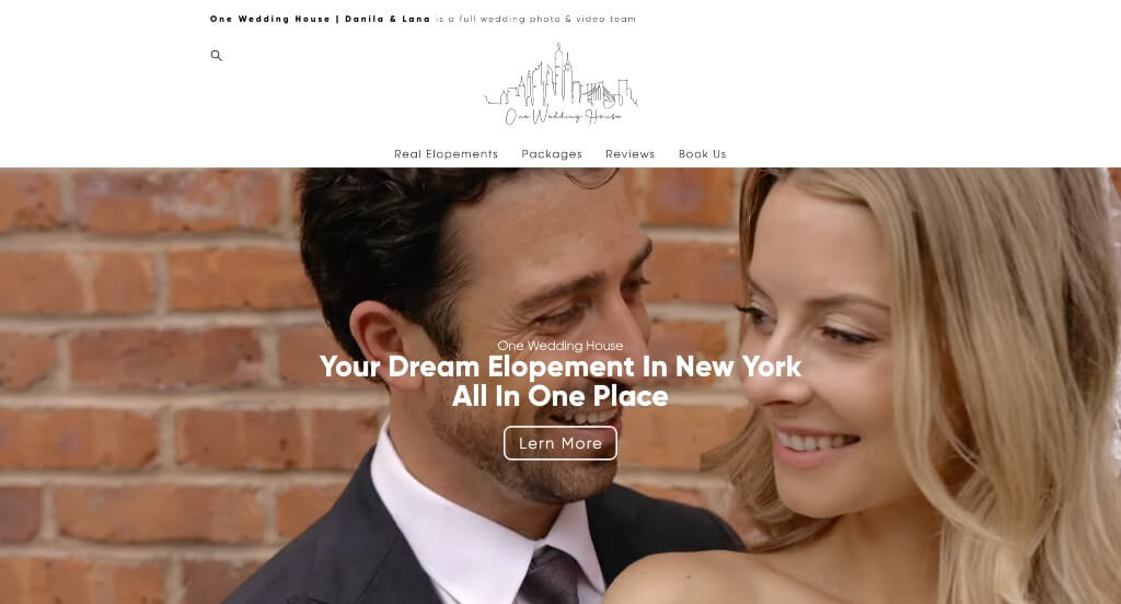
This delicate logo really helped One Wedding House stand out against their competitors. Their balance of videos and photos was something else that we noticed. They also had a good balance of interesting backgrounds and venues, which we really loved. Adding in buttons to guide people towards additional content was something else that we really appreciated.
38. Cedar & Sage Weddings
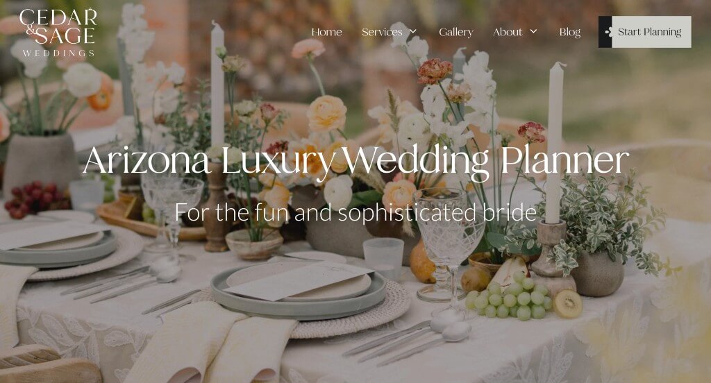
We liked how this example used graphics that were reused often to create unity. Short paragraphs were used in order to keep everything easy to read. Lots of buttons were used to help guide people towards additional information. Cedar & Sage Weddings clearly had conversions in mind when allowing for simple contact information.
39. Bridal Bliss
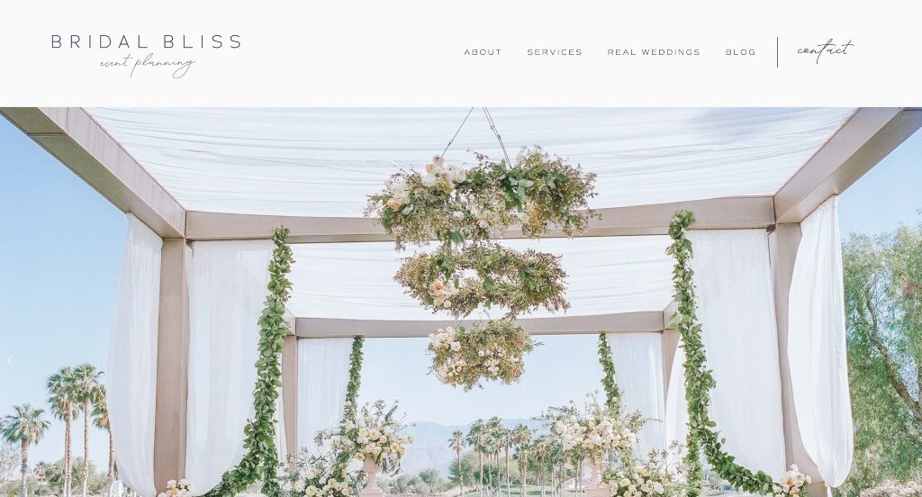
As you scroll through, a quality you’ll notice is their unique template to balance their photos and text. We also really enjoyed their dark blue accent color that appears throughout their pages. Showing off their customers by couple was something else we noticed. Including a blog was another feature we couldn’t ignore.
40. Men’s Wearhouse
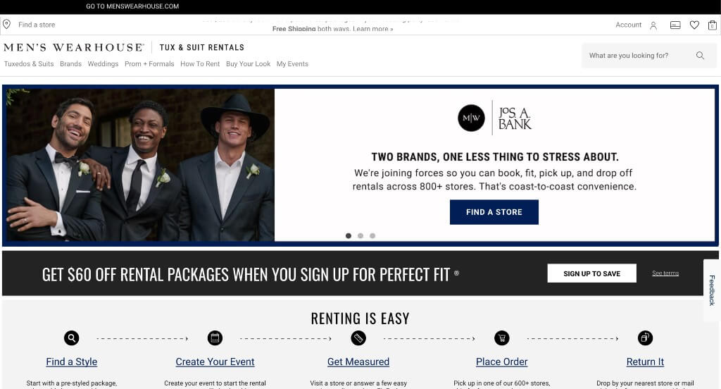
Using a black and white template here is not only modern, but also more masculine which is logical for this brand. We thought it was nice to use a few accents of dark blue to highlight links and other information. The “find your true color” feature was a very helpful feature within their homepage that customers will appreciate. They also made sure that everything was easy to find so there is no confusion.
41. Galia Lahav
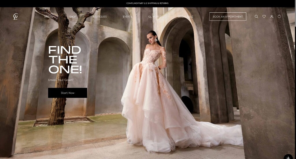
We loved how Galia Lahav made use of a dark background to feel more luxurious. It was also nice how there was an area with images and videos all in black and white. Having a simple checkout process was extremely helpful, making them rank on our list of favorites. Including a blog for their company was another thing that we really liked.
42. Fallon Carter Events
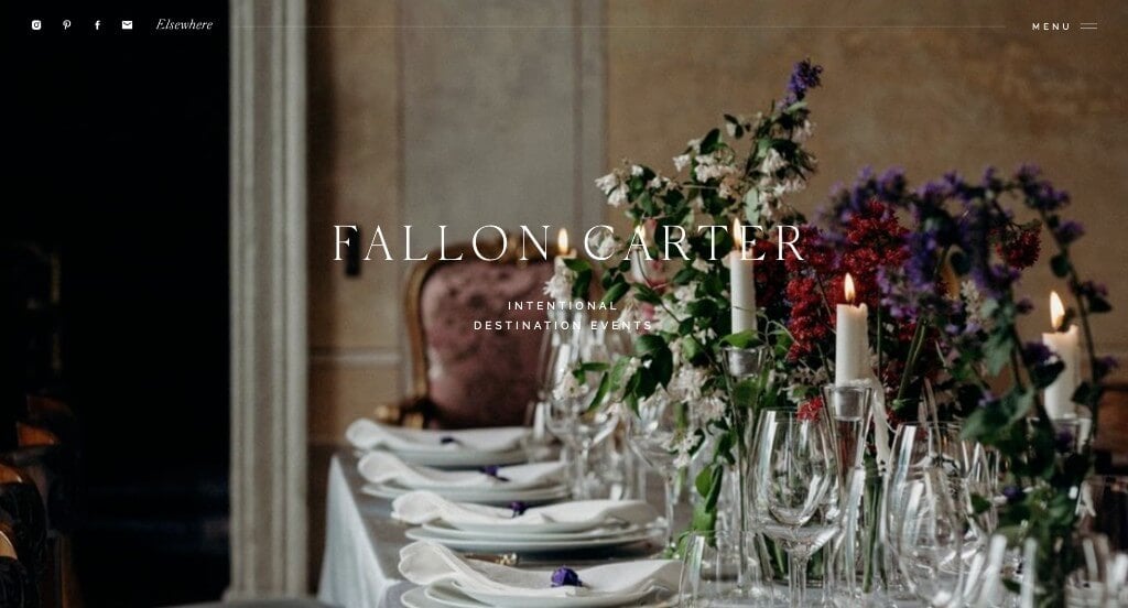
We immediately noticed the white, black and brown color scheme here, which creates a sleek and professional look. Their domain matches their company name which is always a good choice. Their images are vibrant and of high quality. Another thing that we liked was their short paragraphs that kept everything organized and easy to read.
43. La Luz Weddings & Events
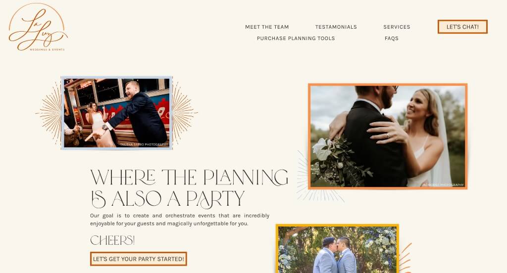
La Luz had beautiful image frames that are creative and are sure to get viewers excited to preview more of their website. They used a creative font that made their overall aesthetic more unique to their brand. Adding in accents of a few different colors was yet another great way to make their template more informational.
44. DFW Event Design
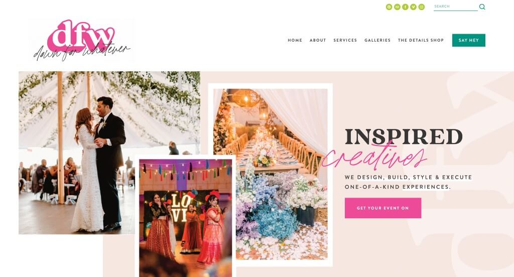
This was a vibrant example that visitors are sure to appreciate. We liked how the image frames were simple but created an authentic feel for their brand. Along with that, we also liked how there was accents of bright colors throughout the design. Showing some of their well known clients was a smart way to build trust with incoming companies.
45. Mumu Weddings
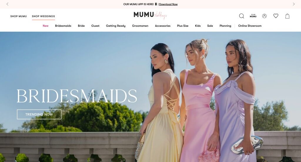
High quality images can be noticed right away which makes them feel like a more professional brand. It looked great to use a mixture of bold and decorative fonts within their pages. A pop-up is included to earn coupons, which we thought was a nice touch. Being able to shop by shade and color or search for something specific were other things that we really liked.
46. Eloping is Fun
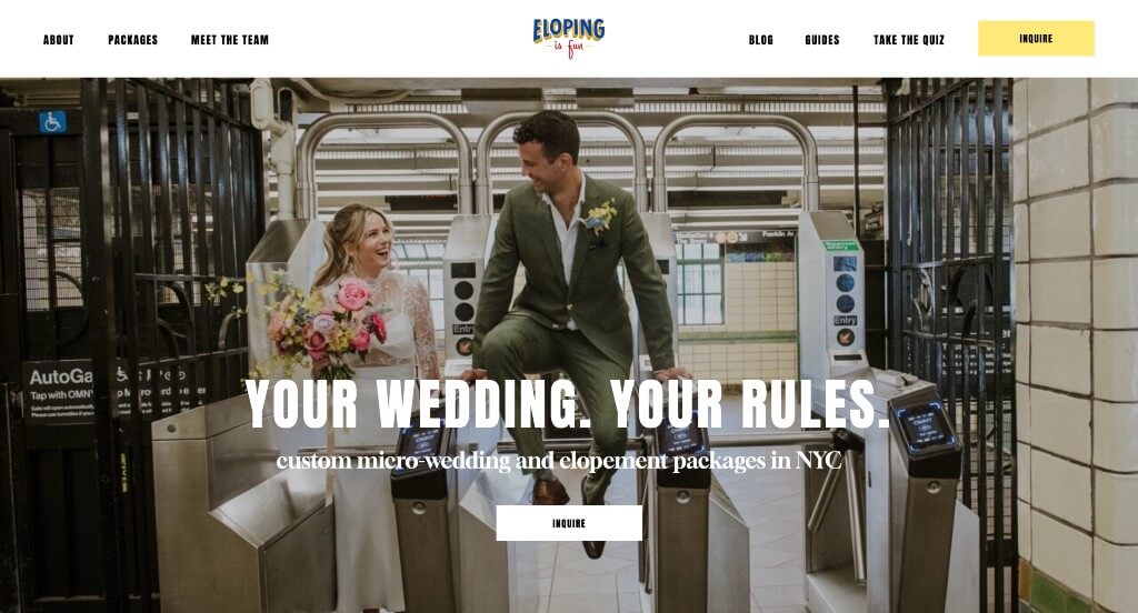
We liked how this example really showcased the fact that you can do whatever you want for your wedding. An automatically playing video shows snapshots of different clients, which was helpful for incoming clients. We also liked their almost comic appearance for their logo. Finally, we liked that they used step by step paragraphs to make sure people understand what they’ll need to do.
47. Kindred Weddings & Events
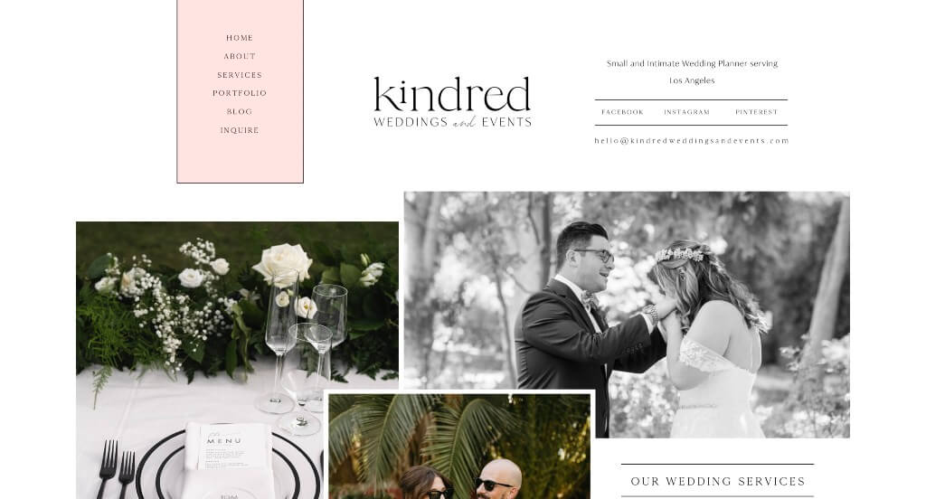
We loved how Kindred Weddings & Events layered their images in order to create a stunning look. Accents of pastel pink allow for a delicate sort of beauty, which is typically wanted at weddings. Their use of buttons to enhance usability was refreshing for any webpage. We also thought it was nice to have occasional black and white images.
48. The Vale
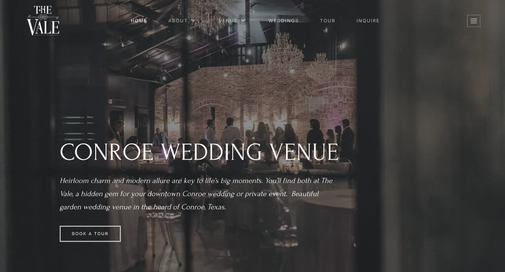
This thoughtful logo was something that we really liked. It was also nice to reuse that logo in many different areas. Having a section dedicated to showing off their own venue was a great choice. Their images were stunning, which is always helpful. Buttons are used to help keep everything organized and easy to find.
49. Mandy Marie Events
This was an example that did a great job with their fonts that viewers will enjoy. We thought it was cool how their images varied in size so their layout never felt boring. This logo design was luxurious and logical for them as a company. Each of their paragraphs were fairly short and got to the point so customers didn’t waste time reading irrelevant information.
50. Simply Elegant Group
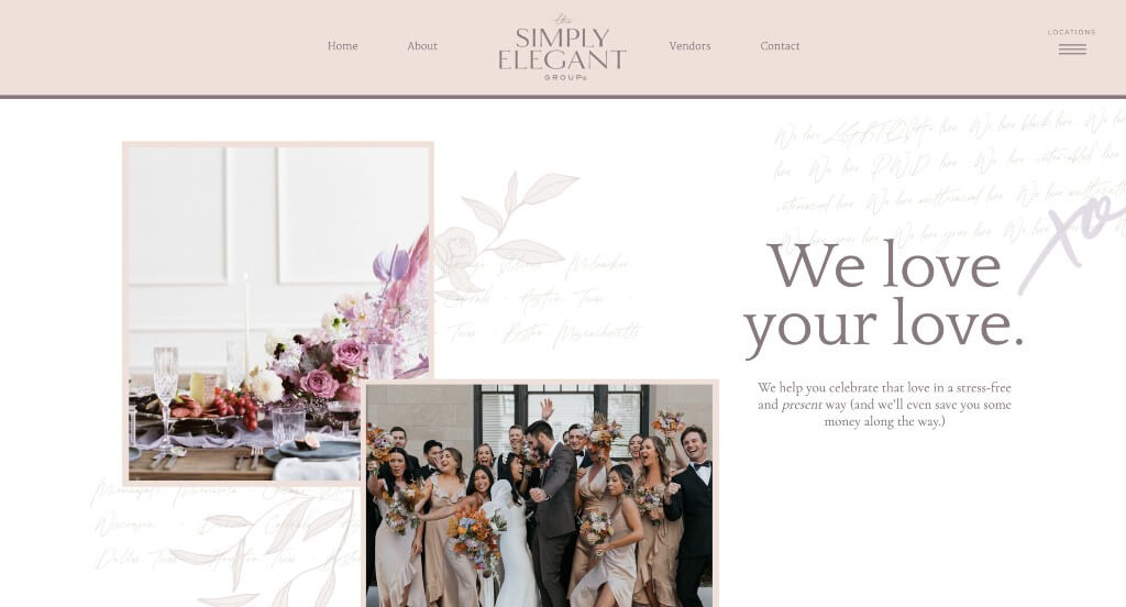
This was a very creative example that blends image frames, stunning colors, and delicate graphics. Simply Elegant Group does a nice job balancing their white space to keep everything feeling clean and uncluttered. Their fonts are also fairly simple and easy to read, which is always a plus. We liked their section that shares how they as a company are different from their competitors.
WordPress Wedding Themes
Explore free themes at wordpress.org or consider wedding-inspired templates on ThemeForest.
WedKnot – Themeforest
$59
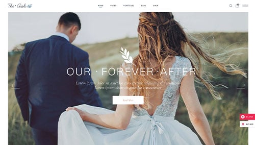
The Aisle – Themeforest
$69
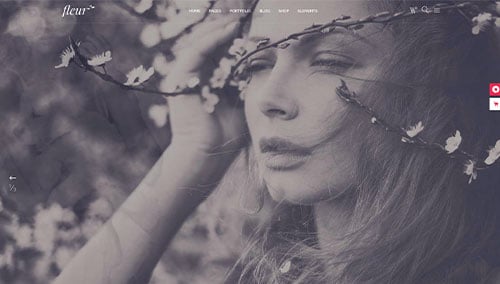
Fleur – Themeforest
$79
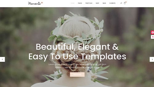
Moments – Themeforest
$79
WooCommerce Wedding Themes
Find a variety of ecommerce wedding themes for WooCommerce on ThemeForest.
Wedding Shop – Themeforest
$59
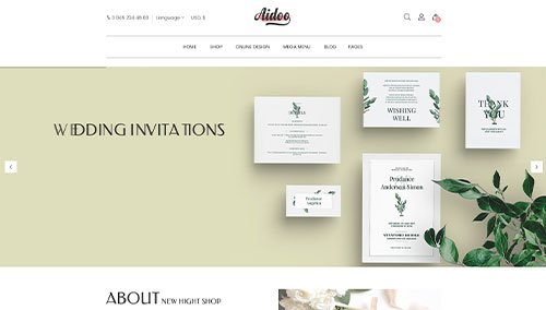
Aidoo – Themeforest
$79
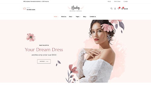
Bridey – Themeforest
$58
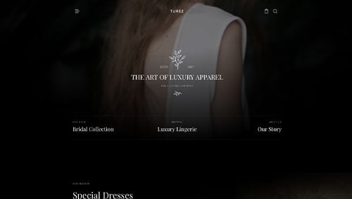
Turez – Themeforest
$49
Shopify Wedding Themes
Browse free and paid themes at themes.shopify.com or explore options on marketplaces like ThemeForest.
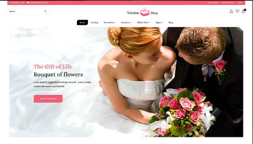
Window Shop – Themeforest
$59
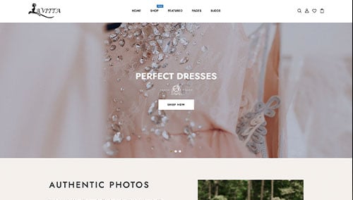
Lavitta – Themeforest
$56
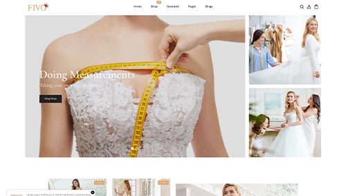
Fivo – Themeforest
$56
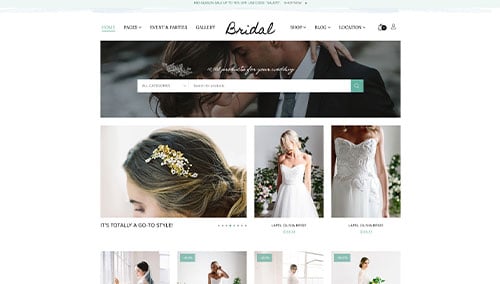
Bridal – Themeforest
$56