WooCommerce is a popular platform for building websites, offering numerous features, customization options, and a user-friendly interface.
We’ve handpicked these top 50 WooCommerce websites to help small businesses and non-profits maximize their online presence.
We ranked sites based on design, functionality, uniqueness, and user experience. These top WooCommerce websites offer inspiration for building or revamping any WordPress e-commerce site.
Whether you’re starting out or seeking a refresh, this list is your guide to building out a WooCommerce design. For other platforms, see our Best Websites of 2025 article!
Top WooCommerce Website Designs
- 1. Minimalist Baker
- 2. Big Fut
- 3. Only Mine
- 4. Sawmill Designs
- 5. Kwik Trip
- 6. Joco
- 7. Zoya’s Pantry
- 8. Magna-Tiles
- 9. Printing New York
- 10. BetterBody Foods
- 11. Kawaii Box
- 12. Porter & York
- 13. Nic Harry
- 14. Ashville Bee Charmer
- 15. Root Science
- 16. Hidden Grounds Coffee
- 17. Nalgene
- 18. Style Girlfriend
- 19. Stems Brooklyn
- 20. 3 Speed Holster
- 21. Sake One
- 22. Huru
- 23. Rusty Surfboards
- 24. Chuckling Goat
- 25. Rotimatic
- 26. NutSite
- 27. Ksport
- 28. DogTV
- 29. Probo Medical
- 30. Soothing Scents
- 31. Bella Beat
- 32. Shaleen Cheah
- 33. Bog Berry Dryer Balls
- 34. Summit Knife Works
- 35. Martin’s Home & Garden
- 36. Tom Chalky
- 37. Veer
- 38. Poppy Barley
- 39. Daelmans Stroopwafels
- 40. AB AETERNO
- 41. Bamford Watch Department
- 42. Jamaica Cottage Shop
- 43. Safe Life Defense
- 44. Burny Wild’s
- 45. Elecbrakes
- 46. Design Modo
- 47. Don’t Buy Her Flowers
- 48. Scepter & Sword
- 49. Longest Road Out
- 50. Hard & Ware
1. Minimalist Baker
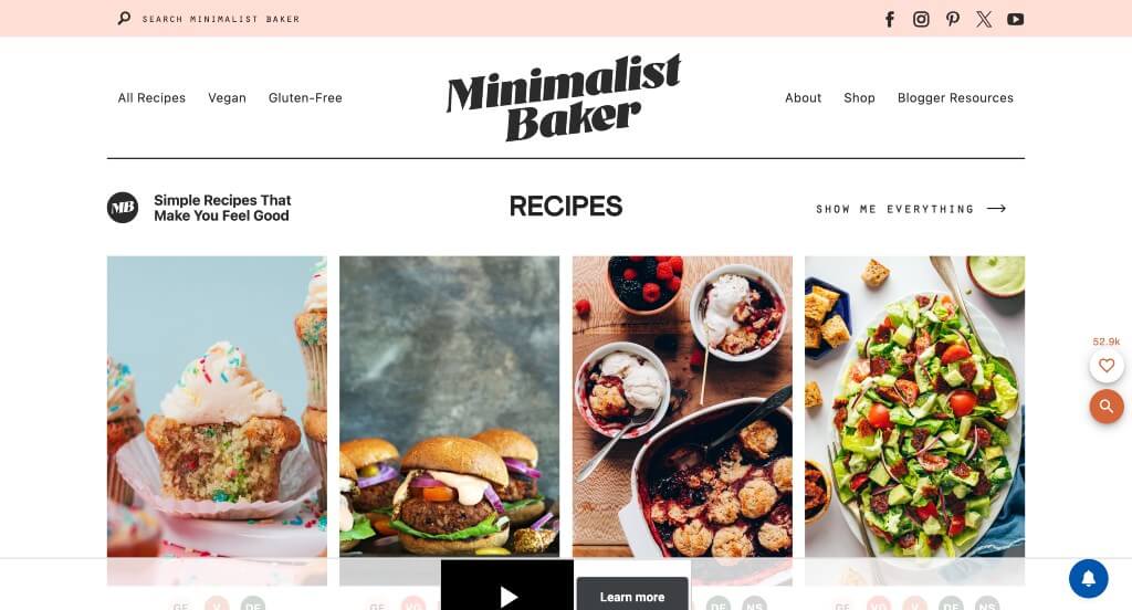
We liked how this example included images with their simple recipes. It was amazing that they included gluten-free options for those who eat that way. Choosing a pick of the week that features a special recipe was a nice touch. We liked how they added in reader favorites in order to help those who don’t know where to start.
Related: Looking for a developer to help build your next WooCommerce website? Check out our WooCommerce agency.
2. Big Fut
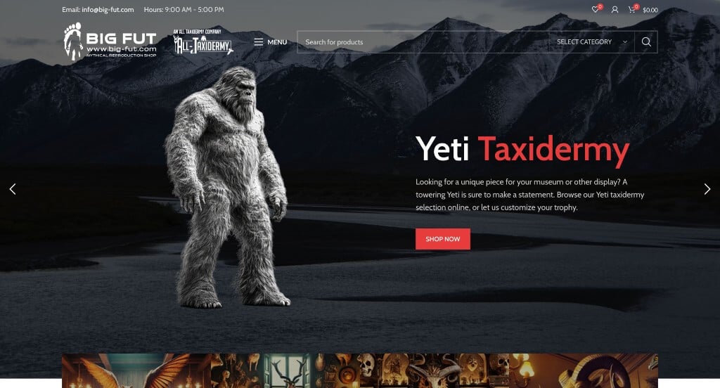
Right away, we noticed how this company did a great job with their logo design. Something that we enjoyed was their ability to create mythological creatures through the form of taxidermy. Displaying the reasons why people should go with this company was a great way to show off what they as a company find important. Additionally, they did a great job with their domain that matched their company name.
3. Only Mine
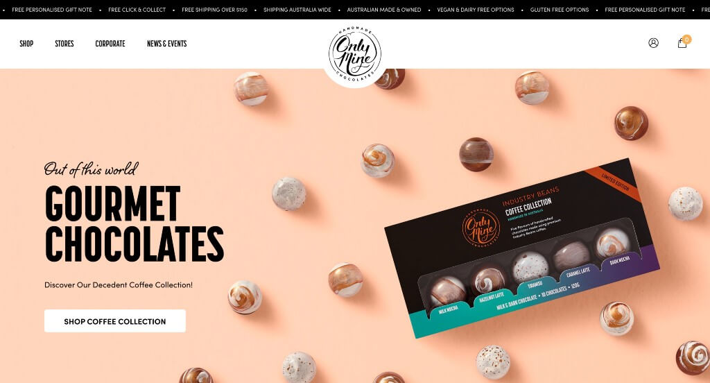
This company gives off a luxurious feel based on their package designs. Their logo design adds to that feeling because there is no cheesy image, just text. Curly fonts are used to seem less modern and a little more of a creative company. Navigation is simple and all products are displayed neatly. We liked their little drop down allowing customers to pick an occasion, type of chocolate and monetary range to find perfect items for you. Another feature we found useful was their recipe section that uses their products to help you make tasty treats.
Related: Already have an ecommerce site running WooCommerce? Our Woo SEO experts can help with search engine optimization.
4. Sawmill Designs
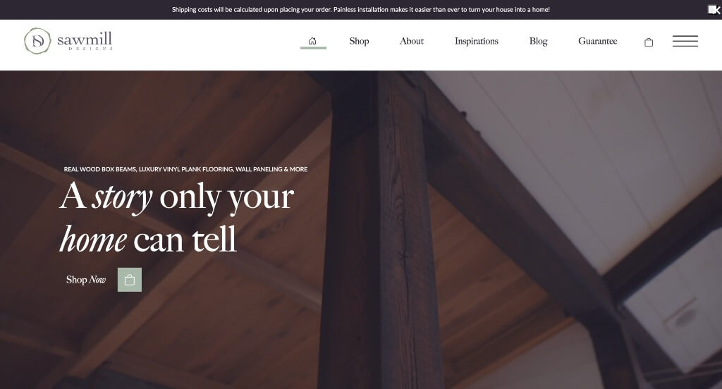
Sawmill Designs is unique because it offers a wide variety of services, including custom furniture design, carpentry, and home decorating. Likely this business’s best feature was their logo design, including a “D”, “S”, and some leaves. Sawmill Designs used graphics to showcase what each type of product will look like in your home, which was useful. Automatically playing videos are used throughout to tell a story. Including a blog was a feature we will never disrespect.
5. Kwik Trip
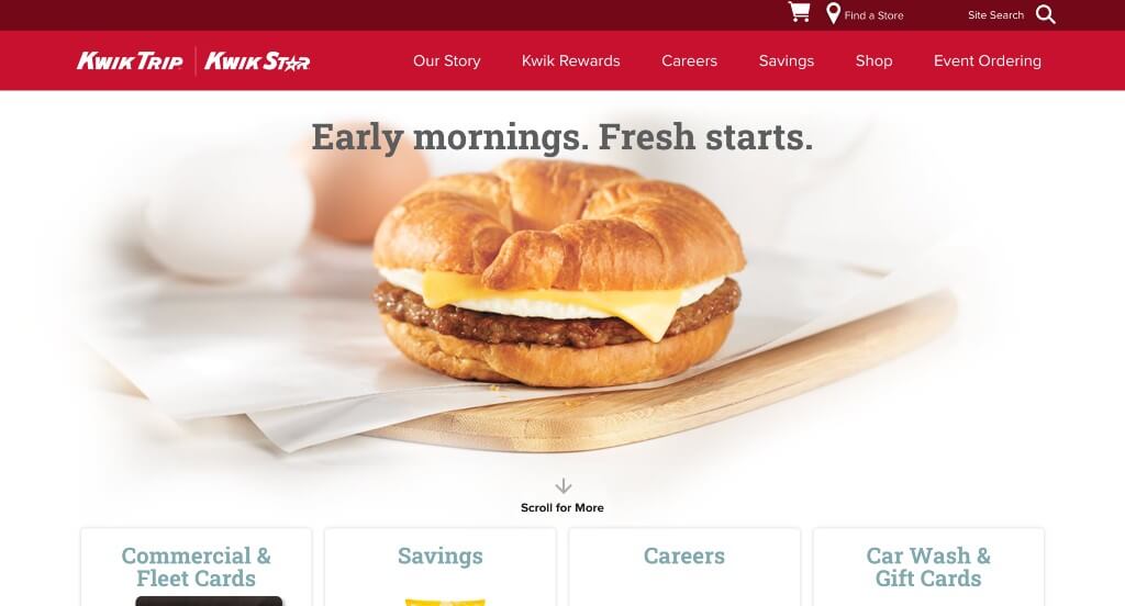
We loved how this example stayed true to their brand. Anyone who has been to a Kwik Trip can truthfully say that their website is represented just as their in-person store is. It was cool how they used silhouettes of states as image frames to show where this company is located. Using a search bar to help people find information within their pages was a great idea.
6. Joco
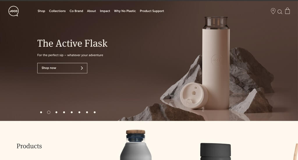
JOJO cups is very modern both in their site and their product. Tones of gray and off-white are used to evoke a sense of simplicity. It was smart to inform customers on their mission to reduce plastic. It was nice to include wooden lids for some products. Additionally, it was decent to include short paragraphs of information about each item.
7. Zoya’s Pantry
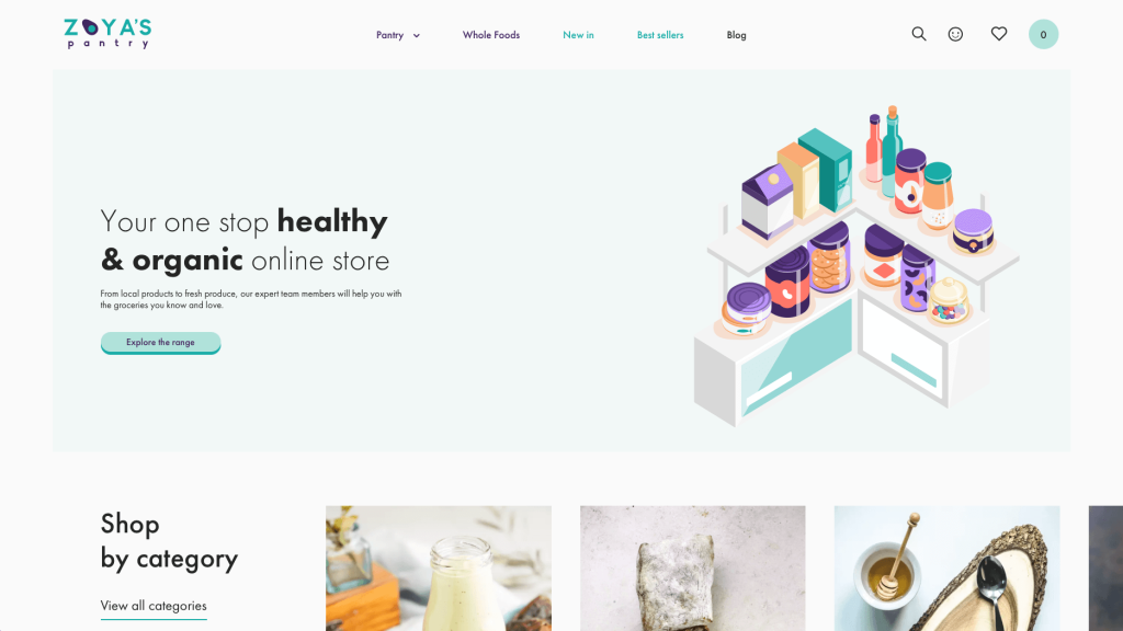
Graphics and imagery was something that really improved this template as a whole. Thin and basic fonts are used to create that simplistic feel. It was creative to include hearts to add products to a favorites list. Lots of additional information was included about each product, so customers know exactly what they are ordering. White space is used very carefully so it balances out all of Zoya’s Pantry’s content.
Related: Need help maintaining or managing your WooCommerce website? Let us know and we can help!
8. Magna-Tiles
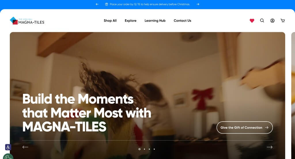
Here we have an extremely innovative product that is well represented in their WooCommerce sire. Bright and inviting colors are used along with a clean and organized template. Magnatiles’ logo design showcases their interlocking feature. It was nice how all their products were organized into four different categories. A FAQ page was something else that truly stood out to us.
9. Printing New York
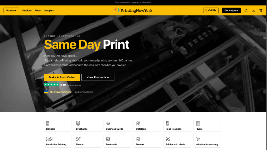
Modernism leaks through every page of this black and yellow covered example, giving it a classy and professional look. We loved their automatically playing video that showcases not only NYC but also what they do at their company. This company did a great job with their logo design that looks like a modernized version of lady liberty’s crown. Printing New York has been around since 1988, so customers know that they can trust them.
10. BetterBody Foods
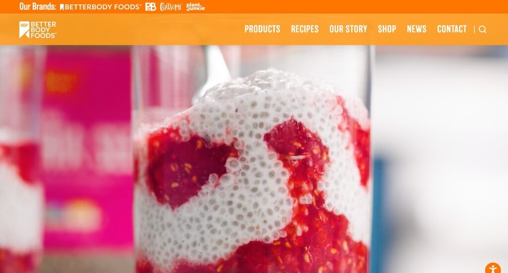
BetterBody Foods uses a bright orange to evoke positivity towards this business. High quality videos show their healthy ingredients that are used. Lots of different diets help to separate their items so customers with specific diets are able to find what they want faster. Including their Instagram right into their template was genius.
11. Kawaii Box
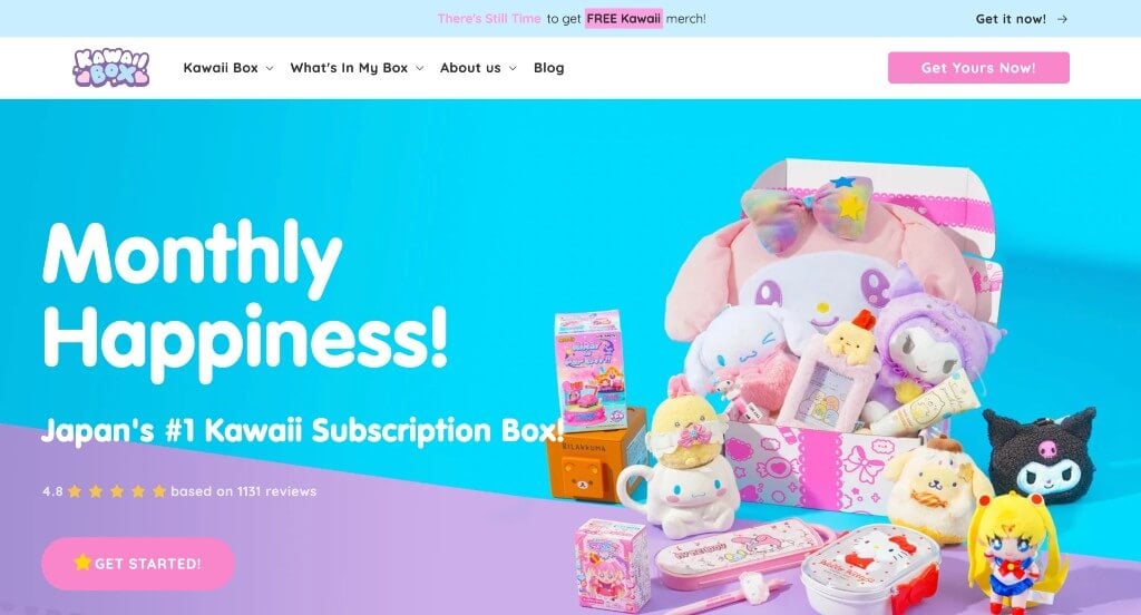
Kawaii Box is a monthly subscription box filled with super cute kawaii items from Japan! Using a pastel color scheme and bubbly letters makes for a kiddish feeling. It was absolutely amazing to include customer reviews and an Instagram section. Another feature we enjoyed was their as seen on TV section, and their blog.
12. Porter & York
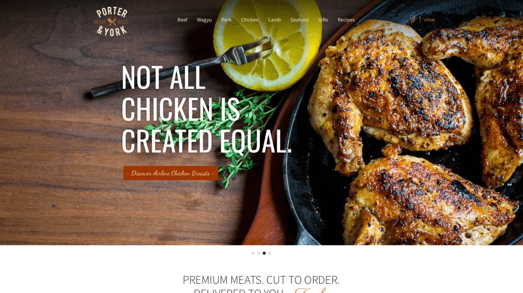
Port & Yorker shows that they sell high-quality meats with their stunning imagery. We loved how their images included raw meat cuts and what meals their meat could become. This is a great example if you want to play around with typography. They use various different fonts that all work together to create a professional feel. Lots of simple graphics were added in to make cuts of meat more obvious what you are buying.
13. Nic Harry
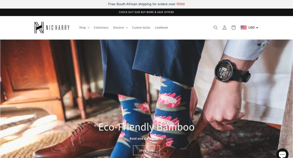
We loved how this logo design seems modern but still creative. Lots of negative space can be noticed, but in a way that it isn’t boring. We liked how most of their imagery clearly focused on their products versus seeing entire model images. This sock company stands out because of their crazy patterns. You can also see all reviews from other customers when viewing a specific product.
14. Ashville Bee Charmer
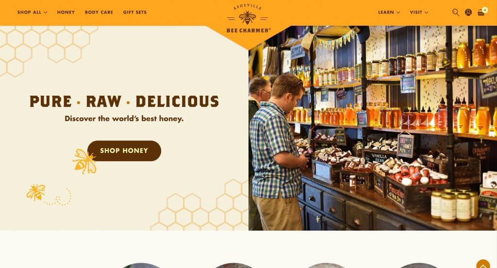
Asheville Beecharmer takes advantage of oranges, yellows browns and off-whites to create that natural feel. This design is also responsive, so it looks great on many different devices. Using a variety of small flowery graphics to make sure that natural feel is noted. It was amazing to include information related to their community that surrounds their business locations.
15. Root Science
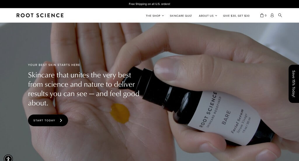
Here we have a modern design that uses mainly black and white to create something stunning. Sleek, thin black lines serve as image frames within their pages which looks great. A skin quiz is included in order to help customers find the best products for them. We thought it was smart to separate products by categories and concerns.
16. Hidden Grounds Coffee
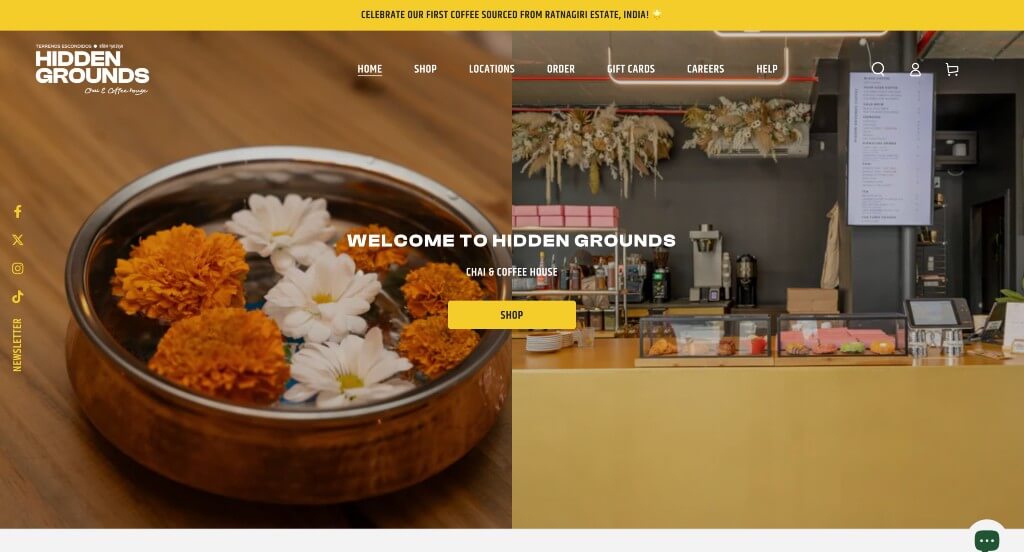
Everything about this site seems simple and modern. We loved how Hidden Grounds Coffee uses lots of bold fonts along with a simple color scheme. Overall it was pretty easy to navigate through because products are very well-organized. Additionally, we enjoy how bright yellow accents that are used as buttons and small accents. Extremely short paragraphs could be noticed to help make this site less overwhelming. Lastly, including an entire section for parts of their Instagram page.
17. Nalgene
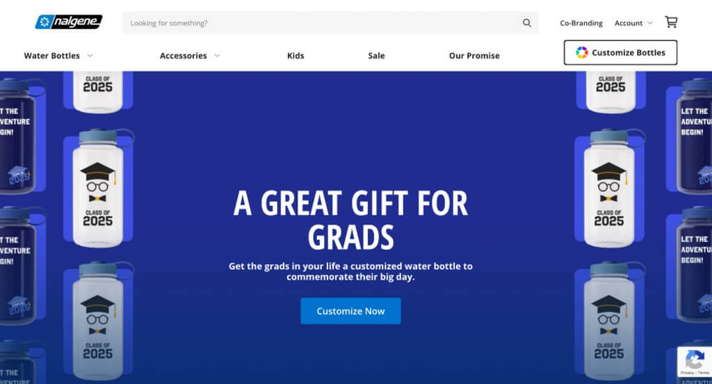
Playful emotions are evoked with their creative fonts along with interesting patterns and graphics. We really thought that having. We thought it was really creative to add a feature to create your own designs, where you can find anything from bright pink to classic black. Nalgene is also a very reputable company with and it shows through their design. Additionally, having a search bar was smart because it allows for customers to find specific information faster.
18. Style Girlfriend
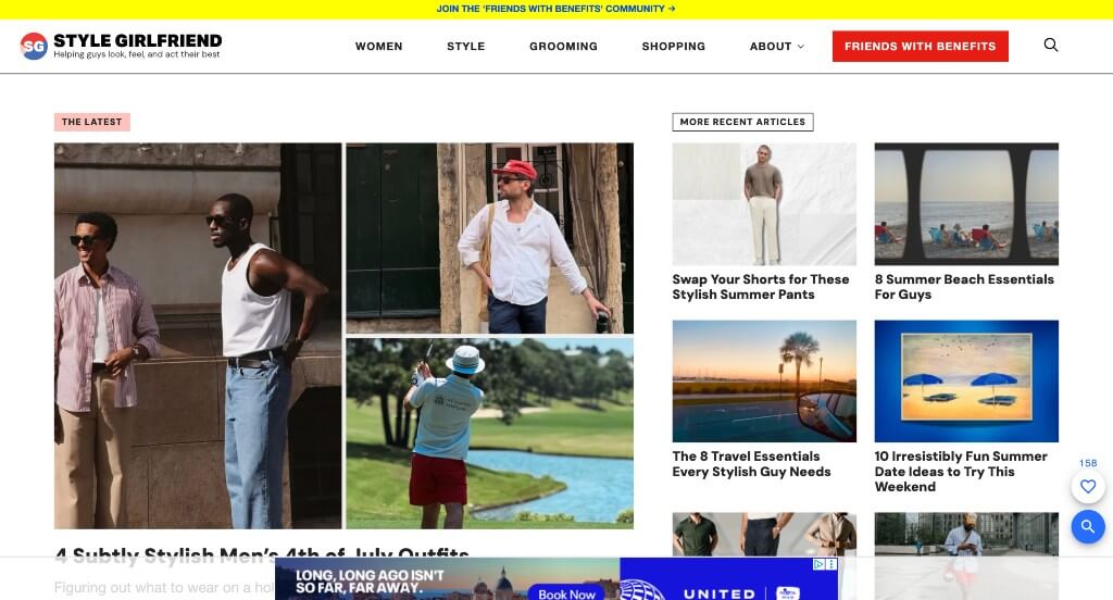
This example uses lots of bright colors in order to highlight information and grab attention. Including a button that shares how old customers are helps them find information and clothing that is more relevant to them. Adding in images with no backgrounds allowed for a more stunning way of showing off their products. A featured area is included that helps with styling based on the specific season.
19. Stems Brooklyn
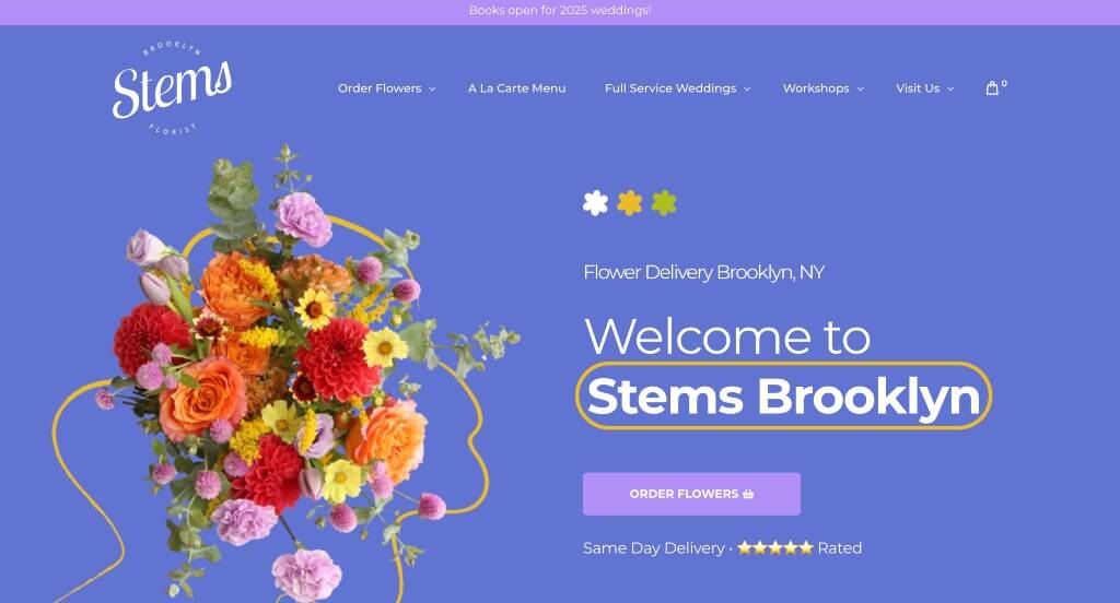
This is an amazing example for anyone looking to develop a site. Having a creative pastel color scheme was a creative choice that we enjoyed. This layout is easy to follow, and a clear hierarchy of information is shown. It was a cool idea to show a picture of their building. We thought it was interesting to paint their part of their building with bright colors to stand out from red brick. Including lots of stunning images of beautiful flowers. Lots of buttons were also included to help customers get to certain information faster.
20. 3 Speed Holster
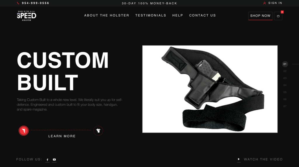
While this example could use a bit more work, it wasn’t terrible. We liked that there was lots of pictures of their innovative product. A dark background helps to create a different feel for this company. Likely this business’s best feature was their logo design that utilized a 3 and speed in one icon. We also liked that there was just the perfect amount of information so it doesn’t seem overwhelming.
21. Sake One
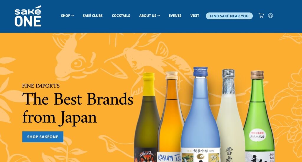
Here we have a minimalist design with a clean, white color scheme. It was great that Sake One used remarkable packaging designs, clearly displayed throughout these pages. We loved how they added in a section for their social media page. We also enjoy their white and blue color scheme that is simple and calming. Finally, this company did a great job with their variety of fonts.
22. Huru
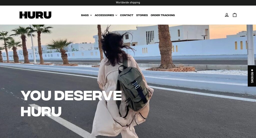
Bold fonts clearly are a plus for this design because it really shows off a modern feel. Along with that, using mainly black and white helped with that simplistic look they were going for. Huru’s overall aesthetic is very pleasing to all customers eyes. There are not a lot of bells and whistles, which is nice when you’re just trying to find information quickly.
23. Rusty Surfboards
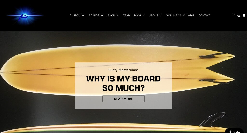
Rusty Surfboards does a great job with their loads of images carefully placed in areas that enhance the overall look. Overall, this design is very clean and minimalistic. Adding in lots of connective blog posts was a smart idea. We also like how it has a lot of negative space and making it look less cluttered. We also thought it was helpful to have drop-down boxes for their navigation bars.
24. Chuckling Goat
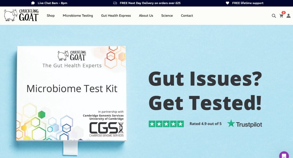
Another one of our examples sells organic goat’s milk soap and skincare products, and you can tell by their business name. Some images are included which really helps with their visual appeal. It was smart to have short and straightforward paragraphs. Another feature we enjoy is having buttons to help customers to get to other pages. We also really enjoyed their use of a green accent.
25. Rotimatic
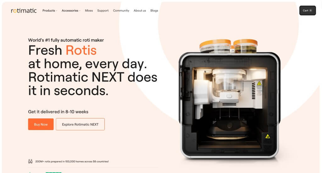
We really like that this company shows off their product as many people might not know what it is. An orange accent covers a mainly white color scheme that helps important parts. All of their photos are very high quality, and they do a great job of highlighting interesting features about this machine. We also liked how they used lots of small graphics to help make this site look more interesting.
26. NutSite
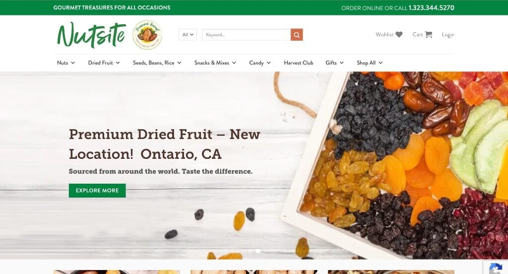
This company used high quality images to show their tasty products. Along with that, we liked their thoughtfully picked font choices that look professional. A green accent was also a great idea for a natural food company. Nutsite uses a domain that matches their company name which is always a helpful idea.
27. Ksport
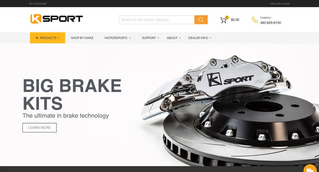
There was a few bright yellowish orange accents that highlight specific information and links. Using those same colors in their images was another thing that we really enjoyed. We liked how in some of the images they broke down parts of their products so people know what to expect. Short paragraphs are also included in order to make it easier for readers to comprehend.
28. DogTV
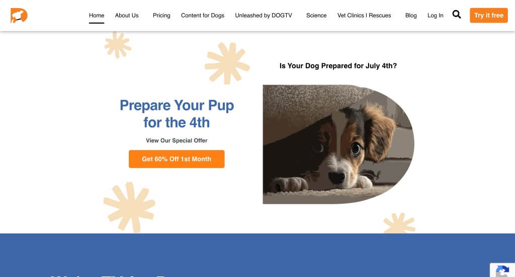
DogTV is very colorful and features lots of images of happy little doggos. We really like their use of additional graphics to enhance their overall look. This company is a great option for those looking for a new place to shop for their dog’s needs. We thought it was helpful that they have clearly labeled pricing. Including a special blog was another smart choice. One more unique feature was their science and FAQ portion.
29. Probo Medical
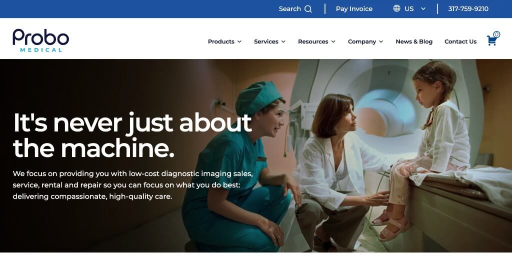
Here we have a very professional and modern design. From their simplistic fonts to their balanced white space, this was a design that we loved. Adding in icons to improve their visual appeal was an interesting choice. High quality images and short paragraphs are a few other features that we appreciated. Customer reviews were also nice to include in any site.
30. Soothing Scents
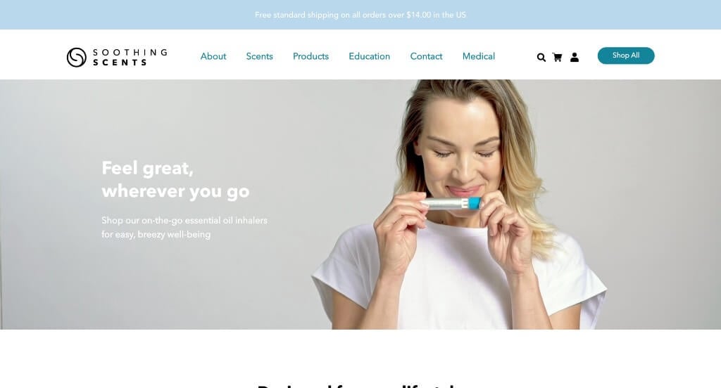
Starting this out with an automatically looping video was an interesting choice. We thought that this logo design was simple and memorable, so we enjoyed it. Including looping images for their products upon hover was another thing that we really liked. Having an extremely organized navigation bar was another feature that stood out to us.
31. Bella Beat
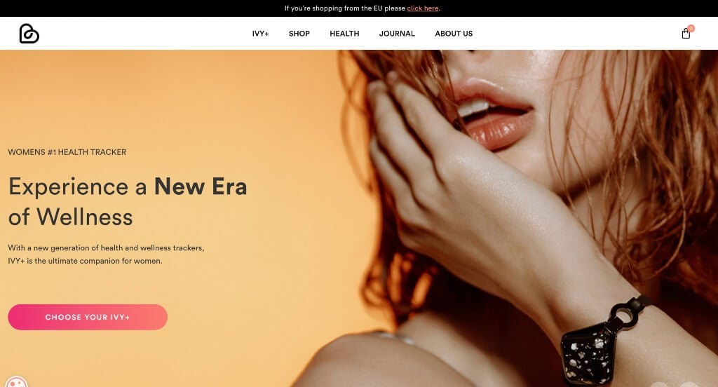
This example blends images, graphics and writing in order to create an appealing layout. We thought their logo design was unique and it helped create a brand for this company. Buttons are also helpful to guide viewers towards additional information keeping everything organized and uncluttered. Including a journal tab was another choice that we liked.
32. Shaleen Cheah
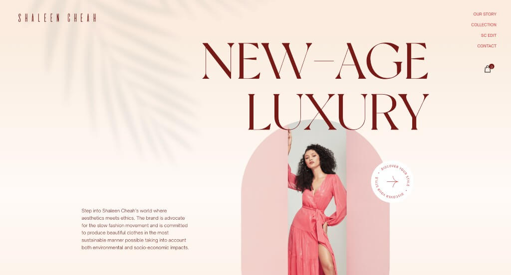
This company’s visuals are one to be jealous of. We loved their large and stylish font for their titles because it helped them stand out from other brands. We liked how they had stunning images, sometimes even within unique frames. Their hover animations within buttons was another feature that really stood out to us. Their color scheme was another thing that we really loved within Shaleen Cheah.
33. Bog Berry Dryer Balls
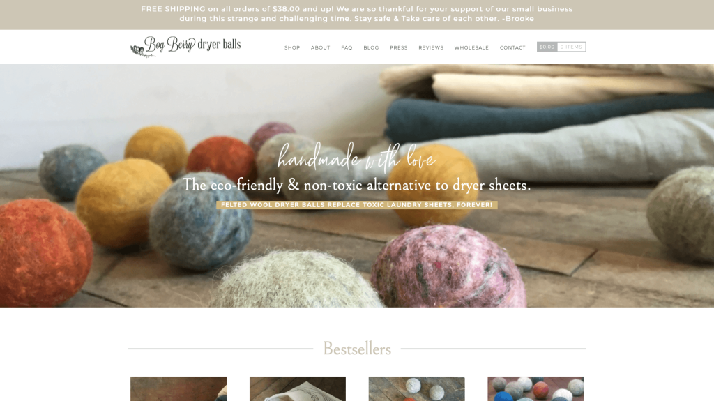
Bog Berry Dryer Balls does a great job creating a look that seems natural and woodsy. It was also great to include lots of images of this product used in different ways. It was also helpful to have a stunning logo design. Their use of different fonts were also amazing. Finally, choosing a domain that matched their company name was smart.
34. Summit Knife Works
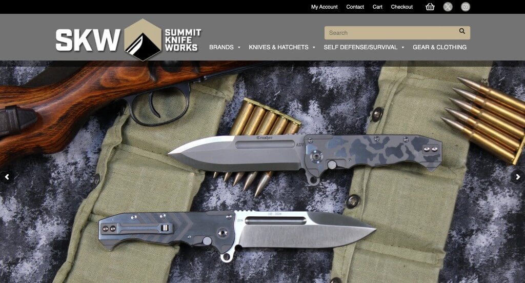
Here we have a nice logo design that looks manly and adventurous which is nice especially for this brand. Displaying their brands within the brand was another smart choice. Their variety of tan colors for their color scheme was helpful for a more neutral look. This domain matches their company name which helps to strengthen their brand identity.
35. Martin’s Home & Garden
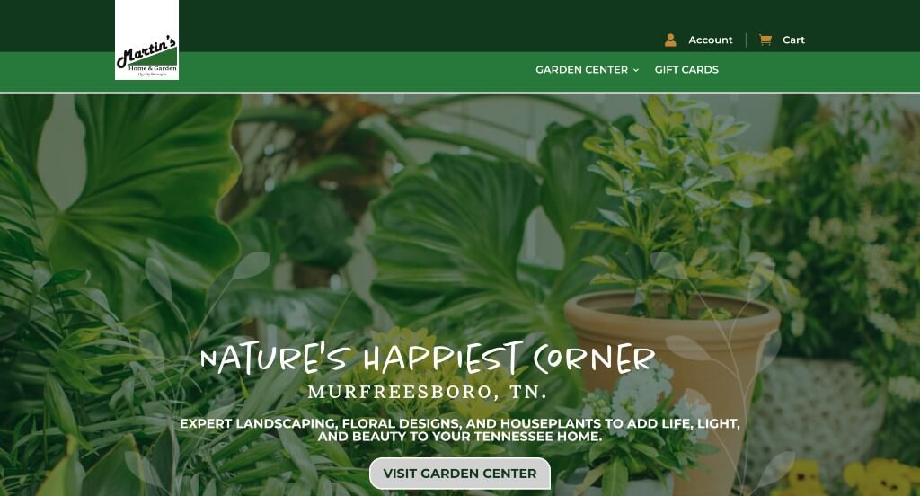
This business uses a relaxing green and white color which is extremely logical for a landscaping business. We liked their bullet points that use a plant graphic to help keep information more organized and uncluttered. They do a great job blending icon graphics with images to create a visually appealing template. Short paragraphs are another thing that makes content easy to comprehend.
36. Tom Chalky
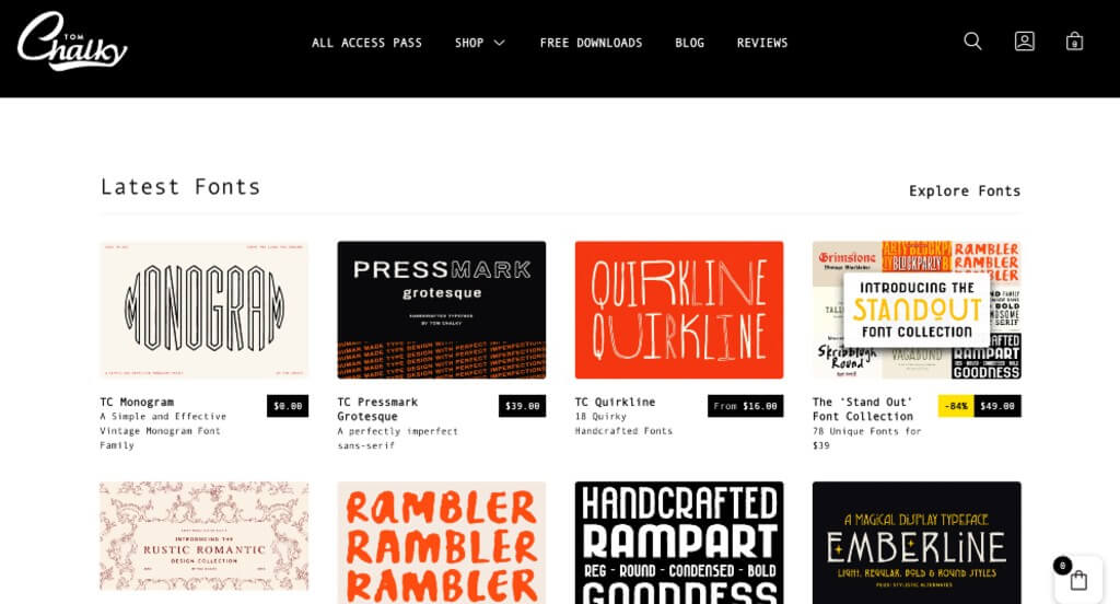
Tom Chalky showcases their portfolios very well, which was very smart on their part. Having a straightforward design was a great choice because it helps customers focus on their products. Lots of whitespace allowed for everything to fall into a beautiful grid design. Overall, this website looks very polished and would be great for any business to be inspired from.
37. Veer
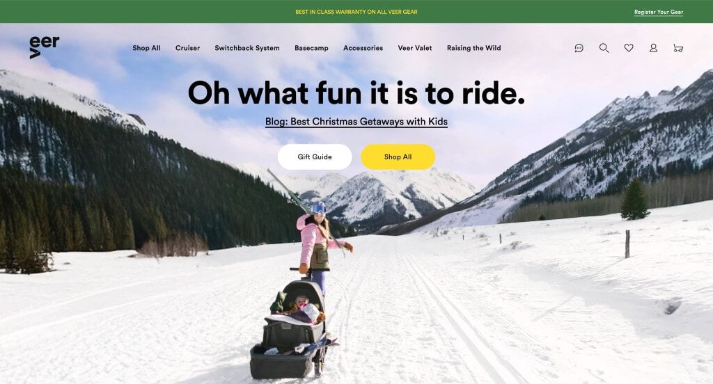
This company uses a great color scheme that alternates between black and white with an accent of yellow. It was super helpful to include buttons so customers can navigate easier. We also thought it was great because of their blog articles. Everything about this website is sleek and modern. Their products are displayed nicely with plenty of images. Additionally, their logo design was simple but playful.
38. Poppy Barley
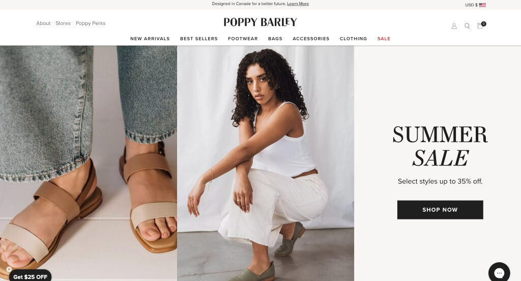
Poppy Barley is a store for trendy footwear and backpacks for both men and women. We do think that this company shows their perception of “trendy” with their logo design, font choice, and their simple color schemes. Each item has a modern yet vintage touch to them. We like how products are displayed right away in a way that is not overwhelming. Navigation is also super simple in Poppy Barley’s template. While this design is aesthetically pleasing, it still keeps things simple enough for people of all ages.
39. Daelmans Stroopwafels
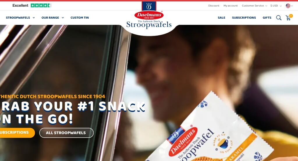
Likely this company’s leading feature was their dark blue and orange color scheme. We loved how this company definitely showcases their products in a perfect way. We loved their short and straightforward paragraphs to make everything easy to understand. Including a well-written and informative blog, was something other sites envy. We also love their use of creative fonts.
40. AB AETERNO
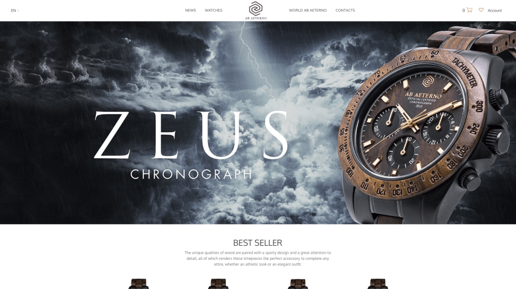
This company screams luxury in every portion of their layout. Their products use lots of high quality materials, making it feel like a better product. Their imagery sets them apart from many competitors. We loved how this company uses and reuses their logo design throughout their pages. Their colors, backgrounds and overall product shows off a masculine product, making males feel better about their purchase.
41. Bamford Watch Department
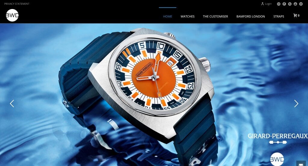
If you’re looking for a way to grab attention right away, be sure to try using large high quality images within the hero header of your homepage. This example gave off a luxurious feel because of its black backgrounds. Along with that, this watch company also did a nice job with their color palette staying simple and sleek. It was also nice how they showed off their partnerships so people can understand that they are trustworthy.
42. Jamaica Cottage Shop
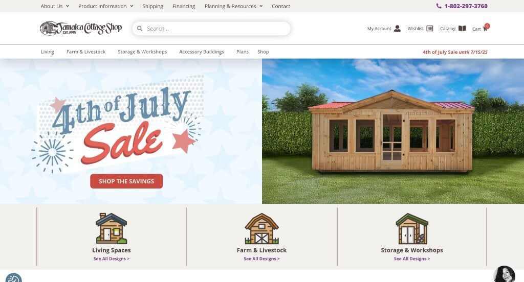
This example does a great job blending graphics and images to create an overall stunning template. We liked how they offered sales around the time of holidays because many people are short on money around those times. Bold fonts are used for titles which is a nice addition because it makes it easier to find information that is relevant to specific people. Bright green buttons was another good addition that helps people navigate to more information.
43. Safe Life Defense
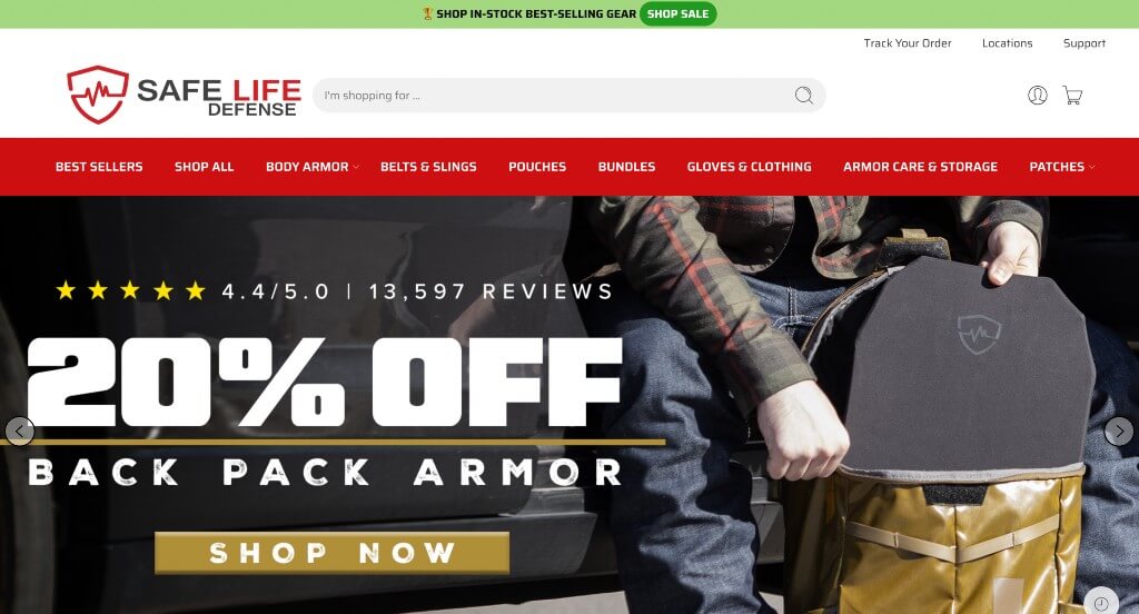
Here we have a site that uses a logical logo design that uses a shield graphic. Using images as backgrounds to help with navigation to more information and products was another smart choice. Bright red can be noticed to highlight links and specific information which is nice for those wishing to learn more about these products. A small tab is shown on products if they are on sale which is nice for those wishing to strike a deal with any of these products.
44. Burny Wild’s
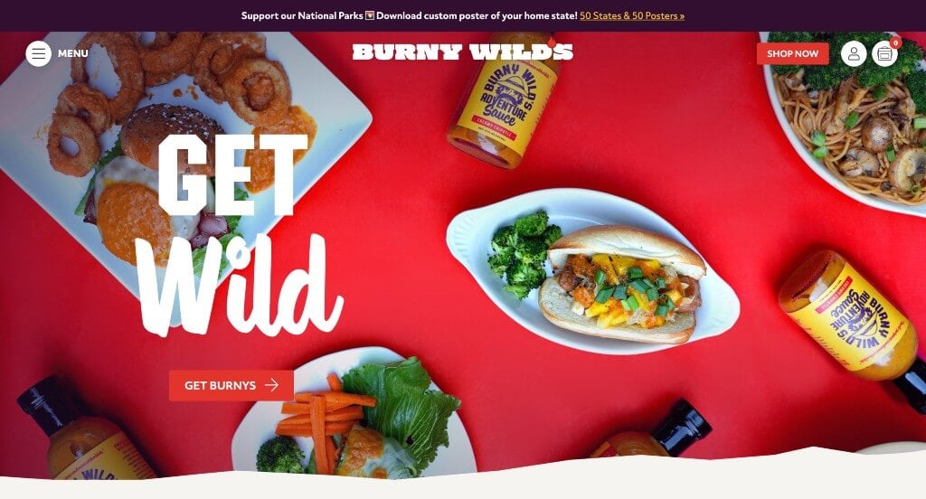
If you are looking for something with a good blend of images and graphics, here is an example you have to check out. The fonts that are used together within this website make for a beautiful template. Having a trade character for this business is something that we really appreciated. This trade character showing up throughout the pages and also on their packaging helps improve their brand identity.
45. Elecbrakes
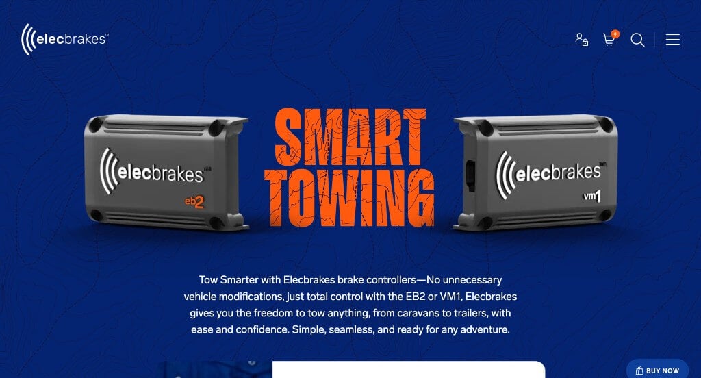
We loved how this example uses orange and blue to contrast against each other. Along with all of that, they do a great job with their patterns within the background in order to create a more interesting layout. Using automatically playing videos occasionally helps people learn about and observe their product in a different way. Including brands that trust their products help this company feel more reliable, making customers trust them more.
46. Design Modo
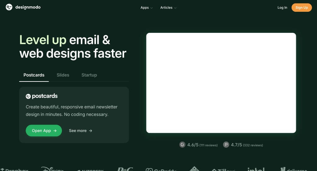
Although this was a fairly simple website, we really enjoyed how rounded rectangles were used to organize content within their page. Their simple logo was nice but it was almost playful which made this company feel more unique. Dark green backgrounds and accents are used throughout many of these pages in order to create a design that viewers will enjoy.
47. Don’t Buy Her Flowers
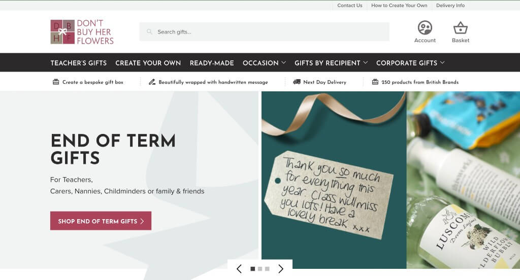
This was a company that creates creative gifts for people that customers care about. We thought it was interesting how they offered gift boxes for teachers to show appreciation. Along with that, a variety of gift box options are provided so that the best possible gifts can be received. Adding in a search bar was another great way for viewers to find something they’re looking for that’s more specific.
48. Scepter & Sword
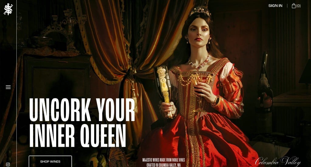
We liked the overall feel that these royal images of products and paintings because it matches with their product. We loved the dark black background because it makes for a more luxurious feeling for their brand. Their bold white fonts was another extremely helpful choice to include in this example. We also really enjoyed their logo design that gives off a similar vibe and uses a sword graphic. Including lots of buttons also helps their pages remain uncluttered while still providing lots of content.
49. Longest Road Out
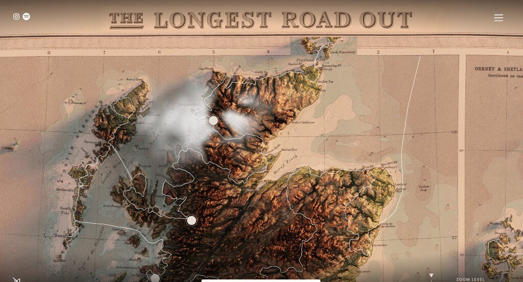
This example really knew how to use subtle animations to introduce information and engage users. Their highly detailed maps were a great way to explore a new area of the world that many people are unfamiliar with. Allowing customers to click on each little button in order to learn more about that specific location was another great choice. It was smart to have a feature that zooms in and out of this map so people aren’t confused.
50. Hard & Ware
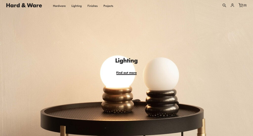
There are lots of high quality images that are used throughout this entire page, making it more interesting for those exploring it. We liked their blocky font that is fun but still professional. Showing off their featured projects is another thing that we really enjoyed about Hard & Ware. Adding in their social media pages right into their pages was a nice touch. Finally, we really liked how this domain matches with their company name in order to improve brand identity.
Recommended WooCommerce Themes
Druco – Themeforest
$59
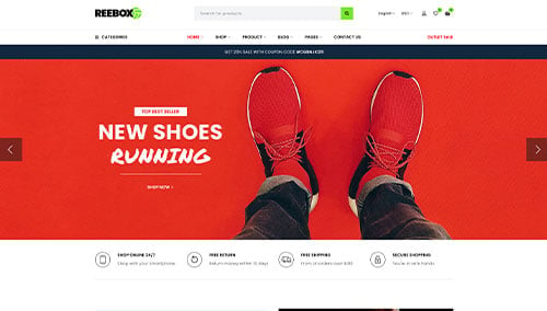
Reebox – Themeforest
$48
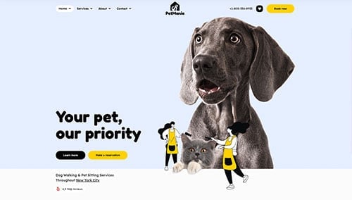
PetMania – Themeforest
$89
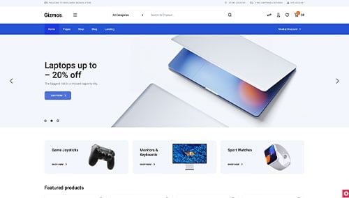
Gizmos – Themeforest
$89