Hello fitness enthusiasts! If you’re looking for inspiration for your business, check out our guide to the top 50 personal trainer websites.
Our experts have found what we consider top fitness trainer layouts that highlight design, functionality, uniqueness, and user experience. These sites set a standard for online excellence.
You’ll find ideas for your site along with tips to make your online presence pop.
Boost your personal training business with this guide! Find web design examples for studios, online trainers, and in-home services. For other industries, visit our greatest website examples blog!
Top Personal Trainer Website Designs
- 1. Speakeasy of Strength
- 2. Karimu Samuels Movement
- 3. PGPT
- 4. Jim Karas
- 5. Orange Shoe
- 6. Chitown Trainer
- 7. Fit with Alf
- 8. Happy Human
- 9. Vitalis
- 10. Body Lura
- 11. Fitness Together
- 12. Homefit
- 13. Alexia Clark
- 14. Gymguyz
- 15. Forge Fitness
- 16. Kayla Itsines
- 17. Body By Ciara
- 18. Training Loft
- 19. Parker Practice
- 20. Coastal Fitness
- 21. Fast Lean Fit
- 22. Dai Manuel
- 23. Perfect Body
- 24. Ultimate Performance
- 25. Fearless Fitness
- 26. Leo’s Fitness Lab
- 27. Mor Athletic
- 28. Iron Orr Fitness
- 29. The Body Coach
- 30. Malta Personal Trainer
- 31. Mountainside Fitness
- 32. TS Fitness
- 33. Jorsano
- 34. Be the Fittest
- 35. LJ Performance Training
- 36. Training Pit Fitness
- 37. Tough Fitness Dallas
- 38. Paige Hathaway
- 39. Tony Gentilcore
- 40. David Kingsbury
- 41. Invictus Fitness
- 42. Shred90
- 43. FitWell
- 44. RightFit Personal Training
- 45. Future
- 46. The Hollywood Trainer
- 47. Crossfit Winter Park
- 48. Florida Fitness Concepts
- 49. Transform Your Body
- 50. Caliber
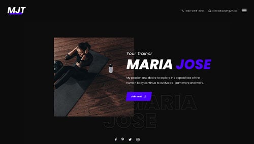
1. Speakeasy of Strength
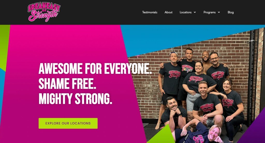
This example was a great way to start out our collection of personal trainers because of their bright colors used throughout the page. Along with that, we really liked how this company used bold fonts to grab the attention of viewers. Adding in these interesting geometric patterns was another thing that would for sure stand out to viewers.
2. Karimu Samuels Movement
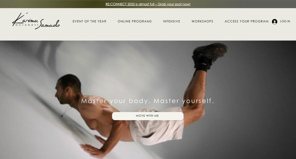
This site started with an automatically playing video which was a great way to introduce their company. Along with that, we liked how they showed off the publications or business that have featured them. Different sized fonts were used here in order to create a sense of visual hierarchy. We liked their interesting graphics that shared the same shapes to make different things.
3. PGPT
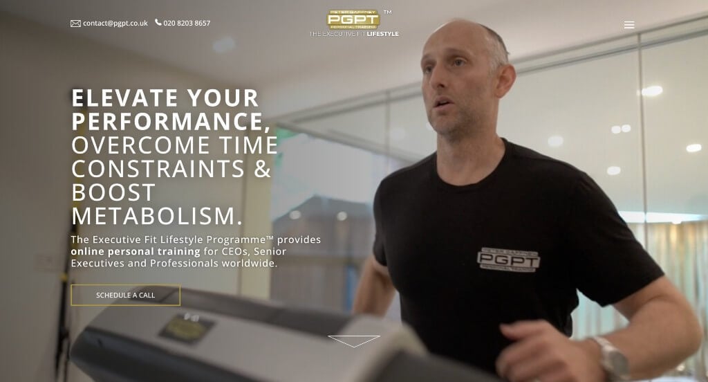
We liked how this one started with a video to introduce their company and show some people training in their facilities. Their dark color scheme with accents of gold creates a more luxurious feel that anyone could enjoy. We also thought this logo was interesting because it was more based around text than images.
4. Jim Karas
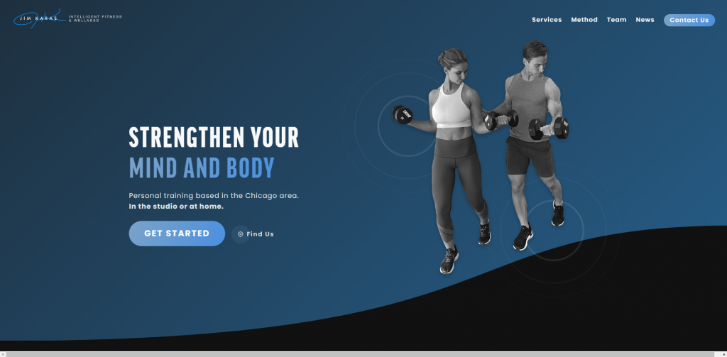
If you are searching for a simple web design for your company, check out this simple blue, white and black arrangement. We thought it was smart to feature reviews showing past experiences right away. On their homepage, information is shared about the business, what they have to offer, along with what to expect if you plan to join their team. Towards the bottom, an Instagram section, Google map, and contact information can be noticed.
5. Orange Shoe
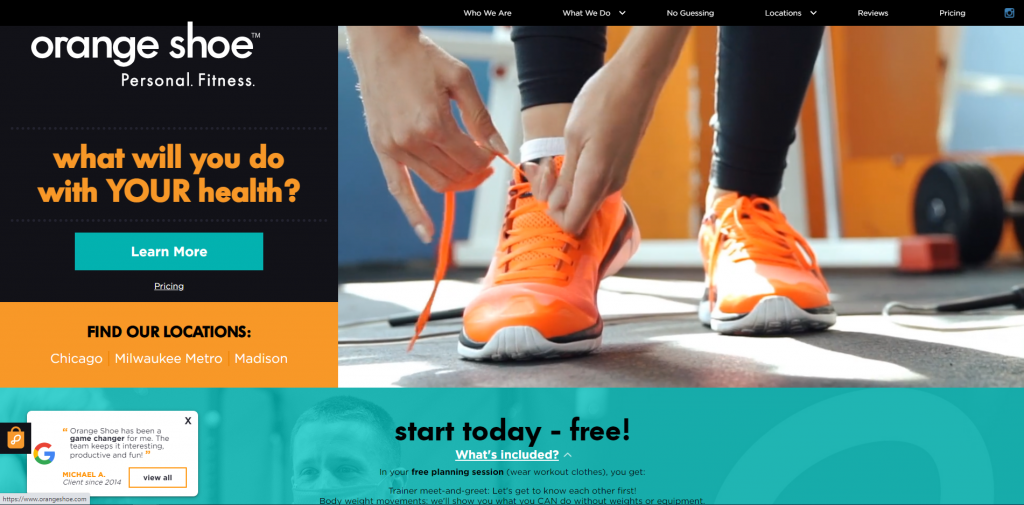
Here we have an informative, but straightforward business. Right away, a form can be filled out to receive a free planning session. You also might notice their use of complementary colors – blue and orange – along with white and black. Many different locations allows for this company to be more convenient to a variety of people. Google reviews pop up to help calm down customers who aren’t so sure about them as a company. From a marketing perspective, it was also a great idea to include a domain that matches this business’s name.
Related: Increase your gym memberships through digital marketing that drives leads to your website / funnel, improves your reputation online, and manages your email automation.
6. Chitown Trainer
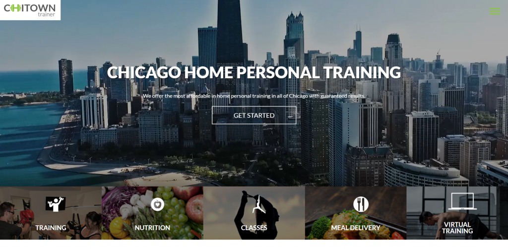
Don’t scroll past this clean and attractive example. An intro clip does a great job to showcase what this company is all about. Many different services, such as classes, nutrition, meal delivery, and virtual training are offered and explained. This helps potential customers know if this company is for them. Also, an informative blog is included to help people choose their trainer.
7. Fit with Alf

This was a fairly modern example due to their mainly black and white color palette. Their use of short paragraphs and buttons was another aspect that we really enjoyed. We liked how they included another section with a calendar to show open dates to schedule coaching calls. Using some large images was yet another thing that we noticed.
8. Happy Human

Here’s another welcoming and bright homepage that attracts customers right away. This company does all of their sessions through your own home, and they do a great job explaining that along with what potential customers can expect upon joining. Many visuals and different patterns are included to keep the attention of clients. Happy Human also effectively uses logos and pathos to persuade people to become their clients.
9. Vitalis

Minimalist is definitely what Vitalis was going for. Images used are very simple and don’t distract. Having a grayscale color palette also adds to this by creating uniformity. We noticed a thoughtful section to tell potential customers exactly what to expect when enrolling or coaching. Email address is found easily so people can reach out with any questions or concerns.
10. Body Lura

Using pink accents to highlight certain information throughout their entire webpage was a great way to create a sense of brand identity. Showing off their different membership plans was another thing that we really appreciated. Adding in customer reviews was another thing that we loved. Using phone graphics as image frames looked great especially because they are trying to sell an app.
11. Fitness Together
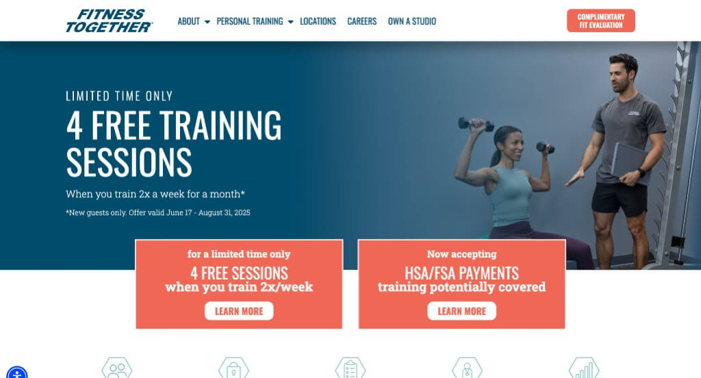
Fitness Together has a creative repetitive design with icons, graphics and images shaped as polygons. We liked how Fitness Together utilized an automatically playing video to liven up their homepage. A blue and orange color scheme creates a cohesive look. Some features that stood out to us were the FAQ page, informative blog, testimonials, and social media links. Don’t forget about how brightly colored buttons were used to ensure simple usability.
12. Homefit
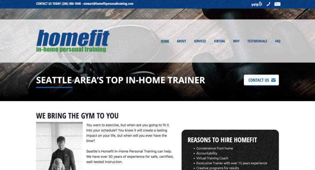
If you’re a personal trainer, be sure to consider a green and blue color scheme for your site. Even though not a lot of information is seen right away, it keeps it simple. Also, having many links offers more information to people if they want to discover more. Including client testimonials can help new customers feel more confident with this company. Having a section dedicated to this company’s owner and his background in exercising was also nice.
13. Alexia Clark
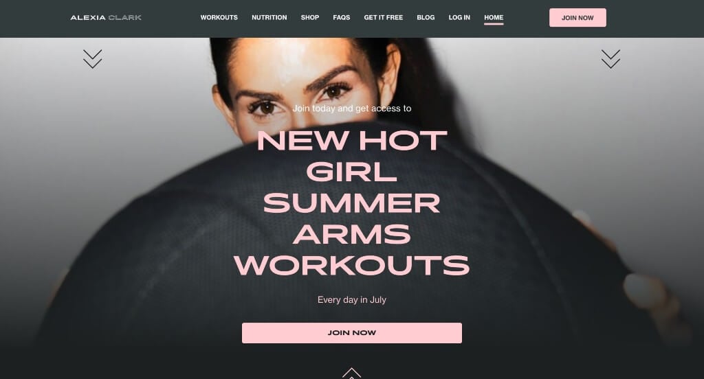
This company has a relaxing color scheme that is feminine but still powerful. Their stunning fonts was something that helped them stand out from competitors for sure. Showing the important steps to improve your fitness program experience. They provided information in short paragraphs and bullet points which helped make everything easier to read and engage in.
14. Gymguyz
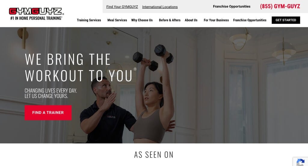
Boldness is strong with this example with a good mix of pictures and written content. Instantly, a section of customers transformations is featured to show that their company is reliable. A hover effect is used to show before and after transformations of past and current clients. We also thought it was effective to add in a quiz to find out what meal plan fits you best. Lastly, it was nice to have a domain that matches their name.
15. Forge Fitness

Forge Fitness does a great job showing what is offered through pictures and written content. Having a color scheme that represents stability and calmness was another aspect we liked. Pictures that are included tell a story and show the atmosphere of this company. We thought it was interesting to include big-name brands that endorse their services. It was nice to have services clearly labeled with pricing. Forge Fitness also has a unique logo that stands out from its competitors.
16. Kayla Itsines
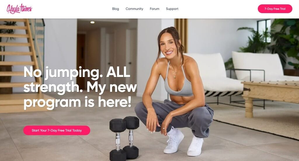
Here we have a stunning landing page that makes use of a large image, bold font, and bright pink accents. We loved that all of their content was logically organized, making everything more interesting. Including buttons throughout the pages, some that even give customers information about their 7 day trial. This domain was simple and matched with their company name, which is always nice.
17. Body By Ciara

In this example, we loved how there was a unique background that is sure to grab attention. Lots of images were included throughout this template to create something that looks stunning but is never crammed. Their logo design was quite interesting and we loved it. This navigation bar was well organized which made information extremely easy to find.
18. Training Loft

Training Loft has a perfect ratio between written content and visuals. Right away, lots of information with buttons linking to additional content can be found. Having alternating blocks of color and texture was also a good addition. A few other things we noticed were the images showing off the gym, a contact form, and a Google map. Don’t forget to check out this site when looking for personal trainer website templates.
Related: Make sure people can find your gym online! Taking care of your SEO services can have a huge impact on your lead generation.
19. Parker Practice
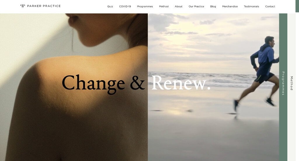
We really enjoyed this company’s choice of a split screen to introduce their company. Their images were large and laid out carefully in order to capture the perfect feeling within their webpage. Offering different forms of personal training such as 1:1 and virtual was something that we appreciated. Testimonials were also included to build trust with this business.
20. Coastal Fitness

Within this company, we appreciated how they started off with an image featuring their team. Showing their values as a company was something that we loved because it helps people see if they have similar values. This company also did an amazing job with their inclusion of Instagram to keep people engaged and connected.
21. Fast Lean Fit
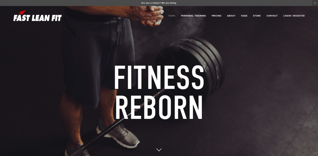
Here we have a straightforward site that features important information first. Bold, capital letters are used for headlines to bring attention to new information. Images help to show what this company can offer. An Instagram section displays previous experiences and also more on what this company has to offer. Contact info is conveniently placed at the bottom so that people can contact them after reading information included in this site.
22. Dai Manuel

This example had a stunning start to their homepage with this slanted look for their text. Fonts are fairly simple which looks great for their website. Adding in buttons to help viewers find additional information is something else that we appreciated. Showing off some of their more well known clients was another thing that we liked about this example.
23. Perfect Body
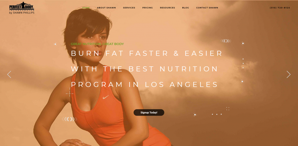
Placement is everything when it comes to creating a stunning layout. It was considerate to include services, pricing, and client testimonials that are visible and easy to read. Within their site, information doesn’t get confusing or overwhelming due to images and different color blocks that are added in. Perfect Body offers many helpful resources, and their template does a great job of showcasing that. Finally, we really liked the beautiful color accents that build upon this site.
24. Ultimate Performance

Ultimate Performance uses bright red accents to contrast with the grayscale and attract attention to important information. It was nice to feature before and after pictures of clients showing success stories and building trust with this company. This homepage does a good job of showcasing what makes them stand out from their competitors. We also enjoyed how Ultimate Performance used bold fonts, short paragraphs, and alternating color blocks.
25. Fearless Fitness
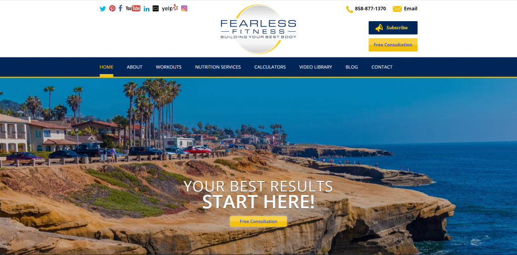
Right away, we noticed how this company used blue, yellow and white, which work well together and brings attention to different aspects. Fearless Fitness is very informative and gets information to customers right away. A video clip is included to show what this company looks like and what it can offer to its customers. Every page features blog posts and YouTube videos showing different workouts that are offered.
26. Leo’s Fitness Lab
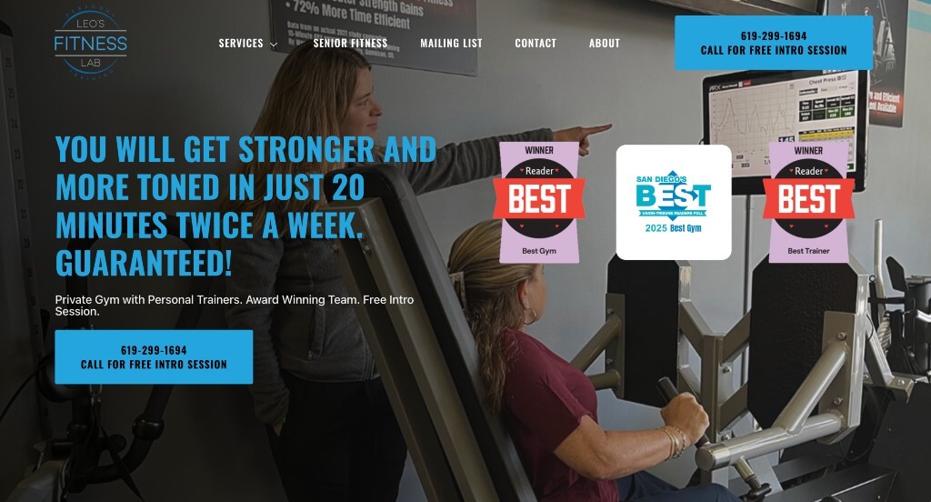
Leo’s Fitness Lab is extremely informative with its many videos including information that is helpful to readers. We also think the ratio of video integration to written content was perfect. Contact information and hours for walk-ins are shown in easily accessible places. Having defined graphics used as icons to decorate their site was also a nice touch.
27. Mor Athletic
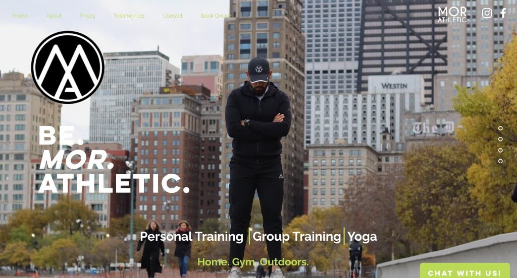
Here is a more modern design for a fitness trainer, but that is why we liked it. The color palette is simple with bursts of lime green to grab attention of viewers. Their organization of text was another thing that we really appreciated because it made it easy to find what you might be looking for or to skim through content. Having buttons right away to view prices and book now was another smart decision.
28. Iron Orr Fitness
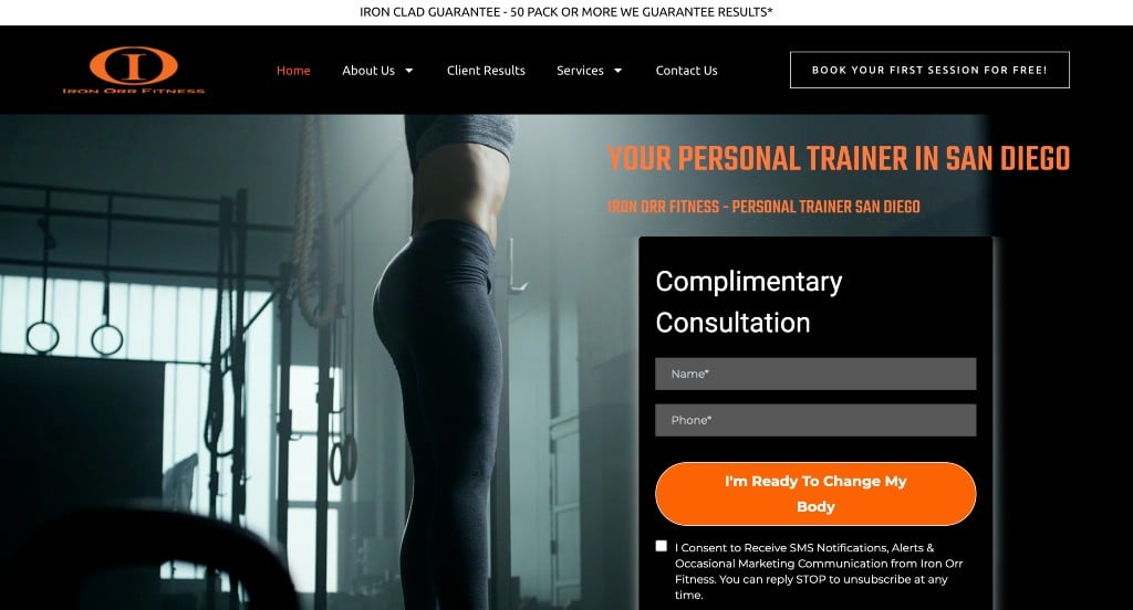
A simple white background with an orange color scheme can be seen here. Right away we noticed a contact form and phone number in areas easily accessed. Balance between visuals and written content allows this site to be straightforward and easy to understand. A few features that stood out was the easy access to contact information, along with a Google map to help people get an idea of where they’re located.
29. The Body Coach
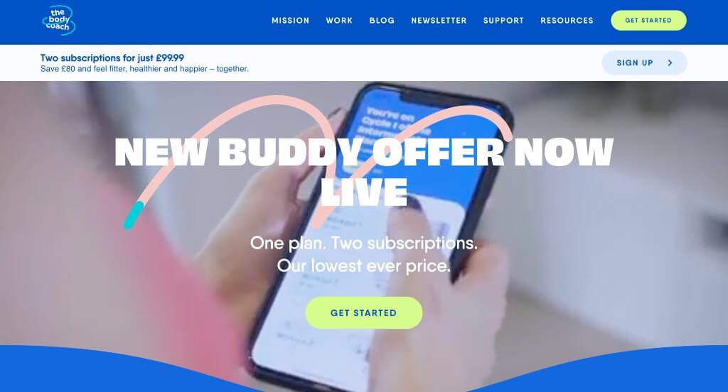
Upon scrolling through The Body Coach, we noticed an automatically playing video which attracts customers to their company. Continuing through this site, you will see lots of colors, bold text, and fun animations. They also incorporate images by having them fade or slide into view. A few small graphics add a welcoming feel that helps them place on our list of best personal trainer web designs.
30. Malta Personal Trainer

This was a stunning inclusion to our list because of their unique color scheme. Another thing that we absolutely loved was their logo that was specific to their company. Their font was another thing that stood out because it was so customized for their business. We noticed how this business did a nice job with their transitions as viewers scroll through the page.
31. Mountainside Fitness

Mountainside Fitness has a simple homepage with a few different offers hoping to convince people to join their gym. Childcare is also offered which attracts a whole new set of customers. A simple template is portrayed by many links bringing people to more information related to class schedules, pricing, childcare info, locations, and so much more. We also liked the amount of white space that can be found on this site.
32. TS Fitness
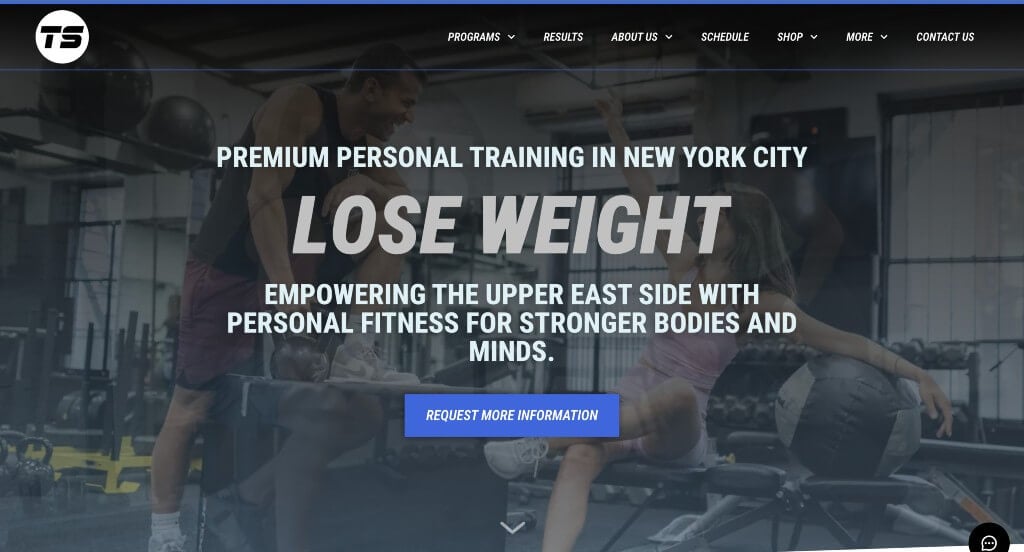
Here is a great web design example for fitness companies looking for a professional layout. As you scroll through the homepage, a design qualities we liked was their bold fonts for titles. Buttons are included to help navigate was absolutely a consideration when ranking TS Fitness in this list of best personal trainer web designs. From a marketing viewpoint, we really like how a section was utilized to introduce this company’s trainers. Any website designer will want to consider checking this website out.
33. Jorsano

We really appreciated how this business made great use of a large image with a filter as their background. Their greenish blue accents was something that is outstanding. Using images that overlap to create a stunning template was another thing that we really liked. Including links to their social media pages was another helpful choice.
34. Be the Fittest

This example did a great job showing off the transformations of their clients. Adding in videos along with images was a great way to include information in a new way was something we liked. Using short paragraphs to make their information easier to skim was another thing that we really appreciated. Bright purple buttons were also used to help organize everything.
35. LJ Performance Training

An automatically playing video is used right away in this webpage in order to introduce their business well. Their bold fonts was a small addition, but it makes the world of a difference. Bright red buttons are a great choice in order for people to see where more information can be found. We also thought it was nice how they organized their information by performance and personal training.
36. Training Pit Fitness

While most fitness websites share this quality, we thought The Training Pit did a nice job with a stunning logo design to represent their company. Another thoughtful feature we liked was their use of graphics. Website accessibility was clearly a focus when choosing a domain that matches their company’s name. Give some thought to this unique design when developing your next professional website.
37. Tough Fitness Dallas
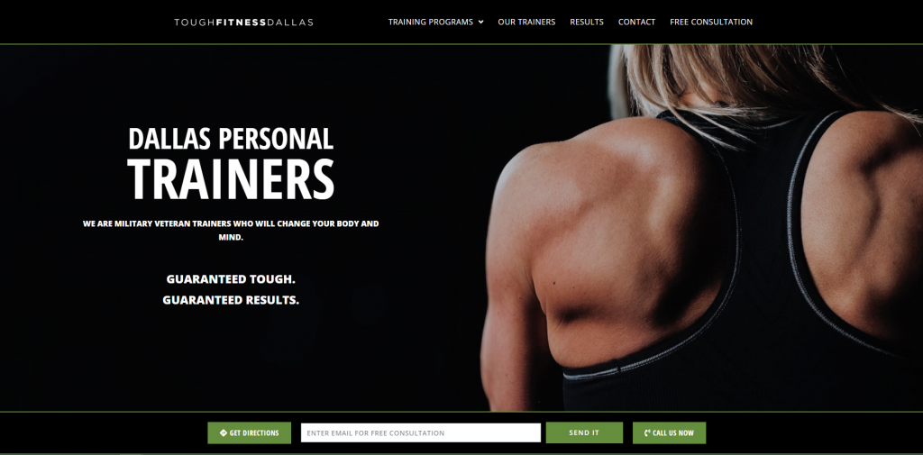
We thought it was great how for every image, there’s written content. First people will look at visuals, then they’ll move onto content near it. Images alternate sides to create a simple pattern, while still breaking up content. It was also a great idea for this company to feature multiple big companies that have featured them such as ABC and iHeart Radio.
38. Paige Hathaway
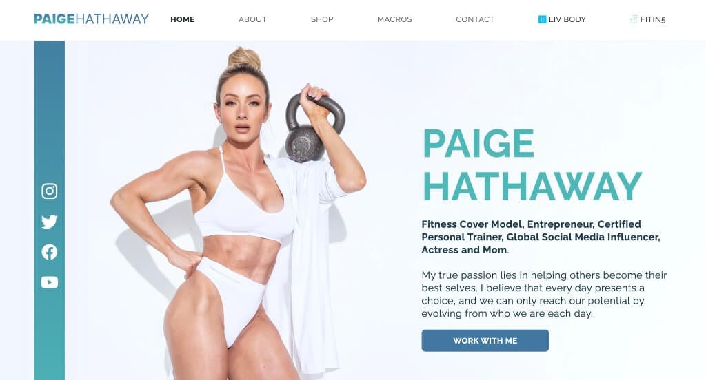
Paige Hathaway has a beautiful color scheme that is sure to make viewers happy. Showing businesses that have featured this company was a great way to build up reliability. Including a feature about the personal trainer helps newcomers trust her and her training sessions. We liked their use of small graphics in the form of icons.
39. Tony Gentilcore
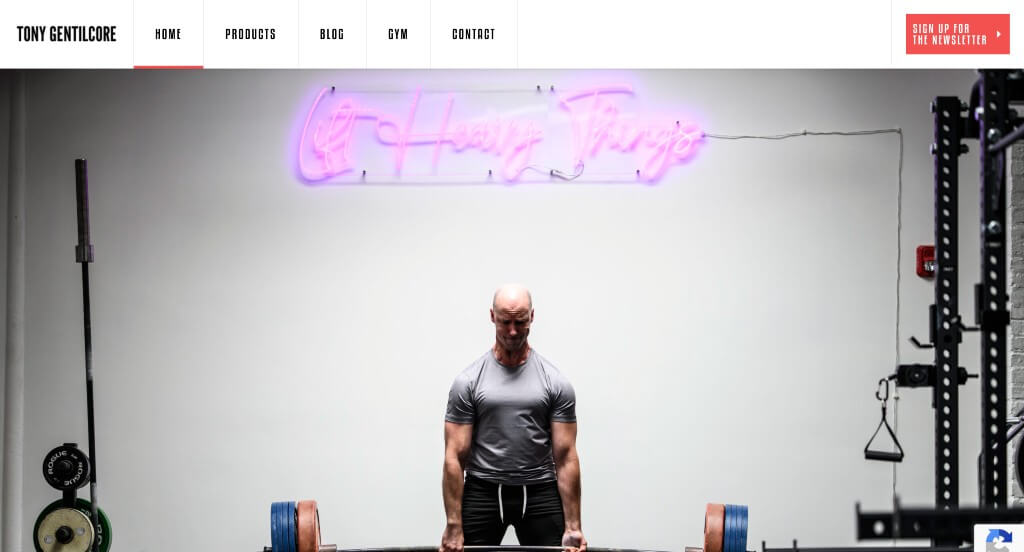
Here we have a template that makes great use of an interesting font. Another thing that we noticed was how Tony Gentilcore organized all of their content into an easy to use navigation bar that can be appreciated by their viewers. Including lots of images to show off their business was something else that we liked about this example.
40. David Kingsbury

This template was one that was unique and sure to grab attention. Accents of red was a nice touch to highlight links and information that are important to viewers. Including client reviews was another thing that we noticed and really appreciated. Including a paragraph about this personal trainer was a great way to build trust with new clients.
41. Invictus Fitness

A bright yellow-orange color scheme can be noticed, popping against the dark background and highlighting information. We noticed an interesting introduction with creative sliding animations. A simple homepage is maintained displaying information that will help potential customers and not overwhelm them. Links to further information can be easily accessed if needed. We also liked the use of buttons because it helps maintain that simple, organized feel and improves navigation.
42. Shred90
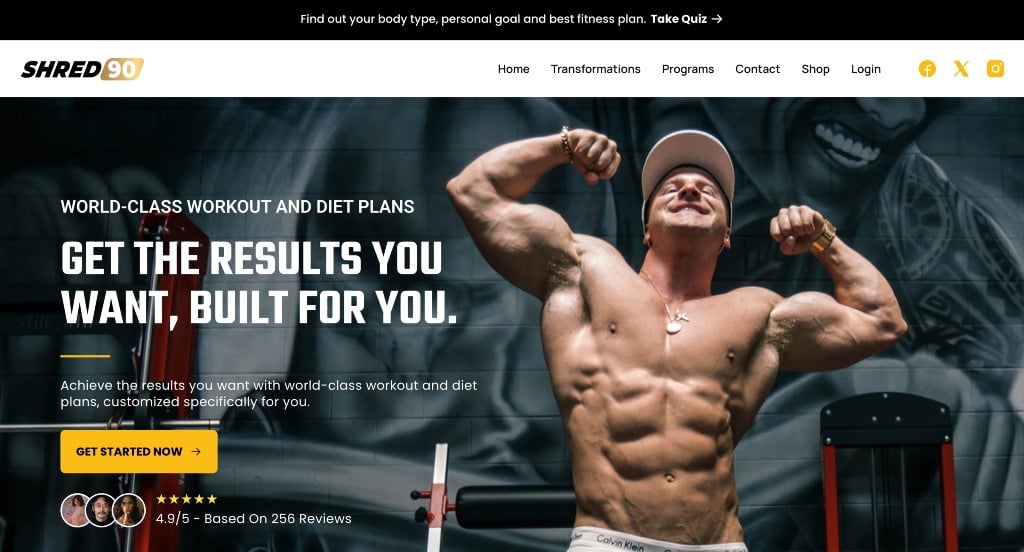
The first thing that we noticed about this example was their bold fonts that are mixed with simple ones to create a sense of visual hierarchy. Showing their different plans along with the price and what’s included was another thing that we enjoyed. They also make use of phone graphics for image frames which we felt like was a unique idea.
43. FitWell
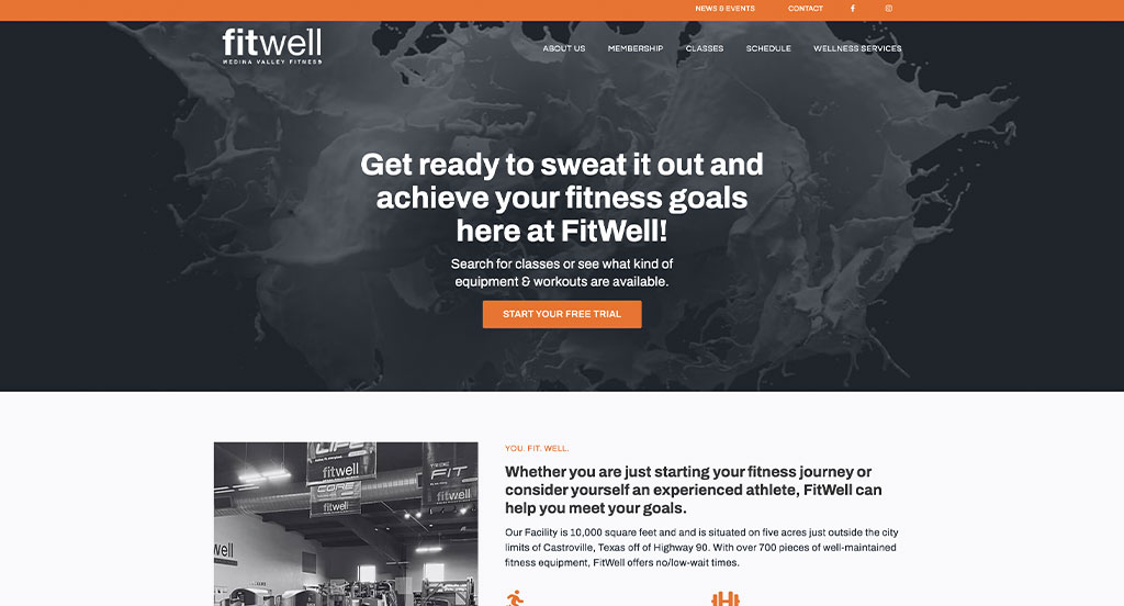
This personal trainer website is very neat, well organized, and features essential information on the homepage. They offer many features to help their customers be successful, which they show right off the bat grabbing the attention of the audience. Also, client testimonials are visible right at the top of the page showing all the success stories. The site has a very clean feel with light colors and beautiful details. It’s very easy for the customer to navigate through the website and find what they’re looking for.
44. RightFit Personal Training

Here we have an example that not only has a stunning template, but a strong company. Their logo was something that we really liked about their company. Including a search bar in order to find trainers near your area was another nice addition. Showing the three easy steps that can be followed in order to match customers with a trainer was another thing that we liked.
45. Future
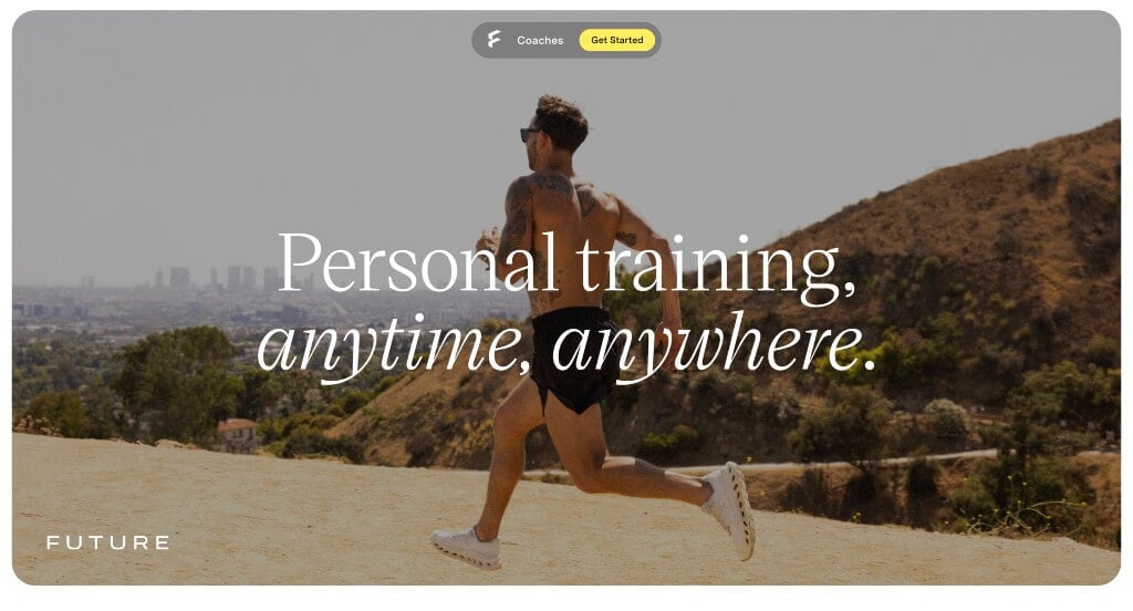
We really loved how this example used lots of large images to create a template that is sure to stun viewers. Including simple fonts was another thing that our team liked. This company’s domain was smart because it matched with their company name in order to strengthen their brand identity. Adding in full screen background colors was something else that we noticed.
46. The Hollywood Trainer
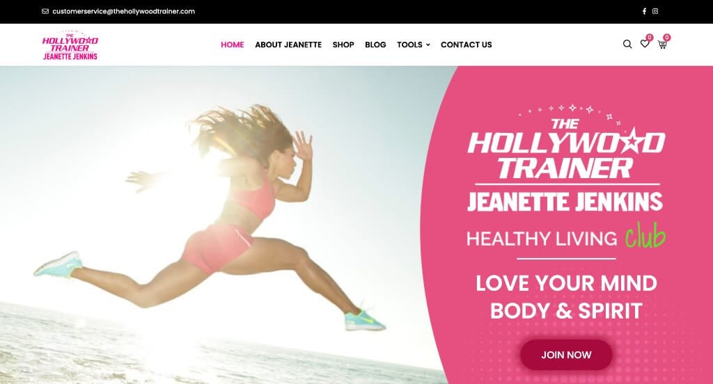
Lots of pink highlights was another feature that makes this example stand out from its competitors. Bullet points were used in order to keep content organized and easy to read. Showing off their trending products was another smart choice because it might convince new viewers to also purchase. Including a blog was another decision that we loved.
47. Crossfit Winter Park

Upon entering this gym’s site we noticed their automatically playing video that shows what you could expect to do if you become a client of theirs. This website is big and bold with a bright red color scheme. Each headline is bold with capital letters to gain more attention. A form can be found to let customers try a free class. Including a blog was a great way to give more information to customers without being annoying. We also really enjoyed the creative logo design this company adopted.
48. Florida Fitness Concepts
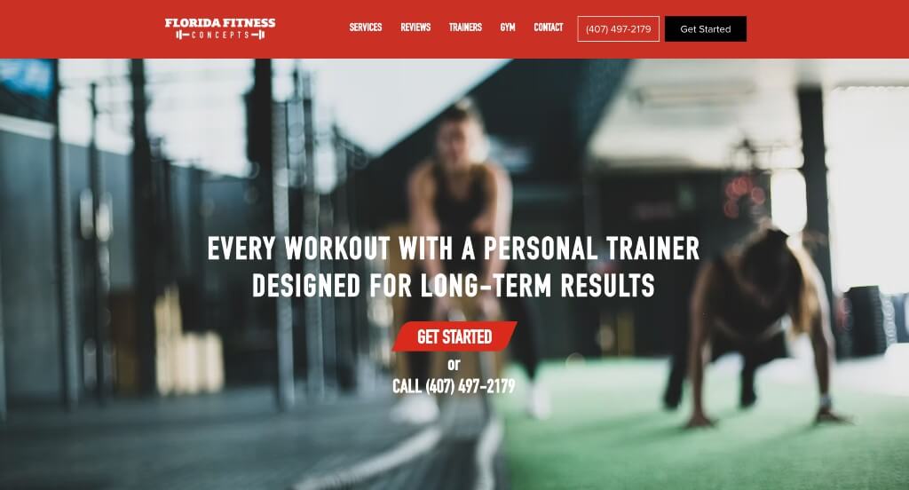
Florida Fitness Concepts has a great layout with good page flow, making it easy to read. Almost right away, images to display their gym is placed alongside written content to show what customers can expect when choosing them. Reviews automatically scroll, allowing visitors to read them. Fun geometric patterns can be noticed to accent backgrounds. Small icons are used throughout the site to make it easier to use.
49. Transform Your Body
While this site might not look any different when compared to its competitors, it is special. Headlines are bold and capture attention of customers. Many success stories and testimonials help customers feel better about joining this company. It was a great addition to include some before and after photos to show to prove their success as a business. We liked their organized navigation bar and creative logo design.
50. Caliber
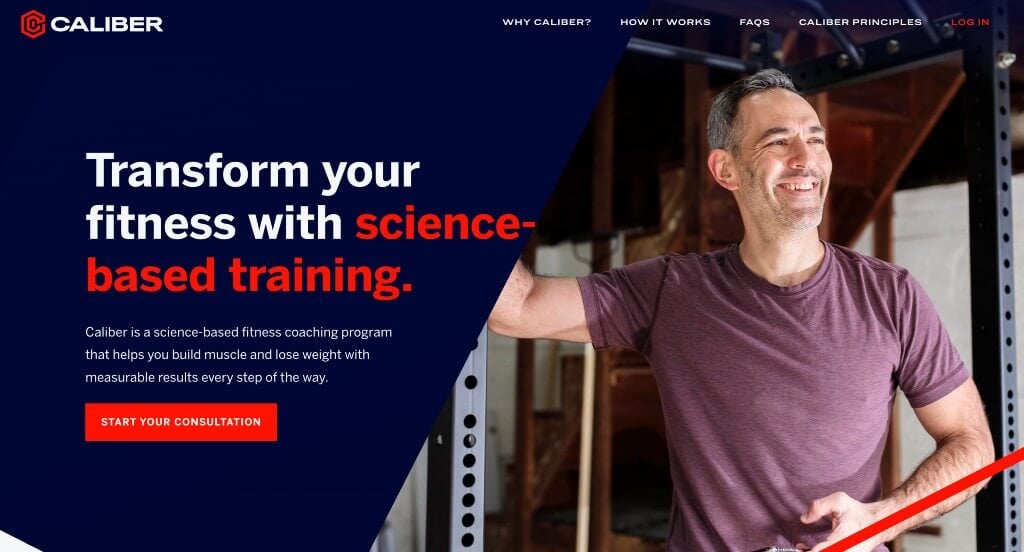
This color palette was one of our favorite parts about this example. Simple icons are used throughout the page which was another thing that we really enjoyed. Using slanted background and graphics throughout the page created a template that we couldn’t ignore. This logo design was another thing that we really appreciated.
WordPress Personal Training Themes
You can find free themes at wordpress.org or explore personal training-inspired templates at ThemeForest.
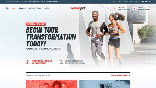
NanoFit – Themeforest
$39
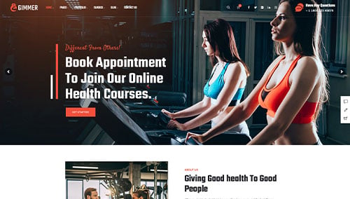
Gimmer – Themeforest
$59
Zyth – Themeforest
$64
Gym Fitness – Themeforest
$69
WooCommerce Personal Training Themes
You’ll find a variety of ecommerce themes for WooCommerce on ThemeForest.
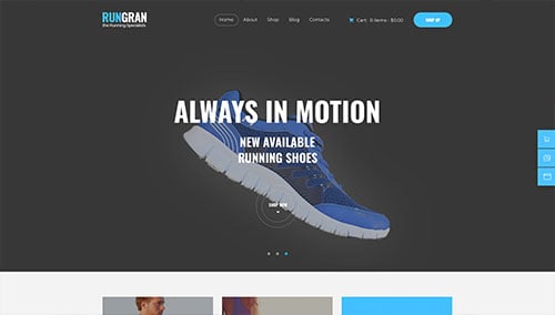
Run Gran – Themeforest
$69
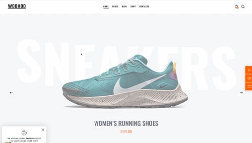
WooHoo – Themeforest
$69
Shopify Personal Training Themes
Explore free and paid themes at themes.shopify.com or consider options available through marketplaces like ThemeForest.
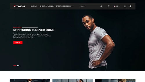
Fit Wear – Themeforest
$48
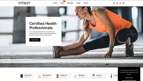
FitNet – Themeforest
$56