As a dedicated service provider, you know that advertising online is challenging. It’s not just about creating the perfect ad and reaching the right audience. What happens after your visitors click on your ad?
They are directed to a page expected to deliver on your ad’s promise. With only an 8-second window to capture their attention, how can you succeed? By using a specially designed, conversion-optimized landing page!
In this blog, we’ll explain what a landing page is, share best practices, and provide examples to inspire your next landing page!
Building the Perfect Landing Page
Your landing page should guide visitors to complete your desired action. At a minimum, it should include these key elements:
- Content that is about a single page in length
- Easy-to-spot customer testimonials
- Sticky call-to-actions (CTA)
- Exclude navigation
- Interesting & high-quality images/gifs/videos
- Unique value proposition
- Captivating headlines
- Highlight top features & benefits
Including these core elements on your landing page is better than linking ads to your homepage. To maximize conversions, follow best practices and avoid worst practices discussed in the upcoming sections.
Best Practices for Landing Page Design
Creating brilliant landing pages involves many factors. Here’s a list of key features and concepts we find crucial for enhancing your visitors’ experience when used effectively.
- Fast loading speed
- No navigation bar
- No unnecessary links
- Include keywords from your ad
- Provide social proof
- Review/testimonial section
- A FAQ section
- Straightforward costs
- If your service is subscription-based, be clear about it
- Make your CTAs easy to spot with contrasting colors
- Use a sticky CTA when possible
- Include compelling features & benefits
- Include brand-orientated and easy-to-read typography
- Provide a unique value proposition
- Make your landing page is built with responsive design
- Include high-quality photos, videos, gifs, and animations
- Add badges and awards if you have them
- Use impressive performance figures, number of users/downloads, and interesting case studies
- Provide contact information
- Keep content clean, simple, and minimal.
- Only include exit-intent popups
- Use white space effectively
- Use story-telling techniques
- Use your company colors (4 colors or less is optimal)
What to Avoid When Designing Landing Pages
As you implement best practices in your landing pages, be mindful of common downfalls seen in custom websites. If creating a landing page feels difficult, stop and refer to this list to ensure you’re avoiding these bad practices.
- Not educating your users on your service
- Low-quality videos, images, animations, or gifs
- More than one CTAs, making it confusing
- Unnecessary complex or technical jargon
- Include information your ad didn’t mention
- Not including your brand’s story
- A color palette that is overwhelming
- Too much written content
- Navigation and links to other pages
- Bad typography (basic, boring, too small, too large, etc.)
- Include stats or facts about your company
- A boring CTA
Top 24 Landing Page Layouts
1. Wag!

What We Liked
- Captivating color palette
- A sort of review from dog walkers which is essentially this company’s clients
- High quality images and graphics
What We Didn’t Like
- Navigation and links on the landing page
- Lots of negative space and not much for call to action buttons
- Too many statistics
2. Udemy Business
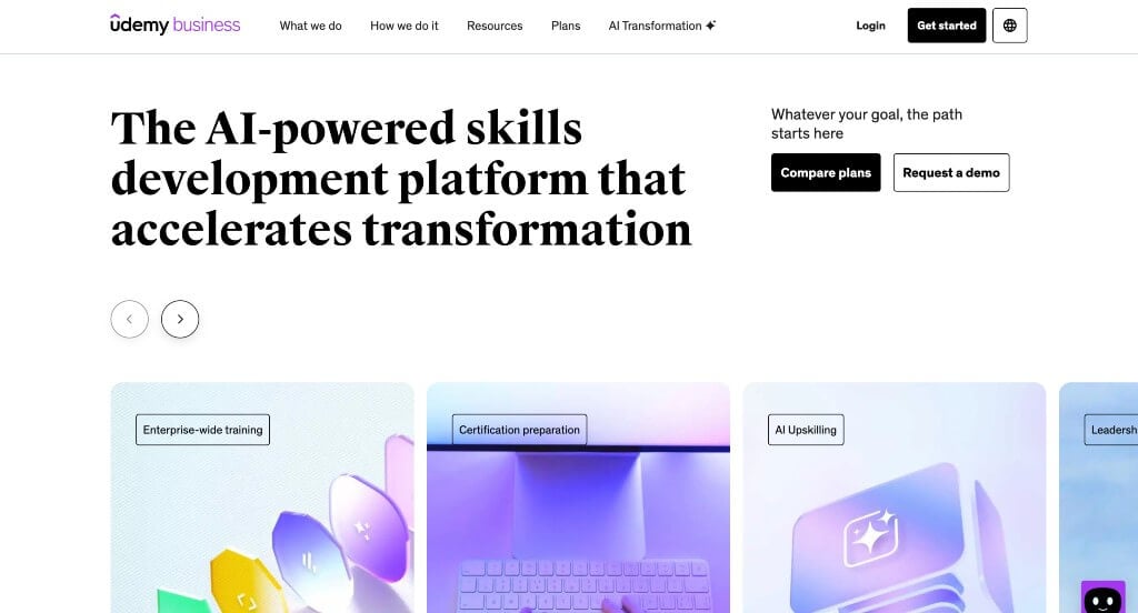
What We Liked
- Badges/awards displayed on the website
- Bullet points to organize their information
- A simple logo design
What We Didn’t Like
- Navigation is found right away on the landing page
- Adding a video was nice, but it’s frustrating that it won’t automatically play
- The review section should have been scrolling horizontally to add in more reviews
3. Airbnb
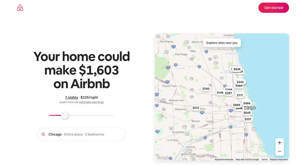
What We Liked
- Interactive sliding revenue calculator
- A color scheme that is used throughout the entire design
- We also liked the interesting phone and circle graphics with a variety of people
What We Didn’t Like
- Page lacks information
- Too much white space
- No comparison section for pricing, features, competitors, etc.
4. BigCommerce
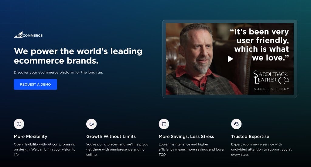
What We Liked
- Lots of imagery
- Small icons just add a professional feel
- Many features allow for better social proof
What We Didn’t Like
- No pricing information
- It’s a little difficult to tell what this company is selling
- Confusing light/dark color scheme
Related: Looking for a web design agency specializing in landing page creation? You’ve found one!
5. Deliveroo
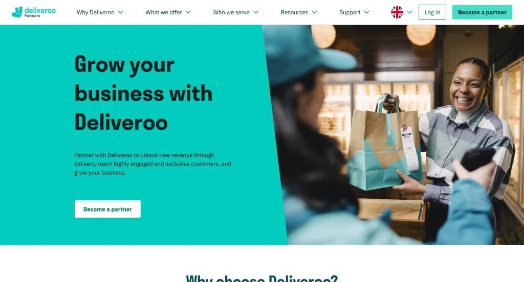
What We Liked
- A highly creative layout with awesome colors and icons
- A balance of images, content and white space
- Check marks used to organize written content and sprinkle it throughout the page
What We Didn’t Like
- Navigation allows visitors to leave the landing page
- Links throughout the page distract users from this company’s landing page
- No videos or gifs
6. Home Chef

What We Liked
- Imagery is high quality and provides images for a variety of foods
- Call to action buttons are everywhere
- Slight animations add in a bit of energy
What We Didn’t Like
- Wasn’t enough written content
- Very little icons
- Photo frames seemed inconsistent
7. Spotify For Creators
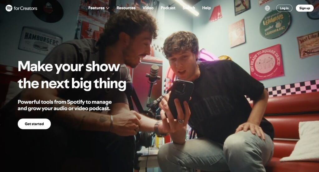
What We Liked
- Creative photo frames were helpful for this page
- Bold fonts are used for titles
- Social media serves as social proof
What We Didn’t Like
- Lots of links will distract customers from the landing page
- Too many colors are used as accents
- Though social media was nice to include, the link to their page sends people off that landing page
8. Weed Man
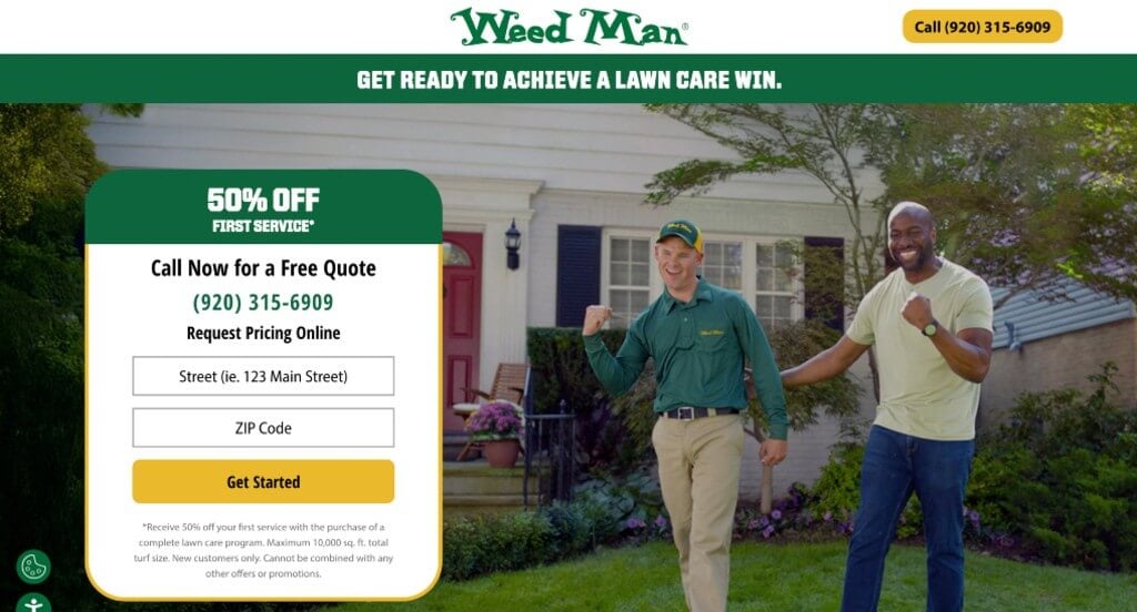
What We Liked
- Service is obvious so customers aren’t left wondering
- No navigation, making people leave the landing page
- Good amount of written content
What We Didn’t Like
- Images could have been larger
- Didn’t include this company’s backstory
- Some fonts aren’t super impressive
9. Express VPN
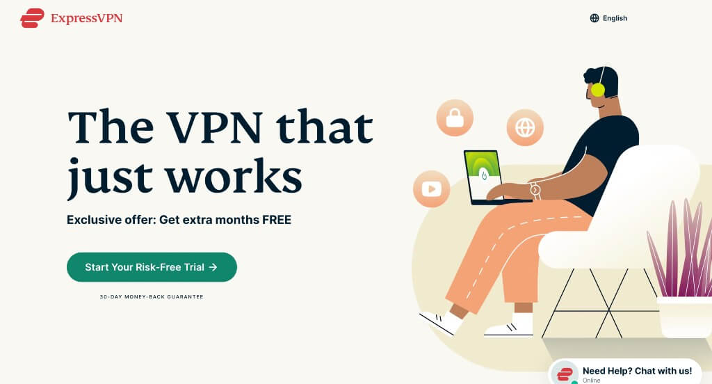
What We Liked
- Many graphics help liven up this page
- The map section is useful for the VPN locations
- Highlight customer and product support
What We Didn’t Like
- The page is filled with links that bring you to other pages
- Could compare their company to competitior sites
- A video would have been a great addition
10. Loomly

What We Liked
- A section was added for awards and recognitions
- Upfront pricing with different options available
- Color palette was fantastic, plus they incorporated those same colors into the buttons, icons, and banners
What We Didn’t Like
- Yellow and purple don’t fit in with their color scheme and they just added them in
- No use of GIFs or videos
- No FAQ section
11. The Great Courses Plus

What We Liked
- Many free trial buttons can be noticed
- Incorporates a FAQ section
- It is obvious to see what this company has to offer
What We Didn’t Like
- There isn’t much for written content on their page
- Pricing is not upfront (other than their free trial)
- Template looks similar to other streaming service websites
12. Row House
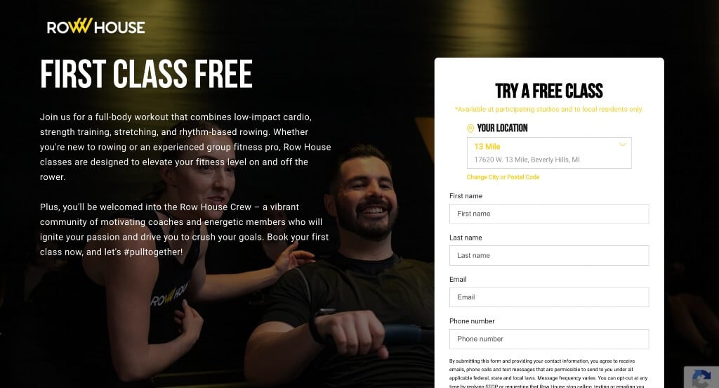
What We Liked
- A form could be easily accessed for a free class
- We liked that an image served as their background
- Simple fonts were used
What We Didn’t Like
- Yellow text for their form is difficult to read
- Little to no information on landing page
- Social proof is non-existent
13. Sunbasket
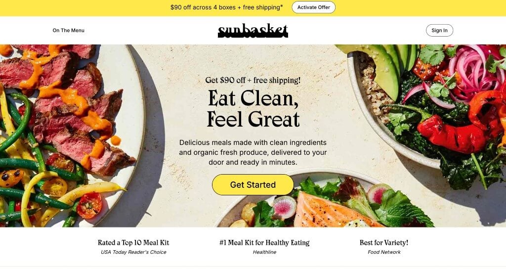
What We Liked
- Pop-up can be noticed right away, offering deals to possible customers
- Typography is fantastic and very unique to this brand
- Many high-quality images and graphics are used to add more color to this design
What We Didn’t Like
- Logo is difficult to read
- Review section could have been placed higher
- Could have a few bigger images to break up written content
14. Curology
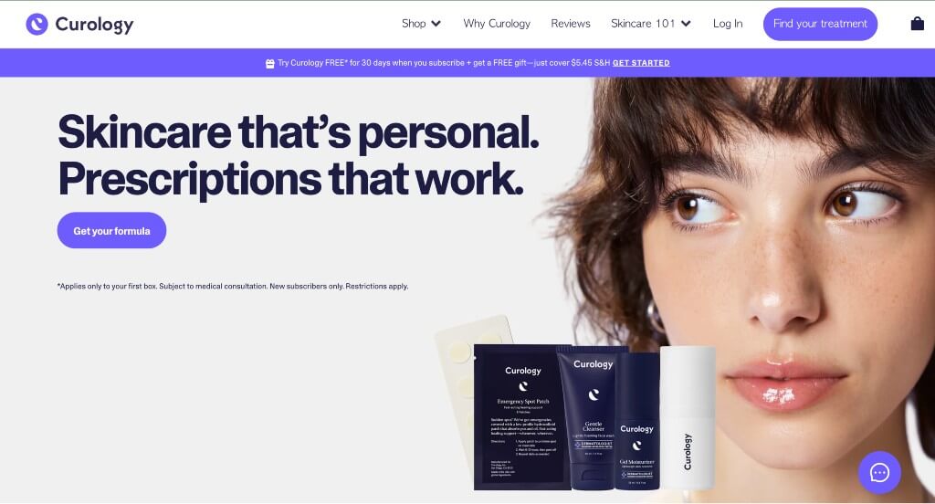
What We Liked
- Personalization and relatability are consistent
- Font was simple and not distracting
- Color scheme was interesting so it grabs attention
What We Didn’t Like
- Includes navigation
- Not much for content
- More info on the product, how it works, and any important data would be nice
15. Nauto
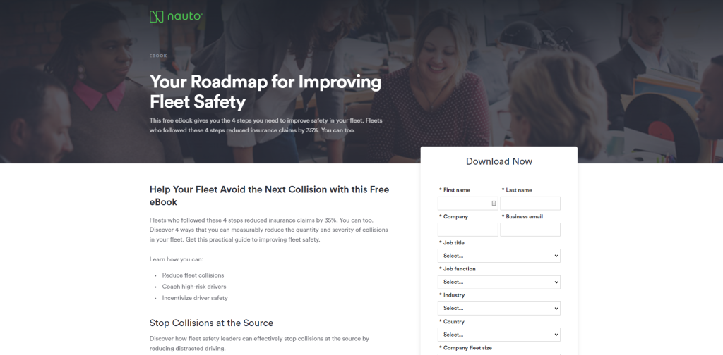
What We Liked
- Nice organization for their written content
- Simple form to gain their free eBook
- Logo design stands out due to it’s bold green color
What We Didn’t Like
- Page is boring, there is almost no imagery, no video, no gifs, and no animations
- Reviews and social media are all missing causing for no social proof to be noted
- Uninspiring and doesn’t make customers feel like they should download the book
16. Wix
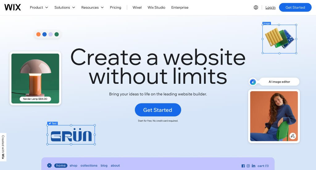
What We Liked
- Unique graphics that leak into each other
- Headings are in bold fonts to attract attention right away
- Feeling of unity throughout the page
What We Didn’t Like
- Lacking on written content
- Social media and reviews can’t be found making their company seem less reliable
- No competition comparison
17. Monday
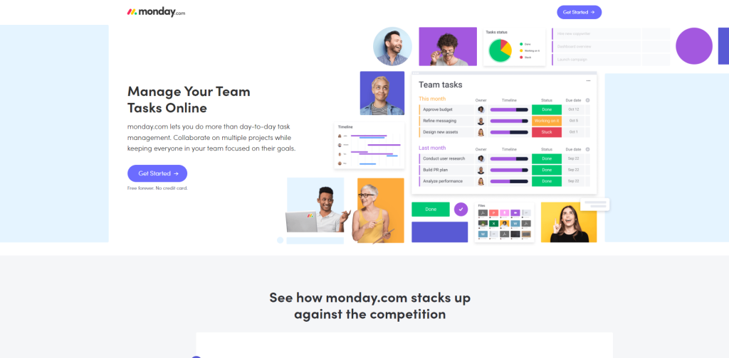
What We Liked
- Top-notch comparison section that visually represents the differences
- Great use of videos, animations, photography, while using their colors excellently
- Includes a sticky header
What We Didn’t Like
- The review section looks good, but there’s not much content there
- Typography is boring
- Doesn’t include integration with other apps
18. ADT
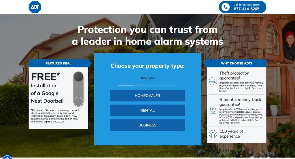
What We Liked
- Having a simple free quote survey right away
- High quality images (including ones of their products)
- Showing their security plans and what each one covers
What We Didn’t Like
- Footer is very messy looking
- Every button was for getting a free quote, which was already at the top of their page
- There were too many useless pop-ups upon entering their site
19. CD Baby
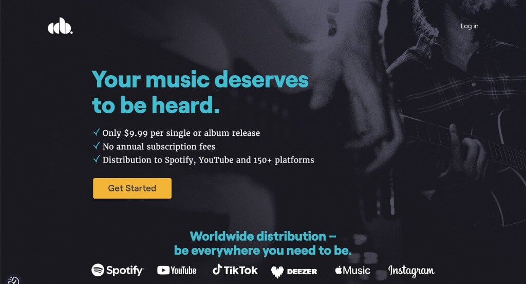
What We Liked
- Stunning color palette
- Only a few buttons leading to the same area
- Logo design was interesting
What We Didn’t Like
- Could have a few more images
- Yellow backgrounds were a bit obnoxious
- Bigger text for titles would have been nice
20. Recharge
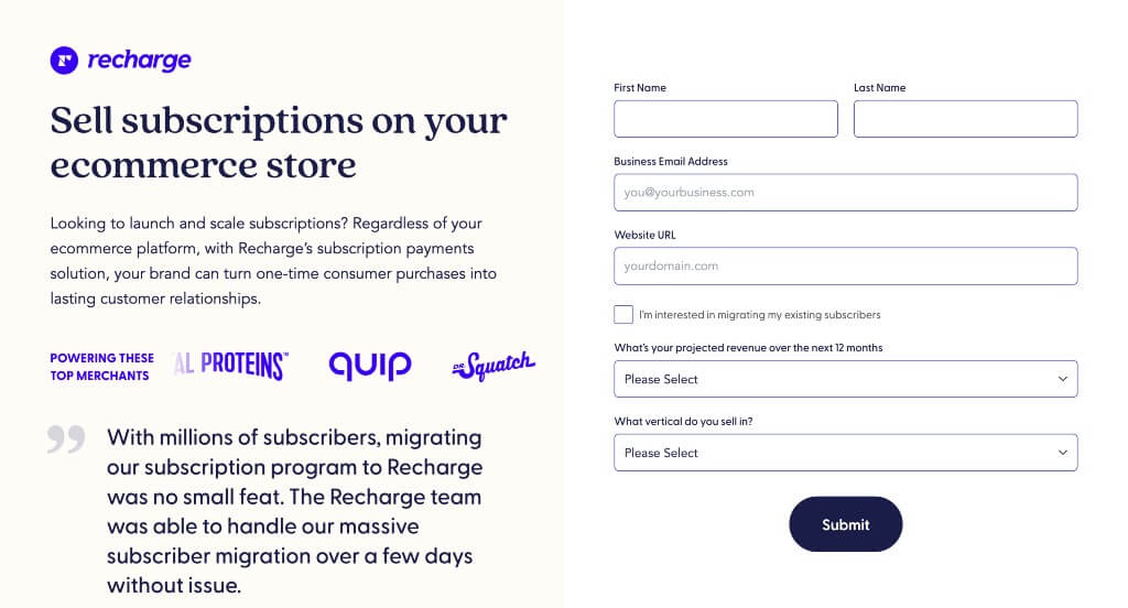
What We Liked
- Many simple graphics used as imagery throughout the page
- We liked how their images and written content alternated sides
- Some information is organized with checkmarks
What We Didn’t Like
- Less obvious call to action buttons
- So many different fonts and sizes are used
- FAQ section was very small
21. Cleaning Authority
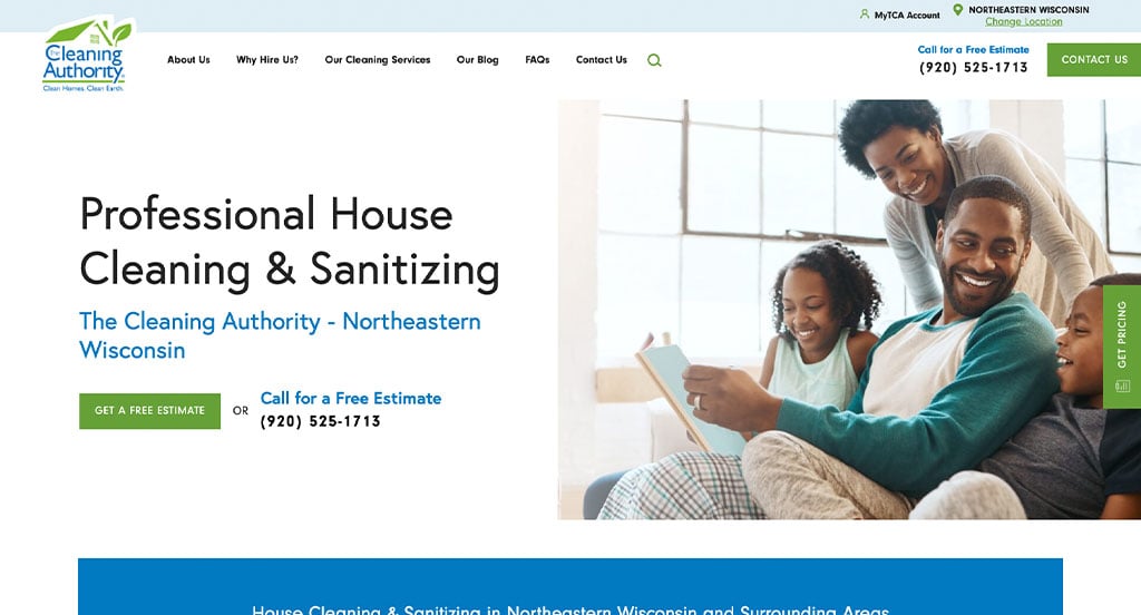
What We Liked
- Logo design is creative and the same colors are used throughout this page
- Many small but creative graphics are used as icons to liven up this site
- We liked their color scheme that was logical for services they offer
What We Didn’t Like
- All images are on one side
- Written content is good but, they don’t do a great job breaking up the content
- Could have a more interesting font
22. Honeybook
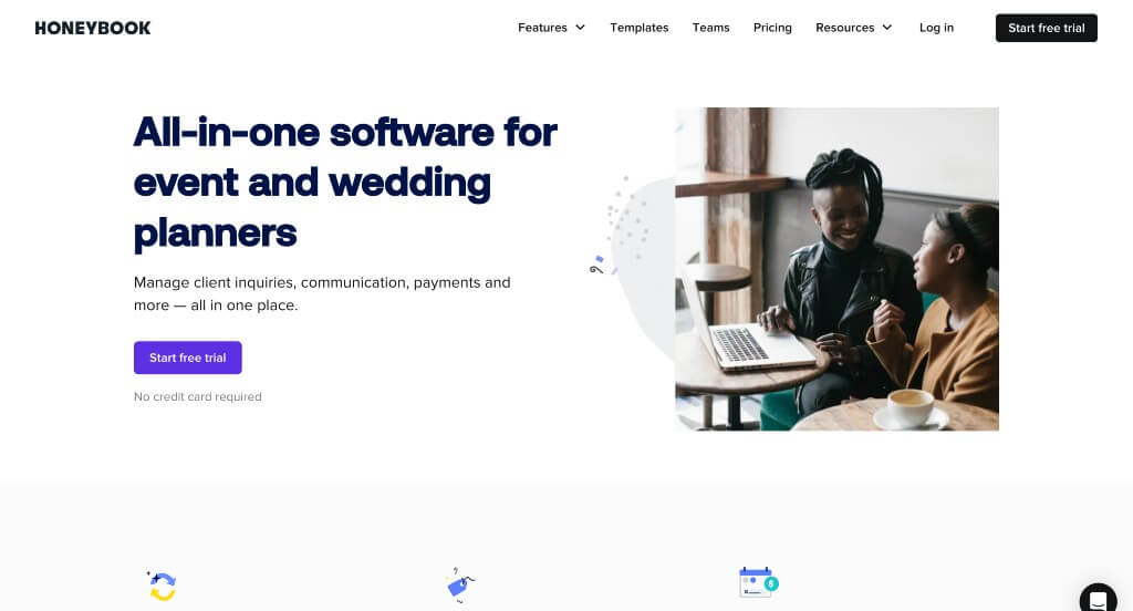
What We Liked
- Checkmarks used as bullet points for written content
- Lots of images and written content is there
- In-depth FAQ section
What We Didn’t Like
- Landing page has navigation
- White space could have been used a little better
- No review section
23. TruGreen
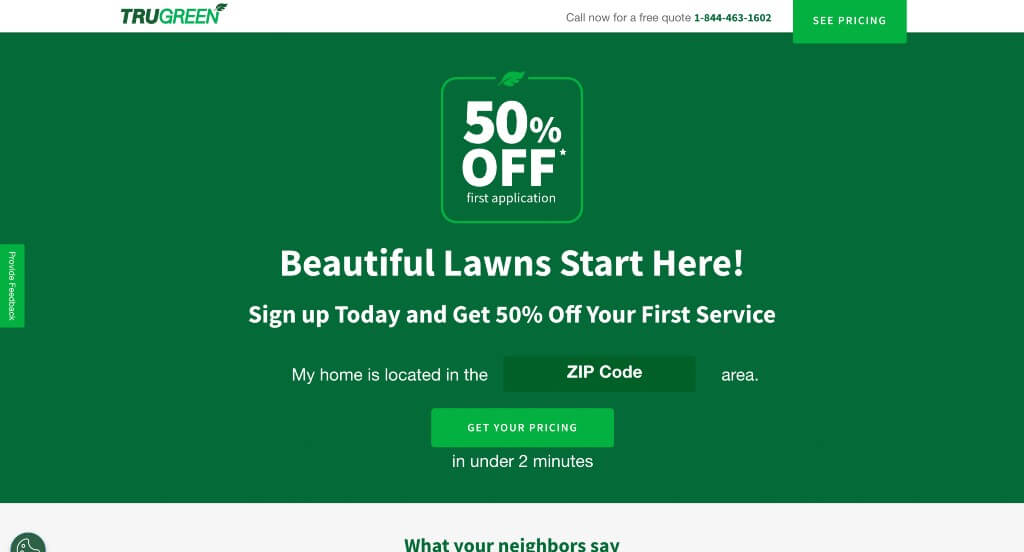
What We Liked
- Bright colors are attractive making customers interested
- Many good icons throughout this landing page
- Wasn’t many links to bring customers to other pages
What We Didn’t Like
- More images would brighten up this basic site
- Very small customer review section
- Site wasn’t very balanced in colors
24. Future
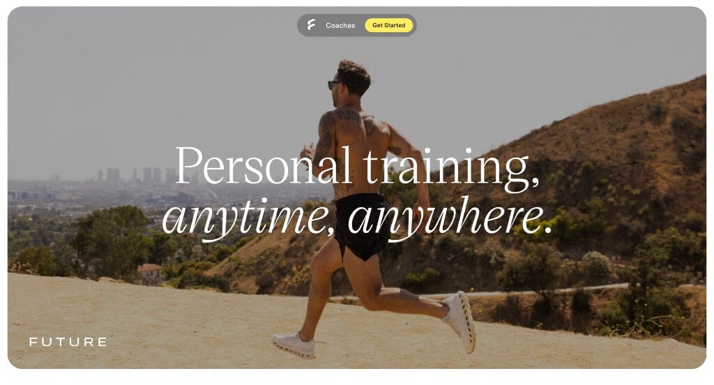
What We Liked
- Images and videos were included all throughout this design
- We liked how their page ran through examples of how they personalize sessions to you
- We also liked the short phrases used throughout
What We Didn’t Like
- Some areas tend to have too much white space
- Menu is included so customers can leave the page
- Could have used a more obvious FAQ and pricing sections