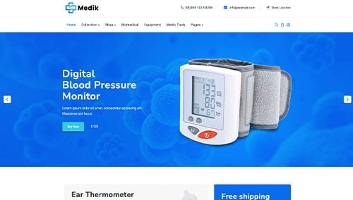
In the healthcare industry, a pharmacy website is more than just a digital storefront – it is a vital extension of the patient care experience. For modern pharmacies, an online presence must immediately establish clinical authority, data security, and unwavering trustworthiness. To thrive in a competitive landscape, your design must balance professional healthcare branding with the high-speed convenience today’s patients demand.
Our design and development team evaluated hundreds of pharmacy websites – from independent community drugstores and compounding pharmacies to clinical specialty providers. We identified the top examples that excel in patient-centric design, specifically analyzing their mobile-friendly prescription refill workflows, HIPAA-compliant security signals, and the clarity of their health resource centers.
Whether you are seeking to modernize a local legacy brand or scale a digital-first pharmacy service, these examples represent the benchmark for pharmaceutical web design in 2026.
Note on Our Selection Process: We recently audited this guide to ensure every featured site meets our 2026 standards for security, speed, and mobile usability. This curated list focuses on the top pharmacy websites providing the most strategic value to health-conscious patients today.
Top Pharmacy Website Designs
- 1. CVS Pharmacy
- 2. Walgreens
- 3. Good Neighbor Pharmacy
- 4. Omnicare
- 5. Sesame
- 6. PillPack
- 7. SpecialtyRx
- 8. Mega Aid Compounding Pharmacy
- 9. SaveWay Compounding Pharmacy
- 10. Pharmacy Innovations
- 11. Medicine Mart of Lexington
- 12. Progress Pharmacy
- 13. Amber Specialty Pharmacy
- 14. Health Warehouse
- 15. Allen Family Drug
1. CVS Pharmacy
Why We Chose CVS Pharmacy
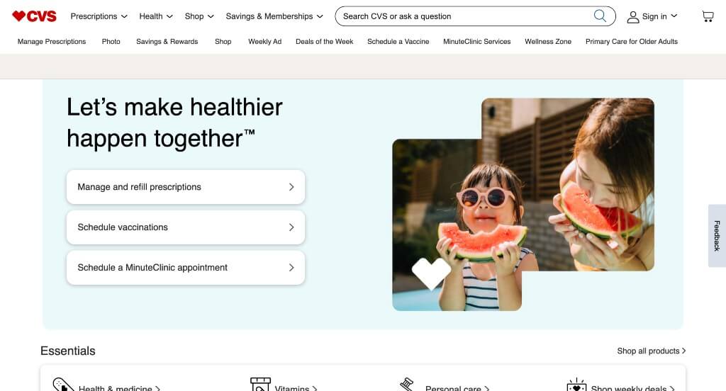
The digital ecosystem for CVS Pharmacy serves as a premier benchmark for “Enterprise-Scale Omnichannel Merchandising and High-Density Retail Utility Architecture.” When dealing with an enterprise corporate space that spans prescriptions, clinical care, photo printing, and brick-and-mortar retail, a website must act as a massively functional marketplace without completely overwhelming the user. The platform navigates this challenge smoothly, leaning on structured space-saving navigation systems and high-contrast styling choices to keep countless moving parts organized and highly scannable for millions of daily shoppers.
Key Design Highlights:
- High-Contrast, Grid-Friendly Collage Layout Frameworks: Managing an overwhelming amount of information across multiple categories is achieved by leveraging a crisp, clean white background to anchor a dynamic collage-style layout. By using a bright white backdrop, the rich visuals, multi-colored promotional banners, and product grids can pop side-by-side without clashing, keeping a high-density merchandising strategy looking clean, structured, and modern.
- Aggressive, Front-Page Cross-Vertical Advertisement Clusters: The homepage operates as a powerful corporate engine by advertising a diverse matrix of clinical services, photo deals, and retail discounts across the primary scroll path. This multi-tiered setup quickly funnel-routes visitors directly into active seasonal campaigns, pharmacy refills, or weekly sales circulars right upon landing, giving distinct departments equal visibility without causing friction.
- Expansive, High-Utility Desktop Hamburger Directories: To prevent immense choice paralysis across their sprawling e-commerce ecosystem, the desktop experience utilizes an expansive, easy-to-navigate hamburger menu. Clicking this anchor rolls open an organized full-screen or slide-out mega-directory that categorizes deep internal sections – like health services, optical, care benefits, and standard retail departments – into clean, bite-sized text columns for fast navigation.
- Integrated Retail Peer-Validation and Social Proof Hubs: Balancing their corporate convenience with community trust, the homepage incorporates real-time customer reviews directly along the product and care journeys. Displaying authentic multi-star feedback and local validation helps ease the online checkout process, proving that even at a massive corporate scale, peer confirmation remains crucial for driving digital conversions.
2. Walgreens
Why We Chose Walgreens
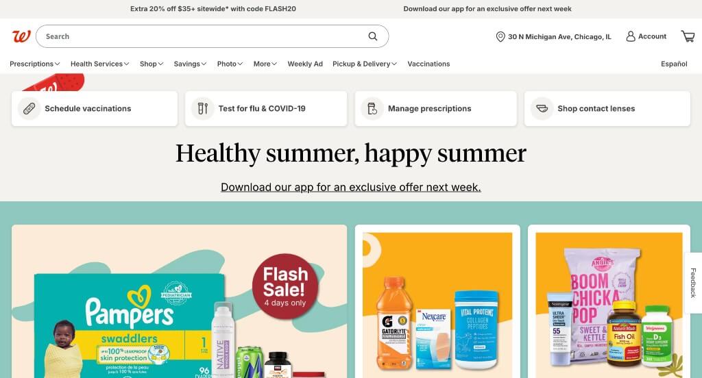
The digital ecosystem for Walgreens serves as a premier benchmark for “Enterprise-Scale Healthcare Merchandising and High-Density Localization Architecture.” In the massive corporate pharmacy and retail space, an online platform must seamlessly balance time-sensitive consumer discounts, vital clinical pharmacy services, and immediate wellness notifications. The interface achieves this complex balance beautifully, organizing a huge amount of data into an ultra-clean mobile and desktop canvas that values customer time, clear navigation, and local community relevance.
Key Design Highlights:
- Clean, High-Speed Mobile Scroll Frameworks: Navigating an enterprise-level inventory with thousands of individual items on a smaller screen is handled beautifully by an incredibly clean, fluid mobile layout. The mobile platform trims away desktop density, optimizing touch targets, image scales, and vertical scroll lanes to ensure that on-the-go shoppers can look up prescriptions or check store inventory without experiencing screen lag or page clutter.
- Targeted Health-Centric Care Blueprints: The website anchors its medical authority through a dedicated “Because Your Health Matters” section directly on the homepage. Rather than letting critical care paths get buried under standard convenience store products, this specialized layout explicitly highlights key healthcare services – such as vaccine scheduling, prescription refills, and 24/7 virtual doctor consultations – putting vital health solutions right within user reach.
- Hyper-Localized “Deals of the Week” Dynamic Showrooms: Driving both digital cart value and physical foot traffic, the homepage features a prominent “Deals of the Week” module that updates automatically based on the user’s location. This smart retail section pulls immediate savings, active circular discounts, and store-specific clearances from the customer’s nearest brick-and-mortar branch, offering a highly personalized, value-driven shopping experience.
- Persistent, High-Utility Top Announcement Banners: Ensuring that critical, time-sensitive information reaches every single visitor instantly, the site implements a clean announcement bar positioned directly above the primary header. This high-visibility bar serves as a direct alert channel for crucial updates – like severe weather pharmacy closures, shipping deadlines, or immediate health alerts – keeping customers informed without interrupting the main navigation flow below.
3. Good Neighbor Pharmacy
Why We Chose Good Neighbor Pharmacy
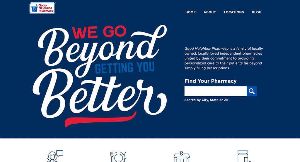
The digital ecosystem for Good Neighbor Pharmacy serves as a premier benchmark for “Network-Scale Independent Retail Architecture and Community-Centric Healthcare Merchandising.” Managing a cooperative network of locally owned, independent pharmacies means the corporate platform cannot act like a rigid, one-size-fits-all big-box store. Instead, the interface functions perfectly as a giant digital bridge – combining broad, full-width retail utility with hyper-local direct connection tools that funnel visitors straight into their neighborhood independent pharmacy.
Key Design Highlights:
- Immersive, High-Impact Full-Width Layout Frameworks: The website maximizes visual real estate by deploying a modern full-width layout that stretches across the entire screen. This design choice provides plenty of breathing room for large retail banners, detailed care resources, and medical product collections, allowing high-density health information to breathe naturally without feeling cramped or text-heavy.
- Immediate Localized Pharmacy Discovery Hero Portals: Recognizing that the primary goal of the network site is driving patient foot traffic to locally owned locations, the hero area includes an integrated pharmacy locator utility. Placing a zip code search and location finder straight into the prime, above-the-fold real estate allows patients to instantly lock onto their closest neighborhood store and access specific pharmacy hours or local services in a single click.
- Targeted HSA/FSA Eligibility and Monthly Product Spotlights: Maximizing retail value while simplifying complex healthcare spending, the homepage features a dedicated Monthly Product Spotlight section. Highlighting bestsellers and essential wellness products that are explicitly marked as HSA (Health Savings Account) or FSA (Flexible Spending Account) eligible takes the guesswork out of healthcare shopping, prompting fast online or in-store purchases.
- Front-Page Patient Empowerment and Editorial Health Blogs: Building immense clinical authority beyond just selling products, the homepage features a prominent editorial showcase for their active health and wellness blog. Seamlessly positioning expert medical articles, seasonal allergy advice, and preventative care tips straight within the main scroll path transforms the retail storefront into a trusted, long-term health education hub.
4. Omnicare
Why We Chose Omnicare
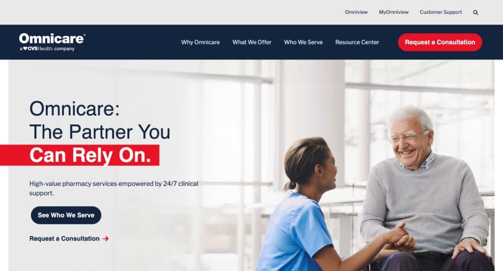
The digital storefront for Omnicare serves as a premier benchmark for “Enterprise B2B Deathcare and Long-Term Care Pharmacy Architecture.” As a major provider of institutional pharmacy services for senior living facilities and long-term care communities, their interface cannot operate like a standard retail drugstore. Instead, the platform functions flawlessly as a high-authority corporate utility, organizing massive logistical networks and clinical service offerings into clean, professional communication paths designed specifically for healthcare executives and facility directors.
Key Design Highlights:
- Immediate B2B “Request a Consultation” High-Priority Headers: Understanding that their primary audience consists of high-intent facility decision-makers looking for operational partnerships, the header prominently displays a “Request a Consultation” action button. This clean placement ensures corporate prospects can immediately enter the sales and onboarding pipeline without wading through consumer-level retail pages.
- Solution-Oriented “Proven Pharmacy Support” Operational Blueprints: The website anchors its corporate value proposition through a dedicated “Proven Pharmacy Support” section right on the homepage. Rather than simply listing general pharmacy features, this targeted layout outlines the exact ways they help facilities – highlighting compliance management, cost control, and clinical accuracy to address a director’s chief operational pain points.
- Long-Term Care Industry Validation and Partner Testimonials: Building absolute institutional trust is handled beautifully by embedding direct, real-world testimonials from active facility partners onto the homepage scroll path. Showcasing specific success stories and professional endorsements from real healthcare providers establishes immense enterprise credibility, reassuring prospects of Omnicare’s reliability at a massive operational scale.
- Front-Page Executive Empowerment and Insight-Rich Industry Blogs: Establishing thought leadership within a highly regulated field is reinforced by featuring their specialized corporate blog directly on the homepage. Seamlessly integrating technical pharmacy breakdowns, industry compliance updates, and senior care insights into the primary navigation path transforms the corporate site into an ongoing educational hub for long-term care professionals.
5. Sesame
Why We Chose Sesame Care
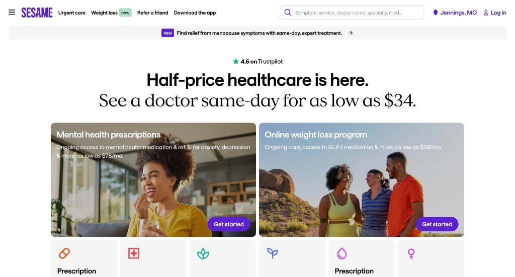
The digital platform for Sesame Care serves as a premier benchmark for “Direct-to-Consumer Telehealth Merchandising and High-Intent Patient Autonomy Architecture.” In a clinical space traditionally defined by confusing insurance networks and hidden costs, this website acts as an open, marketplace-style engine. The design excels at turning complex clinical booking paths into a familiar e-commerce checkout flow, giving users the immediate power to compare, evaluate, and lock in direct medical care within a matter of clicks.
Key Design Highlights:
- Intent-Driven Omnibox Search Hero Frameworks: Instantly capturing the user’s immediate healthcare needs upon page load, the primary hero area centers around a powerful, open-ended search input. By allowing patients to type in exactly whatever symptoms, specialties, or treatments they need help with to dynamically match with a provider, the platform eliminates standard corporate menu friction and routes users to care instantly.
- Frictionless Real-Time Provider Matching and Direct Booking Grids: Drastically cutting down the timeline to receive treatment, the homepage incorporates an active doctor marketplace interface. This section displays individual clinician profile cards – complete with background details, immediate scheduling availability, and an instant booking button – allowing users to seamlessly choose a professional and finalize their appointment right on the front page.
- Strategic Curated Service Matrix Showcases: To elegantly convey the sheer scale of their platform without completely paralyzing the user with choice, the homepage cleanly manages their massive catalog of 383 clinical services. By highlighting a curated cluster of their 6 most popular care pathways (such as primary care visits, mental health sessions, or prescription refills) in a prominent grid, the platform satisfies majority-use traffic while proving their expansive medical scope.
- Dual-Layer Trust Validation and Peer-Review Hubs: Overcoming the natural consumer hesitation regarding digital healthcare quality is handled via an aggressive, multi-tiered review layout. The homepage pairs specific, localized patient star-ratings directly under individual physician profiles with comprehensive global platform reviews for Sesame itself, providing two distinct layers of social proof to reassure new patients at every stage of the scroll.
6. PillPack
Why We Chose PillPack
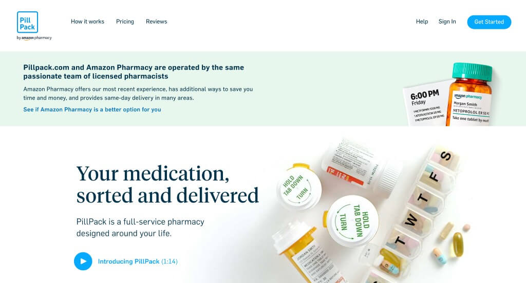
The digital presence for PillPack (an Amazon Pharmacy service) serves as a premier benchmark for “Immersive Product Scrollytelling and Frictionless Medical Onboarding Architecture.” For a service that completely reinvents how patients manage, organize, and consume daily prescription medications, the primary website must act as both an intuitive educational canvas and a high-conversion gateway. The interface achieves this masterfully, leaning on dynamic, scroll-driven visual narratives to dissolve complex pharmaceutical logistics into a delightfully clear, comforting, and modern user experience.
Key Design Highlights:
- Immersive, Interactive “Scrollytelling” Visual Frameworks: As users move down the page, the site deploys smooth, scroll-activated animations and transitions that visually guide them through the product experience. This kinetic design strategy lets the visitor see the actual prescription packaging adapt and separate right before their eyes, turning an ordinary scroll into an active, memorable demonstration of their unique value proposition.
- Dual-Format Explainer Showrooms and Video Guides: Recognizing that different users absorb information in different ways, the homepage integrates a clear, high-fidelity explainer video detailing how PillPack functions from doctor coordination to doorstep delivery. Pairing this video with a beautifully formatted text breakdown gives visitors a quick, comprehensive understanding of the service within their first few seconds on the site.
- Bite-Sized Multi-Stage Process Blueprints with Deep-Dive Anchors: The homepage lays out their entire pharmacy enrollment and distribution model in a series of clean, scannable steps. By breaking down the process into easy-to-digest stages – while pairing each step with direct contextual links to “learn more” – the layout keeps the front page incredibly neat while giving analytical users a clear path to research specific logistical and insurance details.
- Multi-Media Peer Validation and Social Proof Hubs: Overcoming the natural hesitation of switching pharmacy providers is handled smoothly at the base of the homepage through a hybrid testimonial grid. By pairing standard written customer reviews with an authentic video testimonial from a real patient, the platform delivers a powerful layer of social proof that validates their reliability, accuracy, and emotional impact on daily life.

7. SpecialtyRx
Why We Chose SRx Long Term Care Pharmacy
The digital home for SRx Long Term Care Pharmacy serves as a premier benchmark for “High-Identity Corporate B2B Merchandising and Approachable Healthcare Architecture.” In the institutional pharmacy sector, website layouts often lean toward sterile, hyper-corporate, and clinical designs that feel distant. The SRx platform masterfully subverts this expectation, deploying an ultra-cohesive, vibrant color palette alongside friendly, narrative-driven media to transform complex institutional pharmaceutical logistics into a deeply approachable, high-trust corporate partnership portal.
Key Design Highlights:
- Approachable, Character-Driven Animation Hero Frameworks: Instantly setting a warm, human, and modern tone right upon arrival, the homepage bypasses traditional, generic medical stock videos in favor of a custom, cute animated hero sequence. This creative design choice breaks down the initial corporate barrier, using friendly, narrative-driven visuals to immediately communicate their core long-term care mission in a way that feels uniquely welcoming and memorable to facility directors.
- Vibrant, High-Cohesion Brand Color Alignment: The platform establishes immediate visual authority and structural rhythm through a highly disciplined primary deployment of purple across the website. Using this signature hue consistently for major structural accents, typography headers, and key interactive elements creates a beautiful brand thread that instantly glues the entire homepage layout together, reinforcing a premium, highly recognizable brand identity.
- Streamlined, High-Utility Desktop Mega Menus: Efficiently managing a dense matrix of clinical offerings, specialized care pathways, and corporate facility resources is handled flawlessly through a sleek sticky header equipped with an expansive mega menu. As users scroll through the homepage narrative, the navigation remains perfectly anchored at the top of the viewport, opening up into a spacious, beautifully categorized multi-column layout that eliminates choice paralysis.
- Front-Page Knowledge Hubs and Featured Corporate Blogs: Solidifying their clinical thought leadership in the highly regulated institutional care space, the homepage features a dedicated editorial module highlighting their professional pharmacy blog. Seamlessly positioning technical care updates, regulatory insights, and facility management tips within the primary scroll path turns the corporate storefront into a continuous, active resource center for healthcare professionals.
8. Mega Aid Compounding Pharmacy
Why We Chose Mega Aid Compounding Pharmacy
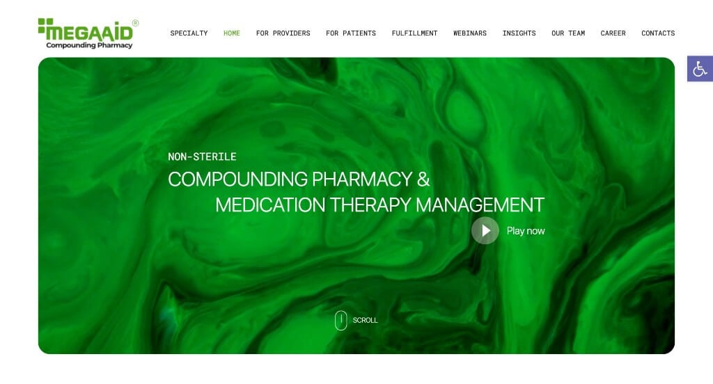
The digital presence for Mega Aid Compounding Pharmacy Click to open side panel for more information serves as a premier benchmark for “Patient-Centric Specialty Merchandising and High-Accessibility Clinical Guidance Architecture.” Specialized custom compounding requires a massive amount of patient education, as consumers are often dealing with complex prescriptions that must be prepared and applied precisely. The layout handles this flawlessly, balancing strict symptom-targeted clarity with inclusive multi-lingual onboarding resources to remove confusion and build deep personal trust.
Key Design Highlights:
- Condition-Targeted Front-Page Care Blueprints: Instead of hiding their specific clinical solutions behind complex medical terminology or deep submenus, the homepage explicitly outlines the exact medical conditions their compounds treat right within the primary scroll path. This transparent layout strategy allows patients to instantly align their specific prescriptions and health struggles with real-world compounding solutions.
- Inclusive Multi-Lingual Application Showrooms: Acknowledging that proper medication application is vital to health outcomes, the homepage features an integrated, high-fidelity explainer video demonstrating how to apply their custom compounds. To support a diverse, multicultural patient base, the interface uniquely places a direct link alongside the media player that unlocks additional instructional videos translated into various languages, drastically lowering the accessibility barrier.
- Integrated Support Peer-Validation Hubs: Overcoming the natural consumer skepticism surrounding custom-mixed pharmaceuticals is handled smoothly by embedding verified customer testimonials directly onto the homepage narrative. Spotlighting authentic success stories from real patients provides crucial social proof, validating the pharmacy’s clinical accuracy and compassionate care to newcomers.
- Front-Page Patient Empowerment and Clear FAQ Matrices: Addressing standard concerns regarding custom compounds, shipping timelines, insurance approvals, and refills, the homepage incorporates a structured Frequently Asked Questions section. Delivering these transparent answers directly on the main landing path educates the user, reduces routine customer support phone calls, and removes the final friction points standing between a patient and their treatment.
9. SaveWay Compounding Pharmacy
Why We Chose SaveWay Compounding Pharmacy
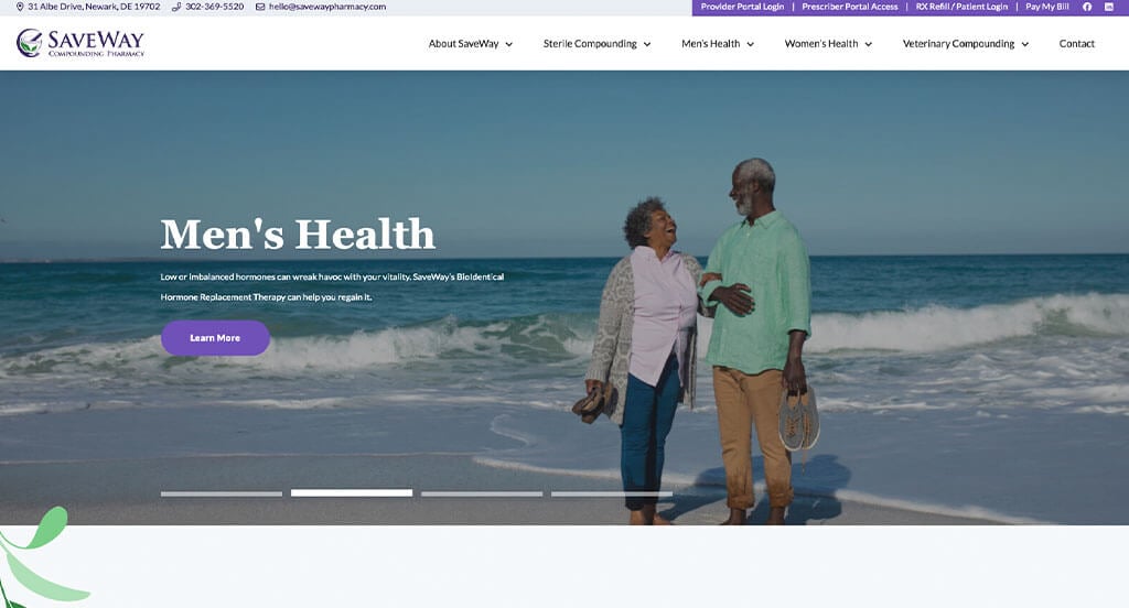
The digital presence for SaveWay Compounding Pharmacy serves as a premier benchmark for “High-Specificity Care Merchandising and Dynamic Multi-Channel Communication Architecture.” In the custom compounding field, a website must bridge the gap between complex pharmaceutical customization and straightforward family care. The platform accomplishes this beautifully, framing their technical formulation capabilities as direct solutions to daily medication challenges while keeping vital neighborhood communication lines anchored right at the top of the viewport.
Key Design Highlights:
- High-Utility Tiered Announcement Bars and Contact Hubs: Strategically positioned above the main header, the site implements an information-dense utility ribbon that immediately surfaces crucial operational data. By packing contact details, direct telephone pathways, and critical quick links into this top-tier space, the layout ensures that busy patients, prescribing doctors, and care facilities can immediately coordinate care without having to hunt down a contact page.
- Problem-Solving “Care That Is Customized” Identity Blueprints: The homepage anchors its core clinical value through a dedicated “Care that is Customized” narrative section. Instead of just listing equipment or mixing capabilities, the copy focuses entirely on patient outcomes – explaining exactly how custom compounding solves common medication challenges, such as flavor preferences for children, allergen removal, and hard-to-find dosage strengths.
- Comprehensive, Structured Front-Page Service Matrices: The homepage serves as a clear, reassuring roadmap by explicitly mapping out their core service pathways within a dedicated “Our Services” framework. Visually breaking down distinct disciplines – such as veterinary compounding, pediatric care, and hormone replacement therapies – helps users immediately identify the exact division that matches their family’s health needs.
- Integrated Support Peer-Validation Hubs: Balancing their clinical formulation data with real-world emotional reassurance, the homepage embeds verified customer reviews directly within the main scroll path. Spotlighting authentic testimonials from local patients who found relief through custom-mixed prescriptions provides powerful social proof, giving new clients total peace of mind before transferring their care.
10. Pharmacy Innovations
Why We Chose Pharmacy Innovations
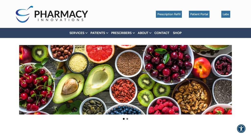
The digital presence for Pharmacy Innovations serves as a premier benchmark for “Dual-Funnel B2B/B2C Healthcare Merchandising and High-Authority Onboarding Architecture.” In the custom compounding landscape, a website must simultaneously market to two entirely different audiences: patients seeking specialized, easy-to-take medications, and physicians looking for a legally compliant, reliable laboratory partner. The platform balances this dual demand flawlessly, utilizing distinct, targeted routing pathways right on the front page to ensure both patients and providers find immediate, relevant clinical value.
Key Design Highlights:
- Dual-Targeted Patient and Prescriber Conversion Pathways: Eliminating the navigation confusion that often plagues B2B/B2C hybrid medical sites, the homepage opens with explicit, separate entry portals tailored for patients and prescribers. This strategic structural layout ensures that a doctor looking for custom formulation forms and a patient checking on refill logistics are immediately funneled into their own optimized, friction-free user journeys.
- Introductory “What is Pharmacy Innovations?” Identity Blueprints: The homepage quickly builds brand authority and clinical comfort by embedding a dedicated “What is Pharmacy Innovations?” narrative module. Introducing their core pharmacy philosophy, advanced laboratory standards, and commitment to customized medicine straight out of the gate educates first-time visitors and establishes deep operational trust before they dive deeper into the site.
- Interactive Condition Management Slider Frameworks: Seamlessly connecting a patient’s symptoms to real-world pharmaceutical solutions, the homepage implements an elegant condition carousel. This interactive slider allows visitors to swipe through a comprehensive matrix of health concerns they specialize in managing – such as chronic pain, veterinary care, or hormone imbalances – making their clinical capabilities instantly scannable.
- Value-Driven Dual Validation and Credibility Showcases: The website solidifies its local and professional reputation through a structured section outlining exactly why both patients and providers choose them. By organizing technical laboratory precision, custom flavor options, and seamless doctor collaboration into distinct, bite-sized value metrics, the copy gives both audiences a clear, data-backed reason to partner with the pharmacy.
11. Medicine Mart of Lexington
Why We Chose Medicine Mart
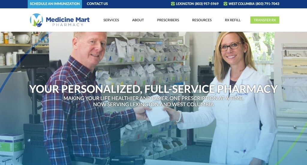
The digital presence for Medicine Mart serves as a premier benchmark for “High-Conversion Local Pharmacy Merchandising and Frictionless Patient Migration Architecture.” In the neighborhood pharmacy sector, a website’s primary mandate is to lower the barrier of entry for patients trapped in tedious big-box pharmacy ecosystems. The interface achieves this flawlessly, utilizing prominent, multi-touchpoint transfer pipelines alongside authentic facility media to make switching prescriptions a stress-free, modern experience.
Key Design Highlights:
- Dual-Anchor “Transfer Rx” Patient Migration Channels: Recognizing that moving prescriptions is the single highest-intent action a new customer can take, the site positions high-visibility “Transfer Rx” buttons both in the primary header navigation and directly within the central hero area. This smart multi-placement layout ensures that whether a user has just landed on the page or finished reading about their services, a fast, streamlined path to migrate their care is always an effortless click away.
- Cinematic Facility, Staff, and Operational Showrooms: Instantly building local community trust and dissolving the cold anonymity typical of massive corporate drugstores, the homepage features an integrated high-fidelity video loop. Showcasing actual footage of their brick-and-mortar building, their friendly, approachable staff, and the behind-the-counter care process humanizes the local pharmacy brand and sets a welcoming tone before a patient ever walks through the door.
- Omnichannel Mobile Ecosystem Integration and App Download Links: To support modern, on-the-go prescription management, the footer includes direct download badges for both the Apple App Store and Google Play Store. Providing clean access to their mobile app directly within the base layout encourages long-term patient retention, allowing clients to order refills, check statuses, and receive health alerts straight from their smartphones.
- Integrated Support Peer-Validation Hubs: Balancing their operational capabilities with genuine community trust, the homepage anchors its clinical reputation by embedding verified customer testimonials directly within the primary scroll path. Highlighting real-world stories of personalized care, short wait times, and helpful staff offers powerful social proof that reassures prospective families they are choosing a reliable, dedicated healthcare partner.
12. Progress Pharmacy
Why We Chose Progress Pharmacy
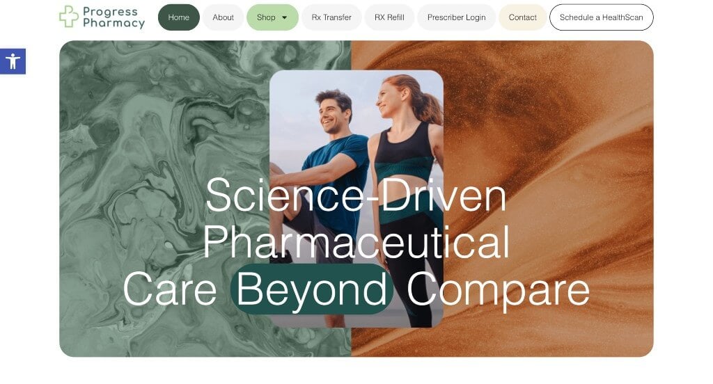
The digital home for Progress Pharmacy serves as a premier benchmark for “Proprietary Clinical Innovation Merchandising and Fluid Mobile Conversion Architecture.” In the competitive local and compounding pharmacy landscape, a digital storefront must transcend standard prescription refills by carving out a distinct, high-value clinical identity. The platform masters this objective, turning their exclusive diagnostic offering into a central, recurring conversion narrative while optimizing the interface for the modern, touch-first mobile patient.
Key Design Highlights:
- Ubiquitous, High-Intent “HealthScan” Diagnostic Integration: Rather than treating their specialized HealthScan evaluation as a hidden secondary page, the site masterfully builds its entire conversion architecture around it. By anchoring a dedicated action button in the primary header and repeating targeted booking triggers throughout the homepage scroll path, the layout turns a unique clinical service into a powerful patient acquisition funnel.
- Streamlined, High-Speed Mobile Scroll Frameworks: Understanding that a massive portion of community health searches occur on smartphones, the interface features an incredibly clean, fluid mobile presentation. The mobile layout strips away unnecessary digital friction, ensuring that interactive buttons, text spacing, and image scales are perfectly optimized for single-thumb navigation and effortless vertical scrolling.
- Comprehensive, First-Touch Care and Service Matrices: The homepage serves as an efficient digital roadmap by explicitly outlining their full menu of service offerings right in the primary path. Cleanly presenting their core clinical divisions – such as custom compounding, health screenings, and wellness consultations – allows incoming patients to instantly see how the pharmacy can fit into their long-term wellness routines.
- Hyper-Localized Navigation Maps and Spatial Onboarding Hubs: Bridging the gap between online discovery and physical foot traffic, the homepage embeds a clean, interactive location map directly into the main scroll. Providing this upfront geographic clarity eliminates the friction of searching through separate contact pages, giving patients immediate access to driving directions, store proximity, and local care access.
13. Amber Specialty Pharmacy
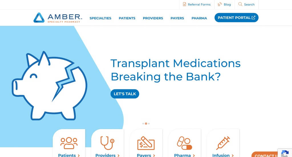
Why We Chose Amber Specialty Pharmacy
The digital ecosystem for Amber Specialty Pharmacy serves as a premier benchmark for “High-Touch Specialty Care Merchandising and Patient-First Communication Architecture.” In the complex world of chronic conditions, rare diseases, and specialty medications, a website must do more than display product lists – it must convey extraordinary empathy, absolute care coordination, and instant accessibility. The platform navigates this masterfully by transforming complex clinical workflows into warm, highly approachable digital interactions that prioritize real-time human connection.
Key Design Highlights:
- Empathetic, Narrative-Driven Text-Communication Showrooms: In a medical sector often plagued by sterile automated systems, the homepage features a high-fidelity video loop depicting a fluid text conversation between the pharmacy team and a patient. This creative visual choice instantly humanizes the brand, demonstrating their modern, high-touch support model and reassuring patients facing challenging diagnoses that dedicated personal care is only a message away.
- Persistent, Low-Friction “Contact Us” Communication Anchors: Recognizing that specialty pharmacy patients often travel with urgent, time-sensitive questions regarding prior authorizations or delivery timelines, the interface includes a prominent floating contact button overlay in the bottom right corner. Staying perfectly anchored through the entire scroll path ensures that direct support is always accessible without forcing users to dig through complex menu hierarchies.
- Comprehensive, Target-Condition Clinical Specialty Matrices: The website cleanly organizes its deep clinical capabilities by explicitly mapping out the complex specialties they treat right within the primary homepage view. By highlighting specialized care paths – such as oncology, neurology, transplant support, and immunology – the layout allows both patients and referring physicians to instantly verify the pharmacy’s expert therapeutic scope.
- Front-Page Patient Empowerment and Insight-Rich Specialty Blogs: Solidifying their role as a trusted healthcare ally beyond just dispensing medicine, the homepage features a dedicated editorial showcase for their active professional blog. Integrating expert clinical insights, coping strategies for chronic illnesses, and navigation guides for complex drug therapies directly into the main scroll transforms the storefront into an ongoing, high-value health resource hub.
14. Health Warehouse
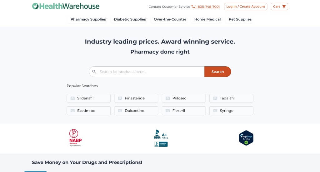
Why We Chose HealthWarehouse
The digital ecosystem for HealthWarehouse serves as a premier benchmark for “Direct-to-Consumer Digital Pharmacy Merchandising and Frictionless E-Commerce Conversion Architecture.” As a pioneer in the mail-order prescription space, the platform is optimized to treat pharmacy care with the ease, speed, and logistical simplicity of modern online shopping. The layout excels at dismantling the historically opaque pricing structures of the pharmaceutical industry by leading with total price transparency and search-first navigation tailored for both desktop and mobile shoppers.
Key Design Highlights:
- Search-Centric Hero Portals with Instant Query Acceleration: Acknowledging that the vast majority of online pharmacy visitors arrive looking for a highly specific medication, the primary hero area is built around a large, centralized search bar. To further accelerate the path to purchase, the interface anchors quick-access buttons directly below the search box for popular medications, minimizing typing friction and moving patients into the shopping funnel instantly.
- Transparent, Price-First Interactive Product Showrooms: Overcoming the hidden-cost anxieties that often plague traditional healthcare, the homepage features a dynamic product slider that displays exact, upfront pricing on popular prescription medications. Showcasing clear, competitive cash prices directly in the primary scroll path allows cash-pay or underinsured patients to immediately calculate their monthly healthcare savings.
- Linear, Trust-Building “How It Works” Logistical Blueprints: Because moving away from a traditional brick-and-mortar neighborhood pharmacy can feel intimidating, the homepage includes a dedicated “How It Works” workflow matrix. This section maps out the onboarding process into clear, logical steps – explaining prescription collection, doctor coordination, and home delivery – to completely de-risk the transition for first-time customers.
- Streamlined, Single-Thumb Mobile Scroll Frameworks: Navigating a massive pharmaceutical catalog on small screens is handled beautifully by a highly responsive, clean mobile presentation. The mobile interface optimizes grid lines, scales down promotional banners, and provides large, touch-safe buttons that allow users to manage refills, compare drug costs, and complete checkouts seamlessly on the go.
15. Allen Family Drug
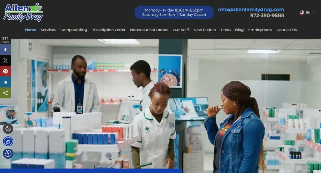
Why We Chose Allen Family Drug
The digital storefront for Allen Family Drug serves as a premier benchmark for “Community-First Pharmacy Merchandising and High-Accessibility Wellness Architecture.” For a neighborhood independent pharmacy that bridges the gap between traditional prescriptions and highly technical customized compounding, the website must instantly communicate professional versatility without losing its warm, family-oriented identity. The platform navigates this challenge smoothly, organizing multiple care pathways into a streamlined layout designed to support patients on both desktop and mobile screens.
Key Design Highlights:
- Top-Tier Communication Ribbons and Social Integration: Positioned directly above the main navigation header, the site implements a high-utility announcement bar that groups essential contact info and direct social media links into one clean space. This upfront directory ensures that patients, caretakers, and prescribing physicians can immediately pull corporate phone lines or cross-platform operational updates without needing to dig through bottom footers or subpages.
- Persistent, Conversion-Optimized Sticky Headers: Keeping vital navigation paths effortlessly accessible through every phase of the user journey, the layout utilizes a smooth sticky header framework. As users scroll down the homepage to learn about specific treatment options, the main menu anchors itself perfectly at the top of the viewport – providing a frictionless path to transfer prescriptions, refill medications, or request consultations at the exact moment a client decides to act.
- Dual-Focus Front-Page Service and Compounding Matrices: The website structures its core health offerings through a dedicated “Our Services” matrix that highlights standard pharmaceutical care right alongside their compounding specialties. Visually charting custom medication adjustments – such as pediatric flavoring, hormone therapies, or allergen-free variations – allows patients to instantly recognize how the team creates tailored medical solutions that traditional big-box pharmacies cannot provide.
- Streamlined, Single-Thumb Mobile Scroll Frameworks: Recognizing that modern patients frequently coordinate family care, refills, and directions from their smartphones, the interface features an incredibly clean, fluid mobile presentation. The mobile layout optimizes paragraph spacing, trims excessive digital margins, and presents tap-safe interaction targets to guarantee an effortless, lag-free vertical scroll experience on the go.
WordPress Pharmacy Themes
You can find free themes at wordpress.org, or consider pharmacy-inspired templates on ThemeForest.
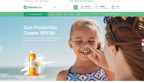
PharmaCare – Themeforest
$79
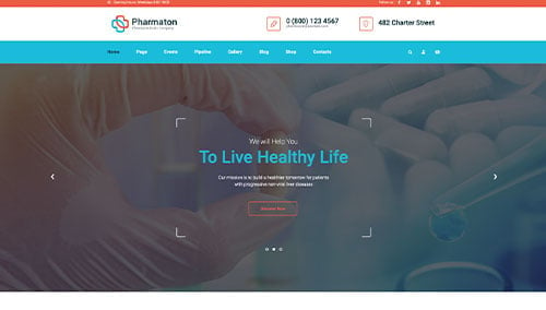
Pharmaton – Themeforest
$49
WooCommerce Pharmacy Themes
There are plenty of ecommerce pharmacy themes for WooCommerce available on ThemeForest.
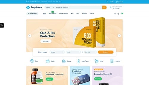
Propharm – Themeforest
$59
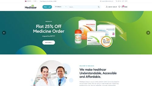
Medilazar – Themeforest
$49
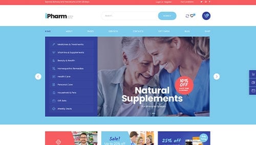
iPharm – Themeforest
$59
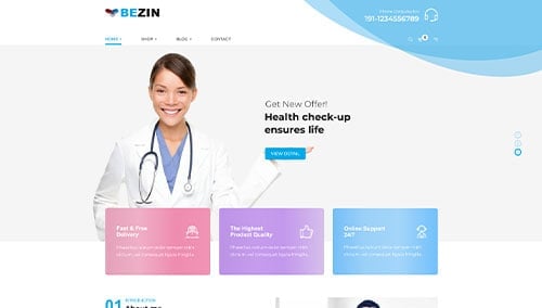
Bezin – Themeforest
$59
Shopify Pharmacy Themes
You can find free and paid themes at themes.shopify.com, or explore options on marketplaces like ThemeForest.
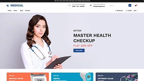
Medicul – Themeforest
$58
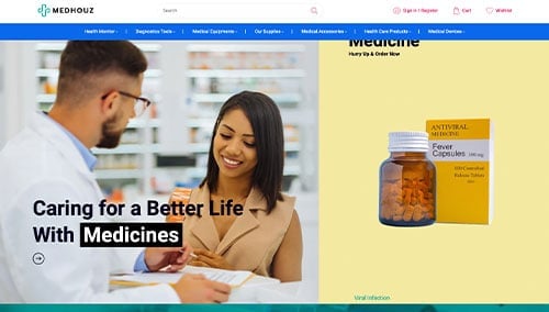
Medhouz – Themeforest
$48
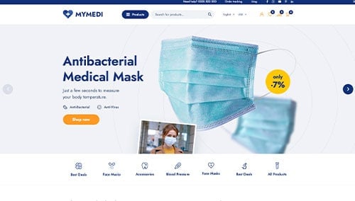
MyMedi – Themeforest
$79
Medik – Themeforest
$59