Picture this: It’s late at night, and you’re scouring the web for a solution to a problem that’s been nagging you all week. You’re tired, slouched with your head in your hands, fighting off sleep. Just as you’re about to give up, a promising search result appears. With bated breath, you click and…
Nothing happens. After an eternity, a white screen with walls of text and a tiny, pixelated product image begins to render. It feels like the age of dial-up. There’s no price info, no customer reviews, and multiple phone numbers urging you to call. No working links in sight, and the only social proof is an animation of a cat saying the product is “Purrrrfect!” It’s clear: you’ve found a website graveyard.
Don’t let this nightmare be your store! The best user experiences come from engaging, regularly updated websites. Whether you’re starting out or updating your ecommerce store, our ecommerce developers are here to help!
This article covers the essential criteria for product pages and design choices to avoid. We’ve also compiled a list of our favorite product pages with pros and cons to inspire your next project!
Building the Perfect Product Page
Your product page’s purpose is to sell your product and meet visitor expectations. With the average person in the US spending nearly seven hours and fifty minutes per day, visitors will scrutinize their experience like a sommelier critiques wine. They can easily distinguish between a good and bad website experience.
Your product page should meet visitor expectations, offer a seamless user experience, and include unique elements to keep them coming back.
Meeting user expectations can be challenging if you’re unsure what they want. That’s why we’ve created a guide with best and worst practices for designing your product page to engage users and boost your conversion rate.
Best Practices for Ecommerce Product Page Design
We’ve compiled a list of essential features and concepts to create brilliant product pages and enhance your visitors’ experience when used tastefully.
- Clean URL
- Captivating name
- Straightforward pricing
- Attractive Call to Actions
- Item availability
- Distinct product options
- Quality product pictures including multiple camera angles, situations, and models
- Comparison to similar products
- “Favorites/wishlist” button
- FAQ section
- Zoom functionality
- Augmented reality
- 360° view
- Vivid product descriptions
- Live chat feature
- A mixture of product and lifestyle media for story narration
- Responsive design
- Relevant “related products” section
- Ability to increase the quantity of product
- Size/fit guide (if applicable)
- Seamless navigation
- Intuitive filter options
- Sticky “Back to Top” button
- Highly accessible to differently-abled users
- Upfront shipping and return policies
- Sticky “Add to Cart” or “Buy Now” buttons
- Social proof
- Extended details (materials, technical specs, dimensions, weight, special features, etc.
- No redundancy
- A spacious and interesting font
- Quick load times
- Dark mode friendly
Beware of feature creep, where too many unnecessary features harm the user experience. For instance, augmented reality might not help a toothpick company but would benefit a furniture seller. Evaluate which features enhance your product without overcrowding your page.
What to Avoid When Designing Product Pages
When implementing good practices, avoid distracting ones. These range from confusing users with hyperlink blue for normal text to more malicious actions like sneaking unwanted items into a cart.
- Too many colors
- Convoluted price
- Inconsistent design
- Bait and switch tactics
- Hidden fees
- Too long/too short or copied description
- Inconsistent product names
- False guarantees
- Recommend non-relevant products
- Burying call to actions
- Small & poor quality images, videos, gifs
- Negative reviews
- Reoccuring pop-ups
- Confirmshaming
- Sneaking items into customer’s cart
- Unclear navigation
- Compact font
- Busy negative space
- No FAQ
- No social proof
Top 25 Product Page Layouts
1. Groove Life
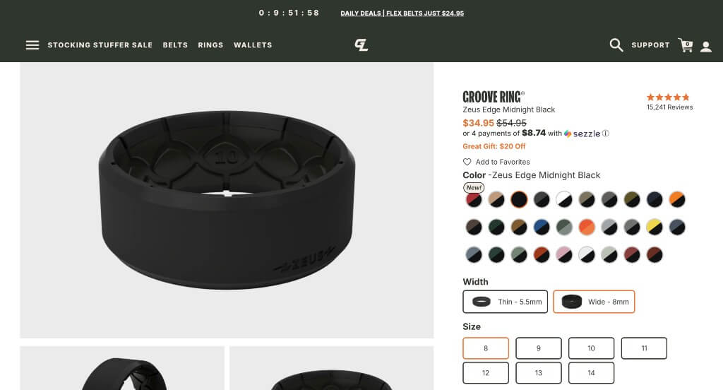
What We Liked
- Easy solution to find out your ring size.
- Great social pressure (Instragram feed, reviews)
- Description is easily digestable.
What We Didn’t Like
- Could use a sticky “Buy Now” button on desktop
- Doesn’t use any upsell techniques
- An uneven design
2. FIGS
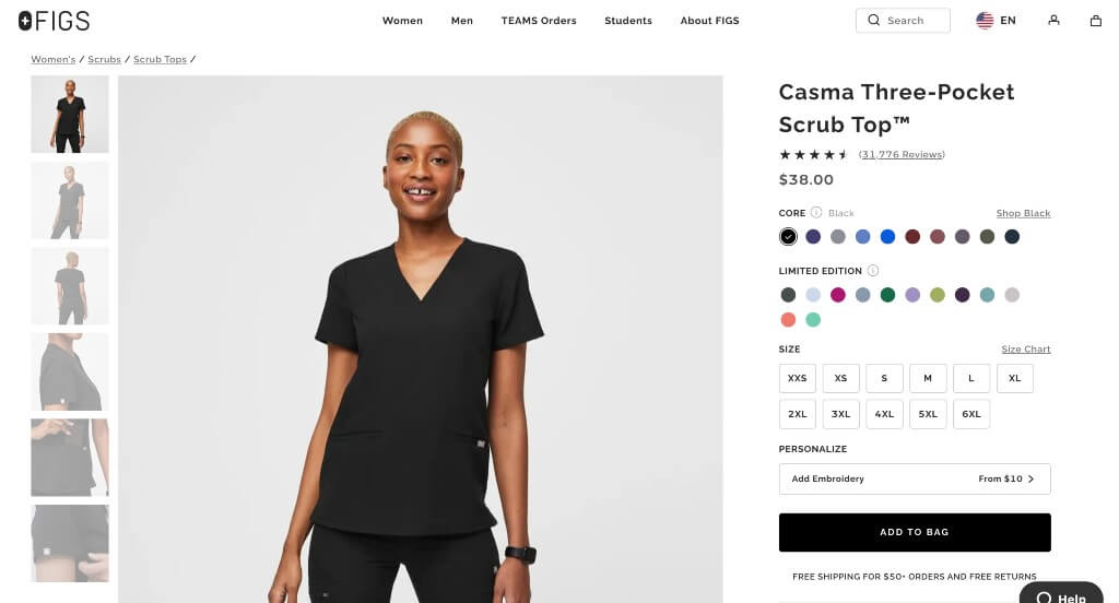
What We Liked
- Relaxing color scheme for the page
- Lots of color options for each product
- Including products to complete a set
What We Didn’t Like
- More information could be found if viewers scrolled
- Hidden taxes and shipping fees
- Reviews don’t provide much information
3. Simple Human
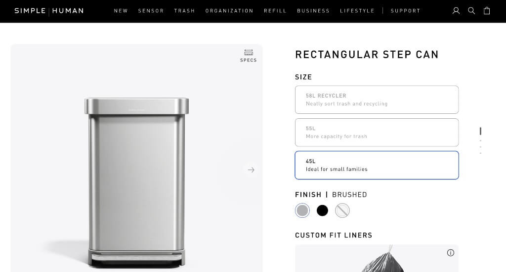
What We Liked
- Interesting navigation tool on the left side
- Use of animations
- Lots of information about their products
What We Didn’t Like
- Reviews didn’t stand out
- Pricing blends in an bit making it difficult to know the price
- Accent colors were all over the place
4. Decked
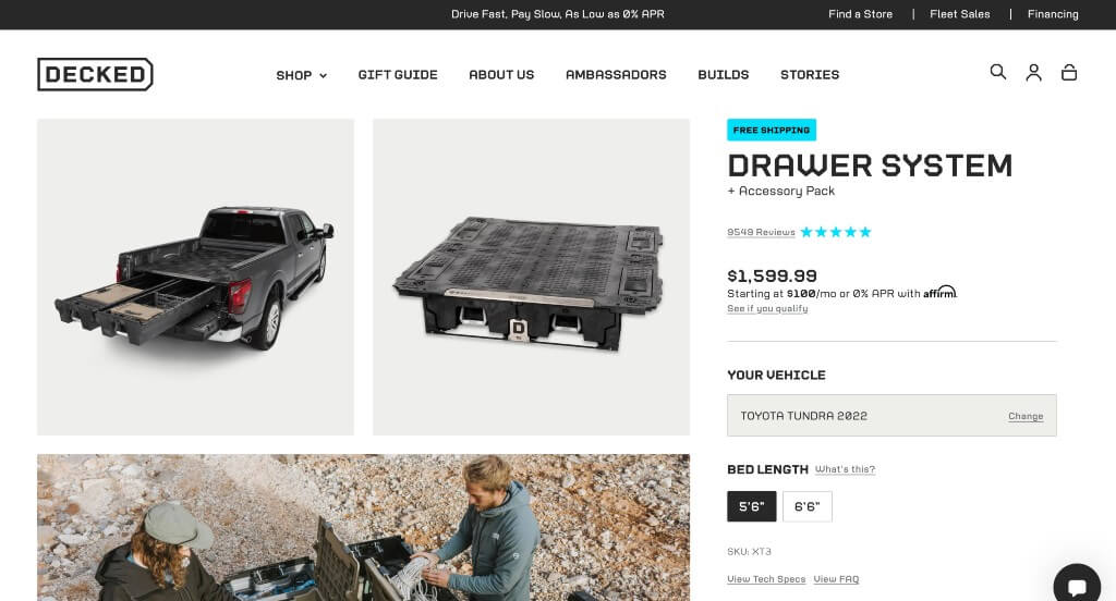
What We Liked
- Good sense of community among buyers with great social proof
- Typography fits the brand’s voice with icons to match
- Images enhance the overall look
What We Didn’t Like
- Large white space by the FAQ
- Contact info is harder to find
- Lacks any sticky header, “Buy Now” button, or way to jump to the top
5. Nanoleaf
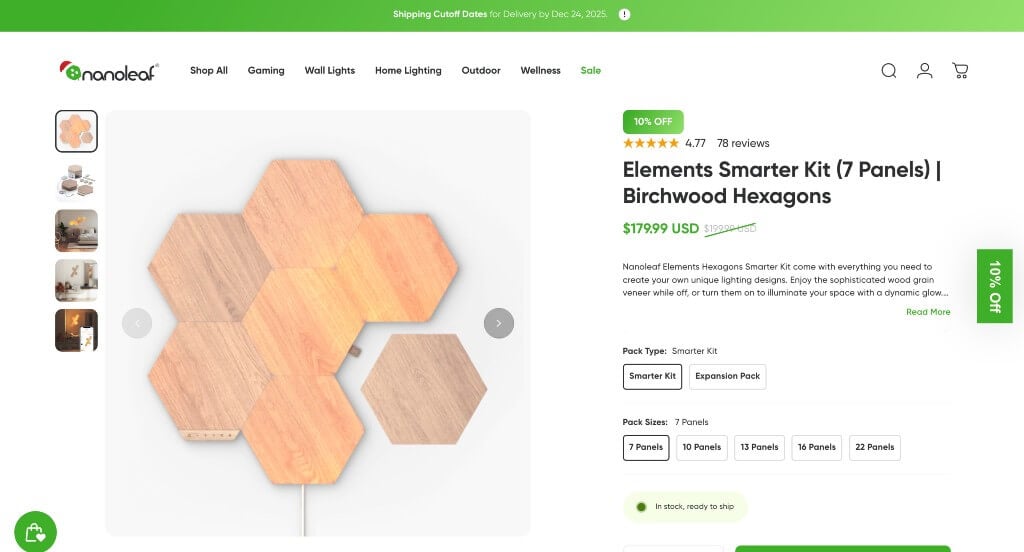
What We Liked
- Awesome scroll animation above the fold
- Excellent story building through images
- Including graphics into the template
What We Didn’t Like
- Only one video – would be nice if it played automatically
- Logo design was really small and hard to notice
- No price listed until it’s in their cart
6. Master & Dynamic
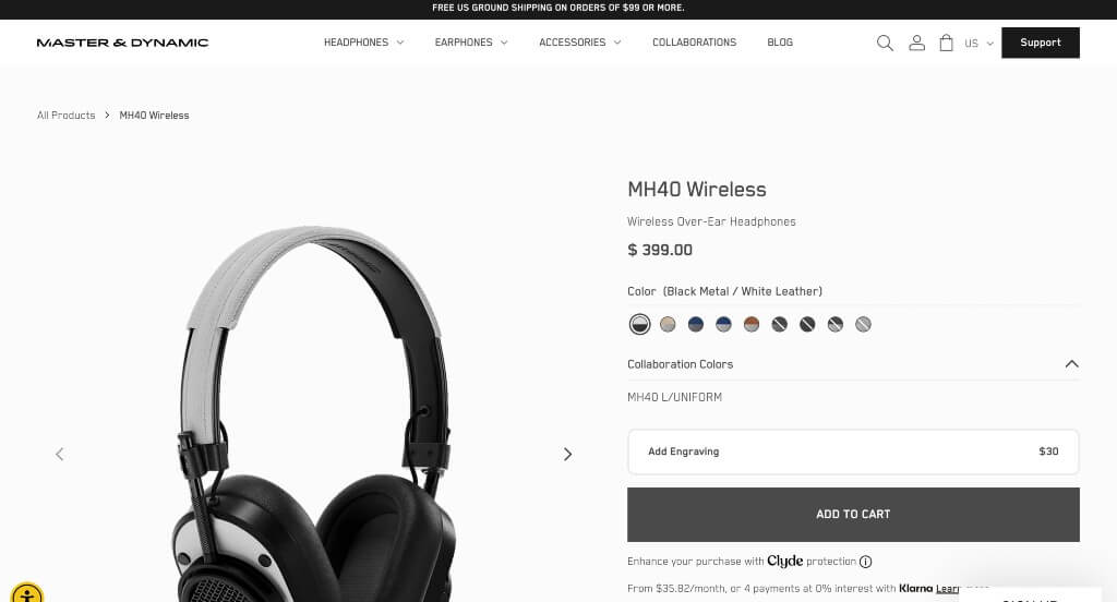
What We Liked
- Option for customization with engraving
- Displaying what each color option looks like on the product
- Images show the same angles no matter the color option
What We Didn’t Like
- Viewers need to scroll to see the whole product image
- Could use an accent color on their page
- Product features can’t be seen until scrolling down
7. DBrand
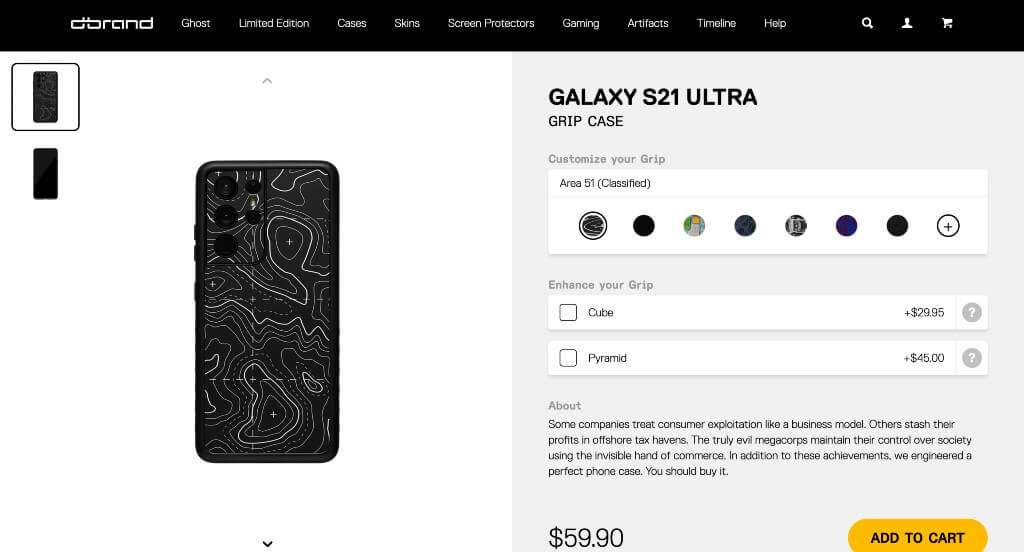
What We Liked
- Ability to see all different patterns displayed on the cases
- Fantastic storytelling with the scroll animations of phone cases
- Ability to add product to your cart
What We Didn’t Like
- Very limited calls to action
- No upsells or cross-sells
- Very bottom of the site looked unprofessional
8. Vessi
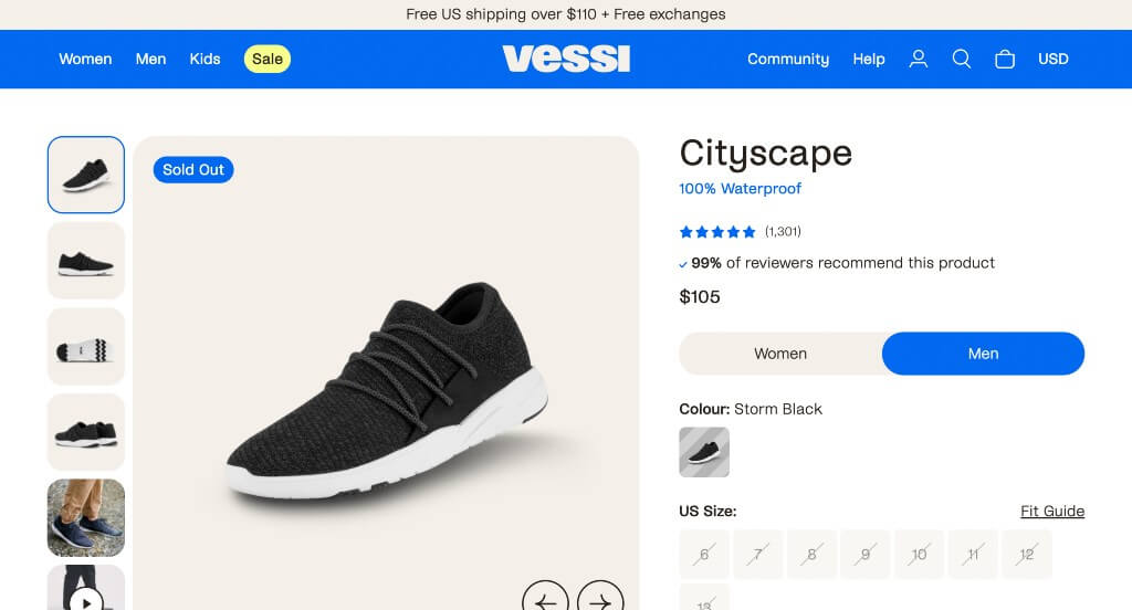
What We Liked
- Lots of images at different angles, plus a video
- The broken down visual of their shoe layers
- Inclusion of social media
What We Didn’t Like
- Customer reviews seemed to be skewed as they only show 5-stars
- This site could have had a better color palette
- FAQ section has font that is way to large
9. Marucci
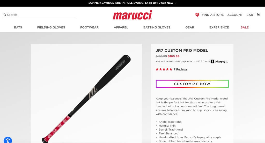
What We Liked
- Bulleted information to display the product’s features
- Related product section
- The interesting loading symbol
What We Didn’t Like
- Lots of white space in this design
- Customize button doesn’t take you anywhere
- Lacks color and general creativity
10. Osprey
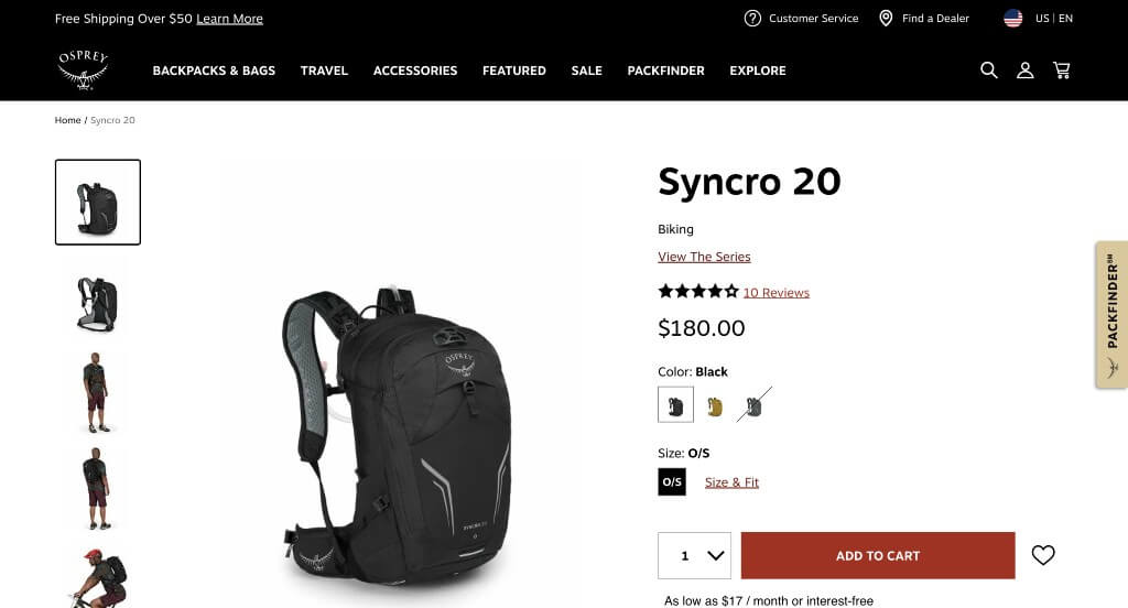
What We Liked
- Interactive and informational “Special Features” section
- Different sized fonts to ensure visual hierarchy
- Ability to heart products
What We Didn’t Like
- Extra-long review section
- Product images could be more unique from color to color
- Color accents could be more relevant as it’s generally a visually boring site
11. Bang & Olufsen
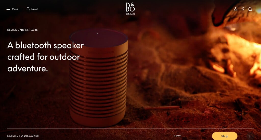
What We Liked
- Social proof from experts
- Short and to the point paragraphs
- Awesome photos and videos of their product
What We Didn’t Like
- Too much white space with small font makes it seem like there isn’t enough information
- No “on-page” FAQ
- No customer reviews
12. Kit + Ace
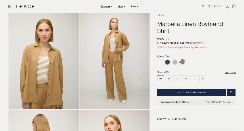
What We Liked
- They showed their sizes and colors option
- Showing if this product is available in store
- Ability to add to a wishlist
What We Didn’t Like
- Shows it styled making it less obvious what they are selling
- Wasted whitespace below their review area on the right
- Doesn’t apply sales until placed in the cart
13. SodaStream
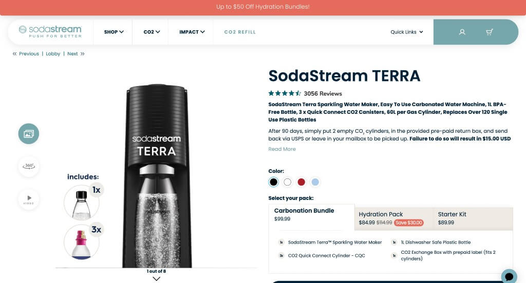
What We Liked
- Images show exactly what you’ll be purchasing and how it works
- “Other Sparkling Water Makers” section
- Inclusion of videos was a great choice
What We Didn’t Like
- Excessive white space
- Reasoning why customers should buy their product isn’t easily noticed
- Price is listed in smaller font making it hard to notice
14. Holstee
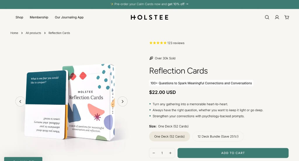
What We Liked
- Blueish green accent used on buttons
- Bullet points highlighting reasons customers love this product
- Includes products that pair well with this one
What We Didn’t Like
- Customer review section could look more professional
- Font could be more interesting
- Accent color doesn’t continue past the beginning of the page
15. HURU
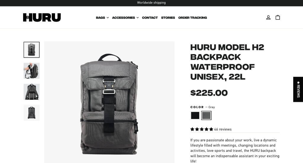
What We Liked
- Bold fonts used for titles help organize this website’s product page
- Informative images and descriptions manage to explain the item well
- Another reason this might be one of the best product pages was due to their simple checkout process
What We Didn’t Like
- Though the color scheme seems to match the rest of the website, the call to action has no color, so it doesn’t stand out
- Review section could have been a lot smaller, and less skewed (all 5-stars)
- The large video could be helpful, but, the words don’t match with the images being displayed
16. Hiya Health
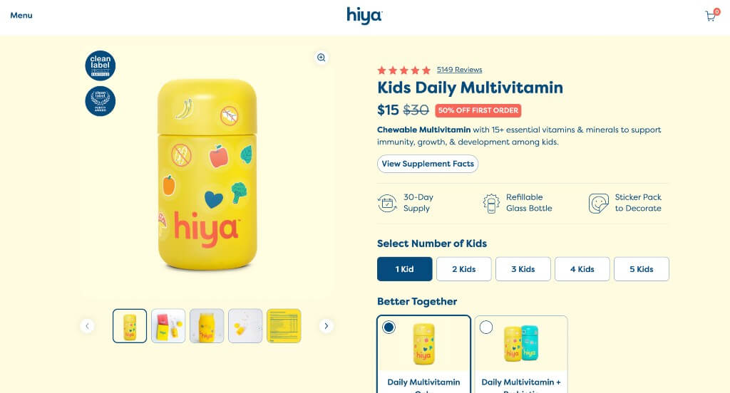
What We Liked
- Background color seems to match their product package
- Cute but professional graphics
- Showing that their price changes depending on how many kids
What We Didn’t Like
- Two areas of customer reviews
- Colors sometimes get overwhelming
- Occasionally there was wasted white space
17. Corsair
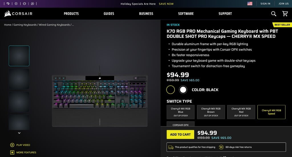
What We Liked
- Having a dark mode to help the product shine was a great choice
- Excellent use of an automatically playing video made this website even better
- Amazing typography was also included
What We Didn’t Like
- Though images and videos are high-quality, they are a bit repetitive
- No upsells or cross-sell section
- The logo design doesn’t seem to fit their company
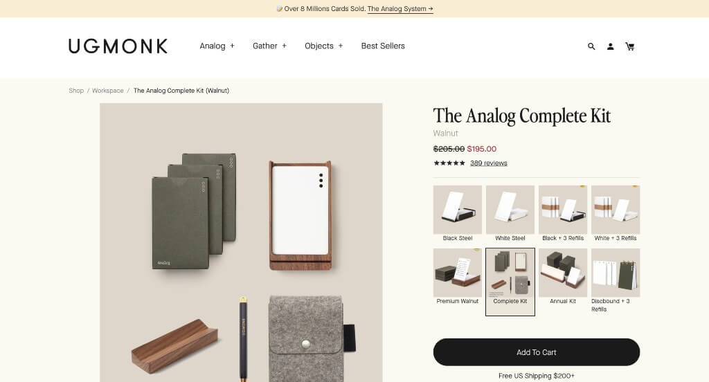
18. UgMonk
What We Liked
- Involving many gifs, creates a unique look
- The overall look creates a feel of old-time journalism
- The creative card look for their customer reviews
What We Didn’t Like
- White space could be utilized better
- Though the vibe of the site matched their company, we didn’t like how sometimes accent colors were blue, sometimes green and sometimes yellow because the accents don’t create a harmony with each other
- We do think that images could have been placed in a more pleasing layout such as an alternating design
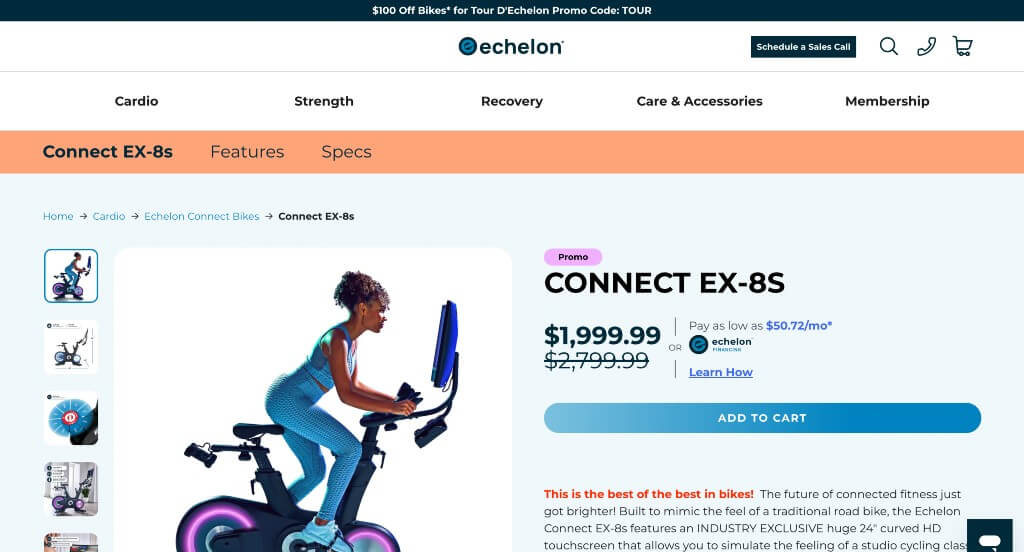
19. Echelon
What We Liked
- Images were stunning with many attractive colors
- White space was used carefully and never wasted
- Inclusion of videos add a new dimension to this site
What We Didn’t Like
- Many sections of the page seemed useless
- Product specs could have been laid out differently so it doesn’t take up as much room
- The font could be more interesting to contrast with their basic design
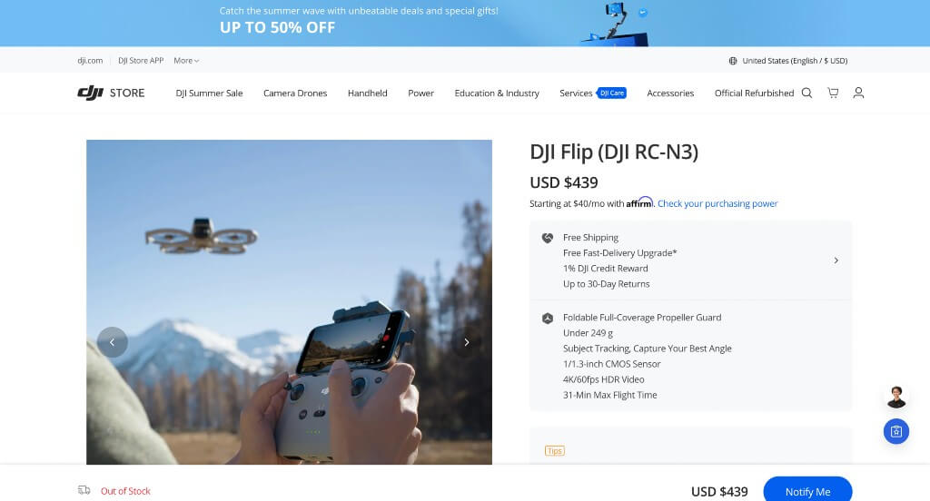
20. DJI
What We Liked
- Great upsells with an attractive “Buy Now” button that has a delivery estimate integration
- Nice “in the box” section
- Excellent use of imagery for the “Take a Closer Look” section
What We Didn’t Like
- No review section with little social proof
- The “Which is best for you” section should have links to the referenced products
- Not much story to the product page
21. Love Wellness
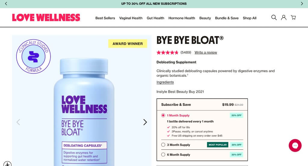
What We Liked
- Logo design was unique and professional
- Accent colors brought attention to sales and other things
- Allowing purchase by month or just one time
What We Didn’t Like
- Content sometimes feels squished
- Buttons aren’t the same size
- Could use a more interesting font
22. Luxy Hair
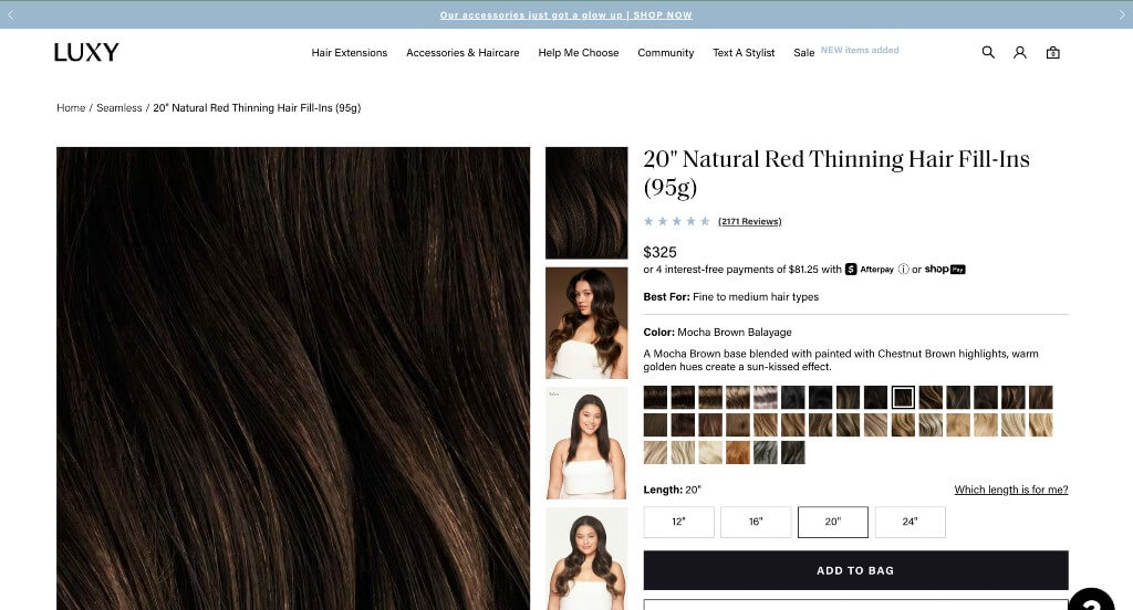
What We Liked
- Displays their color options and lengths
- Font is professional
- Including links to helpful information about each product
What We Didn’t Like
- Information feels cluttered
- Could show actual product faster instead of the color and the model
- Buttons could be larger so they are more noticable
23. Masterbuilt
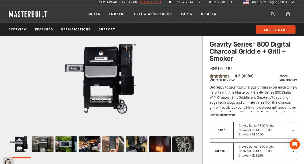
What We Liked
- Well branded company with their own hashtag acting as social proof
- Accessories are provided if people want to look at them but they aren’t intruding on the site
- FAQ and reviews are included properly
What We Didn’t Like
- Menu pops up with just a hover and becomes obnoxious when you don’t want it to pop up
- Video was nice, but would be better if it didn’t have to open a tab to play it
- Listing showing model, price, star rating and more seems squished
24. Plot Devices
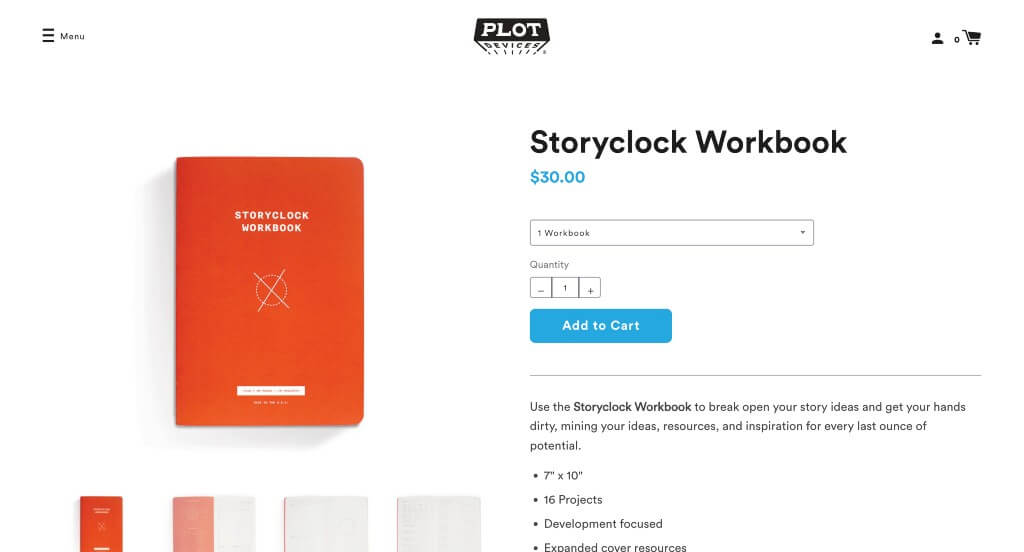
What We Liked
- Graphics were pleasing
- Color scheme creates a sense of uniformity for their company
- Product photos show off important aspects of the product
What We Didn’t Like
- No reviews, customer images or social media pages are including, which forms a lack of social proof
- Could use more animations to have a more catchy design
- Pictures started to get repetitive throughout the page since all the interesting features of their product were shared right away
25. Rocky Mountain Soap
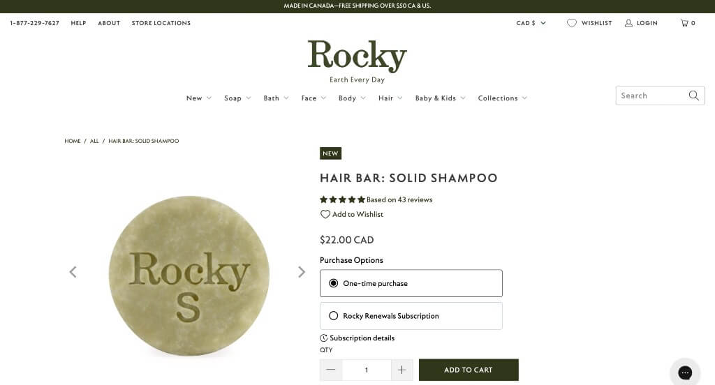
What We Liked
- Accents of dark green
- Option for subscription or one-time purchases
- Ability to add products to your wishlist
What We Didn’t Like
- Wasted white space
- Customer review section could look cleaner
- Information could be condensed or organized better
Final Thoughts on Product Page Design Examples
After reviewing our favorite product page examples, you should now see what makes a good user experience. Apply these qualities to any ecommerce platform, like WooCommerce or Shopify. Remember, there’s no perfect product page, so don’t waste time searching for one. Instead, focus on respecting your visitor’s time and internet expertise to exceed their expectations.