50 Best Mobile Websites

Almost every website being designed and developed these days is done so in a responsive design framework. This is a great start to making the internet a more mobile-friendly environment, but the downside is not every website properly utilizes their responsive design framework.

When was the last time you were on a website on your phone and saw a horizontal scrollbar? How about an image or video that broke outside the width of the screen, only allowing you to see the left half of the video? These are examples of responsive websites with design issues that weren’t addressed during their initial development, or simply never quality checked after a recent content update.

Our guide to the top 50 mobile-friendly websites is here to help you create an exceptional mobile experience for your visitors. Our team of experts has carefully evaluated the best mobile-friendly sites, taking into account factors such as design, functionality, uniqueness, and user experience. From responsive designs to effortless navigation, these sites embody excellence in the mobile world. Not only will you find inspiration for your own website, but also valuable tips on how to optimize your website for mobile devices and provide a seamless experience for your visitors. So, get ready to elevate your website’s mobile experience with the help of this guide, and create an online experience that meets the needs of your mobile visitors! For examples within other industries, head back to our best web designers article!


Top Mobile-Friendly Website Designs

1. Fergus

The blue, orange, black and white color scheme seen in this mobile site stood out to us because it creates a simple but formal design. One of the design features we liked most in the homepage of Fergus was their optimized content because it was rather refreshing. The customer review section was a nice touch for a custom website. They clearly had a focus on website usability when building the clearly labeled pricing for their website. What a great website to review when designing your next website!

2. Cheetos

This is a great example for mobile-friendly websites looking for a professional website template. One of the homepage features in Cheetos we noticed and found interesting was their orange, white and yellow color scheme that is seen throughout the site. The well-labeled navigation bar was refreshing for a professional mobile-friendly site. Cheetos had digital marketing in mind when building the advertisement videos displayed right into their website. Be sure to consider the creative design of this mobile website when building your next website.

3. Squaredot

Squaredot has a well-designed mobile website that uses a yellow, blue and white color palette. After scrolling past the header of this mobile website, you’ll immediately notice the subtle animations that add a fun touch. The use of different font sizes to emphasize statements was refreshing for a custom site. They had conversions in mind when building the domain for their website that matches their company’s name. Give some thought to the great design of this mobile website when building your next website.

4. Frans Hals Museum

Right away, we noticed how this example showcased some art collections currently on show to grab attention of art lovers. Along with that, we loved how they used a variety of different background colors. Rounded image frames were used in order to stand out from their competitors. Their domain also matched with their business name which made for a stronger brand.

5. Warby Parker

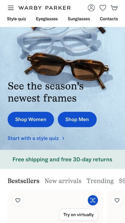
Warby Parker has a great mobile website that uses black and white with a blue accent for a color scheme, which we like because it creates a simple design. As you scroll through the homepage, one of the design qualities you’ll see is their high-quality images. Their color banners with short pieces of information was a nice touch for a unique website. They had website marketing in mind when creating the creative ability to virtually try on glasses within their website. If you are looking for template ideas for your next mobile-friendly site, give some thought to this one.

6. Mountain Dew

This is a good example of a web design for mobile websites looking for a custom look and feel. As you scroll through the homepage of this website, one of the design qualities you’ll notice is their well-planned visuals. The simple navigation was another feature in this professional mobile-friendly site we enjoyed. Mountain Dew clearly had website usability in mind when creating the navigation bar with organized sections for their website. Don’t skip past this website when considering design ideas for your next mobile website!

7. Mammut

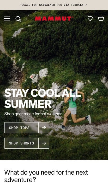
This example made use of a bold red for their logo that stands out from their starting image. Including buttons to help with navigation of their content was another feature that we appreciated. Bold fonts are helpful to highlight certain content and allow for more readable information. Including a search bar was something else we noticed because it helps viewers find specific products faster.

8. Backcountry

This is a great website design example for mobile websites looking to get inspired for their custom layout. We thought this website was a good design idea for mobile websites because of their thoughtful discount banner. The clearly labeled menu was definitely refreshing for a custom mobile site. They clearly had a focus on internet marketing when creating the simple checkout process for their website. Any website designer building websites for mobile websites will want to consider checking this website out.

9. Black Diamond

The basic color palette of this mobile website stood out to us because it allows images to be the main focus of the page. As you scroll through the homepage of this website, one of the design qualities that will catch your eye is their variation of different products. The professional text was refreshing for a custom site. Their interesting logo design helped make this one of the best mobile-friendly websites we looked at. What a great website to review when designing your next website!

10. Zappos

Our web designers noticed the black, white and blue color scheme of the Zappos website, which we liked because it creates a sleek and professional design. One of the sections in this website’s homepage that caught our attention was definitely their layout that was logically organized. Another design quality in this custom mobile-friendly site we noticed was the clearly labeled pricing. The navigation bar with organized categories helped make this one of the top mobile websites we looked at. For mobile websites looking for ideas on their next website, this example will definitely be one to take a look at.

11. Typeform

This is a great example for mobile websites looking for a professional website design. One of the homepage features in Typeform we noticed was their balance of white space. The domain that matched their company’s name was refreshing for a professional site. Typeform clearly had digital marketing in mind when designing the template for their website that was free of distractions. Give some thought to the creative design of this mobile website when building your next website.

12. Adidas

Adidas has a great looking website that uses a black, white and yellow color scheme. After scrolling past the navigation of this mobile site, you’ll notice their memorable logo. Another thoughtful feature seen in this professional mobile-friendly website was their animations for certain products. The organized categories within their menu helped make this one of the top mobile websites we considered. Be sure to consider the one-of-a-kind design of this mobile website when developing your next website.

13. ABC

The website of ABC ranked because it’s one of the nicer mobile-friendly websites we reviewed. The high-quality imagery for each show was probably the most impactful quality within the homepage of ABC. Another thoughtful quality in this clean mobile website was the highlights from different shows on their homepage. ABC clearly had a focus on website marketing when building the simplistic design for their website. Talk about a great website to have included in this list of top websites!

14. CBS

This is a good example of a website design for a mobile-friendly website to check out when looking for custom website layout ideas. The large picture right away showing popular shows was definitely the most impactful feature in the homepage of this website. Another feature in this creative mobile website was the use of a search bar. From a marketing viewpoint, we really liked the way this networking website utilized an interesting logo design. Don’t forget to check this website out while looking through our list of the best mobile sites!

15. Threadless

This is a great website design idea for a mobile-friendly website looking for inspiration for a custom website. The spin-to-win wheel that allows you to save money on their products was definitely the most impactful feature in the homepage of this website. Another feature seen in this clean mobile site was their creative graphics to help display their products. They clearly had internet marketing in mind when creating the ability to browse their site by theme. So many attractive qualities to consider when ranking this website.

16. Etsy

This is a great website design example for mobile websites to see when looking for a custom layout. The use of a search bar was probably the most impactful feature in the homepage of Etsy. Their layout of popular gifts was definitely refreshing for a professional home shop website. They clearly had conversions in mind when building the 5 star rating system for their website. For mobile websites looking for ideas on their next website layout, this example will definitely be one to keep in your back pocket.

17. LEGO Store

The LEGO Store website has a very professional feel to it, thanks to its unique use of a varied color palette. We thought this website was a good example for mobile websites because of their products that appeal to all different ages. Another thoughtful quality we liked in this custom mobile site was their blog. They clearly had digital marketing in mind when designing the domain for their website that matches their company name. What a great website to review when building out your next mobile-friendly website!

18. Dominos

This is a great example for mobile websites looking for a professional website design. The banners showing different sales and deals they have going on was likely the most impactful quality in the homepage of this website. Their creative logo design was refreshing for a professional mobile website. Dominos had website accessibility in mind when building the creative tracker feature for their website. Give some thought to the one-of-a-kind design of this mobile-friendly website when developing your next custom website.

19. Elf on the Shelf

This is a great website design example for a mobile-friendly website looking to get inspired for a custom layout. Our team liked the use of typography on this custom Christmas elf website. After scrolling past the navigation of this mobile site, you’ll immediately notice the ability to browse the site as a kid or a parent. The kid’s version of this site had a fun 3D design to it that allows you to play fun games. Where the parent version shows fun new ways to involve your elf on the shelf into your kids learning and games. Both of which allowed us to easily make the desision to place this website into our list of best mobile-friendly websites. With so many reasons to consider this website, it’s obvious why we included this website in the list of best sites!

20. ilume

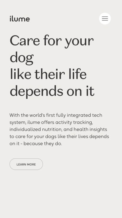
The black, cream and yellow colors of this dog food tracker collar website stood out to us because it creates a positive environment. After scrolling past the navigation of this mobile-friendly site, you’ll notice their smooth transitions. Another design quality in this professional mobile website was their creative font. The optimized content helped make this one of the best mobile websites we reviewed. Be sure to consider the creative design of this mobile-friendly website when developing your next website.

21. Kylie Cosmetics

This is a great web design example for mobile websites looking for a professional look and feel. The color scheme that accents the products was definitely the most impactful feature in the homepage of this website. Another feature seen in this clean mobile site that we enjoyed was the creative before and after pictures for each product. They had website marketing in mind when building the well-labeled navigation bar for their website. Talk about a great website to have included in this list!

22. Lean Labs

This is a good example of a mobile website design to check out when looking for a professional website layout idea. One of the design features we liked most in the homepage of Lean Labs was their creative graphic icons. The creative layout for their imagery was another unique quality seen in this custom site we enjoyed. Lean Labs clearly had a focus on internet marketing when designing the different sized fonts to emphasize a statement within their website. If you are looking for template options for your next mobile-friendly website, be sure to check this one out.

23. Hestra Gloves

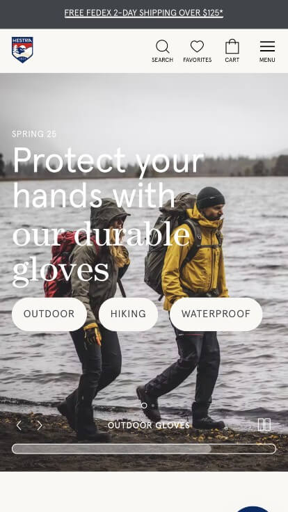
The website of Hestra Gloves ranked because it’s one of the nicer mobile-friendly websites we have encountered. Of all the professional mobile websites we reviewed, one of the features in this custom website we liked was their use of buttons for simple navigation throughout their site. The clearly labeled menu was definitely refreshing for a professional mobile-friendly site. The ability to browse the website by their popular categories was one of the marketing features that really stood out when reviewing this website. Any web designer developing websites to be mobile-friendly will want to consider checking this website out.

24. BuzzFeed

This is a good example of a mobile website design for looking for inspiration on a professional looking website. As you scroll through the homepage of this website, one of the design qualities you’ll notice is the white, red and yellow color scheme. Another thoughtful quality seen in this creative mobile site was their simple logo design. They clearly had a focus on digital marketing when building the categories such to show you what is new or trending within their website. For mobile websites looking for ideas on their next website, this example will definitely be one to keep in your back pocket.

25. Patagonia

The basic black and white colors helped make this site stand out to us because it created a professional design that wasn’t distracting. The layout of this mobile-friendly website was thoughtful because their content was well organized. The high-quality visuals of this website helped us place it into our list of the best website layouts for mobile websites. Patagonia clearly had a focus on website marketing when creating the large display of their products within of their website. You won’t be disappointed after reviewing this website for design ideas for your next website!

26. Pipcorn

There were numerous mobile websites to choose from, but the website for Pipcorn was the perfect example of a well-designed website with a cream, orange and blue color scheme. The captivating text was probably the most impactful quality in the homepage of Pipcorn. The clearly labeled pricing was definitely refreshing for a unique website. They clearly had website accessibility in mind when designing the layout for their site that feels authentic to their brand. Be sure to consider the creative design of this mobile-friendly website when developing your next custom website.

27. KFC

KFC has a great mobile-friendly website that uses black, white and red for a color scheme. As you scroll through the homepage of this website, one of the design qualities you’ll see is their organized special offer section. Another feature in this custom mobile-friendly website was their color scheme that matches their logo. The balance of white space throughout this site helped make this one of the best mobile websites we looked at. Give some thought to the creative design of this mobile-friendly website when developing your next custom website.

28. Squarespace

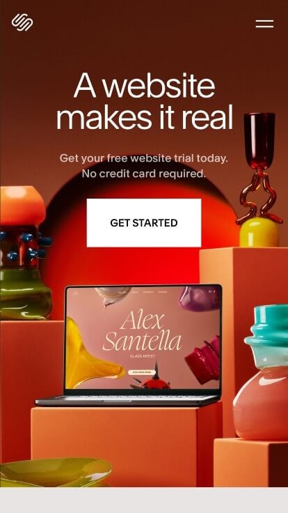
Squarespace started out strong with a bold and colorful landing image. Using an interesting font creates a feeling of individuality while still looking professional. Buttons were used to organize their information and guide viewers towards additional content. We felt that this logo was very thoughtful and memorable for this type of business.

29. Lyft

The variation of colors in this website stood out to us because it allows for a creative design. The use of simple icons was likely the most impactful feature in the homepage of this website. The domain that matched their company’s name was definitely refreshing for a custom mobile-friendly site. Lyft had conversions in mind when designing the well-labeled navigation bar for their website. If you are looking for template options for your next mobile website, be sure to check this one out.

30. Huffington Post

Our team liked the basic color scheme used in the Huffington Post website because it let their images and article names be the main focus of their page. One of the homepage features in Huffington Post we noticed was their variation of articles. The different sized fonts to emphasize titles was another thoughtful feature in this professional mobile site we enjoyed. Huffington Post clearly had a focus on website usability when creating the subtitles showing what category each article is in. Talk about a great website to have included in this list!

31. Oakridge Park

This is a good website example of a website design for mobile websites looking for a custom look and feel for their next site. As you scroll through the homepage, one of the design qualities we liked was their beautiful green color scheme. Another feature in this professional mobile-friendly website we enjoyed was their graphic patterns to enhance the design. They had digital marketing in mind when building the optimized content for their website. Give some thought to the creative design of this mobile website when developing your next custom website.

32. Smart City

This is a great example for mobile websites looking for a professional look and feel for their next website. As you scroll through the homepage of the website, one of the qualities you’ll notice right away is their geometric accent graphics. The professional use of white space was refreshing for a professional site. Smart City had ease of use in mind when designing the unique logo design for their website. Don’t forget to check this website out while looking through our list of the best mobile-friendly website layouts!

33. Purple

Our team liked the purple and white color scheme of the Purple website, which we liked because it matches their company. The automatically playing video was likely the most impactful feature in the homepage of this website. The captivating font was refreshing for a custom site. They clearly had website marketing in mind when designing the clearly labeled menu for their website. What a great website to review when building out your next mobile-friendly website!

34. Galileo Health

We quickly noticed the cream, black and yellowish-green color scheme for the Galileo Health website, which we liked because it creates a relaxing design. The look and feel of the homepage of this mobile-friendly website caught our attention because of their subtle animations. Their creative use of white space was a unique choice for a custom website. They clearly had a focus on ease of use when choosing the professional text for their website. Be sure to consider the one-of-a-kind design of this mobile website when developing your next website.

35. Nationwide Insurance

Sporting a clean and intuitive layout, this website keeps things simple for a mobile-friendly site. As you scroll through the homepage, one of the design qualities you’ll notice is their thoughtful logo design. Another thoughtful quality in this professional mobile site was their use of different icons. From a marketing perspective, we liked the way this mobile-friendly website utilized a blue accent color. If you are looking for template examples for your next mobile site, give some thought to this one.

36. Star Wars

This is a great website design example for mobile websites looking for a custom layout. The high-quality visuals were definitely the most impactful quality in the homepage of this website. Another thoughtful feature seen in this professional mobile website was their integration of TikTok and Instagram videos. Star Wars clearly had a focus on digital marketing when creating the domain for their website that matches their company name. Any website designer making websites for mobile websites will want to consider checking this website out.

37. The Lost Dutchman

This example used an automatically playing video to grab attention and introduce their company which we felt was a brilliant choice. We also loved how they included customer reviews to help new customers feel better about purchasing a high quality product. They balanced white space well which is always an important feature, no matter what type of business you own.

38. Citizen

Here is another example with an automatically playing video to show off what this company really does. Showing their popular styles of watches and their prices was an addition that we appreciated. Buttons were helpful to guide information and create a clean layout. Along with all of that, their fonts were professional and readable which is always nice.

39. Timberland

The first thing that we noticed here was Timberland’s inclusion of a search bar to find specific information. We also liked how this example showed their products on models right away so viewers can understand what they are selling. Including information about sales helps people be more likely to buy products from them. We also thought this cute little logo was thoughtful.

40. Boot Barn

This example is sure to have an impact. They use images and a font that scream western and country, which is their targeted audience. Having a search bar is also quite helpful for those who are returning customers looking for their favorite shoe. Selling more than just boots was a great way for this business to expand and hopefully make more money. An option for concert styles was something that many people would enjoy.

41. Allen Edmond

Here’s an example that stays simple with their color scheme. Black and white is used to stay classy and modern. Along with that, we liked their bold fonts for titles that are sure to grab attention. Having a well labeled menu is always a great help to find what you are looking for as fast as possible. This domain also matches with their business name which makes for a stronger brand.

42. Casely

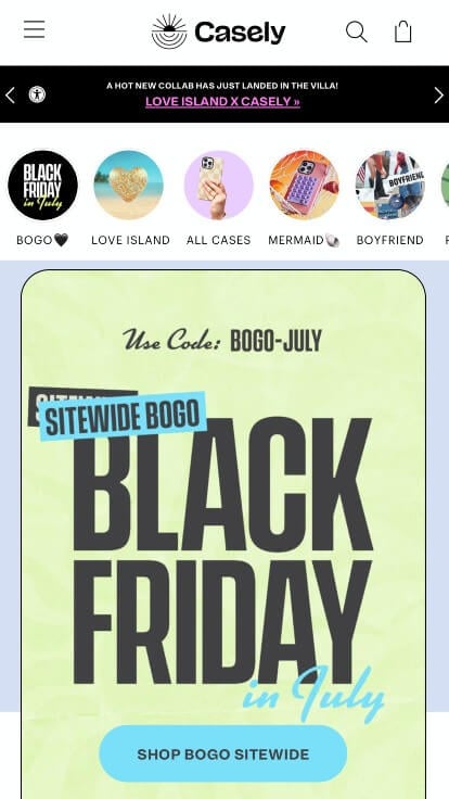
We loved the fun feeling that is portrayed within this template. They liked to use lots of pastel colors for a sense of calmness while still taking time to be playful. This logo represents a sun which many of us represent to happiness and joy. This company has lots of products to offer but yet their site never felt cluttered, so they did a nice job with their organizational skills.

43. Kleenex

Showing off new products is always the way into customers hearts, so displaying that right away was a smart move. We liked how white space was well balanced and never overpowering. Buttons were helpful to guide viewers to other parts of the site without even having to find the pages. The use of an organized menu was also very helpful because customers were able to find information faster.

44. Stanley

Stanley really loves to play around with their colors, and we love that about them. Although much of their site is black and white, the personality shines through their images. These images are colorful, high quality and clearly represent their products, and brand as a whole. Offering a feature to customize your products with engravings was another thing that helps this business stand out.

45. Blue Diamond

Showing off popular products and their packaging right away was a great choice for a business like this one. They did a nice job with their simple color palette that always felt relaxing. Their web domain matched with their company name which is a feature that we really enjoy seeing. Along with that, we also thought it was cool how they offer recipes related to their products.

46. Glory Bee

Here is an outstanding example that really lets their product take control of their webpages. Bright yellow highlights this template which not only looks amazing, it’s logical. Small honeycomb graphics can be noticed throughout the website which was another thing that we appreciated. We thought their logo was simple and sophisticated. Their menu was also very well organized so people were able to find information quickly.

47. Sizzlefish

This company’s best feature is their images. Anyone who loves seafood will appreciate the images that are practically mouthwatering. This is another example with a cute logo that makes sense for their brand. A search bar is another good choice for those who are looking for something more specific. Including a cart icon so viewers can see how many items are sitting in their cart was another nice feature.

48. 44 Farms

44 Farms does a great job with their color scheme that reflects their products. They also do amazing with their high quality images. Buttons are a helpful addition to guide viewers towards new pages with more information. Fonts used in this example were bold and professional, making it easy to read. We also liked their small banner at the top that showcased deals and recent news.

49. Thrive Market

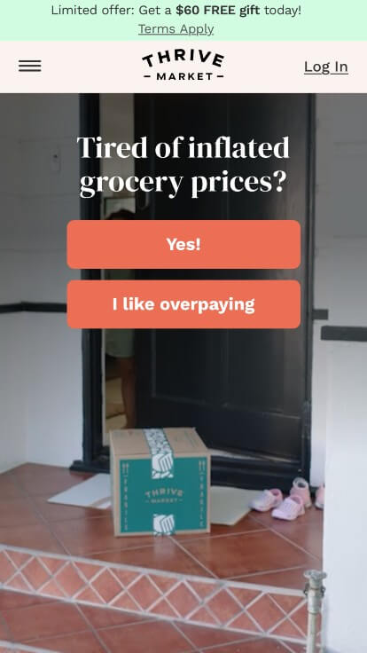
Right away, we noticed this humorous phrase that brings attention to the fact that this company tries to save you money on typical groceries. They also take advantage of that small banner on the top for information and current sales. Using bullet points to show how they as a company are different was a great way to show off their brand values.

50. NuPhy

This last example uses bright accents occasionally which is sure to grab attention. They are also very straightforward about their products, even showing different color options without even clicking on a product. Having the ability to heart products to revisit them later is a feature that we always get excited about. We liked how they labeled their prices and showed star ratings for nearly every product.


Suggestions for Creating a Responsive Web Design

1.) Build for touchscreen functionality

Touchscreens are becoming more and more popular, so make sure that your site is optimized for them. One way to do this is to make sure all elements are large enough to be pressed with a finger. There’s nothing worse than trying to click on a tiny button without clicking on a completely different element.

Person working on a tablet

2.) Decide which elements to hide on mobile devices

If your website is going to be viewed on a small screen, such as those found on smartphones, it’s important that you decide what elements should and shouldn’t be included.

For example, if your site has too many buttons or widgets taking up valuable space, it could make the content difficult to view. It would also be beneficial for you to use smaller font sizes so there can still be enough room for all of the text.

street sign

3.) Use a fluid design grid

Pixel-based layouts were once the standard for website design, but with large advances made in the technology space, designers now adopt a fluid grid.

A grid makes it quicker and easier to size things proportionally, instead of having to set every element to a different size. This means that you don’t have to worry about figuring out how many pixels one thing should be compared to the other when adjusting for screens of all sizes.

These grids often have a fluid layout with columns, which can be scaled. The width and height of the elements are not uniform, but they will change depending on the size of the screen.

Web Design Columns

4.) Determine image sizes that will work on all devices

Responsive web design can be a challenge, and one of the most difficult aspects is determining how to size images. Rules are set to determine how images should be handled on different screens. These rules can include the dimensions, positioning, and scaling of multimedia files.

When dealing with images, keep them as small and manageable as possible. Tools like TinyJPG can be used to reduce the image size while preserving quality during uploads.

3 images of a car all slowly getting smaller

5.) Decide which micro interactions to include

Micro-interactions are a trend that’s slowly coming into web design. They can make your website more interactive and engaging for the user by adding small features, such as hover effects or notifications to an otherwise static page. These animations are great for giving instant feedback to the visitor, which is great for those who use their mobile to browse online.

6.) Choose a responsive theme, if you can’t create a custom theme

If you’re not comfortable making a responsive website, then you can take advantage of the many themes available online. Your job will simply be to update colors, branding, and content – nice! You can customize your design as much or little as needed, without ever worrying about whether the website is responsive or not.

If you’re a WordPress user, responsive themes are right at your fingertips with plenty of free and paid options available.

Related: Check out this comparison of Free & Paid Portfolio Sites.

Portfolio of themes

7.) Hire a professional web designer if you need help

You may find it impossible to locate a pre-designed theme that meets your needs or matches the company branding, especially if you are using something other than WordPress.

If you want an aesthetically pleasing site without any technical knowledge needed, and don’t have time to design every individual element by hand, try hiring a professional, (like the team at WebCitz!) to handle it for you!

If you want your website to look good on every device, be sure that the websites designer has a solid background in web design.  If anything, this job demands higher quality work with prices reflecting as such – so don’t try cutting any corners!

image of WebCitz team

FAQs about Web Development for Responsive Websites

What is responsive web design?

Responsive design is when a website changes its layout based on the device or screen size that it’s being viewed from. If you are in the process of redesigning your website, you’ll want take into account the benefits of responsive design frameworks. This means that if someone goes to visit your site using their smartphone they will be able to view it in an optimized format so everything can still fit nicely onto one page. If you’re not confident with creating responsive websites yourself, consider hiring a professional who knows how to do this properly!

Why choose responsive web design?

Responsive design is a great way to boost your website’s ranking on search engines. If you already have a site that isn’t mobile-friendly, then it might be time for an upgrade! Responsive web design is also more convenient and user-friendly since people don’t need to zoom in or turn their phones sideways just so they can read the content.
You will save money by using responsive design – we promise! There are actually many different services out there that allow businesses and individuals alike to create their own sites without having to hire someone first.

How do responsive websites work?

A responsive site uses code that responds dynamically depending upon what platform/device it is being viewed from. The website adapts and responds to the screen it is being viewed from.
Responsive sites look much better on mobile devices and will automatically resize and reformat content to fit smaller screens (which can be a nightmare for older websites).
This means that you only need one URL (web address) per page. There are no separate URLs like with a mobile site; rather, your content changes based on how it is being accessed by visitors at any given moment.
This makes browsing easier because there isn’t extra effort needed on behalf of your audience: clicking between two websites while trying to access information can get annoying fast.
However, the visual fidelity of responsive sites may not always compare well with that of dedicated mobile or desktop sites – which you might want in order to stand out!
If you’re interested in making a responsive website, check out these 6 effective tips on how to make a website responsive! They might be just what you need to make your website pop!

What is the difference between mobile and responsive website?

Mobile websites are specifically designed for viewing on small screens, such as those found on smartphones. Responsive design means that your site automatically changes based on whatever device or screen size it’s being viewed from – whether it’s an Android phone, iPhone, tablet PC, or something else entirely!
There are benefits to both types of websites, but responsive design is the more popular choice because it works on all devices and screen sizes, so there’s no need to build two completely separate sites.
We have a fantastic blog article if you want a deeper diver into the differences between mobile and responsive websites. Check out the link to learn more!

Will a responsive website look the same on different devices?

Responsive websites automatically change depending on what device they are being viewed from. There is no need to manually switch between websites. Instead, all of your content will be available and optimized for whatever screen size it’s being accessed by.

How do I create a responsive website?

Creating a responsive site is fairly easy! It’s much easier than building an entirely separate mobile website, especially if you don’t need it to be adapted specifically to smartphones or tablets.

Is WordPress responsive?

WordPress is a free website-building tool. It’s easy to use and can be used with a responsive design! In fact, it’s WordPress comes with hundreds of cool themes that look just as good on mobile as they do on desktop.

What is a mobile user-agent?

A mobile user agent is the type of software used by smartphones and tablets to let websites know what device they’re accessing from. This way, your site can properly adapt its content according to screen size!

What are the disadvantages of having a separate mobile website?

Having both a mobile and dedicated website will cost more than owning just one – which means that you might be paying for something that your visitors simply don’t need.
Depending upon how many resources you’re willing to allocate towards this project, having two sites can also be fairly time-consuming. It’s better to avoid doing this if you don’t have the staff or bandwidth for it.


Disclaimer: WebCitz, LLC does not warrant or make any representations concerning the accuracy, likely results, or reliability of the information found on this page or on any web sites linked to from this page. This blog article was written by David W in his or her personal capacity. The opinion(s) expressed in this article are the author's own and may not reflect the opinion(s) of WebCitz, LLC.