User Experience (UX) is the invisible thread that connects a brand’s goals with a user’s needs. In 2026, exceptional UX design goes beyond “ease of use” – it involves anticipating user intent, reducing cognitive friction, and creating meaningful emotional connections. A website with superior UX doesn’t just look good; it feels intuitive, guiding the visitor toward their goal with surgical precision and effortless flow.
Our UX strategy team analyzed hundreds of digital platforms to identify the top examples that master the science of interaction. We evaluated these sites based on accessibility standards (WCAG), micro-interaction quality, information architecture, and performance-centric design. These selections prove that when user-centricity is the priority, the result is higher engagement, lower bounce rates, and increased conversion.
Whether you are designing a complex SaaS dashboard or a minimalist portfolio, these examples represent the current benchmark for UX excellence.
Note on Our Selection Process: We recently audited this guide to remove outdated designs and sites that no longer meet our performance standards.
Top UX Website Designs
1. Happy Sleep
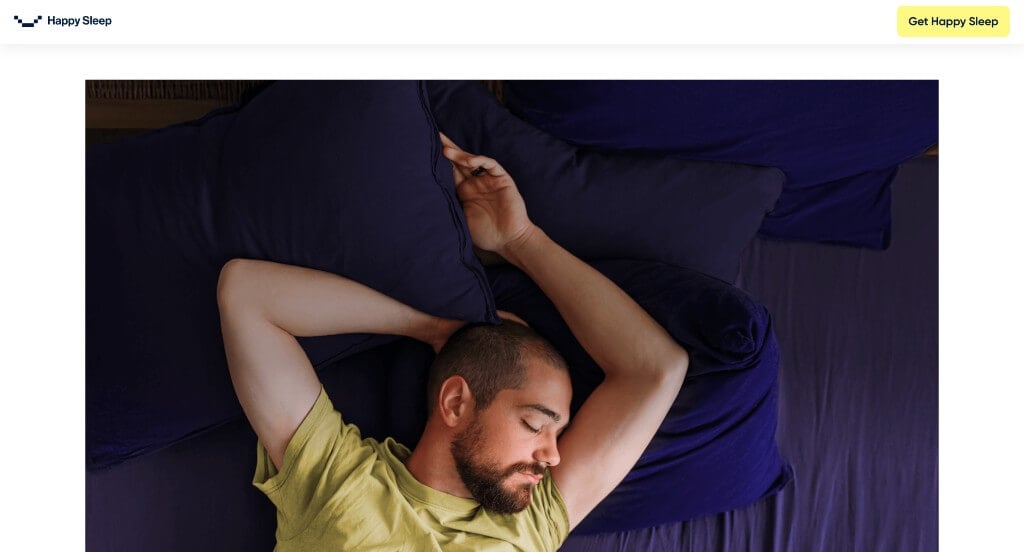
This was a very calming example, which makes sense because they focus on providing customers with true sleep. Something that we enjoyed was their smooth transitions to keep information flowing correctly. Another cool feature was their one minute sleep quiz that helps people predict if they have a sleeping conditioned. They also did a great job balancing their white space to create a stunning look.
2. Parallel
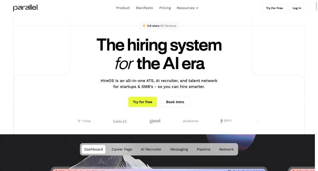
There was a great aesthetic that shines through due to their interesting layout that captures attention. Parallel did a great job with a simplistic font. Our team liked how they had small bursts of color to make everything feel more inviting. Using different sized text was a good choice to create beautiful visual hierarchy. They also added in lots of statistics, which was a great way to prove that they are trustworthy.
3. Ikon Pass
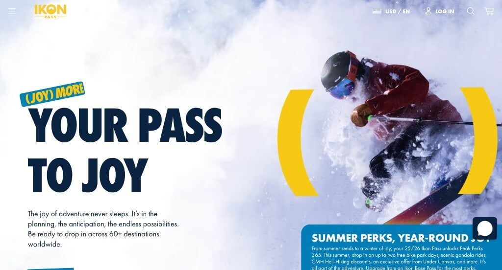
There was lots of large images to create a stunning look. This balance of blue, white and yellow looked great together. We thought it was cool how they used parenthesis to emphasize a variety of statements. Another feature within Ikon Pass we noticed was their subtle animations. There are also great graphics included in order to make a template that stands out.
4. Apple
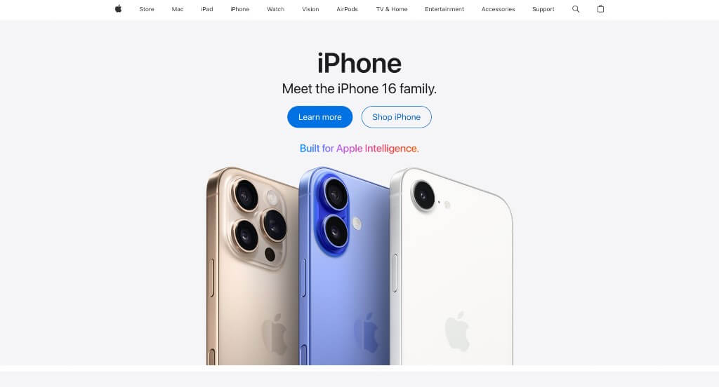
Simplicity leaks through every area of this example, which was perfect because of their products. Information and ads were also included from Apple TV, another great addition. Their images were high quality, but they also use alluring backgrounds. They clearly had conversions in mind when using a simple and professional font.
5. Marcus Medical
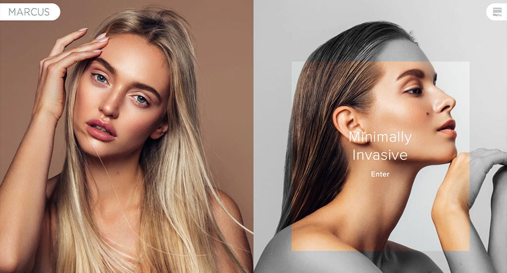
This was an amazing example for those who love attention grabbing images. Creating an interesting feature that turns parts of images black and white was a great choice. We liked these subtle accents of grayish-green. Having different shaped frames for images was another thing that we liked. Including lots of customer testimonials was also very helpful.
6. Symbol Audio

This pairing of yellowish cream along with red-orange was stunning and helped Symbol Audio stand out. Their captivating font choice was very smart because it intrigued viewers. They included lots of images of their products, so people weren’t confused about their business. Labeling each product with prices before clicking on them was another thing that we really did enjoy.
7. The Adventure Group

These colors are carefully picked to create a feeling of exploration and adventure. This logo was definitely on the simplistic side, but we loved it because it made sense for them. Additionally, we liked how they included their Instagram page right into this design. Something else that we thought was really cool was how their buttons tipped upon hover.
8. The Year of Greta
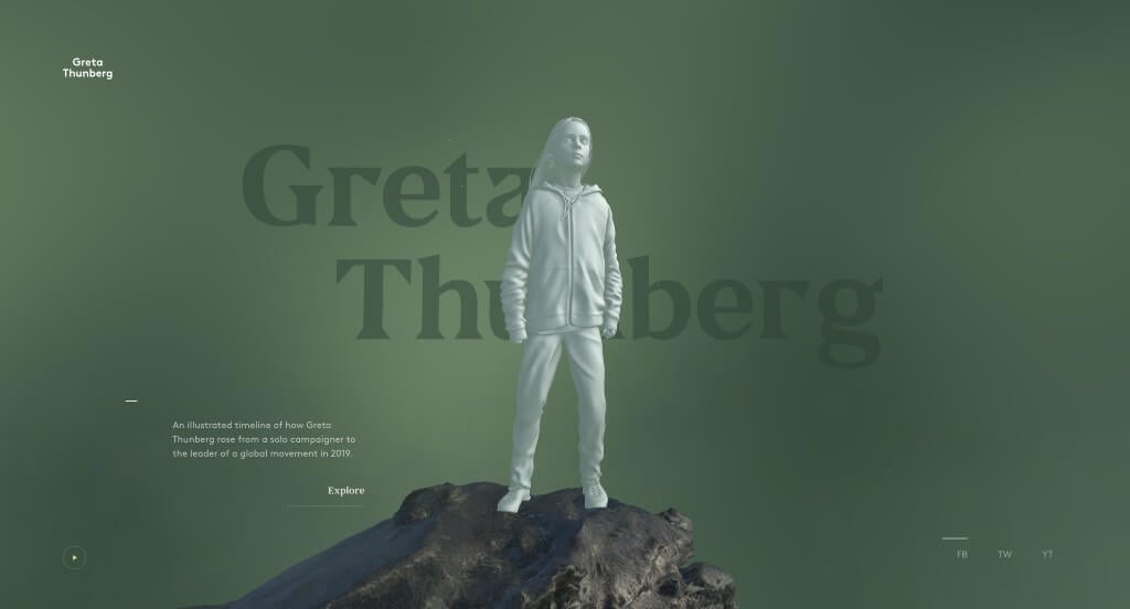
Here we have an example that uses a 3D model of a revolutionary figure in history. Information about this girl’s impact on the world scrolls in a tornado animation around her as viewers proceed through the timeline. We felt that it was nice that they included links to their social media pages to keep people connected.
9. Creative Navy
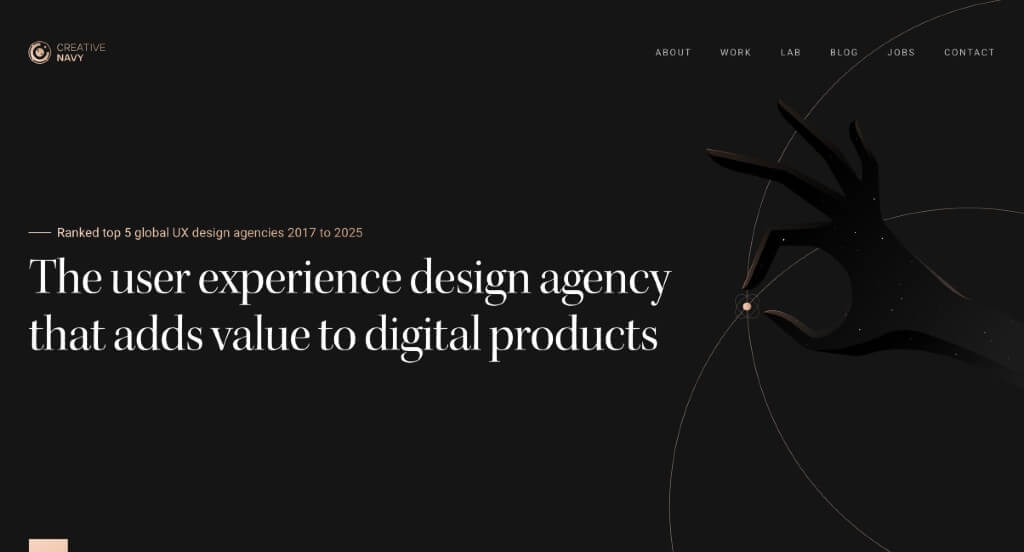
This was an outstanding template because of their graphics carefully placed throughout the entire webpage. Another thing that we enjoyed was their dark background that creates a more sophisticated design. Adding in banners for videos and images was a great way to blend that with their graphics. Placing case studies within their pages was also a great feature to include.
10. Vergo

We really enjoyed how this example did a nice job with their subtle modern colors. Along with that, their font choice was stellar, making it easy to read. Showing famous, well known brands that trust this company helped them become a more reliable company. Using images that show previews of how their product looks when it’s in service was another thing that we really liked.
11. Cinch PR

This example grabbed our attention right away from their large font sharing their business name. We also enjoyed their image that changes to show some of the things that their company values. Their template was well organized and balanced white space carefully which made for a more professional template. Cinch PR had the same domain name as their company do make it easy to find their website.
12. Storylane

Bright colors to highlight information was the first thing that we noticed in this example. Along with that, we liked their use of graphics and patterned backgrounds to create a more visually appealing layout. We liked their use of buttons to help guide viewers to additional information. Making sure to provide the companies that they work with was yet another feature that we found helpful.
13. Jasper AI

We liked this company’s blend of images and graphics with text to create fun accents for their pages. This company did a nice job with their use of short paragraphs that are easy to stay engaged with. Pastel colors can be noticed throughout their entire website in order to highlight information and create a more interesting design overall.