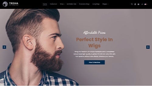
Attention, hair stylists and salon owners! Want to boost your online presence and attract more clients? Check out our guide to these 50 salon designs.
Our website developers have evaluated the best hair salon sites for design, functionality, uniqueness, and user experience. From stylish layouts to intuitive navigation, these sites set the industry standard.
You can find inspiration and valuable tips to make your web page shine.
Boost your business with this guide featuring templates from full-service salons, barber shops, beauty salons, hair replacement clinics, mobile services, and hair product retailers! For more examples, visit our awesome website designs article!
Top Hair Stylist Website Designs
- 1. Salon W
- 2. fringe salon
- 3. Eight Five Zero Salon
- 4. Drybar
- 5. Crowsnest
- 6. TONI&GUY
- 7. Bella Lago Salon & Spa
- 8. Luxe Concept Salon
- 9. Fourteen Jay
- 10. Bleach London
- 11. Lavish Salon
- 12. Plume Salon
- 13. Butchers Salon
- 14. Gem Salon
- 15. La Rousse Salon & Spa
- 16. Spoke & Weal
- 17. Scott Miller Salon
- 18. The Parlour
- 19. Encore Salon
- 20. Heads & Tails Beauty Boutique
- 21. THP Hair
- 22. Mario Tricoci
- 23. Heritage1933
- 24. Studio 27 Salon
- 25. All Dolled Up
- 26. Chez Ann Salon
- 27. Etch Salon
- 28. Steller Hair Company
- 29. Studio Be Salon
- 30. SOHO Hair
- 31. Twig Hair Salon
- 32. Love, Dunette
- 33. Verde Salon
- 34. Fusion Salon
- 35. Verabella
- 36. Code Salon
- 37. Steel + Lacquer
- 38. Michael Albor
- 39. Lunatic Fringe Salon
- 40. Blo Blow Dry Bar
- 41. Urban Evolution Salon
- 42. Black the Salon
- 43. Rinse Salon
- 44. Hairsoda
- 45. SISU Hair Salon
- 46. Tori Did That
- 47. Faith In Curls
- 48. Nine Zero One Salon
- 49. Great Lengths
- 50. The Cutting Edge Salon
1. Salon W
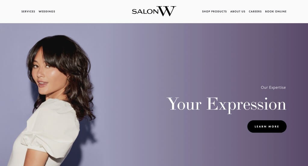
If you are looking for a classy and minimalist design, then Salon W is a perfect inspiration. A neat structure with clear sections helps create that classy feel. Additionally, this company offers advanced treatments and professional styling options. Another feature that stood out to us was high-quality visuals of a diverse group of people with pastel backgrounds. A link for online appointments can be noticed, which should make booking processes easier. Overall, this company also did a great with including buttons.
2. fringe salon
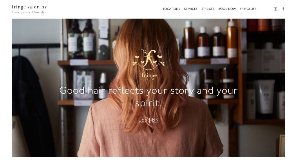
Upon opening this web page, a pops up provides an option to purchase gift cards. We really liked their logo design that displays a scissors and an “f” intertwined. Every part of this site helps to showcase a template with balanced white space. A clearly labeled menu can also be seen here, which allows customers to get along so much better. When clicking on their services tab, we can see their pricing that is clearly labeled. We also thought it was smart to have short and straight-forward paragraphs.
3. Eight Five Zero Salon
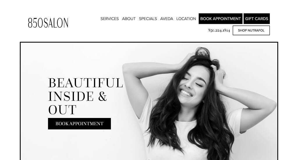
What makes Eight Five Zero Salon stand out was their carousel of client images that is displayed right away. Then viewers can scroll down to find social media links, new guest offers, and an option to meet their team. Using a grayscale for this design allows for an aesthetically pleasing look. Adding in bright images helps to add excitement to this very basic design. It was also helpful to have a domain that matches their company’s name.
Related: An internet marketing campaign can help your day spa improve online contacts and nurture client relationships.
4. Drybar

No one can deny that Drybar has an attractive and aesthetic design and this company flaunts it. A bold yellow is used as an accent color to lead people towards their important information. Additionally, this yellow is used in their images to show off their products. Another thing that was outstanding about Drybar was their inclusion of videos about their products. Each product is well-packaged in beautiful bottles, helping customers feel they are getting a luxurious product. Lastly, we liked how their fonts were simple but easy-to-read.
5. Crowsnest
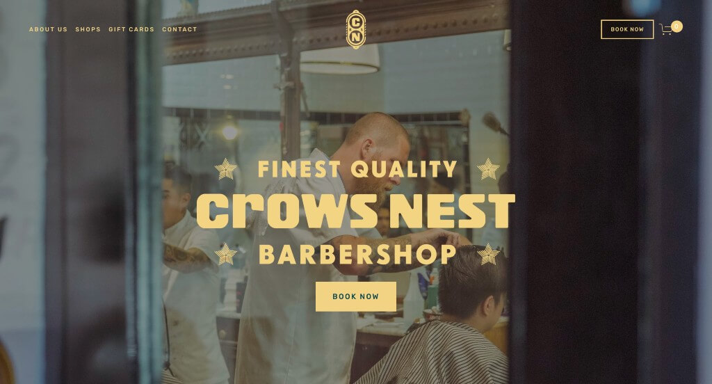
Graphics really helped improve this otherwise simple web arrangement. Crowsnest creates an interesting look because it’s vastly different from competitor sites. Using dark shades makes their page feel unlike salon businesses, so people will want to spend extra time browsing around. Here we have another video that is included explaining more about their company. Separate images can also be noticed showcasing each of their locations. We also liked this yellow color because it is so unique it stands out against similar sites.
6. TONI&GUY
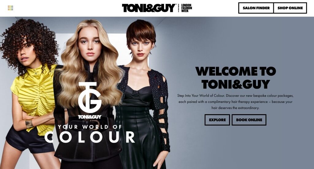
Toni&Guy wants to have a feeling of luxury, showing they are a higher end brand. This feeling of luxury is brought across with their logo, high-quality images, bold fonts, and accent colors. Images depict a diverse group of models with various hairstyles. Many large buttons can help anyone visiting this site navigate it better. It was helpful to have bright colored clothing on many of their models, because it adds that pop that they needed in this design. Don’t forget their good distribution of white space.
7. Bella Lago Salon & Spa
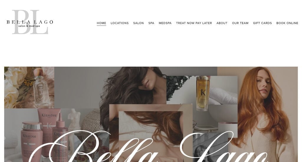
One of the first things that we noticed about this example was this navigation bar that made sure to keep content easy to find. This logo is very modern which makes this much more interesting. We appreciated how this example created a collage as their hero image because it really introduces their business. We also really appreciated how this example had a section for customer reviews.
8. Luxe Concept Salon
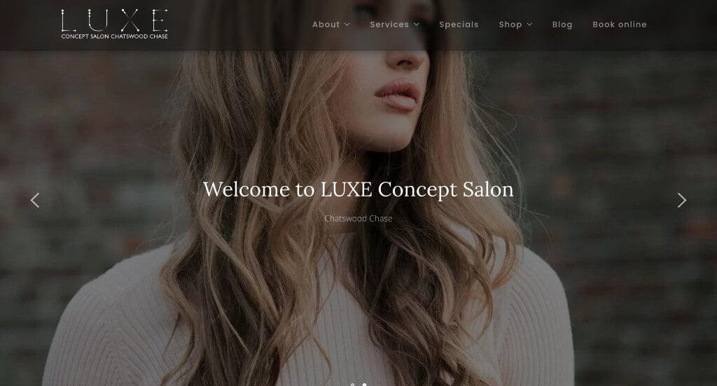
We really enjoyed how this example started with large images to grab attention. Another thing that they did well with was the interesting patterns on their white blocks to add in their text. Adding in lots of customer reviews was a great way to build up their reliability. Using buttons to guide viewers towards additional content was another smart choice.
9. Fourteen Jay
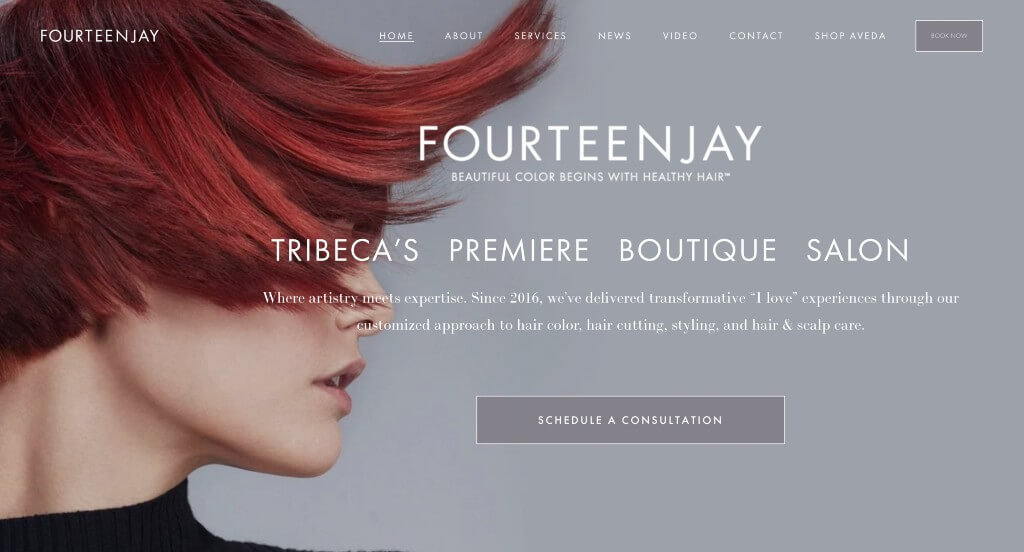
If you’re shooting for outstanding aesthetics, Fourteen Jay is an example that’s pleasing to customer’s eye. First off, we really enjoyed this company’s stunning automatically playing video. Another great choice was their grayscale that makes images stand out more. Having images as backgrounds was a smart decision because it looks great. Everything is organized into boxes making it look much cleaner. It’s also a great idea to include professional looking fonts throughout their entire design.
10. Bleach London
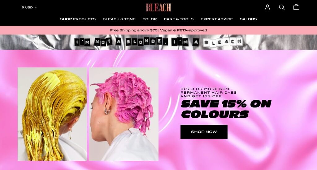
Here was one of our best websites for salons. Many bright hues were used as backgrounds and hairstyles, creating a unique feel for their company. We liked their use of creative fonts to move along that unique feel. It was smart to have buttons that automatically add products to your cart, creating a simple checkout process. Their customer review section was amazing because it also included images and shows which product was purchased. Bleach London also uses a clearly labeled navigation bar and a search feature, which were both great additions.
11. Lavish Salon
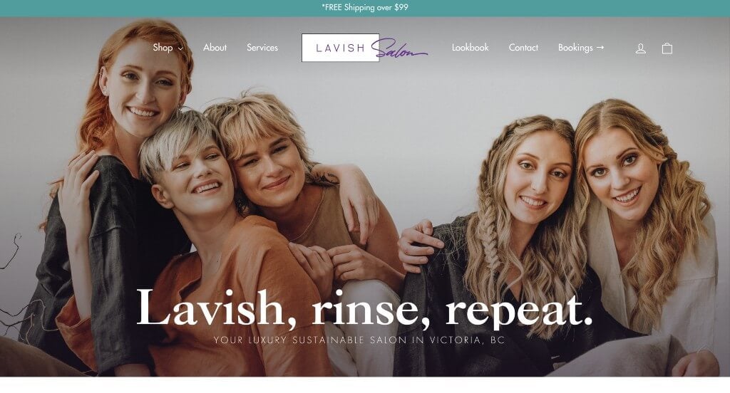
Lavish Salon strives for a simplistic but memorable salon experience, and this mindset shows through to their design. This company’s hero header stands out, but so does their bold fonts reading “Lavish, rinse, repeat”. We liked how organized this company was, especially when looking at their written content. If that doesn’t to catch your attention, maybe an amazing display of customer reviews will. It was helpful to include part of their social media page right on their homepage. A slight accent is used for buttons and a few other things including their footer.
12. Plume Salon
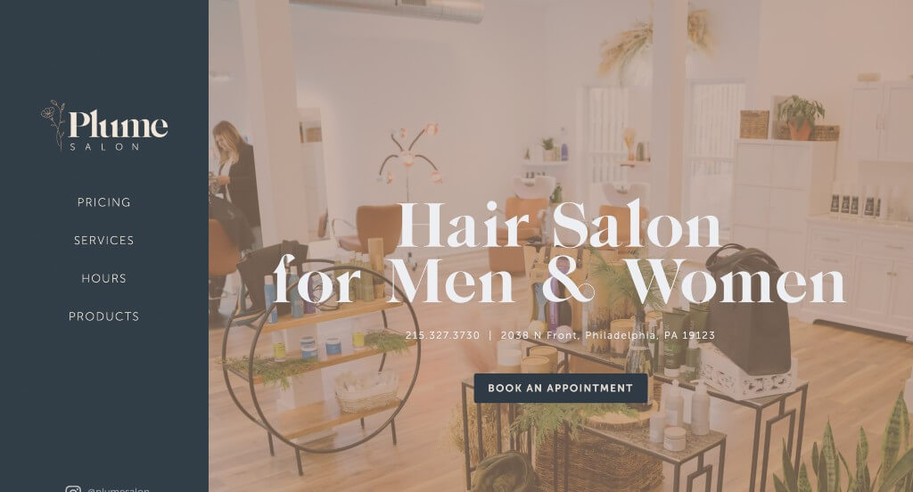
This example was one that we loved because of their stunning color scheme that was sure to grab attention. They used professional fonts which was another plus for this company. We liked how this logo was delicate and cute which was logical for them as a hair salon. Keeping their colors gender neutral was nice because they do provide salon services for men and women.
13. Butchers Salon
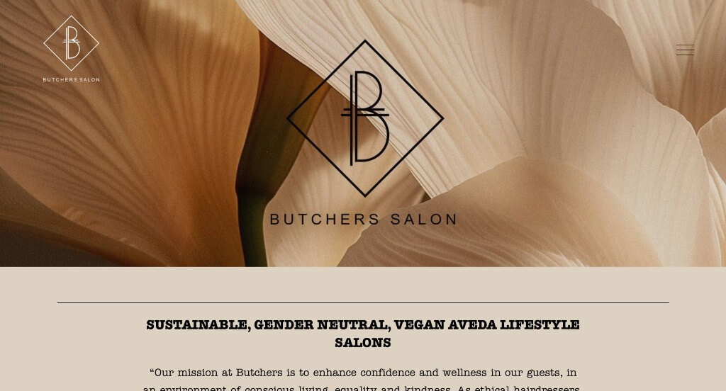
This example has much more of a wild west country vibe to it. Butchers Salon really showed off this vibe not only with their name, but their images, fonts and color schemes. A hamburger menu was included with well organized sections to help viewers really navigate this design. This company made great use of buttons because they care about getting as much information to customers without their site feeling cluttered. Additionally, unique photo frames and a FAQ section was included which was a smart choice.
14. Gem Salon
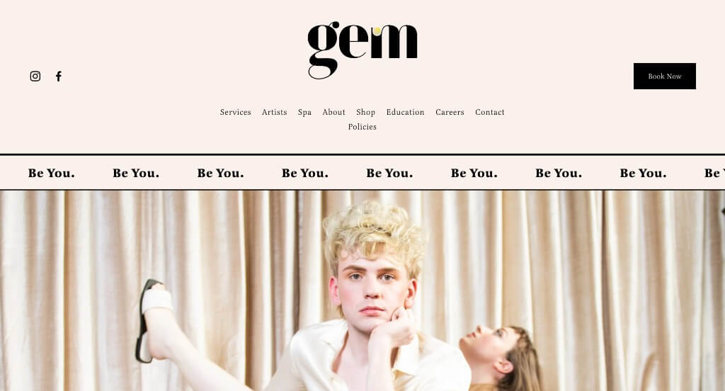
This example was sure to grab our attention because of their stunning color scheme that was delicate. Along with that, they made sure to include lots of high quality images which was another thing that we really liked. This logo design was another feature that stood out to us because it was simplistic, but still equally beautiful.
15. La Rousse Salon & Spa
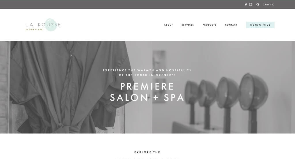
This was a fairly simplistic template that looked great. The use of black and white images was something that we don’t always see, but we still really appreciated. They used cute graphics that were logical for their business which was a nice addition. Including buttons was a great way to guide viewers towards additional information.
16. Spoke & Weal
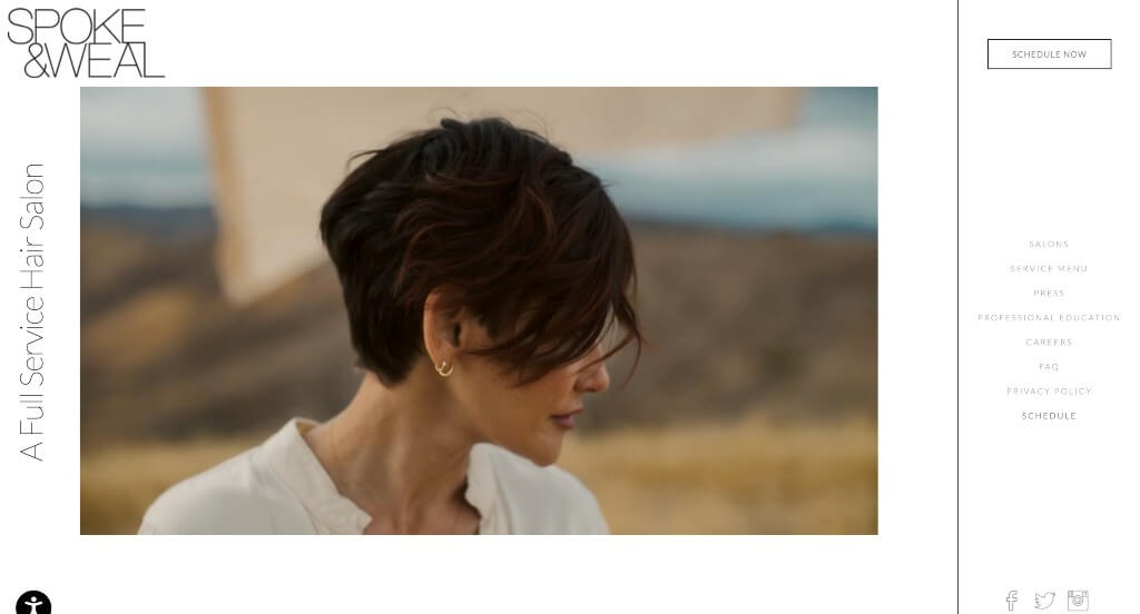
Spoke & Weal uses clean, bold, and a minimalistic black font type on a white background. This look matches their layout that seems slightly disorderly but an asymmetrical balance is maintained. Something that stood out to us was how this business listed ten rules, because it’s a great way to show what your company cares about which will attract your target market to you. It was also nice that though their navigation was located to the right, anyone looking at this site could see all of their pages without having to search for buttons.
17. Scott Miller Salon
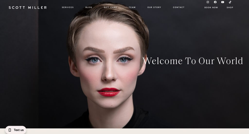
Scott Miller is another good example to turn to when searching for inspiration. Images are displayed in black and white, while boxes next to them are in natural palettes. Linking their social media pages to show photo shoots was a great addition. We enjoyed their seemingly split navigation bar with pages more left and book now/shop are placed more right. Adding in an our story page helps people understand this business and their goals, making a personal connection.
18. The Parlour
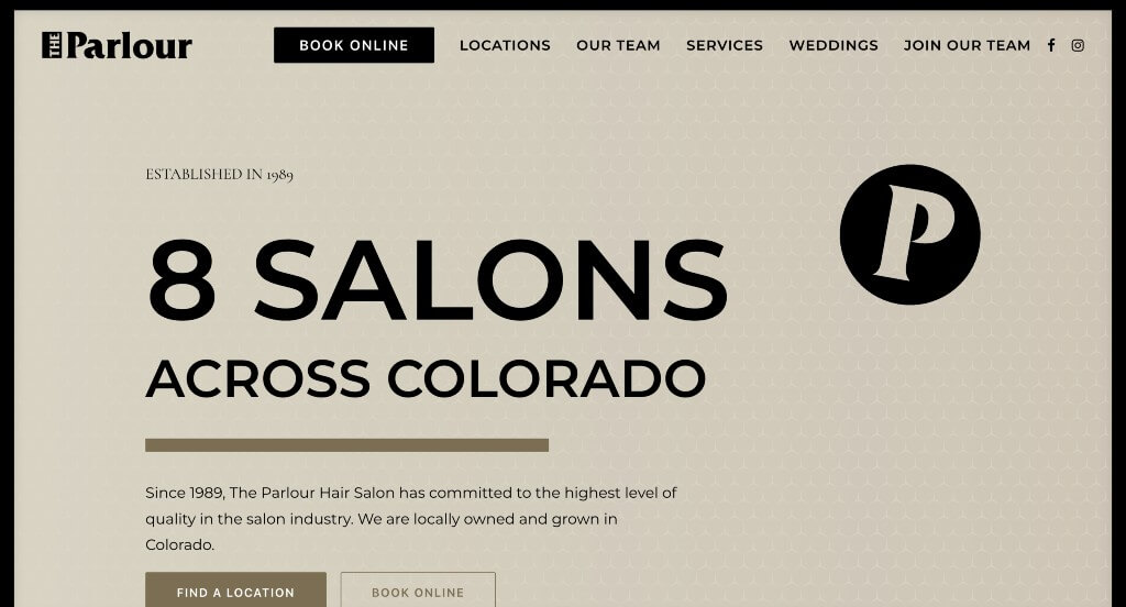
Right away, we noticed this brand’s outstanding template along with their subtle but game-changing sliding animations. Prices were listed almost instantly, so customers can see if this service would be in their budget. Additionally, their homepage included a small portion of other products they sell which helps keep viewers engaged and moving throughout their site. Earthy shades have been used as backgrounds, which makes this company feel more homey. When looking at this site, don’t forget about this company’s domain name that matches their company’s name.
19. Encore Salon
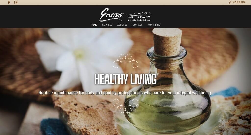
While visiting this website, potential customers will notice beautiful imagery lined up, allowing them to feel relaxed. Small swirly patterns are used to create almost a frame for some titles. We liked how a small section for phone, email, location and hours was included with bold letters so it can’t be missed. It was helpful that upon hovering their navigation bar, drop downs come up so you don’t have to fight with large unorganized navigation bars. Overall, this site was very well organized and it was easy to find their content.
Related: Outrank other day spas in your local area with a quality SEO service.
20. Heads & Tails Beauty Boutique
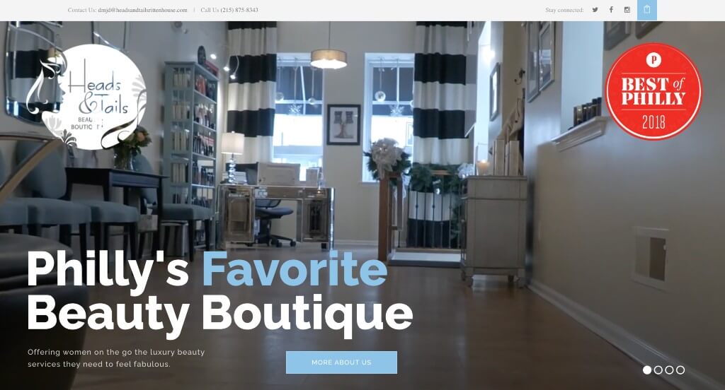
Likely one of the most alluring features here was Heads & Tails Beauty Boutique’s logo design. Their page is designed to ensure that visitors get an overview of what this brand offers. A combination of light blue and white allows for a unique and calming look. Along with this, red is used as a bold accent for super important information because it stands out. Having a client review section also helps possible customers build trust with their company.
21. THP Hair
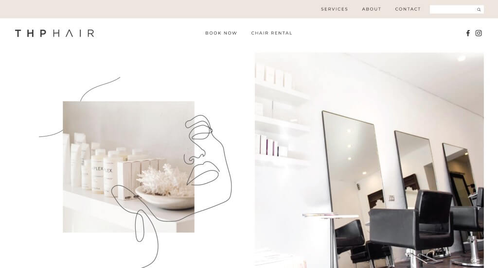
This example started out strong because of their combination of line graphics and images to create something powerful. Their color scheme was neutral which helped them feel more modern and create a calming atmosphere for their site. Including posts from their social media was another thing that we liked about this example.
22. Mario Tricoci
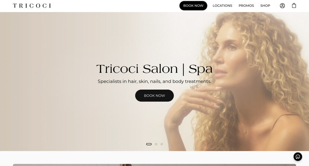
Right away, we can tell that this business is trying to increase sales by giving out a few sales. They are also attracting customers by giving a sort of rewards for using their services. This company used a mainly black and white color scheme to create a sense of luxury and showing they are targeted towards more stylish adults. Comforting and professional fonts are also used to continue on that luxurious feel. Adding in “Book Now” and “Shop Now” options was a great way to shortcut common areas of their site.
23. Heritage1933
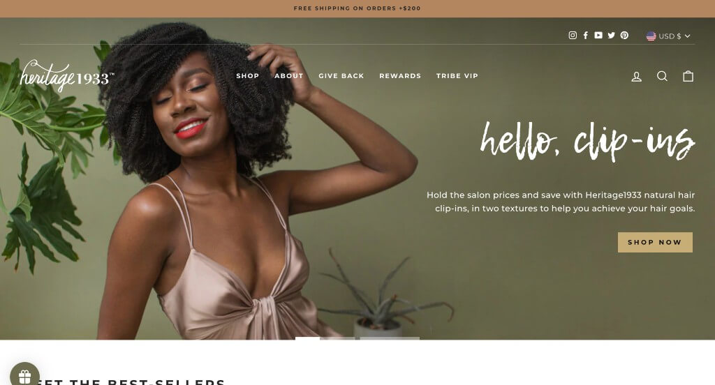
There was lots of good features to notice here, one of those features being their unique fonts. Along with their fonts, these images were high quality and steered people’s attention towards their information. Keeping paragraphs short was a smart way to build their site because viewers can stay engaged longer.
24. Studio 27 Salon
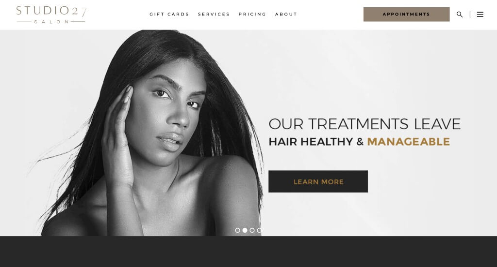
Here we have an example that uses mainly black and white imagery that allows for a modern feel. We liked how some words or links were written in a golden color so everything appears more luxurious. Making sure to include their social media posts right in their homepage was helpful. We also really liked how their domain matches with their company name.
25. All Dolled Up
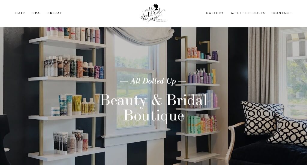
We appreciated how this example does a great job with their different fonts that create a stunning choice. We loved how they included images of their past hairstyles so people can understand what can be possible. Their color scheme was simplistic without feeling whitewashed which was another choice we appreciated. Including lots of links was also helpful to guide people towards additional content.
26. Chez Ann Salon
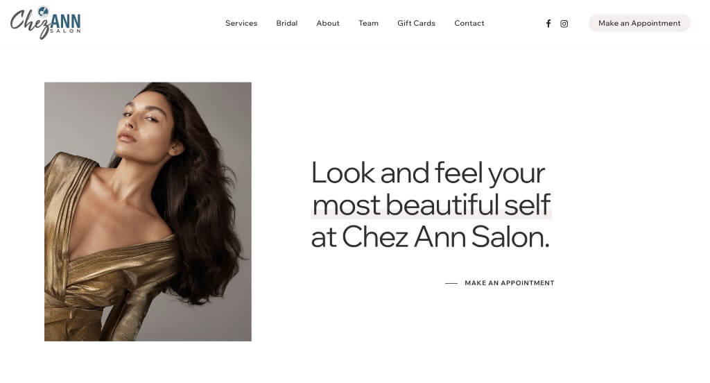
Right away, we will notice this isn’t your basic salon. Based on images placed within this design, we noticed that is seems to be a higher end salon based on clothes worn my the people in their web images. White and black is also used to allow their images to really contrast with their basic background. It was also smart to include facebook and instagram icons, allowing people to connect with their social media pages. If people like what they see, they’re able to browse through this site with ease.
27. Etch Salon
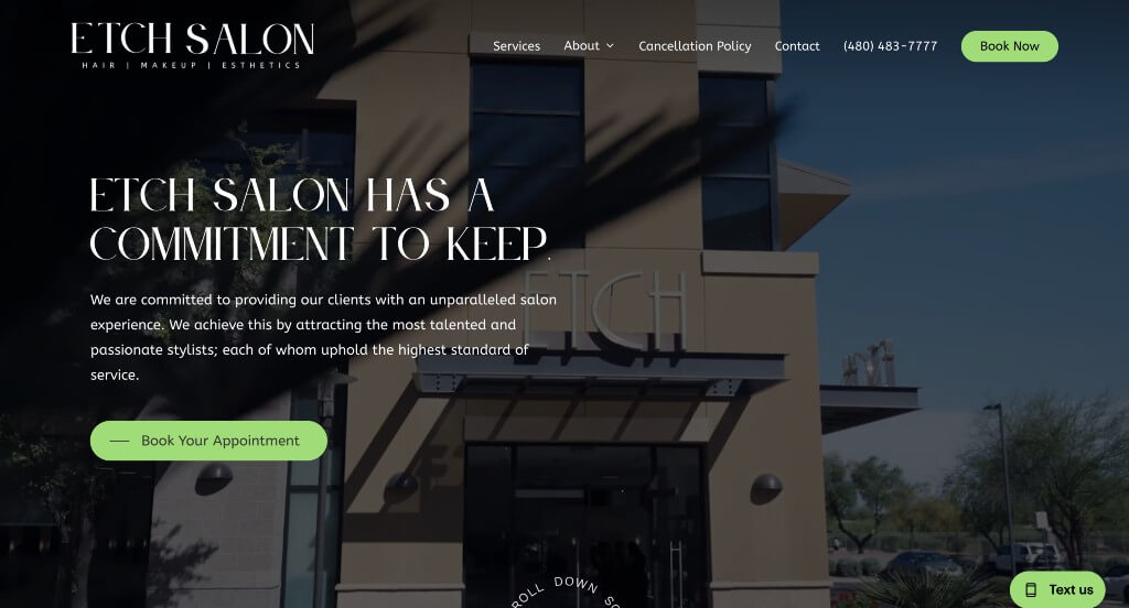
Up next is another mainly black and white design that looks attractive to customers viewing these pages. Even though pictures aren’t fully colored, they make a design that looks more refined. Bright green is used as accents all around this example which is helpful because it helps links and other important information stand out. There was also lots of good use of graphics which just adds a better visual representation. Also, when consumers hover over images, a green highlight appears, helping them to realize there is more information to be seen. This company also has lots of simple but elegant fonts that are easy to read.
28. Steller Hair Company
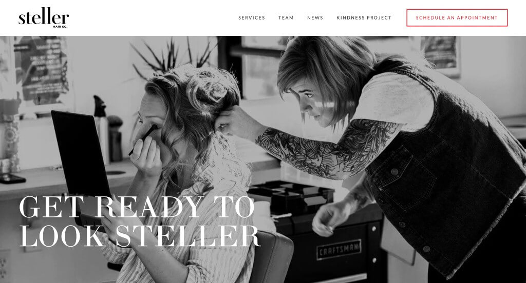
We thought it was unique how this company used mainly black and white images to create a more moody feel for their website. Accents of bright red were included throughout this example to highlight important information and make a visually appealing template. Adding in lots of buttons was another thing that we appreciated because it keeps content organized.
29. Studio Be Salon
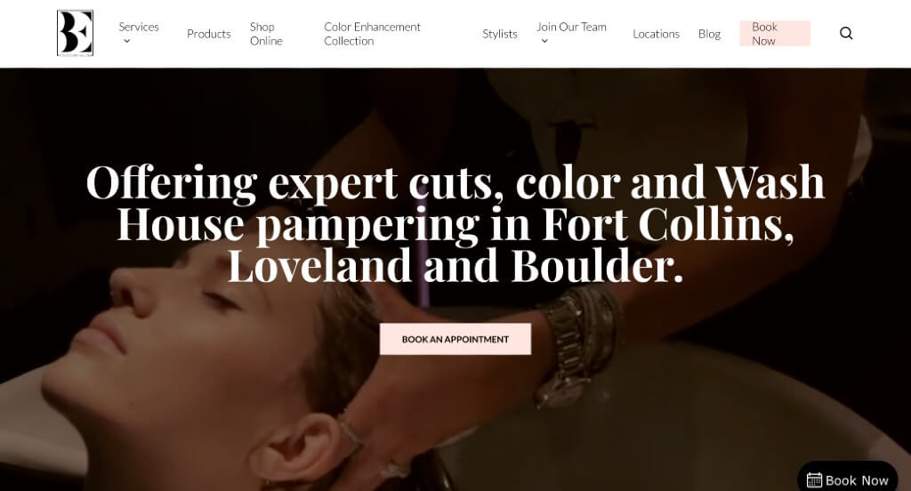
Likely this company’s best quality was their short but informational paragraphs because they keep viewers engaged. Studio Be Salon has a unique and interesting logo design, which helps their brand stand out from their competitors. Combines baby pink with white creates a very aesthetic web design that can help maintain an almost calming feeling. High quality images are also added in to help elevate their visual appeal. Lastly, it was extremely helpful to include buttons so customers can easily access additional pages with more in depth information.
30. SOHO Hair
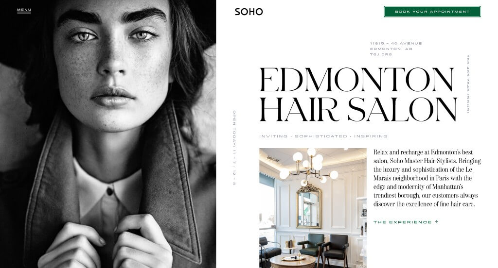
SOHO Hair has a very soothing look that would immediately capture lots of attention. Possibly their most attractive design feature would be their layout. Using a unique layout helps them stand out. Including high quality visuals will also make this site look as professional as it can look. We also thought it was creative to have a visual arrangement that looks similar to a newspaper. Adding in half colored images and half black and white images was another feature they certainly got right.
31. Twig Hair Salon
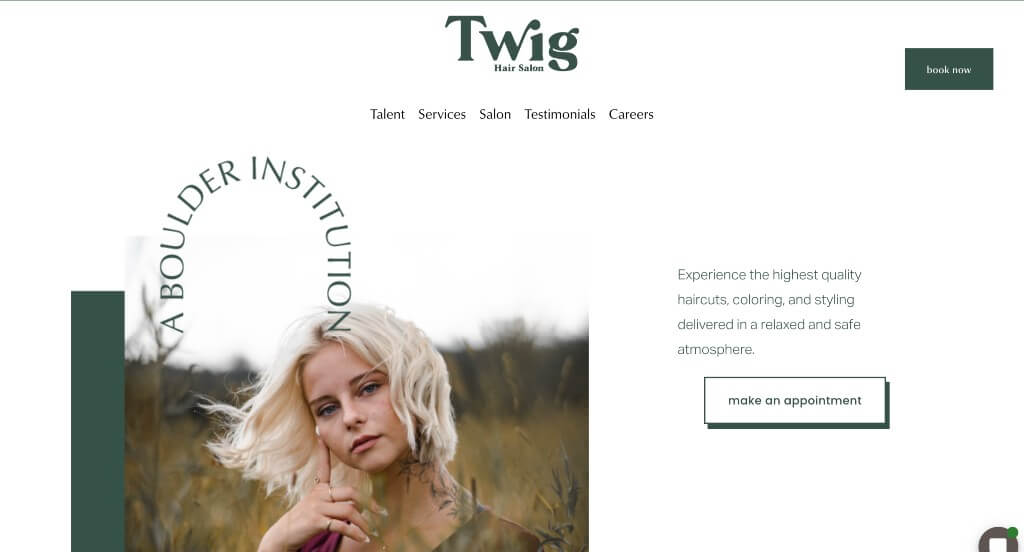
Being able to successfully choose accent colors that match your business is always a challenge, but Twig Hair Salon picked out a beautiful forest green and a few small areas of brown and gray-ish brown. We really enjoyed how this company used stunning photo frames, small animations and decorative text. Also, it was smart to utilize small banners to add customer reviews on because it immediately catches attention, drawing customers to these reviews. Normally, this much white space would lead to a feeling of emptiness but this company really knows how to balance out that white space.
32. Love, Dunette
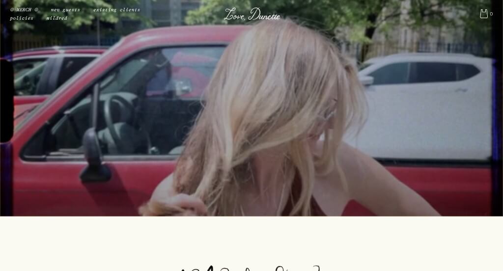
There was lots of creative fonts that were used throughout this example that allowed for an unforgettable layout. Having an automatically playing video right away was a great way to introduce their company. Including little quotes from their customers was a unique way to add in reviews in a non formal way. They also used lots of creative graphics which we really enjoyed.
Related: Grow your hair salon with website advertising that brings in leads and automates marketing tasks.
33. Verde Salon
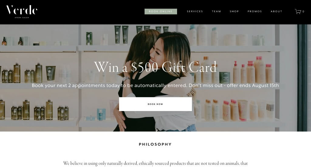
This was a very modern example that makes use of a black and white color scheme. Short paragraphs were used throughout this entire example which was appreciated because it makes content easier to read through. These images were high quality and looked great within these pages which was nice. We also noticed how this company picked a web domain that matched their brand.
34. Fusion Salon
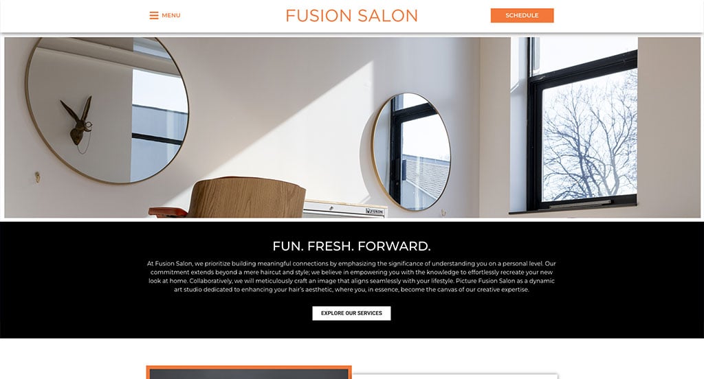
The color black has been used to elevate the viewing experience, and we are totally in love with it. While the background is white, and the logo is orange, black is used a lot throughout, be it for the black clothes worn by individuals or as background for texts. These images of people have an orange outline to highlight them further. Also, when potential clients are browsing, they will notice that the bottom section is entirely black and white. The images are intense, and there is very little text that helps maintain a neat and clean interface.
35. Verabella
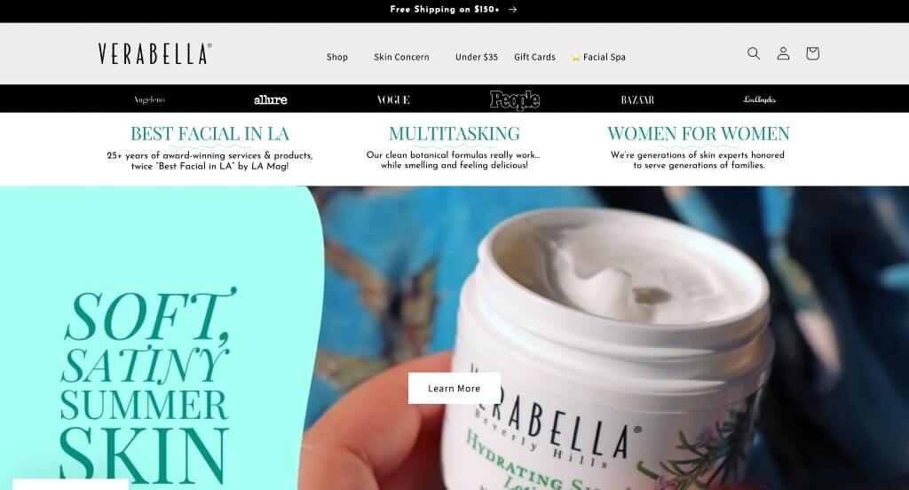
Verabella surely knows how to grab people’s attention and keep them engaged. You might notice a pop-up for an email subscription, allowing for special offers. Red and teal can sometimes be noticed to create an accent to liven up their design just a bit. We liked how all their products have great images, along with 5-star ranking reviews, and clearly labeled prices. Adding in a FAQ section was another feature we really liked. Lastly, mainly using black and white really displays that feeling of luxury.
36. Code Salon
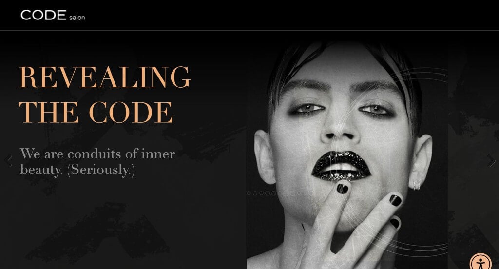
Code Salon makes good use of interesting textures, creating a unique feel to their design. Black, white and peach are used which is also a unique combination that stands out and looks great together. Their navigation bar included many tabs, some even with drop down boxes. This was great because it allows for viewers to find whatever information they are searching for in a timely manner. Code Salon also has made bookings very simple by placing a call-to-action button right away.
37. Steel + Lacquer
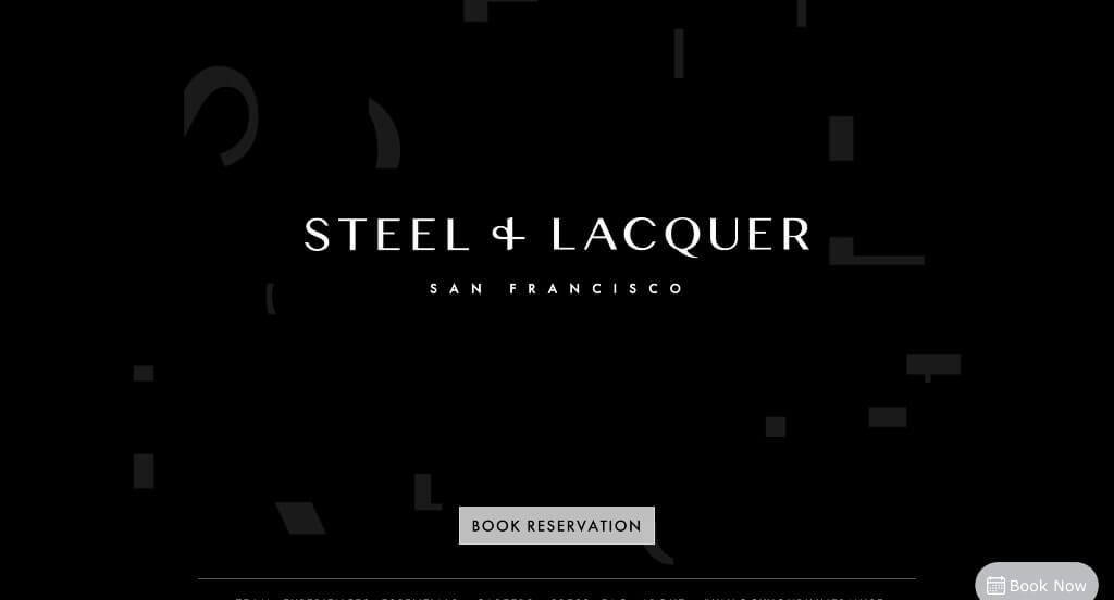
Here we have another company that wants to give an illusion of a fancy brand. Steel + Lacquer uses black and white paired with very thin white fonts to give off this idea. Important links are outlined in boxes to help them stand out. We liked how their Instagram page is included into their homepage. It was helpful to include brands that this business partnered with. A unique artistic choice was only using bright-colored pictures towards to highlight their salon and hair coloring they offer, and they pulled it off greatly.
38. Michael Albor
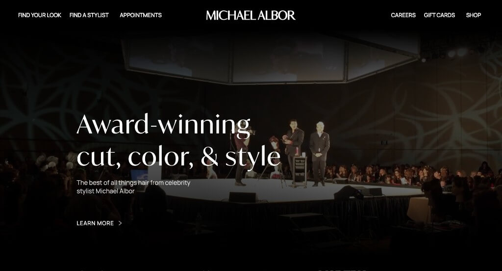
Here’s one more example of a business using black and white. Additionally, a famous stylist is their name inspiration, making customers believe that their price tag is worth it because their styles come directly from a celebrity. In their homepage, a colored video has been included to introduce Michael Albor. Shortly after, a list of publications that Michael Albor has been featured in, along with a small paragraph about their company can be found. We liked how there were images and information for all their locations.
39. Lunatic Fringe Salon
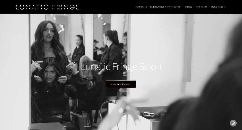
We can only describe this website as magnificent, with a beautiful automatically playing video that showcases their salon, and some of their services. We liked how there was a metallic illusion for their button’s border because it really stands out. Adding in an instagram section was another feature we enjoyed. While many images are big in size, using semi-transparent, tinted boxes with text in them to create an aseptically pleasing web page.
40. Blo Blow Dry Bar
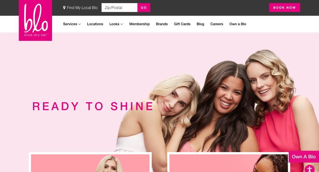
If you want a bubbly and bold look, this will be great inspiration. A pink candy color to highlight and separate portions of their information within this template. We loved how Blo Blow Dry Bar picked out high quality pictures of their models. Additionally, it was smart to keep their color scheme in their models’ clothing. Along with all of that, bright pink buttons can help to organize this design. Lastly, Blo Blow Dry Bar has a clearly labeled menu.
41. Urban Evolution Salon
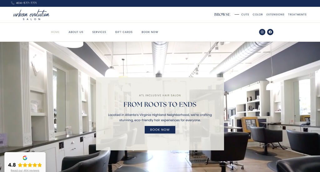
Here is a simplistic example with white and dark blue accents. A minimalist front is used for all the essential information that people might need to know. We liked how there was many images of many different customers and hair styles. Overall, this site was extremely well organized. This company also used a domain name that matches their company name, making it easy for clients to find their site. Aside from all that, we liked how small. gray boxes were used to organize sections of their information.
42. Black the Salon
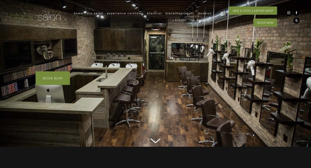
We loved how this company used a creative style for their titles. Another design choice we enjoyed was their lime green lines that was a bold idea against their black background. Lots of written content is included in a basic font. Adding in a book now and a purchase gift card button was an amazing decision. It was interesting to add in a section about experiencing their town, creating a sense of connection to people considering their company.
Related: Rank higher than other hair salons nearby by implementing a professional SEO package.
43. Rinse Salon
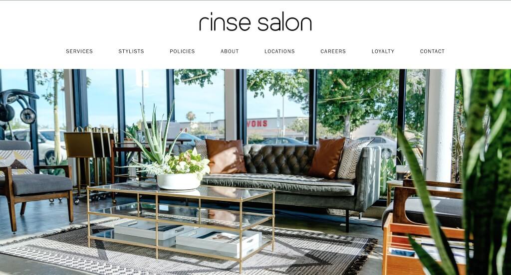
Rinse Salon uses quite a bit of images with brilliantly vibrant photos displayed on a white background. People will find black, bold, but still minimalist text. Along with that, black outlined call-to-action buttons can be noticed all throughout this example. It was a great addition to have short and straightforward paragraphs. Plus, having a simple design and fonts makes this even better. Even social media links are provided so that people can check out customer reviews before booking an appointment.
44. Hairsoda
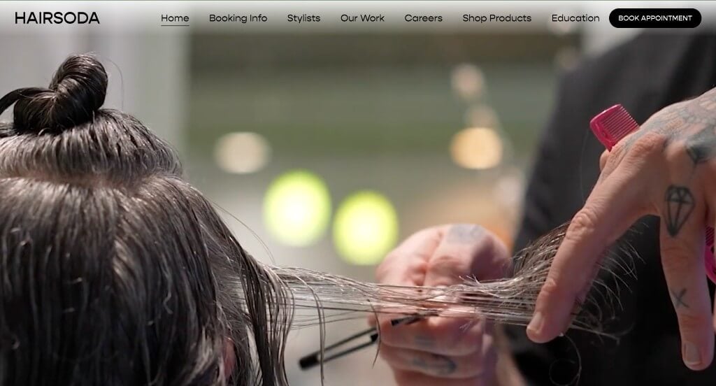
There was lots of things that we loved about this example, one of them being their use of an automatically playing video that introduces the brand well. Lots of high quality images are used throughout Hairsoda which is extremely professional. This navigation bar was well labeled which made it much easier to find whatever information viewers are searching for.
45. SISU Hair Salon
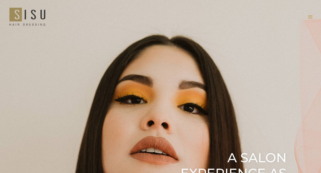
Many elements are outstanding here, and it makes for an eye-catching look. First, we enjoyed their use of large images. Right behind that, we thought their photo frames, squiggles and paint strokes made for an artsy feel. Splashes of peach, beige, and mustard also show off their unique side. Utilizing a simple white background, helped to not take attention away from images and written content. Also, people will find a section dedicated to Instagram, showing off past customers, past cuts and past colors.
46. Tori Did That
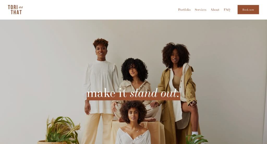
Appearance is everything for this company. It has used a variety of natural tones to create a relaxed feel. What we really liked was their use of a creative background for certain sections, with beige lines running across a brick-red background and well composed images. Unity was also something that was surely depicted here. Images all have similar vibes to them and every page on this site has similar units so you know you are still looking at the same company. It was also a great choice to clearly label their services and the price tag attached to them.
47. Faith In Curls
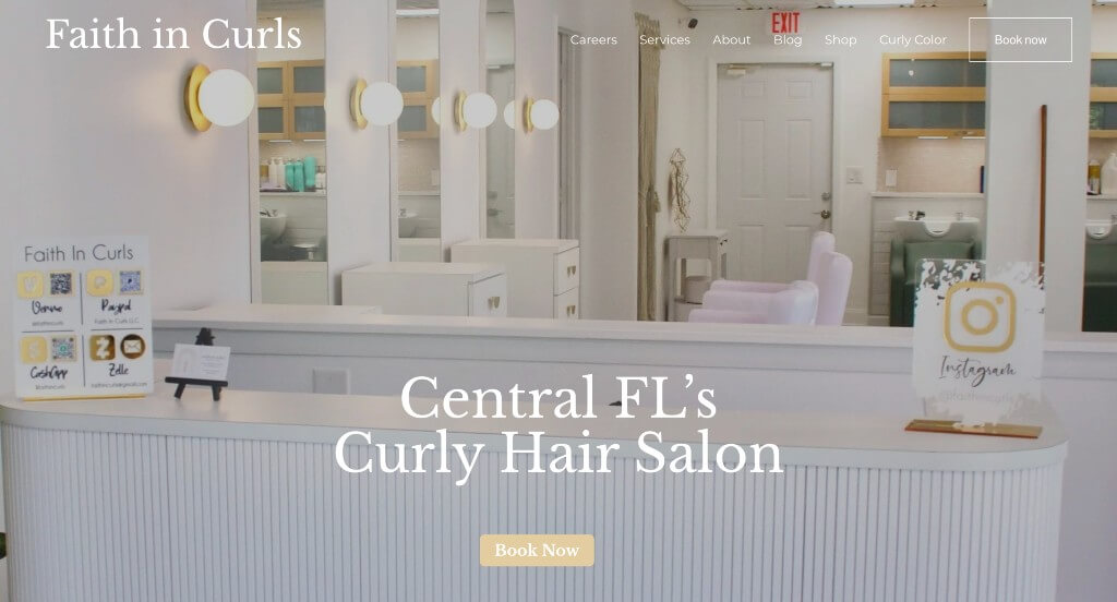
Faith In Curls has a beautiful website that is done up in pastels. Baby pink and white perfectly complement this company’s golden logo because it projects a youth, playful feel. We also enjoyed Faith In Curls’ gallery of past clients, especially images that depicted a before and after style. This company had great font choice that makes them appear to care about style. It was nice that many parts of their site have drop-downs to organize information better.
48. Nine Zero One Salon
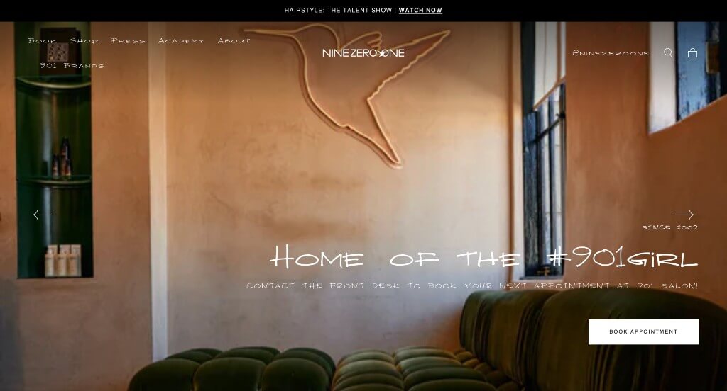
Something that we liked about Nine Zero One Salon was their balance of images and videos that created a stunning look. Buttons are used to help guide customers towards the information that they need. We liked the fonts that were used in this example because they are creative but still professional. Making sure to showcase all of the popular brands that trust this company was a smart choice.
49. Great Lengths
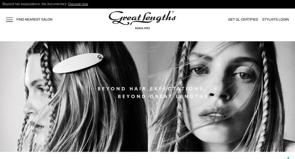
Here’s an example that looks modern but still had pops of color with their images further down in the webpage. This font that was used for their logo was another thing that we really liked. This menu was well labeled, which made it very easy to find information within their pages. Paragraphs were fairly short which was nice because people could stay engaged longer.
50. The Cutting Edge Salon
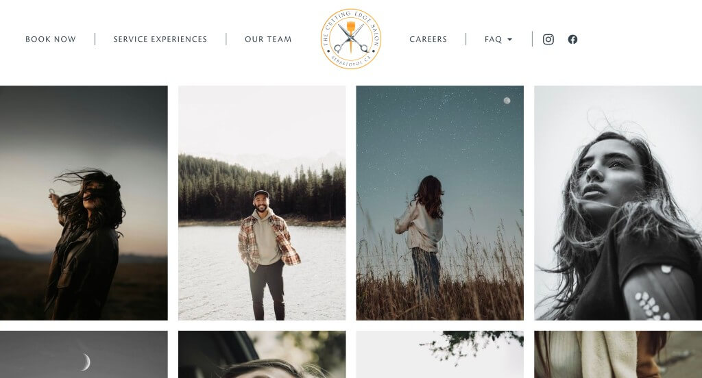
This example did an amazing with their display of high quality images. These images spark joy, and excitement in people who are considering getting their hair done with this company. This logo was simplistic and logical for their business which is another choice that we really liked. Having a section just for frequently asked questions was helpful to comfort unsure clients.
WordPress Hair Salon Themes
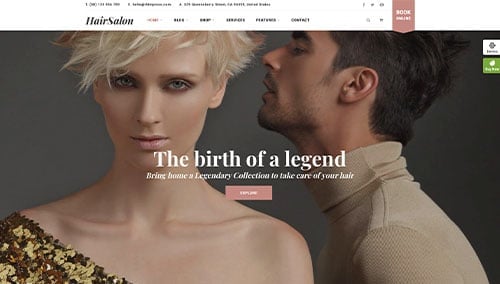
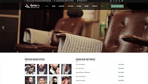
You can find free themes at wordpress.org, or explore hair salon-inspired templates on ThemeForest.
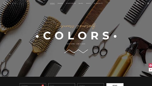
Curly – Themeforest
$79
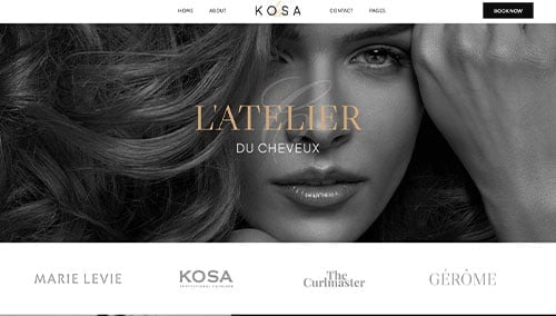
Kosa – Themeforest
$69
Salox – Themeforest
$39
Barber – Themeforest
$49
WooCommerce Hair Salon Themes
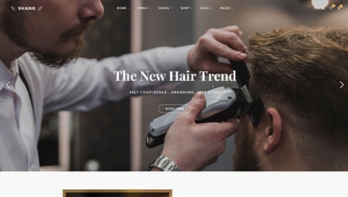
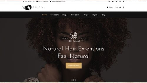
There are plenty of ecommerce hair salon themes available for WooCommerce on ThemeForest.
Shang – Themeforest
$49
Triss – Themeforest
$59
Shopify Hair Salon Themes
Check out free and paid themes at themes.shopify.com or browse options on ThemeForest:
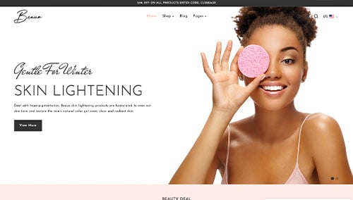
Beaux – Themeforest
$69
Trisha – Themeforest
$59
