In the mental health profession, your website is the digital doorway to your practice and the first point of contact for someone seeking support. Before a client ever reaches out, they use your online presence to evaluate your clinical approach, your professional warmth, and the safety of your environment. To succeed in 2026, a therapist’s website must master the delicate balance between empathetic branding and a frictionless path to care.
Our design and UX team evaluated hundreds of mental health websites – from boutique private practices and specialized child and family clinics to large-scale tele-therapy platforms and group practices. We identified the top examples that excel in human-centric design, specifically analyzing their navigational clarity, provider credential transparency, and the use of calming, high-end visual hierarchies.
Whether you are a solo practitioner building a niche brand or managing a multi-specialty counseling center, these examples represent the current benchmark for therapy web design in 2026.
Note on Our Selection Process: We recently audited this guide to remove outdated designs and sites that no longer meet our performance standards.
Top Therapy Website Designs
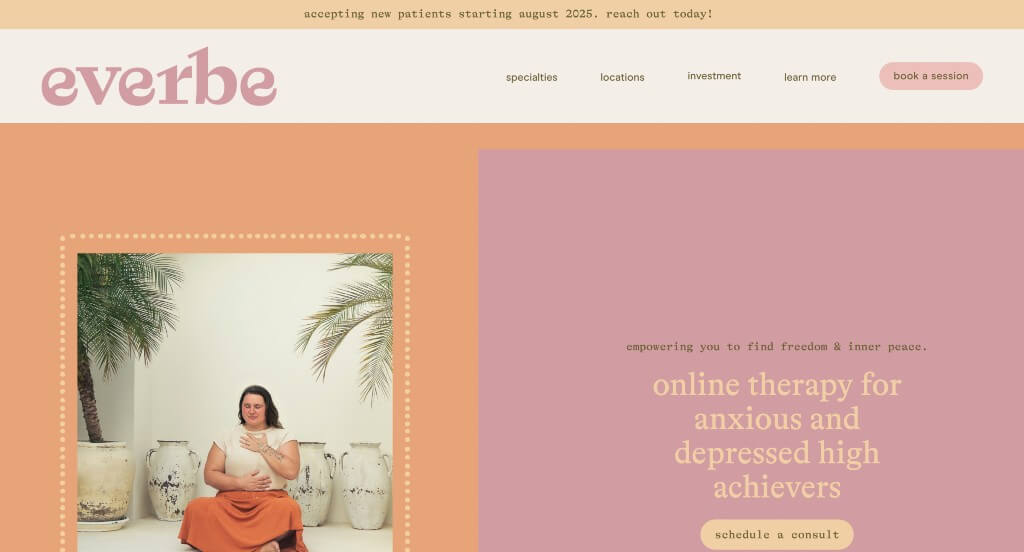
1. Everbe Therapy
Why We Chose Everbe Therapy
The digital presence for Everbe Therapy serves as a premier benchmark for “High-Empathy Private Practice Merchandising and Soothing Clinical Branding Architecture.” In the mental health and therapy sector, a website’s design must immediately establish a sense of psychological safety, warmth, and professional competence. The platform achieves this beautifully, combining a therapeutic color palette with structured expert specialization highlights to ease client anxiety and build immediate professional trust.
Key Design Highlights:
- Therapeutic, Soft-Pastel Color Palettes: The website establishes an immediate atmosphere of calm, comfort, and optimism through its thoughtful use of bright pastel tones. Moving away from sterile, cold clinical whites or overly dark, heavy hues, this bright and welcoming palette acts as a visual embrace, immediately setting a reassuring tone for visitors seeking mental health support.
- Targeted Specialization and Clinical Focus Blueprints: The homepage acts as an informative care directory by explicitly detailing her specific therapeutic specialties right within the main scroll path. Clearly itemizing her expert areas of focus allows prospective clients to easily self-educate and quickly verify that her specific clinical approach matches their personal healing goals.
- Authoritative, Relationship-Building Bio Showrooms: To bridge the vulnerability gap inherent in starting therapy, the homepage features a beautifully integrated therapist biography. Sharing her background, professional credentials, and empathetic approach directly on the front page helps incoming clients form an emotional connection and feel secure in her expertise before reaching out for a consultation.
- Distinguished Peer and Colleague Validation Hubs: Elevating its professional credibility beyond standard client testimonials, the homepage embeds verified reviews from clinical colleagues and peers within the field. Showcasing praise from fellow industry practitioners provides unique, high-value social proof that validates her clinical reputation, collaborative skills, and instructional excellence.
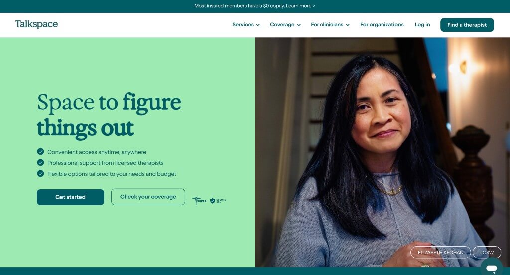
2. Talkspace
Why We Chose Talkspace
The digital presence for Talkspace serves as a premier benchmark for “High-Scale Telehealth Merchandising and Frictionless Patient Onboarding Architecture.” For a massive digital therapy platform, the core objective is to demystify online clinical care, alleviate user anxiety, and establish deep therapeutic trust within a single homepage scroll. The platform achieves this masterfully by paring down complex healthcare logistics into highly digestible, sequential breakdowns while embedding supportive, real-time access points.
Key Design Highlights:
- Structured “How It Works” Sequential Blueprints: Demystifying the process of digital mental health care, the homepage features a clear, step-by-step breakdown of the user onboarding journey. Visually mapping out the process—from the initial assessment to therapist matching and secure messaging—strips away administrative confusion and helps prospective patients feel confident about taking their first step.
- Comprehensive Multi-Tiered Service Matrix Showcases: The homepage serves as a highly organized care directory by explicitly outlining the full scope of Talkspace’s clinical offerings. Segmenting their services into distinct pipelines—such as individual therapy, couples counseling, teen therapy, and psychiatric medication management—allows visitors to instantly self-select the exact care model that fits their personal needs.
- Humanized Patient-Validation Hubs with Portraiture: Balancing medical professionalism with emotional community support, the platform features verified client reviews paired with authentic photographs of the clients. Showcasing real faces alongside heartfelt stories of mental health breakthroughs provides deeply reassuring social proof, reinforcing a welcoming, human-centered brand image.
- Real-Time Interactive Live Chat Communication Hubs: Recognizing that individuals seeking mental health support often have immediate, time-sensitive questions about insurance coverage, therapist qualifications, or technical setup, the homepage integrates an intuitive live chat interface. This responsive utility lowers the barrier to entry, offering a warm, direct line of communication at the user’s moment of highest intent.
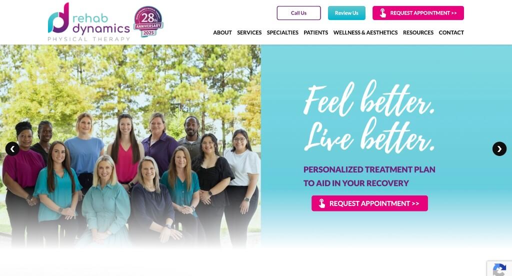
3. Rehab Dynamics Physical Therapy
Why We Chose Rehab Dynamics Physical Therapy
The digital presence for Rehab Dynamics Physical Therapy serves as a premier benchmark for “High-Intent Clinical Lead Generation and Direct Patient Access Architecture.” For a specialized outpatient physical therapy clinic, the primary challenge is to build immediate trust regarding physical recovery while minimizing the administrative friction required for a patient to take action. The platform navigates this masterfully by prioritizing direct scheduling paths and organizing complex clinical specialties into a highly accessible, consumer-friendly layout.
Key Design Highlights:
- High-Visibility “Request an Appointment” Conversion Anchors: Keeping client acquisition at the center of the user journey, the website places bright, high-contrast appointment request buttons prominently in both the header navigation and the primary hero section. This repetitive, highly visible call to action ensures that whether a user is a returning patient looking for a quick booking or a first-time visitor convinced by the opening banner, they have a zero-friction path to secure their session.
- Targeted Condition and Injury Discovery Hubs: The homepage features a structured directory of specific physical conditions, pain areas, and injuries that their clinical team treats. By showcasing these common struggles upfront—and pairing them with a prominent button to explore even more diagnoses—the site helps patients immediately self-identify their symptoms and understand how the therapy team can guide their recovery.
- Specialty Treatment and Modality Matrices: The website cleanly maps out its specialized clinical services directly on the front page. Clearly presenting their distinct recovery offerings—such as manual therapy, sports rehabilitation, or specific neurological programs—allows prospective patients to easily verify the clinic’s advanced capabilities and select the correct track for their rehabilitation.
- Dynamic Customer Feedback and Review Sliders: Building immediate clinical credibility, the homepage integrates an interactive review slider showcasing real patient success stories. Allowing visitors to swipe through authentic accounts of pain relief and functional restoration provides powerful social proof that reduces the anxiety of choosing a new therapeutic partner.
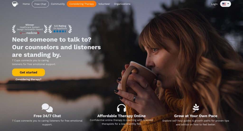
4. 7 Cups
Why We Chose 7 Cups
The digital home for 7 Cups serves as a premier benchmark for “High-Scale Digital Mental Health Merchandising and Trusted Community Onboarding Architecture.” In the digital health space, where users often arrive in moments of vulnerability or skepticism, a platform must establish immediate clinical credibility and structural safety. The interface excels at this by combining prestigious industry recognition with clear service tier comparisons, transforming a massive global support network into a highly structured, trustworthy, and approachable digital harbor.
Key Design Highlights:
- Strategic Trust Anchors and Accolade Showcases: To immediately address the hesitation and skepticism often associated with digital mental health platforms, the homepage proudly showcases their prestigious industry awards and wellness accolades. Displaying these trust signals right upfront acts as an immediate stamp of credibility, reassuring users that the platform is recognized, safe, and clinically respected.
- Comprehensive Multi-Tiered Service and Support Directories: The website does an exceptional job of clearly laying out its diverse pathways of care directly on the front page. By dividing their offerings into clear, distinct channels—such as free 24/7 active peer listening, structured community chat rooms, and professional online therapy with licensed clinicians—visitors can easily find the exact level of support that matches their current emotional needs and budget.
- Value-Driven Therapeutic Comparison Matrices: The homepage features a highly effective comparison chart that weighs 7 Cups directly against traditional in-office therapy. This transparent breakdown highlights the platform’s key advantages, such as 24/7 message availability, absolute anonymity, and massive cost savings, helping users make an informed, confident decision about choosing digital care over conventional methods.
- Persistent, Zero-Friction Navigation Headers: Ensuring that support is never out of reach during a deep scroll, the website utilizes a smooth sticky header framework. No matter how far down a user reads about the platform’s community standards or professional networks, the primary navigation remains anchored at the top of the viewport, providing an instant path to find help or log in at any moment.
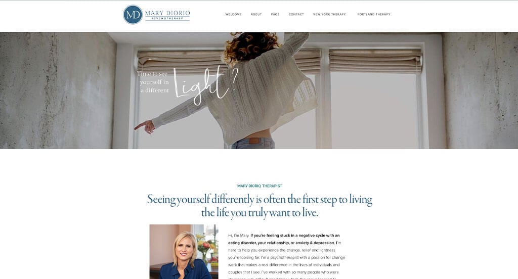
5. Mary DiOrio Psychotherapy
Why We Chose Mary DiOrio, LCSW
The digital storefront for Mary DiOrio, LCSW, serves as a premier benchmark for “High-Trust Private Practice Merchandising and Frictionless Patient Onboarding Architecture.” For an individual mental health practitioner, the primary digital objective is to transform clinical expertise into warm, approachable reassurance. The interface navigates this beautifully, combining a highly accessible layout structure with clear clinical boundaries to ensure prospective clients feel heard, informed, and guided from their very first interaction.
Key Design Highlights:
- Authoritative, Relationship-Building Bio Showrooms: To immediately bridge the vulnerability gap of starting therapy, the homepage prominently features Mary’s biography, therapeutic philosophy, and professional credentials. Placing her licensing, education, and compassionate approach directly on the front page establishes deep clinical credibility while humanizing her practice as a safe, welcoming space for healing.
- Targeted Specialization and “Areas of Focus” Blueprints: The website structures its clinical offerings by clearly outlining Mary’s primary areas of therapeutic expertise directly on the front page. By explicitly detailing the specific struggles she treats—such as anxiety, depression, life transitions, or relationship dynamics—prospective clients can instantly verify her clinical fit for their personal healing journey.
- Coordinated Front-Page Intake Forms and FAQ Directories: Streamlining the clinical onboarding flow, the homepage integrates a zero-friction contact form immediately followed by a structured Frequently Asked Questions accordion. This deliberate layout design addresses logistical anxieties—such as insurance, scheduling, and session structures—right next to the contact point, encouraging confident, immediate inquiry submissions.
- Persistent, Conversion-Optimized Sticky Headers: Ensuring that support and scheduling pathways remain effortlessly accessible during a deep scroll, the website utilizes a smooth sticky header framework. As visitors read through Mary’s bio, therapy approaches, and client resources, the primary menu anchors itself perfectly at the top of the viewport—offering a zero-friction path to make contact the exact moment they decide to take action.
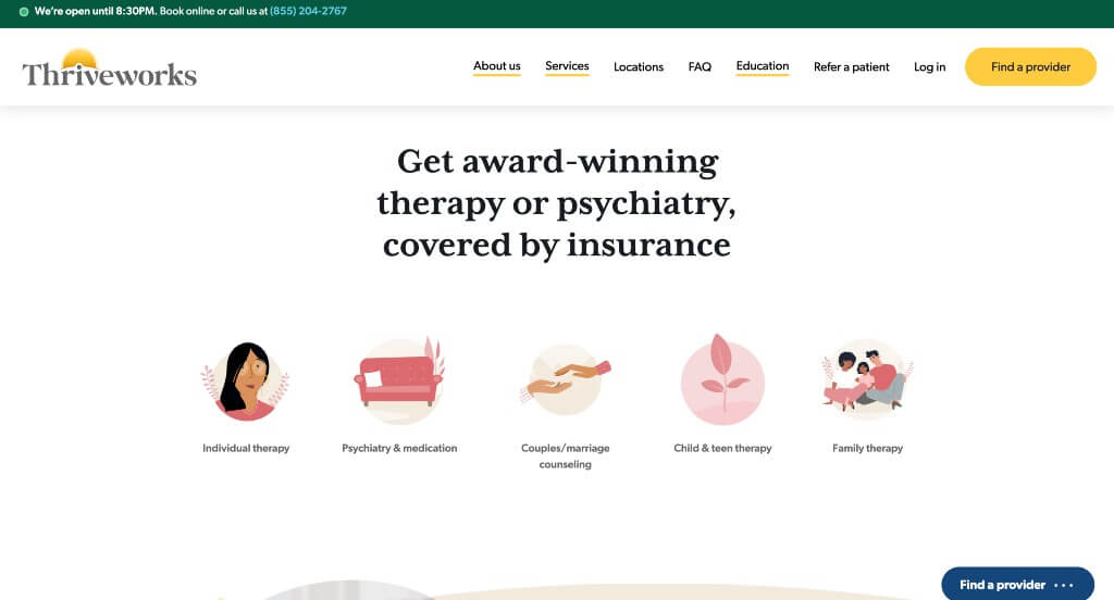
6. Thriveworks Counseling
Why We Chose Thriveworks
The digital storefront for Thriveworks serves as a premier benchmark for “High-Scale Telehealth Merchandising and High-Trust Clinical Onboarding Architecture.” In a crowded mental health market, a national provider must balance corporate scale with deep personal empathy. The interface accomplishes this beautifully, utilizing a highly structured frontend layout that pairs authoritative trust signals with clear brand differentiators to convert anxious visitors into confident clients.
Key Design Highlights:
- Value-Driven “Why Thriveworks” Differentiation Frameworks: The website anchors its operational identity through a dedicated “Why Thriveworks” narrative module embedded directly within the primary scroll path. Rather than relying on vague healthcare slogans, this section outlines their core pillars—such as ultra-fast booking times, flexible appointment options (both in-person and online), and high therapist hiring standards—giving prospective clients a clear, structured understanding of what sets their clinical network apart.
- Strategic Trust Anchors and Validation Hubs: To address the natural hesitation associated with selecting a clinical partner, the homepage showcases both prestigious industry awards and verified client testimonials. Placing these third-party accolades alongside genuine, relatable stories of personal breakthrough establishes immediate clinical credibility and reassures prospective patients that they are in safe, highly professional hands.
- Persistent, Conversion-Optimized Headers with Announcement Bars: Ensuring fluid navigation and instant updates during a deep scroll, the site features a sleek sticky header paired with a top announcement ribbon. This dedicated alert space functions as a friction-free communication channel for critical updates—such as insurance changes, holiday hours, or promotional pricing—while the main header remains anchored at the top of the viewport to provide a zero-friction path to book an appointment.
- Coordinated Editorial Insight and Educational Blog Hubs: Solidifying their status as a holistic authority on mental wellness, the homepage features a dedicated editorial showcase for their active blog. Integrating clinically backed articles, coping techniques, and relationship tips directly into the main scroll transforms the digital storefront into an ongoing, high-value source of personal enrichment that engages users beyond standard booking pathways.
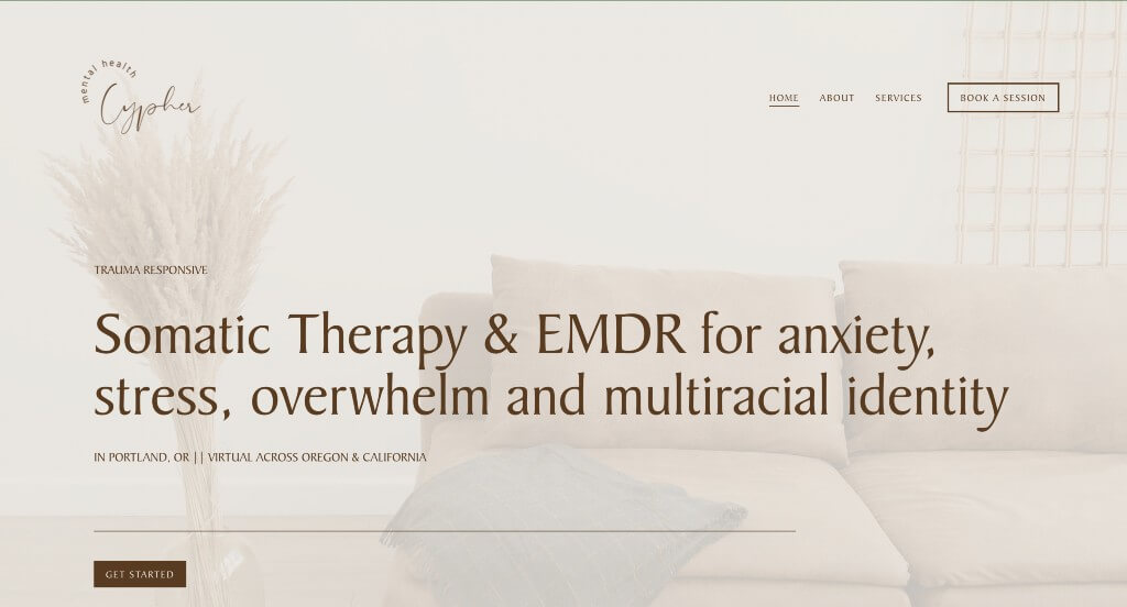
7. Cypher Mental Health
Why We Chose Cypher Mental Health
The digital presence for Cypher Mental Health serves as a premier benchmark for “High-Trust Private Practice Merchandising and Sensory-Driven Clinical Branding.” In the mental health and wellness space, website design must immediately establish a feeling of psychological safety, warm professionalism, and accessibility. The platform excels at this by combining a comforting, earthy aesthetic with direct, low-friction booking channels—helping anxious or overwhelmed visitors transition smoothly from exploration to scheduling.
Key Design Highlights:
- Soothing, High-Empathy Tan and Neutral Visual Palettes: The website establishes an immediate sense of calm, safety, and groundedness through its warm tan and neutral tones paired with soft, gentle imagery. By avoiding clinical, stark white interfaces or overly bright colors, this thoughtful aesthetic acts as a visual deep breath, immediately easing client anxiety the moment the page loads.
- Targeted Symptom and “I Can Help With” Specialization Modules: The homepage features a highly practical “I can help with” directory to clearly outline their areas of therapeutic expertise. Explicitly presenting specific challenges—such as stress, anxiety, life transitions, or relationship dynamics—helps prospective clients instantly self-identify their symptoms and feel validated in their search for support.
- Frictionless, High-Intent Header Booking Gateways: Keeping patient acquisition simple and stress-free, the navigation header features a prominent “Book a Session” action button. Placing this primary call to action permanently at the top of the viewport removes administrative searching, allowing users to schedule a consultation the exact moment they feel ready to take that step.
- High-Empathy, Reassuring “I Am Here to Help” Connection Frameworks: Further humanizing the digital experience, the homepage includes a dedicated, highly supportive “I am here to help” narrative section. This segment bridges the gap between clinical science and human warmth, directly addressing the reader’s vulnerability and assuring them of a collaborative, compassionate healing journey before they commit to booking.
WordPress Therapy Themes
You can find free themes at wordpress.org, or consider therapy-inspired templates on ThemeForest.
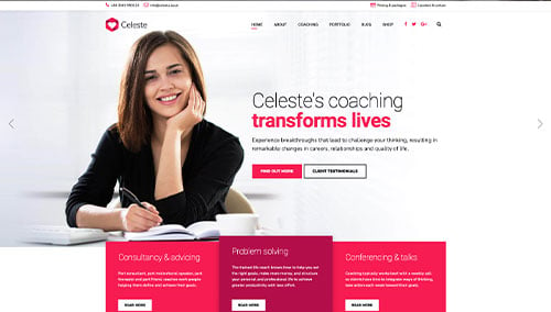
Celeste – Themeforest
$69
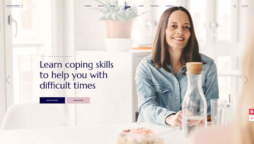
Wellmont – Themeforest
$79
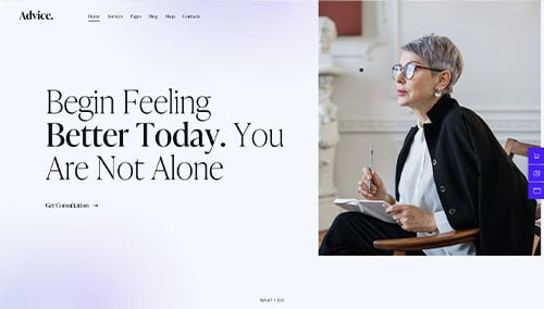
Advice – Themeforest
$69
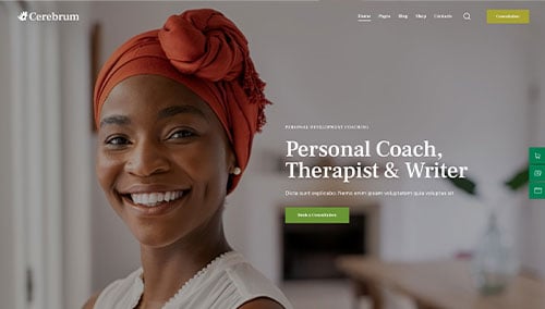
Cerebrum – Themeforest
$69