Are you ready to explore some top exhibits from home? Our guide includes the best museum webpages, showcasing the best in design, functionality, and user experience.
Discover stunning art, history, science, and natural history museum sites that inspire and educate. Whether you’re looking to build your own or just want some virtual inspiration, this guide has you covered.
Take a virtual journey through world-class museums – and find ideas to create an online presence that truly reflects your uniqueness!
For examples in other industries, visit our award-winning websites.
Top Museum Website Designs
- 1. National Museum of Natural History
- 2. Brussels Museum
- 3. Tate
- 4. Crypt Art
- 5. The British Museum
- 6. National Museum of Singapore
- 7. Guggenheim Museum
- 8. Heide
- 9. National Gallery of Art
- 10. Courtauld Institute of Art
- 11. New York Historical Society
- 12. Museum of Science + Industry
- 13. Museums of the World
- 14. Isabella Stewart Gardner Museum
- 15. National Museum of African American History & Culture
- 16. Getty
- 17. The Noguchi Museum
- 18. Serpentine Galleries
- 19. Bob Dylan Center
- 20. Rock & Roll Hall of Fame
- 21. Grand Rapids Art Museum
- 22. Field Museum
- 23. Momentous
- 24. Whitney Museum of American Art
- 25. National Air & Space Museum
- 26. Chrysler Museum of Art
- 27. Art Institute of Chicago
- 28. Barnes Foundation
- 29. Pioneer Works
- 30. Pulitzer Arts Foundation
- 31. Barbican
- 32. The Met
- 33. Phoenix Art Museum
- 34. The Louvre
- 35. British National Gallery
- 36. Children’s Museum of the Arts
- 37. YBCA
- 38. The Jewish Museum
- 39. American Folk Art Museum
- 40. Harvard Art Museums
- 41. Hammer Museum
- 42. Van Gogh Museum
- 43. McColl Center
- 44. Museum of Modern Art
- 45. Walker Art Center
- 46. New Museum
- 47. Cleveland Museum of Art
- 48. MCA Denver
- 49. National Museum of Mexican Art
- 50. MIT Museum
1. National Museum of Natural History
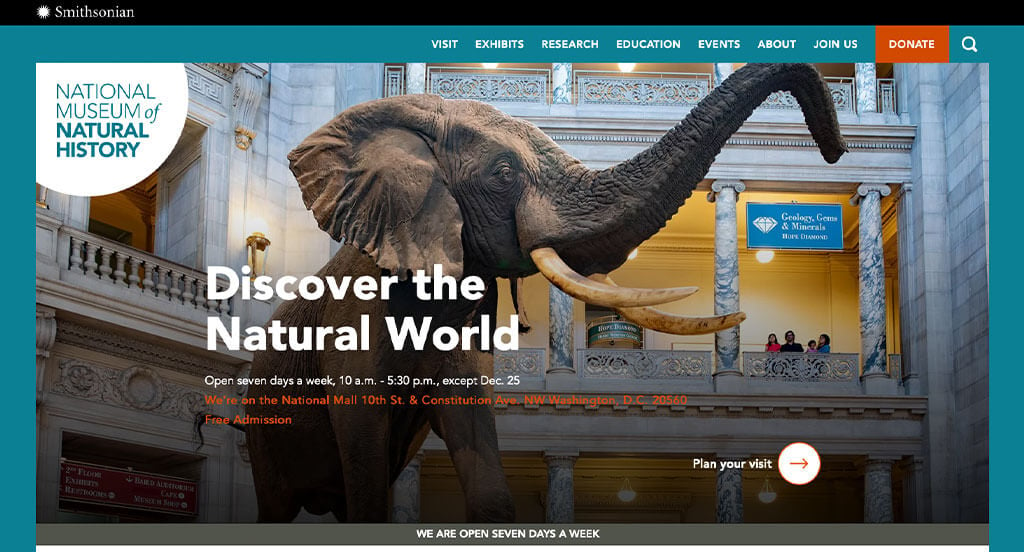
Our team liked this example because of their blue and orange accent colors. Subtle animations helped it stand out from the others. We thought it was interesting to make their donate button a different color so that it is more visible. Using a variety of different photo frames was another idea we noticed.
2. Brussels Museum
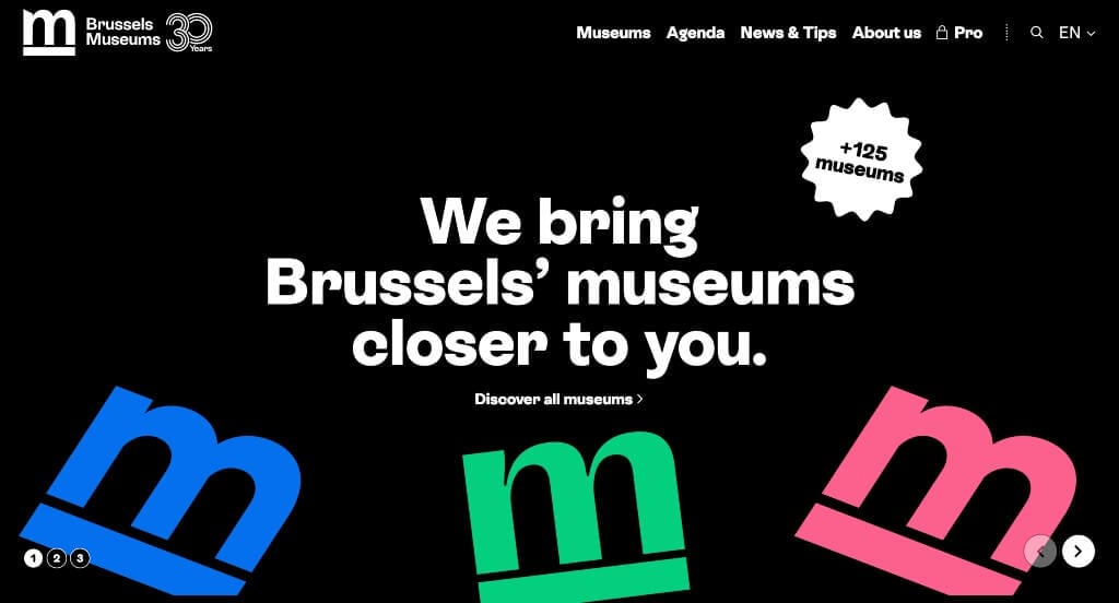
Right away we noticed the bright pops of color that appeared in this example. Repeating their logo throughout the design was also helpful and looked good. This domain was simple and easy to identify with their company because they have the same names. Having an area for news and tips was another thing that we really enjoyed.
3. Tate
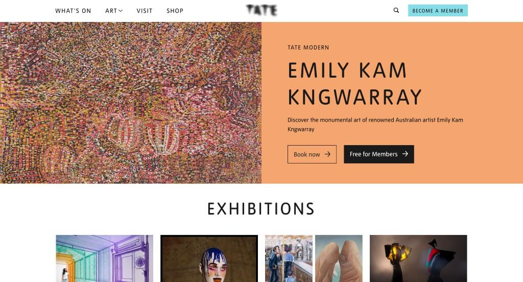
This company did a good job adding in colors and interesting fonts. They carefully balanced their white space which is something else that we appreciated. A search bar was included, which was something that we liked. We also noticed that they included their shop with art, prints, gifts, books, and more.
4. Crypt Art
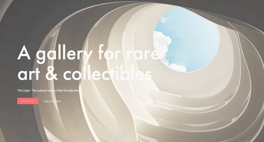
The entry of Crypt Art was something that helped set them apart. It felt almost luxurious and unique as music plays softly from your device. Allowing for a 3D interactive design to explore their art was nice. Their exhibits are constantly being curated so new things can be seen.
5. The British Museum
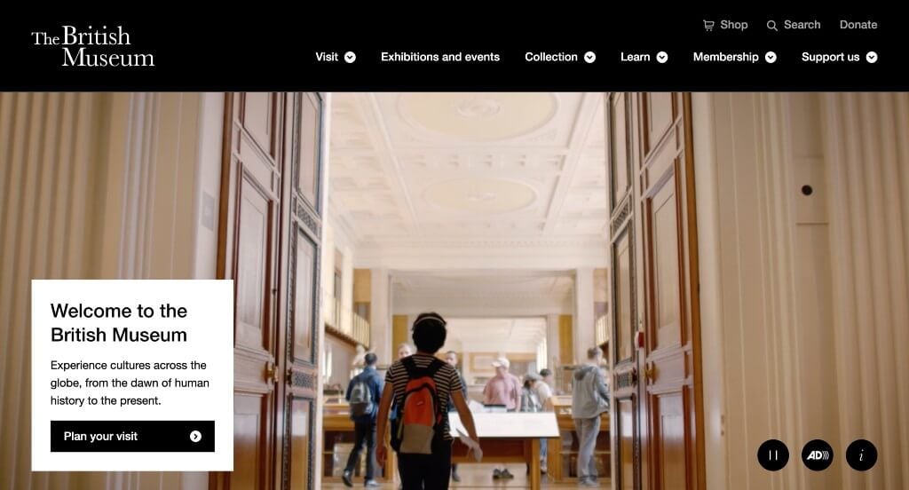
This one balances images and videos well, making it more interesting to explore. Lots of information is shared in their footer, which is nice because it’s easy to access. Their black background was something else that helped them feel more unique.
6. National Museum of Singapore
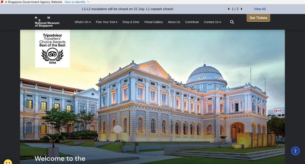
Showing their current exhibits, costs, and time at the museum were all great additions. Including an itinerary to help visitors plan was something else that we liked. Showing some awards from Tripadvisor was another thing that we enjoyed. A search bar was also included, which we liked.
7. Guggenheim Museum
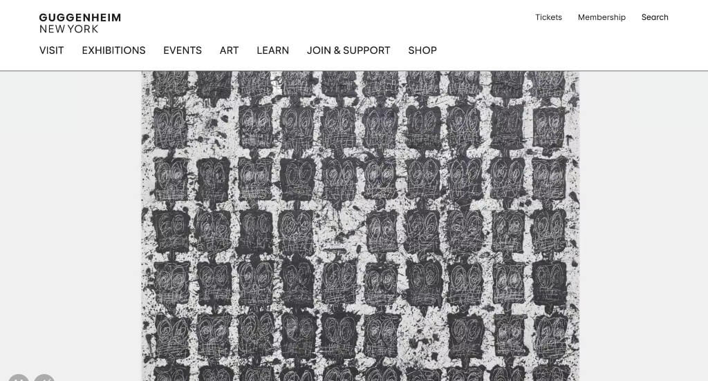
Right away we noticed this thoughtful logo. We thought it was interesting how it changed color as viewers scroll through the pages. Their navigation bar was also very well labeled, making everything easy to find. Guggenheim Museum had a simplistic domain that matches their company name.
8. Heide
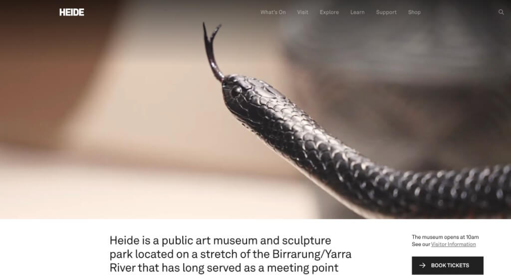
This example does a nice job with their automatically playing video that introduces their company well. Along with that, they use a variety of images throughout to get visitors excited about coming to this museum. Showing off their programs and upcoming events was another thing that we really appreciated.
Related: Raise awareness of your museum as a local entertainment attraction by implementing a digital marketing strategy.
9. National Gallery of Art
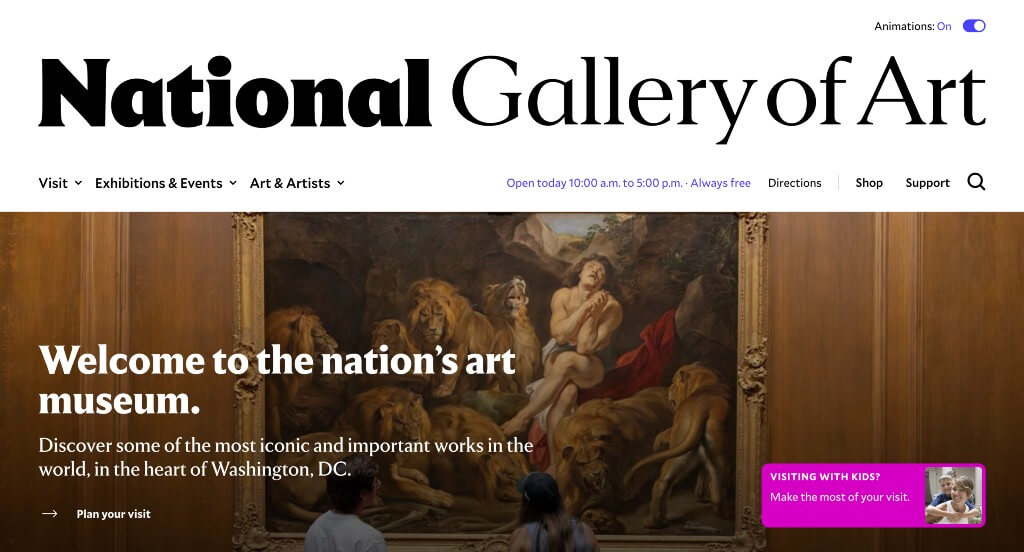
Here we have lots of different pieces on display varying in popularity. We loved their transitions that are subtle, but add to the feeling of their pages. Showing off their different locations was also helpful for those wishing to visit. We also enjoyed how images were all different sizes to help balance the white space more.
10. Courtauld Institute of Art
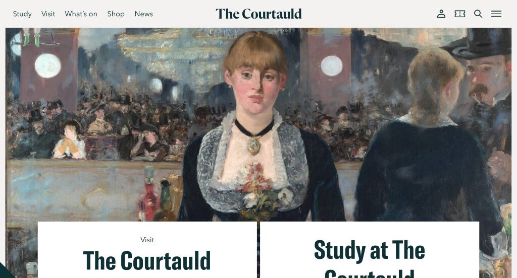
Using a large image to attract customers right away was a smart choice. Virtual galleries were another feature that we found useful for those that are unable to travel to their location. Small icons were used as visuals that included more information, which is always helpful.
11. New York Historical Society
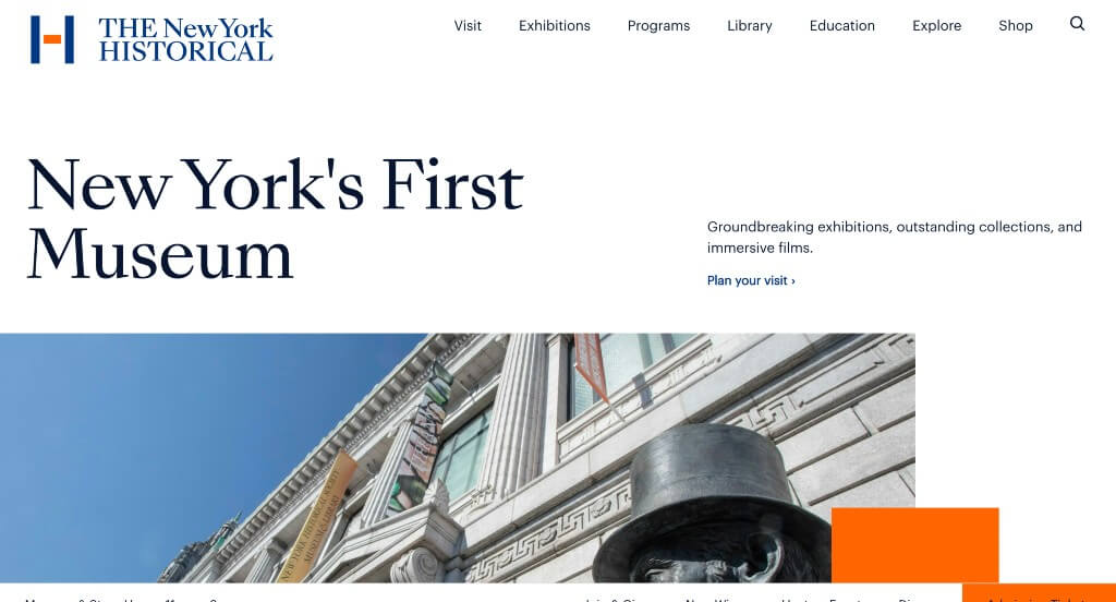
There was a variety of font sizes which was nice because it made it easy to read important information and titles. Including their calendar was another feature that we enjoyed. New York Historical Society also did a good job staggering their images so it never felt overwhelming.
12. Museum of Science + Industry
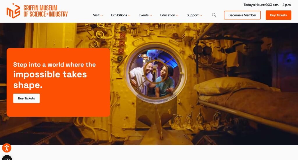
Showing their popular exhibits right away was something that we enjoyed. The complexly interesting logo was a very impactful feature that we saw. They made use of drop downs within their navigation bar, which was something that we liked.
13. Museums of the World
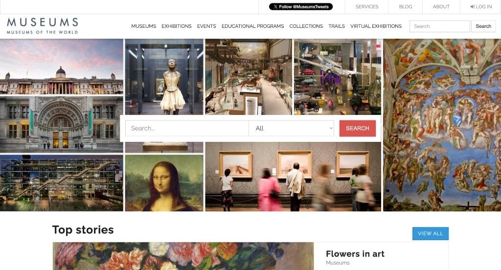
Upon entering this site, one of the first things we noticed was their use of a search bar. Having content logically organized was very helpful for those reading through. This was a unique site because it’s meant for museum goers looking for the best of the best to visit.
14. Isabella Stewart Gardner Museum
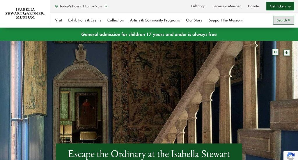
Isabella Stewart Gardner Museum uses red, green, and blue in order to help separate the information within their website. Their fonts were simple, but could be read easily, which is always a plus. Adding in links to their social media pages is helpful to keep customers connected.
15. National Museum of African American History & Culture
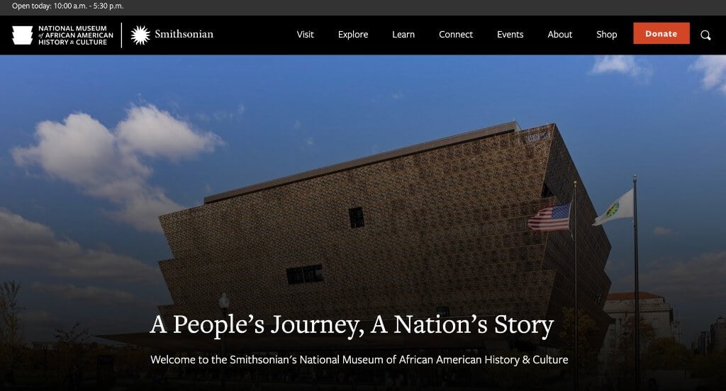
Upcoming events and news are included, helping people stay informed. Additionally, we noticed their good balance of white space, and high quality images. Allowing customers to sign up for email notifications was also very helpful for those who want to learn more. We thought it was interesting that their logo was also the shape of their building.
16. Getty
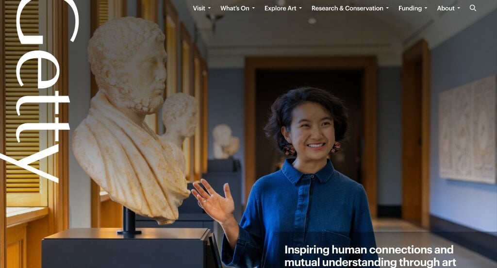
We loved how Getty shows off their business name in many areas. Large images that display people interacting and having fun is always a good choice for sites like this one. Their domain matched with their business name which is always a good idea.
17. The Noguchi Museum
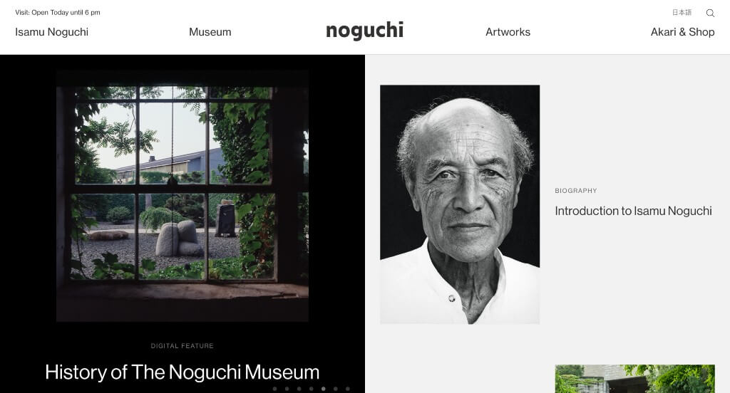
We loved how images were displayed here, there was a unique pattern and a variety of sizes. Another feature we noticed was their high-quality visuals. They clearly had website usability in mind when building the simple navigation.
18. Serpentine Galleries
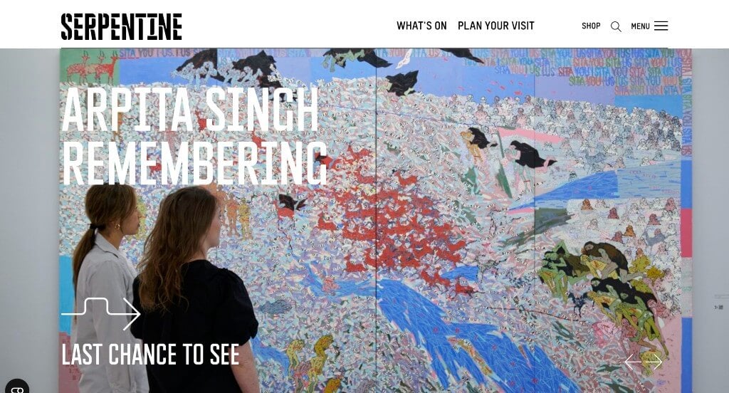
This captivating font was a thoughtful feature that we enjoyed. Their arrows were interesting looking and matched with their decorative font, helping to maintain unity. An online shop could also be found including many pieces that were well labeled with prices.
19. Bob Dylan Center
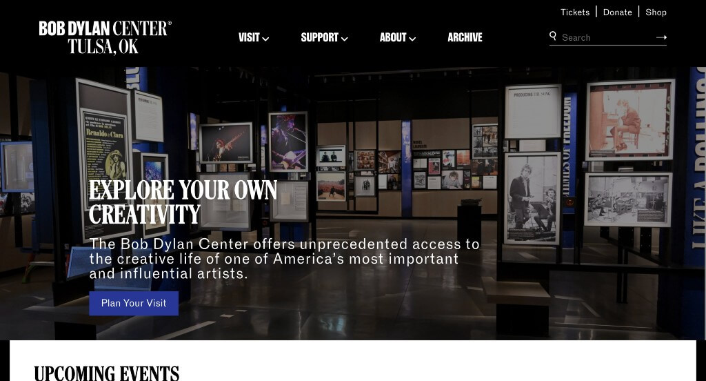
Our team liked the black, white, and blue color scheme used in Bob Dylan Center’s website, because it creates a stunning layout. We liked small transition that were used to introduce information about their business or Bob Dylan himself. This navigation bar is also very well labeled, making it easy to find information.
Related: Museums often look at SEO as a way of improving organic traffic to their website from people searching for attractions in various cities.
20. Rock & Roll Hall of Fame
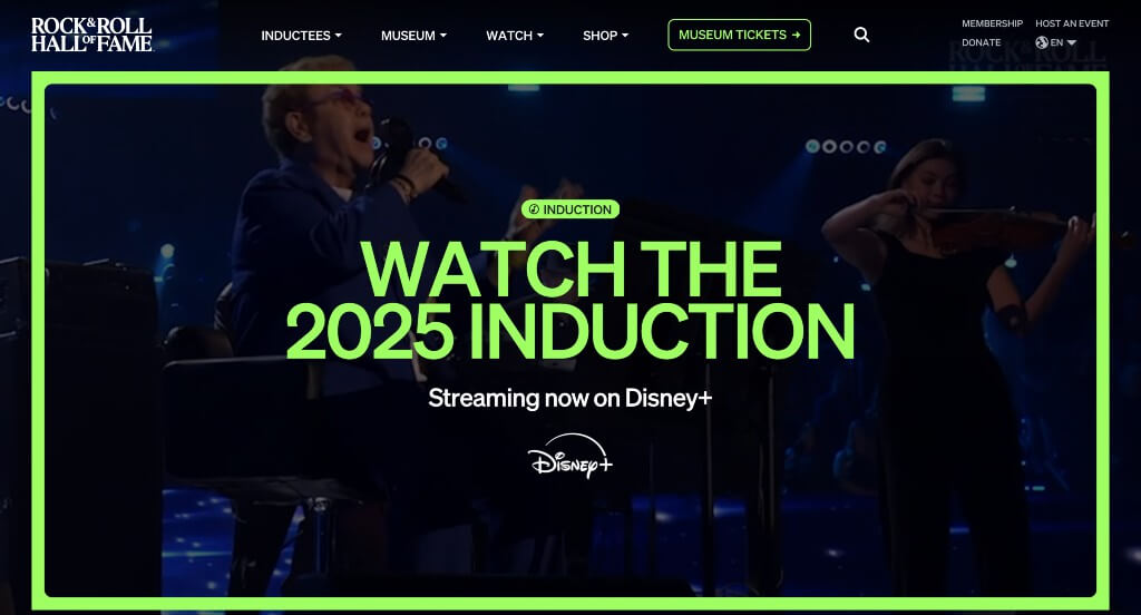
A black and white color scheme allows for a more old-time look for these pages. Showing off lots of information all on their homepage was nice because viewers could click links to learn more. Having an area to buy tickets for their museum was something else that is very important.
21. Grand Rapids Art Museum
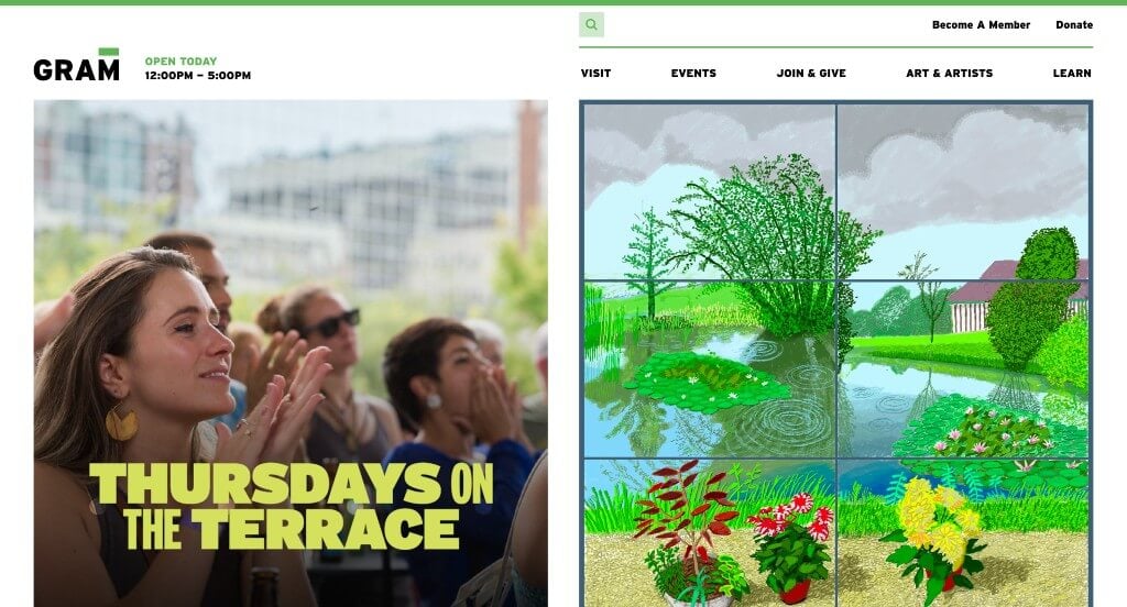
We loved how there was lots of high quality images here. Showing off their partners and thanking them was something that we liked. A search bar was another thing that we liked to see. Having their open hours in the top corner was helpful for those wishing to visit.
22. Field Museum
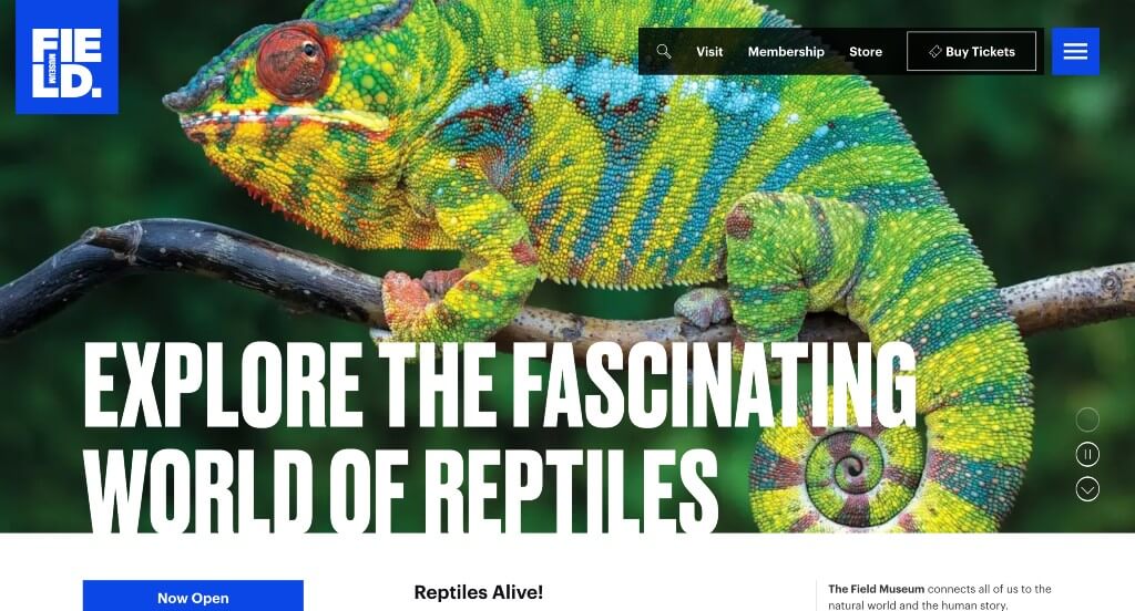
It was interesting to have more unique areas within their site like a “That’s My Cat!” contest. Including a blog was something that we felt was not just helpful, but it also helped them stand out. Using negative space within their logo to include all the information was nice.
23. Momentous
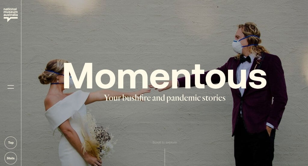
We loved how this example had an interesting layout. A green color scheme was very impactful within this homepage. Balancing videos with images was definitely refreshing. Momentous had digital marketing in mind when building a display of statistics to create a larger impact.
24. Whitney Museum of American Art
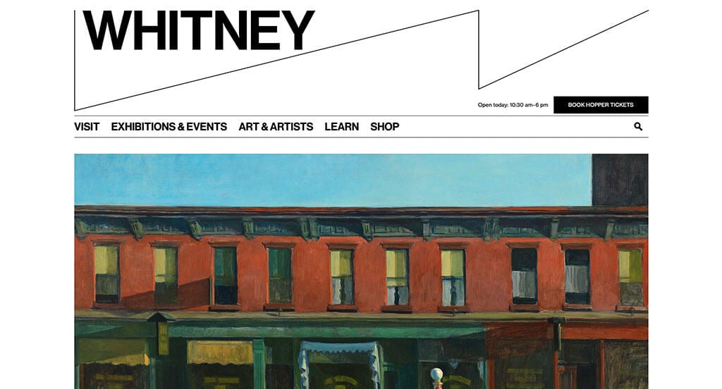
A black background creates a backdrop that we absolutely loved. Including links to each of their social media pages was another thing that we found helpful. Having the opportunity to book tickets or become a member was a nice touch. Besides that, we liked that they included many buttons to help guide people towards different information.
25. National Air & Space Museum
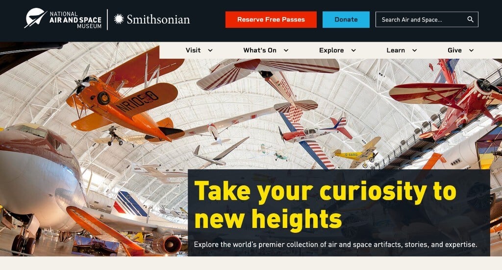
All images related to their theme of space (even the ones of customers and kids). Including lots of buttons to help with organization, and making content easier to find. We liked the little tabs that show what are events, exhibits, or deep dive information.
26. Chrysler Museum of Art
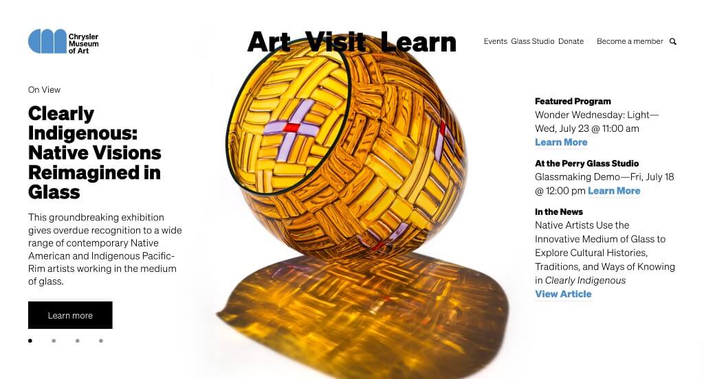
Upon entering this site, we loved how their pages were laid out carefully, allowing for a good balance of white space. High quality images was one of our favorite parts about Chrysler Museum of Art. Showing off customer reviews from their members was a great choice. Subtle accents of blue was also nice because it helped bring life to their pages.
27. Art Institute of Chicago
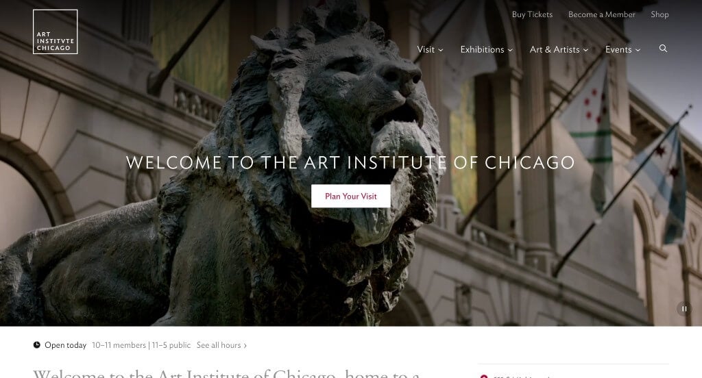
A video is as a hero header in order to grab attention and display their variety of art. Drop downs were used within their navigation bar in order to keep content organized. Lots of information is included in blogs, exhibit pages, and more. They wanted to stand out when creating a bunch of highlight stories.
28. Barnes Foundation
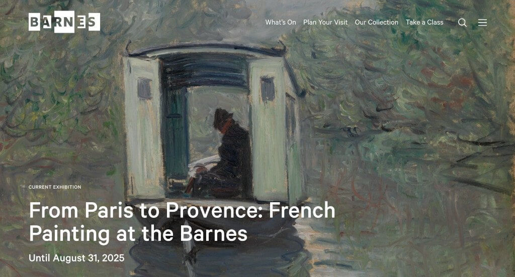
A homepage feature within Barnes Foundation that we noticed was their full screen imagery because that’s something you don’t find on most of these sites. We thought their logo was a great design that was simple and showed off their business name.
29. Pioneer Works

Pioneer Works does a great job with their large images that lead to a variety of different information. Sprinkling in videos and articles along with images from their exhibits was something that we loved. Including a page to donate to them was smart to include, but they don’t continuously ask for money which is nice.
30. Pulitzer Arts Foundation
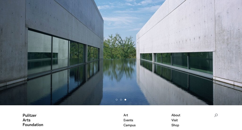
Pulitzer Arts Foundation did an amazing job with their balance of white space. Many of their images have a similar appeal, meaning that it creates a feeling of unity. Adding in a search bar was something else that we enjoyed. Showing off their current exhibits with large images and their titles helped people to see if it’s worth visiting.
31. Barbican
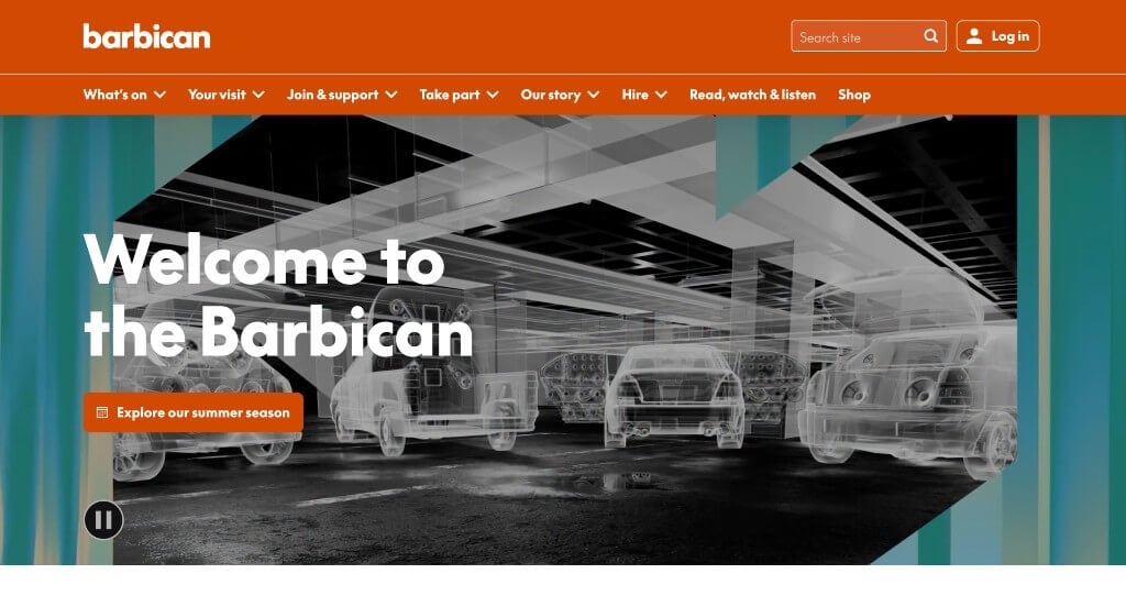
This example was not only well organized, but they include lots of information in many different areas of interest. Many accents of bright colors used throughout their pages was a reason we included them into our rankings. They had accessibility in mind when making use of a navigation bar with organized sections.
32. The Met
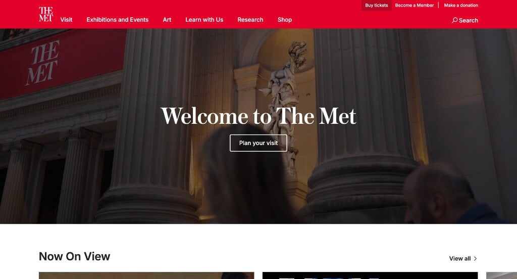
There was lots of images here that help information and artwork to stand out more. Short and straightforward paragraphs are used throughout this example to keep people engaged. Including their locations in the footer was nice because it is easy to find there.
33. Phoenix Art Museum
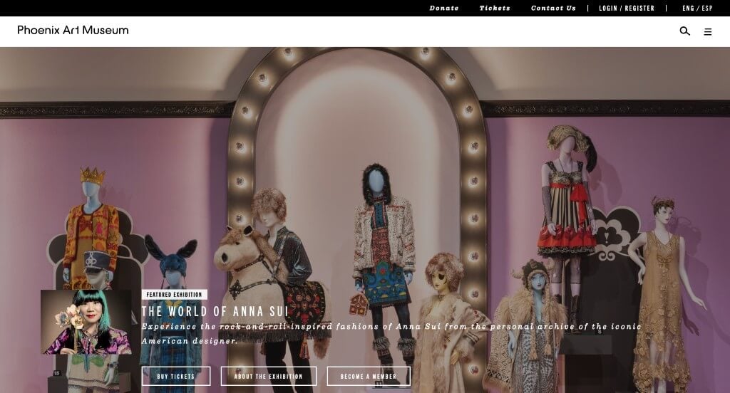
There is clearly a more unique approach to these displays. This clean and professional font was a very impactful feature. Adding in buttons was also a very good choice to help everyone gain more information. There was a good balance of white space, which is always a helpful feature. Including a shop right on their website was something else we couldn’t ignore.
34. The Louvre
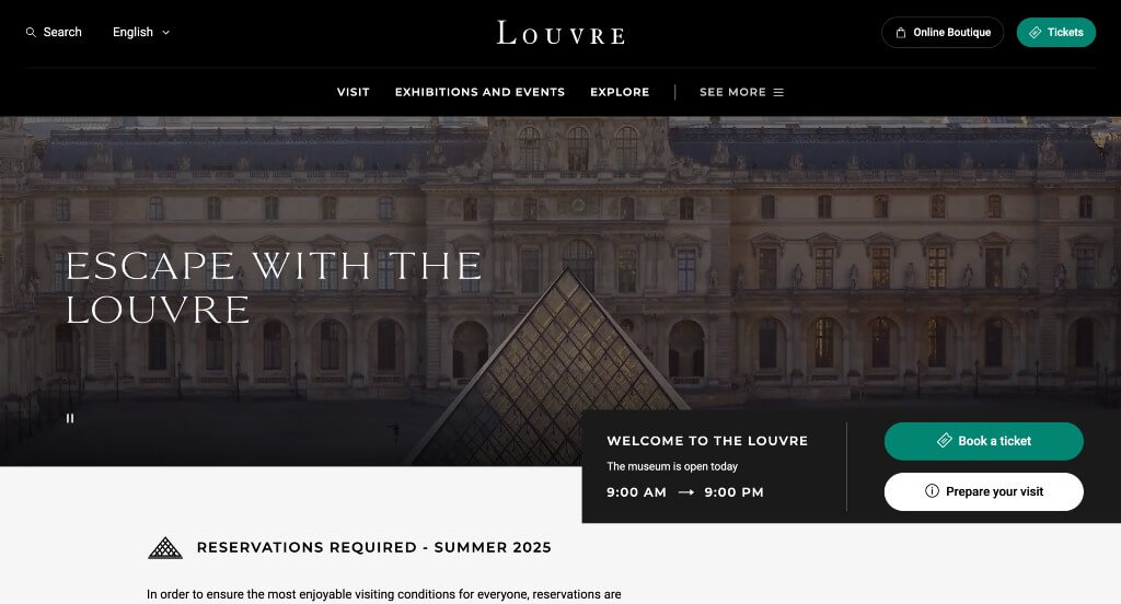
This example had fonts that we absolutely loved. Along with that, we thought it was cool how they created a graphic of their building that was used within the page. Having buttons in blue that help customers purchase tickets was a smart choice. Highlighting specific art pieces or exhibits right on the homepage was another thing that we really enjoyed.
35. British National Gallery
There was lots of stunning images that were used throughout these pages. Bright yellows carefully accented many areas of this webpage, which we loved. Showing off stories through their social media pages was another feature we were grateful for. Linking icons for each of their social media pages was also a nice choice.
36. Children’s Museum of the Arts
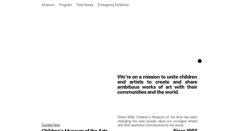
One of the best parts about Children’s Museum of the Arts was their sliding animations to introduce all their content. We loved their simplistic background with a basic color palette, helping images stand out more. Keeping paragraphs short and easy to read was something that makes it easy for everyone to read.
37. YBCA
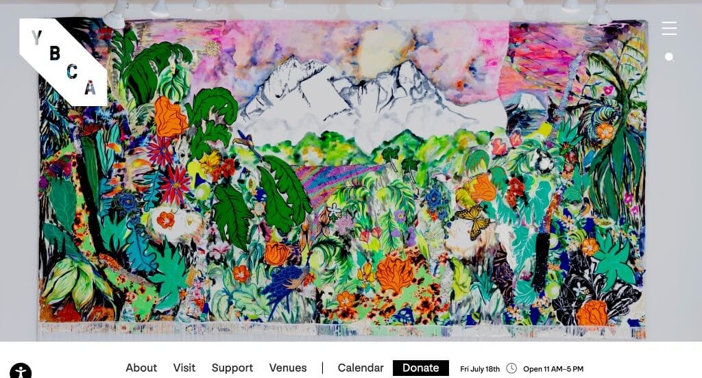
YBCA had a simple but unique logo that gets smaller as customers scroll down. Showing a map in the footer and menu was another interesting aspect that we liked. Accents of orange was nice to help liven up each of the pages. Their logically organized template helped make this an amazing one to review.
38. The Jewish Museum
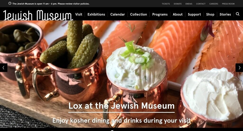
Displaying lots of images of their museum and the art that is on display there was perfect. Incorporating their social media page was something that we really enjoyed. Including titles for almost every image to show what piece is shown was nice.
39. American Folk Art Museum
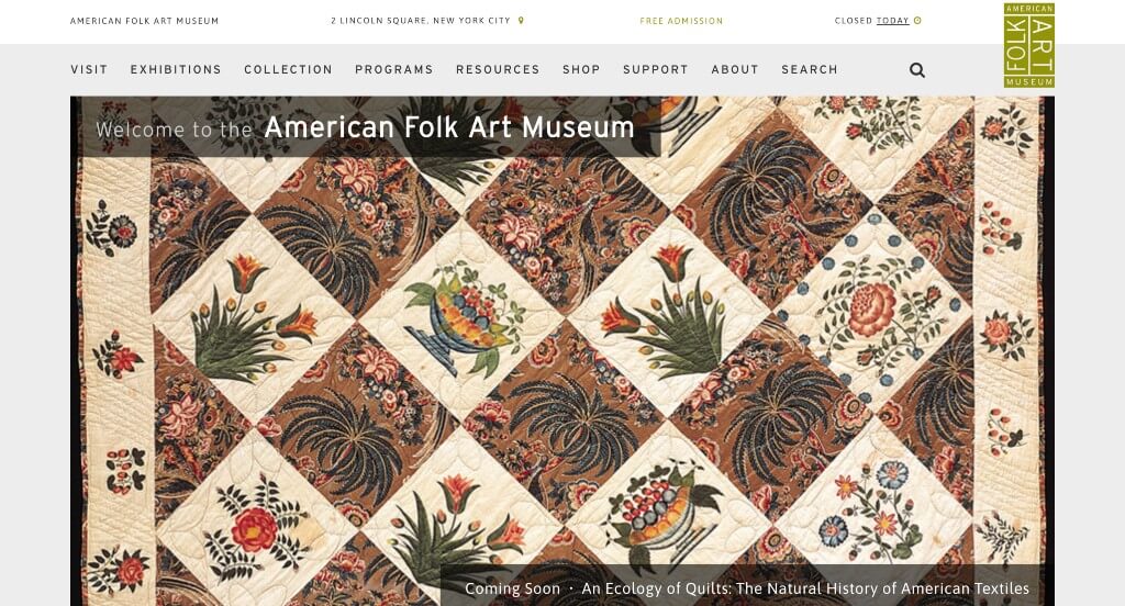
We loved how they showed off their company name in many areas. Balancing images with whitespace was something that is always helpful for any type of business. Showing many things that are new and upcoming is also very helpful. Their domain is also very simple and matches with their name, which is always a good choice.
40. Harvard Art Museums
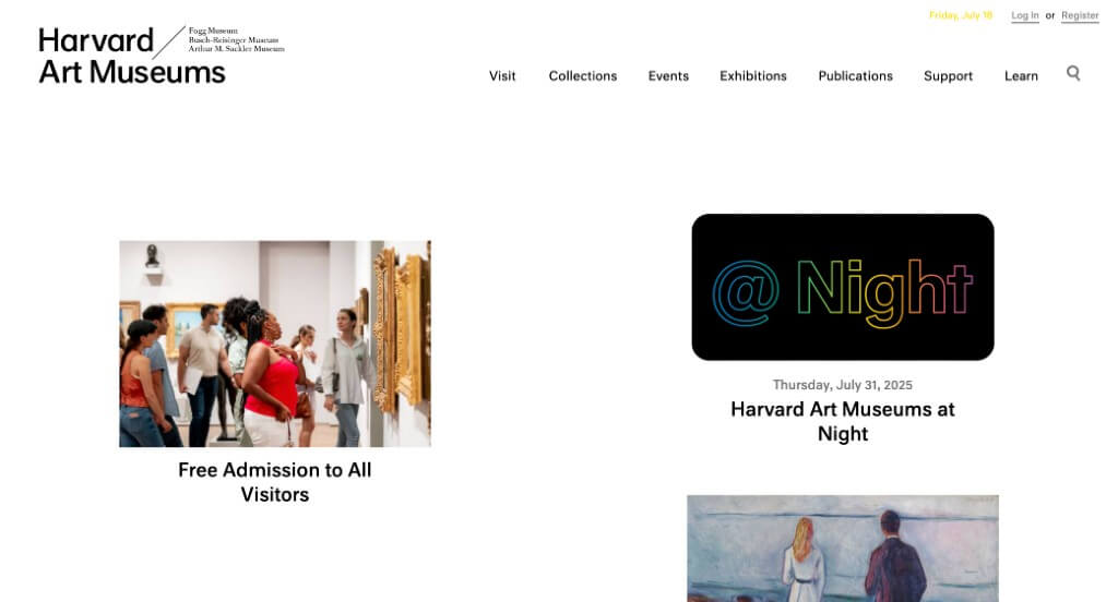
We loved how this layout scatters images in an asymmetrically balanced way. Many of these images included links to additional information. It was also nice to sometimes include frames for larger text boxes. We also liked having a whole page for events, a page for collections, a page for exhibits and more.
41. Hammer Museum
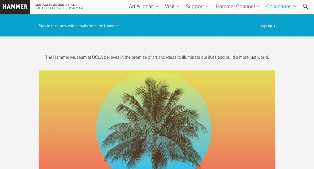
Lots of interesting images are used in every area of this site to keep everything looking great. Their bold fonts for titles is always a helpful choice. We liked how they included information about upcoming readings along with tours & talks. Having their own channel to show off more information was also really cool.
42. Van Gogh Museum
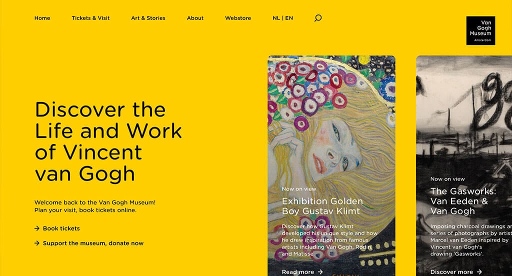
We loved how this example changed colors as you moved through their information. Using a bunch of bullet points to keep everything organized and easy to read. Their simplistic font was another thing that we really enjoyed. Having a search bar was nice for those who are looking for specific pieces.
43. McColl Center
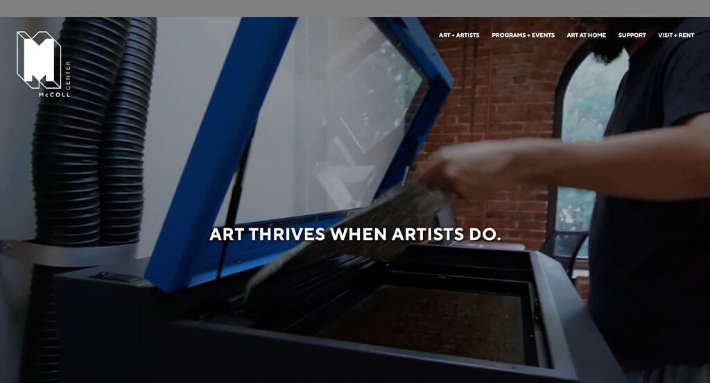
It was amazing to have a logo design that was reused in lots of different places. We really loved how they used short and straightforward paragraphs that make it easy for readers. Allowing for opportunities like co-op programs and internships was what we really loved about McColl Center.
44. Museum of Modern Art
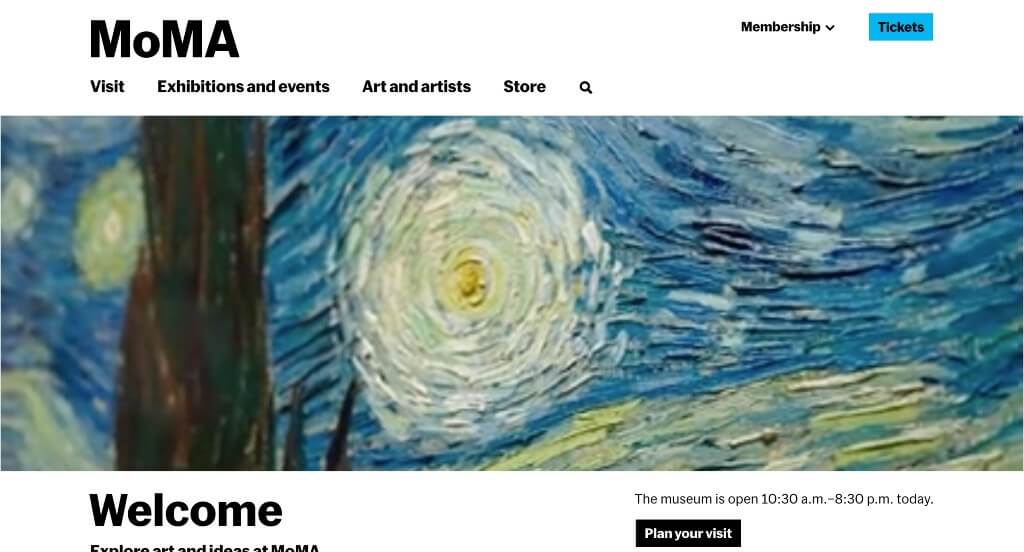
There was lots of unique pieces that are on display here. We liked that their choice in art has a variety of mediums and subjects. We really liked this creative configuration for their layout, also keeping everything organized and looking sharp. The balance of information and images was another thing we enjoyed.
45. Walker Art Center
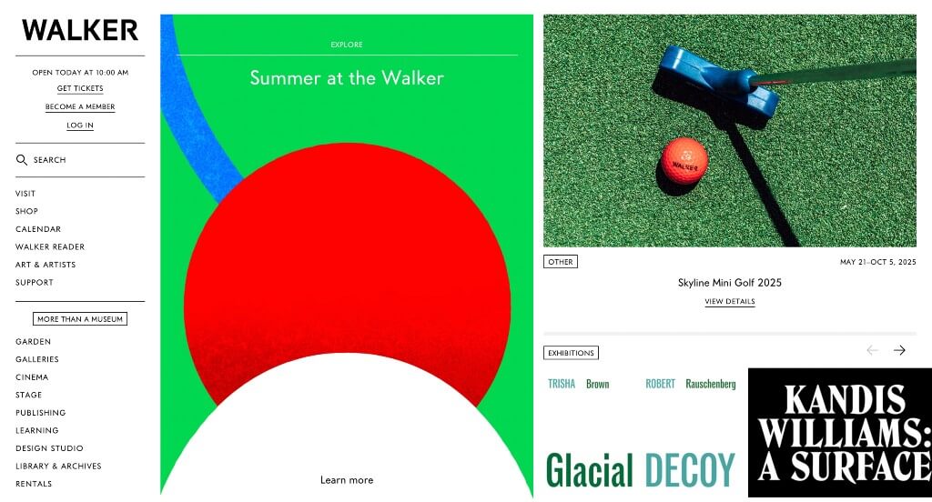
This example appeared more like a newspaper, which we really liked. There was lots of links in their menu which we felt was very helpful. A page dedicated to their Design Studio was different, helping them stand out from their competitors. Having links for buying tickets, becoming a member, and to login was smart.
46. New Museum
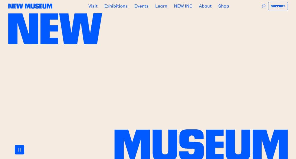
Right away, we noticed how New Museum used bold and fun fonts within their webpage. It was interesting to include a store equipped with apparel and more. There was lots of tabs within their navigation bar making it easy to find information.
47. Cleveland Museum of Art
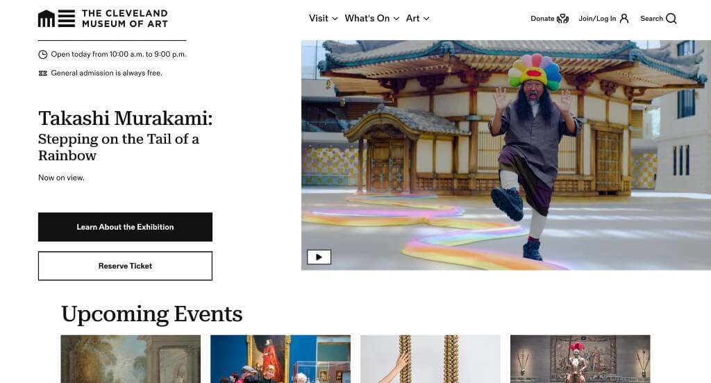
Adding in small yellow tags to show off information that is featured. Information is included for each event such as dates and locations. We liked how people could read about their restaurants, cafe, and store. A section dedicated to AI was interesting, and isn’t typical of art museums to include that.
48. MCA Denver
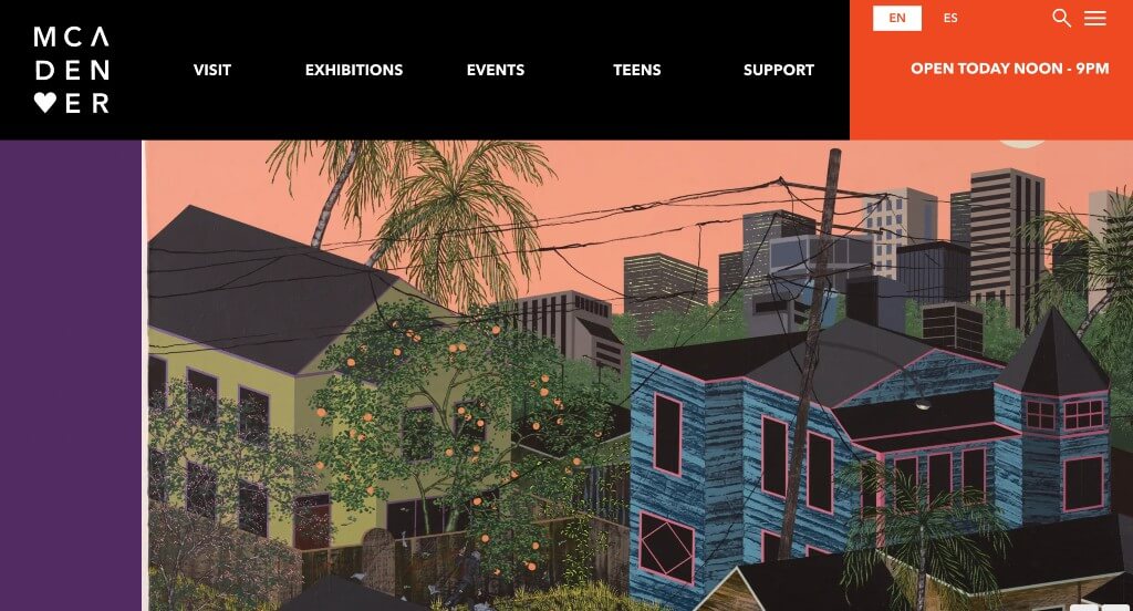
Bright flashes of purple and orange appear just to bring a little excitement to their pages. Bold capital letters are another smart choice for this example. A playful design is a nice touch for anyone looking for inspiration. This domain was simple and matched with their business name which was really nice.
49. National Museum of Mexican Art
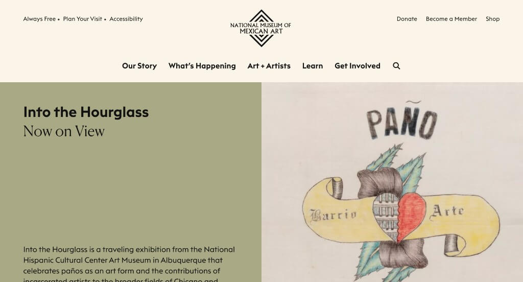
Allowing for a variety of events other than exhibits was the first thing that we noticed. Some muted colors are used in order to grab attention of customers. Large images are occasionally used which was helpful to build up their visual aspects. Simple navigation was another thing that is always important to maintain.
50. MIT Museum
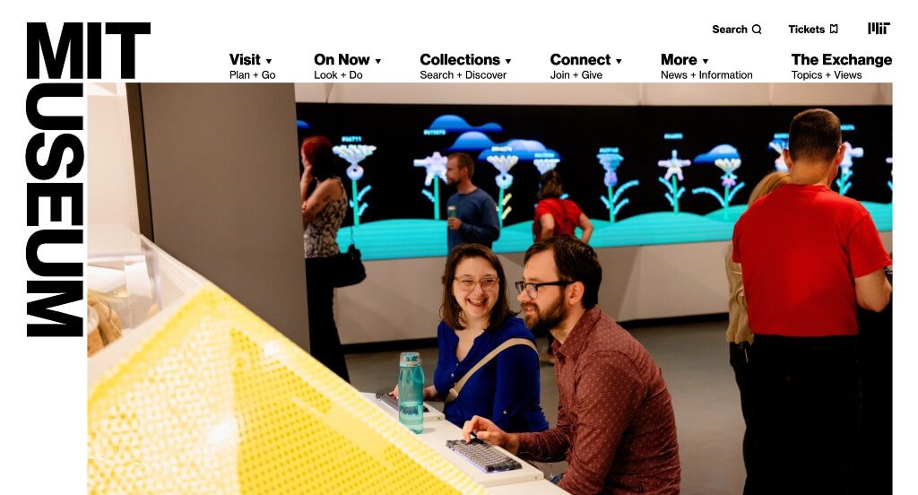
This was a great example because of their careful balance of white space along with bold fonts. We also liked how they use image frames that are sure to grab attention. This navigation bar had drop downs that made it much easier to find information within their webpage. We loved their use of bright colors that improve their visual appeal.
WordPress Museum Themes
You can find free themes at wordpress.org, or consider museum-inspired templates on ThemeForest.
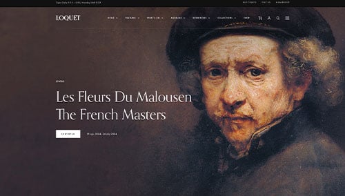
Loquet – Themeforest
$79
Musea – Themeforest
$85
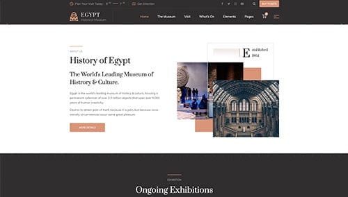
Egypt – Themeforest
$59
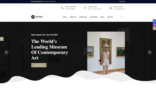
Muzex – Themeforest
$35