In the high-stakes world of enterprise e-commerce for 2026, a BigCommerce storefront is no longer just a shopping cart – it is a scalable, high-performance commerce engine. For brands operating on this Open SaaS platform, a digital presence must achieve a masterful balance: leveraging robust native functionality while offering a bespoke, brand-led user experience. To thrive in today’s competitive market, your design must move beyond standard templates to embrace “headless” flexibility and multi-storefront capabilities that allow you to reach global audiences with surgical precision.
Our team evaluated hundreds of BigCommerce installations – ranging from high-volume B2C lifestyle brands and complex B2B industrial suppliers to innovative D2C startups utilizing composable commerce architectures. We narrowed the field to the top 12 examples that represent the gold standard for the platform. Our analysis focused specifically on AI-driven product discovery, seamless ERP and CRM integrations, and the strategic use of one-page checkout optimizations that minimize cart abandonment and maximize average order value (AOV) across both desktop and mobile devices.
Whether you are an e-commerce director planning a migration from a legacy system or a scaling merchant looking to unlock the full power of the BigCommerce API, these examples provide the definitive benchmark for e-commerce design in 2026.
Note on Our Selection Process: We recently reviewed this list to ensure every featured site demonstrates a clear commitment to modern standards for page load velocity, mobile-first UX, and secure checkout protocols. This curated collection focuses on BigCommerce websites that prioritize technical stability and commercial performance, providing the most strategic value to both the merchant and the modern shopper in 2026.
Top BigCommerce Website Designs
1. Bon Bon Bon
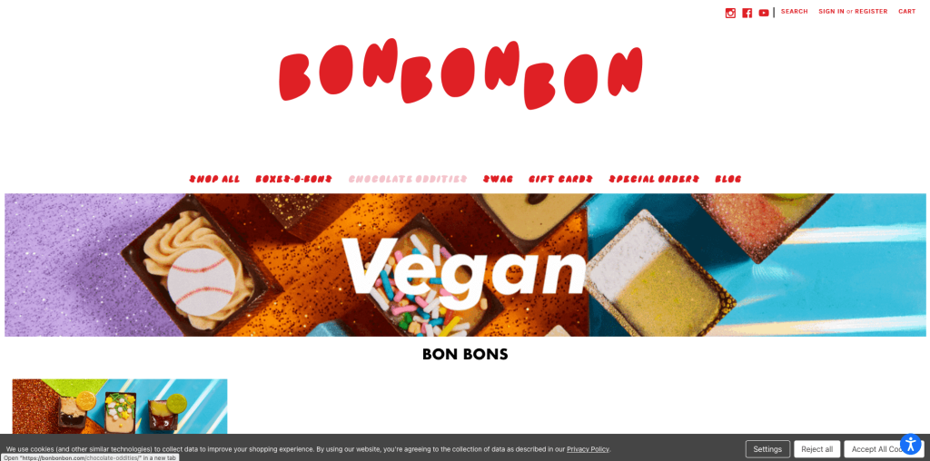
Bon Bon Bon explodes with happiness when you browse through. Bon Bon Bon takes advantage of small icons used as links, leading customers to their Instagram page. High quality photos of a variety of chocolates are added in for a mouth-watering effect. What’s helpful about this design was a ‘create your box’ feature, allowing customers to select their mix of chocolates. It was also entertaining to have small animations sprinkled throughout this site.
2. Skull Candy
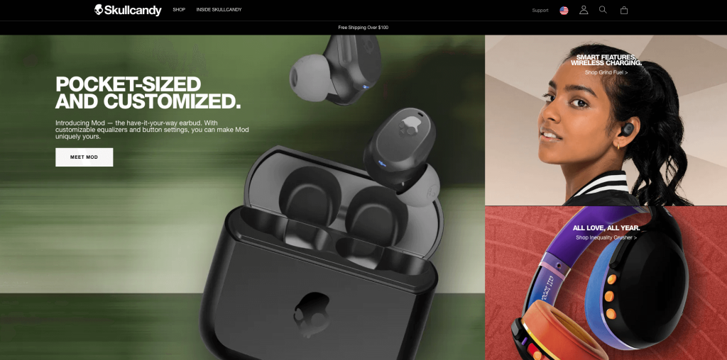
Skullcandy is a BigCommerce template we added to our examples because it has a great color selection, and is designed well. Bold fonts and small accent colors help create a modern feel. It was a smart idea to clearly label their products and prices. They also showed off their variations of each products, which was a marketing feature at best. On this homepage, some links direct can be found so you can get what you need.
3. Natori
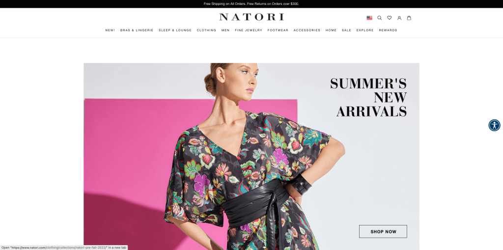
Natori is a high-end lingerie brand with a luxurious website to match. Their color scheme is elegant with muted tones of stylish colors. The design is sleek and modern, emphasizing clean lines and simple shapes. Utilizing social media photos and clips in their design was another noticeable feature. A nice touch is that the brand biography can be accessed from every site page by clicking on About Us. It was helpful to include an option to sign up for a registry because it could be useful to a decent amount of people.
4. Tyler’s
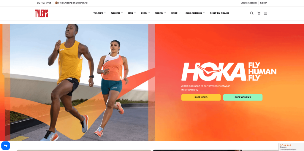
Texas pride really shows through in this example. Their overall color scheme is blue, white with a muted brown which gives it a clean and crisp look. Lots of bold, simple fonts were used to attracts customer’s attention. It was a creative addition to have a section for University of Texas apparel. Having a new arrivals section was another choice that really helped them raise their game.
5. Molton Brown
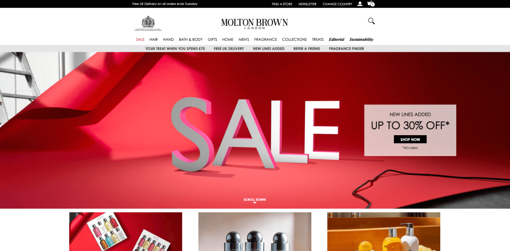
Molton Brown carries a minimalistic and modern look, focusing on products through their visuals. Their specific color palette evokes a luxurious mood, along with their product packaging. Using circle frames helped them seem different than many of their competitors. They’ve done a great job combining their branding elements without having too much going on. We liked how everything was laid out in neat little sections to quickly find what we were looking for.
6. Casio
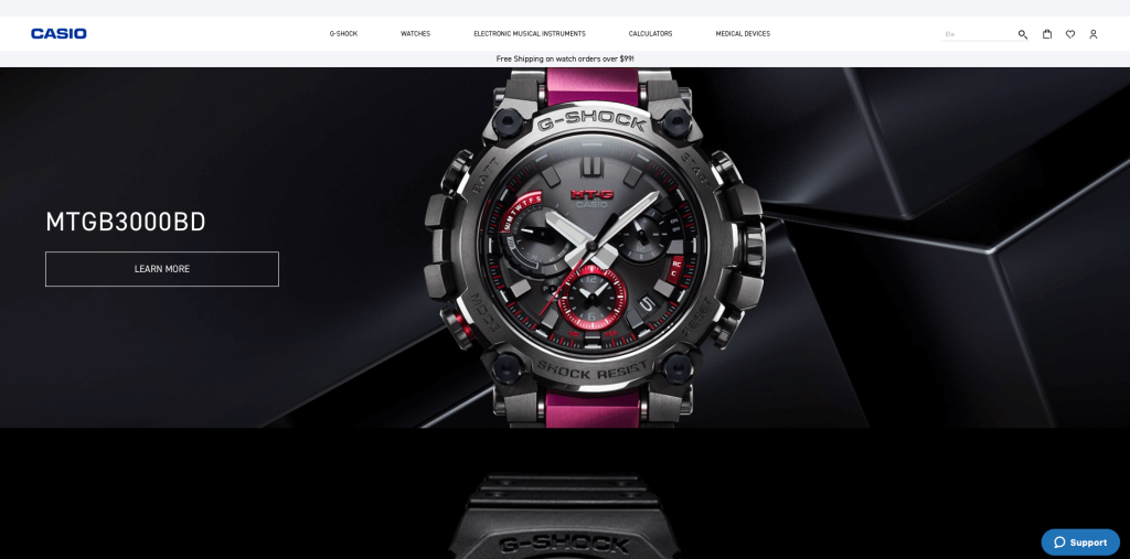
High quality and aesthetically pleasing imagery was an choice they won’t regret. Casio’s commitment to innovation and outstanding design makes it different from other electronics companies. Using bold colors is eye-catching and modern. Having a small heart icon to help customers organize their favorite watches was a logical idea.
7. Savannah Bee Company
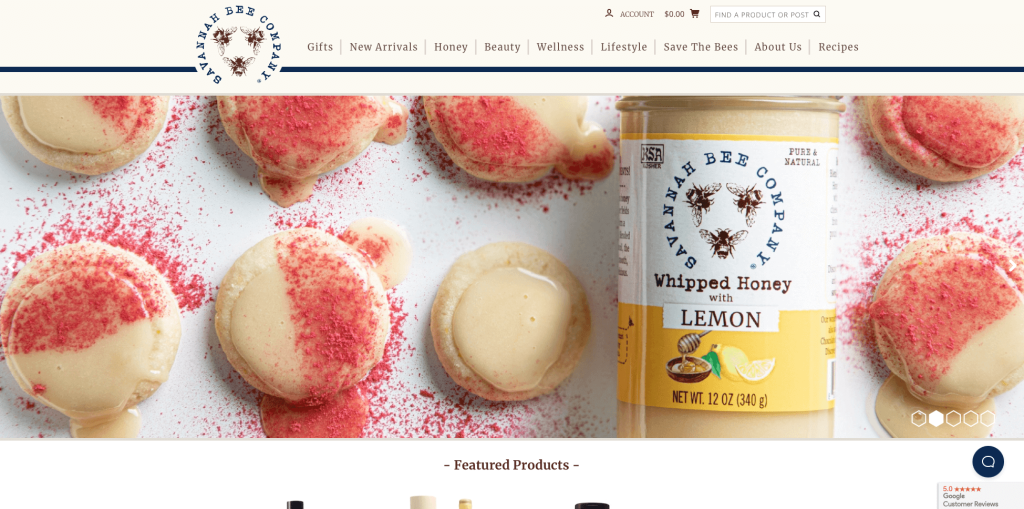
This company did an amazing job to have a complete and fitting aesthetic. Their creative fonts, hexagon honeycombs and natural color palette really created that aesthetic that really matches their business. This site stands out because it focuses on telling a story. Savannah Bee Company isn’t just selling honey – they’re selling a lifestyle. We recommend this site if you want fresh ideas about eco-friendly living and natural health products.
8. Scentos
Scentos has a fun, kid friendly design that has many bright colors and creative characters. Many different types of content are included ranging from DIY crafts to art videos. This is also very user-friendly and easy to navigate. Including an Instagram feed was another choice that was well executed. Another aspect that we felt was necessary was their link to Scentos commercial and also a section displaying stores you can locate their product.
9. Mountain Crest Gardens
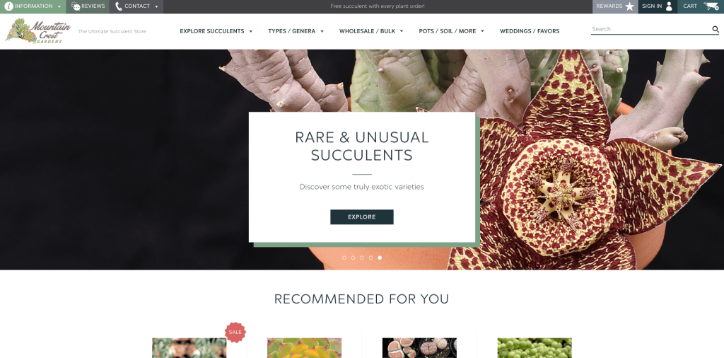
Probably the best part about this site is how straightforward Mountain Crest Gardens is with products they sell. Basic black, white and green allows for a natural feel that matches their plant sales. Having a basic template allows for their imagery to really pop out. A complex logo design points to their products just as much as their site does.
10. Balance Me
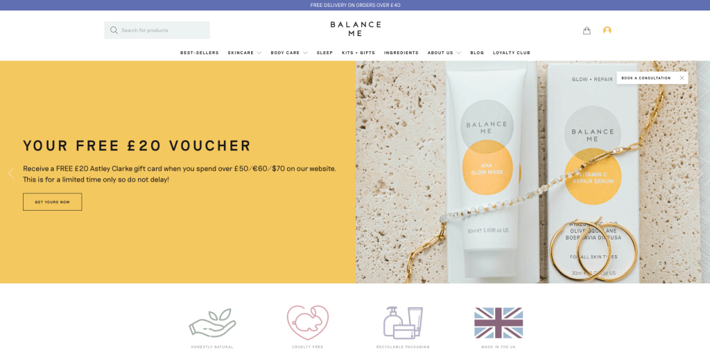
High quality videos and images helped their design stand out. As a company, they offer a wide variety of products, including skincare, haircare, and body care. Another thing that stood out was their color selection and organization. Well labeled products and pricing was another advantage that this company had. It was also good to have a clearly labeled menu.
11. Earth Easy
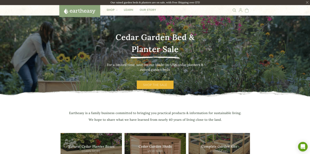
Earth Easy is all about sustainability and being eco-friendly, it says it in their name. Many greens and browns are used to prove their core goals. There are also videos to show you how to be more sustainable in your everyday life. Furthermore, pages such as “Our Story” showcase their mission statements and brand more deeply. Finally, an amazing section of articles and guides for customers to find.
12. Four Pillars Gin
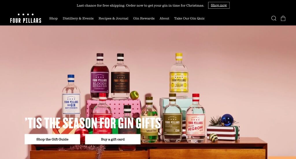
One more fantastic website on our list is Four Pillars Gin. This site is unique because of its focus on one product: gin. What’s nice about this site is that it tells the product’s story and the company behind it. The color selection and design are clean and modern, making it easy to navigate. They also have a history page about the company’s founding and mission statement. As with many websites on this list, they have an online store where you can purchase their products and explore the other spirits they produce.
Recommended BigCommerce Themes
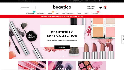
Beautica – Themeforest
$139
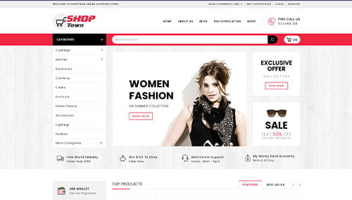
Shop Town – Themeforest
$69
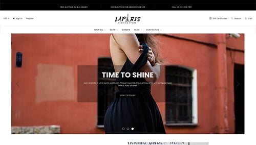
LaParis – Themeforest
$150
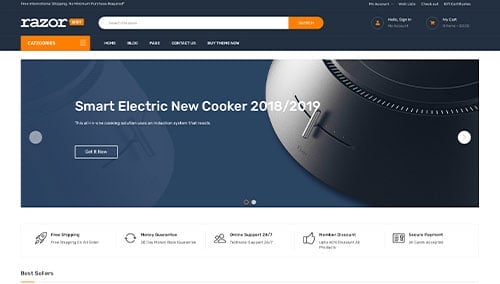
Razor – Themeforest
$139