In the legal industry, your website is your most powerful tool for establishing immediate professional authority. Before a prospective client ever schedules a consultation, they use your online presence to evaluate your firm’s expertise, your reputation, and your commitment to results. To stand out in a high-stakes market, your design must communicate sophistication, technical precision, and unwavering reliability.
Our design team evaluated hundreds of legal websites – from elite corporate firms and litigation powerhouses to specialized practices in personal injury, intellectual property, and family law. We looked for the top 13 examples that masterfully balance professional gravitas with a seamless user experience, specifically analyzing their mobile-first accessibility, attorney profile transparency, and lead-capture security.
Whether you are a solo practitioner building a boutique brand or a multi-state firm, these examples represent the gold standard for legal web design in 2026.
Note on Our Selection Process: We recently audited this guide to remove outdated designs and sites that no longer meet our standards for performance and professional branding. This curated list now focuses on the top 13 law firm websites providing the most strategic value in 2026.
The Top Attorney Website Designs
1. Barr & Douds Attorneys
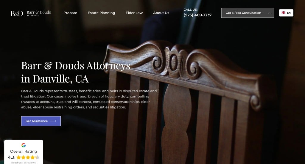
This example started out great with high quality images. Something that continued through this example was their arrangement of images to create an appealing layout. Their fonts were professional and sleek which is logical for an attorney. Displaying their service areas that are offered was a nice touch so customers don’t waste their time. Showing off their team creates comfort and builds trust with incoming customers.
2. The Prinz
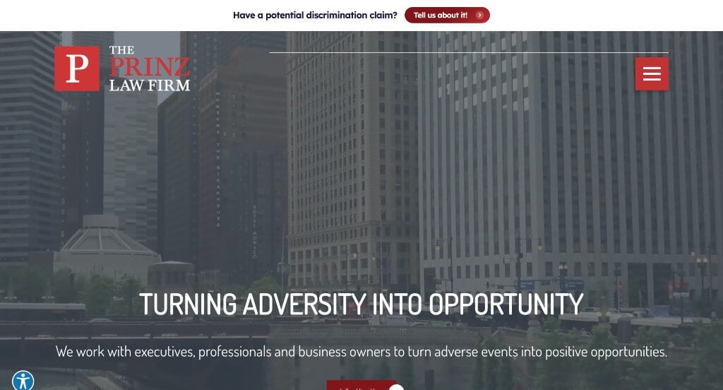
A red color scheme that grabs your attention creates a very clean, attractive layout. Something we enjoyed about this design was how there was plenty of white space along with pictures to break up information. Using buttons helps this site immensely because clients are able to navigate around easier. Also offered in this site was a google map with directions to their firm, phone numbers, plus social media icons.
3. Clifford Law Offices
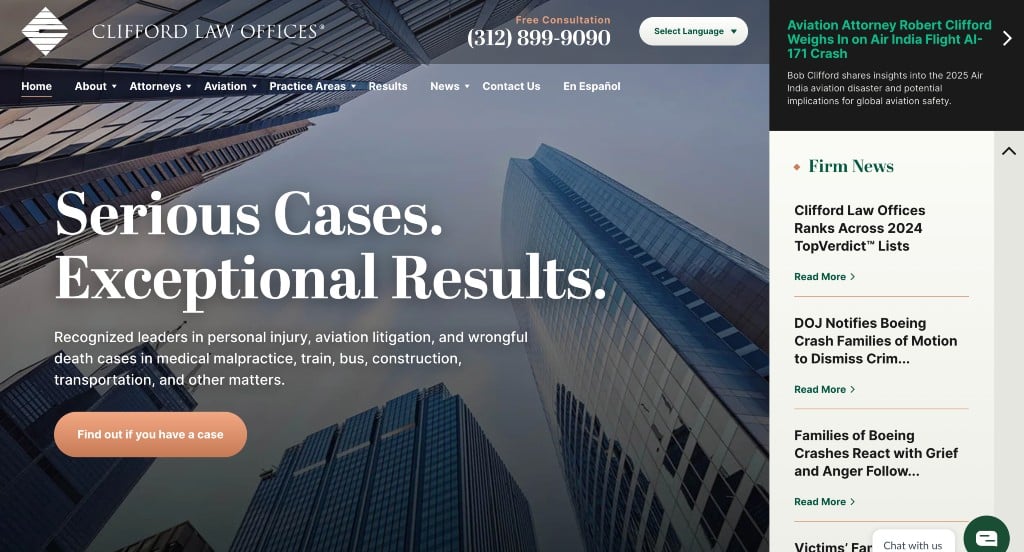
Clifford Law Offices has a custom template that is straightforward. Sharing many facts about their business really proves that. Featuring a video in this home page allows users to learn more about Clifford Law Offices. Having a layout with plenty of white space between information allows for a calming site. We also noticed how this company created a simple but interesting logo to represent their company.
4. Thorelli & Associates
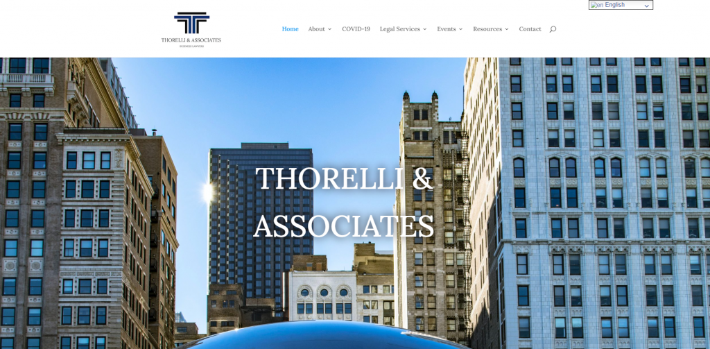
Thorelli’s website uses many different colors to separate information, which creates a nice pop of colors that isn’t distracting. Simple icons are seen throughout to help prove what services are offered. Also, a contact form can be accessed easily for customers to get in touch with them. We also liked how content in this website was organized into short and to the point paragraphs.
5. The Blankenship
This sleek law firm web design focuses on getting information out, while also keeping it simple. There is plenty of white space used throughout this layout along different color backgrounds to separate information. Also, utilizing a bright yellow scheme to highlight testimonials. We liked how there was a section to show results of past trials taken on by this company, because it’s a great way to show potential customers where your company have been successful. Another great design choice was their bold font choices.
6. NWCL
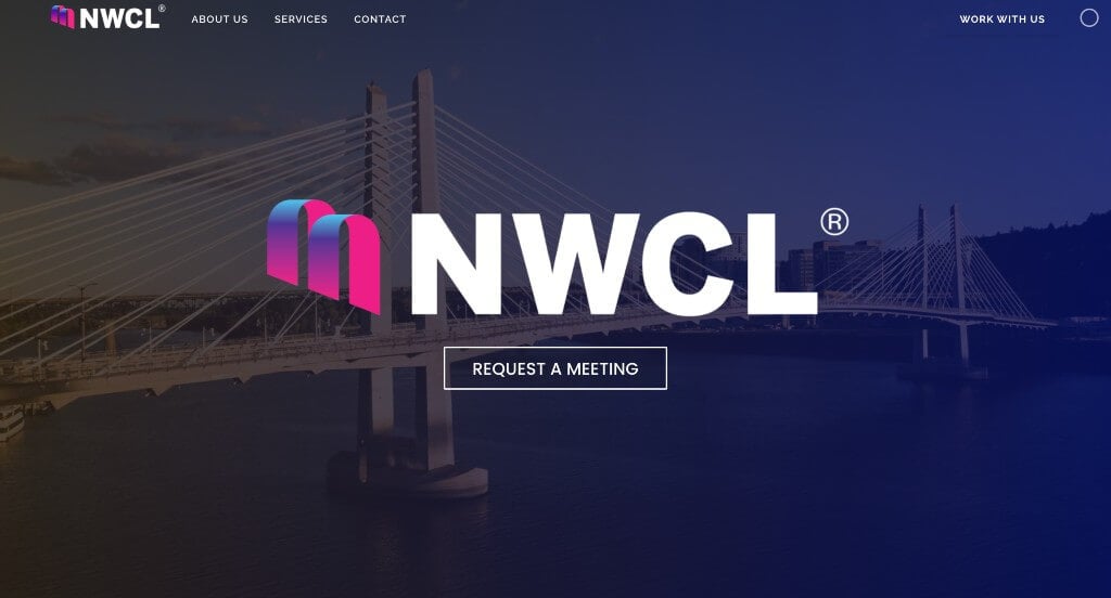
Even though this is a simple homepage, this company successfully shares who they are, what they do, and customer testimonials. Also included in NW Corporate Law was a few CTAs, looking for leads. An interesting feature that helps this site standout from its competitors is how bigger customers are shared along with linking to them into their site. Choosing a domain for their site that matches their company name was a great marketing technique.
7. Johnston Law Firm
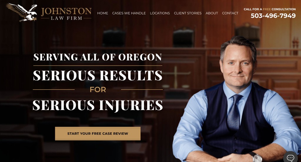
We enjoyed how Johnston Law Firm features a video on the homepage explaining them as a business, which is a great way to share information. Also in this site, different aspects of their law firm are explained throughly. Everything is kept simple along with being easy to read, in order to get as much information to customers as possible. It was also interesting to add in a large button for your free case consultation.
8. Horwitz Horwitz & Associates
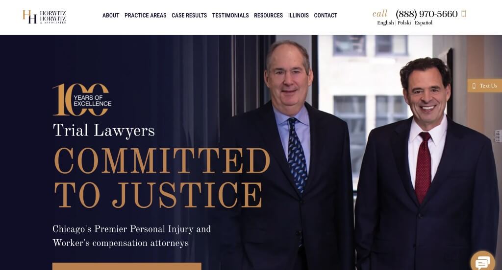
Here we have a classic blend of black, gold and blue to create a luxurious feel. Lots of information is included but it is displayed in a way that never feels cluttered. Showing off their past case results was another feature that we enjoyed. Buttons may also be noticed to help guide viewers to additional information and pages. Small patterns are added in as backgrounds or banners to break up information within their pages.
9. Piering Law Firm
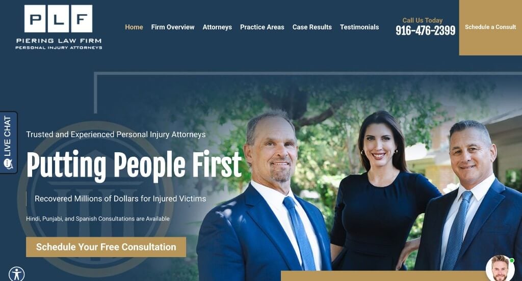
A dark blue, gold and white color scheme is used throughout this site to create a sophisticated design. We noticed how videos, images and text were well balanced. Adding in large buttons helps clients navigate through this lawyer website. Showing their logo multiple times throughout their site was something else we liked. Lastly, having an organized menu really helps viewers find information they need.
Please add a Lead Magnet.
10. Fine Law Firm
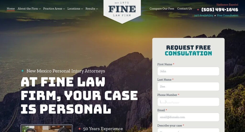
Here we have a blend of large fonts and dainty ones to create a better sense of visual hierarchy. Stunning dark blues are used as backgrounds which we love. Additionally, people might notice how there are bullet points to keep information easy to read. Along with bullet points, short paragraphs help to keep everything organized.
11. Bend Law Group

Right away we noticed how there was a simplistic logo that went with this company’s name. Adding in a blog is a choice that we always appreciate no matter the brand. Client reviews help new customers to see that they are a trustworthy, reliable business. Adding in videos along with images made for a more interesting visual appeal. Adding in a FAQ page was another feature that we really enjoyed.
Related: To get more traffic from Google’s search results, enlist the help of lawyer SEO services to get more exposure for your firm.
12. Cartwright
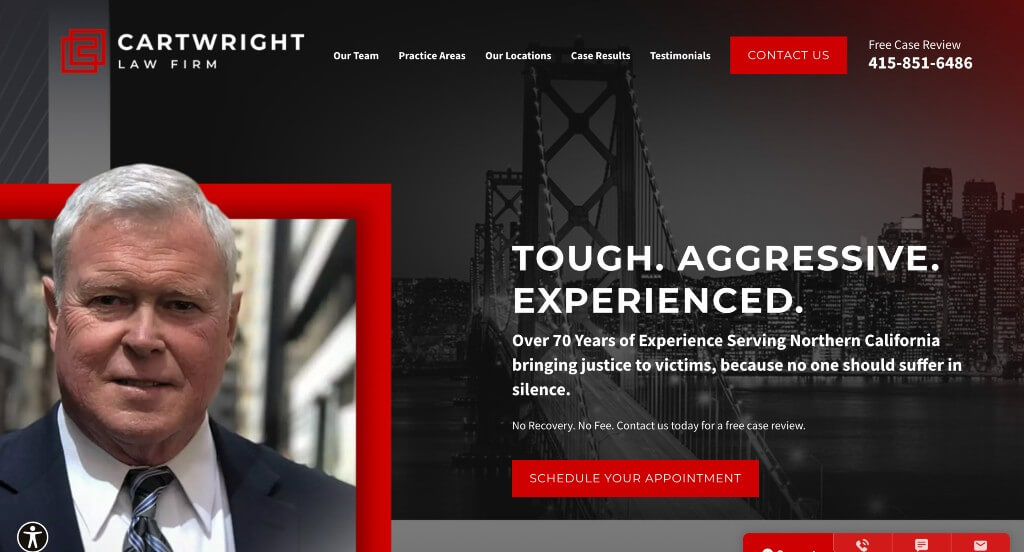
Cartwright has a very attractive layout due to their professional color scheme. Information listed in this site was very well organized as well as being easy to read. Results from past cases can be found on the main page, along with customer testimonials. Information related to their cases of interest can be found in order to decide if this is the firm for you. We also liked how videos were added in to create diversity in their content.
13. Hann
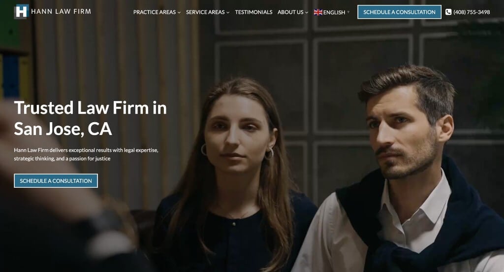
In this site, we noticed an automatically playing video displaying their team. Along with that, showing visuals for each area of practice was a feature that stood out. Including some customer testimonials that are easy to find are a must have. Other features we noticed were sticky headers, google maps, social media icons, along with a contact form.
WordPress Law Firm Themes
You can find free themes at wordpress.org or consider law firm templates at ThemeForest.
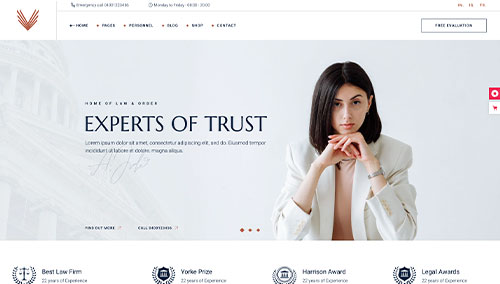
Supreme Court – Themeforest
$79
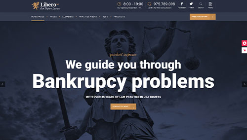
Libero – Themeforest
$79
Law Firm – Themeforest
$69

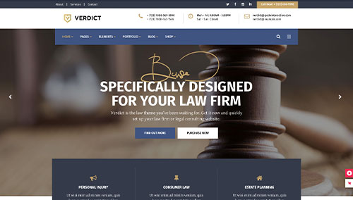
Verdict – Themeforest
$79