In the home repair and maintenance industry, your website is your digital business card and a testament to your attention to detail. Whether you are an independent craftsman or managing a multi-location franchise, your online presence must immediately communicate versatility, reliability, and professional integrity. Our design team evaluated hundreds of handyman websites to identify the top 8 examples that masterfully balance a broad service list with an easy-to-use interface. We analyzed these sites for clear service categorization, high-quality project galleries, and seamless “request an estimate” workflows.
From general home repair specialists to specialized property maintenance firms, these designs represent the benchmark for the handyman industry in 2026.
Note on Our Selection Process: We recently audited this guide to remove outdated designs and sites that no longer meet our performance standards. This curated list now focuses on the top 8 handyman websites providing the most strategic value in 2026.
Top Handyman Website Designs
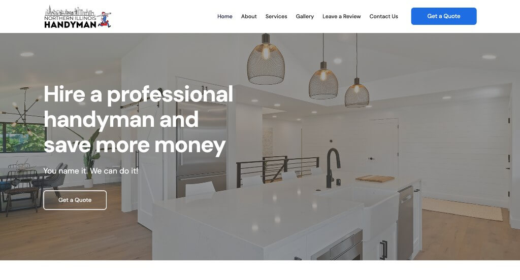
1. Northern Illinois Handyman
Why We Chose North Illinois Handyman
The North Illinois Handyman website is a benchmark for “Process Transparency and Service Differentiation.” By leading with a clear roadmap of how they work and following up with specific reasons why they outshine the competition, the site builds a logical and persuasive case for homeowners seeking reliable home repairs.
Key Design Highlights:
- Structured Client Journey: The home page showcases their simple process, providing an immediate sense of organization. By breaking down the path from the initial request to the completed project, they remove the uncertainty often associated with hiring home service contractors and set clear expectations from the start.
- Competitive Differentiation: Further down the page, they explain what makes them different from other handyman companies. This section is vital for building trust, as it allows the brand to highlight their professional standards, reliability, and specific quality benchmarks that national franchises or independent “truck-and-ladder” operations might lack.
- Verified Reputation: Google reviews are integrated on the home page to provide real-time social proof. Displaying authentic feedback from the local community allows potential customers to see a track record of success, validating the company’s claims of high-quality craftsmanship.
- Operational Clarity and Support: The service area is clearly noted on the home page, and an FAQ section addresses common homeowner concerns. This combination ensures that visitors immediately know if they are in the coverage zone and provides instant answers to logistical questions, streamlining the decision-making process.
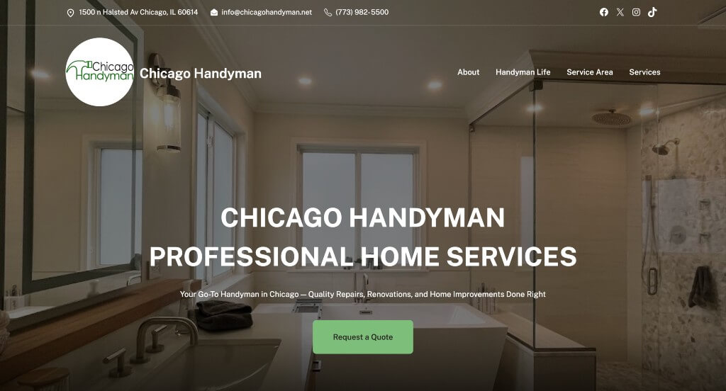
2. Chicago Handyman
Why We Chose Chicago Handyman
The Chicago Handyman website is a premier example of “Professional Transparency and Personalized Service.” By putting a face to the business and providing high-density contact information, the site creates a sense of accountability and trust that is essential for a service that requires technicians entering a client’s home.
Key Design Highlights:
- Maximum Contact Accessibility: The address, email, phone number, and social media links are all located in the top bar. This design ensures that regardless of a user’s preferred communication method, the information is immediately available without any scrolling, which is vital for both quick inquiries and establishing a physical local presence.
- Efficient Service Navigation: Right below the hero section is a list of services with short descriptions and links to more information. This “service-first” layout helps users quickly verify that their specific project – whether it’s electrical, plumbing, or general carpentry – is within the company’s expertise before they commit to reading more.
- Polished Social Proof: The site features a nice-looking Google review integration. By showcasing high-quality, authentic feedback in a visually clean format, the site leverages the “voice of the customer” to validate the quality of their craftsmanship and professional conduct.
- Humanized Brand Authority: A dedicated team member section on the home page shows pictures, names, and work experience highlights. In the home service industry, seeing the actual professionals who will be performing the work creates a significant competitive advantage, transforming the business from a nameless entity into a trusted group of local experts.
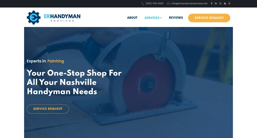
3. ER Handyman Services
Why We Chose E.R. Handyman Services
The E.R. Handyman Services website is a standout example of “Hyper-Local Commitment and Customer Education.” By focusing heavily on their dedication to the Nashville community and addressing common homeowner concerns through proactive content, the site builds a bridge of reliability and professional expertise.
Key Design Highlights:
- Immediate Reputation Proof: The site features integrated Google reviews on the home page. By showcasing high-star ratings and authentic feedback from local clients, they provide the necessary social proof to reassure new visitors of their craftsmanship and work ethic.
- Geographic Specialization: The service area is clearly described on the home page. This transparency ensures that homeowners in and around Nashville can instantly confirm their eligibility for service, which is a critical first step in the local conversion funnel.
- Defined Values and Commitment: The “Our commitment to you on every Nashville project” section provides specific reasons to choose them. This goes beyond a simple list of tasks to explain the philosophy behind their work – such as punctuality, cleanliness, and communication – helping them stand out from less formal competitors.
- Proactive Problem Solving: The inclusion of an FAQ section on the home page addresses common logistical and technical questions. By providing answers up front regarding project scope, estimates, and timelines, the site reduces the “barrier to contact” and positions the company as an organized and transparent partner for home repairs.
4. A+ Handyman
Why We Chose A+ Handyman Services
The A+ Handyman Services website is a benchmark for “Owner-Driven Trust and Geographic Transparency.” By leading with personal introductions from leadership and providing absolute clarity on their service boundaries, the site establishes a level of professional accountability that resonates deeply with Arizona homeowners.
Key Design Highlights:
- Personalized Brand Connection: Right below the hero area, there is a video featuring the company owners talking alongside footage of the team in action. This multimedia approach humanizes the brand immediately; seeing the faces behind the business and watching the crew work in real-time builds a level of “neighborhood trust” that static images simply cannot achieve.
- Dual-Format Location Clarity: The service area is showcased on the home page with both a comprehensive city list and an interactive map. This dual approach ensures that visitors can verify their location in whatever way is most intuitive for them, while also providing a significant boost to their local search relevance.
- Verified Reputation Loop: The site features integrated Google reviews on the home page, followed immediately by a contact form above the footer. This creates a powerful “conversion sandwich” – the user sees the high-quality proof of work and is then given the immediate opportunity to reach out while that trust is at its peak.
- Professional Service Architecture: The well-laid-out service area categorizes their offerings clearly, making it easy for homeowners with a “to-do list” to see that the company is a one-stop shop for diverse maintenance and repair needs.
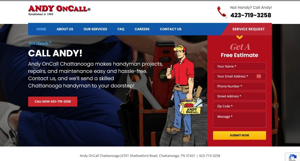
5. Andy OnCall
Why We Chose Andy OnCall
The Andy OnCall website is a premier example of “High-Accessibility and Informative Engagement.” By prioritizing immediate lead generation and providing multiple ways for customers to get answers, the site creates a frictionless experience that caters perfectly to busy homeowners.
Key Design Highlights:
- Immediate Action Hero: The hero section features a “Free Estimate” form right at the top. By placing the primary call-to-action front and center, the site captures high-intent visitors immediately, allowing them to start their project inquiry without searching for a contact page.
- Persistent Mobile Conversion: The site utilizes a sticky footer containing both a phone number and a “Get a Quote” button. This ensures that as a user scrolls through the content, the ability to take action remains permanently accessible at the bottom of the screen, which is especially critical for mobile users.
- Dynamic Service Discovery: There is an “Our Services” slider that provides brief descriptions of their various offerings along with links to more info. This interactive element allows the site to showcase a wide range of handyman capabilities – from carpentry to tile work – in a compact space that doesn’t overwhelm the user.
- Proactive Customer Support: The inclusion of an FAQ section directly on the home page helps demystify the handyman hiring process. By answering common questions regarding pricing, scheduling, and project types, the site builds trust and reduces the mental hurdles that might otherwise prevent a customer from reaching out.
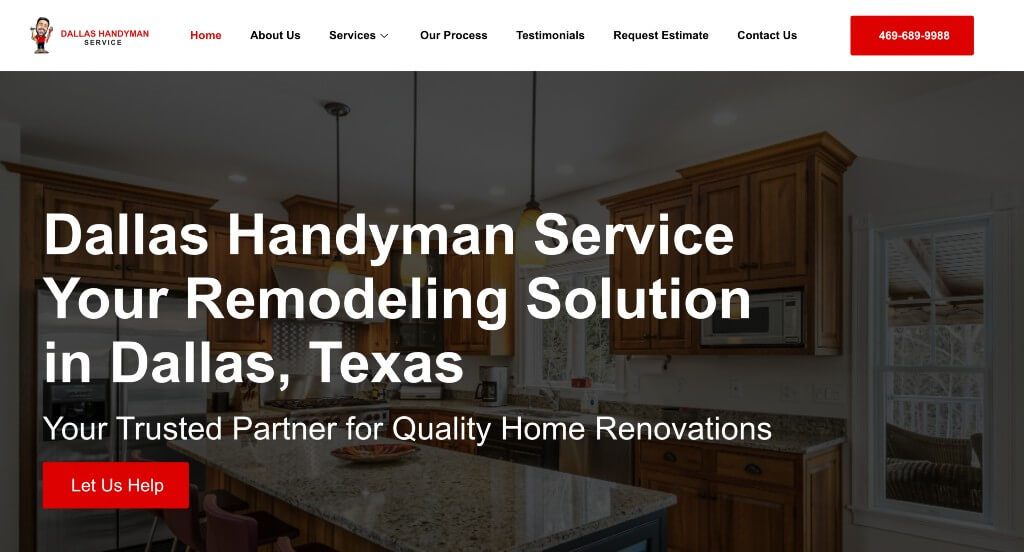
6. Dallas Handyman Service
Why We Chose Dallas Handyman Service
The Dallas Handyman Service website is an excellent example of “Interactive Professionalism and Process Transparency.” By using modern design elements to reveal information and providing a clear roadmap for their service, the site effectively lowers the barrier to entry for homeowners looking for a reliable contractor.
Key Design Highlights:
- Interactive Service Discovery: The services section features hover animation effects that reveal more information when you hover over the tiles. This “discovery” mechanic keeps the initial layout clean and uncluttered while providing deep-dive details only when the user shows interest, making for a more engaging and modern browsing experience.
- Targeted Value Proposition: A dedicated “Why Choose Dallas Handyman Service” section explicitly outlines their competitive advantages. By speaking directly to their local expertise and professional standards, the company differentiates itself from general national franchises and independent, unvetted labor.
- Strategic Client Roadmap: The “Our Process” section provides a clear insight into what to expect from the moment of contact to project completion. This type of transparency is vital in the home service industry, as it helps alleviate the common anxiety homeowners feel regarding timelines, communication, and hidden costs.
- Dynamic Social Proof: The site utilizes a testimonial slider on the home page to showcase customer success stories. This format allows the company to present a high volume of social proof without taking up excessive vertical space, keeping the homepage compact while still validating their craftsmanship.
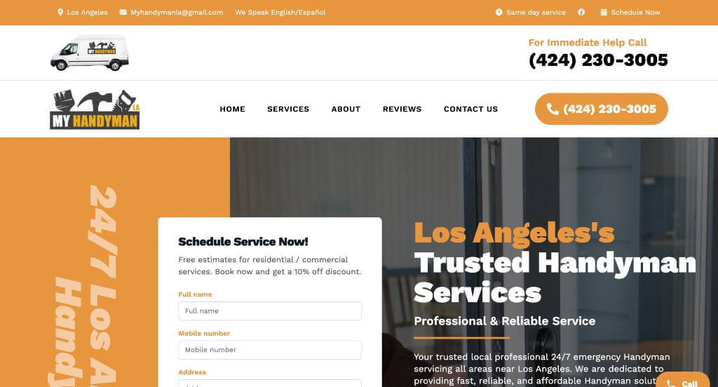
7. My Handyman LA
Why We Chose My Handyman LA
The My Handyman LA website is a standout example of “Conversion-First Design and Verified Reliability.” By focusing on immediate scheduling and leveraging the power of dual-platform social proof, the site creates a professional and efficient environment for Los Angeles residents seeking home repairs.
Key Design Highlights:
- Frictionless Scheduling: The site features a form to schedule a service right in the hero area. This “above the fold” placement respects the user’s time, allowing them to book a technician immediately without having to navigate through multiple pages or search for a contact link.
- Dual-Platform Social Proof: Google and Yelp reviews are integrated directly on the home page. In a competitive market like Los Angeles, displaying verified feedback from the two most trusted review platforms provides a massive credibility boost, reassuring homeowners of the company’s consistent quality and customer service.
- Comprehensive Service Catalog: A robust service list is featured on the home page, with each category linked to more detailed information. This allows the company to showcase their versatility – covering everything from plumbing and electrical to furniture assembly – while providing a deep dive for users with complex project needs.
- Mobile-Optimized Accessibility: The mobile view keeps the phone number prominent in the header at all times. This “always-on” contact method is essential for users on the go, ensuring that a professional handyman is just a single tap away during a home maintenance emergency.
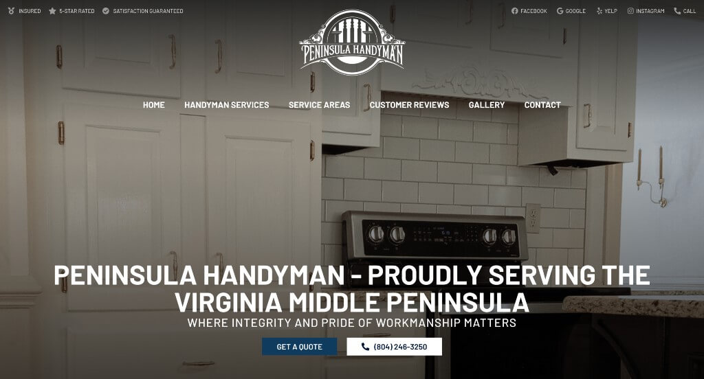
8. Peninsula Handyman
Why We Chose Peninsula Handyman
The Peninsula Handyman website is a premier example of “Operational Integrity and Multi-Step Transparency.” By clearly defining their three-step process and emphasizing their high standards for technician conduct, the site creates a secure and professional environment for homeowners in the Virginia Middle Peninsula.
Key Design Highlights:
- Three-Step Engagement Roadmap: The site features a clearly defined process (Step 1: Request a virtual quote; Step 2: Review and estimate; Step 3: Complete the work). By outlining exactly how a project moves from inquiry to execution, the site removes “process friction” and sets realistic expectations for new customers.
- Defined Professional Standards: The “About” section showcases specific company values, such as being clean, background-checked, drug-free, and tobacco-free. In a service industry where technicians enter a client’s home, these explicit “peace-of-mind” signals are powerful trust-builders that differentiate them from less formal competitors.
- Extensive Service Versatility: The home page and service pages provide an exhaustive list of capabilities, from cabinet repair and carpentry to junk removal and rot repair. This wide-ranging list, paired with the invitation to “send an estimate request even if you don’t see your town,” positions them as a versatile “one-stop shop” for any home repair need.
- Quality and Satisfaction Guarantees: The site prominently features a 1-year labor guarantee and a satisfaction guarantee. These bold accountability signals, combined with a blue accent-heavy design that feels clean and reliable, reinforce their status as the #1 rated handyman service in their region.
WordPress Handyman Themes
You can find free themes at wordpress.org, or consider handyman-inspired templates on ThemeForest.
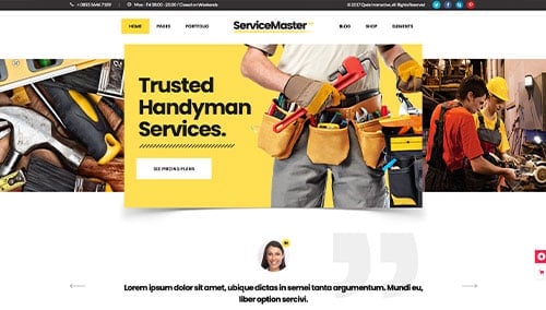
Service Master – Themeforest
$85
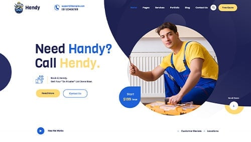
Hendy – Themeforest
$69
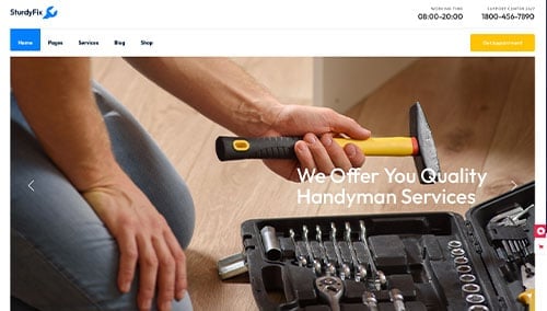
SturdyFix – Themeforest
$79
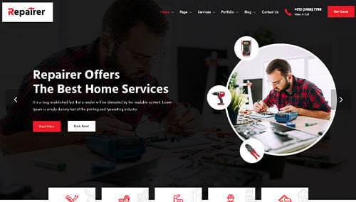
Repairer – Themeforest
$29