In the rapidly evolving landscape of integrative medicine, your website is more than a digital business card – it is a reflection of your clinical philosophy and the patient experience you provide. For an acupuncture practice to thrive in 2026, its online presence must bridge the gap between ancient tradition and modern healthcare professionalism. To win the trust of new patients, your design must communicate clinical authority, holistic wellness, and a high-end patient experience.
Our design and UX team analyzed hundreds of acupuncture websites – from boutique solo practices and community clinics to large-scale integrative wellness centers. We identified the top 10 examples that masterfully balance serene aesthetics with high-performance functionality, specifically analyzing their mobile-first appointment scheduling, educational content depth, and the effective use of patient success stories.
Whether you are launching a new clinic or modernizing an established practice, these examples represent the current benchmark for acupuncture web design in 2026.
Note on Our Selection Process: We recently audited this guide to ensure every featured site meets our 2026 standards for speed, security, and mobile accessibility. This curated list focuses on the top 10 acupuncture websites providing the most strategic value to practitioners today.
Top Acupuncture Website Designs
- 1. Yinova Center
- 2. Advance Health & Wellness
- 3. Solstice Acupuncture
- 4. Minnesota Integrative Medicine & Acupuncture
- 5. Elledge Chiropractic & Acupuncture
- 6. Gotham Holistic
- 7. The Healing Blossom: Acupuncture & Wellness
- 8. Yedam Korean Medicine Clinic
- 9. Copper Wellness
- 10. Good Medicine Acupuncture & Massage
1. Yinova Center
Why We Chose The Yinova Center
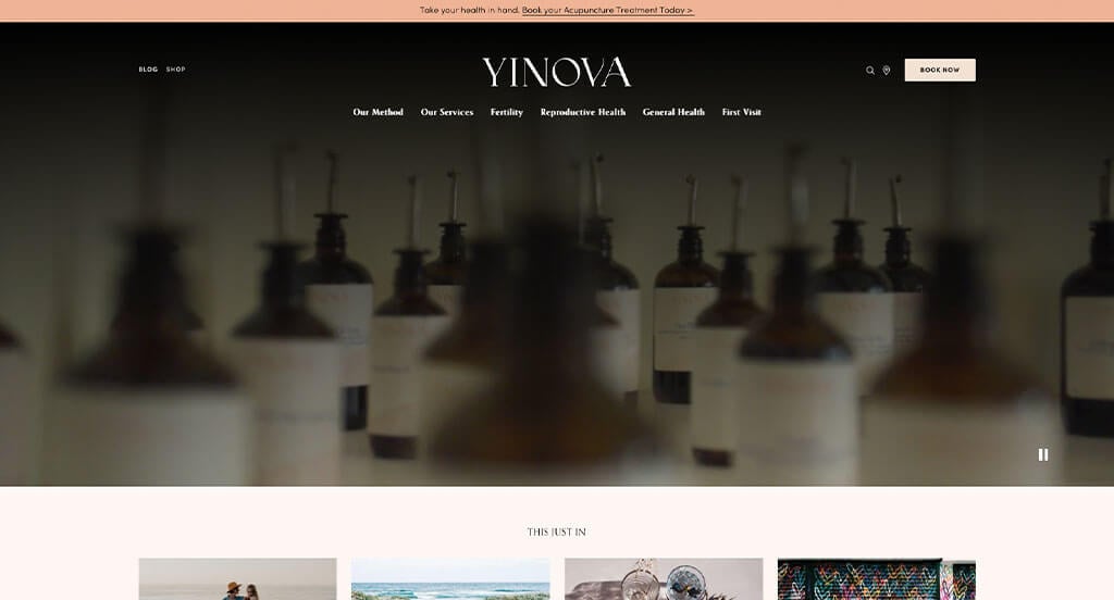
The digital space for The Yinova Center serves as a premier benchmark for “Bespoke Wellness Merchandising and High-Intent Patient Conversion Architecture.” In the competitive clinical wellness and holistic medicine landscape, an online platform must instantly bridge the gap between traditional clinical authority and deeply personalized patient care. The website achieves this masterfully, leveraging a warm, minimal layout that organizes complex medical treatments into clear, comforting paths to comfortably guide new patients from initial health curiosity to their first booked appointment.
Key Design Highlights:
- Personalized Condition-Specific Care Frameworks: Rather than presenting a generic list of alternative medicine services, the homepage explicitly highlights customized treatment plans tailored to a wide range of specific health journeys. Transparently breaking down tailored approaches for fertility support, chronic pain management, emotional health, and general wellness immediately reassures visitors that their unique clinical needs will be met with a bespoke protocol.
- Persistent, Conversion-Optimized Sticky Booking Menus: Keeping the primary patient onboarding route effortlessly accessible, the site utilizes a sleek sticky header featuring a prominent “Book Now” action. As users scroll through educational wellness content or read about clinical philosophies, the ability to schedule a consultation remains anchored at the top of the viewport, removing all friction when a patient decides to take action.
- Streamlined, Simplistic Desktop Mega Menus: Managing a deep catalog of clinical services, locations, practitioners, and educational resources without overwhelming the user is achieved through a beautifully restrained mega menu. Hovering over the main navigation reveals a clean, spacious drop-down directory that organizes options into intuitive columns, preventing choice paralysis while maintaining a calm, premium browsing experience.
- Integrated Patient Validation and Success Showcases: Overcoming natural consumer hesitation regarding clinical outcomes is handled smoothly by embedding verified patient reviews directly on the homepage. Spotlighting authentic success stories and personal transformations within the primary narrative flow provides crucial peer validation, reinforcing the center’s reputation for compassionate care and real-world clinical results.
2. Advance Health & Wellness
Why We Chose Doctors 24/7
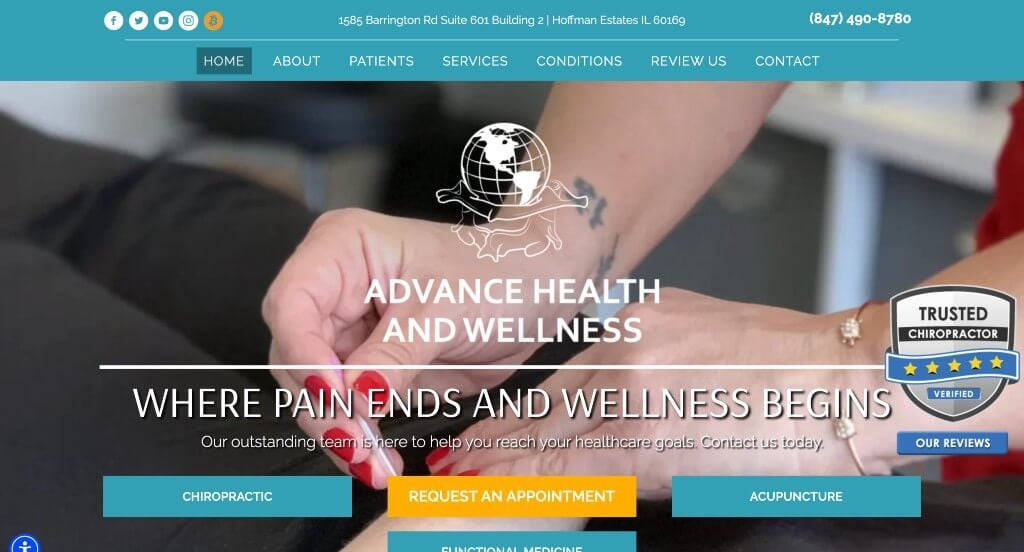
The digital presence for Doctors 24/7 serves as a premier benchmark for “High-Conversion Integrative Medical Merchandising and Holistic Patient Onboarding Architecture.” When patients seek chiropractic relief or alternative medicine, they often arrive either in acute physical discomfort or with a high degree of curiosity about unfamiliar treatments. The layout addresses both mindsets perfectly, utilizing high-contrast call-to-actions alongside approachable educational modules to turn casual, pain-ridden researchers into confident, booked patients.
Key Design Highlights:
- High-Contrast, Friction-Free “Request an Appointment” Anchors: Recognizing that a massive portion of their traffic arrives looking for fast relief, the header features a large, bright orange “Request an Appointment” button. This bold, high-contrast design choice ensures the primary action path is instantly visible the second the page loads, making it incredibly simple for users in pain to initiate a consultation without any clicking around.
- Patient-Centered “How Can Chiropractic Care Help You?” Portals: Instead of listing clinical modalities in a vacuum, the homepage dedicates a core section to answering the exact questions patients ask. By transparently framing what they offer around real-world solutions – explaining how adjustments target specific alignments, alleviate pain, and restore mobility – the copy immediately validates the user’s symptoms and maps out a clear path to recovery.
- Bite-Sized, Approachable Acupuncture Heritage Context: Demystifying holistic treatments that new patients might be nervous about is handled brilliantly via a brief history of acupuncture directly on the homepage. Introducing the time-tested background and therapeutic philosophy of the practice in a short, easy-to-read section builds immense clinical authority and lowers the psychological barrier to trying a new treatment path.
- Integrated Support Peer-Validation Hubs: Overcoming natural skepticism surrounding spinal adjustments and holistic medicine is handled smoothly by embedding verified client reviews directly on the homepage scroll path. Showcasing real stories of pain relief and patient success provides crucial local proof, giving prospective patients the confidence they need to press that big appointment button.
3. Solstice Acupuncture
Why We Chose Solstice Acupuncture
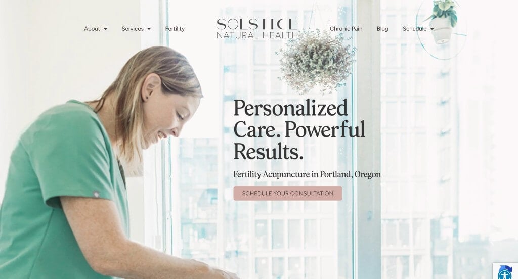
The digital presence for Solstice Acupuncture serves as a premier benchmark for “Intimate Boutique Wellness Merchandising and Practitioner-Led Trust Architecture.” For independent acupuncture and holistic medicine practices, a website must act as a digital reflection of the treatment room itself – calm, personal, and profoundly reassuring. The layout achieves this standard beautifully, blending targeted clinical education with founder-focused storytelling to transform apprehensive, pain-ridden visitors into confident, comfortable patients.
Key Design Highlights:
- Condition-Targeted “Our Treatments” Resource Hubs: Rather than listing eastern medicine modalities in a vacuum, the homepage features a dedicated “Our Treatment” section that clearly maps out exactly what conditions they can alleviate. Explicitly grouping their clinical focus areas – such as chronic pain, stress, digestive issues, and women’s health – allows prospective patients to instantly connect their personal symptoms to real-world holistic solutions.
- Founder-Led Clinical Philosophy and Trust Frameworks: Recognizing that alternative medicine requires an immense amount of personal comfort with the practitioner, the homepage incorporates a prominent biographical profile detailing the acupuncturist. Sharing the face, background, and specific healing philosophy behind the needles humanizes the clinic, lowering the psychological barrier to entry and building instant rapport before a patient ever steps foot in the office.
- Integrated Support Peer-Validation Hubs: Reinforcing their local clinical reputation and validating their treatment outcomes is handled smoothly by embedding verified customer testimonials directly into the primary scroll path. Showcasing authentic stories of pain relief, stress reduction, and compassionate care provides crucial social proof that validates their expertise and reassures skeptical newcomers.
- Frictionless Front-Page Booking and Communication Channels: Maximizing conversion opportunities and respecting the user’s time, the homepage integrates a clean contact form alongside clear, direct contact details at the base of the scroll. Placing these communication tools directly on the main page eliminates the friction of navigating through submenus, making it incredibly simple for a visitor to ask a quick question or initiate an appointment right when their intent is highest.
4. Minnesota Integrative Medicine & Acupuncture
Why We Chose MIMA Clinic
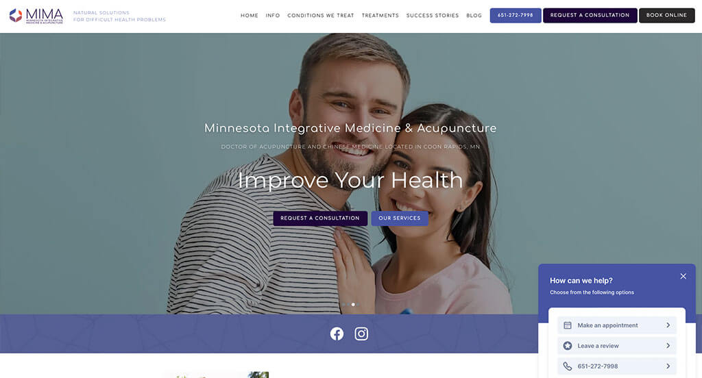
The digital storefront for MIMA Clinic serves as a premier benchmark for “High-Touch Clinical Luxury and Conversion-Optimized Patient Architecture.” In the premium aesthetic, wellness, and medical dermatology space, a website must reflect the absolute pristine quality of the physical facility while operating as a high-performance patient acquisition tool. The layout masters this dual demand, seamlessly blending an immersive virtual tour with highly strategic, layered booking access points to turn aesthetic inspiration into confirmed consultations.
Key Design Highlights:
- Immersive Cinema-Grade Interior Video Showrooms: Instantly overcoming the anxiety or hesitation patients often feel when choosing a new clinical environment, the homepage features a high-fidelity video walkthrough showcasing the inside of their clinic. Giving prospective patients a crystal-clear look at the clean, ultra-modern design, high-end equipment, and soothing treatment rooms establishes a sense of immediate luxury and medical safety before they ever step through the door.
- Persistent, Double-Action Sticky Onboarding Headers: Maximizing every opportunity for patient conversion, the layout utilizes a sleek sticky header equipped with two distinct, high-priority actions: a “Book Online” button and a “Request Consultation” button. Keeping both path options anchored at the top of the viewport during the entire scroll ensures that whether a patient is ready to instantly claim a time slot or needs an initial conversation, the next step is always a single click away.
- Layered, High-Utility Floating Action Matrices: Beyond the standard header, the site implements a smart, unobtrusive pop-up overlay anchored in the bottom right corner of the screen. This floating widget aggregates critical quick-actions – allowing users to effortlessly book an appointment, leave a review, or place a direct phone call – providing a mobile-friendly safety net that stays within perfect thumb reach as users explore the site.
- Practitioner-Led Credibility and “Meet the Team” Portals: Solidifying their professional authority and humanizing the clinical brand, the homepage includes a dedicated “Meet the Team” showcase. Highlighting the faces, specialized credentials, and distinct professional backgrounds of their practitioners builds vital clinical trust, reassuring patients they are placing their health and aesthetic goals in highly skilled, accountable hands.
5. Elledge Chiropractic & Acupuncture
Why We Chose Elledge Chiropractic & Acupuncture
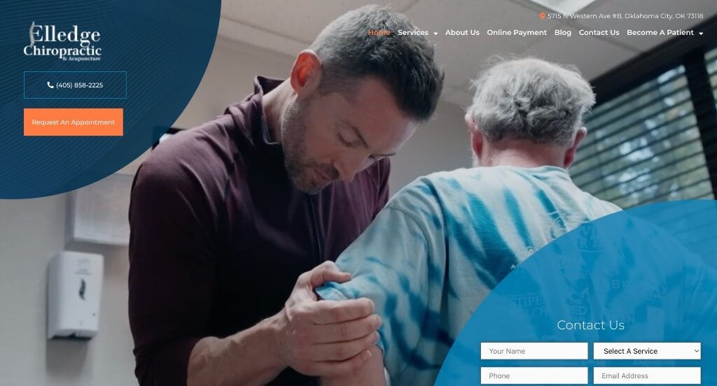
The digital presence for Elledge Chiropractic & Acupuncture serves as a premier benchmark for “High-Trust Clinical Merchandising and Hyper-Validated Patient Conversion Architecture.” In the competitive local chiropractic and physical wellness sectors, a website’s primary job is to lower consumer skepticism regarding spinal adjustments while making clinical capabilities incredibly transparent. The platform executes this beautifully, layering multi-tiered social proof with interactive treatment summaries and genuine facility insights to turn pain-ridden researchers into confident new patients.
Key Design Highlights:
- Cinematic Facility and Clinical Treatment Hero Showrooms: Immediately upon entry, the homepage sets a professional and dynamic tone through an integrated hero video loop. By showcasing high-fidelity footage of their clean, modern facility alongside active clips of clinicians performing precise adjustments, the video builds immediate clinical authority and visually prepares new patients for what to expect during their first visit.
- Layered, Multi-Tiered Social Proof and Validation Channels: Overcoming the natural hesitation many individuals feel toward chiropractic care is achieved through an aggressive, dual-layer review system. The site pairs a persistent, subtle review pop-up utility in the lower-left corner of the viewport with a dedicated, deep-dive testimonial slider further down the homepage narrative, ensuring that local peer validation backs up every scroll.
- Interactive, Space-Saving Treatment Slider Modules: To present a diverse menu of physical therapies – such as chiropractic adjustments, acupuncture, and corrective exercises – without overwhelming the page with dense walls of text, the site implements an elegant treatment carousel directly on the homepage. This interactive slider allows users to quickly swipe through their operational capabilities, matching their specific pain points to real-world clinical solutions.
- Front-Page Patient Empowerment and Clear FAQ Matrices: Addressing common patient concerns, insurance questions, and treatment expectations before they become roadblocks to booking, the homepage features a clean, structured Frequently Asked Questions section. Providing these clear, transparent answers directly on the landing path educates the user, reduces phone inquiries, and removes the final friction points standing between a visitor and a scheduled appointment.
6. Gotham Holistic
Why We Chose Gotham Holistic
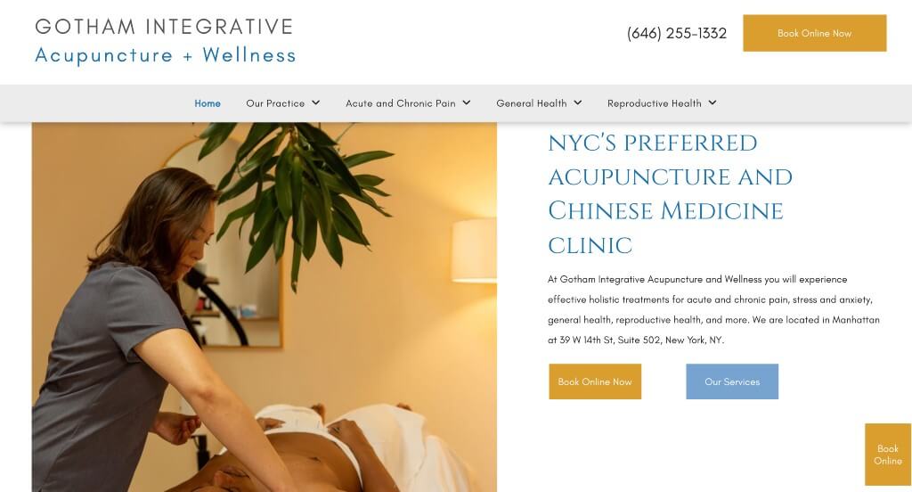
The digital home for Gotham Holistic Acupuncture and Integrative Medicine serves as a premier benchmark for “High-Transparency Wellness Merchandising and Friction-Free Conversion Architecture.” When prospective patients search for holistic healthcare or acupuncture, they are often looking for two things simultaneously: clear medical trust and straightforward logistics. The website excels at removing the guesswork from the onboarding process by placing pricing structures, distinct value metrics, and highly accessible booking routes right on the front page, turning curious researchers into booked patients.
Key Design Highlights:
- Layered, Double-Action “Book Now” Conversion Portals: Maximizing every opportunity to secure appointments, the platform implements a dual-layer scheduling layout. It pairs a prominent, high-visibility “Book Online” button in the primary header with a persistent, floating “Book Now” button overlay anchored to the right side of the screen. This ensures that no matter how far down the page a user scrolls to research treatments, a direct path to secure a slot remains exactly one click away.
- Upfront, Transparent Financial and Pricing Blueprints: In an industry where medical fees are frequently hidden behind confusing consultation steps, the homepage stands out by featuring clear pricing details directly in the primary scroll path. Providing this upfront financial transparency builds immediate consumer trust, respects the visitor’s time, and eliminates the hidden-cost anxieties that often cause prospective patients to abandon a healthcare website.
- Value-Driven “Why Choose Us” Core Identity Frameworks: The website clearly separates its clinical practice from competitors through a dedicated “Why Choose Us” narrative section on the homepage. By organizing their specialized credentials, treatment philosophies, and patient-centered approaches into clean, scannable value points, the copy quickly educates users on what makes their holistic care unique and effective.
- Integrated Support Peer-Validation Hubs: To balance their clinical data with real-world emotional reassurance, the homepage features a smooth Google Reviews slider. Showcasing authentic, multi-star testimonials from local neighbors experiencing real health transformations provides powerful social proof, giving hesitant newcomers the peace of mind they need to finalize their booking.
7. The Healing Blossom: Acupuncture & Wellness
Why We Chose The Healing Blossom
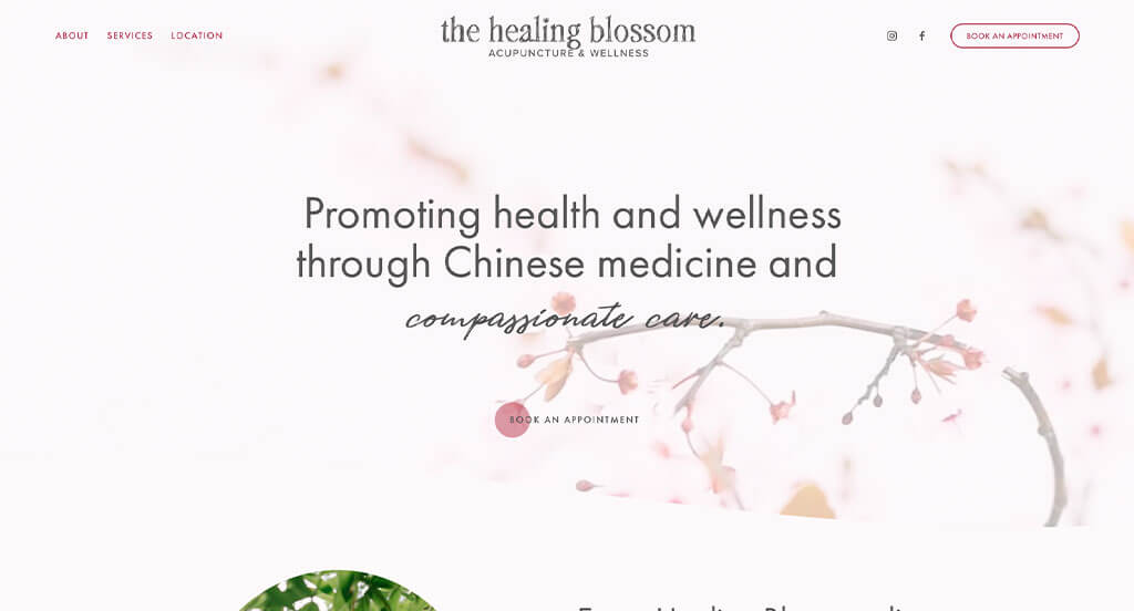
The digital space for The Healing Blossom serves as a premier benchmark for “Bespoke Holistic Merchandising and High-Identity Wellness Architecture.” For boutique healing practices and alternative therapies, a website must feel completely distinct from cold, sterile medical portals. The interface captures this artistic balance perfectly, leaning into custom typography choices and a single-page structure that neatly maps out their healing services, local praise, and direct scheduling paths to guide visitors seamlessly from curiosity to comfort.
Key Design Highlights:
- High-Identity, Emotionally Grounded Typography Frameworks: Breaking away from standard, corporate digital layouts, the website utilizes a highly unique and intentional font pairing strategy across the homepage. This expressive typographic choices immediately establishes a signature visual identity that mirrors the calming, artisanal, and authentic nature of their holistic healing environment, putting the visitor in a serene state of mind right from the first headline.
- Unified, Friction-Free Front-Page Service Matrices: Instead of forcing users to dig through deep submenus and multi-layered subpages to understand what they do, the homepage explicitly outlines their full suite of services within a single, beautifully organized scroll path. This unified structure ensures that prospective clients can casually browse through their therapeutic modalities, quickly understand their healing specialties, and see how the practice aligns with their specific wellness goals without losing their place.
- Integrated Support Peer-Validation Hubs: Balancing the clinical and spiritual benefits of their holistic treatments with authentic real-world feedback, the homepage incorporates a prominent client testimonials module. Showcasing personal stories of emotional, physical, and mental transformation directly in the primary narrative flow provides vital social proof, reassuring new clients that they are entering a safe, highly capable space for healing.
- Immediate High-Visibility “Book an Appointment” Header Actions: Keeping the client onboarding process as simple as possible, the website positions a direct “Book an Appointment” button right in the primary navigation header. Ensuring this core conversion path stays instantly visible ensures that whether a user has just arrived via a direct recommendation or has finally finished reading down the single-page layout, securing a session is always a friction-free, single-click task.
8. Yedam Korean Medicine Clinic
Why We Chose Yedam Wellbeing
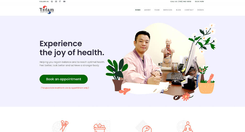
The digital environment for Yedam Wellbeing serves as a premier benchmark for “High-Accessibility Wellness Merchandising and Responsive Patient Conversion Architecture.” In the competitive holistic care and clinical wellbeing space, an online platform must instantly establish clinical trust while ensuring that scheduling paths are immediately obvious. The website masters this balance, using high-visibility booking placements alongside real-time communication tools to seamlessly guide users from clinical discovery to a scheduled session.
Key Design Highlights:
- Immediate Hero-Level “Book an Appointment” Callouts: Recognizing that many visitors land on the site with a high intent to schedule care, the homepage positions a prominent “Book an Appointment” button directly within the primary hero area. Placing this critical gateway above the fold ensures that users seeking fast relief or routine maintenance can immediately launch the booking process without needing to scroll or search through menus.
- Comprehensive Front-Page Treatment and Offering Blueprints: The homepage serves as a clear, reassuring resource hub by explicitly outlining their core services and specialized treatments directly within the main scroll path. Transparently organizing their physical therapies and wellness offerings into clean, scannable sections allows prospective patients to easily match their personal health goals or pain points with real-world clinical solutions.
- Real-Time Digital Support and Live Chat Gateways: To drastically lower user friction and address patient questions instantly, the site implements an active live chat utility on the homepage. This modern communication tool gives users an immediate line of support to ask about scheduling, practitioner availability, or treatment specifics – creating a reassuring, high-touch clinic experience right from their browser.
- Integrated Support Peer-Validation Hubs: Overcoming the natural consumer hesitation surrounding holistic healthcare is handled smoothly via a dedicated client reviews showcase on the homepage. Displaying authentic testimonials and success stories from local neighbors along the primary narrative flow provides crucial social proof, reinforcing the center’s reputation for gentle, effective, and professional care.
9. Copper Wellness
Why We Chose Copper Wellness
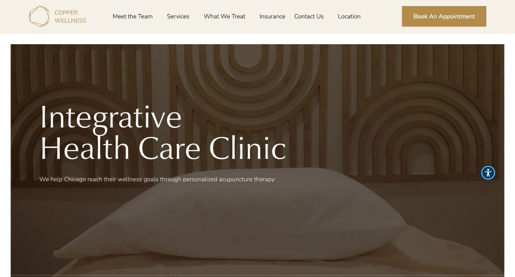
The digital presence for Copper Wellness serves as a premier benchmark for “High-Intent Clinical Onboarding and Asset-Authentic Wellness Architecture.” For modern physical medicine and integrated wellness practices, a website must actively project clinical confidence while lowering the barrier to entry for hesitant new patients. The platform masters this challenge by pairing immediate, dual-layered scheduling access with authentic media assets and condition-targeted education to turn online researchers into committed practice members.
Key Design Highlights:
- Dual-Action, Header-Anchored Strategic Conversion Portals: Directly addressing two distinct stages of patient readiness, the header features prominent buttons to either “Book an Appointment” or schedule a “Free Consultation.” This smart layout choice accommodates both high-intent individuals ready to immediately secure a time slot and cautious prospects who need a risk-free initial conversation before committing financially, capturing both conversion paths instantly.
- Authentic, Image-Driven Service Slider Modules: Rather than relying on generic, sterile stock photography that feels disconnected from the actual clinic, the homepage highlights their services through a custom image carousel utilizing their own original photography. Showcasing real treatment environments, genuine clinician interactions, and actual equipment within a space-saving slider builds immense visual credibility while keeping the homepage tidy.
- Symptom-Targeted Condition Education Matrices: The website bridges the gap between patient symptoms and physical therapies by dedicating a clear section to the exact conditions they treat. By transparently mapping out how their techniques resolve specific complaints – such as chronic pain, mobility restrictions, or sports injuries – the copy validates the user’s physical struggles and points them directly toward a clear path to recovery.
- Practitioner-Led Credibility and “Our Team” Portals: Understanding that physical medicine requires a deep level of personal trust and physical comfort, the homepage incorporates a dedicated “Our Team” showcase. Highlighting the faces, certified backgrounds, and specialized focuses of the providers humanizes the clinic, establishing absolute professional accountability and peace of mind before the first visit.
10. Good Medicine Acupuncture & Massage
Why We Chose Good Medicine Acupuncture & Massage
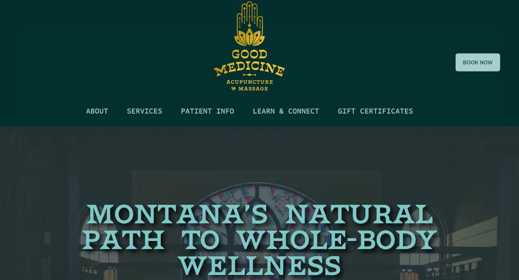
The digital presence for Good Medicine Acupuncture & Massage serves as a premier benchmark for “High-Cohesion Aesthetic Merchandising and Fluid Patient Onboarding Architecture.” In the luxury holistic health and massage therapy sectors, an online platform must immediately echo the physical sanctuary of the practice. The layout captures this dynamic beautifully, marrying a highly disciplined, organic visual style with streamlined structural pathways to guide users smoothly from visual admiration to a confirmed treatment session.
Key Design Highlights:
- Branded Visual Symmetry and Graphic Cohesion: The platform creates an instant sense of luxury and calm through the artistic use of gold, leafy graphic elements paired seamlessly with a matching gold logo and matching gold headings. This intentional design palette acts as a cohesive visual thread across the entire homepage, elevating the clinic’s brand identity and setting a serene, premium tone that mirrors a high-end wellness retreat.
- Unified, Front-Page Service Matrices and Descriptions: Rather than hiding treatment details behind complex multi-layered menus, the homepage explicitly outlines their full menu of service offerings alongside clear, detailed descriptions. Laying out their specialized paths – such as target acupuncture therapies and restorative massage modalities – allows prospective patients to easily educate themselves on the clinical benefits and choose the right treatment for their specific needs.
- Persistent, Conversion-Optimized Sticky Booking Menus: Keeping the primary scheduling path effortlessly accessible at any point during the user journey, the layout utilizes a sleek sticky header featuring a prominent “Book” button. As visitors scroll down the page to read through therapy descriptions or look at pricing, the ability to secure a time slot remains locked at the top of the viewport, removing all friction the moment a client decides to commit.
- Integrated Support Peer-Validation Hubs: Overcoming the natural hesitation surrounding bodywork and holistic healing is handled smoothly by embedding verified customer reviews directly into the primary homepage scroll path. Showcasing genuine, heartfelt testimonials from local clients provides powerful social proof, validating the practitioners’ gentle touch and professional expertise while offering comfort to newcomers.
WordPress Acupuncture Themes
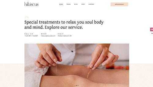
You can find free themes at wordpress.org, or consider acupuncture-inspired templates at ThemeForest.
Hibiscus – Themeforest
$79
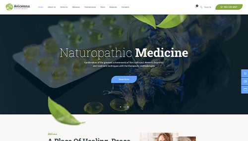
Avicenna – Themeforest
$69
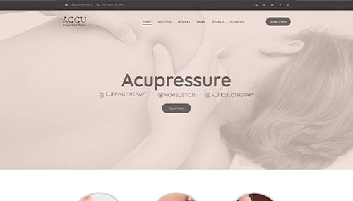
Accu – Themeforest
$69
Vaidy – Themeforest
$69