In the funeral service industry, your website is often the first point of contact for a family during one of life’s most difficult moments. At a time of high stress and profound grief, your online presence must function as a digital extension of your home – offering immediate solace, transparent guidance, and professional reassurance. To serve families effectively in 2026, a funeral home website must master the balance between compassionate storytelling and seamless technical utility.
Our design and UX team evaluated hundreds of death care websites – from historic family-owned chapels to modern cremation providers and full-service memorial parks. We identified the top examples that excel in empathetic user experience, specifically analyzing their mobile-first obituary accessibility, clear pricing transparency, and the use of soothing, dignified visual hierarchies.
Whether you are seeking to modernize a traditional brand or launch a contemporary memorial service, these examples represent the benchmark for funeral home digital excellence in 2026.
Note on Our Selection Process: We recently audited this guide to remove outdated designs and sites that no longer meet our performance or security standards. This curated list now focuses on the top funeral home websites providing the most strategic value in 2026.
Top Funeral Home Website Designs
1. Wichmann Funeral Homes
Why We Chose Wichmann Funeral Homes
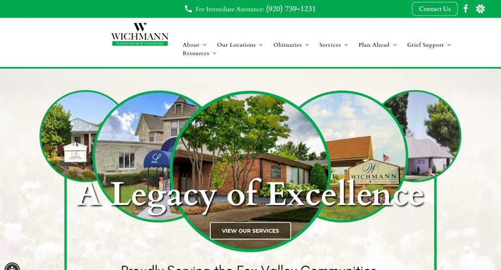
The digital presence for Wichmann Funeral Home & Crematory serves as a premier benchmark for “Compassionate Care Merchandising and High-Utility Localized Service Architecture.” In the deathcare and funeral services industry, a website faces a delicate double challenge: it must provide deep, comforting emotional support during times of grief while operating as a highly functional, clear utility hub for immediate family coordination and community logistical planning. The platform masterfully balances these priorities, placing critical search tools, local validation, and geographic mapping directly on the front page to ease user friction during high-stress moments.
Key Design Highlights:
- Streamlined Front-Page Obituary Search & Notification Gates: Recognizing that a vast majority of immediate traffic visits with a singular, time-sensitive goal, the homepage features a quick, highly prominent obituary search engine. Coupled with an effortless email notification opt-in for new notices, this layout allows mourning family members and friends to instantly locate service arrangements, share memories, or subscribe to community updates without navigating confusing internal pages.
- Geographic Matrix and Interactive Location Grids: Managing multiple physical chapels and service centers across regions is handled beautifully through an organized location grid and map layout on the homepage. This visual directory pairs crisp exterior imagery of each chapel with direct address links and interactive maps, making it incredibly straightforward for out-of-town funeral attendees to plan their travel and identify the exact facility hosting a service.
- Location-Filtered Google Review Trust Sliders: Overcoming natural consumer anxiety and establishing a safe environment for delicate family planning is achieved via a dedicated Google Reviews slider embedded on the homepage. By providing an interactive mechanism that allows families to sort and view testimonials based on specific local branches, Wichmann delivers localized peer proof that highlights their consistent dignity, hospitality, and care.
- Community-Focused Front-Page Event Hubs: Shifting the website from a purely transactional portal into an active civic pillar, the homepage integrates a dedicated module displaying upcoming community events, grief support groups, and remembrance gatherings. Spotlighting these educational and healing programs directly in the primary scroll path reinforces the firm’s long-term commitment to guiding local families through every stage of the healing process.
2. Ringa Funeral Home
Why We Chose Ringa Funeral Home
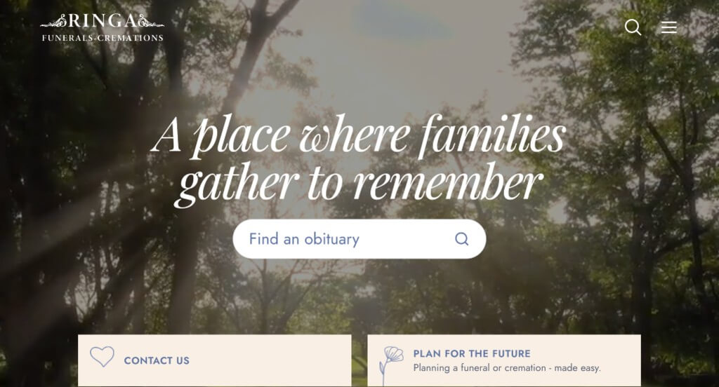
The digital home for Ringa Funeral Home serves as a premier benchmark for “High-Empathy Hospitality Merchandising and Clean-Utility Deathcare Architecture.” Designing for funeral services requires a layout that handles grief with absolute dignity while keeping immediate logistics completely clear. The interface balances these needs gracefully, opting for an elegant, distraction-free environment that blends welcoming facility tours, genuine neighbor proof, and clear support values right within the main scroll path to guide families during difficult times.
Key Design Highlights:
- Value-Driven “We’re Here For You” Commitment Portals: Directly addressing the overwhelming stress and emotional weight that families experience during arrangements, the homepage features a prominent “We’re Here For You” section. This dedicated layout outlines their specific values, custom planning care, and community roots, giving clear reasons why families can trust them to manage final arrangements with absolute respect.
- Immersive, High-Dignity Facility and Grounds Galleries: Overcoming the natural hesitation of choosing a gathering space without visiting in person, the homepage features a beautifully organized gallery showing the building and grounds. Showing the warm, peaceful visitation chapels, comfortable family rooms, and beautifully manicured outdoor landscaping provides instant comfort, proving they offer a calm, respectful setting for remembrance.
- Integrated Support Peer-Validation Hubs: Building deep, long-term trust in delicate moments is handled smoothly by embedding verified customer reviews directly on the homepage. Displaying authentic testimonials from local families within the primary narrative scroll path highlights their consistent gentleness, attention to detail, and support throughout the entire planning process.
- Sleek, Space-Saving Desktop Right-Hand Hamburger Menus: The website keeps the visual field incredibly clean and peaceful by using a modern hamburger menu that expands smoothly from the right side of the desktop view. This choice keeps complex links, resource guides, and pre-planning forms out of the way until needed, letting users focus entirely on the core message while keeping complete navigation just a click away.

3. Moss Family Funeral Homes
Why We Chose Moss Funeral Home
The digital home for Moss Family Funeral Home Click to open side panel for more information serves as a premier benchmark for “Compassionate Regional Merchandising and Founder-Led Heritage Trust Architecture.” In the delicate deathcare space, a web interface must effortlessly project long-standing community stability, absolute operational transparency, and genuine emotional safety. The layout secures this high-empathy positioning, combining real-time navigation tools with an authentic, family-first narrative that instantly reassures grieving families they are entering a place of sincere care and professional guidance.
Key Design Highlights:
- Cinematic, High-Dignity Care Hero Showrooms: Immediately upon landing, the homepage establishes a peaceful and professional tone through a high-fidelity hero video loop. By capturing gentle glimpses of their welcoming interiors, quiet consultation rooms, and the team’s professional, dignified presence, the video framework beautifully communicates their commitment to service and emotional support without requiring heavy blocks of text.
- Dual-Branch Localized Facility Matrices: Explicitly designed to serve neighboring communities without causing geographical confusion, the homepage prominently features their two distinct regional chapels. Presenting dedicated visual profiles, direct addresses, and immediate contact details for each branch side-by-side allows local families to immediately identify and coordinate with the location closest to home.
- Founder-Led Mission and Vision Frameworks: Grounding the firm’s multi-generational reputation, the homepage features a dedicated biographical section highlighting the owner, Bryan Moss. Showcasing the background, face, and personal philosophy of the leadership directly within the primary scroll path humanizes the facility, building deep trust by proving the business is steered by an accountable local neighbor rather than a nameless corporation.
- Persistent, Friction-Free Sticky Utility Menus: Ensuring that critical planning tools and immediate care pathways remain instantly accessible during high-stress moments, the desktop layout incorporates a sleek sticky header. As users scroll through the biographical and facility narratives, essential navigation links – such as obituary search, immediate-need resources, and pre-planning portals – remain anchored at the top of the viewport for one-click access.
4. Bethel Funeral
Why We Chose Bethel Funerals
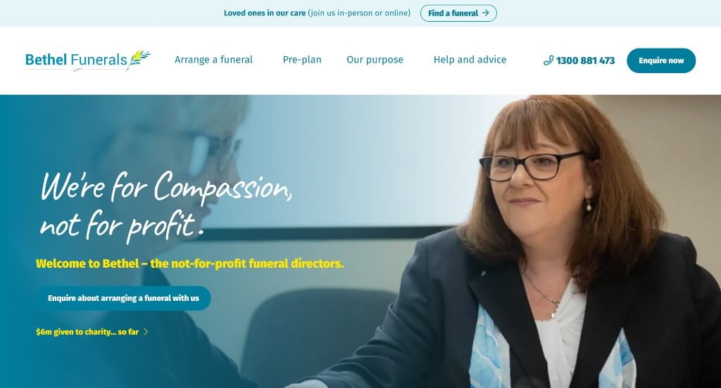
The digital space for Bethel Funerals serves as a premier benchmark for “Faith-Centered Compassionate Care and Process-Driven Guidance Architecture.” Operating a high-empathy funeral service across multiple locations requires an online experience that balances comforting reassurance with crystal-clear logistics. The layout handles this masterfully by blending deep-dive video walkthroughs, explicit service tier breakdowns, and fluid navigation systems to gently guide grieving families and forward-thinking planners through every major decision.
Key Design Highlights:
- Structured “How It Works” Visual Process Walkthroughs: Recognizing that planning a service can feel completely overwhelming during times of grief, the homepage includes a dedicated “How It Works” operational section. By featuring a clear, compassionate video that explains their exact care process step-by-step, the layout replaces intimidating administrative guesswork with an open, reassuring roadmap.
- Comprehensive Multi-Path Service Matrices: The homepage functions as a clear utility hub by explicitly organizing their core offerings into three distinct pillars: Arrange a Funeral (for immediate needs), Pre-Plan Your Funeral (for future preparation), and Help & Advice (for grief support and administrative questions). This intuitive grouping ensures that whether a visitor is in the middle of an immediate family crisis or simply researching options, they are instantly routed to the right resources.
- Organized, Content-Rich Desktop Mega Menu: To manage a wide array of grief resources, location details, pricing transparency checklists, and personalization options without cluttering the screen, the desktop interface utilizes a streamlined mega menu. Hovering over the main navigation links opens an organized workspace that categorizes links neatly, allowing users to find specific logistical information quickly without facing page friction.
- Integrated Support Peer-Validation Hubs: Building ironclad trust during delicate life transitions is handled smoothly by embedding verified customer reviews directly on the homepage. Displaying genuine, heartfelt testimonials from local families within the primary narrative scroll path highlights their consistent gentleness, attention to detail, and support throughout the entire arrangement process.
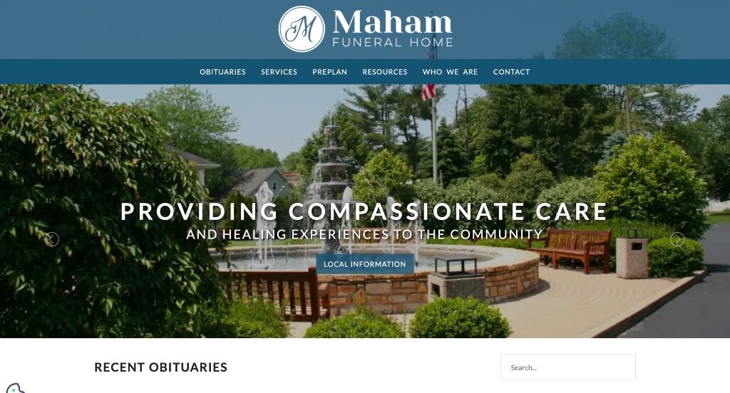
5. Maham Funeral Home
Why We Chose Maham Funeral Home
The digital presence for Maham Funeral Home Click to open side panel for more information serves as a premier benchmark for “Serene Minimalism and Dignified Local Utility Architecture.” In the deathcare industry, digital environments must act as calm, grounding spaces for visiting families. The interface secures this atmosphere perfectly, trading heavy, crowded blocks of text for a clean, light canvas that balances essential neighborhood news, immediate logistical tracking, and simple community peer proof to ensure a completely smooth user journey.
Key Design Highlights:
- Serene, Low-Contrast Minimalist Aesthetic Frameworks: The layout embraces a pristine white background paired with a highly disciplined, minimal color scheme to create an instant feeling of peace and quiet dignity. By removing loud visual elements and intense design distractions, the website respects the emotional state of grieving users, providing a clean digital sanctuary that makes consuming sensitive information feel calm and easy.
- Direct Front-Page Dynamic Obituary Showrooms: The homepage functions as a crucial community news pillar by highlighting recent obituaries straight within the main view. This straightforward choice allows family members, neighbors, and out-of-town friends to instantly find active service times, read life stories, and share condolences without having to dig through multiple complex inner menus.
- Integrated Support Peer-Validation Hubs: Helping families feel secure during vulnerable life moments is handled smoothly by embedding verified customer reviews directly on the homepage. Showcasing authentic testimonials from local neighbors along the primary scroll path highlights their consistent gentleness, attention to detail, and support throughout the arrangement process.
- Friction-Free Desktop Interactive Location Maps: Making chapel logistics and service attendance as straightforward as possible, the homepage embeds a fully interactive Google Map. This visual tool lets out-of-town guests and local attendees quickly pinpoint the facility’s exact geographic location, calculate travel routes, and check parking logistics without leaving the website.
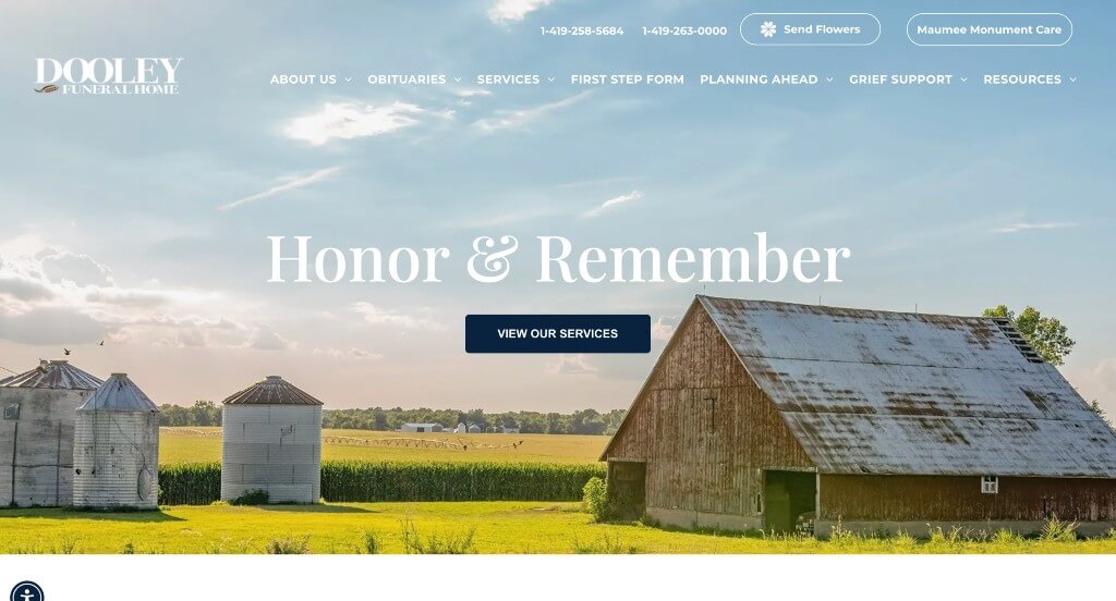
6. Dooley Funeral Home
Why We Chose Dooley Funeral Home
The digital portal for Dooley Funeral Home serves as a premier benchmark for “High-Accessibility Compassionate Merchandising and Responsive Localized Care Architecture.” When families face the sudden responsibility of coordinating arrangements, their primary tool is frequently a mobile device, and their emotional state demands absolute simplicity. The layout masters this requirement by trading overwhelming administrative layouts for a highly responsive, utility-forward canvas that places vital location maps, active communications, and direct support links directly within reach.
Key Design Highlights:
- Frictionless Mobile-Responsive Conversion Flows: Recognizing that urgent community visits and logistical lookups often happen on the go, the platform features a highly adaptive mobile framework. The layout transitions from desktop to handheld screens, adjusting text scales, touch targets, and media assets to ensure that grieving families can access critical service information on any device.
- Geographic Matrix and Desktop Location Maps: Helping out-of-town guests and local attendees easily coordinate travel is achieved through an interactive Google Map embedded right on the homepage. This visual tool lets visitors instantly verify the facility’s exact location, pull up quick driving directions, and calculate transit times without needing to browse separate pages.
- Direct Front-Page Urgent Consultation Gateways: The homepage streamlines immediate inquiries by embedding a clean, prominent contact form directly into the main scroll path. Positioned to assist families in need of immediate support or those researching pre-planning options, this direct link eliminates unnecessary clicks and opens a line of communication when time is of the essence.
- Robust Content-Rich Desktop Footer Directories: The website organizes a deep library of resources, planning guides, and grief support tools into a well-structured footer menu. Acting as an organized safety net at the base of the page, this comprehensive directory provides easy access to deep-level utility pages without complicating the primary, peaceful homepage layout.
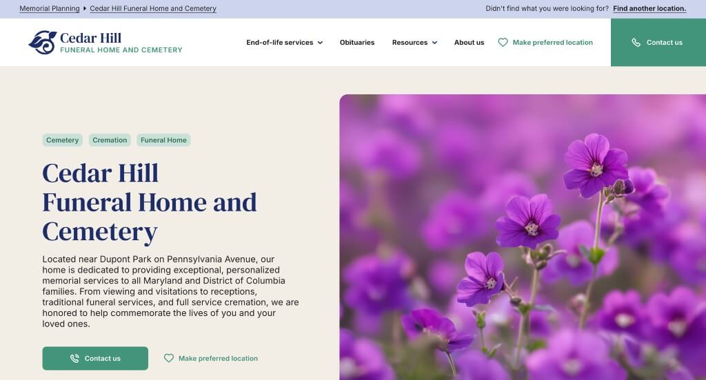
7. Cedar Hill Funeral Home
Why We Chose Cedar Hill Funeral Home
The digital presence for Cedar Hill Funeral Home serves as a premier benchmark for “High-Dignity End-of-Life Merchandising and Content-Rich Care Architecture.” In the deathcare industry, an online space must act as both an emotional sanctuary and a highly functional logistical hub. The platform achieves this balance beautifully by combining intuitive navigation layouts, rich facility storytelling, and prominent community notices to guide grieving families through sensitive arrangements with complete clarity.
Key Design Highlights:
- Comprehensive End-of-Life Service Guides and Facility Galleries: The homepage acts as a transparent, reassuring resource center by pairing detailed explanations of their core end-of-life services with an integrated media gallery. This thoughtful presentation clearly maps out option pathways – such as traditional visitations, personalized celebrations of life, and dignified cremation services – while letting families visually tour their serene, welcoming physical spaces to establish instant peace of mind.
- Direct Front-Page Dynamic Obituary Showrooms: Recognizing that many visitors land on the site looking for immediate service information, the homepage highlights recent obituaries straight within the main view. This straightforward choice allows family members, neighbors, and out-of-town friends to instantly find active service times, read life stories, and leave digital condolences without having to dig through multiple complex internal menus.
- Organized, Content-Rich Desktop Mega Menu: To manage a wide array of grief resources, pre-planning checklists, personalization packages, and location details without cluttering the screen, the desktop interface utilizes a streamlined mega menu. Hovering over the main navigation links opens an organized workspace that categorizes links neatly, allowing users to find specific logistical information quickly without facing page friction.
- Persistent, Friction-Free Sticky Utility Menus: Ensuring that critical planning tools and immediate care pathways remain instantly accessible during high-stress moments, the desktop layout incorporates a sleek sticky header. As users scroll through the biographical and facility narratives, essential navigation links – such as obituary search, immediate-need resources, and contact portals – remain anchored at the top of the viewport for one-click access.
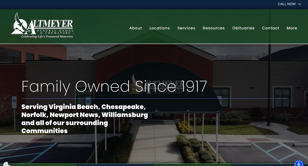
8. Altmeyer Funeral Homes
Why We Chose Altmeyer Funeral Homes & Crematory
The digital presence for Altmeyer Funeral Homes & Crematory serves as a premier benchmark for “High-Accessibility Compassionate Care and Seamless Multi-Branch Operational Architecture.” In the deathcare industry, an online platform must offer immediate emotional reassurance while functioning as an ultra-efficient logistical utility hub. The interface masters this balance, using clear layout structures and persistent engagement channels to lower user friction for families navigating high-stress coordination or early planning.
Key Design Highlights:
- Immediate High-Visibility “Request an Appointment” Gateways: Understanding that visitors often land on the site with urgent, time-sensitive coordination needs, the header features a prominent appointment request action. Placing this tool directly at the top of the page allows grieving families or pre-planners to quickly initiate a consultation without forcing them to dig through standard contact pages.
- Comprehensive Front-Page Care Service Blueprints: The homepage acts as an open, reassuring resource directory by clearly mapping out their primary deathcare offerings right within the main scroll path. This straightforward section organizes their specialized pathways – such as traditional burials, personalized celebrations of life, and dignified cremation services – making it easy for families to quickly identify the right arrangements for their needs.
- Integrated Support Peer-Validation Hubs: Building ironclad trust and reassurance during deeply vulnerable moments is handled smoothly via dedicated customer testimonial grids directly on the homepage. Displaying authentic, comforting reviews from local families highlights their consistent dignity, attention to detail, and gentle professional guidance throughout the entire planning lifecycle.
- Persistent, Friction-Free Sticky Utility Menus: To ensure essential planning tools remain instantly reachable as users explore resources, the layout incorporates a sleek sticky header. As visitors scroll through family testimonials or service options, critical navigation points and immediate support links remain anchored to the top of the viewport for seamless, one-click access.
9. Hatfield Funeral Home
Why We Chose Hatfield Funeral Home
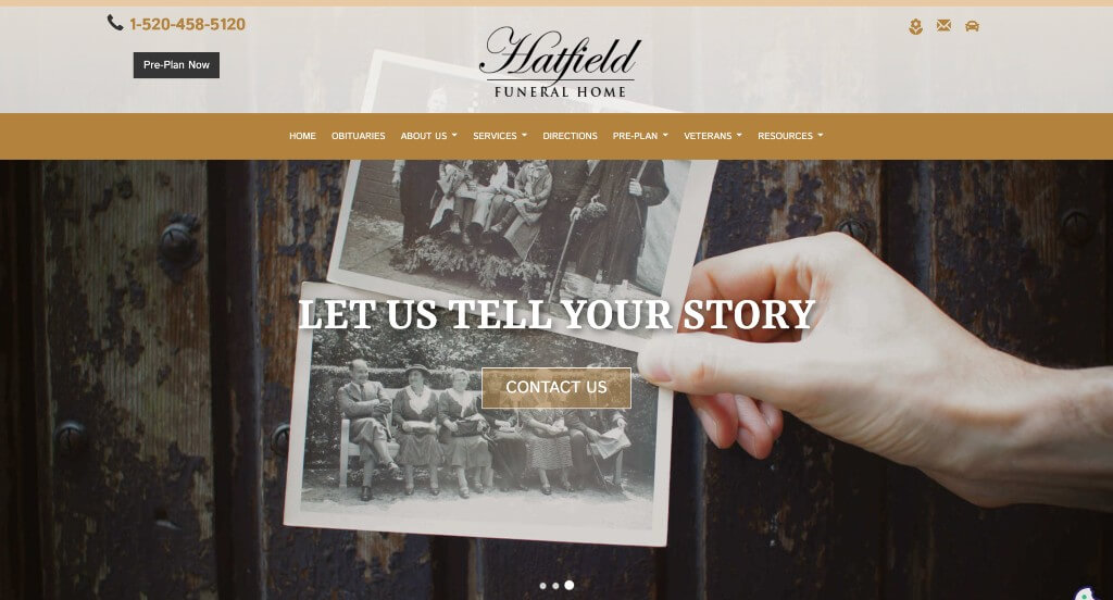
The digital presence for Hatfield Funeral Home serves as a premier benchmark for “Action-Oriented Empathy and High-Utility Deathcare Architecture.” Grieving families and community members looking up funeral arrangements need immediate answers and seamless navigation. The interface handles this perfectly, combining crucial local utility shortcuts in the primary header with a comforting, text-efficient layout that minimizes user frustration during stressful moments.
Key Design Highlights:
- High-Utility Header Action Frameworks: Directly addressing the diverse needs of site visitors, the header incorporates prominent shortcut buttons for driving directions, the contact page, and a direct link to send flowers. Grouping these distinct, high-priority actions right at the top ensures that out-of-town guests looking for the chapel, families needing to speak with a director, and friends wanting to express condolences can all accomplish their goals in a single click.
- Comprehensive Front-Page Care Service Blueprints: The homepage acts as a clear, reassuring roadmap by explicitly outlining their main care pathways right in the primary scroll path. Visually breaking down services – such as traditional visitations, cremation options, and veteran honors – helps users understand their choices immediately without forcing them to hunt through heavy drop-down submenus.
- Dynamic, Space-Saving Obituary Sliders: Keeping the community actively informed without overcrowding the front page, the website implements a smooth obituary carousel directly on the homepage. This layout lets visitors effortlessly scan recent notices, view service dates, and click through to individual tribute pages while keeping the primary visual flow clean and dignified.
- Persistent, Friction-Free Sticky Utility Menus: To ensure that essential contact channels and navigation paths remain instantly accessible as users read through services, the desktop layout utilizes a sleek sticky header. As you scroll down the page, the top navigation remains locked in view, eliminating the need to scroll all the way back up when a visitor is ready to make a decision or reach out.
WordPress Funeral Themes
You can find free themes at wordpress.org or consider funeral-inspired templates on ThemeForest.
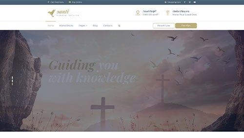
Santi – Themeforest
$49
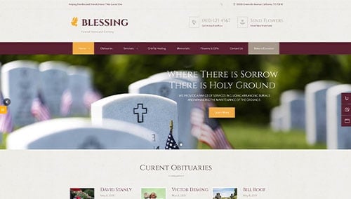
Blessing – Themeforest
$69
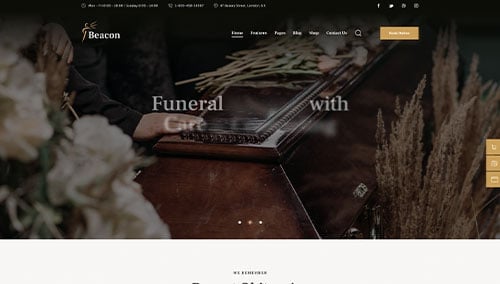
Beacon – Themeforest
$69
Anubis – Themeforest
$69